UPDATE: problem solved, see below.
I wonder if NSIDC actually looks at their own output from day to day? I know that sounds harsh, but the reality is that bloggers keep finding their errors and pointing them out to them, while at the same time the head of NSIDC Dr. Mark Serreze refuses to apologize for his comment “I have yet to lose any sleep over what is talked about in WattsUpWithThat or any other similar blog that insists on arguing from a viewpoint of breathtaking ignorance.“
Last night I published NSIDC’s April Sea Ice Update along with an NWS report about record Bering Sea Ice. Simon F. was first to spot it within minutes.
Simon F. says:
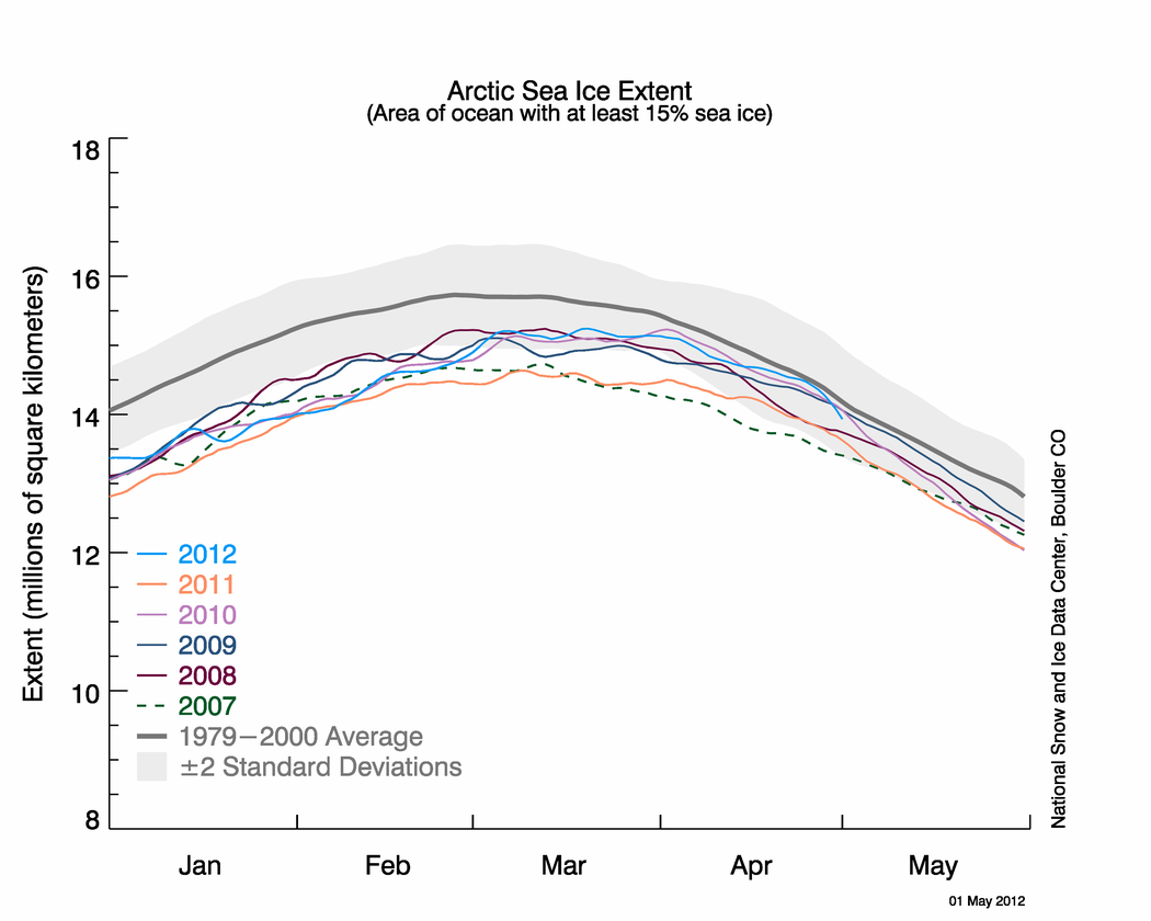
There appears to be another glaring error on the NSIDC page about arctic sea ice. Look at these two images: http://nsidc.org/data/seaice_index/images/daily_images/N_stddev_timeseries.png & http://nsidc.org/arcticseaicenews/files/2012/05/Figure2.png – How come one practically touches the mean and the other never gets close?
I figured I’d wait until morning to see if NSIDC fixed the issue themselves. Nope. Let’s look at those graphs.

http://nsidc.org/data/seaice_index/images/daily_images/N_stddev_timeseries.png
OK, nothing wrong with this one. Note how the sea ice kisses the normal line. NSIDC alludes to this in their April Summary saying: Arctic sea ice reaches near-average extent in April

http://nsidc.org/arcticseaicenews/files/2012/05/Figure2.png
Hmmm….the blue line no longer kisses the normal line.
Since these graphs have the same scale, doing an overlay is easy.

It seems the average line has shifted. WUWT?
Why do bloggers keep having to point out NSIDC’s errors in their public presentations to their scientists? This is the second time in a month such errors have been spotted by bloggers, prompting NSIDC to do a correction last month.
NSIDC fixes their Arctic Sea Ice graphing problem
NSIDC’s oops moment – uncoordinated changes make for an interesting 24 hours
And of course the first time we pointed out a glaring error, that the satellite sensor failed, I was told it wasn’t worth blogging about.
Errors in publicly presented data – Worth blogging about?
NSIDC pulls the plug on Arctic Sea Ice Graphs
No good deed goes unpunished I suppose.
UPDATE: 9:15AM PST
I’ve heard from Dr. Walt Meier at NSIDC, and they are working to fix the problem. He sends his thanks for spotting the problem. – Anthony
UPDATE2: 2:30PM PST.
This came in earlier today at 12:32, but I was busy with other issues. The problem has been solved. Walt Meir writes:
We’ve corrected the image.
Thank you again for bringing it to our attention. It’s always good to have multiple eyes on things like this since we’re not an operational center and don’t always catch things, especially when we’re busy with other responsibilities.
Here is the corrected Figure 2 image:

We had the changing of the measurement when the line was about to cross the average line, now the average line is shifted further away ?
‘Fool me once, shame on you; fool me twice, shame on me
i’d give them the benefit of the doubt but for the previous issues.
What is the relevance of this? Is this so important that it deserves its own blog post? I find mistakes all the time on websites of different scientific organisations. I tell them, they thank me, no problem.
REPLY: What is the relevance of you poo-pooing every thread we do on sea ice? Bug off. – Anthony
“Errors”? The incompetence argument is wearing a little thin. It is the breathtaking arrogance that really concerns me.
“but the reality it that bloggers keep finding their errors”
—–
should be “reality is” not “it”
These are simple graphs. The values that determine the lines should always result in a “dot” occurring in the same place. Since the dots move, how do the values change?
The answer must be that they are not simple graphs but equations derived from graphs that have time-dependent corrections to the values being posted. Where any value shows up depends on how today feeds backwards. That’s weird. I suppose it is possible that they are Photoshop overlays done manually, but I can’t believe NSIDC is that crude.
But maybe I should lower my expectations.
Maybe they forgot to change the ‘climatology’ line on the 2nd graph from centered window to trailing average.
“I have yet to lose any sleep over what is talked about in WattsUpWithThat or any other similar blog that insists on arguing from a viewpoint of breathtaking ignorance.“
You must realise he spent years learning all that he knows and if he finds out it was a complete waste of time he will be shattered. Especially if breathtaking ignorance proves to be correct.
May 4, 2012 by Anthony Watts :
“….head of NSIDC Dr. Mark Serreze refuses to apologize for his comment “I have yet to lose any sleep over what is talked about in WattsUpWithThat or any other similar blog that insists on arguing from a viewpoint of breathtaking ignorance.“”
Being ever optimistic I’d suggest Dr. Serreze take a serious cup of coffee in the morning prior to beginning his work, taking for granted he does wake up at all before stumbling into work.
Do we really have to have the WUWT snotty meter pegged at 10 on every post? Relax folks, this isn’t an evil plot to pull the wool over anybody’s eyes.
REPLY: Do you really have to make “snotty” comments that add nothing to the debate of the issue at hand? Nobody is forcing anyone to click on the meter. I can’t help it if readers like what I write about.
I can if you wish enable comment ratings, and then we can see how you comment fares. – Anthony
The fear of creeping humiliation in the presence of breathtaking ignorance or is it just banal stupidity ?
Dr. Mark Serreze does not care whether his graphs are correct or not as long as they give the standard warmist message otherwise he would be grateful and acknowledge the corrections. Another bought and paid for “scientist”
Perhaps the NSIDC have been obliged to lay off the intern who knew how to operate ‘The Excel’ ?
It’s time for some big changes. I know it’s not fraud… But what is it then?
I’m a plumber and this sort of incompetence (or whatever it is, is) is followed by dismissals.
Like I said… It’s time for sweeping changes…
It’s about time the average was taken over the years 1979 to 2011. But that would be cherry-picking! LoL
They shifted the average line a nine day average and kpet the “real” line at a 5 day average, effectively shifting the average line to four days out of sync with the real line. They clearly did this intentionally, I will not accuse them of breathtaking ignorance. Just maybe breathtaking stupidity and a want to prove their meme at all costs, even the cost of doing good science.
Has anyone commented on the changes in the temp record yet? These guys are not doing science any longer.
Anthony has always given people the benefit of the doubt and in fact in the last little blunder he did too. Serreze is the prophet of the death spiral, so I would not expect him to apologize for anything. When an error I made about their site was pointed out, I apologized over and over for it, as soon as I found out, but still got fried over the coals by the Romminstas and that bunch ( when they get bored, they simply pull out their favorite pinata, me and beat it..thought I would put a little cinco de Mayo flavor into this for you all)
In any case, at the very least, the folks at the top should get a hold of this situation. I watch the Norsex site anyway, I dont normally see things as strange there. It almost seems like things like this are meant to bait us into a fight, and at the very least make you wonder what is going on
This sea ice story brings up an issue worth discussing. In 2009 http://www.wattsupwiththat.com reported a glitch in NOAA’s carbon dioxide update. NOAA’s Dr. Pieter Tans quickly verified and corrected the problem and responded to Anthony with a polite e-mail to that effect. That’s the way these matters should always be handled. The arrogance displayed by Dr. Mark Serreze with regard to sea ice is as puzzling as it is unacceptable. The University of Hawaii Press has just published my book “Hawaii’s Mauna Loa Observatory: Fifty Years of Monitoring the Atmosphere.” This book was written on assignment from NOAA’s Earth System Research Laboratory, which did not tell me what to write and which gave me total access to everything I wanted to review or photograph. I interviewed more than 50 scientists connected with the Mauna Loa Observatory for this book (including Dr. Tans). While they certainly represented a very wide range of view points, they were all courteous in their demeanor. Perhaps Dr. Serreze should get to know some of the MLO veterans and staff so he can better appreciate the value of diplomacy when commenting about those with whom he disagrees, especially when they are right and he is wrong.
drobin9999 says:
May 4, 2012 at 8:13 am
Do we really have to have the WUWT snotty meter pegged at 10 on every post? Relax folks, this isn’t an evil plot to pull the wool over anybody’s eyes.
=================================
I agree….it’s just gross incompetence
Before the people of the world spend trillions on a “problem”, it should not be too much to ask the fearmongering scientists to learn how to take the temperature properly, use a computer, draw a graph, check their work, test others’ work, and answer simple questions without stumbling into illogical fallacies.
I know we are supposed to bow down to their authority, but they still haven’t shown that they can distinguish their asses from holes in the ground.
Humility and good humor are among our best weapons –both offensively (to persuade others when we are in fact right) and defensively (to retain credibility and respect when we’re in fact wrong). As others have noted, it is short-sighted for those running NSIDC to answer their questioners with anything except endless patience and, when NSIDC is found to be in error, infinite gratitude to those who point it out.
Short version: “A soft answer turneth away wrath.”
“I have yet to lose any sleep over what is talked about in WattsUpWithThat or any other similar blog that insists on arguing from a viewpoint of breathtaking ignorance.“ Breathtaking ignorance?
As opposed to Dr. Mark Serreze scientific contributions
“The Arctic is screaming,”
“The ice is in a “death spiral”
Yeah right – more like contributions to Sesame Street!
I’ll bet if Serreze’s bank changed the way they calculated his monthly average balance (in such a way as to disadvantage him) it would be worthy of discussion.
NSIDC appears to be heavily invested in the “human-caused global warming” mantra. They are, after all, an agency of the federal government. If a worker can ‘tweak’ the graphing paramaters to make the extent line not hit the mean line, great. The fact that there are others looking over their shoulders who have access to much of the same information is not really important to them. I doubt seriously that a congressman or congressional staff person has the interest to even look for sites like WUWT or has the ability to understand the data presented and be able to draw logical conclusions and inferences from it. These people only see the ‘official’ data, read the ‘official’ interpretation of it, and proceed from there.
It is, of course, a total coincidence that these “mistakes” always favor the Warmist stance. Any cynicism about this is unwarranted, and saddens Walt, and we do not want that on our conscience. I am sure a completely logical
excuseexplaination will be forthcoming.Given Serreze’s history of proclaiming death spirals of the Arctic ice, I cannot help but to be cynical and suspicious of whether this is merely incompetence or is an intentional act designed to further the CAGW narrative.
The only other place I’ve seen GOD complex’s like climate science is in my local hospital and they do actually save lives there.
Has anyone bother to check the Antarctic ice extent to see if there have been any adjustments there, too?
I can’t tell for sure which way the average line moved. On the overlay chart, the top average line appears to be better centered within the gray area than the bottom averaged line. If this observation is correct then the earlier average line could be the culprit. Further, the lettering on the graphs is not the same size so resizing has been used on one of the graphs while doing the overlay. I suggest you redo the comparison, Anthony.
This does not in any way excuse the snottiness of Dr. Mark Serreze. He is sans le doute a panty waist.
This is not incompetence, its a continuous attempt to defraud and mislead the public. The ice graphs ALWAYS go down when an “adjustment” is made. All these guys will have to account for using public monies to mislead the public.
The average line has shifted up for no reason I can think of other than it was getting too close to the normal line for comfort. Can’t be a more recent timeline average update or the average line would have gone down. Seems like a change done on purpose and if so shame on you NSIDC. Thanks for confirming for us that science is no longer important any more in your department.
Speaking of screwed up graphs; have you noticed cyrosphere today’s Arctic ice comparison chart dates are not working correctly. http://home.comcast.net/~ewerme/wuwt/cryo_compare.jpg
What is it about climate scientists? They keep getting CAUGHT messing with data to misrepresent what is happening in reality. It’s like the whole lot of them need to be fired. I”m not sure that I mean that metaphorically at this point.
There is simply no excuse for this type of “mistake”, assuming it’s a mistake at all. You see it begs the question if it’s really a mistake.
This is why science is suppose to be reproducible… so that others can verify the results to ensure they are done correctly or at least in a reasonably justifiable manner given the circumstances. When reproducibility is lost it’s no longer science.
I ask that NSIDC cough up the source code for their graphing system and the actual data feed (assuming they haven’t already) and let us review their code and plot our own graphs. They are publicly funded so they have no excuses to hid behind. In necessary a Freedom of Information Request for all versions of their source code, binaries, and data feeds plus any documentation to be provided on an ongoing basis. Whenever a change is made the new source code should be posted on their web site at the time the change is implemented.
Open Public Science needs to be the rule rather than the exception. If they want trust and respect then they as scientists need to provide the means to verify their work, their data, their graphs, their conclusions, their math, their assumptions, etc. If they fail to do so they are not following the scientific method nor are they honoring the people who pay their bills and wages.
Oh, Steven Goddard also has an article about this here (beating you to it Anthony [;)] ):
http://stevengoddard.wordpress.com/2012/05/04/nsidc-naughtiness-returns/
drobin999 wrote:
Do we really have to have the WUWT snotty meter pegged at 10 on every post? Relax folks, this isn’t an evil plot to pull the wool over anybody’s eyes.
REPLY: Do you really have to make “snotty” comments that add nothing to the debate of the issue at hand? Nobody is forcing anyone to click on the meter. I can’t help it if readers like what I write about.
I can if you wish enable comment ratings, and then we can see how you comment fares. – Anthony
drobin999’s style is all the rage in blogtrolls. Volokh.com has a particularly bad infestation. You won’t get anything substantive out of them because they don’t have anything. Just more ad hom.
Some of them are paid professionals. One particular group uses dial-up services in Virginia to cover their tracks.
2 points
Has it not become exceedingly obvious that “WUWT Review” has far surpassed “Peer Review” and will only grow to make nearly obsolete what has become pal review.
Who would argue that outdated “Peer Review” is more effective than the instant global review by the limitless skilled critiquing WUWT provides.
In our rapidly advancing tech world the image of a few chin rubbers pondering a paper in isolation is quickly becoming a picture of a horse and buggy era.
Second point- Has there been any “errors” which falsely displayed far too much sea ice?
Imagine if this latest error moved the normal line in the opposite direction and showed Arctic sea ice surpassing normal by a hefty amount.
Is it unreasonable to suspect that it’s probably happened many times but remarkably always gets caught before being released. “Oh that can’t be right. We better look at that some more”.
Tot up the time you have spent. Charge it at a realistic rate like $60/hour and send them the bill.
Then just publish the invoice here.
Too many people have been taken us sceptics for granted, and far from crediting our hard work, have either been part of the lynch mob to have us locked up as “deniers”, have egged on others, or perhaps worst and stood by knowing it was happening and said nothing.
As I said send them the bill, it is time they paid up!
Adjustments of past temperatures weren’t enough, so now they adjust current sea ice. Memes rule over reality and science goes missing. If we do get a Grand Minimum it will be fun to see them try to adjust that out of existence.
If there was a death spiral of Arctic sea ice would Serreze lose his job? There wouldn’t be much for him to do then would there?
pwl says:. “You see it begs the question if it’s really a mistake”
There was a labour aparachik in the UK who on 911 said: “a good day to bury bad news”.
Is this a red rag to the sceptic bull? No?
So, why do I feel like some great oaf looking at a fluttering rag?
Sad that positions of power are held by untrustworthy individuals. . Only a fool continues to allow themselves to be lied to.
REPLY: I don’t know that they are “untrustworthy”, and I think generalizations like that should be reserved for people like Joe Romm, Mike Mann, Bill McKibben, and Dave Appell who have in fact proven themselves as such.
I think NSIDC simply has a case of bureaucracy blinders, as do many similar government organizations. – Anthony
I’m constantly amazed at how tone deaf guys like Serreze are in situations like this. The public’s belief in CAGW is way down and ever increasing numbers of people believe the alarmists are a bunch of idiots yet we still see mistakes like this still occur. And when they occur instead of being thankful for having the error pointed out we see instead an outburst of emotional bluster and venom.
Just how did this guy get to be head of the NSIDC anyway? Did he win a competition for the longest pony tail?
Hummm, I wonder if the IRS would let me underestimate my taxes or if a publicly held company would be permitted to under/over estimate revenue on a regular basis without penalty ?
Ya think!
http://500motivators.com/plog-content/thumbs/motivate/me/large/402-facepalm-your-doing-it-wrong.jpg
I’ve heard from Dr. Walt Meier at NSIDC, and they are working to fix the problem. He sends his thanks for spotting the problem.
There is absolutely no excuse for this.
NSIDC know perfectly well that lots of people watch their graphs on a (dare I say) almost obsessive day-by-day basis. And yet on their main page http://nsidc.org/arcticseaicenews/
the two contradictory graphs are there on the same page, one at the top and one about half way down. It will be interesting to see what excuse they try to come up with.
JFD says:
May 4, 2012 at 8:55 am
I can’t tell for sure which way the average line moved. On the overlay chart, the top average line appears to be better centered within the gray area than the bottom averaged line. If this observation is correct then the earlier average line could be the culprit. Further, the lettering on the graphs is not the same size so resizing has been used on one of the graphs while doing the overlay. I suggest you redo the comparison, Anthony.
Look at where the average line intersects the y-axis. It has moved up about 0.2 million kilometers squared. So has the grey SD squared area. The 2012 line has not moved up, nor has the 2007 line (although that’s a bit harder to tell).
What is truly amazing is that the government has so many breathtakingly stupid people like Serreze in charge of these agencies. You would think that with their overblown salaries and pension plans that we could get some decent quality employees in there, but apparently it is mostly morons who work for our [SNIP: Let’s not go there. -REP] government.
So if there were no bloggers could it be assumed NSIDC would find and correct their errors? Personally I see no reason to trust one thing these folks present to the public and by association, other scientists using their data.
Well done for spotting their error, but I have to say I’m with the people saying turn down the shock-o-meter. Point it out, sure, but less of the adjectives.
If “climate” is supposed to be the long term 30 year average, why does NIDC only calculate the 20 year instead of 30 year average? i.e., from 1979-2000 rather than from 1979 to 2010?
To hide the increase?
My theory is that they have two teams trying to adjust the data with different methods. The members of the teams are not allowed to see the output of their algorithms. Both teams get as input the same measurements (satellite photos).
As amusement for the public, the webserver chooses to display one of the results randomly.
The team that manages to compute the lower summer sea ice minimum gets a pay rise.
Then it should be just as easy to find errors not in favor of the AGW meme. What is the ratio? Really, can they be counted on one hand?
Mistake? Their mistake is to not have a QA program of profession grade.
John
It is time for a post on this article:
http://www.bmartin.cc/pubs/92prom.html
This is fraud of a type, the “fraud of the whole” maybe.
“I can’t tell for sure which way the average line moved. ”
It’s easy — just look where it crosses the axis. It’s about 14.05 in the older graph and about 14.4 in the newer. The fact that the lettering is differently sized gives insight to how the graphs are produced. It might be Illustrator. That’s what I use for complex graphs. Really nice, but you have to doublecheck everything, especially when you reuse elements on new graphs.
Latitude says:
May 4, 2012 at 8:33 am
drobin9999 says:
May 4, 2012 at 8:13 am
Do we really have to have the WUWT snotty meter pegged at 10 on every post? Relax folks, this isn’t an evil plot to pull the wool over anybody’s eyes.
=================================
I agree….it’s just gross incompetence
Hmmm….’an evil plot to pull the wool over (people’s) eyes’, or…..’just gross incompetence’? The future of humankind is in the best of hands.
Probably they figure the number of people who will hear about and notice manipulations even this blatant is relatively small (and those often the minority already knowing what is going on anyway), less than they
gain from the revisionism reaching a larger trusting audience. They might even be right on that as an effective strategy. The largest of the skeptic websites in traffic, Watts Up With That has tens of thousands or so of daily visitors (far higher figures per month but most repeat visits), but, even so, the “mainstream” media and sites like Wikipedia reach a larger audience, more millions of people, supported throughout much of the educational system. What would be most disruptive would be more winters like 2009-2010 in the Europe and U.S., only more so, sometimes a few years from now in the possible event of a solar Grand Minimum developing in the future, as the 2009-2010 experience highlighted where revisionism capabilities break down on local records and how people personally notice. If such happens, even many of the CAGW movement’s elite won’t see it coming, never having been educated on real climate history, spreading inaccuracies amongst themselves as much as to others.
Figures don’t lie, but liars figure. “Adjusting” data seems like poor practice at best. How convenient that we have activist “scientists” allowed to alter historic records, and how surprising that their adjustments always make the past cooler and the present warmer? Most citizens quit paying attention to arithmetic sometime shortly after fourth grade, so cannot ascertain by themselves exactly who is telling the truth and who is not. We owe it to them to continue shouting the truth, from the rooftops if this Blogging is stopped someday!
Obviously, NSIDC used the old 1979-2000 baseline with the newly averaged current data for presentational purposes. Since this whole thing was supposed to be poorly deployed, could be an honest mistake, could be negligence.
I am curious about the apparent lack of applying this new technique at all to the Antarctic data.
Here is the current Antarctic graph:
http://nsidc.org/data/seaice_index/images/daily_images/S_timeseries.png
Here is the graph in 2008:
http://web.archive.org/web/20080502020821/http://nsidc.org/data/seaice_index/images/daily_images/S_timeseries.png
None of this appears to be recalculated. Only the Arctic needs the new averaging technique? Learn something new every day 😉
DR:
That is the real point, every error increases the global warming meme, whether it be to decrease historical temps, increase current temps, increase current sea levels, decrease historic sea levels, decrease current ice, increase historic ice – they all go one way, every single “error” makes the man on the street think global warming is a bigger issue than it is, thus we would all have to breathtakingly ignorant to not know that these folks are not scientists, they are not good arbiters of the data, and they should all be fired.
They raised the ordinate axis by a mere 1/4th of 1,000,000 square kilometers!
A mere 2,057 Manhattans!
Yikes… how did something so easy to cause happen! (If this was stated already, my apology.)
“Günther says:
May 4, 2012 at 8:04 am
What is the relevance of this? Is this so important that it deserves its own blog post? I find mistakes all the time on websites of different scientific organisations. I tell them, they thank me, no problem.”
Gunther, I’m no expert, but the relevance is that the extent had finally reached the 1979-2000 average, right? That had to be great news to everyone concerned about the environment. You couldn’t look at the graph and not notice that 2012 line had touched the mean. Then the graph gets re-issued and no longer touches it. Hmmmm – even if it’s an honest mistake, how do you not notice that it no longer touches the mean? You’d have to not even be paying attention to the point of the graph. So it seems to be very important and certainly deserves a post.
The case for satellite funding depends in part on the integrity of data and interpretation. If the satellites are functioning but the interpretation is suspect, then the argument for funding of satellites is commensurately weakened. Why spend money for bad data?
Sorry, got carried away with my Manhattans… It’s 514 Manhattans! My hectic apologies again.
Anthony Watts says: “I’ve heard from Dr. Walt Meier at NSIDC, and they are working to fix the problem. He sends his thanks for spotting the problem.”
Dr. Walt is a breath of fresh air, as usual.
Anthony, by nature and demeanor you are a gentleman and a scholar. That is what makes your blog one of the best on the Internet. However, I suggest that repeated errors, misinformation and disinformation require liberal use of the BS button.
“bloggers keep finding their errors and pointing them out to them, while at the same time the head of NSIDC Dr. Mark Serreze refuses to apologize “…
Hey, free high-tech labor just frees up the budget for those at the top!
What, do you think he’s dumb?
Better would be to turn the corrections into your Congrssman and let him pass it along down the chain.
I think it is time for a post on this article:
http://www.bmartin.cc/pubs/92prom.html
Which argues that the power structure of science drives memes, like global warming, and driving these memes if fraud.
Why doesn’t NSIDC just out source their graph and illustrations to WUWT? We’d all get more timely, and more accurate presentations.
Sorry Anthony, but I do NOT believe for a second that this was just another mistake.
And then these leftist activist scientists wonder why people like me don’t trust them. This just makes me more suspect of them and their agenda or motive(s).
The death spiral for Dr. Mark Serreze is his credibility and career, not the amount of ice in the Arctic.
We will not forget Mark, we will not forget.
Good spot Anthony! This site is such a great watch dog. Thanks.
You might want to change the acronym from WUWT? to WTF? Just kidding.
Thanks
Clive
REPLY: Not me, but a WUWT commenter, Simon F. gets the credit – Anthony
The whole grey band also seems to have moved up about 0.25.
A.C. Osborn
“The whole grey band also seems to have moved up about 0.25.”
That’s just weather!
Anthony, I had the pleasure of thanking you in person at the Heartland Institute’s sixth international conference on climate change in DC last year. It was nice to know you had all the time in the world to talk with me, a mere attendee… LOL! But seriously: 1. You’re a really nice guy, smart, intelligent & highly productive guy, thankfully. 2. But, (I post proverbially) you are too understanding of the good doctor, professors over at NSIDC. They are incompetent, thieving, Leftists, attempting to destroy our lives & the lives of our children.
In 2008 Mark Serreze said in New Scientist: “There is this thin first-year ice even at the North Pole at the moment,” says Serreze. “This raises the spectre – the possibility that you could become ice free at the North Pole this year.”
http://www.newscientist.com/article/dn13779-north-pole-could-be-ice-free-in-2008.html
Never fear, an intrepid explorer is going shank’s pony to do some science or sumfink.
http://www.penhadow.com/news/pen-hadow-announces-solo-arctic-challenge/
Anthony, since their Eco-weird echo-chamber are no longer referring to these graphs for “proof” the world is frying I suspect that they will not continue making them or caring what they look like.
Sloppy Science or politics…. that what these graphs represent.
Where are the DMI approximations?
The source control and QA in non medical research seems to be way below standard of any serious commercial software developer.
In spite of everything, chaps, I think that the hypothesis “cockup” is a better fit than the hypothesis “conspiracy” in this particular case. Of course, that does not excuse incompetence or arrogance… Although, the arrogance may be what permits the incompetence to flourish.
Looking at your linked figures, it appears that the same thing happened to the Antarctic plots. The 1979-2000 baseline intersects the y-axis at a higher point in the current graph.
“I have yet to lose any sleep over what is talked about in WattsUpWithThat or any other similar blog that insists on arguing from a viewpoint of breathtaking ignorance.“
This guy really doesn’t understand the basics of science does he? If he did, he would realise that the whole point of science is to argue from a viewpoint of breathtaking ignorance. That is how they learn more – 90% of which is more things they don’t know. That is how scientists learn that they will always be breathtakingly ignorant. That is why science is so exciting.
Good find! Insofar as a newly constituted “normal” (mean, or average) should be lower than the one NSIDC has been using, this error is doubly funny, odd, interesting – whatever.
———————————————–
Regarding those few who seem always to want to make a kerfuffle out of posts they find non-relevant or lead-ins they find “snotty” –
Some many years ago – about when Joe Namath’s career was ending – a columnist comment on major league quarterback’s characteristics. Style and Class were the issues. Some had Style. Some had Class. A very few had both. The comment included examples other than the Style of Namath. I suppose in the just past season of the NFL, the quarterback Tim Tebow could be said to have a certain style.
Of course if you don’t like a person’s style – you have options. Complaining seems to be the least sensible.
Anthony Watts says:
May 4, 2012 at 9:24 am
I’ve heard from Dr. Walt Meier at NSIDC, and they are working to fix the problem. He sends his thanks for spotting the problem.
=============================================
horse hockey……………………
A group of people, who’s only job is to produce ice data………didn’t notice it
This is what they do…and all they do……and no one noticed?
Uh oh. When I saw the original post I thought, “Hmmm. I’m pretty sure we had touched the normal line recently…” but figured I was remembering incorrectly or had it confused with Antarctic ice or some such thing. I’m not a scientist, have never been a scientist, and didn’t stay at a Holiday Inn Express last night, so what do I know?
How sad is it that an occasional reader of WUWT spots it but the person producing the graph didn’t?
“I have yet to lose any sleep over what is talked about in WattsUpWithThat or any other similar blog that insists on arguing from a viewpoint of breathtaking ignorance.“ That comment more than anything demonstrates a laziness of intellect an unwillingness to accept honest and accurate criticism without striking back.Not a good sign for what should be a scientific mind!
The only thing in a death spiral is the credibility of the NSIDC
If the math doesn’t cooperate, change the math.
“Well, the trouble with our liberal friends is not that they are ignorant, but that they know so much that isn’t so.” – Ronald Reagan, A Time for Choosing 1964
NSIDC needs to clean up its quality control as well as fix its website so one can find the actual datasources (without clicking through 20 pointless links in a row and having to resort to searching through FTP directories instead), as well as making a good database available of the sea ice extent going back as far as possible.
They may think they are a research organization first. But if that is the case, they should hand over the data management function to another organization because there are millions of people around the world looking for this information.
Dr. Mark Serreze is probably not very nice to many people, Anthony included.
Perhaps he is just upset that Anthony hasn’t sent him something he could describe as a death threat. Alarmists seem to like acusing sceptics of that sort of thing.
I think this is all about sloppy work, which can be quickly remedied. On the other hand, the Team is all about deliberately deceitful work, which is never remedied.
I googled him and found: “October 2007: Briefed former Vice President Al Gore on Arctic climate change.” So he has a lot to answer for.
OK, if you’re looking for more errors, how about the fact that pages such as http://arctic.atmos.uiuc.edu/cryosphere/IMAGES/recent365.anom.region.6.html have not, for a few weeks, been showing the last 365 days, but the last 30-odd years? It’s not a big issue, but it does prevent one from examining the anomalies in high resolution.
Rich.
I would attribute this to laziness. The graph looks like what we want so it’s good. If it had crossed the line you know they would have been checking the graph engine the inputs etc. The two graphs be so noticeable different should have raised flags for them though one or the other doesn’t fit their meme so should have been checked and if it was right then the other…
Roger says:
May 4, 2012 at 8:55 am
My rule of thumb is:
… I find that to be rarely wrong, but unfortunately, these days that covers far too many scientific errors …
w.
You know, in most every ‘design suite’ (schematic entry, board layout etc) there are “design rule checks” (DRCs) that can be run which examine, node by node and circuit by circuit various parameters for which limits were established a priori (beforehand, usually based on board-shop minimum feature detail capability), such as how close any two traces/tracks may be placed or the minimum size annular ring on pads as well as drill sizes etc. … in the days of ‘hand layout’ such checks were performed using a ruler and a second set of eyeballs alone …. so the question is, are there any automated checks performed in their process on the data before plotting, even a difference-compare list in a log file that might flag a problem prior to publication on the public side of the website?
.
Interestingly, Dr Walt Meier is always quick to respond and thank Anthony/WUWT when errors are spotted. Although many people want to tar him with the same brush by saying that errors shouldn’t be made, I have a lot more respect for him than Mark Serreze.
NSIDC puts out a lot of new information pretty much every day so errors will happen. Having errors noticed, pointed out and responded to is exactly the process that produces science. Anyone who simply dismisses critics pointing out errors has lost all respect for themself as a scientist and I certainly would not trust anything that they “publish”.
We’ve all made mistakes and, yes, most of the mistakes we make usually err on the side of supporting our thesis because very, very few people are as critical of their own work as they probably would like to be (I am speaking from personal experience here). That is why we have collaborators, reviewers, editors, copy editors etc. to pick up on these things. Of course, if those people are not doing a good job either, then mistakes are compounded, but refusing to consider criticism is just inexcusable.
Mark’s attitude reminds me of a saying which flight instructors very earlier in flight training pass on to their student pilots, and that saying goes like this:
“There are “Old Pilots” and there are “Bold Pilots”, but, there are no old, bold, pilots because the bold pilots soon were not around.”
Also:
“Don’t be a show-off. Never be too proud to turn back. There are old pilots and bold pilots, but no old, bold pilots.” -E. Hamilton Lee
Mark it seems is still the latter, a ‘bold’ pilot, but that will resolve itself with time and age, one way or the other …
.
Willis Eschenbach says:
My rule of thumb is:
Never ascribe…
Willis, you aren’t looking at the evidence. If you can’t see the nose in front of your face the get your eyes checked.
“To save the graph, we had to destroy it”.
Willis Eschenbach says:
May 4, 2012 at 11:43 am
Never ascribe to iniquity what can be adequately explained by idiocy.
… I find that to be rarely wrong, but unfortunately, these days that covers far too many scientific errors …
============================================
horse manure…………
Willis, that little blue line is all they do….
That little blue line being where it “was” is the most attention they’ve gotten
…saying no one noticed is asinine
I’m not sure if you’re still giving them the benefit of the doubt still but colour (I’m Canadian) me skeptical. I seriously doubt they would correct any errors that favour their CAGW rhetoric unless it was pointed out to them by a “denier”.
Such as your own Will, such as your own.
The predominance of more-alarming errors over less-alarming errors is not so suspicious as the predominance of more-alarming adjustments vs. less-alarming adjustments.
The change is simply that the climatology line was raised. I suspect that they’ve adjusted their past ice data, to increase the amount of past ice. That’s what they do, make the past colder, right? So this new, higher, “old” line will become standard across all the charts. No more line-kissing for you, Anthony! And Dr. Walt’s apologies will sound hollow indeed.
drobin9999 says: May 4, 2012 at 8:13 am
“Do we really have to have the WUWT snotty meter pegged at 10 on every post? Relax folks, this isn’t an evil plot to pull the wool over anybody’s eyes.”
If there is a meter being pegged it is at the NSIDC for incompetence, not conspiracy.
If I were to produce work that is as laden with mistakes, especially in so short of a time period, I would most certainly be called into someone’s office and reamed a new one.
Do you work at the NSIDC?
This might explain your reluctance to castigate when castigation is due. This is public domain information…..it is important….they need to own the responsibility.
I’m curious what all those other busy responsibilities are… seems like a pretty easy job if you can get it…
I was willing to give them the benefit of doubt last time. Not now. They’ve just blown it as far as I’m concerned. The excuse they give will be interesting nevertheless. Is it possible that Dr. Walt Meier doesn’t know what’s going on with these graphs or who’s fiddling with the data? Maybe it’s time for him to get angry about that and start demanding some answers from his own team.
Conspiracy is always less probable than C*ck up. There are more stupid people than intricate deceivers.
And this isn’t the act of one person. Many people combine to look at this; saying yep is simple while interrogating decisions is time-consuming.
Yet still the leader sets the tone. And Serrize with his gloomy death spirals does seem to be spinning his fellows through ever decreasing circles, ascending their own profundiment.
Oh, my prediction is falsified! Good.
Latitude says:
May 4, 2012 at 12:26 pm
So your claim is that you’ve never let an error slip by, even on something important?
You are assuming that they are all assiduously doing their job, and keeping their eye on the ball (or the little blue line) … so tell me, Latitude, how often do you come across that kind of dedication and attention to detail among people who work for Government-funded organizations? Is that common in your experience, that they are assiduously examining their output for errors?
Because my experience is that people working on the government dime USUALLY are not paying that much attention to the end product, because they don’t have any skin in the game. They don’t lose money if they screw up, they won’t get fired, so why should they care if there’s a little error every once in a while?
w.
PS—The alternate explanation, that they have deliberately altered the records and are hoping against hope that not one of the WUWT readers will spot it, would mean that the explanation of idiocy is even more likely …
PPS—You say “that little blue line is all they do” … really? NSIDC, with a couple dozen scientists and a budget of $9.9 million, and that little blue line is all that they do? I don’t think so. I think that maintaining that online graph is a job given to someone well down the food chain, and they’re not paying attention …
Mmm … I would sure like to have been given some understanding of HOW the problem happened … Anthony, any clues on that one?
w.
Willis Eschenbach says:
May 4, 2012 at 2:58 pm
I think that maintaining that online graph is a job given to someone well down the food chain, and they’re not paying attention …
========================
Total horse manure……
No one is taking turns doing it…..there’s someone/group/division/etc responsible for producing the graph, it’s one of their products…………
Latitude says:
May 4, 2012 at 3:24 pm
Willis Eschenbach says:
May 4, 2012 at 2:58 pm
I think that maintaining that online graph is a job given to someone well down the food chain, and they’re not paying attention …
========================
Total horse manure……
No one is taking turns doing it…..there’s someone/group/division/etc responsible for producing the graph, it’s one of their products…………
Yes, and once you have made one or two errors, and you know third parties are going over it with a fine tooth comb, you damn well check it internally three times before putting it out – at least you do if you are competent.
There is a very simple test as to whether errors are accidental or not. Accidental errors are random and thus go more or less equally in both directions. If about half the errors favour warmists, and the other half sceptics, they are probably random. If all the errors go one way they are either deliberate or at least indicate bias.
People make mistakes — but there is a concept in contract law: Errors so egregious as to constitute deliberate fraud. At what point do we start ascribing deliberate fraud to all these errors. Dr. Meir seems to be an up front type of person but I’d call his boss a total (self sniped). Unfortunately, it’s the boss who sets the tone of the office.
Puckster says:
May 4, 2012 at 2:20 pm
Don’t be so harsh on them. Their work and the work of dozens of other institutes only forms the basis of the gold standard of climate science, the IPCC report. So what do they need quality checks for. Don’t know what goes into that box? Hey, make it up. Nobody notices, nobody cares. All’s good when there’s concern. And climate change. There’s no objective reality anyway, the methodology of post normal science says so. The past is cooling. The blue line is shifting. Envisat shows dropping sea level? Well, shut it down and make up new values. Nobody notices, nobody cares. The MSM will keep silent.
Of course in a just world they’d all be waiting tables.
I wonder of there is “pressure” from the other quarter.
Do people call them up and say ” Why is the blue line touching the grey line, how can that be , the ice is MELTING !” ?
The way to avoid such errors is to appoint an “in house sceptic” to keep a critical eye on things. Such errors slip through because of confirmation bias. You need to add a sceptic to the team to guard against this.
Can someone tell this layman why the “average” sits way above the lines for each of the years? Surely the average would be in the middle?
Interns, summer help, co-op students, grad and under-grad students earning some ‘grub’ money, maybe doing a brother-in-law a favor for his kid … who can say where the issues crop up. Surely not with the ‘professional’ degreed staff eh?
Kudos to Dr. Walt Meier for being so upfront and honest; one never knows with what kind of system and personnel issues he may have to work with in the ‘back office’ though …
.
Haydenlee says:
May 4, 2012 at 4:20 pm
Can someone tell this layman why the “average” sits way above the lines for each of the years? Surely the average would be in the middle?
It’s because it is an average for the years 1979-2000. All the colored lines are years post-2000.
Years before 1979 do not count. Its like they never happened. Yes it is pretty thin for an average.
The simplest explanation is confirmation bias. Amazing how they manage to catch all the mistakes that go the other way, in favor of CAGW.
The coming years may be a little harsh on those that believe in the death spiral. The approximate lag in the climate of 16 years is over for the last large solar maximums.
The extra heat pumped into the oceans has almost depleted itself in its perambulations north and south. The coming solar cycles may be a little less than ideal for melting ice.
When your claim to fame is an Arctic ice death spiral and the adoration of your faithful believers, and it does not happen, ego bruising may cause anger management problems. Thus I fear this Dr Mark may not be happy with results.
It is an error and the timing is horrible, that sparks a bit of interest in the timing, don’t you think? maybe this goes on all the time? maybe it doesn’t, fue would notice these errors usually and especially nowadays with all the wild claims of complete and utter bull being indiscriminately dispensed in and by the mainstream, people are having a critical look at the detail and debating it, I’m not sure if science and engineering is properly funded, tho I do still think it is under funded, maybe this could be where the nature of this overlying problem began?
Funding management? who and where does that responsibility fall?
drobin9999 says:
May 4, 2012 at 8:13 am
Relax folks, this isn’t an evil plot to pull the wool over anybody’s eyes.
============
What you have failed to recognize is cognitive bias. The person keeping and reporting the data isn’t likely to catch errors when the data matches their expectations, even when it is wrong.
The problem is that the data isn’t maintained by someone with a neutral point of view, so they never catch one sided errors. In any other branch of science this would have long been recognized and a process (double blind) put in place to prevent such errors.
However this is climate science which is about as mickey mouse an imitation of science as one would ever hope to find. Zero concept of data quality. For this they get paid money. Hard earned taxpayer money to a bunch of nincompoops with titles.
The organization has forgotten who pays for its work. NSIDC would be more responsive to the public if their funding was cut from the tens of millions annually today. The organization cannot even produce a timely annual report. Their last annual report was 2010 with the bulk of the funding stream coming from NASA and the rest from NSF and NOAA.
http://nsidc.org/pubs/documents/annual/NSIDC_Annual_Report_2010.pdf
Cut the funding until NSIDC can provide accurate data, account for its activities, and respond in a timely and appropriate fashion to the taxpayers who pay for its activities.
“I have a dream” that one day there will be a serious and honest high level enquiry which will add up all the “errors” and determine the proportion which went in favour of the warmists and proportion which went against. And that if there is a sufficiently significant difference, courts across the land will conclude in many class actions that fraud was more likely than not the cause. (I may be a lawyer but not from the US so I do not stand to benefit)
This just reinforces my view that climate science is still a few decades behind medical science in methodological rigor.
Willis has wisely invoked the maxim, “Never ascribe to…” Some have responded that if it is incompetence, shouldn’t the mistakes go both ways equally? No, they should not. This is why writers need editors. This is why people measuring the sizes of tumors need to be blinded to the treatments the patients are getting. Everyone has their own bias, and everyone has a harder time catching errors that go with that bias than go against it. No malice required. This is the real danger of “pal review” replacing peer review. If your data and methods are never checked by someone who is predisposed to doubt your conclusions, you are likely to publish something regrettable (like the “hockey stick” for example.).
When was the last time a skeptic at WUWT caught an error that weakened the alarmist case? In your heart of hearts, do you think you are just as quick to catch an error in your favor as you are to catch one against it?
Great work to find errors in the science and point them out! This is positive advancement of climate science. It is why I read WUWT and return here every day.
The other stuff which plays the man so to speak and then hammers people who say they dont like it in the comments is not why I come here. I think rating comments might be a good idea. It gives people feedback.
UnfrozenCavemanMD says:
May 4, 2012 at 6:34 pm
In your heart of hearts, do you think you are just as quick to catch an error in your favor as you are to catch one against it?
==============
hogwash……
A few weeks ago they were just caught doing the same thing……called out on it……they had to correct it.
No one that produces that graph does not know where the blue line is when they start….and does not take a second to see where the blue line is when it’s over…think about that….what’s the point of producing this product if you don’t check it
Especially when it’s historic that it’s hitting the ‘average’ line….and everyone had just raised hell for them doing the same thing before
The grey error envelope has been shifted uo by about 0.2 deg, as well as the dark grey average line. In fact, there are changes to several of the records, including 2 changes in early March 2011. Not big changes, but indicative of an unannounced revision.
errata: In my comment May 4 7.34 pm, plese delete “deg” and replace with “units”.
Please delete comment after “there are several changes”. The forensic analysis method is sensitive to the order of graphics layering and picked up an occasion point where one data line crossed another. My apologies for making a mistake.
See, it’s not hard to apologise for making a mistake.
I think there was an agenda. Can’t make a political point if the blue line touches the normal line. More post-normal science, imo.
Graphing errors aside, I have a question: eyeballing the (corrected) chart, and with only slight exaggeration, all years graphed are below the 2 standard deviation grey area until near the end of February, then most begin creeping up into the “normal” zone.
What is unusual about ALL the last six years that makes ice extent extremely low in Jan & Feb, and less so later in the year?
OTOH, there is clear evidence of artistic licence when the grey ‘average’ curve is examined more closely. In one version, there is an upwards bump in the average curve, a speed hump, when the blue line was approaching it. Then as we go off the overlay graph below, the prior separation of the grey average curves comes together from about 0.2 units to about 0.1 units separation. Who was playing with Photoshop? This is supposed to be an average that ended in year 2000, so why is it changing now, in 2012, not just absolutely, but relatively, earlier and later than the last observation?
http://www.geoffstuff.com/Speed%20Hump.jpg
Answer does not satisfy. They tried to Hoodwink again and we nearly fell for it. These guys are all crooks (maybe HI is right). You have to be on CONSTANT guard. Its ridiculous. Have had it.
Shevva says:
May 4, 2012 at 8:47 am
The only other place I’ve seen GOD complex’s like climate science is in my local hospital and they do actually save lives there.
—————————————————-
Shevva, it is best to stay away from hospitals, people die there.
Can’t see how it could be a ‘simple error’.
The easiest way to create a graph these days, and the way it is almost exclusively done, is to input a set of numbers, NOT draw it freehand, or make it in photoshop.
And …. the only way to get a different graph under that usual scenario is to input a different set of numbers.
In biological sciences there is the rule of blinded analysis. When you perform analysis on data they are anonymised so you dont know which group or series they belong to. This has become standard practice since everyone understands perfectly well the realities of human nature and the subconscious biasing of data toward a desired outcome that will ALWAYS happen.
I dont know if it is possible to apply blinding to this sort of data. Since everyone in professional career climate science is an AGW activist, then if the analysis is not blinded, one can assume that there is always a shift in favour of warming. There should even be a correction in the opposite direction to compensate for it.
UPDATE: 9:15AM PST
I’ve heard from Dr. Walt Meier at NSIDC, and they are working to fix the problem. He sends his thanks for spotting the problem. – Anthony
The problem was, someone caught them fiddling the books, the question is, how stupid do they think people are?
A real cynic would think they didn’t want to produce a graphic with the current data touching average. Now that current data has dropped significantly below average, it is ok to release the graphic.
Looks bad, but I still believe it is more likely shoddy QA + confirmation bias than it is conspiracy. Conspiracy is gaining though 🙂
It seems if NSIDC had a single technical person take ownership of these graphs (this is MY work and I’M responsible for it both before and after its published) then obvious quality assurance problems would be driven to a minimum and they wouldn’t need to run an organizational fire drill every time a problem cropped up. On the other hand, ownership of the global warming issue already exists at much higher levels, the data itself seems secondary, and perhaps they just don’t want to give low level technical people ownership power over the actual data.
Dr. Walt Meier at NSIDC – Please provide some explanation as to why these “mistakes” are always in the pro CAGW support direction and are never caught and corrected internally. Someone IS responsible – so some personnel disciplinary or corrective action should be applied. Surely, portraying NSIDC as incompetent is not part of NSIDC mission. Should the NISDC funding be transferred to WUWT for quality control functions? Something has seriously gone wrong and it is not the instrumentation. What is exactly being done to correct the organization? GK
I wonder how long it would have taken them to spot their error themselves?
Like some other poster said earlier.. There is absolutely no way this can be blamed on incompetence anymore. If it was just a bunch of mistakes, then why does it always favor global warming agenda? Why don’t they ever make a mistake the other way?
The other responsibilities excuse is getting thin. If they weren’t so intent on finding “signs” of Armageddon, they would have the time to do the important work of being about the business of reporting the raw data, and whatever statistical averaging they want to do and present, accurately and with due diligence.
Pamela,
You make a good point. There has to be a lot of pressure to see in current data the threat of future CAGW. Even those who so ardently believe in CAGW, the current standstill must be disturbing, if only because it gives credence to what the skeptics say. There is a great incentive to find prior errors that increase historical ice levels and decrease current ice levels. Any visualization that increases the apparent loss – like shifting averaging periods or comparison years – must be received warmly and with less than critical review. The CAGW narrative has a lot riding on it.
The best example I have for this forced-conclusion is the UK Met Office and its current drought forecast as the wettest month in 100 years came upon them. Where is the distress greatest, at the top, where CAGW rules (and justifies their existence) or at the base, where the data is gathered and pulled together into a suitably threatening view?
Working in the software industry, revision control, validation, and release management are significant areas with their own specialized expertise. It would behoove them to hire a product/release manager that has this skill set. It makes a large difference in a product’s quality and perception.
Currently, they’re doing an unintentional crowd-sourced validation. Given the terrible treatment of the crowd by some of the beneficiaries, better treatment or better QA is in order.
Now, there’s a great title/heading for a continuing WUWT series!
Starting in Feb 13, expecting to take 4 months, estimating volume in ice ridges. No support, on foot, dragging a sledge. Someone making book on him ever being seen again?
That rule of thumb is way past its “Best By” date wrt Climate Science.
Fool me once …
Fool me dozens of times, and I must be brain-dead.
I collect stamps. I have on my desk a release sheet for a new stamp issue. It is signed by the Managing Director of Australia Post, the top person in one of our larger enterprises. No new stamp can be released without his signature. The buck stops with him. This is not simple. Some stamps have marks from other bodies such as the International Olympic Committee, who safeguard their 5-ring logo zestfully. There have to be checks that a person shown on a stamp is named correctly. That an image has not been copyrighted. It’s not hard to envisage the care that has to be taken.
I’ve shown above that in this case the NSIDC graph has been manipulated, probably by hand, for a reason that is easy to speculate as misleading, when that data was supposed to be fixed in stone since year 2000.
If this had been a graph for certain financial transactions, such as the performance of a listed stock, I’d imagine the boss would be facing charges of making a false utterance, or the worse form, that it was done with intent to deceive. It’s easy to speculate that this line manipulation was probably a calculated, malicious fraud. The absence of a proper response from where the buck stops, indeed the seeming absence of a sign-off mechanism by the chief, simply makes the organisation appear to be untrustworthy from now onwards.
It might be interesting for people to check the grey graph to see if has wandered or morphed in shape in years gone by. That would be a normal, prudent response by an interested person. (I’m not an ice watcher).
Brian H says:
May 5, 2012 at 5:53 pm
Thanks for your thoughts, Brian. So your theory is that idiots only make one mistake, and as a result if there are a half-dozen mistakes, that means idiocy is not an adequate explanation?
Man, you must have some low-budget idiots where you come from. Idiots around here can make mistake after mistake without breaking a sweat.
Look, Brian, I’m far from an idiot, and I’ve made a bunch of mistakes. But that doesn’t mean I’m trying to fool people … it just means I’m human.
Here’s one main problem. A lot of these organizations and individuals have been caught by the change in the rules of the game. They are still acting as though they aren’t under the microscope. NSIDC is an example. They have yet to put in the safeguards appropriate to the amount of scrutiny that their results will be under. Five years ago, the NSIDC’s mistake might never even have been noticed. Now, it’s big news.
For another example, for years Phil Jones was quite happy keeping the temperature records at the Climate Research Unit at UEA. But that was before they were being used for billion-dollar decisions. At that point he was way out of his league, the records were in a mess, and when I sent in the first Freedom of Information Act request, he panicked because he couldn’t lay his hands on all the records, and he started lying about it.
The initial mistake wasn’t due to iniquity, but to inability.
However, as in many situations from Watergate to Bill Clinton and Monica to “Fast and Furious”, the real problem wasn’t with the original action, but with the coverup. Phil Jones failed badly in that regard. Rather than admit the records were in a mess, he covered it up, he lied about it, and he continues to lie about it to this day.
And that’s where I give Walt Meier high marks. He has never attempted to cover up any error committed by his folks. He has been clear about it, has admitted responsibility, and has fixed it promptly. I’m not sure what more you could ask, other that what I asked above, which is how the error happened.
Finally, you say “fool me a dozen times …”
Are there folks out there looking to fool us? Most assuredly. Far too many of the AGW superstars are clearly victims of Noble Cause Corruption, they’ll happily stretch the truth and distort the facts and never think twice about it. So you are wise to be cautious.
But not all errors are deliberate. Not all mis-statements are intentional. The ancient human ability to seize defeat from the jaws of victory, to make errors where you’d swear none could possibly be made, is deservedly legendary.
So my point is that each case is individual, each person is individual, each organization is individual, and that while assuming bad motives may be correct, it may also be 100% wrong.
So even if you’ve been fooled a dozen times, don’t assume the worst. Don’t assume the best, either. Don’t assume anything at all.
The thirteenth time may be deliberate, but it also may just be another dumb error, the kind you’ve kicked yourself a dozen times for making … I’m saying, each event is unique, don’t make assumptions.
All the best,
w.
Why don’t they just upload raw numeric data in csv format or something along with docs to a public versioning repo like github and be done with it? There are millions of folks out there who could do a better job of data processing & visualization, this resource could easily be channeled into a GPL’d open source project.
It is also much easier to keep track of version changes that way and exploit the vast crowdsourced debugging capacity.
Last but not least, it is the cheapest way to get rid of some of the workload and improve their PR image at the same time.
I look forward to the time when a whole PDO cycle of data exists and then an average for a whole PDO cycle can be used.
Doesn’t mean that different PDO cycles would have the same average, but it would at least give us the warm cycle and the cold cycle factored into the average…..
Willis Eschenbach:
re your post at May 5, 2012 at 11:16 pm
Well said! Hear, hear!
Richard
It’s nice to be polite and to give people the benefit of the doubt and ascribe their inaccurate data to human error and I’m not a statistician, but when the “errors” are all somehow made in favour of the Alarmist’s hypothesis…..
Once is an accident. Twice is coincidence. Three times is enemy action.
My willingness to take Meier’s response at face value would be much enhanced if there were any instances of him taking unprompted corrective action on record. Are there? Or does he just do a quick soft-shoe routine when fingered?