
National Weather Service, Anchorage Forecast Office issued this today:
NOAK48 PAFC 032215 PNSAFC
PUBLIC INFORMATION STATEMENT NATIONAL WEATHER SERVICE ANCHORAGE AK 215 PM AKDT THU MAY 3 2012
…RECORD SEA ICE AT PRIBILOF ISLANDS…
THIS HAS BEEN AN EXTREME WINTER FOR SEA ICE IN THE BERING SEA AND NOW WE HAVE BROKEN THE RECORDS FOR MOST NUMBER OF DAYS WITH ICE AT BOTH SAINT PAUL ISLAND AND SAINT GEORGE ISLAND.
AS OF TODAY SEA ICE HAS BEEN AT SAINT PAUL ISLAND FOR 103 DAYS THIS WINTER BREAKING THE PREVIOUS RECORD OF 100 DAYS SET IN 2010.
THE NUMBER OF DAYS WITH SEA ICE AT SAINT GEORGE ISLAND TOTALED 79 WHEN THE ICE RETREATED NORTH ON THE 25TH OF APRIL. THE PREVIOUS RECORD OF 60 DAYS WAS SET IN 2010.
THE SEA ICE EDGE TODAY IS WELL SOUTH OF SAINT PAUL ISLAND AND ICE IS LIKELY TO REMAIN AT THE ISLAND THROUGH THE MIDDLE OF MAY.
THE SEA ICE IS NORTH OF SAINT GEORGE ISLAND TODAY BUT ICE IS FORECAST TO PUSH SOUTH OF THE ISLAND OVER THE WEEKEND DUE TO COLD NORTH WINDS.
THE NATIONAL WEATHER SERVICE ALASKA SEA ICE PROGRAM BEGAN ARCHIVING DATA IN THE MID 1980’S. SEA ICE DATA PRIOR TO THIS IS VERY LIMITED AND INCONSISTENT.
KCOLE 2012
$$
Source:
h/t to Marc Morano
==============================================================
From NSIDC – April Sea Ice Summary http://nsidc.org/arcticseaicenews/
Arctic sea ice reaches near-average extent in April
Arctic sea ice extent declined slowly through the first three weeks of April, compared to recent years. The slow decline through March and the first few weeks of April meant that by mid-April, ice extent was at near-average levels. However, much of the extensive ice cover is thin ice that will melt quickly once temperatures rise in the Arctic. Over the past week, extent has started to fall sharply.

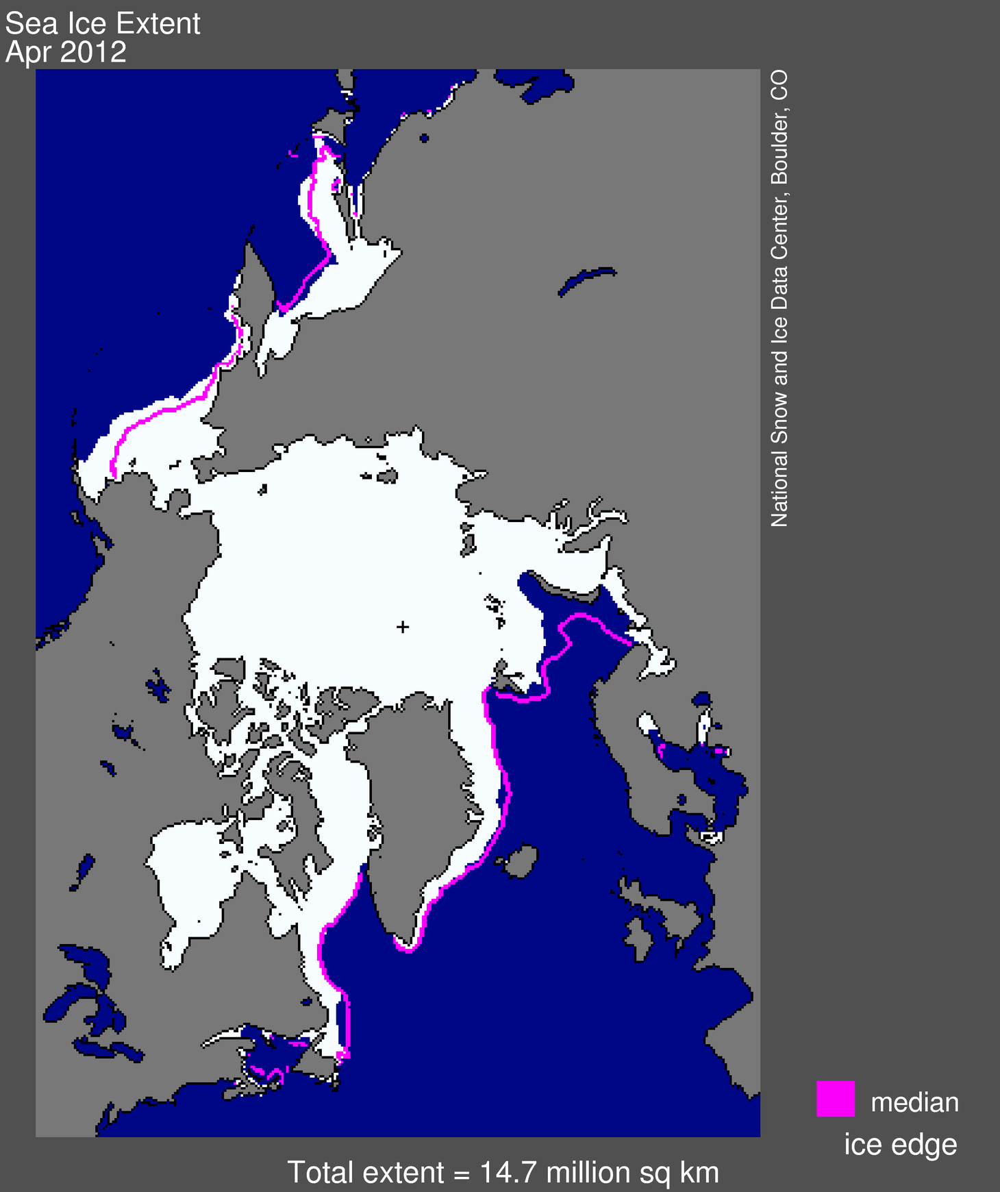
Figure 1. Arctic sea ice extent for April 2012 was 14.73 million square kilometers (5.69 million square miles). The magenta line shows the 1979 to 2000 median extent for that month. The black cross indicates the geographic North Pole.Sea Ice Index data. About the data
Credit: National Snow and Ice Data Center
Overview of Conditions
Arctic sea ice extent in April 2012 averaged 14.73 million square kilometers (5.69 million square miles). Because of the very slow rate of ice loss through the last half of March and the first three weeks of April, ice extent averaged for April ranked close to average out of 34 years of satellite data. It was the highest average ice extent for the month since 2001, only 270,000 square kilometers (104,000 square miles) below the 1979 to 2000 average extent. April ice extent was 860,000 square kilometers (330,000 square miles) above the record low for the month, which happened in 2007.
In April, ice cover remained unusually extensive in the Bering Sea, continuing a pattern that persisted over the winter. Ice extent was also slightly higher than average in Baffin Bay and part of the Sea of Okhotsk. As in recent winters, ice extent was well below normal in the Barents Sea, compensating for the extensive ice in the Bering Sea.
As discussed in previous posts, the high Bering Sea ice extent this winter stemmed from unusually low air temperatures and persistent winds that helped to push ice southwards. During April, atmospheric conditions changed, warming the air to near-average temperatures for this time of year and slowing the strong southerly winds.
During April, air temperatures over most of the Arctic were higher than usual, particularly over the central Arctic Ocean. Over the Bering Sea and parts of the East Greenland and Norwegian seas, temperatures ranged from average to slightly below average.

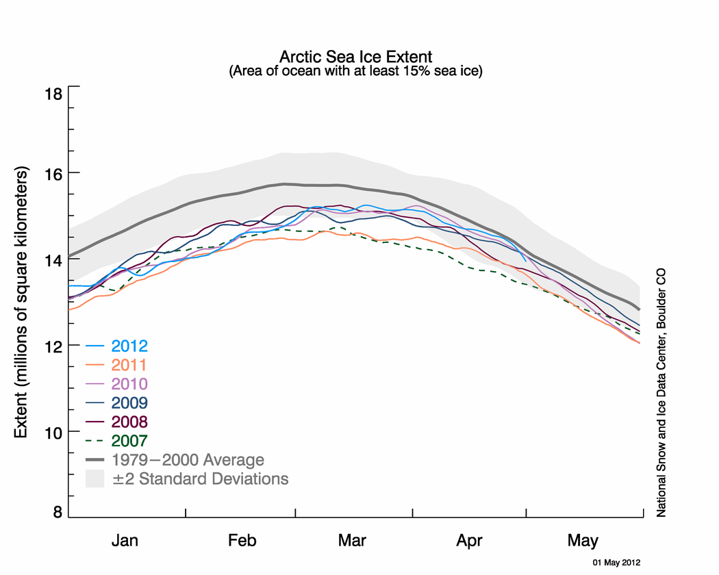
The graph above shows Arctic sea ice extent as of May 1, 2012, along with daily ice extent data for the previous five years. 2012 is shown in blue, 2011 in orange, 2010 in pink, 2009 in navy, 2008 in purple, and 2007 in green. The gray area around the average line shows the two standard deviation range of the data. Sea Ice Index data.
Credit: National Snow and Ice Data Center
Conditions in context
Overall, the Arctic lost 1.07 million square kilometers (413,000 square miles) of ice during April, somewhat less than the 1979 to 2000 average April loss of 1.21 million square kilometers (467,000 square miles). The average daily rate of ice loss was 35,600 square kilometers (13,700 square miles) per day. On April 24, ice extent was only 118,000 square kilometers (45,6000 square miles) below the 1979 to 2000 average for that day, although the difference has increased since then.
While ice conditions approached the 1979 to 2000 average levels for this time of year, the high ice extent will have little influence on how much ice melts this summer. Much of the ice cover is recently formed thin ice that will melt out quickly. Research has shown that sea ice extent in spring does not tell us much about ice extent the following summer. More important to the summer melt is the thickness of the ice cover, and summer weather.

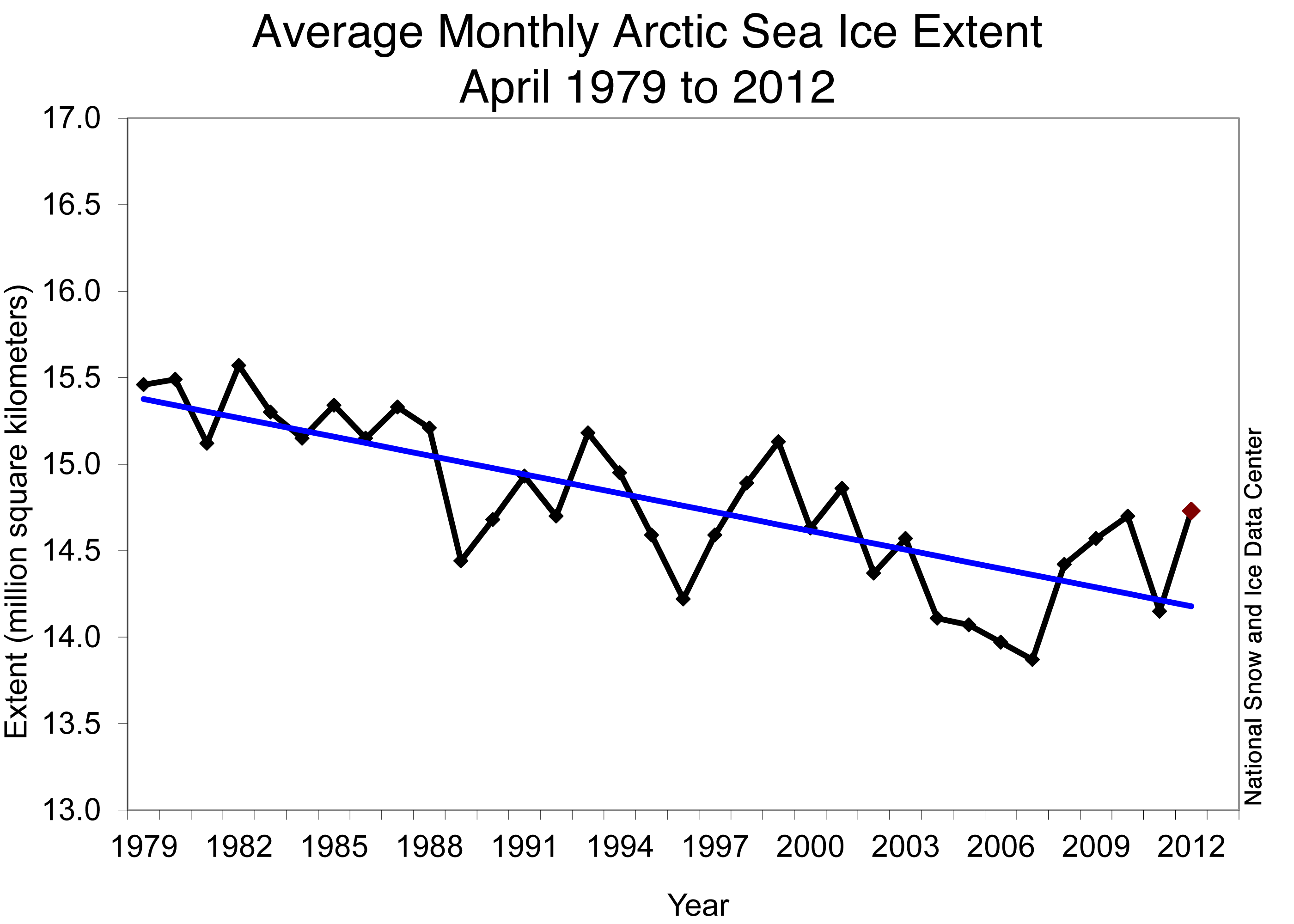
Figure 3. Monthly April ice extent for 1979 to 2012 shows a decline of 2.6% per decade.
Credit: National Snow and Ice Data Center
April 2012 compared to past years
Arctic sea ice extent for April 2012 was near average for the month in the satellite record, but was the highest since 2001. Including the year 2012, the linear rate of decline for April ice extent over the satellite record is 2.6% per decade.

Figure 4. This graph shows Antarctic sea ice extent as of May 1, 2012 (light blue line), along with the average ice extent and the ice extent from last year (dark blue). The average Southern Annular Mode (SAM) index number for each month is overlaid on the image. A stronger SAM correlates to stronger winds, which help to spread the sea ice and increase ice extent.
Credit: National Snow and Ice Data Center
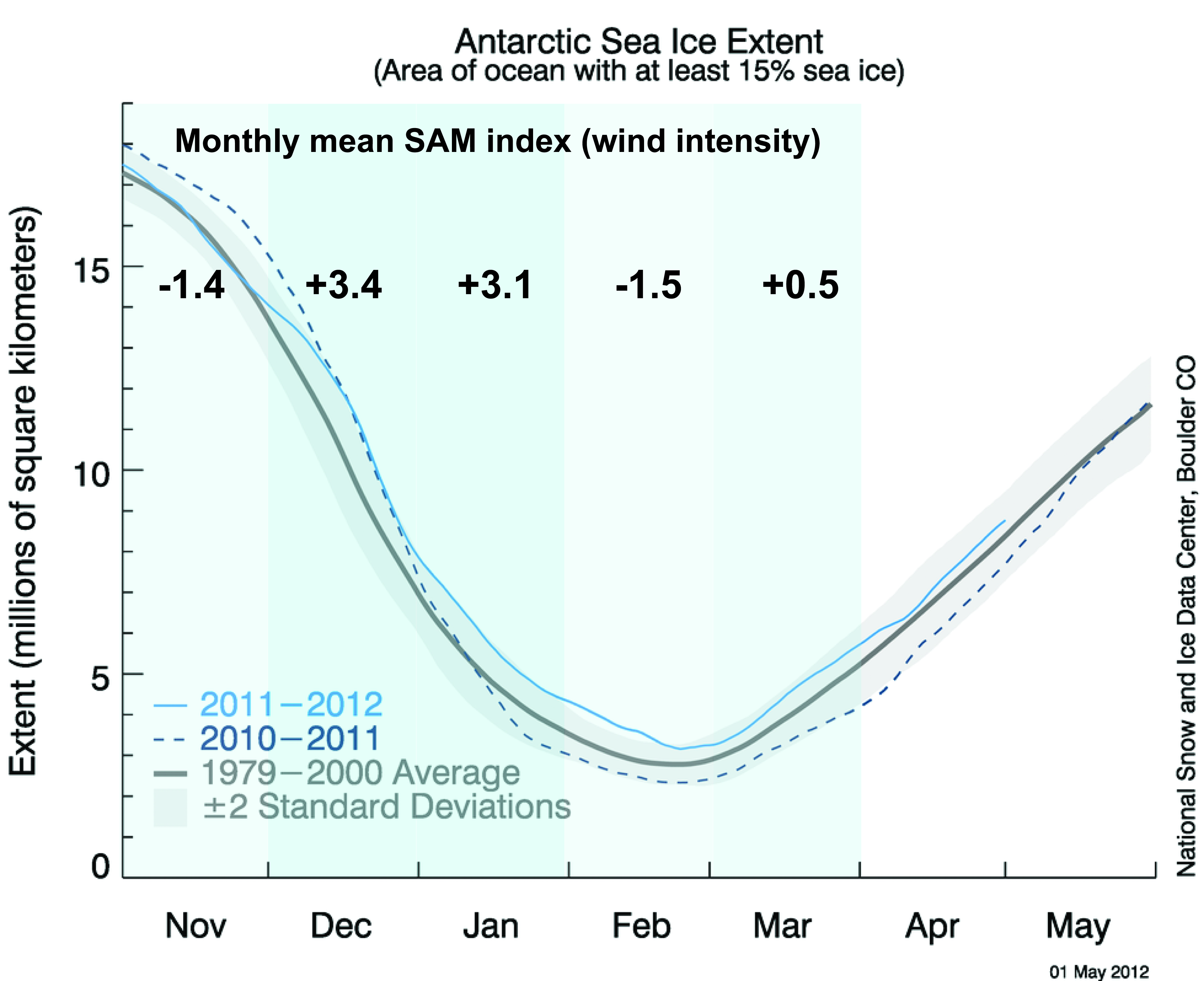
Antarctic sea ice spread by strong winds
The sea ice cover that surrounds the continent of Antarctica has been higher than average through most of the Southern Hemisphere summer (December to March). Ice extent declined much more slowly than usual in late November and remained above average through December and January, although it did not reach record highs for those months. At its minimum extent in March, Antarctic sea ice remained above average. Ice extent was the highest in the Weddell Sea and the northwestern Ross Sea.
The high ice extent likely stemmed from unusually strong winds that circled the continent of Antarctica during most the southern summer. These circumpolar winds tend to push the ice out from the continent, increasing the extent of the ice, although not necessarily the volume. Air temperatures in December and January were close to average over most of the sea ice-covered water. Researchers approximate the circumpolar wind intensity by an index called the Southern Annular Mode (SAM). A positive value for SAM indicates strong circumpolar winds around the continent; negative values indicate weaker winds. This index was at a record high for the two months of December 2011 and January 2012, at the same period of the higher-than-normal seasonal extents. For more information on Antarctic sea ice, see the NSIDC Icelights article: Sea ice down under: Antarctic sea ice and climate.

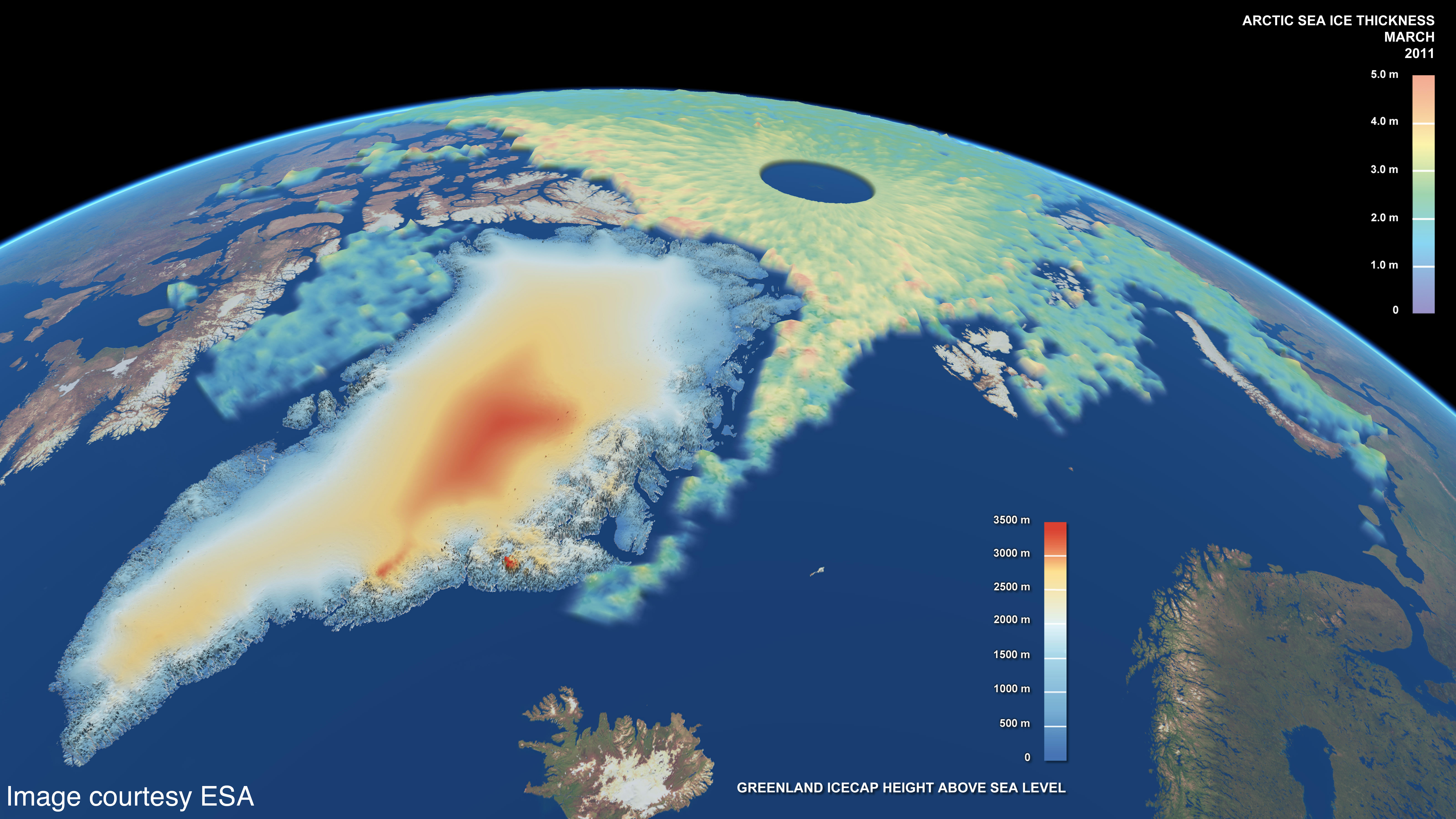
Figure 5. This map shows Arctic sea ice thickness, as well as the elevation of the Greenland Ice Sheet, for March 2011. The data come from the European Space Agency CryoSat-2 satellite. For the sea ice, green shades indicate thinner ice, while the yellows and oranges indicate thicker ice.
Credit: NSIDC courtesy CPOM/UCL/Leeds/ESA/PVL
Cryosat provides new ice thickness data
NSIDC data provide a long-term record of the Arctic and Antarctic sea ice cover. But researchers also want to know how thick the ice cover is, since thinner ice melts faster than thicker ice. Ice thickness measurements are more limited than ice extent, because researchers can only sample small regions in person, and there have only been a few satellite sensors that can measure ice thickness. For example, the NASA ICESat satellite recorded Arctic sea ice thickness between 2003 and 2008, but the mission ended in 2009, and the follow-on mission is not expected to begin until 2016. In the meantime, NASA is filling some of the data gap with airplane-borne instruments as part of Operation IceBridge.
The European Space Agency (ESA) has released initial data from the radar altimeter on their CryoSat-2 satellite. Last week, ESA released the first calibrated maps of Arctic sea ice thickness capturing thickness changes through the winter from October 2010 through March 2011. In the coming years, CryoSat-2 will provide monthly fields of thickness that will allow scientists to track the evolution of the ice cover. For more information on CryoSat-2 and an animation of the thickness maps, see: http://www.esa.int/SPECIALS/Cryosat/SEMU55NW91H_0.html.
I’m a little bothered by Figure 3. The initial data point begins in 1979 — when the decadal warming began. If the beginning of the data sent went back to 1973 when it was colder than 1979, I suspect the slope of the blue line would be rather flat.
So the cork is being placed into position?
Let us see what happens on the other side in the Fram, with respect to wind direction, over the coming months.
It will be interesting, none the less.
Is change upon us? It would do you good, no?
For entertainment purposes only 🙂
“Sea ice record” is very misleading. Extent is but one of, and the least important of several measures of sea ice.
What is the area? What is the volume? By how much is the multi-year ice increasing?
There appears to be another glaring error on the NSIDC page about arctic sea ice. Look at these two images: http://nsidc.org/data/seaice_index/images/daily_images/N_stddev_timeseries.png & http://nsidc.org/arcticseaicenews/files/2012/05/Figure2.png – How come one practically touches the mean and the other never gets close?
Furthermore, how can the mean be different for 1979-2000 in both images?
Were the any graphs in the Hansen-inspired Chicken Little years of the Ice Age Scare showing the ice-extent getting bigger by X percent each year? It was “worse than we thought” then, just as now, just in the opposite direction…
Now that I think of it, I was a total believer in those Chicken Littles of the 70’s… Man, I would have made a great ‘Greeniac’ for the enviros if only they had changed their insanely monotonous screed of, “Oh, poor broken earth, so fragile and so So SO enDANGERED by evil Evil EVIL mankind – ’twas the twin monsters GROWTH and PROSPERITY what ‘dun her in’, so stop all that smarty guy stuff – Gaia commands it!!” After 30 unchanging years and NONE of their calamities coming true, I began to suspect their motives… And what I read again and again was that stupid emotional rhetoric trumps real-world measurements every time in the political world where things get done and laws get passed.
Its worse then they thought, the decline in yearly ice needs to be frozen in the charts.
My former brother-in-law was a grade school teacher in White Mountain, Alaska (look it up), he told me about some folks who would walk back & forth from AK to Russia across the Bearing sea ice…..he laughed about how dangerous it was, considering the polar bears that were on the prowl!
While ice conditions approached the 1979 to 2000 average levels for this time of year, the high ice extent will have little influence on how much ice melts this summer. Much of the ice cover is recently formed thin ice that will melt out quickly.
Older multi-year ice is melting significantly faster than new ice.
http://www.nasa.gov/topics/earth/features/thick-melt.html
And we cannot measure ice thickness and hence volume with any precision. Talk about ‘thin ice’ and ice volume’ is speculation in the absence of data, masquerading as science.
Still shows ice in Denmark where there is none…
I knew this by watching the show ‘Deadliest Catch’
🙂
Over the years I’ve gained the impression that there isn’t much melting inertia in polar ice, that is, a place has ice cover depending on the immediate conditions and not because the ice cover is taking a long time to melt or form. So the open water NW of Nova Zemlya doesn’t portend an early melt north of there — it’ll melt when it’s warm enough not to have ice cover.
By the way, Bering Sea ice junkies can get their fix here: http://pafc.arh.noaa.gov/ice.php
“Extent is but one of, and the least important of several measures of sea ice.”
Wrong.
While volume is interesting, the records are much more disputed as the data is shorter and you have to make more assumptions to generate the answers. If the ice is higher, how much is rebound from less ice weight and how much due to extra ice? Submarine voyages do not cover the same locations in a repeatable manner. Combining an under the ice voyage in 1963 with 1964 requires modelling Plotting the edge is by nature easier to do and partial records are more useful. Ship records go back hundreds of years.
I’m curious. Not being of scientific mind, I do notice a lot of local ice monitoring data being quoted & bandied about through various media – Arctic, Antarctic, Greenland, etc. Is anybody observing & compiling an annual global ice record, i.e. following the ice trends & patterns of the entire earth? Wouldn’t that be more relevant, considering the climate change furore is supposed to be a global phenomenon?
DMarshall says:
May 3, 2012 at 9:07 pm
“Sea ice record” is very misleading. Extent is but one of, and the least important of several measures of sea ice.
What is the area? What is the volume? By how much is the multi-year ice increasing?
To find the area, you first need to know the extent, so that’s not exactly the “least important” measure, now, is it?
I am completely confused, the graphic for this report shows this year not hitting the median, yet the same graph linked from your sea ice reference page shows it just touching the median. Looking at the two graphics it appears the 1979 – 2000 median has magically gained approx 200k sq km for this report…
The chart from this report:
http://nsidc.org/arcticseaicenews/files/2012/05/Figure2.png
The chart from the sea ice page
http://nsidc.org/data/seaice_index/images/daily_images/N_timeseries.png
Someone is playing funny buggers at NSIDC!!!
@eljay says:
May 4, 2012 at 12:55 am
(Asks about global sea ice)
You’ve landed at the right place, eljay. Look up at the top RH of this (or any) and just below the ENSO meter is the Sea Ice page. Click on that and the first thing up is global sea ice info. Enjoy!
No surprise to me. I have been saying it has been cooling since 1994.
(note I have two weather stations from around Anchorage)
http://www.letterdash.com/henryp/global-cooling-is-here
Regardless of what this report is saying, it’s just obvious that all the AGW guru’s predictions the last 20yrs are a big failure. It’s becoming very obvious that natural factors are the rule of nature not man. It’s especially noticeable since the PDO has flipped. Why isn’t this just accepted?
All I know is that we in the UK are getting freezing winds from the Arctic which are completely ruining our early May weather (I nearly said ‘climate’..!)….
Haven’t been in the pool since the back end of March..!
I don’t care about no fancy schmancy satamalite doohickey, Rosie O’Donnel sez the ice is meltin and them thar bears are dyin’. Rosie must know best because she’s famous and yells stuff.
This year’s arctic ice extent is clearly behaving normally if we consider ‘after 2007’ the new ‘normal’. Bering sea is just having an equivalent of a cold wave.
And yes I agree nsidc has clearly more outputs to fix. Their 1979-2000 means are going all over the place.
Simon F. says:
Look at these two images: http://nsidc.org/data/seaice_index/images/daily_images/N_stddev_timeseries.png & http://nsidc.org/arcticseaicenews/files/2012/05/Figure2.png
How come one practically touches the mean and the other never gets close?
Furthermore, how can the mean be different for 1979-2000 in both images?
Mark Serreze, the director of NSIDC is a true believer in CAGW. True believers in CAGW are not scientists. Although they often possess advanced scientific degrees, they either refuse or are unable to follow the scientific method. Their failure to be scientifically objective disqualifies them as scientists.
The simplest explanation is that the empirical data indicates they may be wrong, so they changed it. It appears the NSIDC blatantly manipulated the data to hide the fact that Arctic is not in a “Death Spiral”. If this is not the case, the NSIDC needs to explain the glaring discrepancies between these graphs immediately.
So with the higher than normal Bearing Sea ice, how’s the Anchorage fuel supply holding out?
Who are you going to believe? Don’t Hansen and Gavin at GISS that tell us the Arctic has never been warmer?
So why does the calculation for average ice stop at 2000? There is no valid statistical reason to only use 1979-2000 for the calculation, because this will under represent the natural variability.
The less data you look at, the less natural variability you will expect to see. If we for example had 500 years of sea ice data going back to 1500, then we would expect to see a much larger range to the data and greater variability.
This would increase the standard deviation of the data, increasing our estimate of natural variability. By limiting the calculation of average and standard deviation to only 1979-2000, the data is manipulated to give the idea that there is limited natural variability in the Arctic.
Louis Hooffsteter says:
May 4, 2012 at 5:41 am
Mark Serreze, the director of NSIDC is a true believer in CAGW.
How many true believers were installed as directors of important scientific posts during the 8 years Gore was VP in preparation for the Enron CO2 cap and trade swindle? How many more are being installed today in preparation for a mulligan during the next four years under a new name?
I note that the NSIDC ice extent is trending down very rapidly now and this seems to be related to decline in the Bering Sea ice (Kara and Barents are also down just as much).
Bering sea ice is down about 168,000 km2 in the last 5 days and this is very large amount considering, on average, there would only be about 225,000 km2 of decline across the whole Arctic at this time of year. Now throw in Kara and Barents declining as much as the Bering and that is 3 times faster than average.
But the Terra satellite is not showing this much decline in the Bering Sea (there was alot of cloud cover in the last several days and this may have obscured the measurements used by the NSIDC). The point is there is more ice in the Bering sea than is showing up on Arctic sea ice maps. (red and orange are sea ice and snow on land).
http://lance-modis.eosdis.nasa.gov/imagery/subsets/?project=other&subset=BeringSea.2012124.terra.367.2km.jpg
Its the same in the Kara Sea and the Barents. It almost looks like the NSIDC has changed how they are measuring 15% sea ice coverage perhaps.
Simon F. says:
Look at these two images: http://nsidc.org/data/seaice_index/images/daily_images/N_stddev_timeseries.png & http://nsidc.org/arcticseaicenews/files/2012/05/Figure2.png
Furthermore, how can the mean be different for 1979-2000 in both images?
if you look on the left hand scale in one diagram the mean is 14.0, the other 14.2. The diagrams both state they are the mean from 1979-2000.
Since the mean has shifted, it must mean that the data from 1979-2000 has also changed. In other words, we have Stalinist re-writing the past.
The obvious question to be asked is this – how many times has this happened before? How many times has the past data been adjusted to change the past?
One the great criticism American’s made in the past century of the USSR was the re-writing of history by Stalin. This criticism was used to demonstrate the superiority of Americans as compared to Russians.
Now we find that scientists in America and the UK have been re-writing history. Adjusting the temperature data to make it “more accurate”. This is exactly the same reason Stalin re-wrote history in the USSR – to make it more accurate.
Reportedly the Chinese are now starting to rewrite history – to correct the mistakes made in the past of all things.
http://www.asianage.com/international/china-rewrite-history-correct-mistakes-mao-era-157
Worried about a history re-write gap with China, the US and UK – Putin is also getting into the act.
http://www.highbeam.com/doc/1P2-7559539.html
What the h3ll is going on with NSIDC now!
They’ve back adjusted Arctic extent down again!
Last week they had extent right on the average line….now they’ve adjusted it down so that it was never even close to the average line……………….
http://stevengoddard.wordpress.com/2012/05/04/nsidc-naughtiness-returns/
If they are this incompetent, you can’t believe anything they’ve said………………..
Alan Watt says
how’s the Anchorage fuel supply holding out?
Henry says
mmmm….let me see,
it been cooling quite badly up there
it is now between 1.6 and 2.9 degrees K colder there,
on average
then it was 12 years ago
depending on what weather station you trust most
http://www.letterdash.com/henryp/global-cooling-is-here
Looks like the alarmists are inching away from their Greenland predictions too.
http://www.washingtonpost.com/politics/greenland-glaciers-shrinking-quickly-but-not-worst-case-glacial-pace-not-slow-anymore/2012/05/03/gIQAfgC0yT_story.html
Given the trillions of dollars it is estimated to cost to stop global warming and CAGW, wouldn’t it be a cheaper and a lot less painful to simply adjust historical temperatures upwards by say 0.5 degree, so they match current temperatures? This would eliminate global warming almost overnight.
1934 was the warmest year on record in the US until Steve McIntyre spoke up about it. Then Hansen at GISS was forced to adjust the historical temperatures downwards to fix them, so they fit the GISS climate models. Whoever took America’s temperature in 1934 was obviously wrong.
So, why not have Hansen at GISS simply adjust the historical records upwards and fix GAGW without having to tax the industrialized nations of the earth back to the horse and buggy era? I expect then could do it in just a few month and save trillions in the process.
Isn’t it high time the scientists did more than simply talk about the climate? After all, we are paying them for results. The should stop talking and fix the climate for a price we can afford. It is all well and fine to talk about a trillion dollar fix, but lets face it, the industrialized world is broke. The bankers pulled all their money out of the economy when it looked like cap and trace was about to go through, and it will be a long time before they bring it back.
So, we need folks like Hansen and Gavin at GISS to come up with a solution we can afford. The most obvious one is to fix the GISS record to eliminate GAGW. We are paying the folks at GISS anyways, so they might as well do something to fix the problem and earn their keep. To continually talk about solutions no one can afford is nonsense.
They’ve adjusted the 1970-2000 average line up. They also adjusted the two standard deviation area up. How very Winston Smith of them.
The underlying assumption in almost all climate science is that climate data is normally distributed. ie, that it has a constant mean and constant deviation.
However, if we look at the paleo records of the earth we find this is a wrong assumption. Climate does not have a constant mean and it does not have a constant deviation. They appear to be fractal distributions.
However, the formulas used to calculate of that mean and standard deviation used in almost all of climate science are based on the assumption that the mean and deviation are constant – that climate is a normal distribution.
Thus, the statistical basis for climate science diagrams such as the one above are inherently incorrect. They are assuming the distribution of the data is “normal” without having proved it is “normal”.
Why is this important? Because when you use statistics to do analysis and make projections, the projections will be wrong if your assumptions about the distribution is wrong.
If you throw a pair of dice you expect 7 to be the most common combination, based on the probability distribution of the dice. However, if the dice are loaded they have a different distribution and thus you cannot rely on 7 being the most common throw.
An entire field of science based on a faulty statistical assumption.
Economics is another field that used a wrong assumption about the data. How far ahead can economists predict the future? This should tell us something about climate science. Time series data is rarely normally distributed, thus standard statistical techniques are unreliable.
http://www.amazon.com/Maynards-Revenge-Collapse-Market-Macroeconomics/dp/0674050460
Benoit Mandelbrot has demonstated since 1958 that the time series data in financial markets can’t be normally or log normally distributed.During this same period of time ,Milton Friedman was building his theory of monetarism on the claim that the time series data was normally distributed.Mandelbrot discovered that it is the Cauchy distribution,with infinite mean and variance, as opposed to the usual case where the probability disribution has a finite mean and variance, that fits the time series data the best.
Henry@ferd berple
So what did you think of my statistical exercise
…..connecting the dots…..
http://www.letterdash.com/henryp/global-cooling-is-here
Someone made a comment about submarine maps. Sorry that is not really applicable. While it would be a very good source of data for ice thickness and soes go back to the 50’s the only ones with access to that information is the pentagon and CIA. Even to put sounding information on the charts takes years. The problem is classified data. In order to just get depth information on the charts takes enough seperate tracks to obscure who or what went where, if that makes sense. Essentially they dont’ want anyone to be able to say any one sub went anywhere in particular. And that is for their own use on classified charts so imagine trying to get historical ice thickness data.
To be clear the data does exist and is probably the best data in existance, But they will not release the data. Sub’s measure ice thickness with top sounding sonar’s to map the ice sheet from the bottom so we can find the polinia’s so we can surface if needed.
Tony says:
May 4, 2012 at 7:12 am
Someone made a comment about submarine maps. Sorry that is not really applicable. While it would be a very good source of data for ice thickness and soes go back to the 50′s the only ones with access to that information is the pentagon and CIA. Even to put sounding information on the charts takes years. The problem is classified data. In order to just get depth information on the charts takes enough seperate tracks to obscure who or what went where, if that makes sense. Essentially they dont’ want anyone to be able to say any one sub went anywhere in particular. And that is for their own use on classified charts so imagine trying to get historical ice thickness data.
To be clear the data does exist and is probably the best data in existance, But they will not release the data. Sub’s measure ice thickness with top sounding sonar’s to map the ice sheet from the bottom so we can find the polinia’s so we can surface if needed.
Not true, data for a large part of the central Arctic are available, the Gore box, which was extended in 2006, details can be seen here:
http://nsidc.org/data/docs/noaa/g01360_upward_looking_sonar/index.html
The Okhotsk ice is forming a hard bridge to the Hokkaido shore. That is somewhat rare. I’ve seen lots of shorefast ice in Hokkaido but an actual hard bridge is less common. BTW that’s how the ice oriented fauna got to Hokkaido in the first place, through ice bridges.
I’ve got to wonder if Fig 3 is a lagging indicator of PDO, or, of PDO plus some other driver?
This is not nearly all of the data available. Per the Submarine tracks what has been released was done starting in the late 90’s sciex id scientific ice expediations where the Us Navy allowed scientists onboard US Navy sub’s for scientific expeditions. These allowed them to get data they never had access to before. you notice the Box is away from Russia and other Nations borders? So it wasan unclassified trip. Most of the data does not fall inot that category. I served on Subs had a TS SCI Clearance. MOST of the data is still classified.
I will add this. The man to talk to if you can find him who would know and probably has the mmost under ice experience in the world is a man named Terry Louellan he used to work for the Navy Arctic labs in Sna Diego and built alot of the under ice equipment in use. And to be fair I was unaware of the unclassified release of the under ice data. I also have o experience with the Brits under ice. Though in my time it was my understanding they didn’t go under the ice cap with out a US escort.
Leif Svalgaard says:
May 3, 2012 at 9:48 pm
“Still shows ice in Denmark where there is none…”
Leif that is a known sensor error that may happen and is for sure accounted for. It is not so easy to spot the other way around.
And btw we all knew there is something rotten in Denmark.
@Tuttle Too much emphasis is put on extent, which, with only 15% coverage required to be counted, leaves a lot of leeway for wind & water to move the ice around, either spreading it thinly or clumping it.
It’s conceivable for the total amount of ice to double while the extent remains the same or even reduces.
So, focusing too much on extent is very misleading and if more work has to be put into accurate measurements of area & volume – which, I reiterate, are much more important, then that’s where the effort should be directed.
Might be another poor year for gray whales, which environmentalists will jump on.
The majority of the 20K population only eat in the Bering area.
(They may snack a bit along the way, if they are smart enough to eat fish instead of the bottom creatures they prefer.
One showed up in Vancouver BC a few years ago, waaay off the normal travel route.
A few hundred are smart enough to feed on the BC coast.
And a few thousand skip the commute from Baja to Bering, staying off the OR coast.
Granted, not a lot is known about where they go.)
Lot’s of interesting information in this thread, I’ll save a copy for further reference.
Thanks Anthony!
The decline of 2.6% per decade has disappeared since 1997 and since 2007 the trend is obviously upward.
SteveSadlov says:
May 4, 2012 at 11:43 am
The Okhotsk ice is forming a hard bridge to the Hokkaido shore. That is somewhat rare. I’ve seen lots of shorefast ice in Hokkaido but an actual hard bridge is less common. BTW that’s how the ice oriented fauna got to Hokkaido in the first place, through ice bridges.
The UNISYS SST map currently shows remarkable cooling in the north Pacific especially around the Bering Strait (WUWT ENSO or ocean page):
http://weather.unisys.com/surface/sst_anom_new.gif
Good catch, no wonder the Arctic ice sea is approaching, or possibly surpassing in the near future, the 1979-2000 average, with a little help from the present low solar radiation.
Last year we had the strongest average radiation of the present cycle, which seems to have hindered the cooling trend a little and boosted the “warmism” to very high levels!:-)
Water flows into the Arctic through the Bering Strait. It takes about 18 years for a temperature change in the center Pacific to propagate up to that point (as it wanders back and forth across the Pacific in bands). In 1998 we had a temperature spike, then the drop as a cold wedge formed from near Ecuador out into the central Pacific. So we’re just starting to see the shift back to normal, on the way to cold, at the entrance to the Arctic.
From here on out, the Barents will continue extra cold and icy (with some wobble) and the Arctic will start getting a colder feed in. Watch for the Arctic to shift to ever more ice starting about 1998+18 = 2016. Maybe sooner as that 1998 peak was a spike up with cooler in the year or two ahead of it.
The North Atlantic takes longer to get the cold surge out of the Southern Ocean, as it looks to be fed from a Southern Atlantic current that comes around South Africa from the Indian Ocean (that is itself a bit late to the temperature change process). Australia and Asian Pacific areas go first, then it spreads out. So expect to see the East of the USA continue a bit warm, along with parts of Western Europe, while the rest of us get ever colder. (California has been very cool this year. It’s May already and just now warm enough to get decent growth on tomatoes and greenbeans. Usually we plant them out April 16 and have early harvest in June for greenbeans, July for Tomatoes – though some folks with fast varieties can get May and June tomatoes with some effort).
http://chiefio.wordpress.com/2012/05/02/sea-temperature-time-delay/
Making a global average out of things with long time lags as a change propagates from one starting point to the rest is a sure way to hide what is really happening. First the Antarctic went cold, then the circumpolar current picked up speed sending a ‘cold shot’ up the spine of South America along the coast of Chile / Peru and out into the heart of the Pacific. Now it’s reached the Bering. Australia got cold and wet early, as has California. China feeling it too:
http://chiefio.wordpress.com/2011/12/12/china-2010-worst-sea-ice-in-30-years/
along with parts of Asian Russia with some even spilling over to Moscow:
http://chiefio.wordpress.com/2012/05/06/a-cold-epiphany/
The shift is underway and propagating. Watch for the Warmers to focus on the warm tail end of the spread of ocean water and ignore the areas with an early cold turn. The deaths in South America from cold in the last few years, in particular.
Don’t average away the process. Look at the patterns of change and watch the flows. They matter.
F. Guimaraes says:
May 9, 2012 at 12:05 pm
Good catch, no wonder the Arctic ice sea is approaching, or possibly surpassing in the near future, the 1979-2000 average, with a little help from the present low solar radiation.
Which is the highest since 2004 according to Leif’s website!