Guest post by Bob Tisdale
My blog post October to December 2011 NODC Ocean Heat Content Anomalies (0-700Meters) Update and Comments was cross posted by at WattsUpWithThat here. (As always, thanks, Anthony.) Starting at the January 27, 2012 at 8:44 am comment by J Bowers, I was informed of a critique of my ARGO-era model-data comparison graph by the Tamino titled Fake Predictions for Fake Skeptics. Oddly, Tamino does not provide a link to my post or the cross post at WattsUpWithThat, nor does Tamino’s post refer to me by name. But I believe it would be safe to say that Tamino was once again commenting on my graph that compares ARGO-era NODC Ocean Heat Content data to the climate model projection from Hansen et al (2005), “Earth’s energy imbalance: Confirmation and implications”. If he wasn’t, then Tamino fooled three persons who provided the initial comments about Tamino’s post on the WUWT thread and the few more who referred to Tamino’s post afterwards. The ARGO-era graph in question is shown again here as Figure 1. Thanks for the opportunity to post it once again up front in this post, Tamino.
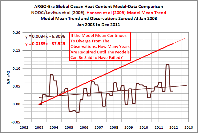
Figure 1
Take a few seconds to read Tamino’s post, it’s not very long, and look at the graphs he presented in it.
My graph in Figure 1 is clearly labeled “ARGO-Era Global Ocean Heat Content Model-Data Comparison”. The title block lists the two datasets as NODC/Levitus et al (2009) and Hansen et al (2005) Model Mean Trend. It states that the Model Mean Trend and Observations had been Zeroed At Jan 2003. Last, the title block lists the time period of the monthly data as January 2003 to December 2011.
In other words, my graph in Figure 1 pertains to the ARGO-based OHC data and the GISS model projection starting in 2003. It does not represent the OHC data or the GISS model hindcast for the periods of 1993-2011 or 1955-2011, which are the periods Tamino chose to discuss.
Do any of the graphs in Tamino’s post list the same information in their title blocks? No. Do any of Tamino’s graphs compare the climate model projection from Hansen et al (2005) to the NODC OHC observations? No. Does Tamino refer to Hansen et al (2005) in his post? No. Do any of Tamino’s graphs present the NODC OHC data or the Hansen et al model projection during the ARGO-era, starting in January 2003 and ending in December 2011? No.
In other words, Tamino redirected the discussion from the ARGO-era period of 2003-2011 to other periods starting in 1955 and 1993. ARGO floats were not in use in 1955 and they were still not in use in 1993. He also redirected the discussion from the projection of the GISS model mean to the linear trend of the data itself. Yet Tamino’s followers fail to grasp the obvious differences between his post and my ARGO-era graph.
In my post, I explained quite clearly why I presented the ARGO-era model-data comparison with the data zeroed at 2003. Refer to the discussion under the heading of STANDARD DISCUSSION ABOUT ARGO-ERA MODEL-DATA COMPARISON. Basically, Hansen et al (2005) apparently zeroed their model mean and the NODC OHC data in 1993 to show how well their model matched the OHC data from 1993 to 2003. Hansen et al explained why they excluded the almost 40 years of OHC and hindcast data. The primary reason was their model could not reproduce the hump in the older version of the Levitus et al OHC data. Refer to Figure 2, which is a graph from a 2008 presentation by Gavin Schmidt of GISS. (See page 8 of GISS ModelE: MAP Objectives and Results.) I presented that same graph graph by Gavin in my post GISS OHC Model Trends: One Question Answered, Another Uncovered, which was linked in my OHC update from a few days ago.

Figure 2
I zeroed the data for my graph in 2003, which is the end year of the Hansen et al (2005) graph, to show how poorly the model projection matched the data during the ARGO-era, from 2003 to present. In other words, to show that the ARGO-era OHC data was diverging from the model projection. Hansen et al (2005), as the authors of their paper, chose the year they apparently zeroed the data for one reason; I, as the author of my post, chose another year for another reason. I’m not sure why that’s so hard for Tamino to understand.
And then there’s Tamino’s post, which does not present the same comparison. He did, however, present data the way he wanted to present it. It’s pretty simple when you think about it. We all presented data the way we wanted to present it.
Some of the readers might wonder why Tamino failed to provide a similar ARGO-era comparison in his post. Could it be because he was steering clear of the fact that it doesn’t make any difference where the model projection intersects with the data when the trends are compared for the ARGO-era period of 2003 to 2011? See Figure 3. The trend of the model projection is still 3.5 times higher than the ARGO-era OHC trend. Note that I provided a similar graph to Figure 3 in my first response to his complaints about that ARGO-era OHC model-data comparison. See Figure 8 in my May 13, 2011 post On Tamino’s Post “Favorite Denier Tricks Or How To Hide The Incline”.

Figure 3
Figure 3 shows the ARGO-era OHC data diverging from the model projection. But the visual effect of that divergence is not a clear as it is in Figure 1. I presented the data in Figure 1 so that it provided the clearest picture of what I wanted to show, the divergence. That really should be obvious to anyone who looks at Figure 1.
Some might think Figure 1 is misleading. The reality is, those illustrating data present it so that it provides the best visual expression of the statement they are trying to make. The climate model-based paper Hansen et al (2005) deleted almost 40 years of data and appear to have zeroed their data at 1993 so that they could present their models in the best possible light. Base years are also chosen for other visual effects. The IPCC’s Figure 9.5 from AR4 (presented here as Figure 4) is a prime example. Refer to the IPCC’s discussion of it here.

Figure 4
The Hadley Centre presents their anomalies with the base years of 1961-1990. Why did the IPCC use 1901-1950? The answer is obvious. The earlier years were cooler and using 1901-1950 instead of 1961-1990 shifts the HADCRUT3 data up more than 0.2 deg C. In other words, the early base years make the HADCRUT anomaly data APPEAR warmer. It also brings the first HADCRUT3 data point close to a zero deg C anomaly, and that provides another visual effect: the normalcy of the early data.
Base years for anomalies are the choice of the person or organization presenting the data. Climate modelers choose to present their models in the best light; I do not.
Those familiar with the history of Tamino’s complaints about my posts understand they are simply attempts by him to mislead or misdirect his readers. And sometimes he makes blatantly obvious errors like using the wrong sea surface temperature dataset in a comparison with GISS LOTI data. His post Fake Predictions for Fake Skepticsis just another failed critique to add to the list.
ABOUT: Bob Tisdale – Climate Observations
SOURCE
The NODC OHC data used in this post is available through the KNMI Climate Explorer:
http://climexp.knmi.nl/selectfield_obs.cgi?someone@somewhere
Mr. Tisdale:
I read Mr. Fosters “supposed” rebuttal to your post.
After reading his blog, I can’t see where there is even any similarity. He must be commenting on someone else’s presentation as there is nothing of validity presented in his blog to disagree with anything that you have written.
IF Tamino’s post was a response to yours, the poor lad really nees to increase his reading and statisistical skills as the commitment to clarity was not there.
I am sure he is a nice fellow, but if this was a response to you then he needs to get back to school and learn basic science and how to stay on topic.
Tamino – he’s not as good as he thinks he is, and what good analysis he does is sullied by his seething anger so apparent in his spiteful posts and unwarranted attacks on others. He should be ashamed of his behaviour. I would say ungentlemanly but he’s obviously not one in the first place, and I will say unscientific.
Anyone wishing to take this up with the “Open(?) Minded One” may as well post it here, as it will unlikely get past muster on any PR site for “the cause”.
If it does, will be adjusted accordingly for the full straw man effect. Good luck.
I think Hansen is something of a strawman in this debate. Does anyone who reads WUWT take Hansen seriously? So I think using him as a proxy for a more thoughtful AGW perspective is probably not the most balanced view.
I also think Tamino has a point. If we use a longer period, then the 2003 period can be said to be above trend, to which the data later caught up. However, note the chart Tamino uses in his post, the one titled Ocean Heat 0-700 meters, with both fit and prediction. Since about 2008, the data is running below his own prediction line. If the temp anomaly does not increase (I would guess to a UAH equivalent of around 0.4 deg C), then his prediction was also come to look falsifiable around 2015.
Tamino blocks me since I caught him Cherry picking. He is nothing but a CAGW religious fanatic who will do anything for the “cause”
The chilean Puyehue Cordon Caulle Volcano have been spitting a big plume since june 2011. I haven’t found any aerosol studies referencing its influence on present cooling. Does it have any influence at all? How long would it take to know? where should I look for good aerosol data?
Galvanize says:
January 28, 2012 at 12:10 pm
“Anyone wishing to take this up with the “Open(?) Minded One” may as well post it here, as it will unlikely get past muster on any PR site for “the cause”.
If it does, will be adjusted accordingly for the full straw man effect. Good luck.”
Tamino uses the “dissent equates no comment” policy at his site. Is really too bad as a lot of time he is wrong and wouldn’t look so foolish if he allowed thinking folks to comment. Oh well.
Bob, It was nice of you to provide link to Tamino, but since 3 years ago, I do not visit Tamino’s blog, and I do not follow links to his blog. Thanks anyway.
Bob Tisdale – If you’re going to evaluate a linear trend prediction, you need to compare observations to the slope (which you did) and the offset (which you did not) of that prediction.
It’s also useful (although not always done) to show the uncertainty range of the prediction, to see if the observed evolution of the data falls within or outside of that range. Then you can evaluate whether a prediction is close or not.
Tamino was entirely correct in calling you out on your previous post – you misrepresented the ocean heat content prediction by giving an incorrect offset.
You miss the point completely and spectacularly. Yes, you explained why you chose to present the data in a certain way. The fact that you explained does not make you correct. Your reason was invalid. Adding an arbitrary offset to the predictions of a model could be simply misguided or it could be an attempt to deliberately mislead. Either way, it’s incorrect.
Alan Statham,
Thanx for that content-free post. And KR does the same thing when he labels something he doesn’t happen to agree with as being “misrepresented”.
Why don’t one or both of you super intellects submit an article to WUWT for posting? I suspect the results would be amusing.
And, once again, Tamino is taken to the woodshed by a retiree who is seeking employment. You would think that funding from Big Green could produce better.
Employers, you could not do better than hire Mr. Tisdale. Though he would be greatly missed on WUWT.
Content free? No, I explained why he was wrong. Sure, I’ll submit an article. What do you want it to be on?
PS if you want to see what a content-free post actually looks like, scroll up to “Joseph Thoma”. Not sure what value there is in allowing such comments to be posted, except if the intention is to appear hostile to anyone who doesn’t share the peculiar viewpoints expressed here.
I teach High School statistics. If we looked at Tamino’s graph, I would not award top grades to students who confidently predicted the temperature to increase at the trend line he shows. His graph clearly shows that the recent trend is lower than the historical one. You don’t need to be a genius to spot that: any smart High School student will see it.
That the predicted trend is not inconsistent with the most recent value is trivial, and statistically more of less meaningless. Especially when we consider that only in Bob’s time period have we been measuring effectively.
Time will be the winner. Tamino has given himself a few more years for ARGO to turn upwards. If it doesn’t then no amount of whining will stop his predictions being wrong. Nor will Bob’s analysis mean much if the rate were suddenly to start upwards (by some miracle).
KR says:
January 28, 2012 at 12:30 pm
The points are very clear and show the divergence very clear.
You may/may not find this link interesting to read.
I would like to see error ranges as standard policy in publishing……wouldn’t you?
The graphs etc presented on a lot of sites are terrible at presenting the true dynamics of the certainty of the data.
http://wmbriggs.com/blog/?p=5107
Why, when you look at the last publication of Church/White concerning OHC, and try to ascertain the errors…..the results become almost laughable……..ok…..past the almost criteria.
I read the post at Tamino’s BLOG… first time I’ve been there and the last. Good grief! The responses from his followers reminded me of a scene from the movie ” The Mummy”. It’s the scene where the streets are filled with people chanting “Imhotep, Imhotep, Imhotep…”
Tamino, Tamino, Tamino…
Congratulations, you’ve now reached the fabled ‘He who must not be named’ status.
==================
KR says:
January 28, 2012 at 12:30 pm
you misrepresented the ocean heat content prediction by giving an incorrect offset
It’s truly pathetic from you, KR, you can do better than that. Offset of ocean heat content, being arbitrary, can neither be correct nor incorrect. It’s like insisting the zero point of the Celsius scale is the “correct” one as opposed to that of the Fahrenheit scale (or vice versa). Idle pastime, no more.
Poor Tamino. All those years and the thousands of postings to promote catastrophic global warming and it is all coming unglued right before his eyes,
The Great Grift, the con that funded so many years of pension eligibility and trips to Bali for The Team is over and they all know it . . .
Back to being nobodies is going to be very unpleasant for all them.
That Tamino character’s obvious lack of grasp of what he thinks is proven by the fact he thought Mike Mann’s math, was real.
DO I N.E.E.D. T.O. S.A.Y. ANYTHING M.O.R.E. about that HICK?
Do I need to REMIND you people, that HE THINKS a TREE: is a TREEMOMETER?
Gentlemen, – and here I’m actually speaking to the mods: just because I point out this clown tried to do such torturous lying through mathematics that I no longer even bother looking for any sense to his WILLFUL FRAUDULENCE
that doesn’t mean, what I’m saying’s irrelevant. THERE ARE PEOPLE COMING HERE WHO HAVE NEVER HEARD of the LOON-SPEAK these F.R.A.U.D.S. have BARKED to FLEECE the PEOPLE of the world.
These people are c.r.i.m.i.n.a.l.s.
They are CRIMINALS.
Look: I myself went into the two way telecommunications equipment troubleshooting, calibration/repair maintenance etc business: that’s the electronic engineering associated with transmitting electromagnetic energy through the atmosphere: capturing it, and analyizing it for quality, etc.
But my father – who just died a few months ago God bless ‘im – was first, a Chief of Police for a number of years; THEN, he worked for the I.R.S. as an enforcement agent.
Bullshitters don’t get far with me.
Not if it has to do with the part of the universe mankind’s detected so far.
And this Tamino _ _ _wipe is nothing more, than an ASSISTANT in a FUNDING FRAUD SCAM.
Every single one of us who has worked with instrumentation and mathematics KNOWS; that if WE BROUGHT THAT (TAMINO/MANN/HANSEN/BRIFFA) kind of MATH to OUR BOSS
WE WOULD BE FIRED, and OUR BOSS would TELL OTHERS IN (whatever industry we worked in) THAT THEY SUSPECTED YOU/ME OF B.E.I.N.G. A. F.R.A.U.D.
It’s past unconscionable, it’s CRIMINAL.
And we need to see to it that people are fired and/or hung from yard arms.
Period.
Sorry for the scathing ad hominum but LOOK AT THAT SO-CALLED ‘ANALYSIS’.
It’s OBVIOUSLY – knowing the OTHER things he SAID HE THINKS IS REAL when it’s OBVIOUS he SHOULD KNOW BETTER:
nothing but SCAM
scam
SCAM.
Tamino thinks Mannian Statistics is real math.
Do we need to do anything here except put up a list of people who’ve endorsed Mann’s fake math and ‘treemometers?’
Berényi Péter – A linear trend prediction includes both the slope and offset.
Tisdale misrepresented the offset of that prediction, which included the data through 1993 – not at all arbitrary if what you are doing is evaluating that prediction. And somehow you don’t think that’s misrepresentation?
Methinks thou dost protest too much…
Not surprisingly two posts I attempted to place on his site were censored and not “approved” presumably because he could make no valid response.
Anyway, I kept a screen capture of this one here: http://climate-change-theory.com/tricks.jpg
The Argo data is a huge improvement over previous OHC measurements, in part because Argo samples all the ice free oceans with a comprehensive geographic spread.
Using pre-Argo data to extrapolate a trend when the much better Argo data is available is poor science.
And as for when will the models be disproved, I’d say they are already disproved. The data is noisy argument doesn’t apply to OHC compared to atmospheric temperatures, because the main source of ‘noise’ in the atmospheric temperatures is variable heat release from the oceans.
If atmospheric temperatures AND OHC are well below model projections as they have been for the last decade then we can be sure the climate is warming at a much slower rate than the models predict, bar the ‘missing heat’ actually existing in the deep oceans (very unlikely IMO).
Alan Statham says:
“Sure, I’ll submit an article. What do you want it to be on?”
I’ll suggest two, so you have a choice:
1. Going strictly by the scientific method, using only verifiable, testable data [no model “evidence”], prove that AGW is anything more than a conjecture in the scientific meaning of the term.
2. Again, rigorously adhering to the scientific method, falsify the following hypothesis if you can:
At current and projected concentrations, CO2 is harmless, and a net benefit to the biosphere.
With regard to base-lines, one of arch-skeptic Richard Lindzen’s best-known and earliest articles is his 1991 Bulletin of the American Meteorological Society article “Some Coolness Concerning Global Warming.”
Lindzen’s baseline temperatures are (1) for northern and southern hemisphere station data the 1950-1970 means (Lindzen Fig. 2), and (2) for ocean data the 1881-1987 means (Lindzen Fig. 4). With this precedent having been established by Lindzen, who is perhaps the most prominent skeptic, these are the baselines that other skeptics should use.
One practical result is that 21 years of subsequent data now show a pronounced “hockey stick” with regard to all of Lindzen’s 1991 measures. And conversely, moving the baseline to later years (like 2003?) does amount to a skeptical strategy of “hide the incline.”
Therefore, it seems to me that Tamino’s criticism is correct in its main point: for skeptical science to be properly evaluated, skeptical scientists should use Lindzen’s base temperatures, even though in doing so, the “hockey stick” of AGW shows itself plainly, relative to the data in Lindzen’s 1991 analysis.
In his blog, Tamino said “Note that there’s a decided hot fluctuation in 2003. So we’ll “predict” the time span 2003 to the present, based on data from 1993 to 2003.” I note from Bob’s second graph above that there was “a decided cold fluctuation in 1993”. The words pot, kettle and black come to mind.
Alan Statham says:
January 28, 2012 at 12:55 pm
Here’s a topic for ya:
Take a closed container of air at room temperature and inject into it sufficient CO2 to raise the CO2 concentration to 5,000 PPM. After two weeks time what will be the temperature inside the container? After one month? One year? Show your work.
Tamino is a low level muppet (or should that be puppet?) in my humble opinion, so in truth, I don’t think it’s even worth a response by Mr Tisdale…..
Thanks for sending me to that site, Bob. The smugness at that place practically scorched my retinas.
I don’t know who’s right here. Presentation is half the game – facts the other.
You could try an analysis of covariance on the two slopes – not strictly valid on a time series but you could give it a go. See if the slopes of model and reality really are different (albeit with assorted caveats).
You know what they say: keep an open mind. But not so open that your brain falls out.
Reading Tommy’s post, the thought that occoured to me is that he is very familiar with data torture.
“Babsy says:
January 28, 2012 at 1:57 pm”
We of ‘The Knowing’ have every evidence we need about radiative forcing of Co2. In its trace form within Earth, it has the same radiative (heat transfer) properties as any composition of mass at equal levels in a straight line.
That, is all the evidence you really need.
Markus Fitzhenery
“I zeroed the data for my graph in 2003, which is the end year of the Hansen et al (2005) graph, to show how poorly the model projection matched the data during the ARGO-era, from 2003 to present.”
I think this quote captures it. The issue is simple. You say you are showing “how poorly the model projection matched the data during the ARGO-era”. But what you’ve plotted isn’t the model projection. You’ve altered it.
Well, I suppose you might want to think about changing the figure one so that the model trend and the argo trend both start at .02 in 2003, to make it clearer that they are what is being compared. But that just makes the difference between the two trends even clearer, so I don’t know why the warmers would call that better.
Since the previous thread appears to have faded out in favor of this one, I’ll repeat a point I made there. Tisdale is making a basic conceptual mistake with his idea of “zeroing,” much as he did an earlier post where he misunderstood “time trends.” In both cases he set out to attack other researchers but builds that attack on his own confusion about research methods.
As in the “time trends” thread, other posters have pointed out the mistake but Tisdale does not grasp what it is.
These are three quite different things:
1. The starting point for a physical model (e.g., Hansen’s). If that point is unusually high or low, but the physics are any good, the model itself should correct to more reasonable values as it runs forward.
2. The y intercept in a regression. That usually is not the starting point of the data, and the trend may well be unrealistic if you force it to be. Creating an unrealistic regression line was Tisdale’s intention here, but it’s created by his own confusion not something Hansen got wrong. No wonder folks elsewhere are laughing at him, again.
3. Anomalies. Shifting the baseline for anomalies can be done for many reasons but should have no effect on how steep either a physical or statistical model trend is. The line should be at an appropriate height as long as the model knows about the new baseline too.
Tisdale’s idea of “zeroing” here manages to confuse his own approach that does not make sense (2) with two other things that make sense in different contexts (1) or (3).
KR says:
January 28, 2012 at 12:30 pm
“Bob Tisdale – If you’re going to evaluate a linear trend prediction, you need to compare observations to the slope (which you did) and the offset (which you did not) of that prediction. ”
The only way to compare the 2 – model and observation – for the ARGO era – is to start from a common point when the ARGO era started. Any other starting point would be misleading. Why to start modelling from a lower point or maybe higher point if the presenter is skeptic? What would be any reason to give the models a different starting point? What’s up with that?
When the discussion is about ARGO era the starting point should be common at the starting of the ARGO era.
It is very clear that models do not fit the ARGO era observations. Instead of acknowledging that you attack the messenger.
Just looking at the graph you can tell the red line wouldn’t even fall within the 95% confidence nor prefiction interval of the actual data (brown line). Is that not be the definition of model fail???? How does the AGW crowd defend this?
markus says:
January 28, 2012 at 2:21 pm
It would be a simple experiment to run. Then we would know for sure. The science would be settled, we could all hold hands, and sing Kumbayah! Wouldn’t that be a grand way to bring a troubled world closer together?.
“David L says:
January 28, 2012 at 2:33 pm
Just looking at the graph you can tell the red line wouldn’t even fall within the 95% confidence nor prefiction interval of the actual data (brown line). Is that not be the definition of model fail???? How does the AGW crowd defend this?”
A. Consensus.
Score: 100%
David L writes,
“Just looking at the graph you can tell the red line wouldn’t even fall within the 95% confidence nor prefiction interval of the actual data (brown line). Is that not be the definition of model fail???? How does the AGW crowd defend this?”
There’s no “AGW crowd” here but there are a handful of people who understand data analysis. And they aren’t defending Tisdale’s graph, they’re pointing out that it is totally misleading. It is misleading because Tisdale took a regression slope and grafted that onto a starting point of his choice instead of a regression y intercept, so we have something that kinda looks like a regression line but isn’t — and it’s fooling a lot of people here.
“Babs Says;
It would be a simple experiment to run. Then we would know for sure. The science would be settled, we could all hold hands, and sing Kumbayah! Wouldn’t that be a grand way to bring a troubled world closer together?.”
Don’t waste any money on experiments, just read the translation of Baron Fouriers works on the physics of the natural world.
A physicist says:
January 28, 2012 at 1:51 pm….
That’s a joke, right? We’re all in the Skeptics club and Richard Lindzen sets the rules for us.
markus says:
January 28, 2012 at 2:49 pm
But I so wanted to verify the hypothesis! I want to BELIEVE! Now you want me to read a MATH book! Oh, the HUMANITY!
Gneiss says:
“There’s no ‘AGW crowd’ here but there are a handful of people who understand data analysis. And they aren’t defending Tisdale’s graph, they’re pointing out that it is totally misleading.”
Gneiss has no concern about what is really “totally misleading“. That’s because he’s a charter member of the cAGW crowd.☺
Gneiss says:
January 28, 2012 at 2:49 pm
“There’s no “AGW crowd” here but there are a handful of people who understand data analysis. And they aren’t defending Tisdale’s graph, they’re pointing out that it is totally misleading. It is misleading because Tisdale took a regression slope and grafted that onto a starting point of his choice instead of a regression y intercept, so we have something that kinda looks like a regression line but isn’t — and it’s fooling a lot of people here.”
You are correct as far as methodology.
What you are missing is that Mr. Tisdale used a starting point to show the large diversion that has occured now that ARGO data is available. The diversion began when the data became more certain, and has accelerated as time expires.
I reckon you have been libelled !!
Isn’t calling someone a “Fake Sceptic” the same as calling them a believer???
“Just looking at the graph you can tell the red line wouldn’t even fall within the 95% confidence nor prefiction interval of the actual data (brown line). Is that not be the definition of model fail???? How does the AGW crowd defend this?”
~David L
Clue: The red line isn’t output from a model. It’s something Bob Tisdale has made.
Clue 2: Bob Tisdale, having decided to very crudely represent the model output with a straight line (so you’re being shown things at very different detail resolutions) of his own making that he extends beyond the model output is then choosing to show you his crude extrapolation against only a small portion of some very wiggly ‘real’ data.
It’s an exceedingly poor and misleading analysis. I’d not host it on my blog.
Thanks Bob,
An excellent article (as always)!
Bob Tisdale you post here and Grant Foster posts at wordpress. Your followers at WUWT cheer you and boo him and Tamino’s followers boo you and cheer him and nothing gets settled. You give what you consider good reasons why you’re right and he gives what he considers good reasons why you’re wrong. Why not break the impasse and use several different origins for your graphs? I agree with AndiC, a Fake Sceptic obviously isn’t a sceptic. Clearly Tamino’s grasp of the English language isn’t up to much either.
Do I read the 6th graph down in Taminos response correctly .. does it really say prediction? Will this change to scenario when and if the OHC remains below that?
Camburn writes,
“You are correct as far as methodology.
What you are missing is that Mr. Tisdale used a starting point to show the large diversion that has occured now that ARGO data is available. The diversion began when the data became more certain, and has accelerated as time expires.”
No, I didn’t miss that, it was the whole point of Tisdale’s post. What I (and others here, and apparently Tamino) pointed out is that doing so is a trick, not a legitimate way to criticize someone else’s research.
I DID go to look at Tamino’s snide little post. It’s a mess! For such a short post to have so many problems!
For a start, it’s logically internally inconsistent, the first graph showing a “smoothed” curve, apparently based on the NOAA OHC webpage. No information about the method or time periods involved in smoothing the curve, nothing! However the curve is a curve – not a linear trend. And the gradient of the curve very clearly reduces from about 2000. That’s just eyeballing evidence, nothing fancy like excel!
And yes weirdly, like some childish little in-game, Tamino doesn’t mention Bob’s post, or that his post is refuting a small part of it. Doesn’t mention Hansen’s 1993 start point, just draws a line from 1993 and claims it should be continues through 2003, without re-zeroing it. Maybe I need to read the Hansen paper myself (I admit I haven’t). I tend to trust Bob to have not misinformed me. If Hansen said he’d zeroed it at 1993, for whatever reason, clearly Hansen was ignoring what the “real” y-intercept value should be? This, to my simple mind, suggests the slope was the important factor, not the y- intercept of the actual values? So why shouldn’t Bob then rezero it?
Again Tamino suggests cherrypicking by alleging that 2003 was a high point in the observations, and suggests that Bob chose that year deliberately, not mentioning once that its the start of the more accurate Argo series of data. That’s the funny bit! The beginning of 2003 as shown in all the graphs, is not the high point. It’s clearly the start of a peak, but its not the peak. If I wanted to cherrypick, I’d be using the end of 2003 or start of 2004. That would be the high point.
Tamino and his little clique have clearly got *issues* at the moment. I’ve been fooled by his posts before, but when I looked at his first graph, I was curious how he was going to talk his way out of it. By the end I knew he hadn’t. He was spruiking to his clique, that’s all.
Bob, love your posts, as always and I love your honesty, your nitpicking detail. Not surprising its upsetting them.
Hi Bob I think I can answer the question you pose with the graph. How many years can the observed mean differ from the model mean before the model can be said to have failed.
The answer is – “it depends”. It depends on what timescale you are using the model to predict OHC for and what the real world does next. Its not looking good for the model. You could say that on a decadal or annual timescale the model appears to have failed. But caution – we only have one decade to base that claim on. What if the next 5 are more in agreement – will the model have failed? What if the model accurately reflects OHC at the end of the century? I doubt that it will prove to be a good model because i think it is based on unsound incomplete science but it’s too early to say how the model will perform for the next 90 years because nobody really understands the true nature of OHC changes at this time.
I think the biggest lesson we can learn from the AGW phenomenon is not to count chickens before they hatch. At least lets not place too much weight on our predictive ability for a system we really do not understand well just yet.
HB says:
“Bob, love your posts, as always and I love your honesty, your nitpicking detail. Not surprising it’s upsetting them.”
Seconded.
I have seen this Tamino, name at WUWT several times, but have never bothered to go look for it Bob.
Somehow I never seem to be able to get past the thought that “Tamino”, is the bit of a sap character in Mozart’s “Magic Flute” Opera, who is head over heels for “Pamina”, his , seemingly equally star struck quarry. I have always thought much more highly about Papageno, and Papagena, who we know are just a couple of love sick crazy kids.
I love the opera, and the spectacular music; but the stars of the show (character wise) seem less spectacular.
So does anybody know where this climatist Tamino, has his pen name’s origin. The Mozartean source, does not seem to me to be a character to look up to, so I presume there is some other origin, I don’t know of.
It has never made any sense to me, that both he and Eli Rabbit, apparently are well known, in academia, so why the pseudonym’s ?
As for your figure 3 graph Bob, I have never had reason to doubt the data you present, I have always presumed you show us the best you know how to lay your hands on. The red line ascribed to Hansen, seems ludicrous, and presumably was some wild guess, and not based on the brown squiggly, which I take to be some NODC actual observation stuff.
The brown “trend line” I take it is an alternative that you offer, or else is NODC’s own trend computation. I’m an old analog circuits signal detection guy, so I have looked at a whole lot of noisy “signals”, but I take it that this NODC info, is much more “jumpy signal” than it is sheer random noise.
My own approach would be to discount the largest deviations from the general signal range, as being “peculiar” and not necessarily of some great significance. White Gaussian noise has frequent peaks of six times the rms, and one’s eye gets tuned to dropping those out, and looking more at what’s left, rather than doing some strict statistical formulation of something that is perhaps partly real signal, and partly real noise. Given the meandering of oceanic rivers, I tend to think that some “data” is more anomalous than other.
If I discard the three highest discrepancy points, the one on the right, and the positive negative pair on the left ( and may I say, completely withoput justification for such a discard) , what remains seems a darn side flatter than even NODC’s trend line indicates.
When I think of the solar flares we have recently had flung at us; they are interesting “events”, but I would tend to look at them as interesting events, rather than some ordinary deviation from the mean solar behavior. So I wouldn’t include them in any “average of solar behavior”.
Now I’m not saying in any way that NODC is wrong in their trend line; I just tend to think more along the lines of the gymnastics, or figure skating judges, and toss out the high and the low, and statisticate the rest.
But anybody who thinks the Hansen red line is a good proxy for the NODC squiggles, is a bit daft in my view.
Statistics is a fairly rigorous mathematical discipline. But virtually ANY statistical analysis, can quite legitimately be applied to a totally fictitious data set, even ones where no two data objects are even related in any way, and the result might be interesting but entirely useless.
Examples of this would be to average all of the telephone numbers in the Manhattan or maybe Washington DC phone directory. The resultant number, may not even be a legitimate phone number, and it is of course quite useless; well unless it just happens to be someone’s real phone number. There is nothing wrong with the statistics; it is the application of it that is meaningless.
Gneiss says:
No, I didn’t miss that, it was the whole point of Tisdale’s post. What I (and others here, and apparently Tamino) pointed out is that doing so is a trick, not a legitimate way to criticize someone else’s research.
I look at Figure 3 above, which is effectively a zoom of what Tamino has, and I don’t see it helps your argument very much at all. The trends are still very different.
And trend is what it is all about. The sea has no “temperature”, so we can only really talk about an increase in heat energy, via the measure of individual temperatures. The “offset” is arbitrary. (And some of us suspect an issue when ARGO was grafted onto the previous series, which is why there is an unusual high spike there, which is not unknown in climate analysis. Which means the offset is totally arbitrary.)
Another eight years at the current rate and the predictions are going to be well off, whether you use Tamino’s starting point or Bob’s. The only thing that will save Hansen is if the rate of increase picks up considerably.
Bob’s main point, namely that the predicted heating trend is not borne out by the ARGO data, is valid. However, he unnecessarily exposed himself to criticism by making this arbitrary “adjustment”.
The y axis in the graph represents the heat content, which clearly has an absolute zero value. Therefore, the situation is different from the arbitrary choice of the Celsius temperature scale. Any artificial offset introduced along an absolute scale needs to be justified. A stronger visual impact is not an adequate justification.
For all of you claiming that an offset change (which is a misrepresentation of the Hansen model discussed) to 2003 is appropriate, note what Josh Willis (http://science.jpl.nasa.gov/people/Willis/) said about ARGO:
“…This estimate only goes back to 2005. The reason for this is that Argo still has a number of floats for which no PI has responsibility for quality control of the data. For early incarnations of these floats, this could mean that significant (albeit correctable) biases still exist in the pressure data. Normally, these biases are corrected by the PI, but since these floats are sort of homeless, they have not yet been corrected. It is also difficult (or in many cases impossible) for the end user to correct these pressure data themselves. Argo is still trying to figure out how to deal with these data and I sure they will receive bias corrections eventually, but for the moment we need to exclude them. So, for this reason I am still not comfortable with the pre-2005 estimates of heat content.” (http://pielkeclimatesci.wordpress.com/2011/02/07/where-is-the-missing-argo-upper-ocean-heat-data/ – emphasis added)
“”””” AndiC says:
January 28, 2012 at 3:12 pm
I reckon you have been libelled !!
Isn’t calling someone a “Fake Sceptic” the same as calling them a believer??? “””””
Not in the least; I’m definitely not a “believer”, and I’m also definitely not a “skeptic”. I’m quite certain that it is largely wrong.
” It’s the water !” is what I believe.
Gneiss says: January 28, 2012 at 3:42 pm
“…a trick, not a legitimate way to criticize someone else’s research….”
I’m pretty sure that word “trick” does not mean what you think it means. Phil Jones insisted that it meant “a clever thing to do”, while no less a scientific authority than the President’s Science Advisor, John Holdren, asserted that it was “…a clever way to tackle a problem….”
You need to get with the program and quit carping over innovative ways to tackle problems.
All this stuff about correctly zeroing the data and models is largely irrelevant. The critical contention is that the slope of the model projections (y=0.0189x) is more than five times higher than the best real world data in existence (y=0.0034x). While not necessarily falsifying the models (the error ranges may still overlap), this should alarm the alarmists. Tisdale asks the correct question: How many years can this go on before the models can be said to have failed?
“”””” Gneiss says:
January 28, 2012 at 2:49 pm
David L writes,
………………………….
There’s no “AGW crowd” here but there are a handful of people who understand data analysis. And they aren’t defending Tisdale’s graph, they’re pointing out that it is totally misleading. It is misleading because Tisdale took a regression slope and grafted that onto a starting point of his choice instead of a regression y intercept, so we have something that kinda looks like a regression line but isn’t — and it’s fooling a lot of people here. “”””
Well Gneiss, In no way am I an expert on “data analysis”, so I don’t spend a lot of time doing it; I’ll leave that to the people who do know how to do that.
Part of the reason I don’t do much “data analysis” as regards climate theories or observations, is that frankly I don’t see much valid data that is being “analysed”.
Long before one gets to apply correct data analysis methodologies, which you say people here are deficient in, you actually have to have VALID data.
And I have yet to hear of anyone on the CAGW gravy train bandwagon; (although admitting it is possible there may be some) that seems to have even the remotest clue about the theory of sampled data systems.
John Christy et al, for example, showed from simultaneous buoy data, that oceanic near surface Water Temperatures, and near surface lower Troposphere Temperatures, are not identical, and more importantly, they are not even correlated. That was a 2001 peer reviewed paper from buoy data going back about 20 years to circa 1980.
The bottom line result of that discovery, is that virtually ALL of the pre-1980 oceanic reported Temperature data is total garbage.
So I’m not too concerned about the “data analysis”; It’s the data, that I am more concerned about, given that the oceans are about 70 + % of the earth surface.
“I’m pretty sure that word “trick” does not mean what you think it means. Phil Jones insisted that it meant “a clever thing to do”, while no less a scientific authority than the President’s Science Advisor, John Holdren, asserted that it was “…a clever way to tackle a problem….”
There we go again, Appeal to Authority. That’s a good trick.
Robert E. Phelan writes,
“I’m pretty sure that word “trick” does not mean what you think it means. Phil Jones insisted that it meant “a clever thing to do”, while no less a scientific authority than the President’s Science Advisor, John Holdren, asserted that it was “…a clever way to tackle a problem….””
Yes of course, “trick” can mean either something clever, as Jones and Holdren note, or it can mean misleading. Which meaning did I mean, Robert?
“You need to get with the program and quit carping over innovative ways to tackle problems.”
Innovation by misleading people? Most of the posters on this thread still haven’t grasped what this “offset” talk is all about, just as most of the posters on Tisdale’s “time trend” fiasco never understood what his mistakes there were either — even after he had retracted the first third of that post.
All these charts are talking about the “change” in Ocean Heat Content using a denominator we can understand.
The y-intercept argument is silly because the y-intercept is really about 780,000 GJ/m2 (note the data increases by 0.02 GJ/m2 from 2003 to 2011 so big whoop).
Chart it starting at Zero and add 0.02 to 780,000 GJ
Start it in 18,000 BC and we could probably notice a difference. Start it in 1950 and it is the flatest line ever seen. The issue is how much is the ocean actually absorbing compared to the models. The most accurate data (since 2005 only) says it is far, far below.
KR says: “Tamino was entirely correct in calling you out on your previous post – you misrepresented the ocean heat content prediction by giving an incorrect offset.”
How did I give it an “incorrect offset”, when I am only looking at the period of 2003 to 2011? The OHC data and model mean before 2003, and any trend contained in that OHC data is not relevant to the presentation of the trend in my Figure 1.
Alan Statham says: “Adding an arbitrary offset to the predictions of a model could be simply misguided or it could be an attempt to deliberately mislead. Either way, it’s incorrect.”
There is no arbitrary offset. You miss the point. The OHC data and the model mean before 2003 is not relevant to the presentation of the trend in my Figure 1.
A physicist says: “Lindzen’s baseline temperatures are (1) for northern and southern hemisphere station data the 1950-1970 means (Lindzen Fig. 2), and (2) for ocean data the 1881-1987 means (Lindzen Fig. 4). With this precedent having been established by Lindzen, who is perhaps the most prominent skeptic, these are the baselines that other skeptics should use.”
The base years of 1951-1970 were not set by Lindzen. He used graphs from other papers and they used the base years of 1951-1970. See the discussion of Figure 2 here:
http://journals.ametsoc.org/doi/pdf/10.1175/1520-0477%281990%29071%3C0288%3ASCCGW%3E2.0.CO%3B2
It would be impossible to use the base years of 1881-1987 for OHC data since the OHC data starts in 1955. But the base years of 1881-1987 in the Lindzen paper represented the term of the SST data. The term of the dataset would be the ideal base years because there is no way anyone could claim a bias in the choice of the years. The term of the data is the term of the data.
I would be more than happy to use the base years of 1955-2011 for the OHC data and the model mean in my short-term ARGO-era graph. Unfortunately, neither the individual ensemble member data nor ensemble mean data for the GISS Model-ER used in Hansen et al (2005) are available online in an easy-to-use format. If you can convince the people at GISS to upload their OHC runs for the top 700m on a gridded basis to the KNMI Climate Explorer, I will use the base years of 1955-2010 for my ARGO-era model-data comparison. Fair enough?
Would you like to know why? I’ve replicated the GISS Model-ER ensemble mean data from Gavin Schmidt’s 2008 presentation here. See page 8:
http://map.nasa.gov/documents/3_07_Meeting_presentations/Schmidt_MAP.pdf
If you replace the older NODC OHC data with the more recent version and change the base years for the anomalies to 1955 to 2010, then this would be a reasonable facsimile of the comparison graph of the OHC data and ensemble mean of the GISS Model-ER hindcast:
http://oi41.tinypic.com/117fx1c.jpg
Notice where the model mean would intersect with the data for the ARGO-era graph? Sure looks like 2003 to me. Let’s check.
http://i41.tinypic.com/eklz6x.jpg
That graph looks familiar, doesn’t? That gives me an idea for another follow-up post. Thanks, A physicist.
I read just about all of the above posts, and the biggest recurring complaint with Bob Tisdale’s analysis, seems to be that Bob slid his graph vertically from the original (whatever the original was).
This does seem a confusing complaint. I was under the impression that it was standard climatism practice to NOT use REAL Temperature axes; so they invented a system of “Anomalies” aka, discrepancies between what things is, and what they is supposed to be. So Bob stood in a hole or on a ladder, so his view of the graph is higher or lower, than Tamino’s or Hansen’s or whoever had the correct view.
I have a suggestion to correct the problem that should satisfy everybody.
We do actually have an internationally recognised thermometry methodology, and it has long been exemplified by the International Thermodynamic Temperature scale, referred to often as the Kelvin scale of Temperature.
So my recommendation to Bob Tisdale, and Tamino/Hansen even Peter Humbug, is to in the future plot their gaphs using the Kelvin scale of Temperature, with it’s zero being in the proper place on the graph. Then nobody can be accused of cheating, by moving the data.
markus says: January 28, 2012 at 4:39 pm
So much insight packed into so few words! I tip my hat to you.
Gneiss says: January 28, 2012 at 4:42 pm
Boyo, I was wondering if you had a sense of humor. Now we know. Your response also seems to suggest that you are one of the few people on the planet who doesn’t think that “Mike’s Nature trick to hide the decline”, so admired by Phil Jones, wasn’t intended to mislead. Says a lot, really,
Bob:
When thinking about OHC, and what it would take it to raise it enough in a short period of time to resemble Hansen’s moded, I believe you have already nulified that model.
The amount of joules required to have the lines approach each other is so large that it would take a super nova or else hundreds of thousands of shallow underwater volcanoes for the trends to once again be close.
I don’t forsee that happening.
When it doesn’t, then off course, the reason will be that the ARGO data is wrong.
Nick Stokes says: “I think this quote captures it. The issue is simple. You say you are showing “how poorly the model projection matched the data during the ARGO-era”. But what you’ve plotted isn’t the model projection. You’ve altered it.”
The model projection is 0.6 watts/m^2 according to Hansen’s reply to Pielke and Christy here:
http://pielkeclimatesci.files.wordpress.com/2009/09/1116592hansen.pdf
All I’ve done is change it to GJ/m^2.
Bob:
One thing to note that could be the cause of all the alarm directed at this thread.
“We note
that a larger (smaller) value, combined with smaller (larger) climate sensitivity, could also yield
global temperature change consistent with observations, but the agreement that we find with
observed ocean heat storage favors a climate sensitivity not too different than that of our model
(2.7°C for doubled CO2).”
This a bit further down in your link.
Ya see,
1. Hansen is using a sensativity of 2.7C.
2. IF that sensitivity was correct, the OHC “should” follow his model.
3. The OHC is NOT following his model……so that indicates that the choice of 2.7C for sensitivity was too high.
And this begs the question, why was he using 2.7C when according to the AGW folks 3.5C is the metric?
Is his paper then heresy? And no one wants that recognized?
Points to ponder sir.
jasonpettitt says: “Clue 2: Bob Tisdale, having decided to very crudely represent the model output with a straight line (so you’re being shown things at very different detail resolutions) of his own making…”
Apparently you’re not aware that the modelers themselves decide “to very crudely represent the model output with a straight line”. Refer to OHC model-data comparisons in the RealClimate posts here:
http://www.realclimate.org/index.php/archives/2009/12/updates-to-model-data-comparisons/
And here:
http://www.realclimate.org/index.php/archives/2011/01/2010-updates-to-model-data-comparisons/
George E. Smith; says: “The brown ‘trend line’ I take it is an alternative that you offer, or else is NODC’s own trend computation.”
The brown trend line is calculated by the spreadsheet EXCEL from the NODC’s Ocean Heat Content data available through the KNMI Climate Explorer.
Camburn
“And this begs the question, why was he using 2.7C when according to the AGW folks 3.5C is the metric?”
1. Hansen’s model has a sensitivity of 2.7. This is not a set parameter but rather is an result of running the model with given forcings.
2. Circa 2007 the models used by the IPCC ranged from 2.2 to 4.4
3. The average of the models is ~3.2C
Perhaps another way to look at this :
obtain the latest ARGO data set and the plot tool from the U of San Diego.
install
run plot for time span of current year, back to year that first represented the current set ( size ) of
ocean buoys in place.
plot is pacific ocean only
plot is surface to max depth ( 700 M ? )
plot is – 60 to 60 lat
plot is – long to + long that your computer main memory can support.
examine carefully for change in ocean thermal energy.
Steven mosher says;
1. Hansen’s model has a sensitivity of 2.7. This is not a set parameter but rather is an result of running the model with given forcings.
2. Circa 2007 the models used by the IPCC ranged from 2.2 to 4.4
3. The average of the models is ~3.2C
—————————————————————————————————————
That’s all good if we live in a model world, but we don’t.
Nail your flag to the mast Steven, are you a believer?
Bob Tisdale – “How did I give it an “incorrect offset”, when I am only looking at the period of 2003 to 2011? The OHC data and model mean before 2003, and any trend contained in that OHC data is not relevant to the presentation of the trend in my Figure 1.”
It’s entirely relevant when you criticize the Hansen 2005 predictions, which include a particular offset that is a fit to longer term data. You’ve changed that offset, meaning that you are no longer discussing the Hansen prediction, yet you mislabel your strawman (http://en.wikipedia.org/wiki/Straw_man) as Hansen’s.
That’s an egregious distortion – and that’s why everyone is calling you on it.
You’re welcome, Bob! Please let me applaud the WUWT trend toward posting:
(1) more data,
(2) higher-quality data,
(3) spanning more decades, and
(4) subtracting known short-term trends
(e.g., volcanoes, solar cycle, El Nino/La Nina), and
(5) comparing with “classic” nonskeptical and skeptical predictions.
(e.g., Hansen 1981, Lindzen 1989)
This (for me) represents the collision of the strongest science with the strongest skepticism.
Everyone wins from that.
Bob Tilsdale, what is your background and career area?
I don’t even know why you choose to debate with him. His language is that of a fanatic and is abusive … it does nothing to acknoweldge it.
Regarding the data, the divergence is clear. The only point I might add is that 10 years isn’t really enough to say anything. I don’t know what might be an appropriate timescale (as per your question) but when looking backwards at century scale data, only anomalies of 30 years plus are usually discussed (eg. the cool period from 1945-1975) etc..
Nick Stokes says:
January 28, 2012 at 2:30 pm
“I zeroed the data for my graph in 2003, which is the end year of the Hansen et al (2005) graph, to show how poorly the model projection matched the data during the ARGO-era, from 2003 to present.”
I think this quote captures it. The issue is simple. You say you are showing “how poorly the model projection matched the data during the ARGO-era”. But what you’ve plotted isn’t the model projection. You’ve altered it.
………………………………………………………………………………………………………………………
Nick you seem unwilling to cast a critical eye over the Hansen paper. The question seems to be whether a decade of OHC data can really give us a complete insight into what is causing the recent warming. That was essentially Hansen’s claim in this paper. Teh 1993-2003 data was doing a nice job of re-inforcing the claims being made with climate models. The slower rate of increase in the ARGO period is undermining that. You can raise doubt’s about the ARGO data or call for a greater role for aerosols or come up with whatever explanation you want for the present situation but the fact remains that the happy coincidence that occurred in that decade appears to be unraveling.
The greatest weakness in Bob’s argument seems to be .the same weakness in Hansen’s. A decade of data is only ever going to confirm our own prejudices or give us insight into a small part of the problem. At least Bob is man enough to admit to this.
To all who feel my zeroing the NODC OHC data and the model projection at 2003 is a problem:
I offered in a comment above to use the base years of 1955-2011 for my short-term ARGO-era model-data comparison. That way there can be no claims that I’ve cherry picked the base years or shifted the data inappropriately. I do not have the capability to process the GISS Model-ER OHC hindcast and projection data from the CMIP3 archive. So I cannot to create the ensemble member mean of the global data, on a monthly basis, for the period of 1955 to present. But some of you do have that capability. You could end the debate.
If you choose to do so, please make available online for all who wish to use it the Global GISS Model-ER hindcast/projection ensemble member data on a monthly basis from 1955 to present or as far into the future as you decide.
I will revise my recent OHC update and reuse that model data for future OHC updates. That way we don’t have to go through this every time I use that ARGO-era comparison graph as the initial graph in my OHC updates.
Does it really matter where the lines start?
It’s really very simple:
1. The model predicts 0.17 rise in the ARGO-Era.
2. Observations show 0.03 rise in the ARGO-Era.
Call it whatever you want, show it to start at whatever level you want. But the model predicts a rise 5.66 times more than actually occurred. Warmists just have their nickers in a knot.
When do you call a model a failure?
As I commented elsewhere, I believe that Tamino chose to avoid using Bob Tisdale’s real name and linking to his post in order to avoid the terms of service issues he encountered when he posted a particularly vitriolic commentary on Donald Rapp. This is speculative on my part, perhaps Tamino will post here and clear up the air on why he chose to not link to the article he was commenting on (and perhaps pigs will learn to fly).
Regarding baselines, they don’t affect trends, and graphs are practically useless as a means of analyzing the significance of difference of trends. Statistical based methods are much better.
But if you are going to compare data, you need to use a common baseline when comparing data to model ensemble mean, and that baseline should be over the “verification period” of the model with data (that is not part of the forecast period)… in Bob’s case this should be 1993-2003.
And you should show the verification period together with the forecast period.
It was also informative to me to see that the models and data failed to converge during the period 1970-1980. This also tells us something about how unique (or not unique) the current period of disagreement between model and data is.
Gneiss: “1. The starting point for a physical model (e.g., Hansen’s). If that point is unusually high or low, but the physics are any good, the model itself should correct to more reasonable values as it runs forward.”
If we assume that (a) it is based on physics, (b) that it is not chaotic, and (c) that negative feedbacks dominate then yes, your point holds. That said, (a) is entirely unnecessary and (b) is in error. Such that there is no prior reason to expect that Hansen’s model will converge. Lastly, if we accept (c) then we, to the best my knowledge, disallow Hansen’s model and the bulk of the other climate models.
“2. The y intercept in a regression. That usually is not the starting point of the data, and the trend may well be unrealistic if you force it to be. … ”
This is a non sequitor. If we’re talking about linear regressions then it is certainly the case in y = mx + b, that m is independent of b. In the non-linear case y = f(x) + b cannot create an inappropriate trend either. It is only in the cases in which we have y_n = f(x, y-(n-1)) + b that your point carries any merit and only on the presumption that f(x, y_(n-1)) is non-linear and that we are ‘zeroing’ the graph at the same time that we are producing the graph. Zeroing afterwards can not reach back though time and create a different trend line.
“3. Anomalies. Shifting the baseline for anomalies can be done for many reasons but should have no effect on how steep either a physical or statistical model trend is. The line should be at an appropriate height as long as the model knows about the new baseline too.”
This also is a non sequitor. If we are talking about zeroing the scale units of the output — after the output has been generated — then the model is entirely independent of this correction. You freely interchanging a view of the produced data (Tisdale) and *producing* the data (new baseline in the model). These are two entirely different subjects and if we accept that you meant the first then your last sentence is nonsense and your argument is in error. If we accept that you meant the latter then your first sentence is in error, and your argument with it.
All that said however, there are a number of sketchy issues involving the use of linear regressions generally and specifically on this topic and for these uses. But it is very much a tu qoque issue. If it is a valid argument for the AGW crowd then it is a valid argument for Tisdale — because valid arguments do not rely on your metaphysics, religion, or income source. If it is an invalid argument for Tisdale, then it is also for the AGW crowd, because it’s simply an invalid argument.
It is beyond contest that the AGW crowd has, and continues to, use arguments such as the one here. And if it is valid then Tisdale is right to ask when we accept that falsification has occured on the basis of those arguments. If it is not valid then the AGW crowd doesn’t *have* any arguments and we aren’t at all worried about the political, religious, and economic fallout from AGW. Nor are we worried about the philosophy of science since we haven’t gotten ourselves around to performing any.
Bob Tisdale says: January 28, 2012 at 5:04 pm
‘Nick Stokes says: “I think this quote captures it. The issue is simple. You say you are showing “how poorly the model projection matched the data during the ARGO-era”. But what you’ve plotted isn’t the model projection. You’ve altered it.”
The model projection is 0.6 watts/m^2 according to Hansen’s reply to Pielke and Christy here:
http://pielkeclimatesci.files.wordpress.com/2009/09/1116592hansen.pdf
All I’ve done is change it to GJ/m^2.’
No, what Hansen said was:
” Our simulated 1993-2003 heat storage rate was 0.6 W/m2 in the upper 750 m of the ocean.”
It’s not a projection for the Argo era. But more seriously it isn’t a projection of OHC. That needs an offset value, which is yours, not theirs.
KR , you quoted Willis, highlighting a portion of Willis’s closing sentence, “So, for this reason I am still not comfortable with the pre-2005 estimates of heat content.”
It appears you are saying we should dismiss the OHC model-data comparison in the Hansen et al (2005) paper due to the errors in the ARGO and XBT data before 2005. That would leave only the ARGO OHC data from 2005 to present for my comparison. If we’re dismissing the Hansen 1993-2003 comparison, how should the model projection and the OHC data be compared from 2005 to present?
All this argument about offsets is pointless because all you need to look at is the different gradients of the trends. You could plot them in different charts and still see the gradient difference,
The most informative plot I have seen (albeit for SST rather than OHC) compares gradients derived from 30 year trends calculated on a moving basis every month.
http://climate-change-theory.com/360month.jpg
I have added the yellow trend line which shows a decrease in the gradient over the 100+ year period. No one can call this cherry picking – it’s nearly all the data we have.
What it shows is that SST were increasing at a rate of about 0.06 deg.C per decade between 1900 and 1930 and are now only increasing at about 0.05 deg.C per decade, heading for a maximum in the actual long-term temperature trend by about the year 2200. You could expect OHC to follow a similar trend in the long-term.
So, yes the world is still warming, but an end to the warming is in sight, followed by perhaps 500 years of cooling.
The reason for the decline in gradient is that the ~1000 year trend is roughly sinusoidal and is approaching a maximum within 200 years, the previous maximum being the MWP. (It has passed the flex.) The decline should increase a little so the trend itself is cyclic and should pass through zero when that maximum occurs, for which temperatures look like being about 0.8 to 1.0 degree higher than at present – in 2200 that is.
You could construct a similar plot of 30-year moving trends for all the OHC data available, and this would not be open to criticism. It is more important to demonstrate however that temperatures won’t increase more than a degree or so, than it is to argue about OHC, because there will come a time when some of the OHC could seep under the floor of the oceans or into the deep depths of the shorelines. This would demonstrate the stabilising effect of the huge amount of energy in the rest of the Earth all the way down to the core – see ‘Explanation’ page at http://climate-change-theory.com
This is hard to follow. Tamino’s first graph clearly shows Ocean Heat Content increasing and the units are Joules. Tisdale’s first graph is GigaJoules per meter squared and does not have the same high density of sample points, making it harder to follow. Tisdale then goes on to show a graph in Watt years per meter squared and then converts to Temperature anomalies in degrees C. So chip away at Tamino’s ankles if you wish but you have left many behind as we can’t see which band wagon we are supposed to be jumping onto.
There are two issues here. Firstly Bob is quite right in saying that the slope over the period of the ARGO data is lower than the slope that Hansen calculated. It is however quite wrong in to that the data has diverged from a projection of Hansen’s regression line.
Hansen’s regression line when projected forward matches the ARGO data remarkably well – see the graph in Tamino’s post which Bob linked to (kudos for that Bob.) Whatever motives that Hansen had for choosing his starting point they were clearly not a fudge to help him match future data!
Mooloo says “time will be the winner.” It is arguable that in Hansen’s case it has already won – the data that were not available to Hansen fit neatly around his trend line. It will be interesting to see how closely the data for the next nine years fits Bob’s trend line.
Nick Stokes says: “It’s not a projection for the Argo era. But more seriously it isn’t a projection of OHC. That needs an offset value, which is yours, not theirs.”
It appears to be common practice by the climate science community in their presentations of data at their blogs to extrapolate model projections and to shift or offset data. Note the extrapolation of the Model Mean and the location of the Lyman et al (2010) OHC data in the OHC model-data comparison from the RealClimate post here:
http://www.realclimate.org/index.php/archives/2011/01/2010-updates-to-model-data-comparisons
Notice the base years of the data in Lyman et al (2010) and how their data actually sits in their graphs:
ftp://ftp.soest.hawaii.edu/coastal/Climate%20Articles/Ocean%20warming%202010.pdf
Sure does look like RealClimate simply shifted or offset the Lyman et al (2010) data when they cut and pasted that Lyman et al curve to their graph. And here’s another RealClimate comparison graph of the same datasets. Obviously, they used different base years, because the Lyman et al curve has been shifted or offset to another location:
http://www.realclimate.org/index.php/archives/2010/05/ocean-heat-content-increases-update
Bob Tisdale -Regarding Willis, I was pointing out that your 2003 baseline didn’t have strong support.
And that doesn’t change the fact that, by shifting the offset, you are misrepresenting your trend as Hansens.
Tamino. Isn’t that a defunct failed auto attempt. El tamino. Fail.
And that doesn’t change the fact that, by shifting the offset, you are misrepresenting your trend as Hansens.
He may well be misrepresenting the prediction, as made in the model.
However, he can’t possibly be misrepresenting the trend, which is invariant of offset.
Kr:
Is the slope of the trend presented different than the slope of the trend from Hansen etal?
No sir…..it is not.
What is mis-represented here?
OHC, on a short timescale, is not following the trend of Hansen etal. Can you accept that? I know you can as it is just the facts.
Kim
Congratulations, you’ve now reached the fabled ‘He who must not be named’ status.
==================
ROTFLMAO
KR
A couple questions for you if you don’t mind. if CAGW is real then please xplain how the ocean level is now dropping, the ocean average temp(whatever that is) is also dropping. Of course all of this verified data is also during a continual rise is CO2. We await your explanation.
I just read the motto for the royal society.
Nullius in verba, is Latin for “Take nobody’s word for it”.
How far they have fallen…..
Just eyeballing it, I’d say unless Tamino immediately triangulates to the center, he’s lost the political battle.
Nobody really need facts to destroy such a biased political position, nor would the scoundrel ever accept them.
scepticalwombat says:
January 28, 2012 at 7:29 pm
When I saw the shennanigans they use in “fudging” missing data in the ARGO buoys, I lost any and all confidence in that data set. It might represent an average, it might represent somebody’s average, it might represent something else entirely.
How would you recommend they “make up” for missing data in a temperature profile? Please give me several methods you favor so we can all understand what your level of competence is–after which we’ll know whether to apply any confidence in what you say.
Help me out here – Hansen’s charts end at 2003 but your chart depicts his predictions going out another decade. Where did he provide that time period prediction? It is not in the 2005 paper. I can’t imagine anyone would predict a straight line anyway, and nobody in the top echelons of this industry are going to allow a decade to pass without adjusting and refining using observed data, so I’m missing something.
I have managed to post this comment on SkS which has stuck for a few minutes at least. I’d appreciate any supporting comments thereon on the “Its cooling” thread.
http://earth-climate.com/SkS120129e.jpg
Some mistakes have been made. Data handling and incorrect interpretations of the PDO etc.
Some ground has been given, but protecting ones ego is not sustainable. The most important aspect is to sum up the evidence and take it on the chin. Having an aggressive attitude to those that have evidence that suggest you may be incorrect, is poor form.
I am not sure I understand this at all.
Bob presents a graph showing a straight line fit representing the model results.
Tamino presents a graph showing a straight line fit that is in fact the long term SST trend. This is a measurement. And then he displaces a portion of that straight line fit by some amount that he considers bogus and misleading as an object lesson in misleading graphs.
The odd thing here is that tamino’s modified SST plot looks identical to Bob’s model heat content plot. Which means the trends are identical and refutes, apparently, Bob’s claim that model and observation do not correspond.
Did Bob just fall into a trap? Pwn-ed? Is that the modern slang?
Rocky Road says
When I saw the shennanigans they use in “fudging” missing data in the ARGO buoys, I lost any and all confidence in that data set. It might represent an average, it might represent somebody’s average, it might represent something else entirely.
How would you recommend they “make up” for missing data in a temperature profile? Please give me several methods you favor so we can all understand what your level of competence is–after which we’ll know whether to apply any confidence in what you say.
I am not defending the ARGO data – Bob on the other hand is at least claiming that it is the best data we have available. I am merely saying that it wrong to say that the ARGO data has diverged from a projection of Hansen’s regression line.
Let me put this differently. As far as I am aware Hansen did not actually predict what the Ocean Heat Content would be at the end of 2011. But if he did he would presumably have used the dotted line in Tamino’s fourth graph (I wish he would number them) and would probably have given an error range based on the variability of the data he had available at the time. A cursory glance at the graph (I don’t have the numeric data) would suggest that the actual level would fall well within 1 standard deviation of the estimate. In fact it is remarkable that the last two observations actually straddle the extrapolation of Hansen’s line.
Incidentally while I agree with Tom that the slope is different, I am not convinced that the difference is statistically significant, and as far as I can make out Tom is not claiming that it is.
Finally it is a complete non sequitor to claim that my credibility on how to extrapolate a line is dependent on my knowledge of methods of estimating missing data.
Smokey, your requests were way too vague and contained subjective and undefined terms. You seemed to think you were setting some kind of test, too, rather than suggesting a topic for an article. Try again, define your terms properly, and suggest a topic instead of presuming to think you are setting some kind of exam question.
dp says:
January 28, 2012 at 9:59 pm
Help me out here – Hansen’s charts end at 2003 but your chart depicts his predictions going out another decade. Where did he provide that time period prediction? It is not in the 2005 paper. I can’t imagine anyone would predict a straight line anyway, and nobody in the top echelons of this industry are going to allow a decade to pass without adjusting and refining using observed data, so I’m missing something.
dp, Mr. Tisdale did not say this was Hansen’s prediction. This is the model mean trend, projected forward from 2003. Bob set the ARGO data and the trend line to the same starting point, to show that the trend of the model did not match the trend shown by the most accurate data we have available. It suggests that the trend in the Hansen model may have been fitted to a particular set of data, rather than actually being able to be a predictive tool. It failed to predict the current shallow heat response as well as failed to account for a heat rise earlier in the 20th century. It has only been shown to work well with one particular time period’s data.
After reading Tamino’s critique of Montford’s ” The Hockey Stick Illusion” I reread the book and every point that Tamino made was an illusion just like Mann’s hockey stick.
Tamino is a warmist fool.
dp says: “Help me out here – Hansen’s charts end at 2003 but your chart depicts his predictions going out another decade. Where did he provide that time period prediction? It is not in the 2005 paper.”
The GISS model projections on my Figure 1 and 3 are extrapolations of the 0.6 watts/m^2 projection from Hansen here:
http://pielkeclimatesci.files.wordpress.com/2009/09/1116592hansen.pdf
It is common practice of the climate science community in blog posts to extrapolate model projections into the future. Refer to OHC model-data comparisons in the RealClimate posts here:
http://www.realclimate.org/index.php/archives/2009/12/updates-to-model-data-comparisons/
And here:
http://www.realclimate.org/index.php/archives/2011/01/2010-updates-to-model-data-comparisons/
scepticalwombat says: “Let me put this differently. As far as I am aware Hansen did not actually predict what the Ocean Heat Content would be at the end of 2011. But if he did he would presumably have used the dotted line in Tamino’s fourth graph (I wish he would number them)…”
Tamino did not present a model projection. He presented the linear trend from the OHC data.
And it is common practice of the climate science community in blog posts to extrapolate model projections into the future. Refer to OHC model-data comparisons in the RealClimate posts here:
http://www.realclimate.org/index.php/archives/2009/12/updates-to-model-data-comparisons/
And here:
http://www.realclimate.org/index.php/archives/2011/01/2010-updates-to-model-data-comparisons/
LazyTeenager says: “I am not sure I understand this at all.”
A tip: It’s always a mistake to start a comment by stating that you don’t understand the subject matter. Because all YOU then do is confirm your misunderstandings with the rest of your comment.
LazyTeenager says: “Tamino presents a graph showing a straight line fit that is in fact the long term SST trend.”
The dataset being discussed is Ocean Heat Content (OHC) not sea surface temperature (SST).
LazyTeenager says: “And then he [Tamino] displaces a portion of that straight line fit by some amount that he considers bogus and misleading as an object lesson in misleading graphs.
The odd thing here is that tamino’s modified SST plot looks identical to Bob’s model heat content plot.”
In reality, Tamino’s modified OHC plot does not looks identical to my OHC graph. Tamino did not present a graph that starts in 2003 and ends in 2011. His graph does not include a model projection. And his graph does not include the linear trend of the OHC data from 2003 to 2011.
LazyTeenager says: “Did Bob just fall into a trap? Pwn-ed? Is that the modern slang?”
No. Bob did not fall into a trap. LazyTeenager hasn’t a clue about the topics being discussed, as he admitted in his opening sentence.
I’ve just been banned again (about the 9th time) on SkS for posting about 6 posts in the last 6 hours and then being complained about by Tom Curtis. I was talking about the plots in this thread, so it is relevant. This would have been my response to Tom Curtis, but you may wish to read today’s posts in the “It’s cooling” thread on SkS first.
To Tom Curtis (if you are reading this) ….
Tom Curtis.
Very clever getting me banned (again) from SkS for so-called “trolling” so you could make the last post and appear to “win” the argument.
The first joke is that you presented a plot of temperatures including ones which showed declining temperatures prior to 1900. When 30 year moving average trends are applied the figures fit quite nicely and extend the sinusoidal like trend in my plot to the left a bit as it goes down to about zero just around 1900 – ie 60 years before the minimum in 1960.
It doesn’t make any significant difference anyway, The second joke is that your talked about cherry-picking and you yourself truncated most data after 2000.
The third joke is that if you had fitted a linear trend to your data the rate of increase is still less than 0.06 deg.C per decade, so how are you going to get over 2 degrees in the next 89 years?
I applied an “axis trend” to an apparent sinusoidal trend, albeit it a little incomplete.
—————-
Regarding “Computational Radiation Theory” you are even more way out. Johnson actually provides a computational proof of the very laws you say he rejects.
You ask for empirical evidence. There will be much more this year produced by Nasif as I jave gleaned from discussion and suggestions I have made to him. Be patient.
You already have DeWitt Payne (of all people) telling you gases don’t absorb if they are warmer than the source. What makes solids and liquids so different?
There is nothing in standard physics textbooks that says such gases do absorb when warmer. Backradiation is an invention to suit climatologists and so they should have produced empirical evidence that it warms a hotter surface.
You will not be able to find empirical evidence of such warming as you well know, which is why you avoid answering the question and will continue to do so.
I put my reputation on the line: if you can prove backradiation warms the surface I will post your proof on my website and alter such accordingly, deleting all reference to Claes from the site and my book about to be published. Meanwhile the hit counter is about to pass 30,000.
Doug Cotton
http://climate-change-theory.com
I think Bob they are trying to wear you out., new tactic LOL They are getting very desperate… current UAH temps at -06C onc e again no trend whatsoever, A lot of MSM now doubting AGW, there quite desperate as they could lose their funds jobs etc quite understandable.
Mooloo says: “He may well be misrepresenting the prediction, as made in the model.”
I’m not misrepresenting the projection. Where it intersects with the ARGO-era data depends on the choice of base years. For example, the following graphs present a reproduction of the GISS Model-ER data from a 2008 presentation by Gavin Schmidt of GISS. See Gavin’s OHC graph on page 8:
http://map.nasa.gov/documents/3_07_Meeting_presentations/Schmidt_MAP.pdf
In my graph, I’ve also replaced the older version of the NODC OHC data with the current version. The following graph presents the OHC data and the model hindcast/projection with the base years set to the full term of the data 1955-2010:
http://oi41.tinypic.com/117fx1c.jpg
And here’s the graph of the OHC data and the model projection if I shorten the two datasets to the ARGO-era:
http://i41.tinypic.com/eklz6x.jpg
KR says: “Bob Tisdale -Regarding Willis, I was pointing out that your 2003 baseline didn’t have strong support.”
Willis was stating that all of the OHC data prior to 2005 was questionable, not simply the 2003 to 2005 period. I understand the early OHC data is questionable. It’s primarily a Northern Hemisphere dataset, with little to no data in the Southern Hemisphere south of 30S. This is widely known. I believe I’ve included that discussion in a number of posts
KR says: “And that doesn’t change the fact that, by shifting the offset, you are misrepresenting your trend as Hansens.”
I’ll repeat a reply to another blogger that I just posted.
I’m not misrepresenting the projection. Where it intersects with the ARGO-era data depends on the choice of base years. For example, the following graphs present a reproduction of the GISS Model-ER data from a 2008 presentation by Gavin Schmidt of GISS. See Gavin’s OHC graph on page 8:
http://map.nasa.gov/documents/3_07_Meeting_presentations/Schmidt_MAP.pdf
In my graph, I’ve also replaced the older version of the NODC OHC data with the current version. The following graph presents the OHC data and the model hindcast/projection with the base years set to the full term of the data 1955-2010:
http://oi41.tinypic.com/117fx1c.jpg
And here’s the graph of the OHC data and the model projection if I shorten the two datasets to the ARGO-era:
http://i41.tinypic.com/eklz6x.jpg
Also, see my comment at January 28, 2012 at 6:18 pm.
Argo is a good attempt to get real time data of ocean temperature, salinity and pH but the data is sparse. Consider the number of buoys, 3400, and the oceans area, 335Million sq Km gives an area of 104,768sq Km for each buoy. They can go to a maximum of 2Km depth gives a volume of around 209,536 cu.Km to monitor. Quite a trick if you can pull it off.
The real data (Argo) starts in 2003 or 2005.
If one wants to splice a different record onto that (hockey stick-like) then one should be very clear about what is being done. And one should also explain why there is such a large unphysical jump between the two datasets over the 2001 to 2003 period. Instead of hide-the-decline, it is create-an-incline.
Remember we are talking about anomalies here and one needs a base period to do that. It looks to me like there is a jump of 2.5 X10^22 joules between the two datasets, just enough to make a large difference in the overall trends.
It should have been done more like this.
http://img836.imageshack.us/img836/340/argosplice.png
Bill Illis – Your modification looks good to me. It would fit a declining curve as was seen in Trenberth’s trend for sea surface temperatures, now declining in that trend here: http://climate-change-theory.com/seasurface.jpg
John Marshall says: “Argo is a good attempt to get real time data of ocean temperature, salinity and pH but the data is sparse.”
It’s a gazillion times better than it was before ARGO.
RE: “Base years for anomalies are the choice of the person or organization presenting the data.”
An interesting thread from January 2005 . . .
” . . . There is a preference in the atmospheric observations chapter of IPCC
AR4 to stay with theREDACTEDnormals. This is partly because a change
of normals confuses users, e.g. anomalies will seem less positive than
before if we change to newer normals, so the impression of global
warming will be muted. ”
And then this bit, “More important, probably, than reliability . . .”
“Would it make a difference in climate monitoring? Yes for those users who make use of the anomaly values it could make a big difference. More important, probably, than reliability is that the climate changes over a decade and takingREDACTEDout and substituting inREDACTEDto the base period calculation may make a big difference in some cases.”
Here’s the context:
http://foia2011.org/index.php?id=172
The point Tisdale is making is how well does the observed data fit the prediction. Off set is one component, but not the relevant point. The scientific method for testing predictions is to develop a prediction model based on one set of data, then test that model on a different, independent set of data. In this case, what is the R^2 of the observed independent data and the predicted model? I asked this question at the Tamino website and it was deleted by the moderators, presumably because they know the answer.
Tamino has taken his prediction model, and included the new data to create a new prediction model, then says the two prediction models are in agreement. That is not a valid way of testing a prediction model, since the two data sets are not independent.
2003 through 2011 (mid-year), waow, that is long term observation.
WUWT vets ideas. Tamino excludes them. Sound familiar?
I’ve never been impressed with Tamino’s mathematical abilities. I try to imagine the people who are.
Bob, nice destruction of Tamino’s religious nonsense. Your one graph says it all:
http://oi41.tinypic.com/117fx1c.jpg
There can be no legitimate complaints of the offset or the trend. And, Bill’s graphic makes it even worse:
http://img836.imageshack.us/img836/340/argosplice.png
It is, however, entertaining to see the alarmists scramble and whine which only ends up making them look like they have no idea how to do real science (as if that would surprise anyone here).
This is precisely the same “nonsense offset depiction” issue you were criticized for few months ago. When you continue to present the misleading offset, expect the much deserved criticism.
Rogelio says: “I think Bob they are trying to wear you out., new tactic LOL”
I find this to be very relaxing.
Having now had a look at Tamino’s website, I’d say that Open Mind is more like open sore.
Jack Greer,
Bob has made clear what he is accomplishing. Nothing is being hidden, you either don’t understand, or you’re trying to make an issue out of a non-issue.
Just for the record, do you approve of this deception? That is a real issue, revealing Mann’s mendacity. You want to try and explain that deliberate omission of inconvenient data? Or would you rather keep harping on Bob Tisdale’s methodology?
Offset goshset.
Doesn’t make a hill of beans difference. The model is divergeing from the data.
This is the CENTRAL conclusion to draw. Anything else is noise.
Tisdale zeros the model mean trend but then zeros the observations, not the observation trend. There’s therefore an offset starting at 2003 is itself misleading since the actual model tend centrally bisects the timeline of focus.
Agree, noise is the central issue.
2003 is when the ARGOS float 3D ocean data became available. A far more reliable data source on OHC than anything before it.
So WHAT IS THE PROBLEM with looking at OHC with a 2003 start date? Its all about ARGOS, nothing else. Bob must be right that this jowl-flapping about statistics is a strenuous effort to put up a smoke screen to distract / misdirect attention from a painful and inconvenient fact.
A child in his dark bedroom thinks that the dim shadow of a big teddy is a scary monster.
Then the lights are turned on and … ITS GONE … no more scary monster.
Bob Tisdale.
From Hansen’s Figure 2 he shows a series of “runs” that model model the OHC increasing from 1993 to 2003 by 6 W yr/m^2 (approx).
Your graph (Figure 1 above) seems to convert that series of runs into a straight line, then you convert the y-axis and finally change the offset to 0.0 in 2003. Why not just take Hansen’s Figure 2 graph and extend it to 2011 adding a projection line of 0.6 W yr/m^2 (6 Wyr/M^2 over 10 years) and then comment on how Hansen has done since 2003?
Tamino is less like his namesake from “the Magic Flute” and more like the Pied Piper.
LazyTeenager says:
January 28, 2012 at 10:39 pm
I don’t know–you’re the teenager. You tell us.
Michael Jankowski says:
January 29, 2012 at 1:17 pm
No, he’s the broken reed.
Jack Greer says: “This is precisely the same ‘nonsense offset depiction’ issue you were criticized for few months ago. When you continue to present the misleading offset, expect the much deserved criticism.”
First, Jack, please advise who were quoting with “nonsense offset depiction”. Those three words in that order do not appear on this thread before your quote. Second, since the time Tamino first criticized me baselessly for that same graph, it has appeared in two other OHC updates here at WUWT without this foolish furor on the parts of so many–like yourself. So apparently, you’re wrong that I should expect criticism when I continue to use the graph. Third, the only thing nonsensical about this is your criticisms, and the criticisms of others. As I have illustrated before on this thread, if I:
1. replicate the GISS Model-ER ensemble mean from Figure 2 above, which is a graph of OHC hindcasts/projections from a 2008 presentation by Gavin Schmidt,
2. then replace the older NODC data with the current version, and
3. set the base years for the for full term of the data (1955-2010) so that no one can claim I’ve cherry-picked those,
look at where the GISS model mean intersects the OHC data:
http://oi41.tinypic.com/117fx1c.jpg
That sure looks like it intersects at 2003. Here’s a close-up starting in 2003, Jack, just in case you’re having trouble seeing it:
http://i41.tinypic.com/eklz6x.jpg
Look familiar?
Ciao.
Steve from Rockwood says: “Why not just take Hansen’s Figure 2 graph and extend it to 2011 adding a projection line of 0.6 W yr/m^2 (6 Wyr/M^2 over 10 years) and then comment on how Hansen has done since 2003?”
As I showed in Figures 1 and 3 in the post, it really makes no difference whether the model projection line intersects with the ARGO-era data in 2003 or later in time. The difference in the trends remains the same. That is, the model projection is still 3.5 times greater than the trend of the ARGO-era Ocean Heat Content data. Everyone, as far as I can tell, is complaining because Figure 1 makes the difference APPEAR worse than in Figure 3. So they’re squawking.
Basically, where the model projection intersects with the ARGO-era data depends on the what base years are used for anomalies. We don’t know what base years Hansen et al (2005) used, but it appears they zeroed the data at 1993, the start of their comparison graph. My logic has always been that if Hansen et al (2005) was able to zero the data in 1993 to make their models look good from 1993 to 2003, then I was able to zero the data in 2003 to show how poorly they projected the flattening during the past 8 years. I’ve also had something in my back pocket just in case the complaints started again about my short-term comparison. And I’ve shown this a couple of times on this thread. That is, if I:
1. replicate the GISS Model-ER ensemble mean from Figure 2 above, which is a graph of OHC hindcasts/projections from a 2008 presentation by Gavin Schmidt,
2. then replace the older NODC data with the current version, and,
3. set the base years for the for full term of the data (1955-2010) so that no one can claim I’ve cherry-picked those,
this is the resulting graph:
http://oi41.tinypic.com/117fx1c.jpg
That sure looks like the model mean intersects with the OHC data at 2003, which is what the complaints are all about. And here’s the same data but only showing the period of 2003 to 2010:
http://i41.tinypic.com/eklz6x.jpg
Look familiar?
Unfortunately, I’ve replicated that model mean data and it’s on an annual basis so I can’t use it for the update posts, which present the data on a monthly basis. So the squawking will continue, until I can get my hands on the actual output data from the GISS Model-ER hindcast and projection on a monthly basis from 1955 to now and a couple of years into the future.
I would encourage folks to see what Hansens actual paper stated, as in http://www.mest.ntnu.edu.tw/seminar/981/981_1006Kueh/ref.2.pdf – particularly Fig. 2. This is a physics based model, not a linear trend, and hence actually responds to ENSO, solar cycle, and other influences.
And you will also note from that Figure 2 that 2003 represents a swing above the Hansen model predictions (perhaps short term variance?), meaning that Tisdale did indeed offset the Hansen model for his graph. Hansen gave an offset as well as a trend, and not a linear projection either. In fact, the word “linear” does not appear in Hansen’s paper.
Bob Tisdale – You keep insisting that you are correct, despite the evidence. But offsetting Hansen’s prediction from what he gave in his paper means you are talking about something other than Hansen’s prediction, and is thus a strawman argument. Again.
Francois says: “2003 through 2011 (mid-year), waow, that is long term observation.”
It’s actually 2003 to 2011 (full year). But what’s a couple of months? And, unfortunately, 2003 to 2011 is the only period when there has been reasonable spatial coverage of the measurements used to calculate the Ocean Heat Content of the global oceans.
KR:
The offset is meaningless except for visual presentation. It’s only the trends that matter.
I think you should look up the word ‘strawman’ so you quit using it incorrectly.
Strawman – “To “attack a straw man” is to create the illusion of having refuted a proposition by replacing it with a superficially similar yet unequivalent proposition (the “straw man”), and refuting it, without ever having actually refuted the original position.”
Yes – it fits. I’m using it correctly.
Actually no, you’ve simply used the word wrong, and the definition you chose to quote demonstrates that:
Tisdale has analyzed what Hansen did differently than Hansen did, as is saying as much (as <a href="http://wattsupwiththat.com/2012/01/28/tamino-once-again-misleads-his-followers/#comment-878957"?your own comments reflect as this same understanding). Since Tisdale’s not saying that he’s refuting an analysis that Hansen actually did, then nope, it’s not a straw man. What he’s done completely unrelated to a straw man in fact.
You could criticize him (and you have done so and incorrectly as I pointed out) for using a different baseline, but the mere use of a different baseline, while it could be wrong or misrepresentative of Hansen’s results when comparing them on a graph (which just makes the graph wrong or misrepresentative, but not a straw man), is not germane to the issue of whether the predicted trend from Hansen agrees with the measured trend from the data.
I’ll also point out that Tisdale hasn’t addressed that latter issue in his post, but this isn’t an error per sé, it just makes his analysis incomplete.
Bob: you might be interested in this, if you haven’t already seen it:
http://www.dailymail.co.uk/sciencetech/article-2093264/Forget-global-warming–Cycle-25-need-worry-NASA-scientists-right-Thames-freezing-again.html
People go to great lengths to show Hansen’s predictions as accurate.
A little adjustment here, a little adjustment there, redoing a base period here and completely mistating the record there, and Hansen is pretty close.
Like his 1988 predictions. Some believe they were right on target. Michael Mann is even touting around a chart lately showing Scenario B following the temperature record to a T. Skeptical Science’s dana1981 is doing the same just a few days ago (again).
Hansen himself, however, knows he was wrong. As he shows in his own chart published on his own personal website just a few days ago (which seems to be accurate to me and is exactly the same as other sceptics have presented recently but is very unlike anything Tamino or Skeptical Science has presented).
Temps lower than Scenario C since 1999. Scenario C had stabilization of GHGs between 1997 and 2000 while they did nothing of the sort. Scenario B (which is almost exactly the actual forcing which has occurred) is 0.5C too high in 2011.
http://www.columbia.edu/~mhs119/Temperature/T_moreFigs/PNAS_GTCh_Fig2.gif
Bill,
From my observation’s Hansen’s famous 1988 prediction was vigorously defended up until the end of 2010 at the height of the last El Nino, which was the last time I recall Realclimate posting on the topic. (A rather bold cherry pick if there ever was one.) I also posted elsewhere that unless global temperatures rose sharply after that, that would be the last analysis on that topic that we would see from them. Since then, the 1988 prediction is now so far behind that *most* warmists seem to have acknowledged this as a failure or have otherwise become silent on the issue.
See:
http://www.realclimate.org/index.php/archives/2011/01/2010-updates-to-model-data-comparisons/
This failure was characterised as:
“As before, it seems that the Hansen et al ‘B’ projection is likely running a little warm compared to the real world.”
Indeed.
The OHC debate here will run a similar course until the diverge grows beyond all possible credulity, except for a few lone voices… Cranks don’t disappear, eventually everyone just stops listening to them. Of course, it’s always possible that OHC may rapidly increase again as it did 20 years ago. Only more data will ultimately decide the debate.
KR says: “I would encourage folks to see what Hansens actual paper stated…”
And that’s why I linked the paper in the first chapter of the post, KR. Scroll up and read the opening chapter. Hmm. This indicates that you’ve been here complaining for a day without having read my post. BTW, I don’t provide links to papers and posts to discourage readers from reading them.
You continued, “This is a physics based model, not a linear trend, and hence actually responds to ENSO, solar cycle, and other influences.”
Apparently you, KR, did not bother to “see what Hansens actual paper stated”, because if you had read it, you would have discovered that Hansen et al state quite clearly that their model does not model ENSO. They write:
“However, excessive tropical warming in our model is primarily in the Pacific Ocean, where our coarse-resolution ocean model is unable to simulate climate variations associated with El Niño–Southern Oscillation processes.”
And that sentence appears in the paragraph just before the section on Ocean Heat Content. You must of skipped important things like that.
Regarding your comment that Hansen et al does not use the word trend, do you understand extrapolation? Do you know that it is commonly used by climate scientists in their OHC blog posts when they’re trying to show how well they’re models project the rise in OHC? If not, refer to the RealClimate posts here:
http://www.realclimate.org/index.php/archives/2009/12/updates-to-model-data-comparisons/
And here:
http://www.realclimate.org/index.php/archives/2011/01/2010-updates-to-model-data-comparisons/
The rest of your recent comment is a regurgitation of your previous comments, to which I have already replied. It also appears you have not read my earlier January 29, 2012 at 3:39 am reply to you in full.
You know, since you continue to have such a hard time grasping this, I’m considering writing another follow-up post, and I think I’ll title it “Tamino’s Disciples and an Author from SkepticalScience Still Don’t Understand.”
If you see that post or something like it, you’ll know you’re one of the reasons for it. I’m sure Tamino and John Cook will thank you for it.
Ciao.
The common practice of extrapolating a person’s calculation into the future, as you call it, should be done only if the author of that function suggests it is a valid practice. If he has stopped using it that is tacit evidence it is wrong.
The climate is never a straight line for long and to just draw a line into the future indefinitely, particularly where the topic is climate, is just a little crazy. It creates a false comparison. You know and I know the climate change trend is not going to be a flat line, and so does Hansen. There will always be a divergence with observation and the original model will be modified in some way or replaced to allow for the new knowledge and observations. Those will be wrong, too. We get it.
There is a reason you provide updates to the data you track – it cannot be predicted well. The honest thing to do with Hansen’s now obsolete guess is to ignore it. If the climate can be modeled it will be modeled some day – that day is not here yet. Except that he appears to be a nutter I can’t even imagine why he makes these crazy predictions at all given the state of the skill of the models and his lack of success.
In any event your making it a contest using your observed data against a static best-effort seems a pointless exercise. It is well known that Hansen’s work did not create any useful prediction tools. To endlessly rehash it is bickering, not science.
For all your effort you are in no better position to predict where we will be climate wise than Hansen was in 2005. Everyone should stop SWAG’ing this and just say “I don’t know”. That would be accurate.
Lies, Damn lies, and Tamino.
dp says: “The common practice of extrapolating a person’s calculation into the future, as you call it, should be done only if the author of that function suggests it is a valid practice. If he has stopped using it that is tacit evidence it is wrong.”
A GISS associate of the author, at his blog posts for the past two years, has been extending the GISS Model-ER hindcast with a linear trend based on the period of 1993 to 2002, “to get a rough sense of where those runs might have gone.”
http://www.realclimate.org/index.php/archives/2011/01/2010-updates-to-model-data-comparisons/
You wrote, “The honest thing to do with Hansen’s now obsolete guess is to ignore it.”
Your assumption in that sentence is that the Hansen guess is now obsolete. Since his associates are using it, I believe it would be safe to say that they do not consider it obsolete.
You wrote, “In any event your making it a contest using your observed data against a static best-effort seems a pointless exercise. It is well known that Hansen’s work did not create any useful prediction tools. To endlessly rehash it is bickering, not science.”
It may be well known to you that Hansen’s did not create any useful projections, but there are many other visitors here and at my blog who do not know. You can skip over the graphs that you feel are bickering, since they are not intended for you.
Fig 2 of Hansen 2005 shows the observed increase in OHC (Ocean Heat Content) between 1993 and 2003 and compares it with 5 model runs and their average. Reading from the graph the increase over the period is 6 WattYears/m^2 or 0.6 WY/m^2 per year and we can draw a straight line with that slope and crossing the y-axis at 1993. That’s not a linear regression because the actual data is not available (at least not to me – I could not find the data of the model runs). Bob Tisdale converts to Giga Joules which results in 0.0189 GJ/m^2 per year. The straight line is y = B + Ax where A=0.0189. We calculate B by setting 0 = B + 0.0189*1993 which gives B = -37.6677. On Bob’s figure the y-axis is translated so that OHC for 2003 is 0. So our straight line points are y = B + Ax – T where T = 0.189, is the y-axis shift. Then the line Bob Tisdale should have plotted starts at y=0 for x=2003 and for x=2012 the point should be -37.6677 + 0.0189*2012 – 0.189 = 0.1701. But this is the value on Bob’s figure. The extrapolation seems to be entirely correct.
Of course the models were not run to 2012 and might have done something entirely different if they had been, and drawing a line is not a linear regression. But the basic point is that the models suggest, as far as we can tell, a much steeper increase in OHC than has been observed in reality. No criticisms I have read here challenge that.
On the other hand to be confident that you have understood a criticism you need to feel it’s force and I can’t do that here. The line is in the right place. So why does Tamino think it has been fiddled and KR think it is an error to “offset” Hanson’s prediction?
It seems Tamino still thinks that sceptics can be bullied and sneered at. But the audience for this sort of stuff was always small and is diminishing. He should look at Judith Curry’s blog, or John Nielsen-Gammon’s “Climate Abyss” to see how this debate is now conducted.
Sunspots are not likely to be the only cause of the natural 60 year and ~1,000 year cycles which are readily observed in the data and which are the only factors affecting climate, seeing that anthropogenic contributions are negligible and backradiation has no effect.
Sunspots may be just indicative of an independent cause for both solar activity and Earth climate. Remember that the last long-term maximum in sunspots was nearly 50 years before the 1998 temperature maximum, so correlation is far from perfect.
The ~1,000 year cycle is still increasing and its rate of increase only reduced from about 0.06 deg.C/decade to about 0.05 deg.C/decade in the last 80 years or so. If we are approaching a maximum in a roughly sinusoidal trend for that, we should see such a maximum in that trend by about 2200, roughly 1,000 years after the MWP and 500 years after the LIA. The previous two cycles, however, were a little longer, so the periodicity may be reducing, indicating a possible maximum closer to 2100, though this is not supported by the rate of decrease in the gradient.
Either way, that maximum in the ~1,000 year cycle should only be about 0.5 to 0.8 deg.C higher than present temperatures for the trend itself, with additional variations for the superimposed 60 year cycle. The latter is expected to rise again between 2028 and 2058 and the cooling since 1998 is just the start of a slight decline in that 60 year cycle until about 2028. After the long-term maximum the world can expect about 500 years of cooling, the next Little Ice Age not coming until then.
@Bob Tisdale
Hi Bob,
I personally feel that these graph wars you engage in with Tamino in every few months are pointless. Frankly I don’t even know what either of you are talking about most of the time.
I submit that you would better use your time doing something else, anything else. Crank Froster over at Gambino’s Closed Mind knows as much as resident brown noser J. Bowers. Anybody that heavily monitors internet comments is a bad scientist.
peter2108 says: “Of course the models were not run to 2012 and might have done something entirely different if they had been, and drawing a line is not a linear regression. But the basic point is that the models suggest, as far as we can tell, a much steeper increase in OHC than has been observed in reality. No criticisms I have read here challenge that.”
The hindcasts were run to 2003. The projections were run to 2100.
Tamino mistook political ‘weather’ for political ‘climate’
when he thought CRIME
was going to be legal, forever.
He was wrong.
I’m with Bob. Keep it coming.
If we don’t do this, everyone will be forced to accept Tamino’s and Skeptical Science’s distortions and every global warming prediction (no matter how different they are from each other) will be 100% correct. Even Hansen knows he can’t get away with restating his 1988 projections anymore and has decided to just be objective about it (because there are lots of us double-checking now).
I would suggest that everyone get real basic with Tamino and double check his work. In his post, he claims to have used 1993-2003 for his trend, but he didn’t. He used 1993-2002, and that changes everything. See the initial discussion and the closing comment here:
http://bobtisdale.wordpress.com/2012/01/31/part-2-of-tamino-once-again-misleads-his-disciples-2/
Dr. Jay Cadbury, phd. says: “I personally feel that these graph wars you engage in with Tamino in every few months are pointless.”
So do I, but I don’t like seeing my posts misrepresented or having readers redirected from the message of my posts with meaningless chatter.
I’ve just permanently banned a blogger for troll-like behavior at my blog. He’s been posting comments on the cross post there. I wonder if he’ll show up here to complain.