UPDATE: Tamino weighs in, see the update at the end of this post. –
One of the great things about WUWT is that it attracts commenters with a wide range of skill sets, who can often contribute far and beyond what we even see from our government sources. I’ve lamented the lack of updates from the University of Colorado sea level website, and when I got no response to emails, I decided to make a rare phone call and ask why. The answer I got from Dr. R. Steven Nerem was:
“This new website design won’t work with our current format, so if you can just be patient and wait a couple of weeks we’ll have it online.”
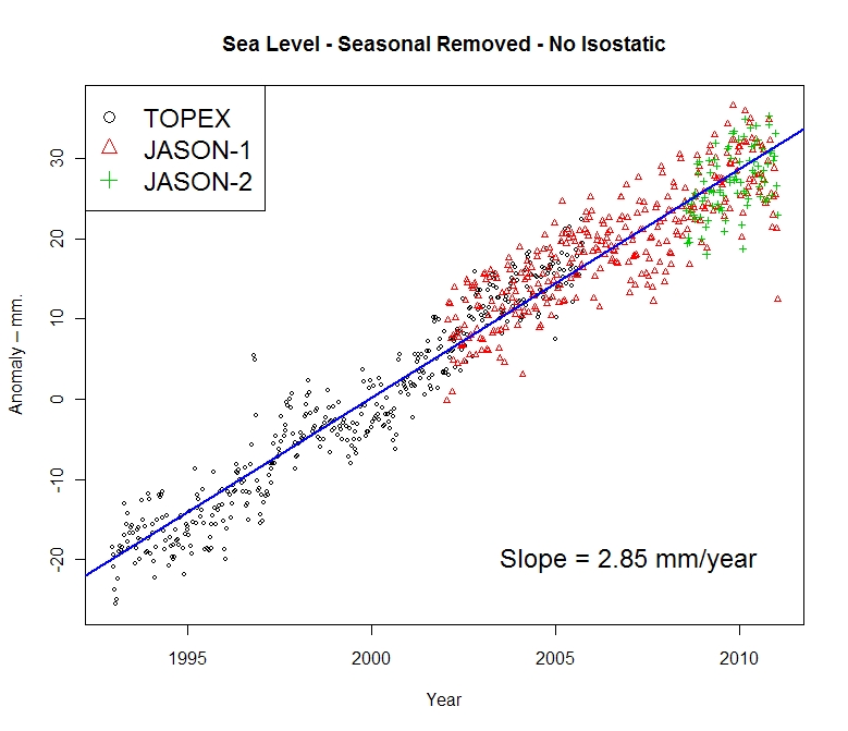
Not content to wait, and prodded by another commenter in an online tussle, CA and WUWT regular Roman M decided to find out himself. The results speak for themselves, quite a drop in the latest JASON-1 datapoint, with a general slight downturn in the JASON1-2 data since late 2009:

Here’s the dialog on how this came about, from RomanM’s comment here:
===============================================================
“… and am very curious to see what the most recent data looks like.”
So why not go and look at it?
Excellent suggestion. I did exactly that.
First, I went to the Aviso web site and found the place where one can generate sea level graphs. I generated the “Reference” version (“Reference” products are computed with the T/P-Jason-1-Jason-2 serie for the time series and with merged datasets for the maps) with the options: inverted barometer, seasonal removed and without isostatic adjustment. I got a graph with some points and a line drawn through it (which I have also saved at this location.

Quick-look of selected data. Click on “download the image”
to retrieve the image in high resolution
or on “download the data” to get the data.
Since it appeared that the “data” was rather sparse and since I enjoy playing with numbers, I chose to download the data. I assume that you didn’t try this, because to my surprise, I got the message:
550 /pub/oceano/AVISO/indicators/msl/MSL_Serie_MERGED_Global_IB_RWT_GIA_Adjust.txt: No such file or directory
Must be a glitch, I thought! After a period of time with the same type of message appearing EVERY time that I tried to download data for a variety of variables, I got the idea that perhaps (as you suggested in an earlier comment) “somebody forgot to update it, or has been busy with other things, or the person who originally did it has left and nobody else was interested” at Aviso as well. must be a lot of that going around in the climate science community, right? 😉
Anyway, not to be defeated so easily, I managed to actually locate some updated results (into January 2011) at NOAA in NetCDF format. I drew what was purportedly the same graph from that data and got something that was quite different.

I have other graphs, but I will just show one more using all of the satellites. This one used real data, not the processed results chosen by Aviso and not even shared by them.

=============================================================
Another curiosity:
The other reason things have gone quiet may be an unprecedented swing in the Jason 2 calibration curve.
http://sealevel.colorado.edu/calibration.php
I don’t know if they have published any findings on why it jumped by 10 mm at the end of 2009 but if it has skipped again maybe they are frantically trying to tidy things up before publishing data.
==============================================================
He has a point, have a look at this calibration curve published on the (CU sealevel website) for JASON1 and 2:

Compare that to the curve from the previous TOPEX A and B satellites:

Curiouser and curiouser.
To be fair, and to compare to what RomanM plotted I’ll also show the similar ensemble graph provided by NOAA, which uses smoothed data points:
 ================================================================
UPDATE:
Oh this is funny. Having been hilariously self pwned before for not reading what’s actually in a blog post, Grant Foster, aka “Tamino”, aka “Open Mind” writes a critique of this blog post complaining that because the post discussed the most recent data that still hasn’t been updated at the CU Sealevel website, and points out the dip at the end, that we are “pretending sea level rise doesn’t exist”. Here’s his graph to drive his point home.
 Here’s the funny part, above in my original post, you’ll count three graphs. One from Roman M., here and one from NOAA, here, both with trend lines for the full length of the data set, both clearly labeled with sea level rise rates of 2.85mm and 2.8mm per year respectively. Then there’s the one from AVISO/CNES/LEGOS, with the red smoothed average line and nice big blue linear trend line and 2.96mm per year rise rate labeled on it.
Gosh, how can anyone miss three graphs with positive trend lines and rates?
Mr. Foster doesn’t even have a sea level rise rate on his graph, ignores the graphs with trend lines and trend rates, and discussion on calibration of JASON 1-2, and yet we are the ones here “pretending (sea level rise) doesn’t exist”? Mr. Foster must be stuck in one of those “Smug Loops” that Steve McIntyre writes about today.
Too funny.
This reminds me of a previous incident where another “smug loop” type situation occurred, where I pointed out some outliers in sea ice satellite data and was told by NSIDC that it was “not worth blogging about“. Days later, they had to fess up to admitting they missed an equipment problem and took their whole dataset output offline to fix it.
Now that IS an inconvenient truth! Sea level dropping 🙂
Sharp downtick???? . . . it’s mm . . . .mm’s!
temperatures going down, ocean heat index going down, thermal expansion going down….
….all the while China is trying their best to save us by pumping as much CO2 out as they can
God help them…………../snark
Lemmee guess — AGW is causing catastrophic evaporation of the oceans that will leave the ocean beds high and dry by the end of the century? 😉
The more they try to bend the figures, the more they tie themselves up in knots.
Good to see the data.
But not sure why Nullius rubbed Roman in such the wrong way.
If it’s the same Nullius I’ve seen on other blogs, he’s not exactly a goose-stepping warmer (did I just demonstrate Godwin’s Law?)
He just indicated that U. Col’s problem could be more related to funding than anything else.
Anyway, very informative, since I’ve always wondered why Aviso’s graphs always looked so…er…”neat”.
We’ve got to use the precautionary approach which clearly means that if there is the slightest hint of a doubt regarding the honesty or integrity of those involved producing such figures we should immediately assume the worst: that they are a bunch of lying scoundrels who couldn’t be trusted not to sell a chewed banana.
Or have I misunderstood the precautionary approach?
In Dr. Nerem’s paper at
http://www.imedea.uib.es/goifis/OTROS/VANIMEDAT/documentos/intranet/Bibliography/Nerem_et_al_Global_Planet_Change_2007.pdf
he mentions the many “adjustments” required for satellite altimetry data:
“Satellite altimetry is somewhat unique in that many adjustments must be made to the raw range measurements to account for atmospheric delays (ionosphere, troposphere), ocean tides, variations in wave height (which can bias how the altimeter measures sea level), and a variety of other effects. In addition, the sea level measurements can be affected by the method used to process the altimeter waveforms, and by the techniques and data used to compute the orbit of the satellite. Early releases of the satellite Geophysical Data Records (GDRs) often contain errors in the raw measurements, the measurement corrections, and the orbit estimates.” Nerem et al also mentions other major problems such as drift in the TOPEX microwave radiometer, a change from the original TOPEX altimeter to the back-up altimeter in 1999 “due to degradation in the original instrument” which had “different electronics” from the original resulting in divergent measurements which had to be “corrected.”
more on ex-post “adjustments” to altimetry data:
http://hockeyschtick.blogspot.com/2010/03/more-ex-post-adjustments-to-satellite.html
http://hockeyschtick.blogspot.com/2010/03/global-sea-level-change-redux.html
http://hockeyschtick.blogspot.com/2010/02/sea-levels-large-variances-between-tide.html
Great!
Could you perhaps add the other graphs at the AVISO site? The ones I had actually been talking about?
(I had suggested going to the site indicated and then clicking on ‘Time Series’ and ‘Jason-1’. ‘Jason-2’ and ‘Envisat’ are also interesting.)
Cheers.
And John M, thanks, it’s the same Nullius. I suspect RomanM may have just seen the first composite graph that comes up and liked it no better than I did. If it’s just a misunderstanding, I don’t have a problem with it.
News Headline for next month:
“Sea level fall due to global warming.”
I think I’ve got it, they are using models to predict sea levels over periods they “forgot” to record the data only they haven’t removed the CO2 “forcing” from the program. /sarc
Mike Haseler says:
April 17, 2011 at 11:55 am
[———————————————————————
Or have I misunderstood the precautionary approach?]
—————————————————–
Gosh Mike – nice turn of phrase there – having a bad day?
Cheers
Douglas
At first glance, it looks to be pretty much following the predicted course:
http://www.trevoole.co.uk/Questioning_Climate/userfiles/Will_Satellite_Mean_Sea_Levels_Continue_to_Rise.pdf
It’ll be interesting to see what the finally published version is like.
All of the data series files have been removed from ftp://ftp.aviso.oceanobs.com/pub/oceano/AVISO/indicators/msl/
That removes the temptation to plot them independently or wonder why Envisat produced a sea level rise of 1.2 mm/year http://www.aviso.oceanobs.com/fileadmin/images/news/indic/msl/MSL_Serie_EN_Global_IB_RWT_GIA_Adjust.png and JASON1-2 produces 3 times as high a rise for the same period http://www.aviso.oceanobs.com/fileadmin/images/news/indic/msl/MSL_Serie_MERGED_Global_IB_RWT_GIA_Adjust.png
I would also pay no attention to the sharp downtick at the end. All series like this have high frequency noise that means nothing.
The drift problems with the Jason 2 sat are rather interesting. Jason 2 supposedly includes a much more sophisticated tie-in to the GPS constellation of satellites, as well as Earth based reference stations, to improve the accuracy of the orbital ephemeris. I seem to recall that the onboard instrumentation for providing corrections for atmospheric factors was also upgraded. In fact, as one would expect, virtually every system involved was supposed to be an improvement over previous iterations. And yet the system performance seems to be even worse than the already poorly regarded Topex sats. The data products handbook for Jason2 indicates that they had a goal of initially achieving an accuracy of +/- 3.4 cm RMS but, given the rather dramatic drift swings, one has to wonder if even that loose standard is reasonably plausible, which is interesting be a +/- 3.4 cm error bar nicely covers the entire 20 yr range of supposed changes in MSL.
Also, though I’m not a big stat guy, the rather extreme range and variability of the drift values doesn’t really seem to be captured by the modest slopes of the trend lines shown. Using these trends to correct the sat data would seem to be fairly problematic.
Get ready for IF the rate of sea level increases then all coral island atolls are doomed. We have been waiting since 1980 and diddly.
Warmists must now be concerned about temperature and sea level rise. It’s not going according to plan.
If anyone is interested in downloading some of the data from NOAA themselves, the more direct option is to go straight to the data directory.
Files ending in “.nc” are NetCDF files which can be read by either the appropriate proprietary software or in R using one of the libraries ncdf or RNetCDF.
Data is also available as “.tar.gz”. These must be un-gzipped and un-tarred before use. I have been using the free program 7-zip File Manager for this purpose in Windows and it works well for me. The end product is simple text files from which the data can be cut-and-pasted to Excel or other programs.
The code to watch out for in the names of the files is “gbl” for global, “free” and “keep” for seasonal variation removed or not removed, “txj1j2” for only the TOPEX and the two JASONs or “all” for all of the satellites together.
Dave Wendt says:
April 17, 2011 at 12:41 pm
“In fact, as one would expect, virtually every system involved was supposed to be an improvement over previous iterations. And yet the system performance seems to be even worse than the already poorly regarded Topex sats.”
A highly likely robust explanation…
http://en.wikipedia.org/wiki/Jason_2
“Scientists consider the 15-plus-year climate data record that this mission will extend critical understanding how ocean circulation is linked to global climate change.”
It’s a climate change satellite, made to specifications by The Team that delivers the data pre-tortured, fit for publication in any esteemed climate change journal. 😉
John A,
A blinder well played.
😉
Bifurcated Realism Conveniently Explained
(Inconveniently absent) global warming increases the evaporation of sea water which cools the oceans (cooling, now inconveniently present) resulting in falling sea levels (also inconveniently present). Increasing carbon-dioxide in the atmosphere (conveniently present) should trap long wave radiation in a largely tropical hot spot (inconveniently missing) at 8-16 km altitude. This putative heat has been modelled to be transported by Hadley Cells away from the (inconveniently cooling) equator eventually raising the temperature of the whole atmosphere (which is inconveniently difficult to monitor accurately). The (conveniently present) carbon-dioxide should, by the mechanism of the lower relative humidity of the now warmer (but inconveniently cooler) air, drives additional moisture into the (hopefully warmer) air. The total atmospheric water vapour content (inconveniently decreasing at critical altitudes) traps additional long wave radiation and according to (conventient) circulation models will show a multiplying of the (inconveniently missing) heating effect for each additional molecule of carbon-dioxide. (Inconvenient positive) changes in cloud cover area caused by the extra evaporation at low altitudes reflects at least some (inconveniently large) amount of (inconveniently decreasing) direct sunlight. The modelled overall effect of these (conveniently simple to study) mechanisms is a projected rapid increase in the atmospheric temperature and sea level if all the outputs are multiplied by some arbitrary (and extraordinarily large) value of 1.
If the meaning of a ‘large value of 1’ is not clear, read on. It is (most conveniently) derived from the engineering term, “unity”. Unity normally means ‘1.0’ but if we all join hands and sing handy-clappy campfire songs together we get additional unity so the value of the arbitrary multiplier, ‘Unity’, (conveniently) increases more and more, ergo: larger values of 1. So much Unity has (conveniently) been created amongst thousands of (conveniently) compliant scientists who need money that the value of Unity has increased to 3.2! That is a (conveniently) very large value of 1, indeed!
Thus, is it explained that the cause of the stasis and/or drop in sea level is: (wait for it!) global warming! I’ll bet you knew that all along! Well done! Here, it’s hot. Have another cup of Kool-aid.
[Global warming is also the cause of the softening of the toe-claws of Gobi marmots but the mechanism is (inconveniently) somewhat less direct and would (conveniently) take too much time to explain adequately.]
Crispin (inconveniently) freezing in Johannesburg
“..this was the moment when the rise of the oceans began to slow…”
Barack Obama June 3, 2008 Nomination Acceptance Speech.
He should declare “mission accomplished” on that one.
Too funny 🙂
G
Correct me if I’m wrong….but should not the very raw data, with zero adjustments made for any reason, if in sufficient number, in and of itself supply a trend with zero bias?
That is, the introduction of any correction for any reason will introduce a bias. If there is a proper data set that is representative of a broad sampling frequency and proper time domain, the raw data itself should really show a trend that is fundamentally a parallel to the “corrected” trend.
The “actual” sea level numbers may be more accurate with the corrected data, but the trend, or rate, is what we’re really after, isn’t it?
AGW causes warming and cooling. Snow/ice and melting. It should be no surprise that it causes both sea level rise and dropping of the same sea level. It is all very indicative of AGW, oh and it’s worse than we thought.
R. Gates, where are youuuuuuu………………………
We need you to explain again how the hydrological cycle has been speeding up causing all this weather………………..
All this is too complicated and open to all sorts of shenannigans. Drift problems, calibrations etc etc
To measure sea level rise, I suggest they do what I did during the recent Queensland floods. I drove a long stake into the ground and measured the water rise every half hour. So maybe they should send a ship out to the “doldrums” in the tropics and drive a long stake into the ocean floor.
Don’t forget to put millimetre notches into the stake. I used my Swiss Army Knife. 🙂
Sea level rise measuring problems fixed.
Latitude,
I suspect that R Gates is recharging his talking points over at ‘skeptical’ science.☺
Smokey: What are you talking about? Do you honestly think R Gates cannot be conned . . . .or Obama for that matter . . . . pa leeze . . . . Even they depend on
ex perts . . . . I don’t know how to wire a three way electrical switch . . . .but, I know it can be done.
Hockey Schtick says:
April 17, 2011 at 11:59 am
If you’re interested in the process by which satellite altimetry readings become MSL data this document does a pretty good job of covering the myriad details
http://www.osdpd.noaa.gov/ml/ocean/J2_handbook_v1-4_no_rev.pdf
It’s the data products handbook for JASON 2. The multitude of corrections and fudge factors involved are discussed in some depth. I would note that many, if not most, are not empirical but are model based and have their own subset of fudge factors employed in their construction.
Of particular interest is sec. 2.3.1 including this
“Generally speaking OSTM/Jason-2 has been specified based on the Jason-1 state of the art, including improvements in payload technology, data processing and algorithms or ancillary data(e.g: precise orbit determination and meteorological model accuracy). The sea-surface height shall be provided with a globally averaged RMS accuracy of 3.4 cm (1 sigma), or better, assuming 1 second averages.”
The table of error budget values that follows is also worth a look, particularly the line for significant wave height, which seems to indicate that, when significant waves are present, they can’t read the surface height to closer than 0.4 to 1 METERS. Aviso has daily graphs of SWH available
http://bulletin.aviso.oceanobs.com/html/produits/aviso/welcome_uk.php3
If you peruse a random selection of those in light of that SWH error, maybe you can come back and explain to me how they can claim centimeter level accuracy when they can’t resolve most of the ocean surface most of the time to closer than a half meter. Personally, I suspect that even a half meter is hopelessly optimistic.
It’s simple as a wood wedge. All the water rushed into the Mediterranean lately, increasing its level by up to 20 cm and causing dramatic sea level drop elsewhere.
I say this is all rather embarrassing what?
I will try ones best with the imminent delivery of a new 6L V8 internal combusting thingy………
Ta.
Does anyone know where I can find the Envirosat data set?
Any chance that that abrupt plunge indicates an instrument failure? As much as I would like to believe the information, such a rapid change tweaks my little grey cells.
IanM
John of Kent says:
Now that IS an inconvenient truth! Sea level dropping 🙂
Sea level is not dropping. A quick look at the graphs will show that just before 2000 there was a similar plateau. It will be a miracle if the trend reverses long-term (it’s been rising for centuries and nothing else miraculous has happened).
Going on-line and saying “sea level is dropping” is unjustified with the current data. It makes you look a fool. I don’t mind that, but I do mind when other climate sceptics have to explain that not all of us are that stupid. And I do mind when some undecided person decides to check out the “dropping sea level” and doesn’t find it, so decides the alarmists must be right.
We can be fairly sure sea level isn’t rising with greater and greater speed, as predicted by the doom-mongers. But no more. That’s enough, of course, but let’s not oversell it.
The graph shows 20 years of sea level data. During that time the rate of rise is essentially constant. The ups and downs within those 20 years correspond very well with the ENSO.
This graph: http://www.appinsys.com/GlobalWarming/SeaLevel_ENSO.jpg compares the ENSO (MEI) with the sea level.
Mike Haseler says:
April 17, 2011 at 11:55 am
“We’ve got to use the precautionary approach which clearly means that if there is the slightest hint of a doubt regarding the honesty or integrity of those involved producing such figures we should immediately assume the worst: that they are a bunch of lying scoundrels who couldn’t be trusted not to sell a chewed banana.
Or have I misunderstood the precautionary approach?”
You are spot on. But the name is The Precautionary Principle. Lisa Jackson puts all her weight behind the use of the Precautionary Principle at all times and places; so, yes, indeed, you must always apply it to Warmista. It shows them how much we respect them.
I am still at a loss here . . . I do not understand why this variation is important?
it’s mm’s . . . .so for me . . . if it is real cloudy it (the mm) could be in the air . . .
My theory is that the earthquake in Japan opened up a big hole in the earth and a lot of sea water poured in, thus lowering the level. /snark
I’m sure any “sharp downticks” will be averaged (massaged) out in the graph used for the public. I wouldn’t be surprised if the are waiting for an uptick in order to hide that sharp downtick. Better to make it a small downtick…
Laurie Bowen,
I know how to wire a three-way light switch.
See if you can draw one: two switches operating one light, using two wires. Each switch turns the light on and off independent of the other switch. It’s an excellent IQ test.☺
Jimbo says:
April 17, 2011 at 1:06 pm
“Get ready for IF the rate of sea level increases then all coral island atolls are doomed. We have been waiting since 1980 and diddly.”
I have been waiting for my dream house in the Maldives. But prices keep going up, not down. When are these people going to realize that the Maldives will be flooded in no time? The Warmista need to do more advertising in the Maldives, darn it!
On a more serious note, actually it doesn’t matter to science whether the sea level rises or falls because there is not one existing scientist who can offer physical hypotheses which explain sea level change or which can serve to predict sea level change. At this time, there is no science of sea level rise.
Oh, just for those who are reading words such as ‘hypothesis’ and ‘prediction’ for the first time. A stated belief that sea levels will rise in the future is neither a hypothesis nor a prediction. The neatest way to learn the semantics of scientific method is to read some history and explanation of Kepler’s Three Laws. Galileo used those three hypotheses to predict the phases of Venus, among other things.
Smokey: Not my point. . . . I can drive a car but, I can’t rebuild a transmission . . .
but, I know it can be done . . . the point I am “trying” to make is that we all have to depend on “experts” but even experts can be tricked . . . or conned . . . . Pollyanna here (that’s me) would like to think R Gates is now a sceptic . . . not to be had twice . . . oh . . . and I still can’t wire a three way switch . . . properly . . .
Dave Wendt says:
April 17, 2011 at 2:20 pm
Hockey Schtick says:
April 17, 2011 at 11:59 am
Do you want to pull the rug this soon? It is so much fun to watch them spin and spin as they hope to create a web that will catch a science.
Make two drawing, one with the light at the end, and another with the light in the “middle.”
Do we need to add a new word to the warmist dictionary … risefall. Without a doubt AGW causes risefall.
Rather than an earthquake causing a big hole, I’d propose an AGW induced micro black hole. The CO2 increase has started creating these black holes all over the world’s oceans. We’re doomed.
If you scan across the graph there are many times at which the data behaved similarly before lurching up again. It would be an extremely brave individual who would dare to make a prediction that sea levels would stabilize or continue to fall.
Sea level rise is mostly the result of thermal expansion. The oceans take an extremely long time to reach thermal equilibrium. The process does not react quickly to changed conditions. The oceans still have not reached thermal equilibrium since global temperatures rose at the end of the last ice age and a continued steady and gradual rise in sea level can be expected from that factor alone.
The lack of `accelleration’ in the graph however is indeed a failed prediction of climate science and the recent dip only serves to make that lack more glaringly apparent.
Fred: Ok . . . I’ll go with it . . “Make two drawings, one with the light at the end, and another with the light in the “middle.”
. . all done . . . . Light still doesn’t work . . .
The sea level is falling because of a black hole made by japan’s failing reactors and we are all doomed
Question : If the tide rises by 10mm in an area where there is a maximum of1 metre of movement between tides, what rise should be expected where the between tide movement is a maximum of10 metres?
“Local sea level has dropped since 1990s
…According to Reinhard Flick, a researcher at the Scripps Institution of Oceanography, who studies tides, sea level and coastal impacts, the average sea level at La Jolla measured with the Scripps Institution of Oceanography tide gauge was 81.8 centimeters for the 1980s (1980-1989), 84.6 cm for the 1990s and 82.9 cm for the 2000s (relative to mean lower low water, the point of reference used on tide tables).
Therefore, local sea level was 1.7 centimeters lower on average in the decade of the 2000s than during the decade of the 1990s…..” April 4, 2011 San Diego Union
Tom: ok . . . I’ll go with it . . . what are wind conditions? . . .where is the moon positioned? . . . ect . . . . in the end all be all about a maximum of 10 metres more or less. .
John A:
Try this Excel file. It has two pages.
Say thank you to the academic. 😉
Heheheheheheh. He only tends to jump into the warm Arctic. Observations trump theory every time.
The UC graph trend in the satellite era (1992-present) closely resembles that from our MET long-term observation:
http://www.data.kishou.go.jp/shindan/a_1/sl_trend/sl_trend.html
AW Lucias done a pretty damming analysis of real data trends v models. worth a look?
http://rankexploits.com/musings/2011/hadley-march-anomaly-0-318c-up/comment-page-1/#comment-73978
especially graph 2 its aklready been picked up by Andrew Bolt Australia
Where is the science in all of this, although I’m leaning toward LarryT. Reminds me of the weather is not climate but 1998 was the warmest year ever, only in reverse.
above correct link Lucias site apologies should have been
http://rankexploits.com/musings/2011/hadley-march-anomaly-0-318c-up/
AW Lucias done a pretty damming analysis of real data trends v models. worth a look?
especially graph 2, it’s already been picked up by Andrew Bolt Australia.
Laurie:
Buy the proper switches and the proper wire. The directions are with the switches! I have wired my share of them.
I dunno! They do have a warmcold theory already in place; just in case.
Winters maybe warmer [? – ?]
Winters maybe colder
Ian H says:
April 17, 2011 at 3:52 pm
If you scan across the graph there are many times at which the data behaved similarly before lurching up again.
========================================================
Ian, I’m having a hard time trying to envision something this small…
….as lurching
Tell me what I’m missing;
A land surveyor with a stable GPS receiver on the ground, has a vertical confidence level of about 1-1.5 centimeters. (At best).
Yet, Sea Level is being measured to millimeters, also by satellites.
This is what is giving them headaches. With all the glacier melt and ‘thermal expansion’ the rate of rise is just being plain difficult.
I want everyone to be very afraid of the rise in sea levels since the end of the last ice-age.
***************************
“It is essential that investigations continue to address why this worldwide-temperature increase has not produced acceleration of global sea level over the past 100 years, and indeed why global sea level has possibly decelerated for at least the last 80 years.”
http://www.jcronline.org/doi/pdf/10.2112/JCOASTRES-D-10-00157.1
Scary graph!
Bangladesh doomed!
Pacific islanders finished!
It’s much worse than I thought!
Dave Wendt says:
April 17, 2011 at 2:20 pm
There is a section in the Jason-2 Handbook entitled 3.2.8 Data Editing Criteria. This appears to identify data to discard. Quite amazing.
I can see that the satellite picks up any water anywhere, rivers, lakes, inland seas ect. But a lot of the data discarding parameters bother me. There is a lot of data being discarded.
Fascinating read anyway, thanks for the link.
I know what caused the drop in sea level. It was Godzilla getting out of the tub!
.
.
In my wildest moments of imagination, I sometimes picture an 8-inch diameter Earth surrounded with with its hair-strand-width of atmosphere. It is a useful sort of picture, particularly because it is easily visualized by folks as young as 30 or 40, maybe even 50.
Then I consider the parameters which could cause those 8 inches diameter to wander from any reported shape.
At a few miles up in the atmosphere it’s very cold; at a few miles depth in the Earth, it starts to get really hot. Farther down, it’s molten. Things that are hot near things that are cooler tend to move around a bit; they expand or contract, shift or slip, etc.
Gravitational-pull from the Earth’s position in the Solar System can change the “plastic” shape of the Earth by 10s of centimeters or so — says somewhere on the Internet.
Then of course, between ice-ages there are giant amounts of ice melting, so the localized weights supported by this “plastic” shell are changing.
Sea-level? What’s that? Does it correlate with Sister Earth’s “blood” pressure when she laughs — or when she cries?
My therapist thinks sea-level fever is a symptom of chronic model-deficiency syndrome (MDS).
.
.
u.k.(us) says:
April 17, 2011 at 4:44 pm
Tell me what I’m missing;
A land surveyor with a stable GPS receiver on the ground, has a vertical confidence level of about 1-1.5 centimeters. (At best). Yet, Sea Level is being measured to millimeters, also by satellites.
The satellite folks claim (personal communication from a scientist on the team at JPL analyzing the data) the large number of measurements smooth out the noise to allow the accuracy they claim. If that was true, why is it necessary to make a vast multitude of modeled “adjustments” to the data? It is difficult to imagine that an altimetry instrument located 100 miles (plus or minus an uncertain orbital position) from the ocean surface can accurately determine sea level changes of a few millimeters per year.
This is mentioned by a coastal engineer here:
http://hockeyschtick.blogspot.com/2010/05/sea-level-expert-recent-sea-level.html
Laurie Bowen said on April 17, 2011 at 3:53 pm
Nor would I expect it to. Of the two wires between the three way switches, only one at a time will be “hot” while the other would be not connected electrically, thus a light connected between them would never turn on. A light wired into one of those lines would turn on, but you wouldn’t wire the system up that way.
The switches used are Single Pole Double Throw (SPDT), where one line is switched between two contacts, with the two wires hooked onto those contacts. You can view the switch schematic here. The circuit can be seen here, you can verify your result, or look on the off chance you still can’t figure it out.
Now adding one or more four way switches, that’s a fun exercise…
Here is a link to a brief discussion of the normal variation in sea level rate of change. Looks like nothing new or different from historical norms is occurring today.
http://www.worldclimatereport.com/index.php/2011/04/07/sea-level-rise-still-slowing-down/
Eyeballing the Colorado Univ. sea level map:
http://sealevel.colorado.edu/current/sl_ib.jpg
I always wonder how the sea level rise/fall could exhibit such a drastic local distribution.
The viscosity of water may lead to temporal/regional difference, but I can’t figure out the physical causes that generate a long-term, conspicuous local difference.
Could someone in the know teach me on this issue please.
ftp://ftp.aviso.oceanobs.com/pub/oceano/AVISO/indicators/msl/
empty ftp dir.
Someone following Phil Jones’ advise about clearing out fpt directories in case anyone finds what’s in them?
Well…..as “I am THE ONE we have been waiting for” said: “this was the moment when the rise of the oceans began to slow and our planet began to heal”.
http://www.huffingtonpost.com/2008/06/03/obamas-nomination-victory_n_105028.html
Note the Royal WE: http://ndn.org/blog/2008/02/we-are-ones-weve-been-waiting
Or…….do I have “HE who’s MIDDLE NAME cannot be spoken” confused with Moses from the movie “Ten Commandments”. Or….is HE confused? (If I spoke HIS middle name, I would be stoned for being a racist bigot! Just like in the Old Testament-cool!)
It is difficult to know with these people where reality ends and satire begins. Or if they have a clue as to the difference.
Pray for our country!
Steamboat Jack (Jon Jewett’s evil twin)
OK Finally I understand. All that snow over the past two winters was caused by the global warming of ocenas, which created more water vapour in the atmosphere which, in winter, fell out of the atmosphere as snow. It’s self-consistent popy-cock.
The “sea level rising due to global warming” theory is based on two things: 1) Ice melting in Greenland and Antarctica and 2) thermal expansion of the oceans.
It appears sea levels are not rising exceptionally, therefore be prepared to hear a third “theory” of non-expansion – something like “the Earth’s crust is also warming and expanding, nullifying the ocean level rise”.
Kadaka
Thanks for the link. I’ve been wondering for a long time, how my living room switches can work without relays. Now if I can relate this to sea level….
Downscope. Dive planes at 15 degrees. Angle on the bow 40 degrees.
I have mentioned before that I believe all the sea level data is compromised. Even many Warmists say that the rise of 3.5mm for the last century is well below the thousand year trend. So where is the water? Antarctica seems to have taken up much of the Northern warming trend, 1990-2002. The rest of the so called warming appears to be exaggeration and falsified data. Initially precipitated by UHE, but then amplified by crazy politicians.
Robert of Ottawa says:
April 17, 2011 at 7:45 pm
That N. Hemisphere snowpack is above normal and not melting like it used to.
It is difficult to imagine that an altimetry instrument located 100 miles (plus or minus an uncertain orbital position) from the ocean surface can accurately determine sea level changes of a few millimeters per year.
A failure of your imagination then.
We measure the distance to the moon down to centimetres (it’s going 3.8 cm further away each year) despite it’s orbit being far from circular and it being far from flat.
We measure continental drift, isostatic rebound etc in centimetres per year, despite all the difficulties.
We measure the physical constants to 9 significant figures. Planck’s Constant, for example, is 6.62606896(33)×10^−34 Js. Do you imagine they are making that accuracy up too?
Hell, even mobile hand-held GPS can be accurate to metres.
So, frankly I don’t care what you imagine. If you have proof that the satellite measuring of sea height is inaccurate, bring it on. Otherwise be quiet.
Mooloo says:
April 17, 2011 at 9:07 pm
=======
I agree with you on all points,
but, the vertical (z) component has bad geometry for an accurate solution.
Let me reiterate, with slight modification, my point posted April 17, 2011 at 7:15 pm.
Since the sea surface is a water surface, it’s hard to imagine that the rising/falling long-term trend exhibits a very uneven regional distribution, as seen on the Colorado marine map.
The earth’s crust, or the seabed, may undoubtedly exhibit spatially non-uniform ups and downs, but a water surface may not…………
Berényi Péter says:
April 17, 2011 at 2:24 pm
“It’s simple as a wood wedge. All the water rushed into the Mediterranean lately, increasing its level by up to 20 cm and causing dramatic sea level drop elsewhere.”
Nope, just took the dog for a walk down to the harbour here in Cyprus and my boat is where its been moored to the same ring since the 60’s.
Look elsewhere Berenyi!
kadaka (KD Knoebel) says:>>>
I already knew how to draw it all up, I can even show someone how to do it in a couple of minutes with a couple of switches on a countertop. Not complicated as your sketches show.
Now about pulling wires through walls from the switches to the light…
That’s actually the hard part. And the guy who does it every day for a living? He has all the tools, can do it in 10% of the time I can and with 95% fewer swear words. and he knows which wires go where so he may as well do the last 120 seconds of the project and put the switches in too!
RomanM says:
April 17, 2011 at 1:07 pm
Files ending in “.nc” are NetCDF files which can be read by either the appropriate proprietary software or in R using one of the libraries ncdf or RNetCDF.
There is an Excel add-in called NETCDF4Excel_2007 that will read NetCDF files straight into Excel. I long since forgot where I downloaded it from but I’ve been using it for over a year and it is WAY less work than cutting and pasting from text etc.
The only downside is you find out real fast how memory efficient NetCDF is and how memory efficient Excel isn’t.
If you have proof that the satellite measuring of sea height is inaccurate, bring it on.
http://hockeyschtick.blogspot.com/2010/05/sea-level-expert-recent-sea-level.html
It must be very difficult, if not impossible, to measure global sea level to within 1mm, so a spike like that has to be equipment related. My guess is that the best you could hope for is a trend over 5 years or so but even then it would be difficult to support a claim of accelerating sea level rise using the published data.
tokyoboy says:
April 17, 2011 at 9:36 pm
Let me reiterate, with slight modification, my point posted April 17, 2011 at 7:15 pm.
Since the sea surface is a water surface, it’s hard to imagine that the rising/falling long-term trend exhibits a very uneven regional distribution, as seen on the Colorado marine map.
The earth’s crust, or the seabed, may undoubtedly exhibit spatially non-uniform ups and downs, but a water surface may not…………
The surface of the world’s oceans is not level. The Geoid from which sea level anomalies are computed varies by nearly 200 meters based on variations of the gravitational strength of the planet
http://en.wikipedia.org/wiki/Geoid
Pat says: April 17, 2011 at 8:58 pm
“…. Initially precipitated by UHE, but then amplified by crazy politicians.”
They’re not crazy, just opportunistic criminals.
In my opinion.
>>
ferd berple says:
April 17, 2011 at 10:32 pm
If you have proof that the satellite measuring of sea height is inaccurate, bring it on.
<<
The late John L. Daly already provided that: http://www.john-daly.com/altimetry/topex.htm.
Jim
u.k.(us) says:
April 17, 2011 at 4:44 pm
“Tell me what I’m missing;
A land surveyor with a stable GPS receiver on the ground, has a vertical confidence level of about 1-1.5 centimeters. (At best).
Yet, Sea Level is being measured to millimeters, also by satellites.”
A perfectly reasonable question. You’re probably missing two things:
1. You need to measure sea level in smaller units than the satellite position uncertainty. If you don’t, your results will be limited by the precision of the units you choose to use rather than the uncertainty in satellite position.
2. The satellite postion is determined by a system called DORIS which is sort of an “inverted GPS” which uses 50 or so fixed ground stations to transmit reference signals that the satellite can use much as a surveyor’s GPS uses satellite signals. I’m not an expert on DORIS. Claimed radial (“vertical”) accuracy is quoted in the 4-5cm range. It’s not clear if that is a maximum error, one sigma error, or typical error. I’m guessing that it is a maximum and that the average radial error from satellite position uncertainty over a number of observations is pretty low. The Jason-2 specs call for errors of 2.5cm, but again, it’s not clear if that is maximum, one sigma or something else. I’d also note that design goals in complex systems aren’t always met completely.
Greg Cavanagh says:
April 17, 2011 at 5:32 pm
“There is a section in the Jason-2 Handbook entitled 3.2.8 Data Editing Criteria. This appears to identify data to discard.”
If I read the Jason-2 Handbook correctly (and I may not have), they do not discard data. They flag data that they think that a sensible user of the data might want to discard — e.g. because they think there is ice present and have no idea exactly how much the ice reflections are adding to reported sea level.
What is the open mind going to do when it turns out that 2010 dropped off from 2009. Aside from the simple fact that ENSO has a fair amount of cause in that result (as it has in most warming and cooling), the linear regression in this is misleading to the point of meaningless.
The sea level rise has been decelerating for almost 10 years now. Doing a linear regression when the data clearly shows a significant second derivative is folly. I still project that the sea level will start to drop on a regular basis by 2025. A strong El Nino will still make it rise, but it is as meaningless as the warming associated with an El Nine.
http://theinconvenientskeptic.com/2011/02/determining-the-true-acceleration-of-sea-level-rise/
http://theinconvenientskeptic.com/2011/02/sea-level-deceleration-inverted-barometer/
Crispin in Johannesburg,
I wish you would write for The Wall Street Journal (the only newspaper I can read time to time)!
Unfortunately, an overwhelming majority of today’s professional journalists is unbelievably incompetent and/or stupid — and invariably, painfully boring.
Its worth noting here that the BBCs ‘nature inc’ series is still flogging the “climate refugee” fraud even now.
They are using deliberately misleading misinformation even as they know that there are in fact no “climate refugees fleeing rising sea levels” not least because sea levels are NOT rising. This amounts to telling lies, a national and indeed world broadcaster lying to the public. The BBC has been a major participant and player in the CAGW fraud with its gigantic unlimited funding from a Soviet style enforced taxation, complete with an army of strong arm thugs.
About 3mm of the sea evaporates each day, and of course around 3 mm of rain returns to the oceans each day as part of the hydrological cycle. So the daily varation can be up to 3 mm although over a month this will balance out unles there are significant additions or removals from the hydrological cycle with ice melting to water or vice-versa or land-based resoviors and auqifiers take up more.
What is unclear is why the recent sea level figures show a downturn. While it is a common event after/during La Nina episodes there dosen’t seem to be much agreement on whether it is a result of thermal contraction – unlikely given the large amount of thermal energy that would need to be lost for this magnitude of change – or just a shift in the balance of partioning of the water in the hydrological cycle with less in the oceans and more in land resovoirs and the atmosphere.
For those who see this sea level fall as clear evidence of the start of a cooling phase in the climate, perhaps you could explain what IS the cause of the fall and how it indicates a cooling ?
Although any such prediction seems more wishfull thinking than fact based judgement given the noise in the data and the consistancy of the recent data with the variations seen in the data in the past during El Nina events.
Just left a little comment for Tamino, times at 8.15am, pointing out that the three graphs with their c 2.8mm/yr rise captions are clearly present & labelled. Plus asking why, if we’re seeing increasing melt from glaciers & icecaps, why the RoR is decreasing, not increasing. I wonder if it will pass muster?
I’veen waiting for this moment, though indeed the measurements do need to be doubly checked.
Everyone’s talking about sea level rise but nobody has mentioned something that I suspect goes very closely hand-in-hand with sea levels. Carbon dioxide levels.
For goodness sake, if sea levels are really slowing right down, keep a watch on Mauna Loa’ s reports.
Heh. Another project here. Check the MLO smoothed figures against the known solar fluctuation in sealevel rise. Anyone?
@tokyoboy: You asked a reasonable question. I can see two mechanisms which might cause this kind of regional variation right off the top of my head.
1. Variations in the timings of tides and their interaction with seabed topography.
2. Weather, and in particular regional variations in average barometric pressure.
I thought that the reason the data was not being releases was because, quote: “sea levels don’t change very much”. Looks like they do…
Ralph, have you ever looked at noisy data?
>>>>
izen
For those who see this sea level fall as clear evidence of the start of a cooling phase in the climate, perhaps you could explain what IS the cause of the fall and how it indicates a cooling ?<<<<
I am not good at this sort of physics/maths, so correct me if I am wrong. According to this graph, at around 10oc the volume of water changes by 0.025% per degree.
http://www.btinternet.com/~martin.chaplin/images/dd.gif
So a column of water 30m deep, cooling 1 degree, would shrink by about 8mm – or about the amount indicated on this graph. And so cooling of the surface levels of the sea could change sea levels by this amount.
I hope I have not displaced my calculation by a factor of 10 somewhere…
.
Well, I predicted you’d do just this in your post about the missing sea level data.
You are telegraphing your cherry picking expeditions, Anthony.
The oscillations in the sea level signal are there over and over. Why is it you’re hanging off this one? Guess you have to get all the cherries you can before the next El Nino and, worse for “sceptics”, the climb to the next solar maximum..
Tough years ahead for you guys.
Ferd Berple says “If you have proof that the satellite measuring of sea height is inaccurate, bring it on.”
And then links to a paper that shows how inaccurate satellite measuring of sea height is.
WUWT Ferd? Too much time at Milliways?
The TOPEX calibration graph which can be linked to from the paper you link to shows a +/- 10 mm peak to peak average noise level and scientists quote sea level in mm to 2 decimal places.
The satellites are 100 miles above the water, approximately 161 million mm or almost 28 bits of accuracy with sign. Their accuracy is stated to be a few centimeters.
The single data point noted here is -20 mm. Check just after 2000 and you will see a +20 mm spike. You wouldn’t quote the height of a person in microns, so why sea level in hundredths of millimeters? If you accept an average noise level of +/- 10 mm then a -20 mm single point means nothing.
pat says: “. . . So where is the water?” Antarctica
In my pea brain this is an example of exactly what the “hucks” do . . . where is the water? Antarctica . . . . Yes, and probably in the ground. . . . in the aquifers, rivers, lakes, . . . in the clouds . . . . many places . . . . every place!
Given the sheer volume of water on earth . . . the obsession to count every single solitary dag nab bit mm seems like a non existent “problem”.
The real issue has always been, do humans control what happens to the weather or climate? . . . we do not . . . did not and never will . . . it’s like asserting that man can control our gravity if we would just change our behavior . . . when . . . about the only way to minimize the effects of gravity, is to become “really” small.
I come from the age when “they” said it was mathematically impossible for a bumble bee to fly . . . so you can understand my cynicism some self proclaimed experts. . .
I think the Satellite is coming closer to the earth.
Ralph:
Don’t you think that someone might have noticed a full 1 C drop in mean global SSTs?
The error bars have GOTTA be wrong, and averaging between two conflicting data sets is NOT appropriate.
When you look at the overlapping data from various satellites, the error bars from each one MUST include the results of the other instruments functioning at the same time. That is just basic logic. At least one of them MUST be wrong, if not all of them. Can somebody with more statistics education than I explain how the error bars can be smaller than the difference of opinion between different measurements?
Secondly, the averaging of measurements that do not agree can’t be right either. If I have two accountants and they each tell me that I have a different account balance, then either one of them is wrong, or they both are. I can’t just average the two balances and “call it good”.
Notice the difference in trend between the various satellites. They can’t all be right, so maybe none of them are. Unless you can convince me that one of them is the “true” measurement, then I have very little confidence that any one of them is correct. Maybe they are all set up in a fundamentally incorrect way, but unless you can get a long enough sample of independent measurement that agree within their mutual error bounds, then you can’t possibly say that either of them is operating correctly.
Steve from Rockwood says:
April 18, 2011 at 5:39 am
“[…]
…You wouldn’t quote the height of a person in microns, so why sea level in hundredths of millimeters? […]”
Good point, Steve, and for those folks out there not used to working in both metric and English units on a daily basis, 0.01mm is 0.0003937 inches. If the sea level changed by 0.03mm, how could anyone tell?
So what’s with the “~12mm” horizontal line in the first graph? Had you contructed the graph just a few months earlier it would be “~39mm”.
Exactly what scientific point are you making here?
As noted below, the past rise in ocean level cannot be explained by either mass increase (ice sheets or glaciers melting) or due to thermal expansion. It appears something else is causing the volume of the oceans to increase. It appears the cause is the sun. Solar cycle 24 is an abrupt change in the solar cycle.
There is observational evidence that the sun produces a scalar field. (For example, there are changes in nuclear decay times on the earth that correlate with aphelion and perihelion, with a time lag. The time lag is indication that the mechanism is a scalar field as there is a time delay for the earth’s surface components to adjust to the change in the field.) The same mechanism explains why there is a significant increase in worldwide volcanic activity and earthquakes during deep solar minimums, as the potential of the deep earth adjusts to the new equilibrium.
If this hypothesis is correct there will continue to be a significant unexplainable drop in sea level. It appears the mechanism that creates sun spots and that equalizes the sun has been interrupted. There is evidence of cyclic abrupt changes (10 events spaced roughly 400 years apart) in the inclination of the geomagnetic field which is observational evidence that there is a sharp increase the scalar field on solar magnetic cycle restart. The effect of the solar magnetic cycle restart is dependent on the eccentricity of the earth’s orbit, the seasonal timing of perihelion, and the tilt of the earth’s axis. The strongest events produce geomagnetic excursions, such as the geomagnetic excursion that occurred during the Younger Dryas event or during past terminations of interglacial periods.
http://lanl.arxiv.org/abs/0808.3283v1
Evidence for Correlations Between Nuclear Decay Rates and Earth-Sun Distance
“The preceding considerations, along with the correlations evident in Fig. 4, suggest that the time-dependence of the 32Si/36Cl ratio and the 226Ra decay rate are being modulated by an annually varying flux or field originating from the Sun, although they do not specify what this flux or field might be. The fact that the two decay processes are very different (alpha decay for 226Ra and beta decay for 32Si) would seem to preclude a common mechanism for both. However, recent work by Barrow and Shaw [12, 13] provides an example of a type of theory in which the Sun could affect both the alpha- and beta-decay rates of terrestrial nuclei. In their theory, the Sun produces a scalar field which would modulate the terrestrial value of the electromagnetic fine structure constant EM. This could, among other effects, lead to a seasonal variation in alpha and beta decay rates, both of which are sensitive to EM [14]. We note from Fig. 3 that the fractional difference between the 226Ra counting rates at perihelion and aphelion is approx. 3 × 10⁻³, and this would require that the coupling constant k of to EM should be k (alpha) approx. 3 × 10^6.”
ftp://falcon.grdl.noaa.gov/pub/bob/2004nature.pdf
Mass and volume contributions to twentieth-century global sea level rise
“The rate of twentieth-century global sea level rise and its causes are the subjects of intense controversy1–7. Most direct estimates from tide gauges give 1.5–2.0 mm/yr, whereas indirect estimates based on the two processes responsible for global sea level rise, namely mass and volume change, fall far below this range. Estimates of the volume increase due to ocean warming give a rate of about 0.5mmyr21 (ref. 8) and the rate due to mass increase, primarily from the melting of continental ice, is thought to be even smaller. Therefore, either the tide gauge estimates are too high, as has been suggested recently6, or one (or both) of the mass and volume estimates is too low.”
These past cyclic sea level changes are too rapid and too large to be explained by changes to continental ice sheets. (Note the sea level drops and then increases by 10 to 15 m.)
Sea Level Change Through the Last Glacial Cycle
“Furthermore, the pre-LGM period is characterized by substantial fluctuations in sea level of 10 to 15 m about every 6000 years. The timing of these rapid change events during oxygen isotope stage 3 (OIS–3) apparently coincides with Heinrich ice-rafting events recorded in North Atlantic sediments (61), which suggests that they reflect major ice discharges from continent-based or shelf grounded ice sheets (62).”
Lightning Alaska’s Redoubt Volcano
http://news.nationalgeographic.com/news/2009/04/photogalleries/volcano-lightning-pictures/
April 14, 2009–Lightning, which often accompanies large eruptions, illuminates a giant ash cloud from Alaska’s Redoubt Volcano, southwest of Anchorage, in a March 28 picture by an amateur astronomer. (See daytime pictures of the Redoubt Volcano eruption.)
“We don’t always get lightning [when a volcano erupts],” said Steve McNutt, research professor of volcano seismology at the University of Alaska, Fairbanks, who was involved in the project. “And that’s one of the things we’re trying to figure out.”
http://www.sciencedaily.com/releases/2008/12/081215121601.htm
“Boundary Between Earth’s Upper Atmosphere And Space Has Moved To Extraordinarily Low Altitudes, NASA Instruments Document
During the first months of CINDI operations the transition between the ionosphere and space was found to be at about 260 miles (420 km) altitude during the nighttime, barely rising above 500 miles (800 km) during the day. These altitudes were extraordinarily low compared with the more typical values of 400 miles (640 km) during the nighttime and 600 miles (960 km) during the day.”
http://geosci.uchicago.edu/~rtp1/BardPapers/responseCourtillotEPSL07.pdf
“Also, we wish to recall that evidence of a correlation between archeomagnetic jerks and cooling events (in a region extending from the eastern North Atlantic to the Middle East) now covers a period of 5 millenia and involves 10 events (see f.i. Figure 1 of Gallet and Genevey, 2007). The climatic record uses a combination of results from Bond et al (2001), history of Swiss glaciers (Holzhauser et al, 2005) and historical accounts reviewed by Le Roy Ladurie (2004). Recent high-resolution paleomagnetic records (e.g. Snowball and Sandgren, 2004; St-Onge et al., 2003) and global geomagnetic field modeling (Korte and Constable, 2006) support the idea that part of the centennial-scale fluctuations in 14C production may have been influenced by previously unmodeled rapid dipole field variations. In any case, the relationship between climate, the Sun and the geomagnetic field could be more complex than previously imagined.”
http://www.agu.org/pubs/crossref/2006/2006GL027284.shtml
Geomagnetic excursion captured by multiple volcanoes in a monogenetic field
“Five monogenetic volcanoes within the Quaternary Auckland volcanic field are shown to have recorded a virtually identical but anomalous paleomagnetic direction (mean inclination and declination of 61.7° and 351.0°, respectively), consistent with the capture of a geomagnetic excursion. Based on documented rates of change of paleomagnetic field direction during excursions this implies that the volcanoes may have all formed within a period of only 50–100 years or less. These temporally linked volcanoes are widespread throughout the field and appear not to be structurally related. However, the general paradigm for the reawakening of monogenetic fields is that only a single new volcano or group of closely spaced vents is created, typically at intervals of several hundred years or more. Therefore, the results presented show that for any monogenetic field the impact of renewed eruptive activity may be significantly under-estimated, especially for potentially affected population centres and the siting of sensitive facilities…”
Having checked over at “Closed Minds”, I see my comment pointing out that the three graphs are posted & captioned showing the c 3mm/yr rise and asking if the rate of glacier & icecap melt is increasing, why isn’t rate of sea level rise?, hasn’t made the cut.
The usual Fanboi comments are there, however.
Or have I misunderstood the precautionary approach ?
Maybe … 🙂
the most common use of the precautionary principle is the assumption that a trend will continue to a catastrophic consequence unless something is done now to save us …
in the case of a “scientist” who hides data all we have is a single event with which to judge a persons actions by … to assume he will continue to hide data without a trend would not be using the precautionary principle … now if it happens twice in a row then you can make that leap … be careful though, with your tongue in cheek you can bite it when you land …
@-Ralph says:
April 18, 2011 at 5:28 am
“So a column of water 30m deep, cooling 1 degree, would shrink by about 8mm – or about the amount indicated on this graph. And so cooling of the surface levels of the sea could change sea levels by this amount.
I hope I have not displaced my calculation by a factor of 10 somewhere…”
No, sounds about right, but as another poster has pointed out the significant drop in temperature required to cause that amount of thermal contraction over the WHOLE ocean would have been noticed.
More to the point, that amount of thermal energy could not be lost in a few months or weeks without an active mechansim for removal of that energy. The oceans are not at a temperature which could emit that much energy (SB law). It would require the addition of enormous amounts of ice or some sort of refridgidation machinery to remove that much energy from the system to cause the thermal contraction of thast much water over the timescales involved. I cannot think of any natural process that would do it.
In answer to a couple of questions upthread, the surface of the seas are not a uniform height because of gravitational forces, the rotational force of the planet (coriolis effect), tides, wind and waves, salinity, different temperatures in different parts of the oceans (eg, near-land tropical vs. deepwater polar), and other sub and super-surface effects (like underwater currents), as well as diurnal and seasonal effects, and interannual to decadal oscillating patterns in different parts of the world’s oceans (ENSO, NAO, AO etc). Only in a featureless world with no atmosphere and no orbital or gravitational forces would the sea surface be flat. However, such a world would have no surface water – if indeed such a planet could exist at all in this universe.
I submitted a couple of comments at Tamino’s. And of course the coward wouldn’t post them. Here they are:
1.
“This conscious decision by those in denial about AGW to ignore the statistically significant long-term trend and to knowingly distort the data grew tiresome a very, very long time ago already.”
No one is ignoring anything, except Tamino. The trend that Tamino shows is shown several times in the WUWT post. He adds nothing new here. That trend turns out to be about 12 inches in 100 years. Why should anyone “deny” that? The real data is a big yawn. Furthermore, there is no acceleration in the trend. I took all of the CU data, split it in two chunks, plotted it and ran trend lines through the two halves. The trend for the second half is less than the trend for the first half. So if anything, the rate of sea level rise is slowing down.
This brings up another question. If the melt of the Greenland and Antarctic ice sheets is accelerating; and if Trenberth’s missing heat is going to the deep oceans, then where is the extra water? Another problem for the alarmists to look into – “let’s find the missing water”.
2.
Heraclitus: “I mean, you only need to look at the comments to see how no-one could possibly get the impression that the headline…”
So what you know about the oppositions arguments is what you get by reading the headlines? It’s nice that Tamino has such informative titles, like “Jerk”.
Anthony’s title is linked to another sea level piece that he had up a few days ago. In that piece he was asking why there had been no sea level update at the CU sea level site for more than 6 months. So the new title relates to the recent data that he was not able to previously get and what that recent data was doing. Anyone who actually reads these posts, instead of having knee jerk reactions to the title, knows that the rate of sea level rise is about 12 inches in a hundred years. No one who reads Anthony’s site, with the possible exception of Tamino and his readers, is confused, or unaware of what the long term trend shows.
>>RomanM (is that 1000?)
>>Don’t you think that someone might have noticed a
>>full 1 C drop in mean global SSTs?
Well world sea temperatures have lowered by 0.3 degrees in the last year. And to what depth is that measured? If it is to 100 meters, then you will have all the contraction and lowering of sea levels you need, to fit this 8mm drop.
.
Sorry, here is the WUWT link, for a graph of sea temperature drop.
http://wattsupwiththat.com/2011/01/03/global-sea-surface-temperature-continues-to-drop/
.
Jonathan: “At first glance, it looks to be pretty much following the predicted course:”
Nice work Jonathan. I’m thinking that we have had over 300 feet of sea level rise since the last ice age. And with or without mankind, we might still be having sea level rise. Maybe the right shape for the curve is the sine wave that you are looking at, but with some level of longer term upward trend. LOL. I think we all need to live about a thousand years just to see the outcome of our theories.
Kudos to Roman M for developing a preview of the tardy UC sea-level presentation. Before we get too wound up about what might be happening behind the curtain at UC and elsewhere, note that ocean temperature to 700-m depth (shown on WUWT reference pages) provides an excellent indication of sea level, and it is updated quarterly.
>>
DeanL says:
April 18, 2011 at 5:37 am
Well, I predicted you’d do just this in your post about the missing sea level data.
<<
Fortune tellers who predict past events are historians.
Jim
All these SST curves show an obvious long term linear trend. In Science , April 11th 2008, Chao, Yu, and Li corrected the published sea level curve for water held in storage and determined that sea level rise had been linear for at least the past 80 years and that the slope of sea level rise curve for this period was 2.46 millimeters per year. I estimate the linear trend in your first graph to be about 2.5 millimeters per year, in agreement with Chao, Yu, and Li. That is just under ten inches per century, not 20 feet like Al Gore dreams about. I think they got it right and the slight variations we get from that are probably instrumental effects.
O.K. For us dim bulbs, is the sea level going down, or is it just not rising as fast as the Warmists want it to?
Attention all dim bulbs. Sea level is rising and will continue for at least 15 years, by which time it may level off, start to decline or continue to rise, but definitely one of those three. And the scientists are absolutely certain that this is true.
Steve from rockwood,
You say “the scientists are absolutely certain” sea level will rise “for at least 15 years.” But you forgot the “/sarc off” at the end.
Nils-Axel Mörner, “Renowned oceanographic expert Nils-Axel Mörner
has studied sea level and its effects on coastal areas
for some 45 years. Recently retired as director of the
Paleogeophysics and Geodynamics Department at
Stockholm University, Mörner is past president (1999-
2003) of the INQUA Commission on Sea Level Changes
and Coastal Evolution, and leader of the Maldives
Sea Level Project. Now he has his own company on
Paleogeophysics & Geodynamics in Sweden, and can
be reached at morner@pog.nu.”
“”While the IPCC and its boy scouts present wilder and wilder sea level predictions for the near future, the freal observational facts demonstrate that sea level has remained virtually stable for the last 40-50 years,” New paper published in 21st Century Science & Technology by Professor Nils-Axel Morner, past president (1999-2003) of the INQUA Commission on Sea Level Changes and Coastal Evolution, and leader of the Maldives Sea Level Project.”
http://nzclimatescience.net/index.php?option=com_content&task=view&id=723&Itemid=1
http://nzclimatescience.net/images/PDFs/paper_540.pdf
http://nzclimatescience.net/images/PDFs/goa.2011.pdf
Some pretty serious claims here?
In the light that that oceanographs will join UNEP like WMO did, I am starting to be worried?
@DeanL
I thought that it was an article of faith among ‘warmists’ that it was all (everything from rising ‘average global temperature’ [WTI*] to rising sea level) due to anything but the sun. Recanting?
*WTI = whatever that is
I don’t know why anyone would be surprised at the oceans dropping.
Obama said:
‘this was the moment when the rise of the oceans began to slow and our planet began to heal;’
http://www.huffingtonpost.com/2008/06/03/obamas-nomination-victory_n_105028.html
PDO seems to be another case of missing updates: http://cses.washington.edu/cig/pnwc/aboutpdo.shtml , not update since 2008.
It links to another page for “current state of the PDO.” Sadly the PDO plot is a broken link.
http://www.jisao.washington.edu/pdo/
The data is there and shows PDO consistantly in negative territory since the 2008 cut-off (with a +ve blip in late 2009)
I have to give you a back story on why Tamino even bothered to post that crap about you in his post,”Cherries Jubilee.”
After having read his original story called, “Jerk”, I thought I would comment about the difference between rising CO2 and not-so-rising sea levels.
After going at it a few rounds, Tamino decided to not even bother to publish or snip my comment. He just refused to respond to what I was debating with him.
Then, I imagine, knowing something was afoot, saw what you published about JASON and came up with that Cherry Jubilee crap.
Anyways, you can read about the whole back story that I just posted about here .
Somewhere I saw a graph today of satellite sealevel data with the seasonal changes still present. It was most interesting. From 2002 to present, I think. Can’t find it again. Anyway, what interested me was WHERE/WHEN the sealevel rose: it was not that sealevels rose each year, but that between October and January they DIDN’T FALL by the 2.0 mm/yr.
Now that may or may not be important, but it is interesting. One would think, in AGW meme, that the sealevel would rise consistently. But it looked to me that there was not a consistent rise, but a step-function involving not-falling from the NH Fall. What I recalled was that going into the southern summer was when the Earth was in an apogee poition. If not-falling were the case, then the timing of the not-falling event IS significant: it suggests that there is, indeed, a time-location causation event going on, not a global thing. In other, specific words, there is added insolation warming the world related to albedo with/without cloud changes, in the fourth quarter of each year, when the Earth is at apogee and insolation is not the average value, but its apogee value.
The apogee value is 350.8 W/m2 (January 4). The perigee value is 330.1 W/m2. The difference is due to the eccentricity of the Earth’s orbit of 1.03. The difference is significant IF there is a difference in albedo (from the long-term average) during the year. Since the alleged CO2 radiative forcing at doubling is only 3.75 W/m2, but there is 20.8 W/m2 difference between the apogee and the perigee position/time, the time-positional considerations seem to be of utmost importance.
Sometimes there is too much averaging. The devil is in the details, perhaps.
http://sealevel.colorado.edu/results.php
I don’t really see what you are refering to in this data except for 2005 in the no seasonal , no barometer case.
One interesting feature of data massaging is that the barometer adjustment gives a different long-term form to the data. +barom+seasonal shows a step drop in 2007 but equal rise before and after and does not show the down-turn.
-barom+seasonal shows post 2003 with a trend about half that of pre-2003.
The two are not necessarily contradictory due to the larger variations in the later so I don’t think there’s any “tricks” but it does show how adjustments can trick the eye. Warming is in the eye of the beholder.
Here is a quick plot of the data smoothed with gnuplots bezier curve smoothing. This is not a rigorous analysis since I have not looked into how that function works, the ticks at each end are obviously artefacts.
GMSL no seasonal, no barom, smoothed
However, the rounding off after 2002 seems clear. No “accelerating” sea rise there.
Tamino might be interested to know sea levels have been steadily rising since the end of the Little Ice Age.
What AGW skeptics claim doesn’t exist — correctly — is the acceleration in sea level rise that was predicted and has not materialized.
This is a mildly important point, given that AGW proponents are claiming we need to divert trillions of dollars to ameliorate AGW primarily because of the effects of sea level rise acceleration.
Another example of evidence tending to weaken the AGW case being suppressed or at least delayed. Maybe a formal procedure would help researchers maintain uniformity of approach……
NB
For the uninitiated, the ‘sub-routine’ (procedure) is written in what software geeks call pseudo-code, designed to be read as a dialect of English but easily translated to most computer languages. Italicised text is in explanation of the process.
SUB(MAINTAIN_FUNDING)
‘Heads I get the money, Tails I get the money
Acquire data
Analyse data
LOOP
IF
THEN
GOTO PUBLISH ‘Excellent – I’m right again
ELSE ‘Oh bother – data don’t fit. Shome mishtake
IF
THEN
Apply plausible manipulations
GOTO LOOP ‘See if that does it
ELSE ‘Big trouble – ran out of manipulations
Keep stumm
Obstruct FOIA requests for access to data
IF
THEN
Destroy offending data
Seek funding to repair gaps in data
EXITSUB
ENDIF
ENDIF
ENDIF
PUBLISH
Extrapolate to catastrophe
Submit to review by selected peers e.g. Greenpeace
Publish with terrifying commentary
Seek funding to avert catastrophe
ENDSUB
It don’t seem to matter how professional your comments are at Open Mind.
Even if you present credible information at that blog, censorship prevails.
Here is my latest comment provided to be posted, that now stands among 3 others he refused to post):
Maybe some of you other chaps might have better luck at getting through to the poor man.
I obviously do not rate on his care meter. Either that, or hes waiting for a more credible skeptic to blast.
I look forward to some of you taking him off of his ‘smug loop’.
Good Day !
Rise or fall, at these rates corals, snails and maybe even Al Gore can keep up.