New SDO images show CMEs exploding from the Sun ripples like clouds do on Earth. It looks a lot like this photo, showing the well known Kelvin-Helmholtz instability.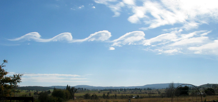
===============================================================
 experiment on NASA’s Solar Dynamics Observatory (SDO)") From the University of Warwick:
From the University of Warwick:
Physicists, led by a researcher at the University of Warwick, studying new images of clouds of material exploding from the Sun have spotted instabilities forming in that exploding cloud that are similar to those seen in clouds in Earth’s atmosphere.
These results could greatly assist physicists trying to understand and predict our Solar System’s “weather”.
The researchers, led by of the Centre for Fusion Space and Astrophysics, at the University of Warwick’s Department of Physics, made their discovery when examining new images of clouds of material exploding from the Sun known as coronal mass ejections (CMEs). These images were provided by the Atmospheric Imaging Assembly (AIA) experiment on NASA’s Solar Dynamics Observatory (SDO). SDO was been launched last year and provides unprecedented views of the Sun in multiple temperatures.
The new SDO/AIA observations provided images of coronal mass ejections in the extreme ultra violet at a temperature that was not possible to observe in previous instruments – 11 million Kelvin. On examining these images the Warwick researchers spotted a familiar pattern of instability on one flank of an exploding cloud of solar material that closely paralleled instabilities seen in Earth’s clouds and waves on the surfaces of seas.
 experiment on NASA’s Solar Dynamics Observatory (SDO)")
When observed these Kelvin-Helmholtz (or KH) instabilities appear to roll up into growing whirls at boundaries between things moving at different speeds, for instance the transition between air and water or cloud. The difference in speeds produces the boundary instabilities.
Similar conditions can occur when one looks at the magnetic environment of the path of these coronal mass ejections as they travel through the solar corona. The difference in speed and energies between the two creates the very similar KH instabilities that we can observe in clouds.
While KH instabilities have been predicted or inferred from observations as happening within the solar system’s weather this is the very first time they have been directly observed in the corona. What makes this observation even more interesting is that the instabilities appear to form and build on one flank of the CME. This may explain why CMEs appear to bend and twist as these instabilities build, and cause drag, on one side of the cloud. This effect will be the next focus for the University of Warwick led research team.
University of Warwick researcher Dr Claire Foullon said:
“The fact that we now know that these KH instabilities in CMEs are so far only observable in the extreme ultra violet, at a temperature of 11 million Kelvin, will also help us in modelling CME behaviour”
“This new observation may give us a novel insight into why these CMEs appear to both rotate, and be deflected away from following a simple straight path from the surface of the Sun. If the instabilities form on just one flank they may increase drag one side of the CME causing it to move slower than the rest of the CME.”
Dr Foullon and her co-researchers have outlined their observations and detailed modelling of how they believe this phenomenon occurs in a paper just published in Astrophysical Journal Letters entitled Magnetic Kelvin-Helmholtz Instability at the Sun by Dr Claire Foullon, Erwin Verwichte, Valery M. Nakariakov Centre for Fusion, Space and Astrophysics, Department of Physics, University of Warwick; Katariina Nykyri, Department of Physical Sciences, Embry-Riddle Aeronautical University, Daytona Beach, Florida; and Charles J. Farrugia, Space Science Center and Department of Physics, University of New Hampshire, Durham, New Hampshire.
The preprint is available at:
http://www.warwick.ac.uk/go/foullon/publications/foullon_preprint_apjl_2011.pdf
KH can also be observed at the heliopause, where the solar wind meets the interstellar medium, at 48 A.U. (beyond the orbit of Pluto).
Here is a Java applet demonstrating the effect:
ftp://space.mit.edu/pub/plasma/models/KH_heliopause_slideshow.html
Very Interesting!
While at matters Solar, it appears that L&P effect may be fizzling out.
http://www.vukcevic.talktalk.net/L&P1.htm
Maybe someone can explain what these clouds are I photographed at work. Sorry if this is OT.
http://www.flickr.com/photos/23654176@N03/5420910747/#/photos/23654176@N03/5420910747/lightbox/
Size does not alter the physics. Everything must obey the same rules.
Ralph says:
February 6, 2011 at 4:51 am
Maybe someone can explain what these clouds are I photographed at work. Sorry if this is OT.
http://www.flickr.com/photos/23654176@N03/5420910747/#/photos/23654176@N03/5420910747/lightbox/
OT Response – These look like they could be non-persistent contrails from high performance military aircraft ‘exercising’ in a tail chase of some sort or practicing maximum rate turns. These exercises go on all the time usually unnoticed but sometimes they are in a patch of high humidity air and the repeated practices leave their patterns in contrails.
vukcevic says:
February 6, 2011 at 4:44 am
While at matters Solar, it appears that L&P effect may be fizzling out.
http://www.vukcevic.talktalk.net/L&P1.htm
Agree….L&P is bad science employed by those that might need a leg out.
Ian W says:
OT Response – These look like they could be non-persistent contrails from high performance military aircraft ‘exercising’ in a tail chase of some sort or practicing maximum rate turns. These exercises go on all the time usually unnoticed but sometimes they are in a patch of high humidity air and the repeated practices leave their patterns in contrails.
In a closed loop with no exit trail? Yeah that makes sense..
“well known Kelvin-Helmholtz instability.”
In some circles…
Ralph says:
February 6, 2011 at 6:55 am
In a closed loop with no exit trail? Yeah that makes sense..
I suggest you look at ‘high energy maneuvers’ sometime together with the thickness of the contrailing layer. All sorts of strange patterns can be generated.
/OT
These look simply like the turbulence that occurs when two adjacent laminar streams of liquid or gas are moving at differing velocities
@Ralph
Ian is spot on. There is another flickr image of a similar cloud ring formation. The (presumably British) photographer contacted the Met Office for an explanation and received this response:
http://www.flickr.com/photos/debi2006/3382989068/
Just a guess, but the (Earth) clouds shown look like they are following the terrain – a mountain wave. I wonder what could be causing the ones in the AIA image. There doesn’t appear to be any terrain to follow.
Geoff Sharp says:
February 6, 2011 at 6:47 am
Agree….L&P is bad science employed by those that might need a leg out.
Disagree, L&P is a strong as ever, but may be a inconvenient truth for some.
@ John Marshall
February 6, 2011 at 5:12 am
Size does not alter the physics. Everything must obey the same rules.
Not true….the law of physics says the faster you go the heavier you get.
That means fat people have an unfair advantage when it comes to running the hundred yards
[snip – “chemtrails” is a banned discussion item here – Anthony]
What’s the controversy of L&P?
I’ve seen similar cloud formations over here in BC. Always wondered how and why they formed.
Carbone says:
February 6, 2011 at 9:24 am
What’s the controversy of L&P?
That sunspots are becoming warmer and thus harder to see and that therefore the sunspot number no longer is a good measure of solar activity:
http://www.leif.org/research/SHINE-2010-Microwave-Flux.pdf
Ralph says: Maybe someone can explain what these clouds are. . .
I’ll go with the contrails theory. The heaviest ring looks like two aircraft, one turning more tightly. In high performance turns, fighters can use afterburner to keep from losing airspeed, which might account for the lack of contrail when they come out of the turn and shut off the afterburner.
Looking back, was there any hint of L&P during solar cycle 23 ramp up?
vukcevic says:
“it appears that L&P effect may be fizzling out.”
Geoff Sharp says:
“Agree….L&P is bad science employed by those that might need a leg out.”
Leif Svalgaard says:
“Disagree, L&P is a strong as ever, but may be a inconvenient truth for some.”
Interesting, another scientific consensus… Anyway, I am planning to add a few plots on the Sun’s Magnetic Field to the WUWT Solar Page:
http://wattsupwiththat.com/reference-pages/solar-images-and-data-page/
I was thinking of adding this one;
http://wso.stanford.edu/gifs/Polar.gif
this one;
http://wso.stanford.edu/gifs/Tilts.gif
and this one;
http://www.leif.org/research/Livingston%20and%20Penn.png
but now after looking at this;
http://www.vukcevic.talktalk.net/L&P1.htm
and this;
http://www.landscheidt.info/images/livingston.png
I am not sure what to add on L&P. What plots on the Sun’s Magnetic Field and L&P do you recommend for inclusion on the WUWT Solar Page and why?
Ed Mertin says:
February 6, 2011 at 10:03 am
Looking back, was there any hint of L&P during solar cycle 23 ramp up?
Yes, but not for cycles prior to SC23:
http://www.leif.org/research/F107-SSN-divergence.png
Just The Facts says:
February 6, 2011 at 10:19 am
Anyway, I am planning to add a few plots on the Sun’s Magnetic Field to the WUWT Solar Page: http://wattsupwiththat.com/reference-pages/solar-images-and-data-page/
I was thinking of adding this one;
http://wso.stanford.edu/gifs/Polar.gif
That one is good
this one; http://wso.stanford.edu/gifs/Tilts.gif
Too complicated to interpret
and this one;
http://www.leif.org/research/Livingston%20and%20Penn.png
Is updated whenever Livingston sends me data. so is good
but now after looking at this;
http://www.vukcevic.talktalk.net/L&P1.htm
The ‘trend’ line has no basis and within uncertainties cannot be distinguished from a simple straight line.
and this;
http://www.landscheidt.info/images/livingston.png
Although it clearly shows the decline in the magnetic field, it is not correct to connect the points by a line as they represent measurements on unrelated sunspots.
Just The Facts says: February 6, 2011 at 10:19 am
I was thinking of adding this one;
http://wso.stanford.edu/gifs/Polar.gif
JTF
I maintain an up to date higher resolution Polar Field graph
http://www.vukcevic.talktalk.net/PF-latest.gif
on my web page: http://www.vukcevic.talktalk.net/LFC6.htm
vukcevic says:
February 6, 2011 at 10:36 am
I maintain an up to date higher resolution Polar Field graph
Considering the uncertainty in the hard to measure polar fields, higher resolution does not make much sense. Stick with the ‘official’ Wilcox graph.
Just The Facts says:
February 6, 2011 at 10:19 am
Anyway, I am planning to add a few plots on the Sun’s Magnetic Field to the WUWT Solar Page: http://wattsupwiththat.com/reference-pages/solar-images-and-data-page/
I was thinking of adding this one;
http://wso.stanford.edu/gifs/Polar.gif
Is good.
this one; http://wso.stanford.edu/gifs/Tilts.gif
To complicated to interpret and theoretically dubious.
and this one; http://www.leif.org/research/Livingston%20and%20Penn.png
Is updated whenever Livingston sends me data, so is good
but now after looking at this; http://www.vukcevic.talktalk.net/L&P1.htm
The ‘alternative’ trend line has no basis and the data is to uncertain to allow any more than a simple linear ‘trend’.
and this; http://www.landscheidt.info/images/livingston.png
although it clearly shows the decline of the magnetic field, it is incorrect to connect the data points with a line as the points from from unrelated spots.
We also have the North;
http://wso.stanford.edu/gifs/north.gif
and South;
http://wso.stanford.edu/gifs/south.gif
any value in including these?
I think I am going to add a new Magnetic Field section at the bottom of the WUWT Solar Page, does anyone have any anything else they think should be included in this section?
Leif Svalgaard says:
February 6, 2011 at 10:46 am
but now after looking at this; http://www.vukcevic.talktalk.net/L&P1.htm
The ‘alternative’ trend line has no basis and the data is to uncertain to allow any more than a simple linear ‘trend’.
Agree with this 100%, I recognized the “real” trend line as misleading as soon as I saw it. That downward dip reminds me of a misleading graphic similar to the one below which was used quite often after the 2008 La Nina as “proof” of an imminent drastic cooling which would continue.
http://static.safehaven.com/authors/hoye/13044_j.png
Leif Svalgaard says:
February 6, 2011 at 10:46 am
“and this; http://www.landscheidt.info/images/livingston.png”
although it clearly shows the decline of the magnetic field, it is incorrect to connect the data points with a line as the points are from unrelated spots.
And the ‘moving average’ is meaningless as the data points are not equidistant in time. Talking about ‘bad science’…
Just The Facts says:
February 6, 2011 at 11:08 am
We also have the North; and South;
any value in including these?
No, as they are also shown in blue and red on the official Wilcox plot.
Leif Svalgaard says: February 6, 2011 at 10:46 am
“http://wso.stanford.edu/gifs/Tilts.gif
To complicated to interpret and theoretically dubious.”
The measure itself is theoretically dubious?
Mr. Alex says: February 6, 2011 at 11:17 am
Agree with this 100%, I recognized the “real” trend line as misleading as soon as I saw it. That downward dip reminds me of a misleading graphic similar to the one below which was used quite often after the 2008 La Nina as “proof” of an imminent drastic cooling which would continue.
Now Mr. Alex,
You are talking a bit of a nonsense, if you did consider the subject properly than you would have realised your misplaced confidence in the Catastrophic Solar Failure, as L&P strait line trend is projecting and Dr.S. is using it as a rather inadequate fig leaf.
Enjoy your world of make-believe, but I suggest do not put your shirt either on the Catastrophic Solar Failure or on the Catastrophic Anthropogenic Warming.
I’ve added Wilcox’s Polar Field Strength and Leif’s L&P chart to the WUWT Solar Page:
http://wattsupwiththat.com/reference-pages/solar-images-and-data-page/
Here are good summaries of all of the products available from the Wilcox Solar Observatory (WSO), Stanford University;
http://wso.stanford.edu/
and Leif’s website;
http://www.leif.org/research/
let me know if there is anything else that should be on the WUWT Solar Page.
Re the circular clouds – those look like either the smoke trails generated by someone doing aerobatics or by skywriting.
Even skywriters need to practice their handwriting… 🙂
Just The Facts says:
February 6, 2011 at 12:21 pm
“http://wso.stanford.edu/gifs/Tilts.gif
Too complicated to interpret and theoretically dubious.”
The measure itself is theoretically dubious?
Yes, as it assumes the solar magnetic field is a dipole, which it is not.
http://www.leif.org/research/Model%20Polar-Sector%20Solar%20Magnetic%20Fields.pdf
Leif Svalgaard says: (February 6, 2011 at 10:24 am )
Ed Mertin says: (February 6, 2011 at 10:03 am)
Looking back, was there any hint of L&P during solar cycle 23 ramp up?
Yes, but not for cycles prior to SC23:
http://www.leif.org/research/F107-SSN-divergence.png
————————————————————————-
We live in interesting times.
And thanks, Leif.
Just The Facts says:
February 6, 2011 at 12:21 pm
“http://wso.stanford.edu/gifs/Tilts.gif
Too complicated to interpret and theoretically dubious.”
The measure itself is theoretically dubious?
Yes, as it assumes the solar magnetic field is a dipole, which it is not.
And that the HCS is tilted which it is not:
http://www.leif.org/research/HCS-Movie-hi.gif
A more correct description would be the ‘latitudinal extent of the warps of the HCS caused by the solar sector structure’
There are other ways of measuring contrast, darkness and magnetic strength of solar regions. We can use the pixel darkness measured in the green band taken from the SOHO Continuum image that allows full coverage (when working) of all regions and this method is not subject to corruption via an increasing speck ratio.
When using this method it shows SC24 is behaving normally, we are having less spots and a greater frequency of spotless days but the magnetic strength is still rising towards solar max. This has been a reliable method up until last month, but SOHO now looks to be having some problems.
Graph HERE.
Geoff Sharp says:
February 6, 2011 at 3:12 pm
this method is not subject to corruption via an increasing speck ratio.
The L&P effect is precisely the increasing speck ratio…
we are having less spots and a greater frequency of spotless days but the magnetic strength is still rising towards solar max.
So, you think that the ratio of visible spots to magnetic field is decreasing. This is, again, just the L&P effect. There is, of course, a selection effect that you must take into account: as the smallest spots [with the weakest fields] are becoming invisible, you’ll tend to pick out progressively larger spots as time goes by. Livingston’s data stand on their own and are not biased by anything. The strongest argument for L&P is the discrepancy with the F10.7 measurements.
Geoff Sharp says:
February 6, 2011 at 3:12 pm
There are other ways of measuring contrast, darkness and magnetic strength of solar regions. We can use the pixel darkness measured in the green band taken from the SOHO Continuum image that allows full coverage
Yet over the interval covered by your graph you only show 62 points. During that time there were ~2000 spots of which L&P observed 280 [they only have telescope time and good weather about 1/7 of the time at best]. Even allowing for the same spot being counted several times as it marches across the disk you clearly are not covering nearly ALL spots. Perhaps you only count active regions [of which there were ~160] and only pick the biggest spot in each. Either way, a biased count and not full coverage.
Leif Svalgaard says:
February 6, 2011 at 3:52 pm
The L&P effect is precisely the increasing speck ratio…
It feels like groundhog day again. If L&P were just telling us that there are more specks then no one would argue, nor would anyone be interested in the so called “effect”. But unfortunately they are telling us that “sunspots will disappear by 2015” because of what they wrongly record appears to show a decline in magnetic strength. But their method is flawed because they measure every speck in a region, which because of the increased speck ratio has to drag the total value down by an incorrect ratio. We have seen this with unipolar groups where the large main spot is magnetically very strong but the small specks surround the main spot get the same weighting, thus dragging down the real figure. I measure the whole region and look at its overall darkness, the specks still affect the overall value but do not skew the figure as in L&P’s case.
Since June last year there has been a regime change. Unipolar groups are dominating. These groups are very strong and long lived magnetically and are recording similar values as groups measured at SC23 max. There is no reduction in magnetic gauss strength but this is being missed by the L&P method.
So there is no reduction in magnetic strength as we ramp up to the weak SSN solar max. What we are seeing is the normal process of grand minima, the magnetic strength follows the normal cycle but the total spot count is down. You are invoking some strange mysterious “effect” to cover for the fact that you did not pick this grand minimum.
The strongest argument for L&P is the discrepancy with the F10.7 measurements.
This is rubbish and only works when you manipulate the F10.7 data. Do we have to go over this ground again?
Yet over the interval covered by your graph you only show 62 points. During that time there were ~2000 spots of which L&P observed 280
As you know I measure the whole region. This is the correct way. Solanki was smart when doing his measurements before SC23 by only measuring the larger spots. L&P should have continued this method.
Geoff Sharp says:
February 6, 2011 at 5:51 pm
What we are seeing is the normal process of grand minima, the magnetic strength follows the normal cycle but the total spot count is down.
Apart from the fact that we have never observed a grand minimum magnetically, what you describe is just what the L&P effect is.
You are invoking some strange mysterious “effect” to cover for the fact that you did not pick this grand minimum.
I’m simply reporting measurements by the most experience solar observer in the wold.
“The strongest argument for L&P is the discrepancy with the F10.7 measurements.”
This is rubbish and only works when you manipulate the F10.7 data. Do we have to go over this ground again?
We can, but I doubt it will make any difference to you. The [very small 1%] adjustment of the F10.7 due to the relocation of the Canadian observatory has no discernible effect on the ratio. You can see the agreement between the two observatories here: http://www.leif.org/research/SHINE-2010-Microwave-Flux.pdf . The directors of both the Canadian and the Japanese observatory agree with this. In fact the discrepancy was first noted by Ken Tapping http://lasp.colorado.edu/sorce/news/2010ScienceMeeting/doc/Session6/6.03_Tapping_F10.7.pdf
As you know I measure the whole region.
then you missed two thirds of them.
Leif Svalgaard says:
February 6, 2011 at 7:00 pm
then you missed two thirds of them.
No, I have measured every SC24 region that has passed the Layman’s speck threshold. This is far more efficient than a 1/7th sample following incorrect principles, and uses the Solanki method.
How do you account for the upward trend in my graph? The data is pure and simple.
That cloud formation is clearly a warm front coming in. 😉
Geoff Sharp says:
February 6, 2011 at 7:30 pm
No, I have measured every SC24 region that has passed the Layman’s speck threshold.
of the 162 regions you picked the 62 largest ones. There is your bias.
The data is pure and simple.
The data is biased by the cherry picking.
Leif,
This looks to be an important issue.
I am not in a position to judge between yourself and Geoff Sharpe.
But obviouly at least one of you is clearly wrong.
I trust that you will pursue this issue to a firm conclusion.
There is much at stake, not just the physics but vital issues relating to the future of industrialisation.
If you are correct, then we will see (at least a temporary) end to sunspots by 2015.
If Geoff is correct, then it is likely that we are already on the downward path to a much cooler period ahead, if not a new ice age (little or not so little).
AusieDan says:
February 6, 2011 at 7:46 pm
This looks to be an important issue.
It is, and so should be approached in a scientifically correct way, uncolored by agenda and wishful thinking.
But obviouly at least one of you is clearly wrong.
I trust that you will pursue this issue to a firm conclusion.
The sun will decide in a few years time. So far, it is firmly on the side of L&P. That can change tomorrow.
If you are correct, then we will see (at least a temporary) end to sunspots by 2015.
The original figure ‘2015’ was based on fewer data points. The actual time is probably a few years further in the future.
If Geoff is correct, then it is likely that we are already on the downward path to a much cooler period ahead, if not a new ice age (little or not so little).
There was no grand minimum in the 1800s, and it is not proven that a grand minimum [if indeed we are heading into one: the Eddy Minimum] changes the Sun’s output enough to cause serious climate effects:
http://www.leif.org/research/Does%20The%20Sun%20Vary%20Enough.pdf
Lief,
One of the things about climatology that I find most unsatisfactory, is the constant movement of goals and even of definitions of how goals are to be scored.
By this I meant the constant movement of thermometers and of the introduction of new methods which are not consistant with, nor reconciled with, well established traditional methods.
Now I am not a stick in the mud, looking back with rose coloured glasses.
Real improvements are fine and are to be encouraged, but they must be run alongside the older methods for a considerable number of decades, before undue reliance can be placed upon the newer technologies.
That is simply because of the chaotic natue of climate and the very long length of its cycles, which must be fully understood before true conclusions can be drawn.
The traditional method of sunspot counting has a very long history and one that has a reasonable correlation with multi century changes in the climate.
Correlation does not indicate causation, but we are just entering a period when a major test can be carried out.
Why abandon this for the S&P method which has no similar pedigree and just at this critical juncture in the cycle?
Lief, one final point,
Forgive me if I have entered this debate and you have already covered this question.
If S&P are correct, what happens to sunspots after 2015?
Are they dead and gone forever?
Or will they just go into [hibernation] for a century or two?
I presume that you do not think that would impact the earthly weather in any fashion.
Am I correct with this last supposition?
Lief – thank you for replying so promptly.
I have a point to make about your reply,
but first I want to assure you I have no agenda.
I have no vested interest, no oil money or big tobacco backing.
I am a private citizen, close to the end of life -there’s not much wishful thinking in that, let me assure you.
I just want to know about the climate.
AusieDan says:
February 6, 2011 at 8:04 pm
Why abandon this for the S&P method which has no similar pedigree and just at this critical juncture in the cycle?
It is L&P [for Livingston &Penn], and their measurements have nothing to do with [and do not change] the way sunspots are counted – although Geoff is trying to change the sunspots counting method]. L&P just measures the magnetic fields and darkness of all the spots [small and large] they can see during their once a month observing window. We find that already we are only seeing about half the spots we would expect for the amount of magnetic flux the Sun has [as manifested in the solar microwave flux].
If L&P are correct, what happens to sunspots after 2015?
Are they dead and gone forever?
Or will they just go into [hibernation] for a century or two?
If L&P are correct and sunspots become effectively] invisible [not gone] it might mean another Grand Minimum lasting perhaps 50 years. During this time the solar cycle is still operating, cosmic rays are still modulated, and the solar wind is still buffeting the Earth.
I presume that you do not think that would impact the earthly weather in any fashion.
It will lead to a cooling of a couple of tenths of a degree.
AusieDan says:
February 6, 2011 at 8:20 pm
I just want to know about the climate.
Then, unfortunately, the solar antics won’t make much of a difference IMHO.
Lief, at the end of your comment you said:
QUOTE
There was no grand minimum in the 1800s, and it is not proven that a grand minimum [if indeed we are heading into one: the Eddy Minimum] changes the Sun’s output enough to cause serious climate effects”
UNQUOTE.
By that I assume that you imply that the rather cooler period experienced in the 18th and early 19th venturies was not due to a solar minimum.
However, I understand that the last solar minimum did coincide with a much colder, earlier period, which forced the Vikings to evacuate what had previously been a more inhabitable greener Greenland. (There were many other unpleasant consequences of that colder period too).
Yes , yes, correlation is not …… etc etc.
You also claim that if we are heading into a solar minimum then that will not change “….. the Sun’s output enough to cause serious climate effects”.
Are you suggesting that I expect changes in the sunspot cycles (or rather the electrical and magnetic forces in the sun causing those sunspots) will significantly cause changes to the climate here on earth?
I’m a little surprised that you infer that this is my belief.
In fact, I try NOT to have beliefs about the climate, but only to hold tentative hypothses, which I regularly modify or discard in the light of obtaining more recent information.
My own observation of publically available data suggests that there is a sixty odd year cycle going through global indices and that we have just moved from the end of the last upswing and are now embarking on the downswing.
Later there will be another upswing etc.
Beyond that I am aware of the research and the theories relating sunspots to the larger multi century climate cycles.
I am very intregued but at present have an open mind.
I am also surprised that you have misunderstood my earlier post to this extent.
Lief, I must apologise, because I left out certain important words in my previous comment.
I wrote “Are you suggesting that I expect changes in the sunspot cycles (or rather the electrical and magnetic forces in the sun causing those sunspots) will significantly cause changes to the climate here on earth?”
I meant to write (in part) “Are you suggesting that I expect changes in the sunspot cycles …….. will significantly cause changes IN THE HEAT ENERGY FROM THE SUN, WHICH WILL SIGNIFICANTLY CHANGE the climate here on earth?”
I presume you did not think me to be so nieve.
AusieDan says:
February 6, 2011 at 8:49 pm
By that I assume that you imply that the rather cooler period experienced in the 18th and early 19th centuries was not due to a solar minimum.
Yes. For example, the solar maximum in 1778 was probably even higher than the very large cycle 19 in the 1950s.
However, I understand that the last solar minimum did coincide with a much colder, earlier period, which forced the Vikings to evacuate what had previously been a more inhabitable greener Greenland. (There were many other unpleasant consequences of that colder period too).
The Vikings’ decline started way back in the 14th century.
I’m a little surprised that you infer that this is my belief.
In fact, I try NOT to have beliefs about the climate, but only to hold tentative hypotheses, which I regularly modify or discard in the light of obtaining more recent information.
I do not imply any beliefs.
My own observation of publically available data suggests that there is a sixty odd year cycle going through global indices and that we have just moved from the end of the last upswing and are now embarking on the downswing.
something like that seems to be going on. The Sun does not share those same cycles.
I am also surprised that you have misunderstood my earlier post to this extent.
I don’t know that I misunderstood anything.
AusieDan says:
February 6, 2011 at 8:58 pm
I meant to write (in part) “Are you suggesting that I expect changes in the sunspot cycles …….. will significantly cause changes IN THE HEAT ENERGY FROM THE SUN, WHICH WILL SIGNIFICANTLY CHANGE the climate here on earth?”
I assumed that this is what you meant, of course.
I presume you did not think me to be so naive.
Lots of people on this blog seem to be so.
You have taught us a lot, Leif, many thanks for your patience. No one person can crystal ball the future, but comments on this from you would certainly be appreciated.
Space and Science Research Center
P. O. Box 607841 * Orlando, Fl 32860
http://www.spaceandscience.net
Press Release 2-2011
Global Cooling Begins and Global Warming Ends with Record Drop in Temperatures
http://www.spaceandscience.net/id16.html
Also…
http://www.spaceandscience.net/sitebuildercontent/sitebuilderfiles/ssrcresearchreport1-2010.doc
Ed Mertin says:
February 6, 2011 at 9:17 pm
Press Release 2-2011
Global Cooling Begins and Global Warming Ends with Record Drop in Temperatures
http://www.spaceandscience.net/id16.html
I would not place any credibility on this. See http://mediamatters.org/print/blog/201005150024
REPLY: Ditto that, ignore it – Anthony
The biggest loser of this “unnamed” grand minimum will be EUV. There are two reasons for this. Solar output will be reduced and the type of sunspot is changing. Unipolar groups are now dominating, these groups naturally have a lower EUV and F10.7 flux output and in some cases actually reduce EUV output by flux cancellation.
The ionosphere is currently very low because of the reduced EUV output. Some suggest this causes changes to the polar vortex and associated atmospheric oscillations. We are currently seeing the result of this world wide. This was predicted last July and will be one of the mechanisms that links solar output to climate.
So the magnetic argument is superfluous although some impact to the solar wind is expected. I have shown sufficient doubt that Leif’s graph is not of scientific quality and at best should be relabeled to suggest it represents an increase in specks only.
Geoff Sharp says:
February 6, 2011 at 9:31 pm
Unipolar groups are now dominating
Not at all. Unipolar groups have always been regulars. Today is not special in any way. The Sun is a messy place. You always have to take a longer view. What happens over a period of a few weeks or months cannot be taken as significant.
Leif’s graph is not of scientific quality and at best should be relabeled to suggest it represents an increase in specks only.
The L&P effect is just that: more and more hard to see specks rather than ordinary spots.
Geoff Sharp says:
February 6, 2011 at 9:31 pm
So the magnetic argument is superfluous
It is the magnetic field in the corona that determinse the EUV in the first place. The solar wind is not part of the equation, and has no influence on the climate anyway.
Leif Svalgaard says:
February 6, 2011 at 9:55 pm
Geoff Sharp says:
February 6, 2011 at 9:31 pm
Unipolar groups are now dominating
Not at all. Unipolar groups have always been regulars. Today is not special in any way. The Sun is a messy place. You always have to take a longer view. What happens over a period of a few weeks or months cannot be taken as significant.
If we isolate specks that don’t meet the threshold since July 1 2010 we have had 34 regions. 16 of those were unipolar which is close to 50%. Past studies show unipolar groups between 1915-1953 made up 38% of total activity. This study includes small pores which I have excluded so you would expect a reduction on the 38% using the same rules. Unipolar groups are significantly on the rise, they are all very strong magnetically but low on EUV. Lets see if they continue. If we look at all the sunspot counting methods the current trend is showing the sunspot number moving higher away from the F10.7 flux. This is a result of the unipolar groups.
The solar wind is not part of the equation, and has no influence on the climate anyway.
The solar wind is a factor in the size of the ionosphere.
Geoff Sharp says:
February 6, 2011 at 11:28 pm
Unipolar groups are now dominating
Not at all. Unipolar groups have always been regulars. Today is not special in any way.
Here is the frequency of unipolar groups compared to all groups for each year since 1988. You can clearly see that 2010-2011 are not special in any way. The mean for 1988-2011 is 34% unipolar.
If we isolate specks that don’t meet the threshold since July 1 2010 we have had 34 regions. 16 of those were unipolar which is close to 50%.
There is your cherry picking again. 16/34 is 0.47, but has a statistical error of the order of the square root of the counts, so the unipolar ones could by chance be any number between 12 and 20. There is nothing special about the recent years.
The solar wind is a factor in the size of the ionosphere.
The size of the ionosphere has nothing to do with the climate.
Geoff Sharp says:
February 6, 2011 at 11:28 pm
“Unipolar groups are now dominating”
Not at all. Unipolar groups have always been regulars. Today is not special in any way.
Here is the frequency of unipolar groups compared to all groups for each year since 1988. You can clearly see that 2010-2011 are not special in any way. The mean for 1988-2011 is 34% unipolar.
here is the figure: http://www.leif.org/research/Frequency-Unipolar-Groups.png
The numbers for 2011 has been scaled up by 365/33 [based on the first 33 days]
Dr. S. & Geoff
Last summer I developed a simple scanning method of
/realtime/mdi_mag/1024/latest
calculating the daily magnetic active area. The 50 days (Jul-Aug) result is here:
http://www.vukcevic.talktalk.net/MI.gif
Leif Svalgaard says: February 6, 2011 at 7:58 pm
It is, and so should be approached in a scientifically correct way, uncolored by agenda and wishful thinking.
Dr. Svalgaard
I have no particular agenda to see the L&P effect either failing or succeeding (far less than you might have). I think that all the major events within heliosphere are cyclical (decade, century or millennia scale). If there are some sudden changes not previously exhibited (on the above scale) than they must be result of a galactic impact.
Symmetry between the L&P contrast and SSN decline
http://www.vukcevic.talktalk.net/L&P1.htm
and luck of the data volume pre 2000, goes in favour of this to be a part of the known (or some new) solar magnetic cycle.
If your synthetic sunspot reconstructions are correct, and you think that this is a factor which may existed during the Maunder, reappearing now, then I think planetarism is not totally out of question.
Since it appears that we are heading for a major reduction in the solar activity, culminating around 2025 (as my formula from 2003 predicted) than a significant wind down in the magnetic levels would be expected.
I would not be surprised (or if you whish, I predict) that as the SSN increases during next year or two, the L&P effect will decline, and then recover a bit as SC24 goes downward.
Considering that bulk of L&P data is since 2001, than veracity of your trend lines in
http://www.leif.org/research/Livingston%20and%20Penn.png
should be far more credible if relates to 2001-2011 period. The trend line currently covers 21 year period (I think looks more like ^2, than linear but either way), so if you are projecting the effect to 10-15 year forward, by apply the same logic to a back extrapolation (should be equally valid) then you may agree, you got rather odd (not to say unrealistic) results for 1970’s.
Leif Svalgaard says:
February 7, 2011 at 12:58 am
You can clearly see that 2010-2011 are not special in any way. The mean for 1988-2011 is 34% unipolar.
Exactly, you agree with recent reports.
The ratio is much higher today.
Thank you Leif and Anthony, all you folks are so valuable to on the go working people with limited time.
Near lost the use of my right leg as a casualty from the falling trees during the January ’09 ice storm. The storm that coated everything in ice from Paris, TX and particularly up into Oklahoma throughout Northwest Arkansas, SE Missouri across to Charleston, West Virginia. That had never been seen, the magnitude of ice, in my lifetime. But thankfully with a shoe 1 1/2″ thicker sole I get around. Time for me to slide off these Ozark Mtns. (hopefully not literally) and get back to work. Thanks again!
Geoff Sharp says:
February 7, 2011 at 4:37 am
“You can clearly see that 2010-2011 are not special in any way. The mean for 1988-2011 is 34% unipolar.”
The ratio is much higher today.
For 2010 it was 38%
For 2011 it is 37%
Not different from 1915-1955 or from 1988-2011 means.
vukcevic says:
February 7, 2011 at 3:24 am
Considering that bulk of L&P data is since 2001, than veracity of your trend lines in
http://www.leif.org/research/Livingston%20and%20Penn.png
should be far more credible if relates to 2001-2011 period.
The trend is for illustration only and has no particular physical significance, but since it is calculated as a least-squares fit, the few points before 2001 have very little weight. Excluding them makes no difference. I am reluctant to cherry pick data, so show all there is.
The rest of your post is just baseless speculation.
L&P Something has occurred to me about a missing dimension which might be related. Want to see if there is enough information to link the two datasets. (I suspect not)
I cannot find the L&P data. Any ideas on where the data is hidden?
Tim Channon says:
February 7, 2011 at 7:43 am
I cannot find the L&P data. Any ideas on where the data is hidden?
http://www.leif.org/research/Livingston.txt
Well they’re not Solitons; so they must be Clouditons, that propagate without changing their shape.
I wish people would stop posting links that end up in a closed loop, so that the back button does not return to WUWT. It’s a royal pain when I have to close my browser, and re-open WUWT, because I looked at somebody’s stupid link.
George E. Smith,
On a Mac you can open a link in a new window [Option+⌘ then click]. Probably PC’s have a similar feature. Then when you’re finished with the new window, just close it and you’re back at your original page without having to reload it.
George E. Smith says:
February 7, 2011 at 8:43 am
……………..
Hi George
On MS IE (and some other browsers) next to the Back- Forward arrows, there is a smaller triangular arrow pointing downwards. Click on it and you will see further down WUWT link that will take you to your last WUWT page and location on it.
George E. Smith,
With Firefox and IE, the back button has a small history viewer next to it to select other than the last page; you could open in another window or another tab, as well . A lot of the links already take you to a new tab but, unfortunately, not all. You’d think it would be the default.
If you fly down the Pacific Coast of the Baja, you will sea the sandy coast line scalloped into those whorly patterns, that simply move the sand around according to some sort of turbulence theory I suspect.
“”””” vukcevic says:
February 7, 2011 at 11:15 am
George E. Smith says:
February 7, 2011 at 8:43 am
……………..
Hi George “””””
Yeah we do use Firefox, and Google Mail, and I hate both of them. With M$ despite all its bugs, I could copy all my e-mails off the servers or wherever they are sorted, and stick them on my local hard drive, and then get rid of what I didn’t need or want to keep.
All I can keep now on my hard drive is the Google mail address of wherrever the hell they have it stored.
I used to have a Telephone that I could actually dial a phone number, and talk to somebody on the phone. Nowadays, I would have to sort through a bunch of cookie recipes, and sewing patterns on a sellphone, in order to get to a dial tone. AT&T wants to fiber cable to me, and give me my phone, and internet, and a T&V in every room so I could watch 400 channels of shop at home, and walk from one room to the other, and have the TV magically follow me from room to room. I really don’t even want to watch that much TV; I’d rather be out some place fishing.
Leif Svalgaard says:
February 7, 2011 at 7:38 am
Geoff Sharp says:
February 7, 2011 at 4:37 am
“You can clearly see that 2010-2011 are not special in any way. The mean for 1988-2011 is 34% unipolar.”
The ratio is much higher today.
For 2010 it was 38%
For 2011 it is 37%
Not different from 1915-1955 or from 1988-2011 means.
What is the percentage from July 1 2010 to now, that is the period in question.
I truly learned about many of this, but however, I still assumed it had been helpful. Fine post!
Thanks Leif.
It has occurred to me I ought to consider the data in relation to some strong linkage co-incidences between datasets, one of which is asymmetry in the nasa/greenwich data. Does L&P have any connection.
What to do with the L&P data is a tricky problem. It would be useful to have the latitude of each measured datapoint. Is going to be a slow think about it and experiment.
Geoff Sharp says:
February 7, 2011 at 2:20 pm
What is the percentage from July 1 2010 to now, that is the period in question.
46%, same as it was during the strong solar maximum in 1990. Beware of the effect of making the period too short [the noise goes up]. E.g. for 2011 alone the ratio was 37%, perhaps the Grand Minimum is already over, now that the ratio has returned to normal…
Tim Channon says:
February 7, 2011 at 4:41 pm
It would be useful to have the latitude of each measured datapoint. Is going to be a slow think about it and experiment.
That data is available, but takes some work to format. I don’t think it is worth the effort as the L&P data is an unbiased sample of the whole thing.
Leif Svalgaard says:
February 7, 2011 at 4:59 pm
Geoff Sharp says:
February 7, 2011 at 2:20 pm
What is the percentage from July 1 2010 to now, that is the period in question.
———————–
46%, same as it was during the strong solar maximum in 1990. Beware of the effect of making the period too short [the noise goes up]. E.g. for 2011 alone the ratio was 37%, perhaps the Grand Minimum is already over, now that the ratio has returned to normal…
Ok, we are starting to get somewhere. Now lets dig a little deeper.
My results returned 47% for the same period. The first half of the year shows 0.04%, there is no doubt about a regime change. There are different types of unipolar groups, I am concentrating on the large circular spots with a dark umbra as they behave very differently to normal beta type groups.
Once again by isolating the tiny speck regions a true picture emerges. SC24 really began around the middle of Dec 2009, from Jan 2010 to June 2010 there were 24 regions recorded by the Layman’s count. Only one of these regions was a large unipolar. Then from July to now we have had 34 regions with 16 being large unipolar, considering how many different types of regions are possible I would say these groups are dominating and represents a certain regime change.
I have plotted all the regions since Jan 2010 to now to show this regime change clearly. The implications are large if this trend continues, we are seeing a very low EUV count now along with the F10.7 flux trending below the sunspot number. Your analysis of F10.7 moving above the sunspot number is wrong. I am surprised that this issue is not being talked about.
Geoff Sharp says:
February 7, 2011 at 6:24 pm
My results returned 47% for the same period. The first half of the year shows 0.04%, there is no doubt about a regime change.
No, just the result of picking too short a period. The 0.o4% is clearly nonsense [think about it – the smallest number of groups is 1 and it takes 1/0.0004 = 2500 groups for 1 group to be 0.04%, but let that slide]
these groups are dominating and represents a certain regime change.
To make statistics with 16 groups is not very meaningful.
with the F10.7 flux trending below the sunspot number.
They have different units so comparing them is as meaningful as to say that 5 degree C is trending below 33 degrees F. You have to bring the series onto the same scale by a formula, e.g. F10.7 = 60 + 1.1*SSN or something like that. What is your scaling formula? and derived how?
Your analysis of F10.7 moving above the sunspot number is wrong. I am surprised that this issue is not being talked about.
The data shows that there is more F10.7per spot lately than before cycle 23. You cannot argue with the data [you can quibble about a 1-2% percent, but that is all and makes no difference]. And the issue is being talked about [Hudson et al., Tapping, Hathaway] and it is clear than there are too few spots [of any size] compared with the coronal F10.7 emission [if you use the Layman’s count, even fewer 🙂 ]: http://lasp.colorado.edu/sorce/news/2010ScienceMeeting/doc/Session6/6.03_Tapping_F10.7.pdf
he states
Conclusions:
1: During the late cycle 23, the relationship between photospheric activity changed with more coronal activity [i.e. F10.7] than one might expect on the basis of the level of photospheric activity. Since photospheric activity drives coronal activity there is an issue here that needs some serious consideration.
2: Indications are that in Cycle 24 so far the deviation from “standard behaviour” is continuing or perhaps increasing.
3: There are indications in earlier cycles of a trend towards changing solar behaviour.
Geoff Sharp says:
February 7, 2011 at 6:24 pm
Your analysis of F10.7 moving above the sunspot number is wrong.
Show that you are up to it by doing the following:
1) compute monthly means of F10.7 and of SSN
2) plot a scatter graph of those monthly means with F10.7 as the X-axis and SSN as the Y-axis. Use different symbols or colors for data before 1996 and after 1996.
3) show the plot here
Leif Svalgaard says:
February 7, 2011 at 8:22 pm
Show that you are up to it by doing the following:
I think I am the one playing the teacher role in this case. I hope you can learn from a layman? The only useful time frame we have for analysis on SC24 is from Dec2009 till now. Agreed it is not a large sample but we have seen two extremes in sunspot formation that should be noteworthy…this is the area I was describing as not being talked about.
There is no need to perform your exercise, we only need to follow the monthly trend lines of both indexes which show F10.7 completely flat for 12 months against the sunspot number with a small rising trend. Going back to 1996 is also pointless, I am talking about SC24 only where we are seeing a change from around July 2010.
Geoff Sharp says:
February 7, 2011 at 9:00 pm
“Show that you are up to it by doing the following:”
There is no need to perform your exercise
So you are not up to it.