Guest post by David Middleton
INTRODUCTION
Anyone who has spent any amount of time reviewing climate science literature has probably seen variations of the following chart…

A record of atmospheric CO2 over the last 1,000 years constructed from Antarctic ice cores and the modern instrumental data from the Mauna Loa Observatory suggest that the pre-industrial atmospheric CO2 concentration was a relatively stable ~275ppmv up until the mid 19th Century. Since then, CO2 levels have been climbing rapidly to levels that are often described as unprecedented in the last several hundred thousand to several million years.
Ice core CO2 data are great. Ice cores can yield continuous CO2 records from as far back as 800,000 years ago right on up to the 1970’s. The ice cores also form one of the pillars of Warmista Junk Science: A stable pre-industrial atmospheric CO2 level of ~275 ppmv. The Antarctic ice core-derived CO2 estimates are inconsistent with just about every other method of measuring pre-industrial CO2 levels.
Three common ways to estimate pre-industrial atmospheric CO2 concentrations (before instrumental records began in 1959) are:
1) Measuring CO2 content in air bubbles trapped in ice cores.
2) Measuring the density of stomata in plants.
3) GEOCARB (Berner et al., 1991, 1999, 2004): A geological model for the evolution of atmospheric CO2 over the Phanerozoic Eon. This model is derived from “geological, geochemical, biological, and climatological data.” The main drivers being tectonic activity, organic matter burial and continental rock weathering.
ICE CORES
The advantage of Antarctic ice cores is that they can provide a continuous record of relative CO2 changes going back in time 800,000 years, with a resolution ranging from annual in the shallow section to multi-decadal in the deeper section. Pleistocene-age ice core records seem to indicate a strong correlation between CO2 and temperature; although the delta-CO2 lags behind the delta-T by an average of 800 years… 
Ice cores from Greenland are rarely used in CO2 reconstructions. The maximum usable Greenland record only dates as far back as ~130,000 years ago (Eemian/Sangamonian); the deeper ice has been deformed. The Greenland ice cores do tend to have a higher resolution than the Antarctic cores because there is a higher snow accumulation rate in Greenland. Funny thing about the Greenland cores: They show much higher CO2 levels (330-350 ppmv) during Holocene warm periods and Pleistocene interstadials. The Dye 3 ice core shows an average CO2 level of 331 ppmv (+/-17) during the Preboreal Oscillation (~11,500 years ago). These higher CO2 levels have been explained away as being the result of in situ chemical reactions (Anklin et al., 1997).
PLANT STOMATA
Stomata are microscopic pores found in leaves and the stem epidermis of plants. They are used for gas exchange. The stomatal density in some C3 plants will vary inversely with the concentration of atmospheric CO2. Stomatal density can be empirically tested and calibrated to CO2 changes over the last 60 years in living plants. The advantage to the stomatal data is that the relationship of the Stomatal Index and atmospheric CO2 can be empirically demonstrated…

When stomata-derived CO2 (red) is compared to ice core-derived CO2 (blue), the stomata generally show much more variability in the atmospheric CO2 level and often show levels much higher than the ice cores…
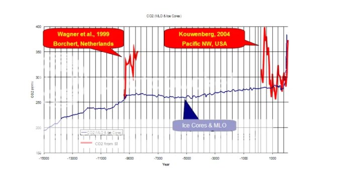
Plant stomata suggest that the pre-industrial CO2 levels were commonly in the 360 to 390ppmv range.
GEOCARB
GEOCARB provides a continuous long-term record of atmospheric CO2 changes; but it is a very low-frequency record…

The lack of a long-term correlation between CO2 and temperature is very apparent when GEOCARB is compared to Veizer’s d18O-derived Phanerozoic temperature reconstruction. As can be seen in the figure above, plant stomata indicate a much greater range of CO2 variability; but are in general agreement with the lower frequency GEOCARB model.
DISCUSSION
Ice cores and GEOCARB provide continuous long-term records; while plant stomata records are discontinuous and limited to fossil stomata that can be accurately aged and calibrated to extant plant taxa. GEOCARB yields a very low frequency record, ice cores have better resolution and stomata can yield very high frequency data. Modern CO2 levels are unspectacular according to GEOCARB, unprecedented according to the ice cores and not anomalous according to plant stomata. So which method provides the most accurate reconstruction of past atmospheric CO2?
The problems with the ice core data are 1) the air-age vs. ice-age delta and 2) the effects of burial depth on gas concentrations.
The age of the layers of ice can be fairly easily and accurately determined. The age of the air trapped in the ice is not so easily or accurately determined. Currently the most common method for aging the air is through the use of “firn densification models” (FDM). Firn is more dense than snow; but less dense than ice. As the layers of snow and ice are buried, they are compressed into firn and then ice. The depth at which the pore space in the firn closes off and traps gas can vary greatly… So the delta between the age of the ice and the ago of the air can vary from as little as 30 years to more than 2,000 years.
The EPICA C core has a delta of over 2,000 years. The pores don’t close off until a depth of 99 m, where the ice is 2,424 years old. According to the firn densification model, last year’s air is trapped at that depth in ice that was deposited over 2,000 years ago.
I have a lot of doubts about the accuracy of the FDM method. I somehow doubt that the air at a depth of 99 meters is last year’s air. Gas doesn’t tend to migrate downward through sediment… Being less dense than rock and water, it migrates upward. That’s why oil and gas are almost always a lot older than the rock formations in which they are trapped. I do realize that the contemporaneous atmosphere will permeate down into the ice… But it seems to me that at depth, there would be a mixture of air permeating downward, in situ air, and older air that had migrated upward before the ice fully “lithified”.
A recent study (Van Hoof et al., 2005) demonstrated that the ice core CO2 data essentially represent a low-frequency, century to multi-century moving average of past atmospheric CO2 levels.

It appears that the ice core data represent a long-term, low-frequency moving average of the atmospheric CO2 concentration; while the stomata yield a high frequency component.
The stomata data routinely show that atmospheric CO2 levels were higher than the ice cores do. Plant stomata data from the previous interglacial (Eemian/Sangamonian) were higher than the ice cores indicate…

The GEOCARB data also suggest that ice core CO2 data are too low…

The average CO2 level of the Pleistocene ice cores is 36ppmv less than GEOCARB…

Recent satellite data (NASA AIRS) show that atmospheric CO2 levels in the polar regions are significantly less than in lower latitudes…


So… The ice core data should be yielding lower CO2 levels than the Mauna Loa Observatory and the plant stomata.
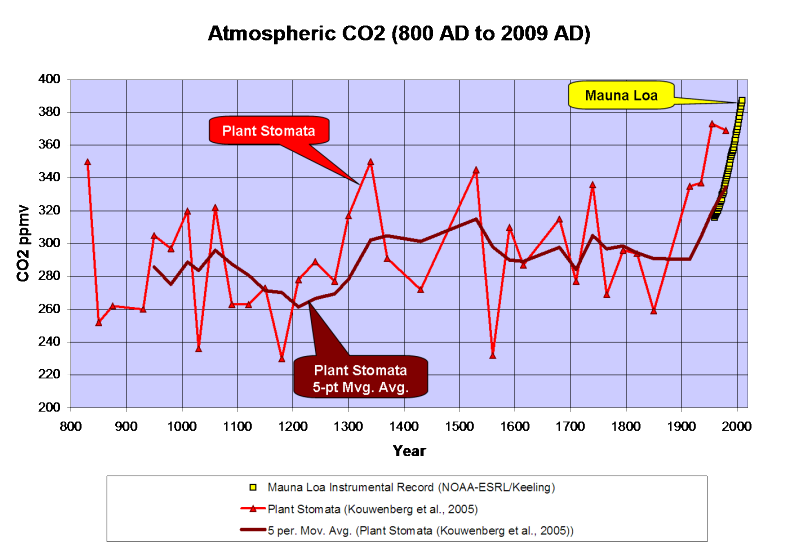
Kouwenberg et al., 2005 found that a “stomatal frequency record based on buried Tsuga heterophylla needles reveals significant centennial-scale atmospheric CO2 fluctuations during the last millennium.”
Plant stomata data show much greater variability of atmospheric CO2 over the last 1,000 years than the ice cores and that CO2 levels have often been between 300 and 340ppmv over the last millennium, including a 120ppmv rise from the late 12th Century through the mid 14th Century. The stomata data also indicate higher CO2 levels than the Mauna Loa instrumental record; but a 5-point moving average ties into the instrumental record quite nicely…

A survey of historical chemical analyses (Beck, 2007) shows even more variability in atmospheric CO2 levels than the plant stomata data since 1800…

WHAT DOES IT ALL MEAN?
The current “paradigm” says that atmospheric CO2 has risen from ~275ppmv to 388ppmv since the mid-1800’s as the result of fossil fuel combustion by humans. Increasing CO2 levels are supposedly warming the planet…

However, if we use Moberg’s (2005) non-Hockey Stick reconstruction, the correlation between CO2 and temperature changes a bit…

Moberg did a far better job in honoring the low frequency components of the climate signal. Reconstructions like these indicate a far more variable climate over the last 2,000 years than the “Hockey Sticks” do. Moberg also shows that the warm up from the Little Ice Age began in 1600, 260 years before CO2 levels started to rise.
As can be seen below, geologically consistent reconstructions like Moberg and Esper are in far better agreement with “direct” paleotemperature measurements, like Alley’s ice core reconstruction for Central Greenland…

In fairness to Dr. Mann, his 2008 reconstruction did restore the Medieval Warm Period and Little Ice Age to their proper places; but he still used Mike’s Nature Trick to slap a hockey stick blade onto the 20th century.
What happens if we use the plant stomata-derived CO2 instead of the ice core data?

We find that the ~250-year lag time is consistent. CO2 levels peaked 250 years after the Medieval Warm Period peaked and the Little Ice Age cooling began and CO2 bottomed out 240 years after the trough of the Little Ice Age. In a fashion similar to the glacial/interglacial lags in the ice cores, the plant stomata data indicate that CO2 has lagged behind temperature changes by about 250 years over the last millennium. The rise in CO2 that began in 1860 is most likely the result of warming oceans degassing.
While we don’t have a continuous stomata record over the Holocene, it does appear that a lag time was also present in the early Holocene…

Once dissolved in the deep-ocean, the residence time for carbon atoms can be more than 500 years. So, a 150- to 200-year lag time between the ~1,500-year climate cycle and oceanic CO2 degassing should come as little surprise.
CONCLUSIONS
-
Ice core data provide a low-frequency estimate of atmospheric CO2 variations of the glacial/interglacial cycles of the Pleistocene. However, the ice cores seriously underestimate the variability of interglacial CO2 levels.
-
GEOCARB shows that ice cores underestimate the long-term average Pleistocene CO2 level by 36ppmv.
-
Modern satellite data show that atmospheric CO2 levels in Antarctica are 20 to 30ppmv less than lower latitudes.
-
Plant stomata data show that ice cores do not resolve past decadal and century scale CO2 variations that were of comparable amplitude and frequency to the rise since 1860.
Thus it is concluded that:
-
CO2 levels from the Early Holocene through pre-industrial times were highly variable and not stable as the Antarctic ice cores suggest.
-
The carbon and climate cycles are coupled in a consistent manner from the Early Holocene to the present day.
-
The carbon cycle lags behind the climate cycle and thus does not drive the climate cycle.
-
The lag time is consistent with the hypothesis of a temperature-driven carbon cycle.
-
The anthropogenic contribution to the carbon cycle since 1860 is minimal and inconsequential.
Note: Unless otherwise indicated, all of the climate reconstructions used in this article are for the Northern Hemisphere.
References
Anklin, M., J. Schwander, B. Stauffer, J. Tschumi, A. Fuchs, J.M. Barnola, and D. Raynaud, CO2 record between 40 and 8 kyr BP from the GRIP ice core, Journal of Geophysical Research, 102 (C12), 26539-26545, 1997.
Wagner et al., 1999. Century-Scale Shifts in Early Holocene Atmospheric CO2 Concentration. Science 18 June 1999: Vol. 284. no. 5422, pp. 1971 – 1973.
Berner et al., 2001. GEOCARB III: A REVISED MODEL OF ATMOSPHERIC CO2 OVER PHANEROZOIC TIME. American Journal of Science, Vol. 301, February, 2001, P. 182–204.
Kouwenberg, 2004. APPLICATION OF CONIFER NEEDLES IN THE RECONSTRUCTION OF HOLOCENE CO2 LEVELS. PhD Thesis. Laboratory of Palaeobotany and Palynology, University of Utrecht.
Wagner et al., 2004. Reproducibility of Holocene atmospheric CO2 records based on stomatal frequency. Quaternary Science Reviews 23 (2004) 1947–1954.
Esper et al., 2005. Climate: past ranges and future changes. Quaternary Science Reviews 24 (2005) 2164–2166.
Kouwenberg et al., 2005. Atmospheric CO2 fluctuations during the last millennium reconstructed by stomatal frequency analysis of Tsuga heterophylla needles. GEOLOGY, January 2005.
Van Hoof et al., 2005. Atmospheric CO2 during the 13th century AD: reconciliation of data from ice core measurements and stomatal frequency analysis. Tellus (2005), 57B, 351–355.
Rundgren et al., 2005. Last interglacial atmospheric CO2 changes from stomatal index data and their relation to climate variations. Global and Planetary Change 49 (2005) 47–62.
Jessen et al., 2005. Abrupt climatic changes and an unstable transition into a late Holocene Thermal Decline: a multiproxy lacustrine record from southern Sweden. J. Quaternary Sci., Vol. 20(4) 349–362 (2005).
Beck, 2007. 180 Years of Atmospheric CO2 Gas Analysis by Chemical Methods. ENERGY & ENVIRONMENT. VOLUME 18 No. 2 2007.
Loulergue et al., 2007. New constraints on the gas age-ice age difference along the EPICA ice cores, 0–50 kyr. Clim. Past, 3, 527–540, 2007.
DATA SOURCES
CO2
Etheridge et al., 1998. Historical CO2 record derived from a spline fit (75 year cutoff) of the Law Dome DSS, DE08, and DE08-2 ice cores.
NOAA-ESRL / Keeling.
Berner, R.A. and Z. Kothavala, 2001. GEOCARB III: A Revised Model of Atmospheric CO2 over Phanerozoic Time, IGBP PAGES/World Data Center for Paleoclimatology Data Contribution Series # 2002-051. NOAA/NGDC Paleoclimatology Program, Boulder CO, USA.
Kouwenberg et al., 2005. Atmospheric CO2 fluctuations during the last millennium reconstructed by stomatal frequency analysis of Tsuga heterophylla needles. GEOLOGY, January 2005.
Lüthi, D., M. Le Floch, B. Bereiter, T. Blunier, J.-M. Barnola, U. Siegenthaler, D. Raynaud, J. Jouzel, H. Fischer, K. Kawamura, and T.F. Stocker. 2008. High-resolution carbon dioxide concentration record 650,000-800,000 years before present. Nature, Vol. 453, pp. 379-382, 15 May 2008. doi:10.1038/nature06949.
Royer, D.L. 2006. CO2-forced climate thresholds during the Phanerozoic. Geochimica et Cosmochimica Acta, Vol. 70, pp. 5665-5675. doi:10.1016/j.gca.2005.11.031.
TEMPERATURE RECONSTRUCTIONS
Moberg, A., et al. 2005. 2,000-Year Northern Hemisphere Temperature Reconstruction. IGBP PAGES/World Data Center for Paleoclimatology Data Contribution Series # 2005-019. NOAA/NGDC Paleoclimatology Program, Boulder CO, USA.
Esper, J., et al., 2003, Northern Hemisphere Extratropical Temperature Reconstruction, IGBP PAGES/World Data Center for Paleoclimatology Data Contribution Series # 2003-036. NOAA/NGDC Paleoclimatology Program, Boulder CO, USA.
Mann, M.E. and P.D. Jones, 2003, 2,000 Year Hemispheric Multi-proxy Temperature Reconstructions, IGBP PAGES/World Data Center for Paleoclimatology Data Contribution Series #2003-051. NOAA/NGDC Paleoclimatology Program, Boulder CO, USA.
Alley, R.B.. 2004. GISP2 Ice Core Temperature and Accumulation Data. IGBP PAGES/World Data Center for Paleoclimatology Data Contribution Series #2004-013. NOAA/NGDC Paleoclimatology Program, Boulder CO, USA.
VEIZER d18O% ISOTOPE DATA. 2004 Update.
“The rise in CO2 that began in 1860 is most likely the result of warming oceans degassing.”
=============================================
Just like it has always been………………..
David,
thank you for the very interesting post. Could you please modify the images to have links to individual pages? I find that the graphs extend out into the right sidebar and are partially covered by the items in the sidebar. For example, I cannot read the caption on the Wagner et. al. image because it is partially covered by the right sidebar.
Links that open the images in their own pages would solve this minor problem and would be greatly appreciated.
Best regards,
Tom Moriarty
ClimateSanity.wordpress.com
Very nice post. Well thought out. Follows standard research article format. Leaves out emotional baggage on either side. Develops summaries based on the data alone. Written at a level and without jargon, that most can readily understand. Would have been nice to see what further information/data analysis would be useful to investigate.
Might we be able to reconstruct the greening of the planet during these episodes of stomata changes? I am guessing there is a correlate lag similar to CO2 reconstruction. Fossil remnants would be useful to measure this, especially around the supposed edges of such “greening”.
Welcome survey of all to often neglected evidence. A good companion to this post would be Jeffrey Glassman’s paper showing the consistency of the vostok record with Henry’s Law:
http://rocketscientistsjournal.com/2006/10/co2_acquittal.html#more
Interesting and informative and obviously took some time and effort to put together.
Thankyou.
A fascinating post, indeed. I have been searching the net, and have not found an answer to this question–are there instruments currently measuring CO2 anywhere other than Mauna Loa? although it is apparently widely assumed that atmospheric concentrations are homogeneous worldwide, it would be useful to know if there is a second site to provide a backup to Mauna Loa.
[Yes; from c. 100 other sites wordwide. The CO2 data itself does not seem to be the problem. Rather, the effect of CO2 seems to be the issue. ~ Evan]
Nice breakdown. I’ve been questioning the ice core data for a while. You do have to marvel at how the major core reference used by the Alarmist side is usually Lonnie Thompson’s, but no one can find his actual data to confirm his work. Makes getting Phil Jones’ homework look simple.
If a layman may ask a stupid question:
Why does the Mauna Loa CO2 readings go up in such a perfectly straight line, in spite of year over year variations in fossil fuel usage, widespread deforestation, and whatever other factors contribute to the amount of CO2 in the Atmosphere.
It just seems that the CO2 levels year over year wouldn’t be such a nice straight line for so many years.
Good post David.
Just one comment: The stomata-based CO2 estimates seem to be generally accurate, but they do exhibit a lot of varibility which means there is a large error margin in the methodology for individual estimates. They should probably be averaged over some longer time period.
Pamela Gray says:
December 26, 2010 at 9:04 am
Might we be able to reconstruct the greening of the planet during these episodes of stomata changes? I am guessing there is a correlate lag similar to CO2 reconstruction. Fossil remnants would be useful to measure this, especially around the supposed edges of such “greening”.
I too have wondered aloud as to this question. I would imagine that someone has at some point thought of coming at the CO2 conundrum from the other direction; if not to show causation then then for little more than curiosity?
Great analysis, many thanks for this.
The article was most interesting. However, I find the two directions of time on the x-axes presented in the graphs to be confusing or difficult to compare. In some cases, time to the present goes to the left, and in the other cases, time to the present goes to the right. Most of the contemporary charts such as the little ice ages or the hockey stick have the present ending on the right. But the ice core graphs have the present starting on the left.
Excellent post, David. I’ve read about the 3 methods individually but this is the first time I’ve seen all three discussed together. Very easy to read and understand. Thank you.
“The age of the layers of ice can be fairly easily and accurately determined”
I challenge this. They still cannot explain how things that they think should be hundreds if not thousands of years old in Greenland can be buried as deep as they are from past settlements and even airplanes! If there is an explanation of this then give me the link.
Wow! So thorough, so methodical, very impressive. You should publish it in a peer reviewed publication.
Stomata-based estimates of CO2 concentration are far from infallible. Indeed, for some species, there is little or no correlation between stomatal density and CO2 concentration.
See Eide & Birks 2004 Stomatal frequency of Betula pubescens and Pinus sylvestris shows no proportional relationship with atmospheric CO2 concentration http://onlinelibrary.wiley.com/doi/10.1111/j.1756-1051.2004.tb00848.x/abstract
Pamela Gray says:
December 26, 2010 at 8:58 am
Written at a level and without jargon, that most can readily understand.
Yes, very well done.
Thanks David.
David:
Great review of the three methods of paleo CO2 determinations.
Looks like C3 stomata provides a good method for high resolution CO2 measurements. Pity that the spatial and temporal resolution is so spotty. Clearly more work needs to be done, and I hope that those doing the research are not being hobbled by the funding bosses due to the inconvenient results.
Excellent post David. Have there been any studies done on refining models for the upward and downward diffusion of gasses in ice pores, using nuclear tagging provided by above-ground nuclear testing during the 1950s?
Just precisely why do you exaggerate the behavior of CO2 in the first figure by leaving out the bottom of the scale? The true shape of the curve can only be seen if you start the vertical scale from zero instead of from 230. These tricks should not be employed if you want to be objective in your presentation.
From one geoscientist to another: nice piece of work.
Thanks for putting this together.
Great article!
Very educational and well structured. I cant find out whether the CO2 measurements from Mauna Loa takes into account that the CO2 levels are lower at the poles than over lower latitudes. Otherwise they are comparing apples and oranges in thier statistics.
@ tommoriarty: If you will right click on the image, you may select view image or open image. That works in Firefox, Opera and Chrome/Safari. I have no clue how to do it in IE.
cheers,
gary
David,
Thank you for your excellent, well presented post.
I have rarely learnt so much in an hour or so than by reading it, although I have to admit my ignorance of a few items.
If I may make so bold, I have arrived at the following…
Temperature in the oceans varies in different areas, hence dissolved CO2 in sea water varies in different oceans;
atmospheric concentrations of CO2 vary geographically;
different methods of measuring past CO2 levels (ice cores & plant stomata) can result in huge variations – >50% at times, although GEOCARB may provide a ‘steadier’ historical record;
there are difficulties in measuring the age of air:ice, and the effects of gas compression at depth;
temperature variation precedes CO2 level variation, upwards or downwards.
Aside from the last point, if I am correct in assuming the others are true, then it would appear that yet more complication is prevalent.
Speaking for myself, the more one delves deeper into any particular aspect of climate, the more one realises how little is known of the whole.
@Middleton
The amount of anthropogenic CO2 released into the atmosphere is one of the better known quantities in this debate. The directly measured increase in atmospheric CO2 if only about half of the anthropogenic emissions. Clearly something is sequestering about half the anthropogenic CO2 emissions. For you to say that the increase is the result of ocean outgassing instead of anthropogenic emission frankly makes very little sense. Environmental sinks do not discriminate between CO2 molecules by source. It almost seems writ in granite that the oceans are not currently a source of CO2 but are rather a sink of CO2 and they aren’t sinking it as fast as anthropoids are sourcing it.
There are a few things in the global warming controversy which are almost beyond reasoned debate. The measured rise in CO2 being due to human activities is one of those few things.
What a goldmine of relevant information!! The author did a lot of work compiling these data, perfect, thanks 🙂
K.R. Frank
Thanks for the very informative post. The general point– that CO2 may have had more variability than ice cores data can show is a valid one, but one should use caution when talking about the accuracy of stomatal densities as their response to CO2 can be quite variable and nolinear and may also be related to other factors such as humidity and temperatures. This is a new area of research with even the lead researchers acknowledging the uncertainties of the science. I am fairly certain however that CO2 was more varible in the past than assumed by the IPCC but the fidelity of the ice core measurements would not yeild such data, however, the longer term TRENDS of atmospheric CO2 over the past 800,000 years as displayed is the ice cores is very likely correct. As stated, stomatal density as a proxy for past CO2 levels is still a relatively young science with known issues and problems that are well documented and caution is warranted before making large assumptions based this new field.
A few conclusions that are probably safe to make, drawn from studies such as this:
http://www.pnas.org/content/early/2008/10/03/0807624105.full.pdf
“A coherent scenario explaining preindustrial atmospheric CO2
changes of the last millennium and their possible temporal link
with changes in terrestrial and marine carbon uptake or release
still needs to be established. Reconstructed multidecadal
changes are not as prominent as man-made CO2 increases since
the onset of industrialization. Yet it seems obvious that a
dynamic CO2 regime with fluctuations of up to 34 ppmv implies
that CO2 can no longer be discarded as a forcing factor of
preindustrial air-temperature changes. The results of our study
therefore underscore the need to understand anthropogenic
global warming within the context of rates and amplitudes of
natural CO2 variability of the last millennium. A stomata-based
CO2 record may provide an important observational constraint
on the sensitivity of climate models.”
Would that Mann had been so cautious about tree rings, a well known caveat had he bothered with it.
@David: I’ll consider this a late X-mas present. Are you planning on taking this report forward to a scientific journal?
As the Mauna Loa data shows there is little variation from year to year [apart from the general rise], so any other method that seems to show very large variations must have a much larger noise level, and most of the variation would then be the just noise. A standard way of beating down the noise is to average over enough time. Such a long-term average would include any systematic errors there might be.
Dave, the natural closed systems (such as human population growth as a direct contributor to the recent rise in CO2) have well known closed system lags and unbalances. This is well established in proxies such as ice cores and stomata data mined for CO2 data. The current rise might very well be due to a closed system on the rising side of the closed equation that includes a lag time in response. It may also be due to a faster out of control rise on one side of the closed equation with a slower catching up on the downside of a closed equation. No where is it scientifically stated that a closed system is always instantaneously balanced. Nature is necessarily unbalanced and is always under pressure to change, which is likely what makes it so robust.
Logically, eventually as the human animal population increases as it is currently doing in dramatic fashion, the ability to sustain such a growth will crumble. Left unchecked, we are breeding a future population of increasing starvation and eventual population deflation. But that is the nature of closed systems. We are no different than a bloom of locusts if viewed from such a lens.
In my opinion, your view of CO2 cycles and data is myopically biased by emotional belief.
Doug in Seattle says:
December 26, 2010 at 10:17 am
“Looks like C3 stomata provides a good method for high resolution CO2 measurements.”
Stomata density is determined by many factors other than CO2. The amount of light the plant receives, temperature, water stress, and nutrients among them.
Using stomata count as a proxy for CO2 is about as reliable as using tree ring width for determining temperature. We all know how well that proxy worked out (cough cough hide the decline cough cough).
Moreover stomata density isn’t even consistent on the leaves of the same plant. Mature leaves produce signalling proteins in response to environmental factors and the level of these signalling proteins control the stomata density on developing leaves so that the new leaves are optimized for the conditions the mature leaves are experiencing. So, for instance, a string of cloudy days experienced by mature leaves changes the stomata density on newly forming leaves.
A year or a decade with a lot of clouds (with no change in CO2) will effect stomata density. Similarly dry and wet years will change stomata density. More or less competition for CO2 from other plants will also change stomata density. Exceptionally good or bad conditions for one kind of plant will leave more less CO2 for other plants. Same goes for producers of CO2 such as fungi. A great year for fungi growth will temporarily raise the CO2 level near the ground and a poor year will lower it. Near surface CO2 concentration is highly variable.
@Pamela
“In my opinion, your view of CO2 cycles and data is myopically biased by emotional belief.”
I’m about as emotionally biased as an eggplant. You’re projecting.
Thank you for all of the comments. I will try to address as many questions and criticisms as possible over the next couple of days; but I may not get to it today.
I didn’t link the images because I was advised that it might bog down Photobucket. A version with linked images is located on my blog, Debunkhouse.
Thanks to Anthony and the WUWT staff for allowing me to contribute to this great science blog.
Warren,
When diagrams are used from previous reports (note the plurals) they are usually used as originally constructed; maybe with something new added. To reverse them side-to-side (mirror) or top-to-bottom (flip) requires (a) the original data, or (b) tedious measurements from the original, and considerable graphics capability –any of which can lead to mistakes, and problems going back to the original source text of clarification.
Try doing such a thing. Take the Pleistocene CO2 vs Temperature chart with four lines (one straight orange one) and five balloon style text boxes and (mirror) it so the x-axis has 0 on the right and 1 on the left. This is easy in a graphics program but the letters and numbers in the chart and in the caption will have to be recreated. And, then as mentioned, the original referenced text (perhaps) will be scrambled.
———————————————————
David, Nice post. Thanks.
Good comments, also. Thanks to you folks.
If they were true scientist they’d not use two different localized reading to compare against each other and call the result global.
Mauna loa can only be compared to mauna loa. And so where are the 1000 years of readings from that location? (Heh, it’d be pretty freakish if they did have those readings though.)
If I understood it correct they only spliced together the Mauna loa because the ice core readings is non existent the closer to present we get. Boo hoo, but when ever have it essentially been correct to splice together data from two, or more, different locations showing local conditions only into one show and not get a freak show?
@Pamela
“Logically, eventually as the human animal population increases as it is currently doing in dramatic fashion, the ability to sustain such a growth will crumble. Left unchecked, we are breeding a future population of increasing starvation and eventual population deflation.”
Paul Erlichism appears to rise and fall in correlation with dress hem length. In the meantime technological advances continue to outpace population growth. Average life expectancy continues to increase even as the number of individuals living those lives increases. Make a logical case for why technological advance cannot continue to outpace population growth and I’ll consider the merits of it. Good luck.
Pretty darned nice post. It took a lot of work to assemble all of this. Very much appreciated.
One should be reminded that there is a fourth method of measuring CO2, as was discussed here the compilation of the late Ernst-Georg Beck of the 200 year record of chemical measurements. These also show large variations of CO2.
The way I have been looking at these discrepancies is not in terms of noise, but in terms of geographical and height variations, as happens also with temperature. In contrast to the method of getting a global average from the surface temperatures, the CO2 is measured at high and remote places, and with an orthodox method of analysis outlined by all the Keeling et al publications.
Ice cores are far away from biological sources. Stomata by construction are not, and will reflect values similar to the values seen in the Beck compilations.
Mauna Loa measure next to a volcano, and volcanoes are known sources of CO2. They have a funny way of throwing away outliers in the analysis. All these were discussed previously.
As one does not go to the top of a mountain and measure the temperature and call it the global temperature one should not declare the Mauna Loa values as global either.
Where do you get this from? This image http://www.nasa.gov/images/content/411791main_slide5-AIRS-full.jpg suggests the entire variation over the earth is around 7ppm. The difference between the average value in the lower latitudes and the high latitudes is even less. The variability would also be expected to be greater at a time like the present when CO2 levels are increasing rapidly than at times when CO2 levels were not rapidly changing.
So, in other words, models are garbage and should not be believed over data except when they tell us what we want to believe. It is in fact worse than this because you are using the GEOCARB model in a way that my guess is even the creators of that model would say is trusting it beyond its capabilities. So, basically, what you are probably doing is believing models over data in a regime when the modelers know that the model cannot be trusted to this degree of accuracy!
And, you choose to believe these noisy data because…Oh yeah, they tell you what you want to believe even though there is no good explanation of what could possibly cause such rapid variations in CO2 levels in the past.
Excellent presentation!
As we know CO2 is a good thing; the more their is, the more life on the planet and the inverse. As I understand, at about 150ppm terrestrial plant growth stops, and being the basis of the food chain, would be a big problem.
We know that atmospheric CO2 has been in the long term decline. The Phanerozoic CO2 vs Temp chart clearly shows the slow long term decline over the last ~530MY. Extending the trend line of the peaks shows, that unless the system will naturally bounce off the 150ppm point, it may break through in the next few MYs (1-10?). Not that it is a personal worry and our species may be long gone anyway.
However, as has been shown here and in multiple presentations, as temp goes down, CO2 follows 230-800 years later.
Of more pressing concern should be the unavoidable imminent climate shift back to the normal state of full-on glacial advance and the following large CO2 and food production decline. I just fail to understand why that is not the big debate; how will civilization survive in any recognizable form when the planet quickly shifts from a carrying capacity of 8 Bil people to 2 Bil people and large regions must be abandoned; such as the UK, Northern Europe, Canada, New York, Chicago….? What is the plan? This should be the focus of even marginally responsible governments. It probably secretly is, but since time is running short, and once the shift is clearly underway, too late; it needs to be made public; what the hard decisions will be. Ultimately people are responsible for themselves, but how the future population will best fit and work together should not be left as a State secret. I probably won’t live to see it, but our decedents, at some point, will.
GEOCARB is a computer model where the input data is averages in 10 million year chunks.
Why then do you conclude “GEOCARB shows that ice cores underestimate the long-term average Pleistocene CO2 level by 36ppmv.”
1) The time scales are different.
2) You are accepting an average from a computer model with large uncertainty over actual measurements of CO2 levels. That’s like saying “computer models show a warming of 1 C the last century, but actual thermometers only show an increase of 0.5 C. Thus we conclude that the thermometers are too low by 0.5 C.”
* Plant stomata estimates of CO2 fall by over 100 ppm in a few decades from ~1530 – 1560 AD.
* Beck’s estimates of CO2 rise AND fall by over 100 ppm in a few decades from ~ 1925 – 1955 AD.
Do your truly think that the concentrations changed that dramatically over such a short time, and if so, what might have caused this change? If you don’t believe the concentration changed so dramatically, then why would you believe these data are in any way more reliable than ice cores?
The abstract for the article you site (Anklin et al., 1997) says “to the early Holocene with concentrations between 290 and 310 ppmv”. This seems to contradict your claim of “CO2 levels (330-350 ppmv) during Holocene warm periods”
Excellent and extremely useful synthesis and summary of this topic David, many thanks. The figure on Phanerozoic temperature (Veizer) against CO2 by stomata and GEOCARB is hugely significant – in a way a mutual validation of stomata and GEOCARB.
One small comment – figure numbers would be helpful.
The conclusions are solidly grounded and hard-hitting.
Pamela Gray says:
December 26, 2010 at 11:19 am
“Logically, eventually as the human animal population increases as it is currently doing in dramatic fashion, the ability to sustain such a growth will crumble.”
Pamela, you really need to take a look at the actual population numbers.
The death rate is whats driving population numbers.
Every year the replacement for 1.1% of us is born. Only 0.8% of us depart.
Not to worry, effective January 1st medicare will pay doctors to inform the elderly of their
patriotic duty to forgo medical careend of life options annually.DEL says:
I have one word for you: TIMESCALES. The rate of warming out of the glacial periods was on the order of 0.1 C per century and the descent into the glacial periods was even slower. So, even if the human emissions of CO2 weren’t already enough to at least delay the next glacial period, we would have plenty of time to get ready for it.
The temperature record does show some more rapid changes occurring but these were probably more regional in nature (i.e., some regions warming, some cooling, some not changing much) and seemed to occur during the glacial periods or during the periods when the climate was already changing rapidly. At best they are irrelevant for current considerations and at worst they warn us that one applies forcings to a very complex and nonlinear climate system at one’s peril!
Technology improvements take money and food in your belly. Something 3rd world net-food importation countries don’t have a lot of. What they do have are dwindling sources of food compared to their population growth.
Food production per capita hides the actual observations. As does food consumption per capita. While low birth-rate countries are consuming more food, high-birth rate countries are consuming less.
I am betting most warmers have a simplistic view of food production, food consumption, and population growth, much like the over-reliance on a global temperature average. These kinds of averages exchange valuable information for sound bites.
David, there are far more severe problems with the stomata data and the historical measurements (pre-Mauna Loa) than with the ice core data.
The main problem is that stomata by definition are from leaves of growing vegetation on land. That means that the local CO2 levels are highly variable from day to day (and night) and year by year. Even if the stomata (index) data are calibrated (+/- 10 ppmv) against ice cores (!) over the past century, there is not the slightest reason to expect that the same calibration is valid over previous centuries: Take e.g. one of the main datasets of The Netherlands: St. Odiliënberg, South Netherlands: in todays main wind direction a lot of industry and trafic of one of the densiest populations of the world. In the previous centuries: a lot of changes from woods and marshes to agriculture and industry/traffic. Even the main wind direction (and CO2 levels) might have changed from the MWP over the LIA to today.
The same problem for a lot of the late Beck’s historical data: taken at places where there were a lot of local CO2 sources and sinks. E.g. the 1942 peak in his reconstruction is mainly based on two places: Poona (India), most measurements within crops, and Giessen (Germany), where modern measurements show a huge bias and extreme much variability. BTW, the 1942 “peak” doesn’t show up in stomata (index) data, neither in high resolution ice cores or (as d13C) in coralline sponges (2-4 years resolution).
Here the modern data from Giessen, compared to the same days measured (raw data!) at Mauna Loa, Barrow and the South Pole:
http://www.ferdinand-engelbeen.be/klimaat/klim_img/giessen_background.jpg
Do you think that historical data from Giessen (3 samples/day taken at 7 AM, 2 and 9 PM, that alone gives a bias of +40 ppmv) have any value for historical background CO2 levels?
Further, the ice cores CO2 measurements of Greenland are unreliable, because of the frequent acid dust from Icelandic volcanoes deposited on the ice. Together with seadust carbonate deposits that gives extra CO2.
Ice core problems like the ice age – gas age difference are difficult to resolve, but have no influence on CO2 levels at all. But there is an averaging over several (10-600) years of the gas composition during narrowing of the pores with depth. Thus at bubble closing time the gas composition is not of today, but a mix of some to many years.
The oceans are NOT the cause of rising CO2: the direct solubility of CO2 in seawater changes with about 16 ppmv/°C, by far not enough to explain the 100 ppmv rise since 1850 or even the 60 ppmv rise since 1958. Because of the negative feedback from vegetation, the real response of CO2 on temperature is about 8 ppmv/°C (ice ages – interglacials, MWP-LIA) on long term, some 4 ppmv/°C for short term variations around the trend.
And the geocarb is based on proxies, while the inclusion of air in ice cores allows a direct measurement, thus is not a proxy, quite accurate, but smoothed, if handled with care.
See further my take on the CO2 increase at:
http://wattsupwiththat.com/2010/08/05/why-the-co2-increase-is-man-made-part-1/ about the mass balance of man-made CO2 emissions and the increase in the atmosphere.
http://wattsupwiththat.com/2010/08/20/engelbeen-on-why-he-thinks-the-co2-increase-is-man-made-part-2/ about the reliability of ice cores.
http://wattsupwiththat.com/2010/09/16/engelbeen-on-why-he-thinks-the-co2-increase-is-man-made-part-3/ about additional evidence from isotope compositions.
http://wattsupwiththat.com/2010/09/24/engelbeen-on-why-he-thinks-the-co2-increase-is-man-made-part-4/ about where one finds “background” CO2 and further discussion of Beck’s historical data and stomata data.
1DandyTroll says:
December 26, 2010 at 11:42 am
If they were true scientist they’d not use two different localized reading to compare against each other and call the result global.
CO2 levels are measured in “background” conditions at some 70+ places over the world + satellites. “Background” levels are within 5 ppmv for 95% of the atmosphere, from near the North Pole to the South pole for yearly averages, but +/- 10 ppmv for seasonal changes. See:
http://www.ferdinand-engelbeen.be/klimaat/klim_img/co2_trends.jpg
If I understood it correct they only spliced together the Mauna loa because the ice core readings is non existent the closer to present we get.
Depends of the accumulation rate: the high snowfall near the seaside allows that the ice already closes after few decades at 72 meter depth (Law Dome, 1.5 meter ice equivalent per year), but the drawback is that it doesn’t go back more than 150 years. For Dome C that takes millennia (only a few mm snow per year), but we can read back some 800,000 years.
For Law Dome, there is an overlap of some 20 years with the direct measurements at the South Pole:
http://www.ferdinand-engelbeen.be/klimaat/klim_img/law_dome_sp_co2.jpg
David
That was a very nice post.
We know that instrumental records show that there has been a rise in temperature from the 1600’s-lomg before co2 had any effect.
1601 was thought to be the coldest year with the mid 1600’s displaying another cold burst.
This is Co2 plus CET showing linear regression from 1660
http://c3headlines.typepad.com/.a/6a010536b58035970c0120a7c87805970b-pi
The next two are other historic temperature datasets.
http://i47.tinypic.com/2zgt4ly.jpg
http://i45.tinypic.com/125rs3m.jpg
This is where I collect them. Michael Mann had his hockey stick upsaide down as he should have been showing a rise from around 1600. Instead he has inverted the graph to show temperatures falling until the sudden upsurge around 1880.
This simply isn’t what happened according to instrumental records and observations.
Tonyb
http://climatereason.com/LittleIceAgeThermometers/
Very interesting. I did a lot of reading on Stomata a year ago and came to similar conclusions. One comment in the research was that:
The stomata react strongly to low CO2 levels, i.e. increase in number, as this is necessary for survival, but as the CO2 concentration increases, the reduction in stomata numbers drops off. The plant doesn’t need the extra stomata, but apart from efficiency, there is no adaptive need for the stomata levels to fall too far. In any case, CO2 varies by season, and diurnally, so the reaction to higher CO2 is muted.
In other words, stomata indicated high CO2 concentrations can be MUCH HIGHER than indicated by the stomata. The high concentrations in the charts are therefore the minimum possible CO2 levels, not necessarily the actual CO2 levels.
David
I have added a link to this article to the one I ran over a Tav which now contains numerous links, discussions and papers on the subject of Co2 measurements.
http://noconsensus.wordpress.com/2010/03/06/historic-variations-in-co2-measurements/#comment-43907
tonyb
Dave Springer says: “The amount of anthropogenic CO2 released into the atmosphere is one of the better known quantities in this debate…”
Okay, if it’s better known, then what is it?
“…The directly measured increase in atmospheric CO2 if (sic) only about half of the anthropogenic emissions….”
Okay, enough hand-waving. Give us the numbers, Dave S., please.
“The advantage of Antarctic ice cores is that they can provide a continuous record of relative CO2 changes going back in time 800,000 years, with a resolution ranging from annual in the shallow section to multi-decadal in the deeper section.”
That’s not true.
Here is the Historical CO2 Record from the Vostok Ice Core. As you can see the difference between Age of ice and Mean age of air in it is anywhere between 1879 and 6653 years (at depth 506.4 m and 3119.51 m respectively).
Therefore it takes several millennia for carbon dioxide to get enclosed in Antarctic ice. It means the resolution is much worse than several decades, even century scale spikes are smoothed out completely.
Temperature resolution is better, since in this case stable oxygen isotope ratio of ice itself is used as a proxy and water in ice crystals don’t move much once frozen.
If you want better resolution for carbon dioxide, you should choose a site where snow accumulation is fast (South-Eastern Greenland?). This way you’ll have shorter records with gas bubbles getting enclosed faster. Depth of firn-ice transition zone (about 90 m in Antarctica) mostly depends on pressure, so it does not vary much between sites.
But even in this case multi-decadal resolution (for CO2) is like pie in the sky.
I would also like to add my kudos , David. Your presentation was interesting and it sparked a really lively debate – which, as I understand it, is sort of what science was all about.
jorgekafkazar says:
December 26, 2010 at 1:54 pm
The emissions are based on a global inventory of fossil fuel sales (taxes!) per country:
http://www.eia.doe.gov/iea/carbon.html
Maybe somewhat underestimated, but rather accurate for the past decennia, less reliable farther back in time.
The increase in the atmosphere is measured at some 70 “background” stations all over the world, where a few near sea-level stations are averaged to give a “global” trend.
Mauna Loa many times is referenced, because it has the longest record (the South Pole started before MLO, but misses a few years). But for the trend it hardly matters which station you use.
The increase in the atmosphere is about 53% of the emissions. This is near the same percentage over a 100+ years period (data before 1958 are less reliable):
http://www.ferdinand-engelbeen.be/klimaat/klim_img/acc_co2_1900_2004.jpg
For the most recent (post-Mauna Loa) period:
http://www.ferdinand-engelbeen.be/klimaat/klim_img/dco2_em.jpg
where the year by year variability is caused by temperature variations, which influence the uptake by nature, but hardly influences the trend.
So, it seems the science was not settled after all. Good work.
Berényi Péter says:
December 26, 2010 at 1:55 pm
“The advantage of Antarctic ice cores is that they can provide a continuous record of relative CO2 changes going back in time 800,000 years, with a resolution ranging from annual in the shallow section to multi-decadal in the deeper section.”
That’s not true.
As you can see the difference between Age of ice and Mean age of air in it is anywhere between 1879 and 6653 years (at depth 506.4 m and 3119.51 m respectively).
Therefore it takes several millennia for carbon dioxide to get enclosed in Antarctic ice. It means the resolution is much worse than several decades, even century scale spikes are smoothed out completely.
There is a correlation between ice age – gas age difference and gas age smoothing (both depend of the accumulation rate), but the resolution of the gas age mainly depends on how long it takes to migrate through the pores vs. the speed of narrowing the pores. For the coastal Law Dome ice cores, the resolution is about a decade, for Vostok and Dome C about 600 and 560 years. A spike of 120 ppmv during 10 years or an increase of 2 ppmv during 600 years would be noticed in the Vostok ice core, but even a spike of 20 ppmv over one year would be measured in the Law Dome ice core.
The Greenland ice cores are not reliable for CO2, as the Icelandic volcanoes frequently added acid deposits over the sea salt (carbonate) inclusions.
@ferdinand meeus Engelbeen
‘CO2 levels are measured in “background” conditions at some 70+ places over the world + satellites.’
That’s over simplifying it to the absurd which just reinforce my general reasoning. First there wasn’t any sat a thousand years ago. We only have 30 years of readings from the latest 30 years and since the sat readings don’t correlate to the down to earth readings on a 1:1 basis, there’s discrepancies to account for, and explain, to boot, and until such time who can say with enough certainty what’s what in that department.
Take into account all the “70+” places, those doesn’t begin to cover the whole planet by even the most liberal statistical concoctions and thus can’t be seen as being representing any global average. Maybe if it were a laughing contest though . . . :p
‘Depends of the accumulation rate: ‘
Which is a problem of definition. The higher the definition the better it was supposed to get, but it didn’t did it? We can no more today with even higher definition than yesterday account for even a decades precision in any age, let alone ten years ago from today. So how can we be certain of the readings at all, really. Maybe it’s not so horribly wrong to be wrong by a few hundred years on some weathery event some thousand years ago but when a few trillions dollars hang in the balance today for what might or might not have been a thousand years ago . . .? One could say it is a travesty that we supposedly know it all what the readings been for a hundred thousand years with todays tech but can’t account for our own “climate” in our own snow and ice for the last couple of decades.
Just happen to be reading Solomon’s ‘The Deniers’ at the moment. He explains that it was only possible to get the nice splice between the Siple ice core data and the Mauna Loa data by shifting the former forward by 83 years. Did the Law Dome data have to be adjusted also?
Since the density of stomata varies with CO2 concentration, natural selection and evolution should be enough to show that CO2 varies a lot. If the CO2 level was constant, plants would evolve to produce the optimum density of stomata for that constant CO2. They might still vary the density to suit humidity and temperature, but wouldn’t have genes to vary the density according to the CO2 concentration.
To give a parallel: Scandinavian people have fair skin to let in enough light to produce vitamins. If a Scandinavian person moves to the tropics, they don’t become black. They just get sunburnt. They don’t have genes to regulate their skin colour to suit variations in sunlight, because for tens of thousands of years they’ve lived in a place without variations in sunlight.
Similarly, if plants lived in constant CO2, they wouldn’t have genes to adjust their stomata for variations in CO2.
The article mentions uncertainties with ice cores, but it doesn’t mention any of the uncertainties and problems with stomata CO2 data.
The conclusion “The rise in CO2 that began in 1860 is most likely the result of warming oceans degassing.” is based on the second to last graph. This graph doesn’t make a lot of sense. The arrows draw with lag times of 250 years seem rather arbitrarily sketched and with only two cases coincidence is quite likely. The value 250 years seem to be based on anything other than the graph itself.
The graph does not make a case for “The rise in CO2 that began in 1860 is most likely the result of warming oceans degassing.”. The temperature fall from the MWP looks to be about 0.6C and the CO2 decrease looks to be only about 30ppm. Yet CO2 has risen far more than 30ppm since then. Basically the recent CO2 rise is far greater than you’d expect even from the temperature/CO2 relationship seen in that graph.
Additionally the ocean is currently absorbing more CO2 than it emits so the cause of the ongoing rise cannot be ocean degassing.
As such the conclusion “The anthropogenic contribution to the carbon cycle since 1860 is minimal and inconsequential.” is not supported.
The anthropogenic contribution to the carbon cycle since 1860 is minimal and inconsequential.
David says
———-
Ice core data provide a low-frequency estimate of atmospheric CO2 variations of the glacial/interglacial cycles of the Pleistocene. However, the ice cores seriously underestimate the variability of interglacial CO2 levels.
————-
Not proven.
You have shown that the stomata give higher CO2 values and that you prefer these higher values.
I would think that the stomata have their own problems. For example stomata are on leaves which are in forests which show differences relative the global average.
You yourself provided evidence that the CO2 at low latitudes is slightly different to the values at high latitudes and some of this variation is due to biological activity.
You presented evidence that the ice core record is shifted in time. You did not demonstrate that the actual analysis values are an undererestimate.
In short you have only proven your own prejudices.
David, you also reran the good ole “temperature change preceded the CO2” story. I believe this has been debunked but you did not address the problems with this particular debating point.
Personally I am suspicious of the “compare the peaks of two curves” technique you use here because the relationships are not necessarily linear and noise makes the correct matching of leaks unreliable.
In addition it is widely believed that CO2 and temp are tied together in a feedback loop. This means that
1. changing the temp will change the CO2
2. Changing the CO2 will change the temp
So you have made an argument that temp affected CO2 in the past. Fine, sounds plausible. But that was then, this is now. We are dumping a whole lot of CO2 into the atmosphere NOW.
Drake reached a similar conclusion about the ice cores underestimated historical concentrations of CO2:
http://homepage.ntlworld.com/jdrake/Questioning_Climate/userfiles/Ice-core_corrections_report_2.pdf
Drake used a method based on the difference in age between the ice and the entraped gas which as Berenyi Peter notes can be considerable. Some people such as De Witt Payne say the Drake method doesn’t take into account rates of snow accumulation but the official method it seems also does not take into account compression reduction of trapped CO2 as Jaworowski identified.
I also see the old chestnut about whether ACO2 is entirely responsible for the increase in CO2; Ferdinand is always instructive in this regard but I don’t think anyone has fully appreciated the ramifications of the Knorr paper:
http://wattsupwiththat.files.wordpress.com/2009/11/knorr2009_co2_sequestration.pdf
Knorr shows that natural sinks are increasing so that the airborne fraction {AF] is constant; CO2 increase in the 20thC has been ~ 50% of the estimated increase in ACO2 so it is assumed that the increase in CO2 is entirely due to ACO2; but this is not logical; CO2 emissions can still be increasing; there is no rule which says CO2 emissions and sinks must be in natural balance; for instance about 12-15bya there was an imbalance between emissions and sinks which increased CO2 from ~200ppm to 270ppm and allowed modern agriculture to develop.
Ferdinand Engelbeen says:
December 26, 2010 at 3:10 pm
For the coastal Law Dome ice cores, the resolution is about a decade, for Vostok and Dome C about 600 and 560 years.
Would you explain if difference between mean age of air and age of ice in the same layer is more than two thousand years in the Vostok ice core, how the resolution is supposed to be as good as 600 years?
Dave:
I second and heartily endorse:
@Economic Geologist says:
December 26, 2010 at 10:21 am
“…From one geoscientist to another: nice piece of work.
Thanks for putting this together….”
It’s like an exploration program laid out for investors to weigh and plunk down their money.
I think too that humans are intrinsically more capable to survive than Dr. Malthus or Pamela Gray’s “bloom” of locusts would suggest.
Thanks for an interesting post, which has obviously taken some time to put together. I would question the statements: “Recent satellite data (NASA AIRS) show that atmospheric CO2 levels in the polar regions are significantly less than in lower latitudes…” and “Modern satellite data show that atmospheric CO2 levels in Antarctica are 20 to 30ppmv less than lower latitudes.“.
The data from various CO2 stations suggests otherwise:
http://members.westnet.com.au/jonas1/CO2AtVariousStations.jpg
Barrow is up in the Arctic, Mauna Loa is a bit tropical, South Pole is somewhere in Antarctica, and the others are dotted around the globe. They all toddle along pretty much together +- seasonal changes.
The full-sized AIRS pic:
http://www.nasa.gov/images/content/411791main_slide5-AIRS-full.jpg
shows that (a) the range of CO2 concentrations is mostly only around 4-5ppm, and (b) the date is July 2009. In July, the N Hemisphere ground-level CO2 is still near its annual high (it typically drops between July and October) and is probably at its annual high in the Troposphere because (I think) there is a bit of a time lag.
I would say the bulk of the difference between the S Pole and mid-latitudes in the AIRS pic is seasonal. In any case, it doesn’t look like a “significant” difference, and I would contend that the ice cores are not even remotely accurate enough to show the difference, as in “The ice core data should be yielding lower CO2 levels than the Mauna Loa Observatory and the plant stomata.“.
I actually suspect that the ice cores are wildly inaccurate, but of course I can’t prove that. Your post does help a bit, though, because if what I said above is correct, then the ice cores have no excuse for showing lower CO2 concentrations.
Very interesting David. Thank you.
Your mistrust of ice core CO2 analysis bears out Jaworowski’s work (he gets attacked like other competent sketpics have been) and I think Jaworowski takes your thesis further, he elaborates detail after detail of the mechanics that all render the ice CO2 record suspect.
Thank you also for putting forward evidence for the 250-odd year lag. This bears out what I have been suspecting, the slow thermohaline turnover being the cause for the still-steady rise of CO2.
http://www.greenworldtrust.org.uk/Science/Scientific/CO2-ice-HS.htm
jorgekafkazar says: “Okay, if [he amount of anthropogenic CO2 released into the atmosphere]’s better known, then what is it?”
http://cdiac.ornl.gov/ftp/trends/co2_emis/prc.dat
CO2 data is available here:
ftp://ftp.cmdl.noaa.gov/ccg/co2/trends/co2_mm_mlo.txt
Statements that the oceans are absorbing about half of human emissions are correct, but many other statements on the topic are quite wrong (eg. that the oceans are a net absorber so wouldn’t have released any CO2 in the absence of human emissions), as I suspect are most estimates of how much CO2 the oceans will continue to absorb (I expect the proportion being absorbed to rise in the near future).
Excellent analysis. We really needed this. A reference I gave on the subject was far too lightweight.
Brief stomata/ice core comments (ice core levels too low) here:
http://wattsupwiththat.com/2010/09/24/engelbeen-on-why-he-thinks-the-co2-increase-is-man-made-part-4/
Methanotroph comments (methanotrophs may convert methane to CO2 from ocean vents/clathrates) here:
http://wattsupwiththat.com/2010/09/16/engelbeen-on-why-he-thinks-the-co2-increase-is-man-made-part-3/
Engelbeen must be corrected here. The oceans contain 38000 Gt carbon and the atmosphere 700GtC. Henry’s law insists that about 1100GtC outgasses per ºC at 15ºC, which equates to over 600ppmC/ºC. Not 16ppmv/ºC as Engelbeen states. http://www.seafriends.org.nz/issues/global/acid.htm
Of course the deep ocean reacts slowly, as the 250 year delay between temperature and CO2 shows.
Lance Endersbee found a short term relationship between CO2 and temperature, at 150ppmv/ºC, still ten times higher than Engelbeen’s estimate. http://www.seafriends.org.nz/issues/global/acid2.htm
Most of the ocean’s outgassing is sequestered by terrestrial plant life, so what remains in air is just enough to speed terrestrial sequestration. http://www.seafriends.org.nz/issues/global/climate5.htm
The carbon budgets have some severe conflicts as explained in http://www.seafriends.org.nz/issues/global/climate4.htm which leads to only one conclusion: the oceans are outgassing and some of it remains in air. Human emissions play only a very small part, and that part has no whatsoever influence on temperature.
I have always suspected that the ice core data represented more of an average temperature for long time periods, than a specific, yearly temperature. Now I feel more certain it must represent an average, due to the fact I better understand how long it takes “firn” to solidify into the actual ice which imprisons the air bubbles. Over 2000 years!
If you’ve ever melted snow to make drinking water, you know how much air there is in snow. Snow is around 95% air, judging from how much water you get from a full sausepan of snow. In order for that snow to be turned into the ice of an ice core, which seems to be at most 5% air (judging very roughly, from photographs I’ve seen,) a great deal of air must be squeezed out. As this air can’t go down, it must go up, mixing with the air in the firn above. I imagine that, over the process of time, the air in the firn becomes a sort of blend, consisting of air stretching over a period of 2000 years, all being squeezed upwards.
A test of this idea would be to measure the CO2 in air in snow only a short distance down. Is it at 285 parts per million, or is it at 270 or less, indicating air from deeper down has been squeezed upwards, “contaminating” the sample?
Adding to this uncertainty is the simple fact air moves about due to the kinetic motions of its molocules. Just consider how flabby a balloon becomes, a few days after a party, and you become aware air molocules can even move through rubber, let alone firn.
Also consider the fact high pressure areas and low pressure areas are moving over the local, at times making the buried air in the snow at a higher pressure than the open air above, and at times lower, and one could suggest the snow pack would be inhaling at times, and exhaling at times.
All in all, it seems a great deal of mixing would occur. By the time the firn finally solidified to what is deemed ice, and the air is trapped, it seems it would be far from the state which is dubbed “pristine.”
Suppose the level of CO2 in the atmosphere peaked at 400 ppm, and then sank to 195 ppm, and then rose to 290. If all that air was mixed, the entrapped air would have a reading of around 250. It would be an average, not an exact figure. Furthermore, it would tend to flatten out any spikes and dips in the historical CO2 record.
My hunch is that this is exactly what has happened, and explains the flatness of the historical record.
LazyTeenager says:
“David, you also reran the good ole “temperature change preceded the CO2″ story. I believe this has been debunked…”
“I believe” is exactly the right response coming from a true believer.
It is clear that rising CO2 is the result of rising temperature, as anyone who hass ever opened a warm beer knows. CO2 follows temperature. Another chart.
This article has some good graphs.
But the central question is this: is rising CO2 harmful? We know from direct observation that more CO2 is beneficial. But we have yet to be shown any testable evidence that CO2 is harmful in any way. The onus is on the alarmist crowd to show that CO2 is a problem. So far, they have come up empty handed.
John S says:
December 26, 2010 at 9:17 am
“If a layman may ask a stupid question: Why does the Mauna Loa CO2 readings go up in such a perfectly straight line, in spite of year over year variations in fossil fuel usage, widespread deforestation, and whatever other factors contribute to the amount of CO2 in the Atmosphere.”
It’d sure be nice if the self-styled “experts” had been so bold. Then, they’d know there is no non-superficial correlation between rising CO2 levels and anthropogenic production.
Dave Springer says:
December 26, 2010 at 10:40 am
“There are a few things in the global warming controversy which are almost beyond reasoned debate.”
Yah. The science is settled. Yada, yada, yada…
Leif Svalgaard says:
December 26, 2010 at 11:14 am
“The Mauna Loa data shows there is little variation from year to year…”
You have not established any reason that CO2 behavior in the different eras should be the same, you have merely assumed it. Typically, data look less random when there is a good SNR, and we could be experiencing an upwelling of CO2 sequestered long ago giving a strong signal.
Ferdinand Engelbeen says:
December 26, 2010 at 1:00 pm
“The main problem is that stomata by definition are from leaves of growing vegetation on land…”
And, there are no problems whatsoever with the ice core data? Ferdinand, you have invested your entire set of arguments on the fidelity of the ice core data, and you seem not to realize you are walking the tightrope without a net.
Carl Chapman says:
December 26, 2010 at 3:25 pm
“Similarly, if plants lived in constant CO2, they wouldn’t have genes to adjust their stomata for variations in CO2.”
Very thought provoking. Thanks.
Onion says:
December 26, 2010 at 3:57 pm
“Additionally the ocean is currently absorbing more CO2 than it emits so the cause of the ongoing rise cannot be ocean degassing.”
Circulus in probandus. You think it is absorbing because you credit the rise in CO2 to anthropogenic sources, therefore the rise is due to anthropogenic sources because the oceans are absorbing.
With the CO2 in ice cores so uncertain what is then with the oft repeated statement that CO2 lags temperatures by 800 years? It would seem that that now is not on firm ground.
Leif Svalgaard says:
December 26, 2010 at 6:37 pm
“With the CO2 in ice cores so uncertain what is then with the oft repeated statement that CO2 lags temperatures by 800 years?”
Nobody is saying the ice core data are meaningless. But, the record is clearly a severely low pass filtered version of the truth. It records the long term behavior, but its information on shorter term variations is strongly attenuated. If the infant field of climate science had a better handle on these well established signal processing concepts, we would not have been dragged through this wasteful and degrading contretemps for the last two decades.
What a pleasure to read a detailed, logical and well researched piece of work. There are so many interesting and accurate points made in it. I hope that you can get it before some politicians who can both read and understand it to alter their obsession with the simplistic AGW agenda,
Nicholas Tesdorf
It seems to me that the stomata data is more interesting than F. Englebeen makes it out to be.
On the one hand the IPCC contends that the warming of the last century is primarily anthropogenic, with CO2 as the cause. Leif and others tell us it’s not the sun. Meanwhile nobody but nobody seems to be able to explain the MWP warmth nor the LIA coldness. CO2 was constant, according to the ice cores, yet the temp varied. Well, then, how can that be? I thought temp went up due to CO2.
OK, so let’s take the IPCC at its word. Temps went up and it’s our fault. In which case there’s no explanation re the MWP and the LIA. There either *IS* a relationship between temp and CO2 or there is not. It’s not “oh, well, back then it was other (unspecified!) stuff but THIS TIME, it’s CO2.” A relationship is a relationship. That means we ought to be able to see increased CO2 during the MWP and decreased CO2 during the LIA.
The much regarded ice cores don’t show this. OK, no relationship then.
But wait! Look closer at the stomata data, which apparently is non-scientific local conditions only stuff, and hey, guess what: there’s a relationship between CO2 and temp after all.
Seems to me that the AGW advocates ought to be all over this because if true then it establishes that the CO2-temp link did and does exist.
The anthropogenic contribution to the carbon cycle since 1860 is minimal and inconsequential.
Sorry David but this is incorrect. CO2 rising from 1860 until now is from human consumption of fossil fuels. 1 gallon of gasoline produces about 20 pounds of CO2. Humans are the reason why CO2 keeps creeping up (27 billion tons a year of CO2 released into the atmosphere).
Bart says:
Exactly! Why is it not obvious to all scientists that CO2 levels before 1959 danced around wildly before 1960, but in a very careful choreographed manner so that the level remained within about 10ppm when effectively low-pass filtered in the ice core data?
Of course, this “dancing around” magically stopped around 1960 when we started measuring it directly and it instead decided to just slowly increase in a manner that mimicks almost perfectly the rise that would be produced if a quite constant fraction of about 50% of what we were producing by burning fossil fuels remained in the atmosphere while the rest was fairly rapidly partitioned into the biosphere and ocean mixed layer.
David,
Do you have any real world, testable evidence showing that increased CO2 has caused damage? Or that it is harmful in any way?
So far, all the available evidence points to the conclusion that increased CO2 is harmless and beneficial.
Bart says:
December 26, 2010 at 7:10 pm
“With the CO2 in ice cores so uncertain what is then with the oft repeated statement that CO2 lags temperatures by 800 years?”
Nobody is saying the ice core data are meaningless. But, the record is clearly a severely low pass filtered version of the truth.
I agree and can accept this, but then we should stop claiming that the ice cores prove that there is an 800 year lag.
David says:
December 26, 2010 at 7:27 pm
“Humans are the reason why CO2 keeps creeping up (27 billion tons a year of CO2 released into the atmosphere).”
No. They aren’t. The increase in CO2 concentration bears only a superficial resemblance to the human production of CO2. The two series correlate poorly in the low frequency regime, and not to any level of significance at all in the higher frequency realm. The natural sequestering of carbon provides a negative feedback which, absent a much larger forcing than anthropogenic CO2, regulates atmospheric CO2 in a narrow band. Indeed, atmospheric concentrations have been decelerating for the last decade, even as human production has increased. Humankind has been convicted in this regard on a post hoc ergo propter hoc basis. In time, it will be exonerated.
Good work. It is about time we geos. took the discussion back from the numeric modelers and ideologist.
G.L. Alston:
“If A then B” does not logically-imply “if B then A”. Temperature changes due to changes in the radiative balance of the earth, which we call “radiative forcings”. Right now, the primary radiative forcings are the rapidly rising CO2 levels (along with other greenhouse gases and aerosol levels). However, in the past, there have been other important radiative forcings. (For the LIA and MWP, it is generally believed to be some combination of solar variations and variations in volcanic forcings…due to variations in the frequency of significant eruptions, although the fact that the global temperature changes were fairly small and the forcings are uncertain to sufficient accuracy during these times, it is hard to pin it down very precisely.) Over timescales of many thousand of years (i.e., glacial -interglacial cycles), variations in the earth’s orbit become significant; these variations do not produce a very significant forcing on a global level but they do produce significant variations in the seasonal and latitudinal distribution of solar insolation which then produce significant radiative feedbacks due the growth and decay of ice sheets and the variation in greenhouse gases in the atmosphere.
John F. Hultquist says:
December 26, 2010 at 11:33 am
Thanks, John, for your comment. Indeed, before I my comment posting, I took one graph and reversed it horizontally in order to visualize the 800 thousand years of measurements. The cycle appears to be a slow cooling and rapid temperature increase. And of course, as you state, the words are backwards which presents a smaller challenge to me than comparing separate diagrams and reversing one diagram in my mind.
I should also add that I prefer time to move from left to right on the x-axis. I would like the authors who start at the present and move into the past from left to right to go the other way.
Plant stomata data appears to me to be nearly as suspect as ice core data for a yard stick for past atmospheric data CO2. Far too many assumptions as to the validity of the science. Kind of like the science of CO2 caused run away global warming.
PNS is the science of faking the assumptions in the questions so you can get the result you want. Just like the ” science ” question in school that poses the Tree falling in the primal woods that has no listener. Is there sound? A philosophy question that is presented as science. But is mainly to prove that normal people are too stupid to really understand science.
No one has proved to me that 0.03% CO2 can cause any measurable warming and that such warming might be bad for man or animal. I do know for sure that increased CO2 results in greater plant growth and better efficiencies in the use of water and fertilizers. I further know that cooling is deadly to all life. pg
David, here’s some food for thought……
http://www.omafra.gov.on.ca/english/crops/facts/00-077.htm
“Carbon dioxide (CO2) is an essential component of photosynthesis (also called carbon assimilation). Photosynthesis is a chemical process that uses light energy to convert CO2 and water into sugars in green plants. These sugars are then used for growth within the plant, through respiration. The difference between the rate of photosynthesis and the rate of respiration is the basis for dry-matter accumulation (growth) in the plant. In greenhouse production the aim of all growers is to increase dry-matter content and economically optimize crop yield. CO2 increases productivity through improved plant growth and vigour. Some ways in which productivity is increased by CO2 include earlier flowering, higher fruit yields, reduced bud abortion in roses, improved stem strength and flower size.
Growers should regard CO2 as a nutrient.
For the majority of greenhouse crops, net photosynthesis increases as CO2 levels increase from 340–1,000 ppm (parts per million).
Most crops show that for any given level of photosynthetically active radiation (PAR), increasing the CO2 level to 1,000 ppm will increase the photosynthesis by about 50% over ambient CO2 levels.”
(my snip to a bit further down)
“To provide a guideline for CO2 addition, a theoretical calculation is given below for a glass house of 100 m2, with a growing crop, on a day with average light intensity. In this calculation, a level of 1,000 ppm CO2 will be supplemented to maintain 1,300 ppm during the day.
Normally CO2 supplementation is not required at night as no photosynthesis occurs. Actually, the CO2 concentration will tend to build up naturally as a result of plant respiration. Therefore, it is not uncommon to find elevated levels (500–600 ppm) early in the morning. Growers using high-pressure sodium lighting during the night should maintain at least 400 ppm of CO2.”
Joel Shore says:
December 26, 2010 at 12:13 pm
they tell you what you want to believe even though there is no good explanation of what could possibly cause such rapid variations in CO2 levels in the past.
I hope skeptics do not fall into the same trap the AGW proponents have, that of following beliefs and ignoring data.
One of the data ignored is that CO2 is a gas. Gas is transported by air. Air means winds. So, even though I do not know what caused the variations in CO2 levels in Becks compilations, I can treat CO2 levels as long term proxies of wind directions. This means that I would have to go where the measurements are done and verify the wind records.
Winds are persistent over decades and change over decades too. I live in Greece and though we have periodic winds called “meltemia” coming from the north in the summer, the past ten years they are mostly missing. We are getting westerly winds and southern ones. North is a great source of green, and CO2. South is the Sahara and water, west is the industrial west.
There were forest fires in Russia this year. We would have gotten lots of CO2 if the meltemia had worked, which they didn;t.I expect if we measured CO2 this decade chemically we would see large variations from the previous decade.
Then there are volcanoes , land and undersea. Their time constants are in decades, and certainly not constant over millenia.
These are hypothesis to be checked and viable until refuted but one cannot make the blanket statement “CO2 cannot change fast”.
Tim Folkerts says:
December 26, 2010 at 12:24 pm
Do your truly think that the concentrations changed that dramatically over such a short time, and if so, what might have caused this change?
see my arguments above.
Has there been any high resolution CO2 data from Vostok released? The last version I have has roughly 8-10 datapoints for the whole interglacial! Not much can be derived from that, other than a very averaged value. GISP2 is hurting too, they haven’t released complete CO2 data, only partial as the data values were too high to be considered valid (presumably dust contaminated), though the values I’ve seen were 300ppm during glacial periods, no data for the interglacial at all. If anyone has seen any high res from Vostok (during this interglacial), or anything from GISP2, I’d love to see it. Always thought it curious that they would collect high res temp, but not high res CO2.
I’d contend that they are hiding inconvenient data…re high freq resolution CO2 vs temp. Otherwise where is the GISP2 CO2 data, and why the low res Vostok data. They did pretty good with the sampling rate during the previous interglacial, but somehow the sampling rate drops for this interglacial? WUWT? I would think it would be rather important to increase the samplig rate during this interglacial…just saying…something smells.
Leif Svalgaard says:
December 26, 2010 at 7:46 pm
“I agree and can accept this, but then we should stop claiming that the ice cores prove that there is an 800 year lag.”
I agree that we do not know anything to that level of precision. I will even allow that it is possible that the CO2 rise could have preceded the temperature rise, and the 800 year gap is merely the phase delay of the effective measurement filter.
But, this is one of those subtle areas in which what people think is intuitively obvious is diametrically opposed to reality. E.g., many people assume that a lagging CO2 proves that CO2 cannot drive temperature. But, it does not prove that at all. It merely suggests that, in whatever process was going on at that time, temperature was driving CO2.
More importantly I think, in most skeptics’ minds, it simply proves Al Gore had no inkling of what he was talking about. But, that’s hardly news anymore.
However, it would actually be bad for CAGW if the CO2 were seen to have driven the temperature, because then the advocates would lose the supporting claim that what we are seeing now is unprecedented. Then, it could just be said, “look, every so often the Earth burps, and temperatures rise. It’s happened before, and it has nothing to do with us.”
Oh, snap! These pesky facts spoil the whole, wonderful theory of AGW!
Can we hide the decline, please? Thus, I would feel a lot warmer while removing the freshly fallen, foot-high blanket of wonderful, white Global Warming from my doorstep.
I want my Anthropogenic Global Warming back!
This is without a doubt one of the most readable and well thought out posts in a long time. I’m especially grateful for the readability, because I’m a layman and not a scientist.
One thing that does leap out at me, however, especially from the comments, is just how dicey it is to rely on just about anything as an accurate proxy, whether it’s ice cores, stomata, tree rings, or whatever. Is there any way to make this less problematic?
One more thing: Pamela Gray, I generally appreciate your tart and pertinent comments. However, your lapse into Malthusianism above sounds a bit like it came from the People’s Republic of Corvallis, hardly from Wallowa. To dispel those thoughts, I have just two words: Norman Borlaug. 😉 I send you greetings from Moscow on the Willamette, home of the mighty Fighting Ducks!
Kind regards to all . . . .
People should have a look at the GOSAT data too, discussehere before .
and also their more recent publication here.
There are over 30ppm variations in column averaged CO2.
What surprises me in these plots is that though we see the variation with seasons in the northern and southern hemisphere, there is continuous large input from Africa. Even the Sahara. This must mean that hot soil also exudes CO2, not just the oceans, something I have seen only in passing and not seriously considered. Thus it is not only the oceans that theoretically contribute excess CO2 as they are heated ( in these plots that effect is not measurable, oceans are mostly white). Also the colors show that the land location is more important in the level of CO2 exuded than the industrial concentrations.
It upsets the CO2 apple cart, in my opinion.
There is a correlation between the atmospheric CO2 concentration and human fossil fuel use but it seems to me, not a happy one.
The IPCC state:
“Most [over 50%] of the observed increase in global average temperatures since the mid-20th century is very likely [over 90% likelihood] due to the observed increase in anthropogenic greenhouse gas concentrations.” (AR4).
Elsewhere in AR4, they state:
“Carbon dioxide, methane, and nitrous oxide have increased markedly as a result of human activities since 1750 and now far exceed pre-industrial values” and “The primary source of the increase in carbon dioxide is fossil fuel use, but land-use changes also make a contribution”.
Emissions from fossil fuel use were an insignificant factor before c. 1945….
http://cdiac.ornl.gov/trends/emis/graphics/global_ff_1751_2006.jpg
….so their first statement is at least plausible.
But it is inconsistent to implicate human GHG emissions in the (alleged) rise from ~280 ppm. in 1750 to ~310 ppm. in 1945…..
http://i90.photobucket.com/albums/k247/dhm1353/Climate%20Change/LawDomeMLO-1.png
……likewise any global temperature rise prior to c. 1945…
http://www.global-warming-and-the-climate.com/images/Manns-hockey-stick.gif
…….(just an ugly reminder).
If we for a second step back from details and look at it logically Temp vs. CO2, just what this high correlation between the two can mean.
CO2 and Temperature seem to be highly correlated through millenia. Even more than that, they nearly match movement to eachother. There were great variations in Earth’s temperature through millenia and CO2 ALWAYS tracked it closely. That much we know for a fact afaik.
If this is not coincidence, then one of two statements is true.
1. Amount of CO2 is the only determining factor of Earth’s temperature. Sun’s activity, volcanos, cloud cover, sea currents, … have or may not have an effect, they influenced temperature at some point or other, but based on nearly perfect Temp to CO2 correlation through millenia, I conclude CO2 is the ONLY factor of all the variables that actually matter for earth’s temperature.
2. Amount of CO2 is the result of Earth’s temperature. There are countless variables that define Earth’s thermodynamics and thus temperature such as sun’s activity, volcanos, cloud cover, sea currents,… but the amount of CO2 in the air reacts to the variable of temperature and just follows it closely.
Hope i was clear in what i wanted to say. Personally i find it a bit funny if CO2 was the ONLY determining factor in what variations in the temperature of Earth will be. And i find it highly probable that CO2 simply mirrors Earth’s temperature. But that’s just me.
Regards,
Sasha
Sasha says: “There were great variations in Earth’s temperature through millenia and CO2 ALWAYS tracked it closely. That much we know for a fact afaik.”
That is not correct:
http://icecap.us/images/uploads/CO2,Temperaturesandiceages-f.pdf
And over the 20thC the r2 relationship between movements of CO2 and temperature is 0.42, less than the probability of a coin toss. This is as you would expect since temperature is almost completely stochastic, a random walk, whereas CO2 increases have been much more regular.
Excellent post!
But what is taking place with the images? I would like to unleash a Czech discussion on it. The graphs disappear irregularly in inscrutable pattern. They are like the very climate.
“The rise in CO2 that began in 1860 is most likely the result of warming oceans degassing.”
Perhaps a bit premature to accept this conclusion – and it is difficult to believe that all our deforestation and burning of fuel are not contributing. However, if true, then perhaps it really is worse than we thought – the seas must be undergoing alkalinisation (alkalinification?): OMG, we will be swimming in loo cleaner!
p.s. Does this mean corals will disappear as they will not be able to sequester enough carbonate to build their skeletons?
Also, this at least suggests what we can do with all that CO2 which is to be removed from coal-fired emissions – just pump it into the deep oceans to replace what is outgassing at the surface!
This would be much more readable if the bandwidth hadn’t been exceeded at PhotoBucket. No illustrations whatsoever make it hard to understand what is going on…
None of the images are working for me-
“photobucket bandwidth exceeded”
any ideas?
Great post; however, all the images read: “Upgrade to pro today… Bandwidth exceeded… photobucket”. Can’t they simply be uploaded as gif files or whatever? I’d really like to see the graphs instead of images of error messages.
Joel Shore — “If A then B” does not logically-imply “if B then A”.
No kidding. 🙂
Let’s look at a few things:
1. We’re constantly told that the rise from 1800 onward (that’s 200+ years) is anthropogenic. CO2 is up. Temps must therefore rise. It’s so well known that this results in the skeptics reminding all that correlation isn’t causation.
2. Advocates tell us there’s a relationship between temp and CO2. To explain ice core lags (or handwave or whatever) the idea is that if temp goes up CO2 will go up, PERIOD. There is no uptick in temp without an uptick in CO2, and it doesn’t matter which one drive which — there’s a correlation. When one goes up, the other one does.
3. OK, so it’s been pounded in my head by everyone from Gavin S to Andy Lacis to other hangers on that there is a correlation between temp and CO2. No matter what they will follow each other, that they MUST follow, else radiative physics simply doesn’t work.
4. OK, let’s accept this as being true: radiative physics works as explained.
5. The MWP was a warming period. It lasted a couple of centuries. The ice cores show no corresponding CO2 increase (despite the radiative physics people claiming that this MUST happen.)
6. Joel Shore posits a 200 year long volcano or planetary wobble event, claiming “other” forcings.
(Dude. Please.)
7. Conclusion:
a) if temp and Co2 are always intertwined as per radiative physics experts like Lacis, then the ice cores MUST be lying.
b) if the ice cores tell the truth then Lacis is completely wrong.
c) We simply don’t know enough to tell.
Choose.
Bill,
I agree that the stomata data are “noisy” – Most high-frequency data components are noisy. I should have emphasized that point more clearly in my post. The ideal way to use stomata data would be through regional, hemispheric and global averaging… If only there were enough stomata chronologies available.
I should have acknowledged your work in my post. I relied quite a bit on your WUWT post that included a compendium of paleoclimatology data.
Tim,
The ice cores are generally drilled in areas of stable ice… With little lateral movement. Most of the villages that were buried during the onset of the Little Ice Age were buried (more like bulldozed) by advancing glaciers. If you can point me to an article on man-made things buried in ice that seems too old, I’ll try to answer your challenge more thoroughly.
The aging of the ice layers is not particularly difficult, provided the ice has not been deformed.
Leif, well said. That ice cores seem to show a huge lag is not evidence of a cause. The goodies are in the noise and variations. Too much filtering, or using a proxy insensitive to short term variations, leaves us with a dearth of information that could be a gold mine.
Richard,
I agree. Plant stomata data are far from infallible and that many taxa are not useful as CO2 proxies. That’s why botanists like Lenny Kouwenberg, Rike Wagner, Wolfram Kürschner, and Henk Visscher take great care to find taxa that are sensitive to CO2 variations. They build “training sets” from extant and herbarium samples that they calibrate to atmospheric CO2 levels.
Bart says:
In fact, the correlation is very good at low frequencies. Knorr et al. ( http://radioviceonline.com/wp-content/uploads/2009/11/knorr2009_co2_sequestration.pdf ) Figure 1 is a graph showing the relation between the growth rate in CO2 levels in the atmosphere and a curve representing 46% of our annual emissions. Note that since this is plotting the growth rate, i.e., the derivative of CO2 atmospheric concentration vs time, it is a much more sensitive test than if just CO2 atmospheric concentration vs time were compared to commulative emissions. (I have seen such a plot before but can’t find it now.)
As for the correlation at high frequencies, on such short timescales the variations in sequestration rate are larger than the variations in emissions and hence dominate things. Nobody expects it to be otherwise.
The sequestering results in a rapid partition of the CO2 emitted into the atmosphere into the ocean mixed layer and the biosphere. However, after the rapid equilibration occurs amongst these 3 subsystems, only much slower processes operate to sequester the remainder of the CO2 (e.g., in the deep oceans). This is well-understood by all scientists studying the carbon cycle.
In fact, the trend in the growth rate in the Mauna Loa data is clearly upward in time. Perhaps if one looks over short enough times where the variability of uptake is a significant enough factor, one can cherrypick start and end dates that make it seem like such a deceleration is occurring. However, a careful analysis of the data over times long enough to get statistically-significant measures of the growth rate show it is increasing in time: http://web.archive.org/web/20080822110546/tamino.wordpress.com/2008/08/08/yet-more-co2/
If you really believe that such exoneration will occur (i.e., that humans will be found not to be responsible for the large majority of the atmospheric increase in CO2 since the start of the industrial revolution), you could make a lot of money on this notion since there are plenty of people, myself included, that would be more than happy to bet you on this.
Springer,
The amount of anthropogenic CO2 is fairly well accounted for. The natural carbon flux is, at best, a gross estimate.
Mankind puts 6 to 8 GtC worth of CO2 into the atmosphere every year. Plant respiration accounts for 40 to 50 GtC, residuum decay accounts for 50 to 60 GtC and sea-surface gas exchanges accounts for 100 to 115 GtC. The total range of natural sources is 190 to 235 GtC. Anthropogenic emissions are less than 1/5 of the annual variability of the natural sources. Furthermore, ~60% of the annual anthropogenic emissions are taken up by sinks. A~ 60% decay rate (Knorr, 2009) fits right in with the well-established atmospheric residence time of ~15 years. Anthropogenic CO2 emissions simply cannot be staying in the atmosphere long enough to be the primary cause of the CO2 rise since 1860.
The plant stomata and Greenland ice core data both show Preboreal CO2 levels of 350-360 ppmv. The stomata data show CO2 levels routinely rose to 330-360 ppmv in response to prior Holocene warming periods. Every line of evidence, apart from the Antarctic ice cores suggests that atmospheric CO2 levels would be at least 330 ppmv and possibly as high as 360 ppmv without the anthropogenic component. The residence time and decay rate, make it very difficult for the instantaneous anthropogenic component of atmospheric CO2 to be much more than 10 ppmv.
Man is unlocking about 5 to 6 GtC worth of CO2 from fossil storage every year; and this CO2 is being added to the carbon cycle. I have a hunch that the sea-surface gas exchange rate has probably accelerated over the last 150 years… Although I am not aware of any long-term, direct measurements of that exchange rate.
Hi Dave,
very interesting. So how do you counter people such as Ferdi Englebeen who say that the d13-d12 ratio is a slam dunk for proving half the additional airbourne co2 can be attributed to man because of the ‘fingerprint’ of fossil fuel C3 plant material?
Dr. Shore,
I’m not suggesting that anyone “believe” any one data-set over any other. I’m suggesting that we use all of the data and assemble those data in a spectrally consistent manner.
GEOCARB = Woofer,
Ice Cores = Mid-Range
Stomata = Tweeter
On the AIRS data… If you look at the raw, unprocessed, un-smoothed, un-averaged images, the pixels in the Polar regions are generally 365-370 ppmv and the pixels in continental areas in temperate latitudes are greater than 380 ppmv.
I probably should say that the AIRS data show that atmospheric CO2 levels in Antarctica can be 10 to 20 ppmv less than lower latitudes.
IIRC Dr. Henson’s “greenhouse runaway” tripping point is at CO2 = 450ppm.
The GEOCARB data shows this value exceeded by most of the time in the last 600 mya, by a large margin. Two Ice ages occurred with CO2 > 2000 ppm. This is why I’ve been a CO2 doom skeptic for a long time.
******
Leif Svalgaard says:
December 26, 2010 at 6:37 pm
With the CO2 in ice cores so uncertain what is then with the oft repeated statement that CO2 lags temperatures by 800 years? It would seem that that now is not on firm ground.
******
Yeah, that’s a pretty important question. Maybe Ferdinand has some idea — he seems to know some of the estimated inclusion time-lags at the various ice-core sites.
Tim,
Good point on GEOCARB… Pleistocene-aged Antarctic ice cores probably should show lower CO2 levels than a 10-million year moving average over the Neogene. I think that was the point I was trying to make.
Here’s a plot of Neogene CO2 and Temp. GEOCARB indicates that over the last 25 million years, the long-term average of atmospheric CO2 levels declined from ~340 ppmv to ~270 ppmv. Plant stomata “snapshots” show CO2 levels varying from 270 to 370 ppmv over the last 15 million years.
On the Anklin paper, I suggest you actually read the paper, rather than just the abstract. Figure 1 shows CO2 measurements from the GRIP core as high as 340 ppmv and Table 1 shows 331 (+/1 7) ppmv in the Dye 3 core during the Preboreal.
Tallbloke,
That’s on my “to do” list. Somewhere on my thumb-drive, I have a couple of good papers on the d13/d12 ratio doing something every similar in the early Holocene. I just can’t recall where I filed them… My record-keeping is often on par with the CRU… 😉
$24.95 on my Discover Card… Bandwidth restored… 😉
Dr. Svalgaard,
In my opinion, the uncertainty with the ice core aging isn’t so much with the age of the gas bubbles, it’s with the age of the gas in the bubbles.
There is a variable lag time between when the snow is deposited and when the pore throats close off. I think the firen densification model does a pretty good job in estimating the lag time between deposition and “lithification.” So, the ~800-yr average lag time is probably reasonable.
To me the uncertainty is the mix of air that winds up being trapped in those bubbles. In areas of low accumulation rates, it can take 2,000 years or more for enough snow to accumulate and “lithify” the firn. These low accumulation rate areas are also the best candidates for obtaining ice cores with long record lengths. Due to the long period between burial and “lithification,” it seems to me that the trapped air would be a blend of older air that had permeated upwards, contemporaneous air that was buried in the original snow fall and younger air that had permeated downward.
I think that Van Hoof et al., 2005 really pins this down by reconciling the stomata and ice core data through the use of a low frequency filter on the stomata data.
@Middleton
If you won’t let facts get in the way of your beliefs there’s little point in arguing with you. If the oceans were outgassing the surface water would becoming more alkaline. Can you cite any studies that show it?
Stomata density varies in response to light, water, and nutrient levels not just CO2. Studies all show it. Google it. It’s no more reliable as CO2 proxy than tree ring width used as a proxy for temperature.
The bottom line is that increase in atmospheric CO2 is quite consistently about half of annual anthropogenic CO2. That is consistent with an increase in partial CO2 pressure at the ocean/atmosphere interface where the anthropogenic contribution throws it out of equilibrium and the ocean simply isn’t returning to equilibrium as fast as we are moving it away from equilibrium.
One might can try to dispute this but one appears as a crank when they do and it makes the reasonable CAGW skeptics look bad. There are far more questionable aspects of the CAGW hypothesis to dispute than basic things like CO2 increase being anthropogenic in origin and CO2’s ability to raise surface equilibrium temperature via it’s experimentally proven action as an insulator.
G.L. Alston says:
December 27, 2010 at 5:37 am
Temps must therefore rise only if everything else remains constant. It isn’t correlation. It’s fundamental physical law known for 200 years and experimentally demonstrated by John Tyndal 150 years ago. The problem is everything else doesn’t remain constant. Tyndal had to be very careful to dry the gases in the thousands of experiments he ran because water vapor was such a good absorber of thermal radiation he couldn’t otherwise detect the thermal absorption properties of any other gases when water vapor at normal atmospheric concentration was present. On a planet where 70% of the surface presents liquid water and surface pressure is 14psi the water cycle caps how warm the surface can become when incoming radiation at the top of the atmosphere remains nearly constant. Non-condensing greenhouse gases put a bottom on how cold the surface can become when ice becomes the dominant surface presentation. Today we are at a tipping point but that tipping point is towards a surface presentation dominated by ice. CO2 partial pressure is far too low to keep the ice away. It’s insane to want it even lower. The periods of great biological fecundity and many tens of millions of years at a stretch without an ice age are marked by CO2 partial pressures of 2000 ppm or more.
The CAGW boffins are the ones in denial. They are in denial of 500 million years of history contained in the geologic column. They are in denial of the water cycle’s action in capping how warm the surface can become. They are in denial of the biological fecundity that happens when CO2 partial pressure is vastly higher than today.
Joel Shore says:
December 27, 2010 at 7:20 am
“In fact, the correlation is very good at low frequencies. Knorr et al.”
Wow. Least squares curve fits are robust. What a revolutionary discovery!
“As for the correlation at high frequencies, on such short timescales…”
Do a cross correlation. Out of dozens of discernible harmonics, there is only one tiny one with a roughly 20 year period which appears that it could correlate.
“The sequestering results in a rapid partition of the CO2 emitted into the atmosphere into the ocean mixed layer and the biosphere. However, after the rapid equilibration occurs amongst these 3 subsystems, only much slower processes operate to sequester the remainder of the CO2 (e.g., in the deep oceans).”
If that were true, the Earth would never have reached equilibrium, and CO2 concentration from a given instant over a long span of time would effectively be a random walk with variability increasing as the square root of time.
“This is well-understood by all scientists studying the carbon cycle.”
You mean, this narrative is well-understood by these scientists. But, where is the proof?
“In fact, the trend in the growth rate in the Mauna Loa data is clearly upward in time.”
I am not speaking of the trend, but of the acceleration, the trend of the trend. The data are clear and unambiguous.
“However, a careful analysis of the data over times long enough to get statistically-significant measures of the growth rate show it is increasing in time.”
Not even close. Your source is – how to put this delicately? – not reliable.
“Wow. Least squares curve fits are robust. What a revolutionary discovery!”
But, for all that, the fit is still poor.
Dave Middleton:
But, the GEOCARB “data” isn’t really empirical data at all. It is a simulation and my guess is that the author of that model might freely admit that he adjusted things to get the current CO2 levels approximately right and that using any discrepancy between the approximate level and the actual average level is thus circular reasoning. Even if this were not the case, I would imagine he would admit that the errorbars on the estimates from the model are quite large…Certainly the errorbars that he shows going back in time over hundreds of millions of years are very large.
As for the stomata data giving us the high-frequency component: What it seems to give us is a lot of high-frequency NOISE.
That’s a little more reasonable but is likely still too high an estimate for several reasons:
(1) There is presumably a reason why they process the data. Perhaps what you are seeing before the processing is noise?
(2) As has been noted, the ice core data acts as a somewhat-low-pass filter, so it would presumably be doing some averaging and smoothing over time…another reason why looking at the unprocessed data would exaggerate the differences with latitude.
(3) As I noted, the rapid rise in CO2 that is occurring likely means that the spatial variations are larger now than they were during periods when such a rapid rise was not occurring.
“Do a cross correlation.”
By that, I mean a cross spectral analysis. I apologize for slipping into colloquial jargon which may tend to confuse.
David Middleton says:
You have the wrong picture of the system in your head. As I explained to Bart, what we have are three reservoirs, the atmosphere, biosphere, and mixed layer of the ocean that form a subsystem with quite rapid exchanges of CO2 between them. Thus, any new slug of CO2 rapidly partitions itself between the three subsystems. However, the eventual decay of this slug of CO2 once it has partitioned between these subsystems is governed by much slower processes such as the exchange between the ocean mixed layer and the deep oceans.
So, no, the residence time of an individual molecule of CO2 in the atmosphere is basically irrelevant. If it was 10^-9 s because the ocean mixed layer and biosphere exchanges were much faster, then it wouldn’t make a hill-of-beans difference. What matters is how quickly the CO2 can exchange out of the subsystem formed by these 3 reservoirs. That is the only way that the amount of carbon in this subsystem can actually decay over time.
…”there is only one tiny one with a roughly 20 year period which appears that it could correlate.”
If memory serves. I only found one harmonic which was close enough that it could be common to the two, and I think it was in the low 20’s. The fact that none of the other harmonics shows up dictates that the input CO2 response is severely attenuated below the noise floor. Which means that the system exhibits either an incredibly efficient low pass response, or more likely, that it is simply insensitive to anthropogenic CO2 across the board.
Bart says:
That is not what is relevant. What is relevant is that if you look at the level of CO2 over time and compare it to the cumulative emissions (scaled by ~50% to account for the CO2 that partitions into the biosphere and ocean mixed layer) then the agreement between the two graphs is very good…especially once you get beyond the earlier years when land use changes were likely more important than fossil fuel emissions.
No…The point is not that there are not relaxation processes but that these relaxation processes are on timescales of hundreds to thousands of years, once you get beyond the rapid process of partition between the atmosphere, ocean mixed layer, and biosphere.
The trend in the GROWTH RATE is indeed the “acceleration”. The growth rate is the first derivative of the atmospheric concentration with time; the trend in that rate is the 2nd derivative.
He has links to his data sources. Check it yourself and then demonstrate to us if you find something different.
Larry D says:
You’ve invented a strawman. To my knowledge, Hansen has never claimed that there is a runaway above 450ppm. What he has claimed is that it will bring us to a world that is quite different than the one we are inhabiting now in terms of temperature, sea levels, and so forth. And, in fact, over the geologic time, there have been quite large changes in climate and sea levels.
As for the claim of two ice ages with CO2 levels above 2000ppm: The temporal resolution and precision of the data (or simulation results…I am amused at how amazingly reliable models seem to suddenly become when one likes the results that they give) for both temperature and CO2 become worse as you go back further in time. So, one cannot make such blanket statements. Furthermore, as one goes back over geological time, other factors have to be considered, including the locations of continents and mountain ranges, etc., etc. Changes in CO2 are not the only forcing that determines the earth’s climate. It is simply the forcing that is changing most rapidly at the moment.
Statement written for the Hearing before the US Senate Committee on Commerce, Science, and Transportation
Climate Change: Incorrect information on pre-industrial CO2
March 19, 2004
Statement of Prof. Zbigniew Jaworowski
Chairman, Scientific Council of Central Laboratory for Radiological Protection
Warsaw, Poland
“A study of stomatal frequency in fossil leaves from Holocene lake deposits in Denmark, showing that 9400 years ago CO2 atmospheric level was 333 ppmv, and 9600 years ago 348 ppmv, falsify the concept of stabilized and low CO2 air concentration until the advent of industrial revolution [13]. ”
Mr. Middleton maybe this will assist you.
“The carbon cycle lags behind the climate cycle and thus does not drive the climate cycle.”
“The anthropogenic contribution to the carbon cycle since 1860 is minimal and inconsequential.”
Two more nails in that coffin!
Thanks for the brilliant article, and a Happy New Year!
Joel Shore said: However, the eventual decay of this slug of CO2 once it has partitioned between these subsystems is governed by much slower processes such as the exchange between the ocean mixed layer and the deep oceans.
And it is well known that some marine animals grow shells faster with more dissolved CO2. These shell sink and sequester CO2 for thousands of years. This opens up more capacity for the oceans to absorb CO2.
Liu, Y., Liu, W., Peng, Z., Xiao, Y., Wei, G., Sun, W., He, J. Liu, G. and Chou, C.-L. 2009. Instability of seawater pH in the South China Sea during the mid-late Holocene: Evidence from boron isotopic composition of corals. Geochimica et Cosmochimica Acta 73: 1264-1272.
A δ11B pH reconstruction from South China Sea corals shows a 7,000-yr long trend of surface water becoming more alkaline.
Pelejero, C., E. Calvo, M.T. McCulloch, J.F. Marshall, M.K. Gagan, J.M. Lough, and B.N. Opdyke. 2005. Preindustrial to modern interdecadal variability in coral reef pH. Science v. 309, pp. 2204-2207, 30 September 2005.
A δ11B pH reconstruction from Flinders Reef (GBR) shows a 120-yr trend of surface water becoming more alkaline from ~1850 to ~1970. The trend is particularly pronounced from ~1890-1955.
I have about a dozen actual papers on CO2 reconstructions from stomata (quite a few are listed in the references section of the post)… I don’t need to rely on Google or Wiki to set me straight.
The botanists who publish these papers actually use plant taxa that are actually sensitive to CO2 and actually try to control for other variables. They’re actually real scientists. I’m even fairly certain that most of them aren’t fellow deniers, skeptics or whatever our nom du jour happens to be.
Knorr, 2009 showed that about 60% of the annual anthropogenic emissions are taken up by sinks. The sinks can’t tell the difference between this year’s and last year’s CO2 emissions. It’s a roughly 60% decay rate. This fits the well-established residence time of 5 to 15 years (Essenhigh, 2009, Segalstad, 1998, Segalstad, 1982, Houghton et al., 1990, Stumm & Morgan, 1970, Revelle & Suess, 1957, etc.).
I have no doubt that the advocates of the Copernican solar system appeared to be “cranks” in the eyes of the defenders of the Ptolemaic solar system.
I’m 52 years old… I’m getting used to being a “crank”… I kind of enjoy being cranky.
If only the US Congress were collectively half as smart as Prof. Jaworowski.
Wagner concluded his 1999 paper, Century-Scale Shifts in Early Holocene Atmospheric CO2 Concentration, with this paragraph…
The ice core gurus didn’t accept Wagner’s falsification of a stable, pre-industrial CO2 level of ~275 ppmv any more than the US Congress and our EPA accepted Jaworowski’s falsification.
The one thing that might sway the ice core gurus is the WAIS Divide Ice Core Project. This particular area has a high snow accumulation rate. They think that they can obtain resolutions similar to the Greenland cores with very small ice-age to gas-age deltas. If I was a betting man, I’d bet their CO2 measurements will surprise them on the high-side and will be summarily rejected and/or explained away.
Joel Shore says:
December 27, 2010 at 11:07 am
“That is not what is relevant. What is relevant is that if you look at the level of CO2 over time and compare it to the cumulative emissions (scaled by ~50% to account for the CO2 that partitions into the biosphere and ocean mixed layer) …”
No, Joel, a thousand times, no. If part of the input to a system is unobservable, then it either had to have been filtered out by some mechanism, or the entire hypothesized input-output mechanism is in error. You can claim this isn’t true all you like, but experienced systems analysts will only laugh at you.
“…then the agreement between the two graphs is very good…”
Not to my eyes. When the residual is a significant fraction of the signal itself, that shows that there are unmodeled processes which could easily account for the entire signal, but the fit still “fits” to some extent because that is what least squares fits do, i.e., as I said before, they are robust.
“…especially once you get beyond the earlier years when land use changes were likely more important than fossil fuel emissions.”
Ah, I see you found it necessary to do some hand-waving yourself, so perhaps my aged eyes are not so bad after all.
“No…The point is not that there are not relaxation processes but that these relaxation processes…”
It does not matter. You are merely approaching the limit of a relaxation-less system, and you will begin to see the same type of behavior on timescales less than the relaxation time. This is why the whole thing just doesn’t gel. You and the rest have jury-rigged a system to behave as you want, but you have not taken account of secondary characteristics which would be exhibited by such a system.
“He has links to his data sources. Check it yourself and then demonstrate to us if you find something different.”
An utter waste of time. I know the man’s works, and their demonstrable lack of rigor, willful omission, and fudging. I have performed the analysis myself. I know. If you perform the analysis yourself, then you will know, too. Otherwise, I suffer no delusion that I can teach you what you do not wish to learn. The only way is for you to demonstrate it to yourself.
Joel Shore says:
December 27, 2010 at 11:17 am
“You’ve invented a strawman. To my knowledge, Hansen has never claimed that there is a runaway above 450ppm. ”
You never disappoint Joel; some interesting discussion is happening and the drift is against AGW and you invariably come out with some agitprop; in fact this is what Hansen has said:
“The Earth’s climate becomes more sensitive as it becomes very cold, when an amplifying feedback, the surface albedo, can cause a runaway snowball Earth, with ice and snow forming all the way to the equator.
If the planet gets too warm, the water vapor feedback can cause a runaway greenhouse effect. The ocean boils into the atmosphere and life is extinguished.
The Earth has fell off the wagon several times in the cold direction, ice and snow reaching all the way to the equator. Earth can escape from snowball conditions because weathering slows down, and CO2 accumulates in the air until there is enough to melt the ice and snow rapidly, as the feedbacks work in the opposite direction. The last snowball Earth occurred about 640 million years ago.
Now the danger that we face is the Venus syndrome. There is no escape from the Venus Syndrome. Venus will never have oceans again.
Given the solar constant that we have today, how large a forcing must be maintained to cause runaway global warming? Our model blows up before the oceans boil, but it suggests that perhaps runaway conditions could occur with added forcing as small as 10-20 W/m2.”
http://climatechangepsychology.blogspot.com/2008/12/james-hansens-agu-presentation-venus.html
Any contribution you have in the real climate debate Joel [which is not AGW but the extent to which humans should intefere with natural process], is mitigated by these obvious little white lies you resort to.
cohenite,
James Hansen is Joel’s god. Cognitive dissonance explains why anyone would worship an advocate of breaking the law and putting citizens behind bars who are engaging in 100% legal activities.
As a taxpayer I object to Hansen being given free rein to spread his repeatedly debunked globaloney. It’s an interesting phenomenon that the folks pushing CAGW depend on prevarication to make their lame arguments.
Joel Shore 11.17
Hansen did claim there was a tipping point at 450ppm. He also claimed sea levels would rise by 20metres.
http://webcache.googleusercontent.com/search?q=cache:5yxOVZMzX40J:www.giss.nasa.gov/research/news/20070530/+hansen+450+ppm+runaway&cd=7&hl=en&ct=clnk&gl=uk
Changes in CO2 are not the only forcing that determines the earth’s climate. It is simply the forcing that is changing most rapidly at the moment.
Exactamundo.
“Indeed, atmospheric concentrations have been decelerating for the last decade, even as human production has increased. Humankind has been convicted in this regard on a post hoc ergo propter hoc basis. In time, it will be exonerated.”
The growth rate doesn’t appear to be decelerating at the moment.
1991 0.96
1992 0.46
1993 1.37
1994 1.92
1995 1.94
1996 1.22
1997 1.93
1998 2.97
1999 0.91
2000 1.75
2001 1.57
2002 2.59
2003 2.30
2004 1.57
2005 2.53
2006 1.73
2007 2.19
2008 1.66
2009 1.86
Sorry David, you are wrong; the rate of change of CO2 concentration as a % of the atmospheric total is declining. Given this the Beenstock and Reingewertz analysis applies; which is for CO2 to affect temperature it must increase exponentially; a linear increase or as Knorr has found no increase in concentration means there is no CO2 affect on temperature.
cohenite says:
tony b says:
My recommendation to both of you is that you learn to read a little more carefully, both what I wrote and what Hansen has said. The statement that I was responding to was the claim that Hansen said there would be a runaway if CO2 levels went above 450ppm. I pointed out is that what Hansen said is that it would bring us into a very different world (and I think he has in fact used the word “tipping point”)…but not a true runaway…and thus it was irrelevant to point out that we had had CO2 levels this high before and the world survived. My point was, yes, the world has survived, but sea levels and temperatures have been quite a bit different from what they were today…and thus this past evidence did not contradict Hansen’s claim of a very different world if CO2 levels go this high.
cohenite: A forcing of 10-20 W/m^2 that Hansen feels may be large enough to trigger a true runaway would correspond to more than a quadrupling of CO2 levels…i.e., something on the order of 1500 (for 10 W/m^2) and much higher for 20 W/m^2. Hansen is worried that we could reach such forcings, especially if we really go to town burning our conventional and non-conventional fossil fuels. I have also stated in the past here on WUWT that I remain skeptical of this claim of Hansen’s, given that (to my knowledge) it has not yet appeared in a peer-reviewed publication and given that other scientists have stated that they don’t think a runaway is possible with current solar irradiance. That is not to say that I know Hansen is wrong…but just that I think he needs to explain in more detail how he thinks this can occur and what those who think it can’t occur are not considering. (I think that he has vaguely said something about carbon cycle feedbacks and the inability of biogeochemical feedbacks that in the past would have prevented such runaways from occurring when greenhouse gas levels were so high to operate on the timescales fast enough to prevent it this time…and also something about the fact that the sun was fainter back in the times hundreds of millions to billions of years ago when the CO2 levels were believed to be really high.)
Smokey says:
Hansen is not my god. He had done or said things recently that seem over-the-top to me and I do not automatically believe his pronouncements, particularly when they disagree with other scientists in the field. However, he is a very good scientist and someone who has a track-record of reaching conclusions well ahead of other scientists in the field, so I think his views have to be taken seriously.
It is interesting that you pronounce him to be my god given that in a previous discussion on WUWT, I challenged you to present examples of AGW-doubting positions that you are skeptical of and gave you two examples of “AGW-alarmist” positions (to use the language you guys are fond of) that I was skeptical of. One of those examples that I gave was Hansen’s claim about the possibility of a runaway, as I have noted in the preceding post. [The other was in regard to the connection between hurricanes and global warming.]
As I recall, you never did rise to my challenge; that doesn’t surprise me, as it is in keeping with your M.O. of holding yourself to an abysmally-lower standard than you hold people whom you disagree with to.
CO2 levels have often been between 300 and 340ppmv over the last millennium, including a 120ppmv rise from the late 12th Century through the mid 14th Century.
Or right in the middle of the hottest part of the MWP… Medieval Warm Period
So a hot spike gives a CO2 spike.
A survey of historical chemical analyses (Beck, 2007) shows even more variability in atmospheric CO2 levels than the plant stomata data since 1800…
A chemical analysis will measure the instantaneous value. Plants must grow stomata, so they will indicate the average value over a much longer period of time. In tropical forests, the CO2 is very high at the ground level where decay is happening, but the top of the canopy where it is sunny has dramatic day / night cycles. So a chemical measure can detect that, but the stomata will only show the average…
I suspect that there is a significant “time filter” in play in these various measures at the time granularity leads to lower readings on long lived ice (as it has 2000 years to diffuse out…) while plants have a 1 year max leaf time and chemical is minutes. The longer the average period, the more the compression of the ranges… a known impact of averages.
All in all, nicely done, BTW.
Joel, you say:
“A forcing of 10-20 W/m^2 that Hansen feels may be large enough to trigger a true runaway would correspond to more than a quadrupling of CO2 levels…i.e., something on the order of 1500 (for 10 W/m^2) and much higher for 20 W/m^2. ”
In the link I provided Hansen says that 1000ppm level in CO2 will be = to a 10W/m2 increase in forcing. First of all some perspective; between perihelion and aphelion, the solar constant varies up to 80 W/m^2, for an average of about 20 W/m^2 and the planet is about 3-4C colder at perihelion. The seasonal flux varies by up to 100’s of W/m^2 across the 4 seasons. The IPCC says that 2XCO2 = 3.7W/m2 for a temperature increase of 3.2C; but that is with feedbacks which are assumed to be positive; Hansen in his 1984 paper says that a non-feedback 2XCO2, whatever that is, would give a temperature increase of 1.2C, presumably the equivalent of ~1.4W/m2. Finally, amazingly, Gavin and the boys at RC equate 2XCO2 with a 2% increase in solar forcing which can be calculated thus: 2% of 341.5 W/m^2 is 6.8 W/m^2, which is more than 2X the 3.7 W/m^2 equated for 2XCO2.
This doesn’t make sense and neither does Hansen’s concern’s about Earth descending into a Venus like hell at above 10W/m2 or 450ppm CO2; this is scaremongering, pure and simple and is to be deplored; yet you continue to defend it, however obliquely.
Middleton (article)
That’s why oil and gas are almost always a lot older than the rock formations in which they are trapped. I do realize that the contemporaneous atmosphere will permeate down into the ice… But it seems to me that at depth, there would be a mixture of air permeating downward, in situ air, and older air that had migrated upward before the ice fully “lithified”.
Caleb’s arguments add the issue of kinetic motion and atmospheric pressure changes.
To this I want to ask if during the process of closing off the pores there is not a significant molecular filtering process in place. In the 200 years it takes to pack snowflakes into an ice cube with “air” bubbles, the molecules are not equally free to migrate through the pores.
At first glance, it might seem that the trapped air may be richer in CO2 than in the atmosphere at deposition because the CO2 molecule is larger and heavier than N2 and O2. But with a variable pressure and diurnal temperature, as that constricting bubble breathes, once a CO2 escapes, it is much less likely to reenter than an O2 or N2.
The other point I did not see mentioned here is the relative solubility of the air gases in Ice and water. When dealing with ppm’s, is the solubility of CO2 on the surface of an ice crystal inconsequential?
David says:
December 27, 2010 at 7:10 pm
“The growth rate doesn’t appear to be decelerating at the moment.”
Try graphing your numbers. If you can’t see it with your naked eye (i.e., if you are blind), fit a quadratic polynomial to it. What is the sign of the quadratic term?
Joel Shore
You are using semantics to support your case. Hansen has clearly said there will be a tipping point if we exceed 450ppm.
I am not a Hansen basher he was a good (if misguided ) scientist at the time of his 1986 paper but he has gone over the top and there is little point in defending his crazier pronouncements.
(Ps Happy New Year)
tonyb
Great article, thank you.
Among the comments there are several assumptions re CO2 and stations and measurements and sources, this page is well worth reading just to get to grips with the difference between modeled data versus real.. Showing there is an underestimate of volcanic CO2: http://carbon-budget.geologist-1011.net
…This is especially problematic when significant elements of the estimates, such as passive submarine volcanic emission, all active volcanic emission, and at least 96% of passive subaerial emissions, are based on statistical assumptions rather than on any actual measurement.
And, in line with historic measurements as with stomata and AIRS, this shows CO2 is highly variable. (There’s a link posted above to a page on historic measurements). What is out of place here is the AGW claim that CO2 levels have been practically static for hundreds of thousands of years.
As one of the “stomata: people and author ofd the cited Tellus paper, I want to draw attention to one of the most interesting outcomes of our research. That is that for the past thousand years the stomata records seem to match with respect to timing to two Antarctic ice core records which are not often cited…. Matching variabilities between ice cores of such resolution has not been achieved yet… well, ice core people claim that they reproduce their flat liners, but if you zoom into detail the small fluxes never match wit respect to timing… The lone fact that stomata data of the USA and Europe have the same timing of a CO2 wiggle which has also been recorded (but with a much lower amplitude) in two Antarctic ice cores is evidence enough that Co2 variability has been larger in the past millennium then assumed. If the variability would have been as small as the ice cores tell us, plant would hav e never ever picked this signal up on two different continents on another hemisphere…
Bart—yes it looks negative on the quadratic (for the recent 2-4 years), but linear is still up…
Cohenite–“Sorry David, you are wrong; the rate of change of CO2 concentration as a % of the atmospheric total is declining. ”
I guess I need to go back and retake my graduate atmospheric radiation courses. And Even if knorr is right about the airborne fraction being stable, the amount of CO2 in the atmosphere is still going up, I don’t see that declining.
Joel Shore says:
“…I challenged you to present examples of AGW-doubting positions that you are skeptical of…” & blah, blah, etc.
FYI, it is the purveyors of the CAGW scare who have the onus of defending their positions. Projecting that onus onto skeptics is just alarmist semantics.
First off, you, like the rest of the alarmist contingent, completely ignore the scientific method. It is not the job of scientific skeptics to ‘present examples of AGW doubting positions.’ I am skeptical of the whole AGW scam. Not because there could not be some insignificant warming based on radiative physics, but because the whole scam is based on the demonization of a harmless and beneficial trace gas.
The Joel Shores of the world are most certainly not skeptical scientists — which are the only honest kind of scientist. You folks are simply true believers, or worse: you know the “carbon” scare is a scam, but you personally benefit from it in some way. I’m not a mind reader so I don’t know which it is with you, maybe a combination of the two. But you are no skeptical scientist.
For example, I am skeptical that the increase in CO2 has caused any measurable harm at all, while there is direct evidence that more CO2 is very beneficial. If you can convincingly show, through testable, reproducible evidence [not models] that the rise in CO2 has caused identifiable, provable “harm,” then I’m all ears.
With $7.5 billion being funneled into “climate” bogosity, there is ample motive to diddle with the results, which is exactly what the object of your adoration, in addition to the serial liar Michael Mann and his poodle Gavin Schmidt are doing. Maybe you can explain exactly how you are any different? Because you’re certainly no skeptic.
Dr. van Hoof,
I think your paper is kind of like the “Rosetta Stone” in regard to reconciling the stomata and ice core CO2. Having been a seismic interpreter in the oil industry for almost 30 years, I tend to look at things from a signal processing angle and I think that’s how the various climate “signals” should be analyzed.
Have you ever tried tying the stomata chronologies into CO2 data from any of the Greenland ice cores?
David says:
December 28, 2010 at 7:07 am
“Bart—yes it looks negative on the quadratic (for the recent 2-4 years), but linear is still up…”
As Doc Brown would admonish, you’re not thinking four dimensionally. Which term will dominate over time?
More importantly, yearly emissions in the last two decades, at a time when India and China, with a combined population of more than 1/3 of the planet, have been rapidly industrializing, show no such slackening.
I don’t think 4 dimensions…only Richard Feyman does that!
Bert, we just had a major global recession, and now we are in La Nina with cooler water temps (less co2), yet this last year 2010 shows a strong rise in CO2.
http://www.esrl.noaa.gov/gmd/webdata/ccgg/trends/co2_trend_gl.png
tonyb says:
It is not semantics at all. The person I was responding to was basically saying, “How can Hansen say that we’ll have a runaway greenhouse effect if we go above 450ppm? We’ve gone above that and the earth didn’t turn into Venus.” My answer was that Hansen didn’t make such a claim. He talked about tipping points involving land ice melting and the earth being a very different place but that does not contradict the fact that CO2 levels have been above 450 ppm before because, from what we can tell, during those times (particularly when they occurred most recently when we have the best data and the sun wasn’t significantly dimmer and the continents and mountain ranges were in about the same place), the world was indeed significantly different.
By the way, in regards Hansen’s predictions of what might really lead to a Venus runaway, I just skimmed through Hansen’s book in the bookstore today and have little to add to what I said earlier about what he had to say about that. cohenite is correct in saying that Hansen talked about the possibility that it could occur at a level as low as 1000ppm (although I don’t think he was saying that 1000ppm corresponds to 10 W/m^2 forcing exactly…unless he was including some additional forcings due to the other greenhouse gases).
cohenite says:
I don’t know why you brought the 450ppm back into it, since that is not what Hansen said.
Also, given your track-record in separating sense from nonsense (e.g., defending Gerlich and Tscheuschner in the past; referencing Beenstock and Reingewertz as a trustworthy analysis in this very thread), I don’t think you are exactly the best arbiter on the subject of what does and does not make sense. I stand by what I wrote, both the skepticism that I have about Hansen’s claims, as well as my unwillingness to dismiss them as wrong.
tonyb says:
You too! (meant to include that in my last post)
Bart says:
If you are really think that you can fit a quadratic over only 2 or 4 years of the data and draw a serious conclusion then you deserve whatever answer you get!
Smokey says:
Thank you for providing one of your typical demonstrations of my statement about “your M.O. of holding yourself to an abysmally-lower standard than you hold people whom you disagree with to.”
Does anybody out there notice how Smokey has turned the question around? I didn’t ask you to demonstrate your “skepticism” by telling us how you are skeptical of AGW. That’s easy for you to do! What I asked you to do is demonstrate you are truly skeptical by telling us which arguments of “climate change skeptics” you are skeptical about. It is strange that you call me a true believer and yet it is you who has been unable to demonstrate any deviation from believing what you want to believe. Talk about projection!!!!!!!
And, you have the easy task. I gave you an example of my being skeptical of something that James Hansen said, a scientist who has won incredible accolades from his scientific peers (awards from the AMS, AAAS, APS, and AGU). All you have to do is express some skepticism about some things out there that are not even being supported by any scientist who has a shred of a reputable publication record in the field! And, so far you have still been unwilling or unable to do it! Talk about a “true believer”!!!
So, I am trying to hold you to a much, much lower standard than I have held myself and yet so far you seem unable to even live up to that!
You claim Hansen is reliable?
Of “that” I claim skepticism!
(And that alone allows me to question your “reliance on (presumed) authority. Please note that at no previous time in scientific history has “reliance on authority – particularly when the “authority” in question has monetary, power, prestige, and reputation on the line! – has the authority figure been proved right.)
On a serious note, you challenge his skepticism by requiring him to challenge other authors? Why? On the other hand, there is NO scientific basis to believe Mann, Hansen, NOAA, NASA – GISS, HadCRU, etc.
GISP2 CO2 Data, anyone have the CO2 data? AFAIK, there are only bits and pieces released (all portions of glacial events, no interglacial samples somehow, unbelievably), and it should be released. If it is contaminated by volcanoes, these should be short term events, and can be low pass filtered, and the longer term averages evaluated. Not released you say? Let me guess, too high on average, regardless of volcanic activity? Someone has some splainin’ to do..
High res data from Vostok? Hmmmm…funny that. Vostok has roughly 10 data points in 10,000years, that’s some good quality data for a good qualitative discussion. My @!$#@*^(&! Is there a scientific reason for why we can’t have better resolution of CO2 data or IS this a coverup/setup and purposely created grey/fudge area? I would think we could at least get CO2 data in Vostok every 100yrs, which would provide 1000 data points, revealing at least 200yr cycles. Of course my preference would be 30yr data (or better) to get some clue as to the 60yr cycles or oceanic responses thereof, or at least nail the lead/lag question. We should be demanding quality data from these guys rather than arguing whether the crappy data supports or doesn’t support an interpretation. Maybe there is a valid reason, if so let me know, so I can at least feel I’m not getting conned by every tom dick and harry ( or at least fewer of them).
@ David Middleton… well actually for the somewhat older stomata data ( I focussed on the past 1000 yrs but my colleages on the whole Holocene) there are Greenland iced-core records which match pretty well… However, we can’t use them for publictions as the ice community officially redrew them as soon as the Antarctic records became available.. they claimed the records are contaminated by too much dust in the ice….
Furthermore I want to mention that we fully understand there are uncertainties with the stomata data. what bothers me is that for our records the scientific community focusses on these uncertainties in exact prediction while all the flaws and errors in ice data are ignored… furthermore it is quite amusing for me as a biologist to read the papers where physicists try to attack the proxies by playing plant physiologist…. I am very surprised the scientific community does not have a very warm welcome for new innovative techniques when those techniques put question marks at established ideas.., I always learned that these discussions are the fundamental backbone for science… therefore my hope that climate science will ever become a fullgrown scientific discipline is lost as long as politics (read funding) keeps intermingling..
@tregembo
See Dr. van Hoof’s last comment. I’ve downloaded some of the bits & pieces of Greenland CO2 data in NOAA’s Paleoclimatology data base. The CH4 also has a higher amplitude than the Antarctic cores during warm periods and interstadials. If you read the Anklin paper, you’ll get the distinct impression that they rejected their own results primarily because they were counter-paradigm.
Sorry for the late reply, I am currently travelling in France, where I have no access to my files…
1DandyTroll says:
December 26, 2010 at 3:14 pm
@ferdinand meeus Engelbeen
‘CO2 levels are measured in “background” conditions at some 70+ places over the world + satellites.’
We only have 30 years of readings from the latest 30 years and since the sat readings don’t correlate to the down to earth readings on a 1:1 basis, there’s discrepancies to account for, and explain, to boot, and until such time who can say with enough certainty what’s what in that department.
We have over 50 years of direct data and a few years of satellite data, which are comparable to the local data near ground. Plus an overlap of some 20 years between ice core data (Law Dome) and South Pole direct data.
Take into account all the “70+” places, those doesn’t begin to cover the whole planet by even the most liberal statistical concoctions
CO2 levels are quite rapid mixed: within days to weeks for the same latitude/altitude. Within weeks to months for different latitudes/altitudes and about a year between the hemispheres. Even one station would be enough to represent the trend in global CO2.
Which is a problem of definition. The higher the definition the better it was supposed to get, but it didn’t did it? We can no more today with even higher definition than yesterday account for even a decades precision in any age, let alone ten years ago from today. So how can we be certain of the readings at all, really.
The resolution of the ice cores really is about a decade for the fastest accumulating ice cores. The ice at closing depth is about 40 years old, the average gas age at the same depth is about 10 years older than at the atmosphere. The (not important) ice age – gas age difference thus is 30 years. The diffusion rate was measured top-down in the firn. At closing depth the composition of air in still open bubbles and already closed bubbles was identical…
Katio1505 says:
December 26, 2010 at 3:19 pm
Just happen to be reading Solomon’s ‘The Deniers’ at the moment. He explains that it was only possible to get the nice splice between the Siple ice core data and the Mauna Loa data by shifting the former forward by 83 years. Did the Law Dome data have to be adjusted also?
This is nonsense, probably taken from Jaworowski: Jaworowski takes the ice age date from the Siple Dome ice core and compares that to the CO2 level of the atmosphere of the same age. But there is no CO2 in the ice! CO2 is in the gas phase, and that is much younger than the ice at the same depth. That was clearly visible in the report of Neftel for the Siple ice core: ice age and gas age are in adjacent columns in the same table.
That Jaworowski doesn’t (want to?) know the difference between ice age and gas age makes him quite unbelievable.
cohenite says:
December 26, 2010 at 4:26 pm
Drake reached a similar conclusion about the ice cores underestimated historical concentrations of CO2:
Drake does “adjust” the ice core CO2 levels for ice age – gas age differences. That has not the slightest physical meaning: ice layers and gas bubbles are independent of each other, except that the number of layers and the averaging of the air composition at closing depth both depend of the snow accumulation speed. Thus the error that Drake made is from the type:
A causes B
A causes C
that makes that there is a good correlation between B and C, even if there is no physical relationship between B and C. The correlation (and thus the correction) is completely spurious.
Berényi Péter says:
December 26, 2010 at 4:30 pm
Would you explain if difference between mean age of air and age of ice in the same layer is more than two thousand years in the Vostok ice core, how the resolution is supposed to be as good as 600 years?
That is because gas age – ice age difference and resolution have nothing to do with each other. The resolution depends of the diffusion speed of air through the pores, top – down through the different layers, as long as the pores are wide enough, the diffusion speed lowers with ice density, thus with depth. The ice age – gas age difference depends mainly on the accumulation speed (and on temperature), which gives the number of ice layers at closing depth. Thus ice age is directly dependent of accumulation speed, gas age and resolution only partly.
Floor Anthoni says:
December 26, 2010 at 6:03 pm
Engelbeen must be corrected here. The oceans contain 38000 Gt carbon and the atmosphere 700GtC. Henry’s law insists that about 1100GtC outgasses per ºC at 15ºC, which equates to over 600ppmC/ºC. Not 16ppmv/ºC as Engelbeen states.
Sorry, but you are wrong on this point: No matter how much CO2 is in the (deep) oceans, Henry’s Law is a matter of differential pressure between CO2 in the atmosphere and CO2 in the oceans. If the ocean surface (as a whole) increases with 1°C, then an increase of 16 ppmv (32 GtC) in the atmosphere is enough to compensate for the temperature increase, no matter how much CO2 resides in the upper or deep oceans…
Further, I have seen several errors in your pages, good for several corrections… To mention one: the oxygen use that you have calculated is based on what rests in the atmosphere, but should have been calculated on the full use of fossil fuels and not only 1:1 (for coal) but also 1:1.5 (oil) and 1:2 (natural gas)…
Note: I don’t know if I will have more time to respond, but I am back home tomorrow (late) night…
Tom van Hoof says:
December 28, 2010 at 6:48 am
The lone fact that stomata data of the USA and Europe have the same timing of a CO2 wiggle which has also been recorded (but with a much lower amplitude) in two Antarctic ice cores is evidence enough that Co2 variability has been larger in the past millennium then assumed.
Some comment on this:
In how far the higher variability (even more in the US than in Europe) of the stomata data is caused by local variability of CO2 levels (and other variables like drought, temperature,…) not reflected in global CO2 levels?
Ferdinand,
I think the only way to answer that question would be through the collection of a lot more Holocene stomata chronologies and building regional, hemispheric and global reconstructions.
Your question does beg the converse questions… “How much of the lower variability in the Antarctic ice cores is due to the lower resolution due to the low snow accumulation rates? How much of the lower variability is due to the relative meteorological isolation of Antarctica? How much of the lower variability is due to the effects of burial compaction?”
If the stomata data and Greenland ice cores are ignored or explained away, none of these questions can be answered.
Interesting accumulation of data but this is meaningless without showing the associated uncertainties.
Don’t feel alone , this now seems to be almost accepted practice in climate “science” !! A point Dr. Judith Curry had being trying to hammer home recently.
Even discussing the 36 ppm difference between the geocarb estimates and ice core data is pointless until you show the experimental uncertainty of those results.
36 ppm in 380 ppm is only around 10% . Do you really believe either method is accurate to within 10% ? Almost certainly not. And for the difference to be anything noteworthy each would have to be better than 5% for there even to be a disagreement in the results to discuss.
The CO2 hockey stick has the same problem as Mann’s temp hockey stick : plotting incompatible data on the same graph and ignoring the fact they are incompatible and then drawing false conclusions.
Mauna Lao is daily data, probably monthly smoothed here. Ice core data has a physical “smoothing” on the scale of centuries as you rightly point out. It has a much greater averaging in that the data points (in Vostok core) are generally thousands of years apart.
If the M.L data was smoothed on the same timescale the rise of the last 50 years would be tiny blip not a hockey stick. Or more likely the whole of the christian era would have been missed in between two successive data points.
Here is the beginning of the Vostok record:
Ice cores tell us nothing about the changes on a timescale comparable to the industrial period.
The available data is not able to prove or disprove that this is in anyway different or “unprecedented”. The whole discussion is totally without foundation.
The most significant thing to note is that in past epochs CO2 was TEN TIMES what it is today and the world did not blow up or evaporate into space. Life on Earth did not end.
I was incorrect to call that averaging. It is not , it is missing data.
This record is incredibly long and is useful for that reason but it is a false assumption to believe it is complete. When you have several kilometers of ice core you have take selective samples along it’s length. The gaps are huge.
So there is century scale smoothing due to gas diffusion in the snow and firn plus millenium scale gaps in the data.
This must be taken into account when trying to infer the magnitude of past variation.
@ P. Solar
Those are excellent points. The inherent problems with tying together data sets with vastly different resolutions was one of the main points I was trying to make.
“Mike’s Nature Trick” is the perfect example of creating an anomaly by improperly combining high- and low-frequency data.
P. Solar says:
Vostok is a slowly-accumulating core and is thus good at providing lower frequency information that goes back far in time. However, there are other cores that have faster accumulation and provided considerably higher-frequency information. For example, here is the Taylor Law Dome data ftp://ftp.ncdc.noaa.gov/pub/data/paleo/icecore/antarctica/taylor/taylor_co2-holocene.txt , where they have about 1 data point every century. There may be others that are higher frequency than this.
If your criterion concerning whether or not a problem is important enough to take action is whether or not it will cause the world to blow up or evaporate into space, then there would be very few problems that we would need to concern ourselves with. For example, do you think terrorists flying planes into a few buildings is at all a danger to life on earth, let alone comparable to some events from geologic times such as major asteroid impacts? Even such terrorists getting their hands on a nuclear weapon is not going to come anywhere close to threatening life on earth. Despite these facts, I would certainly be surprised if you were to express the opinion that nothing should be done to try to prevent this from happening!
Yes, CO2 has been much higher in past epochs (although there are quite large error bars on the estimates of exactly how much higher CO2 levels were), but it is also true that climate and sea level were very different. Such changes may be something that we don’t want to impose on ourselves and the current flora and fauna adapted to the current climate, sea level, etc.
Finally, as I noted in posts above, the few scientists like Hansen who are really concerned about the possibility of a true Venus-like runaway if we really go to town burning our fossil fuel reserves have arguments why a runaway could happen this time even though it never did before. I am not claiming that these arguments are correct, but I don’t think you can just say, “It hasn’t happened before” and be done with it. Hansen understands that, but he also notes ways in which the current situation may not really have a previous precedent.
Bart says:
December 26, 2010 at 7:47 pm
No. They aren’t. The increase in CO2 concentration bears only a superficial resemblance to the human production of CO2. The two series correlate poorly in the low frequency regime, and not to any level of significance at all in the higher frequency realm.
Just back from a few days in Paris…
Well you are completely wrong on this. The correlation between the accumulated emissions and the accumulation in the atmosphere is a near perfect fit for the past 100+ years:
http://www.ferdinand-engelbeen.be/klimaat/klim_img/acc_co2_1900_2004.jpg
Or in direct comparison with temperature (as the late Endersbee suggested):
http://www.ferdinand-engelbeen.be/klimaat/klim_img/temp_co2_acc_31.jpg
Of course if you look only at the derivative (the year by year increase), you remove the trend and only look at the variability around the trend, which is mainly caused by the variability in temperature. But even then, the emissions are twice the average increase in the atmosphere and the variability is about +/- 1.5 ppmv for 4 ppmv/year emissions and 2 ppmv/year increase:
http://www.ferdinand-engelbeen.be/klimaat/klim_img/dco2_em.jpg
P. Solar says:
December 30, 2010 at 12:49 am
Interesting accumulation of data but this is meaningless without showing the associated uncertainties.
Ice cores tell us nothing about the changes on a timescale comparable to the industrial period.
The available data is not able to prove or disprove that this is in anyway different or “unprecedented”. The whole discussion is totally without foundation.
Please, before writing such things, have a look at the existing data! The data of many ice cores are available at:
http://www.ncdc.noaa.gov/paleo/icecore/current.html
There are data from ice cores with very high accumulation (1.2 meter ice equivalent per year) like Law Dome and very low accumulation (a few mm per year) like Vostok and Dome C. The highest accumulation ice cores have a resolution of about a decade and span some 150 years. Some others have a 40 years resolution and go back 1,000 years and Dome C has a resolution of 560 years but goes back some 800,000 years.
For the past 1,000 years, that gives the following combination of datapoints from different ice cores with available points:
http://www.ferdinand-engelbeen.be/klimaat/klim_img/antarctic_cores_001kyr.jpg
While the accumulation rate and temperature and salt/dust inclusions are quite different for the different cores, the CO2 levels found are quite identical for the same gas age (+/- 5 ppmv). The highest accumulation cores of Law Dome (with an accuracy of +/- 1.2 ppmv – 1 sigma) even have an overlap of some 20 years with direct measurements of the South Pole:
http://www.ferdinand-engelbeen.be/klimaat/klim_img/law_dome_sp_co2.jpg
Thus while Mann’s HS was certainly fabricated, the CO2 HS is quite real, at least for the past 10,000 years and probably 800,000 years: one need quite rapid and large changes of temperature to induce rapid and large changes of CO2… The CO2 : temperature ratio in the long run was about 8 ppmv/°C. To obtain a 100 ppmv increase in 150 years by natural causes, one need an increase of 12°C in the same time span. Not completely unprecedented (the end of the Younger Dryas), but quite uncommon and not global. And not lasting for long: even the 560 years resolution of Dome C would notice a 100 ppmv increase lasting over a 20 years time span.
David Middleton says:
December 29, 2010 at 6:36 am
Your question does beg the converse questions… “How much of the lower variability in the Antarctic ice cores is due to the lower resolution due to the low snow accumulation rates? How much of the lower variability is due to the relative meteorological isolation of Antarctica? How much of the lower variability is due to the effects of burial compaction?”
Burial compaction makes that the layers are smaller with depth and thus the resolution get worse.
Then the resolution goes down together with the accumulation rate, but is sufficient over the past 1,000 years to show the influence of the MWP-LIA difference on CO2 levels (about 6 ppmv for an about 0.8°C temperature difference) in a few ice cores. The isolation of Antarctica for CO2 is that the whole SH lags the NH with about one year, which shows that the main source of extra CO2 is in the NH. And the SH has less influence of the seasonal variations (which are caused by vegetation growth and decay). That doesn’t play much role for the averaging of the ice cores, which is about a decade for the fastest accumulating ones. In contrast, CO2 levels over land have a positive bias and are highly variable, even if they show a similar trend as the South Pole data (and thus the ice core data). Here the monthly averages of Giessen (a few hundred km SW of one of the main places where stomata data were taken over the past millennium in The Netherlands)
http://www.ferdinand-engelbeen.be/klimaat/klim_img/giessen_mlo_monthly.jpg
here compared to the (“cleaned”) Mauna Loa monthly averages, the South Pole data are less seasonably influenced and some 3 ppmv below the MLO data with a similar trend.
I am pretty sure that the CO2 variability at St. Odiliënberg (where the stomata data were taken) is as high as in Giessen. Reason why I think that any CO2 data taken over land, be it directly (historical, wet methods) or indirectly (via stomata) must be taken with some grains (or a lot of) salt…
Here a few days in summer of the raw (!) CO2 data from Giessen, Barrow (Alaska), Mauna Loa and the South Pole at full scale:
http://www.ferdinand-engelbeen.be/klimaat/klim_img/giessen_background_zero.jpg
Thus in how far the variability seen in the stomata data is reflecting “global” changes of CO2 remains an open question for me.
Ferdinand,
The last sentence of your most recent comment is the perfect example of a scientific thought process…
In science, most questions should remain open.
As always, thank you for the very constructive input.
Ferdinand Engelbeen says:
December 30, 2010 at 5:09 pm
Here a few days in summer of the raw (!) CO2 data from Giessen, Barrow (Alaska), Mauna Loa and the South Pole at full scale:
http://www.ferdinand-engelbeen.be/klimaat/klim_img/giessen_background_zero.jpg
Hi Ferdinand,
Do you have a plot of seasonal variation at Giessen?
Thanks
tallbloke says:
December 31, 2010 at 4:05 am
Hi Ferdinand,
Do you have a plot of seasonal variation at Giessen?
Should be visible in the monthly averages, but is hardly detectable in the huge noise over more than a decade of data:
http://www.ferdinand-engelbeen.be/klimaat/klim_img/giessen_mlo_monthly.jpg
I have no idea what caused the few extreme peaks in the Giessen data, but in general CO2 levels taken over land are very noisy and influenced by crops, industry, traffic, heating,… and what/how much of these sinks and sources are present in the main wind direction of that particular month. Or growing season for stomata data: according to Dr. Tom Van Hoof, stomata density of new leaves is based on CO2 levels in the previous growing season.
Here another plot of land based monthly CO2 averages near Kennedy Space Centre (Florida, USA), compared to several “baseline” stations over a few years:
http://www.ferdinand-engelbeen.be/klimaat/klim_img/month_2002_2006_ken.jpg
Again hardly any seasonal variation detectable in the huge noise…
The Kennedy Space Center Scrub Oak site is located within the Merritt Island National Wildlife Refuge at the Kennedy Space Center (KSC) on the east coast of central Florida, within a 10 ha park. See:
http://public.ornl.gov/ameriflux/Site_Info/siteInfo.cfm?KEYID=us.ksc_scruboak.01
That is part of the Ameriflux network, aimed to obtain more details about the back and forth fluxes of CO2 over vegetation (and human sources) over the seasons. Not an easy task… See more details at:
http://public.ornl.gov/ameriflux/dataproducts.shtml
Pieter Tans of NOAA has a few plots of the Wisconsin tall tower of summer/winter CO2 taken at different heights at:
http://www.esrl.noaa.gov/gmd/ccgg/about/co2_measurements.html
Ferdinand Engelbeen, I understand it’s hard to wade thru all these comments, so I’ll ask again.
How does the time-lag of CO2 diffusion affect the apparent time-lags of CO2 vs temp? It’s been assumed to be ~800 yrs at the interglacial start and ~1200 yrs at the beginning of the glacial period. Or is the data not detailed enough to determine this?
I looked at your site & couldn’t find anything about this directly.
beng says:
December 31, 2010 at 5:29 am
Ferdinand Engelbeen, I understand it’s hard to wade thru all these comments, so I’ll ask again.
How does the time-lag of CO2 diffusion affect the apparent time-lags of CO2 vs temp? It’s been assumed to be ~800 yrs at the interglacial start and ~1200 yrs at the beginning of the glacial period. Or is the data not detailed enough to determine this?
I looked at your site & couldn’t find anything about this directly.
Indeed, I am just half way the comments now…
The main problem of the diffusion for low accumulation cores is to determine the average age of the air in the gas bubbles and the averaging period that the air represents. The main way is by firn densification models, which were validated by direct measurements of the CO2 levels in open pores of the firn top-down.
An additional problem is that during the cold glacial periods, the accumulation (and thus the firm densification) is even less than during an interglacial.
For some periods, there is some help from known volcanic eruptions (dust, sulfate deposits) and comparisons with ocean sediments and overlapping periods in other ice cores (Antarctic and Greenland). And changes in isotopic composition of the different gases are used to determine the timing of land changes from ice covered to vegetation covered and back.
Nevertheless, there are several corrections issued for different ice cores, where better methods of analyses show (small to important) changes in gas age timing. That is less of a problem for the determination of the age if the ice layers, where the d18O and dD ratio’s gives a quite good information of nearby (for coastal ice cores) to hemispheric (for the inland ice cores) ocean temperatures.
Thus the timing of the changes in the gas composition vs. the temperature (proxies) remains problematic, the more that the resolution of the Vostok ice core is around 600 years. One can only be sure that there is a lag, but less sure if that is small or huge.
For the last end of the glacial period, there are more data from a higher sampling density at Dome C: the resolution still is around 560 years, but samples were taken on small parts of the ice, allowing for more datapoints (about 6 per millenium). That gives a somewhat better insight in the variability of the lag, but in absolute value to be taken with a grain of salt:
http://www.ferdinand-engelbeen.be/klimaat/klim_img/epica5.gif
The graph was made by André van den Berg, based on the Dome C data.
Some more literature:
http://www.sciencemag.org/content/283/5408/1712.abstract
http://www.ncdc.noaa.gov/paleo/taylor/indermuehle00grl.pdf
The latter looked at the D.-O. events and found a lag of 1200 +/- 700 years by a Monte Carlo analyses for a best fit of the temperature-CO2 correlation.
G.L. Alston says:
December 27, 2010 at 5:37 am
1. We’re constantly told that the rise from 1800 onward (that’s 200+ years) is anthropogenic. CO2 is up. Temps must therefore rise. It’s so well known that this results in the skeptics reminding all that correlation isn’t causation.
2. Advocates tell us there’s a relationship between temp and CO2. To explain ice core lags (or handwave or whatever) the idea is that if temp goes up CO2 will go up, PERIOD. There is no uptick in temp without an uptick in CO2, and it doesn’t matter which one drive which — there’s a correlation. When one goes up, the other one does.
1. Is right: humans are responsible for (most of) the 100+ ppmv rise of CO2 levels in the past 150 years. There is a lot of evidence for that and none of the observations are contrary this evidence. Any alternative explanation fails one or more observations.
2. Is questionable. Even without any rise of CO2, temperature is leading the way. But GCM’s imply a huge feedback from CO2, as these overlap over a long period during glacial-interglacial transitions. But other feedbacks may have been underestimated (clouds, albedo), rendering CO2 feedback to an absolute minimum, as can be seen in the long lags of CO2 during the opposite transition:
http://www.ferdinand-engelbeen.be/klimaat/eemian.html
The fact that A causes B doesn’t exclude that B may have an influence on A. As long as the combined factor not is greater than 1, there is no runaway process. In the case of temperature and CO2, CO2 responds with about 8 ppmv/°C over the ice ages and the MWP-LIA difference (and currently with 4 ppmv/°C for short term variability around the trend). Opposite, the (lab measured) response of temperature to 2xCO2 is about 0.9°C. In how far other processes like water vapour, cloud feedback etc… on this water planet, increase or decrease the temperature is still an open question…
David Middleton says:
December 27, 2010 at 1:01 pm
Knorr, 2009 showed that about 60% of the annual anthropogenic emissions are taken up by sinks. The sinks can’t tell the difference between this year’s and last year’s CO2 emissions. It’s a roughly 60% decay rate. This fits the well-established residence time of 5 to 15 years (Essenhigh, 2009, Segalstad, 1998, Segalstad, 1982, Houghton et al., 1990, Stumm & Morgan, 1970, Revelle & Suess, 1957, etc.).
David, like so many before you, you are confusing residence time (which is how much CO2 is exchanged between the different reservoirs each year) with excess CO2 decay time. The former is about 150 GtC/800 GtC present in the atmosphere. That doesn’t change the total amount of CO2 in the atmosphere with one gram. The excess decay rate is what matters: 60% of the emissions (including land use changes) is only 5 GtC/year real reduction of the total amount of CO2 emitted (some 9 GtC/year), thus the real excess decay rate is about 40 years half life time if we should stop all emissions today. Not 5-15 years. And as the difference still is 4 GtC/year, that is what shows up as extra increase in the atmosphere, whatever the origin of the molecules of CO2 which were captured or released by the CO2 exchanges with other reservoirs.
Joel Shore says:
December 28, 2010 at 6:05 pm
“If you are really think that you can fit a quadratic over only 2 or 4 years of the data and draw a serious conclusion then you deserve whatever answer you get!”
It’s two decades, Buckaroo. The curve fit is over two decades, and it is a smooth and typically natural function of time. You recognize these things when you’ve been at it as long as I.
Ferdinand Engelbeen says:
December 30, 2010 at 3:53 pm
“Well you are completely wrong on this.”
Oh, Ferdinand… I’ve tried, but I cannot explain it to you. This just isn’t your area of expertise. All of the information needed has been covered above. You are simply wrong.
Stephen Rasey says:
December 27, 2010 at 11:40 pm
At first glance, it might seem that the trapped air may be richer in CO2 than in the atmosphere at deposition because the CO2 molecule is larger and heavier than N2 and O2. But with a variable pressure and diurnal temperature, as that constricting bubble breathes, once a CO2 escapes, it is much less likely to reenter than an O2 or N2.
The other point I did not see mentioned here is the relative solubility of the air gases in Ice and water. When dealing with ppm’s, is the solubility of CO2 on the surface of an ice crystal inconsequential?
Indeed there is some fractionation of the heavier molecules and isotopes in the lower firn layers. This is compensated for by taking into account the fractionation of 15N/14N with depth. See:
http://www.pnas.org/content/94/16/8343.full
Further, the smallest molecules (Ne, Ar, O2) show a deficit in the resultant air bubbles, because these may still escape during the closing process below a certain porosity. The vibrational diameter of CO2 is somewhat above this porosity diameter, thus doesn’t show such a deficit. See:
http://icebubbles.ucsd.edu/Publications/closeoff_EPSL.pdf
Water is less of a problem, as the waterlike layer at the ice – air surface is about 5 atoms thick and even less waterlike at the intercrystalline borders. Migration of CO2 is extremely low, even for the higher temperature (-20°C) ice cores. And any CO2 dissolved in some water is effectively removed as the measurements are made under vacuum, removing any water over a cold trap and destructing any remaining clathrates. Comparison of this method with another method, where all ice is sublimated and cryogenically separated (mostly done for more accurate mass spectrometer analyses of isotopes) shows the same results…
Enough for today and this year…
Hope you may all enjoy a New Year in good health and lots of discussions…
Happy New Year!
Ferdinand
Joel Shore says:
December 26, 2010 at 7:33 pm
“Exactly! Why is it not obvious to all scientists that CO2 levels before 1959 danced around wildly before 1960, but in a very careful choreographed manner so that the level remained within about 10ppm when effectively low-pass filtered in the ice core data?”
Aye, yi, yi. I just saw this comment. Joel might as well have just broadcast “I know nothing about filtering theory or how ARMA processes work.” Because, that is what this statement reveals. This is precisely what a low pass filter does. It’s not magic. It’s math. It’s what is done every single day in real time as you tune a radio or TV station, or make a call on your cell phone.
Ferdinand Engelbeen says:
December 31, 2010 at 1:34 pm
When, oh when, will you learn the difference between conjecture and proven facts? Maybe in the new year? This is so depressing…
Bart says:
December 31, 2010 at 12:58 pm
Oh, Ferdinand… I’ve tried, but I cannot explain it to you. This just isn’t your area of expertise. All of the information needed has been covered above. You are simply wrong.
Try somewhat harder. My area of (past) expertise is process (automation) engineering, but already 7 years retired…
What you are doing is looking at the derivative of the trend: the year by year emissions, and compare that to the year by year increase in the atmosphere. Thus you are looking at the cause of the noise around the trend, not the trend itself. That noise is mainly caused by year by year temperature variations which influence the uptake of CO2 by oceans and vegetation. That is agreed by “coolers” and “warmers” alike, see the paper by Pieter Tans for the 50 years Mauna Loa festivities:
http://esrl.noaa.gov/gmd/co2conference/pdfs/tans.pdf
His conclusion:
Conclusion:
2/3 of the interannual variance of the CO2 growth rate is explained by the delayed response of the terrestrial biosphere to interannual variations of temperature and precipitation.
Even so, the emissions are about twice the increase in the atmosphere, thus anyone with a minimum sense of logic can tell you that whatever the rest of nature does, the increase in the atmosphere is caused by the emissions, as nature as a whole is a net sink for CO2. Whatever the individual natural flows might be or however these changed over time. At least for the past 50 years of accurate measurements and probably for the past 100+ years. That is what the mass balance tells us.
As no carbon is escaping to space, as long as the increase in the atmosphere is less than the emissions, there is no net contribution of nature. Nothing, nada, zero.
Here a comparison of the accumulation in the atmosphere and the accumulated emissions over the past decades of accurate measurements:
http://www.ferdinand-engelbeen.be/klimaat/klim_img/acc_co2_1960_2006.jpg
If you have any proof that one can have an increase in the atmosphere less than the emissions, and “something else” may be the cause of the increase, you may be a candidate for the Nobel Price of physics by the creation of matter from nothing and/or the destruction of matter to nothing…
Bart says:
December 31, 2010 at 8:22 pm
When, oh when, will you learn the difference between conjecture and proven facts? Maybe in the new year? This is so depressing…
Sometimes it helps if you read the existing literature…
The migration of CO2 in ice cores was theoretically calculated by looking at the migration in remelted layers of a “warm” (-24°C) ice core, Siple Dome:
http://catalogue.nla.gov.au/Record/3773250
The extra smoothing of the gas age averaging caused by migration is about 2 orders of magnitude less than the averaging itself. For the Siple Dome ice core, the average gas resolution is about 22 years. Migration increases that with about 0.2 years.
At lowest depth, the layers become thinner and migration may relatively increase and give a doubling of the resolution to some 40 years.
The Vostok and Dome C ice cores are much older at depth, but also much colder (-40°C), which means less water (no water layer at all at -32°C, as long as no salt inclusions are involved). But there is a simple proof that migration doesn’t play a role at Vostok and Dome C:
The Vostok (and Dome C) ice cores show a quite nice relationship between the temperature proxy (dD and d18O) and CO2 levels, be it with a lag. Nevertheless, the ratio between CO2 and temperature is about 8 ppmv/°C between interglacials and glacial periods over the past 420,000 years (recently conformed for the full 800,000 years in Dome C). If there was some migration, the ratio would fade over time for each 100,000 years period further back. That is not the case. Thus there is little migration of CO2 in the Vostok and Dome C ice cores…
David Middleton says:
December 27, 2010 at 7:34 am
Some more comment on:
Mankind puts 6 to 8 GtC worth of CO2 into the atmosphere every year. Plant respiration accounts for 40 to 50 GtC, residuum decay accounts for 50 to 60 GtC and sea-surface gas exchanges accounts for 100 to 115 GtC. The total range of natural sources is 190 to 235 GtC. Anthropogenic emissions are less than 1/5 of the annual variability of the natural sources. Furthermore, ~60% of the annual anthropogenic emissions are taken up by sinks.
There are natural sources and natural sinks. While human emissions are currently about 8 GtC/year, the variability of all natural sinks and sources together is less than +/- 5 GtC (2.5 ppmv) globally over the seasons and less than +/- 2 GtC (1 ppmv) in year to year variability. Main reason for the relative small natural variability is that a temperature increase/decrease works countercurrent for vegetation and ocean uptake (warmer means less CO2 uptake by the oceans and more CO2 uptake by vegetation):
http://www.ferdinand-engelbeen.be/klimaat/klim_img/dco2_em.jpg
Thus human emissions are about twice the seasonal variability and 4 times the year by year variability, whatever the individual natural flows within a year might be.
Further, while 60% of the emissions in total mass are absorbed, that isn’t caused by the one-year emissions, but by the total difference of pCO2 in the atmosphere and the pCO2 of the oceans (and similar in the plant alveoles). Thus it is the change in total atmospheric CO2 which makes that the oceans and vegetation are increasing in uptake, modulated by temperature variations. That the uptake is increasing at a near fixed rate with the emissions, probably is the result of ever increasing emissions, slightly exponential.
The behaviour of the CO2 carbon cycle looks like a simple first order physical process: as long as the emissions are increasing, the increase in the atmosphere follows at a more or less fixed rate…
Bart says:
A low-pass filter would only work this way if all of the frequencies in the signal (with sufficient amplitude) were much greater than the cutoff frequency of the filter. This would seem highly unlikely on the face of it but now that we have about 50 years of steadily-rising data from Mauna Loa, I think we can say with confidence that there is already a low enough frequency in that data that this statement cannot be true (at least for the faster accumulating ice cores). [I haven’t tried fitting sine curves to the Mauna Loa data but I imagine that if you did then you would be hard-pressed to get this 50 years as even representing a quarter of a cycle, which means that the period would be at least 200 years.]
Ferdinand Engelbeen says:
January 1, 2011 at 2:04 am
“Thus you are looking at the cause of the noise around the trend, not the trend itself.”
No. It is a consistent, decades long, coherent signal. It is not noise.
Ferdinand Engelbeen says:
January 1, 2011 at 2:31 am
“Sometimes it helps if you read the existing literature…”
Sometimes, it helps to think for yourself, and question what you are being spoon fed without sufficient evidence.
Joel Shore says:
January 1, 2011 at 8:10 am
“I think we can say with confidence…”
What do you mean “we”, paleface? We’re not talking about Mauna Loa data here. We are talking about what the ice core data show over time. And, you won’t know for hundreds of years what it will record for the current era.
Ferdinand Engelbeen says:
January 1, 2011 at 2:04 am
“That is what the mass balance tells us.”
It really doesn’t tell us that at all, Ferdinand. I do not know why you cannot grasp your fallacy here. I only know that you cannot, because we have been over and over it, and others have tried to explain it to you, too. It is painful to watch.
Bart says:
January 1, 2011 at 10:05 am
Sometimes, it helps to think for yourself, and question what you are being spoon fed without sufficient evidence.
Bart,
I see that it is to no avail to have a further discussion about these topics. If you don’t think that the available literature has at least something that may be true (even if that doesn’t fit your ideas), then we can’t have any further discussion on that topic.
And I have a nice habit to think for myself, no matter what is said by others (at both sides of the warmist/cooler camps). Only that I accept what is said by others if it seems reasonable, even if it is against my own ideas.
About thinking for yourself: can you explain why there is no fading away of the CO2:temperature ratio over 800,000 years time if there was even the slightest migration of CO2 through the ice?
Ferdinand Engelbeen – First of all, many thanks for your many contributions to WUWT. To my mind, you are dealing with everything in a truly scientific manner, addressing the facts in an open and professional way, putting all your arguments into the open for everyone to see and to test. When people disagree with you (as I have in the past, and may do in the future) you patiently deal with the science itself. If those who promote AGW had taken the same approach as you, we would have far fewer problems.
I see that you are still saying “Even so, the emissions are about twice the increase in the atmosphere, thus anyone with a minimum sense of logic can tell you that whatever the rest of nature does, the increase in the atmosphere is caused by the emissions, as nature as a whole is a net sink for CO2. Whatever the individual natural flows might be or however these changed over time.“.
Mathematically, simple logic does not tell you that the increase in the atmosphere is caused by the emissions. It tells you only that without the emissions, the increase would have been less by an unspecified amount which could have been large (0%).
However, in the real world, where CO2 transfers between ocean and atmosphere are driven by physical laws (including but not limited to Henry’s Law), and where past temperature and CO2 data give us additional clues, it is clear that the amount of atmospheric CO2 increase absent emissions would have been nearer to 0% than 100% of the observed increase. From previous discussions between us on this subject on WUWT, and using the ice core data as the main guide to the temperature/CO2 behaviour, it appears that CO2 would have risen naturally by something like 6-12% of the observed rise, but the figures are unreliable because we are talking about the rise over a few decades while ice cores have a resolution typically in 100’s of years. (Plant stomata and other data indicate that CO2 may vary more over decadal periods than the ice core data indicates). But you have now said “…humans are responsible for (most of) the 100+ ppmv rise of CO2 levels in the past 150 years. There is a lot of evidence for that and none of the observations are contrary this evidence. Any alternative explanation fails one or more observations.” [my emphasis] all of which I agree with, and which I will take as putting the argument to rest.
Bart – “[Humans are not the reason why CO2 keeps creeping up]. The increase in CO2 concentration bears only a superficial resemblance to the human production of CO2. The two series correlate poorly in the low frequency regime, and not to any level of significance at all in the higher frequency realm.“.
I too have put a lot of [amateur] work into analysing CO2 variations and temperature. Whereas you have apparently concentrated on the “charts”, I also tried to look at the possible physical processes. The correlation between temperature and annual CO2 changes looks compelling, but I am satisfied that it gives a short term variation operating on a longer term trend , and the principal obvious cause of the trend is human-emitted CO2. That doesn’t prove that human-emitted CO2 is the only cause, or even the main cause, but Occham’s razor says that in the absence of data showing otherwise we should accept [at least provisionally] that human-emitted CO2 is the cause.
Bart – “we could be experiencing an upwelling of CO2 sequestered long ago giving a strong signal“.
I looked at this possibility too. Using the given figures for ocean circulation, and the highest deep-ocean CO2 concentrations that I thought likely, I could not get an upwelling of CO2 large enough to give the observed CO2 increase.
Nothing I have done actually proves anything of course, and as in all science everything is provisional.
Bart – one last comment: However frustrated you may get, the “Engelbeen model” of civility is worth following. Even Joel Shore, who often gets given a pretty hard time on WUWT, generally (always?) sticks to the science.
Correction : I used some “less than” and “greater than” signs in the text which must have got translated as html. For “an unspecified amount which could have been large (0%).” read “an unspecified amount which could have been large (less than 100%) or tiny (greater than 0%).“
Bart says:
January 1, 2011 at 10:05 am
“Thus you are looking at the cause of the noise around the trend, not the trend itself.”
No. It is a consistent, decades long, coherent signal. It is not noise.
I am not sure where you are talking about. The trend of accumulation of the emissions and the trend of accumulation in the atmosphere show an incredible good correlation. While correlation is not proof of causation, I don’t think that in this case the increase in the atmosphere caused the emissions. Or that any natural cause can show such a perfect match over time with the emissions. Not only over the MLO period, but even so back to 1900, based on ice cores with a resolution of about a decade.
If you only look at the year by year emissions and increase in the atmosphere, you are looking at the first derivative of the trend, not the trend itself, which is influenced by (at least) two variables: the emissions and the variability in sink rate, which is mainly influenced by the temperature variability, but the latter is less important for changes over the past century, as the temperature only shows a small change over the total period.
Mike Jonas says:
January 1, 2011 at 1:16 pm
Thanks for your kind words! I think that we do agree on most of what you said…
Bart says:
January 1, 2011 at 10:19 am
It really doesn’t tell us that at all, Ferdinand. I do not know why you cannot grasp your fallacy here. I only know that you cannot, because we have been over and over it, and others have tried to explain it to you, too. It is painful to watch.
I still wonder why so many brilliant persons have such a problem with the basic logic of a mass balance, while most housewives know that from their own budget:
If you add 100 euro’s (dollars,…) every morning in your wallet and end the day with 50 dollar more than at the end of the previous day and you repeat that for weeks, then the increase of money in your wallet is entirely caused by the daily addition of 100 euro’s. No matter how much ins and outs you had of your wallet over the rest of the day. The housewive knows that, besides the daily addition, the rest of the day there was a net expense of 50 euro’s, so there was no net gain from “something else”.
Ferdinand Engelbeen says:
January 1, 2011 at 1:33 pm
“The trend of accumulation of the emissions and the trend of accumulation in the atmosphere show an incredible good correlation.”
Only on an extremely superficial level, in the same way that any two slopes are always proportional to one another. It’s mere tautology. You have to dig deeper. As I have stated time and again, you MUST find the same fine structure in both the input and output for there to be a plausible, causal relationship. There is no such fine correlation here.
Ferdinand Engelbeen says:
January 1, 2011 at 2:05 pm
“I still wonder why so many brilliant persons have such a problem with the basic logic of a mass balance…”
Indeed. Someone is wrong. Guess who? This is not addition and subtraction in a static ledger. It is a dynamic system with many sources and sinks, which are not anywhere close to being as well understood and quantified as you assume. In your example, you have assumed a closed system in which all quantities are known. But, suppose you are being taxed in proportion to your income and, after April 15th, it turns out you only got 25 euro/day from that source, yet you’ve got the equivalent of 50 euro/day accumulated in your account. Now, you wonder, where did that additional 25 euro/day come from, and some smart guy named Ferdinand says, “dude, you were making 100 euro/day, so that’s where it came from.”
Mike Jonas says:
January 1, 2011 at 1:16 pm
“However frustrated you may get, the “Engelbeen model” of civility is worth following.”
This conversation has been going on a long time in this forum (i.e., WUWT). I have tried. But, it is like trying to assure kindergarteners that Superman is a fictional character, and there is no way a person can actually fly just by thinking about it very hard. Or, trying to convince teenagers that there really aren’t ghosts. Or, UFO conspiranoids that the Earth really is a microscopic needle in a universal haystack, and the odds of aliens having visited are virtually nil. I cannot convince them because they do not understand the concepts necessary to believe me. In the land of the blind, the one-eyed man is a raving lunatic who keeps talking about some crazy visions he has, whatever “vision” means. And, they will only believe him that a typhoon is on the horizon when they start to feel the winds and the rain, but by then, it is too late to do anything but be swept away by the storm.
This is a good movie which portrays a similar situation. On a superficial level, it looks to all the world an open and shut case. They have two ‘youts’, driving a vehicle of the same exact color and with the same tires, who were observed entering and leaving the Sack O’Suds at the same time. Then,Vinny notices the tire marks have some very specific structure, and the whole case unravels. Grab some popcorn and enjoy.
Bart says:
That is ridiculous. There is no reason why the two slopes should remain proportional to each other as both change over time. Why, as the rate of fossil fuel emissions has risen over time has the rate of increase of atmospheric concentration of CO2 risen in the same way? (Yes, to see it most clearly…especially if you actually try to plot “derivative” quantities like the rate of concentration increase rather than simply the concentration itself, you have to low-pass filter the CO2 concentration data a bit to remove the annual cycle and the important effects of climate variations on CO2 uptake on the monthly to a couple year scales…But it is still an amazing coincidence!)
Bart says:
January 1, 2011 at 3:59 pm
Only on an extremely superficial level, in the same way that any two slopes are always proportional to one another. It’s mere tautology. You have to dig deeper. As I have stated time and again, you MUST find the same fine structure in both the input and output for there to be a plausible, causal relationship. There is no such fine correlation here.
Well, here a last attempt to convince you.
I have made a series composed of halve an increasing “emission”, and a trendless sine wave about halve the amplitude of the endpoint of the emission. While the full trend is caused by the “emissions”, the year by year increase doesn’t resemble much of it, simply because the noise introduced by the sine wave suppreses the correlation with the real cause of the trend.
Here the data with graphs:
http://www.ferdinand-engelbeen.be/klimaat/em_sin.xls
or the data as textfile (.csv), without graphs:
http://www.ferdinand-engelbeen.be/klimaat/em_sin.scv
The “accumulated” trends show the perfect match between the “emissions” and the increase:
http://www.ferdinand-engelbeen.be/klimaat/klim_img/acc_sine_1.jpg
but the year by year trends show a very poor correlation between the emissions and the increase:
http://www.ferdinand-engelbeen.be/klimaat/klim_img/acc_sine_2.jpg
Thus while in this case correlation is causation, looking at the “fine structure” gives a wrong answer, as good as is the case for the real emissions and increase in the atmosphere… Just try to find a frequency response (of a straight line!) from the “emissions” with the increase in the above example.
Looking at the derivative of a trend (as is the case if you look at the year by year emissions/increase) doesn’t tell you anything about the cause of the trend.
Indeed. Someone is wrong. Guess who? This is not addition and subtraction in a static ledger. It is a dynamic system with many sources and sinks, which are not anywhere close to being as well understood and quantified as you assume. In your example, you have assumed a closed system in which all quantities are known.
Again, I never assumed a static system. There are a lot of unkown exchanges with other reservoirs within a year, a magnitude higher than the emissions. That has not the slightest interest, as we know quite exactly the result at the end of the year: a net loss of half the emissions (in quantity). Thus whatever the movements within a year, nature is a net sink for CO2.
The same with your tax refund:
If you add 100 euro each morning and the end result is an increase of 50 euro at the end of the day, even if you had an additional 25 euro/day from tax reduction, that only shows that you have spend an extra 25 euro every day, and still have 50 euro more expenses than own income. And without the own 100 euro each morning, you would have had a loss of 50 euro per day (if you don’t adjust your expenses…). Even if you kept your expenses at the same level with the additional 25 euro per day, the net result at the end of the day would be an increase of 75 euro, still 25 euro more expenses than income. Still you own income is fully responsible for the increase at the end of the day and nothing else. Only if your wallet has 105 euro more at the end of the day than the day before, there is a real contribution of 5 euro from something else than your own income…
Again, it is about human emissions against the net movements of nature, the total effect of all natural flows.
This conversation has been going on a long time in this forum (i.e., WUWT).
I think the difference between us is that I try to understand what the other is proving, even if I disagree, I try to argue with new arguments, without arguments from authority. You have a lot of experience in a specific field, my strength is that I have experiences in lots of fields, be it less specific, but a very good insight in combining knowledge of different fields.
My impression is that you don’t see the (causation) wood for the (frequency) trees, as you are overfocused on the lack of correlation in the year-by-year changes. My (sometimes bad!) experience with multivariate processes has learned me that a lack of correlation is not always a lack of causation, especially if the noise caused by other variables is quite high. E.g. it takes some 25 years before one can be more or less sure of the sea level changes of a few mm from a gauge whitin the noise of several meters caused by (spring) tides… I am pretty sure that no “fine structure” can be found linking the real increase in sea level with the increase of the gauge. Despite that, the sea level rise (in most cases) is real…
The more for the increase of CO2 in the atmosphere: the trend now is far beyond the noise, if you look at the accumulation, not at the year by year changes. Even if correlation of two (near) straight lines doesn’t prove causation (but it certainly doesn’t disprove it), in this case all available evidence supports that the emissions are the cause of the increase…
Bart says:
January 1, 2011 at 4:20 pm
This is a good movie which portrays a similar situation. On a superficial level, it looks to all the world an open and shut case. They have two ‘youts’, driving a vehicle of the same exact color and with the same tires, who were observed entering and leaving the Sack O’Suds at the same time. Then,Vinny notices the tire marks have some very specific structure, and the whole case unravels. Grab some popcorn and enjoy.
Except that in the real case there is a lot of evidence that one of them is the murderer, but their tire track was overriden by a big SUV, so the police thinks they are not involved…
Made a few (minor) errors in the data and graphs of the example, the data and graphs now are corrected…
Ferdinand Engelbeen says:
January 2, 2011 at 4:07 am
“Except that in the real case…a big SUV…”
There were no SUV in this movie. You really need to see this movie. The denouement was much more complicated than what you imagine, and is very analogous to our discussion here.
Ferdinand Engelbeen says:
January 2, 2011 at 3:40 am
You are using the wrong tools. You need frequency domain analysis. You will never see everything that is going on in the time domain. It is not a “straight line”, it only looks that way on the surface. Detrend the lines, then perform PSDs on the residuals. In the PSDs, you will see dozens of harmonic components at various frequencies. This is the “fine structure” of which I speak. The harmonics in the emissions data do not appear in the measured data. It follows that either A) the atmosphere acts as an extremely efficient low pass filter to attenuate those harmonics or B) the atmosphere is not sensitive to CO2 emissions across the board. The latter is far and away the more likely case.
Bart says:
January 2, 2011 at 10:54 am
All what I ask you is to use a frequency domain analyses on the synthetic “emission + noise” example that I have made for you. It resembles what really happens with CO2 in the atmosphere, the only difference is that you may be sure in this case that the full trend is from the “emissions”, as I have made it that way and the noise has no trend at all (except for an avoidable begin and/or endpoint bias).
If the analyses shows that the “increase” is directly related to the “emissions”, then we may agree that that type of analyses is adequate to solve the problem of attribution of cause and effect. If not, then we need another method…
Ferdinand – where are you getting your CO2 emission data? It looks nothing like this.
Bart says:
January 2, 2011 at 3:08 pm
Ferdinand – where are you getting your CO2 emission data? It looks nothing like this.
Of course not, as I made it up as a syntheic, simple, smooth, slightly increasing “emission”/year. The result is a synthetic increase in the atmosphere, composed of halve the yearly “emission” + trendless noise from a sine wave.
I just want to see if the frequency analyses does link the cause of the upgoing trend to the (synthetic) “emission”, which I don’t think, as the “emission” trend has near no frequency at all, while the composite result has a high frequency from the sine wave…
The real CO2 emission data are here:
http://www.eia.doe.gov/iea/carbon.html
I’m not sure what you are looking for. A PSD of the detrended “accum” signal falls off smoothly at -40 dB/decade. A PSD of the detrended “accum_em” signal has half the power but looks the same except for a spike at 0.16 year^-1.
Looking at them, if I were told the latter was the output of a system being driven by the former, I would say there was another independent process adding to it. If, on the other hand, I were told the former was the output of a system being driven by the latter, I would say “not likely”.
Seems my earlier comment has disappeared. Maybe I forgot to put in my info. If it somehow magically appears later, forgive me for restating it. What I said was along the lines of:
I’m not sure what you are getting at. If I do a PSD of the “accum” data, I get a smoothly decreasing slope of -40 dB/decade. If I do a PSD of the “accum_em” data, I get the same qualitative result (same form, 1/2 the power) with a spike at 0.16 year^-1 (about a 6 year period).
If I were told the latter was the output of a system driven by the former, I would adduce there was an additional unmodeled input with a 6 year period. If I were told the former was the output of a system driven by the latter, I would say “not likely.”
The reason I came back was to explain that mental exercise. If I have the spike on the output, but not on the input, there is another process. If I have the spike on the input but not the output, then that part of the input has to have been filtered out by the system, rather effectively (which rarely happens spontaneously in nature), or I’ve got the wrong input driving the system, the latter conclusion of which is much more likely.
One of the bothersome things about arguing back and forth like this is that, you are not even attacking the weak point in my argument. So, let me do the service of playing your part and do that.
Weak Point: Yes, but, the emissions data is not certain, and the cyclical inputs you are seeing could be spurious.
Counterpoint: True, but that would call into question the reliability of the entire emissions record. How do we know which parts are spurious and which are not?
On this:
“Yes, but, the emissions data [are] not certain, and the cyclical inputs you are seeing could be spurious.”
We are talking about perhaps a dozen or more spikes which show up in the emissions PSD, but not in the measurement PSD, so every one of them would have to be spurious. I tend to suspect the emissions data are not particularly precise, but I don’t distrust them that much.
Joel Shore says:
January 1, 2011 at 8:31 pm
“But it is still an amazing coincidence!”
Only in the same way that a magician’s disappearing trick is “amazing”. Or, perhaps, in the amazing way the specious reasoning in this puzzle, which was making the rounds earlier
thislast year, purports to demonstrate how an economic “stimulus” works.It is an illusion brought on by your state of mind, because linear-looking trends in integrated data are not only not as unlikely as you have been conditioned to believe, but are in fact quite likely.
Bart says:
January 2, 2011 at 6:00 pm
I’m not sure what you are getting at. If I do a PSD of the “accum” data, I get a smoothly decreasing slope of -40 dB/decade. If I do a PSD of the “accum_em” data, I get the same qualitative result (same form, 1/2 the power) with a spike at 0.16 year^-1 (about a 6 year period).
Isn’t it the opposite? The “accum_em” data are only the accumulation of a slightly increasing “emission” without any variability at all, while the “accum” series is the accumulation of half the “emission” + a sine wave (indeed with an about 6 years period).
Bart says:
January 2, 2011 at 6:00 pm
Some comment on:
Weak Point: Yes, but, the emissions data is not certain, and the cyclical inputs you are seeing could be spurious.
Counterpoint: True, but that would call into question the reliability of the entire emissions record. How do we know which parts are spurious and which are not?
That were not the weak points that I had in mind at all. The emissions are quite certain, as calculated from fossil fuels sales (taxes!) and burning efficiency. And the cyclic outputs are real too: mainly caused by temperature changes.
The weak point is that you don’t take into account the differences in variability of the variables involved:
There is very little variation in the year by year emissions, in the order of +/-0.4 GtC, without a clear frequency (maybe some 40 years if you go from one major economic crisis to the next, but even then). The effect of the variability of the other variable(s), mainly temperature, is in the order of +/- 2 GtC, or a fivefold the variability of the emissions, this completely suppressing the effect of the variability of the emissions. Worst case as I produced, is that there is no variability at all in the emissions, so all variability is from the other variable(s).
In this case, looking at the frequency of the residuals doesn’t help to clear the attribution of cause and effect. In my opinion, it doesn’t help at all if you look for the origin of a trend, but start to detrend the trend and only look at the variability around the trend…
Bart says:
January 2, 2011 at 11:19 pm
It is an illusion brought on by your state of mind, because linear-looking trends in integrated data are not only not as unlikely as you have been conditioned to believe, but are in fact quite likely.
It is very unlikely that any natural cause would show such a linear response, integrated or not. Here the temperature-CO2 trend integrated over the past near 50 years:
http://www.ferdinand-engelbeen.be/klimaat/klim_img/temp_co2.jpg
compared to the emissions – CO2 trend over the same period:
http://www.ferdinand-engelbeen.be/klimaat/klim_img/acc_co2_1960_2006.jpg
There are lots of spurious correlations between integrated variables, but that doesn’t mean that every such correlation by definition is spurious…
Ferdinand Engelbeen says:
January 3, 2011 at 8:27 am
“The emissions are quite certain, as calculated from fossil fuels sales (taxes!) and burning efficiency.”
People don’t cheat on taxes? Efficiencies do not vary?
“There is very little variation in the year by year emissions, in the order of +/-0.4 GtC, without a clear frequency…”
That is simply incorrect. But again, you will not be able to see it in a time domain plot. There is a reason Fourier analysis is used so widely in engineering disciplines. It really works. Try it.
For example, through Fourier analysis, I can show that the accumulated Co2 emissions at the link I provided very closely follows the following quadratic plus periodic expansion with t = time since 1958 in years:
C = A*( -1 + 2.9937*t + 0.059546*t^2 + 2.0847*cos(0.20944*t + 0.59063) + 0.97556*cos(0.2992*t + 1.4507) + 0.37059*cos(0.4161*t + 3.0854) + 0.080103*cos(0.55116*t + 1.7641) + 0.19865*cos(0.69046*t + 2.85) + 0.043587*cos(0.87266*t – 1.4495) + 0.059123*cos(1.0217*t – 3.1232) + 0.029266*cos(1.232*t – 2.6294) + 0.014691*cos(1.5708*t + 1.7792) + 0.019549*cos(1.848*t + 2.6659) + 0.017115*cos(2.0601*t – 0.30909) )
where A is the appropriate proportionality factor. The polynomial terms could just be a fit to a portion of a larger cycle or cycles. The periodic terms have periods (in years) of
3
3.4
4
5.1
6.2
7.2
9.1
11
15
21
30
The error in the expansion over the interval 1959-2006 is about 0.01%.
If you do a similar decomposition of the measured data, you will find major harmonics at periods of (in years)
0.25
0.33
0.5
1
3.6
8.5
21
The only one which is common is the 21 year one, and it is relatively small.
Ferdinand Engelbeen says:
January 3, 2011 at 8:41 am
“It is very unlikely that any natural cause would show such a linear response, integrated or not.”
Any time series with a large mean compared to its variation about the mean will integrate into a nearly linear graph. This is too basic to be arguing over.
Please note, in the expansion above, the frequencies are in reverse order of the list, e.g., in the last term, the frequency 2.0601 corresponds to a period of 2*pi/2.0601 = 3 years.
The expansion for MLO measured data I get is
C = B*( 1 + 0.0032006*t + 2.9249e-005*t^2 + 0.0018552*cos(0.2992*t – 2.1391) + 0.0011578*cos(0.7392*t + 2.4275) + 0.00083587*cos(1.7453*t – 0.93748) + 0.0090819*cos(6.2832*t – 1.6924) + 0.0025457*cos(12.5664*t + 1.0631) + 0.00036225*cos(18.8496*t + 1.9666) + 0.0002946*cos(25.1327*t – 1.3672) )
for a proportionality factor B.
I misspoke before. The 21 year term is not particularly small in either expansion, but it is the only one which shows up in both places. And, we cannot say for sure that it IS the same period in both, because there are limits to how well we can estimate the periods.
Bart says:
January 3, 2011 at 10:01 am
People don’t cheat on taxes? Efficiencies do not vary?
Cheating on taxes is a national sports here, but that only underestimates the emissions. And efficiencies get better when people realize that that saves money. Thus ultimately that underestimates the natural sinks which need to get larger to obtain the measured endresult.
Bart,
I will try to summarize the differences between us here:
Humans currently emit some 8 GtC/year as CO2, some 4 GtC/year increase of CO2 in the atmosphere is measured.
– According to me that is sufficient evidence that humans are the cause of the increase, based on the mass balance. According to you that is not sufficient.
– Analyses of the trends show a high correlation (and a logical causation), but most peak frequencies in the emissions don’t show up in the atmospheric trend.
– Basic objection against frequency domain analyses is that the peaks in the emissions are spurious (not my most important objection). Can be, as the variability around the trend is small and the error margin probably higher. On the 8 GtC/yr emissions the error margin probably is -0.5/+1.0 GtC, backpropagated over time as % of the emissions. On the increase in the atmosphere, the error margin of the measurements is +/- 0.4 GtC (+/- 0.2 ppmv) absolute.
– My objection is that the emissions are frequencyless and that any peak is either spurious or small and single (stochastic) and that any frequencies deduced from such peaks are spurious.
– The lack of frequency response in the atmospheric trend in my opinion is mainly caused by the fact that the natural variation in sink rate is quite huge compared to the variability of the emissions and may override most if not all peaks caused by the variability of the emissions. According to you, the lack of frequency response proves that the atmospheric trend is not caused by the emissions.
Does that give a good oversight?
Well, the emissions are are unequivocally NOT frequencyless. The frequency spikes are very coherent and obvious. I am not grasping at any straws here. You would do yourself a service if you were to perform the analysis yourself before dismissing it. If the emissions data are even remotely accurate, then humanity is not responsible for the increase in atmospheric CO2. Period. Full stop.
What we have here is a suspect (humankind) who was seen at the scene of the crime, and had motive, means and opportunity. However, a fingerprint was left behind, and that fingerprint simply does not match the suspect’s fingerprints.
“- My objection is that the emissions are frequencyless and that any peak is either spurious or small and single (stochastic) and that any frequencies deduced from such peaks are spurious.”
Thinking a bit on this, I realized that you made this assertion without doing any analysis whatsoever. As though your evidenceless assertion carried as much weight as my painstaking analysis.
“The lack of frequency response in the atmospheric trend in my opinion…”
This is just more evidenceless assertion. It is an opinion based on complete lack of knowledge about how systems work.
“According to you, the lack of frequency response proves that the atmospheric trend is not caused by the emissions.”
No, not “according to me”. According to everything we know about how systems respond based on all the acquired human knowledge on the subject to date. This is a reversion on your part to magical thinking, like surmising that a volcano eruption is due to the non-sacrifice of the village virgin to the Gods, and putting it on an equal footing with my explanation that it is caused by the Poisson distributed timing of pressure buildup in the mantle.
Your “opinions” do not have the weight of my informed knowledge in any way, shape, or form. Your method is, at root, entirely faith based.
Wow, it is not because I have not the means (anymore) to make a frequency analyses, that I can’t recognise the reaction of a simple first order physical process to a disturbance (what the increase of CO2 in the atmosphere in fact is or seems to be).
But there is some hope: I have seen that it is possible to load a statistical analyses package with the Excel program I have bought myself some years ago (at least I hope it may be loaded for the home version).
Again, as already said, you know a lot about frequency analyses, but you don’t understand that a simple sum like a mass balance renders any frequency analyses which shows that the emissions are not the cause of the increase in the atmosphere to where it belongs: the waste bin. Thus there is a problem either with the data, the method or both.
That has nothing to do with “belief” in any form, but with experience in real systems in real factories, which not always (mostly not) behave as expected from pre-building analyses/models…
Some extra thought, as I have little time now (family health problems): can you analyse two parts of the emissions series and see if the frequencies match? If they don’t match, then there is a problem with the variancy of the emissions data, which may be spurious (accuracy of the inventories not high enough for frequency analyses)…
Ferdinand,
there’s a free statistics and data analysis spreadsheet package Kyplot (later versions commercialized) that according to this download website:
http://www.pricelesswarehome.org/WoundedMoon/win32/kyplot.html
does various analyses of time series. It also reads datafiles made in Excel.
I use it for basic statistical functions, as it produces neat table of min, max values, SE, SD and mean when I select the dataset column and hit “descriptive statistics” without the necessity to ask for all of these values separately as in Excel.
“…a simple sum like a mass balance renders …”
But, it DOESN’T, Ferdinand. The mass balance tells you next to nothing, because you do not have a closed set of sources and sinks. You can have an amount A going in, and amount B going out, and the total is
T = A – B
You note T is rising, so you conclude A is contributing to the rise.
But, there is another source C of which you are currently unaware so the total is
T = A – B + C
T is increasing, so all you know is A + C is greater than B. But, that tells you nothing about A, just about A + C. For all you know, A = B, and all the increase is completely from C.
It has to be this way, i.e., there has to be an unaccounted source. Why? Because WE KNOW A is not a significant contributor to T, because we cannot see its fingerprint in T.
Forget statistical analysis. Statistical analysis tools are built up based on assumptions which only hold for specific kinds of signals. A linear regression, for example, assumes data which are linear, corrupted by independent, uncorrelated noise. This is not uncorrelated noise. It is a bunch of coherent sinusoidal oscillations.
…”family health problems”…
I regret any discomfort and hope these have been resolved.
“…can you analyse two parts of the emissions series and see if the frequencies match…”
They do, but with less resolution at the lower frequency end, as one would expect. But, I do not agree that would bespeak a problem with the emissions data, in any case. It is reasonable that transient events, e.g., WWII, could impart their own specific imprints. But, that imprint still has to show up in the output.
I think the key thing here is that you need to back off a little from the certainty that you have that it is unlikely for two quantities to integrate into superficially similar-looking curves. I will see if I can work up an example for you, but the basic thing is, for any two curves with shallow curvature, it is always possible to make them look similar via translation and scaling alone. Well, wait, I can do it right here. Let one series be
X = t + 0.1*t^2
and another be
Y = t + 0.2*t^2
Plot it out from t = 0 to 100. Big difference, eh?
Now, plot
Z = -17.266+1.9145*X
and plot Y. Wow! Z looks just like Y! How did I do that? I simply did a linear regression on Y versus X. Least squares curve fits are, as I have mentioned, amazingly robust.
Bart says:
January 6, 2011 at 1:51 pm
T = A – B
You note T is rising, so you conclude A is contributing to the rise.
But, there is another source C of which you are currently unaware so the total is
T = A – B + C
T is increasing, so all you know is A + C is greater than B. But, that tells you nothing about A, just about A + C. For all you know, A = B, and all the increase is completely from C.
We have been many times over this, but again:
T = A – B + C
The important point in this case is that A is greater than T. That means, whatever other increase is at work (even magnitudes larger than A), B is larger in absolute value than C, thus any increase of C (by one of its components) is compensated by an increase in B:
T = A – (B – C)
where B is the sum of all natural sinks (B1 + B2 + B3 +…) and C is the sum of all natural sources (C1 + C2 + C3 +…) and B larger than C.
This is the case for at least the past 50+ years of accurate measurements, even taken into account the uncertainty of the emission estimates and the atmospheric CO2 measurements. Except for one year (1973), where the emissions and increase in the atmosphere are borderline equal within the uncertainty of the data.
Of course you can say that one of the natural incoming flows (C1 or C2 or… e.g. ocean temperature driven) is the cause of the increase, but then you are mixing part of the natural + human emissions + natural sinks together at one side and one natural emission at the other side. But we are comparing the influence of the human emissions with the total of what nature does: nature is a net sink for CO2, at least in the past 50+ years. And that is the only point which counts.
Thus A is not only contributing to the rise, it is the only cause of the rise. But the speed of the rise is modulated by other (natural) variables, mainly temperature. This may contribute to the (integrated) total rise, but as we know from the (far) past, the contribution is limited to about 8 ppmv/°C, thus the temperature increase from the LIA to the current warm period of about 1°C has had a maximum contribution of 8 ppmv of the 100 ppmv rise since 1850 (or 60 ppmv since 1959).
There are far more indications that the emissions are really the cause of the increase, but that is more than enough discussed…
I regret any discomfort and hope these have been resolved.
My wife was recently diagnosed with a very rare combination of immune deficiency and lung fibrosis (but luckily not an aggresive form – yet). The first attempt to add immunoglobulines (a mix obtained from blood samples of other persons) failed, due to an allergic reaction. But the second attempt yesterday did succeed. So there is hope, but still quite scaring…
Because WE KNOW A is not a significant contributor to T, because we cannot see its fingerprint in T.
Regardless if the emissions are a small or the only contributor to the increase, the fingerprint should be visible, as all emissions go into the atmosphere by definition. 8 GtC/yr is significant, even if the main atmospheric exchanges with other reservoirs are around an order of magnitude higher, but the net year by year variability of the total is only +/-3 GtC. But there may be reasons why the fingerprint is missing:
Most of the emissions are over land where most of the exchanges between vegetation and atmosphere occur. These exchanges are local/regional and huge and may suppress the differences caused by the emissions, before the resultant CO2 levels reach the bulk of the atmosphere, where the background measurements like Mauna Loa are done. See e.g. a few days in the summer at Giessen (Germany) where local/regional traffic, and vegetation and to a lesser extent industry show huge day/night differences, due to night inversion and plant respiration and daylight photosynthesis. Despite that the daylight traffic/industry releases are quite higher than at night time, the daylight levels are below background, suppressing any addition from human sources:
http://www.ferdinand-engelbeen.be/klimaat/klim_img/giessen_background_zero.jpg
Thus the emissions during daylight may not even reach the background atmosphere.
Detailed measurements at Diekirch (Luxemburg) show the influence of wind and traffic, including many interesting patterns:
http://meteo.lcd.lu/papers/co2_patterns/co2_patterns.html
Thus the fingerprint of the human emissions may not show up, while still the cause of the increase, because the variability is suppressed by confounding variables and heavy filtering.
X = t + 0.1*t^2
Y = t + 0.2*t^2
Z = -17.266+1.9145*X
I am very well aware of spurious correlations, but in this case, there is:
– reason for a cause and effect relationship.
– a mass balance which doesn’t allow a second (natural) addition, whithout compensation for the same amount as extra natural sink.
– no known natural cause.
– all known natural variables vary in a much more stochastic way, not as smooth as seen in this case.
– any other natural variable which should give the same performance should have the same starting point and the same increase rate a (rather fixed) % of the emissions.
EW says:
January 6, 2011 at 4:51 am
Ferdinand,
there’s a free statistics and data analysis spreadsheet package Kyplot (later versions commercialized) that according to this download website:
Thanks a lot, looks promising and even works on the newer versions of Windows (the horrible Vista in my case). Will take a few days to learn the tricks again…
“The important point in this case is that A is greater than T. That means, whatever other increase is at work (even magnitudes larger than A), B is larger in absolute value than C, thus any increase of C (by one of its components) is compensated by an increase in B:”
You could just as easily say:
“The important point in this case is that C is greater than T. That means, whatever other increase is at work (even magnitudes larger than C), B is larger in absolute value than A thus any increase of A (by one of its components) is compensated by an increase in B:”
i.e., the problem is symmetric in A and C.
“Thus the fingerprint of the human emissions may not show up, while still the cause of the increase, because the variability is suppressed by confounding variables and heavy filtering.”
Very unlikely. Almost perfect filtering like that rarely arises spontaneously in nature.
Very sorry about your wife’s condition. I hope it stays manageable. What a drag it is getting old.
Bart says:
January 7, 2011 at 9:42 am
You could just as easily say:
“The important point in this case is that C is greater than T. That means, whatever other increase is at work (even magnitudes larger than C), B is larger in absolute value than A thus any increase of A (by one of its components) is compensated by an increase in B:”
The difference is that in such a case any increase of the human emissions need to be compensated by a natural sink, as there are near no human sinks (except some attempts to reforestation). Thus even if you mix up human emissions with natural sinks, nature as a whole is a net sink for CO2 and adds nothing to the total amount of CO2 in the atmosphere.
Very unlikely. Almost perfect filtering like that rarely arises spontaneously in nature.
In this case, there is a lot of filtering at work: even when the main exchanges are 90 GtC (oceans) and 60 GtC (vegetation) back and forth over the seasons, these streams are countercurrent and the real variability over the seasons is 5-10 GtC, a magnitude lower. For the emissions, the filtering starts already in the next nearby tree…
But anyway, if the frequency of the human emissions doesn’t show up in the increase in the atmosphere, that shows that the variability is filtered out (if the variations are not spurious) and it also shows that one can’t say that the lack of fingerprint proves that the emissions are not the cause of the increase.
Bart says:
January 7, 2011 at 9:44 am
Very sorry about your wife’s condition. I hope it stays manageable. What a drag it is getting old.
Thanks, until now it is manageable, much will depend of the evolution of the lung fibrosis…
Ferdinand,
Like Bart, I am sorry to hear about your wife’s sickness and hope the treatment is very successful.
Bart says:
Well, I guess robustness is in the eyes of the beholder. Sure, if you start out with two functions of very similar form…and then you look at them over a scale where one of the two terms dominates the other except when the function is very small on that scale, then linear regression can work wonders. However, I played around with your example and found:
(1) The amazing agreement of the regression becomes considerably less amazing (although still pretty good) if you restrict things (i.e., both the plot and the regression) to t over the range 0 to 15, so neither the linear nor quadratic term are completely dominant.
(2) However, once you start making modifications to one of the functions, it really starts to get worse in a hurry. For example, keep X the same but try Y = t + 0.15*t^2 + 0.015*t^3 over the interval t = 0 to 10 or Y = exp(0.35*t) – 1 over that same interval.
And, of course, this is still limiting ourselves to Y functions that have a positive slope and a positive curvature…which already makes us ask the question of why during the period when we have been increasing fossil fuels emissions, has the carbon dioxide concentration decided to behave in this general way? What a happy coincidence!
Finally, one should note that linear regression is easier if the coefficients don’t have any constraints on the basis of physical understanding. However, it seems strange to me that not only has CO2 concentration decided to behave like a function of very similar shape to emissions but it has chosen to do so in a way where the rate of rise makes physical sense (e.g., it corresponds to 1/2 the emissions remaining in the atmosphere rather than rising at 10X that rate) and that other empirical evidence and modeling allow us to understand at least roughly how the biosphere and ocean mixed layer are taking up the other half.
So, is conceivable just on the basis of pure chance that one could have a spurious correlation? Sure…It is conceivable but hardly likely. And, additional physical understanding and empirical evidence basically tell us that the correlation is not in fact spurious in this case.
“Thus even if you mix up human emissions with natural sinks, nature as a whole is a net sink for CO2 and adds nothing to the total amount of CO2 in the atmosphere.”
You are arguing in circles, my friend.
“…that shows that the variability is filtered out…”
One other thing I just realized… such a low bandwidth filter would have considerable phase lag, i.e., lengthy delay between emissions and measurement. On the order of perhaps 20 years or more. But, it goes directly into the atmosphere and is measurable then, you say? Well, then, there is no filtering going on. You cannot have both heavy, low-pass filtering and immediate response in a causal system.
I think we’ve gone about as far as we can here. Until next time…
Joel Shore says:
January 7, 2011 at 11:47 am
“…why during the period when we have been increasing fossil fuels emissions, has the carbon dioxide concentration decided to behave in this general way? What a happy coincidence!”
It either had to have positive or negative curvature. For crying out loud, flip a coin. It came up heads? BFD.
BTW: I think the fit over 0-15 looks just as good as the fit between accumulated emissions and measurements.
Bart says:
But, why is it going up at all…Or, why is it not just going up and down with no pronounced trend or why is it not cyclical? And, why does the rate of increase just happen to be some reasonably-sized fraction of what we are emitting?
Bart says:
January 7, 2011 at 2:29 pm
You are arguing in circles, my friend.
Nothing circular here. Whatever mix you make, nature as a whole is a net sink for CO2. Not only vegetation (as proven by the O2 balance) but also the oceans (as proven by long time measurements over the oceans). That are the only fast and huge natural sources/sinks known (volcanoes have a very limited contribution), but even if there were other extra natural sources, these need to be compensated by (an)other natural sink(s), or you would see an increase larger than the emissions alone. You can’t explain the less than emissions increase in the atmosphere with any increase in net emissions from natural flows.
But, it goes directly into the atmosphere and is measurable then, you say? Well, then, there is no filtering going on. You cannot have both heavy, low-pass filtering and immediate response in a causal system.
I think it is even simpler: the variability around the trend for the years that the emission estimates are somewhat better (and we have accurate measurements) is too small: the residuals around a simple polynomial 1959-2006 all are less than the error in the estimates of the emissions (-0.24 to +0.49 GtC, 2010 higher at +0.70 GtC for an error range in the estimates -0.5 to +1.0 GtC). The same for the atmospheric measurements: if we may assume that half the variability is left in the atmosphere, then all emission induced variability is within the accuracy of the measurements (+/- 0.4 GtC).
Thus the frequency seen in the emissions may be completely spurious and the measurements in the atmosphere are simply not accurate enough to detect the frequencies caused by the emissions, even if these are not spurious. In addition, the variability (and frequencies) of other (natural) variables also suppresses/overrides the much smaller variability of the emissions.
2010 higher at +0.70
must be
2006 higher at +0.70
Joel-
“Or, why is it not just going up and down with no pronounced trend or why is it not cyclical?”
How do you KNOW it isn’t? We only have good data since 1958 (no, I do not trust the ice core data at all – we have no direct confirmation of it, no way to “close the loop” on those observations).
“And, why does the rate of increase just happen to be some reasonably-sized fraction of what we are emitting?”
Why not? “Reasonably sized” is a rather large portion of the available distribution, so it’s not like it’s some fantastically unlikely occurrence. Or, do you think the fraction is consistent with some hypothesized model? Consistency with some particular hypothesis is not proof of that hypothesis, and models are malleable.
Ferdinand –
“I think it is even simpler…”
It cannot be in this universe based on mathematical laws we know hold. A low bandwidth system must have significant phase delay. There is just no way around it.
The only out I see is that the emissions data could be very flawed, and the cyclical correlations almost entirely spurious. But, if the data are that flawed, how can we rely on them at all?
I do not expect to sway you two to my POV. I just hope to make you consider that what you have assumed to be “certain” may not be so much a slam dunk as you have thought. Time will tell…
Joel –
A note on this: “For example, keep X the same but try Y = t + 0.15*t^2 + 0.015*t^3 over the interval t = 0 to 10 or Y = exp(0.35*t) – 1 over that same interval.”
This is a matter of scale. The curve might look like that with time measured in, say, centuries. But, if we are looking at slowly progressing processes, within a “very small” region, the series will be linear (the basis of differential calculus, you know), and in a somewhat larger region, quadratic (the basis of optimization via Newton iteration). We often model complex functions over short durations via Taylor series expansion, keeping the dominant terms, which tend first to be linear, then quadratic, then cubic, etc… That two signals tend to be quadratic over a given interval does not strike me as particularly weird, but rather common.
Bart says:
January 8, 2011 at 12:21 pm
How do you KNOW it isn’t? We only have good data since 1958 (no, I do not trust the ice core data at all – we have no direct confirmation of it, no way to “close the loop” on those observations).
There is a 20 year overlap between ice core CO2 data and direct measurements at the South Pole. Different ice cores (with quite different average temperature and accumulation speed) show the same CO2 levels (+/- 5 ppmv) over the same gas age periods. Stomata data show a similar change in CO2 level in the past century (as far as these are reliable). coralline sponges show a d13C decrease completely parallel with the CO2 level changes…
The only out I see is that the emissions data could be very flawed, and the cyclical correlations almost entirely spurious. But, if the data are that flawed, how can we rely on them at all?
The emission data are not flawed, they only have an error margin which is larger than the cyclic part of its behaviour. Or better said the other way out: the supposed cyclic parts are within the error margins of the estimates. The same for the atmospheric measurements. The cyclic behaviour is too small to be detected within the accuracy of the measurements or simply spurious. No need for huge filtering (but the huge countercurrent flows do that already over months, not years).
I just hope to make you consider that what you have assumed to be “certain” may not be so much a slam dunk as you have thought. Time will tell…
If all available evidence points in the same direction and every alternative explanation fails one or more observations, there is little doubt left that the proposed cause and effect is real.
“Different ice cores (with quite different average temperature and accumulation speed) show the same CO2 levels (+/- 5 ppmv) over the same gas age periods.”
I.e., a the data were calibrated to match over those overlapping periods, probably with some variety of least squares algorithm, and these methods, as we have discussed, are robust. It says little about how well they truly correlate. It says nothing about how the historical record matches. You accept these unsubstantiated declarations without necessary due diligence, Ferdinand.
“..they only have an error margin which is larger than the cyclic part of its behaviour.”
Which is substantial in comparison their apparent (but not necessarily real) secular components, too.
“The same for the atmospheric measurements.”
You really are clutching at straws, here. These are precise measurements.
“If all available evidence points in the same direction and every alternative explanation fails one or more observations…”
But, your explanation fails on the spectral fingerprint front. You just like it better. It is a completely subjective preference. And, you put undue and unmerited weight on the superficial similarity of scaled and translated integrated components.
We’re arguing in circles. I thought maybe I had made some headway, but this discussion appears to be a waste of your time and mine. Until we meet again…
Clarifications:
It says little about how well they truly correlate over such a short time (20 years being a mere hiccup in time). It says nothing about how the historical record matches due to spatial and temporal filtering within the layers.
The pattern is pretty clear, Ferdinand. You are a True Believer in data and analyses which reinforce your POV, no matter how shaky the foundations. You are skeptical of any which oppose it, no matter how well grounded.
On this: “The pattern is pretty clear…”
Just to head you off in case you want to try to turn the tables and accuse me of the same thing, remember, it was I who gave you the argument (in post at January 2, 2011 at 6:00 pm) which you are trying to use now to discount the emissions data.
Bart says:
I understand Taylor Series expansion. But, even if you restrict oneself to the consideration of data since 1958, you have about a 4-fold increase in the slope of the data, with the slope of at least one of the data sets starting from zero. So, over such a range, it is not at all surprising that a linear fit to the slope (i.e., a quadratic fit to the data) might not be so adequate.
And, like I said, there is no a priori reason why the CO2 level in the atmosphere should be rising at all, let alone with a positive second derivative, and let alone with both the positive slope and positive second derivative over the entire record.
Does it at all bother you that basically every serious scientist in the world who has looked at this disagrees with your conclusions, including many who do not believe that AGW is a big concern? It seems to me that one could always do what you have done, which is basically to just take the data to some point where something “breaks” (likely because you are taking the data beyond the point where it is reliable and you are ignoring complications such as the fact that this is a spatial-temporal and not just a temporal problem) and then elevate this over all the other wealth of data that should tell you that you are wrong, wrong, wrong. In fact, it is exactly what people have done when they don’t like the implications of some aspect of modern science.
Bart says:
January 8, 2011 at 4:42 pm
I.e., a the data were calibrated to match over those overlapping periods
No, the gas age timing is calculated (and measured for several high accumulation cores), the CO2 levels in gas inclusions are measured, not calibrated in any way. There is only an increasing smoothing inversely correlated with accumulation speed.
Which is substantial in comparison their apparent (but not necessarily real) secular components, too.
The error margin of the emission estimates are about -6 to +12% of the emissions. This is substantial for the variability around the trend, but of minor interest for the trend itself.
You really are clutching at straws, here. These are precise measurements.
The atmospheric measurements are very precise, +/- 0.4 GtC on a level of 800 GtC present in the atmosphere. But even then, the +/- 0.4 GtC (+/- 0.2 ppmv) is on the monthly averaged “cleaned” data where all non-background outliers (Mauna Loa: +/- 4 ppmv) were removed.
Even if the variability of the emissions around the trend is real, the result would be +/- 0.1 ppmv, largely within the accuracy of the measurements.
The pattern is pretty clear, Ferdinand. You are a True Believer in data and analyses which reinforce your POV, no matter how shaky the foundations. You are skeptical of any which oppose it, no matter how well grounded.
If all (logical) evidence points into one direction (even if I would like the opposite result: if there is no connection between the rise of CO2 and the emissions, then AGW fails completely) and one observation fails, it is best to have an extra look into that observation if there are no problems with it (as good as it is best to look at the probems of all observations).
In this case it seems that the spectral fingerprint is too faint to be observed (and largely overprinted by another fingerprint – temperature in this case).
remember, it was I who gave you the argument (in post at January 2, 2011 at 6:00 pm) which you are trying to use now to discount the emissions data.
As I reacted a day earlier:
I am pretty sure that no “fine structure” can be found linking the real increase in sea level with the increase of the gauge [because the noise is much larger than the signal in this case].
And as I reacted on the same day:
There is very little variation in the year by year emissions, in the order of +/-0.4 GtC, without a clear frequency (maybe some 40 years if you go from one major economic crisis to the next, but even then). The effect of the variability of the other variable(s), mainly temperature, is in the order of +/- 2 GtC, or a fivefold the variability of the emissions, this completely suppressing the effect of the variability of the emissions.
Maybe what I said was not clear enough: the frequencies of the emissions you see may be completely spurious or not, but the variability of other variables on the output is much larger and may suppress the result of the variability of the emissions (of which the result is within the error range of the measurements). Anyway, the fingerprint of temperature on the increase speed is clear, but doesn’t tell us anything about its influence on the increase itself. And it may overprint the fingerprint of the emissions variability.
As said, I need a few days to learn the Kyplot program and then come back with further analysis…
Ferdinand – “…may suppress the result of the variability of the emissions ….”
But, that variability of the emissions has a definite proportion to the “dc” component, which purportedly integrates into the secular increase. It is more than large enough that it should be seen above the noise floor of the measurement data. That is why I expressed my expansions in a form in which you could easily see the relative proportions of the coefficients.
Joel –
“Does it at all bother you that basically every serious scientist in the world who has looked at this disagrees with your conclusions, including many who do not believe that AGW is a big concern?”
Argument from authority is the last refuge of scoundrels. If you do not have confidence in your own abilities, then you shouldn’t be in the game.
“In fact, it is exactly what people have done when they don’t like the implications of some aspect of modern science.”
Ah, so you are the fearless defender of Science against me, the lowly Flat-Earther? Because, the depth of a person’s intellect is proportional to the speed with which he abdicates his capacity for independent, rational thought?
Bart:
Independent, rational thought is an admirable trait. However, if it comes with a sort of lack of humility that prevents you from realizing that others are also capable of it and accepting the idea that people who have studied something for a long time may have collectively reached their conclusions for good reason then it can do more harm than good.
I think when the definitive sociology of this site is written, it will be found that it is populated by a lot of very intelligent people who were nonetheless led astray by a gap between how smart they are and how smart they think they are, particularly in relation to others (namely, the scientists in the field).
Bart says:
January 9, 2011 at 11:29 am
But, that variability of the emissions has a definite proportion to the “dc” component, which purportedly integrates into the secular increase.
The main point is that the variability of the emissions is small (some 5% of the emissions trend – 2 sigma), compared to the emissions trend itself and integrated doesn’t add to the emissions trend (which is 200% of the trend in the atmosphere), while temperature variability causes +/-300% variability in CO2 increase rate over a temperature trend which integrated gives less than 10% of the atmospheric trend (if we may use the historical trends). That makes that finding back the variability of the emissions in the total noise of the endresult is not that simple…
Joel – If you can address the arguments, do so. If you cannot, stop wasting my time.
Ferdinand – But, the variability of the emissions IS NOT small. Look at the coefficients.
C = A*( -1 + 2.9937*t + 0.059546*t^2 + 2.0847*cos(0.20944*t + 0.59063) + 0.97556*cos(0.2992*t + 1.4507) + 0.37059*cos(0.4161*t + 3.0854) + 0.080103*cos(0.55116*t + 1.7641) + 0.19865*cos(0.69046*t + 2.85) + 0.043587*cos(0.87266*t – 1.4495) + 0.059123*cos(1.0217*t – 3.1232) + 0.029266*cos(1.232*t – 2.6294) + 0.014691*cos(1.5708*t + 1.7792) + 0.019549*cos(1.848*t + 2.6659) + 0.017115*cos(2.0601*t – 0.30909) )
The coefficient of the trend is 2.9937. The coefficient of the 15 year cycle is 0.37059. That’s 12% of the trend, more than enough to be picked out in a PSD where we can see down several orders of magnitude.
“…and integrated doesn’t add to the emissions trend…”
Why stop there? Why not integrate again, and really make it negligible? Or, put in a 12th order low pass filter and really beat the hell out of it, then claim it isn’t observable?
You are grasping at straws. If the cycles in the emissions data are real, they should appear in the measured data. Period. Your only out is to claim the cycles are spurious in the emissions data. But, I have to ask, do you really think there are no ups and downs in anthropogenic emissions? Why would you imagine that to be the case?
And, look at the measurement data:
C = B*( 1 + 0.0032006*t + 2.9249e-005*t^2 + 0.0018552*cos(0.2992*t – 2.1391) + 0.0011578*cos(0.7392*t + 2.4275) + 0.00083587*cos(1.7453*t – 0.93748) + 0.0090819*cos(6.2832*t – 1.6924) + 0.0025457*cos(12.5664*t + 1.0631) + 0.00036225*cos(18.8496*t + 1.9666) + 0.0002946*cos(25.1327*t – 1.3672) )
12% of 0.0032006 is 3.962e-4, a little greater than the 1/3 year cycle (18.8496 rad/year) which I can clearly see.
Ah, Bart…The two numbers that you are comparing don’t have the same units. To make a meaningful comparison, you have to compare the coefficient of the linear trend to the coefficient of the cycle multiplied by its omega, which knocks it down to 5%. (And, the reason that you can see the 1/3 year cycle in the CO2 concentration data is because, for the same reason, it is a much larger fraction of the linear trend than what you have calculated.)
If one believes that the cycles seen in the emissions data, it does not follow that there are no ups and downs in the anthropogenic emissions (although my guess is that such ups and downs are in fact quite small on a global scale). It just means that whatever ups and downs there are may bear little relation to the spurious ups and downs seen in the data.
Actually, Joel, it isn’t meaningful even that way. I was trying to keep things simple but (sigh)… I wonder if this is worth the effort of explaining.
What matters is the level of noise, not so much the relative sizes of the coefficients. With no noise, defined as that broadband, incoherent part of the measurement signal, then the relative sizes would not matter at all – I could see all components with infinite precision. Of course, you never have zero noise, hence never infinite precision.
The point was that, if you make the assumption that the relative sizes of the terms should be roughly the same in the emissions input and the measurement output, then if I can see a comparably sized component in the measurement to the expected component from the input, then I ought to be able to see that input’s influence as well.
Bart says:
January 10, 2011 at 10:53 am
The coefficient of the trend is 2.9937. The coefficient of the 15 year cycle is 0.37059. That’s 12% of the trend, more than enough to be picked out in a PSD where we can see down several orders of magnitude.
If we may assume that the slightly quadratic trend is the real emissions trend, the variability around that trend is the sum of all the other, cyclic terms. Not of one of the cyclic terms alone. The 15 years cycle may (or may not) represent a real cycle in the emissions, but its amplitude doesn’t show the real amplitude of real variation around the trend. That is what the total sum of all cycles does. And that shows less than 5% variation around the trend.
Why stop there? Why not integrate again, and really make it negligible?
As far as I remember, the integral of the variability around a least squares trend is zero by definition…
And why would there be any real variability in the emissions data at all? The basic emissions scheme is number of people x their wealth. The number of people ever increased, the average wealth ever increased. There are only two items which may have influenced the emissions on global scale: a global war (1940-1945 was before the better data) and a global economic crisis. The latter may give some (unsure) frequency in the data.
Need some more time for some more experiments with the data…
Bart says:
January 10, 2011 at 2:23 pm
The point was that, if you make the assumption that the relative sizes of the terms should be roughly the same in the emissions input and the measurement output, then if I can see a comparably sized component in the measurement to the expected component from the input, then I ought to be able to see that input’s influence as well.
As said before, while the increase in output is roughly half the increase in input, the variability is leveled off at different stages:
– locally, because of capturing in the next nearby tree. That doesn’t change the average increase in the atmosphere, as a molecule CO2 captured from human emissions would replace a CO2 molecule from another source that would have been captured instead. But it reduces the variability, as higher/lower local CO2 levels increase/decrease the CO2 capturing by photosynthesis.
– hemispheric, because of the huge countercurrent natural CO2 flows between atmosphere and vegetation/oceans, especialy in the NH (as measured at Mauna Loa). While the variability around the emissions is around 5%, that represents not more than 0.25% of the seasonal variability and less than 0.05% of the total amount of CO2 in the atmosphere. The expected variability of the emissions input is within the measurement accuracy of CO2 in the atmosphere, thus in fact undetectable by the current measurement procedures.
– globally, because of the relative small mixing of the NH and SH atmospheres, the hemispheric variability is further filtered out in the SH, with even the seasonal variability hardly visible.
I haven’t been following the comments in this thread, but I thought readers might be interested in this reply to Middleton:
http://rhinohide.wordpress.com/2011/01/11/a-response-to-middleton-ice-cores-vs-plant-stomata/
To come back on questions about the validity of Stomatal index (read, NOT stomatal density) as a CO2 proxy…
We use an index value between the number of leaf stomata and the number of epidermis cells called the stomatal index instead of just the number of stomata per leafarea as some people tned to do, the reason for thsi is that indeed drought can have an influence on stomatal density, but only through the mechanism on epidermal cell expansion… By using the stomatal index the response of leaf anatomy to changes in water availability are covered, temperature itself has almost no influence on leaf anatomy, only if you would change the annual average temperature 10 of degrees celcius as is done in soem experiments… but this is not comparable with a natural situation… So basically using this index proxy we are pretty sure we are looking at CO2 levels… how big they are is something different… calibration is difficult as it relies on historical CO2 data…
The amount of noise, we choose not to put all sorts of high tech statistical tricks over our data so we are very open about our data, in my opinion noise reduction is possible when more leaves are counted….
“The 15 years cycle may (or may not) represent a real cycle in the emissions, but its amplitude doesn’t show the real amplitude of real variation around the trend.”
Of course it does. That is what “amplitude” means. The area under the PSD is the amplitude squared over 2. If I were attempting to compare rates of change, then you and Joel would have a valid complaint. But, that is not what I was doing, as I did my best to explain above.
“As far as I remember, the integral of the variability around a least squares trend is zero by definition…”
It would then be called a “zero squares” trend. We generally measure “variability” in a mean square sense.
An integral attenuates signals inversely proportional to their frequencies.
“And why would there be any real variability in the emissions data at all?”
Are there variations in economic activity? Numbers of cars sold? Tons of steel and cement poured? New efficiencies attained? Come on, Ferdinand. This is not a static world.
Bart says:
Well, Bart, 2009 featured what was presumably the largest recession since the Great Depression (or at least it was for the U.S.) and global CO2 emissions were down by only 1.3% http://www.reuters.com/article/idUSTRE67C1IU20100813 . Since CO2 levels are rising roughly 2 ppm per year, that means one would have to be able to detect CO2 levels to ~0.02 ppm in order to see the effect of this.
Joel… Let me get this straight. You are arguing that the lack of a significant single year variation in the official CO2 emissions record establishes that previous variations in that same record are spurious?
Did you even realize that was what you were arguing?
Bart says:
January 12, 2011 at 7:07 pm
Joel… Let me get this straight. You are arguing that the lack of a significant single year variation in the official CO2 emissions record establishes that previous variations in that same record are spurious?
Did you even realize that was what you were arguing?
Still lack time to go deeper into the frequency analyses…
2008 did show a rise of 2% in CO2 emissions (see http://planetark.org/enviro-news/item/54185 ), despite a reduction of output in the USA and Europe. 2009 did show a reduction of 1.3%. The general trend in emissions 1959-2006 was an increase by average 2.6% per year. Thus the two consequtive years may show a real decline in output due to the global economic crisis.
But the emissions estimates are only accurate to -6 to +12%, thus all variability around the trend is less that the accuracy of the emissions estimates.
That makes that the variability in the emissions may be largely spurious, except for major disturbances like a world war or a global economic crisis. That also makes that a frequency analysis of the emissions doesn’t say much about the real variability.
Even worse, the variability of the emissions is thus small that the resulting amplitude of the variability after mixing in the atmosphere in the atmosphere (even if there was no filtering and no other – far more variable – natural variables at work), is less than the measurement accuracy of CO2 levels in the atmosphere. Thus no wonder that you can’t see the variability of the emissions in the atmospheric measurements.
All you can see is the (relative) huge variability caused by seasonal changes (150 GtC in and out, largely countercurrent), the result of temperature variations on the CO2 sink rate (-4 +/- 3 GtC) and average some 50% of the emissions (currently +4 GtC as mass, not as original anthro CO2 molecules) which aren’t absorbed by the sinks.
Thus anyway, the lack of fingerprint of the emissions in the atmospheric trend is inconclusive for the cause and effect relationship involved.
“Even worse…”
Everything you said up to there is worth considering. After that, you would have to show that the variability of the measurements was such as to cancel out the specific cycles of the input, something very unlikely indeed. Otherwise, it would just be additional noise which would add to the floor, but not affect the shape of the peaks.
I agree that the possibility of spurious cycles in the emissions data is the key weakness in the argument, and have stated so previously. But, I believe it is likely that there should be significant variability in the emissions from year to year, and Joel’s objection on that score is specious, as I explained above.
So, the question becomes, how much of the emissions data do we believe is real? And, if we open ourselves up to that possibility, then given that the variability in the emissions data is greater than the trend which produces positive curvature in the integrated data, how do we even know that the real integrated emissions actually has positive curvature, this being the key reason you guys see a match between the measurements and integrated emissions? If you posit that there is too little information to draw conclusions about the cyclic nature of the emissions data, then you are also positing that the apparent agreement between the measurements and the scaled and translated integrated emissions may, itself, be a phantom.
Bart says:
January 13, 2011 at 2:54 pm
So, the question becomes, how much of the emissions data do we believe is real? And, if we open ourselves up to that possibility, then given that the variability in the emissions data is greater than the trend which produces positive curvature in the integrated data, how do we even know that the real integrated emissions actually has positive curvature, this being the key reason you guys see a match between the measurements and integrated emissions? If you posit that there is too little information to draw conclusions about the cyclic nature of the emissions data, then you are also positing that the apparent agreement between the measurements and the scaled and translated integrated emissions may, itself, be a phantom.
Sorry for the late reaction, was changing some electricity circuits at home (a recurrent problem in older houses…), but underestimated the amount of work involved…
As said before, the error margins of the emissions estimates are around -6 to +12% of the emissions data. Any variability within these limits may be (but isn’t necessary) spurious. In my opinion more important is the fact that the net result of the variability of the emissions (not of the emissions themselves) in the atmosphere is smaller than the accuracy of the atmospheric measurements and is largely overruled by other (natural) variables which show a much larger variability (mainly temperature changes).
That doesn’t mean that the emissions themselves are spurious! Only that the variability of the emissions around the trend is too small to be detected in the measurements, thus a frequency analyses says next to nothing about the cause and effect relation.
Worst case of the integrated emissions is that the real total is 6% less to 12% more than the trend shows, but still the trend of integrated emissions is real and positive, as good as the trend in atmospheric data is real and positive, with in this case a very probable cause and effect relationship (as all other observations show…).
But, Ferdinand, the slope of that emissions line is what gives you the positive curvature which you believe convincingly matches the measurements. And, the slope is within the range of the cyclic variations. Therefore, if the cyclic variations are suspect, so is the slope. So, then, you cannot even be sure of what I claim is a superficial resemblance between the measurements and the accumulated emissions, but which you find so convincing.