By Steven Goddard,
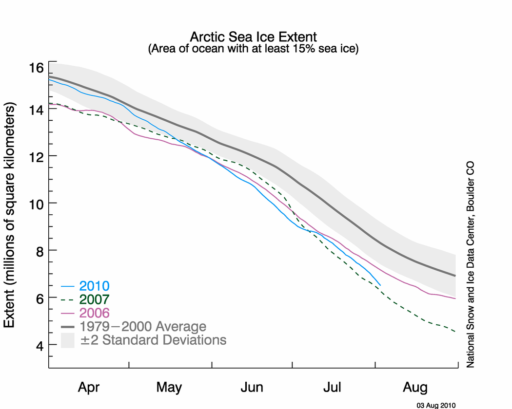
NSIDC published their sea ice news yesterday, and this one is definitely worth a read. Yesterday I pointed out that the graph below seems to be inconsistent with other data, including NSIDC maps.

http://nsidc.org/images/arcticseaicenews/20100804_Figure2.png
The problem is that the 2010 curve appears too close to 2007. Other data sources have the spread much larger, and NSIDC’s own maps show a larger spread. The area of green below represents regions of ice present in 2010, but not present in 2007. As of today, NSIDC maps show 10% more ice in 2010 than the same date in 2007.

Walt Meier from NSIDC responded with this remark :
4. Our sea ice maps are not an equal area projection. Thus one cannot compare extents by counting grid cells – this is probably the reason for the 7.5% vs. 3% discrepancy. Steve has been alerted to this issue in the past, but seems to have forgotten it.
What Dr. Meier seems to have forgotten is that pixels further from the pole in a polar map projection represent larger areas. Thus a correction would slightly increase the discrepancy, not decrease it. Sadly, DMI stopped updating their graphs two days ago – so I am no longer able top do comparisons between DMI 30% concentration and NSIDC 15% concentration. Their most recent graph shows 2010 well above 2007, and close to 2006.

Another data source – JAXA. The gap between 2010 and 2007 has been decreasing in NSIDC 15% concentration data, but has been increasing in JAXA 15% concentration data.


———————————————————————————————————————-
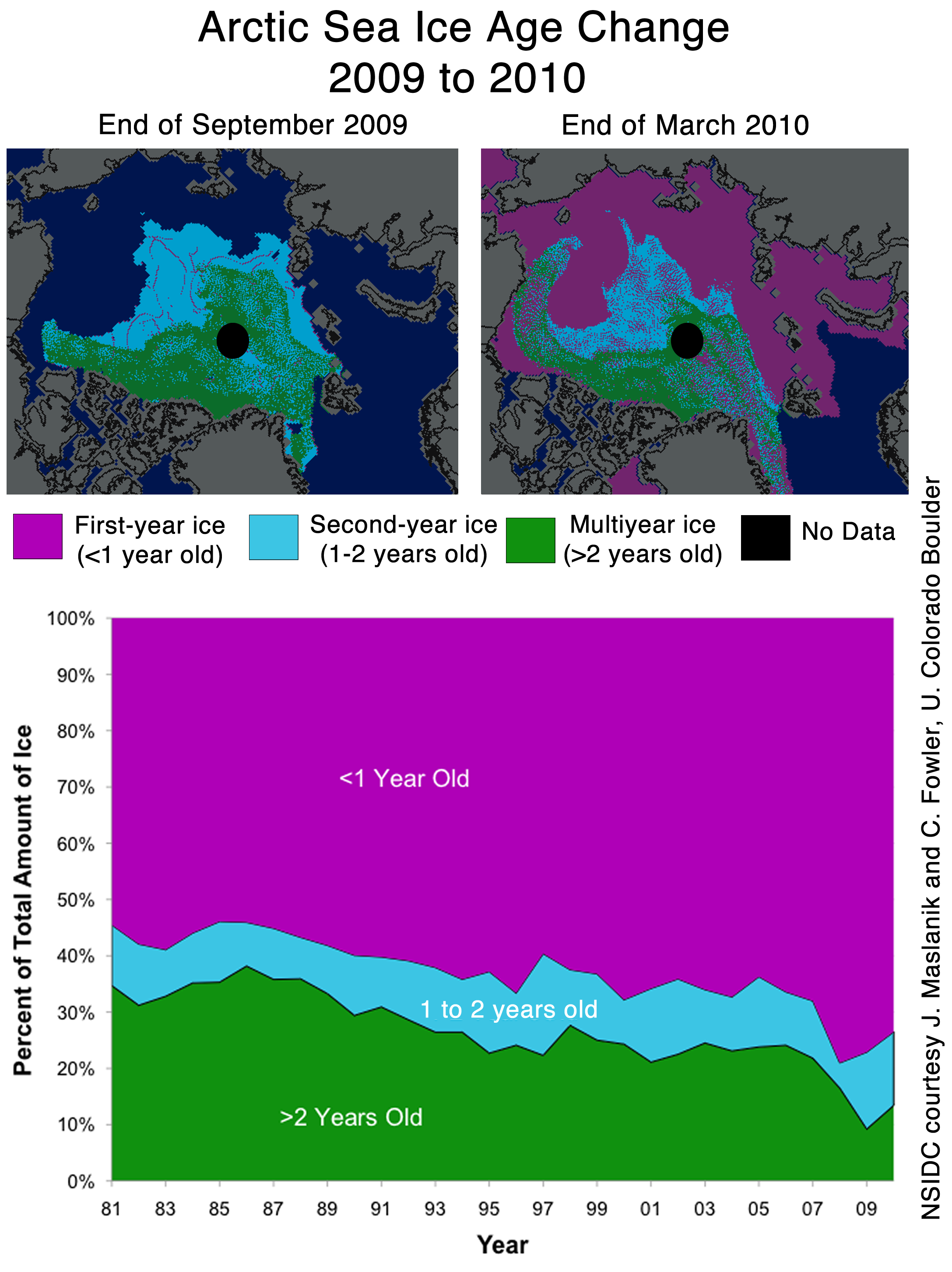
The next item which caught my attention is the discussion of multi-year ice.
Older, thicker ice melting in the southern Beaufort Sea
This past winter’s negative phase of the Arctic Oscillation transported old ice (four, five, and more years old) from an area north of the Canadian Archipelago. The ice was flushed southwards and westward into the Beaufort and Chukchi seas, as noted in our April post. Ice age data show that back in the 1970s and 1980s, old ice drifting into the Beaufort Sea would generally survive the summer melt season. However, the old, thick ice that moved into this region is now beginning to melt out, which could further deplete the Arctic’s remaining store of old, thick ice. The loss of thick ice has been implicated as a major cause of the very low September sea ice minima observed in recent years.
The blink comparator below shows the changes in multi-year ice between the end of March and the end of July.

The multi-year ice has largely survived the summer so far. Pixel counts show that ice greater than two years old has dropped by 11%, and ice between one and two years old has dropped by 4%. (These numbers are slightly low because of the distortion described above.) Most of the ice lost has probably been transported out the Fram Straight near Greenland, rather than melted in situ. The ice in the Beaufort Sea has split and moved north and west.
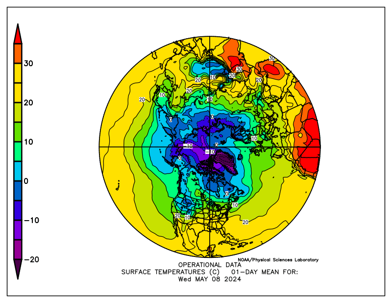
What about the future? The remaining multi-year ice in the Beaufort Sea is largely contained in areas which have dropped below freezing, and are forecast to remain below freezing for the next two weeks. The image below blinks between multi-year ice and current temperatures. Blue indicates below freezing temperatures.

The NCEP forecast below shows freezing temperatures over the ice for most of the remainder of the Arctic summer.

http://wxmaps.org/pix/temp2.html
It appears that the vast majority of the multi-year ice will survive this summer – just as it did in the 1970s and 1980s. The language in the NSIDC article seems to indicate that something fundamental has changed. I don’t see much evidence of that. In fact, given the large amount of 1-2 year old ice, we should see an increase in the amount of MYI next year.
Ice age data show that back in the 1970s and 1980s, old ice drifting into the Beaufort Sea would generally survive the summer melt season. However, the old, thick ice that moved into this region is now beginning to melt out, which could further deplete the Arctic’s remaining store of old, thick ice. The loss of thick ice has been implicated as a major cause of the very low September sea ice minima observed in recent years.
And no mention of the record high ice extent in Antarctica.

http://nsidc.org/data/seaice_index/images/s_plot_hires.png
I have alerted Dr. Meier to most of these issues by E-mail.
Keep ’em honest, Steve. Thanks!
I don’t think temperatures of around freezing above the surface of the ice (in summer) are the most important. I think that what goes on below the ice gets the upper hand in summer. It melts away from below.
Just a hunch.
Did he return any of your inquiries?
I’ll admit to not having as much time as some out there but if there is one thing I’ve noticed with alarmist papers and reports, is that in many cases the conclusion in the text is not well supported by the data presented. Unfortunately it seems scientific opinion is considered just as valuable these days as raw numbers. Dark days for science….
Billy Liar
Please propose a physical mechanism whereby the water heats underneath compact ice.
At least they can’t claim the NWP opened up.
Same post as before until Dr. Meier answers:
Also quite misleading is Fig. 1 Part1 of ice age distribution: 1985 jumping to 2008, 2009 and 2010. Over the past 3 years the variability of distribution is quite significant. Therefore juxtaposing a snapshot at 1985 out of context, without showing the variability then simply occult the processes that lead to yearly transformation of the Arctic ice.
Let’s notice also that the multiyear ice on these images is considered 5y + and not 20y or 50y. Therefore, if Arctic ice was so stable in the past, where has 50y ice gone Dr. Meier? It is likely it has been melted and recycled in an ever dynamic Arctic. Thus presenting 1985 as a supposed representation of the Arctic Ice of the past -i.e. stable- and the evolution since as a abnormal situation -i.e. AGW induced changes- is misleading at best.
Steve is wrong, pixels away from the North Pole represent smaller area than pixels at the North Pole. This is because the area is displayed larger whilst the pixel density is constant, thus less area per pixel. However, the difference is small and I would not think should account for the difference between 3% and 7.5%.
When your mandate is to give nothing but an alarmist perspective, you give nothing but an alarmist perspective, right or wrong!
Eric Flesch
Pixels near the pole are perpendicular to the “camera” – so are seen as their correct area. As you move towards the equator, the earth curves away, each pixel area covers a much larger area of the earth’s surface.
So pixels further from the pole represent have to be weighted more than pixels near the pole.
David Davidovics
I have always found NSIDC personnel to be extremely responsive and helpful.
As much as I appreciate and enjoy your postings Steve, lots BTW, I think your analysis and logic give succour to your opponents whose expertise at dissembling and distortion, necessitated by their need to survive, has been endlessly honed.
Numbers matter, that’s indisputable, but when the numbers that matter have been massaged and mutated beyond recognition, they become meaningless. Noise has become signal and belief trumps observation when facts threaten pre-determined agenda.
You, utilising scientific methods of transparency and disclosure, lie open to critique and accusations of error by your critics who cheerfully quote chapter and verse to prove you wrong. These same critics shout foul when historic, non unprecedented, examples are proferred. Previous low-ice states, admiralty records, sub-mariner snapshots are either ignored or dubbed as forgeries.
They ignore our ascent from the LIA and claim that that climb is ill-portuned unprecedented and
proof that what has proven good for Man is planet killing.
In all good faith I love what you’ve done but I suspect that your approach wooshes over most peoples heads.
Keep the analysis but prefix it with a simple strap-line such as “we’ve been there before folks”
Excuse me for being direct.
stevengoddard says:
August 5, 2010 at 6:37 pm
Billy Liar
Please propose a physical mechanism whereby the water heats underneath compact ice.
In the same way that air moves over the surface, (warm) currents move underneath the ice?
See p472 of N N Zubov’s seminal 1943 work ‘Arctic Ice’.
http://www.archive.org/details/arcticice00zubo
Billy Liar
The Arctic Ocean is stratified. There is a thick layer of cold water underneath the ice, which does not mix with the warmer water below. If it did, there wouldn’t be any ice in the Arctic.
RoyFOMR
I am well aware of how some people distort what I write, but the cool thing about the Arctic is that September is only a few weeks away.
Ultimately the visible satellite imagery will decide who is correct.
stevengoddard says:
August 5, 2010 at 6:37 pm
Billy Liar
Please propose a physical mechanism whereby the water heats underneath compact ice
steve, ever been in a mine shaft under ground? is it warm or cold?
Why is it everyone assumes it is cold water on the bottom of the ocean?
Is the center of the earth frozen? or molten?
just saying ……
Tim L:
As I understand Steve, he is saying that the stratification (or cold layer beneath the ice) protects the ice from the heat you are referring to – or for that matter warm water pulsing through from the Atlantic for instance (at least mostly).
It is getting so I don’t know who to believe anymore. Everyone’s data is so conflicted. DMI shows good 30% concentration. Ice area looks good. It’s just a mess, really.
I completely agree with your assessment that the NSIDC graph does not correlate with the map, and appears to under represent the actual ice extent. Glad you wrote a piece to point out the obvious.
Why the splitting hairs over pixel size and the fixation with 2007 as a single point of reference? Take a look at the big picture: 2010 is well below the ’79-2000 average. Its called ‘climate’, not ‘weather’ for a reason … the long period behavior (average over several years, trends) is the message.
It is interesting that NSIDC sea ice extent data was acceptable back in early July when levels were heading slightly back towards average, now that is no longer the case, there are suggestions something is wrong with NSIDC methodology.
Steve, you seem to be assuming that the NSIDC polar map is as a photo taken directly above the North Pole at an infinite distance, so that longitudes are displayed as shorter away from the pole. I would assume it to be a polar projection with static longitude scale, i.e., if it was extended to the equator, the equatorial lands would be far too large. If my reading is right, you are weighting the pixels in the wrong direction, thus doubling the error beyond if you did not weight them at all. That would indeed account for the gap from 3% to 7.5%, so I suspect this is what is happening.
Billy Liar says:
August 5, 2010 at 6:21 pm
I don’t think temperatures of around freezing above the surface of the ice (in summer) are the most important. I think that what goes on below the ice gets the upper hand in summer. It melts away from below.
Just a hunch.
_________________________________________________________
If I am reading the map correctly it looks like there is not much heat left in the sea to do much melting either. Unfortunately the graphs are anomalies and not direct temp.
Arctic Oscillation:
http://www.cpc.noaa.gov/products/precip/CWlink/daily_ao_index/ao.sprd2.gif
The North Atlantic is not exactly in a warming mode either:
http://www.cpc.ncep.noaa.gov/data/teledoc/nao.timeseries.gif
stevengoddard says:
August 5, 2010 at 7:29 pm
RoyFOMR
I am well aware of how some people distort what I write, but the cool thing about the Arctic is that September is only a few weeks away.
Ultimately the visible satellite imagery will decide who is correct.
________________________________________________________________
Unless of course the satellite imagery goes off line until after November 15………
Mark says:
August 5, 2010 at 6:51 pm
When your mandate is to give nothing but an alarmist perspective, you give nothing but an alarmist perspective, right or wrong!
Alternatively, when your mandate is to give nothing but an anti-warmist perspective, you give nothing but an anti-warmist perspective, right or wrong.
The skeptic questions, the anti-warmist accuses.
latitude says:
August 5, 2010 at 6:37 pm
At least they can’t claim the NWP opened up.
Someone will. After an icebreaker goes through they’ll start talking about how boats can make it through in 2010.
Mark says:
August 5, 2010 at 6:51 pm
When your mandate is to give nothing but an alarmist perspective, you give nothing but an alarmist perspective, right or wrong!
I’ve seen government employees do such when the government does that mandating.
Tim L says:
August 5, 2010 at 7:30 pm
stevengoddard says:
August 5, 2010 at 6:37 pm
Billy Liar
Please propose a physical mechanism whereby the water heats underneath compact ice
steve, ever been in a mine shaft under ground? is it warm or cold?
Why is it everyone assumes it is cold water on the bottom of the ocean?
Is the center of the earth frozen? or molten?
just saying ……
_______________________________________________________
Because cold water is more dense and it sinks. And also because it has been measured. http://www-argo.ucsd.edu/
“…What is Argo?
Argo is a global array of 3,000 free-drifting profiling floats that measures the temperature and salinity of the upper 2000 m of the ocean. This allows, for the first time, continuous monitoring of the temperature, salinity, and velocity of the upper ocean, with all data being relayed and made publicly available within hours after collection….”
However if you are talking the temperatures around the ring of fire or “plates” all bets are off.
http://oceanservice.noaa.gov/education/yos/multimedia/oceanexplorer.noaa.gov/oceanexplorer.noaa.gov/explorations/06fire/background/chemistry/media/eifuku_champagnebubbles.html
Page down for some really great photos:
http://www.barking-moonbat.com/index.php/weblog/more_bothersome_volcanoes/
muographer says:
August 5, 2010 at 7:49 pm
Why the splitting hairs over pixel size and the fixation with 2007 as a single point of reference? Take a look at the big picture: 2010 is well below the ’79-2000
That is far from the big picture.
It is unfair to compare a year of data (2010) to a time period that began when Arctic ice was larger from the 1945 to 1976 cooling in the earth. To get a true picture of climate we should see what climate has done for 1000, or more. It was much warmer on earth 1000 years ago than 1945-1976. So you should compare present data to that 1000 year time period, not to a cool time on earth that made Arctic ice larger than it has been over the last 10 years.
The reason total ice is smaller now is because there was a warming trend from 1977 to 1998 caused by a PDO (+). It’s very important in science to strive to be absolutely fair.
jcrabb says:
August 5, 2010 at 7:57 pm
It is interesting that NSIDC sea ice extent data was acceptable back in early July
Would you cite why you are able to say that?
muographer writes:
“Why the splitting hairs over pixel size and the fixation with 2007 as a single point of reference? Take a look at the big picture: 2010 is well below the ’79-2000 average. Its called ‘climate’, not ‘weather’ for a reason … the long period behavior (average over several years, trends) is the message.”
In a contest between fact and trend, fact wins every time.
Marge says:
August 5, 2010 at 8:17 pm
Alternatively, when your mandate is to give nothing but an anti-warmist perspective
There are people in this comment thread who have been given this mandate? Or is there a better word than mandate, did you mean something other than mandate?
Slight correction: “Fram Strait”, not “Fram Straight”.
IanM
Marge says:
August 5, 2010 at 8:17 pm
Alternatively, when your mandate is to give nothing but an anti-warmist perspective, you give nothing but an anti-warmist perspective, right or wrong.
The skeptic questions, the anti-warmist accuses.
Alternately, when your are nothing but a warmist harp seal, you give nothing but harps and always wrong!
Harp on warmists!
A better map than using an equal area map (polar projection) would be to use Bucky Fuller’s Dymaxion AirOcean Map (http://en.wikipedia.org/wiki/Dymaxion_map). This is the only map that I know of that has the least amount distortion for the shape of the landmasses If one of the panels is centered on the North Pole it is very easy to calculate the areal extent of the sea ice.
muographer says:
August 5, 2010 at 7:49 pm
Why the splitting hairs over pixel size and the fixation with 2007 as a single point of reference? Take a look at the big picture: 2010 is well below the ’79-2000 average. Its called ‘climate’, not ‘weather’ for a reason … the long period behavior (average over several years, trends) is the message.
_________________________________________________________
Fine then look at the WHOLE Holocene:
Greenland Ice Core graph – 10,000 years:
http://jonova.s3.amazonaws.com/graphs/lappi/gisp-last-10000-new.png
And then couple it with this:
Temperature and precipitation history of the Arctic
“..Solar energy reached a summer maximum (9% higher than at present) ca 11 ka ago and has been decreasing since then, primarily in response to the precession of the equinoxes. The extra energy elevated early Holocene summer temperatures throughout the Arctic 1-3° C above 20th century averages, enough to completely melt many small glaciers throughout the Arctic, although the Greenland Ice Sheet was only slightly smaller than at present… As summer solar energy decreased in the second half of the Holocene, glaciers reestablished or advanced, sea ice expanded, and the flow of warm Atlantic water into the Arctic Ocean diminished. Late Holocene cooling reached its nadir during the Little Ice Age (about 1250-1850 AD), when sun-blocking volcanic eruptions and perhaps other causes added to the orbital cooling, allowing most Arctic glaciers to reach their maximum Holocene extent…”
You might also want to read:
Lesson from the past: present insolation minimum holds potential for glacial inception (2007)
The 20th century the sun has been very active according to this paper and NASA But as we enter the new century according to the Solar Dynamics Observatory Mission News that no longer holds true.
If I were you I would be petitioning Congress to emit as much CO2 as possible!
Does anyone know where the rotten ice is that Dave Barber spoke about and was going to melt away in a hurry?
Amino Acids in Meteorites says:
August 5, 2010 at 8:21 pm
Mark says:
August 5, 2010 at 6:51 pm
When your mandate is to give nothing but an alarmist perspective, you give nothing but an alarmist perspective, right or wrong!
I’ve seen government employees do such when the government does that mandating.
_____________________________________________________
If you are a scientist and your employer – corporate or government – tells you to lie, you lie or you quit. Those or your only two options in the USA unless you are a certified Professional Engineer.
That is straight from the lawyer I consulted on a case of certificate falsification…. I quit.
CNN reports that Canadian and British marine archaeologists have discovered HMS Investigator in Mercy Bay, Aulavik National Park. Apparently this ship set sail in 1850 to find sister ships which sailed in 1845. Their position suggests they have navigated through most of the Northwest Passage. What is the implication for sea ice extent in 1850, if these ships reached so far west within the Northwest passage?
muographer says:
August 5, 2010 at 7:49 pm
Why the splitting hairs over pixel size and the fixation with 2007 as a single point of reference? Take a look at the big picture: 2010 is well below the ’79-2000 average. Its called ‘climate’, not ‘weather’ for a reason … the long period behavior (average over several years, trends) is the message.
Tell me how, even in a recovering arctic ice pack, you could have expected any of the years immediately following 2007 to get close to the 79′-2000 average. Thats simply an absurd proposition and that it hasnt does not prove that a long term downward trend leading to the 2007 loss has continued beyond that point.
Your entire argument is disingenuous. 2007 and the years leading up to it, for whatever reasons, changed the rules through extensive loss of multi-year ice. 2007 began with a lot more multi-year ice than 2008, 2009 and 2010 so the result for 2008 to 2010 must be seen in that context. What would the minimums have been in 2008 to 2010 if they had started wth the same amount of multi-year ice as 2006 did (or as 1979 even)?
Measuring 2008-2010 against the long term average loses some context in this case. Weather conditions that might have had very little impact on a “normal” arctic ice pack will see different results through the course of a melt season on an ice pack that has lost much of its multi-year ice.
For some time we will see only modest increases in the minimum extent due to the lack of multi-year ice and probably still some years that it falls. But I certainly haven’t seen anything in the past 3 years to indicate things are getting worse. Rather there are indications that the ice pack is gradually starting to recover.
BTW looking at current JAXA data, I’m still with Steven on a September minimum of close to 5.5 million sq km which would be 250,000 sq km above the 2009 result. Perhaps more if DMI temp data is right and the temps drop below zero in the Arctic basin within the next week (as they did in 2006).
stevengoddard says:
August 5, 2010 at 7:25 pm
Billy Liar
The Arctic Ocean is stratified. There is a thick layer of cold water underneath the ice, which does not mix with the warmer water below. If it did, there wouldn’t be any ice in the Arctic.
———–Reply:
So you’re saying the cold, dense, heavy water stays in the upper level, while the warm, expansive, lighter water stays in the lower levels? And both are moving subject to tides and earth’s rotation yet stay in equilibrium? Does not your model defy that common force called gravity? All it takes is one small vertical perterbation, and the two horizons start to trade places. After that, there’s no stopping them. Admittedly I have no data to support my idea yet logic can be a magnificient, overpowering force.
In terms of the stratification of temperatures in the Arctic, this is the cross-section across the whole Arctic produced by the US Navy (Aug 1, 2000).
The temperatures are around -2.0C for the first 100M or so. If the ice is only 2 or 3 metres thick, the temperature below this is really just above the melting point of salty ocean water so would be -1.9C for example. Remember the least dense form of ocean water is frozen sea ice, it will always float, and then the next least dense water will be the warmest layer of water available. After that, the colder the water, as long as it stays above the transitional freezing temperature, will be the most dense and will sink to the bottom (or more accurately the temperature profile will reflect the density).
So below 100M, the temperature then rises to reach a peak of about 0.6C or so and this goes down to about 1000M. Below that, it gets colder and the coldest water is roughly at the bottom at 4000M, and is about -0.8C (Antarctic waters are similar but they don’t get above 0.0C in the warm 100M to 1000M layer).
There is a seasonality trend as well where the whole profile gets just slightly colder in the winter months. This cold dense -0.8C water will seek out the lowest levels possible and thus will actually flow out of the Arctic (and Antarctica) wherever the geography of the ocean bottom allows it and will become the deepest water in the deep oceans. (This also means the deep ocean will not really warm up until there is no sea ice anymore).
http://a.imageshack.us/img62/7945/arcticdeepoceantemp.gif
Steve Goddard,
You want a physical mechanism to explain how warm water gets under ice? Ever hear of ocean currents? El Nino will cause arctic sea ice to melt. If ENSO is changing to La Nina soon, or has already, then I expect we will see much larger ice extent in 2011.
RockyRoad
The Arctic Ocean is stratified with layers of different densities due to the amount of dissolved salts. The more dense water stays near the bottom, and the less dense water stays near the top.
Gail Combs says:
“Because cold water is more dense and it sinks. …….”
Water is most dense at around 278K. As it cools towards the feezing point it becomes less dense and tends to rise. So in terms of artic water, cold water is less dense and its the warmer water that sinks.
Eric Flesch says:
August 5, 2010 at 6:50 pm
The phenomenon of limb foreshortening is well understood, being practiced daily by those who measure sunspot area.
eg: g 2010 08 04 14 27 32 11093 15 137 23 222 10.35 353.40
where sunspot 11093 was near the limb (foreshortened) and was measured in appearance as 15 Umbra and 137 whole spot.
Upon correction for foreshortening, the umbra was calculated at 23 and whole spot at 222 (if seen from directly above, which it was not).
Therefore, the same pixel that represents X area at the north pole is going to represent much greater area as the radius from the pole increases, while the image is centered above the pole.
A simple empirical experiment with a sphere and a marking pen will suffice to drive the point home.
I don’t think anyone is “lying.”
We all are subject to conformational bias though, aren’t we?
I have seen little discussion of the relationship between the Beaufort Gyre and the 2007 record Arctic sea ice minimum. It seems possible that the record ice loss was connected to a breakdown in the Beaufort Gyre – whether an anomaly or something that is a 30/40/50 year cycle remains little known. It takes approximately 4 years for ice normally to circulate completely in the Beaufort Gyre – and the map above of multiyear ice suggests that the Beaufort Gyre is well along in reestablishing multiyear ice on its circumference – and will complete the cycle in 2011. Once that occurs, it would seem probable that the enclosed area within the gyre will see a resurgence of multiyear ice, as well.
The area per pixel should be easy to resolve.
NSIDC, at http://nsidc.org/cgi-bin/get_metadata.pl?id=nsidc-0081 , describes the dataset as “gridded onto a polar stereographic grid…These data are stored as one-byte flat scaled binary arrays with one byte per pixel, at a resolution of 25 km.”
Per http://en.wikipedia.org/wiki/Stereographic_projection#Properties ,
“Stereographic projection is conformal, meaning that it preserves the angles at which curves cross each other (see figures). On the other hand, stereographic projection does not preserve area; in general, the area of a region of the sphere does not equal the area of its projection onto the plane. The area element is given in (X, Y) coordinates by
dA = 4 / ((1 + X^2 + Y^2)^2) * dX * dY.
Along the unit circle, where X^2 + Y^2 = 1, there is no infinitesimal distortion of area. Near (0, 0) areas are distorted by a factor of 4, and near infinity areas are distorted by arbitrarily small factors.”
It should be noted that “the unit circle” is the equator. Considering that pixels are spaced at 25 km, the distance from the pole to the equator, approx. 10000 km, should be 400 pixels. So the X and Y in the area equation above should be (horiz. distance in pixels)/400 & (vert. distance in pixels)/400.
If the above stereographic is correct, then Eric Fleisch is incorrect when he states that “pixels away from the North Pole represent smaller area than pixels at the North Pole.” From the dA equation above, area per pixel decreases as one departs from the map center (North Pole in this case).
To estimate the amount of area distortion, I’ll take a stab that the leftmost extent of the ice — that is, near Yukon/Alaska — is perhaps 100 pixels from the center, or at the coordinates (X= -1/4, Y=0). From the dA equation, the area per pixel there is about 89% of the polar value. Pixels closer to the pole will be in between the 89% and 100% limits. Referring back at the map at http://wattsupwiththat.com/2010/08/04/discrepancies-in-sea-ice-measurements/ , the green and red areas are at fairly similar distances from the pole, so at first glance I wouldn’t think that the difference between accounting for pixels with the accurate formula, vs. assigning equal areas per pixels, would be terribly significant. But it’s certainly within mathematical possibility that it can provide the difference between 103% and 107.5%. It seems a recount (with non-equal-area accounting) is called for.
Can someone — possibly Steve or Dr. Meier — confirm these calculations?
Steven Goddard:
“Billy Liar
Please propose a physical mechanism whereby the water heats underneath compact ice.”
Apparently you haven’t figured out that liquid ocean water is WARMER than ice. The NATURAL FLOW OF HEAT is from warmer to colder. That is, water HEATS ICE!!! The current continually brings water from outside the area against the edges of the ice and underneath, or, are you going to deny than ANY ice melts every year??
Come on man, get REAL!!
stevengoddard says:
August 5, 2010 at 6:37 pm
Billy Liar
Please propose a physical mechanism whereby the water heats underneath compact ice
REPLY: Steve, some have suggested undersea volcanoes as a potential source of heat beneath Arctic ice. NSIDC published their opinion on this a while back:
http://nsidc.org/arcticseaicenews/faq.html#volcanoes
….I find it unlikely, but wouldn’t mind seeing some data on this from another source! Some credible scientists have mentioned sub-polar geological forces in past posts and
papers.
Steve, you seem to be assuming that the NSIDC polar map is as a photo taken directly above the North Pole at an infinite distance, so that longitudes are displayed as shorter away from the pole. I would assume it to be a polar projection with static longitude scale, i.e., if it was extended to the equator, the equatorial lands would be far too large.
Even if you are right, that does not explain the discrepancy. At 75°a polar projection with static longitude scale will only introduce a small error (cos (15°) = 0.966). The difference noted is far greater. Those running NSIDC can presumably do elementary trigonometry and should not be using this as an excuse.
It doesn’t make any difference what projection is used. All of the ice is close to the pole, and any error introduced by the projection is probably less than the measurement error of the ice – which is the real issue. The pixel aspect ratio argument is just a distraction.
NSIDC predictions and analysis true or false? In less than one month the actual facts will be known, the minimum is near now and all the projections and predictions and models will be tested by actual reality.
Who will be right and who will be proven wrong, who was accurate and who was guided by ideology. NOAA has a north pole cam taking pictures and they used to have an external temperature reading which has disappeared, the website although still alarmist in nature seems to have been edited and information that was available at the start of the melt season is no longer there(can anyone confirm?).
I do not believe that NOAA and NSIDC would stoop as low as to deceive and lie and cheat, yes they might garnish the truth and allow themselves to view reality through the lens of their beliefs but outright fraud? I think not.
However, IF their corporate predictions are proven to be wildly inaccurate and misleading then as with the UK met office their reputation will take a battering, a battering which will take some time to repair. I find it hard to believe that the NSIDC would throw away their reputation by fiddling a graph which may be proven wrong in such a short time.
I don’t know how much time stevengoddard has spent with sea ice but I can assure you that ice forms from the top down and melts from the bottom up.
Unfrozen water contains energy until it freezes. That energy moves toward colder areas melting the ice above, When the energy lost to the colder atmosphere above exceeds the energy from below more ice forms. That is the way water to ice and ice to water works on any body of liquid water. pg
rbateman
A photograph of the earth taken from above the north pole at a long distance away would approximate the distortion as 1/sin(latitude.)
At 75N, the distortion would be only 3%. At 30N, the distortion would be 200%. At 1N the distortion would be 5700%.
Well, to answer my own damn question about sub-Arctic volcanoes:
http://wattsupwiththat.com/2008/06/25/surprise-explosive-volcanic-eruption-under-the-arctic-ice-found/
I KNEW I had read about this on some authoritative site or another! Thanks, Anthony!
My apologies to Eric Flesch — I misspelled his name on my previous post.
P.G. Sharrow
Why do you think Julienne refers frequently to surface melt ponds seen in the Modis imagery?
JAXA shows 2010 10% higher than 2007. The same number I measure from NSIDC maps.
So what’s up with the NSIDC graph?
There have been several comments about stratification and temperature. One needs to remember that the vast bulk of the water in the oceans is indeed very cold. Except for the surface waters in the Arctic and Antarctic regions rthe coldest water in the oceans generally is at the bottom. What warm water there is is generally a thin surficial skin.
The water at the base of the ocean is not just cold (mostly below 3 deg c) but is also rather dense (i.e. very salty and this means significantly more salty than the the rest of the ocean).
The very cold temperature and high density/salinity of the deepest water in the oceans is controlled by surface processes in areas where the surface of the sea freezes during winter. When the surface freezes the ice has low salinity, i.e. it rejects most of the salt. So the water touching the ice must accept the salt that is rejected by the freezing process. Because there is so much salt in the water next to newly formed sea ice it is not only very dense, but also very cold. The greater the salinity the colder the freezing temperature of the water. So the water can get to about -2.2 deg C or so before it freezes under a cover of floating sea ice. As this water accumulates it sinks to the ocean floor. The sinking of this ultra cold high-salinity water helps to drive the deep level circulation patterns of the global ocean. These processes are well known and have been mapped out in detail going back over 10’s of thousands of years.
There is plenty of scientific literature on the stratification of water in the oceans which you can find if your interest levels are sufficiently high. If you do so you will find that there is not much truely warm water beneath the Actic Ice. Its only the surface skin (a few tens of metres over much of the oceans) that carries much heat and not much of the surface skin makes it into the Arctic Basin.
rbateman says:
August 5, 2010 at 9:20 pm
Eric Flesch says:
August 5, 2010 at 6:50 pm
The phenomenon of limb foreshortening is well understood, being practiced daily by those who measure sunspot area.
eg: g 2010 08 04 14 27 32 11093 15 137 23 222 10.35 353.40
where sunspot 11093 was near the limb (foreshortened) and was measured in appearance as 15 Umbra and 137 whole spot.
Upon correction for foreshortening, the umbra was calculated at 23 and whole spot at 222 (if seen from directly above, which it was not).
Therefore, the same pixel that represents X area at the north pole is going to represent much greater area as the radius from the pole increases, while the image is centered above the pole.
A simple empirical experiment with a sphere and a marking pen will suffice to drive the point home.
==============================
Repeated here for effect.
HaroldW says: [If the above stereographic is correct, then Eric Fleisch is incorrect when he states that “pixels away from the North Pole represent smaller area than pixels at the North Pole.” From the dA equation above, area per pixel decreases as one departs from the map center (North Pole in this case).]
Harold, did you mean to say “correct” instead of “incorrect”, as your second sentence agrees with my quote in your first sentence. This is like the King of Hearts (in Alice in Wonderland) who said “That’s very important!” and was immediately corrected by his advisor: “Unimportant, your majesty means, of course!”, with which the King readily agreed and was then seen to be tapping on his fingers whilst mumbling “important … unimportant … important … unimportant”, etc.
Major lakes “turn over” annually, including the Great Lakes. Any reason that this behavior is not also represented in the relatively confined waters of the Arctic? Any Argo data available to confirm or deny? Is “upwelling” the oceanic equivalent of “turnover”?
stevengoddard says:
August 5, 2010 at 9:20 pm
I don’t think anyone is “lying.”
We all are subject to conformational bias though, aren’t we?
===================================
Well said and very apropos.
To err is human…..
Chris
Norfolk, VA, USA
RockyRoad says:
So you’re saying the cold, dense, heavy water stays in the upper level, while the warm, expansive, lighter water stays in the lower levels? And both are moving subject to tides and earth’s rotation yet stay in equilibrium? Does not your model defy that common force called gravity? All it takes is one small vertical perterbation, and the two horizons start to trade places. After that, there’s no stopping them. Admittedly I have no data to support my idea yet logic can be a magnificient, overpowering force.
Water under 4 deg C becomes LESS dense as it approaches 0 deg C, sea water with it’s high salinity goes a few deg below 0 before freezing, as well. This means that the LIGHTER coldest water will naturally float on top, near the ice.
Billy Liar says:
August 5, 2010 at 6:21 pm
I don’t think temperatures of around freezing above the surface of the ice (in summer) are the most important. I think that what goes on below the ice gets the upper hand in summer. It melts away from below.
Just a hunch.
You’re right, of course.
Don’t listen to people that have no time to read scientific papers:
http://www.see.ed.ac.uk/~shs/Climate%20change/Data%20sources/Perovic%20ice%20cover.pdf
There are autonomous ice mass balance buoys (IMB) – these buoys are equipped with a datalogger, satellite transmitter, barometer, acoustic rangefinders placed above the ice surface and below the ice bottom, and a thermistor string extending from the surface through the snow and ice into the upper ocean. These numerous IMB’s observed rapid bottom melting in the Beaufort Sea in 2007 – in the month
of August, bottom melting averaged 4 cm per day and reached maximum values of 11 cm per day in the last week of August. (As Julienne Stroeve put it in one thread – “sometimes the sea ice just runs out of thickness” – and you get open water. )
Bottom melt is due to the ocean temperature, not the air temperature, or the suns radiation (which does more surface melting than the air temperature). The sun warms up the exposed Arctic water, and the warm water diffuses hundreds of kilometers under the ice pack during the melt season. It’s the cold water that sinks, not the warm water.
Here’s another scientific paper analyzing ice mass balance buoy data:
http://adsabs.harvard.edu/abs/2008AGUFM.U13C0074P
Results during the summer of 2008 showed considerable spatial variability in the amount of surface and bottom melt. In the vicinity of the North Pole the amounts of surface and bottom ablation were comparable to values observed in recent years. Modest (less than 0.5 m total) amounts of melting were observed north of Greenland. Melting in the Southern Beaufort Sea was quite large, with 0.85 m of surface melt and more than 1 m of bottom melt. Reduced ice concentration in this region led to a buildup of solar heat in the upper ocean. This absorbedsolar heat was released gradually and also through abrupt episodes when peak bottom melt rates exceeded several cm per day.
This is why large areas of water are opening up in and north of the Beaufort Sea, for example:
http://img844.imageshack.us/img844/9859/arclatestlarge201008050.png
and why large areas of the Arctic will continue melting over the next 6 weeks, regardless of “cold air temperatures”.
I’ve also looked at the saltiness issue. It doesn’t make much difference at all, there is no stratification according to salt content, it is all close enough to the same that it makes little difference. Temperature is, by far, the dominant factor.
Ocean water is going to have a minimum salt content and, after a certain threshold is reached, it no longer becomes an issue. There are larger differentials where fresh water is strongly flowing into the ocean as in the Amazon outflow, but other than this particular area, saltiness does not have to be taken into account.
Anu,
As usual, you forgot to use my complete quote : “Please propose a physical mechanism whereby the water heats underneath compact ice.”
When the ice is very compact (as it is this summer) it is difficult for the water below it to warm – because no sunlight reaches the water.
And don’t confuse surface meltwater with open ocean. Use satellite imagery instead of error prone microwave reflections to get a clear picture.
There is no longer a large Antarctic area/extent
http://arctic.atmos.uiuc.edu/cryosphere/IMAGES/seaice.recent.antarctic.png
Also, I wonder if the northern route on the NW passage will be open this year?
http://ice-glaces.ec.gc.ca/Ice_Can/CMMBCTCA.gif
Andy
Eric Flesch says:
August 5, 2010 at 10:01 pm
I can see this is going to be difficult for you.
What you see on the map at 75N is apparent area when looking down at the Pole.
It’s precise area is greater than what is shown.
If you apply correction to decrease the area, you have committed an error.
If the correction applied by NSIDC is to decrease the apparent area, then the correction is wrong.
That would account for a 7% discrepancy at that (75N) latitude.
Eric Flesch says:
August 5, 2010 at 8:02 pm
Steve, you seem to be assuming that the NSIDC polar map is as a photo taken directly above the North Pole at an infinite distance, so that longitudes are displayed as shorter away from the pole. I would assume it to be a polar projection with static longitude scale, i.e., if it was extended to the equator, the equatorial lands would be far too large. If my reading is right, you are weighting the pixels in the wrong direction, thus doubling the error beyond if you did not weight them at all. That would indeed account for the gap from 3% to 7.5%, so I suspect this is what is happening.
—–
I was not sure of NSIDC’s map and whether it was the same as the map in the post, so I compared the one in the post to the NSIDC map found on the Sea Ice Page by overlaying and aligning them on Photoshop and they are essentially the same. (I assume that Steve is using this NSIDC map for his pixel counting.) Next, I compared the NSIDC map to Google earth by carrying a print screen of the approximate Google Earth center axis that matches the presentation axis of the earth for the NSIDC map (it isn’t the earth’s axis) and overlaid the NSIDC map. The coastlines pretty much matched up.
Now, with earth in the same orientation in Google as the NSIDC, I measured the distance between latitudes using the ruler tool and no matter which two I chose, whether from 90 to 85 through 55 to 50, I was essentially given the same distance — approx 345 miles.
From this, it’s pretty certain that a pixel nearest the axis of the NSIDC map is going to represent a smaller — and more accurate — area of the earth than a pixel at the furthest reaches of the map. Now I can probably investigate further and determine a a table of adjustment factors for pixels counted between certain latitudinal intervals to adjust for the fact the NSIDC map is not equal projection, as NSIDC stated, but I’d have to brush up with books I haven’t used in 35 years, so suffice it to say a pixel at the furthest reaches from the presentation axis of the earth used on the NSIDC map represent a larger portion of the earth’s surface than ones next to the axis.
If my original assumption is correct, I’d also note that I’ve seen, over time, many comments arguing the area differences based on the earth’s axis as the general starting point reference for accurate representation of area. This is not applicable with NSIDC, since the earth’s axis is not their map center so the pixels nearer, say, the Chukchi Sea is further out of proportion by an axis shift of at least 700 miles or about 10 degrees of latitude.
This increasing area representation might be better understood if one envisions a globe of the earth with a sheet of paper with a grid of pixels perpendicular to any axis of the globe you choose. The area of the earth each pixel represents is defined by extending the rectangle vertically down to where it intersects the globe. As you move away from the axis on the paper the area represented by each pixel increases.
AndyW
Temperatures have turned very cold over the Northwest Passage region. Don’t look for much melt there any time soon.
AndyW says:
August 5, 2010 at 10:55 pm
Better have a 2nd look at that graphic of Antarctic Sea Ice Anomaly.
The average is the brown number. The present measurement is the blue number.
The present measurement is greater than the average, or positive.
The red number is the positive anomaly reading, currently rising once again at 0.893M km2.
From looking at the geometry of the projection, my conclusion is that the stereographic projection causes areas away from the poles to appear larger than they really are. The projection causes both distances between parallels and distances along parallels to be plotted longer than on the original sphere. Therefore I’d say that pixels far from the pole cover a smaller area than pixels near the pole.
stevengoddard says:
“Pixels near the pole are perpendicular to the “camera” – so are seen as their correct area. As you move towards the equator, the earth curves away, each pixel area covers a much larger area of the earth’s surface.
So pixels further from the pole represent have to be weighted more than pixels near the pole.”
Here is a link to the projection used for the NSIDC sea ice data:
http://nsidc.org/data/polar_stereo/ps_grids.html
It’s a polar stereographic projection. The projection plane they use is 70 degrees latitude- not the pole!
That means there is no area distortion at 70 degrees. North of 70, areas are compressed (so each pixel covers a bigger area than actual). South of 70, areas are expanded (so each pixel covers a smaller area than actual).
Depending on the exact shape of the ice, and the relative proportions of ice above and below 70 degrees, counting pixels can give you very different results for the exact same ice area.
Dr. M is correct- Counting pixels just does not work.
Eric Flesch (August 5, 2010 at 10:01 pm)
Eric, that’s the second apology I owe you tonight. You’re absolutely correct, again. [I suspect that sentence came out wrong because I originally wrote the sentence about Steve Goddard’s claim contrasting it to yours, and then changed it because the sentence had become too tortuous — rather like this one.] I just messed up, no two ways about it.
And I think you’re being quite magnanimous in comparing me to royalty. Correct — incorrect — correct — incorrect — which sounds better?
(aside) Moderator, any chance of editing my post at 9:22 — striking out “Fleisch” and “incorrect”, replacing them with “Flesch” and “correct” resp.? If you can, thanks.
Chris V
Everyone counts one form of pixels or another – and in fact NSIDC teaches image pixel counting to their students. Pixel distortion is not the cause of the discrepancy.
REPLY: Pixel counting is used in many areas of science where imaging is involved. For example to estimate biomass:
A chromaticity-based technique for estimation of above-ground plant biomass
Tomasel, F.G.1,3*Paruelo, J.M.2,3Abras, G.4Ballarín, V.4Moler, E.4
1Departamento de Física, Facultad de Ingeniería, Universidad National de Mar del Plata, Juan B. Justo 4302, 7600 Mar del Plata, Argentina; 2IFEVA and Cátedra de Ecología, Facultad de Agronomía, Universidad de Buenos Aires, Av. San Martín 4453, 1417 Buenos Aires, Argentina 3Research Scientist of the Consejo National de Investigaciones Científicas y Técnicas (CONICET) 4Departamento de Ingeniería Electrónica, Facultad de Ingeniería, Universidad National de Mar del Plata, Juan B. Justo 4302, 7600 Mar del Plata, Argentina
ABSTRACT
Abstract. This paper presents a new and simple technique to derive quantitative estimates of green or dry biomass using colour information from digital pictures. This pixel-counting technique is based on the association of particular plant material with a representative region on a two-dimensional colour space, and applies to cases of non-overlapping canopies. The efficacy of the method is demonstrated using sets of samples obtained from both field and laboratory studies. It is shown that application of the proposed approach results in a highly linear relationship between pixel count and foliar area for both green and non-green material [r = 0.99 (p < 0.001)]. Analysis of images from a short-grass steppe shows a high correlation between pixel count and measured values of green biomass [r = 0.95 (p < 0.001)]. The method outlined here allows for a substantial improvement in the speed of sample evaluation to estimate biomass both in the field and in the laboratory. It also provides a non-destructive alternative to monitor plant cover and biomass in open canopies.
================
Weather Forecasting System Based on Satellite Imageries Using Neuro-fuzzy Techniques
(3) The Institute of Systems Science, National University of Singapore, 25 Heng Mui Keng Terrace, 119615 Singapore
Abstract
We have built an automated Satellite Images Forecasting System with Neuro-Fuzzy techniques. Firstly, Subtractive Clustering is applied on to a satellite image to extract the locations of the clouds. This is followed by Fuzzy C-Means Clustering which operates on the next satellite image, seeded with the cloud clusters of the previous image. With the matching of cloud clusters across successive images, cloud cluster velocities are deduced. Using a Generalized Regression Neural Network, we interpolate the cloud cluster velocities over the whole area of interest. Finally, the linear forecasting scheme then moves each cloud pixel in that satellite image according to the velocities of the past hour.
============
Navigation-related structural change in the hippocampi of taxi drivers
Image Analysis Method 2: Pixel Counting.
The three-dimensional images from the 16 taxi drivers and a precisely age-matched sample of 16 normal controls taken from the 50 used in the VBM analysis were submitted for region-of-interest-based volumetric measurement of both hippocampi by using a well established pixel-counting technique (12, 13).
======================
In all cases, the imager provided numeric data that became an image, the image was then pixel counted. It is no different with a satellite data image. Pixel counting is an accepted technique in many areas of science, engineering, and even in manufacturing product quality control. – Anthony
Chris V: excellent find of the website. The germane point is not that 70N is their projection plane — that just twiddles the distortion. No, the germane point is their “SSM/I Polar Spatial Coverage Maps” which shows that they do indeed use static longitude scale, i.e. the displayed distance between latitudes is the same, for all latitudes. Thus Steve’s premise that the map corresponded to a bird’s eye of the North Pole from infinity is wrong, and he has been adjusting in the wrong direction, as I previously described.
There is a lot more ice in 2010 than 2007. Period.
http://climateinsiders.files.wordpress.com/2010/08/nsidcaugust032010vs2007.png
stevengoddard-
If you want to count pixels to determine areas, you have go back to the equations for the map projection, and then apply an adjustment to each pixel depending on it’s longitude.
Sorry, but there’s no way around this.
I have no idea how much error your method produces, but until you do the math, you don’t know either.
Walt Meier from NSIDC responded with this remark : 4. Our sea ice maps are not an equal area projection. Thus one cannot compare extents by counting grid cells – this is probably the reason for the 7.5% vs. 3% discrepancy. Steve has been alerted to this issue in the past, but seems to have forgotten it.What Dr. Meier seems to have forgotten is that pixels further from the pole in a polar map projection represent larger areas. Thus a correction would slightly increase the discrepancy, not decrease it.
If the first map isn’t equal area, then it must be a gnomic projection, in which case pixels <grammar> farther </grammar> from the pole would represent smaller, not larger areas. This is much the way equator-centered Mercator projections make Greenland look so large. I don’t know that Dr Meier is right about it not being an equal area projection, though.
stevengoddard-
My criticism is not against pixel counting per se; it’s just not appropriate for what you’re using it for here.
To put it another way, the scale varies significantly across the NSIDC map- increasing away from the pole. Just changing the shape of the ice will give you different areas when calculated using the pixels.
Eric Flesch-
I have a bit of a map fetish…
“Sadly, DMI stopped updating their graphs two days ago – so I am no longer able top do comparisons between DMI 30% concentration and NSIDC 15% concentration” – I sent a mail to DMI this morning, asking for the reason why their 2010-plot hasn’t been updated since 3. August(?) No reply yet.
[snip]
[reply] Too much attribution of motive. Try a rewrite. RT-mod
NSIDC data is in a polar stereographic projection…it is true 25km around 70 latitude
It’s always like this when Climatologists or Meteorologists start talking about Cartography. An ice extent map on a non-equal area projection is completely useless. Polar projections can be whatever you wish them to be, the choice of central point is unrelated to the distortion. An azimuthal projection with central point on the North Pole will only exhibit the effect described by Anthony if it is a Stereographic or Gnomonic projection; Equidistant, Equal-Area or Orthographic projections will produce the exactly opposite effect.
Mathematical Cartography should feature heavily on any Climate or Meteorology superior course.
Anthony –
Nobody’s arguing against pixel counting – however, one must be sure to do the pixel counting accurately, while keeping units in mind.
In essence, Steve is reporting a 7% difference in the counts of square pixels. But he’s comparing this with the difference from the NSIDC plot which is in square km. So if he were to accurately convert square pixels to square km (not a 1:1 conversion), he will likely find the percent differences from the area projection and NSIDC plot will be much closer.
Sorry – wrote this too early in the morning. Second paragraph, first sentence in my last post should read: ‘In essence, Steve is reporting a 7% difference in the counts of square pixels compared to the number of square km.’
Clearly a comparison of apples to oranges.
Isn’t it the water temps that really count?
AFAIK, icesheets melt from the bottom up, rather than from top down.
Do we have a reliable reading of the actual water temperatures in said areas, and can we compare them to the water temps there in former years?
There would appear to be a case to suggest that your measurers from Boulder are required to show some difficulties ahead.
I use the word ‘required’ with care………….
Don’t know if this has been mentioned yet, but at the bottom of the NSIDC August 4th update is a link to the July SEAC update;
“The July Outlook for arctic sea ice extent in September 2010 shows some notable adjustments from the June Outlook, with both downward and upward revisions from last month.
Downward revisions reflect in part rapid ice loss observed during June together with the presence of the Arctic Dipole Anomaly (DA), which promotes clear skies, warm air temperatures, and winds that push ice away from coastal areas and encourages melt. Upward revisions reflect the slowdown of ice loss during the first two weeks of July and a change in atmospheric conditions to cooler, cloudier weather.
The July 2010 Sea Ice Outlook Report is based on a synthesis of 17 individual pan-Arctic estimates using a wide range of methods: statistical, numerical models, comparison with observations and rates of ice loss, composites of several approaches. Two contributors to the outlook represent “public” contributions.
Including all contributors, the individual Outlook values for September 2010 range from 1.0 to 5.6 million square kilometers, with a mean of 4.6 +/- 1.10 million square kilometers. Excluding the outlier of 1.0 million square kilometers by one of the public contributors gives a range of 4.0 to 5.7 million square kilometers, with a mean of 4.8 +/- 0.62 million square kilometers. This is below the 2009 minimum of 5.4 million square kilometers and just slightly above the 2008 minimum of 4.7 million square kilometers. Only three of the Outlook contributions give a value equal to or above the long-term linear trend line (5.6 and 5.7 million square kilometers, respectively). All of the estimates remain significantly below the 1979-2007 average of 6.7 million square kilometers, and six estimates indicate a new record minimum.
The spread of Outlook contributions suggests about a 29% chance of reaching a new September sea ice minimum in 2010 and only an 18% chance of an extent greater than the 2009 minimum (or a return to the long-term trend for summer sea ice loss). 53% of the Outlook contributions suggest the September minimum will remain below 5 million square kilometers, representing a continued trend of declining sea ice extent.”
http://www.arcus.org/search/seaiceoutlook/2010/july
If you look at the Cryosphere today maps in the WUWT sea ice pages the comparison between the 22/7/07 and 22/7/10 maps clearly show that the 7/10 ice extent is far greater. When one looks at the 03/08/10 picture nothing much seems to have changed in two weeks other then a bit of thinning. The pixel count issue is a red herring since the variances from year to year occur at roughly the same latitude. These pictures certainly seem to match the DMI graph.
Something fundamental has changed.
http://wattsupwiththat.com/2010/06/01/the-ice-who-came-in-from-the-cold/
The strong annual signal that Willis noted.
As we both agreed, if real, the NULL hypothesis is challenged.
DMI graph updated again, tracking 2009 trend.
http://ocean.dmi.dk/arctic/icecover.uk.php
“And no mention of the record high ice extent in Antarctica.”
Why should they? These people have an agenda. The media hardly ever reports of the ‘loss’ in the Arctic then balances it with record ice extent in Antarctica, i.e. nothing to shout about. Globa sea ice is unchanged over the past 30 years. Yet we get manufactured alarm about something that has happened numerous times in the past.
Looks like DMi has updated.
A question for Dr Meier: WHY are your sea ice extent maps not equal area? Doesn’t extent = area?
stevengoddard says:
August 5, 2010 at 9:17 pm
“The Arctic Ocean is stratified with layers of different densities due to the amount of dissolved salts. The more dense water stays near the bottom, and the less dense water stays near the top.”
That’s quite correct, but consider, how do the salinity differences arise? From the freezing and melting of ice.
Warm salt water passes under the ice, melting some of it. This simultaneously cools the water (which would make it sink) and dilutes it (which keeps it afloat despite the cooling). This “melting” continues until the temperature of this water layer is -2C. I put “melting” in quotes because the ice is only truly melting so long as the temperature is above 0C; between 0C and -2C it is dissolving into the solution. Thus you are correct in implying that a layer of cold water insulates the ice from the warmer layers, and that these layers mix only weakly. However, in order for this mechanism to function at all, some melting of the ice must take place. It ameliorates the melting from underneath. It does not eliminate it.
If the depth of the chemocline is ~100m, as an earlier poster suggested, then the sea water could melt the equivalent of ~4m of ice from underneath in its passage across the arctic (100m*latent heat/specific heat). That 100m seems rather deep to me, and the linked gif would seem to suggest a figure less than 50m, though on the other hand the gradation of temperature below would imply that there is also a fair bit of mixing and the chemocline is not a hard boundary. Either way, this mechanism has the capacity to remove several metres of ice, which is far from trivial.
This is the 5th Arctic post this week, though one was about James Hansen’s Arctic temps and not ice. Close to 700 comments altogether. I suppose if you thought Arctic ice wasn’t worth blogging about you would see by now that people are paying attention to global warming predictions, Arctic ice being one of them.
Maybe the next hot topic after minimum is reached will be how far into negative anomaly will temperatures go from the La Nina.
Sorry, that equation should be 100m*2C*specific heat/latent heat (=100*2*4000/200,000=4).
Eric Flesch:
Here’s a projection with scale shown, which appears to match the NSIDC map.
http://www.arctic.ac.uk/images/polar_projection.jpg
Which I think means that your are correct regarding the direction of the distortion.
“Looks like DMi has updated” – indeed. I was informed a couple of hours ago by DMI (Gorm Dybkjær who was previously (favo[u]rably) mentioned here?) that a minor technical ‘glitch’ had been corrected this morning.
steveta_uk says:
August 6, 2010 at 3:49 am
Here’s a projection with scale shown, which appears to match the NSIDC map.
http://www.arctic.ac.uk/images/polar_projection.jpg
__________________________________________________________-
That is a great map to compare to this one
http://www.heritage.nf.ca/exploration/vmap.html
“[A] Late 16th century world map based on Icelandic writings.
This map by Sigurd Stefánsson, a schoolmaster who taught at Skálholt, dates from the 1500s. The western hemisphere place names were derived from information contained in old Icelandic writings. Although the original map has not survived, this reproduction was published in 1706 by Torfæus from ‘Gronlandia Antiqua.'”
The pixel distortion argument is nothing but a distraction and a diversion. The effect is minor at high latitudes and does not account for the large discrepancy. Something else is going on.
If the data from satellites passing over the Arctic is capable of misinterpretation to the extent under discussion here, then how can we rely on the temperature data produced by satellites to measure the warming or otherwise of the surface of Earth?
If the State servants who propound alarmist conclusions have egos as large as some who post so eloquently here, then I suspect the whole gamut might well be described as much ado about nothing.
However, many pleasant hours can be spent here monitoring the ebb and flow of argument earnestly and politely put forward, on all the topics that Anthony choses to feed us.
Angels and pinheads anyone?
Has anyone revised the 1979-2000 average?, could you get an older average?
rbateman said:
August 5, 2010 at 11:01 pm
“Better have a 2nd look at that graphic of Antarctic Sea Ice Anomaly.
The average is the brown number. The present measurement is the blue number.
The present measurement is greater than the average, or positive.
The red number is the positive anomaly reading, currently rising once again at 0.893M km2”
———
I know it is still positive but it has halved recently, I fully expect it to be near normal again around or just after maxima and the melt season starts.
Andy
Steve,
How do you know that – have you calculated it? You may want to brush up on your geometry if you think correction for a geographic projection is not important in a comparison. If you’re not willing to do it, send me your pixel data (lat/long) and I’ll calculate it. By my estimation, the scale factor of pixels at 70 degrees latitude is 3%. There’s your difference right there!
Or you can read about it yourself: http://nsidc.org/data/polar_stereo/ps_grids.html, keeping in mind that:
map scale factor = ( 1 + sinΦ_0 ) / ( 1 + sinΦ )
where Φ_0 is the map projection latitude, and Φ is the latitude of interest.
“Daily Updated Time series of Arctic sea ice area and extent derived from SSMI data provided by NERSC” uses 15%. Their charts don’t appear to agree with NSIDC and they are using a 12 month vs 5 month time frame.
http://arctic-roos.org/observations/satellite-data/sea-ice/ice-area-and-extent-in-arctic
Matt
Look at the map. There is a lot more ice in 2010 than there was in 2007.
http://climateinsiders.files.wordpress.com/2010/08/nsidcaugust032010vs2007.png?w=510&h=344&h=344
Specifically, ice is covering large areas of the East Siberian Sea which were not covered in 2007. This is not rocket science.
No, but this is science. If you want to claim that there’s something wrong or dishonest about the 3% difference in NSIDC ice extents, you’re going to have to do better than telling me to ‘look at the map and eyeball it.’
I have a question, as I am not knowledgeable in this area at all, although I don’t believe in man-made global warming, I try to look at both sides. I do however get confused. I went to accuweather and there is a man who runs a blog on global warming. I will link his article below on this topic. Does your points dispute anything that they say? I do thank you for your time.
http://www.accuweather.com/blogs/climatechange/story/34647/expert-opinion-on-arctic-sea-i-1.asp
Matt
If you believe that pixel distortion is significant, feel free to do the math. You are the one who is concerned about it.
Matt
Has it occurred to you that your 3% distortion is going in the wrong direction? Pixels at 70N would be weighted heavier than pixels at 90N.
We have already been through this entire discussion on other recent threads, and I don’t have any inclination to repeat it here.
Arctic-ROOS, Jaxa, DMI, and the actual extent maps all agree there is significantly more ice in 2010 than 2007 (on the order of 10%). The NSIDC graph is the outlier amongst all the rest of the data, so clearly it is not a “pixel” argument or “you can’t just tell us to eyeball it”. Its pretty obvious there is a solid consensus amongst all the data with the one lone exception being the NSIDC graph.
However, if you look at today’s NSIDC graph, it appears to be diverging from 2007 again, though still closer than the other data sources.
Sean says:
August 6, 2010 at 8:39 am
Sean, your reference is to studies that just happened to coincide with a warm area of the Arctic this past winter (west coast of Greenland). I don’t think you can use it to understand the entire Arctic. This has been born out by the fact that the melting has not been anything out of the ordinary so far.
Thanks Richard M. Much appreciated.
Steve,
You’re the one complaining that the NSIDC plots are different than your analysis of the map – so the onus is on you to demonstrate that. If you’re not going to compare them correctly, then I’m going to keep being skeptical of your results.
And you’re wrong about the pixel count. The actual number of square meters will be larger than the calculated number of pixels. The ‘scale factor’ equation I used applies like this: Δprojected = scale_factor × Δearth
I’ll walk you through this: Using the equation I posted before, @ 70N I get a scale_factor of 1.03. So 1 projected length unit = 1.03 earth length units. Now lets say for the sake of argument that 1 pixel at the pole equals 1 km^2. So from this relationship, for a pixel at 70N, we get 1 pixel = 1.07 km^2.
So lets pretend all the difference of ice occurs at 70N, and you find a difference of 100 pixels. The equivalent loss in m^2 is therefore 107 km^2, or a larger number than you originally estimated.
Steve, you aren’t using their raw data, you’re using a processed data product as input.
The bigger distortions probably come from the manipulation that they do to get the raw data onto pixels on that projection. Yes, their data is manipulated in that image. You’ve caught the fact that anyone taking raw data and creating a graphical projection of it like that inherently manipulates the data.
Pixel counting images like this is a stupid trick to try to impress the masses.
Matt-
Your calculation re the scale factor is correct.
There is a table of the scale factors for the stereographic projection in here (pg 172):
http://pubs.er.usgs.gov/djvu/PP/PP_1395.pdf
Matt
The excess ice in 2010 is (of course) at lower latitudes. So any correction would increase the weighting of those pixels and therefore increase the difference between 2010 and 2007.
Matt,
We went through all of this yesterday. You are not presenting any new information or ideas.
stevengoddard says:
August 5, 2010 at 10:37 pm
“Anu,
As usual, you forgot to use my complete quote : “Please propose a physical mechanism whereby the water heats underneath compact ice.”
When the ice is very compact (as it is this summer) it is difficult for the water below it to warm – because no sunlight reaches the water. “
This factoid is one of the reasons that it is so difficult to predict the final outcome of sea ice extent at the end of the melt season. A period of strong winds tends to facilitate the fracturing of the edges of the sheet, while clouds tend to prevent the sea warming. There are too many non-linear processes at work to enable accurate prediction even just a few weeks before the next re-freeze.
Chris V – Good find!
Steve –
Lower as in closer to the equator? I don’t think there’s much ice lower than 70N.
Here’s some other values for you:
Latitude Scale Factor
90N = 1
85N = 1.00
80N = 1.01
75N = 1.02
70N = 1.03
65N = 1.05
60N = 1.07
etc
So if the ice was indeed at lower latitude, you’d be overestimating NSIDC’s ice extents even more with your pixel counts. The way I make it, most of the ice lost is between 70-80N. So you’re still looking at your pixel counts overestimating NSIDC’s extents by between 2-7%.
Steve –
So if you were pointed out to be wrong yesterday, why are you still continuing to make posts claiming NSIDC is wrong.
Matt,
Given that the 2007 ice was centered around the pole, the excess ice in 2010 has to be at lower latitudes. You can see this clearly in the imagery.
http://climateinsiders.files.wordpress.com/2010/08/nsidcaugust032010vs2007.png?w=510&h=344&h=344
If I did apply the correction which you think is so important, it would increase the gap between 2010 and 2007, not decrease it.
Matt
You are going to believe what you want to believe.
I can see that logic is not relevant. Please don’t start a discussion about mathematics if you don’t intend to complete it.
Steve, NSIDC never really did answer the question did they?
Several posters on this thread have mentioned heat from below, which is mostly radioactive decay. Please allow me to add numbers to this assertion. The planetary thermal gradient is about 25C per kilometer depth in the crust. But the quantity of heat (not temperature) is low. Heat from the bottom of the sea is roughly 0.1 W/m2, which is about 1/10,000 the amount of heat from solar insolation.
Heat from below is tiny, even at the poles where solar insolation is small.
MattN
Walt Meier is travelling, and tells me that they are looking at it. I am sure that they want to get to the bottom of this as much as anyone.
stevengoddard says:
“The excess ice in 2010 is (of course) at lower latitudes. So any correction would increase the weighting of those pixels and therefore increase the difference between 2010 and 2007.”
No- you’ve got it backwards.
Say 1 pixel = 1 km2 at the pole.
With the scale factor (squared, because you’re calculating areas), at 70 degrees, 1.07 pixels = 1 km2. So 1 pixel = .93 km2.
So by assuming all pixels cover the same area (1 km2 in this example), you are OVERESTIMATING ice extent away from the poles, with the amount of overestimation increasing the further away from the poles you get.
Chris V
There is no longitudinal adjustment, because longitudes are not distorted – only latitudes. So nix your squared idea.
Pixels at 75N represent 3% more area than pixels at 90N, so each pixel at 75N gets multiplied by 1.03. This increases the area of ice in 2010 relative to 2007, because there is more ice in 2010 at lower latitudes.
Hope this helps.
Dan in California
Actually, no place on earth receives more summer solar insolation than the poles.
http://earthobservatory.nasa.gov/Features/EnergyBalance/page3.php
Steve, did you forget that you can actually download the area-per-pixel file from NSIDCʻs website and do your own ice extent calculations from the actual sea ice concentration data? Why not do that instead of pixel counting which everyone knows is inaccurate because the data are on a polar stereographic grid?
As previously alluded to by Gilbert K. Arnold, given that the purpose of the NSIDC map is to show ice area, it seems misguided to use a projection that preserves angles rather than area. Why not use a Lambert azimuthal equal area projection?
This posting appears to be another attempt to pretend that the ice is not shrinking in summer. The ice in 2010 did not recover as Steve has predicted all year, and in fact it has continued the amount of ice loss seen the last few years. I do not understand all this effort to try to hide the decline. No one is saying the ice decline is from CO2, but it is happening so it would be so much more informative to focus on the factors of the decline rather than pretending itʻs not happening. These sea ice posts are continually disappointing.
I seriously doubt NSIDC has suddenly changed the way they compute ice extent from the ice concentration data. They are a transparent institution who makes their data and their processing codes available. Steve should have downloaded the data and made his own calculations of ice extent if he was concerned processing recently changed. Counting pixels in a non-equal area grid is just plain wrong.
Steven:
Thanks for the correction. I verified the radioactive decay numbers, but just made an assumption about polar insolation. Heat from below is still tiny.
Dan
As the total Arctic and Antarctic sea ice extent seems to have remained relatively constant for the last 30 years, I wonder if a term describing the interaction between the two regions like “Trans-Arctic Oscillation” might one day enter the lexicon of Meteorology?
“Walt Meier is travelling, and tells me that they are looking at it. I am sure that they want to get to the bottom of this as much as anyone.”
Thanks for the update….
JJB
No method is perfect, but counting pixels is more than adequate for this exercise.
JJB,
Please explain why the NSIDC summer 2010 trend is so different from the JAXA and DMI trends.
The pixel counting discussion is simply a diversion to avoid dealing with the problem at hand.
JJB
I am not sure where you are getting your information from, but my summer 2010 prediction is right on track.
In fact, odds are my prediction will turn out to be too conservative.
Steven –
The reference given above by Chris V (August 6, 2010 at 11:03 am), Map Projections – A Working Manual is unambiguous. Figure 31 (found on PDF page 164, which is p.155 of the document) shows an illustration of the polar stereographic projection method. It can be clearly seen that a region near the equator projects into more pixels than an equal area near the pole. Or in other words, the area represented by a pixel decreases with increasing distance from the pole, that is, with decreasing latitude.
PDF page 172 (document p.163) has a table of the variation of scale factor with latitude, or it can be computed with excellent approximation using a spherical-earth assumption, as varying according to 2/(1 + sin(latitude)), cf. equation 21-7 in the reference.
I’m sorry that this discussion of projection is distracting from the main point of this post, which is the variation between the different estimates/metrics of sea ice extent. But the claim that the NSIDC is in error based on unweighted pixel count doesn’t hold up.
stevengoddard-
No, there is distortion along both latitude and longitude. There has to be- the stereographic projection is CONFORMAL. It preserves angles; the only way to do that is to have distortion in both directions.
And you don’t understand the concept of map scale.
On a stereographic projection, scale INCREASES away from the center of the map (in this case, the pole).
That means that means that the size of a 100 km2 land mass gets BIGGER ON THE MAP as you go from the pole (90 degrees) to 70.
Since it’s bigger ON THE MAP, it covers more pixels.
But the size on the earth of that 100km2 land mass hasn’t changed- it’s still 100km2.
So more pixels cover the same EARTH AREA at 70, compared to the same earth area at the pole.
That means that each individual pixel at 70 covers a SMALLER area ON THE EARTH, so you have to DIVIDE, not multiply, by the scale factor(squared-because we’re talking area) to correct for the distortion.
Here are a couple of good links that have info on map projections and scale:
http://egsc.usgs.gov/isb/pubs/MapProjections/projections.html#stereographic
https://www.e-education.psu.edu/natureofgeoinfo/
HaroldW
We don’t know what projection they are using and it doesn’t make any difference – the error is in the noise regardless of their choice of projection. If they are using a stereographic projection, that makes pixel counting more accurate, not less.
I never made any statements about how NSIDC does their weighting. This argument is a straw man discussion started by someone else. The fact is that NSIDC graphs are inconsistent with JAXA, DMI and their own maps.
HaroldW
Also, your interpretation of that document is incorrect. A projection that is intended to be accurate at 70 degrees is also going to be fairly accurate at 75 degrees. The equator is in the opposite direction.
The ice is at higher latitudes than 70 degrees, not lower latitudes. Comparisons of distortion at the equator are meaningless to this problem.
“In the noise.”
stevengoddard says:
“We don’t know what projection they are using and it doesn’t make any difference”
Yes, we do know- I posted a link earlier to the NSIDC website that shows what projection they use. Polar stereographic on the secant at 70 degrees.
And it does make a difference. There is a reason why there are many dozens of different map projections; you choose the projection to based on what you want to use the map for.
If you want to measure areas accurately over large areas of the earth, you need to use an equal area projection- that’s why they exist. The projection used by NSIDC is not equal area, so you can’t use it to accurately measure areas.
And since you’re talking about differences in ice extent of only a few percent, that accuracy is important.
I have no idea how the Aug 2010 ice extent compares to 2007 (and i really don’t care). But I do know that you can’t measure it accurately by counting pixels on a stereographic projection.
Chris V
There are quite a few different projections they could be using. You are talking about a different projection from what we were talking about earlier.
I’ll send the ball over to your court. Prove to us that the East Siberian Sea has almost no area, which is the necessary corollary of your argument. You are claiming that the green region is distorted. Do the math and report back.
[youtube=http://www.youtube.com/watch?v=kvatHj3T-hA]
Or you can start with the NSIDC maps if you prefer.
http://nsidc.org/data/seaice_index/images/daily_images/N_daily_extent.png
http://nsidc.org/data/seaice_index/images/daily_images/N_record_extent.png
Chris V,
You said “Polar stereographic on the secant at 70 degrees”
You do realize that that the ice is north of 70 degrees?
Suppose for a minute that the argument made by ChrisV is correct. Another corollary would be that the claimed NSIDC ice loss is exaggerated, because it is at lower latitudes. Note that the discrepancy between 2007 and 2010 (green) covers most of the area which NSIDC reports as missing from 2007.
You can’t claim that region is sometimes large and sometimes small, depending on what is convenient for the current argument.
[youtube=http://www.youtube.com/watch?v=kvatHj3T-hA]
Amino Acids in Meteorites says:
August 5, 2010 at 8:31 pm
“It is unfair to compare a year of data (2010) to a time period that began when Arctic ice was larger from the 1945 to 1976 cooling in the earth. To get a true picture of climate we should see what climate has done for 1000, or more. ”
Its been said ‘Climate is what you expect, weather is what you get.’ It doesn’t take 1000 years to define climate. But… if you object to using a single year (2010) as a comparator, stop using 2007 for min ice extent or 1998 for max global temperatures. And stop using the ice extent on a month-by-month basis to draw any inference at all.
Chris V-
Just let it be – Steve clearly doesn’t want to get to the bottom of this. You and I have both linked to the NSIDC site which clearly states which projection they’re using. Steve claimed to me that the ice was at lower latitudes, now he claims its at upper latitudes. He’s just playing games now, and any further facts won’t sway him – his head is firmly buried in the sand.
And no, Steve, that would not be a corollary. NSIDC ice loss is not exaggerated because they aren’t trying to calculate ice loss from a pixel count off a stereographic map. Stop making stuff up.
Matt,
The NSIDC graph shows 2010 almost the same as 2007. Look at the overlay of their maps below. Their graph is simply not credible.
[youtube=http://www.youtube.com/watch?v=kvatHj3T-hA]
Their graph does not agree with DMI or JAXA. How can you continue to ignore this blatantly obvious fact?
Chris V
The ice is at lower latitudes from the pole and higher latitudes than 70N. The discussion of projections has discussed two different types of projections.
If you feel the need to quote half sentences out of context, then your position isn’t very strong, is it?
Sorry, last message was directed at Matt – not Chris V.
I agree with those who say that for a stereographic projection pixels at the pole represent more area than pixels away from the pole; however, I agree with Steve Goddard that it’s probably insignificant. According to the very useful map projection document, the correction factor at 67 degrees is 1.04137. So that’s the maximum adjustment within the Arctic Circle. If the raw pixel count shows 10% more ice than 2007, the adjusted pixel count would be at least 10%/1.04137 = 9.6%. If the raw pixel count shows 7.5% more ice than 2007, the adjusted pixel count would be at least 7.5%/1.04137 = 7.2%.
stevengoddard says:
“There are quite a few different projections they could be using. You are talking about a different projection from what we were talking about earlier. ”
No- I (and Matt, and Harold…) have been talking about the same projection since the beginning the one NSDIC does use. What map projection were you talking about?
“You said “Polar stereographic on the secant at 70 degrees” You do realize that that the ice is north of 70 degrees?”
Yes I do- that doesn’t change how the scale varies across the map. It just means that distortion is smallest at 70. North of 70, areas are reduced, south of 70, expanded. But there is still 6% distortion between the the pole and 70 degrees, and about 2.2% distortion between 75 and 70 degrees.
Your calculated difference was what, 4.5%? The distortion across the map is greater than that.
“You are claiming that the green region is distorted.”
Not a claim- it’s a fact, based on the map projection. Heck- the entire map (like every map) is distorted.
When choosing a map projection, you (should) choose one that distorts the stuff you’re not interested in.
To minimize the distortion, NASA and NSIDC made this polar stereo projection true at 70 degrees rather than at the poles. While this increases the distortion at the poles by six percent, the latitude of 70 degrees was selected so that little or no distortion would occur in the marginal ice zone.
So the maximum distortion at the pole is 6% too small compared to 70°.
The ice we are counting is well within the 70° band, so it is also distorted onto the small side.
Integration quickly reveals that the error in pixel size is very small during high melt, because the area at maximum distortion is the small area round the pole, whereas the areas least distorted are much larger.
(We can see the scale effect by assuming bands of 5°, recalling that the bulk of each band is in the outer half and therefore at less distortion. The area between 90° and 85° will be on average some 5% too small, but is only 1/16th of the area inside 70°. The area between 85° and 80° will be some 3.5% too small, but is only 3/16th of the total area. The area from 80° to 75° will be some 2% too small, and is 5/16th of the area. The area from 75° to 70° is only 0.5% too small and is the 7/16th of the area. That is for over half the area inside 70° the distortion is less than 2%.)
Round up, because the pole isn’t a perfect circle, and some melt is in the region closer to the pole and as we get to 75° the distortion in the centre is proportionally more important. That still gives pixel counting at high melt will introduce an error in the region of 3% too high on the projection given.
It does not explain NDISC’s discrepancy.
Now the NSIDC maps show a leveling off in Sea Ice. I’m going to trust DMI from now on, instead of the NSIDC!
http://nsidc.org/data/seaice_index/images/daily_images/N_stddev_timeseries.png
So, if I understand this correctly, and tried to put it in simple terms… Can someone tell me if the following is correct?
“Polar stereographic on the secant at 70 degrees” means that:
1. everything at the 70 degrees is on a scale of 1-1
2. everything north of 70 degrees would be shrunk (each pixel represents more actual area) by some amount
3. everything south of 70 degrees would be enlarged (each pixel represents less actual area) by some amount
If I have that understood correctly, can someone show on these maps where 70 degrees is? That may help clear up all the confusion.
JJB says:
August 6, 2010 at 12:53 pm
“This posting appears to be another attempt to pretend that the ice is not shrinking in summer. The ice in 2010 did not recover as Steve has predicted all year, and in fact it has continued the amount of ice loss seen the last few years. I do not understand all this effort to try to hide the decline.”
LOL. I think your calling things a little early there.
If we match the ice loss of 2006 for the remainder of the season, this years minimum ice extent will beat 2009 by a good margin. The average melt for the remainder of the season based on JAXA data has been as low as 25,000 sq km per day in some years and as high as 50,000 sq km in others. The years that have higher melt rates late in the season do so because they lost their first year ice later so the higher loss rate is seen late in the season.
This year the first year ice was lost very early early. I dont consider conditions particularly favour rapid loss of multi-year ice this year. I’d be expecting a repeat of 2003 or 2006 ice loss rate for the remainder of the melt season bringing this years result above 2009.
Not bad for the “warmest” year on satellite record with an ice pack that lost a lot of multi-year ice in 2007. In fact, a little mystifying if you believe AGW is destroying the Arctic Ice Pack.
I believe I made a mistake in my previous comment. I thought the correction factors in the table were for area, but they are probably for distance, and must be squared to adjust distances. 1.04237^2 = 1.08445, so the correct results are, I believe, 10%/1.08445 = 9.22%; 7.5/1.08445 = 6.92%.
…squared to adjust areas…
Those who think the map is distorted at lower latitudes should write to NSIDC and tell them that their 2007 ice loss maps exagerated the magnitude of the loss.
Steve, NSIDC takes the sea ice concentration data on the polar stereographic grid and derives the ice extent using the “actual” area per pixel. I certainly wouldn’t publish any numbers assuming a constant 25 sq-km per pixel.
The idea that NSIDC is suddenly manipulating the data to show a steeper decline in the 2010 extent is wrong. If you do the extent calculations accurately (i.e. using the actual area per pixel for each pixel which you can get from NSIDC’s ftp site, together with the sea ice concentration data) you will get the values that we record. Any differences in extent between institutions is a result of using different data sources, different algorithms, different thresholds for ice, different weather filters, etc.
For those interested, you can see the grid projection here:http://nsidc.org/data/polar_stereo/ps_grids.html
Note: To minimize the distortion, NASA and NSIDC made this polar stereo projection true at 70 degrees rather than at the poles. While this increases the distortion at the poles by six percent, the latitude of 70 degrees was selected so that little or no distortion would occur in the marginal ice zone.
And SnowLover, the extent is leveling off again because of ice divergence under the central Arctic low pressure. That in no way implies that earlier ice loss was incorrect.
Steve Goddard says:
“Those who think the map is distorted at lower latitudes should write to NSIDC and tell them that their 2007 ice loss maps exagerated the magnitude of the loss.”
The map they use isn’t designed to be used for calculating ice areas directly.
When NSIDC calculates ice areas, they calculate each pixels individual area, based on the map scale at that point:
“Each pixel’s area is calculated individually, and is obtained by multiplying the nominal pixel size (625 km²) by the square of the map scale at the center of the pixel. Pixel areas range from 382 to 664 square kilometers for the Northern Hemisphere and 443 to 664 square kilometers for the Southern Hemisphere, under the polar stereographic projection and grid used for the input data sets.”
From here: http://nsidc.org/data/docs/noaa/g02135_seaice_index/index.html#doc_info
NSIDC does it the correct way.
Julienne said:
“And SnowLover, the extent is leveling off again because of ice divergence under the central Arctic low pressure. That in no way implies that earlier ice loss was incorrect.”
_______
Julienne,
Question: This divergence I take it pushes the ice a bit outward? Is it in a sense the opposite of compaction? If so, it seems so long as the surrounding water stays warmer than normal, I would posit that we might see the net effect being a bit more net ice melting before the September minimum as the divergence keeps more ice over warmer water for a longer period. Is this even a potential?
JJB says:
August 6, 2010 at 12:53 pm
This posting appears to be another attempt to pretend that the ice is not shrinking in summer.
Really? Wow, that’s wild, man!!
Marge says:
August 5, 2010 at 8:17 pm
Alternatively, when your mandate is to give nothing but an anti-warmist perspective
Amino Acids in Meteorites says:
August 5, 2010 at 8:36 pm “There are people in this comment thread who have been given this mandate?”
I find that at least as plausible as the implication that scientists at NSIDC are mandated to “give an alarmist perspective, right or wrong”.
“Or is there a better word than mandate, did you mean something other than mandate?”
Perhaps you should address that question to Mark.
muographer says:
August 6, 2010 at 3:03 pm
if you object to using a single year (2010) as a comparator, stop using 2007 for min ice extent or 1998 for max global temperatures. And stop using the ice extent on a month-by-month basis to draw any inference at all.
Ok. I wasn’t using them for the things you say anyway.
Marge
There is clearly political momentum for manmade global warming. Manmade global warming, unfortunately, has been pushed by the government for a long time in the US. NSIDC is doing the same. Mark Surreze, head of NSIDC, a government agency, is famous for the ‘death spiral’ quote. Arctic ice is not in a death spiral. The data shows it is not. Either someone is blindly following manmade global warming without seriously questioning it to think it is, or they have an agenda.
……………………………………………………………………………………………………….
Also, would you point out a ‘skeptic’ in this comment thread who you think may have a mandate to be a skeptic.
Marge,
You know, I may be misunderstanding what you are saying.
Looking at the graphs in the Sea Ice Page it’s obvious 2010 won’t surpass 2007. And that is something we really can all agree on……. Right?
Julienne
No one said anything about “manipulating” data.
But there is a large difference in ice extent vs. 2007 which is not reflected in NSIDC graphs, but is seen in the DMI and JAXA graphs.
Julienne Stroeve says:
Steve, NSIDC takes the sea ice concentration data on the polar stereographic grid and derives the ice extent using the “actual” area per pixel. I certainly wouldn’t publish any numbers assuming a constant 25 sq-km per pixel.
Until you quantify the error caused by using raw pixel count instead of area-weighted pixels, I think the discussion will go nowhere. I believe I’ve shown that the low distortion near the poles makes the difference quite small; considerably less than needed to account for the 7.5% vs. 3% discrepancy mentioned by Walt Meier.
R. Gates, yes that certainly is possible, especially given all the open water areas in the interior of the pack. Ice divergence tends to cause more openings within the ice pack as the ice spreads out. Having thin ice also doesn’t help. In 2008 ice loss in August was the fastest recorded during the satellite data record, reflecting the fact that the ice cover started to run out of thickness. The same thing may happen again this August…
Julienne said:
“And SnowLover, the extent is leveling off again because of ice divergence under the central Arctic low pressure. That in no way implies that earlier ice loss was incorrect.”
Please cite where I said that the graph before was incorrect, instead of saying things that I didn’t say.
———
DMI now shows 2010 about to cross 2005.
http://ocean.dmi.dk/arctic/icecover.php
MJW
NSIDC maps currently show a 10% increase since 2007, which agrees closely with JAXA .
The current NSIDC graph shows about 6%. I expect it will come back into line in a couple of days. What bothered me is that the very low graph made it into the NSIDC newsletter. It gave a wrong impression about the state of Arctic ice.
July had the slowest melt in the JAXA record.
Julienne
2008 started the year with “rotten ice” and suffered what Mark Serreze described as the “perfect storm” in early August. As of August 1, 2008, NSIDC was still contemplating the possibility of an almost “normal” minimum.
http://nsidc.org/images/arcticseaicenews/20080801_Figure3.png
R. Gates
I’m sure you have considered the fact that the sun is now getting low in the sky in the Arctic. It will set at the pole in six weeks.
Julienne,
You should stick to your guns.
The 5.5 million forecast which both of us made is probably too conservative. I don’t think it will get that low.
It would no doubt be best, in the best of all possible worlds, if Steve Goddard weighted his pixel counts to correct for the projection distortion. However, as Julienne Stroeve says, “While this increases the distortion at the poles by six percent, the latitude of 70 degrees was selected so that little or no distortion would occur in the marginal ice zone” (my emphasis). The projection effect cannot possibly account for the difference Steve finds, because the gains and losses are almost entirely within the low distortion zone.
stevengoddard says:
August 7, 2010 at 6:41 am
R. Gates
I’m sure you have considered the fact that the sun is now getting low in the sky in the Arctic. It will set at the pole in six weeks.
__________
Steve,
For some reason that seems that happens every year about the same time, so I suppose it had crossed my mind a time or two. Never the less, the melt right now is not being driven by primarily by insolation, but largely by the warmth of the water. Right now, as has been the case for much of the season, SST’s in the Arctic region are running higher than normal:
http://polar.ncep.noaa.gov/sst/ophi/color_anomaly_NPS_ophi0.png
And has been a trend for a number of years:
http://maps.grida.no/go/graphic/arctic-ocean-surface-temperatures
Paul,
Thanks for that. All of the discrepancy lies between 70 and 80N, so there is no reason to believe that pixel distortion has any meaningful effect on the area measurement.
R gates,
SSTs in the East Siberian and Beaufort Seas are running below normal. Those are the critical areas.
http://weather.unisys.com/surface/sst_anom.html
stevengoddard says:
August 7, 2010 at 6:30 am
MJW
July had the slowest melt in the JAXA record.
_______
Steve, why do still insist on equating sea ice extent with total melt? In truth, no one knows what the total melt of Arctic sea ice was in July 2010 (as in the total loss of volume) and we won’t really have a good idea on total melt until CryoSat 2 data starts to come on line. The point being, the sea extent trend is NOT a good gauge of the rate of melt during certain shorter periods, especially when the ice is spreading or diverging from the passage of weather fronts, etc. During these times, the ice is still generally melting just has fast (because much of that melting is coming from the water anyway) and so the total volume is decreasing just as fast, but the divergence makes the sea ice extent not drop so fast, so you get these little bumps. Moreover, the divergence sends more ice over open water leading to a potential acceleration of melt later on.
I think myself and others have spoken to this before, but it seems to be a key point you often miss. Thankfully, with accurate CryoSat 2 data, we might eventually have an accurate total sea ice Volume measurement (not models) and this will be the best guage to see how the ice is actually behaving. These future sea ice volume charts should be far smoother and less prone to the the short term bumps in the sea ice extent that when see when weather systems cross the arctic and cause divergence, even though the sea ice continues to melt at a constant rate during these times driven mainly by heat flux from the water.
Also, in regards to your unisys map for SST’s…I prefer the much higher fidelity and accuracy of the NOAA chart and hold by my statemennt that the majority of Arctic SST’s are warmer than average this year, have been for several months, and have shown a longer term (multi-year) trend of increasing (due mainly of course to more open water for longer periods of time in the summer months).
stevengoddard says:
August 7, 2010 at 9:06 am
R gates,
SSTs in the East Siberian and Beaufort Seas are running below normal. Those are the critical areas.
http://weather.unisys.com/surface/sst_anom.html
________
In addition to the NOAA link provided before, here’s another look at current SST anomalies, which confirm the generally warmer temps in the Arctic regions:
http://iridl.ldeo.columbia.edu/maproom/.Global/.Ocean_Temp/Weekly_Anomaly.html
Of particular interest to me is the large and growing warm body of water in the Easter N. Pacific. This has developed rapidly in the past few weeks, and shows signs of spreading further eastward. It will be interesting to see if it continues to grow and squeezes out and replaces the generally colder water that has been in existence this summer from the Gulf of Alaska south to the California coast. If it does, then the cooler period that the Pacific NW and California coastal areas have seen this summer may be replaced by a warmer than normal fall, which would be in contrast to what one might expect from the La Nina conditions developing in the equatorial regions of the Pacific.
JAXA is taking a turn that is bad news for the rotted/alarming thinning hypothesis. What is happening in the real world has always been bad news for ‘global warming’ because the real world isn’t doing what global warming says it will do.
So, how many are now ready to conclude the rotted/alarming thinning hypothesis is wrong?
Or are going to continue arguing about pixels, and the NW Passage, and warming currents that don’t exist, and frozen or not frozen melt ponds on top of the ice, and if Barrow had an open shore, and DMi accurate cooling data vs. James Hansen’s GISS fudged warming, and if PIPS is really used by the Navy or not, etc., etc., etc.?
MAY DAY! MAY DAY!
It looks like DMi could crash through 2005!
http://ocean.dmi.dk/arctic/plots/icecover/icecover_2010.png
(but maybe not 😉 )
R Gates,
Any place that “normally” has ice cover, but doesn’t this year is of course going to have a positive SST anomaly. That tells you nothing about the water temperature under the remaining ice.
Amino Acids in Meteorites says:
“So, how many are now ready to conclude the rotted/alarming thinning hypothesis is wrong?”
___________
I would suspect that you’d gladly get many a skeptic to take you up on making that conclusion…which means they know nothing about the long term trends or dynamics of sea ice.
The volume data we’ll be able to get from CryoSat 2 can’t get here fast enough…
The projection effect cannot possibly account for the difference Steve finds, because the gains and losses are almost entirely within the low distortion zone.
I’ve been arguing the distortion effect is low, but it certainly is not low for this reason.
Any percentage changes are measured as a percentage of the whole. If the count total for the whole is artificially low – which it is – then the percentage change will be wrong. Even if the area being counted is the part with no distortion.
Rather the effect is low because the portion most distorted – the pole at 6% – is also the area with the least volume.
R Gates
Right now, as has been the case for much of the season, SST’s in the Arctic region are running higher than normal:
And has been a trend for a number of years:
But the last couple of years have seen ice increases in summer!
Whether the long term trend is down or not, the water in the north cannot have been abnormally hot since 2007, or the pole would have entered the famous “death spiral”.
If the waters at the North Pole have been abnormally hot since 2007 then we have a problem, because that is incompatible with the ice cover seen. Either the SST or Ice Cover set of data must be wrong.
R. Gates
Cryosat won’t tell you anything about historical ice thickness. There will be no frame of reference to compare against, but I am sure that won’t stop people from making things up.
Mooloo
What do you get if you divide 6% by 6%?
Ice in 2oo7 and 2010 is identical north of 80N.
R. Gates says:
August 7, 2010 at 2:33
I would suspect that you’d gladly get many a skeptic to take you up on making that conclusion…which means they know nothing about the long term trends or dynamics of sea ice.
Ya, I know, not right now, but 40 years from now…..look out, the global warming monster will come out from under the bed.
By the way R. Gates, should anyone listen to you since your prediction about Arctic ice this year is so bad? You insisted for weeks that there was going to be dramatic ice loss in August. But the data in the shows you are wrong. With that in mind, should we trust your long term predictions when your short term ones are so bad?
Amino Acids in Meteorites says:
August 7, 2010 at 4:51 pm
R. Gates says:
August 7, 2010 at 2:33
I would suspect that you’d gladly get many a skeptic to take you up on making that conclusion…which means they know nothing about the long term trends or dynamics of sea ice.
Ya, I know, not right now, but 40 years from now…..look out, the global warming monster will come out from under the bed.
By the way R. Gates, should anyone listen to you since your prediction about Arctic ice this year is so bad? You insisted for weeks that there was going to be dramatic ice loss in August. But the data in the shows you are wrong. With that in mind, should we trust your long term predictions when your short term ones are so bad?
_________
Amino,
I’ve said since March that the sea ice extent will end up lower than 2008 and 2009, but higher than 2007, which happens to be right where we’re at right now. My comment about a downturn in late July and early August was about the time that Steve was getting all excited by the slowdown in extent decline at the beginning of July. He was claiming that the extent would begin to parallel 2006, and I said not so fast, I think you’ll see if more closely parallel 2007 with a some big drops in late July and into August, which is exactly what we’ve seen. So how is my prediction of ending up lower than 2008 & 2009 but higher than 2007 a “bad prediction”. I guess being right on target so far is the definition of “bad” to you…
Oh well, to each his own.
I don’t see a long term trend of ice loss. I do see a trend of ice loss since 1979. But that is not a long term trend. It is a short term. To just use data from 1979 to 2010 to establish what is normal in Arctic ice is bad science. We cannot establish anything from such a short data set.
But some are doing bad science and are thinking they have established what is normal in Arctic ice from that small data set.
stevengoddard says:
August 7, 2010 at 3:30 pm
R. Gates
Cryosat won’t tell you anything about historical ice thickness. There will be no frame of reference to compare against, but I am sure that won’t stop people from making things up.
_____
You are correct, CryoSat 2 will begin a new area of accurate sea ice volume measurements, and so we’ll need to be aware that anything before this period is extrapolated and prone to higher error rates. Never the less, when we get around to 2015 (by which date I’m forecasting we’ll see a 2.5 million sq. km Arctic sea ice minimum), we’ll also have several years of volume data that we can also use as a guage. So slowly, but surely, the “travesty”of not having accurate data on important climate related areas gets whittled away at…
No, R Gates
you said there was going to be dramatic ice loss in August. But, as I thought would happen, you change what you said now. You revise, as always happens in ‘global warming’. People don’t have to look very far to find your predictions of dramatic ice loss in August.
R. Gates
What possible logic could there be behind your forecast of 2.5 million?
REPLY: Yes, I agree. Even NSIDC thinks there will be at least 4 million, probably 5 million. I had an email exchange with Walt Meier that confirms this. 2.5 million is just unsupportable. – Anthony
stevengoddard says:
August 7, 2010 at 6:45 pm
R. Gates
What possible logic could there be behind your forecast of 2.5 million?
REPLY: Yes, I agree. Even NSIDC thinks there will be at least 4 million, probably 5 million. I had an email exchange with Walt Meier that confirms this. 2.5 million is just unsupportable. – Anthony
________________
I highly respect Walt Meier, and appreciate your private exchange with him, but I stand by my forecast of a 2.5 million sq. km. minimum during some summer by the 2015 Sept. minimum. (I hope no one thought I was talking about this summer, as I’ve never made that forecast). I’m hardly an expert like Walt nor like Julienne, but I’ve got what I feel are very good reasons for my longer range forecast. I’ve stated for many months that I thought the long and deep solar minimum of 2008-2009 had the effect on Arctic Sea ice of merely slowing down and leveling the accelerated decline we saw in 2007, but hardly mounting any sort of recovery. I feel quite strongly that upcoming solar max in 2013, combined with a what I think will be a strong El Nino in 2012-2013, will combine the general global warming trend of the last few decades to push the sea ice down to this level. I also don’t see any let up in warmer Arctic SST’s, and I also see the positive feedback increasing Arctic Dipole events combining with the above mentioned solar and ENSO mentioned events combining to push the sea ice down to the 2.5 million sq. km. range, somewhere in the summer of 2012, 2013, 2014, or 2015. Exactly which year will be subject to the actual weather of those summers, but I have confidence it will happen.
Just as shocked as everyone was initially at the low extent in 2007, I think this new low will be equally shocking (at least for some), but will set the intial stage for an ice free summer Arctic by 2030, though it could linger in a virtually ice free zone (1 million sq. km. minimums) for a period of time in the 2020’s.
Amino Acids in Meteorites says:
August 7, 2010 at 6:12 pm
No, R Gates
you said there was going to be dramatic ice loss in August. But, as I thought would happen, you change what you said now. You revise, as always happens in ‘global warming’. People don’t have to look very far to find your predictions of dramatic ice loss in August.
_____
Shame on you Amino. My forecast has been consistent since March, and after the ice extent loss slowed in early July, and Steve was forecasting that the decline track 2006, I stated that I doubted that and at the end of July and into to August we would see the decline accelerate once more and more closely parallel 2007 but not 2006. This is pretty much what has happened, and currently the ice is below 2008-2009, but above 2007, and certainly no longer looking like 2006, which it only paralleled for a week or so, but had totally different dynamics during that time.
R. Gates
Arctic ice has been tracking a little below 2006, just as I said it would in May and have said several times a week since.
R. Gates
Is it the record cold Arctic temperatures this summer which are convincing you that the ice is doomed?
stevengoddard says:
August 7, 2010 at 9:45 pm
R. Gates
Arctic ice has been tracking a little below 2006, just as I said it would in May and have said several times a week since
_________
So you are still good with your 5.5 million sq. km. minimum extent though, right?
A lot of numbers here and a lot of science but in terms of predictions what I see is Steve at 5.5 and R. Gates at 4.5.
R. Gates: “And BTW, I’ve been rock solid at a 4.5 million sq. km. projection for minimum melt (based on IJIS/JAXA data) for many months (since March actually), and that’s well documented here on WUWT, so please don’t try to put any other words in my mouth or spin what I say.”
Amino Acids in Meteorites says:
August 7, 2010 at 6:09 pm
“I don’t see a long term trend of ice loss. I do see a trend of ice loss since 1979. But that is not a long term trend. It is a short term. To just use data from 1979 to 2010 to establish what is normal in Arctic ice is bad science. We cannot establish anything from such a short data set.”
***
Well some can, how about “Global cooling since 1998”
****
But some are doing bad science and are thinking they have established what is normal in Arctic ice from that small data set.
***
Bad science? Take it up with Dr WHO, borrow his time machine and launch satelites from say 1800? Further back? Your choice and may I suggest using the latest version Cryosat. Let me know when its done, can’t wait to see a few hundred years of arctic ice minimums and maximums. What a trend that will be.
http://wattsupwiththat.com/2010/06/14/wuwt-arctic-sea-ice-news-9/#comment-409584
R. Gates
Have I given any reason to believe that I have changed my forecast?
Mooloo says:
August 7, 2010 at 3:23 pm
“I’ve been arguing the distortion effect is low, but it certainly is not low for this reason.
Any percentage changes are measured as a percentage of the whole. If the count total for the whole is artificially low – which it is – then the percentage change will be wrong. Even if the area being counted is the part with no distortion.
Rather the effect is low because the portion most distorted – the pole at 6% – is also the area with the least volume.”
What you say is true, but slightly misses my point. The distortion effect could certainly introduce a (small) bias into the total. But the inconsistency Steve noted is a difference from one year to another, in both of which the relevant peripheral areas were in this low distortion zone; the central polar area was always filled. So the bias cannot have significantly changed between the two. The discrepancy must be real.
Steve,
I just did some calculations of my own using the binary sea ice data available on the NSIDC website, and from a simple pixel count, I get the same % difference between 03 August 2007 and 2010 as you’ve calculated from the NSIDC timeseries — 3%. Not sure where you’re getting your 7.5% from.
Here’s the numbers I got from a simple pixel count (pixels with concentration > 15%):
2007 = 9578 pixels
2010 = 9895 pixels
I can send the code if anyone wants to verify.
Conclusion: NSIDC plots are correct. There must be an error in Steve’s pixel count.