
Guest post by Dr. Walt Meier
Steve Goddard has written several contributions on sea ice lately, particularly on the PIPS model, and as expected there has been much discussion about sea ice as we’ve entered another summer melt season. I can’t possibly comment on everything, but I will provide some information on a few points. In this post, I’ll tackle the PIPS and PIOMAS model issues.
In a following post, I’ll address the other three issues. I include several peer-reviewed journal references for completeness and to give a sample of the amount of research that has gone into investigating these issues. Note that as usual, I’m speaking only for myself and not as a representative of the National Snow and Ice Data Center or the University of Colorado at Boulder.
PIPS 2.0 and PIOMAS
When I saw PIPS being mentioned, it brought back fond memories for me. I haven’t worked with PIPS recently, but several years ago, I was a visiting scientist at the U.S. National Ice Center (NIC). NIC is a joint Navy, NOAA, and Coast Guard center whose primary duty is to provide operational support for military and civilian ships in and near ice-covered waters.
NIC is the primary customer of the PIPS model outputs, which they’ve used the operational forecasts to help produce their operational ice analyses. As a researcher at NIC, one of the projects I was involved with a project to evaluate the operational forecasts. I was a co-author on a couple peer-reviewed journal articles (Van Woert et al., 2003; Van Woert et al., 2001), where we found that the operational forecasts showed some skill at predicting ice edge conditions over the following 1-5 days, but the forecasts had difficulty during times of rapid ice growth or melt. (Steve referenced one of the papers – thanks Steve!). So I can perhaps clarify and explain some issues about PIPS and its applicability for studying climate and its appropriateness for studying climate compared to PIOMAS. Here are some relevant points:
1. As mentioned above, PIPS is an operational model. It is run to forecast ice conditions over 1-5 day intervals. The basic model physics is the same for any sea ice model – ice grows when it is cold, melts when temperatures are above freezing, and moves around due to winds and other factors. However, model details and how each type of model is implemented and run differ depending on the application. Similarly, climate and weather models include the same basic underlying physics, but you wouldn’t run a climate model to forecast weather or vice versa.
2. Validation of PIPS (see references above) has been done for sea ice extent, concentration, and motion near the ice edge (an important factor in the day-to-day changes in the ice edge). This is because the ice edge is the area of operational interest – i.e., the focus is on providing guidance for ships to avoid getting trapped in the ice. Very little validation was done for ice thickness estimates, particularly in the middle of the ice pack.
PIOMAS has been specifically validated for ice thickness using submarine and satellite data (http://psc.apl.washington.edu/zhang/IDAO/retro.html). Of course, the PIOMAS model estimates are not perfect, but they appear to capture the main features of the ice cover in response to forcings over seasonal and interannual scales.
3. PIPS 2.0 was first implemented in 1996 using model components developed in the 1970s and 1980s. These components capture the general physics of the ice and ocean well, but are basic by today’s standards. This provides suitable simulations of the ice cover, especially for short-term forecasts (which are most sensitive to the quality of the atmospheric forecast that drives the model). There has been a lot of sea ice model development since the 1980s, which according to a recent abstract for a conference presentation at the Joint Canadian Geophysical Union and Canadian Meteorological and Oceanographic Society 2010 Meeting, will be implemented in the next generation PIPS model, PIPS 3.0. However that is not yet being run operationally and thickness fields on the website are from PIPS 2.0. The primary references for PIPS 2.0 are Hibler (1979), Hibler (1980), Thorndike et al. (1980), and Cox (1984).
PIOMAS includes much more up-to-date model components (developed during the late 1990s early 2000s) with significant improvements in how well the model is able to simulate the growth, melt, and motion of the ice cover. In particular, the model do a much better job at realistically moving the ice around the basin and redistributing the thickness (i.e., rafting, ridging) in response to wind forcing. Thus, the thickness fields are likely to be more realistic than PIPS. The primary references for PIOMAS are: Zhang and Rothrock (2003), Zhang and Rothrock (2001), Winton (2000), Zhang and Hibler (1997), Dukowicz and Smith (1994).
4. The PIPS website has very limited information about the model or the model output products; it contains only image files; there are no raw data files, no documentation, no source code, no citation of peer-reviewed journal articles. A few articles can be found online elsewhere, and there are a few journal articles, but overall the information is quite sparse. This isn’t a big issue for PIPS, and I don’t fault those who run the PIPS model, because it has a small, focused user community who are familiar with the model, its characteristics, and its limitations.
The PIOMAS website contains detailed documentation including several peer-reviewed journal articles describing the model; it also contains model outputs, images, animations, and source code. Of course, the amount of documentation doesn’t say anything about the quality of the model outputs. But I think most people today agree that for climate data being widely-distributed and which is being used to make conclusions about climate change, it is a good idea to have data and code freely available.
So, which model results do I trust more? For operational forecasts, I might use PIPS. And PIPS probably does capture some aspects of the longer-term changes. But for the reasons stated above, I would trust the PIOMAS model results more for seasonal and interannual changes in the ice cover. I very much doubt that anyone familiar with the model details would unequivocally trust PIPS over PIOMAS.
But what about the PIOMAS volume anomaly estimates? How can they be showing a record low volume anomaly when there is less of the thinner first-year ice than in previous years as seen in ice age data? Doesn’t this mean that PIOMAS results are way off? Well, first, it is quite possible that the model may currently be underestimating ice thickness. No model is perfect. However, there is a possible explanation for the low volume and the PIOMAS model may largely be correct.
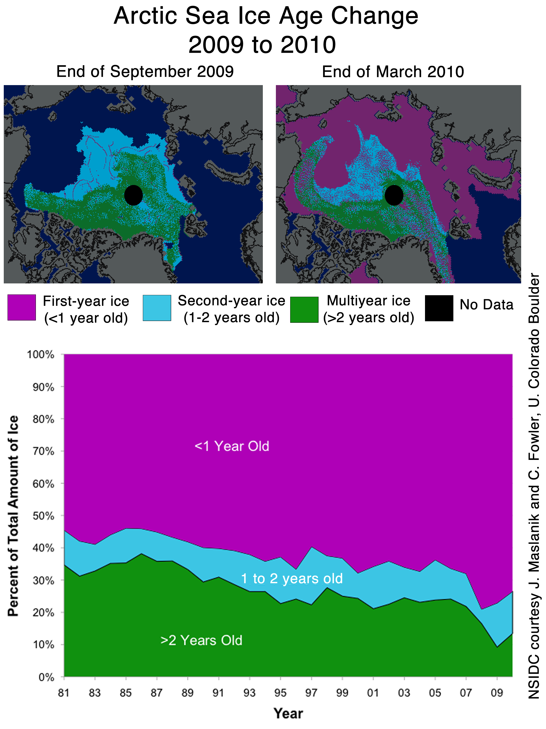
The areas that in recent years have been first-year ice that are now covered by 2nd and 3rd year ice will increase the volume – in those regions. However, compared to the last two years, there is even less of the oldest ice (see images below – I also included 1985 as an example of 1980s ice conditions for comparison). The loss of the oldest, thickest ice may more than offset the gain in volume from the 2nd and 3rd year ice. Also, it’s been a relatively warm winter in the Arctic, so first-year ice is likely a bit thinner than in recent years. Finally, the extent has been less than the last two years for the past couple of months. So the PIOMAS estimate that we are at record low volume anomaly is not implausible.

Early May ice age for: 1985 (top-left), 2008 (top-right), 2009 (bottom-left), and 2010 (bottom-right). OW = open water (no ice); 1 = ice that is 0-1 year old (first-year ice), 2 = ice that is 1-2 years old (2nd year ice), etc. Images courtesy of C. Fowler and J. Maslanik, University of Colorado, Boulder. Updated from Maslanik et al., 2007.
What does this all mean for this year’s minimum? Well, much will depend on the weather for the rest of the summer. As NSIDC states in its most recent post, we’ve expected we may see the rapid decline begin to slow because the melt will soon run into older, thicker ice, which will slow the loss of ice. Steve has said essentially the same thing and indeed we’ve the rate of loss slow over the past few days. Of course, there still a lot of time left in the melt season, and pace of melt continue to be relatively slow or it may speed up again, so we’ll see what happens. Regardless of what happens this summer though, the most important fact is that, despite some areas of the Arctic being a bit thicker this year, the long-term thinning and declining summer ice extent trend continues.
One final note about both PIPS and PIOMAS: Steve has claimed that “everyone agrees that PIPS 2.0 is the best data source of historical ice thickness”. Well, no scientist would even agree that what PIPS 2.0 produces are data! Being a data person myself, this is a bit of a pet peeve, but it’s important to make the distinction that model outputs are not data. Models are tremendously useful for obtaining information where data doesn’t exist (i.e., data sparse regions, historical periods without data), for projecting future changes, and for understanding how physical processes interact with each other (e.g., changes in climate due to changes in forcings).
However, model results are simulations, not observed data. And if there is good data available, I trust data over model estimates. And there is good historical data on ice thickness from submarine and satellite records (Kwok and Rothrock, 2009) and from proxy thickness estimates from ice age data (e.g., Maslanik et al., 2007). These data clearly show a long-term thinning trend. And while 2010 has relatively less of the thinner, first-year ice than the last couple of years, the ice cover is still much thinner than it was in earlier years. And it is clear that the models don’t entirely capture the spatial distribution of thickness correctly. As an example, compare the first-year ice in the ice age figure above with the PIPS 2.0 estimate from the same time period (below). In May, PIPS showed most of the central Arctic covered by ~3+ m ice, all the way to the Siberian coast. This is simply not realistic because the ice age data indicate first-year ice on much of the Siberian side of the Arctic (see images above), which would average at most 2 m. Thus Steve’s comparison of May 2010 and May 2008 with PIPS data is not valid because the model results are capturing observed spatial patterns of thickness.

References
Kwok , R. and D.A. Rothrock, 2009. Decline in Arctic sea ice thickness from submarine and ICESat records: 1958–2008, Geophys. Res. Lett., 36, L15501, doi:10.1029/2009GL039035.
Maslanik, J.A., C. Fowler, J. Stroeve, S. Drobot, J. Zwally, D. Yi, and W. Emery, 2007. A younger, thinner Arctic ice cover: Increased potential for extensive sea-ice loss, Geophys. Res. Lett., 34, L24501, doi:10.1029/2007GL032043.
Key PIPS 2.0 Model references:
Cox, M., 1984. A primitive equation, 3-dimensional model of the ocean, Geophysical Fluid Dynamics Laboratory Ocean Group Technical Report, Princeton, NJ, 1141 pp.
Hibler, W.D. III, 1979. A dynamic thermodynamic sea ice model, J. Phys. Oceanogr., 9(4), 815-846.
Hibler, W.D. III, 1980. Modeling a variable thickness sea ice cover, Mon. Weather Rev., 108(12), 1943-1973.
Thorndike, A.S., D.A. Rothrock, G.A. Maykut, and R. Colony, 1975. The thickness distribution of sea ice, J. Geophys. Res., 80(33), 4501-4513.
Key PIOMAS Model references:
Dukowicz, J.K., and R.D. Smith, 1994. Implicit free-surface method for the Bryan-Cox-Semtner ocean model, J. Geophys. Res., 99, 7791-8014.
Winton, M., 2000. A reformulated three-layer sea ice model, J. Atmos. Oceanic Technol., 17, 525-531.
Zhang J., and W.D. Hibler III, 1997. On an efficient numerical method for modeling sea ice dynamics, J. Geophys. Res., 102, 8691-8702.
Zhang, J., and D.A. Rothrock, 2001. A thickness and enthalpy distribution sea-ice model, J. Phys. Oceanogr., 31, 2986-3001.
Zhang, J., and D.A. Rothrock, 2003. Modeling global sea ice with a thickness and enthalpy distribution model in generalized curvilinear coordinates, Mon. Weather Rev., 131, 845-861.
“So the PIOMAS estimate that we are at record low volume anomaly is not implausible.”
Mystery solved: Trenberth’s ‘haunting’ missing heat.
http://www2.ucar.edu/news/missing-heat-may-affect-future-climate-change
Could you expand on the idea that old ice can be thinner than 1st year ice under certain conditions related to location of compaction and ridging? First year ice subjected to compaction and pressure can be quite thick compared to multi-year ice that has migrated to an area conducive to thinning.
Wow! Thanks for taking the time for such an excellent explanation. More than anything, I think we all can look forward to the time that we start getting the real data from CryoSat 2.
However, model results are simulations, not observed data. And if there is good data available, I trust data over model estimates. And there is good historical data on ice thickness from submarine and satellite records (Kwok and Rothrock, 2009) and from proxy thickness estimates from ice age data (e.g., Maslanik et al., 2007). These data clearly show a long-term thinning trend.
================================
“Long term” on what scale?
Dr. Meier, You are a damn good scientist and that is why we listen to you here.
But what do you mean by “long term”…and are these “long terms” explainable at least in part by idioms such as the AMO, PDO and maybe other yet unnamed “long-term” cycles?
Chris
Norfolk, VA, USA
“the long-term thinning and declining summer ice extent trend continues.”
Well, I suppose that depends on what one means by “long term trend”. I mean, if you make a trend line that starts, say, 1990 to today, sure, the trend line still trends downward. But the trend line in minimum since 2007 trends upward. So it is valid to say the downward trend continues but it is also valid to say that the trend shows signs of reversing.
What I found most valuable in the article was this reminder:
“The areas that in recent years have been first-year ice that are now covered by 2nd and 3rd year ice will increase the volume – in those regions. However, compared to the last two years, there is even less of the oldest ice”
So in 2007 while we lost a lot of ice >5 yo, we also lost ice of ALL ages. So going into 2008, we would have seen less 2yo, 3yo, and 4yo ice than we saw in previous years. So in 2008 the remaining 4yo ice minus any losses becomes 5yo. Then in 2009, any remaining 5yo ice minus losses becomes 6yo, etc.
So that is why it will take at least until 2020 or so to completely recover from the 2007 anomaly. Ice inventory must be rebuilt and the inventories of ice that is 7yo is lower than it was before 2007. The amount of 5yo ice won’t return to “normal” (normal meaning in this case levels that reflect what would be considered normal conditions and not excessively depleted due to anomalous wind or other events) until 2011, 5 years after 2007. Then take 5 more years for the inventory better 5yo and 10yo (I would guess there isn’t a lot of ice over 10 years old) so now we are in to 2016.
So basically, the amount of ice >5yo will probably continue to decline until the first 2008 ice reaches 5 years old. When 2008, 2009, and 2010 ice “matures” that number is only then going to begin to climb so even if things have turned the corner, we aren’t really going to see much improvement until 2012 or so. There is an indication that things MIGHT be turning the corner, but it is premature to say they HAVE turned the corner and another wind event between now and 2016 could set the whole thing back to even worse than 2007.
Thank you Anthony for also letting the ‘other side’ speak up their arguments here. Doesn’t happen in RealClimate.
By August 3, the PIOMASS ice extent forecast will be far off the mark.
Mark it on your calendar.
We won’t have an El Nino to kick around in the Arctic this year.
So while there may be less multi-year ice now than 4 years ago, we’ll have to do the same thing we did for SC24:
Watch and wait.
Meanwhile, the 30 yr global sea ice sits at zero anomaly.
So, if the ultimate scenario plays out, the Arctic will turn into an open sea, and the Antarctic will cut the Atlantic off from the Pacific at the kneecaps with permanent ice. And the global sea ice will still be sitting at zero anomaly.
thank you Walt for finally setting the record straight about PIPS2.0, R. Gates tried hard to, but perhaps now that it’s come from a scientist who has worked with the model, others will finally understand what R. Gates was saying all along.
Good job!
Personally I’m happy to wait a few days to see a graph of actual data only. I don’t need a model that predicts the next few days but that needs to be altered when the model gets it wrong.
Thanx again Anthony, and you too Dr. Walt.
Sea Ice extents and areal trends are just as susceptible to the Black Swan outlier as anything else in the climate or the stock market. You may think that everything point to higher & higher, or lower & lower, but watch out. One big swing the other way and you’re looking like a re-run of “The Coming Ice Age”.
Specifically, what do we know of the AO/PDO and Nino SST’s that tells us what comes next?
I second the request to see a definition of “long term.” Given that the planet has warmed since the end of the LIA, it seems likely that there should have been a trend toward lower ice volumes as well. So is a century “long term,” or is 10 years “lomg term?”
http://www.ipsnews.net/news.asp?idnews=51826
Dr. Walt Meier,
Just moved you to the ‘actual scientist’ side with some of the impressive thoughts you portrayed within:
– Models are simulations and never create data. Data is from observations. Agree.
– Observed data always takes precedence over any model estimates. Agree.
– PIOMAS is likely to be more realistic than PIPS. Likely is a key word for scientists when still in question. Thanks for refraining with “is” when that matter is still questioned.
One thing I wish you would have placed in the “always” category. New does not immediately mean better. More complex does not immediately mean better. That can only be determined through time with proven better results which is never guaranteed in complex models.
Noticed you carefully isolate the ice age data input to PIPS from the other observations. Could you give us a bit more on the places this data is compiled and stored and which is currently being used?
You also mentioned satellite measurements of ice thickness, how is that currently measured and by which instrument (or is it an inferred parameter from other measurements such as the various sounders)?
Thank you for taking the time to add some clarity I this matter.
Dr Meier, as one familiar with PIPS2, can you clarify how volume should be estimated?
The model provides average thickness and concentration fields. Is the concentration already taken into account when generating the thickness field?
That is: should total volume be calculated as (area x average thickness) or as (area x average thickness x concentration)?
Thanks, Dr. Meier, for a great post and for taking time to share some of your experience and expertise. Also very much appreciate the even-tempered tone of the post in outlining the areas of agreement and disagreement with Steve.
“there is good historical data on ice thickness from submarine and satellite records (Kwok and Rothrock, 2009) and from proxy thickness estimates from ice age data (e.g., Maslanik et al., 2007). These data clearly show a long-term thinning trend.”
Chris (savethe sharks) beat me to it, but I’d like to second his call for a definition. “long term thinning trend” sounds worrying, but without a start date it is UTTERLY MEANINGLESS.
I suspect that neither of the models used by PIOMAS and PIPS 2.0 give a good estimate of ice volume and we will have to wait for Cryosat 2 data before we start having good estimates.
In the mean-time we to have the Cryosphere satellite maps for sea ice concentration, and this shows that Arctic ice 13 July 2010 is in much better condition than it was on the same date in 2008 (2009 missing for this date). Have a look and see what you think.
http://a.imageshack.us/img24/8725/deetmp4704.png
“long term”?
Climate is 30 years of weather. The ice satellite have been recording data since 1979.
That is 1 (one) climate data point.
One lousy, stinking data point can not be made into a curve that can be extrapolated.
One data point is the shortest term possible.
There are no data to make any predictions on at all, sorry.
John Silver:
Very good point. It is very difficult to argue a trend on such a small amount of data.
However…
As Steven Goddard is very fond of telling everybody, ice melts when it gets warmer and freezes when it gets colder.
Sea ice conditions in the Arctic are a symptom of changes in temperature so we can use
trends in temperature data as a proxy for the prospects for Arctic sea ice. We can therefore make a pretty good guess that if global average temperatures continue on a rising trend then the chances are that the amount of Arctic sea ice will continue on a falling trend.
Now, we may have only one 30-year climate data point for sea ice, but the HadCrut3 temperature series goes back to 1850, which is 5 full data points if you end with the
most recent full year (2009) and start in 1860. Not much to go on, but the best we
have.
Do you think that 5 lousy, stinking data points are enough to extrapolate a trend?
Most climate scientists say “yes” but a few say “maybe” but I no of none that say “no”,
not even Lindzen and Spencer go that far.
Right… so what do those 5 lousy stinking data points tell us?
Below are the five full 30-year average data points in the HadCRUT3 record ending with the most recent full year:
1860-1889 -0.31
1890-1919 -0.42
1920-1949 -0.16
1950-1979 -0.12
1980-2009 0.25
These can be plotted on this chart:
http://a.imageshack.us/img37/4525/tempsx.png
Overall the trend is 0.56c during that period. However I think you would agree that the slope for the 90 years 1950-2009 is rather steeper than the slope 1860-1949.
Now I am no climate scientist, but the most recent data suggest that, despite a “pause”
in the rate of growth over the last 10 years, the last 30 year trend (from -0.12 to 0.25) is still inexorably up.
Based on this data, what are the chances that the next 30 years will be warmer than the last 30 years?
Regardless of whether you think that the warming seen so far is man made or natural, the outlook for the Arctic sea ice over the next 30 years is not good. No amount of cherry picking data and literature by the severely Confirmation Bias afflicted Steven Goddard is going to change that.
Correction to my comment on the slope of the graph, that should of course have been
“However I think you would agree that the slope for the 90 years 1920-2009 is rather steeper than the slope 1860-1949.”
You want to know what is “long term?” About half an average human life-span. You can’t “save the planet” if you’re dead. : )
Matthew L says:
July 14, 2010 at 3:12 am
The latest ‘data point’ shows the Arctic warming and the Antarctic cooling.
That data point is neutral to the global temperature.
Could it be that the hockey stick missed the puck?
Can somebody take a minute to remind me why I should care about how much ice there is in the Arctic? Sometimes getting too close to the trees misses the wood entirely.
Apart from the poor cuddly-wuddly polar bears (who seem to have miraculously discovered how to swim), little else lives there. And the ice is floating so whether its there or not makes no difference to sealevels.
Is it all not just a biiiig yawn?
Note that NSIDC “forecast” the slower ice loss in their July 6 newsletter, about six days after the slowdown had already started.
http://nsidc.org/arcticseaicenews/
By contrast, my PIPS based forecast of July slowdown came in June, with the exact date in the future attached.
http://wattsupwiththat.com/2010/06/28/sea-ice-news-11/#comment-419233
R. Gates says:
July 13, 2010 at 9:42 pm
“Wow! Thanks for taking the time for such an excellent explanation. More than anything, I think we all can look forward to the time that we start getting the real data from CryoSat 2.”
Contain your excitement. I’ve thought that given data will start being generated now, at a time when PIOMAS model extremely low ice volume, there is a possibility that the data moving forward will be showing an upward trend.
It has worried me that the satellite data we’ve been working with since 1979 started at a period when ice was at recent era high and this has contributed to the recent ‘long term trend’. (I hope this isn’t just wishful thinking but relates to the question below)
Dr Meier would you care to comment on Petr Chylek 2010 paper on the arctic-antarctic seesaw which suggests much of the recent arctic warming is due to a natural climate cycle which is likely to reverse in the coming decades?
my PIPS based forecast of July slowdown
Steven, how did your PIPS forecast provide you with the insight the winds would turn drastically?
Günther Kirschbaum
1. You are misquoting me. Strike 1
2. I didn’t say anything about the wind. Strike 2
3. PIPS does forecast future wind conditions. Strike 3
You’re out!
Latimer Alder
Little else lives there? Are you serious?
They may not be many animals that live directly on the ice, but there are plenty that live under and around it – or depend on it for their way of gathering food. Try various whale species such as the Beluga, Orca and Grey. Lots of other mammals such as Seals (various), sea otter and Walrus live on or around the ice and use ice-holes to lure and catch fish.
And of course there are the fish populations that depend on the ice ecosystem.
Not all of these species will die out completely if there is no summer ice, but expect a huge stress on their populations. When I read your post I visualised stuffing a dead Walrus into that biiig yawning gob of yours.
Excuse my anger.
Dear judge, jury and executioner, aka Steven Goddard, don’t you think it a coincidence that the slowdown started when the winds turned drastically? PIPS forecasts future wind conditions only one day in advance.
If the winds would have remained the same (strong Beaufort Gyre) we could have attributed the slowdown to thick ice in the Arctic Basin . Now we’re not sure yet, but perhaps the winds will turn again and provide more information. Do you expect melt rates to remain low if this happens?
I’m glad that Dr Meier has cleared up the much disputed question of which version of PIPS (2.0 or 3.0) is actually used (please take note – R. Gates June 12, 2010 at 12:22 pm on What is PIPS? Posted on June 12, 2010 by charles the moderator ).
Matthew L,
The Arctic has been ice free many times in the past. It is a routine event.
Poor fishies, how do they ever handle the stress?
Mathew L,
Sorry but I fail to see the logic behind your post, are you saying that the industrial world should destroy iteslf on the basis that it might cause a “huge population stress”?
and that based on the theory that AGW does in fact cause the melting of the polar caps which is by no means even a vague possibility.
The problem with your emotional statement is of course that it forgets just how resilient and robust wild animal populations can be when confronted with habitat change.
The planet is not and never has been fond of ‘stasis’ to nature stasis leads nowhere, the evolution of species throughtout earth history has been one of adaption to new circumstances, the natural challenge to animal life is a positive thing for species.
The laudable wish to protect animals should have boundaries based on common sense, I myself would wish to protect animals from wanton cruelty but to rearrange our entire industrial economy because of an emotional response run wild is not my idea of common sense. Please remember that wild animals are one heck of lot tougher and more resilient to change than many realise.
Your anger is understandable because of the fashion to see wild animals as almost helpless infants unable to adapt, please try to see past the emotional response.
Günther Kirschbaum
I predicted a path similar to 2006 over six weeks ago, when your side was bragging about the “fastest melt on record.”
http://wattsupwiththat.com/2010/06/02/the-undeath-spiral/
You can either be a good sport, or a sore loser. Your choice.
Heh, ‘long term’ is for as long as we’ve been carefully observing the Arctic ice with satellites. About 30 years, incidentally, or not, the term for one phase of the PDO. And remind me, was it the warming or cooling phase of the PDO?
======================
Usually I’m a very sore loser. :-p
Another rephrase of the same question (maybe three times is lucky): do you think the thick ice will withstand the winds if they return to June patterns?
Matthew L
How does a paopulation suffer stress?
Since stress is a mental condition, I can understand how an individual might suffer from it. Though judging on my goldfish fishywishys aren’t among the highest forms of intelligence. But how does a population as a whole suffer from it?
I think you mean that ‘as the conditions around the species change then the population as a whole will change accordingly’ – which is hardly new news. But using the term ‘stress’ tends to anthropomorphise the entirely natural effect. Sloppy terminology designed to induce sloppy and fuzzy thinking.
I’ve just had my lunch thanks.. a very nice kipper. So no need for the walrus just yet.
Time for a snooze. Yaaaawnn……
>> Matthew L says:
July 14, 2010 at 3:12 am
Now, we may have only one 30-year climate data point for sea ice, but the HadCrut3 temperature series goes back to 1850, which is 5 full data points if you end with the
most recent full year (2009) and start in 1860. Not much to go on, but the best we
have. <<
Actually, we have the same 1979 start point for temperature. Before the satellite records the 70% of the planet covered by oceans had no accurate temperature measurements. A few occasional passing ships provided temperatures accurate only within several degrees. If you think this lack of ocean coverage is unimportant, then note that the globally warm March 2010 was one of the coldest March's for the very places (USA, Europe, China) that were almost entirely responsible for the pre-1900 temperatures, and a dominant factor in the 1900-1979 'global' temperature. Had we no satellites, winter 2010 would have gone down as one of the coldest in history.
What the Arctic ice will do in the next century is anybody's guess. The historical record of a warm Greenland lasting 200 years suggests that the nearby Arctic was
ice-free in the summer back then, but we have no satellite records from 1100 AD to verify that.
Nice post.
Which is more important for the melting of sea ice – atmospheric air temperature or ocean water temperature?
If we have 30 years of data why does the basis period end in 2000?
Matthew L : “Sea ice conditions in the Arctic are a symptom of changes in temperature so we can use trends in temperature data as a proxy for the prospects for Arctic sea ice.”
I think it is not correct to refer to “the Arctic” as if it is a single unit, as ice conditions and temperatures vary widely in space and time.
From the CRU e-mail: 1213201481.txt
“1981: This looked at statistics of annual/winter/summer
Temperatures for the NH and zones of the NH to see what
signals might you be able to detect. SNR problem really.
Showed that best place to detect was NH annual and
also Tropics in summer. Last place to look was the Arctic
because variability was so high.”
Dr Meier conveniently overlooks the fact that much of the ice that has melted the last thirty years was added from 1955 to 1969 during a negative phase of the NAO.
http://en.wikipedia.org/wiki/File:GISP2_ice_core_eng.svg
Declining ocean heat content and the demise of thirty years of positive NAO points to another round of ice increase.
http://en.wikipedia.org/wiki/File:Winter-NAO-Index.svg
Yet another good quality post.
It is a credit to the site that all views are given a proper hearing.
One thing troubling me however is the statement;
“Regardless of what happens this summer though, the most important fact is that, despite some areas of the Arctic being a bit thicker this year, the long-term thinning and declining summer ice extent trend continues.”
How can the trend continue if the data is going the other way?
I meant to post this link to modeled sea ice volume from 1948 to present
http://psc.apl.washington.edu/zhang/IDAO/retro.html#Satellite_ice
@Phil’s Dad
‘How can the trend continue if the data is going the other way?’
Same way as if its a hot week its climate change and VERY IMPORTANT. But a cold week is just weather and can be ignored.
Aka ‘the having your cake and eating it trick’.
Wow, excellent article with a lot of new aspects worth to discuss.
The Swiss Cheese Foto: (North Pole is close to screen bottom)
http://ice-map.appspot.com/?map=Arc&sat=ter&lvl=8&lat=87.042952&lon=154.697724&yir=2010&day=193
Almost spit the coffee out on that one – LOL.
Congratulations R. Gates, the scientist pretty much agrees with what you’ve been saying for months.
http://www.ijis.iarc.uaf.edu/seaice/extent/AMSRE_Sea_Ice_Area.png
Only the second lowest on record – oh well. Still two months to go, maybe the melt will pick up.
NSIDC people are so nice and folksy since Climategate – nothing has changed in the climate projections, but they aren’t calling it “death spiral” anymore. It’s a kinder, gentler AGW.
…the long-term thinning and declining … trend continues.
It just sounds like the Arctic is losing it’s hair – nothing catastrophic there.
There is an interesting article about the connection between different solarcycles and the extent of the arctiv sea ice;
http://www.eike-klima-energie.eu/
The article is in german, so you have to translate it by google.
HR says:
July 14, 2010 at 4:06 am
R. Gates says:
July 13, 2010 at 9:42 pm
“Wow! Thanks for taking the time for such an excellent explanation. More than anything, I think we all can look forward to the time that we start getting the real data from CryoSat 2.”
Contain your excitement.
__________
New information is always exciting to me.
One question that still lingers for me is one of sea ice mass vs. volume. It’s seems the idea of “rotten ice” etc. is something that will be with us, and so you can have thick ice that is less dense. It would be nice to be able to measure both density AND volume, and hense get an idea of how much actual mass we have. This would seem to take a combination of what both GRACE and CryoSat – 2 can deliver. I would hope that IceSat 2 will deliver this. Julienne?
Anu,
You might want to keep your coffee contained for a bit longer. PIPS has been spot on.
http://wattsupwiththat.com/2010/06/02/the-undeath-spiral/
Dr. Meier’s quote was made out of context.
I was referring to “everyone” on WUWT, none of whom were able to produce a single other source of historical thickness data. I also don’t believe that Dr. Meier has mentioned any other source of historical thickness data. So, PIPS is indeed the best source.
From the article:
I agree that data completely trumps model, but I definitely disagree with proxies being considered data. Proxies convert one measurement to a different estimate something else using what?…a model. Clearly some proxies are vastly superior to others, but I think Mann and coworkers pretty much put a black stain on proxies in the area of climate science with the hockey stick debacle.
-Scott
”Had we no satellites, winter 2010 would have gone down as one of the coldest in history. ”
False
Canada’s warmth more than made up for cold across many regions.
Good post, lots of substance.
Clarification sought, though–shouldn’t that last sentence have another “not” in it? As in, “the model results are NOT capturing observed spatial patterns. . .”
The emended version would seem consistent with the preceding sentence, which the existing version does not.
My wife has been going through the books we gave our children and giving them to our grandchildren. She called my attention to this one, which may be on topic:
White Wilderness – Animals of the Arctic (Golden Press 1958)
The Golden Library of Knowledge – Factual Books for Young Readers
“The carefully researched, scholarly texts are nevertheless simple and easy to read.”
The world wears a cap of ice all through the year. Over an area around the North Pole the sun is not warm enough to melt all the ice during the summer….
The Arctic Ocean has many icebergs, but the sea ice itself averages only about seven feet in thickness, and never forms a solid frozen crust. Tides, currents, and winds constantly are breaking it up into huge floes, which are great flat cakes of ice….
In every season, [seals, walrus, and polar bear] always can be found on the southern fringes of the ice pack….
The killer whale also preys on the ringed seal. But it comes to the Arctic only during the summer to hunt in the wide channels of open water at the edge of the ice pack….
[T]he polar bear is a powerful swimmer and has been seen swimming in the open sea miles from ice or land….
We think the book accurate enough for our grandchildren.
I thank folks for the comments, though I apologize that I only have time to scan through them. A couple things that I’ve seen:
1. PIPS actually doesn’t forecast winds, it forecasts ice motion. The ice motion is driven primarily by winds, which are forecast by a weather model (in this case the Navy NOGAPS model). A subtle difference perhaps, but I think important because a lot of the accuracy over a synoptic scale is determined by the accuracy of the weather model, more so than the sea ice model. The sea ice model physics becomes more important over seasonal and interannual scales. That is why PIOMAS, with improved model physics, is more trustworthy over the long-term.
2. “Long-term” is a bit ambiguous of a term. Generally I mean decadal to multi-decadal scale. That is the scale where the CO2 signal becomes clear outside of the short-term climate variations. It is the scale where thinning of the sea ice starts to show up beyond the year-to-year ice extent variations. And it is the scale where glacier/ice sheet melt and SLR becomes clear.
3. I do congratulate Steve on his assessment of the ice conditions this summer. He has been pretty accurate (though I would say in spite of the PIPS model, not because of it). While we only post once per month, so are sometimes behind the trend, the recent slowdown is nothing terribly surprising. In our April post, we noted the increase in multiyear ice and the effect it may have on summer extents.
walt
Tenuc says:
July 14, 2010 at 12:09 am
I suspect that neither of the models used by PIOMAS and PIPS 2.0 give a good estimate of ice volume and we will have to wait for Cryosat 2 data before we start having good estimates.
Well stated. One of the big problems in climate science, and most likely affecting PIOMAS, is bias. They have under-predicted the ice extent the last two years and will most likely miss on the low side again.
This is the factor that most warmists can’t seem to get their brains around (and I’m afraid Dr. Meier falls into this group). There actually is a reason that any medical study that is not double-blind is considered questionable. That means ALL climate studies are questionable. It doesn’t mean the scientists aren’t trying to be objective, the fact is, it is IMPOSSIBLE to be objective.
Sorry, but this article by Dr. Meier will also be be contaminated by personal bias just as Steve’s articles are, R Gates posts are, and every else who has a strong opinion.
I cannot see that any human is under either a moral or even prudential obligation to strive to ensure that all animal species now extant remain so and remain in the same numbers as now exist.
The human race exists, and many other present species, because of previous mass extinctions so not all extinctions are to be regreted. Would any Green dare claim that it was unfortunate that a passing alien did not prevent the extinction of the dinosaurs?
Do people think this is accurate? There’s a lot of blue on it. I can’t find other up to date concentration maps. http://nsidc.org/data/seaice_index/images/daily_images/N_daily_concentration_hires.png
Walt,
Mark Serreze has been often quoted in the press as expecting a record low this summer. This seems to be at odds with what you have been saying.
http://www.allheadlinenews.com/articles/7018784377
As far as PIPS goes, its relative comparisons have done an incredible job of describing relative year over year Arctic conditions, and was the primary basis of my analysis this summer.
http://wattsupwiththat.com/2010/06/02/the-undeath-spiral/
Also, no one so far has provided me with any other links to historical ice thickness, besides PIPS.
Robert (8:20 am):
Canada’s warmth more than made up for cold across many regions.
============
I believe those who live west of Ontario who would dispute that
rbateman says:
July 13, 2010 at 10:04 pm
the Antarctic will cut the Atlantic off from the Pacific at the kneecaps with permanent ice.
Maybe you ought to look at the southern sea ice dynamics before making wacky projections – http://arctic.atmos.uiuc.edu/cryosphere/IMAGES/seaice.area.antarctic.png
stevengoddard says:
July 14, 2010 at 9:47
Mark Serreze has been often quoted in the press as expecting a record low this summer. This seems to be at odds with what you have been saying.
http://www.allheadlinenews.com/articles/7018784377
I don’t see the quote. Maybe you pasted the wrong link?
jakers says:
July 14, 2010 at 9:32 am
Do people think this is accurate? There’s a lot of blue on it. I can’t find other up to date concentration maps.
ftp://ftp-projects.zmaw.de/seaice/NEAR_REAL_TIME/Arc_latest_large.png
http://iup.physik.uni-bremen.de:8084/amsr/arctic_AMSRE_nic.png
(but this site has been having trouble the last few days)
http://climateprogress.org/2010/05/24/arctic-sea-ice-extent-volume-nsidc-record-steve-goddard/
Anu,
Thank you for the above link. My quick perusal of the site found these for 2007 – 2009.
ftp://ftp-projects.zmaw.de/seaice/AMSR-E_ASI_IceConc/SeaIceMinimum2007-contour50.png
ftp://ftp-projects.zmaw.de/seaice/AMSR-E_ASI_IceConc/SeaIceMinimum2008-contour50.png
ftp://ftp-projects.zmaw.de/seaice/AMSR-E_ASI_IceConc/SeaIceMinimum2009-contour50.jpg
Cannot wait to add image for the minimum for 2010 to see how it compares.
Again, Thank you!
Another image to watch, The Prediction.
ftp://ftp-projects.zmaw.de/seaice/prediction/current_estimate.png
Jon P
Very bold of people to make predictions in mid-July ;^)
It’s always good to hear from Dr. Walt Meier here. I hope he’ll be a frequent contributor. His input is very helpful, as he intends. Thanks, Dr. Meier.
Since when is ‘I think it’s quite possible’ the same as ‘I expect’?
Thanks for answering all my questions, Steve! I’ll leave you in peace now.
Dr Walt Meier states:
“Long-term is a bit ambiguous of a term. Generally I mean decadal to multi-decadal scale. That is the scale where the CO2 SIGNAL becomes clear outside of the short-term climate variations. It is the scale where thinning of the sea ice starts to show up beyond the year-to-year ice extent variations. And it is the scale where glacier/ice sheet melt and SLR becomes clear”
I take issue with the statement about a CO2 signal becoming clear simply because there is no proven correlation between tiny increases in multi decadal average temperature and an as yet uproven atmospheric carbon dioxide greenhouse effect. Polar ice levels have been lower in the past and higher with greater and lesser CO2 concentrations and higher and lower GATs. Conventional AGW wisdom dictates that higher GATs are having a direct and lasting effect on the polar ice caps yet the rise is so tiny and uncertain and the polar caps are so massive that any mathematical equation of the timeline a tiny rise in GATs and subsequent melting of the caps will run into the thousands of years.
What the planet has seen over the last thirty years(multi decadal) is a slight increase in GATs and a subsequent slowing on a decadal timescale, going back further than sattelite coverage becomes uncertain at best with the supposed “CO2 signal” being dwarfed by the error margins in measured/value added averages alone. To be perfectly blunt, if a CO2 signal stands out from a supposed net 0.5c rise in average temperatures when the error margin is much greater than that of the supposed multi decadal rise then I am a pink alligator.
The questions that need to be examined are:
a) What would be the estimated rise in global average temperature from natural cyclic warming alone and how much higher over that is the supposed AGW component and what is the margin of error involved?
b) How much of the supposed rise in global average temperatures can be attributed to this “clear CO2 signal” and again what is the margin of error involved?
c) How could such a tiny increase in temperatures cause a polar ice loss over the long(geologic)term let alone a few years to decades as the AGW wisdom dictates?
With respect may I submit that in fact this clear CO2 signal is in fact an artefact of a series of unreliable and inaccurate models fed with a series of educated guesses based on speculation and highly dubious data sources. The error margins alone are simply too high to determine a rise in GATs let alone an anthropogenic carbon dioxide component.
Yours
Cassie K.
So, Walter, Models are not data? If so, why does PIOMAS show error bars in their estimates. I thought error is a statistical probability device only used with data. How did PIOMAS then come up with their error bars? To obfuscate and pretend that PIOMAS is data, is that the intent? So they can point to ice being at “historically low values”, since one or two sigmas have been exceeded?
Not only that, but PIOMAS error bars are fixed, that is, the trend line uses a fixed error of unknown provence based on a composite “error” based on a fortuitous starting point near a known high ice value, then proceeding until it arbitrarily cuts off during a warming period, ignoring recent high ice recovery values after 2000.
“Adjustments” such as these in the trend line surely make a better case for ice loss so that grants can proceed at a prolific and lucrative pace. This is why PIOMAS must be looked at with much less objective confidence. There are good reasons why PIPS is relied upon for accuracy by military and commercial interests, since these need the most accurate and update picture they can get or their dogs won’t hunt.
“Mark Serreze of the center forecast the ice decline this year would even break 2007’s record.”
Read more: http://www.allheadlinenews.com/articles/7018784377#ixzz0tgK32mzL
Latimer Alder, not sure why I am bothering to reply to this codswallop, but I can’t let you get away with this…
You clearly have a very limited vocabulary. Stress is simply an undesirable reaction to change from previously experienced normality. It is usually physical. It can apply to steel girders in a skyscraper during high winds or to the crank shaft of an internal combustion engine forced to rotate at higher than its designed speed.
In the case of animals when I say “population” I mean the numbers of animals. When a population of animals is put under “stress” it means that a change is putting downward pressure on the numbers of animals. For instance in the case of the Arctic the population of, say, Fur Seals is put under stress by:
– cub clubbing for fur
– overfishing of their food source
– polychlorinated biphenols in the food chain
All these factors reduce the numbers of live young and the ability of the females to breed and raise young to mature breeding age.
The population of Fur seals is also put under stress when the ice through which they fish disappears and they have to adapt to open water conditions. It is very likely that this, too, will result in a reduction in their numbers. In other words their population is put under “stress”. Capiche?
Stress is not an “anthropomorphic” term at all – and it certainly is not sloppy or fuzzy thinking. It has a very precise scientific meaning. The above paragraph just reflects your very limited understanding of the word.
Very few of the stresses under which the populations of Arctic mammals are put are “natural”. Almost all are caused directly or indirectly by human beings.
Kippers of course being smoked herring – a fish population put under such enormous stress by over-fishing in the twentieth century that it is all but extinct now in the North Sea. Latest estimates put its population at around 5% of its size in 1900.
You might need that Walrus soon. Oh, sorry, they will have died out as well. Looks like you will have to eat your words instead.
Ah, a sloth, another endangered species.
Walt Meier says:
July 14, 2010 at 8:56 am
“That is why PIOMAS, with improved model physics, is more trustworthy over the long-term.”
2. “Long-term” is a bit ambiguous of a term. Generally I mean decadal to multi-decadal scale.
Are you saying that PIOMAS is “only” more trustworthy over the long-term, therefore PIPS would be better for the “short-term? We have recently seen PIOMAS’s terrible short-term record…
Thanks
Cassandra King
July 14, 2010 at 11:01 am
The main signals that warming of the atmosphere is caused by rising greenhouse gases are as follows:
1. more warming at night than during the day
2. more warming at higher latitudes (Arctic / Antarctic) than lower latitudes (tropics)
3. more warming in the Troposphere than the Stratosphere. In fact the Stratosphere can cool while the troposphere warms rather like increasing the insulation in a roof makes the upper surface of the roof colder and the lower surface of the roof warmer.
All these are happening. So there is a very high likelihood that a significant amount of the warming seen during the late 20th and early 21st Centuries is as a result of the rising proportion of greenhouse gases in the atmosphere.
There are a number of more precise analyses of the spectrum of outgoing radiation demonstrating this.
@4:31 am Matthew L replied to Latimer Alder:
“Not all of these species will die out completely if there is no summer ice, but expect a huge stress on their populations. When I read your post I visualised stuffing a dead Walrus into that biiig yawning gob of yours.”
Matthew’s sole point was the “ice eco-system.”
But now he re-frames his argument to include clubbing baby seals, kippered herring, and polychlorinated biphenols [sic].
That’s how the alarmist crowd handles being wrong; they move the goal posts. Remember that the most basic assumption of the CO2=CAGW conjecture posits that the tiny trace gas carbon dioxide drives the climate. That conjecture has been shown to be nonsense. CO2’s effect is so small that it is unmeasurable [if it were measurable, the question of the climate sensitivity number would be answered].
The original contention by Matthew L was that populations would be put under such stress by melting ice that many species would die out. Of course Matthew can not credibly defend that conjecture, since the Arctic has been ice free many times in the past. Such mass exterminations would have been found in the fossil record.
Rather than admitting that organisms adapt to either an ice covered Arctic or an ice free Arctic, he now says that fishing for herring, and polychlorinated biphenyls are the culprits, instead of his original argument that melting ice will cause species exterminations. Not a very robust argument.☺
Matthew L
Warm nights are a classic symptom of Urban Heat Islands.
Antarctica has not warmed.
Most Arctic warming is attributed to soot.
Smokey says:
July 14, 2010 at 11:48 am
Not my point. These are just other examples showing how an animal populations can be put under “stress” used to refute Mr Adler’s poor understanding of the word.
Falling sea ice cover will put the populations of many animals under “stress”. How that will ultimately affect their ability to survive will of course vary depending on how adaptable the species is. My point is that sea ice loss and global warming are avoidable. These species should be allowed to change and adapt to natural changes in the environment, not forced to change by man-made changes to the environment.
See my reply to Cassandra King regarding the attribution of global warming to greenhouse gases. Not “unmeasurable” at all.
Matthew L:
“My point is that sea ice loss and global warming are avoidable.”
How, exactly?
“Regardless of what happens this summer though, the most important fact is that, despite some areas of the Arctic being a bit thicker this year, the long-term thinning and declining summer ice extent trend continues.”
Unfortunately that is an opinion not supported by fact.
It is based on a trend line through one half of an ocean oscillation period that lasts approximately 60 to 70 years. You can not draw any conclusion for at least another ten to twenty years because you must see if the expected decrease in sea temperature forecast by past trendsin sea temperature effects the “declining summer ice extent trend” Only at that point, with most of the 60+ year cycle documented, would you be justified in making a prediction.
(You were doing real well until you left science and went with the political propaganda.)
Barents Sea temp and AMO:
http://wattsupwiththat.files.wordpress.com/2009/10/barents_sea_temp_with_amo.png
Steve Goddard:
…as well as a classic symptom of greenhouse gas emissions. Obviously you think it is the former whereas climate scientists think they have adjusted the records sufficiently to remove the spurious effect of UHI. This is the whole original point of this blog of course and I don’t intend to repeat all the arguments here.
Parts of Antarctica are warming very strongly. I have a friend who works for the British Antarctic Survey who has spent every one of the last 15 Antarctic summers down there. He has very strong views on the subject and is documenting rapid changes in the fauna of the Western Antarctic Peninsula that have not changed for hundreds of thousands of years. He has been in the press and media recently. A more general paper on the subject here:
http://www.antarctica.ac.uk/bas_research/science/climate/antarctic_peninsula.php
You mean this study:
http://www.nature.com/ngeo/journal/v2/n4/abs/ngeo473.html
Well that is only one study, and the conclusion is that black carbon deposits have made a “substantial contribution” to Arctic warming. That is very different from saying “Most Arctic warming”. What it actually says is that not only is there differential warming in the Arctic caused by greenhouse gases but man is also contributing to the warming through atmospheric pollution by black carbon deposits.
That is hardly helping the argument that most global warming is “natural” is it?
Matthew L says:
July 14, 2010 at 12:43 pm
‘He has very strong views on the subject and is documenting rapid changes in the fauna of the Western Antarctic Peninsula that have not changed for hundreds of thousands of years.’
Which oracle does he use for that?
Excerpts from: Matthew L on July 14, 2010 at 12:43 pm
and
Since you have indicated these examples of increased warming are caused by greenhouse gases, mainly the increased atmospheric CO2 levels per the standard (C)AGW presentation, please cite the work where all other possible explanations have been ruled out.
Hansen on soot :
http://pubs.giss.nasa.gov/docs/2004/2004_Hansen_Nazarenko.pdf
Matthew L
Phoenix is normally 10-15 degrees warmer at night than the desert around it. There must be a massive CO2 bubble over the city.
Global sea ice is above normal. Quite a polar meltdown we are having!
http://arctic.atmos.uiuc.edu/cryosphere/IMAGES/global.daily.ice.area.withtrend.jpg
Matthew L:
“That is hardly helping the argument that most global warming is ‘natural’ is it?”
You have again failed to falsify the null hypothesis: that the observed warming is a result of natural climate variability. You have a lot of company in that regard.
The climate’s sensitivity to CO2 is almost certainly <1°C. In fact, the effect of CO2 is so insignificant that it can be disregarded.
Once it is accepted that the planet is not lying, it is easy to see that the entire “carbon” scam is nothing but a proposed immense transfer of wealth based on a chimera. CO2 is a harmless minor trace gas, beneficial to all life. More is better [within reason, and keeping in mind that CO2 has been almost twenty times higher in the geologic past].
CO2 has nothing measurable to do with Arctic ice extent. If it did, the Antarctic would be on a similar trend.
Unless the climate alarmist advocates can credibly falsify the hypothesis of natural climate variability, their arguments will continue to be debunked by planet Earth.
jakers says:
July 14, 2010 at 10:02 am
I make no assumptions other than the poster’s insistence that temperatures will continue to rise and extents fall in the Arctic, while temperatures continue to ??? while extents rise in the Antarctic.
If the poster does not want to respond to the why of the polar opposites, I have to assume that the question has no answer, and that this whole frenzy over an Ice-free arctic is pure hyperbole.
Warm nights are a classic symptom of Urban Heat Islands.
And humidity, which is water vapor. The diurnals show as much, and sort according to solar cycle length.
There are also natural Heat Islands. I know of two of them.
Matthew L
One little tiny piece of Antarctica was “warming strongly” and it is located on an active volcanic ridge.
stevengoddard says:
July 14, 2010 at 7:56 am
Dr. Meier’s quote was made out of context.
I was referring to “everyone” on WUWT, none of whom were able to produce a single other source of historical thickness data. I also don’t believe that Dr. Meier has mentioned any other source of historical thickness data. So, PIPS is indeed the best source.
____________________________________________________________
Actually PIPS is not the best source.
In your opinion PIPS 2.0 is the ONLY source.
Therefore PIPS 2.0 is both the BEST source and the WORST source, since it is the ONLY source, in YOUR opinion.
PIOMAS was mentioned by Dr. Meier and many others here on WUWT, if one has volume data (PIOMAS), and one has extent (or area) data (JAXA, NSIDC, et. al.), one obviously has thickness data. D’oh!
Perhaps you missed that part of his discussion titled;
NSIDC’s Dr. Walt Meier on PIPS -vs- PIOMAS
@Matthew L
If you choose to use the word ‘stress’ in a way unknown to my dictionary (OED) or even http://www.thefreedictionary.com/STRESS feel free. But don’t get all upset if others don’t agree with your definition. This is not Alice in Wonderland. You are not Humpty Dumpty.
And thanks for letting me know the provenance of a kipper. There was me thinking they were just funny shaped things that grew naturally on the fish counter at Waitrose. Nice, after 50 years of eating them about once a week to be corrected.
So now to global warming. Why should we assume that this should bad for the fishies? Fishies are cold-blooded creatures, so as the sea temperature warms up, they will be able to move around more as their biochemistry speeds up (Arrhenius), and eat more and get bigger quicker and have more babies. And as the nasty walrusses and seals and polar bears aren’t going to be around to stick their paws through the ice and catch them , then the fishies will be more plentiful. so from a fishy perspective, global warming is a super good thing. It will Prolong Active Life in every sense.
And as I like eating kippers more than I imagine I would like eating walrus, I too think that this is all a jolly good idea. Bring it on.
Dr. Meier, it is *always* a pleasure to see you here and dialogue with you. You are a gentleman and a scholar, and I can always respect that combination even where I have areas of disagreement.
A few issues –what the heck is up with PIPS 3.0, and why has it been stuck “in development” missing so many expected release dates? Is there any reason today to prefer/trust PIPS 3.0 outputs if the Navy isn’t willing to rely on them themselves?
How concerned are you about PIOMAS re the scarcity of validating data? A few years vs actual observations from ICESat, and it missed the last one quite badly from what I saw. Do we anticipate that CRYOSAT-2 input is going to be going into that? My problem with PIOMAS is I just don’t see any reason to think there has been enough validation to give it confidence. I do applaud the effort. I also look at one of the prime devlopers of PIOMAS “prediction” for minimum extent last year, which missed very badly, and it does not give me a great deal of confidence in his algorithms in general at this point.
Also, ICESat granularity was very poor (i.e. number of observations per year). We get extent *daily*. Do we know what is expected from CRYOSAT-2 in those regards?
Perhaps daily is too much to expect. But at least monthly should be the goal, and weekly would be much better. Appropriate granularity of measurements is pretty important in my book. It makes the data points add up much, much faster and thus allows confidence in any modelling done from those data points increase much, much faster. To my mind, PIOMAS is woefully weak and unreliable, and that’s the primary reason right there. If they start getting more data more regularly it will no doubt improve.
Jon P says:
July 14, 2010 at 10:35 am
I’m glad to see someone that actually follows the link, and explores the site.
Those minimum sea ice contours are for 50% concentration – the IARC-JAXA figure for minimum summer sea ice extent will be for 15%, but the contours are still interesting. 15%, 50% are both rather arbitrary.
I wonder if 2010 will be the third year in a row that the Northern Sea Route (North East Passage) will be open.
<i.Jon P says:
July 14, 2010 at 10:44 am
Another image to watch, The Prediction.
ftp://ftp-projects.zmaw.de/seaice/prediction/current_estimate.png
Yes, these University of Hamburg guys have an “official” prediction with Arcus:
http://www.arcus.org/search/seaiceoutlook/2010/june (click on the pan-arctic Tab)
Kaleschke and Spreen (University of Hamburg); 4.7 Million Square Kilometers; Statistical
With the additional processing steps, we considerably reduce the observational noise and improve the prediction skill as compared to our last year’s attempts using SSM/I data. The higher spatial resolution of AMSR-E compared to SSM/I allows to better resolve small scale sea ice openings like coastal polynyas.
Their method is simplistic, but easy to recalculate every week, which they seem to be doing:
ftp://ftp-projects.zmaw.de/seaice/prediction/outlook2010.pdf
Of course, an accurate “prediction” for the summer minimum, made the second week of September, is no great accomplishment…
Latimer Alder:
July 14, 2010 at 3:30 pm
Well I am glad you know how to find a web dictionary. Unfortunately you do not appear to have read it. One definition is:
“7. A state of extreme difficulty, pressure, or strain”
which is a pretty good description of what the populations of various Arctic mammals will go through if the summer ice disappears.
As only one of the seven definitions has anything to do with a human mental state, your original accusation that I was anthropomorphising the problem is proven to be poppycock, balderdash, twaddle and blather. Anyway this is all dreadfully OT.
As I am not a marine biologist (and I would hazard a guess that neither are you) I won’t conjecture randomly on what the effect of the loss of summer sea ice will be on the population of various “fishies”. One thing is certain, there will be drastic changes. Sure, some species will thrive and others will decline. I bet you something though, previous sudden changes in environment have shown that many more species will decline than thrive. As we have eaten over 90% of all the big fish in the worlds oceans already it is quite possible that there won’t be any significant populations of edible fish left by then anyway.
From your post I would guess your age at somewhere between 60 and 70. So just be thankful you will be long dead by the time any major consequences of global warming will be seen. Shame the same cannot be said for your (or my) children and grandchildren.
However, there is a good chance there won’t be any more kippered herring for you to eat before you slip off this mortal coil though.
Dr. Meier, thank you for the well-reasoned post. However, I hope this does not now put you on the denier blacklist. I wish you much success in your life and career!
Many thanks to Mathew L for the reply to my questions, I will read up on the details of your reply.
Yours
Cassie K.
PIPS versus PIOMAS: Deductive versus Inductive (a.k.a. Karl Popper)
The comparison of PIPS with PIOMAS is a good way to illustrate the deductive or inductive nature of scientific method as set out by Karl Popper in books such as “Conjectures and Refutations”. PIPS and PIOMAS are good examples of the deductive versus inductive scientific methods, respectively.
Of course it was one of Popper’s main conclusions that true scientific method could only be deductive and not inductive, and that in the end inductive inferences are an illusion. This was in parallel to an connected with Popper’s statement that for a theory or “conjecture” to be considered scientific, it must be falsifiable.
First, what do deductive and inductive mean? Approximately, deductive means disproving – believing a conjecture until it is disproved, then not believing it any more. Inductive means building a series of assumptions on each other in a complex structure without a clear possibility of falsification.
I looked at some dictionary definitions and other reference sources about these two words, inductive and deductive, since their meanings might be slipping and blurring. Inductive is linked to synthetic and synthesis while deductive was linked to analysis and analytic. I like to think of it in terms of the length of the paths that one draws between observation and conclusion. Short and economic (“parsimonious”) = deductive; long and convoluted involving multiple serial assumptions = inductive.
Finally “inductive” and “deductive” can be illustrated as follows. Two teams of scientists, team inductive and team deductive, were given a task: design a speedometer for a car – a device for measuring and displaying the speed that a car is travelling.
So team inductive got to work. This team included a fair number of physicists with computational and modelling skills. It became immediately clear to them that this was a task requiring the procesing of multiple factors all impacting on speed: what was the energy and force driving the car forward, what was the origin of this energy? Chemical and thermodynamic energy from the combustion of fuel needed to be carefully evaluated and modelled. What was the efficiency of this conversion from chemical to kinetic energy – how much was lost in the inefficiency of the motor?
Several team members were assigned to modelling these processes. How much energy was lost as friction and heat through the gas exhaust? Simulation of the turbulent fluid flow and associated heat fluxes along the exhaust pipe was clearly called for.
Then of course there were hours of immense fun to be had modelling and evaluating the fluid friction of the air passing over the car. This of course was modified by the dynamics of the air itself – what was the prevailing wind direction?
Then there was the question of how you define the spatial relationship between the car and the ground, whether to adopt a merely Cartesian or a Euclidian or relativistic or any other geometric frame of reference? Then of course there was the friction between the tyre and the road.
So it became clear to team inductive that to have any hope whatsoever of measuring speed in a credible way, to give an output that would be accepted by internationally recogonised car speed scientists associated with the high profile journals and societies, that a large number of data inputs were needed: chemical measurement probes in the fuel tank to asses the fuel chemical potential energy; probes within the ignition chamber to assess on a millisecond basis pressures and temperatures to illucidate combustion energy. Then multiple sensors were required in the exhaust pipe to
provide input for fluid flow modelling of the exhaust gasses. Sensors were also required at many locations on the car’s surface to assess airflow and boundary layer turbulence, as the exact location of the laminar-turbulent transition was a key factor in getting the drag models to work reliably. Sensors were needed within the tyres also. Other factors and associated sensor inputs were also identified and subject to in-depth research and computer simulation.
Thus at the end of the day it was deemed impossible to prove that the “speed” of the car that one measured was correct or not, or that the car was in fact moving at all, or whether it was even in contact with the road, and indeed what it was exactly that one meant by the concept of a “road”.
Then team deductive got to work. They measured the circumferance of the wheels. And set up a sensor to measure the rate of rotation of the wheels. From this they got a speedometer.
So PIPS fits the bill as a deductive method – simple, but it gives reliable results. As Walt Meier himself says, good for “operational” uses i.e. when the results actually matter, e.g. navigating on a ship. PIOMAS is by contrast inductive. That is why it does not work.
The inductive approach is not necessarily completely useless. The PIOMAS type model could be used to try to understand Arctic ice processes, just as “team inductive’s” model could be used for basic research into how a car behaves. But this is not the same thing as making robust and reliable measurements of a parameter. Confusion between research modelling and measurement of an environmental parameter is one of the weaknesses of the AGW approach to climate. Plus not having read and understood Popper.
From: EFS_Junior on July 14, 2010 at 2:21 pm
Nah, what one has is a big steaming pile.
If you have volume and area you can calculate average thickness. But does one have the area? According to IARC/JAXA:
You can’t use extent data as that uses ice concentration, so if a given measured area has 20% sea ice you would only use 20% of that area towards the sea ice total. IARC/JAXA has archived daily extent numbers and concentration maps, NSIDC has daily extent maps without a number and concentration maps which are not archived. Guess you could always count pixels off the concentration maps once you figure out how much area each pixel covers. The NSIDC archives do have monthly area figures, for whatever that’s worth.
Well, assuming you have usable area figures, then you need the volume data. Okay, where is it? From PIOMAS comes the terrifying Arctic Sea Ice Volume Anomaly chart, which has remained stuck at June 18 displaying the unprecedented long dead-straight drop. But that shows the anomaly, we need the actual numbers. On the PIOMAS main volume page we find… nothing daily, no archived volume figures, not even monthly. On Zhang’s site we find… no volume data, and some data files that are not current related to the “retrospection” of the Arctic sea ice. The volume numbers aren’t available.
So, where are we at? Can’t get the PIOMAS volume numbers anyway, and if there is daily area info available it won’t be coming from IARC/JAXA or NSIDC.
Then we get to how you’re mixing systems. Item one: Does the region that PIOMAS considers to have “Arctic sea ice” match up with the regions IARC/JAXA or NSIDC use?
Item two: Are you mixing algorithms? We often see how the same satellite data yields different extent figures due to the algorithms processing the data. Volume is not measured directly, PIOMAS calculates it, and somewhere along the way it has to be figuring out what the area is. Is there a mismatch? Well, the PIOMAS main page says they use the sea ice concentration data from the NSIDC near-real time product so the NSIDC daily area figures would be indicated. If such were available.
Note the “disclaimer” about the NSIDC near-real-time data:
What does that mean? According to the NSIDC, PIOMAS is using the wrong data.
Finally, why do you want to compound errors? While calculating volume, PIOMAS must have also calculated thickness. So why reverse-calculate from volume to get something used to calculate volume? Why not just use the PIOMAS thickness info which is available… Oh yeah, it isn’t available.
Well, as you said, if you had volume data and area data you could calculate thickness, albeit average thickness. So to do what PIPS already does and show you what the thickness is at a certain general area you would… need volume data for that certain general area. Got any?
Matthew L says: July 14, 2010 at 5:36 pm
Well I am glad you know how to find a web dictionary. Unfortunately you do not appear to have read it. One definition is:
“7. A state of extreme difficulty, pressure, or strain”.
There is no data that has significantly determined that an ice-free Arctic will endanger species. Because according to you, the Arctic has never been ice-free before. Or has it?
Mann, you’re stressing me out.
Have you looked at the posted source code? The PIOMAS code is not available, and offhand I do not see anything there that is indicated as actually used in PIOMAS. For example, the sole link to actual code says it’s for a Global sea Ice Model (GIM).
This must be indicative of that enormous chasm between scientists and engineers. I would have thought the distinction would be between model data and measured (or calculated from measured) data. Imagine how that would sound otherwise: “Here’s the wind tunnel data, and it matches pretty well with these numbers the model cranked out that aren’t data.” One needs to keep track of which is which and accept that model results are secondary to real-world measurements, but otherwise the use of that word to keep them distinct seems rather artificial.
And am I expected to believe no scientist at all ever talks about “the model data” when referring to the output?
Found at noaa.gov:
Hey look, links to Coupled Climate Model data are there.
The PIOMAS main page says:
At the NSIDC site it says:
You would so trust a product when the NSIDC itself is saying the product is using data unsuitable for the product’s results?
Tim Clark says:
July 15, 2010 at 8:20 am
Pardon? Me? I have not ventured an opinion here on whether the Arctic has been ice free in the past or not. You must be thinking of someone else.
Anyway it is a matter of fact that the Arctic has been ice free in the (distant) past. My problem is not that it will be ice free again, just that it is man’s selfish disregard for his environment that will make it so – and very quickly too. And it is this speed of change that will put most stress on animal populations, which generally need many hundreds of generations in order to adapt.