By Steven Goddard
The Arctic sun has now passed its peak, and is starting its decline towards the horizon over the next 90 days.
")
All four (JAXA NSIDC DMI NORSEX) ice extent measurements now show 2010 as below 2007. You can see in the modified NSIDC map below that the regions which are below the 30 year mean (marked in red) are all outside of the Arctic Basin and are normally ice free in September, so it is still too early to make any September forecasts based on extent data.

The modified NSIDC map below shows ice loss (in red) during the last nine days. There has been very little change in the Arctic Basin.

The modified NSIDC map below shows ice loss (in red) since early April. According to JAXA, this is about 5 million km².

The modified NSIDC map below shows ice loss (in red) since early April. According to JAXA, this is about 5 million km².
The modified NSIDC map below shows ice loss (in red) since 2007. According to JAXA, this is about 500,000 km². Areas in green have more ice than 2007.

There has been a strong clockwise rotation of wind in the Beaufort Gyre, which is pulling ice away from the land around the edges of the Beaufort, Chukchi and East Siberian and Laptev Seas.

http://www7320.nrlssc.navy.mil/pips2/archive/mag/2010/mag_2010062200.gif
The video below shows changes in PIPS ice thickness and extent during June. You can see the ice rotating clockwise and concentrating in the center of the Arctic Basin.
During the last 10 days, PIPS shows that Arctic Basin ice volume has dropped close to 2007 and 2009 levels. Volume has increased by about 40% since 2008.

Average ice thickness is now the highest for the date during the last five years. This is due to the compression of the ice towards the interior of the Arctic Basin.

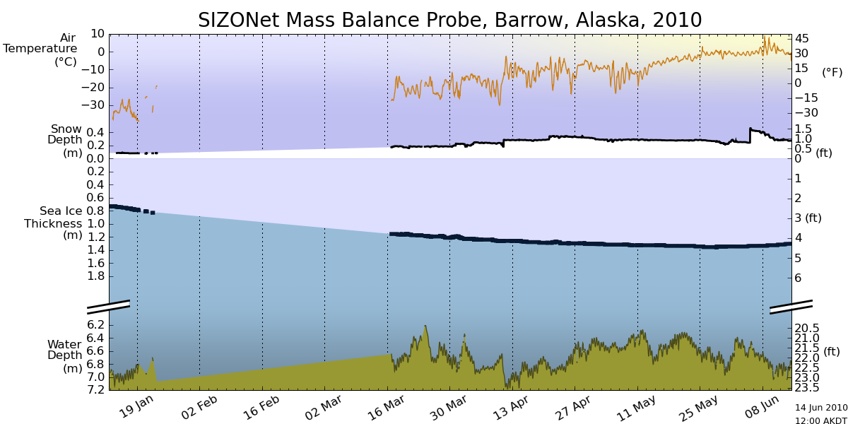
Ice offshore of Barrow, Alaska is showing little signs of melt so far.
") ‘
‘
http://seaice.alaska.edu/gi/observatories/barrow_sealevel/brw2010/BRW_MBS10_overview_complete.png
The current break up forecast calls for July 5.
")
http://seaice.alaska.edu/gi/observatories/barrow_breakup
Temperatures north of 80N have been persistently below normal this summer.
")
http://ocean.dmi.dk/arctic/plots/meanTarchive/meanT_2010.png
There are still no signs of melt at the North Pole, with temperatures running right at the freezing point – and below normal. Normally there has been surface melting for several weeks already.
")
http://psc.apl.washington.edu/northpole/webphotos/noaa2-sml.jpg
Arctic Basin ice generally looks healthier than 20 years ago.

I’m forecasting a summer minimum of 5.5 million km², based on JAXA. i.e. higher than 2009, lower than 2006.
Meanwhile down south, Antarctic ice is well above “normal” close to a record maximum for the date.
")
http://arctic.atmos.uiuc.edu/cryosphere/IMAGES/seaice.recent.antarctic.png
The video below shows the entire NSIDC Antarctic record for the last 30 years.It looks like a heart beating
We are all doomed any way…
And yet we are told that 2010 will beat 2007 in terms of melt. As you say, we will not know until September, and the Arctic basin looks much healthier than 20 years ago
Forgive the OT:
Yahoo News has finally featured an article (from The Washington Post) about the current solar minimum. It is quite a good read and contains almost no AGW nonsense.
Steve–
So you’re issuing a new forecast of 5.5M km/2, superceding your original 5.8M km/2?
My feeling on the matter of issuing multiple predictions for the same melt season is I don’t care to do it. My 6.0-6.2M km/2 (made in late March or early April) may turn out wrong, but I don’t want to be like the Solar guys and forever chasing a series of predictions. I made one for this year, I’ll follow developments until extent minimum, learn whatever lessons are to be learned, and apply them to next year’s prediction.
It is quite amazing the focus on the Arctic sea ice extent. If all the Arctic sea ice melted, sea levels would not rise at all. It is equally amazing the lack of interest, and in some instances false statements, about the ice conditions in the Antarctic. It is Antarctic ice that must melt to cause sea level rise yet the Antarctic had the most sea ice ever recorded in 2008 and the ice extent is currently 1 million square kilometers above average. Antarctica is the highest continent on earth, the average temperature is 55 below zero, it is classified as a desert, the driest place on earth. Even if the man made global warming theory was true, melting Antarctic sea ice would not cause any sea level rise, yet there would be more humidity and thus more snow fall in the interior, Antarctic snow levels would increase, and the land ice would build up.
I am an avid “ice watcher” and appreciate this the comprehensive yet concise data set here, with not too much analysis and prognostication.
I watch because it is clear we are not in a “death spiral” and I can use the info to console those that believe polar bears are indeed going to perish in their lifetime due o arctic ice loss.
It does seem to me though that the continued gradual warming during this interglaciel will lead to gradual ice loss at the poles. So “record ice extent lows” are to be expected. The thing is the record only has to be slightly lower to be a record but its not much and not much to worry about!
5.5 is the only estimate I have made.
If the extent in 2006 this time of year was any kind of predictor of what will happen in September as compared to 2007 then we’re in for a minimum that beats 2003!
But it seems that there’s almost nothing in the data of any year that predicts 3 months later for any time period that I can tell. We just have to wait….
Lucia’s Blackboard gives you three bites at the apple: Long-, medium-, and short-range forecasts, with winners in each category.
I still like the original 5.8 forecast, but would not be surprised if 2010 follows right on 2006.
Does it mean that it endangers our whiskey on the rocks?
Global sea ice area is now plunging well below zero on cryosphere , don’t expect it to go much positive for the rest of the year as the Arctic drop takes the rains and the Antarctic rise peters out against the Southern ocean winds and currents.
Will the Arctic turn upwards like 2006 again? I doubt it, the guesses of 5.5 and 5.7 of WUWT and Steve G. I think will be shattered. Sub 5 is my esitmate.
No recovery, R. Gates is likely to be closer.
Mr. Alex says:
June 23, 2010 at 1:42 pm
It is quite a good read and contains almost no AGW nonsense.
Only mantras from Nasa church…how cool!
It looks to me that sea ice will make another record low this summer. People need to get off the oil addiction. The polution and warming is killing the planet.
Maybe we’ll know by late August. Here’s something interesting I noticed in the IARC/JAXA data…
YEAR MIN_ICE RANK AUG28 RANK
=============================
2003 6032031 1 6353125 1
2004 5784688 2 5971563 2
2006 5781719 3 5966406 3
2002 5646875 4 5957656 4
2005 5315156 5 5771250 5
2009 5249844 6 5554219 6
2008 4707813 7 5163125 7
2007 4254531 8 4724844 8
The August 28th rank is a perfect predictor (so far) of the final rank. You can’t beat 100% correlation.
Thanks for the extensive overview Steve.
geo says:
June 23, 2010 at 1:52 pm
I agree with Geo. Dont modify the forecast now. Stand by your forecast until the date is here. Otherwise, whats the point?
Either do not come with any forecasts that early, or stick with it, and admit it was to high later. Your forecast might be right too. We have the whole month of July in front of us.
I have a question. Who modifies your NSIDC images?
As to the point made about surface melting being visible by now, I looked at the North Pole Webcam website and went back 2009, 2008, 2007, and 2006 for the period covering June 20th thru 24th and in no images during those dates back 4 years is there any visible signs of melting or ponding
Steve, I think it’s a bit misleading to say that the ice is healthier today than 20 years ago by looking at ice concentration from two days from different years. Just yesterday I looked at ice concentrations from this year and 2007 on the 22nd of June and 2010 showed lower ice concentrations (and we all know how 2007 turned out). There is a lot of daily variation sometimes in the ice concentration fields from weather effects. So personally, I wouldn’t make comparisons between a day from two different years and read much into it.
I’m glad you included mention of circulation/winds in this post. The Arctic Dipole has been implicated in the 2007 ice loss, and this pattern is happening now. If it persists the entire summer like it did in 2007, then I think the September ice extent will fall below 5.5 million sq-km. Note just based on survival rates of ice from different ice age classes during the last several years, we also predicted a 5.5 million sq-km value. But a weather pattern like in 2007 (with 2007 ice survival rates) would yield around 4.3 million sq-km. Interestingly, J. Maslanik whose ice age product we use, is predicting more like 4.3 million sq-km based on the southerly location of some of the old ice (making it more prone to melt out).
But like you say, it’s too soon to tell. Would be good though to mention to your readers that June 2010 is a new record low in the satellite data record…
regards, Julienne
I also wanted to mention, right now the 2010 ice extent is nearly 700,000 sq-km below that in 2007 (10.14 vs 10.82 million sq-km)
And while the sun is now past it’s peak, another 5 million sq-km of ice will likely be lost by September.
A couple looks at Antarctic Sea Ice Extent, which, like Area, is trending well above average;
http://nsidc.org/data/seaice_index/images/daily_images/S_stddev_timeseries.png
and:
http://www.iup.uni-bremen.de:8084/amsr/ice_ext_s.png
Also, for those of you who would like to do some of your own digging here are some of the best sources of Sea Ice Data:
The Cryosphere Today – Arctic Climate Research at the University of Illinois:
http://arctic.atmos.uiuc.edu/
http://arctic.atmos.uiuc.edu/cryosphere/
http://arctic.atmos.uiuc.edu/cryosphere/IMAGES/
National Sea and Ice Data Center (NSIDC):
http://nsidc.org/
http://nsidc.org/data/seaice_index/images/
http://nsidc.org/searchlight/
University of Bremenpart
http://www.iup.uni-bremen.de/eng/
http://www.iup.uni-bremen.de/iuppage/psa/2001/amsrop.html
http://www.iup.uni-bremen.de:8084/
International Arctic Research Center/Japan Aerospace Exploration Agency (IARC-JAXA)
http://www.ijis.iarc.uaf.edu/en/
http://www.ijis.iarc.uaf.edu/en/home/
Danish Meteorological Institute (DMI)
http://ocean.dmi.dk/english/index.php
http://ocean.dmi.dk/arctic/index.uk.php
If I missed any, please let me know.
Is there any news from Russian ice breakers on how thick the ice is from their point of view?
Sea ice, schmee mice.
Just to pick a nit: 1990 was 21 years ago.
The ice 20 years ago looked like this
Totally agree with Julienne’s point about comparing with a single day 20 (or 21) years ago. It’s all about the trends.
http://nsidc.org/data/seaice_index/images/n_plot_tmb.png
And a correction, that’s the National “Snow” and Ice Data Center (NSIDC) not the National “Sea” and Ice Data Center.
Thanks Steven for another good sea ice update. Looks like the ice is better than we thought. Arctic-Roos are still showing area and extent tracking 2007/2008 coming out of the knot:-
http://arctic-roos.org/observations/satellite-data/sea-ice/ice-area-and-extent-in-arctic
Will be interesting to see where the minimum ends up – my guess is it will end up around the 5.9m km^2 level. The continuing quiet sun and cooler ocean will mean more ice than many of the ‘experts’ predict!
Zhang (using the PIOMAS model) is currently predicting 4.7m km^2. http://psc.apl.washington.edu/zhang/IDAO/seasonal_outlook.html
Last year Zhang was about 20% low
http://wattsupwiththat.com/2009/09/07/how-have-the-scientists-done-on-arctic-sea-ice-forecasts-this-year-maybe-not-so-good/
Most of the submissions to the Study of Environmental Arctic Change see more than 5m
http://www.arcus.org/search/seaiceoutlook/2010/june
A breakdown in the Beaufort Gyre – perhaps occurring in a multidecadal cycle – is one of the primary reasons for the extensive melt in 2007 in the Arctic Basin. A strong Beaufort Gyre combined with significant increases in ice thickness would suggest that melting in the Arctic Basin will be minimal this year.
Does area mean anything? How about thickness? http://network.nationalpost.com/np/blogs/fpcomment/archive/2009/05/04/lawrence-solomon-deep-arctic-ice-surprises-scientific-expedition.aspx
They are going about it all wrong. If they want to predict the melt in the Arctic Basin they should start measuring the flow of current through the Bering Strait and its water temperature. It is this warm water flowing through the Bering Strait that caused the record melt in 2007, and its annual fluctuations determine the variations observed. The other side of the Arctic Ocean is warmed by the Gulf Stream that annually eats up about a third of the sea ice that otherwise would exist in its absence.
Agree with Julienne about the significance of looking at a single day 20 years ago as an informative comparison. And to pick a nit, June 22 1990 was 21 years ago.
But if you want it, here is the ice concentration 20 years ago (June 22 1991)
http://tinyurl.com/27urrmy
And here is the the trend for May
http://nsidc.org/data/seaice_index/images/n_plot_tmb.png
geoff pohanka says:
June 23, 2010 at 1:59 pm
“It is quite amazing the focus on the Arctic sea ice extent. If all the Arctic sea ice melted, sea levels would not rise at all. ”
VILLABOLO RESPONDS:
Geoff, sea level rise is a non issue concerning the Arctic Ice Cap. The real issue is what the exposure of open seas will do to the weather patterns.
Since ice REFLECTS 80-90% of the sunlight while blue ocean ABSORBS 80% it’s evaporation will increase tremendously and cause a chain reaction of events that will affect the entire Northern Hemisphere.
Sorry ’bout the double post – my browser just vanished the post rather than showing ‘your comment is awaiting moderation.’
I plotted up the AMSR-E data for ice extent from June 1, 2002 to May 31, 2010. The data currently available, and the trend is slightly but insignificantly positive, at +79±132 km2/day. It is somewhat hard to see in the overlapped year lines on the AMSR-E standard plot in the side bar, but if you just plot the data as a straight series you can see how little change there has been over the last 8 years. there certainly has been a downward trend in the last forty years, but it is possible we are experiencing the flat trend at the minimum now.
Galane wrote,
“It’s nearly impossible to have more or less than 50% of whatever you’re measuring above or below the mean.
It’s very easy to have more than 50% above or below average or median.”
Just a typo I’m sure but that’s backwards. The median equals the 50th percentile, or value that (approximately) divides the data in half. The mean is a center of gravity, which in skewed distributions can be quite a ways from the median, i.e. above (or below) much more than 50% of the data.
Arno Arrak says:
June 23, 2010 at 3:06 pm
They are going about it all wrong. If they want to predict the melt in the Arctic Basin they should start measuring the flow of current through the Bering Strait and its water temperature. It is this warm water flowing through the Bering Strait that caused the record melt in 2007, and its annual fluctuations determine the variations observed. The other side of the Arctic Ocean is warmed by the Gulf Stream that annually eats up about a third of the sea ice that otherwise would exist in its absence.
———————
Arno, if it was all a result of ocean temperatures, then you would be more inclined to believe Dr. Maslowski’s predictions of when the Arctic would be ice free since that is what he bases his assessments on (the role of the warm Pacific water entering the Arctic Basin).
It’s important to understand that the warm SSTs in the Chukchi in 2007 were not shown to be a result of more warm water inflow through Bering Strait, but a result the timing of the retreat of the sea ice in that area. But earlier years have shown pulses of warm water entering the Arctic through Bering Strait that then circulate around the Arctic Basin. Rebecca Woodgate has many publications on this if you’re interested.
In general there is very little mixing of the warm Atlantic water with the sea ice because of the strong stratification in that part of the Arctic. But there was a recent paper that came out looking at how wave action could change that so it might be more important in the future as the ice cover declines. Ocean data do show a cooling of Atlantic water entering the Arctic the last few years (though it remains anomalously warm).
villa:
“The real issue is what the exposure of open seas will do to the weather patterns.”
Well, what do you think they will do?
Many would think that it would mean catastrophic run-away warming. In reality what will happen is that the North Pole will be ice free in late summer (September) after the days has begun to get shorter. An after September the ice will grow back. It is an incremental development, not a run-away thing. My bet? I have yet to see the run-away effect claimed by the CAGW-crowd.
Volume has increased by about 40% since 2008.
PIOMAS show something different:
http://psc.apl.washington.edu/ArcticSeaiceVolume/images/BPIOMASIceVolumeAnomalyCurrent.png
Who to believe, who to believe……… 😉
Arctic Basin ice generally looks healthier than 20 years ago.
That’s on top. It’s the underside that’s sick. 😉
Once again I see the need to remind folks that the Arctic comprises a multitude of variables and a multitude of sea ice areas that interact individually to these variables. I continue to be shocked regarding this obvious lack of knowledge. A case in point:
Keith Tax said:
“It looks to me that sea ice will make another record low this summer. People need to get off the oil addiction. The polution (sic) and warming is killing the planet.”
This kind of response reveals a near complete lack of knowledge (easily obtained) about individual arctic sea oscillations, topography, summer solstice variables, and individual arctic atmospheric oscillations. CO2 could not have warmed the incoming Atlantic current that is melting the edge of the ice next to Greenland. CO2 could not have caused the gyre to pull the ice from the land edges. The air over the Arctic basin is not any warmer and is in fact a bit colder than average right now.
Pollution and fossil fuels cannot be the cause. There is no mechanism that connects CO2 with Arctic melt.
I’m forecasting a summer minimum of 5.5 million km², based on JAXA. i.e. higher than 2009, lower than 2006.
That would be a continuing growing trend. And it would be more proof that the PIOMAS graph is wrong.
It would also mean it is even more unlikely that Al Gore’s prediction of an 2013 ice free Arctic will be happening.
It would also be more evidence that the ‘death spiral’ is not happening.
😉
I think it will pass the 2003 line when reaching the minimum… let’s wait and see!!!
“”Julienne says:
June 23, 2010 at 3:54 pm
In general there is very little mixing of the warm Atlantic water with the sea ice because of the strong stratification in that part of the Arctic.””
So you are basically saying all we need is frigid thick cloud cover, plenty of snow, and a quite sea, forget the currents, they don’t matter. Well, that’s much easier, pray it be so.
Indeed. Suppose we have a distribution of ten people, six of whom have no children, two each have one, two each have two, and the last has fourteen. The median is childless, but the mean is exactly two children.
Many people use the term “average” loosely, without defining whether they refer to the median, arithmetic mean, or something more exotic. If you don’t know by which definition someone means (heh) a word to be understood, then the sentence in which it’s used doesn’t convey a clear meaning.
Pamela, changes in temperatures can and do modify atmospheric and oceanic circulations. I can point you to a number of published studies and chapters in physics/atmospheric/oceanic text books that show this to be true if you are interested.
Air temperatures do remain anomalously warm over the Arctic, I am not sure where you are getting the information that says otherwise.
Barrow Sea Ice Web Cam:
http://seaice.alaska.edu/gi/observatories/barrow_webcam
…nary a death-spiral to be seen!
Keith Tax says:
June 23, 2010 at 2:23 pm
“It looks to me that sea ice will make another record low this summer. People need to get off the oil addiction. The polution and warming is killing the planet.”
Yeh, our desire for stuff like food and energy is just way out of line! And we know using oil causes ice melt and even though it’s happened before, we know ice melt is really, really bad! If for no other reason than if too much ice melts in Greenland, Canada, and Russia, they’d probably just use that extra land for farming and start using oil all over again!
Tangentially related, I was amused by this press release in the The Tasmanian Times related to Anthony’s trip:
http://tasmaniantimes.com/index.php?/weblog/pr-article/climate-activists-urge-people-to-pay-attention-to-the-science-not-the-clima/show_comments
I found this line particularly amusing:
“Real science is conducted through peerreviewed publications in respected journals”, said Phil Harrington from Climate Action Hobart.
If any of you were confused, apparently what’s going on in the thread isn’t science, rather when you manufacture a paper that supports your conclusions, and then submit it to a biased journal for review by biased reviewers, now that’s “real science”. How many of Einsteins papers were peer reviewed? “According to the physicist and historian of science Daniel Kennefick, it may well be that only a single paper of Einstein’s was ever subject to peer review.”:
http://www.abhishek-tiwari.com/2009/01/einstein-and-peer-review.html
Hmmm, so much for “real science”…
Steve,
Thanks for taking the time to assemble this data, it’s always useful as a point of departure for discussion. I won’t get into your use of the PIPS 2.0 data again, as we are all tired of that I’m certain. But your statement that arctic sea ice volume having increased by 40% since 2008 is, in my estimation, completely preposterous. I just don’t think the PIOMAS model could be that far off:
http://psc.apl.washington.edu/ArcticSeaiceVolume/images/BPIOMASIceVolumeAnomalyCurrent.png
But more than that, the PIOMAS based prediction for how the melt will progress this summer is pretty amazingingly accurate so far. Watch it, and compare to the current extent and concentration images:
http://psc.apl.washington.edu/zhang/IDAO/seasonal_outlook.html
I would tend to trust PIOMAS more than PIPS 2.0, and the difference between 40% more volume (your estimate based on PIPS 2.0) and what the PIOMAS model predicts means that one of them is going to be proven as horribly wrong when CrySat 2 starts to deliver data later this year. I would (and obviously do) tend to trust PIOMAS, and it’s accurate prediction so far for how the summer melt season will be progressing and the fact that it uses the CICE model gives me this confidence.
The video presentation I posted before given by a research team right in the Arctic this entire past winter, tells exactly why the estimates of volume given by measurements such as PIPS 2.0 are being fooled tremendously. I really would suggest that everyone watch this video if you have not, as it gives the latest update from a team that wintered over in the Arctic and was shocked by ice that they thought was 2.0 meters or greater, being far thinner (with much less mass as well) and weaker as well, as why it is so:
http://video.hint.no/mmt201v10/osc/?vid=55
This “on the ice” kind of reporting is very powerful and direct, and needs to be including in understanding how to more accurately interpret satellite data.
Also, you really need to stop even talking about the Mass Balance Probe in Point Barrow, as that probe has been recovered and is not longer transmitting any data since June 14th. In addition, the ice is all shore fast ice in the area, with open sea, and it ‘s pretty much irrelevent when this little narrow strip shore fast ice breaks up anyway.
We have now officially entered the heart of the melt season, with a good solid 8 weeks of strong melting in front of us. From today’s sea ice extent of 9.6 million sq. km., I think we’ll just a little over 5.1 million sq. km. more ice before the September low, putting right about the 4.5 million sq. km. mark. (the PIOMAS based projections are ranging anywhere from about 4.4 million sq. km. up to about 4.7 million).
Finally, I just “happened” to have been in Boulder today, and spent a few hours up at NCAR. It was a goregous day with more than the normal number of bicyclists out for bike to work day. But I did happen to be speaking with one of the staff members there who mentioned this new survey about the general consensus about AGW among the experts:
http://green.blogs.nytimes.com/2010/06/22/evidence-for-a-consensus-on-climate-change/
But I’d like to get a few of the other expert opinions on the accuracy of this survey. I thought the numbers felt a little high to me, but the person I was speaking with at NCAR felt they were probably about right.
Just The Facts says:
June 23, 2010 at 5:17 pm
We must not mention that stuff!!! ‘Cause if we start talking about Einstein and peer-review, some one might mention people like Newton, Galileo, Pasteur, Copernicus……well, all those guys that didn’t have the “benefit” of their peers reviewing their work in the manner it gets “reviewed” today. We’d probably have to invalidate all knowledge gained prior to the 90s. …………………………………….. Have we come up with anything useful since then using the peer-reviewed method of discovery?
Who of any scientific significance is making this unqualified prediction? I’m guessing no one (except some lay people in blog threads).
Steve Goddard says:
June 23, 2010 at 2:05 pm
5.5 is the only estimate I have made.
++++
This is the piece I’m referring to, Steve: http://wattsupwiththat.com/2010/02/09/prediction-arctic-ice-will-continue-to-recover-this-summer/
If Anthony inartfully, and mistakenly, put you on the record for ~5.8M km/2 by saying you agreed it would be 500,000 km/2 greater than last year, and you corrected that later, then I missed it (always possible).
Hey, why no itty bitty teeny weenie 8-bit PIPS 2.0 Ice Thickness GIF images?
Here, let me help you;
http://www7320.nrlssc.navy.mil/pips2/archive/pips2_thick/2010/pips2_thick.2010033000.gif
http://www7320.nrlssc.navy.mil/pips2/archive/pips2_thick/2010/pips2_thick.2010062300.gif
48K km squared per day until Sept 15 and Steve is right.
64K km squared per day until Sept 15 and we will have a new record minimum.
100K km squared per day until Sept 15 and Gore will be the winner.
OK, I’m calling less than a million ice free, so sue me.
The current pace has been averaging 63K for the last month, and most
years, the early summer pace held on for the summer.
Except 2007, where it increased.
So, my dollar says 4.3 to 4.5, no new record but it will be close.
R Gates writes of David Barber’s excellent talk at the Oslo IPY conference:
“This ‘on the ice’ kind of reporting is very powerful and direct, and needs to be including in understanding how to more accurately interpret satellite data.”
I agree, Barber’s report from the ice makes a fine illustration of how field science complements the remote sensing and modeling work in climate research.
As if reinforcing Barber’s sea-level view, MODIS now shows huge areas of riddled ice in the Beaufort Sea and elsewhere that grow day by day.
barry says: June 23, 2010 at 6:04 pm
[And yet we are told that 2010 will beat 2007 in terms of melt.]
“Who of any scientific significance is making this unqualified prediction? I’m guessing no one (except some lay people in blog threads).”
Apparently Wilson and Maslanik, but they do appear to be outliers:
http://www.arcus.org/files/search/sea-ice-outlook/2010/06/images/summary/sioresultschartfig1rev_0.jpg
Julienne says: June 23, 2010 at 5:01 pm
“Air temperatures do remain anomalously warm over the Arctic, I am not sure where you are getting the information that says otherwise.”
This chart from DMI appears to show a negative anomaly;
http://ocean.dmi.dk/arctic/meant80n.uk.php
but I haven’t done much digging into Arctic temps. What data sources do you rely upon?
Why is this;
http://climateinsiders.files.wordpress.com/2010/06/uiucjune222010vsjune221990.jpg
Totally different from from the following two higher resolution two sea ice concentration images for the 20-year difference between 6/22/1990 and 6/22/2010?
http://arctic.atmos.uiuc.edu/cryosphere/IMAGES/ARCHIVE/19900622.png
http://arctic.atmos.uiuc.edu/cryosphere/NEWIMAGES/arctic.seaice.color.000.png
I mean 1990 looks way better than 2010, the small image you posted comparing 6/22/1990 and 6/22/2010 looks completely different for the current date, 6/22/2010.
Does this disclaimer “Sea ice concentrations less than 30% are not displayed in these images.” for the itty bitty teeny weenie Cryosphere image comparisonator have anything to do with this dramatic difference?
R, Gates,
you are biased. you make no attempt to be unbiased. Though you feign that you are unbiased.
In an thread yesterday you twisted something I said and tried to make it appear that was what I was actually meaning.
R. Gates says:
June 23, 2010 at 5:39 pm
as we are all tired of that I’m certain
You’re right, you are tiring.
And here you are again trusting in one climate model and ignoring EVERYTHING else.
Julienne says:
June 23, 2010 at 5:01 pm
Air temperatures do remain anomalously warm over the Arctic, I am not sure where you are getting the information that says otherwise.
Anomalously warm? This data says otherwise, doesn’t it?
http://climateinsiders.files.wordpress.com/2010/06/meant_2010-3.png?w=510&h=340
Julienne, I am sure you understand the properties of LW and SW infrared and its ability to warm air versus water. I hope you do. CO2 is a greenhouse gas that absorbs and re-radiates LW infrared, and is one of the gases (water vapor being king of course) responsible for keeping air temperatures warm (but not oceans) which is way desert air cools so rapidly at night (no water vapor to keep things warm). So given that LW cannot warm oceans (it only penetrates the surface tension layer of water and then the thin layer of heated water is quickly evaporated), please explain your mechanism that says it does.
Julienne,
DMI shows below normal temperatures north of 80N, and NOAA shows normal to below normal temperatures in the Arctic Basin for the last month.
Richard Lindzen makes an illustration that computer models are like Ouija boards:
The 2007 melt had little to go with global warming. Ice floes were directed towards a powerful shoot out Fram Strait where the ice melted outside of the Arctic. Kinda like a “duh” event. People who compare any year with that year as an argument for or against a long term trend position argues with an anomalous event, and thus weakens their argument considerably.
geo,
I think you are referring to a rough estimate Anthony made seven months ago. Looks like he may turn out to be amazingly close, particularly considering how early his estimate was made.
Ron,
You must be using the new maths. 2010 – 1990 = 20
BTW – the NSIDC graph you linked shows that 1990 was about the same as 2010.
http://nsidc.org/data/seaice_index/images/n_plot_tmb.png
I’m going to have to give you two strikes for that post.
Pamela Gray says:
June 23, 2010 at 7:48 pm
The 2007 melt had little to go with global warming. Ice floes were directed towards a powerful shoot out Fram Strait where the ice melted outside of the Arctic. Kinda like a “duh” event. People who compare any year with that year as an argument for or against a long term trend position argues with an anomalous event, and thus weakens their argument considerably.
And as in 2007 the thick, ‘old’ ice is ‘shooting out’ the Nares strait, so in that regard 2010 is as anomalous as 2007.
Pamela Gray says:
June 23, 2010 at 7:48 pm
and thus weakens their argument considerably
I agree with you.
What I’m putting next I know you know already. But I think there’s readers who don’t understand what global warming scientists are saying about Arctic ice being in a possible ‘death spiral’.
They view 2007 as evidence that global warming has warmed up ocean waters and that warmed waters flows in currents that travel under Arctic ice. That warmer water, they say, is melting away the underside of Arctic ice. So that though things look ok on the topside of Arctic ice there is something looming from the underside of the ice that is alarming.
The evidence is clear: this has been the fastest melt season thus far and we are now at the lowest extent for this time of year – almost 400,000 square kilometres lower than 2006 and around 500,000 square kilometres lower than 2007.
Does that mean that we will get a record? No. But it certainly means that a record is easier to acheive than otherwise.
So, those predicting something close to a record do have a significant basis on which to make that claim – the observations to date.
Sea Ice News #10
Posted on June 23, 2010 by charles the moderator
By Steven Goddard
Ice offshore of Barrow, Alaska is showing little signs of melt so far.
Probably because it stopped recording on June 14th! The little upkick in the snow depth on about the 5th June was caused by a Polar bear ‘playing’ with the equipment, data after that was compromised. That ice is in fact the ‘fast’ ice on shore, the ice offshore of Barrow has in fact gone:
http://rapidfire.sci.gsfc.nasa.gov/realtime/single.php?A101712310
Phil. says:
June 23, 2010 at 8:20 pm
And as in 2007 the thick, ‘old’ ice is ‘shooting out’ the Nares strait, so in that regard 2010 is as anomalous as 2007.
The Northern Ice Cube Maker can afford to do that. We in the Northern Temperate Zone, however, call ill afford to have the ice cubes lowering the Atlantic SST’s even further. As if the Eastern Pacific and the Northern Atlantic aren’t cooling fast enough already. Lastly, for all the ballyhoo about the Arctic, the Global Sea Ice Anomaly hangs right around zero.
Mercator Ice Thickness (which, oddly enough is quite similar to Pips 3.0, in that it adds Ice MOVEMENT to the raw concentration data from the microwave sats, see: http://www.mercator-ocean.fr/html/actualites/news/actu_glacedemer_en.html … Note that like Pips, they keep promissing to have “real-time” updates for the Buoy data. Instead they do a daily extrapolation from concentration alone = Pips 2.0, but do adjust it about every 2 weeks for the ice drift — which is, of course, better than Pips.):
… using their archive & plugging in past years::
http://bulletin.mercator-ocean.fr/html/produits/psy3v2/ocean/regions/bull_ocean_arc_en.jsp?nom=psy3v2_20100526_22060
I found an AVERAGE THICKNESS in one corner of the map:
18 June 2008: – – 3.2 meters
17 June 2009: – – 3.1 meters
18 June 2010: – – 3.0 meters
hmmm.
Visually, the difference in the thicker ice is GROSS. Looks like as LOT more drop than that.
Piomas’s new Update (getting to be 1 a month) is now almost 3000 km3 below 2007 !
– – as the 2009 minimum was 5800 – – that is HALF. And that would be IF it levelled out.
http://psc.apl.washington.edu/ArcticSeaiceVolume/IceVolume.php
The June Sea Ice Outlook that FergalR mentioned has >> ME << in it:
http://www.arcus.org/files/search/sea-ice-outlook/2010/06/images/summary/sioresultschartfig1rev.jpg
In the text: they put me last, but gave a truly proper summary of my position:
http://www.arcus.org/search/seaiceoutlook/2010/june
Wilson (No organization provided); [Prediction:] 1.0 Million Square Kilometers; [Methods:] Statistical and Heuristic
2007’s El Nino did three things to melt off 40% of ice volume relative to 2006:
(1) 2007 was hot, 2010 was more so; December was the highest monthly anomaly ever, February was 4th highest, March 10th highest, April 7th highest and the warmest April ever (these are figures from the Satellite (uah) Lower Troposphere breakout for N. Polar OCEAN).
(2) Winds pushed ice, though this will be critical mainly in July. 2007 and 2010 are unique in breaking the Nares Ice Dam, and 2010 broke it much worse.
(3) Cloudiness was 16% less than norm; if I am wrong, it will be here.
– – –
Frankly, if this were a Contest, except for the Clouds: Looks like I'll Lap the Field.
But I don't want to.
Rather not DIE, you see.
So Congrats again on the Barrow Cloud report Steve: – – KEEP THOSE CLOUDS COMING !
More Clouds = Live.
Here's the BEST graph showing how clouds, on average, reduce Sun, after May:
http://www.arcus.org/search/seaiceoutlook/2010/june
And Piomas WAS (past tense) the ONLY Ice-volume model to use actual Ice Thickness MEASUREMENTS … nothing I have seen can Overrule its accuracy for May 2008 to May 2010 (You all have been confused by the JUNE dates Steve gives – – ICESAT only charted Feb-March & October-November -to conserve its failing lasers – – so his 2008 figures are really BEFORE-the-2008-melt & are properly considered the results of 2007's Big Melt not 2008 – – also, those one-off accounts of 1 ship or 1 sub trip have wide variability: here is the TOTAL sub vs. Piomas :http://psc.apl.washington.edu/zhang/IDAO/retro.html#Submarine_ice … and just to show it kept dropping after that: ("Ra" is the subs, "MY" is multi-year FY = first year=thin ): Note the big Drop in 2007: Icesat http://www.arctic.noaa.gov/reportcard/figures/seaice2009fig4.jpg )
…. BUT:
… since May 1, no more "IceBridge" laser-equipped Airplane flights … & Piomas becomes an extrapolation just like the others (at least away from the shore where there are a few measurements).
Maybe it can't be trusted either.
I hope.
Meanwhile everyone else is confident they can Predict really reliably the September 8 Minimum …
… if they wait for the data from August the 28th.
Doesn't give a lot of time to stop it.
If the Great Melt Off happens = Warm Currents turn around = 300 mph Winds come February or so..
Currently I give it 15%
… times 6 Billion dead.
David Gould says:
June 23, 2010 at 8:28 pm
And if we get a record melt in the Arctic, it will be at the expense a monsterously-cold Northern winter, El Nino being exhausted.
So…
the ice thickness and volume are now like they were in 2007
the weather patterns are very alike 2007
so, if the 2007-like weather pattern does not change, a new record, or near-record, low sea ice extent-area is likely.
Some are issuing forecasts.
I guess that if (bif if) weather patterns stay the same:
sea ice extent(amsr-e): 4*10^6 km^2
sea ice area(cryosphere today): less than 3*10^6 km^2
I said “I guess that if (bif if) weather patterns stay the same:”
I wanted to say: “I guess that if (big if) weather patterns stay the same:”
EFS_Junior,
There are problems with the cryosphere today comparison images. They are most certainly different than the large daily image that they display. There are a number of possible reasons for this, including differences in resolution, colour differences and the low ice concentration issue. I am not sure that they completely explain it, however. Others have asked cryosphere today this question, but I am not sure that a definitive answer has been provided as yet. Personally, I would not rely on their comparison images. But maybe stevengoddard has more information regarding this than I do.
Don’t know if this has been mentioned, but the current ice extent is not below 2007, it is behind or ahead of 2007, depending on your calendaring logic. Regardless, it is within 2 weeks of 2007 and in the big picture that is not a significant lead or lag period. You know and I know that nobody knows what the norm is for this day of the year or for any other day of the year. We just know that the extent passes through this value about this time each year. The rate of change is also typical for this time of year.
Somebody wake me up if something important happens to the arctic ice.
Sea Ice News #10
Posted on June 23, 2010 by charles the moderator
By Steven Goddard
Ice offshore of Barrow, Alaska is showing little signs of melt so far.
————————————————————————-
Probably because it stopped recording on June 14th! The little upkick in the snow depth on about the 5th June was caused by a Polar bear ‘playing’ with the equipment, data after that was compromised. That ice is in fact the ‘fast’ ice on shore, the ice offshore of Barrow has in fact gone:
http://rapidfire.sci.gsfc.nasa.gov/realtime/single.php?A101712310
———————————————————————-
Confirmed
Sea Ice News #10
Posted on June 23, 2010 by charles the moderator
By Steven Goddard
Ice offshore of Barrow, Alaska is showing little signs of melt so far.
Probably because it stopped recording on June 14th! The little upkick in the snow depth on about the 5th June was caused by a Polar bear ‘playing’ with the equipment, data after that was compromised. That ice is in fact the ‘fast’ ice on shore, the ice offshore of Barrow has in fact gone:
http://rapidfire.sci.gsfc.nasa.gov/realtime/single.php?A101712310
————————————————————————
Myth Confirmed 🙂
http://ice-map.appspot.com/?map=Arc&sat=ter&lvl=7&lat=71.163689&lon=178.113075&yir=2010&day=175
Seriously when will you start showing maps using AMSR-E data. AMSR-E has a *much* higher pixel resolution, 25Km2 compared to 100KM2 for SSM/I. (16 pixels AMSR-E = 1 pixel SSM/I)
SSM/I image
http://nsidc.org/data/seaice_index/images/daily_images/N_daily_extent_hires.png
AMSR-E image
http://www.iup.uni-bremen.de:8084/amsr/arctic_AMSRE_nic.png
I know what image shows an accurate sea ice extent!
As for melting I think this rather nice image shows it well. You can see where the snow cover has been melted off up to about 85N.
http://ice-map.appspot.com/?map=Arc&sat=ter&lvl=7&lat=71.163689&lon=178.113075&yir=2010&day=175
Ewww cut and paste glich sorry
Phil,
The ice is still present in Barrow, and they are currently forecasting it will break up on July 7.
http://seaice.alaska.edu/gi/observatories/barrow_breakup
You can see it in the webcam.
http://seaice.alaska.edu/gi/observatories/barrow_webcam
And if you zoom all the way in here, you can see about a mile of ice offshore.
http://ice-map.appspot.com/
But nice FUD anyway.
Keith Tax,
If you want to get off oil, then stop eating, using electricity or manufactured goods. Turn off all your appliances and heat, don’t ever use any medicine, and don’t access the Internet or read a newspaper. Don’t drive a car or use public transportation. Don’t go to the store, and don’t walk under a streetlight.
David Gould
I’m curious how June ice melt in the Hudson Bay, Baffin Bay, and the Barents Sea affects the summer minimum? Please explain.
David Gould says:
June 23, 2010 at 8:28 pm
this has been the fastest melt season thus far
How much is from shear?
David Gould says:
June 23, 2010 at 8:28 pm
the observations to date
Is this one of the rare times when global warming believers will actually use observation instead of pessimism? Well, looks like it’s pessimism of what the data appears to be saying. But things are not always what they appear to be.
Our Mr R Gates seems unable or unwilling to part from his beloved models and maybe he is correct but the history of models shows us they should be taken with a pinch of salt.
I remember R Gates posting that this year would be “one heck of a melt season” which could mean a high or low minimum.
BTW A team on the ice finding one spot of thin ice and then being “shocked” that the thin ice they looked for actually exists and then extrapolating that tiny spot as being representative of millions of square kilometers seems a little unscientific at best, it could be that if you want to find something and are being finananced to find something and your beliefs dictate that something exists then you will probably ‘find’ what you are looking for.
Of all the methods of measuring ice, sending a few people out on the ice using the easiest route which just happens to be composed of the thinnest ice must represent the worst method yet devised.
Its akin to digging up a grain of dirt in your garden with a sewing needle, not finding a worm and then declaring that worms do not exist.
What does PIPS means? WattsUpWithThat has one of the highest traffics in the world, but if you use UNEXPLAINED ACRONYMS you are losing a lot of readers. We normal people cannot go on reading EVERY post and EVERY paper and we cannot go on KNOWING every climate related acronym. You should do posts that any person with a reasonnable understanding of graphics can understand
Apart that, this an excellent post.
villabolo says: “…Since ice REFLECTS 80-90% of the sunlight while blue ocean ABSORBS 80% it’s (sic) evaporation will increase tremendously and cause a chain reaction of events that will affect the entire Northern Hemisphere.”
At the high zenith angles found at the poles, the reflectance of seawater and ice are very similar. There will be no such chain reaction.
stevengoddard,
Energy is required to melt ice. If I have a smaller amount of ice, then it requires a smaller amount of energy to melt it. So, if at the end of June there is a smaller amount of ice than in previous seasons, the energy that would have been used to melt that ice in July is now available to melt other ice.
We can see this by looking at the correlation between June average ice extent and September average ice extent in the NSIDC data. The r^2 value is .59, which is significant. The lower the average ice in June, the lower the average ice in September.
Amino Acids in Meteorites,
A fair bit, as in every other year. However, weaker ice shears more easily than stronger ice, so if you are arguing that there has been lots of shear this year then you must also be arguing that the ice is weaker this year than in previous years.
As to things not being what they appear, at present the data is not suggesting that the ice is strong. The ice may well be strong. But there is no data available that indicates that.
re average ice extent in June, my estimate is that the average ice extent for this June will be around 10.9 million square kilometres, which – on the trend line – points to an *average* ice extent in September of around 4.9 million square kilometres. An average ice extent in September of 4.9 million square kilometres would mean a minimum of around 4.7 million square kilometres.
Today the curve is perhaps 2 mm below 2006. If it continues to follow 2mm below 2006, it will be close to 5.8. So if Steves other observations is correct in this excellent post, I’d say the changes still are good for 5.8.
But noone can say what will happen in July, right?
Unless you have a crystall ball.
Steve, I have been looking at the NCEP/NCAR reanalysis data (note this is a different reanalysis than what DMI uses). I’m not looking at areas just north of 80N, but at the entire Arctic. You can go to (http://www.esrl.noaa.gov/psd/data/composites/day/) and make your own daily images (spatially, temporally, means, anomalies, etc) and temperatures remain anomalously warm (looking at the data through June 20).
But the temperatures are not as warm as we saw in 2007 (the anomalously low SLP is shifted more over Eurasia than Siberia which reduces the advection of warm, southerly air over the Chukchi and E. Siberian Seas that characterized summer of 2007).
I know folks here keep pointing to the DMI web site to say that temperatures north of 80N are not as warm as climatology, but note the DMI site uses a model as well, and they are using different models to compute the entire time-series (and hence the climatology) which may not be correct. There have been papers that have shown a bias in the ERA40 air temperatures past 2002. Really, if you want to do this assessment of Arctic temperatures you should use a consistent reanalysis data set. If you want to stick with ERA40 then the ERA40 Interim should be used instead since they fixed the problems with the ERA40 data set that the DMI site is using.
middle of september is coming soon. we all will know if the ice really is thin. even though we should already know because we see the data. computer models say it’s alarmingly thin. data says it isn’t. middle of september is soon.
stevengoddard says:
June 23, 2010 at 10:01 pm
Phil,
The ice is still present in Barrow, and they are currently forecasting it will break up on July 7.
http://seaice.alaska.edu/gi/observatories/barrow_breakup
Yea fast ice, not ‘offshore’, fairly early breakup for grounded ice ridges.
You can see it in the webcam.
http://seaice.alaska.edu/gi/observatories/barrow_webcam
And if you zoom all the way in here, you can see about a mile of ice offshore.
http://ice-map.appspot.com/
Are you sure you know where Barrow is?
http://rapidfire.sci.gsfc.nasa.gov/realtime/single.php?2010174/crefl2_143.A2010174140000-2010174140500.500m.jpg
But nice FUD anyway.
Back in April “09 I posted my NSWAG for the summer minimum on JAXA of 5.714285 million km2. I actually thought it would be a little less, but I wanted a number that I could quote to the same totally unrealistic precision they used and still be able to remember it without writing it down somewhere. This Spring I figured the min would probably be be just slightly north of 2008, but going by that same requirement I had to go with 4.285714 Mkm2 for this year. The purely scientific methodology I used to smoothly extract each number from my anal orifice is based on a little recognized numeric phenomenon that used to quite frequently get me free beers from overly calculator dependent engineering types back in the day. I missed on the high side last year and expect to miss a bit on the low side this time.
David Gould
If you read the article, then you know that average ice thickness is greater this year than any of the previous four years.
Do you think that thick ice melts slower or faster than thin ice?
stevengoddard,
Your analysis indeed suggests that average ice thickness is greater this year than any of the previous four years. However, I am my doubts regarding your analysis, particularly that reliant upon the cryosphere today comparions. You should carefully examine the image on the main page and compare it with that used on the comparion page. They do not match.
Phil has also pointed out that your point re Barrow is in error.
The ice is melting very fast – the fastest in any recorded year. The question is: do *you* think that thick ice melts faster than thin ice? Ice melting fast would seem to me to equate to the ice being thin – your view may differ, of course.
Amino Acid in Meteorites,
Which data are you pointing to regarding ice thickness?
Phil,
Apparently one of us doesn’t know where Barrow is, and it is you. There are two miles of ice west of Barrow and at least 20 miles to the east.
It should be noted that I am quite happy to be proven wrong regarding this year’s melt. I hope that we do have a recovery. I am sceptical that we will, however.
“””SouthAmericanGirls says:
June 23, 2010 at 10:42 pm
What does PIPS means? WattsUpWithThat has one of the highest traffics in the world, but if you use UNEXPLAINED ACRONYMS you are losing a lot of readers. We normal people cannot go on reading EVERY post and EVERY paper and we cannot go on KNOWING every climate related acronym. You should do posts that any person with a reasonnable understanding of graphics can understand
Apart that, this an excellent post.”””
Perfectly agree with that. Being fairly knowledgeable in most areas of science and reading here constantly I find myself spending wasted time looking up forgotten sequences of letters. I might know what the letters mean but many times can’t remember the exact word.
Case of point: BoM, can’t tell you the exact words, can’t remember what the B is, something of Meteorology, however, I do know it is basically NOAA of Australia, a government agency.
Now if you only read here periodically or aren’t based in science I feel for you. You probably are totally lost and shouldn’t be if someone would just state the complete phrase or name.
Very good point girls down south!
stevengoddard,
I have some questions re the ice volume and ice thickness graphs that you have posted. If the current thickness is higher than 2009, how is volume is lower than 2009? Is this because concentration in the Arctic Basin is much lower today than in 2009? If so, how does this reconcile with the notion that the ice is being compressed into the Arctic Basin? If not, what are other possible explanations? (genuine questions)
Volume = area X thickness. The thickness is greater than 2009, and the area is less than 2009.
http://arctic.atmos.uiuc.edu/cryosphere/NEWIMAGES/arctic.seaice.color.003.png
This image seems to suggest that to the west of Barrow there is not much ice. But to the north and east there is a fair amount.
Amino Acids in Meteorites,
Mid September may be coming soon, but it still seems a long way away. 🙂
Is there any sort of adverse consequence to less arctic ice? I know of a number of upsides including a northwest shipping lane that will drastically reduce intercontinental transit times and fuel requirements as well as making a larger safer area for fishing and additionally there are likely some big underwater oil reserves that’ll become accessible.
The way this is being framed by the greenie weenies you’d think there would be some terrible consequences associated with it but near as I can determine there isn’t a single thing bad about it. That’s pretty much the same story for all global warming consequences – far more upside than downside to it. Snow and ice simply aren’t friendly to life as we know it. The less of it the better.
1990, 1991, 1992, 1993, 1994, 1995, 1996, 1997, 1998, 1999, 2000, 2001, 2002, 2003, 2004, 2005, 2006, 2007, 2008, 2009, 2010=21 years…
Must be the new math…..
Polynyas are now opening north of Canada.
http://ice-map.appspot.com/?map=Arc&sat=ter&lvl=8&lat=81.332756&lon=-104.865508&yir=2010&day=174
stevengoddard,
But weren’t those figures for volume and thickness for the Arctic Basin? As far as I can see – and you were arguing this, I am sure – ice extent in the Arctic Basin is about the same as it was in 2009. The melt has occurred – as it does in every year – at the lower latitudes first. So I am still a little confused. For what part of the Arctic are those volume and thickness figures – the whole Arctic or the Arctic Basin (the charts say ‘Arctic Basin’)? Further, what are the area figures that you are using (the values, I mean)? Thanks.
“The Arctic Basin includes the Arctic Ocean within the average minimum extent of sea ice …”
Taken from Wikipedia, but I am not sure which definition those charts might be using.
Further, according to my examination of those graphs (admittedly, it is a little tricky to be completely accurate) we have around 55,000 for both 2009 and 2010 volume and around 2.5 for 2010 thickness and 2.1 for 2009 thickness.
This indicates that there is 16 per cent less area now than there was in 2009, a pretty huge drop, and an unlikely one. That would be an area difference (assuming that the Arctic Basin is 5 million square kilometres) of some 750,000 square kilometres.
Now, I understand that area is not the same thing as extent. But is the area for 2010 really 750,000 square kilometres less than the area for 2009? That seems a huge loss, given that extent for the total arctic is only 500,000 kilometres lower today than it was at this time in 2009. (Apologies if this has already been covered and I missed it).
Steve:
Perhaps an explanation as to the difference between this
http://arctic.atmos.uiuc.edu/cryosphere/NEWIMAGES/arctic.seaice.color.000.png
and this
http://arctic.atmos.uiuc.edu/cryosphere/IMAGES/ARCHIVE/20100622.jpg
will clear things up a bit.
Dave Springer says:
June 24, 2010 at 1:08 am
Is there any sort of adverse consequence to less arctic ice?
Depends on how it is lost.
Hi there,
I’m sorry to come back with the PIPS 2.0 – PIOMASS thing, I know you’re all tired about this, but anyway I wanted you to know the opinion of people at the NSIDC (which is more than probably THE reference about sea ice). A French blogger asked them about the relevance of these two models, and here is the answer:
“Thank you for contacting NSIDC. Walt Meier, one of our sea ice scientists provided some thoughts which I will sum up along with a few other points from talking with other scientists here at NSIDC:
Unfortunately, there are no continuous, Arctic-wide measurements of sea ice volume/thickness which is why models are used to estimate volume/thickness. Sea ice extent on the other hand is derived from remotely sensed data from satellites.
The PIPS model is an operational model, and is designed to forecast the ice a few days into the future (for navy submarine use, etc). It is not proper to use it to study year to year changes. PIPS, is known to be not terribly useful for sea ice other than perhaps motion; definitely not thickness.
Our assessment at ( http://nsidc.org/arcticseaicenews/) is based on (1) the ice age fields we get from data from our colleagues, Charles Fowler and James Maslanik, Colorado Center for Astrodynamics Research, University of Colorado Boulder, (2) models better suited to tracking thickness year to year, such as the University of Washington, PIOMAS model we’ve discussed in the past couple articles, and (3) consultation with operational ice centers that have very high quality data and human expertise at assessing the state of the sea ice. The PIOMAS model is looking back in time and estimating what the volume was in order to monitor trends. It has the benefit of “hindsight” and can incorporate actual recorded measurements (weather, satellite data etc.) that by nature are not available to make a forecasts. The most recent update of the PIOMAS model looks to be May 30th.
Let me know if you have any more questions or need more information.
Regards,
Kara Gergely
NSIDC User Services”
here is the original blog post
http://www.climat-evolution.com/article-banquise-arctique-pips-piomas-52419993.html
There are a couple of people here who seem to believe that the University of Alaska site http://seaice.alaska.edu is a hoax.
Sometimes it might be a good idea to think things through before posting?
http://seaice.alaska.edu/gi/observatories/barrow_webcam
David Gould says:
June 23, 2010 at 11:51 pm
The ice is melting very fast – the fastest in any recorded year. The question is: do *you* think that thick ice melts faster than thin ice? Ice melting fast would seem to me to equate to the ice being thin – your view may differ, of course.
++++
The problem with generalities about an area covering millions of square kilometers is that they can be very misleading, as is yours above.
The ice that is “melting rapidly” is not the thick ice, it is the thin ice. Steve’s graphics make that clear. What is “the thin ice”, you ask? The thin ice is those areas *that melt every year*. Good year, bad year, medium year –those areas melt. They have no opportunity to achieve “multi-year ice” status.
This is why Steve (and me, for that matter) focus on the arctic basin, rather than, say, the Bering Sea or the areas along the east/west coasts of Greenland (not an exclusive list, just for example). To the degree there *can* be thick multi-year ice, the Arctic basin is where most of it will be found.
Julienne
Thanks for the link. Apparently there is some disagreement between models? Buoy data shows that temperatures have been very close to 0C at the pole.
http://psc.apl.washington.edu/northpole/PAWS_atmos_recent.html
Temperatures in Barrow have been well below normal.
http://www.wunderground.com/history/airport/PABR/2010/6/24/MonthlyHistory.html#calendar
And NCEP is forecasting near freezing temperatures in the Beaufort Sea for the next two weeks.
http://wxmaps.org/pix/temp2.html
Looks like it is going to be decided by what the wind does, like in 2007.
I hope no one is trusting the GISS data set to find what temperatures are in the Arctic
Even if you think it is trustworthy i think it is easy to see it is not the same as other sets from around the world
Rob Vermeulen
The PIPS literature makes it quite clear that they constantly update their forecasts with the latest available information. I am not using PIPS as a predictive tool, because I am only looking at the current day.
As your post stated “The PIPS model is an operational model”
Hi Rob,
Thanks a lot for that useful piece of information.
David Gould
It will be Brett Favre time starting in September too. I’ll also be interested to watch the Jets defense this year. They had #1 defense last year and they added more good players in the off season.
That is if you’re interested in football.
But oh, back on topic. I don’t think Arctic ice is alarmingly thin. I don’t think anything unusual is happening in climate. Everything is carrying on same as it always has.
“JB says:
June 24, 2010 at 2:43 am
1990, 1991, 1992, 1993, 1994, 1995, 1996, 1997, 1998, 1999, 2000, 2001, 2002, 2003, 2004, 2005, 2006, 2007, 2008, 2009, 2010=21 years…
Must be the new math…..”
Let’s do the math….
June 24th 1990 to June 23rd 1991 would you count that as 1 year or 2? By your above math it is two: 1990 & 1991. By most other peoples math it is 1 (365 days = one year).
Phil. says:
June 23, 2010 at 8:37 pm
Sea Ice News #10
Posted on June 23, 2010 by charles the moderator
By Steven Goddard
Ice offshore of Barrow, Alaska is showing little signs of melt so far.
Probably because it stopped recording on June 14th! The little upkick in the snow depth on about the 5th June was caused by a Polar bear ‘playing’ with the equipment, data after that was compromised. That ice is in fact the ‘fast’ ice on shore, the ice offshore of Barrow has in fact gone:
http://rapidfire.sci.gsfc.nasa.gov/realtime/single.php?A101712310
___________
Phil,
I made this point myself to Steve, but it seemed to be ignored. and I think the PIPS 2.0 data is about is as good as the Point Barrow Mass Balance probe that was taken off line a few weeks back…
Ron Broberg says:
June 23, 2010 at 2:48 pm
“Totally agree with Julienne’s point about comparing with a single day 20 (or 21) years ago. It’s all about the trends.”
Actually it’s straight line trends that I find pointless. A 2c/century straight line trend means in some 4000 years the Earth’s average temperature will boil water. IPCCs 6c/century lowers that to ~1300 years. I seem to remember even scarier predictions.
geo says:
June 24, 2010 at 6:14 am
To the degree there *can* be thick multi-year ice, the Arctic basin is where most of it will be found.
___________
This is definitely NOT the case this year. The thicker multi-year ice is further south, near Siberia (as Julienne et. al pointed out aleady), and as the video presentation I linked to yesterday showed, the central Arctic basin ice is weak and thinner than satellite images alone or PIPS 2.0 modelling would indicate. The PIOMAS model seems to be far more accurate in giving the true volume status of ice in the Arctic right now.
Hi Steven,
excuse me but the mail exactly states that
“It is not proper to use it [PIPS] to study year to year changes. PIPS, is known to be not terribly useful for sea ice other than perhaps motion; definitely not thickness.”
We’re not talking about forecasts here. They basically say that PIPS is absolutely not a relevant model for ice thickness. What do you think? How far can we trust your PIPS thicknesses? Why (in your opinion) do they diverge so strongly from PIOMAS, that NSIDC largely prefers?
I find it highly unlikely that the Navy would be using a model that is good only a few days in advance. Care to guess how expensive those subs are to replace? Care to guess how expensive it would be to plan war games months ahead of when you actually get to play the game and then find out your model sucks when you get there? Care to guess that it is possible that Navies are working very hard to come up with their own forecasts that out forecast each other? Doesn’t take a rocket scientist to figure out that the Navy with the most accurate short AND long term forecast has the advantage. By more than the length of a football field.
I hate to say this because I am an information freedom kind of gal, but it seems reasonable that the real ice forecast model the Navy uses might be held pretty damn close to the chest and away from public knowledge. A tenant of armed forces is to always have two sets of knowledge. Stuff that everybody can know. And stuff that the armed forces needs to win wars is to know.
JB says:
June 24, 2010 at 2:43 am
1990, 1991, 1992, 1993, 1994, 1995, 1996, 1997, 1998, 1999, 2000, 2001, 2002, 2003, 2004, 2005, 2006, 2007, 2008, 2009, 2010=21 years…
Must be the new math…..
January 1, 1990 – January 1, 1991 <— This is one year
Therefore:
1990, 1991 = 1 year
If you like maths, the total number of year when a list of years is given as you gave =
T= n-1
Therefore if you list 1990 through 2010 the list has n=21, therefore the total T=20.
sorry for the old math.
stevengoddard says:
June 24, 2010 at 6:16 am
Steve, yes there is some disagreement between reanalysis data sets. Certain variables are more consistent than others, but the ERA40 does have a discontinuity in its temperatures after 2002 and this was noted by many responses to the Graverson et al. paper in Nature a couple of years ago. The ERA40 Interim should have fixed that problem. I mostly use the NCEP/NCAR reanalysis for quick looks at SLP and 925 mbar air temperatures since it’s a very easy on-line tool for making any type of plots you want (means, anomalies, time-series, etc.). I just looked today at the 925 mbar anomalies from June 1-June 21 and temperatures are anomalously warm over the entire Arctic, ranging from 1.5 to 3.5oC above normal. Mean temperatures show air temperatures remain below freezing north of Greenland and right around 0C near the pole, and over much of the Arctic Ocean.
Pamela Gray says:
“I hate to say this because I am an information freedom kind of gal, but it seems reasonable that the real ice forecast model the Navy uses might be held pretty damn close to the chest and away from public knowledge. A tenant of armed forces is to always have two sets of knowledge. Stuff that everybody can know. And stuff that the armed forces needs to win wars is to know.”
______
Exactly the point I’ve been making for weeks now. There is no way the Navy has its best model out on the web for the whole world (friend and enemy alike) to use. The Arctic is far too strategic an area. PIPS 2.0 is the old model that the Navy is happy to let any one use for any reason and it is essentially discounted by professionals in the business for any serious analysis. It doesn’t even use CICE which is accepted by most as the best sea ice model in the world.
The Navy is not releasing misinformation about Arctic Ice. People depend on the Navy for current information.
R. Gates,
The US Navy should allow their enemies to steal your precious CICE. Since PIOMAS was off on last year’s minimum by 20% it would be a masterstroke of disinformation.
I see that R Gates subscribes to the idea that the Navy is releasing misinformation, and that he also believes the University of Alaska Barrow webcam and ice breakup forecasts are a hoax.
I think some of us might be talking at cross purposes regarding Arctic temps. There are air temps over land and then there are air temps over the Arctic Ocean basin. Maybe if we clarify which we are referring to, it would help.
I pay attention to air temps over the Arctic Ocean basin and SST temps of incoming warm oceanic Arctic currents. The air temps can change quickly as a function of weather system fronts (let alone the condition of the ice). Oceanic SST changes much more slowly as a function of ENSO-lag parameters and solar irradiance (clear sky versus cloud type cover).
These parameters do not affect the Arctic as a whole, because the Arctic environment is not one thing, but is made up of distinct parts. Simply adding the parts up does not accurately reflect the artificial statistical Arctic trend, and the artificial Arctic Trend does not reflect the condition of all its parts.
If you go here: http://www.arcus.org/search/seaiceoutlook/2010/june
you will see the lobe of old ice that was advected into the Beaufort/Chukchi seas this past winter under the negative winter AO phase. Note that this lobe of old ice has not turned back northwards as in a classic Beaufort Gyre pattern, but is being advected across into the E. Siberian Sea (two different techniques are shown that map this old ice, Lagrangian tracking of individual ice parcels from visible, thermal and passive microwave data, and classification using scatterometry data).
From MODIS imagery it’s clear that the first-year ice surrounding that old ice is starting to melt out subjecting that older ice to more lateral and basal melt. It will be interesting to see if that ice can survive the melt season.
And yes Phil, it is interesting that Nares Strait is open this year since it’s another location where the Arctic can lose it’s store of old, thick ice.
I didn’t say it was releasing misinformation. I was simply suggesting that they could be hot on the trail of better and better models, some of which we are not being made aware of, which would include proponents on both sides of this debate (meaning that Gates is likely in the same boat with the rest of us).
Our historical knowledge of armed forces information is filled with released data. The fact that we have this information does not make it “misinformation”. It just means that something better came along that was held back from public scrutiny for a time.
I remain unconvinced that the public models pointing towards a death spiral debated here are correct. Given that my skepticism is from an armchair observer, submariners would reasonably not be putting all their eggs in one modeled basket either. Our military history is filled with misconceptions, poor assumptions, and wrong decisions based on less than accurate information regarding theater conditions. That we would do so now means that we still have not learned to take into account the vagaries of the friend or foe “3rd” force known as “Earth”.
Julienne
Thanks for the forecast link.
Looks like “consensus” agreement that 2010 will be higher than 2008, but split about whether 2010 will be higher than 2009. Hopefully next year WUWT will make the list ;^)
Pamela, I am sorry but I do not understand what you are trying to say. Are you trying to say there is no trend in Arctic sea ice? And what about Arctic temperatures? And melt extent over Greenland, and permafrost temperatures, and “greening” of the Arctic? When you look at the individual parts in the Arctic, you see a clear warming signal and the various components of the Arctic are responding accordingly.
Steve, well at least your values are in the same range as those from the scientists 😉
Julienne,
I looked closer at the forecast link, and see that your forecast lines up pretty closely with mine. Interesting that Mark Serreze is talking about a possible record minimum.
Julienne
How would you define a “scientist?”
Julienne, I beat the drum for real debate behind statistical trends (especially since statistics provide no explanations). Statistics can tell us if what we are seeing is outside the normal range (if you have a large enough random data set- something I don’t think we have). Statistics cannot explain what we see, which is why I refer to trend lines as artificial. The Arctic has MANY natural systems that are quite capable of producing the melt pattern we are seeing right now. Let’s debate that. Do we have a decrease in outgoing LW over the Arctic as a result of an increase in CO2 molecules in the atmosphere there? Or do we have natural weather pattern variations combined with natural current oscillations that have resulted in the melt we see?
We need to be knowledgeable about all such possibilities in order to strengthen our respective opinions.
Julienne says:
June 24, 2010 at 10:19 am
Julienne, would you say a sine-curve is a trend?
stevengoddard says:
June 24, 2010 at 9:27 am
I see that R Gates subscribes to the idea that the Navy is releasing misinformation, and that he also believes the University of Alaska Barrow webcam and ice breakup forecasts are a hoax.
__________________
Steve,
This is by far the worst twisting of my words that I’ve seen here on WUWT, and I’m surprized it came from you.
1) There is a huge difference between allowing an older models data to used on a public site and not releasing your best navigational information to your potential enemies.
2) I never said anything about a “hoax”– those are your words completely. I simply pointed out that it really doesn’t matter what the Barrow data is saying since it’s no longer operational, and the only ice in the area is shore-fast anyway, and so you even mentioning it in your update is irrelevent.
Finally, in your update you failed to mention the fact that EVERY basin the the Arctic, including your much beloved central Arctic is showing a negative anomaly.
Steve, I do believe there could be a possible new record low if the Arctic Dipole pattern persists the entire summer like it did in 2007. That is what Mark is thinking too, but since we can not predict the summer circulation pattern, all we can say is there is a possibility, not that it will happen for sure.
My estimate was based on typical survival rates for ice of different ice age classes. It’s hard to base it on an average from all years because it’s clear that these rates have been changing (as you can see from different estimates I listed based on values from the last 10 years versus values from the last 5 years). I believe survival rates are changing in part because of shifts in atmospheric circulation patterns, changes in SSTs and also changes in the ice thickness vs age relationship. So if we use survival rates observed in 2007, then this September would see a similar value as observed in 2007. But if the ice is thinner than in 2007, we could drop below that value given the same circulation patterns.
As for a definition of a scientist..I suppose I would agree with the definition given by Wikepedia.
R. Gates says:
June 24, 2010 at 7:03 am
This is definitely NOT the case this year. The thicker multi-year ice is further south, near Siberia (as Julienne et. al pointed out aleady), and as the video presentation I linked to yesterday showed, the central Arctic basin ice is weak and thinner than satellite images alone or PIPS 2.0 modelling would indicate. The PIOMAS model seems to be far more accurate in giving the true volume status of ice in the Arctic right now.
++++++
I did not mean to exclude the northern coast of Siberia from my definition of “arctic basin”.
The swirl continues. I expect that ice to be on the other side before all is said and done re minimum this year.
From my handy web dictionary:
But according to some folks, all real scientists have published at least twenty peer reviewed papers.
stevengoddard,
“Hopefully next year WUWT will make the list ;^)”
Why wait until next year – is there something in the rules stopping you from submitting your prediction for inclusion in the next update of the Sea Ice Outlook? I believe the deadline in June 30th.
Pamela Gray says:
June 24, 2010 at 11:06 am
Julienne, I beat the drum for real debate behind statistical trends (especially since statistics provide no explanations). Statistics can tell us if what we are seeing is outside the normal range (if you have a large enough random data set- something I don’t think we have). Statistics cannot explain what we see, which is why I refer to trend lines as artificial. The Arctic has MANY natural systems that are quite capable of producing the melt pattern we are seeing right now. Let’s debate that. Do we have a decrease in outgoing LW over the Arctic as a result of an increase in CO2 molecules in the atmosphere there? Or do we have natural weather pattern variations combined with natural current oscillations that have resulted in the melt we see?
We need to be knowledgeable about all such possibilities in order to strengthen our respective opinions.
————————————–
Pamela, I think we are not understanding each other.
I know that statistics does not prove cause and affect. This is why scientists spend so much time trying to understand the physical mechanisms for any type of correlations between two variables. I will disagree with you that there is no trend in Arctic sea ice, over the period of the most reliable observations (1953-present), the trend is sound, the Arctic sea ice is declining. Any statistical robustness test you apply to this trend reveal that it is sound.
So perhaps you are trying to get at that we don’t have a long enough data set to say the ice is declining? How long do you think it needs to be? Does it need to be as long as humans have existed on the planet (perhaps 3 million years given the oldest fossil that has been found)? Or do you think it needs to extend back further when the continents were in different positions? What about just looking at the sea ice record during the period when human populations went from 1 to nearly 7 billion people and the industrial revolution happened (so the last 150 years)?
As far as CO2 goes, we know that CO2 is a greenhouse gas. We know we have increased the concentrations of CO2 in the atmosphere as a result of human activity. What the issue comes down to is how much of the observed warming is a result of CO2 versus natural variability. What I’m not sure you understand is that warmer temperatures, regardless of what is causing them, causes changes in atmospheric and oceanic circulation, the purpose of which is to transfer heat and energy to the polar regions. So when you say things like CO2 is not causing changes in wind patterns or ocean temperatures, that would imply you believe CO2 has not influenced air temperatures at all. But if you believe that CO2 has warmed the Earth’s atmosphere, then you would have to realize that may have also changed the winds and SSTs in the Arctic which are impacting ice melt. It’s all connected.
I agree that it’s not clear how much of the warming this last century is a direct result of changes in GHGs versus natural variability.
I would like to know what you mean by natural Arctic systems are providing the melt we’re seeing today.
Steve said:
stevengoddard says:
June 24, 2010 at 10:52 am
Julienne,
“I looked closer at the forecast link, and see that your forecast lines up pretty closely with mine.”
_____________
But you might want to note the important qualification at the end of Julienne’s et. als prediction.
“If the 2010 survival rates are similar to 2007, however, the September 2010 extent will rival what was observed in 2007 (4.31 versus 4.13 million square km).”
And so, if the survival rates are even slightly better than 2007, than the 4.5 million sq. km. prediction I put forth in March is also, quite reasonable I would think.
Just noticed the ARCUS predictions are up for minimum. 6 of the 16 are predicting > 2009 (tho one just barely). Median of the group is at 4.9M km/2. Low 1.0M, high 5.7M. 3 of the group are at Steve’s prediction or higher.
None predicted as high as Anthony, so Anthony will probably turn out right. 😉
I’ll be at least moderately satisfied if my prediction is closer to reality than the median’s delta from reality turns out to be. Since I predicted a range, I’ll take the middle of my range for that purpose, and that would make 5.5M km/2 or greater, and geo wins. Less than 5.5M km/2 and the panel of “experts” win.
Of course I made my prediction in late March, so they have that advantage. But that’s the way it goes, nobody made me do it.
Anthony’s prediction on the other hand was made months before that, so he could really burnish his seer, soothsayer, and sage credentials. We may have to chip in for a Carnac hat for him if 5.8M km/2 hits closeish (say +/- 100K km/2).
Zhang, leading figure in developing the PIOMAS model, is predicting 4.7M km/2. So, that should be an interesting comparison point for the predictive powers of his models, and will add/subtract from PIOMAS credibility as well depending on the closeness of his results.
Oh my Julienne, I hope you must be referring to warmer SST’s, which is entirely the case then in terms of affecting weather pattern variations. But the ONLY thing that can warm (or cool) SST’s is the combination of shortwave infrared radiation and equatorial wind that is not (or is) pealing back that warmed layer to allow colder layers to mix upward.
It follows then that ENSO parameters DO have a lag affect on Arctic atmospheric and oceanic circulation (thus air temps as well), all of which is entirely natural. Some of these parameters have natural oscillations between primarily cool/warm that can last up to 80 years in the recorded data. Since we do not have 100’s of years worth of data, we don’t know if there are Earth bound interglacial oscillations that last longer than that.
A case in point, we had a weather cell over the top of us yesterday that caused temps to plummet from the high 70’s to the low 60’s in about an hour. That weather cell came from a Pacific low. CO2 didn’t have a chance.
Just remember where milk comes from (not cartons but cow teets). Meaning, remember where the data comes from before turned into a trend line. Daily temperatures are a function of weather parameters and are entirely explainable by weather parameters. Take any point in a data set and it can be matched to the weather parameters active at that time and place. The cause does not magically change when the data is trended.
Btw, last year Zhang (PIOMAS devleoper) predicted 4.5M km/2. Oops.
I just noticed an interesting difference between the 2009 panel of experts prediction graphic and the same graphic for 2010.
On the 2009 graphic, there is a line showing where the “Linear Trend” would be. On the 2010 graphic, that line does not appear.
Why not?
Could the reason be that in 2009, that Linear Trend line was safely above all of the predictions of the experts, but for 2010 it would show that two experts are predicting almost right on that Linear Trend, and a third expert is actually predicting a minimum *above* the Linear Trend?
Gee, I wonder. I can imagine the internal discussion about how it would make it that much harder to keep up the “worse than we thought” meme, and sneer at the word “recovery”, if they had to admit that some of their own experts were predicting above the Linear Trend for 2010.
Anothering interesting point from the 2010 ARCUS predictions. Morrison and Untersteiner, who came closest from last year’s panel (just a shade under actual –yes, that’s right, in a group of 14 predictions last year NO ONE predicted higher than the eventual “actual”; that’s really an indictment of our understanding right there), are predicting 5.3M km/2, or in other words, “2009 again”.
Julienne @10.19
As a beginner, I find it difficult to appreciate how long are the lag time associated with the heat of a warmer earth, if it be warmer, affecting the Arctic. If it be true that there has been some warming – whatever the cause – but that it has now levelled off for the last ten years or so,(as seems to be the case) could the “warming signal” mentioned in relation to the Arctic just be a lagged response rather than an indication the warming is still going on? Or don’t we know?
I ak because melting Arctic seems to be a cause celebre, or do I mean poster child? Anyway, a lot of propoganda significance seems to be attached to it!
Myself, I ‘ll take warm over cold anyday. Staying the same isn’t an option I fear!
I believe the lack of a trend line was discussed indirectly in the body of the text on the web site. The site no longer heralds the predictive nature of their modeling endeavors. Instead the various models are now being used (so they say) to discuss/explore the possible causes of ice conditions. So, I think you are correct geo, but I also think these suite of scientists ate a slice of humble pie last year and are becoming more realistic about the power of natural phenomenon.
geo at June 24, 2010 at 12:36 pm
Whoa I don’t get any sense that they’re “hiding the trend”, anyway last year’s graph was extra tall to show a big scary line of what a “normal” ice minimum would be – and we’re not likely to get anywhere near that.
In any case I’m very grateful and impressed that researchers are willing to be so transparent by predicting something that will happen in my lifetime.
Perhaps they’ll accept a prediction from Messrs Watt and Goddard if they’re taking forecasts based on June data again this year.
As Julienne points out, it is all dependent on the weather. And no one can effectively forecast the weather more than a few days out.
Let’s settle this argument once and for all.
Here.
Now.
Does June 23, 2010 sea ice extent;
http://www.ijis.iarc.uaf.edu/cgi-bin/seaice-monitor.cgi?lang=e&mode=img&size=L&date=set&y=2010&m=06&d=23
Look more like June 23. 2006;
http://www.ijis.iarc.uaf.edu/cgi-bin/seaice-monitor.cgi?lang=e&mode=img&size=L&date=set&y=2006&m=6&d=23
Or does June 23, 2010 look more like June 23, 2007;
http://www.ijis.iarc.uaf.edu/cgi-bin/seaice-monitor.cgi?lang=e&mode=img&size=L&date=set&y=2007&m=6&d=23
You decide?
Me?
I’ve already decided that 2010 will set a new record low sea ice extent for the satellite era.
Do you see what I see?
http://psc.apl.washington.edu/northpole/webphotos/noaa1.jpg
NOAA Arctic StarDot NetCam #1 Thu Jun 24 15:02:12 2010 UTC
Exposure: 1/1000 Internal Temp: 12.0C
Image (C) NOAA/PMEL
EFS_Junior
Finally, the person in charge of Arctic ice has posted.
Dave Springer says: June 24, 2010 at 1:08 am
“…pretty much the same story for all global warming consequences – far more upside than downside…”
Hi Dave. For anyone interested on potential consequences of rising global temperature try “Six Degrees” by Mark Lynas. Before gagging at the title, the author does not claim temperatures will rise by six degrees celcius. Rather, the book is organised by what could reasonably be expected to happen if temperatures rose by 1C, 2C, 3C etc, with less certainty in the outcomes as progressively higher temperatures are examined. Given that a doubling of CO2 is associated with rises of around 3C based on numerous lines of paleo-climate evidence it is well worth becoming acquainted with the possibilities. Rapid temperature change leaves little time for adaptation and many of the consequences are far from benign, particularly where they impact agriculture.
EFS_Junior says:
June 24, 2010 at 1:59 pm
Let’s settle this argument once and for all.
___________
:)) If only it were that easy. I love your attempt, but even when the Arctic is seasonally ice free sometime in next few decades, AGW skeptics will claim it is natural variation and show us their pictures of submarines coming up in polynya at the north pole and claim it is evidence the Arctic was ice free in recent past. This isn’t a matter of science, but of belief, so there will never be any “settling it once and for all”.
But to your point, 6-23-2010 is far more similar to 2007 than 2006, and so shall the September minimum for 2010.
Ammonite
CO2 has risen from 280 to 400ppm with a 0.7C increase in temperature. That doesn’t extrapolate out to 3C at 560ppm.
But math isn’t important to the politicians at the IPCC.
Ammonite says:
June 24, 2010 at 2:46 pm
Has anyone done the same for the opposite result?
Since we are dealing with hypothetical outcomes not yet in evidence.
R. Gates says:
June 24, 2010 at 2:49 pm
Are you trying to say that the pictures of the USS Skate at the North Pole in 1959 that I witnessed in print in 1959 are not real?
To my eye, neither 2006 or 2007 looks like 2010. They are both similarities and differences. Like Solar Cycles and Grand Minimums, no two exactly alike.
R. Gates says:
“…even
whenif the Arctic is seasonally ice free sometime in next few decades, AGW skeptics will claim it is natural variation and show us their pictures of submarines coming up in polynya at the north pole and claim it is evidence the Arctic was ice free in recent past.”That is exactly right. As long as what is being observed is a local effect restricted to the Arctic, and the Antarctic is its “polar opposite,” gaining ice, then as much as it bothers the true believers in catastrophic, runaway global warming, what you’re seeing is simply regional climate variability.
When the Antarctic ice cover starts disappearing, wake me.
Pamela Gray says:
June 24, 2010 at 1:08 pm
I believe the lack of a trend line was discussed indirectly in the body of the text on the web site. The site no longer heralds the predictive nature of their modeling endeavors. Instead the various models are now being used (so they say) to discuss/explore the possible causes of ice conditions. So, I think you are correct geo, but I also think these suite of scientists ate a slice of humble pie last year and are becoming more realistic about the power of natural phenomenon.
++++
Morrison and Untersteiner certainly have nothing to be humble about for last year. They essentially nailed it from the perspective of “material difference”. They were just a touch low. Individually, standing by itself, that was a fine prediction. When they saw they were higher than everyone else, they probably had some indigestion over it, so good on them for being essentially right.
It’s when 16 (I said 14 earlier, but I mis-remembered) can’t manage even one OVER the eventual actual that we are entitled to give the group effort the “Groupthink of the Year” award, and make some caustic comments about the value of “consensus science”.
EFS_Junior says: “I’ve already decided that 2010 will set a new record low sea ice extent for the satellite era.”
That’s _kinda_ cute, but experience seems to suggest that it’ll be at least a month before anyone can use utilise current data to forecast the minimum.
Walter Dnes at 2:24 pm up there seems to have the JAXA rankings 100% by the end of August.
It all depends on how the winds blow I guess. The Arctic Oscillation is on its way up but it would have to get strongly positive to have much of an effect on the Beaufort Gyre flywheel that charged up in October, December and January (and defeat the Coriolis force).
The Fram Strait is open, but ice is still being dragged Pacific-ward of there and I believe it’s normally open by mid July anyway. There’s a plume of multiyear ice that has been dragged from Canada towards Siberia which will melt where it is or stay strong and be pushed by the Gyre toward the pole as the intervening newer ice melts and thus survive for another (3?) year(s).
Unless the extremely low Arctic Oscillation has compacted the ice which formed in the Beaufort and Chukchi Seas (very possible since they lagged other years badly during the extreme low AO of October) dateline-wards of the pole then towards Siberia when the basin was too packed to take it [that appears to be PIPS’ 3m basin reasoning]. If that happened then there’s loads of ice, PIOMAS is way off the mark, the globe has (possibly measurably) cooled through the formation of many thousand km^3 of ice under cloudless skies and there’ll be a very healthy minimum.
Sorry if that was too long.
Dig deep within your pockets. Pull out a nickle if you have one.
Place nickle on side and view thickness.
That’s how much the average sea-level rise was last year.
Wow.
rbateman says:
June 24, 2010 at 3:00 pm
R. Gates says:
June 24, 2010 at 2:49 pm
Are you trying to say that the pictures of the USS Skate at the North Pole in 1959 that I witnessed in print in 1959 are not real?
______________
Nope, they probably are real, but a submarine surfacing in a polynya in 1959 doesn’t quite constitute scientific evidence of anything. I think’d we of all known if the Arctic Ocean had been ice free in 1959. The picture is a historical point of interest, not a climatological one.
stevengoddard says:
June 24, 2010 at 5:56 am
There are a couple of people here who seem to believe that the University of Alaska site http://seaice.alaska.edu is a hoax.
Really, I haven’t noticed.
Sometimes it might be a good idea to think things through before posting?
Good advice, you should take it!
Steven Goddard
http://seaice.alaska.edu/gi/observatories/barrow_webcam
Ice offshore of Barrow, Alaska is showing little signs of melt so far.
Phil: That ice is in fact the ‘fast’ ice on shore, the ice offshore of Barrow has in fact gone
http://rapidfire.sci.gsfc.nasa.gov/realtime/single.php?A101712310
stevengoddard says:
June 23, 2010 at 10:01 pm
Phil,
The ice is still present in Barrow, and they are currently forecasting it will break up on July 7.
http://seaice.alaska.edu/gi/observatories/barrow_breakup
Steve has now switched to ‘ice’ as opposed to ‘ice offshore’.
You can see it in the webcam.
http://seaice.alaska.edu/gi/observatories/barrow_webcam
Indeed, the webcam shows that there is ‘fast ice’ on shore, but not ‘offshore ice’.
And if you zoom all the way in here, you can see about a mile of ice offshore.
http://ice-map.appspot.com/
Actually not, what it shows is an off-shore ice front about 20 miles from Barrow which is clearly breaking up, contrary to your “Ice offshore of Barrow, Alaska is showing little signs of melt so far”.
rbateman says:
June 24, 2010 at 3:34 pm
“Dig deep within your pockets. Pull out a nickle if you have one.
Place nickle on side and view thickness.
That’s how much the average sea-level rise was last year.
Wow.”
I wish I had a nickle.
We had the harshest winter in 40 years here. And I’m paying a Carbon tax on my car’s fuel. And I’ll be paying a Carbon tax on heating my home heating come autumn. And I had to pay big on the damage to fix the damage to my Carbon–guzzling-deathmobile because my government didn’t bother ordering any road grit because climatologists told them that harsh winters were a thing of the past.
I pay Global Warming tax on my fuel and there’s no money to repair the roads destroyed by cold.
Go figure.
EFS_Junior says:
Do you see what I see?
http://psc.apl.washington.edu/northpole/webphotos/noaa1.jpg
__________
Yeah. Melt ponds. At the same North Pole that yesterday was proclaimed not to show any signs of melt. And the same one that several days ago I pointed out was covered in waterlogged snow that was within a week of turning into puddles.
stevengoddard,
I do not think that you have answered my questions regarding your ice volume/ice thickness graphs.
There is also another potential problem with them. If average thickness is 2.5 metres, how is volume 55,000 cubic kilometres (the metric that I am assuming that you are using for volume, as the units are not marked)? This would imply an area of over 20 million square kilometres, something which seems a little tricky as ice area in the arctic does not reach that far even in the depths of winter.
Further, PIOMAS (and I know that you do not like them, but bear with me) suggest that average ice volume for winter is less than 30,000 cubic kilometres, with recent years being much lower. 55,000 is quite different from 30,000, and your 55,000 figure is not even the winter one, but rather taken from the middle of June.
Again, I apologise if this has been discussed elsewhere, but what are the area figures that you are using to calculate volume? As you say, volume = thickness * area. We have your volume and thickness figures, and they are indicating that you are using an unusually large area figure. Is this correct, or have I made an error in my assumptions or calculations?
Thanks
David
R. Gates says:
June 24, 2010 at 3:48 pm
You probably weren’t around in 1959, before the C02 is supposed to have caused catastrophic global warming.
Sarah says:
June 24, 2010 at 4:04 pm
Yep. http://www.robertb.darkhorizons.org/0857806.jpg Melt ponds in 1959.
Wow.
FergalR says:
June 24, 2010 at 3:58 pm
We are the unwanted masses, as well as the unwashed masses, that cannot possibly understand the genius of the Agenda.
Remember what the Alien in Independence day said it wanted?
rbateman says:
June 24, 2010 at 3:34 pm
Dig deep within your pockets. Pull out a nickle if you have one.
Place nickle on side and view thickness.
That’s how much the average sea-level rise was last year.
Wow.
villabolo responds:
“The greatest shortcoming of the human race is our inability to understand the exponential function.” Albert Bartlett
Just think of it rbatement, sea level rise was about 1.5 mm a year in 2000. Now it’s 3mm a year. that’s a doubling within ONLY 10 YEARS!
Before you follow up on your “Wow” with “Gasp” please tell me the following:
How many 10 year periods can fit in the rest of, let’s say, this century?
Then tell me what a doubling continued every 10 years, for another year will come out to.
When you figure out the answer then realize that:
a) Greenland’s melt down doubled from 2002 (137 billion metric tons of ice) to 2009 (286 metric tons).
b) We have assuming that we magically stopped our CO2 today and it held steady at 390 pmm we still have a ways to go in our heat increase. It’s called Thermal Lag (or “time delay”). We have about 30 years or so for temperatures to increase another 1 degree Fahrenheit. That would make a total of about 2.5 degrees, including our current average.
Needless to say, that will accelerate any melting.
Nevertheless, by the time Miami and Manhattan get drowned, nobody is going to care. Those cities will probably be mostly abandoned before then.
What I like particularly of that submarine picture is to see that sea water that stretches all the way to the horizon. 🙂
But seriously: I used to think that the Arctic sea ice was one huge sheet of ice, like a skating ring. Now, thanks to the MODIS satellite images, I know that it actually consists of thousands of ice floes constantly grinding against each other, but with spaces in between them here and there. So it’s not that inconceivable that a submarine can pop up in a small strip of open water between ice floes on the North Pole. In fact, I see plenty of spaces in the North Pole area where a submarine could emerge and make pictures for the folks back home.
The probability that a submarine could have sailed all the way to the North Pole in the past is very low, however.
So, have I displayed the right kind of skepticism?
R. Gates says:
June 24, 2010 at 2:49 pm
___________
:)) If only it were that easy. I love your attempt, but even when the Arctic is seasonally ice free sometime in next few decades, AGW skeptics will claim it is natural variation and show us their pictures of submarines coming up in polynya at the north pole and claim it is evidence the Arctic was ice free in recent past. This isn’t a matter of science, but of belief, so there will never be any “settling it once and for all”.
But to your point, 6-23-2010 is far more similar to 2007 than 2006, and so shall the September minimum for 2010.
___________
Hey R. Gates.
I really like your efforts in countering the status quo here at WUWT, particluarly on Arctic sea ice extent.
Hope you realize why I chose 2006 and 2007, as these are the two closest years to the current 2010 season trend line at the moment (yes 2005 is also in there, but 2010 seems to be moving away from 2005 faster than either 2006 or 2007).
You should also notice that 2006 and 2007 bifurcate from each other in early July.
At this point in time, for a 5.5E6 km^2 prediction to hold, means that 2010 will almost have to follow the 2006 trend line to a tee.
May 2010 was a record, and it is almost a given that June 2010 will also be a record, or near record, in terms of sea ice extent loss.
July and August have historically seen the maximums in terms of negative trend line steepness (JAXA 2003-9).
Let’s see what happens in the next two weeks, at which time #12 Update will be posted, and I’ll have much more to say on the subject matter.
Got’s me one heck of a kick azz spreadsheet, totally blows away anything posted here to date at WUWT.
Cheers.
Phil. says: June 24, 2010 at 3:57 pm
RE: Ice, or lack of it or something
It might be helpful if you’d locate Barrow, Alaska on
http://ice-map.appspot.com/
for others?
On Firefox I can zoom in and click the chain-style icon in the upper left to get the location put in the address bar, then copy and paste from there. Here’s where I think (I’ve never been in Alaska) Barrow is:
http://ice-map.appspot.com/?map=Arc&sat=ter&lvl=5&lat=79.467223&lon=-117.133555&yir=2010&day=175
I’ve zoomed in a little and put a red dot near where I think Barrow is (I’m a bit tipsy, though, mind) hopefully it’s probably near thereabouts.
http://i45.tinypic.com/1zyems.jpg
If I’m somehow correct there seems to be a couple of km of sea-ice there, if shore-fast ice is qualitatively different but looks the same and extends visibly from the shore so much then please enlighten me. Thanks.
Actually, the Arctic in 1959, when the North Pole was ice free, doesn’t look much different than now.
But I guess some folks just aren’t happy unless they have something to worry about, even if it’s only natural variation due to wind and currents.
Oops, the 1959 graph didn’t come up. Just click on 1959 on that page, and compare it with 2010. Or any other year, for that matter.
Heck, click through all of them. Only takes a minute or two. You will see that 2010 isn’t much different than previous years. That means the current ice loss is not due to temperature, but to variable winds and ocean currents.
villabolo
I flew over western Greenland in early October, 2007. The most noticeable feature of the ice on the western side is how dirty it was. There must have been strong winds bringing soot to western Greenland that summer, which no doubt was largely responsible for the melting of the ice sheet.
Smokey says: June 24, 2010 at 3:08 pm
“When the Antarctic ice cover starts disappearing, wake me.”
This is an important point. Seeing the myriad of variables involved in Arctic sea ice makes me think that Antarctic sea ice might be a better thermometer of Earth’s temperature. Why is everyone so focused on the Arctic?
Villabolo, you should respond by being more critical of what you’re told.
Here’s the satellite measured annual rises in sea-level:
http://www.climate4you.com/SeaTemperatures.htm#GlobalSeaLevelAnnualChange
An El Nino now would seemingly have the rise near zero for the next 6 months. Anyway the sea level has been rising for 13,000 years with rare pauses like the Little Ice Age. Probably a little faster due to CO2 but most likely nothing to get your knickers in a twist about. I’ve only ever been in New York while in transit so I might not have as much attachment to it as you, or certainly the people who live there, have.
But there are few buildings in that city more than 100 years old. If there’s something really historic that needs saving you’ll have 100 years to pay for a big dam around it. Unless the IPCC is wrong. In which case you won’t have to bother.
In any case you’d most likely you’d let it sink like our ancestors did when they had to leave the disappearing shores when the last ice-age ended. Thankfully we’ll have lovely carbon dioxide to help our plants grow faster, so that even though we have more than double the arable land – right now (3.5 billion hectares)- necessary to feed 12 (20?) billion people, we’ll still be able to starve people to death in 2100 when the population is (according to UN estimates) 4 billion. Whilst growing loads of biofuel. And laughing evilly I presume.
Even with a 2/5/10m sea-level rise.
People are starving to death right now and there’s an excess of arable land. Open your eyes.
FergalR says:
June 24, 2010 at 3:58 pm
“We had the harshest winter in 40 years here. . . . because climatologists told them that harsh winters were a thing of the past.”
It forever amuses me to see people of a so called advanced culture/nation believe that their immediate environment is the center of the universe.
Last winter, according to NASA thermal imaging maps which display the Earth’s different temperatures in color coding, about 10-15% of it’s surface was cooler than usual. The other 85-90% was warmer, even blazing hot compared to our “back yard”.
The ARCTIC AREA was 10 degrees WARMER than usual, it appeared in two shades of dark red extensively overlapping each other.
The part of the Earth that was colder than usual, showing up as white in the heat images went, in our area, from approximately the Canadian border to slightly south of Cuba. Then it went all the way around the Earth from The US to Europe, Russia, Siberia, parts of China then back to the US.
The connection between the much warmer Arctic and the cooler band immediately south of it is clear and obvious to Meteorolists. There basically was a flip flop of heat and cold between the two areas.
This happened because, under unusual weather conditions, the Arctic basically spills it’s frigid guts down south as far as it will go and then sucks in warmer air from the south causing its temperature increase of 10 degrees.
South of this small cooler area and down to the equator, Global warming as usual.
Then you had the Southern Hemisphere which was in its Summer season. Which is allright, summers can be cooler than usual. But this Summer it suffered its greatest heat in all recorded temperature history. 122 degrees in South Africa, heat waves in Brazil and Australia.
MORAL OF THE STORY. THE BIG PICTURE IS WHAT COUNTS.
Pamela Gray says:
June 23, 2010 at 4:21 pm
Thank you Pamela. Well said.
I don’t know what will happen in September. But I’m quite sure it won’t matter.
Well, maybe one exception: If it goes below 4.0, Gore will be guzzling enzyte and no poodle will be safe.
villabolo June 24, 2010 at 5:55 pm
You’ve got it precisely ass-backwards. The negative Arctic Oscillation that brought cold weather to the Northern Hemisphere also increased ice production in the Arctic. The higher temperatures at the Pole this year were mostly due to the latent heat released when huge amounts of ice froze.
Villabolo, sorry, I missed the last part “122 degrees in South Africa, heat waves in Brazil and Australia.”
I’m stunned, I’ve never been to South Africa or Australia, but I’ve certainly been to Brazil during a heatwave. I was in bits (I must confess that I’m a little pale), but the inhabitants of Rio and Sao Paolo thought it was great! I probably needed a little more time to adapt. 122(F=50C) degrees in South Africa sounds a little more life-threatening. Was that in the whole of South Africa? Was it for an extended period? Did anyone survive?
As for Australia, well, I don’t mean to get on people’s nerves but that island is pretty much uninhabitable without highly advanced hunter/gatherer techniques and/or modern technology. Just kidding! 😉
stevengoddard says:
June 24, 2010 at 5:38 pm
“There must have been strong winds bringing soot to western Greenland that summer, which no doubt was largely responsible for the melting of the ice sheet.”
VILLABOLO:
Steve, thanks for the comment on Greenland.
If that soot was a steady feature throughout Greenland then you may have a point. However, if you look at the images below, you’ll notice the following:
http://www.sciencedaily.com/images/2010/03/100323161819-large.jpg
In 2005, Greenland had barely any melt in the West, except for one very limited spot. It also had a certain amount of melt in the East. Most curious of all, it had a very small growth in the center.
In 2008, however, it had a large growth of melt in the West. A much greater melt in the East and South. It also had a very expanded GROWTH in the center, high altitude regions.
On the basis of these observations, I ask the following questions concerning the possibility that soot is causing the melt:
!) Has this soot been a constant occurrence every year for the past 10+ years that
we have been having melt throughout Greenland?
2) Why is it that the fresh snow that falls throughout Greenland, fails to protect the
ice underneath by providing cover from the sun?
3) Why is it that the snow, covering the soot and then turning to ice, not compensate
for any previous loss of ice?
4) Why is it that the increasing area of the melting edges are spreading further
inland, throughout the years, as a result of soot?
5) Are the winds so constant and precise in their pattern throughout the years that
they happen to deposit soot equally throughout all of Greenland?
I look forward to further communicating with you Steve.
geo,
I agree that the thin ice melts first. However, the argument is about the evidence that exists for the ice being thick. At the moment, I would suggest that the only evidence that we do have – the speed of the ice melt – is not evidence for the ice being thicker than normal. I have also pointed out that there seem to be problems with stevegoddard’s analysis of ice thickness, ice volume and ice area in the Arctic Basin.
So, I agree that the Arctic Basin is the key. But I do not see at this point on what basis claims are being made that the ice in the Arctic Basin is thicker and has more volume than 2008. I know that stevegoddard uses PIPS to generate these estimates. But the estimates seem to be inconsistent with reality (greater than 20 million square kilometres of ice in the arctic basin, for example). I am hoping that stevegoddard clarifies this for me.
Günther Kirschbaum says:
June 24, 2010 at 5:14 pm
The probability that a submarine could have sailed all the way to the North Pole in the past is very low, however.
If the 1959 feat was claimed to have taken place by a submarine sailing on the surface, it’d be a farce.
They went under the ice, using upward looking radar, and surfaced in stages where the ice was very thin or non-existent.
Also, it was not the only such feat, as the Brits joined the U.S. Navy in many such forays in the years afterward.
This one is from 1962 : http://www.robertb.darkhorizons.org/0857805.jpg and you can see they had a bit of ice/snow to pop through.
The kicker for 1959 is that a series of pictures were taken along the way, under widely varying conditions. But the prize was in open water on March 17, 1959….before the sun had risen at the North Pole.
This is like trying to dismiss the Apollo Lunar Landings.
David Gould says:
June 24, 2010 at 7:40 pm
How do you differentiate between ice that has melted and ice that is bunched up by winds?
stevengoddard says: June 24, 2010 at 2:52 pm
“CO2 has risen from 280 to 400ppm with a 0.7C increase in temperature. That doesn’t extrapolate out to 3C at 560ppm. But math isn’t important to the politicians at the IPCC.”
How many are skeptical of Steven’s statement above? The reasoning is faulty and the misdirection to politics fails to rescue it.
A jug of water on the stove does not reach its final temperature straight away. It keeps heating as it absorbs energy until a balance is reached between the energy going in and the energy going out (assuming it doesn’t boil). The 0.7C rise mentioned above is a partial response so far to the increase in CO2, not an end-point. Extrapolating assuming it is an end-point yields an incorrect conclusion.
Ammonite,
Please provide empirical, testable measurements showing how much of that 0.7° rise is attributable to the recovery from the LIA.
Thanx in advance.
rbateman,
You can use concentration maps to examine that, but I imagine that it would be quite difficult to do. The only metric that we have available to us is the ice extent (which does include concentration in it). Ice extent is lower this year than in the years that we have on record and is dropping faster than in the years that we have on record. That cannot be construed as evidence for thicker ice.
If all you are saying is that I cannot prove that the ice is thin, fair enough: I agree. But the only evidence that we have is not something that points to the ice being thick.
Ammonite
The effects of CO2 are logarithmic. Further increases of CO2 have less effect than past increases. Expect the next 120ppm to have less than 0.7C effect.
Smokey writes.
“Actually, the Arctic in 1959, when the North Pole was ice free, doesn’t look much different than now.
But I guess some folks just aren’t happy unless they have something to worry about, even if it’s only natural variation due to wind and currents.”
Some folks take a more analytical approach. For example, Kwok & Rothrock (Geophysical Research Letters, 2009) compared declassified Navy submarine records (1958-2000) with more recent satellite-based measurements:
“Decline in Arctic sea ice thickness from submarine and ICESat records: 1958–2008
The decline of sea ice thickness in the Arctic Ocean from ICESat (2003–2008) is placed in the context of estimates from 42 years of submarine records (1958–2000) described by Rothrock et al. (1999, 2008). While the earlier 1999 work provides a longer historical record of the regional changes, the latter offers a more refined analysis, over a sizable portion of the Arctic Ocean supported by a much stronger and richer data set. Within the data release area (DRA) of declassified submarine sonar measurements (covering ∼38% of the Arctic Ocean), the overall mean winter thickness of 3.64 m in 1980 can be compared to a 1.89 m mean during the last winter of the ICESat record—an astonishing decrease of 1.75 m in thickness. Between 1975 and 2000, the steepest rate of decrease is −0.08 m/yr in 1990 compared to a slightly higher winter/summer rate of −0.10/−0.20 m/yr in the five-year ICESat record (2003–2008). Prior to 1997, ice extent in the DRA was >90% during the summer minimum. This can be contrasted to the gradual decrease in the early 2000s followed by an abrupt drop to <55% during the record setting minimum in 2007. This combined analysis shows a long-term trend of sea ice thinning over submarine and ICESat records that span five decades.”
http://www.agu.org/pubs/crossref/2009/2009GL039035.shtml
Ooo000ooo, Gneiss, that sounds like a nice paper I’ve never seen
All I know is the sub thickness estimates from ~1975 hinting at a sine wave
http://www.arctic.noaa.gov/reportcard/figures/seaice2009fig4.jpg
And a sneaking suspicion that thickness might follow (with a complicated few years of adjustment lag) the AO:
http://digitaldiatribes.files.wordpress.com/2009/09/arctic120200908.png
FergalR says:
June 24, 2010 at 6:29 pm
villabolo June 24, 2010 at 5:55 pm
You’ve got it precisely ass-backwards. The negative Arctic Oscillation that brought cold weather to the Northern Hemisphere also increased ice production in the Arctic. The higher temperatures at the Pole this year were mostly due to the latent heat released when huge amounts of ice froze.
VILLABOLO RESPONDS:
Ah ha. Let’s see. As far as far as your concept of “precision” goes, the following is from the Arctic Sea Ice News put out by the NSIDC January 5th, 2010. Please read it “PRECISELY”:
*************************************************************************
http://nsidc.org/arcticseaicenews/2010/010510.html
Warm air keeps ice extent low
December air temperatures over the Arctic Ocean region, eastern Siberia, and northwestern North America were warmer than normal. In contrast, temperatures in Eurasia, the United States, and southwestern Canada were below average. The strongest anomalies (more than 7 degrees Celsius/13 degrees Fahrenheit) were over the Atlantic side of the Arctic, including Baffin Bay and Davis Strait, where ice extent was below average.
Negative phase of the Arctic Oscillation
These regional contrasts in temperature anomalies resulted from a strongly negative phase of the Arctic Oscillation (AO). The AO is a natural pattern of climate variability. It consists of opposing patterns of atmospheric pressure between the polar regions and middle latitudes. The positive phase of the AO exists when pressures are lower than normal over the Arctic, and higher than normal in middle latitude. In the negative phase, the opposite is true; pressures are higher than normal over the Arctic and lower than normal in middle latitudes. The negative and positive phases of the AO set up opposing temperature patterns. With the AO in its negative phase this season, the Arctic is warmer than average, while parts of the middle latitudes are colder than normal. The phase of the AO also affects patterns of precipitation, especially over Europe.
The phase of the AO is described in terms of an index value. In December 2009 the AO index value was -3.41, the most negative value since at least 1950, according to data from the NOAA Climate Prediction Center.
While a negative AO leads to warmer temperatures over the Arctic, it also tends to reduce the flow of sea ice out of the Arctic by affecting the winds that can export the ice to warmer waters, where it melts. In this way, a negative AO could help retain some the second- and third-year ice through the winter, and potentially rebuild some of the older, multiyear ice that has been lost over the past few years. However, we do not yet know if the strongly negative AO will persist through the winter, or what its net effect will be
**************************************************************************
I’ll also link up to NSIDC’s satellite temperature image.
http://nsidc.org/images/arcticseaicenews/20100105_Figure4.png
**************************************************************************
Just a reminder to those who may not have “precisely” read FergalR’s post to villabolo:
“You’ve got it precisely ass-backwards.”
PLEASE LINK TO THIS ICE THICKNESS IMAGE TO SEE HOW MUCH ICE FORMED IN THE WINTER OF 2009/2010.
http://nsidc.org/images/arcticseaicenews/20100406_Figure6.png
AND NOW, PLEASE LOOK, WITH “PRECISION” FERGALR AT THE ACTUAL ICE BUILD UP THROUGH THE WINTER, YES, I “PRECISELY” SAID WINTER, OF 2009/2010.
LET ME BE VERY “PRECISE” ABOUT THIS FERGIE. THE GREEN ON THE MAP REPRESENTS MULTIYEAR ICE. WHEN YOU LOOK AT IT THROUGH THE HIGH RESOLUTION IMAGE (MOVE CURSOR TO SMALL IMAGE AND IT TURNS INTO A “MAGNIFYING GLASS”).
LOOK AT SEPTEMBER OF 2009 COMPARED TO MARCH OF 2010 AND YOU WILL NOTICE NOT MERELY A LOSS IN SURFACE AREA, BUT MORE IMPORTANTLY, WHAT REMAINS THERE IS RIDDLED LIKE TERMITE HOLES
WITH A LOT OF MUCH THINNER ICE.
IN SEPTEMBER OF 2009 SUBSTANTIAL AREAS OF BLUE COULD BE FOUND IN THE GREEN. THE BLUE IS 2 YEAR ICE WITHIN ICE (GREEN) THAT IS SUPPOSED TO BE 3-10 YEARS!
NOW LOOK AT MARCH OF 2010, THE END OF WINTER, AND PLEASE NOTICE THE DRAMATIC LOSS OF ICE. THERE IS, OVERALL, LESS SURFACE AREA OF WHAT USED TO BE THICK MULTIYEAR ICE (GREEN) . IT IS ALSO SEVERELY RIDDLED WITH 1 YEAR ICE (PURPLE) AS WELL AS 2 YEAR (BLUE).
NOW FERGAL, LOOK AT THE BLUE AREA IN GENERAL THAT REPRESENTS THE 2 YEAR ICE. IT NOT ONLY SHRINKS IN SURFACE AREA AT THE END OF WINTER BUT IT BECOMES EXTENSIVELY RIDDLED WITH 1 YEAR ICE.
THE SOLID PURPLE AROUND THE ICE CAP IS THE SEA ICE EXTENT. I LIKE TO REFER TO IT BY THE VERY “PRECISE” NAME OF “ICE PUFF”. HERE THIS WINTER GONE NEXT SUMMER.
I HOPE FERGALR THAT THIS RESPONSE HAS BEEN “PRECISE” ENOUGH TO STRAIGHTEN SOMEBODY’S POSTERIOR. I WON’T MENTION NAMES.
Gneiss says at 8:28 pm [ … ],
So in other words, the 1959 ice-free North Pole re-froze for the following 50 years due to global warming…
…Ri-i-i-i-i-ght.
I’m not dismissing it, it really did happen. The point is that it isn’t proof of some natural variability that caused the North Pole (or the Arctic for that matter) to be ice-free in the recent past. I believe it was just a submarine that found a lead it could surface in, nothing more, nothing less. The North Pole wasn’t ice-free.
The North Pole was ice free ten years ago in July
“Open Water at Pole Is Not Surprising, Experts Say
By JOHN NOBLE WILFORD
Published: August 29, 2000”
http://www.nytimes.com/2000/08/29/science/open-water-at-pole-is-not-surprising-experts-say.html
Günther,
The operative words in your post are “I believe.”
Disregard the picture of the submarine surfacing at the NORTH POLE in ice-free waters. Alarmist belief trumps observations.
stevengoddard says: June 24, 2010 at 8:17 pm
“The effects of CO2 are logarithmic. Further increases of CO2 have less effect than past increases. Expect the next 120ppm to have less than 0.7C effect.”
The point is that past increases are yet to have their full effect – sometimes referred to as “warming in the pipeline”. Your response once again incorrectly treats 0.7C as if it were the final outcome of present CO2 equivalent levels. The ocean is a big pot of water and it will take some time to heat.
David Gould says:
June 24, 2010 at 8:16 pm
Candor appreciated.
What I am saying is that what we currently know is not definitive either way.
The open areas at the pole in 1959 during a cold period for the N. Hemisphere simply implies a zero-sum game.
We at least know that much actually took place.
Ammonite says:
June 24, 2010 at 8:07 pm
I am skeptical of the IPCC proclaiming that C02 feedsback to H20 vapor in a linear fashion in multiple chain reactions without the empirical evidence to prove it. C02 itself being logarhythmic I do accept.
Computer models & simulations prove nothing.
Let the IPCC bring forth thier empirical tests that can be duplicated and we’ll go from there. Else the IPCC can hit the road, Jack, and take their junkyard dogs with them.
Ammonite
You may have missed it, but your warming pipeline has been constipated for the last 10 years. The Met Office said it might remain plugged for another two or three decades.
http://www.cru.uea.ac.uk/cru/info/warming/
I’ve put the Meat of this up before: The Sub & Icesat Charts Rise & Fall in the 60-year NATURAL Pattern:.
from: http://www.arctic.noaa.gov/reportcard/seaice.html
Their words … TWIST the data.
It’s really just (mostly)
1. the gradual 60-year Rise & decline Cycle
2. the sudden Jumps from El Ninos & drops from Volcanos
Note how they crow about how Gradual a decline it is – – then put the Lie to their own words when describing 2007
(but only if you read past the first words).
OK:
3. Maybe there is SOME Gradual Warming: One is supposed to compare :
Dip – with – Dip and
Peak – to – Peak
… the two cyclic dips are not equal, 2000+ being worse than 1954. AGW is real ! … but …. SMALL.
The Sub Peak is early 1980s – – just when you expect. BEFORE THEN IT DECLINES. Saying 1954 was less than later is meant to trick the reader into thinking there is a Continuous decline when it looks like the rolling Waves of the Sea.
We see that from the Piomas site too: go past the Sub data & see Ice Volume from 1948 : http://psc.apl.washington.edu/zhang/IDAO/retro.html#Submarine_ice.
This is an interesting archive:
http://www.arctic.noaa.gov/npole/index.php?year=2002
One can get as far back as 2002
It seems open cracks with water are evident every summer
Pamela Gray, I think you should take a look at atmospheric dynamics/thermodynamics text books (or even just basic climatology text books) and then come back and discuss atmospheric and oceanic circulation and the redistribution of heat on the planet by these circulation patterns. I’m not sure how you missed that the temperature gradient between the equator and the poles is what drives the planet’s atmospheric and oceanic circulation, the purpose of which is to transport the excess heat the Earth receives at the equator towards the poles. When that temperature gradient is altered, so are the weather patterns and the ocean circulation patterns.
I did my PhD dissertation on the energy balance of the Greenland ice sheet from AVHRR data (so I understand the role of LW and SW energy quite well).
Pamela Gray says:
June 24, 2010 at 12:26 pm
I also have a lot of experience working with all kinds of climate data and actually produce my own data products from satellites. I think you should be careful in your statements about data and you may want to try to remain respectful in your dialogue. I have very much appreciated my dialogue with Steve on his blog posts since we have maintained mutual respect between us and we can both learn from each other.
I notice you never did answer any questions I asked of you in trying to better understand what points you were trying to make. I ask because I do want to understand your point of view.
Steven, so is ‘open water at Pole’ the same as ‘Pole ice-free’? It might be a good idea to define what ice-free actually is.
Is it a lead a submarine can pop up in? Or is it a, I quote from the piece you linked to, “a large body of ice-free water about 10 miles long and 3 miles wide near the pole”? Or is it completely ice-free?
Ammonite says:
June 24, 2010 at 9:36 pm
I’d be very interested in hearing your version of HOW the atmosphere can warm the oceans. By how much and how long it takes.
Whilst you’re at it, tell us how long before this “full effect” takes place? Are the CO2 molecules bouncing radiation around that hasn’t found it’s way to a thermometre yet?
rbateman,
An open area at the pole is one data point. We currently have 30 data points showing a trend downwards in the ice – a trend that we have an explanation for, at least in part.
Phil,
honestly, you are juvenile sometimes
why don’t you just say, “i’m rubber, you’re glue, everything you say bounces off of me and sticks to you”?
On a Totally Different Topic:
. . . I know what Steve’s next Post should highlight & you all should see it :
New Ocean Temp charts are out (a sudden dip),
……… http://www.drroyspencer.com/2010/06/global-average-sea-surface-temperatures-continue-their-plunge/#comment-583
PLUS the “instant” El Nino Rating “ENSO” (“ONI” is a 3 month running Average),
……..http://www.drroyspencer.com/wp-content/uploads/AMSRE-SST-Global-and-Nino34-thru-June-17-2010.gif
Best:
PLUS CLOUDINESS From 2002 to now ! !
http://www.drroyspencer.com/wp-content/uploads/AMSRE-CLW-est-of-CERES-SW-global-60N-60S-thru-June-17-2010.gif
Do note that time Lags are several MONTHS as the Pacific warms — OOPS ! — COOLS ! — the Atlantic, then through the wide & deep connection
past Iceland, then into the Arctic. How long does the Ice have ?
I just superimposed the Piomas Chart & the Piomas vs. ICESAT (why aren’t they to the same scale?) , and got these results:.
.. all units are: cubic km ( “km3” )
P+I = Piomas + Icebridge Laser Measured Thickness
(Much better)
————- ICESAT / PIOMAS (km3)
’06-7 Change: 4000 ——- 2700 P (with no Icebridge, Piomas didn’t “see” the Central Arctic Melt)
2007 Sept. __ 5250 d —– 6550 P
2007 Nov. __ 6000 ——- 7300 P
2009 Sept. —– ? ——— 5800 P+I
..Zero Ice at a -15300 Anomaly ( = km3 different from Average year)
2010 17 Apr. -8700 An.= 6600 P+I
2010 18 June -11700 An.= 3600 P
d = derived from subtracting Piomas Spt-to-Nov gain, from November ICESAT.
ICESAT’s damaged euipment was only turned on in Feb-March & October-Nov. to extend its life.
Yes, the new June 18 Piomas is out: – – Another 3 weeks, another 1000 km3 gone.
= 333/week = 11 weeks to ICE DOOM.
Note these AGW’ers still label the site with 3.4 K km3/decade, ie, they expect a drop of:
340 km3 PER YEAR.
After one 4000 drop-in-a-year, you think they’d Learn.
… of course this is the trend in an ANOMALY, which could reverse at any time. But it has been very steady for 9 weeks & may be a Feedback effect which will only get worse UNLESS WE GET MORE CLOUDS.
this is the: OPEN WATER ABSORBS SUN + HEATS UP = MELTS NEARBY ICE FORM THE UNDERSIDE.
Note both Pips & Mercator are presenting those Open Water zones on the Satellite Pics as THICK ice !
I told you so !
And now the NSIDC says the same: it’s worthless from year to year:
— it’s RELATIVE Concentration & has to be calibrated.
… Both Pips & Mercator use a Microwave Sat which interprets More radiation reaching it AS MORE REFLECTION = MORE ICE..
Mixed Ice & water do not reflect as much.
SO THE MORE THAT OPEN WATER HEATS, THE THICKER IT LOOKS because the Satellite Map interprets a stronger signal as a HIGHER CONCENTRATION OF ICE.
Look at what 2007 did : http://www.arctic.noaa.gov/report08/images/essays/ocean/o2.jpg and http://www.arctic.noaa.gov/reportcard/figures/Fig5c2_2008.jpg
So now the airplanes of Icebridge are gone PIOMAS cannot calibrate itself either ! – – well, outside of the Coastal areas. PS Mercator is really Pips 3.0 — it adds in Ice Drift from Buoy data, but only every 2 weeks, for which delay they keep apologizing. Note the Open water North of New Siberian Islands appears as Ice. It does show why the Navy keeps Pips: Pips is crude BUT it is DAILY & that is what Icebreakers need. You don’t sail a day & then wait 2 weeks for the next Mercator Map or 3 weeks, for Piomas.
PS
Sorry: my previous post should have referenced Gneiss, and his source, Kwok & Rothrock. FergalR was quicker on the keyboard.
Again: GO CLOUDS GO !
There are many comments antagonistic of Steven Goddard, Pamela, me, rbateman, and others of our general* ilk. I know come the middle of September there will be few. And I know that some of the antagonists who do stay will be tap dancing with rationale as to why Arctic ice didn’t decrease as much as they are thinking it will to now.
*-I know all of the ilk are not commenting with the same ideas and demeanor, so I say ‘general’
From stevengoddard and Baa Humbug
SG: “You may have missed it, but your warming pipeline has been constipated for the last 10 years.”
BH: “I’d be very interested in hearing your version of HOW the atmosphere can warm the oceans. By how much and how long it takes.
Whilst you’re at it, tell us how long before this “full effect” takes place? Are the CO2 molecules bouncing radiation around that hasn’t found it’s way to a thermometre yet?”
SG: Global temperatures year on year persist in being amongst the top 10 ever measured with 2010 setting records to date.
BH: The “how long it takes” portion of your question is most interesting to me. Paleo studies showing temp rise with CO2 are numerous with 3C for a doubling the most likely outcome. How long would it take if true? My answer is that I don’t know. Another example; there is evidence that a substantial amount of the Greenland ice sheet will melt at +2C. How long would that take? I don’t think anyone knows. There are areas such as this where the science is not “settled”. They are open areas of research. GCMs are an attempt to address such questions. That it will happen is solid. How long it will take is challenging to determine however the trend in temps since 1970 does not provide much in the way of comfort.
This is the actual picture of the USS Skate at the North Pole in 1959, as the crew scatters the ashes of George H. Wilkins:
http://library.osu.edu/sites/archives/polar/nautilus/images/wilkins35_5_4.jpg
http://library.osu.edu/sites/archives/polar/nautilus/images/wilkins35_5_1.jpg
Some open water.
Lets look at the archives
2003 shows the highest summer extent in JAXA, at 6 million
In DMI it is consistently over the melting point from June
and in the archive pictures it shows rain and rain puddles from June 26.
2007 has the lowest at about 4 million
In DMI it is consistently over the melting point
and in the archive pictures open water appears by July20, not in June
So foreseeing what will happen with ice extent, is like playing Pooh sticks.
The temperature seems irrelevant, the melt to date seems irrelevant.
stevegoddard,
Regg on Accuweather.com forums has stated that the Beaufort Gyre is NOT the reason for all of the melting.
Here’s his explaination:
The Beaufort Gyre is on his anti-cyclonic phase – it’s been like that since the mid 90’s.
It has a cycle between 5 to 10 years, but it has been anti-cyclonic for an exceptionnaly long period (more than 15 years now), compare to the lenght of previous cycle. That might have been cause by the temps raised observed for the past 20-30 years (GW, maybe – a theory is supporting it – source Beaufort Gyre exploration project).
Is it the source or the consequence ?
Melting ice is creating fresh water. That fresh water displacement is influenced by the Beaufort Gyre. This looks to me as a consequence, not the cause. Polynyas is one of the consequence of that deplacement of fresh water.
Still you need melting ice to create the fresh water that will travel with the B.G. . Beaufort Gyre itself does not cause melting of ice, nor warming.
Knowing all that, it becomes a consequence of warming, not the cause. Nice try.
http://forums.accuweather.com/index.php?showtopic=20142&st=140&start=140
stevengoddard, have anything to say?
-G.W.
GettingWarm
Please tell us how you differentiate melting from compaction.
Interesting claim about sea ice volume being above 2008.
How do you reconcile it with the chart at
http://nsidc.org/images/arcticseaicenews/20100608_Figure5.png
which shows an increase in the anomaly over 2008?
Arctic ice volume has not recovered, and is not healthy.
To: Amino Acids …
Lighten Up.
This is the Best SCIENCE site on the web because people throw Graphs & Charts at each other.
If we start to throw chairs: that’s a problem.
Science is about Questioning.
Both sides have to try REAL HARD.
A lot of this is about Questioning Sources — & some do not hold up.
Other sites just say “you can’t listen to them”.
…But they then give NO DETAILS.
Example: People will say: ‘GISS is awful. Here I’ve seen: Look at these Charts from Goddard/GISS versus Others’ – – or even one of GISS’s own.
GISS really is in charge Only of USA surface Data & has been quite good at REVISING their Results when, say, outsider Steve McIntyre challenged the demotion of 1934 as the USA’s hottest year. Globally, though, they accept Everything for the rest of the Globe, from the IPCC(even though Hansen’s hissed: “tenths of a degree, TENTHS OF A DEGREE ! ” on the Letteman Show indicated even HANSEN personally prefers the Satellite Data over the Global Surface Temps his own GISS site features – – but there Is no other SURFACE Data Set for the Globe, since they Hijacked the Old sets sent to Sir Issaac Newton’s Greenwich for centuries, and Locked them in the Vaults of East Anglia University ). And, GISS makes these Glitzy Presentations which, when you click on their High Resolution maps of the Arctic: you see just a couple little spots & blank Space — they are just bridging Data from 2 or 3 sites (Eureka, Spitzbergen) over the Whole Arctic – – most of the European ones showing Temp DECREASES somehow got Closed, or excluded from the IPCC maps (like most of Canada).
Currently: Steve Goddard is into – – Anything new that OPPOSES A BIG-MELT.
That’s his JOB (scientifically).
Every ICE Index was Up in March, & He looked Good.
Now every Extent, Area & Volume site is not just Low, but RECORD LOW except 2 of the 4 NORSEX charts ( both of which lines are now TOUCHING the 2007 record line ), and an index he put together recently – – his Pips-derived Volume.
And.TomP recalculated that …
– – though I want to see TomP’s Calculations, especially How he got it — not just the end Product.
By the way, Tom’s Graphs were a Treasure: If I missed his Calculations/ and/ot Method, can anyone point to it ?
Steve put his Pips Method out.
And …
I roasted him for it.
Well, parts of it.
But it’s what you are SUPPOSED TO DO.
Everything on the line.
Nothing Held back.
But in CLOUDS, Steve has the Hot Hand.
More CLOUDINESS could REVERSE the slides in every Indexes.
And though I always mentioned it as 1 of 3 Parts of the 2007 Melt – & the one I was uncertain of …
– – Steve FOUND A SITE WITH CURRENT DATA & A Forecast of LESS Sunshine coming up.
He even enlightened us about Cloud Forecasting’s Reliability – – which is:
– – that it Ain’t.
The El Nino is fading (see http://www.drroyspencer.com, as above)
.. maybe the Clouds will win.
You better have a sense of Humor when you forecast the WEATHER.
Kelly Manning,
Steve has already debunked that graph in one of his posts. Skeptics have adequately found the flaws in Global Warming, now it’s your turn.
-Snowlover123
GettingWarm,
I’m sure you believe in the propaganda about CO2. Posting Regg’s comments onto this board, when it was clearly debunked by Steve Goddard. Nice work Steve!
-Snowlover123
stevengoddard
Please tell us how you differentiate compaction from expansion.
Pardon me for being a skeptic about the “arctic ice mass is increasing theory”, but the last time Mssr. Goddard had a disgreement with NSIDC he turned out to be working with incorrect assumptions.
On the other hand sailors who navigated the arctic last winter reported that what >zero year ice they saw was rotten. What is “rotten ice”? One ice breaker which has a top speed of 13.7 knots in clear water got slowed all the way down to 13 knots in rotten ice.
Looks like the McLure – Parry deepwater northwater passage is well on the way to opening up this summer. The Canadian Ice Service shows sea ice concentration down from 90% to 35% since May 14.
http://ice-glaces.ec.gc.ca/IceGraph/CwtClimChtSrvlt?region=cwa04_01&nrmlsta=1971&nrmlend=2000&sizex=1230&sizey=780&lang=en&showwarn=false&plotnormal=true&plotmedian=false&plottrend=false&plothilite=false&plotwarn=false&plotscaled=false&cachelife=60&errorpage=/IceGraphDisplay-GraphdesGlacesDisplay.jsf&charttype=awss&ssnsta=2010&ssnend=2010&histdtsta=0514&histdtend=0625&format=ct
http://ice-glaces.ec.gc.ca/IceGraph/IceGraph-GraphdesGlaces.jsf;jsessionid=8055FF7CEEB5D6743CFDE8F589EB2B72
Goddard’s comment about the solstice being past could mislead uninformed readers into thinking that the melt season is over. In fact it is just moving into high gear. The maximum melt point is usually in September, sometimes stretching into October.
When the Manhattan tried ramming through McLure – Parry in September 40 years ago it got stuck repeatedly in 20 meter pressure ridges. The world has changed, in our lifetimes.
Kelly Manning
You seem confused. I correctly pointed out a discrepancy between UIUC and NSIDC in 2008, and UIUC has since made a couple of corrections to their maps as a result. But if you feel the need to spread misinformation about other people, that is your personal problem.
Julienne, I quite understand the temperature gradient. That includes trade winds and the Coriolis effect.
Might we agree on a null hypothesis basis? Understanding solar radiation, Coriolis, GPS topography, our overall stratified atmosphere, and seasonal axis tilt parameters to be relatively constant, Earth’s climates are a function of a chain comprised of natural weather systems generated over trade wind warmed, neutral or cooled oceans and especially equatorial oceans, then further impacted by topography over land areas. This chain is impinged upon by natural internal energy oscillations in these links that lead to long and short periods of weather pattern variability change.
Now add just the human source increase in CO2 to the above. With respect, tell me (see below for discussion ideas) how the human sourced increase in CO2 concentration has somehow developed more power than natural parameters on this chain (IE disprove your null hypothesis).
As a side note in this debate re: your concern over my manners on this blog. Your fall back argument to send me back to some basic textbook is not good debate technique, does not prove your case, and is far more disrespectful than my questioning of your beliefs.
So I challenge you to make a clear explanation about both potential drivers (the natural chain, and human sourced increase in CO2) of weather pattern variability change. By explaining your position on both, (you must rule out other potential causes of your hypothesis in order to develop your position into a theory) you will have made a stronger statement:
Human Sourced CO2 driver
1. Human sourced CO2 increase has changed SST’s through LW re-radiation increase, which in turn has disrupted the temperature gradient, which in turn has changed oceanic and weather systems, thus warming the Arctic ocean, as well as other oceans, yes or no, and if yes, how: state mechanism/mathematical proof, and show historical data graphs of these parameters.
2. Human sourced CO2 increase has changed land/air temperatures through LW re-radiation increase which in turn has disrupted the temperature gradient, which in turn has changed oceanic and weather systems, yes or no, and if yes, how: state mechanism/mathematical proof, and show historical data graphs of these parameters.
The Null Hypothesis: Natural intrinsic random and oscillatory drivers
1. Natural oscillations (which include the extremes of these oscillations), both long and short term, drive oceanic SST and weather pattern variability change, yes or no, and if yes, how (state mechanism/mathematical proof, and show historical data graphs of these parameters).
In order to prove your hypothesis, you must examine and prove/disprove the entire chain of events at each link on both sides of the debate, or else your hypothesis is still null.
So we are faced with three scenarios:
1. If CO2 proves to be more powerfully correlated with observed data at each link, the hypothesis is not null.
2. If both drivers are equal in correlation at each link, the hypothesis is null.
3. If natural variation is more strongly correlated than CO2 at each link, the hypothesis is null.
Correction
I talked a lot about eating Crow
— time to chow down.
I redid my superimposing of the Current-PIOMAS chart onto the “ICESAT & PIOMAS Compared” chart. In the opposite direction. Seems I’d lost the “-10” label on the scale for “Current-PIOMAS” , so the “Zero” of the Current-PIOMAS Chart should be:. Zero = 14,200, & it’s June 18 number was -10,700. It does not affect the “Ice-Left-Above-Zero” which is the Prime Output, but I took the trouble to refine my readings:
I thus reduce by 100 km3 the “Anomaly” = the amount below normal on June 18, which if applied to the September minimum, works out to = 3500 km3 (Previous record 5250, last year 5800).
The Drop rate is revised by 3% = 324 km3 per week
Zero Date forecast is now 10.7 weeks not 11.
Thus my Conclusions are unaffected, the changes are just Refinements – – but one never likes to see errors. .
The LASER Measurements from ICESAT and ICEBRIDGE … were unaffected.
Let me Re-Do My Chart, benefitting from doing the superimposition both Forwards and Backwards … both Original Charts at::
In km3 above Zero Ice (exc: Piomas Coordinates measure: Down from Average)
————- ICESAT / PIOMAS /////// ——- ICESAT
———— In total Ice @ minimum ////// Coordinates on PIOMAS-Current:
’06-7 Change: 4000 Less– 2700 Less ————— ——————
2007 Sept.__ 5050d —— 6350 P /////// -9150d (I-SAT) / -7,850 P
2007 Nov. __ 6000 ——- 7300 P /////// -8200=ICESAT / -6,900 P
2009 Sept. —- ? —— — 5800 P+IceBridge ///////// —— -8,400 P+IB
2010 17 Apr. ————- 6400 P+IceBridge //////// ——– -7,800
2010 18 June ———— 3500 P ////////////////////// ——— -10,7000
ZERO ICE LEFT @– 0 —– 0 —–////////// (for Spt 8) = -14,200
2010 April to June = 62-days fell 6400 to 3500 = LOSS OF 2900 km3
= LOSS RATE of 327.4 km3 lost/week = 10.7 weeks left
Notes: ICESAT & ICEBRIDGE Measure Ice with Lasers
Piomas Calibrates Relative Ice with Shore stations, Ships etc. & Icebridge Airplane Lasers for the Central Arctic
Without Icebridge, as in 2007, melting FAR FROM SHORE causes heat to rise which the non-Laser MW Satellites cannot tell from HEAVY ICE, reflecting MORE SUN. It’s still accurate, but by late July will be UNDERESTIMATE ICE LOSS.
2007 Spt-Nov gain, revised from 750 to 950
… all units are: cubic km ( “km3” )
d = DERIVED from ICESAT’s November 6000, by subtracting Piomas’s Spt-to-Nov gain
P+I = Piomas + Icebridge Laser Measured Thickness
PIOMAS CAVEAT:
Piomas begins with the crude readings of MW Satellites and CALIBRATES THAT with EXACT MEASUREMENTS from Shore stations, Ships etc. – – & Icebridge Airplane Lasers for the Central Arctic.
As of May: NO ICEBRIDGE.
Without Icebridge, as in 2007, melting FAR FROM SHORE causes heat to rise which the non-Laser MW Satellites cannot tell from HEAVY ICE, reflecting MORE SUN. It’s still accurate now, but by late July IF the central Area is Opening, about a quarter of the Ocean will Appear to ADD ICE WHERE THERE IS ONLY OPEN WATER.
As in 2007, this can/will result in a sudden Gross UNDERESTIMATION.
Mercator does an Ice Thickness that is a Piomas WITHOUT the Calibrations::.
NB: it does not show Open Water Lakes = polynnyas, where it should.
Pips 2.0 is even more crude (Mercator adds Buoy data every 2 weeks), but Manually adds the Open Water “Polynnyas”.
You can see the “trade-off” between Accuracy & Timeliness:
Pips = 1 / day.
Mercator = 1day & 14 days ….. accuracy declines radically after the 14-day update.
PIOMAS = 21-day updates.
LASERS (ICESAT & Icebridge) took a month to cover the Arctic in very narrow strips.
Therefore ICESAT did 2 months, & analysts interpolated a rate-of-change so they could adjust all PARTS of the Arctic as if the readings were taken on the same day = March 1 & November 1, until early 2008 when it failed & ICEBRIDGE airplanes took over.
Until the Europeans put up Cryosat II, a Laser satellite.
But they won’t tell anyone what it says.
Charles Wilson
Remember when David Letterman was just a fun guy and didn’t talk about politics all the time?
Charles Wilson says:
June 25, 2010 at 12:49 pm
To: Amino Acids …
Lighten Up.
This is the Best SCIENCE site on the web because people throw Graphs & Charts at each other.
If we start to throw chairs: that’s a problem.
Science is about Questioning.
——————————————————————————————–
What’s going on here with most (I didn’t say all) antagonistic commentors here is not science. One reason I know that is because come September when Arctic ice does not shrink as much as these certain antagonists think it will they will disappear. If they really did care about ‘science’ they would always be here giving their viewpoint. But I’m pretty sure most of them are just repeating things they read on a blog somewhere and don’t really know what they are doing.
Re: Amino Acids in Meteorites
Well, I generally just read this site …
I Comment a lot now because I think it’s an Emergency. … Possibly.
But even “just” a 1-in-4 to 1-in-8 chance of Personal Death of ME, gives a lot of incentive.
I’ll write on something else if it is more Dangerous.
Thanx, by the way: Without the based-on-facts Criticism here, I’d likely not have founded My Outlook professionally enough to get into the Sea Ice Outlook.
It’s Official now – – it is up to Obama.
(Arrrgh)
Years ago, I determined to Assess ALL major Threats (e.g. Nukes, etc.) Here are two I wrote several years ago:
/ = means Divided by:
(a)ABRUPT CHANGE DAMAGE : 10% of Abrupts times $700,000 B loss to USA ( = most of people killed, etc. )
+ other 90% of Abrupts ~ = not 9 times, but say: equal to that = $ 140,000 Billion per Abrupt Change
(b) SMOOTH CHANGE Change Damage = Farmers have to move, etc. = $ 500 B.
Time at Risk ———————————————- next 33.3 years ————————–
next 33.3 years: Risk Arctic Sea
(a) = 1% x .$ 140,000 Billion/33.3 years = $ 420 B/year (1 big Disaster)
(b) = 100% x $ 500 B / 33.3 years = $ 15 B/year ( weather change )
[ PS … (b) is: that I felt the Lack of Ice: drying out the Tran-Mississippi: was near Certain,
but Melting off ALL in 1 Year & so inducing Ocean Current Reversals & 300 mph winds
= 1% overall = 1 in 3300 EACH year (1 in 3330) – – – I guess we hit the Un-Jackpot ]
Risk: 50 years General Warming = 1% Abrupt Change over first 50 years,
(Each Successive 50 years = 3% , then 6%, 10, 20, 30, 50%) $ = that % times
(a) __ % x $ 140,000 B. /50 years = % of DISASTER = $28 B/year for 1% , etc.
(b) __ % x $ 500 B/50 years = Gradual changes BUT TIMES 10 AS REPEATED CHANGES = $ 1 B/yr.
[As you can see, This was my ANTI-AGWer argument – – I felt the other problems — $29 B — too small for the 100s of Billions/year to solve them
— the Arctic ? $ .02 Billion for a Sulfur Hose looked fine by Me. A 21,000:1 return on investment. PS: I like to refer to $20 million as 2 Billion cents. Keeps everything in the same Units.
Here’s the full list] :
Disasters Rated: ($Billion Dollars per year, Average)
1. $2700 Billion [ /year ] = Atlantic Bomb (ie 270,000 /1% chance PER YEAR)
— Solution: better Satellites
[PS: or, had we Not already done so: INVADE IRAQ — years later, a shame-faced French study found Niger’s buyer REALLY WAS Iraq ! — that is where all Sadaams Foreign Exchange we all assumed would buy Raw Material for the Chemical Factories went — we found the factories — fighting for them for over a year after the invasion. He did not turn into a Nice Guy — he just Concentrated his ca$h on the MAIN, CENTRAL NECCESSITY. . His secondary source for Raw Uranium was Iran, with all those mines & more material than they can even low-level refine. Thus NO invasion of Iraq, & the East Coast would Already be dead. Since he HAD the X-ray mirrors to detonate an H-bomb & then this higher temperature detonates ALL the Raw Uranium, ie all the U-238 too, & his was the Only fruity country with this capability, HE was the USA’s biggest Risk by several THOUSAND times. At the time, it was thought Libya was 80% plus & Iraq only a 10% possibility, but: Libya had been “purging” itself for 2 years, Iran had so much they weren’t buying, & N.Korea didn’t have the Money: SURPRISE.: GWBush did something RIGHT. I guess that makes 1. But a BIG one. ]
2. $2100 B/yr = 10-30 H-Bombs over U.S. cities
— Solution: BOOST Phase SDI
[ PS: I wanted to make it JOINT, with Russia. They’ve already offered to PAY for Radars in a Joint Defense, as part of their Opposition to GWB’s ‘Defense of Europe – – ONLY’ ABM plan. ]
3. $1400B/yr = Present Value of missed Growth from Science Cuts
— +$50-80 Billion/year non-classified Research
–Space/Science solves #1 saving 2700, #3 saving 1400, #4 =1050, 800, 400, 2 of the ca.200’s, 82 + helps #2=2100 & #8=600
4. $1050 = Super-Disease
— Space Colony to solve 100 times faster + Ground Water Heat pump for all new furnaces
5. $1000 = Natural Gas Runs Out ‘ala California (& it almost happened in April 2003)
— Salt Mine Storage (75% usable, “real” working gas is now 33% of Storage bassed on 2003)
— we can increase margin 30% & actually have Leftovers to SELL.
6. $800 Billion = LIFESPAN DECREASE
— EXPLORATION (in 100 years of statistics , LIFE jumps, 8 years AFTER) (in effect: NEED MORE NASA)
7. $700 B. Traffic Accidents (ca $30 Billion of this is paid by Transit-users)
— Electric Roads will allow an “Interlligent road” — while recharging batteries as we drive. PS this is 1990’s updated = 300 damage to people & 400 to car; 2004 NS(?Rumsfeldites) say “only” 241 (with 41 (!) damage to cars? — what are they smoking?).
8. $600 Billion = Climate Change with 300 mph WIND (NB Ocean Current Turnover
9. $400-600+ Natural Gas SUPPLY Shortage> Note: chance is times 100% as is here NOW
— Solution: TANKERS to Alaska for non-Prudhoe Gas.
— PS: includes GASOLINE increases from difficulty refining without Natural Gas.
10.. $400 Billion: Social Security Shortfall
— Solution: high GROWTH PER PERSON via RESEARCH $.
11. $330 Billion = OIL SPIKE: of $35 Dollars (ie $22 + 35)
— Solution: Platinum, Loan Guarantees (eg for Gas TANKERS), Squirt Gas [CH4] into Coal Plants)
12-16: $100-300 B each: DRUGS, CRIME, ALCOHOL, POLLUTION, ASTEROIDS:
? = 1000 for five
Respectively: Solutions: Foot Police & Coast Guard/same/ALCOHOL: wish I had a clue/PLATINUM from Asteroids & Gas Squirting into Coal Plants, as in #11 /a NASA search for 70m Beta Taurids
17. $82 B. = Peak Oil — as this is 30 years in Future, reduced 50% per Decade for “Present Value” … BUT likely the “Flex Point” where production, while NOT declining, STARTS to level out (as happened to Canadian Gas in about 2000), will hurt nearly as much & I believe the DOOMSAYERS” earlier dates may well apply to it coming earlier for the “LIGHTER” CRUDES … we may already have started to hit that.
Solution (for the situation circa 2050) = Electric Roads, with Electricity from SPACE COLONIES (“O’Niel Program”)
18. $44 = Terror: if a WTC = $220 B, every 5 years
— sending War to Iraq is working — sort of. Problem is that cure is 20 times the cost of the Disease.
19. $27 = Canary Island Landslide
… asphault curtain as below Dams, & may delay UNTIL water table starts to shift to wet the crucial slope.
20. $17 Billion/year = Volcanos
20. ~ Hurricanes: mostly = New Orleans floods: 3 years of past 45 had >20′ surge x $200+B.
Cost to stop: Barrier Islands $3B in 1 year [ PS: SEE HOW JINDAL SNUCK THAT INTO THE BP RESPONSE ]
+ Army outer Wall 15′-25′-40’ = $6-13-25B + anti-overtop =$ 2+B
Total = 3+6+2 = $11 B.
[ less than Current Plan to heighten Inner Wall from 14 to 16 feet. And a Bonus: it would work ]
So normally I write on Military Matters, and Space: e.g. SAMO on Space.com.
So: Don’t give up trying to poke holes in anyone’s ideas: this is a Save-the-World Science Site. As all Science is.
You sounded like you feel it is just registering an Opinion ?
Much more than that.