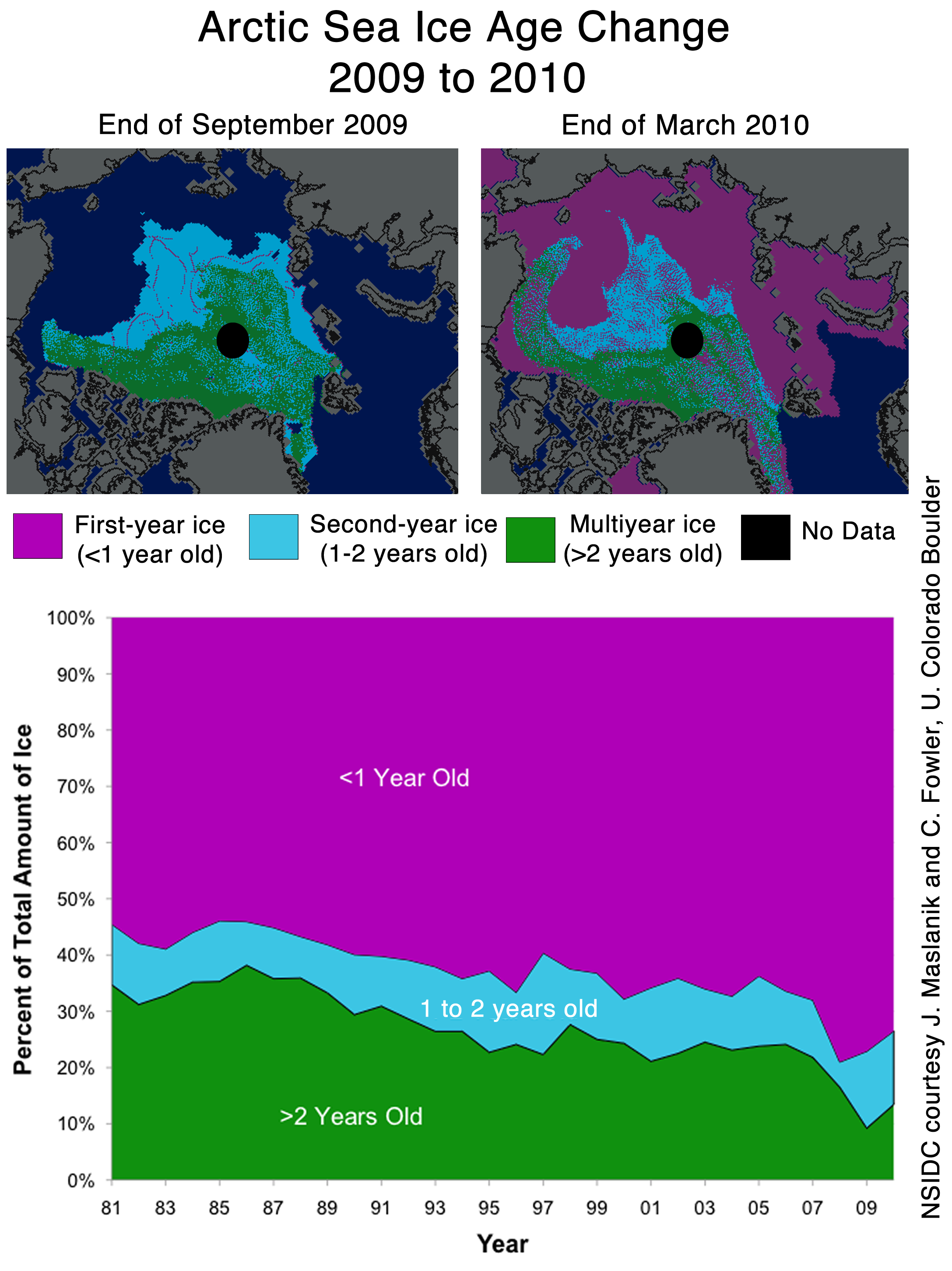
We’ve all seen that Arctic Sea ice area and extent has expanded and is back to normal. NANSEN Arctic ROOS just got their web page plots back online yesterday after an outage, and there’s a bit of a surprise when compared to NSIDC’s plot.

Sources:
http://arctic-roos.org/observations/satellite-data/sea-ice/observation_images/ssmi1_ice_ext.png
http://nsidc.org/data/seaice_index/images/daily_images/N_timeseries.png
Here’s a magnified view with the NANSEN graph zoomed and set to match the NSIDC scale, done with the help of my graphics program:

Both datasets use the SSMI satellite sensor, both datasets plot extent at 15%. Yet we have significant differences in the output which would seem to point to methodology. Note that in the magnified view, NANSEN has a peak “normal” of ~15.25 million square kilometers while NSIDC’s “normal” is higher at ~15.75 million square kilometers. You’d think there would be a standard for deciding what is the “normal” baseline wouldn’t you? [Note: The NSIDC average is for 1979-2000, NANSEN’s is for 1979-2006] Maybe the scientists can hammer this out at the next ice conference.
Regarding the plots above.
NANSEN says:
“Ice extent is the cumulative area of all polar grid cells of the Northern Hemisphere that have at least 15% sea ice concentration, using the NORSEX algorithm. Ice area is the sum of the grid cell areas multiplied by the ice concentration for all cells with ice concentrations of at least 15%. Ice extent and ice area are calculated for a grid resolution of 25 km.”
NSIDC says:
“Extent defines a region as “ice-covered” or “not ice-covered.” For each satellite data cell, the cell is said to either have ice or to have no ice, based on a threshold. The most common threshold (and the one NSIDC uses) is 15 percent, meaning that if the data cell has greater than 15 percent ice concentration, the cell is considered ice covered; less than that and it is said to be ice free.”
NSIDC also says:
“Other researchers and organizations monitor sea ice independently, using a variety of sensors and algorithms. While these sources agree broadly with NSIDC data, extent measurements differ because of variation in the formulas (algorithms) used for the calculation, the sensor used, the threshold method to determine whether a region is “ice-covered,” and processing methods. NSIDC’s methods are designed to be as internally consistent as possible to allow for tracking of trends and variability throughout our data record.”
Given that both NANSEN and NSIDC use the same SSMI sensor data, and calculate the extent based on 15% concentration, that half a million square kilometers difference in the “normal” sure seems significant in the context of the magnified extent view NSIDC presents. A half million here, a half million there, and pretty soon we are talking about real ice extent differences.
Another interesting difference is that NANSEN plots Arctic Sea ice area in addition to the extent. Here’s that graph:

Arctic Sea ice area is above the “normal” line as defined by NANSEN. As far as I know, NSIDC does not offer an equivalent plot. If I am in error and somebody knows where to find NSIDC’s area plot, please let me know and I will include it here.
One final thing to note about the difference between NANSEN and NSIDC. I don’t recall the director of NANSEN/Arctic ROOS ever coming out and saying something like “Arctic ice is in a death spiral” or making any sort of press announcements at all. They seem content to just present the data and let the consumer of the data decide.
In contrast, NSIDC has a whole section that addresses sea ice in the context of global warming. I haven’t found a comparable section on NANSEN Arctic ROOS.
Of course we know that NSIDC director Mark Serreze is very active with the press. Perhaps some of our media friends reading this should seek out someone at NANSEN for the next sea ice story so that there’s some balance.
The differences in the way each organization presents their data and views to the public might explain the differences in the way the output is calculated. One might take a “glass half full” approach while the other takes a “glass half empty” approach. Or it may have a basis in science that I’m not privy to yet. The point is that there are significant differences in the public presentation of sea ice data between the two organizations. One showed sea ice extent as normal, the other took sharp right turn just before it was expected to happen.
I welcome input from both of these organizations to explain the difference.
In related news, Steve Goddard writes:
NSIDC seems to confirms the WUWT 12 Month Ice Forecast. Twelve months ago, WUWT forecast that 3 year old ice would increase during the next year, and explained why. NSIDC confirmed the accuracy of the forecast with their most recent Sea Ice News.

Source: http://nsidc.org/images/arcticseaicenews/20100406_Figure6.png
Note that 3+ (>2) year old ice has increased from 10% to about 14% during the past year, shown with the two black horizontal lines near the bottom. That shows an impressive growth of 40% relative to last year.
Ice older than one year has also increased by a substantial amount over 2008 and 2009. The implication being that ice thickness has been increasing for the last two years. Older ice is thicker ice.
So we will leave it up to the readers to do the math. Thickness has increased. Area has increased. What does that tell us about volume? What does that tell us about the “Arctic Death Spiral“?
Don’t be fooled though. “Decreasing ice is climate. Increasing ice is weather.”
I was a Teen Age Werebear.
===============
Anthony.
I really enjoy your website.
It has become a standard read of mine!
Thanks
“Mistakes” happen all the time, but why are all the errors in favor of AGW???
Strange !!!
Great catch. I’ve been talking with some colleagues about sea ice recently, and this apparent discrepancy is an important one. Thanks.
The NSIDC average is for 1979-2000, NANSEN’s is for 1979-2006. Walt Meyer has explained their choice to stop at 2000 many times (they want an unchanging reference). You can disagree with his choice but it is a choice and nothing’s fishy.
“hide the decline”
What a fuzz about nothing !!!! Both data gives about the same absolute amount of sea ice. The one gives just a normal amount and the other a almost ignorable shortage compared to normal.
I don’t see any reason to make noise about these data. Gosh….How low do we need to go to make a scene about something normal ?….If this normal situation is actually something whith a high news value….then there is something wrong ! If we stayed under normal vor the last 8 years, then it should be logical and normal to conclude something is terribly wrong with the Arctic sea ice content.
These folks homogenize temperatures all day long, why can’t they homogenize 15% ice extent? This is absurd, and if Anthony did not do such a careful explanation, appears calculated. I do note, though, the trend line still differs.
By tomorrow or Saturday, the NSIDC and Nansen graphs should look more similar. NSIDC’s averaging algorithm creates some lag.
Also, NSIDC uses a higher baseline from 1979-2000, so their average is higher.
For me it’s a simple choice.
I am with Nanson Arctic Roos.
I don’t carry the concept of death spirals and I detest the the scaremongering tactics in support of power and money grabbing politicians.
There is nothing wrong with the climate or the Arctic, we won’t experience any dramatic effects in the rise of ocean levels.
The only thing we have to fear are the carbon scam artists that are after our money.
That’s it.
Good news. In europa they are launching another satellite today. It will measure freeboard. It can then calculate how much ice is submerged. Then they can toss in some proxies from morrocco and we will have more data. I am shocked that they can now create a trend from a single point.
NSIDC has raised the bar, to make it easier for Serreze’s “death spiral” to limbo under.
The most obvious difference between the two is that NSIDC defines normal based on the period 1979-2000, while NANSEN uses a period of 1979-2006. Those extra six years would have brought the average down; if they add in 2007 to the average next year, it should be even lower.
The really interesting figure should be the level of melt reached this September. We’ll see then how fares the dreaded death spiral…
All this suggests to me that the cycle is headed for the opposite end of the spectrum: Above normal ice pack conditions. The pendulum swings back.
The director of NERC sent out this just after the Gore-Støre report. May be of interest here:
Press Release
Nansensenteret (http://www.nersc.no), Bergen
15. December 2009
Gore – Gahr Støre report; “Melting snow and ice, a call for action”;
http://www.regjeringen.no/upload/UD/Vedlegg/klima/melting_ice_report.pdf
The report prepared by the Norwegian Polar Institute after a “closed” conference in April 2009, is superficial. The authors, according to Gahr Støre are “world leading scientists”, refer to few published work and often to themselves. For example, the ice chapter has only10 published articles – of which only 8 deal with the ice in Arctic and two the ice in Antarctic. Of the 8 articles just 4 of them refer to articles written by 2 of the 5 authors. Other important and published articles are not mentioned.
Several statements in the ice chapter are incorrect. In the introduction (page 34) it says “”Sea ice extent in the Arctic has shrunk by almost 40% since 1979”, the correct numbers is 4,1% per decade or 12,3% since 1979 – not 40%. 4,1% per decade comes from the Nansen Center ice information system; http.arctic-roos.org.
Furthermore, it is not mentioned that the ice extension has great natural variability. In the period 1915-1935 for example, during the natural warming of the Arctic, the ice decreased 0.6 mill km2 while in the summer of 1996 the ice increased with 1.6 mill km2 – caused by the North Atlantic Oscillation. The connection between the increase in CO2 and decrease in the ice spreading is not mentioned either – see for example Johannessen 2008 (enclosed).
The chapter about the Greenland ice sheet has also few references, only 7 articles, which are referred to by the authors – this is not good enough. Regarding the increase of the ocean level Gore and Gahr Støre have over-interpreted the report. They say that the ocean level will increase with 1 to 2 m. The highest value that is mentioned in the report is in the range of 0.5m – 1.5m and with great uncertainty with regard to the increase of 1.5m in this century.
For more information or questions please contact;
Ola M. Johannessen mobile: +4790135336.
What’s the problem here, they both clearly use a different baseline?
Nansen uses a 79-06 average and NSIDC uses a 79-00 average, that wholly explains the difference in their normal lines. Same measuring system + same “ice-covered” definition + different baseline == different normal value…
REPLY: Sure the baselines differ. I’m pointing out that the public presentations differ significantly and who defines “normal”? Normal seems to be in the eye of the beholder of the data. Essentially it is an anomaly, and you can make an anomaly look like anything you want with a simple choice of defining the baseline. – Anthony
” Frederick Michael (09:51:36) :
The NSIDC average is for 1979-2000, NANSEN’s is for 1979-2006. Walt Meyer has explained their choice to stop at 2000 many times (they want an unchanging reference). You can disagree with his choice but it is a choice and nothing’s fishy.”
That doesn’t explain the decline compared to the incline…
It shows how the artificially chosen baseline measurement affects the reported anomaly.
What is “normal” for the Arctic sea ice? We’ve only measured it by satellite for slightly over 30 years. How do we know what normal really is?
Sea ice forecasts are now made out of fudge … Climate changes, it gets hot, then it gets cold. And cold is much worse for life on earth than is hot.
Does anyone know where the “Ice by Age” data comes from? I tried searching for the IceBridge data from NASA but apparently I am a little useless. I did find a great picture of a crack in the ice though, With an alarming proclaimation about open water in the NW Passage.
The images are visually making my BS detector going off and I would like to see the raw data and any algorithms used to create the graphics.
Since most are smarter than me around here anybody got this?
There is a review and extension of area taken NSDIC very interesting. http://www.americanthinker.com/2010/04/was_the_arctic_ice_cap_adjuste.html
According to the NSIDC web page, “Fossil fuel burning is responsible for climate change”
Does this mean that “fossil fuel burning” has been going on for 4.5 billion years of continuous climate change on Earth?
I bet if extent increases above normal, the +/- 2 sigma shading stretches out to +/- 3 sigma, and/or the base period is adjusted to increase the mean.
If there were an options contract on it, I’d be all in. C’mon ProShares, I want a climate market!
There is nothinhg unusual, all of this happened before.
Read (a book from 1943):
http://www.archive.org/stream/arcticice00zubo#page/444/mode/2up
I don’t think that NSIDC do use the same sensors now. Following the problems with the F13 satellite last summer NSIDC switched to the F17 following cross calibration. Arctic-ROOS did something different and came on-line with a product that has varied from the other sources ever since, NSIDC, ASMR-E/JAXA and MODIS appear to be self consistent while Arctic-ROOS is the outlier.
REPLY: Could be, the point I’m making here is that the public presentation differs significantly. Who’s got the “right” presentation? I don’t know. – A
A bit off topic, but has anyone taken a look at the arctic death spiral propaganda being perpetrated by EDF?
“This is the story of a fictional polar bear family — Aakaga and her cubs Qannik and Siku — as they make their perilous journey in a melting Arctic world.”
http://www.edf.org/page.cfm?tagID=53590
This is hysterical!
NSDIC uses extension because it shows a decline greater than that area. But area is more important, no? “Hide the decline”
paulo arruda (10:18:34) :
I have looked at that American Thinker article and believe the author has made a critical error. Concentration at the pole hole is much higher than 15% – actually closer to 100%. Using the correct concentration numbers, the NSIDC area and extent trends correlate correctly.
REPLY: I agree. Send me the results and I’ll send it to the American Thinker with a suggestion that they check their work and make a correction if indeed they made that error. -Anthony
There is appearing today a new fly in the ointment . In order to study the alarming results of climate change , the publicity tune of today , the european space agency launched a new satellite , cryosat , intended to take hourly pictures from both icecaps and whereof spectacular results are expected within half a years time . A new radar will be able to look under the ice and is surely going to deliver the proof that agw is resulting in an impoverished icefloor even when the real ice-extent is growing . All ice will be almost certain classified as unfit for human travelling and the proof of this fact may even come earlier from the catlin-insurance group or a crazy individual trying to conquer the north pole on his own . Anyway we are living in fascinating times and any real capitalist will applaud the hype as long as he is able to make money out of it ! You are a winner , baby al on the way of becoming a zillionaire !
The difference in direction in the recent trend (i.e., still increasing for NANSEN vs. decreasing for NSIDC – and the NSIDC revisions, documented here, for the last days of March) seems a bit incongruent, but the methodologies are somewhat different. Both eliminate any cells with less than 15% cover. NSIDC counts cells at >15% as all ice. NANSEN multiplies those same cells (that is if the cells are gridded the same) by the ice concentration within the cell (as I understand the description). So NSIDC should show a greater extent on any given day. I can’t tell from the graphs whether that is the case, but would be interested in that comparison if anybody wants to put out the effort. Regarding the difference in “Normal”, NSIDC is based on 1979 – 2000 while NANSEN is based on 1979 – 2006. So the lower NANSEN normal makes sense since extent in 2001 – 2006 was lower than in 1979 – 2000. But it’s interesting to see that we do seem to be returning to a more “normal” condition (as normal may be defined), at least for now. It will be interesting to watch the trend in the months to come as we go through the “Straits of June”, as on commenter recently coined.
I’m still sitting on 6.0-6.2M km2 for summer extent minimum.
But apparently I need to call out specifically that is based on NSIDC’s and JAXAs historical graphs.
Take a look at the extent minimums on NANSEN as well. It’s not just the max where they disagree with NSIDC. For 2009 NANSEN shows an extent minimum at ~6M km2, whereas NSIDC was a hair shy of 5.3M km2.
Okay, what’s going on here? They both claim to be doing 15%.
Are they using doing different grid cell sizes, perhaps? If NSIDC’s grid cell size is significantly bigger than NANSEN’s 25km, that could explain it. A bigger grid cell would have a harder time reaching the 15% threshold.
De Rode Willem,
You have to understand what “normal” actually means in context. NSIDC uses a baseline period of 1979-2000 to calculate “normal”. NANSEN uses a baseline period of 1979-2006 to calculate “normal”.
What this means is that the NSIDC uses 1979 and the early 1980’s in their calculation of normal (all years with very HIGH ice cover), but does NOT use 2000-2006 (some of these years had very LOW ice cover). NANSEN, on the other hand, does include 2000-2006, so their calculation of “normal” is somewhat lower than the NSIDC number for “normal”.
In order to know what is truly normal (as in, what is a typical average ice-cover area for the arctic), we would probably have to have an absolute minimum of 100 years of data, and it would be far better to have, say, 10,000 years of data. That would give us a MUCH better idea of what is truly normal as opposed to some arbitrary “normal” based on a very small dataset.
Unfortunately, we did not begin getting satellite data for this until 1979, and 1979 and the early 1980s had very high ice-cover. In a 30-year database, 4 or 5 years of very high ice-cover is going to bias “normal” to the high side.
So, it is important to remember that “normal” has nothing to do with “the expected average” in this case. In this case “normal” simply means either the 21-year or 27-year average ice-cover in the arctic. Whether these 21 or 27-year averages resemble “normal” in any meaningful way is basically anyone’s guess untill we get a LOT more years of data.
Extent has to decline faster than area, because extent is greater than area. So the extent slope has to be steeper than the area slope.
I’m flipping out over this news! That increase is going to increase albedo during the summer months, and cause rapid cooling of the planet! We’ve reached a tipping point, and we’re going to plummet into a new Ice Age! And it’s all from ice formed from the gases released by mankind’s industrialization! AHHHHHHH!!!
*dons sackcloth*
And don’t accuse me of overreacting. The science is settled!
*sets hair on fire*
Intersting to see temps in the Arctic seem to have taken a massive jump recently! Any info on this anyone?
Mike Bryant (10:10:14) :
” Frederick Michael (09:51:36) :
The NSIDC average is for 1979-2000, NANSEN’s is for 1979-2006. Walt Meyer has explained their choice to stop at 2000 many times (they want an unchanging reference). You can disagree with his choice but it is a choice and nothing’s fishy.”
That doesn’t explain the decline compared to the incline…
The current value from NSIDC is 15 million km. sq. here:
http://nsidc.org/data/seaice_index/images/daily_images/N_stddev_timeseries.png
The current NORSEX value is about 14.7 million km. sq. Here (look at the extent graph on the right):
http://arctic-roos.org/observations/satellite-data/sea-ice/ice-area-and-extent-in-arctic
My guess is that the NSIDC 5-day moving average is shorter than the smoothing method used by NORSEX. Thus, the NSIDC plot shows a decline already (but from a higher peak) while the smoother NORSEX plot is just beginning to slide.
I love it when a scientific consensus comes together 🙂
I’m still interested in seeing the actual raw data or pictures for the “maximum ever” Arctic ice extents. When you compare the “better instrument” in the 2002-now AMSR-E’s data to the average, the difference is a whole lot of ice. And half the data has to lie on the other side of the average.
The actual Arctic is still freezing pretty solid – the “missing” ice is precisely the same areas that (1) should be well documented by shipping reports, and (2) just inherently seems unlikely to freeze from a current perspective.
Frederick Michael (10:48:39) :
Looking at DMI’s data, which does not do any averaging, you can see that the trend since mid-March is still upwards. NSIDC’s short tail should turn upwards tomorrow or Saturday.
http://ocean.dmi.dk/arctic/icecover.uk.php
I don’t understand why they don’t use all years for the average. Isn’t that the way it is supposed to be calculated? We all know that we really don’t know what the “average” is supposed to be, since we have relatively limited data, but why not recalculate it every year? They do that with baseball statistics. A players’ season or career average changes every day, though the career average will barely change day to day, and even later in the season, his seasonal average will not change that much day to day.
But why would they not calculate recent years in order to figure out what “average” is? Is it because they assume the ice is not supposed to be low, therefore the last decade or so should not be counted? I would think every baseball player would love to have their bad years thrown out too!
Someone said Meier wants an unchaning reference, but averages do change over time, don’t they? Someone else could use the last 10 years as the average baseline, and we would see that ice is now WAY above average, and we must do something to stop it!
Pardon?
If NANSEN uses a baseline from 1979-2006 while NSIDC uses one from 1979-2000 then it is pretty obvious where the difference most likely lie. 2001 thru 2006 were considerably warmer years with lower sea ice concentrations. Thus, not only does NANSEN have a lower “peak” but the the entire cure is lower – hence 2010’s line intersecting the NANSEN curve, but not intersecting the NSIDC curve.
That said, NSIDC needs to extend its baseline past 2000.
REPLY: I agree, and I find it interesting that NSIDC does not point out this baseline difference in the explanation about differences with other presentations I cited from their web page above. – Anthony
The main item of note here is that NANSEN seems to show sea ice extent expanding for the first week of April while NSIDC shows it decreasing, but if you look at NANSEN’s raw data plot (dashed red), you can see that it too shows decreasing ice for the first week of April. It’s half obscured by the solid red homogenized line, but clearly pops up above the homogenized line at the end of March, then descends from there.
If the solid line is a smoothed line, then the April decrase in the raw data is consistent with NSIDC. If the solid line involves data processing that makes it improper to look at the raw data on its own, then there may be an ongoing mystery as to how the two data sets show opposite April directions.
In 2007, Mark Serreze appeared ready to open up The Northwest Passage as a commercial route. Hopefully no one invested too heavily in that idea.
http://www.livescience.com/environment/070914_northwest_passage.html
As others have pointed out, the ‘normal’ lines will be different because of the different baseline years. There’s no mystery there. I wonder what the ‘normal’ curve from 1940 to 2010 would look like.
The slight differences in the current curves can be explained by their using different smoothing algorithms. The NSIDC curve could be explained by their using the ‘average’ line (or last-year’s line) to estimate future measurements in order to smooth the tail end of the current line. It would be interesting to see the raw data to find out if those differ.
Where did the information on ice ‘age’ come from? I can’t imagine that satellites could tell whether a section of ice was two, three, or four years old.
REPLY: The point is the difference in public presentations. Who defines “normal” baselines? It would seem to me that that the public interest is not served by having conflicting presentations, one above and one below, “normal”. – A
Why does NSIDC show 2010 area at or below 2007 for most of Jan-Feb while Nansen 2010 is always above 2007? Watt am I missing?
NSIDC does not have a rational explanation for the fixed average they use. I could speculate that they saw a decline and decided to fix a time range to reference to. Since we are seeing an increase your point is well taken. They should add each successive year into the average, much as they do when the perform their regression analysis.
@Mike Bryant (10:10:14) :
“but it is a choice and nothing’s fishy”.
I’m sorry, but I can’t agree with that. You’ve stopped your analysis one level short of truth.
Here’s what NSIDC says on their website on this issue in their FAQ:
“Why do you use the 1979–2000 average for comparisons?
NSIDC scientists use the 1979 to 2000 average because it provides a consistent baseline for year-to-year comparisons of sea ice extent. Scientists call this long-term average over a data series a “climatology.” If we were to recalculate the climatology every year to incorporate the most recent year of data, we couldn’t meaningfully compare between recent years. To borrow a common phrase, we would be comparing apples and oranges.
The problem with relying on a sliding average becomes clear over time, when we try to compare new years of data with previous years. For example, if we rely on a standard, unchanging climatology like 1979 to 2000, we can easily and clearly compare September 2007 and September 2008 with each other. However, if we were to use the sliding climatology of 1979 to 2006 for September 2007, and the sliding climatology of 1979 to 2007 for September 2008, we would no longer be comparing “apples to apples” when we compared the two years to climatology.
Finally, some scientists point out that since 2000, sea ice has declined precipitously. While you can do an average over any period, it is better to do so over a stable period, either a period of relatively flat change or cyclical change with little overall trend. If you include a strong increasing or decreasing trend when you calculate an average, you probably will not have a representative average.
That said, NSIDC has recently considered revisiting the 1979 to 2000 average. We now have thirty years of Arctic sea ice data. A thirty-year time series is a widely accepted scientific standard for a climatology because it is long enough to encompass most cyclical patterns of natural variation. The problem, however, is that we would have to deal with the potential confusion caused any time that a standard is changed. The graphs would look different to the general public and would require a great deal of explanation.”
Consider that final paragraph, which is the important one for our discussion on this topic. NSIDC admits that 30 years is “a widely accepted scientific standard”, and yet they have not made the move because of “potential confusion”.
Potential confusion to who? Pielke, Jr? Gavin Schmidt?
No, of course not. In fact, they say “the general public” is their concern re confusion.
Well now, isn’t that interesting. That friends is in fact the defintion of politics vs science right there.
So I have to disagree. It is indeed “fishy”.
I could go on at length about what I think they really mean by confusing the general public, but while I have a great deal of confidence in my analysis, it would still be speculative. And frankly, I shouldn’t even need to in this context, because NSIDC just admitted in public that they are engaging in politics instead of science by not going to a 30 year baseline, and frankly that should be enough for me to win my case.
Brian in Bellingham (10:57:38) :
http://nsidc.org/arcticseaicenews/faq.html#1979average
Why do you use the 1979–2000 average for comparisons?
NSIDC scientists use the 1979 to 2000 average because it provides a consistent baseline for year-to-year comparisons of sea ice extent. Scientists call this long-term average over a data series a “climatology.” If we were to recalculate the climatology every year to incorporate the most recent year of data, we couldn’t meaningfully compare between recent years. To borrow a common phrase, we would be comparing apples and oranges.
The problem with relying on a sliding average becomes clear over time, when we try to compare new years of data with previous years. For example, if we rely on a standard, unchanging climatology like 1979 to 2000, we can easily and clearly compare September 2007 and September 2008 with each other. However, if we were to use the sliding climatology of 1979 to 2006 for September 2007, and the sliding climatology of 1979 to 2007 for September 2008, we would no longer be comparing “apples to apples” when we compared the two years to climatology.
Finally, some scientists point out that since 2000, sea ice has declined precipitously. While you can do an average over any period, it is better to do so over a stable period, either a period of relatively flat change or cyclical change with little overall trend. If you include a strong increasing or decreasing trend when you calculate an average, you probably will not have a representative average.
That said, NSIDC has recently considered revisiting the 1979 to 2000 average. We now have thirty years of Arctic sea ice data. A thirty-year time series is a widely accepted scientific standard for a climatology because it is long enough to encompass most cyclical patterns of natural variation. The problem, however, is that we would have to deal with the potential confusion caused any time that a standard is changed. The graphs would look different to the general public and would require a great deal of explanation.
For those who are interested in comparing the thirty-year decline in Arctic sea ice extent to something different than the 1979 to 2000 average, the NOAA Arctic Report Card 2008: Sea Ice offers a graph showing groups of five-year averages from 1979 to 2008. What one immediately notices is that the overarching story remains the same: Arctic sea ice is rapidly declining over the satellite record, no matter how you calculate the averages.
… but Anthony the “science is settled”
It has already been mentioned that the Cryosat-2 satellite was launched today.
One of its missions is measuring ice thickness. Unfortunately it seems it will have a limited life span.
The other possibly unfortunate part might be that it’s european. The EU is very keen in promoting GW business. Let’s wait and see.
I doubt they will solve the baseline issue at the next ice conference.
They will probably just skate around it.
I’ve been posting for yonks about this here, Blackboard and Mike Marinaralenas site… finally its being noticed. I believe it requires much more investigation ie icearcticgate. LOL. Once again DMI ice is live data
http://ocean.dmi.dk/arctic/icecover.uk.php with no suggestions/agendas
here is Mike’s records of ice re-adjusments for past 3 years
http://mikelm.blogspot.com/2007/09/left-image-was-downloaded-from.html
Arctic ice is much easier to fiddle with as each “slab” of ice lets call it can have different borders etc (eyes of beholder) old ice, new ice ect. No such thing in Antarctica so no fiddling there. Notice how SH has been in fact ABOVE anomaly for past 3-4 years! Even CT has been unable has been unable to play with that one. The AGW’ers cannot admit defeat on this one its far too important and would bring the edifice down much quicker than desired (until at least they can find new jobs for them). Another favorite (in this case) is to play with the average so current data always looks below (suspect who?). Anyway the whole thing is BS because its only 30 yrs data = meaningless so I dont care if it goes up or down it doesn’t mean AGW warming or Denier cooling haha
Normal….ya…for what its worth.
When i worked for Env. Canada, we used the last 30 years of temp data to define a ‘normal’. Over the next 10 years, those temps were used to show the difference from ‘normal’. Once you acccumulated another 10 years, you dropped off the oldest 10 and added in the new 10 years.
I don’t see ‘ICE’ being any different. use 1979 through to 2009 as your ‘normal’.
Then again GISS still uses 50-80 as their temp ‘normal’… must not show the decline…
just my 2 cents
anthony:
Note that in the magnified view, NANSEN has a peak “normal” of ~15.25 million square kilometers while NSIDC’s “normal” is higher at ~15.75 million square kilometers. You’d think there would be a standard for deciding what is the “normal” baseline wouldn’t you? [Note: The NSIDC average is for 1979-2000, NANSEN’s is for 1979-2006] Maybe the scientists can hammer this out at the next ice conference.
you are right. the exclusion of 2003-2006 data from the NSIDC avg number alone will increase the peak number for the historical avg(???) by 0.2 million km2. excluding 2001-2002 ( for which i have no data to do the calc ) probably will add less than 0.1 million km2, could be 0.05 million km2. So, only about half of the difference ( between 15.25 and 15.75 ) is explained by the exclusion of years 2001-2006. the rest has to come from somewhere else. and as you said, they both can/may explain that 0.25 million km2 difference.
KC (10:24:03) :
A bit off topic, but has anyone taken a look at the arctic death spiral propaganda being perpetrated by EDF?
“This is the story of a fictional polar bear family — Aakaga and her cubs Qannik and Siku — as they make their perilous journey in a melting Arctic world.”
http://www.edf.org/page.cfm?tagID=53590
This is hysterical!
———————-
I don’t think Aakaga and her fake babies find it “hysterical”!
LOL
I’ve got the Arctic sea ice extent very close to the 1979 to 2010 average at only 27,000 km2 (0.2%) below average.
This comparison will not be perfect as some adjustment was required to match up the datasets but it gives a reasonable indication of where 2010 sits now compared to other years.
http://img517.imageshack.us/img517/529/nhsieapril7.png
The natural ocean cycle appears to be in the order of 60 years. The average of any related effect, such as ice, should therefore be calculated over any whole number of 60 year periods. If there is no trend it should not matter which 60 year period you take. Given that the satellite record only starts in 1979 we will not know what “normal” is until 2039. However, if we have reason to believe that 1979 was at a maximum in terms of ice (since it was a temperature minimum) it would be a reasonable approximation to take the 30 year period between 1979 to 2009 where ( as looks to be the case) 2009 is close to the ice minimum. If my assumption is correct the “normal” thus calculated should be fixed until 2039. If more years are included the “normal” would gradually decrease until 2024 as more of the cold cycle is included. This would be good for the anti AGW argument but not good science.
“What Is Wrong With Science Today”
Googled on Cryosat 2, found this brief news piece.
With this picture (Caption: “Artist’s impression of CryoSat imaging an iceberg, image courtesy of EADS Astrium”).
*groan*
Dear Mods,
Re: kadaka (11:51:12) (awaiting moderation)
First time I’ve tried the CA-Assistant “Insert Image” option, looked good on Preview, didn’t seem to take on the actual submitting.
Is there a proper way to insert images here?
Thanks for the good work!
I do expect that NSIDC will go to a 30 yr baseline *eventually*, reclaiming their scientific self-respect. And it won’t be a sliding baseline (nor should it in my view), but it may or may not start in 1979.
I think they believe that the inexorable retreat of the arctic icecap will give them plenty of opportunity to switch to a 30 yr baseline a few years down the road, without creating that “confusion” they cite today, because the baseline line will still be comfortably above the reality at that time. It wouldn’t be today, no question.
What’s going to be embarrassing for them is if the arctic ice refuses to cooperate on that score over the next few years. Then they may be forced to take their scientific manhood in hand and bite the political bullet anyway eventually.
If 2010 ends up where I think it will, then perhaps they’ll consider using a 30 yr baseline ending at 2010. That might appeal to them because it will somewhat minimize the 2007/2008 dragdown effect.
If 2010 ends up where Anu and R. Gates think it will, perhaps that will give NSIDC the confidence to go to a 1979-2008 baseline, in the greater confidence that 2011 won’t cause that dreaded “confusion”. Tho I suspect they’ll want to wait until 2012 or so, even if retreat resumes below the 2007 line to be sure of not being embarrassed by “confusion”.
@ Anu (11:13:40)
Thanks for your response on the sea ice average. I had asked the question in previous posts and had not yet got the answer. I do note that the NSIDC still frames it in a way that makes the more recent declines look more disastrous than needed
Per Lance (11:27:43), I would still like to see SOMEONE plot the 2009 – 2010 sea ice against the 1979 – 2009 average. I don’t buy the argument that you use a base that isn’t changing as it is self serving to the alarmist notion. Artic ice probably is decreasing, just like temperatures and sea levels are rising during the current interglacial, and using the average that shows recent decline will better demonstrate that there is no link to human activity.
My favourite line I picked up somewhere on WUWT – “Climate Change – not new, not much, and nothing to worry about” It applies equally to ice extent.
Steve Goddard (10:54:19) :
Looking at DMI’s data, which does not do any averaging, you can see that the trend since mid-March is still upwards. NSIDC’s short tail should turn upwards tomorrow or Saturday.
http://ocean.dmi.dk/arctic/icecover.uk.php
This is a great plot because they use a 30% sea ice threshold for their area. This gives a sense of how robust the 15% threshold figures are. They are, at this time, quite robust — encouraging. The trend is down over the last week or so but not dramatically.
This figure also bodes well for lots of sea ice over the next week or so:
http://nsidc.org/data/seaice_index/images/daily_images/N_daily_extent_hires.png
The rapid melt now would be in the Canadian Maritime provinces — but there’s not much there to melt. The areas with a current excess (e.g., the Bering sea) will hold for a while longer. This is why I expect the NSIDC average line to be breached in the near future.
I thought it was interesting that IARC-JAXC AMSR-E data shows that Arctic sea ice extent is the greatest since these measurements began in 2003.
http://www.ijis.iarc.uaf.edu/en/home/seaice_extent.htm
And all of this while CO2 has risen substantially…
…the only death spiral I can believe in is for the funding streams for climate science!!
Just wait, the spin will come.
Looking at the NANSEN unfiltered data in the graph, it appears to look more similar to the NSIDC. Anybody have a clearer picture of that?
FWIW, the posts on this website, and the subsequent discussions, are the reason I come here. It’s a wonderful little conclave of logic and reason, with intellectual arguments thrown in there. Thanks to all the scientists who continue to pursue the discourse of data and reason in a congenial environment.
Baselines being different don’t matter, nor does coverage area. The problem is that the actual numbers sometimes match and sometimes do not, sometimes by a million km2. Compare either the January start line of 2007 and 2010 extents or March 1 2007 and March 1 2010 extents. I can’t trust either source. Facts are verified data, this ain’t it.
Note that the difference in “baselines” is 500,000 square kilometers (about three percent or somewhat larger then the state of California). There are lots of relevant variables aside from “extent” and “area” and “thickness”, depending on what your study is in aid of. How continuous is the sea ice (open or close pack), what is its albedo (effects of snow cover, dust load, surface roughness, latitude), what are its movements (response to winds, currents, shorelines, shoals), etc. These aren’t just ice cubes in a glass. Coriolis and Ekman, anyone? The triple interface of ice, water and air, plus mobility and insolation (or the lack thereof) defies simplistic characterization.
Glad to see this. I was wondering why Nansen wasn’t reporting lately.
Using the 1979-2000 base seems OK as long as it is disclosed. That baseline does imply that those years were “normal” and later change is thus “abnormal.” But that is stretching. NSIDC shows what it shows and eventually will abandon their weak argument about the baseline.
Good to see another satellite launched today. I prefer several measuring the same ice but reporting through independent agencies.
Pardon my question. If there is only a small difference between the current measurements and the historical NSIDC “normal” curve, shouldn’t there be a statistical test that can characterize whether the current data (say over the last month) is statistically distinguishable from the “normal” population? Perhaps Steve McIntyre should be brought into this discussion.
Do they remove 2007, since it is an outlier?
Well, darn! My 722 to 0 streak finally has to be changed to 722 to 1. However, all this proves is that there is at least one government or university scientific organization which will actually publish publically something that a person skeptical of all of the other published climate science ‘facts’ in the last two years would view as encouraging or leaning to his or her viewpoint. Science might not be totally broken by the governments and universities after all. I probably need to end my paper right here before any chance of a trend-breaking flurry occurs for I then might need a statistician’s help to bolster my hypothesis. I know, I have to jump to political science for this one. 🙂
Maybe time for a better sig too, things are ‘a changing. Anthony, is this what they mean by ‘identity theft’? 😉
/sarc
or not
Some have mentioned a ‘change’ in baseline may be appropriate. While that may be true (using a 30yr spread seems consistent with other climate methodologies) it may give a false impression of what is going on.
Particularly with the general public – they will see these numbers jump all over the place, demonstrating some kind of inconsistency – and will fall back on what they believe, rather than what they know.
I’m no fan of ‘hiding the decline’; unfortunately, going to a 30 year span will do precisely that (basically shifting your baseline down). This will force people to look at the historical picture, putting them into information overload, and, once again, putting people into belief mode. Since we have so few measurements, it’s really an arbitrary line, anyway, and used for political purposes.
I would favor forcing the hand of the AGW alarmists to shift to the (perhaps proper) 30 year span. True, as always, the AGW sceptics are still in the reactionary position, but it’s not always a bad thing to be there.
Summarily, use an ‘average’ which gives us the best guess of consistent cyclical coverage rather than the 30 year span. This doesn’t mean the average is ‘normal’, but just a span in time where the coverage did not vary as much as it has over the past decade, and gives a reasonable point of comparison. This is what the human eye naturally does, anyway.
All this talk about spin…it’s interesting that this figure never gets posted here:
http://nsidc.org/images/arcticseaicenews/20100406_Figure3.png
Enjoy your return to “normal”. Me and my eco-fascist-warmist-greenie-halfwit-tree-hugging-sandal-wearing-dope-smoking-scientist buddies would like to see you all hide THAT decline…
REPLY: It gets posted here quite frequently in comments. And it was shown also last year. The ice aging graph above also shows the same trend. Point is that unlike you and your self described “buddies”, we simply aren’t that worried about it.
Watch for the reason why in a day or two. And yes, we’ll use that graph too. – Anthony
KC (10:24:03) :
A bit off topic, but has anyone taken a look at the arctic death spiral propaganda being perpetrated by EDF?
“This is the story of a fictional polar bear family — Aakaga and her cubs Qannik and Siku — as they make their perilous journey in a melting Arctic world.”
http://www.edf.org/page.cfm?tagID=53590
This is hysterical!
I can’t recall the word for it at the moment which attributes human behavior and character to animals.
Using this technique I often find deplorable, particularly when aimed at children.
I watched David Attenborough documentaries when he (and others like him) demonstrated the brutality of life in the animal kingdom. Nowadays, such documentaries, although showing the exact same things from decades ago, always have that political ‘man did this’ undertone – or, more and more, blatant overtone.
So the sea ice this year appears to have the best cover since 2002 and yet the first three months of this year have been some of the warmest on record, especially in the Arctic. Any explanation?
@geo
NSIDC hopped on the AGW bandwagon and now can’t get off and still keep a straight face. Otherwise my guess is that they’d stopped with the screwy semantics in their FAQs a several years ago and hopped on the reality train.
——-
If NSIDC had had 150 years of data then sure jumping over a few years between 2001-2010 wouldn’t have mattered much and could’ve easily been rectified by a proper error bar. But now they have 21 years which they claim is a proper static long term normal…. suddenly those 30 years as a some kind of minimum went out the window.
A problem with their reasoning is of course that today isn’t 2001 but 2010. 2001, and maybe 2002, their arguments were sound, but now they have 10 years to their last entry for their 21 year normal. That’s an almost 50% difference in time length with the result as in comparing 2000 to a normal that was computed for the years 1850-1950, which only is ok if you have a proper context and reason for doing so.
NSIDC doesn’t try to describe reality, which could’ve been ok if they’d had a proper context to go with their stuff.
They now have a proper 30 year timeframe. And if they can take 1979 and compare it with a normal based on 1979-2000, then of course it’s equally ok to take 2009 and compare it with a normal based on 1979-2009.
These difference seem to be such minor short-term issues. Let’s see what the trend is over the next 4-5 years. If we don’t see a new satellite record summertime low for the arctic by 2015, then I’ll start to be suspicious of the AGW models, but right now, these very short term “blips” are just that, regardless of which data set you want to use. These “blips” will only be significant if the start to become a new trend…and that can be seen only over a longer term. We had an extremely negative AO this winter and less flushing of older ice, so conditions should be ripe for some more recovery of arctic sea ice if certain AGW sceptics are to believed, but I don’t see it. I see warmth from Hudson Bay over to Greenland, and then into the central arctic. I see the Bering sea (where most of the March “bump” occurred as having very thin brand new ice that will melt very fast when the summer melt really starts up. I see a summertime low around 4.5 million sq. km (as measured by IJIS/Jaxa). Those calling for a summertime low around 6 million I think are underestimating how warm it has been over much of the N. Atlantic and Greenland into the central part of the Arctic…and yes, warmth matters, not just winds and currents.
DocattheAutopsy (12:32:53) :
FWIW, the posts on this website, and the subsequent discussions, are the reason I come here. It’s a wonderful little conclave of logic and reason, with intellectual arguments thrown in there. Thanks to all the scientists who continue to pursue the discourse of data and reason in a congenial environment.
—
REPLY: Thanks! Join in any time, this is a good bunch of folks!
Quick thought: consider how much computing speed and memory have improved over the time-spans involved in these time series graphics, as well as improvements in sensor technology. Perhaps we are now seeing a more accurate/comprehensive picture of Arctic and Antarctic ice extents?
Back in 2000, the Pentium VI was state-of-the-art, and Pentium III in widespread use.
One of the first rules of epidemiology (my field) is to first ascertain the accuracy of your data….are results real, or the result of better monitoring/diagnostics?
This is an ongoing discussion regarding autism spectrum disorders (is the increase in incidence real, or due to better diagnostics?)
Satellite systems are not my strong suit, any thoughts?
Given that the NSIDC graph hit the average line, then was turned away the following day, more scamming is plainly afoot !
Phil M (13:16:09),
Cherry-picking only the Arctic as usual, I see.
Let’s look at what’s happening in the Antarctic: click
Want more? OK, if you insist: click
See, what matters is global ice cover: click
Nothing unusual is going on in the Arctic. Ice cover is pretty much at the 1979 – 2010 mean: click
Bill Illis made a nice chart he posted above. Here it is again: click
Point out that “death spiral” for us. I don’t see it.
**************
Phil M (13:16:09) :
All this talk about spin…it’s interesting that this figure never gets posted here:
http://nsidc.org/images/arcticseaicenews/20100406_Figure3.png
Enjoy your return to “normal”. Me and my eco-fascist-warmist-greenie-halfwit-tree-hugging-sandal-wearing-dope-smoking-scientist buddies would like to see you all hide THAT decline…
***********************
Dang Phil! If not for you, all us dumb skeptics would have never known the Arctic ice extent is decreasing. You deserve some kind of medal for saving climate science from WattsUpWithThat. Man, imagine that! Arctic sea ice is in decline! Who’d a thunk it??
Phil M (13:16:09) :
All this talk about spin…it’s interesting that this figure never gets posted here:
http://nsidc.org/images/arcticseaicenews/20100406_Figure3.png
Enjoy your return to “normal”. Me and my eco-fascist-warmist-greenie-halfwit-tree-hugging-sandal-wearing-dope-smoking-scientist buddies would like to see you all hide THAT decline…
Thanks Phil, that’s 723.
Sea ice extent, area, and thickness are the result of climate processes driven by deterministic chaos. During Earth’s warm periods, ice metrics oscillate from year to year in a nonlinear way – always have and always will. Thus linear trends have no predictive power concerning future levels.
This years Arctic maximum is bad news for the ‘warmists’ though:-))
Phil M
I would like to see that graph referenced to zero Km squared and then see how precipitous the resulting slope is. The total drop in that graph is only one million square kilometers, a number I don’t find very threatening.
Anthony, you wrote:
“One final thing to note about the difference between NANSEN and NSIDC. I don’t recall the director of NANSEN/Arctic ROOS ever coming out and saying something like “Arctic ice is in a death spiral” or making any sort of press announcements at all. They seem content to just present the data and let the consumer of the data decide.”
This isn’t entirely true. As reported by me last year, the then director of the Nansen Centre made an astonishing prediciton of an ice free Arctic, summer AND winter, by 2100. I found that particularly alarming and unscientific, as that would require increased winter temperatures of about 30K in order to prevent the Arctic Ocean from freezing.
http://www.vg.no/nyheter/utenriks/klimatrusselen/artikkel.php?artid=542650
Also, this is not by any means supported by Nansen’s own data, which show a decline of 2.8% per decade for yearly maximum (winter) ice. Hence, a simple extrapolation of trend would imply it would take 35 decades for winter ice to disappear.
http://arctic-roos.org/observations/satellite-data/sea-ice/total-icearea-from-1978-2007
Johannessen argues that asssuming CO2 increase is responsible for 90% of ice reduction, a further increase to 765 ppm CO2 would be enough to melt all winter ice, and this could happen before 2100.
Founding director Ola M. Johannessen retired as of 31-12-2009, and the new director Stein Sandven has not made any similar alarming predictions, at least not as far as I am aware.
http://arctic-roos.org/Members/webadmin/newsbox/new-director-at-the-nansen-center-in-bergen
REPLY: Thanks, I stand corrected. I knew there had not been anything recently, and I wasn’t aware of the news article you cited. Do you know if it got any press beyond that? – Anthony
“OceanTwo (13:26:29) :
[…]
I can’t recall the word for it at the moment which attributes human behavior and character to animals.”
Animals that look like and behave like humans: antropomorphic.
People that look like and behave like antropomorphic animals: Furrys.
Don’t know why they don’t switch to 30yrs of mean data like Cryosphere did. You have high ice yrs with low ice yrs. Seems you get a good average from that.
I believe the UK Guardian Newspaper who had this headline based on a NSIDC source
“Arctic winter ice recovers slightly despite record year low, scientists say”
Phew, managed to get the “record low” in so presumably we are still on course for a death spiral.
Link is
http://www.guardian.co.uk/environment/2010/apr/07/arctic-sea-ice-recovers-slightly
“R. Gates (13:51:37) :
These difference seem to be such minor short-term issues.”
I’ll use this quote on the next alarming once-in-a-century event caused by global warming. Ooh, unprecedented warming – minor short-term issue. Really catchy. Thanks!
Is it just me, or for the last week NANSEN shows ice still increasing, while NSIDC shows decreasing? Opposite trends?
For the downward trending NSIDC plot, can anyone check to see what the numerical difference is to normal for the last week? Checking numbers might reveal some ‘fixing’ of data.
Although the plot is not continuous, there is a sudden rise in the DMI graph showing the temperatures in the Arctic.
If this is correct, I suspect we will see the slope of the ice extent curve bend downward relative to the “normal”
Is there any reason to believe this is in error?
http://ocean.dmi.dk/arctic/meant80n.uk.php
Maybe we should believe that there is a lot of error involved in trying to figure out how much ice cover there is.
OceanTwo (13:26:29) : {…}
I can’t recall the word for it at the moment which attributes human behavior and character to animals.
It’s anthropomorphism, seeing human traits where there are none. Seems widely used to encourage empathy leading to money donations.
“…Walt Meyer has explained their choice to stop at 2000 many times (they want an unchanging reference)…”
Since somebody referenced the unchanging reference period used by GISS (totally ignoring the WMO’s guideline of using a minimum 30 year period ending at the decade), I won’t mention it again.
Oh, wait…
Has anybody ever put up a spaghetti graph of all the years? They only seem to chose the “lowest” values in their chart. Would love to see ALL the years that fell below their “normal” line.
For them to have “error bars”, there would have had to been a FEW years that went below (or do they only want to show the “record” low values).
REPLY: Thanks, I stand corrected. I knew there had not been anything recently, and I wasn’t aware of the news article you cited. Do you know if it got any press beyond that? – Anthony
No, I haven’t seen this prediction getting any further press. Also, to be fair, Johannessen was cited in the press in September regarding increased Ice concentration in the Arctic:
http://www.dagbladet.no/2009/09/16/nyheter/miljo/milj/arktis/8143738/
“Johannessen said that at this time one can conclude that this is due to natural fluctuations in temperature and among other things cloud situation in the area.
– There were many who got overly excited and talked about man made global warming. But here it was clearly a question of a very powerful natural variability, said Johannessen.”
CRS, Dr.P.H. (13:56:10) :
[…] Back in 2000, the Pentium VI was state-of-the-art, and Pentium III in widespread use.
Excellent point!
And considering the great lag between satellite system conception – design and deployment as chips are custom built, I bet most satellites in service today are still on the 386 or maybe 486 level, if that. OTOH, being realistic, even 1900 vintage thermometers, when built and tested by true scientists who cared for accuracy, were extremely accurate, in fact, in many ways they had better absolute accuracy than most modern electronic models when read properly. Electronics tend to drift with age, temperature, and even background cosmic ray noise levels that cannot ever be totally compensated for; even the compensation circuitry falls prey to the same said effects. In some respects we have taken a step backwards in respect to absolute accuracy, don’t you see that sometimes too? You get more coverage with satellites and usually more precision but give up absolute accuracy.
JAN (15:12:18) :
For clarity:
The citations by Johannessen in my last post was comments by him on the extreme minimum ice concentration seen in 2007, which he now clearly attributes to natural variability, not to AGW.
So let me see if I get this right. These bozos can’t even measure the amount of ice in the Arctic region today despite the billions of public dollars spent on satellites and study after study and they want me to believe they have any clue how much ice was there a couple hundred years ago? And still these “climate scientists” insist that 1) the world is headed for doom unless we all drive electric cars and cut down on toilet paper use and 2) if we just give them billions more they can really, really prove it this time?
Bernie Madoff is a piker compared to these guys.
franks (14:30:02) :
I love that Guardian article. We are both at a record low and above average.
geo (11:57:46) :
I do expect that NSIDC will go to a 30 yr baseline *eventually*, reclaiming their scientific self-respect. And it won’t be a sliding baseline (nor should it in my view), but it may or may not start in 1979.
I think they believe that the inexorable retreat of the arctic icecap will give them plenty of opportunity to switch to a 30 yr baseline a few years down the road, without creating that “confusion” they cite today, because the baseline line will still be comfortably above the reality at that time. It wouldn’t be today, no question.
It’s true that baselines that include 1979-2008 would be lower than a baseline of 1979-2000, because the Arctic ice is declining, decade after decade.
But that doesn’t mean the even now we aren’t lower than that 30 year, lower baseline:
http://arctic.atmos.uiuc.edu/cryosphere/IMAGES/seaice.recent.arctic.png
http://arctic.atmos.uiuc.edu/cryosphere/IMAGES/sea.ice.anomaly.timeseries.jpg
Any way you slice it, the Arctic is losing ice, decade after decade. For as long as they could measure all of it. If you pick a baseline of 2002 to 2009, you might still get a few days above baseline… but that won’t stop the Death Spiral down to no ice that will come soon enough.
http://arctic-roos.org/observations/comparison-of-algorithms
This seems to explain the difference in the way the different groups make their calculations.
The difference between different groups is irrelevant what matters is the trend found by each group. Those trends have generally been down for the end of season ice for the last 30 years. A downward trend since 1960 if you take the norwegian observational data.
geo (11:57:46) :
I do expect that NSIDC will go to a 30 yr baseline *eventually*, reclaiming their scientific self-respect. And it won’t be a sliding baseline (nor should it in my view), but it may or may not start in 1979.
Interesting, do you think that Roy Spencer’s use of 1979-1998 as his baseline undermines his ‘scientific self respect’?
CRS, Dr.P.H.
‘Quick thought: consider how much computing speed and memory have improved over the time-spans involved in these time series graphics, as well as improvements in sensor technology. Perhaps we are now seeing a more accurate/comprehensive picture of Arctic and Antarctic ice extents?
Back in 2000, the Pentium VI was state-of-the-art, and Pentium III in widespread use.’
Actually it has never had much to do with the hardware. As an example, i386 CPU’s are still in use by NASA. No matter the hardware, crappy software will still be crappy software. Why do you think mission critical hardware has had to prove it self over time? And in space over time against radiation.
—
‘This is an ongoing discussion regarding autism spectrum disorders (is the increase in incidence real, or due to better diagnostics?)’
Is the incidence level real or just perceived?
First and foremost the autism spectra has gone from narrow to become somewhat braodbandish.
Second, peoples’ diagnoses are usually a function of money, either by individual or by society, or both. As in the more people who can afford a diagnosis of autism the more people with autism will live in that society, or reversed the more a society can afford to give the diagnoses…. In Europe this is actually becoming a serious problem, so much so that neighbors get different diagnosis’ for the same autistic ailment just because there’s a virtual line going through the neighborhood, some doctors in some cities, depending only on the city “treasury”, don’t give diagnosis of autism to people over a certain age, and I’m not meaning just 65, or retirement, but rather 25.
I’ve a brother and an uncle who’s autistic to various degrees, if you wondered.
NANSEN says:
“Ice extent is the cumulative area of all polar grid cells of the Northern Hemisphere that have at least 15% sea ice concentration…
***************
NSIDC says:
“Extent defines a region as “ice-covered” or “not ice-covered.” For each satellite data cell, the cell is said to either have ice or to have no ice, based on a threshold. The most common threshold (and the one NSIDC uses) is 15 percent, meaning that if the data cell has greater than 15 percent ice concentration, the cell is considered ice covered; less than that and it is said to be ice free.”
The way I read that is for NANSEN is >=15% While NSIDC is >15%
It might not make a hill of beans difference, but it caught my eye.
Tenuc said:
“Sea ice extent, area, and thickness are the result of climate processes driven by deterministic chaos. During Earth’s warm periods, ice metrics oscillate from year to year in a nonlinear way – always have and always will. Thus linear trends have no predictive power concerning future levels.
This years Arctic maximum is bad news for the ‘warmists’ though:-))”
———
Tenuc,
As a “warmist” (at least a 75% warmist), I don’t really know what you mean by the current state of the arctic sea ice being “bad news” for warmists? Are you implying that we should “want” the ice to be a certain way, as opposed to being simply neutral observers of the phenomenological world, and objectively judging whether a certain condition or event does or doesn’t fit the model suggested by any certain hypothesis?
If this is what you mean by “bad news”, then your suggestion is absurd in itself, but if this was the way “warmists” think, (which of course it isn’t), but if it was, then they would be logical enough to know that a few months of sea ice returing to almost normal conditions (based on 30 years of satellite data) is interesting, but hardly proves or disproves AGW theory. Now IF the “bump” of March 2010, turned in the bump of Summer 2010, which turned into arctic sea ice going into a positive anomaly range for 5 years or even a decade, then that would cause many a “warmist” to need to reconsider how much credibility AGWT has.
As it is, the MOST interesting thing so far about the so far brief return to near the 30 year average seasonal arctic sea ice level is the way AGW sceptics have rallied around it as “proof” against AGWT or a “nail in the coffin” AGWT. This is the same tune they sung this winter when Florida had snow, (though Greenland was having record warmth). It was related to a very negative AO index, but AGW sceptics were saying the next ice age was upon us. In short, the most interesting thing about the current arctic sea ice is from a psychological standpoint in terms of how AGW sceptics are all a twitter about it…
I certainly would if he said he *wanted* to use a 30 yr baseline but didn’t dare because of fear of “confusion”.
And I’d support him doing so, even if his reasons have nothing to do with politics.
Anu (15:52:26) said:
So, that’s your prediction, is it? Does it matter to you that there is evidence that the arctic has been ice free in summer during the last 20,000 years?
I lined up the 2010 NANSEN & NSIDC plots. Watch the blue line:
http://i40.tinypic.com/vnmhoo.gif
JAN (14:26:28) wrote:
“Founding director Ola M. Johannessen retired as of 31-12-2009, and the new director Stein Sandven has not made any similar alarming predictions, at least not as far as I am aware.”
I think you may have missed this article. It seems that they have been busy trying to think up ways to explain away the “lull”.
http://www.reuters.com/article/idUSTRE61O3O820100225
“Melting Arctic ice was evidence for continuing change, regardless of observed temperatures, said Stein Sandven, head of the Nansen Environmental and Remote Sensing Center in Norway.
“The long-term change for the Arctic sea ice has been very consistent. It shows a decline over these (past) three decades especially in the summer. In the past 3-4 years Arctic sea ice has been below the average for the last 30 years.””
This is a case of comparing apples to oranges:
Using this set of data:
N_03_area.txt
at this address:
ftp://sidads.colorado.edu/DATASETS/NOAA/G02135/Mar/
Which has a headline of:
FTP directory /DATASETS/NOAA/G02135/Mar/ at sidads.colorado.edu
I plotted out this graph:
http://www.robertb.darkhorizons.org/TempGr/MarExtentVSArea.JPG
Where the Sea Ice is displayed as
N. Hem. Extent (plunging … the graph we normally see and cited often)
N. Hem Area (flat)
Global Extent /2 (flat)
Global Area /2 (somewhat rising)
S. Hem Extent (rising)
S. Hem Area (rising)
All baselines are computed the same, 1979-2010 inclusive.
If we combine N. Hem extent with S. Hem extent the result is flat.
If we combine N. Hem area with S. Hem. area the result is almost flat (which isn’t saying much other that it’s statistically insignificant).
The dwelling on N. Hem. Extent while ignoring the counterpart in the S. Hem. is disingenious and highly misleading.
If this wasn’t costing the taxpayer unnecessary burden and thowing good money after bad, it would be a joke.
Whom to believe??
I’ll believe the data straight up, on the rocks. ALL of it.
I agree with an earlier poster in that measuring against ice coverage over a 30 year average makes no sense when there are natural climate cycles which span 60 years that could significantly impact the results.
Blaming reduction in sea ice extent to AGW when the majority of the measurement period has been during a “warm” PDO phase seems a little disingenuous to me.
Your basically taking a measurement at the bottom of the cycle which of course will be less than the average measurement for the whole cycle. Lets see where were at after 20 years or so of a “cool” PDO phase. (or even in 5 years time).
What is the cause of the tiny rebound in June every year on the JAXA Arctice Ice extent graph?
Don’t you get sick and tired of those warmists sticking their effort in talking Arctic Ice Extend down only because they get a “feel good” feeling when they can make the lives of others miserable?
That’s exactly where this is all about, making humanity feel guilty and miserable!
Normal people would be glad when they receive good news!
This is food for psychiatrists!
1DandyTroll (16:29:08) :
CRS, Dr.P.H.
‘Quick thought: consider how much computing speed and memory have improved over the time-spans involved in these time series graphics, as well as improvements in sensor technology. Perhaps we are now seeing a more accurate/comprehensive picture of Arctic and Antarctic ice extents?
Back in 2000, the Pentium VI was state-of-the-art, and Pentium III in widespread use.’
Actually it has never had much to do with the hardware. As an example, i386 CPU’s are still in use by NASA. No matter the hardware, crappy software will still be crappy software. Why do you think mission critical hardware has had to prove it self over time? And in space over time against radiation.
–
‘This is an ongoing discussion regarding autism spectrum disorders (is the increase in incidence real, or due to better diagnostics?)’
Is the incidence level real or just perceived?
First and foremost the autism spectra has gone from narrow to become somewhat braodbandish.
Second, peoples’ diagnoses are usually a function of money, either by individual or by society, or both. As in the more people who can afford a diagnosis of autism the more people with autism will live in that society, or reversed the more a society can afford to give the diagnoses…. In Europe this is actually becoming a serious problem, so much so that neighbors get different diagnosis’ for the same autistic ailment just because there’s a virtual line going through the neighborhood, some doctors in some cities, depending only on the city “treasury”, don’t give diagnosis of autism to people over a certain age, and I’m not meaning just 65, or retirement, but rather 25.
I’ve a brother and an uncle who’s autistic to various degrees, if you wondered.
—–
REPLY: Good point on the processors! I was told that the i486 processor was the beginning of the end for the Cray supercomputer, so you have a great point on software. I still have a Pentium 3 that I fire up on occasion, it works well through the Internet via ethernet.
OT….regarding autism, there is much discussion amongst epidemiologists about this. The general opinion is that the increased incidence is real, eg. not only due to better diagnostics and recognition. I have many good friends with children afflicted with Asperger’s and related autistic spectrum disorder.
Why? Not the vaccines, they have been vindicated. I’m reviewing the fairly recent rise in consumption of sushi by pregnant women as a major risk factor….tuna is filthy with organic mercury! I never touch the stuff anymore.
One reason why the AGW stuff ticks me off, we have much more important things to work on and spend time with than these myths and legends. Sorry to wander OT, guys!
jaymam (17:03:01),
Nice work.
Re Leif Svalgaard (09:51:55) :
Did you mean “Hide the incline?”
Anthony,
I think you need to recheck Artic Roos, it would appear that they have seen the error of their ways and have fallen in line.
This statement makes it sound as though the Arctic Ice has been stable at high numbers for all of history and is just now losing ice. The assumption and this statement is absurd. Satelite record is so incredibly short that the only meaningful information that can be garnered is that the ice has declined for the last 30 years. Even if we only go back for 1000 years of climate history (in which we experienced both warm and cool periods) the only scientific thing you could say is that the ice has declined for the 3% of the last 1000 years thats we have accurate records for – and that is nothing compared to the time period of this interglacial.
Arctic Ice decline, as we see it, cannot be attributed to AGW just because the tiny slice we see has been declining. That is attempting to prove the theory because of correlation – and that is bad road to go down. The reason sceptics jump on the increase, is because while the decrease has correlated with AGW to date, a diversion will be hard to explain within the theory. In addition, most sceptics are sick to death of overblown reactions to what we are seeing – such as the “death spiral” and then attributing that to climate change. We have not seen catastrophic climate change. There is not even any evidence that we will see catastrophic climate change. It is also infinitely more likely that if we do see catastrophic climate change it will be us freezing our collective asses off and wishing for the days of “global warming” because the history of this planet shows that almost every catastrophic climate change in history was not hot – it was cold. They don’t call our current time in history an interglacial on a whim.
I’m okay with the 1979 – 2000 baseline.
First, if you look back to the longer history of guess-timated sea ice extent, the 1979 – 2000 average is pretty close to the average ice extent over the long-term.
Secondly, we are supposed to be measuring the ice extent versus some period which was less affected by global warming (if we are to understand if it is lower now due to global warming).
Third, the satellite data that was specifically designed to measure sea ice extent started at the end of 1978 (although the satellite data actually goes back to 1972 and earlier) so a reasonably long period which is not as impacted by global warming (if there is such an effect) is 1979 to 2000.
Close enough for guv’mnt work.
Frederick Michael (09:51:36) :
The NSIDC average is for 1979-2000, NANSEN’s is for 1979-2006. Walt Meyer has explained their choice to stop at 2000 many times (they want an unchanging reference). You can disagree with his choice but it is a choice and nothing’s fishy.
The choice is fishy.
Richard Sharpe (17:02:04) :
So, that’s your prediction, is it? Does it matter to you that there is evidence that the arctic has been ice free in summer during the last 20,000 years?
There’s “evidence” that JFK was shot by three people, if you use the term loosely.
The hard part is proving it.
How about starting with a citation or two ?
It’s not possible to define what ‘normal’ is in the earth with just 31 years of data.
What was the ice like during the Little Ice Age?
What was it like during the Medieval Warm Period?
Since normal variation can explain what has been happening to Arctic Ice since 1979 then Arctic Ice is in the range of ‘normal’ right now and every year going back to 1979.
There is no reason to say anything trepidacious about Arctic Ice. If you are unbiased you must conclude that there’s nothing to see there.
R. de Haan (17:53:51) :
Fair is fair. They (alarmists) are getting big bucks for stirring up nightmares and stressing out millions.
That’s it. We should immediately open a clinic for people seeking relief from AGW induced post-traumatic stress disorder.
NSICD probably can’t update their 1979 – 2000 “average” because then the 2007 line in this chart;
http://nsidc.org/data/seaice_index/images/daily_images/N_stddev_timeseries.png
would be mostly, if not all, within 2 standard deviations / “normal”.
If we could look at this for a slightly longer time period, e.g. 100 years, 2007 would probably be well within the “normal” range. 1000 years and the decline in 2007 would probably look insignificant. A small sample exaggerates variances. Note to selves, the planet is 4,500,000,000 years old, a 21 year sample is meaningless…
Phil. (16:23:51) :
geo (11:57:46) :
I do expect that NSIDC will go to a 30 yr baseline *eventually*, reclaiming their scientific self-respect. And it won’t be a sliding baseline (nor should it in my view), but it may or may not start in 1979.
Interesting, do you think that Roy Spencer’s use of 1979-1998 as his baseline undermines his ’scientific self respect’?
Dr. Spencer still has all the scientific self respect he started with.
Read all about it in his book:
“Climate Confusion: How Global Warming Hysteria Leads to Bad Science, Pandering Politicians and Misguided Policies that Hurt the Poor”
http://www.drroyspencer.com/climate-confusion/
T-shirts, mugs and hats also available.
Donations accepted for his website – he takes VISA, Mastercard, AMEX, Discovery and Paypal.
http://irregulartimes.com/wp-content/uploads/2009/02/dr-roy-spencer.jpg
Anu (20:15:57),
Writing books and accepting voluntary donations is something alien to the taxsuckers that infest our world.
Paying one’s own way, without depending on government handouts results in “self-respect.”
The idols you worship have none. They are parasites on society.
David Williams (17:31:22) :
I agree with an earlier poster in that measuring against ice coverage over a 30 year average makes no sense when there are natural climate cycles which span 60 years that could significantly impact the results.
Blaming reduction in sea ice extent to AGW when the majority of the measurement period has been during a “warm” PDO phase seems a little disingenuous to me.
And what, exactly, does a PDO “warm” phase mean ?
The west Pacific becomes cool and part of the eastern ocean warms.
During a “cool” phase, the opposite pattern occurs.
And this would melt Arctic ice because…
http://upload.wikimedia.org/wikipedia/commons/e/e1/Pdoindex_1900_present.png
Additionally, we are currently in a “cool” phase, starting in about 2008.
During a “cool” phase of the PDO, the waters up by the Bering Strait and the Sea of Okhotsk are warmer, leading to more summer ice melt. If anything, the PDO “warm” phase was causing less summer ice melt in the northern Pacific.
http://jisao.washington.edu/pdo/
Notice where the sea ice is in the northern Pacific during near “maximum extent”:
http://nsidc.org/data/seaice_index/images/daily_images/N_bm_conc.png
Your basically taking a measurement at the bottom of the cycle which of course will be less than the average measurement for the whole cycle. Lets see where were at after 20 years or so of a “cool” PDO phase. (or even in 5 years time).
If you are positing a 60 year cycle to Arctic sea ice extent/area (leaving aside for a moment that the PDO would not lead to this), your best bet is to claim that the 30 year decline is merely a peak-to-trough half of a sine wave.
That is, this sea ice decline:
http://nsidc.org/images/arcticseaicenews/20091005_Figure3.png
is really just a section of this type of periodic growth/decline curve:
http://www.dsplog.com/db-install/wp-content/uploads/2008/02/single_sine_wave.png
say from 16 to 48 on the x-axis.
Of course, 5 years from now, you will have to claim a 70 year period. In 10 years, an 80 year period to sea ice extent/area oscillation. Without an actual mechanism to explain this periodicity, the skeptics who will be waiting for the next period to start will be fewer and fewer.
Hey, maybe its a 100 year cycle ! For some reason…
200 years ?
Jimbo (20:48:14) :
From NGU – 20 October 2008
“Recent mapping of a number of raised beach ridges on the north coast of Greenland suggests that the ice cover in the Arctic Ocean was greatly reduced some 6000-7000 years ago. The Arctic Ocean may have been periodically ice free.”
http://www.ngu.no/en-gb/Aktuelt/2008/Less-ice-in-the-Arctic-Ocean-6000-7000-years-ago/
Nothing to see here folks, move along, move along.
What’s your point ?
That maybe the Sun had a few decades of unusual brightness 6000-7000 years ago, and the Arctic ice melted for awhile ?
That this might happen again this century, when we already have CO2 warming the planet, so a freakish Sun brightening would be twice as dangerous ?
Maybe it was a huge volcanic explosion that sprinkled ash all over the Arctic, and this absorbed the sunlight that summer leading to an Arctic sea ice Death Spiral ?
Any point at all ?
Maybe it was the Sumerian gods – they were pretty active about 7000 to 6000 years ago…
I’ll wait till this “beach ridge” finding generates some concrete hypotheses as to why that small region of the Arctic was ice-free before I worry about whatever caused it adding to the current global warming.
Anu, the cool PDO phase causes globally cooler temperatures on average, so despite the fact that there may be warmer water near the Bering Sea, it wouldn’t be a net negative affect . It also lines up decently with the AMO and AO decadal phase, maybe just a few years ahead of those other two, especially the AMO which didn’t switch phases until about 15 years after the PDO. The negative phases of the AMO and AO saw much colder conditions than the positive phases in the last 100 years. The last big positive phases of all three before the 1980s/1990s occurred in the 1930s/1940s when there was significant warming before things cooled again in the 1960s/1970s.
While obviously arctic sea ice is a very debatable science, there have been plenty of studies now done to indicate the Arctic Oscillation (AO) is much more influential to the ice than just temperatures because of wind currents. The AMO has also been linked to the sea ice.
@David Williams (17:31:22) :
Actualy, if you do the math, then if you accurately grab the right 30 years 1/2 cycle of a a 60 year cycle, it does in fact work.
You can argue about “accurately” grabbing the right 30 years, but if you accomplish the feat then the results are equal vs 60 years. if you doubt me, try a countdown of 30-1, evenly spaced vs 30-1 and 1-30 evenly spaced, and I think the results are the same.
@Anu (20:15:57) :
Arm wave all you want. Try to distract attention from the man behind the curtain all you like by pointing at the Lindbergh Baby or whatever strikes your fancy.
You can speculate all you please about others motives.
It won’t change that NSIDC is on record (“on record” –you do know the difference between that and 3rd-party speculation, yes?) as to what they think is appropriate by scientific standards by the own public admisssion, and why they aren’t adhering to those standards they find scientifically appropriate.
The negative AO has been shown in peer reviewed papers to mitigate ice melt. Based on that research, I predict an average ice melt pattern this summer. No excessive melt and no supersized fast ramp out Fram Strait. One of the ways that this may happen is that a negative AO may cause 1 and 2 year old ice to compact and pile up, becoming quite thick in the span of one ice season. Maybe even thicker than multi-year ice.
Slightly OT
http://jeremynell.com/images/2010/04/global-flooding-computer-model.jpg
A South African cartoonist, this parodies computer climate models – enjoy!
There has been some discussion about how the baseline is calculated. To me that appears fairly irrelevant. What matters is the *shape* of the curve in recent weeks. Irrespective of how the baseline is calculated, the actual shape of both curves should be fairly similar, assuming they are both accurate and honest.
We know that the NSIDC curve was heading straight for the average, and then data from previous days was adjusted so that the trend took a sharp downwards turn. There may be valid reasons for adjustments, but it does seem suspicious that this occurred just as it seemed set to touch the average line. Of course, for the ice to be equal to the long-term average would be very embarrassing, particularly for the director of the NSIDC.
So, one organisation, which does not appear to be pushing AGW alarmism, shows the ice at the long term average. The other organisation, whose director is a prominent AGW supporter, shows the ice staying suspiciously below the average. Which organisation would you believe? I know which one I believe!
Chris
>>>R. de Haan (17:53:51) :
>>>Normal people would be glad when they receive good news!
No, these are not normal PEOPLE, these are normal DEISTS – a bıt lıke the old prophet Jeremıah. Don’t quote me, but Jeremıah was fond of sayıng thıngs lıke “to prove that he ıs the one, true and forgıvıng god, he wıll wıpe you all off the face of the earth” etc: etc: etc:
.
Bill Illis,
You said the following:
“I’m okay with the 1979 – 2000 baseline.
First, if you look back to the longer history of guess-timated sea ice extent, the 1979 – 2000 average is pretty close to the average ice extent over the long-term.
Secondly, we are supposed to be measuring the ice extent versus some period which was less affected by global warming (if we are to understand if it is lower now due to global warming).
Third, the satellite data that was specifically designed to measure sea ice extent started at the end of 1978 (although the satellite data actually goes back to 1972 and earlier) so a reasonably long period which is not as impacted by global warming (if there is such an effect) is 1979 to 2000.”
Now explain to me how any of what you said actually makes sense since human-induced global warming has supposedly been going on for 60-70 years now? If human-induced global warming started in earnest with the huge industrial boom following WW2, then we have NO DATA which is free of human influence so we have no baseline data to actually compare to, by your own argument.
Re: Who to believe? … here’s a bit of a surprise
Obviously believe both of them. Since both organisations clearly state what algorithms they use and that the different algorithms give different results there is no surprise. It would be surprising if they agreed on absolute values. It is very clear that they agree on the annual growth trend and longer term trends.
Re “I welcome input from both of these organizations to explain the difference.”
Algorithm comparison is available at Arctic ROOS as pointed out by HR (16:06:52) :
http://arctic-roos.org/observations/comparison-of-algorithms
References for the Norsex Algorithm [Svendsen et al 1983] are also given on this page.
References for the NASA Team Algorithm used by NSIDC are given on this page.
http://nsidc.org/data/seaice/faq.html#2
where they state “The Sea Ice Index products are developed from the NASA Team algorithm and are updated monthly. ” NSIDC also compare the NASA Team and Bootstrap algorithms and explain why one may sometimes be preferred to another.
You could also look at
http://www.dcrs.dtu.dk/research/DCRS/projects/algorithm-report/node4.html
Although I am less sure if this is comparing exactly the same algorithms.
Pamela Gray (22:47:38) :
The negative AO has been shown in peer reviewed papers to mitigate ice melt. Based on that research, I predict an average ice melt pattern this summer. No excessive melt and no supersized fast ramp out Fram Strait. One of the ways that this may happen is that a negative AO may cause 1 and 2 year old ice to compact and pile up, becoming quite thick in the span of one ice season. Maybe even thicker than multi-year ice.
More of your fantasies Pamela, in the meantime on this planet the ice continues to do the opposite i.e. flow out and stretch and fragment!
Time for a reality check for you, here’s the latest ice drift map for the Arctic:
http://i302.photobucket.com/albums/nn107/Sprintstar400/20100328-20100403.jpg
“Ice extent and ice area are calculated for a grid resolution of 25 km.”
Considering that this figure refers to a regular square grid the obvious question is: what cartographic projection is using each Institution?
Even if using proper projections for this sort of analysis, but of different kind (e.g. Azimuthal vs Cylindrical) the results shall have to be different.
Anu both the PDO and AMO have been shown to have an impact on arctic sea ice. Warm waters from a positive AMO from about 1999-2005 contributed strongly to the loss of ice on the atlantic side of the Arctic leading up to the dramatic 2007 loss. The AMO is now turning negative.
The PDO going into a cooler phase sees cooler ocean temps off the alaskan coast which has the effect of “blocking off” the warmer waters that develop in the west pacific from making it into Bering Sea.
So with the both the AMO and the PDO now appearing to go negative, yes I am fairly confident that we will continue to see increasing sea ice extent and the negative Arctic Ice anomalies were related to positive or warm phase of these cycles over the past 30 years. Nothing you have posted indicates otherwise.
Jimbo (20:48:14) :
From NGU – 20 October 2008
“Recent mapping of a number of raised beach ridges on the north coast of Greenland suggests that the ice cover in the Arctic Ocean was greatly reduced some 6000-7000 years ago. The Arctic Ocean may have been periodically ice free.”
http://www.ngu.no/en-gb/Aktuelt/2008/Less-ice-in-the-Arctic-Ocean-6000-7000-years-ago/
Nothing to see here folks, move along, move along.
Answered by:
Anu (22:04:47) :
What’s your point ?
That maybe the Sun had a few decades of unusual brightness 6000-7000 years ago, and the Arctic ice melted for awhile ?
That this might happen again this century, when we already have CO2 warming the planet, so a freakish Sun brightening would be twice as dangerous ?
Maybe it was a huge volcanic explosion that sprinkled ash all over the Arctic, and this absorbed the sunlight that summer leading to an Arctic sea ice Death Spiral ?
Any point at all ?
Maybe it was the Sumerian gods – they were pretty active about 7000 to 6000 years ago…
Without realizing it, you actually made his point. Maybe it was any/all the events you mention. They are as plausible as the data supporting the dubious proposition that CO2 is causing the melt, and that the melt is anything to be alarmed about.
Phil. (06:15:26) :
The sky is falling, hey Phil?
Phil, you need to show an anomaly map to have any credibility, not just what the ice flow is doing the past 6 days. Is what you showed above normal, below normal, or what?
NSIDC has already mentioned in their latest April 6th report that the strong -AO allowed for less ice to exit the arctic than the past few years:
“Although the Arctic has much less thick, multiyear ice than it did during the 1980s and 1990s, this winter has seen some replenishment: the Arctic lost less ice the past two summers compared to 2007, and the strong negative Arctic Oscillation this winter prevented as much ice from moving out of the Arctic.”
Luís (06:53:22) :
Even if using proper projections for this sort of analysis, but of different kind (e.g. Azimuthal vs Cylindrical) the results shall have to be different.
Lo and Behold, Luis, you are correct.
I did exactly as you suggest here: http://www.robertb.darkhorizons.org/TempGr/MarExtentVSArea.JPG
and the result was a Globe that is NOT uniformly warming, though it might be ever so slightly uniformly cooling, for the month of March.
For AGW to be correct, the Energy of Global Warming has to be found as a global budget surplus. March Polar Ice is not showing anything of the sort.
Thrasher (07:54:49) :
Phil, you need to show an anomaly map to have any credibility, not just what the ice flow is doing the past 6 days. Is what you showed above normal, below normal, or what?
NSIDC has already mentioned in their latest April 6th report that the strong -AO allowed for less ice to exit the arctic than the past few years:
Were I attempting to rebut NSIDC’s report you might have a point, however what I was doing was pointing out that Pamela is spouting nonsense as usual. I notice that you don’t require her to support her point with data, something she has failed to do on the several occasions she has made it. Each time I’ve pointed out that her idea is at variance with the current reality by producing data (not just the last 6 days). Of course Pamela doesn’t allow the facts to get in the way of her fantasy, she just ignores them. As you put it she currently has no credibility because of her failure to support her ideas with data.
“One showed sea ice extent as normal, the other took sharp right turn just before it was expected to happen.”
Since the obvious difference between the algorithms is that one sees ice when the other does not we might also infer from this discrepancy that the the conditions exist to exacerbate differences in the behaviour of the algorithms; the ice in question is of marginal visibility, it may be there it may not.
Further more the algorithms introduce a systematic (or rather subjective) error in our measurements of ice extent. We don’t really know which is the most accurate even if both methods appear precise. Our knowledge of the true ice extent is likely to be in error by 500,000 km2 because we have to interpret satellite data rather than poking the sea with a stick. Minor changes or differences in absolute values as highlighted in this article are irrelevant since they are far smaller than the actual errors in knowing the true sea ice extent.
Fortunately we don’t need accurate measurements of ice extent to infer that the extent is decreasing decade by decade. We need precise data consistently interpreted over several decades to obtain an accurate measurement of how the ice is behaving without being fooled by noise. The data collected and published by climate scientists show very clearly the Arctic ice is melting and is not returning to the higher levels seen in the past.
This
I don’t think there is any significance in this approach/crossing of the normal line at all which is being repeatedly referred to in this article and other recent posts here and on other sites.
The aveage is not useful as baseline to measure an anomaly nor to suggest an anomaly no longer exists. It is very misleading to suggest this.
It is difficult to know what the normal ice extent is in the Arctic due to a lack of records of the quality of recent satellite data. It would be a pretty good guess that is not the same as the mean of the 79-00 average and more than likely given the records of ice melt that normal will be higher than than that seen in 79. So the ice has not returned to anything like ‘normal’ even for this short period of a few days.
Also the curve presented as an average over the last 30 years is not useful for direct comparison since ice extent has been decreasing for the last 30 years. Had the extent been varying about a constant value it would be a sensible as a baseline to suggest normality had returned. The average does tell us something about when typical magnitudes, when we expect the ice to be growing , how fast and when the maxima and minima are expected to occur.
rbateman (08:46:46) :
Rbateman, you are a lighthouse in the current Dark Ages.
” Phil. (09:48:07) :
Were I attempting to rebut NSIDC’s report you might have a point, however what I was doing was pointing out that Pamela is spouting nonsense as usual. I notice that you don’t require her to support her point with data, something she has failed to do on the several occasions she has made it. Each time I’ve pointed out that her idea is at variance with the current reality by producing data (not just the last 6 days). ”
So you believe that what happened in the last 6 days must also happen in summer 2010? And that Pamela should show the DATA for summer 2010? Her guess is at least as good as the prognosis of Serreze in August 2009 for September 2009 (in other words: it might be nonsense, too).
But she will forgive you for not knowing what a “gentleman” is.
Chris Wright (03:19:49) :
There has been some discussion about how the baseline is calculated. To me that appears fairly irrelevant. What matters is the *shape* of the curve in recent weeks. Irrespective of how the baseline is calculated, the actual shape of both curves should be fairly similar, assuming they are both accurate and honest.
We know that the NSIDC curve was heading straight for the average, and then data from previous days was adjusted so that the trend took a sharp downwards turn. There may be valid reasons for adjustments, but it does seem suspicious that this occurred just as it seemed set to touch the average line.
Data from previous days were not ‘adjusted’, both plots use a smoothing algorithm to display the data. NSIDC uses a 5 point running average whereas Arctic-ROOS uses a Rloess smooth, this doesn’t make much difference to the body of the graph but it does effect the end of the graph. The end condition of the 5 point running average tends to continue the slope of the last three points, so when a datapoint diverges from the direction of the previous few points the change in the smoothed curve appears more dramatic. Remember that the previous day’s smoothed curve was exaggerated the other way.
Of course, for the ice to be equal to the long-term average would be very embarrassing, particularly for the director of the NSIDC.
This is a very strange mindset you have, attributing your emotional attachment to data that supports your POV to others perhaps?
At this time of year that has come close to occurring for the last three years on the area plot (CT), I’m sure that Chapman isn’t embarassed.
http://arctic.atmos.uiuc.edu/cryosphere/IMAGES/seaice.recent.arctic.png
So, one organisation, which does not appear to be pushing AGW alarmism, shows the ice at the long term average. The other organisation, whose director is a prominent AGW supporter, shows the ice staying suspiciously below the average. Which organisation would you believe? I know which one I believe!
Chris
For the record, I get (via some serious number-crunching) that the 2010 plot on the right is actually closer to 400k higher than the one on the left (plus a little more in Feb and early Mar). The difference doesn’t look like a scaling factor, just a bias. Apparently that bias changes somewhat over time, since the “average” peak was noted to be more like 500k different.
Alexej Buergin (13:24:21) :
Phil. (09:48:07) :
So you believe that what happened in the last 6 days must also happen in summer 2010? And that Pamela should show the DATA for summer 2010? Her guess is at least as good as the prognosis of Serreze in August 2009 for September 2009 (in other words: it might be nonsense, too).
But she will forgive you for not knowing what a “gentleman” is.
Pamela predicted an average ice melt pattern this summer based on her idea that that a negative AO may cause 1 and 2 year old ice to compact and pile up, becoming quite thick in the span of one ice season. Unfortunately for this theory this isn’t happening and hasn’t been happening (your fixation on the last 6 days despite my rebutting this theory since at least January on here is a sign of desperation). Her theory has the compression of the present ice as a necessary precursor to her prediction for the summer, that isn’t happening.
My idea of how the summer melt will be is based on the present and recent state of the ice and may well not occur but at least it is based on what is actually happening at present!
By the way it’s not a gentleman/lady issue, it’s science, you make your case and back it up, if you can’t stand the heat get out of the kitchen. This is polite discourse, you should try making a presentation to a room full of Russian academicians!
NSIDC use a baseline they’ve been running with for a few years. ROOS have a different one. NSIDC had no way of knowing how things would turn out the past week or so and therefore can’t be can’t be suspect for a decision made years ago.
On the same page cited in the top post, NSIDC explain their consistent use of the 1979 – 2000 baseline:
This is consistent with the excerpt quoted in the article at the top of this thread:
They then helpfully provide links to a number of other data sets, including ROOS.
More info here: http://nsidc.org/arcticseaicenews/faq.html
Phil,
Cryosphere Today ice area data from 1979 to the present (updated daily) can be found here:
Arctic: http://arctic.atmos.uiuc.edu/cryosphere/timeseries.anom.1979-2008
Antarctic: http://arctic.atmos.uiuc.edu/cryosphere/timeseries.south.anom.1979-2008
Global: http://arctic.atmos.uiuc.edu/cryosphere/timeseries.global.anom.1979-2008
The 1979-2008 refers to the baseline for the anomaly calculations.
Also, the 1979-2000 data is still there too. Just delete the ‘.1979-2008’ from the URL’s.
Regarding the 60-year PDO cycle, see Dr. Syun-Ichi Akasofu’s paper, “Two Natural Components of Recent Climate Change,” here (as a 50-Mb PDF):
http://people.iarc.uaf.edu/~sakasofu/little_ice_age.php
For those who follow such triva:
The arctic sea ice has lost about 400,000 sq. km of ice since it’s annual peak on March 31, (even though as late as April 5th Rush Limbaugh continued to report that the arctic was gaining sea ice). But such trivia such as THE FACTS may not matter to certain folks…
Is this a “one-off” problem where >=15 is not equal to >15? One of them includes grid where ice content is exactly 15% and the other does not.
I’ve re-read the NSIDC statement several times and cannot glean at all whether grids exactly equal to 15% are included.
Phil – {This is polite discourse, you should try making a presentation to a room full of Russian academicians!}
are they like macadamians? you know, nuts?
🙂
Academia nuts.
What a bunch of baloney.
Why are you focused on sea ice EXTENT rather than sea ice VOLUME?
It’s very dishonest the way you manipulate people… garbage in garbage out as proven by the following :”Both data gives about the same absolute amount of sea ice …” No, the above has nothing to do honestly looking at the “amount of sea ice”
REPLY: I always get a chuckle out of comments like these. A disagreement over presentation elevated at first contact to the “dishonest” presentation is a sure sign of a closed mind driven by dogma. Looking at your website strengthens that observation. -A
John Cook just fleeced you
http://www.skepticalscience.com/Has-Arctic-sea-ice-returned-to-normal.html
Once again another Skeptic shows only the part of the story that fits his narrative.
REPLY: eh. not worried about what John Cook has to say. Especially when he pulls tricks like switching from a statement about extent to making it about volume. Heh. -A
Robert (12:22:10),
“Skeptical Science” is not a skeptic blog. Cook has zero credibility. Why even bother with someone who misrepresents his blog like that? He disingenuously pretends to be a skeptic, when he’s only another climate alarmist blogger.
‘Skeptical Science’ is to science as astrology is to astrophysics.
Cook already has 13 comments. Very unimpressive. And several of those posters made more than one post. That’s what you call an echo chamber of True Believers.
To test Cook’s credibility, why don’t you send him the link to this page? See if he posts it. Be sure to remind him that WUWT is the “Best Science” site; 42 million hits and counting…
And citizenschallenge (10:40:00) is even more pathetic. ZERO comments on ALL of his ramblings. He probably still lives in his mom’s basement. I wonder if she still does his laundry?
Anthony,
Cryosphere Today data is sea ice area and they cite the NSIDC as their source (you asked if the NSIDC had area data at the start of this blog). As Dewitt pointed out, Cryosphere Today shifted their baseline from 20 years to 30 years earlier this year. If the NSIDC shifted their baseline their old press releases could not be compared to current ones. Cryosphere Today only lists data so it is easier to change the baseline (it was still confusing when they switched for a while, you get used to it). Cryosphere Today shows area data going back to around 1900 which show that the ice area was fairly constant from 1900 until around 1990, when it began to decline. Of course that is not satalite data until 1979.
“Thickness has increased. Area has increased. What does that tell us about volume? What does that tell us about the “Arctic Death Spiral“?”
You’re the one who made the erroneous statement. You know very well you could clearly find out “what this tells us about volume” but you decided not to because the answer (shown by cook) would not support your narrative.
So Cook has zero credibility because he named his blog inappropriately? And because he doesn’t have enough comments right now? Of Course this blog has so many views, are you kidding me, there are tons and tons of people out there wandering the internet willing to jump on bandwagons without the scientific integrity to actual look up the core literature and make their minds for themselves. Look up conspiracy theories about UFOS and you’ll get just as many “views” on those websites.
Good strategy though regardless, attack and debate the credibility of someone when you have no response to the science.
This blog can be a good thing, a good way to investigate real scientific issues, but disingeniousness does not help advance the scientific understanding or method.
It is clear that there are far too many people who comment here without being willing to read up the actual literature. Individuals who are so eager to disprove what they are told by one side that they blindly follow the other.
Skepticism is healthy to scientific debate, but it has to be on both sides.
“eh. not worried about what John Cook has to say. Especially when he pulls tricks like switching from a statement about extent to making it about volume. Heh. -A”
Really? What about…
“”So we will leave it up to the readers to do the math. Thickness has increased. Area has increased. What does that tell us about volume? What does that tell us about the “Arctic Death Spiral“?””
Don’t you think that statement is very disingenuous considering you lead people to believe that the volume is increasing and yet as Cook points out, the volume is still decreasing. You can attack his credibility all you like, but the truth is you shaped your argument to envoke skeptcism not true scientific thought. If you had, you would of clearly pointed out that the Volume for March 2010 was the lowest ever recorded for March? Once again, lets not let facts get in the way of science.
Smokey,
Because someone has a blog named Skeptical science doesn’t make him not have any credibility. Neither does the amount of comments or views. I could check a UFO conspiracy site and find just as many views and comments as this site, does that make their credibility higher than both bloggers?? Your argument is faulty in every sense.
-Actually there was already a link to this website on his post, whereby he refutes Watts argument quite easily.
-Finally with regards to calling me pathetic, the only thing that’s pathetic is people who are so eager to be skeptical of AGW and disbelieve everything they’re told about it, and yet these very same people don’t bring the same skepticism towards what they are told by skeptics. It’s Like when loehle came out with a flawed paper in 2006 and it was hailed by the folks at Climate audit who go to great lengths to refute AGW papers, and yet this paper turned out to be so flawed that Loehle even thanked RC for pointing out all his errors…. where was the “climate audit” on that particular paper. Skeptics want so much skepticism towards any proponent paper and no accountability for baseless skeptic claims.
michael sweet (14:38:44),
I’ve noticed the same shenanigans with NSIDC. They are constantly moving the goal posts. Their funding depends on alarming the populace, so their lack of ethics may be understandable, but I still don’t condone their re-jiggering the data.
***
And relax, Robert, I didn’t call you pathetic. That was a reference to the Alarmist Science blog. Read my post again.
Three points: first, any dispute you have with Climate Audit should be taken up with them, not here. I have a feeling you would be set straight if you took your arguments there.
Next, Anthony’s questions are not contradictory, as you imply, while Cook’s are certainly questionable. Did you question Cook, as I suggested? Didn’t think so.
Finally, I agree with you about skepticism. Everyone should be skeptical about wild-eyed claims, eg: that the Arctic is melting due to human influence. Currently it has been melting [although it has rebounded strongly this year], but it is well within normal climate variability. Nothing to be worried about. The climate is well within its natural historical parameters, so what’s the problem? The change in Antarctic ice extent hasn’t mimicked the Arctic, so the cause can not be global.
When you can falsify the null hypothesis, you will get everyone’s attention. Until then, it’s like worrying about a black cat in your dark bedroom — but when you turn on the light… there’s no cat. And there never was a cat. So relax, CO2 isn’t gonna getcha. The climate naturally fluctuates, and people exaggerate for grant money. That’s the truth. Deal with it.
First of all Smokey,
Watts did insinuate with his sentence “What does this tell you about volume?” that volume was decreasing whereby it has been shown that it is not. He could have easily said, Volume however continues to decrease but that would not fit the “scientists are alarmists” narrative he was trying to sell.
Secondly, I did not question Cook’s usage of Volume rather than extent because as anyone who studies glaciology would know the winter extent is not as important as the winter volume. The summer extent however is very important because if the extent drops too far then you have an arctic ocean with a much lower albedo which can set in place positive feedback mechanisms. It is like picking a glacier which has advanced but is thinning and then saying, Hey look everyone global warming isn’t happening, this glacier has advanced since 1970 but yet its volume has significantly decreased thus making it a faulty argument.
Thirdly,
pertaining to Antarctic sea-ice, you very well know that the increase in Antarctic sea ice is due to increased winds around Antarctica (and if you don’t you should). These winds are being caused by Ozone depletion in the region which has caused stratospheric cooling. This has been known for a couple of years now… so once again another faulty argument because the Ozone Depletion is our fault thus making the increase unnatural in itself.
Finally,
to say that arctic sea ice losses are within the natural variability is a bit disingenuous, although some regions have had decreases within natural variability, many regions are outside of the natural variability such as the western Arctic, see
Macias M., A. Grinsted, S. Helama, J. Moore, M. Timonen, T. Martma, E. Isaksson, M. Eronen, Unprecedented low 20th century winter sea ice extent in the Western Nordic Seas since A.D. 1200. Accepted into Climate Dynamics 2009.
We all know the climate fluctuates and we all realize that it is likely that the pre-1960s warming was likely part of some natural cycle for the most part, but it has become increasingly clear that post-1960 has had anthropogenic forcing which is significant. You can see Harries et al. 2001 for proof that the infrared absorption from Greenhouse Gases is increasing and you can see Wang and Liang (2008) for proof that the downward LW flux is increasing too. Until you can refute that actual empirical evidence of an anthropogenically enhanced greenhouse effect then you have no validity to your argument.
[snip] Calling the host of this site dishonest, without any facts, is unacceptable. ~dbs, mod.
Jack Mildam,
I would not call the host of this site fully dishonest or that he is a dishonest person in general (Where did I say this?) and I do not think that. However, with respect to the aforementioned issue in my two comments (which has still yet to be addressed) the author insinuates that volume is increasing without illustrating the graphical evidence to support his claim. I merely pointed out that the graphical evidence exists and shows that volume continues to decrease. If you determine that to be “calling him dishonest” then so be it. Your criticism is noted and ignored.
I call that merely pointing out the flaw in someones argument. People can disagree you know! Furthermore, your response did not even address the issue. Rather than get all over-hyped over my post you could have easily discussed this issue in full, however you did nothing of the sort, rather you resorted to petty, baseless accusations.
Anthony says, “Note that 3+ (>2) year old ice has increased from 10% to about 14% during the past year, shown with the two black horizontal lines near the bottom. That shows an impressive growth of 40% relative to last year.”
1. How does >2 = 3+? What happened to 2.1? 2.5? Etc.?
2. 40% from one year to the next? How about that long climb from @ 82 – 86? Or 90 -91? Or – wow! – the rise in the 97 – 98 time frame! But the trend keeps heading downward…
3. The 40%, btw, is only 10% of what has been lost over the time of the trend. Much less impressive, isn’t it?
4. It should be obvious to all that the ice extent **does not** equal total ice. But this is what Anthony says, ” The implication being that ice thickness has been increasing for the last two years. Older ice is thicker ice.”
Incorrect. **Some** ice has increased in thickness, not all ice. A simple thought experiment: If 1% of the total ice is 5+ meters thick and this is lost through the Fram Straight, melts, whatever, but 1.5% more ice is >2m, but <3m, what have you gained? Nothing. This is essentially what Anthony is calling a significant rebound.
Also, we know from measurements made last year that ice that is of very poor quality is being measured as multi-year ice. http://www.time.com/time/health/article/0,8599,1956932,00.html
Anthony, why isn't this included in your post? Because it's about extent? Fine. But why focus on extent at all? It just isn't the more important metric.
5. The winter maximum, which is what Anthony is calling a rebound, is not very important in measuring ice health. The summer minimum is the gold standard for understanding change of ice health in the Arctic. Making a big deal of winter extent is a bit like Casanova getting excited about making it to first base on his date with the town floozie.
6. The Discrepancy: The difference between the two methods is a constant, Anthony, not a cumulative difference, so the difference will always be about the same, as opposed to your implication it is cumulative, "A half million here, a half million there, and pretty soon we are talking about real ice extent differences."
No, Anthony, pretty soon you are talking about the same half-million.
As ever, the trend is the thing, and the trend is down.
REPLY:
“Anthony says, “Note that 3+ (>2) year old ice has increased from 10% to about 14% during the past year, shown with the two black horizontal lines near the bottom. That shows an impressive growth of 40% relative to last year.”
No K. Obrien, you really should learn to read before citing. Steve Goddard wrote that. Regardless how you spin it, we have two years of recovery -A