Statistical Significance in Satellite Data
Guest post by Jeff Id of The Air Vent
If you’ve been following along here you probably suspected the difference between UAH and RSS are substantial enough to reach 95% significance. In this short post, you can see you were right. Significance is a measure of likelihood that the short term noise is creating the slope we see. Now since we’re looking at a difference between two series measuring the same thing, a simple reasonable method is to take the difference between the two series and look at the residuals for significance.
Global RSS and UAH temperature anomalies look like this.
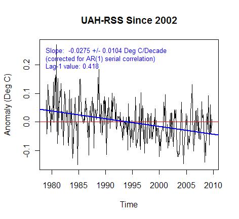
By taking the difference between the two anomalies, the graph below is calculated. You can see that if 95 significance in trend is 0.0104 the trend of 0.027 is almost 3 times outside of what is created by noise in the data. Much of this was created by a well known and still contested step at 1992 which was a particularly difficult satellite transition point.
Now recently UAH and RSS started using different datasets for the first time. RSS continued using the old NOAA style satellites which decay in orbit over time while UAH switched to the AQUA station keeping satellite. The obital decay of NOAA-15 causes the instruments to measure different parts of earth at different times of day, gradually shifting over years. Imagine the difficulty in correcting temperature for all locations on earth based on time of day. You would need to quantify how the land, mountains, oceans, forests and even ice react over a day of heating. Each day being different over a year. RSS solved the problem with computer modeling of each grid square while UAH did it by measurement employing other satellites measuring at different times in the same day. I vastly prefer measurement to modeling in this case but that doesn’t mean RSS is wrong, just that there’s another black box step which is exceptionally difficult to verify.
The new AQUA satellite used in UAH has a station keeping thruster which keeps the measurement time of each gridcell constant for years at a time. The thing I think some miss about this is that the huge massive corrections which must be implemented over a day are suddenly the same correction value from day to day – no change. Therefore errors in corrections no longer create artificial trends. We’ve got our first high accuracy global trend measurement –ever. The record only extends from June 2002 though and RSS is already experiencing a large divergence over that time.
The last figure is UAH minus RSS for June 2002 until present. The data was re-anomalized after subtracting but the trend difference between the correct trend UAH and the old style calculation RSS is just past 95% significance.
RSS is showing too low of a trend over this timeframe. Dr. Christy mentioned that it’s a result of overcorrection for diurnal shift of the old style satellites orbit. Either way the UAH with the better quality trend since 2002 is below.
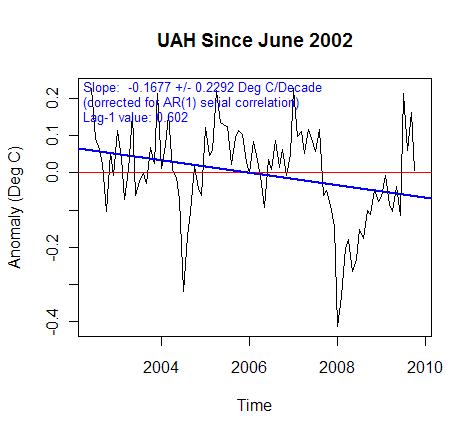 UAH negative trend nearly reached 95% significance. So of course we have to look at RSS.
RSS is cooling outside of 95% significance for the past 8ish years. That’s the first statistically significant cooling I’ve seen so far. A short check of RSS on an annual basis shows that in 1978 over an 8 year window the trend is significantly negative. This means that by RSS there is a 95% certainty that cooling is occurring outside of weather variation since 2002. Not that it’s that big of a big deal, but cooling is cooling right?
My opinion is that UAH is the superior metric still, remember though I’m just an aeronautical engineer and not an expert. As a side note I’ve got a beauty of a quote in a private email from a specialist saying that nobody outside of Alabama prefers UAH. I wonder if the fickle tides of science will be turning.
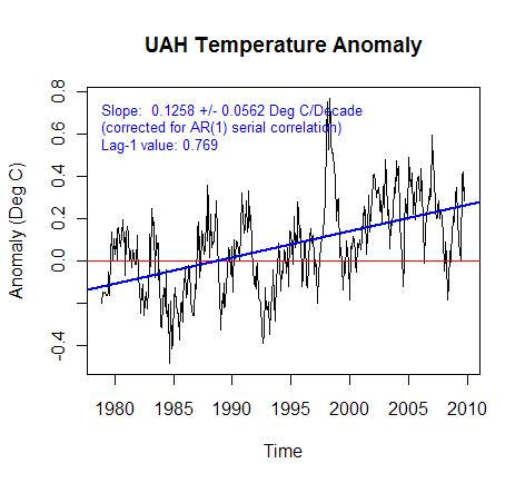
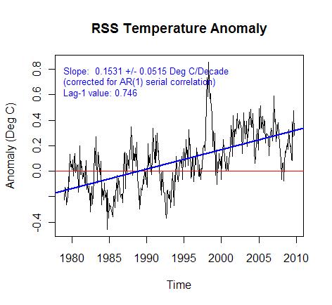
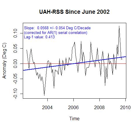
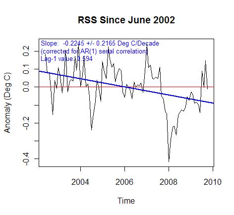
Now the point in the last plot of this post is not to declare significance of cooling but rather to show that RSS has a bit of an issue in comparison to everry other measure.
The negative trend is probably exaggerated by a diurnal correction problem since 2002. However, the UAH trend is of very high quality during this timeframe – again not an expert. However my aeronautical engineering experience tells me that the effect corrections have on trend are vastly reduced for the 2002 to present AQUA satellite.
The interesting thing from my perspective is that the RSS and potentially UAH could experience a homogenization from this new improved data.
RSS seems like a whole lot of extra work to get something almost as good.
The trend line slopes in the 1st and 2nd Figures may be fairly smaller, if not negative, when a correction is made for the effect of El Chichon and Pinatubo eruptions, though an accurate correction will not be an easy task.
Interesting work, Jeff. Have you corrected for autocorrelation, and if so, how?
w.
THE MSUIC HAS STOPPED FOR THE WARMISTS
it’s the first time in my scientific life that I see someone stating that, when one has a linear trend with a standard error bigger than the trend itself, it is statistically significant. What’s next?
The trend since 2002 is heavily influenced by the 2007/08 La Nina. Let’s see what the trend is in 3 or 4 years time.
It’s a good example, though, how short term trends can be misleading and should not be used.
But….But…But..
Surely the science is settled and it’s much worse than we thought!
And there’s a consensus that we need to destabilise what’s left of the economy NOW!!
Yes??
John Finn (03:27:21) :
“Its a good example, though, how short term trends can be misleading and should not be used.”
Please tell this to the folks at the NSIDC…
Seriously, can anyone tell me if there is any real significance in a linear trend in climate data? A positive trend will have us on fire in XX number of years, and a negative trend will have us in an ice ball in XX number of years.
What is at work when maybe more than a million people can march in Washington DC to protest what they perceive is an out of control government, and members of the news media who support big government can only bring themselves to report that “thousands” marched?
The plain truth is that such people have given themselves a pass on reality, to the extent that what they want to be true is the only truth that matters. There are a lot of people who want to suppress our prosperity and indeed our national power, and faux AGW is one of the best shell games to come along for that purpose in a long time.
Willis Eschenbach (01:14:06) :
The trend significance is AR1 corrected for autocorrelation using the Quennonville DOF reduction. RyanO actually put together the significance corrections for the Antarctic. The code is at tAV if you’re interested.
Steve M. (05:36:53) : and others.
The point of the effort was to look at if the satellite data has statistically significant errors in it. The last graph was an accident. This is the main argument that Tamino and RC put together for the cooling not being real. It’s only semantics IMHO but the point is that the measure of global cooling crossed the arbitrary 95% limit of statistical significance accepted in climatology for a 9ish year window. Maybe they’ll accidentally put an end to RSS with one last test of the missile defense system.
The most interesting part of the post for me was the trend in UAH since 2002. The trend is reasonably well known for the first time because there aren’t difficult and substantial trend altering corrections to the data, I wonder how well surfacestations will compare to post 2002 UAH when It’s completed.
@ John Finn
You would also agree then all El Nino’s have an impact on trends as well? Or do we only include years that support our own pet hypothesis?
Met O predicted 2007 to be the “warmest year on record”, which we all know now was hideously wrong and resulted in the exact opposite into 2008. For the sake of argument though, let’s suppose they turned out to be correct. Would you be here making the same statement?
I think we all know the answer to that 🙂
the bottom line here (for me, at least) is that:
From 1900 to 1950 we had warming with no increase in CO2. No correlation.
From 1950 to 1979 we had cooling with increasing CO2. Negative correlation.
From 1979 to 1999 we had warming with increasing CO2. Nice correlation.
From 1999 to 2009 we’ve had zero warming, probably cooling, with an increase in CO2. Again, negative correlation.
People keep saying that the most recent 10 years’ cooling is “too short” to be a “climate trend.” My response is that you only had 20 years of warming, which itself is less than what most consider “climate.” We’ve now had non-warming for at least half of the length of the warming period; a full decade.
Maybe in 10 years, when we’ve had more cooling years than warming years, all this nonsense will stop.
John Finn (03:27:21)
Actually this isn’t about el nino as much as this:
http://noconsensus.wordpress.com/2009/10/26/bias-in-satellite-temperature-metrics/
Which was demonstrated first by Chad at treesfortheforest and was followed by this set of replies by Dr. Christy:
http://noconsensus.wordpress.com/2009/10/28/satellite-temps-getting-closer/
And is the subject of a recent paper presented at Roger Pielke’s blog here:
http://pielkeclimatesci.wordpress.com/2009/11/04/guest-post-by-ben-herman-of-the-university-of-arizona/
Resulting recently in checking of the short term trends for significant differences – which this shows the temps just barely crossed. Anthony is aware of these issues which is probably why he carried the post. There will be some corrections to RSS forthcoming in my opinion that will probably require reprocessing of the entire series. It’s possible UAH will receive some corrections as well.
“It’s only semantics IMHO but the point is that the measure of global cooling crossed the arbitrary 95% limit of statistical significance accepted in climatology for a 9ish year window.”
Excellent stuff. Poking the AGW proponents with their own metric.
….. and of course all those wizz bang 100 year computer models of future climate, that the AGW’ers did ten years ago showed this supposedly brief cooling?…. Oh, they didn’t! Well that must be awkward…..;-)
Jeff Id,
I wasn’t questioning your work, so I hope I didn’t offend you. I’m thinking more along the lines of IPCC predictions. Or any predictions. One might be able to predict one or 2 years in the future with a trend, but 100 years?
The caption on the 3rd chart says “… since 2002,” but the chart starts in 1978.
Steve M. (07:32:47) : Don’t worry it didn’t bother at all. You can’t have thin skin in blogland, people tell you your wrong all day long every day.
The reason for the reply is that your point is valid. It is a short trend window and is potentially lucky to 95% (there is a 1 in 20 chance with 5% remaining) but there is a lot of really interesting background information that led to this post and the difference in the satellites is something which can now be statistically demonstrated to be a problem. Since we now know the diurnal correction is too large for RSS, what will happen to the old trends when the new diurnal corrections are applied to the whole seires?
I am wondering if the third chart is mislabeled. Perhaps it should be labeled “UAH-RSS since 1979.” The following chart is UAH-RSS since 2002.
Yup the label is wrong.
For those interested the code is available at tAV.
So I have this variable that I call Temperature. It has a very specific definition; and I have instruments called thermometers to measure it, in units called Kelvins; but often colloquially reported in other convenient scales of Celsius or Fahrenheit.
I can measure Temperatures periodically and report them; but I decide to arbitrarily set the reference of my Temperature scale; not to zero Kelvins; or even zero C or F, but to some other arbitrary value that I consider to be what should be the normal Temperature.
So I subtract my arbitrary reference form my real Temperature,a nd since my arbitrary zero was considered normal; the difference is considered abnormal; so I call it an abnormality; or anomaly two synonyms for the same improper value.
The process I have performed when plotted as a time function is somewhat similar to applying the differential calculus. My abnormality is analagous to the derivative of my temperature; arbitrarily scaled to some easily plottable range. I just subtract a fixed offset, rather than a variable one.
Of course both my Temperature readings and my arbitrary set zero reference are noisy values; due to thermometer errors, siting errors, and who knows what other random processes; and the same noisiness infected all of the myriad of data that went into the computation of my arbitrary zero reference. Notice that the values recorded for each location that was included, and each time epoch that was recorded are each a measurment of a DIFFERENT observation; so they are all expected to be different; they are not different measurments of the same event.
Consequently the “average” or whatever AlGorythmic property of all that data, really is, is no less noisy than any of the original data. But since we only calculate that number once; we don’t seem to be aware that it is as uncertain as any of the input data values.
So it is no surprise that our abnormality function is now even noisier than our original temperature funtion was; that is also a well known property of differentiation; noise is enhanced by the process.
So now I have a colleague who takes a similar set of readings as I do; except they aren’t all quite the same, and he applies slihtly different AlGorythms to his data, and he gets an abnormality graph that is quite similar to mine; well it ought to be similar since it is presumably measurments of the same phenomenon.
But of course the noise generated in his “experiment” is not identical to the noise generated in mine; that is the nature of noise; it never repeats. Well at least you can never prove that it has ever repeated.
So now I take his abnormality, and I subtract it from my abnormality, and once again plot it as a funtion of time (the difference that is). Not surprisingly the second difference is even noisier than the first
Multiple differentiation is also a process for burying signals in noise; and thereby reducing the information content of the data.
So just why is it that we do this differencing process ? Isn’t climate supposed to be the long term sum of all of the weather events that have happened previously. Yes I know its defined as the average; but then if it is the average why does it change so rapidly ?
DR (06:07:05) :
@ John Finn
You would also agree then all El Nino’s have an impact on trends as well? Or do we only include years that support our own pet hypothesis?
I haven’t got a hypothesis. I’m just interpreting the data as I see it and I don’t see any evidence that the earth is in a long term cooling phase. Temperatures dipped in response to the 2007/08 La Nina but they now look to be recovering. The next few years will tell us if this represents a return to the previous warming trend or something else.
Yes, the next few years will tell us a lot.
I think we all know the answer to that 🙂
Well I don’t. Sometimes I know the answer to this. Less frequently to this and that. And hardly ever to that alone. This is one of the frequent times that I don’t have an answer to that.
Jeff,
I’m not sure I have a clear image in my head of what it is you chaps do with this data.
But looking at your very first graph of the UAH from about 1978 to present; which I presume from the start date is about the sum total of the satellite data set (that they have).
The black line appears to be a straight line. Am I to assume that the rms value of the point by point deviations from that one straight line reaches its absolute minimum value for just that slope and vertical location; the only other constraint being that it is a straight line ?
If that is not the case; then just how is that line defined ?
Any particular reason why a straight line is presumed; since many of these plots seem to show clear indications of some cyclic behavior.
What would the Fourier transform frequency spectrum of that data look like ? I’m wondering if it might reveal the presence of periodic components that are of comparable significance to the zero frequency component.
John Finn (12:39:11) : I haven’t got a hypothesis. I’m just interpreting the data as I see it and I don’t see any evidence that the earth is in a long term cooling phase. Temperatures dipped in response to the 2007/08 La Nina but they now look to be recovering. The next few years will tell us if this represents a return to the previous warming trend or something else.
How could you EVER possibly see evidence of the Earth being in a “long term cooling phase”? You would have to firstly define “long term”. Secondly even if by your definition there was a linear cooling trend over this defined period, you would only be able to “see the evidence” after the period was over and then it would tell you nothing about the next period.
As it happens there is a hypothesis put forward by the alarmists and adopted by the western nations that unstoppably dangerous warming is being caused by anthropogenic CO2. The evidence of the temperature records of the last 7 years, at least, among other evidence, does not seem to support this. But ignoring this and assuming AGW to be gospel we are nonetheless committing to a suicidal battle against this imaginary foe.
George E. Smith (13:21:52) :
I wasn’t sure how to answer the longer comment. The line is an RMS fit which I’m sure you’re familiar with of the equation y = a x + b to the data x.
The straight line is the trend of course as without it there is no definition of trend. Regarding the Fourier spectrum of UAH and RSS I’ve done some work with that from last year. It’s taken a year to figure out why the cyclic variations were occurring in UAH.
http://noconsensus.wordpress.com/2008/10/26/half-year-cyclic-variaition-in-rssuah-and-giss-anomaly/
This linked post above also has implications that UAH may require additional corrections as well.
For those interested, Lucia confirmed the results in the last graph at this link.
http://rankexploits.com/musings/2009/satellite-trends-rss-and-uah/
evanmjones (12:48:18) : “Yes, the next few years will tell us a lot.”
Yes, the next few years will tell us what the calculated “average temperature of the earth” was for those few years. 🙂
They’ll also give us the trend(s) for the preceding years.
As for the future…eeeh, not so much.
Yes, much. It will tell us about the progression of the negative PDO and possibly other cycles. (Not to mention solar issues.) That is very much indeed. The next few years are critical.
Jeff Id (06:22:04) :
John Finn (03:27:21)
Actually this isn’t about el nino as much as this
You’re right – my original comment was a bit off topic. Sorry.
George E. Smith (11:20:09) : “…I subtract my arbitrary reference form my real Temperature,a nd since my arbitrary zero was considered normal; the difference is considered abnormal; so I call it an abnormality…
The process I have performed when plotted as a time function is somewhat similar to applying the differential calculus. My abnormality is analagous to the derivative of my temperature; arbitrarily scaled to some easily plottable range. I just subtract a fixed offset, rather than a variable one.”
What you have is NOT analogous to the derivative or anything even remotely close to it. Sorry. Back to Calculus I.
Like those claiming warming in a short period, this is much ado about nothing.
I downloaded the UAH and RSS data from woodfortrees so that I could plot the difference on the same graph as the 2 datasets, and I noticed that the difference seemed to have an annual periodicity starting around 2000, By simply subtracting a scaled and phased annual sinusoid from the RSS-UAH difference signal, I was able to reduce the Standard deviation from 6.7e-2 to 5.0e-2, or a 25% reduction in the apparent annual fluctuation. I went back to woodfortrees and plotted the fourier transforms of the RSS, UAH, and, to generate a reference annual signal, the Fourier transform of the arctic ice extent. see http://www.woodfortrees.org/plot/rss/from:1990/mean:2/fourier/magnitude/window/from:2/to:40/plot/uah/from:1990/mean:2/fourier/magnitude/window/from:2/to:40/plot/nsidc-seaice-n/from:1990/scale:0.01/offset:-0.1/fourier/magnitude/window/from:2/to:40
It is apparent that the UAH data has more signal than RSS coincident with the peak at 20 of the ice extent, which has a large annual signal. Could the decline in arctic sea ice and exposed ocean in the arctic be affecting the UAH signal, either directly or through changes in water vapor over the newly exposed ocean? Any other thoughts on what could be causing this annual signal to appear in the UAH data?
Brian Dodge (20:29:34) :
Nice work by the way. The ice does affect the sensors, the satellites don’t measure the poles but UAH does some infilling. You can see the actual data area though in this video of RSS and UAH
http://noconsensus.wordpress.com/2009/11/03/rss-and-uah-videos/
The reason for the annual signal is the errors in diurnal correction which were also present in UAH before the UAH 2002 change to AQUA. This is why UAH is likely to also require a correction – it’s a more subtle point though and I haven’t heard that from Dr. Christy — yet.
This post should answer some of your questions.
http://noconsensus.wordpress.com/2009/10/26/bias-in-satellite-temperature-metrics/
Brian: Interesting idea.. but I should just point out that “window” is supposed to be used in time space, before “fourier”, to remove edge effects when looking at frequency spectra. The effect of using it after, in frequency space, will be to reduce the peaks at the left and right edges.
Also, I’m not quite sure why you’re doing a “mean:2” on the temperature signal first.
Here’s your graph with this tidied up a bit:
http://www.woodfortrees.org/plot/rss/from:1990/window/fourier/magnitude/from:2/to:40/plot/uah/from:1990/window/fourier/magnitude/from:2/to:40/plot/nsidc-seaice-n/from:1990/scale:0.01/offset:-0.1/window/fourier/magnitude/from:2/to:40
I’m afraid in this case the two harmonic 20 (approx 1 year) peaks look rather more similar… Sorry!
Best wishes
Paul
” Jeff Alberts (18:38:55) :
Like those claiming warming in a short period, this is much ado about nothing.”
It’s significant because it casts doubt on the CAWG hypothesis, which strongly links increases in CO2 to increases in temperature, and on the robustness of the IPCC’s predictions. The disconnect that is being observed becomes more and more awkward for the CAWGers with each passing year, so our side is right to harp on it.
I was averaging the signal to reduce the high frequency bias that I introduced by misusing the “window” function.
If one starts the dataset from 2002 when the UAH was changed to the Aqua satellite, (and doesn’t screw up the “window” function &;>), the difference in energy at the yearly harmonic(~7.5) between RSS & UAH is even more pronounced. I wonder if the peaks at 5 and ~16 that both RSS and UAH see are shared processing artifacts or represent real periodic temperature variations?
to save y’all from some typing, the URL is
http://www.woodfortrees.org/plot/rss/from:2002/window/fourier/magnitude/from:2/to:40/plot/uah/from:2002/window/fourier/magnitude/from:2/to:40/plot/nsidc-seaice-n/from:2002/scale:0.01/window/fourier/magnitude/from:2/to:40
I suspect the peak at 15-16 is a harmonic of 7.5 produced by ‘ringing’; not sure about the one at 4-5 (18 months-2 years) though.
Here’s the raw(-ish) data you’re analysing:
http://www.woodfortrees.org/plot/uah/mean:6/from:2002/plot/rss/mean:6/from:2002
It looks to me like there’s actually quite a strong 18-month-ish signal here, in both series, which I don’t have any explanation for – but it’s a short sample, and it could just be weather noise! But note it also exists in HADCRUT:
http://www.woodfortrees.org/plot/uah/mean:6/from:2002/plot/rss/mean:6/from:2002/plot/hadcrut3vgl/mean:6/from:2002
so whatever it is, it isn’t satellite-specific!