
Guest Post by Werner Brozek, Edited by Just The Facts:
A new HadCRUT4.5 data set came out last month. HadCRUT4.5 replaces HadCRUT4.4. In an earlier post, I commented on how virtually all changes over the past 16 years showed increases. I cannot say that this time. Of the last 6 complete years, the last 3 showed increases but the previous 3 showed decreases. Changes in earlier years are relatively minor for the most part.
Last month, I was happy to say that HadCRUT4 and WTI had finally been updated on WFT. Normally, when a new anomaly comes out, it automatically appears on WFT within 24 hours. But when the title changes to 4.5 instead of 4.4, it takes a manual adjustment which has not been done yet, but hopefully will be done soon. If not, you will just be able to get slopes and all monthly values to July with the 4.4 version using WFT. If you want slopes and all monthly values to August using the latest 4.5 version, you can go to Nick Stokes Trend Viewer Site.
In the table below the graph above I provide the final average values for the calendar year 2013 using various versions of HadCRUT. You may have values that differ by 1 or 2 thousandths, depending on when the anomaly was taken, however the general trend is clear. I could not get a HadCRUT4.1 value since it ended in February of 2013.
According to this article by Eric Worral, “The first six months were a sweltering 1.3°C above pre-industrial times.” The graph above compares UAH with Hadcrut4. The mean of 6 months was set at the same maximum height for 1998, and as a result, the 6 month mean in 2016 was about 0.3°C higher for HadCRUT4 than for UAH. Does that imply that if it were not for pause busting adjustments and other adjustments, that HadCRUT4 would be 0.5°C away from the 1.5°C tipping point?
Other questions also arise. For example, which pre-industrial times period was chosen and how accurate are the numbers from that period? In a 2009 article Lubos Motl noted that, “What the “pre-industrial temperature” actually means is an arbitrarily chosen and mostly unknown temperature at a random year during the feudal era.”
Does any one have a better answer? And what would the error bars look like? Why did they not pick a more modern time period where we have a better idea as to what the anomaly was like? For example, why not set a goal to be no more than 1.3 °C above the GISS average for 1951 to 1980? But how well do we know this value?
Bob Tisdale noted in a 2014 article that “[T]he average global mean surface temperature during their base period of 1951 to 1980 (their climatology) is roughly 14 deg C +/- 0.6 deg C.” Well that does not sound too good. If we only know the temperature to the nearest 0.6°C, can the anomaly be better known? And I assume the HadCRUT error bars for their base period are no better.
Why not use something from this century with the latest technology to get the best temperature and go from there? For example, why not suggest that we should not go higher than a certain amount above the 2013 HadCRUT anomaly? But as shown above, how well is that known? Furthermore, is it possible that with HadCRUT8.3 in 2028 we will discover that 2016 had already averaged above 1.5°C but we did not know it at the time?
To paraphrase Mark Steyn, they apparently know the pre-industrial anomaly, but they do not know the 2013 anomaly. Another question to be raised is if this 1.5°C is to be measured during an extremely large El Niño or whether it should be measured during an ENSO neutral year. As well, should a 6 month average be taken or should it be for a calendar year? An entirely different question to be addressed is if the 1.5°C is at all meaningful. I would argue that it is not, but that is for a another post.
NOTE: There are also major changes to all RSS numbers as compared to last month as this recent article on WUWT illustrated.
In the sections below, we will present you with the latest facts. The information will be presented in two sections and an appendix. The first section will show for how long there has been no statistically significant warming on several data sets. The second section will show how 2016 so far compares with 2015 and the warmest years and months on record so far. For three of the data sets, 2015 also happens to be the warmest year. The appendix will illustrate sections 1 and 2 in a different way. Graphs and a table will be used to illustrate the data. All data sets except Hadcrut4 go to September.
Section 1
For this analysis, data was retrieved from Nick Stokes’ Trendviewer available on his website. This analysis indicates for how long there has not been statistically significant warming according to Nick’s criteria. Data go to their latest update for each set. In every case, note that the lower error bar is negative so a slope of 0 cannot be ruled out from the month indicated.
On several different data sets, there has been no statistically significant warming for between 0 and 23 years according to Nick’s criteria. Cl stands for the confidence limits at the 95% level.
The details for several sets are below.
For UAH6.0: Since September 1993: Cl from -0.002 to 1.801
This is 23 years and 1 month.
For RSS: Since July 1994: Cl from -0.033 to 1.800 This is 22 years and 3 months.
For Hadcrut4.4: The warming is statistically significant for all periods above three years.
For Hadsst3: Since February 1997: Cl from -0.029 to 2.124 This is 19 years and 8 months.
For GISS: The warming is statistically significant for all periods above three years.
Section 2
This section shows data about 2016 and other information in the form of a table. The table shows the five data sources along the top and other places so they should be visible at all times. The sources are UAH, RSS, Hadcrut4, Hadsst3, and GISS.
Down the column, are the following:
1. 15ra: This is the final ranking for 2015 on each data set.
2. 15a: Here I give the average anomaly for 2015.
3. year: This indicates the warmest year on record so far for that particular data set. Note that the satellite data sets have 1998 as the warmest year and the others have 2015 as the warmest year.
4. ano: This is the average of the monthly anomalies of the warmest year just above.
5. mon: This is the month where that particular data set showed the highest anomaly prior to 2016. The months are identified by the first three letters of the month and the last two numbers of the year.
6. ano: This is the anomaly of the month just above.
7. sig: This the first month for which warming is not statistically significant according to Nick’s criteria. The first three letters of the month are followed by the last two numbers of the year.
8. sy/m: This is the years and months for row 7.
9. Jan: This is the January 2016 anomaly for that particular data set.
10. Feb: This is the February 2016 anomaly for that particular data set, etc.
18. ave: This is the average anomaly of all months to date.
19. rnk: This is the rank that each particular data set would have for 2016 without regards to error bars and assuming no changes to the current average anomaly. Think of it as an update 45 minutes into a game.
| Source | UAH | RSS | Had4 | Sst3 | GISS |
|---|---|---|---|---|---|
| 1.15ra | 3rd | 3rd | 1st | 1st | 1st |
| 2.15a | 0.261 | 0.381 | 0.760 | 0.592 | 0.87 |
| 3.year | 1998 | 1998 | 2015 | 2015 | 2015 |
| 4.ano | 0.484 | 0.550 | 0.760 | 0.592 | 0.87 |
| 5.mon | Apr98 | Apr98 | Dec15 | Sep15 | Dec15 |
| 6.ano | 0.743 | 0.857 | 1.024 | 0.725 | 1.11 |
| 7.sig | Sep93 | Jul94 | Feb97 | ||
| 8.sy/m | 23/1 | 22/3 | 19/8 | ||
| Source | UAH | RSS | Had4 | Sst3 | GISS |
| 9.Jan | 0.540 | 0.679 | 0.906 | 0.732 | 1.16 |
| 10.Feb | 0.832 | 0.989 | 1.068 | 0.611 | 1.34 |
| 11.Mar | 0.734 | 0.866 | 1.069 | 0.690 | 1.30 |
| 12.Apr | 0.714 | 0.783 | 0.915 | 0.654 | 1.09 |
| 13.May | 0.545 | 0.543 | 0.688 | 0.595 | 0.93 |
| 14.Jun | 0.338 | 0.485 | 0.733 | 0.622 | 0.75 |
| 15.Jul | 0.389 | 0.492 | 0.734 | 0.670 | 0.84 |
| 16.Aug | 0.435 | 0.471 | 0.775 | 0.654 | 0.97 |
| 17.Sep | 0.441 | 0.576 | 0.607 | 0.91 | |
| 18.ave | 0.552 | 0.654 | 0.859 | 0.646 | 1.03 |
| 19.rnk | 1st | 1st | 1st | 1st | 1st |
| Source | UAH | RSS | Had4 | Sst3 | GISS |
If you wish to verify all of the latest anomalies, go to the following:
For UAH, version 6.0beta5 was used.
http://vortex.nsstc.uah.edu/data/msu/v6.0beta/tlt/tltglhmam_6.0beta5.txt
For RSS, see: ftp://ftp.ssmi.com/msu/monthly_time_series/rss_monthly_msu_amsu_channel_tlt_anomalies_land_and_ocean_v03_3.txt
For Hadcrut4, see: http://www.metoffice.gov.uk/hadobs/hadcrut4/data/current/time_series/HadCRUT.4.5.0.0.monthly_ns_avg.txt
For Hadsst3, see: https://crudata.uea.ac.uk/cru/data/temperature/HadSST3-gl.dat
For GISS, see:
http://data.giss.nasa.gov/gistemp/tabledata_v3/GLB.Ts+dSST.txt
To see all points since January 2016 in the form of a graph, see the WFT graph below.

As you can see, all lines have been offset so they all start at the same place in January 2016. This makes it easy to compare January 2016 with the latest anomaly.
The thick double line is the WTI which shows the average of RSS, UAH6.0beta5, Hadcrut4.4 and GISS. Unfortunately, WTI will not be updated until HadCRUT4.5 appears.
Appendix
In this part, we are summarizing data for each set separately.
UAH6.0beta5
For UAH: There is no statistically significant warming since September 1993: Cl from -0.002 to 1.801. (This is using version 6.0 according to Nick’s program.)
The UAH average anomaly so far for 2016 is 0.552. This would set a record if it stayed this way. 1998 was the warmest at 0.484. Prior to 2016, the highest ever monthly anomaly was in April of 1998 when it reached 0.743. The average anomaly in 2015 was 0.261 and it was ranked 3rd.
RSS
NOTE: As noted earlier, there are major changes to all RSS numbers as compared to last month.
Presently, for RSS: There is no statistically significant warming since July 1994: Cl from -0.033 to 1.800.
The RSS average anomaly so far for 2016 is 0.654. This would set a record if it stayed this way. 1998 was the warmest at 0.550. Prior to 2016, the highest ever monthly anomaly was in April of 1998 when it reached 0.857. The average anomaly in 2015 was 0.381 and it was ranked 3rd.
For comparison, here is what I said last month:
For RSS: There is no statistically significant warming since December 1993: Cl from -0.008 to 1.746.
The RSS average anomaly so far for 2016 is 0.645. This would set a record if it stayed this way. 1998 was the warmest at 0.550. Prior to 2016, the highest ever monthly anomaly was in April of 1998 when it reached 0.857. The average anomaly in 2015 was 0.358 and it was ranked 3rd.
Hadcrut4.5
For Hadcrut4: The warming is significant for all periods above three years.
The Hadcrut4 average anomaly so far is 0.859. This would set a record if it stayed this way. Prior to 2016, the highest ever monthly anomaly was in December of 2015 when it reached 1.024. The average anomaly in 2015 was 0.760 and this set a new record.
For comparison, here are the last two lines from last month:
2015 when it reached 1.010. The average anomaly in 2015 was 0.746 and this set a new record.
Hadsst3
For Hadsst3: There is no statistically significant warming since February 1997: Cl from -0.029 to 2.124.
The Hadsst3 average anomaly so far for 2016 is 0.646. This would set a record if it stayed this way. Prior to 2016, the highest ever monthly anomaly was in September of 2015 when it reached 0.725. The average anomaly in 2015 was 0.592 and this set a new record.
GISS
For GISS: The warming is significant for all periods above three years.
The GISS average anomaly so far for 2016 is 1.03. This would set a record if it stayed this way. Prior to 2016, the highest ever monthly anomaly was in December of 2015 when it reached 1.11. The average anomaly in 2015 was 0.87 and it set a new record.
Conclusion
How close are we really to the 1.5°C tipping point? If we consider that we were 0.2°C short to begin with, and if we then subtract 0.3°C to account for the difference between the HadCRUT and UAH peaks, and if we then subtract a further 0.5°C to account for the difference between very strong El Niño and neutral conditions, it seems as if we might only a third of the way there. Do you agree?
Maybe this question should be asked in 10 years as we progress into a cooler cycle. And please keep track of all the “adjustments”.
I always thought it was a 2 degree C “tipping point”. When did they move the goal posts?
Someone can correct me on this. But it seems to me that the pause made people think that 2 C was a long ways off and since they wanted to change the world’s economy, they had to lower it to 1.5 C to make is look more urgent. Is that about right?
2 degree tipping point:
First, there is no study or research establishing a 2 degree tipping point. It was started by a certain “scientist”, and now everyone repeats it including politicians. The media has failed to question any person who notes it.
Then came Paris last year. Canada had a new government and a new bunch on sudden experts. Trudeau appointed Catherine McKenna as Minister of Environment and Climate Change. This lawyer became an expert in one month.
So Canada sent over 300 people (twice the USA number) to Paris. Now to show how urgent Canada considered the climate, the Canadian delegation made a motion to lower the critical number to 1.5 deg Celcius frm 2 deg..
The Liberals and Trudeau said that the previous government had not done enough for climate change. However, Trudeau had NO plan and went to Paris with the previous governments target for emissions reduction. Except of course the 2 degree thing which was their own doing even thouigh they did not have a clue about it.
I don’t think they have moved the tipping point from 2 degC. At paris they just said they would aim for 1.5 degC. Quaint thinking and totally unscientific but it made them feel good.
The basic thing about claiming someone is wrong is to say who is saying it and cite what they said. This article is a lamentable mish-mash of hearsay and straw man arguments which does more to accept the climate spin than to challenge it.
Firstly neither the 1.5 degree not 2 degree limits are described as “tipping points” by the IPCC.
The concept of tipping points is baby talk for a positive feedback. A situation where higher temperatures cause further warming leading to ever increasing run away global warming.
The 2 degree limit , while being pretty much a figure pulled out of the air , was just proposed as being a temperature rise below which we could be fairly sure that there would not be dangerous climatic change.
Secondly, this idea of a 2 degree limit was not supposed to be monthly or even annual anomaly. It is a limit of long term climate change so needs to be taken as at last a ten year or maybe 30 year average.
There has been a lot of hype in the press along the lines of “how near are we to the danger limit” but this article, rather than questioning the very foundation of this misinterpretation simply plays along and accepts it.
FAILED scepticism.
“When did they move the goal posts?”
When they realised 2 deg C was never going to happen?
I do not accept it at all. I said:
The 2015 COP21 conference of the UNFCC in Paris did that. The IPCC now has to prepare a report on „ … of what warming of 1.5ºC would mean and how we could get there“; IPCC Vice-Chair Thelma Krug is seeing to it. http://www.ipcc.ch/news_and_events/pdf/press/161020_P44_PR.pdf
https://ipcc.ch/nominations/cv/cv_thelma_krug.pdf
The normal 5-yearly assessment report is scheduled for the end of 2019.
Thanks Werner, I am appreciative of you effort and the “Joe Friday” approach to data.
Thank you! When you give “Just the facts”, no one can contradict you.
No, they still can. Remember that if Liberals believe something, it then becomes fact simply because they say it is a fact. Now that’s skepticism.
Werner ?w=614&h=373
You ask an interesting question as to what baseline we should use to calculate anomalies from
In 2011 I wrote this article
https://wattsupwiththat.com/2013/05/08/the-curious-case-of-rising-co2-and-falling-temperatures/
from which this graph was taken.
It shows the evolution of CET from 1538 to 2011. It is my reconstruction from 1538 to 1659. The remainder is from the Met office who are the guardians of CET. It should be noted that temperatures fell, then rose again from 2011. This is the current CET chart
http://www.metoffice.gov.uk/hadobs/hadcet/
It can be seen that around 2005 CET peaked at around 1 degree C above the max temperature since 1772, which would be termed post industrial. The pre 1750 period is generally considered to be pre industrial i.e. before mans efforts started to add co2 to the atmosphere, which at that time was 280ppm or so (see the co2 line on the graph)
As can also be noted, if we look beyond the pre industrial date, the 1730’s were very warm with an anomaly of around 0.4C . Phil jones wrote a paper on this, remarking it was the warmest decade until the 1990’s.
So, we can perhaps, with lots of caveats, place the current maximum temperature reached around 2005, at around 0.6C above pre industrial
As can be noted, my reconstruction suggests a very warm period around 1530/40 just before the first ‘Breughel’ burst of the LIA. This is partly an artifice of the graphing package combined with, as yet, a lack of data for the 1520 to 1540 period. So it can be viewed as interesting but by no means definitive.
tonyb
Thank you! As you show, depending on which year or decade you are looking at, “pre industrial” can have a huge variation. Perhaps the focus should be how much above 2005 we should go. But that assumes any warming is dangerous which is a totally different issue.
I noticed that in different years in pre industrial times, the temperatures varied by up to 3 C from each other. Yet we are still here! If 1.5 C or even 2 C are real tipping points, things should have tipped long ago.
It’s worse than we thought 🙂
climatereason alias tonyb on October 26, 2016 at 7:00 am
1. A correct citation writes:
– 2006 was the warmest year on record for min HadCET.
– 2014 was the warmest year on record for mean HadCET.
– 2003 was the warmest year on record for max HadCET.
2. You are nevertheless correct with an assumption of 0.6 °C / century: the OLS trend computed for Berkeley Earth’ temperature data since january 1850 is: 0.589 ± 0.009 °C / century.
I have their data since 1750 somewhere in the PC, but it won’t change that much the value above.
3. A look at
http://booty.org.uk/booty.weather/climate/1500_1599.htm
doesn’t quite convince about “a very warm period around 1530/40”.
bindidon
I was not quoting MIN or MAX hadcet. That is a quite different exercise. I did not use 2014 figures as my article was written prior to that date, as clearly explained. I provided a link to the latest Met office figures.
Booty has its uses and I do look it at sometimes as a first reference and guide. However, my records for the period are far more extensive that that from Booty which also uses some references from earlier chroniclers who these days are not always considered reliable. However, as you can see, there were four very hot years (apparently) towards the end of the 1530’s which are reflected in both our data.
As I clearly wrote in my post;
“This is partly an artifice of the graphing package combined with, as yet, a lack of data for the 1520 to 1540 period. So it can be viewed as interesting but by no means definitive.”
I am currently researching the 13th century CET but hope to return to the 1520 to 1540 period again in due course.
tonyb
Just what is it that’s going to tip at +1.5c ?
What will “tip” is the credibility of the IPCC, from “some” to “none.”
Good question!
From:
http://www.dailykos.com/story/2015/12/28/1463788/-The-Ultimate-Global-Warming-Tipping-Point-The-2016-Elections
“Time is rapidly running out, the 400 parts per million tipping point for CO2 is gone, the 1 degree C and possibly the 1.5 C tipping points are gone.”
But we seem to have thrived by surpassing the 400 ppm and the 1 C tipping point.
“The first six months were a sweltering 1.3°C above pre-industrial times.”
A degree or so C is sweltering? Honey, could you put the thermostat up a swelter? Thanks.
The best comparison yet of the Dishonest Hardcrut chart with the honest UAH chart. The differences are the deception.
The Climate Change Gurus manipulated the Hardcrut chart so it went along with their CAGW narrative of “hotter and hotter”.
The chart in green is the honest chart, the chart in red is the dishonest chart. The Climate Change Gurus think we are fools.
No, TA!
1. You confound a chart showing a set of plots (what you reproduced from the top post) and a single plot within the chart.
2. What is dishonest here is not the red plot (HadCRUT), nor is it the green plot (UAH). It is to show two plots with a wrong offset displacement between them.
Here is the corrected version:
Bindidon, your version doesn’t change a thing. The Hardcrut chart is still dishonest. It still makes the subsequent years look “hotter and hotter”. Hardcrut shows 2010 as hotter than 1998. UAH does not. Hardcrut shows several years after 1998 as equal to or hotter than 1998. UAH does not. That doesn’t change no matter how you position the graphs relative to each other.
TA, I’m afraid you never will understand the difference between surface and troposphere. Simply because you DON’T WANT to understand it.
1. UAH is a temperature series concerning the troposphere at (officially) about 4 km altitude. Why in the world should everything at the surface look exactly like 4 km above it?
2. Why don’t you consider the inverse, and complain about the fact that UAH makes the subsequent years “cooler and cooler” ? Look at the graph! WHY do you accept cooling as an evidence while claiming that warming trends would be dishonest?
This discussion is a nonsense.
Please concentrate on major issues, e.g. the fact that even for UAH and RSS, the Arctic region is the one warming the fastest: for the latitude stripe at 80.0N-82.5N, UAH6.0beta5’s trend since 1997 is above 4 °C / century. That’s nearly four times higher than for the entire Globe.
TA and Bindidon….
Satellite and near-sfc thermometers systems both have their pluses and minuses which can be remarkably complex. I suspect if the satellite data was hotter, the skeptics and CAGW crowd would reverse arguments.
That is why I generally prefer to use WTI. It is more comprehensive and robust, and splits the difference between the two types of data. Using WTI makes everybody unhappy.
There is another sources of global temperature data… NCEP CFSR hourly model initializations. Every hour, global data is collected and error-checked and a 2m temp grid is computed to initialize models. This data series was created essentially by accident with the only purpose to run operational models. But not it has produced a long-running hourly data set of global 2m temps.
The CFSR data has some limitations, too. There is no correction for UHI for one since that is important to keep in to run a proper forecast model.
Anyway, UAH and HADCRUT have diverged quite a bit since 2000. CFSR more closely tracks UAH showing a lower rate of warming. The significance of this and the problems with this comparison are beyond my current knowledge… but I find the existence of this data very interesting and rarely talked about.
http://models.weatherbell.com/climate/global_trace.php
Thank you Mary Brown for the info… but I know of Ryan Maue’s work, unfortunately behind paywall for real data access. It is not rarely talked about: Roy Spencer repeatedly has shown Weatherbell’s 2m maps on his own web site. He doesn’t need to pay for, yeah!
Should you think I would prefer whichever method, so you would fail. I’m not defending any of them, but like to write against ignorance and/or manipulation.
Maybe you appreciate another “global trace”:
http://fs5.directupload.net/images/161028/g25fmuo9.jpg
This is a set of OLS trend plots made out of UAH6.0beta5’s 2.5° monthly grid data:
http://www.nsstc.uah.edu/data/msu/v6.0beta/tlt/{tltmonamg.YYYY_6.0beta5}
where all 144 grids of each of the 66 active latitude stripe were averaged to a single monthly anomaly value wrt 1981-2010 (82.5N-90.0N and 82.5S-90.0S are not in the dataset).
The trend periods are: 1979-2016, 1997-2016 and in addition 2000-2013, to exclude 1998/2016 ENSO influence.
Interesting details:
– the warming trend for latitudes 80°N-82.5°N doesn’t seem to be modified by the trend period selected;
– the warming trend for latitudes 80°S-82.5°S increases with “younger” trend periods.
I thought the latest was to warm the 1910-1940 increase so that it could not
be attributed to natural variation?
By ‘warm’ I meant flatten.
That brings up an interesting question. Namely how much of the increase that we have now already occurred by 1940 before CO2 had a significant impact. It would be nice if we had satellite data back to 1910.
“Namely how much of the increase that we have now already occurred by 1940 before CO2 had a significant impact.”
I would say all of it already occurred by 1940 plus a little bit more. According to a prominent Climate Change Guru, the 1930’s was 0.5C hotter than 1998, which makes the highpoint of the 1930’s hotter than it is now, in 2016, since we are currently cooler than 1998 (according to UAH).
TA on October 27, 2016 at 8:19 am
According to a prominent Climate Change Guru, the 1930’s was 0.5C hotter than 1998, which makes the highpoint of the 1930’s hotter than it is now, in 2016, since we are currently cooler than 1998 (according to UAH).
TA, here is the GHCN unadjusted list of the 20 hottest months from jan 1880 up to aug 2016 for the CONUS (absolute values):
1901 7 25.46
1936 7 25.07
2012 7 25.03
1934 7 24.86
2006 7 24.68
2011 7 24.64
1931 7 24.45
2002 7 24.45
1980 7 24.38
1935 7 24.30
1998 7 24.13
1900 8 24.11
1921 7 24.09
1954 7 24.09
1930 7 24.08
1983 8 24.08
2005 7 24.08
1936 8 24.04
1966 7 24.04
2010 7 24.03
Averaging the 6 top months for the 1930’s and those of the 2000’s gives exactly the same result: 24.5 °C; and averaging the complete decades (120 months) gives 12.0 °C (1930-39) compared with 11.8 °C (2006-16).
Thus indeed: for CONUS the 1930’s were as warm as today. But this list above holds for CONUS only. If you consider the entire Globe, you get this below:
2006 7 22.94
2012 7 22.90
2002 7 22.87
1901 7 22.80
2010 7 22.68
2005 7 22.59
2011 7 22.56
1998 7 22.53
2016 7 22.52
1999 7 22.51
1995 8 22.42
2003 7 22.42
1995 7 22.39
2003 8 22.38
2001 8 22.35
2008 7 22.35
2010 8 22.31
2007 8 22.29
2015 7 22.29
2007 7 22.20
Looks a little bit different. August 1998 appears at position 22, and July 1936 at position 30.
The decade average: 12.2 °C for the 1930’s, and 13.8 °C for the last decade.
The surface is not the troposphere. Maybe your “prominent Climate Change Guru” didn’t mention that…
That is a good point. The latest adjustments were an exception, but the previous two showed warming for most of the previous 16 years. See an earlier article of mine here:
https://wattsupwiththat.com/2014/10/05/is-wti-dead-and-hadcrut-adjusts-up-again-now-includes-august-data-except-for-hadcrut4-2-and-hadsst3/
“There is one tie in 2000. All the other 15 are larger. So in 32 different comparisons, there is not a single cooling.” (This 32 was over two adjustments.)
There is no 1.5C tipping point. Just like there is no 2C tipping point; Schellnhuber admits to having made that up for for warmunist propaganda purposes.
“There is no 1.5C tipping point.”
Whoever said there was? This is yet another example of a WUWT discussion misfiring because people don’t quote what they are talking about. 1.5C is a target adopted by the Paris conference.
See the following:
https://robertscribbler.com/2016/09/16/approaching-the-first-climate-tipping-point-on-track-to-hit-1-5-c-before-2035/
“Approaching the First Climate Tipping Point — On Track to Hit 1.5 C Before 2035”
Are you suggesting that the 2 C is a real tipping point but that the 1.5 C is not a real tipping point?
“Are you suggesting that the 2 C is a real tipping point but that the 1.5 C is not a real tipping point?”
You’re citing a headline at a rather excitable blog. Even at WUWT, headlines aren’t always reliable.
Again, what is lacking here is a citation of source. Who said either 2C or 1.5C were tipping points? They are policy targets. Rather like the targets in a national budget. They aren’t tipping points, but things will get worse if you don’t meet them.
See: http://www.cbc.ca/news2/interactives/2degrees/
“How a 2 C temperature increase could change the planet
UN warns of ‘severe, pervasive and irreversible’ impact if average temperatures rise
Two degrees, at first glance, might seem an unremarkable, modest uptick in the temperature scale. But climate scientists warn that, in an increasingly warming world, this measure in fact represents a crucial tipping point.”
Yes, a jounalist does (once) use the term tipping point – mostly he calls it a target. Certainly 2°C warming has consequences. But he also describes the effect of 4°C warming, so it seems the world doesn’t end at 2°C.
James E. Hansen said that this tipping point had already been reached in April 2008 when the CO2 level was 385 ppm. (Hansen states 350 ppm as the upper limit.)
https://en.wikipedia.org/wiki/Tipping_point_(climatology)#Outline
No. Wiki gets that wrong. In their link, titled “Global Warming 20 Years Later:
Tipping Points Near “, he refers to 350 ppm as a target and a “safe level”, but not as a tipping point. He certainly talks about tipping points (“near”), but doesn’t give a value. And the rest of the Wiki article, explicitly on tipping points, doesn’t mention 1.5°C or 2°C. In fact it quotes:
“The IPCC AR5 report stated with medium confidence that precise levels of climate change sufficient to trigger a tipping point, defined as a threshold for abrupt and irreversible change, remain uncertain”
I’m not sure how it helps to say that with medium confidence you’re uncertain, but anyway, no 1.5°C.
And why was it adopted then? Because more than that is safe still?
Sheer sophistry.
You can’t ague with the data or the actual point being made, so you try and pick apart the wording as if that proves you are right.
The above provides a swelter of evidence that Hadcrut4 is a pile of dingo’s kidneys.
http://models.weatherbell.com/climate/cdas_v2_hemisphere_2016.png
Here is the correct data and the data I use.
There is no data driven evidence that a 1.5oC tipping point exists. The exercise outlined in this post is interesting. It would be compelling if the climatocracy assertion of a “tipping point” was deconstructed. For me what the analysis discussed in this blog really demonstrates is how untenable the consensus position really is. If we are experiencing, as the consensus claims, a climate crisis, then why is it only measurable as small fractions and trends only perceptable by heavy analysis? A disaster or crisis is not subtle.
It’s obvious that no such tipping point exists.
The Holocene has been warmer than now and the prior interglacial, the Eemian, even hotter, without dire consequences or runaway warming.
The Eemian (~130,000 to 114,000 years ago) lasted 5000 years longer than has the Holocene so far and was much warmer, yet the Greenland Ice Sheet didn’t melt. Its Southern Dome lost at most about 25% more in those 16,000 years than it has during the 11,000 years of the cooler Holocene. The Northern Dome was little affected.
Hippos enjoyed the balmy Thames at the site of London, yet Neanderthals flourished along with them, without benefit of an industrial age, while modern humans lived happily in Africa. Times were good.
I should add that the corrupt, book-cooking gatekeepers are also trying to disappear and regionalize the Eemian, along with the Holocene Climatic Optimum, the Egyptian, Minoan, Roman and Medieval Warm Periods.
An interesting pattern continues. the two El Nino events of 1998 and 2010 show that surface data sets are less sensitive than the Sat. data. No problem there, the surface data does not respond as quickly and so misses the sharp peaks.
Now, all of a sudden, the surface data sets are just as sensitive to the 2015 El Nino as the Sat. data.
How did that happen?
So, I’m at least as predisposed as most here to “agree” with UAH…but, on Dr. Spencer’s blog (or maybe here at WUWT, I forget), someone raised the accusation that UAH blended the cooling stratosphere with the warming troposphere to get the lower temp trend. I don’t have the background to evaluate the claim myself, but it does remind me that I shouldn’t simply believe what I want just because it happens to conform to my preferences.
I guess my real point is, there is a plausible mechanism by which UAH could be inaccurate. And if it’s inaccurate, on the low side, then there’s a possibility that our favorite nemesis is accurate. (I mean, in the set of possible possibilities, there exists at least one that HadCrut 4.x could be accurate.)
Btw, if anyone has any additional info or background on the answer to the UAH question, I’d love to be pointed in the right direction.
rip
Anything is possible, but see the following:
http://www.woodfortrees.org/plot/rss/from:1997/mean:6/plot/uah6/from:1997/mean:6/offset:0.0695
Despite the recent RSS adjustment, RSS and UAH are still very similar.
ripshin on October 26, 2016 at 11:42 am
1. Mr Brozek is wrong: what he shows here is the old RSS3.3 TLT (officially no longer supported by RSS, like UAH5.6 TLT no longer is by UAH).
RSS3.3 TLT indeed is very similar to UAH6.0beta5 TLT (excepted for the Arctic region).
The adjustments solely concern the transition to RSS4.0, which doesn’t exist in the TLT variant yet, and aren’t visible at WFT.
A correct comparison from 1997 until today between RSS and UAH is only possible when comparing RSS4.0 TTT with UAH6.0beta5 TLT:
OLS trend for 1997 – 2016
– RSS: 0.136 ± 0.024 °C / dec
– UAH: 0.057 ± 0.022 °C / dec
Graph
http://fs5.directupload.net/images/161026/en4z7efe.jpg
This is a completely different situation.
You say I am wrong and then you compare apples and oranges.
NO! It was just an answer to your wrong assessment: “Despite the recent RSS adjustment…”
Because when talking about this recent adjustment which led to RSS4.0, you no longer may speak about that RSS displayed on WFT, which is namely RSS3.3. This is simply a manipulation, and you know that.
RSS3.3 was adjusted last month however they still call it RSS3.3. Did you miss this article from October 10:
https://wattsupwiththat.com/2016/10/10/remote-sensing-systems-apparently-slips-in-a-stealth-adjustment-to-warm-global-temperature-data/
Did you miss this article from October 10
How is it possible to be so ridiculous?
http://fs5.directupload.net/images/161027/3lfzh7z7.jpg
I told it already to you: Roy Spencer (a sound skeptic person) once edited a list of the 10 worst skeptic arguments.
You still manage to make that list a bit longer.
Since when do you make the rules? Furthermore, Nick Stokes has exactly that same RSS as WFT. That is the latest lower troposphere set.
ripshin on October 26, 2016 at 11:42 am
I don’t have the background to evaluate the claim myself, but it does remind me that I shouldn’t simply believe what I want just because it happens to conform to my preferences.
The same holds for me ripshin! I have over you the minuscule advantage of having inbetween a considerable amout of temperature data…
And what you describe here isn’t incorrect at all.
Simply because when you compare UAH6.0beta5 temperature data with the data provided e.g. by the 1500 IGRA radiosondes, you see that the fit between UAH and the balloons occurs at a much higher altitude as expected.
So, to clarify, we can reasonable conclude that the independent confirmation of radiosonde (balloons) temperatures at specific altitudes indicate that at least some of the temperature difference between the UAH and surface datasets is due to influence of stratosphere? Not to beat a dead horse, but if this is accurate, then the claim that the stratosphere is cooling, and being blended in with the troposphere could be pertinent.
Furthermore, as I understand it, the claim that the stratosphere is cooling is supposed evidence of tropospheric warming (with the implication that this is due to CO2 increases). At first blush, I would say it seems to make sense to me. If the troposphere is retaining more heat, then there is a certain logic that says the stratosphere must cool congruently. But, I guess I’m not sure I totally buy it. The additional heat (ok, energy, at 3.7 w/m2, right?) that’s supposed to be retained by the added CO2, wasn’t necessarily going to be captured by stratosphere anyway, was it? (What’s up there to absorb the energy of the frequency bands correlated to CO2 absorption?) So, it’s not like we’re starving the stratosphere at the expense of the troposphere.
Anyway, seems my thoughts have wandered far from the topic at hand. I appreciate the response and wish Dr. Spencer would address this directly…either to clarify why UAH signal is an accurate representation of the troposphere, or to revise their approach.
rip
ripshin on October 26, 2016 at 1:48 pm
I’m afraid this discussion about CO2 influence and any relation between stratospheric cooling and tropospheric warming is a bit too complex for us lay(wo)men.
I’m more interested in considering bare facts, e.g. that in the troposphere, at the highest latitudes still processed by the satellites (80° N – 82.5° N), the UAH 2.5° grid temperature record found in
http://www.nsstc.uah.edu/data/msu/v6.0beta/tlt/tltmonamg.YYYY_6.0beta5 (1978 <= YYYY <= 2016)
shows trends nearly four times higher than for the entire Globe (0.42 °C / decade compared with 0.12).
And that actually bothers me far more than the discussion about wether or not CO2 is the main agent of the situation itself.
‘So, I’m at least as predisposed as most here to “agree” with UAH…but, on Dr. Spencer’s blog (or maybe here at WUWT, I forget), someone raised the accusation that UAH blended the cooling stratosphere with the warming troposphere to get the lower temp trend. I don’t have the background to evaluate the claim myself, but it does remind me that I shouldn’t simply believe what I want just because it happens to conform to my preferences.”
What UAH ESTIMATE AND MODEL as temperature is in NO WAY WHATSOEVER COMPARABLE
to surface measures
1. they measure Different things.
A) the surface thermometers indirectly estimate the temperature of the air at 1.5m.
B) UAH measures the BRIGHTNESS TEMPERATURE at the SENSOR FACE in space.
from this, using….
1. A radiative transfer model for microwave transmission
2. An assumed constant emissivity of the surface
They MODEL the average temperature of the BULK (volume) of atmosphere from just above
the surface to several km up.
2. They measure at differ times.
A) The surface metrics are taken various ways.. two measures once a day (min max) measures
4 times a day, measures every hour, or measures every 5 minutes or 1 minute depending on
the source. The lowest common denominator is is Min/ max so we typically process records to
produce the min and max records.. tmin has one trend. tmax has another trend. We also combine
them into one value Tave.. which has a different trend.
B) satellites pass diifferent parts of the globe at different times. Once in an ascending orbit and once
in a descending orbit. So it maybe over San Franciso at 2pm and over Cape horn at 9pm. These
measurements all have to be adjusted to a LOCAL NOON. and that adjustment changes over time
as you have diurnal drift. In any case, the satellites are not measuring ‘tmax’ or tmin.. and neither
are they measuring a tave. they are ( in the case of RSS) adjusting measures to noon.
So.. When you compare satellite trends ( the trend at local noon) to surface trends you have a
question to ask yourself since you know the trend in Tmin differs from the trend in tmax and the trend in Tave.. That question is.. Apples to Apples??
3. They measure different areas.
While both satellite and surface methods use sample data to represent large grids. there are some areas that the satellites dont estimate.. The poles and areas of the surface where the elevation is high and the ground return corrupts the signal ( above 1500m as I recall)
Maybe they intentionally dropped years 4 to 6, anticipating the El Nino, to show any even spikier rise.
NWO Globalist Molochs
“If we only know the temperature to the nearest 0.6°C, can the anomaly be better known?”
Yes, of course. That is why anomalies are used. Temperatures are very variable on the earth – latitude, but also altitude, sea proximity. These are fixed differences, and mean that there is a huge sampling error for the mean. That is why GISS and NOAA deprecate that measure (though they still sometimes foolishly quote it).
The 0.6 is mainly the uncertainty (sampling error) of the spatial mean of long term average temperatures, which is not of interest for climate change. If you subtract that out for each location, you are left with an anomaly which has far less spatial variation. Exact sampling is far less critical (because of spatial coherence) and the mean has far less uncertainty. And it tells you what you want to know – how things are changing.
Thank you! But if we consider that over time, the paint on Stevenson screens may wear off which can alter readings, or that thermometers can be added or subtracted from one location to the next, or that new thermometers may replace old ones, etc, what is the uncertainty in the anomalies?
I agree that for a given thermometer, the difference may be minimal from year to year even if it is calibrated wrong and is off by 1 C all the time.
” But if we consider that over time, the paint on Stevenson screens may wear off which can alter readings, or that thermometers can be added or subtracted from one location to the next, or that new thermometers may replace old ones, etc, what is the uncertainty in the anomalies?”
Guess you never looked at the “test results” of that conjecture.
I must confess I did not. So exactly what are the error bars for anomalies? If I told you in January of 2014 that the average anomaly for Hadcrut3 in 2013 was 0.457, what would you have said the error bar was? Do not forget that Hadcrut4.5 said the average anomaly in 2013 was 0.512. And who knows what Hadcrut4.6 will say?
i recall reading a paper that estimated that paint degregation could cause more than 1 degC warming.
There at least one paper on this very subject.
Thank you! So if that is the case, it would automatically cause “more than 1 degC” change in the anomaly.
As mentioned, I have read an actual paper on the effect of paint degregation over time, but I do not have a reference for it.
WUWT did some experiment on screens, not on degregation over time. But this gives some insight as to what would happen as clean white paint (which is reflective) tends to become dirty/decay and bare wood exposed (which has a lower albedo). See the peak temperature difference between whitewash and wood:
“. Does that imply that if it were not for pause busting adjustments and other adjustments, that HadCRUT4 would be 0.5°C away from the 1.5°C tipping point?”
There is no such thing as a 1.5C or 2C TIPPING POINT
Both guardrail values are recognized as rough heuristic goals that if met will limit damages.
not TIPPING POINTS.
burn ur starwman
If you google “2C TIPPING POINT”, you get 123,000 responses.
“If you google “2C TIPPING POINT”, you get 123,000 responses.”
If you google “pigs can fly” you get 1070000 responses. That doesn’t make it true.
I wrote this article for people who believed in a 1.5 C tipping point. But as I clearly stated, I do not believe in it. Thanks to your inspiration, let me state my opinion as follows:
The 2 C tipping point is as real as a flying pig.
What damage?
We are in the midst of an ice age. The planet is in a very cold period, but fortunately for us we are within a relatively warm period of the present inter-glacial. The bad news is that that inter-glacial is probably more than half spent whereupon the planet will return to the deep throes of the ice age in which it is currently stuck. That is when we will see climate change, and that is not long off in the grand scheme of events.
All the warming to date has been entirely beneficial and there is no reason to consider that further warming will not also be beneficial. Everything we know about planet Earth and the biossphere suggests that warmth is good, and it would be a godsend for temperatures to increase by more than 2 degree C.
If only we can strike it lucky that by some happy coincidence CO2 will add some warming, but the observational evidence on that happy event does not appear strong.
PS. CO2 will never save us from the fading and end of the Holocene. When that happens we will have to migrate away from the high northern latitudes where we mainly reside and head to the tropics.
Even this time again, Mr Brozek didn’t manage to provide WUWT with a graph correctly comparing two temperature series. Is it intention or lack of knowledge how to do the job? Dunno.
Here is a correct version of the top graph:
http://fs5.directupload.net/images/161026/h9y25wmu.png
http://www.woodfortrees.org/plot/hadcrut4gl/from:1997/mean:6/offset:-0.293/plot/uah6/from:1997/mean:6/offset
It is so simple to calculate the anomaly offset wrt 1981-2010 for any temperature series…
My intention was to show that relative to 1998, Hadcrut jumped way more than UAH in 2016. If I were to say 2 + 4 = 6, then what you are doing is the equivalent of saying it is wrong to say 2 + 4 = 6 but you must say 4 + 2 = 6. Who cares?
Hadcrut jumped way more than UAH in 2016.
No it did not at all in the real world: it does only when looking through your very special glasses.
HadCRUT4 in 2016 (column 3 has climatology 1961-1990, column 4 1981-2010):
2016 1 0.91 0.61
2016 2 1.07 0.78
2016 3 1.07 0.78
2016 4 0.92 0.62
2016 5 0.69 0.40
2016 6 0.73 0.44
2016 7 0.73 0.44
2016 8 0.78 0.48
UAH6.0beta5 in 2016 (column 3 has climatology 1981-2010):
2016 1 0.54
2016 2 0.83
2016 3 0.73
2016 4 0.71
2016 5 0.55
2016 6 0.34
2016 7 0.39
2016 8 0.44
All in science starts with an accurate comparison.
Compare the red line in YOUR OWN GRAPH ABOVE with the green line for 1998 and 2016. Do not put words into my mouth and then tell me I am wrong.
The problem is not wether or not you are wrong: it is wether or not you perform accurate comparisons.
it is meaningless to compare 1998 with 2016 AND surface with troposphere, as the two have considerably differing responses to each different ENSO event.
Download for example JMA gridded sorface data, and compare it with UAH gridded troposphere data, latitude stripe by latitude stripe, and maybe you will begin to understand.
Think of it as two reporters covering the same event and highlighting different things. That does not mean one reporter is wrong and the other right. CNN may word things differently than FOX.
“My intention was to show that relative to 1998, Hadcrut jumped way more than UAH in 2016”
Anyone have a comparison handy of UAH versus the surface temperature chart for the period 1978 to 1998, (using the surface temperature chart for that period, not any updated, manipulated chart)?
Using WFT, you can plot the “Hadcrut3 unadjusted global mean” versus UAH6.0beta5. Does that help?
TA on October 27, 2016 at 10:05 am
Anyone have a comparison handy of UAH versus the surface temperature chart for the period 1978 to 1998, (using the surface temperature chart for that period, not any updated, manipulated chart)?
http://fs5.directupload.net/images/161028/nl5ztsjh.jpg
Choosing HadCRUT3 is nonsense: this series was based on CRUTEM3’s land data, which in comparison with CRUTEM4 was extremely poor with land stations in the Arctic regions. CRUTEM4 contains hundreds of them.
So it’s evident that HadCRUT3 will show a pretty cool world in comparison with HadCRUT4, as the Arctic regions are know to warm the most (see UAH: 0.12 °C/decade for the Globe, and 0.24 for the Arctic).
Bindion:
Only one problem with this “analysis” of yours. You ‘forget’ the ANTarctic, which covers just as much of Earth as the Arctic does. And what is the UAHv6 trend for the Antarctic? -0.01 K/decade. So the overall UAH 1979-2016 trend for the entire globe (90N-90S) is almost EXACTLY equal to the overall UAH 1979-2016 trend WHEN LEAVING OUT the polar regions (90-60N, 60-90S). In fact, if anything, the global (90-90) trend is a tiny bit steeper than the near-global (60-60) trend: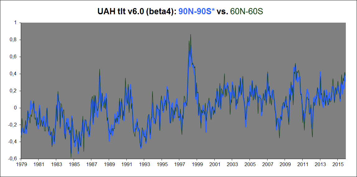
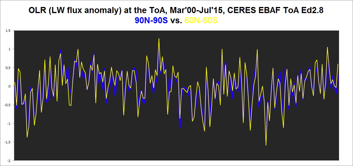
HadCRUt3 gets this exact same result: Its 90-90 trend is also quite the same as its 60-60 trend. Same with the CERES EBAF Ed2.8 product. Total all-sky OLR flux anomaly at the ToA, 90N-90S vs. 60N-60S:
AGW theory in a word is a scam which is in the process of ending. That is the only thing I am 100% sure about when it comes to the climate.
Another point I am 100% of is that the climate of the earth is in no way close to a tipping point. A joke.
For the record I don’t know for sure why and how the climate changes and why abrupt climate changes happen , so I am not separating myself from everyone.
I have thoughts as I have expressed and will once again
Nevertheless I am frustrated because every theory every thought including my own can be shown to be deficient to one degree or another.
We have so many potential good thoughts(other then AGW theory) but if one is really honest they all do not stand the test of time 100%, in other words exceptions can always be found no matter how tight or reasonable the theory may be.
Nevertheless , I keep coming back to these items to explain the climate puzzle which is I agree in the very big picture Milankovitch Cycles and Land Ocean arrangements are very important but they do not explain the abrupt climatic changes superimposed upon the gradual climatic trends.
I still think and I know I have very little fanfare here is that primary solar variability is greater then we think as evidenced by the Maunder Minimum.
I also think there have been periods of solar variability that have exceeded the Maunder Minimum in the historical past . That aside even from the depths of the Maunder Minimum to the solar maximum of the last century it looks like solar irradiance increased by some .3 or .4%. Which is much greater then the .1% we constantly hear. Another lie.
I think the secondary effects even from slight changes in solar variability play even a bigger role especially when it come to changes in UV light and cosmic rays and their impacts upon the climate.
Lastly the geo magnetic field as VUK has been pointing out has a role in all of this.
For my two cents to sum it up I think it is Milankovitch Cycles ,Land /Ocean arrangements control the climate in the big picture, while primary and even more importantly secondary solar effects moderated by the strength of the geo magnetic field are vital in the small climatic picture which are able to bring about abrupt climatic changes by driving the terrestrial items that control the climate to threshold values which cause a complete flip or reorganization of the climate system.
I think this is the best explanation but I know it will be shown by others that it falls short as everyone does with every single climatic proposal that is put out there.
This is why I hope this prolonged minimum solar period that has just become established once again will lead us away from the AGW theory scam which has no data past or present to back it up.
“That aside even from the depths of the Maunder Minimum to the solar maximum of the last century it looks like solar irradiance increased by some .3 or .4%. Which is much greater then the .1% we constantly hear. Another lie.”
In what way a “lie” Salvatore?
I’d be pleased to see some science on it .
This paper finds an even lesser figure for a TSI reduction due to a “Maunder-like” event (using Svalgaard’s SS numbering)…
https://arxiv.org/ftp/arxiv/papers/1601/1601.05397.pdf
“The net effect on climate due to this new sunspot-number record is at a nearly insignificant level.
Using the SILSO record, global warming estimates attributable to solar variability over the last
four centuries may be up to 20 % less than current estimates suggest, perhaps causing only a
0.08 °C increase rather than a possible 0.1 °C increase in global surface temperature. These
differences are negligible compared to uncertainties, and either contribution to overall global
warming remains much less than those due to other climate influences.”
+ 1
“Of the last 6 complete years, the last 3 showed increases but the previous 3 showed decreases. ”
I hope you see that this a way to boost the slope of warming.
True. And check the magnitude of the changes.
If you count the warming from 1908 to 1941 as anthropogenic, then you have some serious explaining to do about climate sensitivity. Warming from 1978-2005 was nearly identical but had 10 times the forcing (guessing that number).
Don’t let the alarmist get away with counting significant warming before WWII as anthropogenic. That’s a flawed argument. If it was AGW, then climate sensitivity would be wildly higher than it is now. If it wasn’t, then the cumulative AGW is far less than what is claimed by those who go back to “pre-industrial times”
Why does everyone use slopes as this is not a waveform free of any cyclic element and therefore slopes are misleading and the province of the undereducated? Would you dream of predicting the sea levels using the slope of the wave at any time? Of course not. It is obviously cyclic. The climate has cycles just as the daily weather does. We have weather temperature cycles daily and yearly. We have climate cycles easily identified, and coincidental or otherwise, they do align with cycles like the lunar and earth years synchronising points.
Where do we find the global warming for rural sites compared to those for urban ones to ensure both are identical as even the Poundland product QA procedures would require but climate science does not seem to.
Why can we not have the equivalent of the insurance mis selling offers by law firms for the far greater fraud of renewable energy subsidies? Either the science was beyond question and the recent changes are fraud or the original claims by the climate scientists were fraud.
Hadcrut update:
Hadcrut4.5 has the September anomaly at 0.714, a drop from August which was 0.768. The average for the first 9 months is 0.841. While this is above the record 0.760 from 2015, it is within the margin of error which I will assume is 0.1. As the effects of a dropping ENSO will manifest itself for the next three months, this average will drop a bit however 2016 will probably set a record. But it would be more correct to call it a statistical tie for the record.
Forrest Gardener on October 26, 2016 at 7:38 am
… the common allegation that the data tamperers cool the past and warm the present.
Well if this was the case I guess a temperature series like GISS ‘land-only’ would show for the past anomalies cooler than the data it is originating from, namely GHCN unadjusted station data, and a fortiori warmer for the present.
But the chart
http://fs5.directupload.net/images/161028/5v4ob3xl.jpg
shows the contrary: GISS ‘land-only’ (blue plot) has a lower trend then GHCN V3 unadjusted (white), what means it “is” warmer in the past and cooler in the present.
And GISs land+ocean (red plot) has, as is to be expected due to the oceans, even a lower trend than the land-only option.
No, FG: I didn’t miss the point.
The point is that in science, the present partly consists of reconsidering the past according to new knowledge.
This is a selfunderstanding matter in many disciplines, especially in particle physics. Apart from climate skeptics, I have no idea of who could disagree with that.
But I don’t feel any need to convince you. I simply have my own meaning, and manage to formulate it, that’s all.
Werner Brozek writes:
This has been an ongoing problem I’ve had with reconstructed datasets since I began my review of the AGW hypothesis in 2000. My first investigations were based on Mann’s paleo reconstructions so had a different baseline, but the problem isn’t really different; it asks the same “how accurate are the pre-industrial records?”, whether those records are 400 years old, 4000 or 400,000. Essentially, before we had instruments broadly deployed (spatially), consistently calibrated and accurately read, we really can’t make any statements about the significance of a 0.1 or 0.01 deviation from an “average” that isn’t precise at that level itself with any credibility.
This doesn’t get much, if any, attention in the literature as far as I can tell, and I’ve looked for it very deliberately. I don’t have an answer to your question of how we can improve the situation. It doesn’t seem there’s any solution to the problem other than to loudly contest the allegations we know more than we really do and that doesn’t appear to work, or at least it hasn’t for me.
I agree the most honest approach would be to limit the entire analysis to the time period we have accurate measures.