 Global climate trend since Nov. 16, 1978: +0.13 C per decade
March temperatures (preliminary)
Global composite temp.: +0.24 C (about 0.43 degrees Fahrenheit) above 30-year average for March.
Northern Hemisphere: +0.39 C (about 0.70 degrees Fahrenheit) above 30-year average for March.
Southern Hemisphere: +0.10 C (about 0.18 degrees Fahrenheit) above 30-year average for March.
Tropics: +0.06 C (about 0.11 degrees Fahrenheit) above 30-year average for March.
February temperatures (revised):
Global Composite: +0.20 C above 30-year average
Northern Hemisphere: +0.24 C above 30-year average
Southern Hemisphere: +0.15 C above 30-year average
Tropics: +0.03 C above 30-year average
(All temperature anomalies are based on a 30-year average (1981-2010) for the month reported.)
Notes on data released April 3, 2018:

Compared to seasonal norms, the coldest spot on the globe in March was in northwestern Russia, near the southern tip of Yuzhny Island. Temperatures there were 5.30 C (about 9.54 degrees Fahrenheit) cooler than seasonal norms.
Compared to seasonal norms, the warmest place on Earth in March was near the Buutsagaan district in Western Mongolia. Tropospheric temperatures there averaged 4.81 C (about 8.66 degrees Fahrenheit) warmer than seasonal norms.
As part of an ongoing joint project between UAH, NOAA and NASA, Dr. John Christy, director of the Earth System Science Center at The University of Alabama in Huntsville, and Dr. Roy Spencer, an ESSC principal scientist, use data gathered by advanced microwave sounding units on NOAA and NASA satellites to get accurate temperature readings for almost all regions of the Earth. This includes remote desert, ocean and rain forest areas where reliable climate data are not otherwise available.
The satellite-based instruments measure the temperature of the atmosphere from the surface up to an altitude of about eight kilometers above sea level. Once the monthly temperature data are collected and processed, they are placed in a “public” computer file for immediate access by atmospheric scientists in the U.S. and abroad.
The complete version 6 lower troposphere dataset is available here:
http://www.nsstc.uah.edu/data/msu/v6.0/tlt/uahncdc_lt_6.0.txt
Archived color maps of local temperature anomalies are available on-line at:
Neither Christy nor Spencer receives any research support or funding from oil, coal or industrial companies or organizations, or from any private or special interest groups. All of their climate research funding comes from federal and state grants or contracts.
— 30 —
Dr Roy Spencer adds at his blog:
The Version 6.0 global average lower tropospheric temperature (LT) anomaly for March, 2018 was +0.24 deg. C, up a little from the February value of +0.20 deg. C:

Why do we use 1979 as the baseline when we have accurate records before that? Temperatures before ’79 were warmer.
Satellite era
No disrespect to Dr. Spenser, but I just can’t buy into global resolution to the 10th degree over a 30 year span.
It isn’t ‘global resolution’. it’s an AVERAGE.
Of course it’s an average. Resolution refers to the accuracy of the data used to calculate the mean.
Can I put you down for hundredths?
“No disrespect to Dr. [Spencer], but I just can’t buy into global resolution to the 10th degree over a 30 year span.”
The 1/10th of a degree is reasonable, because of the accuracy of the equipment used.
Missing of course, is the propagated uncertainty. Because the result is a number deriving from a calculation and each input has an uncertainty which is not removed by replicating the measurement. It is inherent in the calculated result.
Let us suppose the propagated uncertainty is 2/10ths of a degree. Then the anomaly should be reported as being:
+0.24 ±0.2C
That is how ALL reports should read. Dropping the uncertainty is a technical foul. If this month it is +0.24 and next month it is +0.22 then there is no claimable difference because the difference cannot be discerned with confidence.
Whenever, every time, the ±nn is missing from ANY claim, do not accept it until you have satisfied yourself what the uncertainty is.
Egregious claims such as NASA-GISS’ that 2015 was, for example, 0.001 C warmer than 2014 are simple proofs that the reporter was not really a scientist. Gavin Schmidt, asked what the confidence was that the 0.001 figure was correct, replied, “38%” which is shorthand to say the difference was half of Sigma 1, or half of one standard deviation. No one, but no one, claims a significant difference when the two readings are less than one standard deviation apart, let alone half of one. Pathetic.
How do these microwave sensors again track hot spots in some of the most little known, robustly remote unprecedented enigmatic countryside – not that to that which we readers are accustomed?
Geoff
About what was expected. Open waters in the Arctic still providing extra warmth to the NH during the winter months. Mostly neutral temperatures over the tropics which means this La Nina is not having any real impact on temperature.
Richard
The report is for lower troposphere temperatures. The wonderful thing about atmosphere is that it is constantly moving.
What these reports record is the movement of heat by atmospheric transport, not the source of that heat.
Regards
ozone, i think what richard said is consistent with what you’re saying (he’s pretty careful about how he words things)…
Afonz
Agreed.
The first image also identifies warm atmosphere moving to Antarctica above the three ocean corridors during March.
Interesting that March data at ozonewatch identifies low DU and ozone holes at the warmest time of the year above Antarctica.
How could that be, all that nasty clorine is on vacation. Where the wind blows.
Regards
“The wonderful thing about atmosphere is that it is constantly moving.”
Yes out to space, the satellites measure the heat leaving the Earth.
Corrections, Second image above, and Chlorine
A C Osborn
Exactly.
Why is that folks interpret the lower troposphere temperature anomaly charts shown above as global warming. They are simply a measure of heat release from sinks such as the ocean into the atmosphere where it is released to space mainly via the poles.
An alternative way of looking at these temperature anomalies from 1980, is that there has been a higher than average (for the selected period) heat release from the oceans to the atmosphere for transport primarily to the poles for dissipation to space. The anomalies record heat transport and the atmospheric pathways. If the heat bearing atmosphere goes north west instead of north east and travels through traditionally colder air space, the anomaly will be greater. Does it effect that region, yes but for only a short period and the temperatures revert when the wind direction changes, or the release of heat reduces.
And when this heat gets to its natural destination – the poles, folks declare dooms day is they see an atmospheric heat rise that usually originates from mid latitude source. The EPTG (earth to pole temperature gradient) works, and has been working as predicted for the satellite record area. It should also be seen as a pressure gradient, EPPG.
El Nino is a release of heat into the atmosphere for transport to dissipation. It is a loss of heat as the atmosphere is not a heat sink, just a transport mechanism. Even during La Nina heat is being released to the atmosphere albeit at a lower rate . Folks see blue on the second image above and suggest there is no heat being released. It is just lower than the average.
Regards
“This LaNina”, isn’t.
Conditions are approx neutral.
So what would the anomaly be if the period of the average temperature was 1988-2017?
About 0.155°C.
“About 0.155°C.”
Not sure how I adjust my thermostat for that, maybe i need a new one, do they make fractional degree thermostats?
“Not sure how I adjust my thermostat for that”
You don’t need to adjust a thermostat, it adjusts the temperature for you.
Bellman
OoooooH, thanks
I guess the real question now is whether i will save more money from having to heat my house less or spend more money because I have to cool my house more?
Bob, you need to pay more because new tax fights global inequality by feeding pockets of the elite.
IOW, because there are supposedly poor people hit worst, you’re hit badly to feed more money to Soros so he can make California a new Venezuela. No, there’s no logic in there. It’s just socialism shaking hands with the ultra rich.
The Alarmists will look at this graph and say Seeeeeee Look at all the red it is getting hotter and hotter. However as soon as a blue stretch will happen again then that blows their theory out of the atmosphere.
And that’s why I don’t like those sorts of graphs. It’s highlighting a very arbitrary part of the temperature record. Whether a month is red or blue only reflects the temperature relative to a base period. Use a different period and it there will be more red or blue, but the warming will be just the same.
until it isn’t
Switch the colors.
Another light bulb went off in my head. It was interesting to see the post on the temperature records on the Masters golf tournament in Atlanta since the beginning starting in 1935. Those temperature records are probably the most accurate temperature records ever taken for that long a stretch and probably the most trustworthy too with no missing data and no fudging of the figures. The records show no local warming in that 83 year period. The lightbulb is that you cannot have a localized spot with no warming and yet also have an overall global warming scenario. Either you have global warming everywhere or you don’t. And you certainly can’t have CAGW if it doesnt happen everywhere. How many other spots on the globe are there that show no long term local warming? I would venture to guess there are thousands of these spots. The problem is in the recordkeeping. However even 1 such spot as those Atlanta records proves that there is no global warming happening. What has happened to our society when a few evil men can hoodwink an entire planet?
Alan
“Another light bulb”
What type of light bulb? I hope it was an eco friendly LED!
Actually it’s fairly easy for one spot to stay the same or even cool while the entire planet is warming.
It’s called weather.
And, consistent groundskeeping, monitoring soil moisture, grass cutting, etc. Think of the course as a managed ecosystem, and you’ll be on the way to understanding the situation.
You are missing the point. It has a blanket of increasing CO2 over it as well, yet there is no discernible impact. And, it’s more than a localized spot like Augusta. To the degree the surface records accurately reflect the Southern hemisphere, it is entirely out of step with the Northern hemisphere.
http://woodfortrees.org/plot/hadcrut4nh/from:1970/plot/hadcrut4sh/from:1970
One can argue that this is because of all that ocean area in the South, but that only goes to show how surface temperatures depend on a lot more than just the atmospheric content of greenhouse gases. The cartoon physics of CO2 blocking more surface radiation, directly causing a temperature rise, is a vast oversimplification of the interconnected radiative-convective processes which hold sway.
Rural stations tend to show zero warming. Look at the Antarctic science stations, Davis, Halley, Vostok and Amundsen-Scott. They all show zero warming since 1957.
A few stations with data over a century in europe and USA that have been examined don’t make sensational news because they show zero warming. CET is unique in longevity and shows zero warming, but is not truly immune from UHI contamination.
Also WHY did NOAA in 2002 start an entirely new set of very expensive weather stations with the express purpose of recording data over many decades. Simply, the old stations are not fit for climate analysis.
I noticed that Masters golf tournament data myself. *Very* interesting.
I have not worked it up myself, but I agree, no chance the data was tampered with. Nobody would have thought of it.
One of the really curious things of life. The data is good because the American public is very concerned with sports and wants accuracy in all things sporting but cares not at all for science.
One of the reasons that this information can be considered accurate is the necessity to manipulate the playing conditions. The course Superintendent has a set of parameters of how long the grass should be in different areas, how hard and fast the fairways and greens should be so he would need accurate info about temperature and precipitation to ensure the correct conditions. Another specialty of the Masters is the foliage around the course. It is famous for the blooming dogwoods and azaleas. They can manipulate the timing of those bloomings to coincide with the days of the tournament. They have been doing this since at least the 50’s.
@ Tom in Florida:
Thanks for the extra info. I did not know that things were all that involved.
All the better.
This is the link to that data. It includes daily TMax and TMin plus precipitation.
https://www.sercc.com/MastersClimo.pdf
Here it is in graphical format.
http://i66.tinypic.com/1r8dja.jpg
Looks like a rising trend.
The Masters Golf Tournament is held in Augusta, not Atlanta, Georgia, April 5-8 at the Augusta National Golf Club.
That should have read…
And Troposphere is warming (Roy Spencer’s graph) and “Stratosphere” is cooling, as would be expected if CO2 was a major culprit.
Alan Tomalty
Congratulations. Just when I thought I had read it all…. you come up with a comment that makes stupidity an Olympic sport. So you are saying the planet must warm uniformly, otherwise that is proof that it is not warming at all? Really? So every share on the stock market has to rise the same, or the market is not actually growing?
No Simon ….. the planet need not warm uniformly ….. but it Would need to warm uniformly to call it GLOBAL warming. As it stands, we just have Arctic Warming. The rest of the Globe is just fine.
Yes that is what it means. If the theory is that increase in CO2 is causing world temperature increase then the world temperature will show a worldwide temperature increase. Of course I keep asking for the theory stated in definitive terms but none of the alarmist will give me a concise statement because they don’t have. one.
Dr Deanster
OK you win the silver meddle. It is not just the arctic that is warming. Where did you hear that nonsense?
Simon where else do you show warming?
Then the IPCC gets the gold “meddle.”
Alan T
Actually I don’t show warming anywhere…. but here is what NASA has to say about how the planet has warmed and where. Not hard to see it is not uniform, but it is warming. And this stops at 2011. Since then there has been a sharp spike up
Simon, if you evenly distribute “extra” CO2 and that is the purported reason for global warming then YES that heat should be distributed evenly as well.
If you were to increase the back radiation within a greenhouse, would you create pockets of warmer air and pockets of colder air or would you see an even increase of heat? In order to concentrate heat in or away from areas you would need a mechanism for it to do this, so how do you propose that evenly distributed scattering of light would do this?
How the CO2 heating signature takes an evenly absorbed “extra heat” then instantaneously and unevenly distributes it to places like the Arctic and the deep ocean, literally bypassing any empirical signature of the actual heating mechanism itself, is something that skeptics have pointed out for years.
What a fraudulent NASA video that is. Even the IPCC has said that total global warming in a century has not been more than 0.75C And that is fudged airport warmed urban areas. Rural areas in the world have shown no warming. Stratosphere records have shown no warming. 10 of the 13 stations in Antarctica have shown no warming. There are dozens of of local areas around the world like the Augusta Georgia Masters temp records that show no warming. This idea of a warming planet is ridiculous. Even if there were natural causes of cooling that were outweighing the hoax CO2 warming ; those would only be local areas. CO2 is evenly mixed all throughout the atmosphere all around the globe. If it was responsible for warming we would see it everywhere. If you are going to argue that natural cooling phenomena outweigh the CO2 caused warming then you have to argue that at some point the local natural cooling phenomena will stop. It hasnt stopped in Augusta Georgia. It hasnt stopped in 13 places in Antarctica. It hasnt stopped in all the rural areas around the globe. We need to teach logic in elementary schools and stop teaching main stream religious theory as well as the religion of global warming and ozone hole theory (all crap) at any school level. Our education system is in a mess.
simon, if anyone will be getting a gold medal for stupidity i don’t think it will be alan tomalty. what alan highlights is why the alarmists prefer the term climate change over global warming as the small amount of warming over the last 100 years or so certainly hasn’t been global.
Alan tomality
“What a fraudulent NASA video that is.”
That is the go to for the fake skeptics. Its all fraudulent. They are lying to us… Oh dear….There is no sensible discussion that can be had with fools who take this line.
“And that is fudged airport warmed urban areas. Rural areas in the world have shown no warming.”
Rural areas show warming. Where do you get your nonsense info from?
“Stratosphere records have shown no warming.”
Wrong. Look at Roy Spencer’s graph above, there is a clear warming sign.
“There are dozens of of local areas around the world like the Augusta Georgia Masters temp records that show no warming. This idea of a warming planet is ridiculous.”
Oh dear, back to the “my garden doesn’t seem to be warming so they are all lying.”
“CO2 is evenly mixed all throughout the atmosphere all around the globe.”
No its not. See video.
“If it was responsible for warming we would see it everywhere.”
No we wouldn’t. CO2 is not the only factor affecting climate.
“If you are going to argue that natural cooling phenomena outweigh the CO2 caused warming then you have to argue that at some point the local natural cooling phenomena will stop.”
There is no one in their right mind who is arguing that at the moment.
“We need to teach logic in elementary schools.”
They do…. it’s a pity they don’t in old folks homes.
“….and stop teaching main stream religious theory .”
What has religious theory got to do with your wack-a-doodle ” my house is not changing the world is fine” theory?
“Our education system is in a mess.”
And Trump ain’t helping it by putting Betsy De Vos in charge.
Looks well mixed to me. If you look at the numbers instead of being mesmerized with the pretty colors you will see that there is little difference in CO2 concentrations throughout the atmosphere.
Also, you might want to learn the difference between stratosphere and troposphere.
RWturner
Are you saying CO2 is uniformly distributed across the planet? Because if you are, then I say you are wrong. Here is a prettier graph that also says you are wrong.
https://earthobservatory.nasa.gov/IOTD/view.php?id=82142
Actually it’s a picture…. that should make it even easier for you.
And Troposphere is warming (Roy Spencer’s graph) and Troposphere is cooling, as would be expected if CO2 was a major culprit.
Simon, don’t be so smug… Your pretty picture only has a range of just 10ppm. And, it was taken in May at a time when we would expect northern hemispheric concentrations to be high (which is why we get that seasonal saw tooth)…
afonzarelli April 5, 2018 at 5:34 pm
“Simon, don’t be so smug… Your pretty picture only has a range of just 10ppm. And, it was taken in May at a time when we would expect northern hemispheric concentrations to be high (which is why we get that seasonal saw tooth)…”
But…. it shows that CO2 is not uniformly distributed. And what is so smug about that… except I’m right.
I’ve pointed this out before and poked fun at it claiming that the climate cult now believes (unknowingly) that CO2 acts as a heat pump, distributing heat some places and pulling it from others.
A few months ago, I found a similar warm pattern to what appears extending in March from the Eastern Atlantic, across Africa, the Middle East and across Asia. The month of my comparison had high rainfall in the warm zone.
I think a review of the precip will be similar this time.
At least it was cold near Paris and London. They need some reminders….often it seems.
…and NY
It’s unfortunate that the data set happens to only cover a period which starts at the end of a cooler period. 30 years doesn’t give an accurate picture of the climate. Of course, the Warmunists love it.
“Of course, the Warmunists love it.”
Strange, I thought it was those suggesting warming wasn’t happening who loved the satellites.
I think we can safely ignore those who just reject temp measurements. The question is more about how much warming for what reasons, and most importantly, what not to do about it.
Many or most warmunists reject nuclear power, and adaptation, but want provably inefficient and expensive, destructive mitigation. That’s the issue, not a few dragonists.
As we shovelled away the white stuff here in the coast of the mild south west of England, on the coldest March day in the 300 year plus CET record I remarked to my friend that this was, of course, only weather.
‘You will notice how you were sweating as you pulled on your very thick jumper, your ski jacket and padded trousers in order to venture into the high street to buy some milk.” I said.
Although unfortunately it turned out there wasn’t any, as the tankers couldn’t get to the farms due to the snow and sub zero temperatures, there was still no doubt that we both really noticed the extreme warmth that required two pairs of gloves and we had a bet that the Northern Hemisphere must be around: +0.24 C above 30-year average. Which it was!
Its pointless denying this extreme heat and out of control temperatures. If it wasn’t for this quarter degree rise just imagine how deep the snow would have been. Where will it all end?
tonyb
All that to say that it’s truly a wonder how powerful this synthetic political truth can be in the short run.
Good post ! I don’t remember ever having such arctic conditions at low levels in England my whole life. When have we seen dry powder snow blowing around like that? Perhaps 1963 but too young to recall it. But it wasn’t just the UK, the USA had a terrible cold spell earlier in the winter also.
Also noticed the leaves fell about 2 weeks earlier last autumn. Global cooling is well underway now I think.
Solar minimum at least for NH impact and the AMO are just getting started. More fun ahead.
1963 was WAY worse.
I’m too young to have any personal memories of the brutal winter of 63, but temperature records suggest March 1963 wasn’t particularity cold. In fact the previous March was much colder.
As far as recent years go, although there were some very cold periods this March, my feeling was that March 2013 was on the whole colder. It seems CET agrees with me. March 2018 was 4.9C, whereas March 2013 was 2.7C, in the top 15 coldest on record.
Interestingly, the preceding years, March 2012 and 2017 were both had very warm Marches.
KZB
Dry powder like this is remarkable anywhere in the UK let alone at such a low level next to the SW Coast.
Our 80 year old neighbour told me she had never seen snow like this in all her life, which has been spent in this village.
I was in the SE during 1963 and the snow was certainly deeper and longer lasting, but I don’t remember this dry powder. Mind you the second snow storm at the end of march was worse for us here than the one at the start of March. Not quite so cold, but there was more snow and unlike the first snowfall you could actually make snowmen with it.
A good sign of how retarded the season is can be seen from our diary which showed that this day last year the first bluebells were out. This year they are weeks away and the daffodils are still looking good.
tonyb
we had several inches of global warming yesterday in the lomond foothills, roughly 7 miles inland from the coast. it has now frozen solid and it is -3c outside at the moment.as you say , how bad would it have been if the planet hadn’t turned into a raging inferno the last few decades ;).
The whole anomaly approach leaves me cold. If you believe in CGW you have to believe that temperatures are a nonstationary time series process, which implies the mean is undefined. If you believe the temperature process is stationary, then all of the data should be used in calculating the mean. Taking just the data from 1981-2010 has no statistical justification in my view. I guess the good news is that the coming negative phase of the AMO should put to rest the CO2 climate hysteria. Maybe then the world can worry about the potential for a magnetic field reversal in the next 70 years or so.
The problem with not using just the satellite record is the very spotty records before that period. But if one used raw records, the 1930’s were rather warmer than the present in the US.
“Anomaly” is a horrible word, but this is just display normalisation, all the data gets shifted up or down, making no difference to the time variation. Notice avoidance of the word “trend”, another horrible word, linked to the more horrific tendency to fit straight lines to everything.
You have to compare with something. And using 1981-2010 is better than what the Met Office does with the CET, which is to use 1961-1990 – apparently because the WMO says so. I’m more interested in whether we are continuing to warm, i.e. relative to last 30-40 years, than whether we are maintaining warmth relative to a period which started nearly 60 years ago. There was nothing blissfully perfect about conditions from 1961 to 1990.
Rich.
The real issue is having to eliminate the seasonal differences – if you just use a composite temperature it will change over the year regardless of any underlying “trend”. It isn’t intuitive (to me at least), because we tend to think that globe should average out at the same all year, but the difference in land mass between the southern and northern hemispheres means that the global temperature does change over the year. Therefore, to get a figure which can be compared month-to-month, the temp is given relative to the 30-year average for that month. As such, it has to be described as an anomaly because it has a different base-line each month.
Agree, the summer in Oz this year was the mildest I can remember, the SE trades from blocking highs made the late spring and summer a doddle. Now in Autumn but getting back to normal now.
But the global map projection above is presenting an alterate reality, that I didn’t experience. It was VERY memorably cooler than normal.
I will always remember the horrible heat of summer in 1998, and I will always remember the exceptional coolness of 2018.
And I find it very curious that the official weather ‘data’ is in denial of what we’ve just experienced, and seems biased, in advance, to show the opposite.
“and I will always remember the exceptional coolness of 2018.”
Do you live in the southern Gulf of Carpentaria? How was the 300ml of rain and a cyclone in March? Oh you don’t?
http://www.bom.gov.au/web03/ncc/www/awap/temperature/meananom/month/colour/latest.gif
I know I know, we should trust your gut feeling more than the BOM and their lying computers.
Hmm, try March
http://www.bom.gov.au/jsp/awap/temp/index.jsp?colour=colour&time=latest&step=0&map=meananom&period=month&area=nat
@ zazove on April 4, 2018 at 7:18 pm
“l know I know, we should trust your gut feeling more than the BOM and their lying computers.”
—
The graphic depicts the typical pattern that emerges from blocking highs.
Except the graphic is certainly false with respect to the extraordinary East coast coolness from Nov through to end of Feb.
Which is why I said this, “…the SE trades from blocking highs made the late spring and summer a doddle. Now in Autumn but getting back to normal now. …”
i.e. the humid northerly flow resumed in March.
Now, what you “trust”, I could not give a rat’s fundamental orifice, I am conveying clearly that what I experienced was easily the coolest summer I have experienced in my entire life.
You see, the problem for BOM and its fanboys, zazove, is there are at least a million people on the central and north east coast and hinterland who experienced the same thing. It is a topic of common discussion you see.
So if you and BOM want to clown away with the assertion it didn’t occur, then you will continue to be a laughing stock among all those people.
Because will not go quiet while guys like you attempt to batter us with absurd lies that fly in the face of experience.
To be clear, it was as much as 3 to 4 degrees cooler than normal, and humidity was exceptionally low, to the extent that I experienced cracked and bleeding lips from dry air, periodically during ALL OF SUMMER, and several instances of bleeding nose due to dried out nasal membranes.
This air dryness also affected at least a million people. And the temp drop, and also apparent ‘feels like’ temp drop were far greater than BOM’s now very low-credibility pseudo-data has ‘recorded’.
Gee, how can that be?
Which is why I correctly stated this:
” … And I find it very curious that the official weather ‘data’ is in denial of what we’ve just experienced, and seems biased, in advance, to show the opposite. …”
Because that’s really how it is. BOM really are thAT HOPELESSLY DISHONEST, AND CORRUPTED, BY YEARS OF POLITICISATION OF WEATHER DATA REPORTING.
In the same way a broom was put through the CSIRO to get rid of the opportunist political riff-raff, and refocus the remainder on actual science or get fired, the same scale and depth of high-pressure BS cleaning-out, must now occur root and branch, to BOM.
If you ever think I’ll back down to you on this, zazove, think again.
WXcycles I agree with you, the blocking highs are a global cooling signal.
It began in July 2017 when the subtropical ridge lost its intensity and coincidentally the PDO entered its negative phase.
Thanks for the comprehensive report.
Slight, mostly beneficial warming continues.
Dangerous warming only exists on speculative (broken) global climate model projections that have been too hot.
Charlie Brown is standing a top the pitcher’s mound sporting baseball cap and glove amid partly cloudy skies…
Lucy (at the base of the mound): Can thinking bad thoughts cause it to rain? Linus took the last donut this morning, and I yelled at him, and now it’s clouding up so I was just wondering…
Charlie Brown: If bad thoughts caused rain, we’d never see the sun shine.
Lucy (turning away from the mound): PLAY BALL!
In the coming few years, it will be interesting to see if the moving average stays up where this month’s reading is (+0.25), indicating a step change globally after the 2016 El Nino as was seen after the 1998 El Nino; or, whether this average falls back to the level seen for most of the first decade of the 2000’s (+0.15); or, perhaps, something else entirely.
“In the coming few years, it will be interesting to see if the moving average stays up where this month’s reading is (+0.25), indicating a step change globally after the 2016 El Nino as was seen after the 1998 El Nino; or, whether this average falls back to the level seen for most of the first decade of the 2000’s (+0.15); or, perhaps, something else entirely.”
Interesting maybe, relevant to anything no. We have come out of a 300+ year cooling event, we are in the middle of 120 year recovery from that event, but the overall trajectory is down until we have another glaciation, lucky for us we will all be long dead when that time comes we should be grateful for the warmth and relatively ideal climate we have now, not fearful of the boogieman people are trying to scare us with.
It’s relevant to model forecasts, most of which are currently being passed off as accurate; but without the 2016 El Nino would already be showing large divergence. (This ignores whatever “adjustments” have been made to get to this point.)
finnpii: it will be interesting to see if the moving average stays up where this month’s reading is
I agree with that.
I struggle to get excited about variation that is pretty much at most half a degree below average and half a degree above average in a global data set over a reasonably long time.
It still looks like a random walk.
“I struggle to get excited about variation that is pretty much at most half a degree below average and half a degree above average in a global data set over a reasonably long time.”
Don’t know what you are talking about! since man created fire we have had almost 20C of AGW if we have even half of that moving forward it may or could be really really bad and i for one am considering being afraid.
20C of AGW? We’re not talking about your living room here. You don’t have to be 100% accurate 100% of the time but try not to make a fool of yourself.
Ice many km thick melted before mankind burned fossil fuels.
Except for the time that hapless Magdalenian reindeer hunters Cro and Sol accidentally built a campfire over a natural gas seep on the then exposed but now submerged floor of the North Sea.
John
Are you sure it was me who made the fool of them self.
“Are you sure it was me who made the fool of them self.”
Yes Bob…you
some people don’t get humour bob. i thought it was funny.
bitchilly
how correct you are.
Strange that no sign of the La Nina.
La Nina is putting on its shoes…
Well, maybe La Nina _is_ acting, but there has been a step change following the recent El Nino, and +0.30 will prove to be the average over the next 10 years.
Rich.
The legend for the figure on Spencer’s site gives 1981 – 2010 average as base for the anomalies.
I expect +0.1 to be the average over the next 10 years. Maybe even zero.
pochas94 April 4, 2018 at 11:18 am
The baseline will change to 1991 to 2020 in less than three years.
@ edim …that is what I think as well regarding La Nina. I think that the 10 year average will drop below zero. That is based on the assumption that this cooling trend will be colder than on average.
We are not in a La Nina.
https://www.longpaddock.qld.gov.au/soi/
SOI values for 4 Apr, 2018
Average SOI for last 30 days 10.47
Average SOI for last 90 days 4.39
Daily contribution to SOI calculation 17.38
Monthly average SOI values
Jan 8.93
Feb -7.74
Mar 8.42
I guess sea surface temperatures are not lower troposphere temperatures.
Is clouds raised the temperature of the atmosphere?
Northern Hemisphere land areas (excluding Greenland)
Ren
That record snow mass will really come into play lf northern Eurasia remains cool during April. Those Russian snowfields will be hanging around for quite awhile this spring if that is the case.
As you know the mass of snow in North America will increase further in April.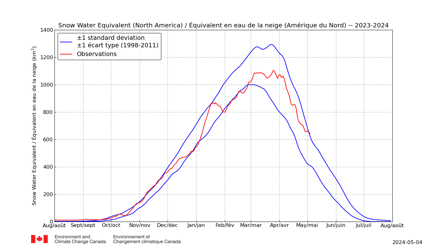
Sea Surface Temperature Anomalies, Ice and Snow Cover
This is not typical of La Niña, because the temperature of the western equatorial Pacific is normal.
Yes its looking like N America will remain cool at least during the first half of April.
The current spring snow extent is already above average.
The map makes me curious as the area where I live in Western Canada has been about 10- 20C colder than normal through most of February and now March, yet the map says warmer than normal. Not even close!
That is very worrying. Has some diabolical in-filling been going on? Do you have local temperature records you could use to solidify your claim?
Rich.
last months warm atmosphere does not seem to have affected this months surface temperatures in Greenland, the white means temperatures of -50 degrees centigrade.
http://www.intellicast.com/Global/Temperature/Current.aspx?location=CAXX0403
I love the “Texas Magnum” precision.
http://mit-a.com/Images/big/Texas%20Magnum%20410-big-photo.jpg
Pocket protector not included.
Rookie question:
What does a “global composite temperature” — to hundredths of a degree — physically mean?
AGW Expert Response:
It’s the end of the world, as we know it….
https://youtu.be/Z0GFRcFm-aY
R.E.M. … when whining and angst collide.
All of the cluttered modern world ‘crisis driven’ irrational fears, expressed as rock and roll parody.
Not much to get alarmed about here…. but I’m sure someone will be, regardless.
Graph looks like the ocean, oh hey!
Interestingly, I compared the data provided from the link in the paper, with Hadcrut 4 global data that I recently downloaded (HadCRUT4-gl.dat 2018-03-04).
From Jan 1995 to Jan 2018, the slope in the UAH data is .093 +/- .017 C/decade, while the slope in the Hadcrut data is 0.158 +/- .012 C/decade.
In other words the slope in the Hadcrut data over a period of 23 years is almost twice as high as the slope in the UAH data. The confidence intervals don’t even overlap.
The something is that HadCRU cooks the “surface temperature data” sets.
According to the AGW from GHE hypothesis, the air should warm first and faster than the surface, not the other way around.
Could be, but that’s not how the AGW via GHE hypothesis supposedly works.
Chimp, you are wrong when you say: “According to the AGW from GHE hypothesis, the air should warm first and faster than the surface”
…
On a nice sunny day, take your shoes off and walk on a black asphalt surface. If the air temp is oh, say 70 degrees F, the bottoms of your feet will experience much more than 70 degrees. The incoming visible sunshine heats surface, then the green house gasses retard the emission of IR to space. The warm asphalt heats the air.
Lionheart,
Sure sunlight heats the surface, but AGW via GHE hypothesis says that more CO2 in the air will cause more radiated IR to heat the air first, followed by the surface.
Hence, for the repeatedly falsified hypothesis to work, first the air must warm before the surface and more than it, then heat the ground and water.
Chimp, incoming solar radiation has most of it’s energy in shorter wavelengths than IR, and it passes through the CO2 and strikes the surface. The CO2 in the atmosphere absorbs the IR emitted from the surface. The warmer the surface, the more IR it emits.
The CO2 in the air does not warm the surface, it retards the surface cooling.
Lionheart,
Yes. My point exactly. Thanks.
Regardless of how much IR the surface radiates, the GHE hypothesis states that more CO2 in the air will retard the loss of that energy to space. GHE hypothesis says nothing about the incoming solar radiation flux, only that increased CO2 slows down the escape of whatever the surface radiates.
Thus, the air has first to warm up, then warm the surface. If for some reason more high-energy sunlight is striking the surface, such as for instance more solar radiation or fewer blocking clouds, then there will be more IR photons to hit the CO2, but that has nothing to do with the effect of more CO2.
Lionheart,
Yes, more CO2 retards cooling, thus warming the air, ie raising its temperature. Hence it’s called global warming, and is measured in the troposphere as well as at the surface.
“Thus, the air has first to warm up, then warm the surface.”
…
Your understanding of how things work is flawed. Early in the morning the air temps do not rise until the sun comes out and warms the surface. The surface then warms the air.
Lionheart,
You don’t understand how the GHE is supposed to work. Of course shortwave solar radiation warms the surface, but that happens regardless. The surface warms and radiates to the air. GHGs are supposed to slow down whatever longwave energy enters the air.
Here’s how IPCC describes the process:
http://www.ipcc.ch/publications_and_data/ar4/syr/en/annexessglossary-e-i.html
“Greenhouse effect
Greenhouse gases effectively absorb thermal infrared radiation, emitted by the Earth’s surface, by the atmosphere itself due to the same gases, and by clouds. Atmospheric radiation is emitted to all sides, including downward to the Earth’s surface. Thus greenhouse gases trap heat within the surface-troposphere system. This is called the greenhouse effect.Thermal infrared radiation in the troposphere is strongly coupled to the temperature of the atmosphere at the altitude at which it is emitted. In the troposphere, the temperature generally decreases with height. Effectively, infrared radiation emitted to space originates from an altitude with a temperature of, on average, –19°C, in balance with the net incoming solar radiation, whereas the Earth’s surface is kept at a much higher temperature of, on average, +14°C. An increase in the concentration of greenhouse gases leads to an increased infrared opacity of the atmosphere, and therefore to an effective radiation into space from a higher altitude at a lower temperature. This causes a radiative forcing that leads to an enhancement of the greenhouse effect, the so-called enhanced greenhouse effect.”
Thus, in the GHE hypothesis, more CO2 causes more surface warming thanks to first warming the air before and more than the surface.
Thank you Chimp, note: “Thus greenhouse gases trap heat within the surface-troposphere system.”
…
It does not say the air warms the surface.
…
Also note: “absorb thermal infrared radiation, emitted by the Earth’s surface ”
..
It does not say the air warms the surface.
This seems to be where you get lost Chimp: “This causes a radiative forcing that leads to an enhancement of the greenhouse effect, ” It does not say the air heats the surface, it says the RADIATIVE forcing increases. The key thing you don’t get is that the radiative forcing is net .
Lionheart,
Why do you suppose that NOAA, NASA and HadCRU care about global warming of the surface, if the GHE doesn’t warm it?
More from IPCC, with graphics:
http://www.ipcc.ch/publications_and_data/ar4/wg1/en/faq-1-3.html
?Much of this thermal radiation emitted by the land and ocean is absorbed by the atmosphere, including clouds, and reradiated back to Earth. This is called the greenhouse effect. The glass walls in a greenhouse reduce airflow and increase the temperature of the air inside. Analogously, but through a different physical process, the Earth’s greenhouse effect warms the surface of the planet. Without the natural greenhouse effect, the average temperature at Earth’s surface would be below the freezing point of water. Thus, Earth’s natural greenhouse effect makes life as we know it possible. However, human activities, primarily the burning of fossil fuels and clearing of forests, have greatly intensified the natural greenhouse effect, causing global warming.”
Chimp, you just don’t understand radiation. The GHE doesn’t “warm” anything. It retards cooling. NET radiative forcing is increased by the GHE. The air is not warming the surface, the green house gasses in the atmosphere are retarding the cooling due to IR radiation. The only positive thing I can get from your posts is that you’ve stopped saying “the air warms the surface.” Progress with you is slow, but not impossible.
One of the silliest side-thread arguments ever.
Lionheart,
What you don’t get is that GHE “theory” demands that the air warms the surface. Why is that hard for you to understand?
If it doesn’t, then there cannot possibly be any threat from man-made CO2. Again, please explain why NOAA, NASA and HadCRU worry about the supposed surface data.
WXcycles April 4, 2018 at 6:51 pm
Please state what you find silly.
Thanks.
” GHE “theory” demands that the air warms the surface.”
…
You don’t understand the theory Chimp.
..
The surface is warmed by radiation, not by the air. Sunshine warms the surface of the earth.
Chimp, why is it “cooler” in the shade of a tree? If the air was warming the surface, it would as hot under the shade of a tree as it would be in direct sunlight.
Lionheart,
You continue to fail to grasp the most elementary aspect of GHE theory, which says that more CO2 will cause the surface to warm more. Your failure is to understand that it is the alleged marginal temperature increase over what would have been the surface warming in the absence of more GHGs that so concerns CACA advocates.
Again, please state why you suppose that NOAA, NASA and HadCRU point to surface “data” as evidence of man-made global warming due to the GHE of more CO2.
Clearly, you’re never going to get it, so there’s no point in further trying to explain CACA theory to you.
But of course I agree that there is nothing to worry about. The gatekeepers have cooked the “surface data” to a crisp. Not that there is even such a thing, since “surface” is a mix of made up land station “data” with even more fictitious below the sea surface “data”.
Chimp, even cows, who don’t know anything about GHE, CO2 or AGW know it’s cooler in the shade: http://blog.usu.edu/behave/files/2014/11/Cows-in-the-shade.jpg
Coeur de Lion
I’m surprised you missed your callin’: Line of lions lay’in in the shade.
http://oopslist.com/African%20preflight.jpg
Chimp, CO2 does not warm the surface. It retards the cooling of the surface.
LMFAO @ Chimp….you don’t have a clue do you?
…
My advice to you?
..
Study radiative physics.
…
You got it backwards, the surface warms the atmosphere.
For example Chimp, during an El Nino, the warm waters of the Pacific warm the air. There’s enough heat release from the Pacific to raise the average global air temperature.
Keith and Coeur,
Please tell it to the IPCC, which insists that AGW via GHGs warms the surface:
https://www.ipcc.ch/pdf/assessment-report/ar5/wg1/WG1AR5_SPM_FINAL.pdf
“Each of the last three decades has been successively warmer at the Earth’s surface than any
preceding decade since 1850 (see Figure SPM.1). In the Northern Hemisphere, 1983–2012
was likely the warmest 30-year period of the last 1400 years (medium confidence). {2.4, 5.3}”
Truly, I don’t know how anyone can be so obtuse as not to realize that the whole CACA sc@m rests on the proposition that a warmer troposphere warms the surface.
But, hey, if you guys want to trash IPCC, I’m with you!
But, hey! Don’t take my word for it or even that of the IPCC. Please read what NASA GISS’s blogger on the public dime Gavin Schmidt and colleagues have to say about the atmosphere warming the surface:
https://www.researchgate.net/publication/7660485_Atmospheric_science_Amplification_of_surface_temperature_trends_and_variability_in_the_tropical_atmosphere
Gosh! Even that fount of all wisdom and truth, Wikipedia, says you are dead wrong, based upon IPCC:
https://en.wikipedia.org/wiki/Greenhouse_effect
“The greenhouse effect is the process by which radiation from a planet’s atmosphere warms the planet’s surface to a temperature above what it would be without its atmosphere. If a planet’s atmosphere contains radiatively active gases (i.e., greenhouse gases) they will radiate energy in all directions.”
Thanks for all the belly laughs!
In any cases of retarded surface cooling from CO2, air would not be anything to measure.
You’d just measure the temperature of all surfaces and prove AGW when the Sun sets.
The extreme spread, from high to low, is 1.4 degree C. Not much variation.
Where I live, we’ll enjoy a four degree C swing in daily high and low T today.
The alleged trend in temperature gain per decade since 1979 is not statistically significant. It’s basically within margin of error.
And before warming started in 1977, with the PDO flip, the world cooled dramatically from the end of WWII, despite rising CO2.
Note how the warming is over Africa, and not America. Did Africa suddenly start producing CO2? How does a uniform blanket of 400ppm cause such variation?
Magic
As people have said above, satellites just show air movement. The rest is bunkum.
Thank the Lord it’s still getting warmer…slightly, because I am freezing my ass off!!
Same here. We’re way below normal.
NOAA Data Tampering Approaching 2.5 Degrees
NOAA’s US temperature record shows that US was warmest in the 1930’s and has generally cooled as CO2 has increased. This wrecks greenhouse gas theory, so they “adjust” the data to make it look like the US is warming. https://realclimatescience.com/2018/03/noaa-data-tampering-approaching-2-5-degrees/
OT …the West Coast is going to get inundated over the next several days. A huge plume of moisture has been drawn north by a strong Hadley cell. My area is slated for 1+ inches tomorrow, and 2+ inches the next day. From the smell of the air the rain is close at hand as of now. There is snow on all of the surrounding mountains to the north of me. This rain is coming in warm. Rivers and streams are going to flow high on this one. Oroville dam may be tested, potentially. …https://earth.nullschool.net/#current/wind/surface/level/overlay=total_precipitable_water/orthographic=-123.22,34.02,1107
Climate is changing. Deserts will be blooming again in California.
The reservoirs in California are full.
https://cdec.water.ca.gov/cgi-progs/products/rescond.pdf
Measuring air temps to prove “retarded surface cooling” is this what everyone is up to at IPCC?
How awfully convenient od them to use data starting at a time of global temperature lows.
We have good data to compare to gor many years orior to 1979 do why are they not using it.
(ckoud, that’s when the satellite record began)…
(sorry ’bout dat cloud, brand new tablet)…
UAH TLT v6 continues to run much cooler than RSS TLT v4, despite both using data from the same satellites. The split seems to be centred around 2000.

Clearly at least one of these satellite data interpretations is wrong. In terms of overall trend since 1979, RSS is much closer to the surface data sets.
Make of it what you will.
What the charts do display clearly is that AGW should not have been on any .gov agency radar until somewhere post 2013.
(if two men say they’re jesus, one of them must be wrong)…
RSS replaces some of the satellite data with surface data or model data. It is no longer a satellite data set. It is now pure garbage. Sorry you are confused.
How did the greater hours of night over day effect surface temperatures with high pressure or low pressure changes in the atmosphere during winter?
An atmospheric river is approaching California, and the reservoirs are full.
http://pics.tinypic.pl/i/00962/ak0fhlmpqw0n.png
A question about the basis for the measurements – the Lower Troposphere from surface to approx 8km (airplane cruising height). Where do the satellites actually take the measurement from in this vertical range because at 8km it could be -60 deg c, at say 3km it could be -10 deg c and then the surface 8 deg c.
Is it an average of many measurements at different heights or from one uniform height globally? perhaps it is defined somewhere and I missed it.
We have learned some interesting terms recently one is “polar vortex” which seems to be associated with cold air being pushed from the arctic down to the gulf of Mexico which whips the Atlantic into a fury and sends huge storms across the Atlantic to flood the UK but the Sahara stays a bit cooler and as this is defined as being part of the Northern Hemisphere rather than the tropics pushes northern hemisphere down. We have learned about another term “Northern blocking ” where the passage of these huge storms towards the UK and further north are blocked so that we don’t get flooded and it even gets colder in the UK, Northern Blocking most often happens around or just after Solar Minimum so that that because The Sahara will get warmer during the next few years while the UK gets colder and dryer and I will just have to live with the “Northern Hemisphere” temperatures getting warmer because I am certain that “northern blocking” will continue over the next few years.
I can confirm that it has been unseasonably warm in Mongolia, thought not in January as readers will recall. It has been unusually windy, if that is an indicator of something.
On Saturday it was 0/17 C morning and afternoon. They are enjoying an early spring and grass is growing. It will be a good year for herders.
Meanwhile it snowed today in Waterloo which continues well below seasonal. That’s the split in the polar vortex having its go at Ontario.
But, I can’t complain about the sunshine here in Potchefstroom, South Africa! It was 27 today and glorious.