By Andy May
In previous posts (here, here and here), we have shown reconstructions for the Antarctic, Southern Hemisphere mid-latitudes, the tropics, the Northern Hemisphere mid-latitudes, and the Arctic. Here we combine them into a simple global temperature reconstruction. The five regional reconstructions are shown in figure 1. The R code to map the proxy locations, the references and metadata for the proxies, and the global reconstruction spreadsheet can be downloaded here. For a description of the proxies and methods used, see part 1, here.

Figure 1A, all proxies except TN057-17 on the Antarctic Polar Front

Figure 1B, the proxies used for the reconstructions
It is interesting that the Northern Hemisphere is the odd reconstruction. This was also true for the Marcott et al. (2013) Northern Hemisphere reconstruction from 30°N to 60°N, see figure S10f, in their supplementary materials. The Northern Hemisphere has the greatest temperature variation of the five regions and a clearly different trend. Is this because it contains most of the land? Perhaps so. It may be, in part, the impact of the melting continental glaciers from the last glacial advance. Certainly, the high Northern Hemisphere insolation, early in the Holocene due to orbital precession and obliquity played a significant role (see figure 2 in part 1, also shown for convenience as figure 2 below). In the figure, the colored curves are the seasonal changes due to precession and the background color is insolation by latitude due to obliquity changes. The black curve is the Greenland NGRIP temperature reconstruction, note that the end of the last glacial period is when both orbital obliquity and precession hit their peak insolation in the Northern Hemisphere. The labels on the curves indicate Northern Hemisphere as “N” and Southern Hemisphere as “S.” The letters after that are the first letters of the months of the year. At the beginning of the Holocene, the Northern Hemisphere summer had maximal insolation due to precession and the higher latitudes (poles) had greater insolation, due to obliquity, at the expense of the tropics. Thus, both the precession cycle and the obliquity cycle were in their warmest phases for the Northern Hemisphere mid and high latitudes. This changed a few thousand years later and the climatic equator (the Intertropical Convergence Zone) shifted and the long Neoglacial cooling period began (see figure 12, in part 2).
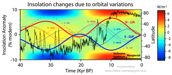
Figure 2 (Source: Javier, see his post for a detailed explanation of the figure.)
The Southern Hemisphere is also a bit anomalous, with a dip in the period of the HCO, corresponding with a dip in winter insolation in the Southern Hemisphere. The other interesting thing about the reconstructions is that the Northern Hemisphere has a higher and longer Holocene Climatic Optimum. The Northern Hemisphere was affected much more by the last glacial advance due to the large continental ice masses there. The Southern Hemisphere ice was mostly sea ice which, presumably, melts at a steadier rate with less dramatic effect.
The Arctic and Antarctic each cover 6.7% of the globe, the southern and northern mid-latitudes cover 18.3% each and the tropics covers 50%. If we weight each reconstruction by the area of its region we get the reconstruction in figure 3. Figure 3A uses all proxies, except for TN057-17, which was removed in part 2. Figure 3B also eliminates ODP-658C, KY07-04-01 and OCE326-GGC26. The removal of the latter three proxies are discussed in part 2 and part 3. The two reconstructions only differ in detail.

Figure 3A, all proxies
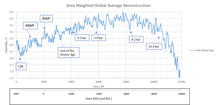
Figure 3B, three additional proxies removed
We will discuss the reconstruction in figure 3B since we prefer it. In this reconstruction, the depth of the Little Ice Age (LIA) occurs in 1610 AD. The apparent Medieval Warm Period (MWP) is smeared over several hundred years and occurs from around 510 AD to 1050 AD which does not fit the historical record. Oddly, only the Southern Hemisphere and the tropics show a distinct Medieval Warm Period (MWP) in its historical time. This is despite abundant historical evidence of a Northern Hemisphere MWP from around 900 AD to 1200 AD. The Antarctic reconstruction shows several warm spikes during the period, but nothing very distinct. The reason for the lack of a distinct MWP signature in the northern reconstructions is not known. In part 3 we looked at the individual proxies for the Northern Hemisphere and saw that they disagree on the presence and timing of the MWP.
The Roman Warm Period (RWP) shows up well in the reconstruction, at about the right time. The “collapse of civilization” at the end of the Bronze Age is clearly seen. The 4.2 kiloyear event that led to the collapse of the Akkadian empire in 4170 BP can be seen (deMenocal, 2001). The 5.9 kyr event that occurred as the Sahara was turning into a desert, causing a great migration to the Nile valley that ultimately resulted in the Egyptian Old Kingdom is clearly seen. The LIA is the most significant climatic event of the Holocene without question, but the second most severe climatic event may well be the 8.2 kyr event. This event ended the Pre-Pottery Neolithic B culture and was when the Black Sea was catastrophically connected to the Mediterranean in an event that may be remembered as Noah’s great flood (Ryan and Pittman). The 10.3 kiloyear event takes place about the time the Pre-Pottery Neolithic period began. For more details on human history and climate change see “Climate and Human Civilization over the last 18,000 years” here. The historical climatic events match this reconstruction well, except for the MWP.
The details of the regional areas are in Table 1. This table is different from the one presented in part 1 of this series because after part 1 was put up we dropped ODP-658C from the tropics reconstruction and KY07-04-01 and OCE326-GGC26 from the Northern Hemisphere reconstruction. Marcott, et al. (2013) used 73 proxies for their reconstruction and our first pass retained 31 of these and added the Rosenthal et al. (2013) Indonesian proxy for a total of 32. As the study progressed we dropped three more proxies and ended with 29. Fifty-five percent of the proxies are north of 30°N and only 21% are south of 30°S.

Table 1
If we simply average the 5 reconstructions with no weighting, we get the reconstruction in figure 4.

Figure 4, Straight average, no weighting, final proxy set
The two reconstructions are not very different. In this reconstruction, the depth of the Little Ice Age (LIA) occurs between 1530 AD and 1670 AD and the temperature anomaly is -0.84°C. The Holocene Climatic Optimum (HCO) runs from 10500 BP to 4500 BP and has numerous peaks between 0.35°C and 0.48°C. Figure 3B is similar, with a slightly larger temperature range. The average temperature difference then, in these reconstructions, is between 1.2°C and 1.4°C. This compares well to the geological and biological evidence presented in Javier, 2017.
A word about error
There are many sources of potential error in these reconstructions. In this series of posts, we have emphasized those sources we thought were most important and significant. Specifically, we focused on the geographic distribution of the proxies, proxy selection, the choice of the mean used to generate the temperature anomalies, the effects of proxy dropout, proxy resolution, and the impact of local conditions on the proxies. The latter problem relates to how applicable the proxy is to regional climate as opposed to local climate. Examples of inappropriate proxies due to local conditions are TN057-17 and ODP-658C which are discussed in part 2.
Dating the proxy samples can be problematic. Marcott, et al. (2013) emphasize potential dating errors in their paper and supplementary materials. They consider dating errors to be the largest source of error. Marcott, et al. (2013) also provide a very detailed discussion of proxy-to-temperature calibration uncertainty in their supplementary materials. Generally, they assume one standard deviation (normally distributed) to be the error inherent in the proxy-to-temperature conversion, otherwise they follow the proxy author’s recommendations.
Marcott, et al. assumed a fundamental dating error of 120 to 150 years for most cases and accounted for it using a Monte Carlo procedure (1,000 realizations) which is detailed in their supplementary materials. For the layer counted Antarctic ice-core records they assumed a ±2% uncertainty and for Greenland cores they assumed a ±1% error. All radiocarbon dates were recalibrated using IntCal09. Our reconstructions use the original published dates and not the recalibrated dates.
Dating errors and proxy-to-temperature errors are undoubtedly important and Marcott et al. (2013) provide a good discussion of these problems and their supplementary database contains estimates for these sources of uncertainty. They also considered that some of the proxies may have a seasonal bias and attempted to account for this source of error in their Monte Carlo procedure. They do not believe that seasonal bias is an important source of error. We have nothing to add to their work on these uncertainties and the interested reader is referred to their paper. They do present an interesting figure in their supplementary materials displaying the 1,000 Monte Carlo realizations that result from their study of error due to dating and proxy-to-temperature conversion. It suggests that error due to these factors is roughly ±0.5°C. We show their figure as our figure 5:
Figure 5 (Source: Marcott, et al., 2013 supplementary material)
Marcott, et al. (2013) also provide their own latitudinal temperature reconstructions and display them in their supplementary figure S10, not reproduced here. Their regional reconstructions are different in detail than ours because they use more proxies, but their 30°N to 60°N reconstruction for the Holocene is the same big outlier we see in our figures 1A and 1B. They also note, as others have, that computer simulations of Holocene climate do not agree with the proxy reconstructions, the so-called Holocene temperature conundrum. The largest difference between the simulation results and the proxy reconstructions occurs in the mid-high latitude Northern Hemisphere, which suggests that the models are missing some key component of Northern Hemisphere climate. They suggest that the models may not be modeling north Atlantic Ocean circulation properly, we agree. The global climate models also have other problems, for a discussion see here.
We believe the greater source of error in these reconstructions is in the proxy selection. As documented in this series, some of the original 73 proxies are affected by resolution issues that hide significant climatic events and some are affected by local conditions that have no regional or global significance. Others cover short time spans that do not cover the two most important climatic features of the Holocene, the Little Ice Age and the Holocene Climatic Optimum.
Conclusions
We’ve tried to address the criticism of the Marcott et al. (2013) global temperature reconstruction. Steve McIntyre, Grant Foster and others contested their adjustments of the published proxy dates, their inclusion of some inconsistent proxies, and not compensating very well for proxy drop out. Javier has pointed out that their proxy reconstruction does not reflect abundant geological and biological evidence that the average sea surface temperatures were at least one degree Celsius warmer during the Holocene Climatic Optimum than during the Little Ice Age. In addition, the use of proxies that do not cover the interval from the LIA to the HCO is problematic since these are the two best defined temperature extremes in the period. Further, we are using temperature anomalies from the mean to build these reconstructions and prefer to get the mean from the period 9000 BP to 500BP so that the mean represents both the high temperatures of HCO and low temperatures of the LIA. This is not possible if the proxy does not cover this interval.
We also avoided proxies with long sample intervals (greater than 130 years) because they tend to reduce the resolution of the reconstruction and they dampen (“average out”) important details. The smallest climate cycle is roughly 61 to 64 years, the so-called “stadium wave,” and we want to try and get close to seeing its influence. In this simple reconstruction, we have tried to address these issues.
The reconstructions show a difference of 1.2°C to 1.4°C between the LIA and the HCO. This suggests that the underlying data support this temperature difference. These reconstructions also show more detail. The additional detail appears to correspond to known climatic events. While the LIA, HCO, Roman Warm Period, Minoan Warm Period and other historical events show up well in the reconstructions, the Medieval Warm Period does not, it appears dampened and offset in time from historical records. The reasons for this are unclear. As discussed in part 3, some Northern Hemisphere proxies show an MWP and some do not. The proxies may be wrong or perhaps the MWP occurred in different times or in different intensity in different places, smearing it on a global reconstruction. Either way proxy choice determines the MWP intensity and timing, which is disappointing. More work and better proxies are needed to improve our Holocene temperature record.
An accurate Holocene temperature reconstruction is not possible, even measuring the potential error in a reconstruction this long is incredibly difficult. Marcott, et al. (2013) did a good job of estimating dating error and proxy-to-temperature error, in our opinion. But, they do not address the other issues, such as proxy selection, that may be more important. But, even without a viable error calculation, a generally accepted estimate of Holocene temperature trends is greatly desired. To understand the present, we must know the past. This is a very simple reconstruction and it is not meant to be definitive, but we present it as a starting point for future work. It is a presentation of the data and some useful tools needed to work the data.
To improve the reconstruction, I think we need to compare it and the component proxies to other data. In particular, historical records, archeological records, glacial advance histories, biological and geological data. This “outside data” can be used to select proxies and guide the reconstruction.
The R code to map the proxy locations, the references and metadata for the proxies, and the global reconstruction spreadsheet can be downloaded here.
I am very grateful to Javier who has read this post and made many very helpful suggestions. Any errors are the author’s alone.
Interesting review. What would be interesting would be to check Chinese and Japanese historical records, such as have survived, on historic climate, as they were the only literate peoples in North Asia during the LIA and before.
Tom,
Plus Koreans, Manchu and Mongolians. Not to mention travelers on the Silk Road and Christian missionaries.
And during the LIA, Russia advanced to the Bering Strait and beyond, to Alaska, thence down the Pacific Coast of North America to the Russian River in California.
Go East to Alaska!
My bad! I did forget about the Koreans, but they also have the same problem with losing records in war.
We know the precise date and approximate time of the AD 1700 Cascadia earthquake because of Japanese tsunami records.
The Russians kept weather records. Severe winters in Alaska during the Dalton Minimum forced them to establish settlements down the coast in California, to provide Alaska with reliable food supplies.
http://www.fortross.org/russian-american-company.htm
It is interesting to note though that “the Great Northern Expedition” that mapped the north coast of Siberia (and included Bering’s expedition to Alaska) took place during the brief but intense warming episode c. 1720-1740 at the end of the Maunder Minimum. Most of the Siberian coast wasn’t reached by ship again until the 1870’s.
They didn’t have thermometers of course. The historical records act as a sanity check on the proxy data. I became a skeptic when Dr. Mann’s hockey stick egregiously contradicted the historical record. Thanks Michael. 🙂
Dunno about the 17th century in Siberia, but the Russians did have thermometers in the 18th and 19th centuries. Also dunno when China and Japan started using them, or the Catholic missionaries there.
For most of written history, nobody had thermometers.
Obviously you never heard of the daily records of the joseon dynasty.
You’re right. It is an amazing example of the devotion to truth that lasted for centuries.
The daily records, which included meteorological phenomena, were recorded in secret. When a king died the daily records would be compiled into his official, public, history. The Koreans had the impressive foresight to keep backup copies. Truly awesome.
I hadn’t heard of them, but a quick search revealed no indication of thermometers, and only the intention of translating to English by 2033, if and when a budget of 40 billion somethings is forthcoming.
A great improvement on and critique of Marcott. Now we have a serious Holocene reconstruction finally – thank you!
You rightly talk of resolving the HCO from the LIA as extremes. Some of Marcott / Shakun’s proxies scarcely resolve the HCO from the LGM.
Nothing to see. A glacial period ended about 12,000 years ago and it’s an inter-glacial period until it isn’t anymore.
Nothing to see ? ? ? I have to disagree with that …..
Seems to me there is a great deal to see – not least that temperatures today are below those of Minoan and Roman Warm periods, perhaps now recovering sufficiently from the LIA to be approaching those of the MWP.
And last but not least that the 20th C rise and fall in temperatures is not in the least unusual in either speed (rate) of change or amount compared against past temperature changes and rates of change.
I just noticed … Some of the graphs, Figure 4 for instance, show the modern anomaly about half a degree below zero. 🙂
I assume that is because the average global temperature is taken across the entire 12,000 year period.
It reinforces the frequently made point that there is no evidence in past temperatures to either suggest or to support the hypothesis (claimed as fact by alarmists) that current temperatures are somehow ‘abnormal’. It also shows that there is no evidence to suggest that man is influencing temperatures.
The anomalies I plot in the graphs are from the average temperature from 9000 BP to 500 BP to capture some of the LIA and HCO.
Looks like dangerous global cooling since the HCO hasn’t been reversed by the Current Warming Period. We need more CO2, stat!
Assuming adding more has any measurable warming effect at all.
How many of the global proxies extend past 1950? Is the recent data based on proxies from all the regional areas? Just trying to understand if this data has much support.
Some of the proxies go past 1950, but anything past 1900 is very speculative. Be careful with both ends of the reconstructions.
AM, your figure 5 is just another proof that Marcott committed academic misconduct compared to his thesis using same oroxies and methods. Go over to Judith Curry’s Climate Etc. for a compelling proof offered at the time. The 2013 guest post was ‘Playing hockey, Blowing the Whistle.’ Renamed A High Stick Foul in my 2014 ebook.
Your careful redo of the various latitudinal proxies is to be lauded. Well done. Archived.
Thanks Rud.
I second and third that. The effort many posters put into their work is exemplary and a great example to the scammers if they were not to busy chasing funds
Hardly.
The northern hemisphere at 65N has lost about 30 watts/square-meter of insolation over the past 9 kyr due to Earth’s orbital change. Might that account for the steady decrease in NH proxy temperature? It is most unlikely to be due to growing NH ice albedo. The SH at 65S has gained that 30 w/m^2, but most SH heating goes into the ocean and is distributed around the globe, so the SH temperature change ought to be less.
Combining your regional temperatures (Fig. 1) suggests a nearly constant Holocene temperature.
Disagree.,.. combining them results in the other graphs shown. The results in figure are consistent with another natural negative feedback… Meaning the resulting overall temp variations would have been even more dramatic not necessarily flat like you suggest.
The Marcott chart was dominated by its date error widths because those errors shrank toward the base year 1950AD and became zero at that year. The date error widths determined the amount of data intermingling between adjacent date bands when the 1000 Monte Carlo perturbations were done. But because the date error at 1950 was zero, it did not share its data with earlier dates. This decreasing data sharing as 1950 was approached is the entire reason for the phony hockey blade of the Marcott chart. Unfortunately the above article failed to detect that overarching cause & effect.
I dealt with that issue, which I call proxy drop out, several times in the series. Plus I referenced Steve McIntyre’s work in part 1. Your description of the Monte Carlo mathematical problems is nice though. I like that way of saying it. Monte Carlo has many pitfalls.
Unless this work is submitted to a journal and you haf to deal with the critiques of the grownups, you have only the the nth post on Marott ’13. Another nothing-burger. Good luck.
In other words, pal-review is all ?
Andy deserves credit for posting his data and code.
Let the “grownups” come here.
There are several troubling aspects to this reconstruction.
1. The MWP, which should be prominent in any reconstruction, is inconspicuous.
2. The NH curve cannot be correct–it doesn’t even show the YD! And it is very different from all the others.
3. The 8.2 cooling doesn’t show in some of the reconstructions.
4. Orbital variations are so slow they cannot possibly explain the variations seen in the Holocene climate record (as claimed).
The Marcott et al paper was not scientifically credible. Because of the problems cited above, I have serious reservations about these reconstructions.
Don Easterbrook June 9, 2017 at 9:44 pm
“1. The MWP, which should be prominent in any reconstruction, is inconspicuous.”
WR: there have been serious efforts ‘to get rid of the medieval warm period”. Perhaps they succeeded in doing so. See: https://wattsupwiththat.com/2013/12/08/the-truth-about-we-have-to-get-rid-of-the-medieval-warm-period/
“Steve McIntyre points out in his article:
(…) Overpeck hasn’t challenged the authenticity of the Climategate email in which he aspires to “deal a mortal blow” to the MWP”
“2. The NH curve cannot be correct–it doesn’t even show the YD! And it is very different from all the others.”
WR: given the enormous surfaces to cover (both at sea and land) and the enormous variations in regional circumstances, the number of proxies that could be used for the reconstructions is minimal. That limits the conclusions that can be drawn. But it is refreshing to have a zonal reconstruction anyway, one of which the limitations are well described. It is a good start for an extended research, one that makes an important switch from the ‘global thinking’ about climate to the zonal / regional way of looking at changes we could face. Future will show that important processes often act on a zonal / regional scale – with global consequences. Understanding the zonal / regional physical processes is the first step to understanding world wide climate.
This attempt to understand ‘climate’ from a zonal view is a very good first step, but as you (Don Easterbrook) point out, it has its limitations.
“4. Orbital variations are so slow they cannot possibly explain the variations seen in the Holocene climate record (as claimed).”
WR: Orbital variations often have zonal (latitudinal) effects (insolation, length of season etc.) Understanding these zonal effects will be necessary to understand the – so far – unpredictable moves world climate makes. We are just at the beginning of understanding.
+1, although tend to agree with Don on the orbital effects. Since the LGM is only a half period for precession, a quarter period for obliquity, and a tenth/fortieth for eccentricity. The orbital effects are predominantly zonal, and the regional variation is predominantly meridional.
My preference would be to look only at the isotope based proxies, ice core and sediment, and ignore all the pollen, midges and other biological proxies whose relationship to climate is weak and uncertain. Only then do you get the real picture.
The only reason Shakun – Marcott brought in the army of biological proxies was as “false witnesses”, to deliberately obscure, not clarify, the Holocene temperature record. The motivation for this is utterly transparent – to inflate the significance of the “Mike’s Nature-Trick” tacked on 20th century warming.
Science is supposed to be a search for truth and clarity. The recent Shakun-Marcott type proxy studies have been the precise opposite of this, a determined effort to obscure the truth for transparent political goals.
ptolemy2, The problem with ice core and lake sediment proxies is the land surface is only 30% of the surface of the Earth and they tend to be air temperature proxies and the atmosphere only contains 0.07% of the heat energy on the surface. To get a true picture of climate one must study the oceans. Then we have the issue of depth, since the oceans have a steep temperature gradient near the surface. Thus algae and forams are used since they have a limited depth range. It’s not perfect and dating is more of an issue with ocean proxies than ice cores, but if you don’t sample the oceans, you aren’t looking at global climate, only regional climate. And as I showed, all regions do not vary the same.
Andy
I’m 100% with you that oceans store 99% of the climate’s energy and that climatic trends come from the ocean.
But let’s be clear. Ocean temperature, while causative of climate, is not climate. The “climate” that concerns us is just the temperature at the land surface, weighted in importance to where people live. (Was it Goethe who said “all that concerns a man is man” – or was it Novalis, I don’t remember.)
Hypothetically for example, lets say we’re in a glacial maximum with New York, London, Berlin and Beijing all under a kilometre of ice. However the abyssal ocean temperatures are 1 degree C warmer than now, and total ocean heat content slightly higher than at present. Would this mean that climate was not cooler, and that only oil industry funded shills would draw attention to the kilometre of ice underneath which progressive caffe latte drinking urbanites burrowing around in these cities would be pretending the ice above them did not exist and still be anxious about global warming?
No – what you say about isotope data being limited in scope to land surface and atmosphere only strengthens my point – this makes it clearer why these are the the important proxies of climate.
By “climate” I mean (land surface) [SIGMA] (time): weather
That is, weather integrated in over land surface and through time.
What happens in the ocean is oceanography. Yes, it is important to both weather in the immediate sense and to climate of which ocean dynamics are by far the leading driver. But climate is restricted to the surface and what happens at a kilometre depth in the ocean is not climate. It’s the oceanography.
“The NH curve cannot be correct–it doesn’t even show the YD”
It starts with the younger Dryas which ended c. 11,700 calendar years BP.
Don Easterbrook, The end of the YD is the beginning of the Holocene as discussed in part 1. I show a little of it and it ends at the correct time. The 8.2 kyr cooling shows in all reconstructions within the margin of dating error, approx. +-150 years. The NH reconstruction is probably correct, or close to it, the NH is anomalous in this time period. I think orbital variations are the dominant driver of the cooling from the HCO to the LIA(~6000 years). Smaller changes are sometimes due to ocean circulation. As for the MWP, why it doesn’t show up is a mystery to me. I can speculate that it occurred in different times in different places, but I have no proof.
Andy,
I appreciate the effort and intent of the curves you have developed, and would really like to have a reliable global Holocene temperature curve, but, as I’m sure you well know, the devil is in the details. Hence the reservations that I cited. Particularly troubling is the NH reconstruction (the yellow curve in your Fig 1A and 1B). Putting aside the fact that it is way out whack with the other curves, it just doesn’t make sense. If that curve is so far off, how accurate can the composite of all curves be using the same proxies?
Perhaps this is a case of trying to mix too many inaccurate proxies. It’s a bit like the global glacier record—if you study a few carefully selected, climate-sensitive glaciers, you get consistent, reliable results (some glaciers are good paleo-thermometers). But other glaciers are not so climate sensitive and make lousy paleo-thermometers. If you mix them together, you generally get unsatisfactory results. For example, I studied some large, very climate sensitive glaciers in the North Cascade (they matched historic atm and ocean temps almost exactly). But right next to them were some small cirque glaciers that didn’t show much of anything. If you used the climate-sensitive glacier data, you got good results, but if you used only the small cirque glaciers you got very poor results, and if you mix the two together, you get an unsatisfactory result. The same kind of thing also applies to isotope, dating—if you are extremely selective in sample selection and apply rigorous sampling techniques, you get good dates with small plus/minus error bars. On the other hand, if you just collect every sample you find, you get very large error bars and low accuracy. If you mix the two methods, you destroy the accuracy of the good samples. The point here is that perhaps using too many proxies, or mixing good ones with poor ones, gives anomalous results.
Anyway, I applaud your attempts to get a reliable Holocene temperature curve, but, at least for now, I remain skeptical.
Dr. Easterbrook, Skeptical is good. Thanks for your comments. I certainly agree with your comments about proxy selection, whether glacier front studies or forams and algae. But, we do disagree on the NH reconstruction. Take another look at part 3, the NH reconstruction has very good coverage around the world. I show it with two proxy sets and it doesn’t change much as I take questionable proxies out. Further, Marcott, et al.’s NH reconstruction is in agreement with both of mine and it uses a lot more proxies. I suspect it is a solid reconstruction. Plus, given the precession and obliquity changes in the Holocene it makes sense.
I don’t see why it should be troubling at all, except that you have in your head an idea of how the climate should have been and the reconstruction doesn’t fit your idea.
Andy’s NH reconstruction from figure 1B fits extremely well Central England reconstruction by H.H. Lamb from the 70’s (summer reconstruction shown):
So why are you troubled? This is consistent with a century long climate research.
I find reassuring that Andy regional curves are different. Otherwise I would think they are wrong. The NH has experimented the biggest drop in summer insolation during the Holocene, and being mostly land is more sensitive to regional changes. The tropics display climate dampening. It is not surprising that they barely show a Neoglacial. Lets remember Scotese temperature curves:
http://clivebest.com/blog/wp-content/uploads/2017/02/meridional-profiles.png
And The Southern Hemisphere had reverse insolation profile to the Northern Hemisphere. That it has not been warming during the Holocene is attributed to inter-hemispheric teleconnections.
I guess the problem is with our poor knowledge of paleo climate more than with the proxies or Andy’s reconstruction.
Javier–“I don’t see why it should be troubling at all, except that you have in your head an idea of how the climate should have been and the reconstruction doesn’t fit your idea.”
Aside from the fact that I don’t know how you could possibly know what I “have in your head an idea of how the climate should have been,” I NEVER consider what “should be” — my work ALWAYS goes where ever data takes me without regard to where it leads. “Conclusions based upon preconceived ideas are valueless. It is only the open mind that really thinks.” (Patricia Wentworth, 1949)
Let’s just stick to the data and not invoke personal insults.
Since genuine temperature measures for most of the Holocene and for that matter the rest of geological history are outright impossible, proxies are what you have. The important thing is to use them guardedly and be very explicit about errors, potential confound factors and all cruft that can affect or bias a reconstruction. The use of C-14 to acquire that age of archaeological and paleontological specimens has had to adapt steadily to refinements in our understanding of just how variable C-14 can be over time. C-14 is a proxy for time. Yet, in general, by keeping in mind its limitation and biasing conditions it is made to work reasonably well. The problems with proxies almost always reside in the user and how they apply them. One thing this analysis confirmed for me was that the polar data from ice cores (Greenland and Antarctica) show no trend. My analysis of that data indicated no significant trends over the Holocene. There was a discernible, but not statistically significant cooling trend.
Figure 1A en 1B are very interesting. In fact they show why ‘Global Warming’ of ‘Global Change’ never has been really global. Temperature changes are in the first place visible in the North Atlantic region, I once checked that. From there, there are world wide consequences. For example the average (!) world wide temperatures rise as the North Atlantic / Arctic region shows a big rise in temperatures. But the change is not really ‘global’. To understand you must understand the influencing processes where they do occur.
It is an important distinction: ‘regional’ or ‘global’. All the talk about ‘global warming’ [by CO2] took all the attention from where important climate processes have been taken place since billions of years: at the regional and zonal scale, often induced by orbit. To understand ‘climate’ we have to go back to where ‘nature’ performs. ‘Global calculating’ doesn’t reveal what the real processes are.
This series of articles is a very good attempt to bring back the attention to where the attention has to be. To the zonal and regional physical processes.
A question for Javier (or someone else) about Figure 2 (= Fig. 34 of Javier): “Changes in seasonality insolation caused by the precession cycle (modified by eccentricity) are asymmetric and less important for the global response, although they cause profound changes in regional climatic differences.“
WR: I am interested in the asymmetric changes in seasonality insolation caused by the precession cycle. I want to know:
– What exactly are those changes? I know the precession shortens/lengthens seasons.
– When do these changes occur? In which period do I find what effect? How can the effect be quantified?
– And in which zones and hemispheres do the changes occur? And when exactly?
Background: I suppose precession has so far unknown regional effects which are important to know in order to understand climate. Understanding precession well therefore is the first step.
Wim, Precession changes the intensity of the seasons, the extremes of summer and winter. Right now summers in the Northern Hemisphere are milder because perihelion occurs early in January. In the Southern Hemisphere, they are warmer. Precession influences ocean currents that carry heat from the tropics to the poles. They also control the position of the climatic equator or “ITCZ” as alluded to in the post.
Wim,
Precession changes affect the way the yearly insolation from the sun is distributed over the surface depending on latitude and changing the amount of insolation each day. the effect is to increase or decrease seasonality, the difference in insolation between seasons.
Precession changes are taking place all the time everywhere. Insolation has to be calculated for a specific day of the year at a certain latitude, and it changes very slightly every year according to a ~ 23,000 years cycle. Laskar has a webpage that allows those calculations to be made. The effect is measured as W/m2 of incoming solar irradiation taking an average value (1366 if I remember correctly) and correcting for sphericity and rotation.
Precession changes can be ignored unless one works in multi-centennial scale. At this scale and above it influences regional climate considerably. One has to check what seasons are getting warmer or colder and longer or shorter. Biological proxies respond very strongly to those changes. At certain times in the 23 kyr precession cycle summer insolation goes from predominate in one hemisphere to the other, and the climatic equator, the ITCZ, suffers a dramatic displacement that completely alters the subtropical climate, affecting the entire world.
The figure was originally at my article:
https://judithcurry.com/2017/04/30/nature-unbound-iii-holocene-climate-variability-part-a/
The sources are: Insolation curves: P.J. Polissar et al. 2013. PNAS Vol. 110 No. 36 pp. 14551–14556 (supplemental information). NGRIP δ18O isotope curve: NGRIP members. 2004. Nature, 431, 147-151. Background color: Steve Carson. The science of Doom. http://scienceofdoom.com/2014/01/
Andy and Javier, thanks for your answers. They partly help. I know the sources that are mentioned but still I don’t know which precession effect is where visible and when. I am interested in the effects on a multi centennial scale. I am not only interested in the quantity of insolation at certain latitudes (and the relative lack of insolation at other latitudes!) but also – and perhaps even more – in the length of season for every season at both hemispheres. Some climate variables are pronounced in certain seasons and sometimes on specific places in a specific hemisphere. A shorter and less intense season (or the reverse) might have a tremendous effect on climate, if – as with obliquity – the total effect adds up. For example ocean currents might change if seasons shorten or lengthen and/or intensify.
For obliquity you showed the insolation effects in your figure 34, Javier. Do you (or Andy or someone else) know time tables and / or maps and / or articles that show which precession effect (not only insolation) is where and when? Also historically and looking to the future? That would be very helpful. Precession is a cycle, varying in time. We know that climate cycles are not showing a rigid pattern: they are varying in time. Understanding precession better (and her physical effects) might help understanding climate and its cycles. I suppose precession does do more than just affect insolation.
I’m sorry Wim, but you will have to work out that information yourself, as far as I know.
To get you an idea of how this works, you have figure 2 from Marcott et al., 2013 (appropriate for this article):
http://www.realclimate.org/images//marcott_fig_2.png
Figure 2 Changes in incoming solar radiation as a function of latitude in December, June and annual average, due to the astronomical Milankovitch cycles (known as orbital forcing). Source: Marcott et al., 2013.
The December and June changes are mostly due to precession changes with some contribution from obliquity changes. The annual changes are due exclusively to obliquity changes, as precession does not change the annual amount of insolation.
As far as it is known, all changes from precession are primarily due to changes in insolation, while the climatic system response is not well known.
Javier (June 10, 2017 at 7:59 am) thank you, I knew the figure you show, but I was not sure how to interpret the figure. But I still have a problem. The 36 W/m2 surplus for June for large parts of the NH at 10.000 year BP does not show up in the yearly anomaly for that year, the SH high latitudes seem to get the same yearly surplus anomaly while the December graph (the upper graph does not show any warming in the South at all at 10.000BP. I can’t combine that.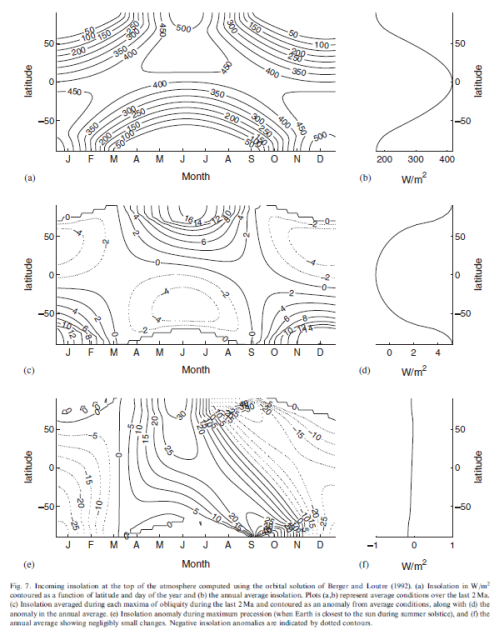
A figure in one of your links (a figure that I overlooked the first time) is figure 7C from Huybers 2007:
It shows the maximum precession effect for each month of the year and for latitude. This figure does show warming in the SH during some months but also cooling in other months.
Wim, I am not sure you have understood what that figure shows.
a) is a 2 Myr average, so in essence it averages the orbital forcing eliminating the cycles.
c) Is a 2 Myr average of insolation difference at maximal obliquity from average. Does not represent a real situation, but gives an idea of the averaged effect of obliquity.
e) is a 2 Myr average of insolation difference at precession maxima, only when the earth is closest to the sun at NH summer solstice. Again not the real deal. Last time this happened was ~ 10,000 years ago, and the insolation is calculated as the difference between an average of every such period during the past 2 Myr against the average for the whole period.
None of the figures shows warming or cooling as they are insolation curves, not temperature curves.
Javier you are right. I first read the text of scienceofdoom: “The third graph shows the anomaly compared with the average at times of maximum precession.” After that I looked at that third graph left under and saw a ‘c’ barely visible above it. In the original text below the graph I couldn’t discover a difference between the ‘c’ and the ‘e’ (I even didn’t discover an ‘e’) and held the text for ‘e’ for the text for ‘c’. So I was reading the wrong graphic.
I again will have a look at the real ‘c’. Thanks.
Thanks for figure 2 below. Had not seen that. It seems to be anomaly or deviation from the present. It seems to agree with Andy’s northern hemisphere reconstruction really well. Thirty summer watts lost LGM to present. Those watts appear to have been stolen from just south of the equator.
Bravo for showing all the proxies.
Every decision to remove a proxy incurs uncertainty.
Folks will invent all manner of rationale to drop proxies.
The uncertainty is symmetrical to the one incurred by the decision to include said proxy.
Exactly.
Monte Carlo simulations study variance about the mean of a set of observations that are assumed to vary in some known way about the correct value. It’s possible that the proxy-to-temperature measurement roughly meets that criteria. Date errors might also. It’s not unreasonable to try to use Monte Carlo for these sorts of errors. But, proxy selection, the big problem, cannot be dealt with in this way.
That said, we cannot be sure what the accurate number is, so applying any certainty to the Monte Carlo range is wrong. We can just say that if the accurate number is within the proxy range and the seed error ( that is the 120-150 year dating assumption and the proxy error assumptions) are correct this is what the error is. Not very satisfying.
I really loathe these graphs you read from right to left. I’ve been performing technical writing professionally for 17 years and NEVER do that.
Geologists do that because they can always dig deeper and add more data to the right, while at their scale the present is the fixed point and thus the origin of ordinates. It gets confusing when both types of graphs get mixed. However most WUWT readers are already quite experienced geological and climatological graph readers.
One thing about the Milankovitch cycles and Figure 2: The Milankovitch cycle that global temperature correlated with most strongly in the past roughly 2.7 million years is the eccentricity one, whose period is close to 100,000 years, even though it is weaker than the variations shown in Figure 2. Apparently something resonates with the eccentricity cycle, or the changes take too long to be accomplished by shorter cycles. (Before about 2.7 million years ago, when the Isthmus of Panama was under water, ice age glaciations came and went in correlation with a cycle shorter than the eccentricity one.)
Milankovitch thought that the obliquity cycle was the driver of glaciations in the Pleistocene and I agree with him. Eccentricity may play a small role, but mostly it is obliquity and precession. Javier has written about this a lot. See his post here: https://judithcurry.com/2016/10/24/nature-unbound-i-the-glacial-cycle/ especially figure 5.
Andy May:
Andy May on June 10, 2017 at 4:04 am
ptolemy2, The problem with ice core and lake sediment proxies is the land surface is only 30% of the surface of the Earth and they tend to be air temperature proxies and the atmosphere only contains 0.07% of the heat energy on the surface. To get a true picture of climate one must study the oceans. Then we have the issue of depth, since the oceans have a steep temperature gradient near the surface. Thus algae and forams are used since they have a limited depth range. It’s not perfect and dating is more of an issue with ocean proxies than ice cores, but if you don’t sample the oceans, you aren’t looking at global climate, only regional climate. And as I showed, all regions do not vary the same.
ptolemy2 on June 10, 2017 at 1:00 pm
Your comment is awaiting moderation.
Andy
I’m 100% with you that oceans store 99% of the climate’s energy and that climatic trends come from the ocean.
But let’s be clear. Ocean temperature, while causative of climate, is not climate. The “climate” that concerns us is just the temperature at the land surface, weighted in importance to where people live. (Was it Goethe who said “all that concerns a man is man” – or was it Novalis, I don’t remember.)
Hypothetically for example, lets say we’re in a glacial maximum with New York, London, Berlin and Beijing all under a kilometre of ice. However the abyssal ocean temperatures are 1 degree C warmer than now, and total ocean heat content slightly higher than at present. Would this mean that climate was not cooler? Climate that matters is at the land surface.
No – what you say about isotope data being limited in scope to land surface and atmosphere only strengthens my point – this makes it clearer why these are the the important proxies of climate.
By “climate” I mean (land surface) [SIGMA] (time): weather
That is, weather integrated in over land surface and through time.
What happens in the ocean is oceanography. Yes, it is important to both weather in the immediate sense and to climate of which ocean dynamics are by far the leading driver. But climate is restricted to the surface and what happens at a kilometre depth in the ocean is not climate. It’s the oceanography.
This might be the heart of the proxy problem. Defining climate as relating to land surface and restricting proxies to isotope records of atmosphere and land surface, might add clarity and stop important features such as the YD, MWP, LIA being dissolved in deep ocean water.
+10
Andy
This is not about happiness or sadness but wtf are we talking about. Yes ocean proxies are important as are land surface and atmosphere proxies. Look at them separately alongside eachother. Why smear them together and call it “climate”?
If during glacial periods deep sea temperatures are a bit higher – a bit of thermal zero-sum-game, does this mean there was no ice age?
Javier’s recent work has shown clearly that the obliquity cycle which changes ocean heat in real time, forces glacial-interglacial timing with a delay of 6,500 years. Mixing both ocean temperatures and the glacial cycle is only going to blur and not clarify the study of climate. For instance as Don Easterbrook pointed out, this blurring of ocean with land surface temperatures makes important features of land surface climate, like the YD, MWP and LIA, disappear. If you are Shakun ot Marcott this might be your goal. I would hope it is not your goal also.
ptolemy2 says “But let’s be clear. Ocean temperature, while causative of climate, is not climate. The “climate” that concerns us is just the temperature at the land surface, weighted in importance to where people live.” It would be funny, if it weren’t so sad!
ptolemy2, Sorry, my remark was not clear. I meant sad because people do think climate is only what affects them, not as a global event. Speaking of “global warming” and only considering land surface air temperatures is silly. If a forcing is strong enough to affect global climate, it will affect the oceans. If it only affects the atmosphere, it is a local weather event and lost in the imprecision of the 4th or 5th decimal place. It just doesn’t matter. The oceans provide a huge dampener on atmospheric temperature changes. Just evaporation in the tropics limits atmospheric temperatures to 30 degrees. So, the ocean temperatures do change slower than atmospheric changes, true enough. But, we are not looking to measure actual air temperatures of the past, we are looking for delta temperature, is it going up or down? We fully understand that air temperature swings will be larger and much faster than what our proxies show. But, this dampening effect of ocean heat capacity does make a signal that tells us what is significant and it culls out weather events. We will see an event that is 150 years or more, we will not see 20 year events. To study ancient climate, studying the oceans is critical. Ice cores are all we have at the poles and we must use them there. Large lake sediment cores, well located and selected can also be used. I’ve looked at tree ring data and consider it crap, just my opinion.
Point taken. Yes the ocean is central to climate and to climate reconstructions. There is some truth in the saying “atmosphere brings weather, ocean brings climate”. I guess any lags, between land and ocean or even “stadium wave” type longitudinal phasing of the type proposed by Wyatt and Curry, will result in blurring of globally integrated climate reconstructions. Past climate is the greatest detective story of all time – thank-you for your important contribution to this very difficult task. It helps when new and improved proxies are discovered – for instance the excellent speleothem from the Indonesian Island of Flores with its clear reconstruction of alternating ENSO phases going back 2000 years. This strengthened the case for multidecadal climate oscillations in the main ocean basins.
I accept my “anthropic” definition of climate might sound silly, but I think it’s not entirely trivial. When surface climate fails to warm as predicted, alarmists respond with “but look at all the heat going into the ocean”. But how alarming is this? Not so much. This could be just the normal mechanism of natural climate oscillations, a periodic exchange of heat from the oceans and atmosphere. Going back to Javier’s 6500 year lag between obliquity and glacial cycling, this huge thermal lag shows that in much shorter terms, climate heat is almost a zero sum game, since it takes so long to significantly heat or cool the oceans.
Andy — I’m chuckling at your comment “I’ve looked at tree ring data and consider it crap, just my opinion.” I done a lot of tree core work and have come to the conclusion that as a measure of atm temperature they are pretty much useless, largely because trees are much more sensitive to available water that to temperature. As temp goes up, the climate can become drier, which is an indirect factor, but isn’t very reliable..
ptolemy2, “but look at all the heat going into the ocean”. I looked at some ocean buoy data some time ago and verified that the oceans seem to be warming a bit. Just averaging the JAMSTEC MOAA worldwide data from 0 to 2000 meters, I get a rise of about 0.06 degrees C from 2004 (the first year with good coverage) to 2014. Given lag, I suspect this is still recovery from the LIA. Most of the warming is in the upper 400 meters, but some has already trickled down to 2000 meters. I don’t know what the lag is, maybe 6500 years for full equilibrium? But, I think a lot of the atmosphere to ocean transfer takes place in less than 150 years from what I’ve seen comparing land proxies to ocean proxies. I need to put more effort into that, it is kind of a key area. You are definitely correct that mixing land and ocean data blurs the result, no doubt about that.
Once again a post and the following comments sparked a thought in me which has led to as insight. An insight which I think has merit for holding further clues to the answers we all seek. I reead the comments around 1 am this morning. As I did a new thought popped up in regards to the graphs which I have viewed hundreds of times before in attempts to find clues/meaning of some significance. So here we go.
As some of you likely know, I am interested in the possible flood cycle pattern of the West Coast of US. This is the base which has allowed me to gain footing in the world of climate change. I also have several memories from my younger days of the major floods of 1955/56 and 1964/65. Wim Rost’s 11:38 pm comment was the spark for this. His comment on the importance of understanding regional influences was the key as I have come to think the same in that regard. It made me think of the summer of 1957. In that year my father took my brother and myself on our first fishing trip for steelhead on the Trinity River in Northern California, an exciting venture for us boys.
We went in late July as that is when the earliest of the runs would form up to move in off of the ocean. The weather was hotter than a firecracker, the hottest weather which I had ever felt with temps hitting into 110 to 116 degrees F. It is the heat/hot spell that is key here. The flood of 1955/56 had struck around 20 months prior to this heat wave hitting the same region. That made me wonder “Can I find other examples of a similar pattern of flood winter followed by heat wave within 2 years”. The answer is a resounding Yes. I should have seen this before, but the dots never connected. Here is what I see.
Almost every solar minimum produces an above average wet winter on the West Coast which will range anywhere from moderately heavy to flood level rains as we saw in this last winter. The process is solar minimum + heavyrains/floods+within 2 years of this there will be a temperature peak on global temps. To follow along with the following references please open a copy of the UAH temp graph as that is what I am using here. UAH starts in 1979 so the mid 1970s solar minimum is missing. There is also something there in the mid 1970s which may be unique, will have to think further on that.
The start then is the winter of 1985/86 and solar minimum = low temps on UAH and moderately heavy rains in that winter= leads to a peak temp on UAH in Dec/Jan 1988. Next is the winter of 1996/97 +solar minimum= low UAH temp + semi biblical rains/flooding= leads to a temp peak around March 1998. The next is 2007/08 close to solar minimum= UAH low temp + moderately heavy rains/light flooding= leads to a peak temp around February of 2010.
Now going back prior to UAH I went to the Hadley[1850/2010} to see if I could see the same pattern, and sure enough it can be plainly seen. Working backwards in time the winter of 1964/65 close to solar minimum= low temp on Hadley+ massive flooding= leads to a temp peak around Jul/Aug 1966 and an interesting quick zig zag afterwards. Next is the winter of 1955/56 close to solar minimum= low temp on Hadley+severe flooding= similar to 1964/65 rapid upswing in temps, an initial temp peak around Jul/Aug {my steelhead fishing trip} 1957, although this is also followed by a quick zig zag and a higher peak around 6 months later. Next is the winter of 1946/47 {this is the pivot point to cooling 1946/47 to 1976/77, imo} several years after solar minimum but right after a rapid rise to a max, an equally quick drop occurs close towards minimal conditions= low temp on Hadley+heavy rains and moderate area flooding=temp peak on Hadley around Sept of 1948. An interesting peak as otherwise temps drop steadily from early 1945 to early 1951. Looking back further just exposed another clue to this puzzle. I have been assuming solar/flood correlation, although there is to a certain degree. However, now that I look into the 1930s and the 1920s I see what now appears to be a 9 year cycle running through all of this. In both decades, which is the main warming trend 1915/16 to 1946/47, the wet/flood winter cycle strikes after the solar minimum by 2 to 4 years, but always on a solar dip/Hadley low temp which is then followed by a further Hadley temp peak less then 2 years later, actually around 18 to 20 months from what I can see. Could this be a lunar cycle as a main component? I will need more time to look further back. Plus several other avenues of thought have come up as well.
Lastly, what does all of this portend for the future next several years? Is this last heavy rain winter indicating a new temp peak around mid to late 2018? Or will there be one more heavy winter coming up at the end of this year along with a subsequent drop of temps on UAH between now and then? Otherwise, if Feb 2017 is presumed to be the low temp point/flood pattern, then late 2018 would be a high temp point. That doesn’t seem right to me as the solar minimum is still approaching, but the solar minimum may now shift to arriving after the wet/flood pattern, as in 1920s/30s/40s solar minimum arrives first followed by the wet/flood pattern, 1950s/60s/70s/80s/90s/00s solar minimum and wet/flood pattern very close to each other, and now the pattern may have changed to wet/flood comes first followed by solar minimum. That is something to watch in the years to come.
Temps should be shown as dropping on the monthly UAH in the months ahead, or this might mean that we are about to see a step change in global temps in the near future, or this could also be pointing to one more heavy winter coming up. That would fit with historical patterns as there are typically 1 or 2 moderate to strong winters prior to any main flood winter, and every flood winter is followed by a moderate to strong winter. I stated this 3.5 years ago when I first was putting the pieces together on these potential correlations. The winter of 2017/18 as the main winter in this cycle would mean a temp peak would show up around mid to late 2018. The end for now. There will be a bit more to add later on.
The PDO flipped in 1977.
I think that I flipped in 1969.
Since the NH (yellow) curve (Fig 1) has the most land mass, I thought it would be interesting to drape a specific temperature curve over the NH curve and compare them. The Greenland GISP2 ice core and global glacial record seems like a good representative of NH temperature, so I superimposed the past 5000 year GISP2 temperature curve over the yellow curve. They are quite strikingly different.
From 5000 years ago, the NH (yellow) curve shows monotonic cooling with only minor temperature bumps until about 1000 years ago. In contrast, the GISP2 core shows 7 warm spikes from about 4500 to 1500 years ago and the trend line is essentially flat—at the end of the Roman Warm Period (~1500 yrs ago), the temperature was essentially the same as it was 4500 years ago. The GISP2 temperature then drops abruptly into the Dark Ages Cool Period for several hundred years before warming again during the MWP (~1300 to 900). The NH (yellow curve) shows none of this. The Roman Warm Period, Dark Ages Cool Period, Medieval Warm Period, and Little Ice Age are all well documented historic climatic changes. No matter what you think of the GISP2 temperature curve, historic records confirm that the temperature variations in the core really happened, so the question becomes how valid is the NH (yellow curve) that shows none of them?
Dr. Easterbrook, I’m not sure which Greenland reconstruction you are referring to. The Greenland reconstruction in my Arctic reconstruction (different from my NH reconstruction) is the one from Vinther, 2009, “Holocene thinning of the Greenland ice sheet,” Nature. It is a composite of 6 cores, corrected for elevation differences. You can see it compared to the other north of 60 degree proxies in part 3. The NH reconstruction does not go as far north as Greenland, it stops at 60N. There are 9 Arctic proxies, all very similar, and all very flat. They are all from the North Atlantic area.
Andy,
I used two curves–(1) plotted directly from the GISP2 18O data by Stuiver and Grootes, and (2) the Cuffy and Clow temp curve replotted by Alley (2000). I’ve correlated these curves with the global glacier data and the CET and they math very well, so I think it’s a good record of what was happening in the NH.
I’m troubled by the distinct lack of similarity with your NH curve–I wouldn’t think they would be so different.
Regardless of which ice core data is used, I don’t see any sign of the Roman Warm Period, Dark Ages Cool Period, or Medieval Warm Period on your curve–why is that?
Here is the Alley reconstruction on top of my global reconstruction:
Here is Alley on top of NH:
Here is Alley versus Arctic. This one compares better, except in amplitude, which is to be expected, since we are comparing land and ocean. I think the correct comparison is Arctic to Alley, the differences are telling us about the amplitude differences between land and ocean.
Notice the time shift in the MWP, The time stays the same for the RWP and the Minoan, the Greek Dark Age, and the 4.2 and 8.2 kyr events. This might be a way to get at ocean thermal inertia on a big scale.
Don Easterbrook is right….. the yellow NH line is bad, he stated the reasons.
The GOLD STANDARD is the GISP2-Alley, R.B time series, the other two
GISP2 Kobashi and Vinther series (Alley manipulated for ice loss) are no
good.
A major point scores Ptolemy2: The ocean proxies are DAMPED values,
because the water temperatures do not swing as much as land/air temperatures.
see rise in global temps 1980-2017 compared to rise in ocean temps 1980-2017.
…..The more water proxies included, the more the climate curve (air/land) gets
narrowed down in the amplitude range and large climate swings after 8.2 kyr,
4.2 kyr etc are reduced to small wiggles …..
What also disappears is the spiky character of the climate, see
http://www.knowledgeminer.eu/climate-papers html……
Alley’s GISP2 reconstruction is very different from either of mine. Is this simply the difference between weather at one location versus the whole world or the whole Northern Hemisphere? Or is one of them wrong? Mine are mostly ocean temperatures and Alley’s GISP2 is a land air temperature proxy, perhaps the question is not which is right or wrong, but can we explain the differences? Which is more relevant to global climate? I’m not sure I can answer any of those questions?
Andy, the analysis of GISP2 ice cores was extensively discussed
in the early 80´ and this type of O-18 data means the air temperature
of the lower atmosphere….such as measured today 2 meters
ABOVE ground….
Now, if you bring in data from the bottom of the sea, then this data
has to be converted into the above mentioned 2 m above ground air
values…..in order to produce a meaningful climate evolution curve
for comparison…..
The grand problem is that data from deep under the water surface
are slow responding, buffered, temperature retarded values,
compressed into a narrow temperature amplitude range….
compare the large temp swings of GISP2 to the short temperature
swings of the underwater temperature data….
A sudden temperature shock drop on Earth would only show retarded
and as small value on the bottom of the ocean, compare your graph of
the Holocene 8.2 kyr event to mine in Holocene part 1 (now actualized
with fresh data – I also threw out the previous Javier – i.e. Masson-Delmotte
obliquity approach) in http://www.knowledgeminer.eu/climate-papers.html …..
Your Holocene graph is a wonderful UNDERWATER HOLOCENE
reconstruction, as fishes would experience and endorse it…. but we need
the atmospheric approach, which needs to convert sea bottom values
into atmospherical values, compensating 1. retardation and 2. damping.
Cheers J.
Andy,
I prefer to use the GISP2 data because
1. Minze Stuiver (whose accelerator lab made the measurements) is a long-time friend and I trust the rigor of his δ18O measurements),
2. Thousands of actual δ18O measurements are readily available so I can plot any time interval at any scale.
3. Annual layering allows unusually accurate chronology for the entire core.
4. The GISP2 core is at the center of the ice sheet where ice flow isn’t a problem and the core penetrated the entire thickness of the ice sheet (~10,000 ft) and goes back 100,000 years.
5. The δ18O data can be checked against global glacial data and more recent historical temperature measurements, so the data is not just applicable to Greenland. I plotted the δ18O data from 1500 AD to the top of the core and compared it to CET temperature measurements of the same interval—they are quite compatible. Then I compare the δ18O data to the late Pleistocene glacial record (well dated by 14C and 10Be) and got excellent correlations. So, I take the GISP2 data to be the most representative measure of climate changes in the NH. You could make a similar argument for the GRIP ice core.
6. Cuffy and Clow (1997) developed a temperature curve based on ice core temperatures. This was used by Alley to create his 2000 temperature curve, which correlates well with the δ18O curve.
In answer to your question about the data you used, I don’t know what you used (except you said it was a composite). I’m not a big fan of composites—if you want to measure something in water and you have two buckets, one with pure distilled water and another with impure water, you could combine the two so you are using all the water you have, but in the process, you destroy the good data you could get from the distilled sample. Hence my distrust of composites. This also applies to ice cores, isotope dating, etc.
The reason for the discrepancy between your ice core data and mine is probably the location of the cores. Of the dozen Greenland ice cores, only GISP2, GRIP, and Crete are at the center of the ice sheet. All of the others are near the ice margin where ice flow can be a problem. I would strongly advise against mixing these to get a composite core. Which cores did you use in arriving at your composite?
Looking at the overlay of the Alley curve over yours shows remarkable differences. Your curve shows essentially monotonic declining temperature over from about 5000 to 1000 years ago, and I can’t pick out the Roman Warm Period, Dark Ages Cool Period, or Medieval Warm Period on your curve. In contrast, the Alley curve and the δ18O curve show all of these quite distinctly, and the overall trend for this period is essentially flat until the Dark Ages Cool Period. Do you think the reason for the difference is that ocean data suppresses the amplitude of the temperature spikes? I know of two studies of sea surface paleotemperatures that show the MWP and Little Ice Age, so sea surface temperatures seem to be in line.
Don Easterbrook
you are entirely correct to take GISP2-Alley as the GLOBAL GOLD
STANDARD. It shows clearly 1. your above mentioned time periods
2. clear spikes for the 62-yr AMO/PDO/SIM cycle and 3. the correct
dates for cosmic meteor impacts on Earth, correct to within one decade,
4. more details concerning the character of climate forcing drivers,
in particular see part 1, part 6 and part 7 (just finished) of
my Holocene series http://www.knowledgeminer.eu/climate papers.html.
The paper series explains the origin and cause of each of the top and
bottom spikes in the GISP2 record. As cosmic meteor impacts have
global forcing, therefore, the GISP2 of the NH must have its similiar
counterpart on the SH.