Guest essay by Larry Hamlin
In February 2016 climate scientist Dr. John Christy presented testimony to Congress demonstrating that climate models grossly exaggerate and over estimate the impact of atmospheric CO2 levels on global temperatures . Dr. Christy noted in his testimony that “models over-warm the tropical atmosphere by a factor of approximately 3″.

NOAA climate activist scientist Dr. Gavin Schmidt challenged Dr. Christy’s work claiming that it was “partisan” and using vague statistical arguments claimed that Christy’s work improperly presented the performance of climate models. These claims by government scientist Dr. Schmidt peaked the interest of statistics expert Steven McIntyre who was one of the most prominent experts to expose the flawed science (proxy shenanigans) and mathematics (statistical errors) behind the now disgraced thousand year long global temperature profile infamously known as the “hockey stick” (https://climateaudit.files.wordpress.com/2005/09/ohioshort.pdf).
Mr. McIntyre conducted a review of Dr. Schmidt’s claims (https://climateaudit.org/2016/05/05/schmidts-histogram-diagram-doesnt-refute-christy/) noting that his analysis evaluates the diagram used by Schmidt allegedly supporting his claims against Christy by “first discussing the effect of some sleight-of-hand and then showing that Schmidt’s diagram, after removing the sleight-of-hand and when read by someone familiar with statistical distributions, confirms Christy rather than contradicting him.”
Additionally Mr. McIntyre provided expert findings of his review of the statistical results of Dr. Christy’s work as showing that climate models were indeed “over warm” in their projections as follows:
- a model run will be warmer than an observed trend more than 99.5% of the time;
- will be warmer than an observed trend by more than 0.1 deg C/decade approximately 88% of the time;
- and will be warmer than an observed trend by more than 0.2 deg C/decade more than 41% of the time.
McIntyre concluded:
“The bottom line is that Schmidt’s diagram does not contradict Christy after all, and, totally fails to support Schmidt’s charges that Christy’s diagram was “partisan”.”
Climate scientist Dr. Judith Curry has prepared a new presentation (highlighted in 56 slides) on climate issues (https://curryja.files.wordpress.com/2016/05/spe-curry-final.pdf) which addresses many climate science topics including global temperatures and the growing divergence between actual temperature measurements and the overly warm exaggerated temperature projections of climate models.
She notes in her presentation that the latest 2013 UN IPCC AR5 climate report presented information showing (slide #24) how climate models over state and exaggerate projections of global temperatures versus actual measured data. Dr. Christy’s Congressional testimony data on climate model global temperature exaggerations is also included in her presentation (slide #25).

In addition to climate models over exaggerating global temperature projections these models also have failed to account for the behavior and impact of major natural climate variation events such as those associated with ENSO as discussed in the Watts Up With That article “Once Again El Nino Didn’t Do What Was Forecast. Why?.
In his article Dr. Ball notes that
“The IPCC claimed with 90% certainty that global warming is due to human CO2. Lack of data combined with omission or lack of understanding of major mechanisms are major reasons why all past, present, and future predictions are wrong. The same is true of major events within the Earth/atmosphere system like El Nino or ENSO. As it is more frequently said these days, if your predictions are wrong the science is wrong.”
Naturally occurring El Nino events have and continue to influence increasing global temperatures and temperature trends and have done so multiple times every decade. (http://ggweather.com/enso/oni.htm).

Dr. Curry’s presentation provides global temperature data that show natural climate variation associated with the strong El Nino’s of 1997-1998 and 2015-2016 as well as other smaller El Nino events have major impacts on recent increasing global temperatures and temperature trends (slide #13). Some climate alarmists have claimed that man made CO2 emissions are causing recent increasing global temperatures and temperature trends but these claims inappropriately ignore the significant strong EL Nino influences on recent temperatures.

The impact of El Nino events is present in both surface temperature and atmospheric temperature data measurements (slide
#14) as well.

Climate alarmist media such as The New York Times drone on about recent record high global temperatures in 2016 being caused by man made CO2 emissions. (http://www.nytimes.com/2016/04/20/science/2016-global-warming-record-temperatures-climate-change.html?_r=0 ) However these alarmist claims are based upon arbitrarily minimizing and understating the importance of the strong El Nino of 2015-2016 as the driving force behind these recent warming temperatures and temperature trends as clearly illustrated in Dr. Curry’s presentation.
Analysis of global temperature data shows clear exaggeration and over statement of projected temperatures by climate models versus actual measurements as demonstrated by both Dr. Christy and Dr. Curry’s work. Additionally the significant impact of natural climate events, such as El Nino’s, on recent global temperatures and temperature trends is clearly evident but unaddressed in climate model results as noted by Dr. Ball.
Climate alarmist scientists and media seek to downplay and ignore the demonstrated failures of climate models to provide valid temperature projections as blatantly exposed by the ever increasing temperature divergence of these models results from actual measurements as well as for these models failures to address natural climate event impacts such as El Nino’s.
Dr. Curry notes that the climate change issue is a “wicked” one (slide #46) and that both the problem and solution have “been vastly oversimplified”. Proposing costly and bureaucratically burdening climate policy actions based on poorly performing and scientifically inadequate climate models is simply not justified.

That would be “piqued the interest”.
From the french verb piquer to prick
Modelers know that models are wrong. Instead of improving them, they just waste megawatts running them again and again.
https://judithcurry.com/2013/06/28/open-thread-weekend-23/
Yes, and during witch crazes there was a class of individuals whose job it was to go around and prick birth marks on people. It was believed that these marks were indications of possible complicity with the devil. If the prick bled, it was deemed natural, but if it failed to bleed it was deemed certain evidence of consorting with the devil.
Public sentiment towards people with this job very likely has led to the negative connotation when this word is used to describe someone.
Stephen Richards
I’m glad you point out that in this context “prick” is a verb, otherwise I might have concluded you were referring to Schmidt, Mann or both…
If you have a credible model of a real system, then you only need ONE run to show what it does; you don’t need 102 runs.
On the other hand, if your “model” consists of throwing a dart at a dart board, then 102 tosses would be enough to find out if you understand how to throw a dart.
The problem with GCMs is that they don’t model any real planet, let alone this one we live on.
G
The system worked. We haven’t had much trouble with witches since then.
So we don’t have time for a FES meeting.
Well we do have about 84 1/2 years for the 2100 AD doomsayers to put up or shut up.
g
The whole point of the politicians and their indentured scientists is to create complexity, confusion and cost. They do not care about the contradictions or bad science. It is all about sowing in the majority of the voters that there is a problem that only more government control and expenditures can solve. They do not want or care about facts or science.
+97, Tim F
Hi from Oz. I appreciate the visual impact of Dr Christy’s excellent chart, but I’m not sure that averaging the results of 102 climate model runs is meaningful. However, I do appreciate that the outputs of those 102 runs were probably all over the shop, so maybe showing the average is less dodgy than simply ‘cherry picking’ the best/worst one (depending on your point of view). Not that I am accusing Dr Christy of anything – just being my usual pedantic self. Otherwise yet another excellent attempt to drive a stake thru the heart of the ‘climate model outputs are data’ myth that just won’t die.
It wasn’t Christy’s idea to foist the ensemble mean on us.
I’m naturally cynical so to me this ensemble mean idea seems
like a cynical way of visually improving your data. It makes it
easier to conflate 95% model spread with 95% confidence
interval. To my mind, we’re talking about models representing
a physical reality. The ‘average’ of this is meaningless.
The ensemble with a very wide distribution of output climate responses has its purpose.
– on the low end of sensivity to CO2, the 1 or few cooler running models can be post hoc cherry-picked to show closer agreement with observation.
– on the hot end of sensitivity to CO2, the 4-6 deg C sensitivity model outputs provide the alarmist narrative to keep the climatism congregation faithful appeased with an end-is-nigh narrative.
– the ensemble mean then takes on the appearance of a reasonable,statistically sound middle ground consensus compromise. But it is at least as meaningless as any of the individual model outputs, and probably even more so in actuality.
Models and the ensemble are Pseudoscience at its finest. The cargo planes will be landing anytime now, so to speak.
If 102 model runs have different outputs, at least 101 must be incorrect. Averaging 101 (at least) incorrect answers is no guarantee of getting a correct answer.
Climatology is Nature’s way of making astrology and economics look respectable.
Cheers.
Mike Flynn
You’ll no doubt be happy to learn that the author of one of the most far-off-the-mark models – Andrew Weaver of the UofVic, BC, Canada, has since completing this seminal “magnus opus” decided to pursue a career in politics, and following the last provincial election is now the only Green Party Member of the Legislature in British Columbia.
I’m no alarmist and tend to agree climate models are useless, but averaging wild guesses (the Wisdom of the crowd) does seem to be the best method of guessing the number jellybeans in the jar at the County fair http://wisdomofcrowds.blogspot.com/2009/12/jelly-bean-experiment.html
Henry,
but averaging wild guesses (the Wisdom of the crowd) does seem to be the best method of guessing the number jellybeans in the jar at the County fair.
OK, whatfor supercomputers when there’s public polls.
If you don’t like the “95%” picture, you can look at the whole lot here:
http://www.drroyspencer.com/2013/06/still-epic-fail-73-climate-models-vs-measurements-running-5-year-means/
Every single one of the 73 models ran hotter than the actual temperature.
There is in fact a meaning to the average of 102 climate model runs. It tells you that if you were to run the climate models another 102 times, you would expect the average output of those climate models to remain about the same. Remember, you always have to pay attention to what population is being sampled when calculating an average. If you’re sampling a simulation, or a prediction, whatever statistics you make of the samples are only valid for simulations or predictions. The statistics themselves tell you nothing about actual system being simulated.
I agree as I think it would be better to show the run(s) that convinced the politicians to take action.
There’s little point in showing the runs that would have made people shrug their shoulders.
Tim Hammond
As I pointed out above, Andrew Weaver [former prof at UofVic] first developed one of the most outlandishly wrong climate models, and then decided to go into Green politics to act on the implications of his fabulations.
What I don’t know is whether he did this out of true conviction or because even the Canadian National Research Council realized how far removed from reality his GIGO “climate science” was, and his grants dried up…
What do you mean NOT MEANINGFUL ??
There must be at least 100 credible Statistical Mathematics Textbooks, at say a PhD level, that all have in them a rigorous definition of the “Average” algorithm of statistical mathematics.
Briefly stated this could be summarized as: ” Add algebraically ALL (N) elements of ANY finite data set of real finite numbers, and divide that sum by N. ”
The result of doing that is instantly recognizable by ANY Dr. of Statistical Mathematics, as fulfilling the requirements of the “Average” algorithm.
In this case the number N happened to be 102, and that presumably was the value used in computing Dr. Christy’s graph of 102 GCMs.
Not only is it eminently MEANINGFUL; but ” AVERAGE ” is the ONLY meaning that result has. The algorithm does not endow the result with ANY other property besides “average”.
G
G
Actually, it is quite literally statistics 101 that some kinds of measurements cannot meaningfully be averaged. Agree/disagree on a five point scale, for example. In this case, we have to ask, what is the *physical* meaning of the ensemble average. Here it is: if you were told one of the models was going to be picked at random, what value should you guess? Since the differences between models are systematic, it’s like computing the mean height of buildings in a city.
but without the climate models, the CO2 Warming alarmists have nothing, nada,, nil, zilch, zero. The climatism models are the center pole of their tent.
They will obsfucate, muddle, half-truth, and outright lie (if they think they can) until the cows come home to save their reputations, grants, subsidies, renewable surcharges, and carbon tax wet dreams of gushers of wealth to redistribute.
I’ve always thought that only the terminally gullible could believe that human beings could ever program a computer that would accurately simulate the climate system’s response to a change in a single variable, on any time scale.
We can’t conduct a controlled experiment on the Earth to measure the response to CO2. We don’t have multiple Earth’s in alternate realities with varying CO2 emissions, to do something akin to an epidemiological study. All of the known scientific techniques of actually measuring the response of the climate to CO2 changes aren’t available. Since scientists’ expertise is only in the scientific procedure, or method, there is no reason to believe that any scientist, no matter how intelligent, has any innate ability to somehow predict or offer judgments as to values that can’t be measured or observed scientifically. (The phrase “scientific opinion” is an oxymoron – there’s nothing scientific about a person’s opinion, and if it was reasonable for a scientist to just offer an expert judgment on the amount by which a change in X changes the output Y of a system, then what is the purpose of a double blind study where researchers are kept in the dark so as to avoid the possibility of confirmation bias?)
Climate scientists now say that climate changes can only be observed over multi-decadal scales.We’ve put our satellites in orbit in the late 1970’s. We have no reliable measurements of ocean temperatures, except maybe at a few defined depths in recent years, or even surface temperatures outside of a relative small sample of populated areas that haven’t been torn apart by war or famine or other things that distract scientists from diligently collecting data. Instead we seem to be relying solely on proxy data to reconstruct the historical data needed as input for climate models, proxy data for which its reliability can’t possibly be confirmed or measured, but only inferred. (Who has a time machine to send an army of graduate assistants back 500 years to take readings?) Outside of temperature, I’m not sure we have any reliable measurements of any climate variable that go back more than a couple decades. Cloud cover? Precipitation amounts? How do we know whether or to what extent the patterns of the jet stream or ocean currents flowed prior to say 1960? I can’t imagine that fluid systems like air or water preserve that information and its hard to imagine trusting any indirect proxies to give us precise measurements in changes to either of these patterns.
In short, we haven’t been observing the Earth’s climate system, in the sufficient detail that would be required, and for long enough, to ever believe that any mathematical model of the climate would be remotely accurate. If I hypothesize a relationship between the length of a bear’s hibernation and the amount of berries it eats in the fall, then watch a single bear eat a bunch of berries from September to November, and go to sleep in December, I can’t possibly be ready to model the hypothesized response the following February while the bear is still sleeping. No one would trust my results even after one, or two, or even 10 years – the number of samples are too small.
+11
Bravo !!!
Precisely!
So true. you can only “model” what you know, anything else is a simulation, like Sim City or Sim Farm. Neither of those programs would have output upon which I would want to plan the future of mankind and the Earth. And we have Sim Climate Science based on Sim Data to boot. Hard, isn’t it, to expect sound output from that. Oh look, the sky is falling.
I would argue that the main error in climate and also in ENSO models are that they suffer from what I call “The Black Box Syndrome”. What I mean with that is that they ignore climate forcing which is acting from outside Earth’s internal weather system, which by the way, may be the dominant drivers of climate variability.
I have discovered with my ANN software is that ENSO variations is driven by a combinations of lunar cycles and by variations in the sun’s electromagnetic activity.
Internal variations in the distribution of heat around the Earth’s climate system are NOT “forcings”, as they require that energy be mediated from the Sun (greater/lesser).
They are just internal variations and in a cycle such as the PDO/ENSO they will average out in the long term.
As they do not we know that there IS a driver on the system.
http://www.skepticalscience.com/pics/JohnN-G_ENSO_trends.gif
Only if your long term is actually the long term.
That is a key problem with all of this, we don;t know in any way what time-scales make sense to look at in terms of working things like that out.
The question then becomes, is the recent warming of the Earth surface since 1950 dominated by warming caused by changes in Earth’s energy balance or by changes in the heat distribution of the Oceans affecting the SST?
I would suggest it is the latter.
After presenting an intentionally misleading graph, Toneb said, “They are just internal variations and in a cycle such as the PDO/ENSO they will average out in the long term.”
You obviously do not understand, or you’re intentionally misrepresenting, the processes of ENSO, Toneb. Strong El Nino events, very obviously, can and do contribute to long-term global warming. See Chapter 3.7 of “On Global Warming and the Illusion of Control – Part 1”:
https://bobtisdale.files.wordpress.com/2015/11/tisdale-on-global-warming-and-the-illusion-of-control-part-1.pdf
Specifically, see the discussion starting on page 603.
Cheers.
“Internal variations in the distribution of heat around the Earth’s climate system are NOT “forcings”, as they require that energy be mediated from the Sun (greater/lesser).
They are just internal variations and in a cycle such as the PDO/ENSO they will average out in the long term.”
Not necessarily – you are assuming a static climate system. If the mechanisms that control the internal behavior of the climate system change slowly over time – think plate tectonics, earthquakes on the seafloor or volcanic eruptions on the seafloor that shift ocean currents around, then the internal variations will always be changing. Even the loss of glaciation following the glacial period of the ice age we’re in is structurally changing the climate system itself.
Interesting graph, one of very few bits of decent work that Tamino has produced, but doesn’t actually say very much other than “warm years are warmer than cold years but the trend in both is about the same”. Looking at the chart, the anomaly trend is about +0.75c over roughly 45 years (the axes could be better labelled – no telling when the series ends – I am guessing 2015). That is equivalent to +1.67c over 100 years, rather less than the catastrophe predicted – extrapolating from a linear trend. In the
Personally I would never use the heavily “adjusted” GISS temperature series in this forum anyway, as it has zero credibility because of the highly biased stance taken by its directors, Hansen and Schmidt.
HADCRUT has a lot more integrity (though far from totally free from bias). I would be interested to see the same graph using that series.
The satellite series has a lot more credibility still and shows +0.11c a decade, 1.1c a century. Interesting that Christy is being dissed in this conversation because he holds a different view from Schmidt, but his results are almost identical to the RSS data that shows a significantly lower trend in temperatures than GISS or any of the other surface records.
The lower troposphere is the atmosphere from ground up to 10km with about an 80% weighting given to the atmosphere below 5km. I fail to see how it can be “contaminated” by temperatures in the Stratosphere which starts at anywhere between 13km and 18km above ground level depending on latitude.
Toneb, other than the word “cycle”, what evidence do you have that El Nino and La Nina cancel out? This is the kind of non-scientific hand-waving that drives much of the AGW side of the debate …
Solar variation and orbital variation?
No they don’t. Those are forcings that are used in models.
Be careful of p-hacking.
You have to differentiate between the effects from variations in the lunar cycle, in sun’s electromagnetism and Earth’s distance from the Sun, if these effect are direct or if these effect are indirect. Sure in climate and ENSO models they may have included variations in direct effects such as TSI and changes in distance from the Sun. When it comes to indirect effects, there is no research. Why is it that they have missed that variation in the lunar cycle is the main cause of ENSO variability?
No, that’s tides.
The ENSO is much more stochastic.
So how can you have a climate ” forcing ” that is OUTSIDE the climate system ??
The recent (13 billion years ago) spiraling collision and coalescence of two black holes, resulting in Einstein waves being emitted, will NOT have any “forcing” effect on the earth climate system.
Climate responds ONLY to the effects of elements OF the climate system.
G
TonyB,
The driver on the system earth is the sun.
‘They are just internal variations and in a cycle such as the PDO/ENSO they will average out in the long term.
As they do not we know that there IS a driver on the system.’
__________________
Your external view leads to
there IS NOT a driver ON
but there ARE depending responses IN the system.
Reblogged this on Climatism and commented:
97% of climate models say that 97% of climate scientists are wrong. Yet we base, literally, trillions of dollars of other people’s (taxpayers) money on alarmist climate change policy, schemes and rent-seeking scams (windmills/solar) on overheated, predictive models that do not observe climate reality.
CMIP5 IPCC climate models don’t even ‘model’ clouds, the sun or ocean currents (AMO/PDO).
What possibly could go wrong? /sarc.
RCP8.5 BS in = Alarmist BS out.
It’s no wonder ‘Climate models don’t work’!
https://climatism.wordpress.com/2013/09/17/97-of-climate-models-say-that-97-of-climate-scientists-are-wrong/
“NOAA climate activist scientist Dr. Gavin Schmidt challenged Dr. Christy’s work claiming that it was “partisan” and using vague statistical arguments claimed that Christy’s work improperly presented the performance of climate models.”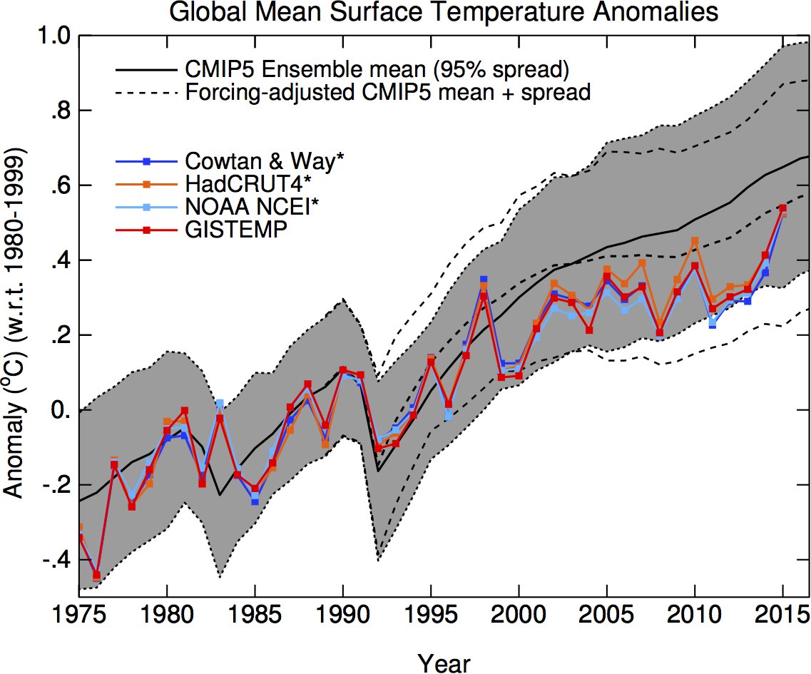
Not vague at all. Actually extremely comprehensive.
Those (very few on here I know) who wish to examime it then it’s here….
http://www.realclimate.org/index.php/archives/2016/05/comparing-models-to-the-satellite-datasets/
Oh, and you do realise that the forcing assumumptions used in the CMIP5 ensemble runs imparted a warming bias of up to 0.1C by 2012?
No – silly question.
I noticed the forcing asumptions used for RCPs in the AR5 were goofy, started writing about it about 30 months ago, emphasizing RCP8.5 was a poor choice for a “business as usual” designation, or for impact studies. As time goes by we are seeing that indeed RCP8.5 isn’t a business as usual projection at all. Emissions simply fail to track it, and as time goes by it will be goofier and goofier, if not fraudulent to use it for impact studies.
I usually write about the CO2 emissions and concentrations being off, but methane and other gases also bear scrutiny.
My current position is that models do run slightly hot, and that modelers need to keep a close eye on their data feed. Most modeling teams accept input data as gospel, don’t “get inside” to make sure it’s fit. What I found in my career is that the top notch modeling teams were extremely picky about the data they took in, and pored over model outputs via hind casts and other tricks to make sure the darned model was giving a reasonable result. I don’t sense this is the case with climate models.
I think I must have missed something. What is your point?
Is it that climate models are right and the data is wrong?
Thanks Tonneb. I read Gavin’s article. It appears to be a valid analysis but the results are not much different from Christy’s. About 95% of the models still over estimate warming.
Are there even 95 climate models to be able to say that. I think Christy’s plot is of 102 runs of a climate model, not a run of 102 models.
g
The chart used in the above essay showing the 2015 update to the models versus surface temperature observations (second one down, attributed to Ed Hawkins) clearly shows that observations by 2015 were very close to the multi-model average.
As things stand, at a monthly level at least, observations have been warmer than the multi-model mean projected over the past 3 months. That’s using RCP 8.5, which is the ‘warmest’ of all the CMIP5 model runs.
Whatever the models representing the mid-troposphere above the tropics are doing (Dr Christy’s chart), the surface models (Ed Hawkins’s chart) appear to be performing well.
Don’t trust any chart that plots two data sets together with the vertical axis being measured in anomalies. Doing this lets you shift the curves together and apart by selecting the base period to measure the anomalies, and particularly when the graph only shows a relatively small time interval on the x-axis. In the case of that graph, whoever made it could have arbitrarily lined up the observational temperatures to fit within the predicted range of the model, and truncated the time scale to hide the fact that doing so threw past temperatures out of whack with the model. All you need to do is pick your reference period to have the needed difference in average temps between the model output and the observations to push the right sides of the two curves together, then snip, then you’re good to go.
Come to think of it, don’t trust any chart that shows model predictions in anomalies, period. Changing the output of a computer model from temperature, precipitation, etc. to an anomaly can only obfuscate the meaning of the output by discarding important information, e.g. the real values of the temperatures predicted.
Don’t they all use anomalies?
Kurt,
All of the relevant charts above, John Christy’s, Roy Spencer’s and Ed Hawkins, are all plotted as anomalies.
Since an anomaly is just the ‘difference from a long term average’, what’s the problem exactly?
I usually have no problem plotting a single data set with an anomaly on the y-axis as long as you understand that you are looking at a trend divorced from the actual values. 0.2C per decade in a locale that changes only 10C over a year on average is different than 0.2C per decade in a locale that changes 35C over a year.
My real issue is when you plot two data sets on the same graph, with the y-axis as an anomaly, and you are comparing them to see whether one set is validated against the other. Those graphs are too easy to manipulate. In the last IPCC report, the preliminary draft showed the last 5 or so years of measurements as being outside the 90% range of model runs. When that was brought to their attention, they “fixed” the issue by simply sliding the range of model runs downwards to show the recent temps as being within the model range. They did this by selecting the point at which the two lines were forced to align.
Using anomalies lets you do this, because you are literally selecting a period of time within which you align the average of one set to the average of the other set. All you do is look at the two lines, and see what time interval – if used to calculate a base period average – will bring into alignment the time period that you want to show in the graph. The point is that the graph is so susceptible to abuse that you shouldn’t take what it seems to show at face value until you know what was used as the base period, why it was chosen, and whether that decision makes sense.
Alternatively, I’ve always wondered why you don’t just select a base period for observational data to choose an average value X, and then plot both sets of anomalies from that single value X over the whole time series. Doing that would show not only the difference in trends between the data, but the real, temperature offset between the two data sets at the origin. This isn’t done though. The anomalies of each set are separately tabulated based on their own respective averages over a common, arbitrarily chosen time interval.
Kurt
“I’ve always wondered why you don’t just select a base period for observational data to choose an average value X, and then plot both sets of anomalies from that single value X over the whole time series.”
_____________________________________
How can you plot a chart of anomalies from different data sets based on the value obtained from only one of those sets?! You’d end up with something meaningless for comparison purposes. You would be inserting a spurious value into each data set that you didn’t use for the base.
In order to compare like with like you need all data sets base-lined to the same reference period. You then use the individual value for each set as its respective zero point. That’s what every anomaly chart used in the above article does; Christy’s, Spencer’s and Hawkins’s.
There are questions over how long the base period should be. For instance, Christy’s chart uses a 5 year base from very early in the record; Spencer’s uses a 30 year base and Hawkins’s uses a 20 year base (following the IPCC figure on which it is based). These can have a visual impact on the data, but they don’t affect the trends.
If you’re plotting say CO2 levels and temps on the same chart using anomalies, to show a relationship between the trends, then I agree with you that you need to have separate averages calculated over a common base period. But when you’re comparing modeled temperatures with actual temperatures, you don’t have to line them up to a common value at all – in fact I think that doing so is misleading.
The actual anomaly plot of a single data set simply subtracts an arbitrarily determined number from the actual data. The average of a base period is simply one method to select that number. If the point of a chart is to visually demonstrate how one time series of temperatures matches another time series of temperatures over the same period, then why not subtract the same set value from both series? You preserve more information that way – you get a re-scaled version of the trends, plus you see how far off the two series are in absolute terms.
None of the GCMs replicate future ENSO events. They can get them to track historical temp anomaly data because they know the answer the models must produce a priori.
With that simple realization then DWR54, what will be the excuse when the coming La Nina drives the troposphere tropics temps down, nay, well down from the previous 3 months? Either the models work or they don’t.
The models simply serve their intended purpose, which is to dish up an Alarmist truck load full of manure to feed to the public mushrooms.
As things stand, at a monthly level at least, observations have been warmer than the multi-model mean projected over the past 3 months.
What good for is a multi-model mean projected over the past 3 months –
to keep supercomputers busy?
That climate model defendings reminds on
driving with 90 mph through 65 mph speed limits to argue about police’s speed reading accurate.
accurate -> accuracy
Steve McIntyre was not one of the first. He was the first and has been doing a brilliant job ever since.
You can’t show that models are wrong by comparing the mean to current temperatures.
You have to look at individual runs, and see if they span the observations.
Observations are only one run of the actual climate, not an average.
It would seem (according to you) that models are always right regardless of data
Alex said:It would seem (according to you) that models are always right regardless of data
I don’t recall saying that. Do you have a link?
You really are a silly boy. Don’t assume that I am one too. Your implications are quite clear. You have displayed your particular bias on many threads. Links to your other comments? You have to be kidding. It’s up to you to discover your stupidity,
Please Alex, be kind. We should never give someone a job they can’t do.
The climate is a chaotic system. In fact, chaos theory is a result of climate models. Any individual model run is almost guaranteed to be wrong.
What to do?
We could look for attractors. What evidence is there of attractors in all the model runs? Not a lot. We might as well use the average since we have nothing better. Otherwise, the best we can say is that the vast majority of the models overstate warming by a lot (which is what Steven McIntyre has done).
The idea that we can claim that the observations lie within the span of all model results, and we can thus claim validity for the models, is risible. It is, in fact, very close to the Texas sharpshooter fallacy. What you’re saying is, “Ignore all those bad runs, this one run proves that we’re right.” ROTFL
The really interesting and telling thing is that in spite of the fact that the models run warmer than reality, run after run after run, the modellers never, ever add or go looking for negative feedbacks. The path to the truth might be there for the models, but it can’t be found with both eyes shut tight.
The average is meaningless for a chaotic system. The points circle around one or many attractors (according to the system considered) and the probablity they are at the average is almost zero. This means that an average value is useless for predicitng the behaviour of the system. There are however specific tools for analyzing chaotic time series (phase plan, Lyapounov or Hurst exponents, recurence plots, false neighbours, correlation dimension, mutual information, visibility graphs, etc.). Some of those methods allow defining a horizon of predictability. Applied to climatic data, this horizon is more than an order of magnitude less than the century over which the IPCC makes its “predictions” (they prefer the word “projections”, although politicians do not make any difference between the two concepts).
Also, the local weather and the global climate exhibit a fractal behaviour( linked to the chaotic signature). Which means that you cannot just add on local weather data over a long range ot time and average geographically over the earth surface. The local short term details of (local) weather emerge globally (with another time and space scale) in a fractal structure. It is the whole approach used by climate models that is thus wrong.
Also chaotic time series are a-periodic (but close to quasi – multiple periodic signals). Drawing a (linear) trend line through such a kind of data depends on the initial moment and on the length of the time window you select. The trend line is meaningless.
Even the concept of temprature anomaly is wrong: it is based on a moving average 30 years in length, the “residue” (in the statisitcal meaning of the word) over the following years is considered as the climate indicator. For quasi-periodic signals, this induces biases and false trend lines. take for example a single sinusoid of period equal to 180 years and starting from an initial phase = 0°, take the average value over successive length of 30 years (0° to 60°, then 60° to 120°, etc.) and consider the difference between those average values and the sinusoidal “signal” over the next 30 years (from 60° to 120°; then from 120° to 180°, etc.) The anomaly of your perfectly horizontal and stable sinusoid will show all the possible behaviours: increasing, decreasing, etc.) and when you will change your reference period, you will have a jump in the bias.
And finally the “forcing” concept is based on the hidden hypotheses that all the feedbacks are known, are linear and instantaneous. An oversimplification suppressing in the models a good part of the complexity of the real climate system. And one wonders why the climate models fail over and over again….
Seth
Admit it . You are a bot. I feel stupid discussing anything with you.
The comparison by Christy is bad for several reasons, and can’t really answer if the troposphere is warming slower than expected by the models:
-The satellite series are too short and start with a warm period after a big leap from the cool seventies.
-The satellite series have significant drifts, especially during the AMSU period.
-The TMT-layer has no natural physical boundaries, it blends troposphere with stratosphere which has cooled significantly more than expected by the models
If we really want to know if the troposphere is warming slower than the models, I suggest comparisons like this:
http://imgur.com/O1snvir
Can we really say that the models are bad?
‘For global observations since the late 1950s, the most recent versions of all available data sets show that the troposphere has warmed at a slightly greater rate than the surface, while the stratosphere has cooled markedly since 1979. This is in accord with physical expectations and most model results, which demonstrate the role of increasing greenhouse gases in tropospheric warming and stratospheric cooling; ozone depletion also contributes substantially to stratospheric cooling.’
https://www.ipcc.ch/publications_and_data/ar4/wg1/en/faq-3-1.html
IPCC is not telling the truth?
It looks like the models are tracking temperature perfectly in this graph but names like Rat Pack and Chimp 5 make me distrustful. Hopefully someone better informed than I am about the “data” they represent will provide you with more useful feedback 😉
It would be hard to be less informed than you! Perhaps you should learn to read first?
Please show where the stratosphere has cooled more than the models? Last time I looked at stratospheric temps they have flat lined unchanged since 1994/95 at a time when we have increased CO2 significantly.
Even NOAA shows this static stratospheric trend post 1994 before which saw a series of major volcanic eruptions including Pinatubo and probably explain the series of cooler steps down.
http://www.arl.noaa.gov/documents/JournalPDFs/RandelEtal.JGR2009.pdf
I know there are many attempts to dismiss the temp “pause” at the surface, but I wonder why there has not been more focus on the lack of cooling in the stratosphere and in fact remarkably stable temperatures for the past 22 years. This during a period of the of the largest CO2 emissions.
I once asked an climate expert about this 22 year stratospheric temp pause (which he admitted) and his response was “Decadal variability and a good reason why cherry picking shorter time scales in climate change was not a good idea.” One wonders how many decades it takes to dis-prove the link to AGW theory?
Of course, I have a chart with all three Ratpac layers vs model means, with trends included:
http://imgur.com/ddBLz2s
The satellite TLS layer also show a larger cooling trend than the model mean, trends about -0.3 C/decade are reported by the different TLS providers (but from 1979 only). Watch this for a visual comparison:
http://images.remss.com/figures/climate/RSS_Model_TS_compare_globe_tls.png
It depends on what’s the quality and reliability of the RATPAC curve you show, and whether the bulk data was cherry picked over an interval which did match the models. I would love to spend a year at NOAA and NASA just asking questions about the raw data and how it’s massaged, and having them put up displays in a HIVE environment to see whether models do work or not. Maybe somebody can make a project out of this and put together a two hour special on HBO?
O R writes: “Can we really say that the models are bad?”
And then you present the CMIP5 rcp 8.5 mean from 1970 to 2012 charted.
Let’s visually chop-off the chart prior to 2006, because that is the first year the models were initialized to run forward at 2005 and project/predict.
I can correctly “guess” past lottery numbers. It is the future numbers, that if I could correctly determine them ahead of time, I would show skill.
Visually, the model mean and the RATPAC A line looks impressive for the big dip in 1992, and recovery in 1993-94. But the modelers had to tune-in the negative aerosol forcing event from Pinatubo to get that agreement. So one must understand that everything shown by the model mean prior to 2005 (historical) has been aerosol tuned to achieve an acceptable output. In fact, a large amount of negative aerosol tuning must be applied to the models inputs to get them to track historical and not run too hot. Trenberth calls that unfortunate. An objective statement would be that it is a failure.
why are we debating the relationship between atmospheric co2 levels and temperature when the AGW is about a relationship between fossil fuel emissions and temperature?
http://papers.ssrn.com/sol3/papers.cfm?abstract_id=2725743
Because the climate change anthro-CO2 as the climate control knob illusion would begin to unravel for the climate hustle if they did as you suggest.
If the model try to replicate what the pCO2 levels should be based on past temperature records, then you get periods where pCO2 falls. But the MLO pCO2 record of course tells us there is no year (since 1958) that one year’s pCO2 average is lower than the previous year’s.
The best example of how it would unravel the hustle is in the chart widget Gavin and Co created last year for the Roston & Migliozzi article in Bloomberg almost exactly a year ago.
Read how it was debunked here at WUWT.
https://wattsupwiththat.com/2015/06/27/bloombergs-made-up-climate-widget/
“NOAA climate activist scientist Dr. Gavin Schmidt challenged Dr. Christy’s work claiming that it was “partisan”… ”
And the work of Mr. Gavin Schmidt is actually what then?
“Neutral” or “Unbiased” or “Disinterested” or “Nothing but the truth” or – maybe and only maybe – even much more PARTISAN because Gavin has a lot to lose if Christy is right ??!
I am more puzzled by the contention that Gavin Schmidt is a NOAA climate activist, since he is the director of NASA/GISS.
IMO Christy is a bad scientist, since good scientist are not certain about the uncertain.
The other satellite team is different:
http://skepticalscience.com/pics/rss_ensemble_series_rg.png
Schmidt is a political creature and not a scientific one. Politics claims certainty but science claims uncertainty. Politics/religion is what you are interested in. I guess the discussion ends there.
I just noticed (in detail) the image you have shown.
Thermometer records have been shown to be crap. Some idiot showing smaller error bars on crap data is ……. Larger error bars on satellite data are more realistic and for well
documented reasons. Funny thing is that the trends and offsets are different. Satellites show business as usual. Your thermometer seems to show a ‘hockey stick’. Everyone here knows a hockey stick when they see one.
F* off
Transparent, Spencer bad Christy bad, RSS good, lately, GISS and NOAA good
Schmidt is an activist and was politically appointed and he knows nothing about climate science.
He’s a modeler. Doesn’t understand statistics and makes ludicrous claims.
he believes paleo data tells the future (his get out for model fail) and he lies repeatedly, CA have pulled him up on his dishonesty repeatedly
His predecessor Hansen was appointed by whom? One guess
O R
May 26, 2016 at 2:14 am
So tell me RC fan
When did Dr Roy Spencer become “bad”? Was it after he left NASA because Hansen could say what he wanted and Dr Spencer was told what he could and could not say? or before?
Explain “IMO Christy is a bad scientist, since good scientist are not certain about the uncertain.
The other satellite team is different:”
But then again, you got your chart from skeptical science so i expect you haven’t got 2 brain cells to rub together
Mark, if you question the chart, you can reproduce, check, accept or reject it. The data is here:
ftp://ftp.remss.com/msu/data/uncertainty/
But I guess that you comply with a saying in the minority language of your country ” A lot of talk but no workshop”…
In retrospect one can say that the TMT v3.3 uncertainty interval wasn’t wide enough, since the new TMT v4 virtually is outside the upper bounds.
This is the wrong blog to use thermometer temperatures as they are not temperature readings.
OR
You are using english words but I can’t fathom the meaning
Whenever I see satellite data compared with thermometers I recall how thermometer data is collected.
The uncertainty shown in your thermometer data is fabricated. I’m being polite (to the best of my ability).
CA have clearly shown when it comes to statistical analysis he doesn’t know what he is talking about.
Schmidt seems to think it is a “conceptual flaw” to compare ens model mean to observation
and I quote “Flaws in comparisons can be more conceptual as well – for instance comparing the ensemble mean of a set of model runs to the single realisation of the real world.”
“Or comparing a single run with its own weather to a short term observation. These are not wrong so much as potentially misleading”
Essentially comparing the output of models to the observations as a group or singularly, as in validation is both conceptual flaws and potentially misleading
The guy is off his snack
Never expect a straight answer to a simple question from that guy, linguistic obfuscation is aplenty because he talks on far too many subjects he knows nothing about, He’s copy pasting from solicited advice behind the RC scenes, I see right through him
This is why he has refused any debate out in the open without his coterie of “super friends” in the background to pass him information.
His arrogance makes me laugh, because he uses it to conceal is lacking knowledge in so many parts of climate science, he’s a mathematician after all
He is a politician. Knowing mathematics and being a mathematician are two different things
Watch this carefully, this is how Gav rolls when he hasn’t got his behind the scenes chums to solicit advice from
Watch the obfuscation attempt when Hurricanes are brought up, he didn’t even realise he was being set up. Smart bloke? not on your life.
https://youtu.be/eYKggC5VOzA
Note that trademark glazed over expression, there is lift music playing in his head
“He is a politician. Knowing mathematics and being a mathematician are two different things”
Valid point, going on his actions, politically appointed hack is a term I could coin
He avoided Dr Spencer because of the uncertainties, note Schmidt stated many things as fact without uncertainty. Deception is his thing, science a distant second, so distant that science is a dot to him
Schmidt isn’t a scientist. He may have been trained as one but it doesn’t apear to be his calling.
Should work at Airfix, more his kind of modeling maybe
According to the Lawrence Livermore National Labs website describing “Project CMIP-5”:
CMIP5 will notably provide a multi-model context for
1) assessing the mechanisms responsible for model differences in poorly understood feedbacks associated with the carbon cycle and with clouds,
2) examining climate “predictability” and exploring the ability of models to predict climate on decadal time scales, and, more generally,
3) determining why similarly forced models produce a range of responses.
CMIP-5 is thus a collection of different models produced by different climate research groups around the world. Being different, it is highly unlikely they will all be the same, and perhaps only one would best match observational data. Failed models do not match observational data and should be discarded. Averaging results of failed models makes no sense. For example, it would be patently incorrect to average the results of the failed equipartition theorem (which led to the “ultraviolet catastrophe” in physics) with the still-used Planck quantum formulation (which was institutionalized by Einstein).
The creators of failed models should hang their heads in shame and silence until they can at least explain their failure, but preferably until they produce some useful extension of human knowledge.
…they demonstrate what should NOT be done; in some circles that’s useful.
Yes, if they can explain why they failed.
Bernie, as long as no one makes any attempt whatsoever to make public policy based on the models, we’re in perfect agreement; the models are experimental, no one really knows if they work, so we’re all in the business doing doing science, not, for example, restructuring the world economy. I’m OK with that.
But that isn’t what’s happening is it Bern? Nope. Not at all. Instead we seem to be taking the most dire unverified hypotheticals as God’s own truth without bothering to question any of them.
You do understand why that might be wrong don’t you?
BTW, averaging the results of the models does make sense it you’re trying to characterize model performance. It makes no sense as model itself, but it’s a very good indicator of whether or not the models, in general, work.
Nicely contentious discussion. It still looks like NASA is “correcting” data to fit model, not vice versa.
Tom Halla,
“It still looks like NASA is “correcting” data to fit model, not vice versa.”
________________
It’s not just NASA that show the recent increase in surface temperatures (they’ve been rising strongly since 2008, really). It’s also NOAA, the UKMO, the Japanese Met. Agency and even the privately funded BEST group. This upsurge in warming since 2008 has also been registered in the satellite tropospheric data.
Are you suggesting that all these groups are fabricating data in order to better fit the observations to the model projections? If not, then why single out NASA?
DWR54 wrote: ” This upsurge in warming since 2008 has also been registered in the satellite tropospheric data.”
What you call an upsurge in warming since 2008 is “within the margin of error”.
Actually, yes – they’ve been coordinating efforts.
And since 2008? Hmmm. Who got into office that year?
Well, Hell Yes:
The biggest change to the NOAA records comes from a correction to ocean-temperature readings, to account for differences in measurements from ships and buoys. Scientists have long known that ships log slightly warmer ocean temperatures than do buoys operating in the same location. The influx of data from an expansion of buoys during the past two decades has reduced the apparent rate of ocean warming. NOAA has now adjusted for this effect, in line with similar changes that the UK Met Office made to its global temperature record.
— Nature Communicaitons, doi:10.1038/nature.2015.17700
Any questions?
After reading my reply to you DW, I realized the quote might not be self-explanatory and the irony of it might be lost, so I thought I’d clarify my intention. If you got it, my apologies for being pedantic, otherwise bear with me please.
Apparently the very expensive and purposely designed ARGO sea surface temperature probes designed and deployed by NOAA aren’t as reliable or accurate as the thermometers in a bucket that have been used by seamen for centuries.
This should come as no surprise to anyone who might be tempted to think NOAA had an agenda. Certainly those buoys must be wrong; thousands of deck mates tossing buckets in the sea at 2 am couldn’t be. It just stands to reason?
TA
“What you call an upsurge in warming since 2008 is “within the margin of error”.”
______________
Following the same logic, the error margins surrounding what was referred to as a ‘pause’ in the satellite data until recently were so large that they could easily have covered strong warming or cooling.
Bartleby
“Apparently the very expensive and purposely designed ARGO sea surface temperature probes designed and deployed by NOAA aren’t as reliable or accurate as the thermometers in a bucket that have been used by seamen for centuries.”
__________________
Overlooking that the ARGO probes aren’t primarily surface temperature monitors, and that the data used for NOAA’s adjustments came from different, dedicated surface buoys, I’m afraid you’ve got that all back to front.
It’s precisely ‘because’ temperature readings from surface buoys were found to be more reliable than those from buckets that the record was adjusted. Long term observations confirmed that buoys indicated colder temperatures than the bucket method from the same dates and locations. This meant that past records must affected by an artificial warm bias. Hence the adjustment had the effect of cooling past temperatures. This naturally had the effect of increasing the warming trend.
How else do you suggest they should have adjusted for this known bias?
As with all things liberal (now, “progressive”), an issue is always far more about the long term effect of having the issue rather than the issue itself. All the solutions that advocates of human-caused climate change demand converge on one goal: more government, less prosperity, less liberty.
Climate models are a means to an end, They are not tuned to be accurate, they are tuned for how well their announcement and their “narrative” can support this long term social and political goal. It this were not true, we would not have climate change advocates who keep models that so widely diverge from subsequent real world experience.
‘All the solutions that advocates of human-caused climate change demand converge on one goal: more government, less prosperity, less liberty’
And require total compliance for almost no result.
Of course, total compliance is the intended result.
Why wouldn’t Obama have time for a meeting of the flat earth society? Wasn’t that the “consensus ” a while back? What a jackass.
Obama is a member in good standing of the modern day Flat Earth Society: The Climate Alarmist Society.
I can imagine some day in the future someone making fun of some concept by saying “we don’t have time for a Climate Alarmist Society meeting.
The Alarmist’s climate religion dogma demands that man be at the center of the changing climate. Thus there is something to control, something to regulate, something to tax.
If man and his CO2 emission sins are not at the center of a changing climate world, but is instead admitted that it is mostly natural cycles and nature in control of climate with anthro-CO2 a minor actor, their case for controlling carbon sins is greatly diminished.
Thus the climatist religion demands an anthro-centric climate. Much like the pre-telescope ages could posit a geo-centric universe to perpetuate Catholic church dogma of God’s placing man at the center of everything.
Luddite. Not “Flat earth”, Luddite.
From Websters:
A member of any of the bands of English workers who destroyed machinery, esp. in cotton and woolen mills, that they believed was threatening their jobs (1811–16).
• a person opposed to increased industrialization or new technology : a small-minded Luddite resisting progress.
Model with constant forcing with large thermal inertia: take average of global temperature of last year project forward as a straight line with zero slope. Works as any other model.
Incompletely, and, in fact, insufficiently characterized, and unwieldy. Therefore a limited frame of reference in the scientific domain. Anything else is a personal philosophy, fantasy, or article of faith.
Models, models, models. I can only remember an exchange I witnessed about 12 to 15 years ago. A graduate student (GS) and a staff scientist (SC) were having a conversation.
This is NOT fictional. The conversations really happened and is here the best I can remember it.
GS: My computer modeling says that I should see a spectral feature at this energy.
SC: Is that your data from yesterday? What does it show?
GS: The instrument must not be working properly. I don’t see that feature.
SC: The instrument was just re-calibrated. Unless you messed it up, all is well.
GS: But my model runs show there should be an absorbance right here.
SC: I can’t see anything there. So, something about your model isn’t right.
GS: But, the computer says….
SC: I don’t care what the computer says, your actual observations say that it isn’t there.
GS: But, the model proves that it must be there!
SC: And the real observational data says nothing is there.
GS: The instrument has to be wrong! The computer says there is a feature! The instrument just missed it!
SC: That instrument is working properly. It’s working right now, and everything is right on spec. You need to see what might be wrong with your model.
GS: But, the computer shows. . .
SC: I don’t give a damn what the computer shows you! That is a model, a simulation. You collected data about a real compound with real results. Those results say the model is wrong!
GS: But, my computer runs show it is there!
SC: And, your observations show that it isn’t. What don’t you get about that?
GS: But, the computer PROVES that the feature is there!
SC: And, the actual data PROVES that the feature doesn’t exist!
GS: The computer shows it is real!
SC: Go away. I don’t want to hear any more about your imaginary feature. If the computer told you that Bigfoot lives in the trunk of your car, would you believe it?
GS: But, the model clearly shows it is real!
SC: The real world shows it isn’t. World wins, computer loses. Go away. I have better things to do.
I don’t understand the slavish adoration of anything at all that comes out of a computer screen or hard-copy printout. I can set my computer clock to August 24th, 2165. Does that mean that I have traveled in time?
That’s an idea. Let’s send them all to year 2100.
“Let’s send them all to year 2100”
I think it would be better to spread them out. Let’s say we pick a range between 2100 and maybe 2600. A culture can’t survive absorbing more than about 10% alien influence.
I have to say that I find the first graph in this article to be much more intelligible than the global warming speedometer. The simplicity appeals to my simple mind.
So far, then, I have noted the following failures of prediction.
1. The models predicted far more warming than actually occured.
2. The models predicted warming would correlate with CO2 production. But during “the pause” (is it over yet?) CO2 increased and temperatures did not.
3. The models predicted a large, warm, damp spot not where such things are usually found, but in the upper equatorial troposphere. No such thing has been found, and we’ve been looking hard.
4. The models predict that as the Earth warms up it will emit less heat. The data show the opposite.
Since the models are based on the AGW hypothesis, these failures lead me to have doubts about that hypothesis. I trust that these are the only failures of the models, and that the diligent readers of WUWT will not bombard me we details of other failures that might intensify my doubts.
I think you managed to hit all the high spots, in fact the Earth warming up was a new one on me.
In a nutshell, the models don’t work and there’s no empirical relationship between warming and CO₂.
Oh well. Pop goes the weasel.
“bombard me with details…
“bombard me with details…
That’s not an invitation is it? 🙂
Indeed not. Details might foster further doubts.
Climate models don’t work?
They certainly don’t unless these climastrologists believe in Martians-
http://www.dailymail.co.uk/sciencetech/article-3611117/Mars-ICE-AGES-similar-Earth-Nasa-radar-data-signs-red-planet-emerging-deep-freeze.html
Still I suppose if you consider yourself a Greeny it stands to reason you’ll believe in little green men.
And who would have known?
Obama may find that compared to the surface curvature of the sphere chicago the real earth is big – and flat. From the eyes of a man with feets on the ground.
Some observations and comments.
1) Figure 1 seems to suffer from the same fault as the speedomenter. The predictions are for surface and the measurements are satellite and balloon.
2) Slide from Judith Curry titled “Growing Divergence. Climate Models vs Surface temperature Observations” clearly has the current temperature well within the CMIP5 predictions, and close to the top of the IPCC prediction. Far from growing divergence, the predictions and observations seem to have converged.
Can someone explain why this is growing divergence?
I quote: “2015 was striking as ‘warmest year’ since there had been very little warming since 1998.”
Tirst, the temperature curve that goes with that statement is all wrong. It shows a stepwise increase of temperature tor the first decade of the twenty-first century, with the El Nino of 2010 actually higer than the super El Nino of 1998. This is absurd. Satellite data show a step-wise decrease, not not increase, of the first four peaks in that graph. I regard this as an additional falsification of ground-based temperature curves yhat has a history which started with the wipeout of the hiatus in the eighties and nineties. Furthermore, it is not permissible to compare directly the temperatures of the twentieth and twenty-first century years because of an abrupt change at the beginning of the twenty-first century. It so happens that immediately after the departure if the super El Nino a short step warming raised the global temperature up by one third of a degree Celsius. It took only three years, from 1999 to 2002, to do that and was caused by the huge amount of warm water that the super El Nino had carried across the ocean. If you wish to compare the twenty-first century warming with the twentieth century you must first subtract that extra third of a degree from the twenty-first century values you use. This is necessary if you are looking for warming caused by the global greenhouse effect because that step warming was quite certainly not any greenhouse warming. I find that if I do thos the twentieth and twenty-first century warmings become pretty much equivalent.
Climate models do work.
You could not be more wrong!
You falsely assume they are being used to predict something.
In fact, they can’t predict anything, because no one knows what causes climate change, other than assuming the sun must have something to do with it.
The purpose of climate models is to scare people.
After enough people are scared, they can be told what to do, and how to live.
Who would believe Al Gore, Obama, and the Pope, about a coming climate change catastrophe …. unless there were PhD scientists and SuperComputer Models ‘standing behind them’ ?
Would you believe a prescription drug commercial without an actor wearing a lab coat and stethoscope, pretending to be a doctor?
No one would believe the leftist climate scaremongers without the “Hollywood” science props — well paid PhD climate modelers and their confuser models.
The models do not have to predict anything — they just have to predict something bad in the future.
Nothing bad ever happens — we’ve been waiting 40 years for the coming climate catastrophe … that must have gotten lost, because it never comes — in fact, the climate is better than ever today — but the future is always bad news according to the models.
The strategy: If you don’t do what we leftists say, Earth will turn into “hell”.
This is just a secular version of religious leaders’ old strategy to control people (if you don’t do what we/God says, you will go to “hell”).
The only difference: The religious scaremongers make you pack suitcases and travel to “hell” … while the secular scaremongers just let you stay where you are — “hell” will come directly to you!
I think they are both nonsense, but that’s just me.
Now that I’ve insulted just about everyone’s beliefs, I’ll go outside to enjoy the wonderful climate
… where I will be surrounded by people who believe in all sorts of things without proof:
Heaven and “Hell”,
coming back to life after death,
Obama is a Muslim,
Hillary Clinton didn’t break any laws,
and the biggest tale of them all,
from the Coming Climate Change Catastrophe Cult:
CO2 is going to end life on Earth as we know it.
My Climate Change Blog for non-scientists:
Free
No ads
No money for me
A public service to help people enjoy the current climate,
and ignore the crazy leftists, who apparently can’t be happy
unless they are predicting a coming environmental catastrophe
of some sort, and telling everyone how to live.
http://www.elOnionBloggle.Blogspot.com
There are groups progging “the mother of all hot summers” this year for the US. Seriously? With La Nina kicking in and the North Atlantic also starting to wobble, that is highly doubtful. Can’t make this stuff up … it’s shear insanity.
The fact that almost all the strong evidence for the AGW alarmist position comes from the arctic, while adequate countervailing evidence to demolish the alarmist case can be found elsewhere (the antarctic where ice mass is increasing, the lack of the “hot spot” in the troposphere over the tropics, the lack of fit between the alarmist models and observation) has always suggested to me the need to find a proper scientific explanation not for global warming, but for arctic warming.
The lowering of arctic albedo due to soot is the most obvious explanatory theory for arctic warming, and seems to be confirmed by both observation and modeling. It is quite possible that this is, indeed, an instance of anthropogenic climate change (yes, that is a real phenomenon — the urban heat island effect and the moderation of climate in the Great Plains which occurred when the Corps of Engineers built lakes provide two examples).
It is, however, not one which serves the purpose of the globalist left. The solution would be for the Russian Duma and Chinese National Peoples Congress to adopt analogues of the American Clean Air Act, and enforce them to reduce soot emissions from their coal-fired power plants and other industries. This theory, however, does not provide an excuse for the Brussels, Washington, London, Canberra,… to aggregate more power over energy production and usage, which is the whole point of AGW alarmism.
I think this might be related enough to the thread.
The following is based on Figure 10 of “Atmospheric Moisture Transports from Ocean to Land and Global Energy Flows in Reanalyses” Trenberth et. al. 2011 and in particular the 333 W/m^2 GHG/GHE perpetual heat loop.
341 W/m^2 arrive at ToA.
102 W/m^2 are promptly reflected by the albedo which includes clouds, ice, ocean, vegetation and the ground and do not participate in the 333 W/m^2 GHG/GHE perpetual heat loop.
239 W/m^2 pass on beyond the albedo.
78 W/m^2 are absorbed by the atmosphere, i.e. clouds, water vapor, etc. and do not participate in the 333 W/m^2 GHG/GHE perpetual heat loop.
161 W/m^2 pass on past the atmosphere to strike the surface.
0.9 W/m^2 are absorbed by the surface and do not participate in the 333 W/m^ GHG/GHE perpetual heat loop.
160 W/m^2 are partitioned thus.
17 W/m^2 leave the surface as thermal convection and do not participate in the 333 W/m^ GHG/GHE perpetual heat loop.
80 W/m^2 leave the surface as evapotranspiration and do not participate in the 333 W/m^ GHG/GHE perpetual heat loop.
63 W/m^2 leave the surface of the earth as radiation.
40 W/m^2 travel through the atmospheric window and do not participate in the 333 W/m^ GHG/GHE perpetual heat loop.
23 W/m^2 travel past GHG/GHE level and do not participate in the 333 W/m^ GHG/GHE perpetual heat loop.
All of the energy (power flux) is accounted for without including the GHG/GHE perpetual heat loop. So what is the origin of the energy which feeds the 333 W/m^2 GHG/GHE perpetual heat loop? Not that it matters because simply erasing it makes absolutely no difference in the overall and ToA balance.
Relatively minor fluctuations in the albedo reflection and ocean absorption will raise or lower the atmospheric & surface temperatures per Q = U * A * dT without resorting to some magic unicorn’s GHG/GHE perpetual heat loop.
dogdaddyblog wrote on May 8, 2016 at 7:43 pm
Excellent graph, Bindidon! Thank you very much. I would have had to learn some new programs.
Looking at the data it is not apparent to me they start at 1998. From a visual standpoint, it would help if each of the trend lines began in 1998, as a common reference date (zeroed). Additionally, the slopes of the trends in degrees C per decade would be very meaningful to me as an old engineer. I do not, however, know if your program(s) have such capabilities.
Dave Fair
Sorry, I was quite busy at that time, and then comments were closed for the thread. Maybe you walk along here and discover the answer.
Firstly, what kind of ‘new programs’ do you mean? It’s just no more than this good ol’ Excel you may use on Google for free. Then, if you ask for a graph depicting the “post 1998” era, you get that! Here is what in fact you wanted, starting even in january 1997, with origin there:
http://fs5.directupload.net/images/160529/j4hwnkuv.jpg
or in scalable pdf format:
http://fs5.directupload.net/images/160529/qk9fdeln.pdf
Recall: this plot compares various pressure levels of the radiosonde temperature record “RATPAC B monthly combined” with the satellite records “UAH6.0 beta5 TLT”, “RSS4.0 TTT” and the surface record “GISSTEMP” (all normalised to UAH’s baseline 1981-2010).
And it tells us clearly that these 85 radiosondes measured something differing a lot from what the graph presented at essay begin tries to show:
– most pressure levels give anomalies higher than both RSS4.0 TTT and even GISSTEMP;
– UAH6.0 is below RATPAC’s 250 hPa level (it should be in fact near 700 hPa, a few miles lower).
The RATPAC B dataset has data from more radiosondes than Prof. Christy selected (59), and Christy’s selection moreover refers to data from radiosondes out of service (VIZ for example).
And the most interesting point in his testimony is that the picture showing a good fit of satellite with radiosonde data strangely ends in… 2004.
So Prof. Christy should feel free to publish his radiosonde data sources… and we can then compare these sources with publicly available data.