 This post provides an update of the data for the three primary suppliers of global land+ocean surface temperature data—GISS through July 2014 and HADCRUT4 and NCDC through June 2014—and of the two suppliers of satellite-based lower troposphere temperature data (RSS and UAH) through July 2014.
The map to the above right shows the July 2014 surface temperature anomalies. Please click on it for a full-sized version. The map is available through the GISS map-making webpage.
Initial Notes: GISS LOTI, and the two lower troposphere temperature datasets are for the most current month. The HADCRUT4 and NCDC data lag one month.
This post contains graphs of running trends in global surface temperature anomalies for periods of 13+ and 17+ years using GISS global (land+ocean) surface temperature data. They indicate that we have not seen a warming halt (based on 13-years+ trends) this long since the mid-1970s or a warming slowdown (based on 17-years+ trends) since about 1980. I used to rotate the data suppliers for this portion of the update, also using NCDC and HADCRUT. With the data from those two suppliers normally lagging by a month in the updates, I’ve standardized on GISS for this portion.
Much of the following text is boilerplate. It is intended for those new to the presentation of global surface temperature anomaly data.
Most of the update graphs in the following start in 1979. That’s a commonly used start year for global temperature products because many of the satellite-based temperature datasets start then.
We discussed why the three suppliers of surface temperature data use different base years for anomalies in the post Why Aren’t Global Surface Temperature Data Produced in Absolute Form?
GISS LAND OCEAN TEMPERATURE INDEX (LOTI)
Introduction: The GISS Land Ocean Temperature Index (LOTI) data is a product of the Goddard Institute for Space Studies. Starting with their January 2013 update, GISS LOTI uses NCDC ERSST.v3b sea surface temperature data. The impact of the recent change in sea surface temperature datasets is discussed here. GISS adjusts GHCN and other land surface temperature data via a number of methods and infills missing data using 1200km smoothing. Refer to the GISS description here. Unlike the UK Met Office and NCDC products, GISS masks sea surface temperature data at the poles where seasonal sea ice exists, and they extend land surface temperature data out over the oceans in those locations. Refer to the discussions here and here. GISS uses the base years of 1951-1980 as the reference period for anomalies. The data source is here.
Update: The July 2014 GISS global temperature anomaly is +0.52 deg C. It dropped a good amount (a decrease of about -0.10 deg C) since June 2014.

Figure 1 – GISS Land-Ocean Temperature Index
NCDC GLOBAL SURFACE TEMPERATURE ANOMALIES (LAGS ONE MONTH)
Introduction: The NOAA Global (Land and Ocean) Surface Temperature Anomaly dataset is a product of the National Climatic Data Center (NCDC). NCDC merges their Extended Reconstructed Sea Surface Temperature version 3b (ERSST.v3b) with the Global Historical Climatology Network-Monthly (GHCN-M) version 3.2.0 for land surface air temperatures. NOAA infills missing data for both land and sea surface temperature datasets using methods presented in Smith et al (2008). Keep in mind, when reading Smith et al (2008), that the NCDC removed the satellite-based sea surface temperature data because it changed the annual global temperature rankings. Since most of Smith et al (2008) was about the satellite-based data and the benefits of incorporating it into the reconstruction, one might consider that the NCDC temperature product is no longer supported by a peer-reviewed paper.
The NCDC data source is through their Global Surface Temperature Anomalies webpage. Click on the link to Anomalies and Index Data.)
Update (Lags One Month): The June 2014 NCDC global land plus sea surface temperature anomaly was +0.72 deg C. See Figure 2. It showed a drop (a decrease of -0.02 deg C) since May 2014.
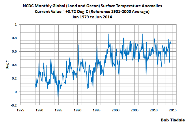
Figure 2 – NCDC Global (Land and Ocean) Surface Temperature Anomalies
UK MET OFFICE HADCRUT4 (LAGS ONE MONTH)
Introduction: The UK Met Office HADCRUT4 dataset merges CRUTEM4 land-surface air temperature dataset and the HadSST3 sea-surface temperature (SST) dataset. CRUTEM4 is the product of the combined efforts of the Met Office Hadley Centre and the Climatic Research Unit at the University of East Anglia. And HadSST3 is a product of the Hadley Centre. Unlike the GISS and NCDC products, missing data is not infilled in the HADCRUT4 product. That is, if a 5-deg latitude by 5-deg longitude grid does not have a temperature anomaly value in a given month, it is not included in the global average value of HADCRUT4. The HADCRUT4 dataset is described in the Morice et al (2012) paper here. The CRUTEM4 data is described in Jones et al (2012) here. And the HadSST3 data is presented in the 2-part Kennedy et al (2012) paper here and here. The UKMO uses the base years of 1961-1990 for anomalies. The data source is here.
Update (Lags One Month): The June 2013 HADCRUT4 global temperature anomaly is +0.62 deg C. See Figure 3. It increased (about +0.02 deg C) since May 2014.
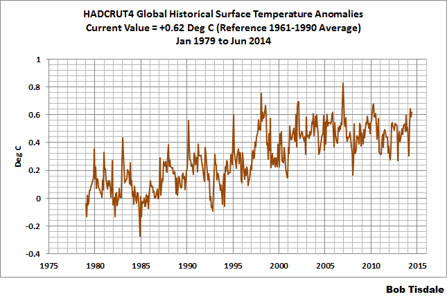
Figure 3 – HADCRUT4
UAH LOWER TROPOSPHERE TEMPERATURE ANOMALY DATA (UAH TLT)
Special sensors (microwave sounding units) aboard satellites have orbited the Earth since the late 1970s, allowing scientists to calculate the temperatures of the atmosphere at various heights above sea level. The level nearest to the surface of the Earth is the lower troposphere. The lower troposphere temperature data include the altitudes of zero to about 12,500 meters, but are most heavily weighted to the altitudes of less than 3000 meters. See the left-hand cell of the illustration here. The lower troposphere temperature data are calculated from a series of satellites with overlapping operation periods, not from a single satellite. The monthly UAH lower troposphere temperature data is the product of the Earth System Science Center of the University of Alabama in Huntsville (UAH). UAH provides the data broken down into numerous subsets. See the webpage here. The UAH lower troposphere temperature data are supported by Christy et al. (2000) MSU Tropospheric Temperatures: Dataset Construction and Radiosonde Comparisons. Additionally, Dr. Roy Spencer of UAH presents at his blog the monthly UAH TLT data updates a few days before the release at the UAH website. Those posts are also cross posted at WattsUpWithThat. UAH uses the base years of 1981-2010 for anomalies. The UAH lower troposphere temperature data are for the latitudes of 85S to 85N, which represent more than 99% of the surface of the globe.
Update: The July 2014 UAH lower troposphere temperature anomaly is +0.30 deg C. It dropped (a decrease of about -0.01 deg C) since June 2014.

Figure 4 – UAH Lower Troposphere Temperature (TLT) Anomaly Data
RSS LOWER TROPOSPHERE TEMPERATURE ANOMALY DATA (RSS TLT)
Like the UAH lower troposphere temperature data, Remote Sensing Systems (RSS) calculates lower troposphere temperature anomalies from microwave sounding units aboard a series of NOAA satellites. RSS describes their data at the Upper Air Temperature webpage. The RSS data are supported by Mears and Wentz (2009) Construction of the Remote Sensing Systems V3.2 Atmospheric Temperature Records from the MSU and AMSU Microwave Sounders. RSS also presents their lower troposphere temperature data in various subsets. The land+ocean TLT data are here. Curiously, on that webpage, RSS lists the data as extending from 82.5S to 82.5N, while on their Upper Air Temperature webpage linked above, they state:
We do not provide monthly means poleward of 82.5 degrees (or south of 70S for TLT) due to difficulties in merging measurements in these regions.
Also see the RSS MSU & AMSU Time Series Trend Browse Tool. RSS uses the base years of 1979 to 1998 for anomalies.
Update: The July 2014 RSS lower troposphere temperature anomaly is +0.35 deg C. It rose (an increase of about +0.01 deg C) since June 2014.

Figure 5 – RSS Lower Troposphere Temperature (TLT) Anomaly Data
A QUICK NOTE ABOUT THE DIFFERENCE BETWEEN RSS AND UAH TLT DATA
There is a noticeable difference between the RSS and UAH lower troposphere temperature anomaly data. Dr. Roy Spencer discussed this in his July 2011 blog post On the Divergence Between the UAH and RSS Global Temperature Records. In summary, John Christy and Roy Spencer believe the divergence is caused by the use of data from different satellites. UAH has used the NASA Aqua AMSU satellite in recent years, while as Dr. Spencer writes:
…RSS is still using the old NOAA-15 satellite which has a decaying orbit, to which they are then applying a diurnal cycle drift correction based upon a climate model, which does not quite match reality.
I updated the graphs in Roy Spencer’s post in On the Differences and Similarities between Global Surface Temperature and Lower Troposphere Temperature Anomaly Datasets.
While the two lower troposphere temperature datasets are different in recent years, UAH believes their data are correct, and, likewise, RSS believes their TLT data are correct. Does the UAH data have a warming bias in recent years or does the RSS data have cooling bias? Until the two suppliers can account for and agree on the differences, both are available for presentation.
In a more recent blog post, Roy Spencer has advised that the UAH lower troposphere Version 6 will be released soon and that it will reduce the difference between the UAH and RSS data.
13-YEARS+ (163-MONTH) RUNNING TRENDS
As noted in my post Open Letter to the Royal Meteorological Society Regarding Dr. Trenberth’s Article “Has Global Warming Stalled?”, Kevin Trenberth of NCAR presented 10-year period-averaged temperatures in his article for the Royal Meteorological Society. He was attempting to show that the recent halt in global warming since 2001 was not unusual. Kevin Trenberth conveniently overlooked the fact that, based on his selected start year of 2001, the halt at that time had lasted 12+ years, not 10.
The period from January 2001 to July 2014 is now 163-months long—more than 13 years. Refer to the following graph of running 163-month trends from January 1880 to April 2014, using the GISS LOTI global temperature anomaly product.
An explanation of what’s being presented in Figure 6: The last data point in the graph is the linear trend (in deg C per decade) from January 2001 to July 2014. It is basically zero (about +0.02 deg C/Decade). That, of course, indicates global surface temperatures have not warmed to any great extent during the most recent 163-month period. Working back in time, the data point immediately before the last one represents the linear trend for the 163-month period of December 2000 to June 2014, and the data point before it shows the trend in deg C per decade for November 2000 to May 2014, and so on.

Figure 6 – 163-Month Linear Trends
The highest recent rate of warming based on its linear trend occurred during the 163-month period that ended about 2004, but warming trends have dropped drastically since then. There was a similar drop in the 1940s, and as you’ll recall, global surface temperatures remained relatively flat from the mid-1940s to the mid-1970s. Also note that the mid-1970s was the last time there had been a 161-month period without global warming—before recently.
17-YEARS+ (206-Month) RUNNING TRENDS
In his RMS article, Kevin Trenberth also conveniently overlooked the fact that the discussions about the warming halt are now for a time period of about 16 years, not 10 years—ever since David Rose’s DailyMail article titled “Global warming stopped 16 years ago, reveals Met Office report quietly released… and here is the chart to prove it”. In my response to Trenberth’s article, I updated David Rose’s graph, noting that surface temperatures in April 2013 were basically the same as they were in July 1997. We’ll use July 1997 as the start month for the running 17-year trends. The period is now 206-months long. The following graph is similar to the one above, except that it’s presenting running trends for 206-month periods.
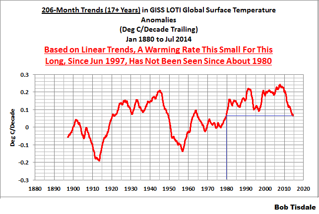
Figure 7 – 206-Month Linear Trends
The last time global surface temperatures warmed at this low a rate for a 206-month period was the late 1970s, or about 1980. Also note that the sharp decline is similar to the drop in the 1940s, and, again, as you’ll recall, global surface temperatures remained relatively flat from the mid-1940s to the mid-1970s.
The most widely used metric of global warming—global surface temperatures—indicates that the rate of global warming has slowed drastically and that the duration of the halt in global warming is unusual during a period when global surface temperatures are allegedly being warmed from the hypothetical impacts of manmade greenhouse gases.
A NOTE ABOUT THE RUNNING-TREND GRAPHS
There is very little difference in the end point trends of 13+ year and 17+ year running trends if HADCRUT4 or NCDC or GISS data are used. The major difference in the graphs is with the HADCRUT4 data and it can be seen in a graph of the 13+ year trends. I suspect this is caused by the updates to the HADSST3 data that have not been applied to the ERSST.v3b sea surface temperature data used by GISS and NCDC.
COMPARISONS
The GISS, HADCRUT4 and NCDC global surface temperature anomalies and the RSS and UAH lower troposphere temperature anomalies are compared in the next three time-series graphs. Figure 8 compares the five global temperature anomaly products starting in 1979. Again, due to the timing of this post, the HADCRUT4 and NCDC data lag the UAH, RSS and GISS products by a month. The graph also includes the linear trends. Because the three surface temperature datasets share common source data, (GISS and NCDC also use the same sea surface temperature data) it should come as no surprise that they are so similar. For those wanting a closer look at the more recent wiggles and trends, Figure 9 starts in 1998, which was the start year used by von Storch et al (2013) Can climate models explain the recent stagnation in global warming? They, of course found that the CMIP3 (IPCC AR4) and CMIP5 (IPCC AR5) models could NOT explain the recent halt in warming.
Figure 10 starts in 2001, which was the year Kevin Trenberth chose for the start of the warming halt in his RMS article Has Global Warming Stalled?
Because the suppliers all use different base years for calculating anomalies, I’ve referenced them to a common 30-year period: 1981 to 2010. Referring to their discussion under FAQ 9 here, according to NOAA:
This period is used in order to comply with a recommended World Meteorological Organization (WMO) Policy, which suggests using the latest decade for the 30-year average.

Figure 8 – Comparison Starting in 1979
###########
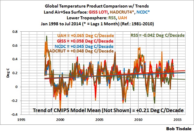
Figure 9 – Comparison Starting in 1998
###########
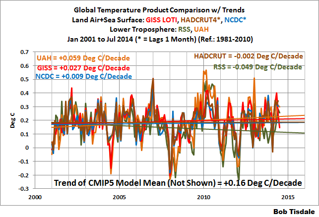
Figure 10 – Comparison Starting in 2001
AVERAGES
Figure 11 presents the average of the GISS, HADCRUT and NCDC land plus sea surface temperature anomaly products and the average of the RSS and UAH lower troposphere temperature data. Again because the HADCRUT4 data lag one month in this update, the most current average only includes the GISS and NCDC products.
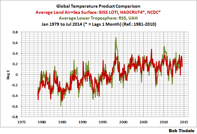
Figure 11 – Average of Global Land+Sea Surface Temperature Anomaly Products and Lower Troposphere Temperature Anomaly Products
The flatness of the data since 2001 is very obvious, as is the fact that surface temperatures have rarely risen above those created by the 1997/98 El Niño in the surface temperature data. There is a very simple reason for this: the 1997/98 El Niño released enough sunlight-created warm water from beneath the surface of the tropical Pacific to permanently raise the temperature of about 66% of the surface of the global oceans by almost 0.2 deg C. Sea surface temperatures for that portion of the global oceans remained relatively flat until the El Niño of 2009/10, when the surface temperatures of the portion of the global oceans shifted slightly higher again. Prior to that, it was the 1986/87/88 El Niño that caused surface temperatures to shift upwards. If these naturally occurring upward shifts in surface temperatures are new to you, please see the illustrated essay “The Manmade Global Warming Challenge” (42mb) for an introduction.
MONTHLY SEA SURFACE TEMPERATURE UPDATE
The most recent sea surface temperature update can be found here. The satellite-enhanced sea surface temperature data (Reynolds OI.2) are presented in global, hemispheric and ocean-basin bases. We discussed the recent record-high global sea surface temperatures and the reasons for them in the post On The Recent Record-High Global Sea Surface Temperatures – The Wheres and Whys.
Thank you, Bob. That’s about as comprehensive description of “the lay of the global temperature land” as anyone could wish.
Very good agreement with the analysis provided by the good ol’ IPCC when they said “the rate of warming over the past 15 years (1998–2012; 0.05 [–0.05 to +0.15] °C per decade)”….
Which is to say, over that last decade and a half, global warming has been somewhere between slightly warming and slightly cooling. Somebody needs to get those big oil shills at the IPCC on board!
Considering the US and Canadia are in mini Ice Age, I’m assuming we’ll be hearing nothing about them and a lot about the Arctic Peninsula this month.
“Since most of Smith et al (2008) was about the satellite-based data and the benefits of incorporating it into the reconstruction, one might consider that the NCDC temperature product is no longer supported by a peer-reviewed paper.”
Wow, can anyone confirm Bob’s statement that the NCDC temperature product is now essentially, as wiki puts it, “the act of pointing to individual cases or data that seem to confirm a particular position, while ignoring a significant portion of related cases or data that may contradict that position”?
agwnot, here’s a link to the paper for the NOAA ERSST.v3 dataset:
http://www.ncdc.noaa.gov/sites/default/files/attachments/Improvements-NOAAs-Historical-Merged-land-Ocean-Temp-Analysis-1880-2006_0.pdf
The word “satellite” is used more than 50 times in that paper.
Here’s a link to NOAA’s webpage for the ERSST.v3b dataset, the current version:
http://www.ncdc.noaa.gov/data-access/marineocean-data/extended-reconstructed-sea-surface-temperature-ersst-v3b
In the opening paragraph, they write:
“The newest version of ERSST, version 3b, is optimally tuned to exclude under-sampled regions for global averages. In contrast to version 3, ERSST v3b does not include satellite data, which were found to cause a cold bias significant enough to change the rankings of months.”
Bob, thanx much. As usual for me, it will take quite a while to read through all the links in your post, as well as the new ones just offered. I always enjoy plowing through your posts.
@Bob Tisdale says:
August 17, 2014 at 5:49 am
” ERSST v3b does not include satellite data, which were found to cause a cold bias significant enough to change the rankings of months.”
So, let’s eliminate areas that have a cold bias, but we’ll keep the warm bias ones in.
If you get to pick and choose you data, you can prove anything.
I’d like to add my compliments to Bob on producing a very understandable posting on the current situation. Maybe because it’s a Sunday morning read when I’m not in a rush, but I found this to be one of Bob’s best. Nice job Bob. Appreciate your effort.
I averaged the warming rates per decade from data sets (only those that show warming UAH, GISS & NCDC) for the period of 2001-2014 to get 0.032 C/decade. Then the same for all data sets of the period from 1979 to 2014, to get 0.144 C/decade. I then produced CMIP-5 factor errors (Model Predicted Warming Rate/Observed Warming Rate) for each time period to model factor errors of 5.05 and 1.60, respectively; (climate model warming bias is reduced over time). Plotting model factor error against time range, allows prediction of a 45 year time range required using exiting CMIP-5 model means to drive model prediction error to zero. Thus, due to natural climate variability, the current CMIP-5 climate models are incapable of reliable warming prediction in time ranges less than 45 years. This means if you are one who supports the AGW hypothesis, you must start to say that without climate model improvement, we can not reliably predict the correct amount of AGWing in time frames less than 45 years.
agwnot:
Your post at August 17, 2014 at 6:49 am
Am I right to understand your post as saying you are a climate modeler who wants to keep his/her job despite the models’ total lack of any demonstrated forecast skill?
Richard
Nope. Just saying natural climate variability makes climate modeling about as reliable as stock market modeling.
agwnot:
At August 17, 2014 at 7:21 am you say
I see. And what evidence do you present to indicate that economic models have predictive capability for time frames in excess of 45 years?
The reality is that climate models lack of any demonstrated forecast skill over any time frame.
Richard
“The reality is that climate models lack of any demonstrated forecast skill over any time frame.”
Certainly so for the 13 yr and 35 yr time frames referenced by Bob Tisdale here. Doing the same analysis I outlined above, but using actual warming-rate delta ({model prediction mean – observed mean} for both time ranges), instead of the error-factor ({model prediction mean/observed mean} for both time ranges), you need about 80 years time range to drive existing climate model warming rate bias to zero. I’ll say it again, but differently, those who support the hypothesis of AGW need to start admitting current climate models are poor predictors of AGW, due to natural climate variability.
agwnot:
re your post at August 17, 2014 at 7:47 am.
Hindcasting is not forecasting.
No model has existed for 80 years so your assertion saying
cannot be known to be true.
1.
There exists an infinite number of ways to construct a model which emulates the unique past.
2.
There are an infinite number of possible futures and each can be modeled but there is only one future which will evolve.
3.
Therefore an ability to hindcast does not inform about an ability to forecast.
4.
And forecast skill is demonstrated by a sequence of successful forecasts.
The truth of point 4 is used by scammers to fool people into buying fake investment forecasts.
Richard
Another post in the ‘bin’ for no apparent reason. Thankyou WordPress.
ippc says .2C per decade
obs say .15C per decade
since 2008, lukewarmers have said .15C per decade.
c02 warms the planet. the question is how much
Thanks, Bob. You increase the breath and depth of the observations.
looking at Figs 6 & 7 smoothed trends (temperature rates of change), both are still in positive territory. The very real crisis for the AGW believers will come if when the 13+ trend goes negative. As long as the trend remains positive, the AGW believers can obsfucate the finer points of model failures and point to “still rising temps”.
From fig 6, that negative point is possible around 2015-2016. For fig 7, being a 17 yr smoothed rate, that negative territorry arrival is 2017. To get there, a few harsh winters and mild summers would be necessary to ignite the public awareness that everything the IPCC and ALGore has been saying is false, with no temp record to stand on at that point, CAGW meme collapses.
CAGW meme, born circa 1990 – died circa 2017.
joelobryan:
At August 17, 2014 at 9:14 am you say
No, not 1990 but 10 years earlier; i.e. 1980, see here.
Richard
Steven Mosher says:
c02 warms the planet. the question is how much
CO2 might well warm the planet slightly. And FWIW, I think that’s true. But that is only speculation.
CO2 must measurably warm the planet. If any warming is too small to measure, then the rise in the trace gas CO2 should be completely disregarded for all practical purposes. Because being able to measure any effect is where you must draw the line.
If one extra molecule of CO2 warms the planet imperceptibly, should we take that into account? No, for the same reason that we don’t take another few ppm into account: it just doesn’t matter.
The rise in CO2 doesn’t matter, unless you can produce verifiable measurements specifically quantifying the fraction of a degree rise in global T that results from anthropogenic emissions. So far, no one has been able to measure that minuscule amount of warming — if it exists at all. Therefore, the carbon scare is baseless.
Steven Mosher on August 17, 2014 at 9:13 am
ippc says .2C per decade
obs say .15C per decade
since 2008, lukewarmers have said .15C per decade.
c02 warms the planet. the question is how much
CO2 warms computer models of the planet.
As for the real world – the jury’s still out.
This step down in global temps in spite of apparently near record high global SST (Bob Tisdale’s post here a few hours ago), would seem to support the argument by Bill Illis on that SST thread, that the exceptionally high north Pacific temps are a product of gross uncorrected seasonality in the north Pacific SST.
What goes around comes around. In the new year there will be a sharp fall in global SST and temperature – some of which will be real.
Solar variation also cyclically warms the planet but not to the degree that is measurable using current land, water, and satellite sensor devices and platforms. Current AGW models are based on old TSI data that produces a false solar warming during the time span used to tune the models. The new reconstruction now calls that “Grand Maximum” warming into question. All solar-included models that use old TSI data will need to be scrapped for new versions (Why? It isn’t all that necessary but read on:). Alas, that means we will have another 20 years of new improved more accurate than ever before models with promised pronouncements of actionable scenarios unless we do something. The solar reconstruction effort is an excellent example of good research. But the AGW crowd of scientists and modelers will make lemonade money out of sour solar lemons so that this environmentalist fad and its unending gravy train will continue.
August is going to be interesting….. Very cool in the UK and the states. No real warmth across Europe either. Could be a further monthly drop…..
By now, UAH at least shows a clear upward trend in the temperatures since 1998, but one must note that it’s still a whole lot less than what the models predicted.
Interestingly enough, the datasets that seem to indicate a continuing pause are the surface-based ones that were maligned here at times before (especially GISS). This also throws a curveball towards the arguments stated by those who say CO2 is dangerously warming the Earth because they are the datasets that they cite. Now I know the GISS dataset has been adjusted a number of times, but we’re talking about the last 16 years here and not the last century.
thanks bob for a most comprehensive post! excellent!
NASA GISS linear trends:
last 5yr: 0.00 C/yr
last 10 yr: 0.00 C/yr
last 15 yr: 0.01 C/yr
last 20 yr: 0.01 C/yr
Only the 20 yr trend is statistically significant different from 0
UAH linear trends:
last 5yr: -0.023 C/yr
last 10 yrs: 0.006 C/yr
last 15 yrs: 0.013 C/yr
last 20 yrs: 0.013 C/yr
Only the 15 and 20 yr trends are statistically significant different from 0.
IF the 20yr trend continues for the next 85 yrs, then GSTA will be about 0.85C above their base-line periods by the year 2100. This at the “lower estimated low emission scenario” the IPCC uses, which is the lowest estimate they have….
Steven Mosher says:
August 17, 2014 at 9:13 am
ippc says .2C per decade
obs say .15C per decade
since 2008, lukewarmers have said .15C per decade.
c02 warms the planet. the question is how much
Show us your proof, steven. !!
JustAnotherPoster says:
August 17, 2014 at 11:29 am
August is going to be interesting….. Very cool in the UK and the states. No real warmth across Europe either. Could be a further monthly drop…..
Another way of saying that we CE are having our worst June, July and August for 50yrs (anecdotally). Temps this august are running up to 6°C below norm.
richardscourtney says:
August 17, 2014 at 9:22 am
joelobryan:
At August 17, 2014 at 9:14 am you say
CAGW meme, born circa 1990 – died circa 2017.
No, not 1990 but 10 years earlier; i.e. 1980, see here.
Richard
Actually, I have a BBC book from 1974 with the AGW proposition in it.
Stephen Richards:
At August 17, 2014 at 12:34 pm you say
The “proposition” had been around for about a century, but that was not the point of dispute.
joelobryan had suggested “the CAGW meme” originated from 1990 and I pointed out it was generated by Margaret Thatcher and her campaign to do it began in 1980. Many had attempted to create an AGW-scare prior to Thatcher but she was able to do it and did.
Richard
I think you are missing my point. I believe comparing the model’s predicted warming-rate to the observed warming-rate, after the warming has occurred is not hindcasting. It is a way to measure model error, or to use your word “skill”. Doing the same over more than one time period is just one way to estimate that error on a 2-dimensional basis. Hindcasting is defined as known or closely estimated inputs (physical data, i.e. temps, solar energy, atmospheric humidity…) for past events are entered into a mathematical model to see how well the output matches the known results. This is not what I have done. I have made an estimate of the CMIP-5 bias by generating a calibration curve. The curve says short bias is really high to the warm side, and longer term bias still to the warm side, but lower. I then simply extrapolated the calibration curve to zero bias, to get the additional time needed for current models to be useful. Then I have applied that bias to show what I believe are worth mentioning:
1. current CMIP-5 model require much longer time to revert to the true warming rate, than the 30-year time period that Kevin Trenberth suggested was needed to measure a real climate shift. Implying that current climate models are far less than useful versus simply doing the work of actual global temperature measurements.
2. the current global temperature instrumentation system’s measurement-uncertainty of +/- 0.46C (I think) is large relative to actual measured warming. Consequently, the time frame of 45 to 80 years of actual warming needed to drive current models to zero bias is relevant. Put another way, due to the uncertainty in measurements, we should expect the models to have zero bias, or at least darn near zero bias; cool or warm.
3. the current climate models’ predicted warming rate is biased high (nothing new on this site); which at the very least, should require climate modelers to question the currently assumed climate-sensitivity to green house gases.
I am not sure what you mean when you say, “The truth of point 4 is used by scammers to fool people into buying fake investment forecasts.” With all do respect Mr. Courtney, I don’t particularly appreciate the implication that I am some scam artist.
Steven Mosher on August 17, 2014 at 9:13 am
c02 warms the planet. the question is how much
When I jog eastward, I slow down the rotation of the Earth. That’s an undeniable, iron-clad, unassailable fact.
A minor point but I think you got the UAH June and July temps reversed. June was 0.30 and it increased +0.01 to 0.31 in July.
Sorry folks but that anomaly map is complete rubbish. Please check Tasmanian and SE Australian temps through another source. The map shows a one degree above average for that region. Absolute nonsense. July was cold and wet. There is seriously something wrong here as my local weather station records a degree below average for July.
Steven Mosher says:
August 17, 2014 at 9:13 am
ippc says .2C per decade
obs say .15C per decade
since 2008, lukewarmers have said .15C per decade.
c02 warms the planet. the question is how much
As a radiative gas added to non-radiative O2 and N2, CO2 by radiating IR that the other gases cannot, cools the planet the question is how much.
So as others have said Steven, less of the drive by vague one-liners – and point everyone to the proof that in the real atmosphere CO2 causes warming.
Interestingly the hottest anomaly is in Antarctica where nobody lives so no complaints. I’m with Gez here NZ is not warm for all of July.
The map is biased.
Dbstealey.
How do you know it only warms slightly?
Settled science?
Certainty in skeptics is funny
Steven,
I specifically wrote: might. CO2 “might” warm the planet.
You wrote:
c02 warms the planet.
That sounds like certainty, no?
I replied:
CO2 might well warm the planet slightly.
See?
You also wrote:
Certainty in skeptics is funny
Funnier in alarmists. ☺
I’m not trying to give you a hard time, Steven. But you make it so easy…
Mr Mosher, you really have to make a start in paying attention. You’re lagging some way behind.
Current temperature at an altitude of about 1500 m.
http://earth.nullschool.net/#current/wind/isobaric/850hPa/overlay=temp/equirectangular
The mass of cold across both Northern and Southern hemispheres is striking. I know its “Winter” in the southern hemisphere…. But that Encroachment of the Antartic Air mass towards australia and south america does look worrying…….
A little OT…
Arctic temperatures (DMI) just dipped below zero, summer’s over up there.
Arctic ice is holding steady.
East Pacific upwelling continues to build slowly, snuffing out el Nino chances and setting the stage for a big La Nina early next year.
Business as usual with the trades.
The Kelvin wave that caused all the warmist excitement about a super el Nino has now vanished entirely. A new one is starting but will be weak.
Thanks very much Bob. Imagine the money if you were on the other side and truth didn’t matter.