Sorry this update is late. I got sidetracked with the post about Risbey et al. (2014), and the post about the new climate model, now with knobs.
This post provides an update of the data for the three primary suppliers of global land+ocean surface temperature data—GISS and NCDC through June 2014 and HADCRUT4 through May 2014—and of the two suppliers of satellite-based lower troposphere temperature data (RSS and UAH) through June 2014.
Initial Notes: Because this update is over a week late, GISS LOTI, NCDC and the two lower troposphere temperature datasets are for the most current month. The HADCRUT4 data lag one month. (Normally, the NCDC data are also lagging by a month.)
This post contains graphs of running trends in global surface temperature anomalies for periods of 13+ and 17+ years using GISS global (land+ocean) surface temperature data. They indicate that we have not seen a warming halt (based on 13-years+ trends) this long since the mid-1970s or a warming slowdown (based on 17-years+ trends) since about 1980. I used to rotate the data suppliers for this portion of the update, also using NCDC and HADCRUT. With the data from those two suppliers normally lagging by a month in the updates, I’ve standardized on GISS for this portion.
Much of the following text is boilerplate. It is intended for those new to the presentation of global surface temperature anomaly data.
Most of the update graphs in the following start in 1979. That’s a commonly used start year for global temperature products because many of the satellite-based temperature datasets start then.
We discussed why the three suppliers of surface temperature data use different base years for anomalies in the post Why Aren’t Global Surface Temperature Data Produced in Absolute Form?
GISS LAND OCEAN TEMPERATURE INDEX (LOTI)
Introduction: The GISS Land Ocean Temperature Index (LOTI) data is a product of the Goddard Institute for Space Studies. Starting with their January 2013 update, GISS LOTI uses NCDC ERSST.v3b sea surface temperature data. The impact of the recent change in sea surface temperature datasets is discussed here. GISS adjusts GHCN and other land surface temperature data via a number of methods and infills missing data using 1200km smoothing. Refer to the GISS description here. Unlike the UK Met Office and NCDC products, GISS masks sea surface temperature data at the poles where seasonal sea ice exists, and they extend land surface temperature data out over the oceans in those locations. Refer to the discussions here and here. GISS uses the base years of 1951-1980 as the reference period for anomalies. The data source is here.
Update: The June 2014 GISS global temperature anomaly is +0.62 deg C. It dropped a good amount (a decrease of about -0.14 deg C) since May 2014.
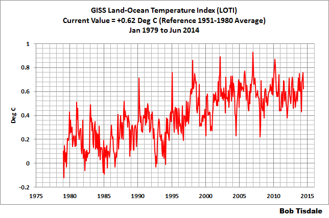
Figure 1 – GISS Land-Ocean Temperature Index
NCDC GLOBAL SURFACE TEMPERATURE ANOMALIES (NO LAG THIS MONTH)
Introduction: The NOAA Global (Land and Ocean) Surface Temperature Anomaly dataset is a product of the National Climatic Data Center (NCDC). NCDC merges their Extended Reconstructed Sea Surface Temperature version 3b (ERSST.v3b) with the Global Historical Climatology Network-Monthly (GHCN-M) version 3.2.0 for land surface air temperatures. NOAA infills missing data for both land and sea surface temperature datasets using methods presented in Smith et al (2008). Keep in mind, when reading Smith et al (2008), that the NCDC removed the satellite-based sea surface temperature data because it changed the annual global temperature rankings. Since most of Smith et al (2008) was about the satellite-based data and the benefits of incorporating it into the reconstruction, one might consider that the NCDC temperature product is no longer supported by a peer-reviewed paper.
The NCDC data source is through their Global Surface Temperature Anomalies webpage. Click on the link to Anomalies and Index Data.)
Update: The June 2014 NCDC global land plus sea surface temperature anomaly was +0.72 deg C. See Figure 2. It showed a drop (a decrease of -0.02 deg C) since May 2014.
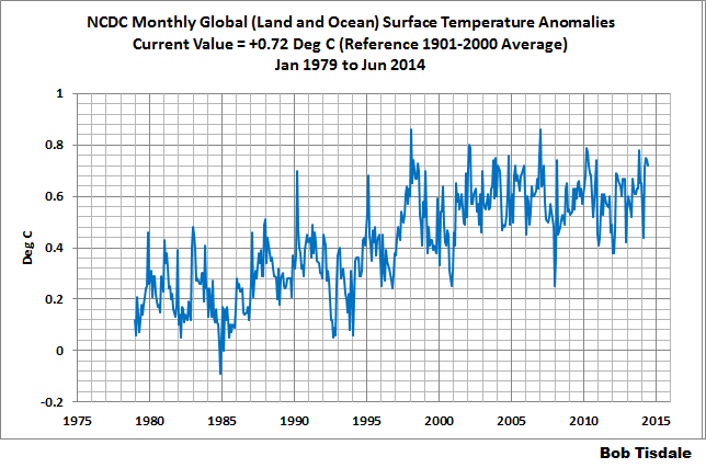
Figure 2 – NCDC Global (Land and Ocean) Surface Temperature Anomalies
UK MET OFFICE HADCRUT4 (LAGS ONE MONTH)
Introduction: The UK Met Office HADCRUT4 dataset merges CRUTEM4 land-surface air temperature dataset and the HadSST3 sea-surface temperature (SST) dataset. CRUTEM4 is the product of the combined efforts of the Met Office Hadley Centre and the Climatic Research Unit at the University of East Anglia. And HadSST3 is a product of the Hadley Centre. Unlike the GISS and NCDC products, missing data is not infilled in the HADCRUT4 product. That is, if a 5-deg latitude by 5-deg longitude grid does not have a temperature anomaly value in a given month, it is not included in the global average value of HADCRUT4. The HADCRUT4 dataset is described in the Morice et al (2012) paper here. The CRUTEM4 data is described in Jones et al (2012) here. And the HadSST3 data is presented in the 2-part Kennedy et al (2012) paper here and here. The UKMO uses the base years of 1961-1990 for anomalies. The data source is here.
Update (Lags One Month): The May 2013 HADCRUT4 global temperature anomaly is +0.59 deg C. See Figure 3. It decreased (about -0.06 deg C) since April 2014.
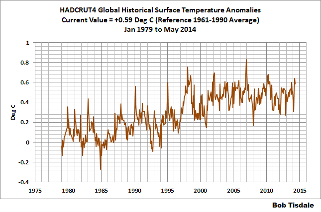
Figure 3 – HADCRUT4
UAH Lower Troposphere Temperature (TLT) Anomaly Data
Special sensors (microwave sounding units) aboard satellites have orbited the Earth since the late 1970s, allowing scientists to calculate the temperatures of the atmosphere at various heights above sea level. The level nearest to the surface of the Earth is the lower troposphere. The lower troposphere temperature data include the altitudes of zero to about 12,500 meters, but are most heavily weighted to the altitudes of less than 3000 meters. See the left-hand cell of the illustration here. The lower troposphere temperature data are calculated from a series of satellites with overlapping operation periods, not from a single satellite. The monthly UAH lower troposphere temperature data is the product of the Earth System Science Center of the University of Alabama in Huntsville (UAH). UAH provides the data broken down into numerous subsets. See the webpage here. The UAH lower troposphere temperature data are supported by Christy et al. (2000) MSU Tropospheric Temperatures: Dataset Construction and Radiosonde Comparisons. Additionally, Dr. Roy Spencer of UAH presents at his blog the monthly UAH TLT data updates a few days before the release at the UAH website. Those posts are also cross posted at WattsUpWithThat. UAH uses the base years of 1981-2010 for anomalies. The UAH lower troposphere temperature data are for the latitudes of 85S to 85N, which represent more than 99% of the surface of the globe.
Update: The June 2014 UAH lower troposphere temperature anomaly is +0.30 deg C. It dropped (a decrease of about -0.03 deg C) since May 2014.
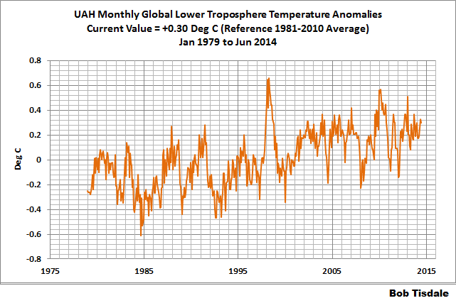
Figure 4 – UAH Lower Troposphere Temperature (TLT) Anomaly Data
RSS Lower Troposphere Temperature (TLT) Anomaly Data
Like the UAH lower troposphere temperature data, Remote Sensing Systems (RSS) calculates lower troposphere temperature anomalies from microwave sounding units aboard a series of NOAA satellites. RSS describes their data at the Upper Air Temperature webpage. The RSS data are supported by Mears and Wentz (2009) Construction of the Remote Sensing Systems V3.2 Atmospheric Temperature Records from the MSU and AMSU Microwave Sounders. RSS also presents their lower troposphere temperature data in various subsets. The land+ocean TLT data are here. Curiously, on that webpage, RSS lists the data as extending from 82.5S to 82.5N, while on their Upper Air Temperature webpage linked above, they state:
We do not provide monthly means poleward of 82.5 degrees (or south of 70S for TLT) due to difficulties in merging measurements in these regions.
Also see the RSS MSU & AMSU Time Series Trend Browse Tool. RSS uses the base years of 1979 to 1998 for anomalies.
Update: The June 2014 RSS lower troposphere temperature anomaly is +0.35 deg C. It rose (an increase of about +0.06 deg C) since May 2014.
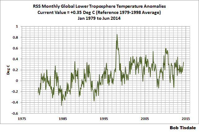
Figure 5 – RSS Lower Troposphere Temperature (TLT) Anomaly Data
A Quick Note about the Difference between RSS and UAH TLT data
There is a noticeable difference between the RSS and UAH lower troposphere temperature anomaly data. Dr. Roy Spencer discussed this in his July 2011 blog post On the Divergence Between the UAH and RSS Global Temperature Records. In summary, John Christy and Roy Spencer believe the divergence is caused by the use of data from different satellites. UAH has used the NASA Aqua AMSU satellite in recent years, while as Dr. Spencer writes:
…RSS is still using the old NOAA-15 satellite which has a decaying orbit, to which they are then applying a diurnal cycle drift correction based upon a climate model, which does not quite match reality.
I updated the graphs in Roy Spencer’s post in On the Differences and Similarities between Global Surface Temperature and Lower Troposphere Temperature Anomaly Datasets.
While the two lower troposphere temperature datasets are different in recent years, UAH believes their data are correct, and, likewise, RSS believes their TLT data are correct. Does the UAH data have a warming bias in recent years or does the RSS data have cooling bias? Until the two suppliers can account for and agree on the differences, both are available for presentation.
In a more recent blog post, Roy Spencer has advised that the UAH lower troposphere Version 6 will be released soon and that it will reduce the difference between the UAH and RSS data.
13-YEARS+ (162-MONTH) RUNNING TRENDS
As noted in my post Open Letter to the Royal Meteorological Society Regarding Dr. Trenberth’s Article “Has Global Warming Stalled?”, Kevin Trenberth of NCAR presented 10-year period-averaged temperatures in his article for the Royal Meteorological Society. He was attempting to show that the recent halt in global warming since 2001 was not unusual. Kevin Trenberth conveniently overlooked the fact that, based on his selected start year of 2001, the halt at that time had lasted 12+ years, not 10.
The period from January 2001 to June 2014 is now 162-months long—more than 13 years. Refer to the following graph of running 162-month trends from January 1880 to April 2014, using the GISS LOTI global temperature anomaly product.
An explanation of what’s being presented in Figure 6: The last data point in the graph is the linear trend (in deg C per decade) from January 2001 to June 2014. It is basically zero (about +0.02 deg C/Decade). That, of course, indicates global surface temperatures have not warmed to any great extent during the most recent 162-month period. Working back in time, the data point immediately before the last one represents the linear trend for the 162-month period of December 2000 to May 2014, and the data point before it shows the trend in deg C per decade for November 2000 to April 2014, and so on.
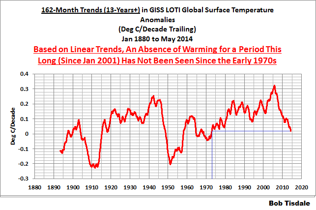
Figure 6 – 162-Month Linear Trends
The highest recent rate of warming based on its linear trend occurred during the 160-month period that ended about 2004, but warming trends have dropped drastically since then. There was a similar drop in the 1940s, and as you’ll recall, global surface temperatures remained relatively flat from the mid-1940s to the mid-1970s. Also note that the mid-1970s was the last time there had been a 162-month period without global warming—before recently.
17-YEARS+ (205-Month) RUNNING TRENDS
In his RMS article, Kevin Trenberth also conveniently overlooked the fact that the discussions about the warming halt are now for a time period of about 16 years, not 10 years—ever since David Rose’s DailyMail article titled “Global warming stopped 16 years ago, reveals Met Office report quietly released… and here is the chart to prove it”. In my response to Trenberth’s article, I updated David Rose’s graph, noting that surface temperatures in April 2013 were basically the same as they were in June 1997. We’ll use June 1997 as the start month for the running 17-year trends. The period is now 205-months long. The following graph is similar to the one above, except that it’s presenting running trends for 205-month periods.
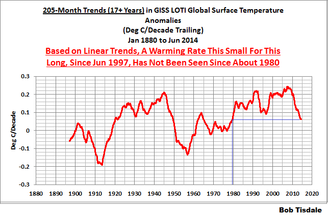
Figure 7 – 205-Month Linear Trends
The last time global surface temperatures warmed at this low a rate for a 205-month period was the late 1970s, or about 1980. Also note that the sharp decline is similar to the drop in the 1940s, and, again, as you’ll recall, global surface temperatures remained relatively flat from the mid-1940s to the mid-1970s.
The most widely used metric of global warming—global surface temperatures—indicates that the rate of global warming has slowed drastically and that the duration of the halt in global warming is unusual during a period when global surface temperatures are allegedly being warmed from the hypothetical impacts of manmade greenhouse gases.
A NOTE ABOUT THE RUNNING-TREND GRAPHS
There is very little difference in the end point trends of 13+ year and 17+ year running trends if HADCRUT4 or NCDC or GISS data are used. The major difference in the graphs is with the HADCRUT4 data and it can be seen in a graph of the 13+ year trends. I suspect this is caused by the updates to the HADSST3 data that have not been applied to the ERSST.v3b sea surface temperature data used by GISS and NCDC.
COMPARISONS
The GISS, HADCRUT4 and NCDC global surface temperature anomalies and the RSS and UAH lower troposphere temperature anomalies are compared in the next three time-series graphs. Figure 8 compares the five global temperature anomaly products starting in 1979. Again, due to the timing of this post, the HADCRUT4 and NCDC data lag the UAH, RSS and GISS products by a month. The graph also includes the linear trends. Because the three surface temperature datasets share common source data, (GISS and NCDC also use the same sea surface temperature data) it should come as no surprise that they are so similar. For those wanting a closer look at the more recent wiggles and trends, Figure 9 starts in 1998, which was the start year used by von Storch et al (2013) Can climate models explain the recent stagnation in global warming? They, of course found that the CMIP3 (IPCC AR4) and CMIP5 (IPCC AR5) models could NOT explain the recent halt in warming.
Figure 10 starts in 2001, which was the year Kevin Trenberth chose for the start of the warming halt in his RMS article Has Global Warming Stalled?
Because the suppliers all use different base years for calculating anomalies, I’ve referenced them to a common 30-year period: 1981 to 2010. Referring to their discussion under FAQ 9 here, according to NOAA:
This period is used in order to comply with a recommended World Meteorological Organization (WMO) Policy, which suggests using the latest decade for the 30-year average.
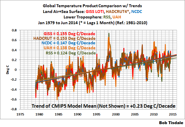
Figure 8 – Comparison Starting in 1979
###########
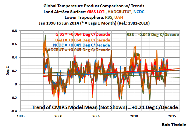
Figure 9 – Comparison Starting in 1998
###########
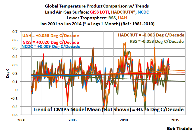
Figure 10 – Comparison Starting in 2001
AVERAGE
Figure 11 presents the average of the GISS, HADCRUT and NCDC land plus sea surface temperature anomaly products and the average of the RSS and UAH lower troposphere temperature data. Again because the HADCRUT4 data lag one month in this update, the most current average only includes the GISS and NCDC products.
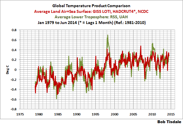
Figure 11 – Average of Global Land+Sea Surface Temperature Anomaly Products
The flatness of the data since 2001 is very obvious, as is the fact that surface temperatures have rarely risen above those created by the 1997/98 El Niño in the surface temperature data. There is a very simple reason for this: the 1997/98 El Niño released enough sunlight-created warm water from beneath the surface of the tropical Pacific to permanently raise the temperature of about 66% of the surface of the global oceans by almost 0.2 deg C. Sea surface temperatures for that portion of the global oceans remained relatively flat until the El Niño of 2009/10, when the surface temperatures of the portion of the global oceans shifted slightly higher again. Prior to that, it was the 1986/87/88 El Niño that caused surface temperatures to shift upwards. If these naturally occurring upward shifts in surface temperatures are new to you, please see the illustrated essay “The Manmade Global Warming Challenge” (42mb) for an introduction.
MONTHLY SEA SURFACE TEMPERATURE UPDATE
The most recent sea surface temperature update can be found here. The satellite-enhanced sea surface temperature data (Reynolds OI.2) are presented in global, hemispheric and ocean-basin bases.
Bob, thanks for the update. Can you (or someone else) clarify exactly what the global temperature is? There are measurements made at various places around the globe, is the global average the MEDIAN of all those measurement, or the MEAN, or something else.
The Hadcrut4 website says MEDIAN, but someone on here said that was not correct.
MEDIAN seems to me to be the sensible choice, to avoid errors due to outliers.
Let’s look at reality.
MikeUK, at the UKMO HADCRUT4 webpage…
http://www.cru.uea.ac.uk/cru/data/temperature/
…”median” is used with respect to the models used to determine HADCRUT4 (that is, it’s the model median).
But the global surface temperature anomalies are a weighted average.
Instruction Manual reality.
Thanks for all the work on recent posts. They have been very good. Especially one on the Risbey paper.
Unfortunately I’m too busy to read this one right now so I’ll just assume that the predicted big El Nino hasn’t happened yet.
But it was meant to have kicked in by now, wasn’t it?
Your trend graphs echo IMHO, the hint of the recovery from the previous deep cold glacial era overlaid with oceanic/atmospheric teleconnected oscillations (without regard to volcanic activity). Notice that subsequent trend peaks are slightly higher than the previous trend peaks and show no sudden increasing trend response to anthropogenic additions to greenhouse gasses.
In the context of glacial periods, how much longer do we have to luxuriate in warmth and plenty before we start the rather sudden and harsh slide into another glacial period? Seems to me that unless we are ready to respond to mass migration South to get away from mile thick ice sheets, flora and fauna will not survive, just like in the past. The irony it burns. Mexico will be our mecca instead of the other way around.
MikeUK says:
July 25, 2014 at 8:07 am
Bob, thanks for the update. Can you (or someone else) clarify exactly what the global temperature is ?
Mike I wouldn’t bother. GT makes no difference to the (middle earth) UK’s
Central England June temperature for all of its 350 years long record.
No hay El Nino.
Note that in the last 2 Graphs it is UAH that is the outlier along with GISS, not a good place to be, no wonder they say that Version 6 will be released soon and that it will reduce the difference between the UAH and RSS data, it needs to.
In your post on SST, you said it went up by 0.016 from May to June on that data set. However Hadsst3 has an increase of 0.083 from May to June. We know GISS went down by 0.14 from May to June. Should we then expect a much smaller drop, or perhaps even an increase for Hadcrut4 in June since they use Hadsst3? Thank you!
Figure 11 shows much greater internal variation for the satellite data than for the surface data (higher highs, lower lows). Why might this be? Perhaps a result of the homogenization of the surface data?
This would also lead to increased monthy variation of the trend for the satellite data. I think it would be useful if you were to add the standard deviation or standard error or 95% confidence interval to your graphs showing the trend values in degrees/decade. Would this show that the difference in trends (0.147-0.155 degrees/decade in the three surface datasets since 1979) is not significant? Or perhaps that the difference from those 3 and the UAH value of 0.138 is also not significant?
Current southern polar vortex at an altitude of 17 km.
http://earth.nullschool.net/#current/wind/isobaric/70hPa/orthographic=23.26,-86.31,318
Ren, I don’t get your video point. What are you thinking about these videos? Posting a video without commentary doesn’t provide much. Many times, a picture is not worth 1000 words, particularly in science.
ren says:
July 25, 2014 at 9:37 am
Current southern polar vortex at an altitude of 17 km.
http://earth.nullschool.net/#current/wind/isobaric/70hPa/orthographic=23.26,-86.31,318
I find the Antarctic jetstreams down at 250hPa
http://earth.nullschool.net/#current/wind/isobaric/250hPa/orthographic=-91.10,-90.82,353
and 500hPa
http://earth.nullschool.net/#current/wind/isobaric/500hPa/orthographic=-91.10,-90.82,353
more interesting.
Stephen Wilde was forecasting this meridonality and it will have significant cooling effect due to the longer track of the Ferrel cells and associated increase in cloudiness.
Ian W says:
July 25, 2014 at 10:06 am
…..
What you see is the evidence of the Antarctic’s Circumpolar wave quadrupole.
Y-scales of each plot have different ranges with no justification. Also, you are plotting anomaly “data” on a plot with asymmetric Y-scale ranges. Not justified.
The only justification for your Y-scale ranges seem to be whatever fills the graphic display. Every month, more plots with randomly chosen Y-scale plots.
The actual range of the Y-scale should be about 10 times the approximate error of the measured parameter. Since the “data” you display have an error range of about +/- 0.2 degrees, then set the Y-scale range at plus/minus two degrees.
That scale will show a much more realistic display of yearly global temp trends. Far more people will then understand the magnitude of those trends.
Current growth of cosmic radiation will cause a stronger blockade of the southern polar vortex. This will result in a stronger cooling of the South Pacific.
http://earth.nullschool.net/#current/wind/isobaric/700hPa/overlay=temp/orthographic=-137.93,-1.61,419
> …RSS is still using the old NOAA-15 satellite which has a decaying orbit, to which they are then applying a diurnal cycle drift correction based upon a climate model, which does not quite match reality.
The models seeking to be validated are being used to calibrate the data used to validate the models.
henry says
there is no global warming
there is only global cooling
http://wattsupwiththat.com/2014/07/23/new-paper-finds-transient-climate-sensitivity-to-doubled-co2-levels-is-only-about-1c/#comment-1694235
we have re-think the global sampling procedure
bw:
Your post at July 25, 2014 at 10:35 am says in total
I have tried and tried but cannot understand what you are trying to say.
Bob’s graphs use the same scale for their Y-axes and they plot anomalies so I don’t understand why they should have the same ranges. And on what basis do you assert that “the Y-scale should be about 10 times the approximate error of the measured parameter”?
Are you trying to claim that the graph should include error bars?
In short, what the Perkin Elmer do you want changed, how do you want it to be changed, and why?
Richard
“COSMIC RAYS IN THE ATMOSPHERE
A variety of neutral and charged particles are produced in a cosmic ray shower . During a collision between an air molecule and a high energy cosmic ray, protons and neutrons and other secondary particles are released. Pions are particles with more mass than an electron, but less than a proton. They quickly decay in two ways. Charged pions decay into muons, and neutral pions decay into photons. Muons, produced by the charged pions are then also charged. The decay occurs so quickly that it often occurs before any other process can take place. At the point of decay the new muon jets off in another direction. Muons decay into an electron or positron (the antiparticle of the electron), and a neutrino. A neutral pion, as mentioned above, decays into two photons. Photons with enough energy can transform into an electron and positron. If a positron or an electron meets a nucleus in its path then another photon is created.
The more energetic the primary cosmic ray, the deeper into the atmosphere the cosmic ray penetrates. Since cosmic ray particles lose energy in the atmosphere, not all secondary cosmic rays make it to the ground.”
http://neutronm.bartol.udel.edu/listen/main.html#source
http://www.cpc.ncep.noaa.gov/products/intraseasonal/temp50anim.gif
Ozone anomalies over the southern polar circle and the magnetic field.
http://exp-studies.tor.ec.gc.ca/ozone/images/graphs/sh_dev/current_1.gif
http://www.geomag.bgs.ac.uk/images/fig4.pdf
wbrozek says: “In your post on SST, you said it went up by 0.016 from May to June on that data set. However Hadsst3 has an increase of 0.083 from May to June. We know GISS went down by 0.14 from May to June. Should we then expect a much smaller drop, or perhaps even an increase for Hadcrut4 in June since they use Hadsst3?”
The sea surface temperature dataset presented in my sea surface temperature update no longer used by GISS. It had been used by GISS until last year. Now GISS uses NOAA ERSST.v3b. It’s difficult at best to know where HADCRUT4 will go based on GISS or NCDC data since they approach the manufacture of global surface temperature of data in such different ways.
[“since they approach the manufacture of global surface temperature of data in such different ways” ?? For our other and newer readers, can you amplify that quote, please. .mod]
bw says: “Y-scales of each plot have different ranges with no justification. Also, you are plotting anomaly “data” on a plot with asymmetric Y-scale ranges. Not justified.”
Of course it’s justified. The closer the range of the graph is to the actual range of the data, the easier it is for people to see the variations in the data. And I furnish all the data on one graph for those who wish to compare wiggles.
Richards Courtney: Look at the range from highest positive to lowest negative on each graph and you will see that the scales are not the same. The importance of this might be that by changing the scale you make it look to the casual observer that the climate varies more or less. My favorite graphing effort is to put zero on the bottom and about 288 or 290 kelvin on the top of one of these temperature graphs. I then draw a straight line parallel to the x axis with an unsharpened pencil at about 287. For a period of about 13 to 17 years backwards from the present all the data should fit within the width of that line. Does this have any meaning? I am not qualified to say, but it surely seems like it should.
M Courtney says: “Unfortunately I’m too busy to read this one right now so I’ll just assume that the predicted big El Nino hasn’t happened yet. But it was meant to have kicked in by now, wasn’t it?”
The warm water from the downwelling (warm) Kelvin wave that crossed the equatorial Pacific earlier this year is pretty much exhausted. That does not mean that a second downwelling Kelvin wave this year can’t cause an El Nino. In fact, a new warm subsurface anomaly formed in the western equatorial Pacific recently. I was waiting for the
June 22July 22 pentad maps and cross sections from NOAA GODAS before I published a post about it.[Corrected the date after the comment was posted.]
Bob Tisdale says:
July 25, 2014 at 1:20 pm
bw says: “Y-scales of each plot have different ranges with no justification. Also, you are plotting anomaly “data” on a plot with asymmetric Y-scale ranges. Not justified.”
Of course it’s justified. The closer the range of the graph is to the actual range of the data, the easier it is for people to see the variations in the data. And I furnish all the data on one graph for those who wish to compare wiggles.
Some people just like the “0” line to be in the middle.
Regardless, the data provides the justification for the above presentations.
Thank you for your continued effort.
Guy:
Thankyou for your thoughts which you put to me at July 25, 2014 at 1:23 pm.
Firstly, and I intend no offense by this, your ideas cannot be the information from ‘bw’ which I requested as clarification of what he wrote and I don’t understand.
However, I provide the following responses to your post addressed to me.
A graph is presentation of data: it is not data. And a presenter of data chooses the graphical form which she considers to most clearly present what she wants to show is indicated by the data.
However, it is very wrong to devise a graph which clearly present data in a manner which misrepresents what the data says.
For example, this WUWT article discusses that in the same week as MBH98 was published I wrote an email on the ‘ClimateSkeptics’ circulation list. That email objected to the ‘hockeystick’ graph because the graph had an overlay of ‘thermometer’ data over the plotted ‘proxy’ data. This overlay was – I said – misleading because it was an ‘apples and oranges’ comparison: of course, I was not then aware of the ‘hide the decline’ (aka “Mike’s Nature trick”) issue. Climategate provided Mann’s response to obtaining a copy of my email and the article discusses that.
Anybody should present data in a form they honestly think is a clear and honest presentation of what they want people to see is indicated by the data. Others may have different opinions on how to present the data and – if their opinions are honest – then they need to present the data in their chosen form.
As to your specific question, I respond that a person who does not know the “meaning” implied by a choice of graphical style should reconsider how they are presenting the data.
I hope this answer is at least the kind of reply you wanted from me and is some help.
Richard
A somewhat reasonable question I hope, but one apparently very difficult to answer correctly!
I have been saying “Today’s current “catastrophic Global Warming is 1/3 of one degree warmer since the baseline was set back during the mid-70’s – a temporary low point between a short Dust Bowl before 1940 and today’s high point. But the world has been getting gradually hotter since 1650, when it was 1-1/2 degrees colder. Before that, in the year 1100, the world was 1 degree hotter than now, but during King Arthur’s Dark Ages, we were 1 degree colder than now. Then again, in the year 100BC the Romans were 1-1/2 degree hotter than now. Do you see the pattern?”
But, looking at the plots of each different bureaucracy, I see only UAH satellite readings are actually at 0.3 anomaly. The rest are substantially higher at 0.6 and 0.7 degrees warmer.
Is my summary of the trend since the LIA correct?
If not, what should my “rounded off numbers” actually be for the average layman who is NOT interested in minute decimal places and exact years?
NOAA Global Highlights for June 2014:
“The combined average temperature over global land and ocean surfaces for June 2014 was the highest on record for the month, at 0.72°C (1.30°F) above the 20th century average of 15.5°C (59.9°F).
The global land surface temperature was 0.95°C (1.71°F) above the 20th century average of 13.3°C (55.9°F), the seventh highest for June on record.
For the ocean, the June global sea surface temperature was 0.64°C (1.15°F) above the 20th century average of 16.4°C (61.5°F), the highest for June on record and the highest departure from average for any month.
The combined global land and ocean average surface temperature for the January–June period (year-to-date) was 0.67°C (1.21°F) above the 20th century average of 13.5°C (56.3°F), tying with 2002 as the third warmest such period on record.”
So – no cooling on that data set HenryP.
Anyone watching the Greenland surface melt ? – almost the whole summer so far has been above average:
http://nsidc.org/greenland-today/
Why there is no trace of the Atlantic hurricane?
http://weather.unisys.com/surface/sst_anom.gif
RACookPE1978:
re your post at July 25, 2014 at 1:53 pm.
Please remember that we are discussing temperature anomalies and not temperatures so you can adopt any offset you want.
Global temperature varies by 3.8°C during each year. So, if global temperature anomaly was ~1.5°C higher in Roman times than now then that anomaly difference is less than half the global temperature variation which occurs during each year.
You are presenting data so you can present it in any honest way you want (please see my post at July 25, 2014 at 1:48 pm).
Richard
The concentration of ice in the Arctic is higher than in the previous year.
http://igloo.atmos.uiuc.edu/cgi-bin/test/print.sh?fm=07&fd=23&fy=2013&sm=07&sd=23&sy=2014
This may be a silly question, but how come NOAA/NWS just put out a press release that said June 2014 is hottest ever and ocean temps are near record hot and Jan-June is something like the second hottest ever globally?
Darn, just went to look for the article but I can’t find it.
James Abbott:
At July 25, 2014 at 1:56 pm you ask
Well, yes, you say you are. Of course we only have your word for that.
Please report back in the unlikely event that something interesting or unusual happens.
Richard
The ice in the south growing rapidly.
http://arctic.atmos.uiuc.edu/cryosphere/antarctic.sea.ice.interactive.html
richardscourtney
If you had read my previous post you would see I did: The surface melt over
“almost the whole summer so far has been above average”
Given the Greenland ice cap is the largest body of frozen water in the northern hemisphere that I would suggest is interesting and given almost the whole summer has seen above average melting (and often significantly so) that is also unusual – at least for the period of the satellite record.
Also, looks like the NOAA forecast of a positive anomaly in arctic sea ice extent has failed big time.
By now it should have gone positive according to their prediction plots issued on 24th May.
Its actually negative to the tune of around a million sq km.
James Abbott says:
July 25, 2014 at 2:51 pm (replying to richardscourtney)
If you had read my previous post you would see I did: The surface melt over
“almost the whole summer so far has been above average”
Given the Greenland ice cap is the largest body of frozen water in the northern hemisphere that I would suggest is interesting and given almost the whole summer has seen above average melting (and often significantly so) that is also unusual – at least for the period of the satellite record.
Also, looks like the NOAA forecast of a positive anomaly in arctic sea ice extent has failed big time.
By now it should have gone positive according to their prediction plots issued on 24th May.
Its actually negative to the tune of around a million sq km.
Hmmmmn.
Strange that Antarctic sea ice record: Been setting all-new highs since 2007.
Consistently and continuously increasing since 2007 – during EVERY season of the year: winter, spring melt down under, summer low-point, autumn re-freeze!
Been consistently greater than 1.0 million sq kilometers of sea ice up at latitudes that matter – up between 69 and 59 degrees latitude. That Arctic lower-than-nominal sea ice. At minimums in mid-September, it is between 80 and 81 north. Not much solar energy available up there even in those few hours of the day when the sun is even higher than 5 or 6 degrees above the horizon.
In fact, the last many years when the Arctic sea ice at minimum has been less than 4 – 5 Mkm^2 in September and October?
Well, the “excess” Antarctic sea ice you are deliberately ignoring is reflecting FIVE TIMES the solar energy that the missing Arctic sea ice “might be” receiving .. except that at those solar elevation angles almost all the day, almost all of the solar energy is reflected from the Arctic ocean anyway…..
Net? The Arctic ocean after late August is LOSING more heat from increased evaporation, increased convection, increased LW radiation and increased conduction than it gains from increased solar exposure.
Less arctic ice = more heat loss over a 24 hour day every day between late August and early May.
Greenland ice cap loss? Maybe you can tell us how much the bedrock under the ice cap is moving. How much does that (unknown) movement (lifting and falling) affect the so-far-uncalibrated GRACE satellite numbers? Are you really sure there is ice loss at all over most of the island?
Scott in Nebraska says:
July 25, 2014 at 2:13 pm
Darn, just went to look for the article but I can’t find it.
Here it is:
http://www.ncdc.noaa.gov/sotc/global/
It says:
“The combined global land and ocean average surface temperature for the January–June period (year-to-date) was 0.67°C (1.21°F) above the 20th century average of 13.5°C (56.3°F), tying with 2002 as the third warmest such period on record.”
However RSS does not agree. On RSS, June was the 4th warmest and the year to date is the 7th warmest when comparing the average over six months to other total yearly averages.
RACookPE1978
I am not ignoring the ice around Antarctica – have posted several times on this site that the above average sea ice area there needs to be explained.
If you are right about the energy balance in the arctic, how come sea temperatures are so high ? Check out the anomalies on the sea ice page on this website.
I have no idea how much the bedrock of Greenland is moving and I never said there is ice loss over “most of the island”. I said that the surface melt is unusually high this year. If you follow the link I gave you can see that the loss is mostly around the coastal areas (as would be expected as they are at lower elevation).
Presumably though if the Greenland ice cap does melt substantially the bedrock will rise due to isostatic rebound.
ren says:
July 25, 2014 at 2:12 pm
“The concentration of ice in the Arctic is higher than in the previous year.”
One year does not make a trend.
ren, thanks for staying on-topic. (sarc off)
Re: Bob’s sarc note…I’m about to put “ren” back in moderation, since he can’t seem to control his off topic postings.
I suggest a post of his own for ‘ren’. Pull it all together.
==================
Bob Tisdale says:
July 25, 2014 at 1:20 pm
“”……for those who wish to compare wiggles.””.
============================================
Thanks for all the wiggles, Bob. They have forever changed my life, and made a new man out of me!
In my uneducated mind the Winter of Southern Australia puts an El Niño of any consequence in doubt. Cold outbreaks have been frequent and high pressure cells have tracked well North allowing cold fronts to amplify into Southern Australia. This may be as a result of a strong Antarctic vortex but what effect does the strength of the polar vortex have on El Niño formation, if any?
richardscourtney says:
July 25, 2014 at 2:14 pm
“James Abbott:
At July 25, 2014 at 1:56 pm you ask
Anyone watching the Greenland surface melt ?
Well, yes, you say you are. Of course we only have your word for that.
Please report back in the unlikely event that something interesting or unusual happens.
Richard”
Gents, the average elevation of the Greenland ice sheet is, according to global warmers’ favorite source, Wiki, is “..The mean altitude of the ice is 2,135 metres”, over 7,000m. Some years ago, I nearly froze my toes at 6000ft in Nevada in May – coming from Ottawa, I thought it would be warmer there, didn’t dress appropriately and had to borrow a parka.
“www.sierranevadaphotos.com/geography/sierra_climate.asp
Map and descriptions of the climates of the Sierra Nevada mountains of California. … coldest month below 27°F. These are the areas of heaviest snowfall in the Sierra. … Altitude Range: Typically above 6,000-7,000 ft (to the snowline).
And this is in California. Only NOAA and the UK Met Office can “model” significant melting over Greenland.
I gave a quick scan of UAH, and it also has 2014 June as 4th highest of all June anomalies (if I didn’t miss any). Of course the differences are in hundredths of a degree.
NOAA got rid of satellite (i.e. global) SST in their latest version because it “introduced a small residual cold bias.” Choosing the data source that gives the most warming? Imagine that!
Bob, are you familiar with the difference between v3 and v3b? Could you give us a brief summary?
The link to the entire description: http://www.ncdc.noaa.gov/data-access/marineocean-data/extended-reconstructed-sea-surface-temperature-ersst-v3b
Hey ren, I know where you can buy an abandoned ski resort real cheap. Get ‘er fixed up & running and watch ‘er turn into a real cash cow. Timing is everything, plain and simple.
http://arkansasroadstories.com/attractions/dogpatch.html
James Abbott:
re your post addressed to me at July 25, 2014 at 2:51 pm.
I am grateful to all who ‘rubbed your nose’ in your daft and off-topic assertions, but I write to point out the obvious fact that something being above average is NOT interesting and is not unusual, and nor is it being below average.
I suggest that you attempt to understand the concept of “average”.
Richard
Ed Martin I can not afford a holiday. Tilopa said: the Accept.
But this has a lot to do with Land/Sea ratios in the 2 hemispheres.
The last time the global temperature anomaly was 5 degrees C lower than now there were mile high ice sheets stretching down as far as the M4 in England. A difference of 1-2 degrees might not be catastrophic but it’s not insignificant.
John Finn:
re your post at July 26, 2014 at 6:38 am.
The facts are as I said and I note you do not dispute them.
Anybody can put a spin on any facts. My post stated the facts and your post that quotes my post puts an alarmist spin on them.
As you say
The IPCC agrees that global temperature rises of less than 2 degrees C would not be “insignificant”: the IPCC says such temperature rises would be net beneficial.
Who should people believe; John Finn or the IPCC or neither?
Richard
Compared to the erudite contributions already made my comment on Bob Tisdales’s essay is going to seem naïve, but here it is anyway.
Visually, and without recourse to signal and statistical analysis, the Global Low Troposphere plots seem to show a clear pattern:-
There are 2 strong troughs following the El Chinchon (1982) and Mt Pintaubo (1991) volcanic events (cooling) and a strong peak associated surely with the 1997/8 “super El Nino” (warming) . After allowing for those, the plots show a reasonably level state until 2001/2 when there is a step change of about 0.2C , followed by another fairly level plateau. It can also be seen , but less clearly, in the Surface Temperature Anomalies and in the Averaging plots in the summary of the essay.
My question is : was there something meteorologically or geophysically significant that happened in 2001 , perhaps particularly affecting the atmosphere.
Presented with a step change like this in a Lab or factory floor situation I would initially suspect a change in sensor or its calibration , but presumably that is not the case here , given the array of different sensors and project teams.
So do others see a step change and did something happen in 2001/2 which might explain it?
@mikewaite
I think 2001/2 was about when the scientific community decided it was time to cool the 1930’s and 1940’s and warm the 2000’s to make things match up with their theories.
So we could officially announce with this entry, that previous WUWT’s claim:
“Warming stopped in 1997/1998” has been changed to “Warming stopped in 2001/2002”.
I could bet, until end of current decade it will be changed to “Warming stopped in ~2006”.