INITIAL QUESTION
Once upon a time, the NCDC published its monthly global land+ocean surface temperature anomaly data around the 15th of the month. They have recently relaxed the dates of their monthly global state of the climate updates. The NCDC are now showing on the webpage here that they will be publishing their monthly global updates around the 22nd of each month. Because GISS is still updating their data around the 15th of the month, it seems like old news when I wait a week for the NCDC data before publishing these updates.
So the question is, should I publish this monthly update about the 15th of each month, updating only the GISS data for the most current month, and with the NCDC and HADCRUT4 updates included, but their data lagging one month? That way the update would be little more timely, but the NCDC and HADCRUT4 data would not be current, lagging a month. All three datasets mimic one another. Since January 1979, the monthly GISS data correlate with both the NCDC and HADCRUT4 data with a correlation coefficient of 0.96. So if the GISS data warm one month, we can expect the NCDC and HADCRUT4 data to do so as well.
Back to your regularly scheduled update:
Initial Notes: This post contains graphs of running trends in global surface temperature anomalies for periods of 13+ and 16+ years using HADCRUT4 global (land+ocean) surface temperature data. They indicate that we have not seen a warming halt (based on 13 years+ trends) this long since the late-1970s or a warming slowdown (based on 16-years+ trends) since about 1980.
Much of the following text is boilerplate. It is intended for those new to the presentation of global surface temperature anomaly data.
Most of the update graphs in the following start in 1979. That’s a commonly used start year for global temperature products because many of the satellite-based temperature datasets start then.
We discussed why the three suppliers use different base years for anomalies in the post Why Aren’t Global Surface Temperature Data Produced in Absolute Form?
GISS LAND OCEAN TEMPERATURE INDEX (LOTI)
Introduction: The GISS Land Ocean Temperature Index (LOTI) data is a product of the Goddard Institute for Space Studies. Starting with their January 2013 update, GISS LOTI uses NCDC ERSST.v3b sea surface temperature data. The impact of the recent change in sea surface temperature datasets is discussed here. GISS adjusts GHCN and other land surface temperature data via a number of methods and infills missing data using 1200km smoothing. Refer to the GISS description here. Unlike the UK Met Office and NCDC products, GISS masks sea surface temperature data at the poles where seasonal sea ice exists, and they extend land surface temperature data out over the oceans in those locations. Refer to the discussions here and here. GISS uses the base years of 1951-1980 as the reference period for anomalies. The data source is here.
Update: The March 2014 GISS global temperature anomaly is +0.70 deg C. It warmed (an increase of about 0.25 deg C) since February 2014.

Figure 1 – GISS Land-Ocean Temperature Index
NCDC GLOBAL SURFACE TEMPERATURE ANOMALIES
Introduction: The NOAA Global (Land and Ocean) Surface Temperature Anomaly dataset is a product of the National Climatic Data Center (NCDC). NCDC merges their Extended Reconstructed Sea Surface Temperature version 3b (ERSST.v3b) with the Global Historical Climatology Network-Monthly (GHCN-M) version 3.2.0 for land surface air temperatures. NOAA infills missing data for both land and sea surface temperature datasets using methods presented in Smith et al (2008). Keep in mind, when reading Smith et al (2008), that the NCDC removed the satellite-based sea surface temperature data because it changed the annual global temperature rankings. Since most of Smith et al (2008) was about the satellite-based data and the benefits of incorporating it into the reconstruction, one might consider that the NCDC temperature product is no longer supported by a peer-reviewed paper.
The NCDC data source is usually here. NCDC uses 1901 to 2000 for the base years for anomalies. (Note: the NCDC has been slow with updating the normal data source webpage, so I’ve used the value listed on their State of the Climate Report for this month.)
Update: The March 2014 NCDC global land plus sea surface temperature anomaly was +0.71 deg C. See Figure 2. It rebounded considerably (an increase of -0.30 deg C) since February 2014.
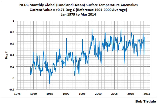
Figure 2 – NCDC Global (Land and Ocean) Surface Temperature Anomalies
UK MET OFFICE HADCRUT4 (LAGS ONE MONTH)
Introduction: The UK Met Office HADCRUT4 dataset merges CRUTEM4 land-surface air temperature dataset and the HadSST3 sea-surface temperature (SST) dataset. CRUTEM4 is the product of the combined efforts of the Met Office Hadley Centre and the Climatic Research Unit at the University of East Anglia. And HadSST3 is a product of the Hadley Centre. Unlike the GISS and NCDC products, missing data is not infilled in the HADCRUT4 product. That is, if a 5-deg latitude by 5-deg longitude grid does not have a temperature anomaly value in a given month, it is not included in the global average value of HADCRUT4. The HADCRUT4 dataset is described in the Morice et al (2012) paper here. The CRUTEM4 data is described in Jones et al (2012) here. And the HadSST3 data is presented in the 2-part Kennedy et al (2012) paper here and here. The UKMO uses the base years of 1961-1990 for anomalies. The data source is here.
Update (Lags One Month): The February 2013 HADCRUT4 global temperature anomaly is +0.30 deg C. See Figure 3. It plummeted (about +0.21 deg C) since January 2014, as the other two datasets did in February. But both of the other datasets showed a rebound in March.

Figure 3 – HADCRUT4
13-YEARS+ (158-MONTH) RUNNING TRENDS
As noted in my post Open Letter to the Royal Meteorological Society Regarding Dr. Trenberth’s Article “Has Global Warming Stalled?”, Kevin Trenberth of NCAR presented 10-year period-averaged temperatures in his article for the Royal Meteorological Society. He was attempting to show that the recent halt in global warming since 2001 was not unusual. Kevin Trenberth conveniently overlooked the fact that, based on his selected start year of 2001, the halt at that time had lasted 12+ years, not 10.
The period from January 2001 to February 2014 is now 158-months long—more than 13 years. Refer to the following graph of running 158-month trends from January 1880 to February 2014, using the HADCRUT4 global temperature anomaly product.
An explanation of what’s being presented in Figure 4: The last data point in the graph is the linear trend (in deg C per decade) from January 2001 to February 2014. It is basically zero. That, of course, indicates global surface temperatures have not warmed during the most recent 158-month period. Working back in time, the data point immediately before the last one represents the linear trend for the 158-month period of December 2000 to January 2013, and the data point before it shows the trend in deg C per decade for November 2000 to December 2013, and so on.

Figure 4 – 158-Month Linear Trends
The highest recent rate of warming based on its linear trend occurred during the 158-month period that ended about 2004, but warming trends have dropped drastically since then. There was a similar drop in the 1940s, and as you’ll recall, global surface temperatures remained relatively flat from the mid-1940s to the mid-1970s. Also note that the late-1970s was the last time there had been a 158-month period without global warming—before recently.
16-YEARS+ (201-Month+) RUNNING TRENDS
In his RMS article, Kevin Trenberth also conveniently overlooked the fact that the discussions about the warming halt are now for a time period of about 16 years, not 10 years—ever since David Rose’s DailyMail article titled “Global warming stopped 16 years ago, reveals Met Office report quietly released… and here is the chart to prove it”. In my response to Trenberth’s article, I updated David Rose’s graph, noting that surface temperatures in April 2013 were basically the same as they were in June 1997. We’ll use June 1997 as the start month for the running 16-year+ trends. The period is now 201-months long. The following graph is similar to the one above, except that it’s presenting running trends for 201-month periods.

Figure 5 – 201-Month Linear Trends
The last time global surface temperatures warmed at this low a rate for a 201-month period was about 1980. Also note that the sharp decline is similar to the drop in the 1940s, and, again, as you’ll recall, global surface temperatures remained relatively flat from the mid-1940s to the mid-1970s.
The most widely used metric of global warming—global surface temperatures—indicates that the rate of global warming has slowed drastically and that the duration of the halt in global warming is unusual during a period when global surface temperatures are allegedly being warmed from the hypothetical impacts of manmade greenhouse gases.
A NOTE ABOUT THE RUNNING-TREND GRAPHS
There is very little difference in the end point trends of 13+ year and 16+ year running trends if HADCRUT4 or NCDC or GISS data are used. The major difference in the graphs is with the HADCRUT4 data and it can be seen in a graph of the 13+ year trends. I suspect this is caused by the updates to the HADSST3 data that have not been applied to the ERSST.v3b sea surface temperature data used by GISS and NCDC.
COMPARISONS
The GISS, HADCRUT4 and NCDC global surface temperature anomalies are compared in the next three time-series graphs. Figure 6 compares the three global surface temperature anomaly products starting in 1979. Again, due to the timing of this post, the HADCRUT4 data lags the GISS and NCDC products by a month. The graph also includes the linear trends. Because the three datasets share common source data, (GISS and NCDC also use the same sea surface temperature data) it should come as no surprise that they are so similar. For those wanting a closer look at the more recent wiggles and trends, Figure 7 starts in 1998, which was the start year used by von Storch et al (2013) Can climate models explain the recent stagnation in global warming? They, of course found that the CMIP3 (IPCC AR4) and CMIP5 (IPCC AR5) models could NOT explain the recent halt in warming.
Figure 8 starts in 2001 which was the year Kevin Trenberth chose for the start of the warming halt in his RMS article mentioned and linked earlier. Because the suppliers all use different base years for calculating anomalies, I’ve referenced them to a common 30-year period: 1981 to 2010. Referring to their discussion under FAQ 9 here, according to NOAA:
This period is used in order to comply with a recommended World Meteorological Organization (WMO) Policy, which suggests using the latest decade for the 30-year average.

Figure 6 – Comparison Starting in 1979
###########

Figure 7 – Comparison Starting in 1998
###########

Figure 8 – Comparison Starting in 2001
AVERAGE
Figure 9 presents the average of the GISS, HADCRUT and NCDC land plus sea surface temperature anomaly products. Again because the HADCRUT4 data lags one month in this update, the most current average only includes the GISS and NCDC products.

Figure 9 – Average of Global Land+Sea Surface Temperature Anomaly Products
The flatness of the data since 2001 is very obvious, as is the fact that surface temperatures have rarely risen above those created by the 1997/98 El Niño. There is a very simple reason for this: the 1997/98 El Niño released enough sunlight-created warm water from beneath the surface of the tropical Pacific to permanently raise the temperature of about 66% of the surface of the global oceans by almost 0.2 deg C. Sea surface temperatures for that portion of the global oceans remained relatively flat until the El Niño of 2009/10, when the surface temperatures of the portion of the global oceans shifted slightly higher again. Prior to that, it was the 1986/87/88 El Niño that caused surface temperatures to shift upwards. If these naturally occurring upward shifts in surface temperatures are new to you, please see the illustrated essay “The Manmade Global Warming Challenge” (42mb) for an introduction.
MONTHLY SEA SURFACE TEMPERATURE UPDATE
The most recent sea surface temperature update can be found here. The satellite-enhanced sea surface temperature data (Reynolds OI.2) are presented in global, hemispheric and ocean-basin bases.
The most recent weekly data, presented in yesterday’s mid-April update, show that NINO3.4 sea surface temperature anomalies have not reached the threshold of an El Niño.
here is the reality: it’s the after effects for volanoes that caused the late 20th c. warming
http://climategrog.files.wordpress.com/2014/04/tropical-feedback_resp_ci.png?w=843
Detailed article on above in preparation but this excerpt shows how there was a net increase in the amount of radiation trapped in the lower atmosphere since Mt Pinatubo.
This is in agreement with the cooling of the stratosphere:
http://climategrog.wordpress.com/?attachment_id=902
That ladies, not CO2, was the cause of the “catastrophic” warming. And that is why, as Bob’s graphs show there has been no warming this century.
Glad you are at the boiler-plate! So very useful to have this material to hand. Big thanks for your work – especially the comparisons and reasons for differences.
Too funny. It’s not yet 6am where I live.
Haven’t finished my second cup of joe yet.
I sat here for about 2 minutes wondering why the National Center for Disease Control was compiling and publishing climate data.
Good for a morning laugh.
The IPCC remained silent about the 17.5 year global temperature pause until last year. Remember at the Climate Conference in 2012, Christopher Monckton brought it up during an open forum and was immediately thrown out of the conference.
The IPCC successfully kept their supporters in the dark for about 16 years. What I find disturbing is the lack of outcry from climate alarmists. No shock, no admonishment, no complaints, nothing but silence.
If I were an alarmist I would have been mad as hell. But instead we hear nothing. Wow.
It must be humiliating having to maintain the climate alarmist charade.
“The most recent weekly data, presented in yesterday’s mid-April update, show that NINO3.4 sea surface temperature anomalies have not reached the threshold of an El Niño”.
I thought an El Nino was pretty much going to happen.
Bob, you ask “So the question is, should I publish this monthly update about the 15th of each month, updating only the GISS data for the most current month, and with the NCDC and HADCRUT4 updates included, but their data lagging one month? ”
If I may make a suggestion. There are two other data sets; Christy and Spencer’s satellite data. These come out at the beginning of each month; not long after HAD/CRU from the previous month. Personally I would like to see a comparison between all 5 data sets, and I suggest that this could be done early in each new month, with the satellite data having one more month than the other three.
Kenny says: “I thought an El Nino was pretty much going to happen.”
It’s not showing itself yet in the surface temperatures of the equatorial Pacific. It’s still early.
Cheers.
Jim Cripwell says: “If I may make a suggestion. There are two other data sets; Christy and Spencer’s satellite data.”
TLT data are a totally different variable, which is why I haven’t included them. The primary difference is the oceans. The GISS, HADCRUT and NCDC data include sea surface temperature data. The TLT data, on the other hand, include the temperature of the atmosphere above the oceans, at altitudes of 0-12000 meters but focused on about 3000 meters. It’s not an apples-to-apples comparison.
The powers that be need more time to cook the books.
For me personally, Mr. Cripwell’s preference–namely to wait until all indexes are ready, including the satellite-bases ones. But perhaps the decision whether to accommodate that preference should depend on how intense the desire of the readership as a whole is to remain absolutely au courant.
I would publish while the data is hot…
Jim Cripwell: Disregard my earlier reply. I’ll prepare a post in a few days.
Bob Tisdale: “It’s not an apples-to-apples comparison.”
Granted. But your post above admirably rehearses the differences among the indexes you do show, so you would no doubt include something similar to draw readers’ attention to the difference between surface and lower-troposphere temperatures. And you could provide two cross-index averages in place the the single one of Fig. 9 above.
(Of course, this suggestion blithely ignores the cost in your now-reduced free time. So let me take this opportunity to thank you for your already much-appreciated efforts.)
Re the Trenberth repetitive hiatus argument:
It must be nice to be able to change your tune whenever it suits your cause and still maintain credibility with ones peers.
Rhetorical question: So what’s causing all these hiatuses if the CO2 keeps increasing and the CO2 sensitivity is so high and the positive “feedback” is so onerous?
Something other than AGW obviously; enough to counteract the alarming increases from AGW.
But back in the 90’s, after a few short years of T increases, Trenberth was very satisfied to let his colleagues rule out a myriad of other causes if those T increases could be blamed on AGW.
I’m not sure who detracts most from the credibility of the alarmist arguments: Trenberth or Gore?
My vote would be to condense all this info into a reference page like the sea-ice page and remove it from the main topics thread entirely, but give annual or semi-annual reviews.
If a fall of 0.21 deg C in HadCRUT4 between January and February means the temperature “plummeted”, then how come a rise of 0.25 deg C in GISS between February and March is merely an “increase”?
Surely more florid phraseology is called for. How about “shot up”, or “rocketed”?
Re:
SCheesman says:
April 23, 2014 at 6:21 am
My vote would be to condense all this info into a reference page like the sea-ice page and remove it from the main topics thread entirely, but give annual or semi-annual reviews.
Good idea, but a monthly “Call out” to the reference page would be welcome as it is updated.
If “Climate Medals” are ever to be awarded, Watts & Tisdale deserve them in multiple iterations!
“So the question is, should I publish this monthly update about the 15th of each month, updating only the GISS data for the most current month, and with the NCDC and HADCRUT4 updates included, but their data lagging one month?”
– – – – – – –
Bob Tisdale,
Publishing as each occurs is nice, but it taxes your time and energy . . . . so whatever you decide is good.
John
Bob Kutz says:
I sat here for about 2 minutes wondering why the National Center for Disease Control was compiling and publishing climate data.
—————————-
Mission creep. It’s what governments do.
Figure 6 shows that between 1979 and the present surface temperatures warmed at a rate of ~0.15 deg C/dec. Figure 7 shows the same data since 1998, since when the warming rate has fallen to ~0.05 deg C/dec; about a third as fast as the long term trend.
Most of the warming over the whole period must have occurred between 1979 and 1997. The average warming rate over that period was 0.13 deg C/decade. That’s pretty fast, but consider again the long term rate: 0.15 deg C/dec. It’s faster.
The rate of warming per decade between 1979 and the present is faster than the rate of warming per decade between 1979 and 1997, when most of the warming of the past +35 years occurred.
Is this just a statistical artefact of some sort or does it illustrate the hazards of using relatively short periods (less than 2 decades) to draw conclusions about longer term trends?
Klem,
What you have to keep in mind is that climate change/global warming was never about real science for most of its advocates. It was an ideology, not science. It’s the reason many of them were able to turn their belief of 1970s global cooling into 1990s global warming without any embarrassment either.
The ideology is this: the belief that the actions of MAN affects the environment in a negative way. This ideology attracts people from all over the left wing spectrum, from outright socialists (who seem to dominate the issue now) to moderate liberals, etc. It’s the reason the only solution they’ll accept is one where we surrender freedom to government control. First they believed that a growing population could not keep up with food supply (an issue, repeatedly discredited over past century, that seems to be making a comeback among these idiots); then they believed pollution would block sun, thus, making world cooler (1970s); then they believed hole in ozone layer was caused by pollution, would continue until we were all dead never entertaining possibility that it was natural (1980s); then they believed world was warming, would continue to warm, and we were all doomed (1990s); then it was climate change and weird weather (now).
It doesn’t matter what is happening, it is society which is causing it. There is no actual fear on the part of the left because it is not about facts or science at all. It’s an ideology. When disproved, AGW will just morph into something else.
As proof they will cite the “certainty” of self-selected “experts,” just as they always have. Failure to heed their warnings always leads to imminent doom.
Col Mosby says
“…. there’s not SUPPOSED to be any fall between January and February, January being a colder month, there should have been an INCREASE, and alternatively, there’s SUPPOSED to be an increase between February and March”.
Your comment is only true for the northern hemisphere; it’s the opposite in the southern hemisphere, and these *global* figures. Global February anomalies have been lower than January for 6 out of the past 10 years according to GISS.
Noting the obvious: the main temperature satellite datasets start in 1979 because that was the coldest year in about a century? So all slopes are up, up, up from there?
Greg Goodman:
Only in the tropics? I’m not seeing it on Wood for Trees plots I’ve been playing with:
HADCRUT4 tropics + HADSST3 sea surface 1986-2001
HADCRUT4 tropics + HADSST3 sea surface 2001-2014
Thanks Bob. Very useful and interesting as always.
“TLT data are a totally different variable, which is why I haven’t included them. The primary difference is the oceans. The GISS, HADCRUT and NCDC data include sea surface temperature data. The TLT data, on the other hand, include the temperature of the atmosphere above the oceans, at altitudes of 0-12000 meters but focused on about 3000 meters. It’s not an apples-to-apples comparison.”
In my opinion, the TLT data are the most useful in determining the trends in atmospheric “warming”. However, I would imagine that the NCDC, HADCRUT, and GISS (ugh) data sets would show similar trends. So I feel it would be useful to show both in the interest of completeness, but plotting the satellite data separately as they are fundamentally different data sets.
DavidR says: “Your comment is only true for the northern hemisphere; it’s the opposite in the southern hemisphere, and these *global* figures. Global February anomalies have been lower than January for 6 out of the past 10 years according to GISS.”
The January anomalies are compared to the average of the January values during the base years. Same thing with Februarys. The February anomalies are compared to the average of the February values during the base years. So there should be little seasonal component in the anomalies.
Also, where’s Col Mosby’s comment, the one you quoted?
Can anyone show how much these indexes are affected by the temperature “adjustments” that Steve Goddard keeps reporting?
Thanks Bob.
————–
Steven Goddard put up a post on the 21st linking to the Guardian and a short note by Kate R. – the funny part is a photo of the Namibian Skelton Coast under which it says “hot sea meets hot land” and no indication she has ever heard of the Benguela Current.
The not so funny part is the interpretation in the text (taken from NcNeall and Palmer of the Hadley Centre; ref. article in ERL) and from Matthew England et al. (NCC, 14 Feb.) explaining why surface temperatures are not rising: “… some unusually strong trade winds in the Pacific Ocean, which have buried the surface heat deep underwater, reducing the amount of heat flowing back into the atmosphere. Once the trade winds relax again that heat will likely be released and surface temperatures will bounce up again.”
As I read this, she or they are expecting the Pacific Ocean to soon disgorge all the CO2 heating that is not currently being registered in the atmosphere (“the pause”). The phrase “unusually strong trade winds” suggests they are still looking for their deus ex machina.
nutso fasst says:
Greg Goodman:
it’s the after effects for volcanoes that caused the late 20th c. warming
Only in the tropics? I’m not seeing it on Wood for Trees plots I’ve been playing with:
HADCRUT4 tropics + HADSST3 sea surface 1986-2001
HADCRUT4 tropics + HADSST3 sea surface 2001-2014
====
I did not say “only in the tropics” but the plots I linked are tropics for two reasons. Firstly the ERBE data outside tropics has too many breaks, so I put it to one side. Second, the tropics are what is all important for incoming energy and are where the climate feedbacks are strongest.
TLS temp graph is global not tropics only.
The thing is with the cumulative integral is we see a continuous _extra_ flux of external power ( about 1 W/m2 entering the system that kicked in 2 months after Mt P went upwards. And this is nothing to do with CO2.
http://climategrog.files.wordpress.com/2014/04/tropical-feedback_resp_ci.png?w=843
I’ve shown before that tropics are almost immune to changes in radiative forcing. If they take a hit they just make up for it a couple of years later until they fill the deficit. Extra-tropics do take a hit, then stabilise at their previous temperature but without making up the lost growth years by being warmer.
http://climategrog.wordpress.com/?attachment_id=285
This 1 W/m2 is solar, a lot of it deep penetrating shorter wavelengths. It seems to build up and then get burped out and spread by El Nino events.
It is the TLS graph that is the main clue. This clearly shows it is tied to the two major eruptions, not a slow build up due to CO2 et cie.
In the Vancouver Province newspaper today, I read an article about how March 2014 was globally, the hottest on record. Up 0.7 deg C. North America was down on average by 0.5 deg C. Not sure if they included Mexico in North America’s average temp. They only mention Can/USA .
The graph showing a straight line starting in 1979 increasing to the right …. IPCC and in particular, Trenberth are so fundamentally deceiving / disingenious / dishonest in daring to show this with a straight face. Did they did take math and science in high school?
So the question is, should I publish this monthly update about the 15th of each month, updating only the GISS data for the most current month, and with the NCDC and HADCRUT4 updates included, but their data lagging one month?
What has happened so far this month in terms of global updates include the following:
April 3 I had a post on February data for 6 data sets however it was later than usual since Hadcrut3 and 4 were extremely late for February.
April 5, Lord Monckton had an RSS update.
April 7, the UAH update appeared.
April 10, Lord Monckton combines a post with UAH and RSS.
April 23, you have a post on GISS and NCDC for March but Hadcrut4 for February.
April 30?? I expect to have a post on 6 data sets for March whenever the Hadcrut3 and 4 data come out.
So here is my opinion. While the three of us talk about slightly different things in terms of these global data sets, we complement each other very nicely by giving the latest information we have. So keeping things slightly spread out over the month is the best way to keep things current on at least one data set. At the same time, brand new readers would not have to read for too long before becoming aware of the pause in one form or another.
It is certainly not my intention to tell anyone what to do, but since you asked the question, I would say that either doing GISS on the 15th or both GISS and NCDC on the 22nd would be equally good in terms of spreading certain things out.
Cheers
Thank you. I appreciate your efforts.
Werner Brozek: So keeping things slightly spread out over the month is the best way to keep things current on at least one data set. At the same time, brand new readers would not have to read for too long before becoming aware of the pause in one form or another.
Thank you. I had in mind a similar comment but suppressed it. As long as there are fairly regular posts, the timing of each does not matter. This is a long duration game.
Fantastic!! Shows exactly what statistics can be used for!
Average GLOBAL temperature anomalies are reported on the web by NOAA, GISS, Hadley, RSS, and UAH, all of which are government agencies. The first three all draw from the same data base of surface and near surface measurement data. The last two draw from the data base of satellite measurements. Each agency processes the data slightly differently from the others. Each believes that their way is most accurate.
Hadley is always the last, publishing about a month after the last day of the data. NOAA has been next slowest and now they are taking another week.
Also, the random scatter is huge and biases exist because of methodology, area covered, etc. My suggestion, to avoid bias and minimize being misleading, is to apply offsets and average all five with noted offsets and period covered by each agency, similar to the graph at http://endofgw.blogspot.com/
No offence I admire Mr Tisdales efforts but he keeps using c@@@ data from GISS, hadcrut contaminated adjusted data please read the climate gate emails. You continue to feed the warmist climate trolls by using this data. It is utterly unreliable even though it is showing cooling because they cannot now continue the lie. LOL to be taken with a grain of salt please! The ONLY reliable surface temperature data (in my personal view) is most likely CET and Argmagh (rural stable and very ancient) it SHOWS NOTHING! recent satellite data RSS and AMSU shows NOTHING as well (no warming of any description)
C02 (human or otherwise) does not have ANY effect of Earth temperatures due to overwhelming negative feedbacks refer to Lindzen etc. If it did we would have disappeared a long time ago LOL
…
I don’t want to scare you but it is worse than you think.
I think the global data sets are being cooked.
My own data set seems to agree (with some other data sets) over the past 35 years of a warming rate of about + 0.014C/annum
look at the 2nd table on means, here,
http://blogs.24.com/henryp/2013/02/21/henrys-pool-tables-on-global-warmingcooling/
but is showing significant cooling from 2000, of -0.017C/annum.
now my tables run up to 2012, i.e dec. 2011
I have started to add 2012 and 2013 now, and I am stunned to find that much more cooling has set in. Global cooling is now at a rate of more than -0.02C/annum, that is -0,2C/decade.
So my data set on global surface temperature is telling me that we already dropped more than -0.25K globally since 2000……and we are still accelerating downwards.
Eliza says: “No offence I admire Mr Tisdales efforts but he keeps using c@@@ data from GISS, hadcrut contaminated adjusted data please read the climate gate emails. You continue to feed the warmist climate trolls by using this data.”
I disagree, Eliza. The data do not support the hypothesis of human-induced global warming, so I can’t see how I’m feeding trolls.
Cheers.
“” ponysboy says:
April 23, 2014 at 5:53 am
Rhetorical question: So what’s causing all these hiatuses if the CO2 keeps increasing and the CO2 sensitivity is so high and the positive “feedback” is so onerous? “”
Indeed this is the million dollar question.
It has been avoided by a million alarmists.
It is hard to den-eye the obvious LACK of correlation.
You get the same response from a lot of balanced, right thinking open minded types. The IPCC answer is that manmade warming / forcings continue unabated but natural variations are masking it. Amazing isn’t it, for 16 years natural variations have been canceling out a growing warming forcing from manmade causes resulting in the hiatus. How convenient as someone once said…