UPDATE (April 6, 2014): I’ve added a link to a follow-up post about the cause of the observed C-shaped warming pattern in the Pacific.
# # #
The climate models stored in the CMIP5 archive are supposed to be simulations of Earth’s climate, but the simulated sea surface temperatures of the models used by the IPCC for their 5th Assessment Report are definitely not of this planet. 70% of the Earth is covered by oceans, seas and lakes. Because the models show no skill at being able to simulate the rates of warming and cooling of the surfaces of the global oceans over the past 32+ years, and because the models show no skill at being able to reproduce the spatial patterns of that warming and cooling, all of which drive temperature and precipitation patterns on land, then any and all projections of future climate are based on modeled worlds that have no similarity to the real world. In other words, climate model projections are meaningless.
This post will serve as the model-data comparison for satellite-era sea surface temperature anomalies for this year. This is an expanded version. It provides a couple of answers for why the models perform so poorly when attempting to simulate the surface temperatures of the global oceans.
PRELIMINARY INFORMATION
The Reynolds OI.v2 sea surface temperature anomalies through the NOAA NOMADS website are referenced to the base years of 1971-2000, even though the data only runs from November 1981 to February 2013. The same base years are used for the model outputs.
The climate models presented in this post are those stored in the CMIP5 archive, which was used by the IPCC for their 5th Assessment Report (AR5). The CMIP5 climate model outputs of sea surface temperature are available through the KNMI Climate Explorer, specifically through their Monthly CMIP5 scenario runs webpage, under the heading of Ocean, ice and upper air variables. Sea surface temperature is identified as “TOS” (temperature ocean surface). For consistency, the “CMIP5 mean” and the RCP6.0 scenario are being used. The RCP6.0 scenario is the closest to scenario A1B used for the CMIP3 models (used by the IPCC for the 4th Assessment Report). And once again we’re using the model mean because it represents the forced component of the climate models; that is, if the forcings used by the climate models were what caused the surfaces of the oceans to warm, the model mean best represents how the ocean surfaces would warm in response to those forcings. For a further discussion, see the post On the Use of the Multi-Model Mean.
The data as suggested above are the Reynolds OI.v2 satellite-enhanced sea surface temperature anomalies, which are available through the NOAA NOMADS website here.
The model-data comparisons in this post run from the November 1981 start of the Reynolds OI.v2 data to February 2014, more than 32 years.
The linear trends in the graphs are as calculated by EXCEL. And the trend maps were produced at the KNMI Climate Explorer.
TREND MAPS
Figure 1 presents maps of the modeled and observed warming and cooling rates of the surfaces of the global oceans for the period of 1982 to 2013. The color-coded contour levels are presented in deg C/year. The model mean is presented in the left-hand map and the observed warming rates are presented in the right-hand one. There are no similarities between the spatial patterns of the modeled and observed trends. The models show the greatest warming near the equator, while in the real world, the greatest warming has occurred at mid and high latitudes. The North Atlantic in the real world warmed at the highest rate. That warming of the North Atlantic is associated with the Atlantic Multidecadal Oscillation.
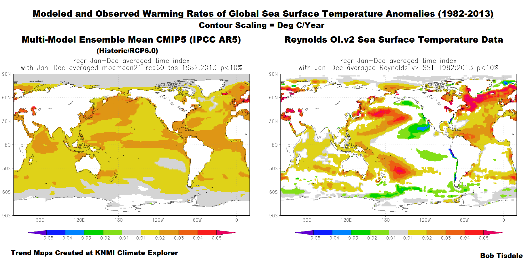
Figure 1
The model mean does not present that additional warming in the North Atlantic, which indicates that the recent additional warming of the North Atlantic has occurred naturally; that is, the Atlantic Multidecadal Oscillation is not a process forced by factors that are used to make the oceans warm in the models. We’ll discuss and illustrate this later in this post.
The observed C-shaped pattern of warming in the Pacific is the result of the dominance of El Niño events during this period. El Niño events release sunlight-produced warm water from below the surface of the western tropical Pacific. That warm water temporarily floods into the eastern tropical Pacific, primarily along the equator, during El Niño events. At the end of the El Niños, the leftover warm water is driven west by the renewed trade winds and by other ocean processes. The leftover warm water collects in the Kuroshio-Oyashio Extension (east of Japan) and along the South Pacific Convergence Zone (east of Australia and New Zealand). As a result of that process, the observed sea surface temperatures of the East Pacific Ocean (from the dateline to Panama) and of the tropical Pacific (24S-24N, 120E-80W) show little to no warming in over 32 years. Because the climate models do not properly simulate El Niño and La Niña events, they do not create the spatial pattern of warming and no warming in the Pacific. Keep in mind, the Pacific Ocean covers more of the surface of the Earth than all of the continental land masses combined, and the modelers show no skill at simulating how and where or why the surface of the Pacific Ocean warmed.
UPDATE: See the follow-up post El Niño Residuals Cause the C-Shaped Warming Pattern in the Pacific for a further discussion.
[End of Update]
The spatial patterns of the warming of the ocean surfaces dictate the spatial patterns of warming of the surface air temperatures over land, and those sea surface temperature spatial patterns contribute to the precipitation patterns on the continents. Because the climate models cannot simulate the spatial patterns of the warming of sea surface temperatures, one wonders how the modelers expect to properly simulate the warming of land surface air temperatures or the precipitation that occurs there.
GLOBAL TIME-SERIES
Figure 2 presents the model-data comparison for global satellite-era sea surface temperature anomalies. The data show the oceans warmed at a rate of 0.08 deg C/decade for the last 32+ years, but the models indicate they should have warmed at twice that rate if they were warmed by manmade greenhouse gases.
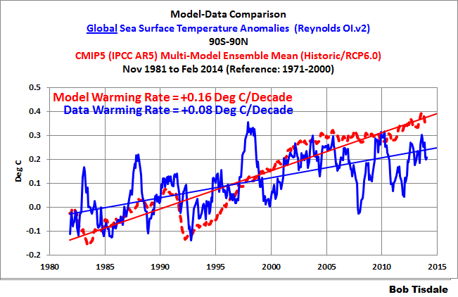
Figure 2
Phrased another way, manmade greenhouse gases in the climate models were expected to warm the surfaces of the global oceans at a rate of 0.16 deg C/decade for the past 32+ years, but the observed warming was only 0.08 deg C/decade. That’s an atrocious modeling effort. Now consider that this time period includes naturally occurring upswings in the surface temperatures of the North Atlantic and North Pacific (see the post here) and you’ll begin to understand the full extent of the model failings.
We could end the post on those notes, but let’s examine the models in more detail to see how else they fail.
TRENDS ON A ZONAL-MEAN (LATITUDE-AVERAGE) BASIS PER OCEAN BASIN
Figures 3, 4 and 5 are model-data trend comparisons of sea surface temperature anomalies for the Pacific, Atlantic, and Indian Oceans, respectively. But they aren’t time-series graphs. Looking from left to right along the horizontal (x) axis, “-90” represents the South Pole, “0” the equator, and the North Pole is at “90”. The units of the vertical (y) axis are degrees C per decade—based on the calculated linear trends. Each data point represents the linear trend (warming or cooling rate) in degrees C per decade for a 5 degree latitude band, where, for example, the data point at -82.5 (82.5S) latitude represents the linear trend of the high latitudes of the Southern Ocean surrounding Antarctica (85S-80S). The data points representing the trends then work northward in 5 degree increments through each of the ocean basins (80S-75S, then 75S-70S, then 70S-65S, and so on) using the longitudes for each ocean basin. The average temperatures of latitude bands are called the “zonal mean” temperatures by climate scientists; thus the use of that term in the title blocks.
Figure 3 shows the observed and modeled sea surface temperature trends for the Pacific Ocean (longitudes of 125E-90W) on a zonal-mean basis. At and near the equator, observed sea surface temperatures cooled since January 1982. And the highest observed warming in both hemispheres occurred at the mid-latitudes in the Pacific. The models, unfortunately, do not create that spatial pattern. The models show much more warming in the tropics than observed. The models also overestimate the warming at the high latitudes of the North Pacific and they show warming in the Pacific portion of the Southern Ocean, while the observations show cooling there over the past 32+ years.
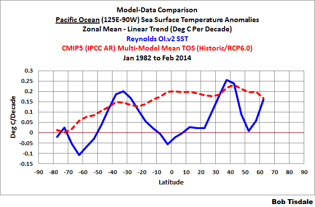
Figure 3
How can climate scientists/modelers hope to simulate the patterns of warming on land when they can’t simulate the warming patterns of the largest ocean on this planet?
What causes the mid-latitudes to warm, while the tropics show little warming?
Short answer: El Niño and La Niña processes.
Longer answer: The observed warming trends at mid-latitudes, with no warming near the equator, suggest warm water was distributed poleward in both hemispheres by ocean currents. That happens in the Pacific when El Niño events dominate, which was the case during this period. That is, a period during which El Niño events dominate causes the additional distribution of warm water toward the mid-latitudes. Refer to Figure 4, which is a comparison of Pacific trends on a zonal-mean basis for the periods of 1944 to 1975 and 1976 to 2011. It’s Figure 8-32 from my ebook Who Turned on the Heat? From 1944 to 1975, El Nino and La Niña events were more evenly matched, but slightly weighted toward La Niña. During that period, less naturally (sunlight) created warm water was released from below the surface of the tropical Pacific by El Niños and distributed toward the poles. But from 1976-2011, El Niño events dominated, so more warm tropical waters were distributed from below the surface of the tropical Pacific to the mid-latitudes. I’ve highlighted the differences between the two periods.
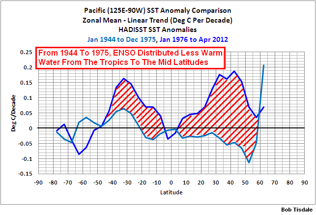
Figure 4
Figure 5 shows the modeled and observed trends in sea surface temperature anomalies for the Atlantic Ocean (longitudes 70W-20E) from Jan 1982 to February 2013. The models overestimate the warming in the South Atlantic and underestimate it North Atlantic, especially towards the high latitudes. In fact, the models show just about the same warming trends from 40S to 70N—that is, the models show the Atlantic Ocean should have warmed at about 0.15 to 0.2 deg C/decade for the last 32+ years for the latitudes of 40S to 70N—while the observed trends change greatly over those latitudes. Again, how can the climate scientists/modelers hope to create the warming patterns on adjoining land masses when they can’t simulate the warming pattern of the Atlantic?
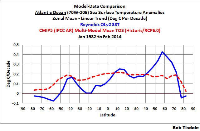
Figure 5
The last of the trend graphs on a zonal-mean basis is for the Indian Ocean, Figure 6. The models, basically, show way too much warming at most latitudes.
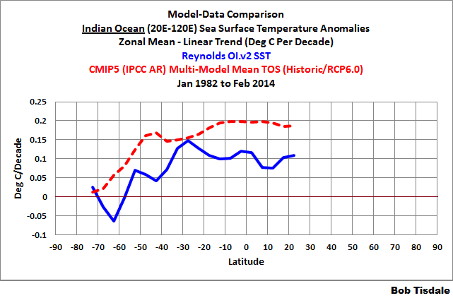
Figure 6
TIME SERIES – TROPICAL AND EXTRATROPICAL SEA SURFACE TEMPERATURE
In the past model-data comparisons of satellite-era sea surface temperatures (see the posts here and here), I’ve compared the data and model outputs for the Northern and Southern Hemispheres. For this post, I’ve divided the global data into three subsets: the tropical oceans (24S-24N), and the extratropical oceans of the Northern Hemisphere (24N-90N) and the Southern Hemisphere (90S-24S).
The reason: In June of 2013, Roy Spencer presented model-data comparisons of the warming of the tropical mid-troposphere prepared by John Christy. See Roy’s posts EPIC FAIL: 73 Climate Models vs. Observations for Tropical Tropospheric Temperature and STILL Epic Fail: 73 Climate Models vs. Measurements, Running 5-Year Means. The models grossly overestimated the warming rates of the mid-troposphere there. So I thought it would be worthwhile, since the tropical oceans (24S-24N) cover 76% of the tropics and about 46% of the global oceans, to confirm that the models also grossly overestimate the warming of sea surface temperatures of the tropical oceans.
It should come as no surprise that the models did overestimate the warming of the sea surface temperatures of the tropical oceans over the past 32+ years. See Figure 7. In fact, the models overestimated the warming by a wide margin. The data indicate the sea surface temperatures of the tropical oceans warmed at a not-very-alarming rate of 0.06 deg C/decade, while the models indicate that, if the surfaces of the tropical oceans were warmed by manmade greenhouse gases, they should have warmed at 3 times that rate, at 0.19 deg C/decade. For 46% of the surface of the global oceans (about 33% of the surface of the planet), the models tripled the observed warming rate.
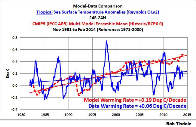
Figure 7
For the extratropical oceans of the Southern Hemisphere (90S-24S), Figure 8, the observed warming rate is also extremely low at 0.06 deg C/decade. On the other hand, the climate models indicate that if manmade greenhouse gases were responsible for the warming of sea surface temperatures in this region, the oceans should have warmed at a rate of 0.12 deg C/decade, effectively, doubling that observed trend. The extratropical oceans of the Southern Hemisphere cover about 33% of the surface of the global oceans (about 23% of the surface of the planet) and the models double the rate of warming.
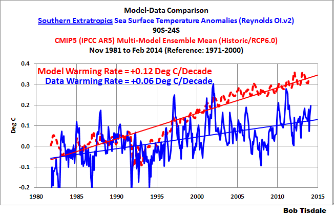
Figure 8
And the climate models seem to get the warming rate of sea surface temperatures just about right for the smallest portion of the global oceans, the extratropical Northern Hemisphere (24N-90N). See Figure 9. The extratropical oceans of the Northern Hemisphere cover only about 21% of the surface of the global oceans (about 15% of the surface of the Earth).
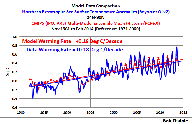
Figure 9
Unfortunately for the modelers, they underestimated the warming of the surface of the extratropical North Atlantic (Figure 10), and overestimated the warming in the extratropical North Pacific (Figure 11), though the differences are not bad compared to what we’ve seen elsewhere.
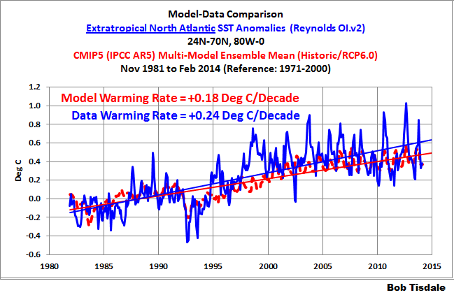
Figure 10
# # # # # # #
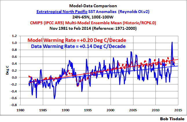
Figure 11
TIME SERIES – ATLANTIC OCEAN
Figure 12 presents the model-data comparison of the sea surface temperature anomalies for the Atlantic Ocean. They do a reasonable job here. The modeled warming rate is slightly more than the observations. In fact, of the three major ocean basins, the models perform best in the Atlantic.
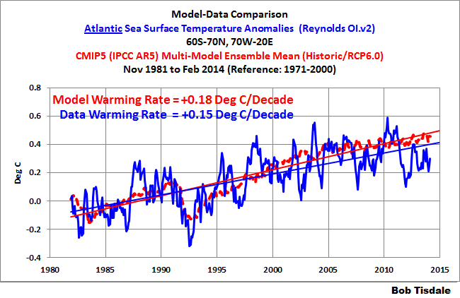
Figure 12
But the models accomplish it incorrectly. They underestimate the warming of the North Atlantic (Figure 13) by a little, but overestimate the warming of sea surface temperatures in the South Atlantic (Figure 14) by a huge margin.
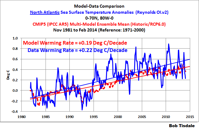
Figure 13
# # # # # # #
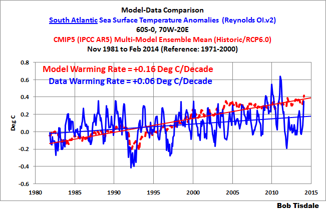
Figure 14
TIME SERIES – PACIFIC OCEAN
Figure 15 is the model-data comparison for the sea surface temperatures of the largest ocean on our planet, the Pacific. The models more than double (almost triple) the warming rate for the surface of the Pacific Ocean.
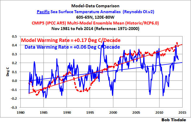
Figure 15
The models perform poorly in the North Pacific (Figure 16) and in the South Pacific (Figure 17), more than doubling the observed warming rates.
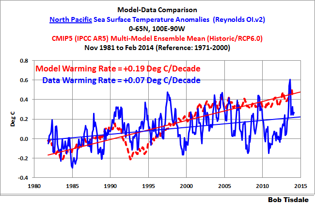
Figure 16
# # # # # # #
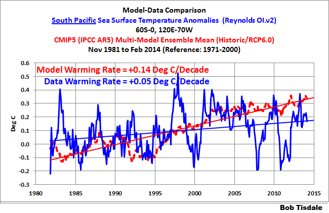
Figure 17
Let’s confirm a few things that were blatantly obvious in the trend maps in Figure 1.
The model-data comparison for the tropical Pacific (24S-24N, 120E-80W) is shown in Figure 18. The surface of the tropical Pacific shows basically no warming in 32+ years. According to the models, if manmade greenhouse gases were responsible for the warming of the surface of the global oceans, the tropical Pacific should have warmed at a rate of 0.18 deg C/decade, but the tropical Pacific hasn’t warmed.
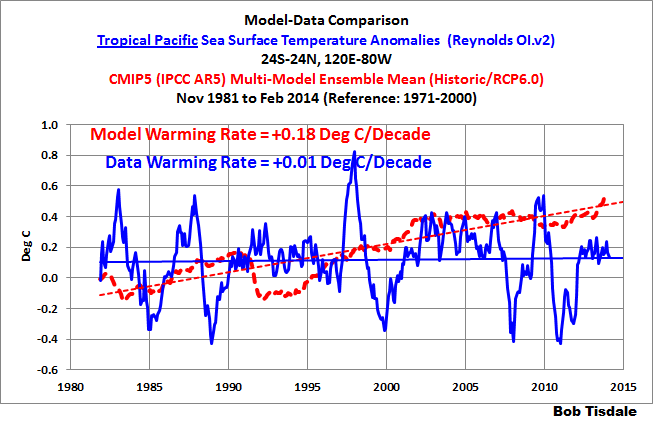
Figure 18
The last of the Pacific subsets is the East Pacific, Figure 19. For this comparison, I’ve extended the coordinates into the Southern and Arctic Oceans. With the coordinates of 90S-90N, 180-80W, the East Pacific covers about 33% of the surface of the global oceans. It too, basically, shows no warming in 32+ years. This contradicts the models, which indicate that the surface of the East Pacific should have warmed at a rate of about 0.15 deg C/decade…if they were warmed by manmade greenhouse gases.
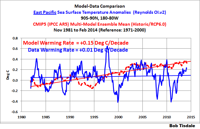
Figure 19
Not too mysteriously, manmade greenhouse gases have had little impact on two (overlapping) portions of the largest ocean on the planet.
TIME SERIES – INDIAN OCEAN
The models also performed poorly at simulating the warming rate of the sea surface temperatures of the Indian Ocean, Figure 20. The models almost double the warming rate there.
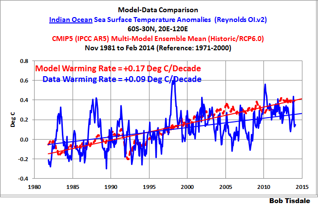
Figure 20
TIME SERIES – POLAR OCEANS
Figure 21 is the model-data comparison of the sea surface temperatures of the Arctic Ocean. The models captured the warming rate of the Arctic Ocean sea surface temperatures reasonably well.
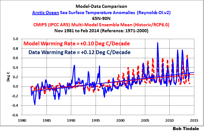
Figure 21
At the other end of the globe, the models failed miserably. The models indicate that the surface of the Southern Ocean (Figure 22) should have warmed over the past 32+ years, but the sea surface temperatures there cooled in that time.
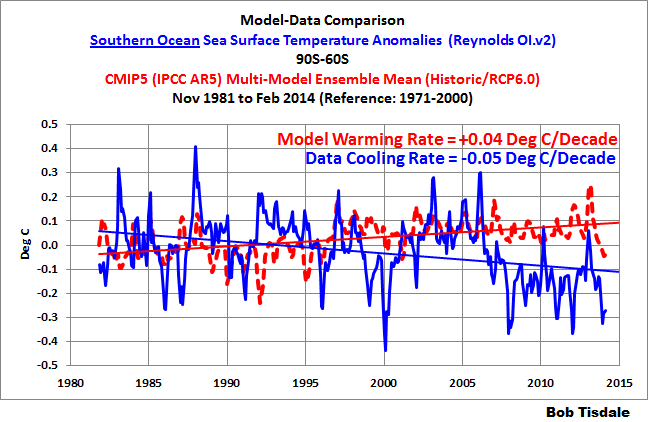
Figure 22
TABLE
Table 1 presents the observed and modeled linear trends for the sea surface temperature subsets presented in the post, for the period of November 1981 to February 2014. I’ve also included the differences between the modeled and observed trends and the differences as a percentage of the observed trends. [Difference as a Percentage of Observed = ((Model Trend – Obs. Trend)/Obs. Trend)*100]. Click on Table 1 for a full-sized version.
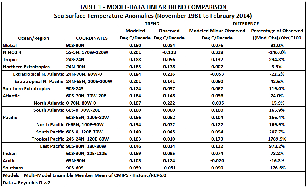
Table 1
MODELERS’ FOCUS
The models perform best in the extratropical oceans of the Northern Hemisphere, in the North Atlantic and in the Arctic Ocean. The modelers’ focus is pretty obvious. They’ve tried to get the models to simulate the warming of the Arctic Ocean so that they could melt sea ice, and they’ve tried to better capture the warming of sea surface temperatures at latitudes with the most land (extratropical Northern Hemisphere. See the graph here.) so that they could better simulate the Northern Hemisphere land surface air temperature anomalies, which would also be necessary if they wanted to melt Arctic sea ice. Figures 23 and 24 confirm a part of that.
Figures 23 and 24 are model-data comparisons of land surface air temperature anomalies from November 1981 to December 2013. Again, we’re using the multi-model ensemble mean of the climate models stored in the CMIP5 archive. And for the data, they’re the Berkeley Earth Surface Temperature (land surface air temperature) anomalies. Both are referenced to the period of 1961-1990 for anomalies. The models perform very well at simulating the warming rate of the land surface air temperatures in the Northern Hemisphere (Figure 23), but overestimate the warming of land surface air temperatures in the Southern Hemisphere by a wide margin (Figure 24).
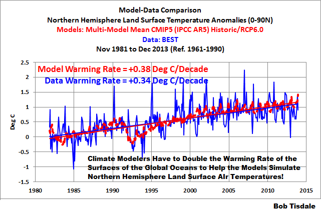
Figure 23
# # # # # # #
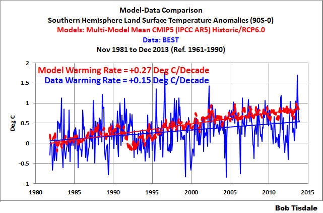
Figure 24
THE ATLANTIC MULTIDECADAL OSCILLATION IS NOT A FORCED COMPONENT OF THE CLIMATE MODELS
The North Atlantic has an additional mode of natural variability called the Atlantic Multidecadal Oscillation. We’ve discussed it in numerous posts over the past few years. (See the posts under the category of Atlantic Multidecadal Oscillation here.) If you’re not familiar with the Atlantic Multidecadal Oscillation see the NOAA Frequently Asked Questions About the Atlantic Multidecadal Oscillation (AMO) webpage and the posts:
- An Introduction To ENSO, AMO, and PDO — Part 2
- Multidecadal Variations and Sea Surface Temperature Reconstructions
Over some multidecadal periods, the sea surface temperatures of the North Atlantic warm faster than the rest of the global oceans, and during other multidecadal periods, the North Atlantic sea surface temperatures warm slower than the rest of the global oceans and can cool dramatically. For the period of November 1981 to February 2014, the sea surface temperatures of the North Atlantic were on one of their naturally occurring upswings.
In the real world, the sea surface temperatures of the North Atlantic warmed naturally at a much faster rate than the rest of the global oceans. See Figure 25. To determine the data for the rest of the global oceans, it was assumed that the North Atlantic represents 11.5% of the surface of the global oceans, and the scaled North Atlantic data was then subtracted from the global data. (For the percentage, see the NOAA GCDC webpage here.) As shown, the sea surface temperatures of the North Atlantic warmed at a rate that was more than 3.5 times faster than surface of the rest of the global oceans.
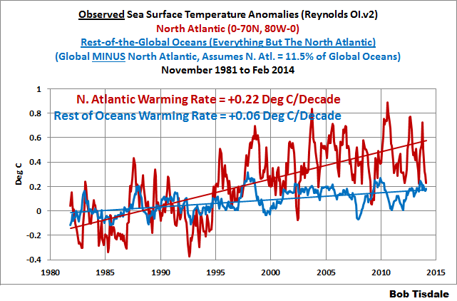
Figure 25
But in the modeled world, where they likely try to account for the additional warming of North Atlantic by jockeying aerosols around the globe, the modeled sea surface temperatures of the North Atlantic warmed at a rate that was only slightly higher than the rest of the global oceans. See Figure 26.
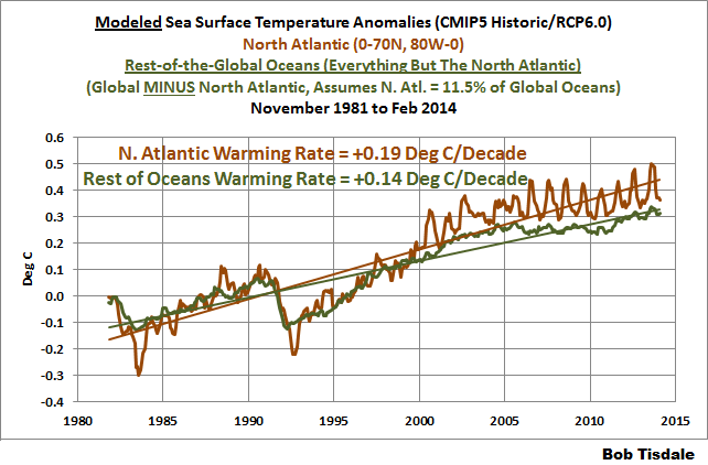
Figure 26
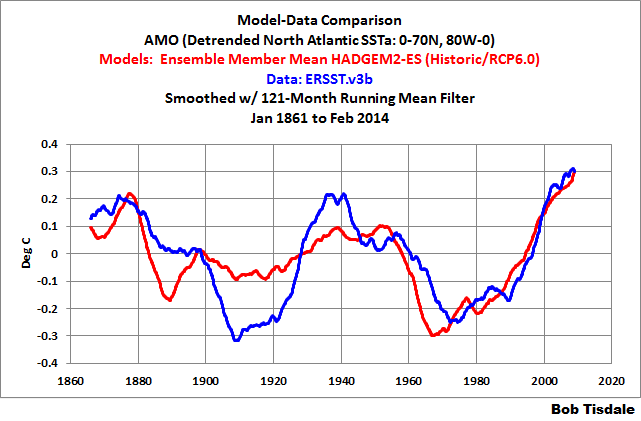
(I’ll try to head off an argument: The title of Booth et al. (2012) Aerosols implicated as a prime driver of twentieth-century North Atlantic climate variability explains their findings. Refer to the discussion of Booth et al. (2012) under the heading of ON THE HADGEM2-ES AMO SIMULATION in the post here. The HADGEM2-ES model used by Booth et al. (2012) does a pretty poor job of simulating the AMO as shown in the illustration here from that post. Booth et al. also failed to account for a couple of other factors that drive the Atlantic Multidecadal Oscillation.)
There are a number of ways to present the Atlantic Multidecadal Oscillation. The NOAA ESRL simply detrends the North Atlantic sea surface temperature anomalies. That’s the most common way. Another way: Trenberth and Shea (2006) subtracted global sea surface temperature anomalies, excluding the polar oceans (60S-60N), from sea surface temperature anomalies of the North Atlantic (0-60N, 80W-0). That method accounts for the additional variability of the North Atlantic data above the variations in the global data. Unfortunately, the North Atlantic is included in the global data so they’re subtracting a portion of the North Atlantic from itself, and that becomes a problem in the early part of the data. Sea surface temperature data sampling is best in the North Atlantic, especially in the 1800s and early 1900s, so a greater portion of the global data is from the North Atlantic then.
Ideally, because we’re interested in the additional variations of the North Atlantic sea surface temperatures above and beyond the rest of the global oceans, those are the two datasets that should be used to determine the Atlantic Multidecadal Oscillation. That is, the Atlantic Multidecadal Oscillation should be calculated as the North Atlantic data minus the data for the rest of the global oceans. Again, for long-term evaluation, it presents the problem when there is little source data for the rest of the global oceans (in the early part of the datasets), but at least we’re not subtracting a portion of the North Atlantic data from the North Atlantic data.
So, based on that discussion, the modeled and observed satellite-era Atlantic Multidecadal Oscillation (AMO) data are shown in Figure 27, where the short-term AMO is determined by subtracting the data (and model outputs) for the rest of the global oceans from the North Atlantic data (and model outputs). And once again, the data (and model outputs) for the rest of the global oceans were determined by subtracting the scaled North Atlantic data (and model outputs) from the global value (the same method for the rest of the global oceans shown in Figures 25 and 26). As shown in Figure 27, the models do not capture the additional natural warming of the North Atlantic associated with the Atlantic Multidecadal Oscillation.
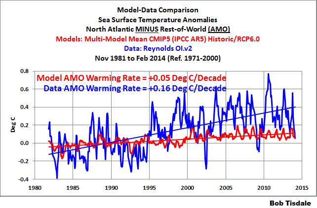
Figure 27
If the model-mean had produced the observed differences in the warming rates of the North Atlantic and rest of the global oceans, then we would have to conclude that the Atlantic Multidecadal Oscillation was a forced component of the models. Because the model mean does not show the great difference in warming rates, the additional variability of the North Atlantic has to be caused by naturally occurring factors that are not used force the operation of the models. Thus the heading for this section: The Atlantic Multidecadal Oscillation is Not a Forced Component of the Climate Models.
Now, the climate science community acknowledges the importance of the Atlantic Multidecadal Oscillation. The climate scientists who run the blog RealClimate note on their Atlantic Multidecadal Oscillation webpage:
A multidecadal (50-80 year timescale) pattern of North Atlantic ocean-atmosphere variability whose existence has been argued for based on statistical analyses of observational and proxy climate data, and coupled Atmosphere-Ocean General Circulation Model (“AOGCM”) simulations. This pattern is believed to describe some of the observed early 20th century (1920s-1930s) high-latitude Northern Hemisphere warming and some, but not all, of the high-latitude warming observed in the late 20th century. The term was introduced in a summary by Kerr (2000) of a study by Delworth and Mann (2000).
Yet the climate models used by the IPCC for their 5th Assessment Report cannot simulate the additional warming of the North Atlantic, as shown in Figure 27. As a result, they have to more than double the warming rate for the rest of the global oceans. See Figure 28.
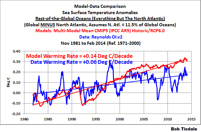
Figure 28
CLOSING
Ponder than for a moment.
Because the models do not properly simulate the naturally occurring additional warming of the North Atlantic, which only covers 11.5% of the surface of the global oceans, the modelers had to more than double the warming rate for the other 88.5% of the global oceans, in order to bring the North Atlantic into line.
As discussed and illustrated in this post, there are two naturally occurring, coupled ocean-atmosphere processes that the models obviously fail to simulate properly:
- El Niño and La Niña Processes
- Atlantic Multidecadal Oscillation Processes
Because the models fail to properly simulate those naturally occurring processes, they have to double the observed rate of warming of the surfaces of the global oceans in order to properly simulate the warming rate of land surface air temperatures in the Northern Hemisphere and to melt Arctic sea ice.
The climate science community somehow believes their science is settled…or at least we’ve been led to believe it’s settled. But the climate scientists who contribute to the IPCC are no closer to being able to discern man’s fingerprint on climate than they were in their first report back in 1990. That is a sad reality that they refuse to accept. Or maybe the scientists understand it, and it’s the politicians, those who fund climate science and steer its course, those who are ultimately responsible for its failings, who refuse to accept that climate science has been stymied by its focus on the assumed effects of manmade greenhouse gases…without understanding of the fundamental roles of natural variability.
ADDITIONAL READING
This post presented evidence that the hypothesis of human-induced global warming is flawed, because the models that serve as the foundation for the hypothesis are flawed…fatally flawed. Further, as we’ve been illustrating and discussing for more than 5 years, ocean heat content data and satellite-era sea surface temperature data both indicate that natural processes are responsible for the warming of the oceans, at the surface and to depth. An overview of this can be found in my illustrated essay “The Manmade Global Warming Challenge” (42mb). Much more detail about the natural warming of the global oceans can be found in my ebook Who Turned on the Heat? – The Unsuspected Global Warming Culprit: El Niño-Southern Oscillation. See the post here for an introduction to Who Turned on the Heat?
This post presented how poorly climate models simulate sea surface temperatures during the satellite era. Climate models also do not simulate land surface air temperatures properly in many parts of the globe. They do not simulate precipitation well. Climate models also do not properly simulate long-term variations in global surface temperatures. And there are numerous peer-reviewed papers and journal letters by climate scientists that present many other flaws in climate models. These flaws are collected in my ebook Climate Models Fail. See the post here for an additional overview.
And if you enjoyed this post or learned something from it, I would very thankful for a contribution to my tip jar.
With my new job, work on my next book is progressing slowly. The new working title is Fundamentals and Failings of Human-Induced Global Warming. I’ve written and produced illustrations for about 20-25% of it so far. An expanded version of this post will appear in it.
Forget the turtles. For the warmists, its flawed models all the way down.
Nuff said!
How about Warming or Worming? (That’ll pique browsers’ interest. “Worming” is suggestive of book-worming (out of touch with the real world), with “wormy” (full of holes), and with “worming his way out of it” (twisting things to a deceptive end). It’s not perfect, but you could do worse–and HAVE with the one you’ve got!
PS: Use your current title as a subtitle of mine, if you wish.
Another classic Tisdale post!
Absolutely. Compare the specific heat capacity of water to that of the atmosphere and there’s no contest.
I wonder how much extra understanding of the oceans will come as a result of the search for MH370? It’s an ill wind as they say.
Thanks Bob.
It also shows that the IPCC has no sense of reality at all. Their energy exchange diagram in AR4/5 does not reflect reality but a flat earth, 24/7 sunshine at a power too low to run the water cycle. The planet is a globe that rotates round the polar axis. Only half the planet is heated by the sun at a time as it rotates. Reality has a water cycle based on liquid water so average temperatures must be over 0C not below as the IPCC claims. Reality does not need a GHE to make up for a lack of heat. Reality has more heat than needed which is controlled by adequate negative feedbacks like latent heat and clouds.
A great article, yet again, by Bob Tisdale. This one explained a great deal to me about how the atmosphere and oceans work together, From the Warmistas, one would think that the the specific heat capacity of oceans and that of the atmosphere were even vaguely comparable. For tem, it’s models all the way down to disaster.
Bob, that is a yeoman’s work. Many thanks.
Crispin
Great article! And it ends with this….
Because the models do not properly simulate the naturally occurring additional warming of the North Atlantic, which only covers 11.5% of the surface of the global oceans, the modelers had to more than double the warming rate for the other 88.5% of the global oceans, in order to bring the North Atlantic into line.
I wonder what they are going to do to bring some of us “in line”.
What an article. More science in this opus than in 25 years of globaloneywarming ‘models’ and propaganda. AGW ‘models’ have about as much scientific rigour as a super model’s strut. CAGW has forever debased the name of science.
As the rate at which the atmosphere warms according to increasing CO2 has not actually been quantified or measured the climate models must be driven by assumptions. In addition the rise in temperature since the end of the mini-ice age can be viewed as a correction back to average inter-glacial temps, or is the assumption that a freezing Thames is normal? Therefore, once we have arrived at the correct inter-glacial average temp then we can measure temp ‘increase’.after that? This particular inter-glacial does appear different to all previous in that the expected gradual decline in temp has taken so long to happen, unless it already is happening!
Bob, great post. While staying at my winter home on the Big Island several years ago, I remember reading a forecast discussion put out by the Honolulu WFO where they were amazed about how dry the atmosphere was above islands that were “surrounded by 2000 miles of ocean” (their exact words, I believe). I’ll bet it’s natural variability like that which the models have a tough time depicting.
Absolutely, Bob.
It is incredible to make the claim of having modeled the earth’s climate and to then predict a certain amount of global warming by a certain time, but to then turn around and blithely claim it disappeared into the ocean “which, anyway, we always knew was absorbing 90% of the incoming energy”…. Helluva model(s). One could surmise they are missing a few fundamentals.
does anyone else think that, in the first two charts, having a “normal” range of a whopping 0.02C is ridiculous? the entire anomaly range shown only covers 0.1C
Maybe the IPCC should pull the plug on it’s self.
Much better suggestion
Thanks Bob. Well done.
Brrrr! Throwing cold water on “settled science.”
But, . . .
“. . . science is settled . . .” appears to be a “catapult the propaganda” phrase introduced by a London PR firm hired by Al Gore or associates and used in the sense of “the big lie” or maybe just the repeated lie. I no longer have the reference and, having looked for it, wonder if it has been hidden.
Anyway, it is likely unfair to accuse the women and men in the labs and at their computers of thinking the simulations are a final product. Blame that on Gore, other NGOs, the IPCC and associated political élites.
Nice work, Bob. There are other papers showing other spatial miscorrelations between CMIP5 and observation. I used clouds in a recent essay for my next book. Had not seen sea surface temps before. Your figure one is a publishable paper all by itself.
Hope the new job (congrats) does not impede you contributions too much.
John, I too am guessing the modelers know this about their product and for want of bread and butter, continue to put this stuff out there whilst holding their collective noses. The Ivory Tower river of blood money would dry up in an instant were they to unleash their ever-collecting thoughts and doubts. Given time, I believe they will either let go of all that collecting thought or their heads will simply explode from the pressure. What makes this popcorn worthy is that we are already past the recommended tire pressure.
My apologies to the people looking for the ‘missing heat’. I have to confess that I have been keeping it in my apartment. It’s f*ucking cold outside.
“And if you enjoyed this post or learned something from it, I would very thankful for a contribution to my tip jar.”
===================
Done.
It was long overdue.
What price ?, education.
Thanks, Bob. An excellent post.
You have killed the IPCC’s GCMs in great detail.
It’s not like the IPCC did not know; they decided that if the models averaged the oceans to about right nobody would look into the details. How sleazy is that?
Looking forward to the publication of your new book.
If I may suggest “Fundamentals Failings of Human-Induced Global Warming”?
Another highlight from Bob. A wealth of verifiable facts to counter a wealth of speculation.
thanks for a great post Bob. We should always remember G. E.P. Box quote: “Essentially, all models are wrong, but some are useful”. If we think the models are right, it thus means we are wrong. Climate models don’t even fall in the “some are useful” category…
======================================================================
I don’t think so.
Who wants tsunami warnings every week? 😎
“…manmade greenhouse gases in the climate models were expected to warm the surfaces of the global oceans at a rate of 0.16 deg C/decade for the past 32+ years, but the observed warming was only 0.08 deg C/decade. That’s an atrocious modeling effort.”
This brings up a somewhat off-topic point that doesn’t get made nearly often enough IMO: Even IF the models were perfect (i.e. predictions matched observations exactly), we’d be at half a degree centigrade warming after 32 years. That’s a) a very minor temp rise, and b) one which would actually benefit ocean coral and other sea fauna. In any case, even the worst-case scenario isn’t very much, and as Mr. TIsdale notes, we’re nowhere near the worst-case scenario in reality.
I just noticed something about the ~60 year cycle evident in the temperature data.
The Earth’s rotation axis is nutatiing with a period of about 18.6 years. However, that is only part of the story. In actual fact, the nutation takes the form of an elliptical cone, as shown here. The distance between the J2000 polar axis and the actual rotation axis looks like this. Its period is necessarily halved, to about 9.3 years.
Thus, the magnitude of the component of the magnetic moment of the Sun along the Earth’s rotation axis should have periods of about
T1 = 11*9.3/(11+9.3) = 5 years
T2 = 11*9.3/(11-9.3) = 60 years
Coincidence? Maybe. But, is there not a 5-ish year quasi-periodicity to the major temperature sets? Hard to say for sure, but there surely are several ups and downs which are in the neighborhood of 5 years.
So, maybe this is a solar-magnetic effect, being modulated by the tilt of the Earth relative to the solar magnetic axis of symmetry?
Bob, can you tell if the models account for the deep ocean currents bringing in cold water on their 800 to 1200 year trip around the globe. The Indian ocean hotter spot off the Horn of Africa and the cool spot in the N. Pacific are just where the cold, deep currents are to reach the surface?
http://www.google.com/url?sa=i&rct=j&q=&esrc=s&source=images&cd=&cad=rja&uact=8&docid=gsBUcCW0U1yhWM&tbnid=l8I9f2cyqVBl3M:&ved=0CAUQjRw&url=http%3A%2F%2Fwww.windows2universe.org%2Fearth%2FWater%2Fthermohaline_ocean_circulation.html&ei=mI00U4nwIfP7yAHK0YDQAw&psig=AFQjCNHa-t7hTvVd4Dt9M8FxqqyOzuQdrA&ust=1396039447432494
“The models perform best in the extratropical oceans of the Northern Hemisphere, in the North Atlantic and in the Arctic Ocean.”
The cooling in the equatorial band would seem to support Willis’s thermostat hypothesis. Heat distribution doesn’t just take place in the oceans.
Don Bennett says:
March 27, 2014 at 6:53 am
“ . . . the Honolulu WFO where they were amazed about how dry the atmosphere was above islands . . .
Rathing astounding, that!
The explanation is cooling and precipitation going up, leaving a low humidity (dry) atmosphere above the islands. Check #7 and other comments here:
http://www.wrcc.dri.edu/narratives/HAWAII.htm
Don Bennett says: March 27, 2014 at 6:53 am
“ . . . the Honolulu WFO where they were amazed about how dry the atmosphere was above islands
The Doldrums / ITCZ
The doldrums are a belt of low pressure along the Equator where the Sun’s heat is the hottest. As the hot air expands and rises, it leaves long periods of windless calm. Sailing ships used to be trapped here for days or weeks, giving rise to the name doldrums.
Today, the doldrums are usually known as The Intertropical Convergence Zone (ITCZ), since this is where the trade winds from each hemisphere converge (meet). The weather here is hot and humid, and this is the home of the Earth’s major rain forests.
The Horse Latitudes
What goes up must come down. And the hot air that rises in the doldrums comes down again in two high-pressure areas called the horse latitudes (30 degrees north and 30 degrees south of the Equator).
The horse latitudes are also known as the mid latitudes or the subtropics. The winds are light here and the weather is hot and dry.
Air flows from the horse latitudes toward the Equator (as part of the trade winds) or toward the poles (as part of the easterlies).
Hawaii is on the same latitude as the Sahara Desert.
DD More says: “Bob, can you tell if the models account for the deep ocean currents bringing in cold water on their 800 to 1200 year trip around the globe…”
Nope. There is no way to tell that through the KNMI Climate Explorer.
Bravo! The Pacific is the Panthalassa, the mother of all oceans . A bit diminished these days because for whatever reason Vulcan has chosen not to sweep the continents into a pile. Nevertheless, the dominant thermal influence on the atmosphere. We have everything to learn, and nothing to lose.
Mosher Makes Models for Money* while Tisdale Tells Truth for Tips.
When Reason and Justice rule, Mr. Tisdale will win a Nobel.
*(and there’s nothing inherently wrong with that; I’m not a Mosher Basher)
Without detracting from the messsage of the post:
None of which really matters. The current models do the job they were/are intended to do.
Increase public alarm to garner support for globalisation and total control.
Global warming/climate change was always only the means to that end.
If you want the name of an extremist organisation dedicated to global control of everything, and not for any good reason, I give you a name: United Nations
DD More says:
March 27, 2014 at 1:52 pm
Bob, can you tell if the models account for the deep ocean currents bringing in cold water on their 800 to 1200 year trip around the globe.
DD, you might be interested in some of Spencer Weart’s articles on the evolution of climate models leading to the current state of the art:
http://www.aip.org/history/climate/GCM.htm
http://www.aip.org/history/climate/oceans.htm#L_0626
Also Isaac Held’s blog delves into many of the details of climate modeling, though I don’t see anything there that specifically addresses your question.
In a nut shell, climate models can now broadly reproduce ocean currents and atmospheric patterns but they certainly diverge at some scale. Climate modelers would concede that ocean and cloud dynamics are the most significant sources of uncertainty in their projections.