No mention though of the possibility that this is all part of a natural pattern, and of course no mention of Ms. Stroeve’s Greenpeace connections to her research, which brings her scientific objectivity into question. UPDATE: A graph submitted by a commenter suggests otherwise as does recently published paper. See below. UPDATE2: data source has been added.
From NSIDC and UCL:
New data confirms Arctic ice trends: sea ice being lost at a rate of five days per decade
The ice-free season across the Arctic is getting longer by five days per decade, according to new research from a team including Prof Julienne Stroeve (Professor of Polar Observation and Modelling at UCL Earth Sciences). New analysis of satellite data shows the Arctic Ocean absorbing ever more of the sun’s energy in summer, leading to an ever later appearance of sea ice in the autumn. In some regions, autumn freeze-up is occurring up to 11 days per decade later than it used to.
The research, published in a forthcoming issue of the journal Geophysical Research Letters, has implications for tracking climate change, as well as having practical applications for shipping and the resource industry in the arctic regions.
“The extent of sea ice in the Arctic has been declining for the last four decades,” says Julienne Stroeve, “and the timing of when melt begins and ends has a large impact on the amount if ice lost each summer. With the Arctic region becoming more accessible for long periods of time, there is a growing need for improved prediction of when the ice retreats and reforms in winter .”
While temperatures have been increasing during all calendar months, trends in melt onset are considerably smaller than that of autumn freeze-up. Nevertheless, the timing of melt onset strongly influences how much of the Sun’s energy gets absorbed by the ice and sea. This in turn is affected by how reflective the surface is. Highly reflective surfaces, such as ice, are said to have a high albedo, as they reflect most of the incoming heat back into space. Less reflective surfaces like liquid water have a low albedo, and absorb most of the heat that is directed at them.
This means that even a small change in the extent of sea ice in spring can lead to vastly more heat being absorbed over the summer, leading to substantially later onset of ice in the autumn. There is also a second effect, in that multi-year ice (which survives through the summer without melting) has a higher albedo than single-year ice that only covers the sea in winter. Since the 1980s, the proportion of the Arctic winter ice that is made up of multi-year ice has dropped from around 70% to about 20% today, so the changes are quite substantial
These feedback effects, in which small changes in atmospheric temperature and sea ice lead to large changes in heat absorption, was what the team set out to study.
Stroeve’s team analysed satellite imagery of the Arctic region, dating back over 30 years. The data breaks down the whole region into 25x25km squares, and the team analysed the albedo of each of these for each month for which they had data. This allowed them to update trends and add an extra 6 years onto the most recent analysis of its kind. The new data continues the trend towards longer ice-free periods previously observed.
“The headline figure of five days per decade hides a lot of variability. From year to year, the onset and freeze-up of sea ice can vary by about a week. There are also strong variations in the total length of the melt season from region to region: up to 13 days per decade in the Chukchi Sea, while in one, the Sea of Okhotsk, the melt season is actually getting shorter.”
The amounts of energy involved in these changes are enormous – hundreds of megajoules of extra energy accumulated in every square metre of sea. This is equivalent to several times the energy released by the atom bomb at Hiroshima for every square kilometre of the Arctic ocean.
For organisations such as oil drillers operating in the Arctic region, a sophisticated understanding of when the sea will freeze up is essential. For climate scientists, this type of study helps them better understand the feedback mechanisms inherent in the Arctic climate. The results from this study are closely in line with previous work and therefore give added confidence that models of the complex Arctic climate are broadly correct.
Notes
- The research appears in a paper entitled “Changes in Arctic melt season and implications for sea ice loss”, to be published in a forthcoming issue of the journal Geophysical Research Letters. An online pre-print is available now on the journal website.
- Julienne Stroeve is a recent appointment to UCL Earth Sciences, joining the department from the National Snow and Ice Data Centre in Colorado, USA.
Related links
- Article in Geophysical Research Letters
- UCL Earth Sciences
- National Snow & Ice Data Center
- Centre for Polar Observation and Modelling
High-resolution images
Satellite view of sea ice
This image may be reproduced freely as it is in the public domain
Map of changing melt seasons in the Arctic
This image is available under a Creative Commons Attribution Non-commercial No-derivatives licence. It may additionally be reproduced for the purpose of news reporting.
Researcher profile
=================================================================
UPDATE: Gail Combs offers this graph in comments which suggests that there is no long term trend for the data back to 1979, only a recent drop. FTP Data source listed below.

UPDATE2: Les Johnson Sends over his spreadsheet with data. He writes:
This is my spreadsheet on arctic ice max/min. The data is taken from the link in the sheet. I apologize as its not user friendly, nor fully automated. I did not expect to share it. I filter by year, and take the max/min and the respective dates. That’s it. The assumption is that after max, the ice is melting, until minimum is reached.
1979-2011 arctic melt season (XLSX)
Also Greg of “climategrog” says he thinks the graph needs more context. So, here it is with his links:
The data source listed on that graph is the original data source from which it is derived. It is not the data which is shown in the plot. I know because it’s my processing of that data.
Taken out of context it is rather misleading. Indeed you seem to have (not unreasonably) misunderstood it be the data in the FTP link that is plotted directly. It would seem more appropriate to provide a link to my documentation of how it was derived.

==============================================================
By way of explaining the recent drop in days, we have this recently published paper Via the Hockeyschtick:
New paper finds lows of Arctic sea ice in 2007 and 2012 were due to storms
A new paper published in The Cryosphere finds that the 2 recent lows in Arctic sea ice over the past decade during 2007 and 2012 were strongly related to storm activity, rather than a long-term effect of climate change. According to the authors, “Strong summer storms on the Siberian side of the Arctic Ocean may have been important contributions to the recent [Arctic sea ice minimums] in 2007 and 2012.” Arctic sea ice strongly rebounded in 2013 by up to 78% in comparison to 2012, suggesting the 2007 and 2012 lows were just natural variation.
The paper adds to many other peer-reviewed publications finding Arctic sea ice extent is due to natural variability from winds and storms, not AGW.
The Cryosphere, 8, 303-317, 2014
http://www.the-cryosphere.net/8/303/2014/tc-8-303-2014.html
Cyclone impact on sea ice in the central Arctic Ocean: a statistical study
A. Kriegsmann1,* and B. Brümmer1
1Meteorological Institute, University of Hamburg, Hamburg, Germany
*now at: Climate Service Center, Hamburg, Germany
Abstract.
This study investigates the impact of cyclones on the Arctic Ocean sea ice for the first time in a statistical manner. We apply the coupled ice–ocean model NAOSIM which is forced by the ECMWF analyses for the period 2006–2008. Cyclone position and radius detected in the ECMWF data are used to extract fields of wind, ice drift, and concentration from the ice–ocean model. Composite fields around the cyclone centre are calculated for different cyclone intensities, the four seasons, and different sub-regions of the Arctic Ocean. In total about 3500 cyclone events are analyzed. In general, cyclones reduce the ice concentration in the order of a few percent increasing towards the cyclone centre. This is confirmed by independent AMSR-E satellite data. The reduction increases with cyclone intensity and is most pronounced in summer and on the Siberian side of the Arctic Ocean. For the Arctic ice cover the cumulative impact of cyclones has climatologic consequences. In winter, the cyclone-induced openings refreeze so that the ice mass is increased. In summer, the openings remain open and the ice melt is accelerated via the positive albedo feedback. Strong summer storms on the Siberian side of the Arctic Ocean may have been important contributions to the recent ice extent minima in 2007 and 2012.
Sea ice used to be stable, same with sea level, temperature, snow cover, precipitation, insolation, ocean currents, wind, cloud cover, etc. Those were the days.
New analysis of satellite data
remind us again of how many years of this date they have and how long a period we have to wait before we can say ‘climate doom is off’ ?
Its easy to forget now that such images we take for granted were simply no possible until the last few years and that weather elements , such as the very existence of the Jet Stream, where simply unknown until the last centenary.
When people make claims based on long term trends its always useful to ask how if at all this data was collected in the past or are we just really looking at proxies or model guesswork with all the problems that involves.
Harold Ambler says:
March 4, 2014 at 9:58 am
> Sea ice used to be stable, same with sea level, temperature, snow cover, precipitation, insolation, ocean currents, wind, cloud cover, etc. Those were the days.
Then we got the resources to measure it. 🙂
No mention of the inverse in the Antarctic.
If AGW is in fact a “G” (global) issue, then sea ice concerns should factor both poles into the calculations. And sea ice is a concern from an “impacts” standpoint because it is a proxy for the glacial ice masses on land that, as they melt, create a rise in sea levels, right?
Narrowest of perspectives taken to produce maximum alarm, then extrapolated to “global”.
Tell this to the guys whose yachts are stuck in the Arctic after believing that the Northwest passage would be open last summer. It will be interesting to see how many survived the winter.
“The amounts of energy involved in these changes are enormous – hundreds of megajoules of extra energy accumulated in every square metre of sea. This is equivalent to several times the energy released by the atom bomb at Hiroshima for every square kilometre of the Arctic ocean.”
They used Hiroshima bomb equivalents (HBE) – argument over!
Look. nothing is more un scientific than attacking a person because of their politics or religion.
Folks rightly object when they are called oil shills or when their connections to repubican or libertarian think tanks are cited as a reason to doubt them. Skeptics who disbelieve in evolution routinely have their science questioned because of their religious beliefs. Skeptics who are doubted merely because they have no formal education are also subject to this nonsense.
They did a study. look at the data. Noting a persons gender, or orientation or race or politics or religion or activism as a reason to doubt them is anti scientific bull crap. Doubt them because you doubt EVERYTHING until its checked. Avoid personalizing and politicizing the debate even if others behave badly. get the data, get the code. do the science of checking rather than the smearing of politics.
REPLY: Nothing was said about gender, or orientation, or race, or religion, that’s all you Mr. Mosher. What was demonstrated was that there’s an obvious connection to Greenpeace during Ms. Stroeve’s Arctic research, and given Greenpeace’s history of activism, and in some cases illegal actions in the name of that activism, I say it is fair game. A researcher that poses for a political picture in an activism setting, much like Hansen has done, reduces their perceived objectivity, especially while it is on a research trip.
NOAA has Arctic capable research vessels, and connections to other scientific agencies that have such vessels, if Ms. Stroeve wanted to avoid such criticism, she should have arranged to use one of those rather than use a political attack ship.
Imagine if you decided to join a climate protest group at Berkeley, and had your research funded/abetted by that group and had a photo of you protesting with them. I think it would be fair game to point it out and note that this likely would reduce your scientific objectivity.
[added: also, see the update for a competing paper and graph]
– Anthony
Given the low angle of solar irradiation, how much of the meltback
is the responsibility of the sun and how much the responsibility of
the Gulf Stream current, which originates in the Caribbean?
The dramatic freezing of the Northern Hemisphere over the last five
winters suggests changes can’t be far away.
You’re right. Now stop it …
GRAPH: Length of Arctic Melt Season (from ice extent)
Seems the NOAA data does not agree.
@Steve Egbert
I wonder how many negative Hiroshima Bomb Equivalents are represented by additional Antarctic ice in the same period.
“The amounts of energy involved in these changes are enormous – hundreds of megajoules of extra energy accumulated in every square metre of sea. This is equivalent to several times the energy released by the atom bomb at Hiroshima for every square kilometre of the Arctic ocean.”
Maybe we should test this by actually dropping an atom bomb on every square kilometer of the Arctic ocean and measure the loss of sea ice. Sounds reasonable to me.
‘Less days’ jars a bit.
” In some regions, autumn freeze-up is occurring up to 11 days per decade later than it used to. ”
Great start, sounds like a newspaper report. Science by press release.
“The extent of sea ice in the Arctic has been declining for the last four decades,” says Julienne Stroeve, “and the timing of when melt begins and ends has a large impact on the amount if ice lost each summer.
Well if you dice it small enough you’ll always be able say “some regions….” and ” up to xxxx more than it used to”.
However, looked at as a whole Arctic melting season has been getting steadily shorter since 1990.
http://climategrog.wordpress.com/?attachment_id=210
BTW – the cited “growing need for improved prediction of when the ice retreats and reforms in winter” sure would have helped in the Antarctic this last year. Right Chris Turney?
Sounds like Stroeve’s study should be reproduced there as well.
http://climategrog.wordpress.com/?attachment_id=206
…
The ice-free season across the Arctic is getting longer by five days per decade, according to new research from a team including Prof Julienne Stroeve (Professor of Polar Observation and Modelling at UCL Earth Sciences). New analysis of satellite data shows the Arctic Ocean absorbing ever more of the sun’s energy in summer,
Re: my bold above: That’s GOT to really be minimal at that latitude, compared to say, 20 deg N …
How does that compare to natural circulation from waters outside the arctic?
.
“The ice-free season across the Arctic is getting longer by five days per decade” ??
I’m unaware that there is ever an ‘ice free season’ in either the Arctic or Antarctic. How on earth can a ‘scientist’ use this kind of imprecise, emotion laden terminology (along with the now apparently obligatory ‘Hiroshima Bomb’ equivalence reference) in a paper they wish anyone to take seriously?
And she has “a sophisticated understanding.” Scientists don’t say “sophisticated.” Add it to the Hiroshima Bomb pile.
She needs to look across an entire sixty year cycle to get the full picture. We lack data from the first twenty years.
Currently the AMO is warm but the the PDO has shifted to cold. Ice on the Atlantic side remains below normal while on the Pacific side during the past few years maximum extent has shifted to above-normal, and this year is at normal despite a slow start. The multi-year-ice ice against the Canadian coast in the Beaufort Gyre is much thicker than it has been, and that thick ice has extended west, north of Alaska, towards Bering Strait. If the ice can recover so swiftly when the PDO flips, what do you imagine will happen when the AMO flips? Only after twenty years will we have reasonably good data for a full sixty year cycle.
Arctic sea ice has turned the corner.
http://climategrog.wordpress.com/?attachment_id=783
It will become evident fairly soon whether this model of the “death spiral” best fits the data.
“The ice-free season across the Arctic is getting longer by five days per decade” ??
That makes exactly no sense at all. There has never been an ice-free season across the Arctic.
Derivation of the adaptive anomaly is detailed here, This was also posted and discussed on Judith Curry’s Climate Etc.
http://climategrog.wordpress.com/2013/09/16/on-identifying-inter-decadal-variation-in-nh-sea-ice/
Gulf Stream doesn’t care about CAGW:
“URI oceanographer refutes claims that climate change is slowing pace of Gulf Stream”
http://www.uri.edu/news/releases/?id=6965
“I wonder how many negative Hiroshima Bomb Equivalents are represented by additional Antarctic ice in the same period”
talking of bombs-
the 15-megatonne Bravo test on 1 March 1954, at Bikini Atoll, was a thousand times more powerful than the atomic bomb dropped on Hiroshima.
it vaporized vaporized 3 islands ,
several decades on the coral is doing quite well.
“Coral flourishing at Bikini Atoll nuclear test site – because humans have been driven away”
Whether the longer ice-free periods are from more solar heat or from increased circulation from the Gulf stream, it would be nice to be able to predict the opening of more sea lanes in the future.
Anthony,
I agree with you. It’s pertinent. In my view, it’s a free country sure. Scientists are free to be activists in their fields. And reasonable people are free to doubt their objectivity as a result.
5/3650 =0 .13% change. There is no way that they have measured sea ice that accurately.
This is another alarmist bit of arm waving.
In traditional Climate Change, things went in cyclical patterns.
In New Age Climate Change, things are linear and prove the magic beans we threw into our computer models are working to enhance our reverence and devotion to Gaia.
Philip Haddad says:
March 4, 2014 at 11:06 am
Whether the longer ice-free periods are from more solar heat or from increased circulation from the Gulf stream, it would be nice to be able to predict the opening of more sea lanes in the future.
Sure, but they can’t serve two masters. For them, CAGW reigns supreme. Any and all “predictions” then are suspect. Their statements regarding serving the interests of shipping and oil companies is mere pretense, and laughable on its face.
I guess they teach climate scientists everything but cycle math so that they appear to ignore dynamics of curves and turning points. This too shall pass. Something similar must have happened during the Black Plague when they were clueless about fleas.
do they differentiate between reduction in sea ice extent due to ‘ice melt’ vs reduction in ice coverage due to winds and currents causing ice compaction?
i thought arctic ice ended in sept 2013? that was the prediction?
does anyone know what the ‘correct’ climate is for the earth? why is the current situation the MOST desirable one? why not ice age or ice free?
Munch screaming about ‘change’ is what kids do.
Response to Gail Combs:
Gail, either you are not aware of the problem of curve fitting to segments of data all the way through the end points, or you are being deliberate in your misinformation. The start and end of your data set are not unusual compared to the rest of the set, but happen to start on a local high point and end on a single low point that happens to be near a previous low point. For example, if you started in 1980 rather than 1979, the start of the curve would be down, not up. This is called being not robust, among other comments. Also, if you observe 1985, 1999, and 2010, you see three similar negative spikes, but 1999 is the lowest, not 2010 or the present. You simply do not have a long enough data set to come to the conclusions you make. Your basic argument is that a couple of years is a real trend. If that is so, the 17 years the global temperature has not increased is absolute proof that there is no global warming. I don’t even believe that , but it is far more convincing than your point.
1. Fewer days is better.
2. Whole thing added to my collection of Girly Science
3. Anyone have any thoughts on this please.For part of November all December, January and part of February almost every day the UK weather forecasts showed winds at gale force blowing Northwards straight up the Irish Sea and the North Sea up the coast of Norway into the Arctic region. Often these winds originated over Iberia or the Bay of Biscay and I would think contributed some warmth to the north as well as giving the North Atlantic Drift a bit of a boost.
Is there any ice left in the Arctic sea this year? How soon will any effects of these warm(er) winds be attributed to AGW?
As this layman sees it, the sun never reaches 45 degrees above any Arctic horizon thus more sunlight energy is reflected than absorbed by ice free sea water. Also ice free sea water radiates more energy to space than an ice covered sea surface. The ice surface can be several tens of degrees Celsius BELOW zero. It seems to me ice on the Arctic waters is a good insulator REDUCING energy loss at the North Pole during winter.
The present low level of Arctic ice cover definitely follows storm weather events that rapidly break up newly forming ice. Look at records available at:
http://www.ijis.iarc.uaf.edu/en/home/seaice_extent.htm
Leonard Weinstein says:
March 4, 2014 at 11:44 am
Response to Gail Combs:
Gail, either you are not aware of the problem of curve fitting to segments of data all the way through the end points, or you are being deliberate in your misinformation.
===
Leonard, the graph Gail linked is one of mine Gail apparently found on a pastebin. I also linked to that analysis above, where I covered it in some detail how it was derived.
http://climategrog.wordpress.com/?attachment_id=210
http://climategrog.wordpress.com/?attachment_id=206
Perhaps you should look at that description and then post back with any criticisms of the method.
If you think there is some problem with the end points please be specific.
“This allowed them to update trends and add an extra 6 years onto the most recent analysis of its kind. The new data continues the trend… ”
Only in post-normal science is ‘projection’ called ‘data’…
Steven Mosher says:
March 4, 2014 at 10:19 am
Look. nothing is more un scientific than attacking a person because of their politics or religion.
Hey Stephen, I just copied and pasted the first line of your post. I used “ctrl c” to copy the highlighted text and “ctrl v” to paste the text. So could you please do me the honour of doing the same from the original thread which supports your assertion.
I must be really dim because I cannot see it.
Or maybe you could apologise to your host. {but I guess I won’t hold my breath waiting for that to happen…}
I also did the melt season charts. It shows that the melt season is increasing over the record, by 0.5 days per 100 years.
The dates of maximum and minimum ice are remarkably flat, especially minimum.
http://oi62.tinypic.com/20uae79.jpg
Ms Stroeve then looked at the data from Antarctica and concluded that if the current trend continues, by 2100 winter sea ice will be visible from Tasmania.
Mosher (and everyone else). That paper is crap. 5 days per decade? Not a chance. Using max and min dates, the melt season is getting longer by 0.5 days per 100 years.
This paper is only out by two orders of magnitude.
http://oi62.tinypic.com/20uae79.jpg
“The ice-free season . . .”
Did I miss one of Winston Smith’s memos?
I don’t know where this came from. Didn’t find it in the article.
A question: When these types of studies measure/calculate albedo, especially of the liquid ocean, are they measuring it from the high elevation angle of the satellite, or of the elevation angle of the sun, which is what primarily matters?
In the late summer, when sea ice extent is at its minimum, and has seen the most decrease in recent decades, the elevation of the sun is so low that most sunlight would get reflected off the water’s surface (at least if relatively smooth), so the effective albedo to sunlight would actually be quite high.
“NSIDC’s Greenpeace connected researcher claims less days of Arctic sea ice being seen”
Yeah, well, one can not see the ice when they have their eyes and mind closed.
I agree also with some comments upstream regarding what is happening at the other pole – Antarctic Ice is increasing which may be keeping a relative total ice amount somewhat balanced.
Remember, as mentioned, it is “Global Warming” or even “Global Climate Change” that is the supposed concern.
early in the report:
With the Arctic region becoming more accessible for long periods of time, there is a growing need for improved prediction of when the ice retreats and reforms in winter .”
funding please.? How obvious can you get!
Anthony
Last year I wrote ‘Historic variations in Arctic Ice part two.
http://judithcurry.com/2013/04/10/historic-variations-in-arctic-sea-ice-part-ii-1920-1950/
The edited version was carried at Climate Etc but there is also a much longer, much more detailed version which has never been published on the web. As it involves the subject of your post I have included a lengthy abstract from it, which seems to indicate that the certainty over our estimates of ice might be somewhat over confident.
——— ———- ——– Abstract——– ——-
This was noted by the author in the library of the Scott Polar institute in Cambridge and has parallels in one of the news items previously quoted;
‘Observational data of the drifting station 1950-51-by M Somov -Volume 1 of 3 of this Russian North pole station on an ice floe.’
Middle of June onwards ‘the melting of the snow and ice took place very quickly although the air temperature remained close to freezing’
‘the sun shone…could walk about without a coat…some even tried to get a sun tan.’
‘because of the thaw an enormous amount of water accumulated on the ice’
‘walking was only possible if one wore high rubber boots reaching above the knees’ (because of the water sitting on the ice.’
‘many problems because of the thawing.’
The book described how later in the season some high spots became dry and these were little hillocks in a sea of icy water sitting on solid ice. This caused me to ask the following question of NSIDC;
“ …..how did pre satellite researchers estimating sea ice extent tell the difference between water, water floating on ice, and solid ice, and how can satellites differentiate between the three states? I was struck by Russian reports from the 1950’s at The Scott Polar institute in Cambridge when staff at the floating research stations commented about using Wellington boots in order to walk around the station, and how little dry ice islands eventually formed by the end of the summer surrounded by water on top of ice.”
I received the following reply from Julienne Stroeve ;(reproduced with permission)
“ … using passive microwave data it is very easy to tell the difference between ice and water as the dielectric constant differs quite a bit and this is reflected in large differences in the microwave emission. The main advantage of using passive microwave is that it can see the ice even if it’s cloudy or dark. There is a problem however in summer when melt ponds form on the ice since the sea ice algorithms then underestimate how much ice there really is (they think it’s open water). That’s one reason why we focus on extent rather than true ice area for the NSIDC sea ice news and analysis web site.
Visible and thermal imagery provides higher spatial resolution but is often hampered by clouds. Trying to do this work using earlier visible and thermal imagery requires the scientists to go through each image and manually filter out the clouds and determine where the ice is.”
The arctic in those pre satellite days was simply too large to be effectively and continually monitored. Observers getting close enough to the ice edge to make physical observations might be deterred from proceeding further by apparently impenetrable ice although better, more open conditions, might lie beyond. Data from such as the Russian sector – where much warming occurred, was not always taken into account. (However, the reader should be aware that, as Larsen noted, ice did sporadically return whilst reports from 1939-45 are sparse for obvious reasons.)
In trying to determine the true extent of sea ice melt during the period we run the risk of comparing apples-physical observations, and oranges- satellite altimetry, and the different methods employed over the years creates uncertainties over whether each accurately picked up what is ice, what is water covered ice and what is open water. This makes it difficult to determine how modern ice extent compares to the past with any certainty.
However, the conclusion must be that drawn that warming was more widespread in the arctic-not just the Atlantic side-than is currently noted in the official sea ice data bases covering1920-1945/50 and that the official records appear to very substantially overstate the ice area extent. Some of the thinning of the ice and reduction of glaciers noted today appears to have had their genesis in the period.
——— ——— End——–
tonyb
Les Johnson. “That paper is crap. 5 days per decade? Not a chance. Using max and min dates, the melt season is getting longer by 0.5 days per 100 years. ”
To be fair, it may be better to do something a little more subtle than just taking one day minima and maxima to determine before declaring a paper to be “crap”.
I also disagree with the result of the paper but dismissing it as “crap” without even reading it is not very sensible or fair.
Greg: Its crap. The melt season is NOT getting 5 days longer per decade, based on min/max ice dates. Its out by 2 orders of magnitude.
Just ask the guy what pot he is smoking.
Must be the same pot the Russians found when they boarded the GreenPeace ship protesting the Russian oil platform.
Something tells me this dope has huge influence on judgement.
Just send the guy to the Rehab and he will come to his senses.
The Inuvik to Tuktoyuytuk ice road (about 160 miles) on the Mackenziie River and then on the Beaufort Sea has seen slightly increasing open for travel dates since the 1980’s. That does not seem to align with the findings of this paper.
Anthony.moderators”
I have my spreadsheet and chart on arctic ice melt season. I can make this available, so everyone can see that the melt season is increasing at only 0.5 days per century, and not the ludicrous clain in this paper.
5 days per decade is her “trend”!! LOL.That’s a slope of 0.00137! Help, help! The world is sliding into an abyss!
sarc off.
The only abyss here is the one this cretin’s objectivity and scientific integrity is in, along with the rest of her tribe of scientific hillbilly Taliban.
Les, since there is a sizeable circa 14d ripple in the data, taking one day min/max can push the individual dates a week or so either way. How those ripples land in relation to annual min and max makes a very significant difference to the calculated “melt period”. There is also large weather based differences based on timing of storms etc.
That is why the annual ice minimum jamboree is stupid. We have DAILY data available. There is no good reason to select just one or two data points per year and ignore the rest.
See my links above for how to deal with short term variation and get a more objective assessment of the long term changes , having removed the weather.
Agreed, the atom bomb equivalent is relevant only in noting the power of the sun. An easy calculation shows that a Hiroshima bomb/squ. km would melt ice to a depth of ~25 cm.
The low resolution satellite MSU have a single pixel resolution of 25x25km. So we know that is what was used for this study. In each pixel, the ice water ratio is determined by the difference in their dielectric constants. This works fine in winter, when ice is ice and seawater is not. It does not work well at all in late spring and early summer when meltwater can pool on top of ice before it breaks up into small flows. And it does not work well (because of resolution) for ‘slushy’ conditions with lots of ice fractured by storms, such as trapped a lot of Northwest passage vessels August 2013. It does work again well for refreeze conditions when ice again becomes ice while water remains water. So the papers focus on melt timing picks the poorest quality sat data.
And, most of the satellite era decline took place during the pause.
And, there is lots of Danish and Russian regional summer ice map evidence that Arctic ice was as low in the late 1930’s early 1940s as from 2002 to 2012. RCMP Larsen completed his east-west Northwest Passage transit of 1944 in just 86 days by sailing vessel, using a more northerly route than before.
Flawed methods over a short period that does not even take in one ocean cycle are not very impressive. No wonder others have pointed out the papers conclusions are just wrong, evenmformthe satellite era.
Greg: Yes, and over time those “ripples” will average out. They are not that sizeable, either.
By taking maximum extent and minimum extent only, one will get, on average, the melt season for the entire arctic.
Over the record, the melt season got above and below 1 sigma only 6 times; 3 above and 3 below.
The experts get larger numbers than me, but much smaller numbers than Stroeve. They also get that the minimum date, and the maxmium date, are both coming earlier. They also get my result that the change in melt seasons is not significant.
http://pielkeclimatesci.wordpress.com/2009/09/09/temporal-trends-in-arctic-and-antarctic-sea-ice-maximum-and-minimum-areal-extents/
Who of the above commenters has read the paper? It’s open access, no excuses.
This is careful work, based on satellite observations mostly, with references to all databases employed, and a reasonable discussion of uncertainties. I did find one minor error in a table in Supporting Information, emailed the author, and received an immediate reply that the error would be corrected as soon as possible. (There are no mentions of hydrogen bombs in the paper. That is PR flak.)
@tony b, march 4, 12:49pm
As always, Excellent!
The Hiroshima bombs equivalents tells you all you need to know about this “study” … it’s just more alarmist baloney!
Les Johnson says:
March 4, 2014 at 1:24 pm
Greg: Yes, and over time those “ripples” will average out. They are not that sizeable, either.
By taking maximum extent and minimum extent only, one will get, on average, the melt season for the entire arctic.
—–
Why do you assume that something “averages out” . If they are lunar tidal effects, as I suspect is mainly the case, they will shift in phase relative to the annual cycle. You cannot presume how that will affect one day per year extrema.
The fact that you get significantly different profile to what I get when I filter them out suggests your assumption is wrong.
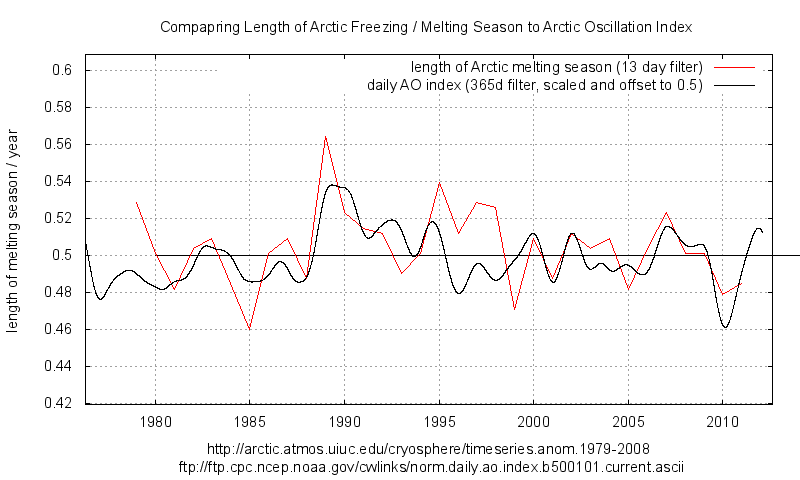
The graph which Gale linked is basically this one from ice extent. It is fairly flat but with a down ward trend since 1995 and a strong shortening of melt period since 2007.
http://climategrog.wordpress.com/?attachment_id=206
The other graph I did is based on ice area from Crypsphere Today (same stuff Pielke used but he also makes the mistake of one day per year).
http://climategrog.wordpress.com/?attachment_id=210
This is quite similar in form to ice extent but shows strong spike in 1989 and basically shortening ever since. It is interesting that this ties in quite closely with Arctic Osc. Index.
I would note that your graph also shows a high point in 1997 and downwards since. In that respect it is similar to what I found. Just that by filtering the bumps mine jumps about less. It appears that the high you show in 1997 was at least to some extent a result of where the bumps lined up.
Both extent and area shows a notable shortening since 2007. It looks like this is starting to have an impact in the last couple of years.
The Stroeve paper , despite it’s complexity, also seems to rely on since day events
‘The ice-free season across the Arctic is getting longer by five days per decade…’
They’re not merely moving the goal posts, they’re renaming them, too!
Fabi, yes a number of people picked up that BS statement. You’ll note that this is science by press release. They can paraphrase the paper however they like, spin it with a bit of AGW and everyone can quote it.
I don’t think you’ll find that in the paper.
I took the maximum and minmum ice extent, and the date, for every year in the record.
If we are getting different results, it may be the data source.
http://arctic.atmos.uiuc.edu/cryosphere/timeseries.anom.1979-2008
Again, Chapman gets similar results in 2009. Both the max and min dates are getting earlier, neither are significant. While his increase in melt season is larger than mine, its also much smaller than Stroeves.
Ok, lets do the sniff test.
According to Stroeve et al, the melt season should be 17 days longer now, than at the start of the record in 1979.
I see no indication that the melt season has increased by over 1/2 a month over that period.
I don’t see of that in your chart either.
“NSIDC’s Greenpeace connected researcher claims less days of Arctic sea ice being seen”
That’s totally wrong. Maybe fewer days of Arctic sea ice are being seen, and maybe not.
Agreed, my ice extent graph shows about 0.51 years at the start and 0.49 years now. That’s 6 days shorter , melting season.
My ice area treatment shows a jump to longer melting season in 1989 and drift back to about the same value now. Depending upon where you start and end it could be marginally longer now by a day or two in 35 years but you’d need to pick you cherries with some care. I’d have to say it’s indistinguishable between the start of the record an the end of my graph.
This also underlines once again the fallacy of fitting straight lines to everything (anything) in climate. Climate is anything BUT straight lines. Even if the ice area may indicate roughly same values now it’s clear that melting season has been getting shorter since 1989 and it is currently shorter than 6 months.
It’s interesting to note that there was a major geomagnetic storm in 1989, I don’t know if that’s related but both melting season and AO took a jump that year and seem to have been recovering since.
The paper seems to be claiming melting season is currently getting longer on average across the arctic. I find it hard to see that in the data. It should be noted that they are reworking all this from the basic microwave data. That implies that they are in effect saying the Cryo Today and NASATEAM extractions are wrong.
I suspect that they’ve just diced it small, given it a good shake and added some home made curry sauce.
re: Lance Wallace says March 4, 2014 at 1:26 pm
“Who of the above commenters has read the paper? It’s open access, no excuses.”
Me; I went to the website and looked at it, skimmed some parts and concentrated on others, then read the conclusion part …
Did you read it?
.
I wonder, was there any sampling of ‘ground truth’, e.g. using Mark I eyeballs via aircraft or higher-res visible satellite imagery (hard to do in arctic winter perhaps) to verify MSU data? Having skimmed the paper I don’t recall any sampling or verification … I would check now, but, have to runs some errands pronto.
.
“The Hiroshima bombs equivalents tells you all you need to know about this “study” … it’s just more alarmist baloney!”
talking of Hiroshima, the atomic bomb at Bikini atoll , 1000x the strength of the Hiroshima bomb , heated the waters to 55,0000 degrees, vaporized three island, shock waves were felt 200 kilometres away , it left a crater 2 kilometres wide and 73 meters deep, and today the coral is dong well and in pristine condition,
55,000 degrees
Ah , I think I have found it :
“For the Arctic as a whole, the observed difference in freezeup between 1982–1999 and 2000–2012 is about 6 days. In other words, freezeup is occurring 6 days later during the last 13 years than in the previous 19 years when averaged over all sea ice regions. ”
So what they call the “headline figure” of 5 days per decade is indeed a cherry pick. Take the midpoints of the those two periods : 1990 and 2006 , it’s basically the period of the accelerating downward trend, cut off just before it starts to flatten out.
http://climategrog.wordpress.com/?attachment_id=496
All the rest is breaking it down to find regional variations so they can play the “. up to 11 days per decade later than it used to” game.
As someone once said: “if you want to make cherry pie, you have to pick cherries.”
Arctic amplification led to a 50% increase of September Arctic seas ice and volume on 2012. 2013 was the coldest central Arctic Ocean air temps since 1957 on the DMI record. We are doomed.
Richard says:” ….and today the coral is dong well and in pristine condition”
Pristine except for the fact that much of the calcium and potassium has been replaced by Strontium 90 and Caesium 137.
Your recommendation to save coral reefs is what then? It’s like pruning roses? Nuke em hard and next spring they’ll be full of buds? I suppose it’s a cheap and effective way to impose a marine natural reservation area.
Perhaps this season’s swimwear can be yellow and black triangled bikini’s to celebrate.
Eyeballing the arctic ice maximums over the last several years, they seem to occur about ten days later recently. Look at the DMI graph on the Sea Ice Page, it is noticeable comparing the mean to the recent years. I don’t see the same at the minimum.
http://ocean.dmi.dk/arctic/plots/icecover/icecover_current_new.png
Sometimes I get fatigued by the pure quantity of propagandist pseudo-science – which, of course, is the purpose of it. To wear down opposition until they beg to enter a re-education camp.
“the observed difference in freezeup between 1982–1999 and 2000–2012 is about 6 days.”
So they reduce the whole record of 40 years of daily data into two numbers and draw a straight line through them. Amazing.
I just love these people who believe they can see trends in short sections of cyclic data.
Only in Climate McScience…
In some regions, autumn freeze-up is occurring up to
11an infinite number of days per decade later than it used to.Parts of the Barents Sea aren’t freezing up any more.
Anyone can make alarmist statements that are true but pointless.
Gail’s graph is interesting, but immaterial.
Her graph basically tells us how many days each year have less total Arctic ice than the day before. it does NOT tell us whether there is less ice than the same day the year before or the decade before. Nor does it tell us how the ice is distributed.
So, yes, the date for the overall turn-around is about constant — but that is NOT what the paper is the discussing! . There has been a downward trend in the max and min, so the data that the ice melts or refreezes at a particular location can and will vary considerably. When the paper talks about the “ice-free season”, they mean the ice-free season for some specific point. Point Barrow has fewer days of ice each decade; Murmansk has fewer days ice each decade; Nuuk has fewer days of ice each decade.
Ms. Stroeve apparently agreed with the hyperbole in the press release since she didn’t change it. Therefore, in my opinion, it is perfectly acceptable – and indeed imperative – that Hiroshima-type crap needs to be highlighted and ridiculed. In ALL studies and ‘science’ press releases.
and…And…AND…GIANT VIRUSES! Coming to a theater near you!!!!!
http://www.foxnews.com/science/2014/03/04/giant-virus-resurrected-after-30000-years/
Giant amoeba eating viruses! Next week, Man eating viruses? 🙂
Maybe the artist Christo can go up there and cover the landscape with that white plastic crap and spool up the albedo.
richard says:
March 4, 2014 at 11:03 am
“Coral flourishing at Bikini Atoll nuclear test site – because humans have been driven away”
———————————————————————————————————————-
Please don’t give the crazy people any ideas.
I don’t have a problem with activists writing papers. But they only get a vote, not a veto. The number of open water days definitely increased but it has been quite a while since there was an ice-free Arctic in summer.
The growing season north of Latitude 49 has been increasing at about 2 days per decade over the same time period. When the natural cycle goes into cooling mode, it will reverse, hopefully temporarily.
The last thing the bread baskets of North America need is cooler summers!
Curt says:
March 4, 2014 at 12:38 pm
You are both very astute and absolutely correct, but incorrect at the same time. 8<)
Almost all of the sunlight hitting the open ocean near the equator at noon is absorbed. Under those conditions of solar elevation angles greater than 45 degrees at all latitudes, open ocean albedo is about 0.035 based on real world measurements, regardless of satellite elevation angles. (Wikipedia's oft-repeated 0.065 ocean albedo is for INDIRECT or DIFFUSE sunlight only, and is relatively constant across almost all solar elevation angles. Diffuse or indirect sunlight is also only a small fraction 10% too 30 of the potential direct sunlight – under clouds or fog or storms – as under 84% of the arctic days during the summer – there is no direct sunlight at all. )
Now, real world open ocean measurements of the albedo of actual open ocean under real world waves (not a lab-world perfectly flat pure water sample!) show that the albedo of the open ocean continuously increases about ten times from that 0.035 at 45 degrees SEA up to 0.35 to 0.45 at only 4-5 degrees SEA. To repeat: As the solar elevation angle gets smaller => the sun gets closer to the horizon, the albedo – as you indicate above! – gets much higher. Lower Solar Elevation Angle => Higher albedo => More energy is reflected.
But it is worse than you think!
Also, as the SEA gets smaller, the projected area that the radiation falls on gets larger and larger! The actual radiation falling on any square meter of surface is proportional to the sin of the SEA: AS the SEA gets smaller, the radiation intensity ALSO gets lower and lower.
But it is even worse than you thought you thought!
As the SEA gets smaller and smaller, the energy of the sun must penetrate more and more atmosphere to even get down to the sea level to be either absorbed or reflected at those ever smaller and smaller intensities! (This is true at all latitudes, at twilight, you can stare straight into the same sun that noon would blind you instantly.) Thus, near the horizon at 5 or 10 SEA, the same sunlight that might at noon only penetrate 2 or 4 atmosphere thicknesses at latitude 60, must penetrate 30 atmosphere thickness before it can spread out to be reflected back into space.
Now, all of the above combine in the Arctic: Very high latitudes and a varying declination angle and very high atmosphere thicknesses, AND a much higher albedo caused by those low elevation angles mean little solar energy is actually absorbed.
Not nothing, but much less solar energy is absorbed in the Arctic ocean water than what the same equations would imply if that ocean water were on the equator.
But is even worser than you thought you were thinking you were thinking you thought about the Arctic!
See, the Arctic sea ice is long-lived ice compared to the seasonal Antarctic sea ice. “Fresh” sea ice underneath “fresh” snow has a very high albedo: Fresh sea ice DOES reflect a larger amount of energy compared to open ocean waters at high angles of SEA.
But Judith Curry actually measured the Arctic sea ice as it aged over the summer months: Instead of teh oft-quoted sea ice albedo of 0.80 or 0.85 or 0.70, she found the following.
From January through early May, Arctic sea ice albedo was 0.83
From May through late August, it decreased to a low of about 0.46 on day of year = 206, then increased again until early October when new snow kept it at 0.83 until the next May.
So, remember that actual open ocean albedo of 0.35- 0.40 at low elevation angles? It turns out that the actual sea ice albedo of the Arctic is ALSO about 0.35 – 0.40 in mid-summer. So many days of the melt season, in many hours of each day, the actual albedo of old sea ice and open ocean water are just about the same! There can be NO Arctic amplification possible many hours of every day in the Arctic melt season: Both Arctic sea ice and Arctic open ocean water are absorbing just about the same amounts of solar energy.
Not every day, not every hour of every day: Across the early summer to mid-August, there is a net absorption of solar energy IF the arctic sea ice melts.
However! IF the Arctic sea ice melts, the open ocean LOSES more heat energy via evaporation, convection, and increased thermal radiation than does ice-covered arctic waters. Thus, on all, over the entire day of the late Arctic melt season, MORE ENERGY IS LOST FROM THE OCEAN THAN IS GAINED WHEN ARCTIC SEA ICE MELTS under today’s conditions.
Anthony, “UPDATE: Gail Combs offers this graph in comments ”
The graph Gail linked is my work that she found an attributed version of that I had stuck in tinypic, probably for an earlier comment on WUWT.
In fact it is the Arctic line from a combined Arctic / Antarctic plot I had already linked here. Plus a similar treatment using ice area.
http://climategrog.wordpress.com/?attachment_id=206
http://climategrog.wordpress.com/?attachment_id=210
Out of context any graph like that is pretty meaningless. It could have been created by any kind of manipulation. If I were to see a graph presented like that, without explanation, I would ignore it as useless.
The above articles give a basic description of how the graphs are derived which would seem much better than a naked graph without explanation. They also highlight the problem of using one day per year ice minimum to get excited about death spirals and the need to make full use of the daily data available.
By all means keep the plot used but it has no objective value in countering Stroeve paper, without an explanation of how it is derived.
I’m pleased this is relevant to this discussion but would appreciate a credit.
RACook says “However! IF the Arctic sea ice melts, the open ocean LOSES more heat energy via evaporation, convection, and increased thermal radiation than does ice-covered arctic waters. Thus, on all, over the entire day of the late Arctic melt season, MORE ENERGY IS LOST FROM THE OCEAN THAN IS GAINED WHEN ARCTIC SEA ICE MELTS under today’s conditions.”
Yes indeed. The simplistic albedo positive feedback hypothesis is outweighed by the other negative feedbacks. It looked like it was working during 1997-2007 when the data did roughly fit a quadratic decline. However, what has happened since 2007 is a slowing of the long term rate of change.
http://climategrog.wordpress.com/?attachment_id=496
This is totally incompatible with the idea of a dominant +ve feedback. Once a glass tumbler has reached a “tipping point” it does not slow down when it’s half way over.
Computer models, like PIOMAS are fundamentally flawed and totally fail reproduce the 50% increase in ice volume measured last year by Cryosat2. Either they are badly underestimating the negative feedbacks or there is an external periodic driver that they are not accounting for.
Possibly BOTH.
Anthony PS that should have read :” that she found an UNattributed version of ” . No criticism of Gail there. I sometimes stick things on pastebin sites until I get them written up.
March 4, 2014 at 3:17 pm | Greg Goodman says:
—–
I remember recently reading about the regeneration of the coral species at Bikini Atoll but don’t remember anything about radioactive isotopes being sequestered in place of calcium and magnesium. Both Ca and Mg in the (alkaline) water at standard concentrations are all that is required for growing the cnidarians skeletons.
You know much about coral propagation ? I’ve been doing it for a couple of decades and better than most academic research labs. It is an amazingly adaptable life form … but somehow the academics just don’t seem to be able to grasp the technique and one day when they do all will become perfectly clear to them … just as it is to advanced marine aquarists. 😉
“…but don’t remember anything about radioactive isotopes being sequestered in place of calcium and magnesium.”
Probably because whatever you read did not assess it. Strontium and Caesium are quite similar chemically to calcium and potassium and often get assimilated as drop in replacements when they are present in the environment, and the chemistry still works.
Similar things have been found in studies in the “natural park” around Tchernobyl. The result is radioactive grass, trees, mice etc. Some species, like pine mutate badly ending up as distorted bushes instead of tall straight trees. Others. like silver birch with simpler DNA, are apparently much more tolerant and show few defects.
It is quite possible the coral are equally tolerant, though I have no specific knowledge on that either way.
That of course does not mean it be equally inoffensive to other species with large and complex DNA like, say, fish, marine mammals and humans.
I was reacting to the rather stupid comment someone made that a zone so radioactive that the native population can still not return 60 years later is “pristine coral” but the whole subject of the sensitivity of different species to radio isotopes is quite fascinating.
Sadly humans do not have simple DNA like birch trees. That leaves us with a problem.
“Hiroshima bomb” seems to be the new mantra so how many Hiroshima bombs does the sun deliver to the earth over a 24 hour day?
Thanks for the reminder about the Stroeve – Greenpeace link.
Mosher thinks we should not know about it.
Interesting.
It certainly does.
But, according to Willis, English isn’t logical, therefore anything you say in English means only what you want it to mean. So black = white, yes = no, could = couldn’t. Good old Humpty Eschenbach.
“sea ice being lost at a rate of five days per decade”
But can it make the Kessel run in 12 parsecs?
Tim Folkerts says:
“Murmansk has fewer days ice each decade”
No it hasn’t, because Murmansk has zero days of Ice per year and always has had zero days of ice per year (though the ice-edge apparently did come fairly close in March 1866, the worst ice-year in recorded history).
Anthony says: UPDATE: “Gail Combs offers this graph in comments which suggests that there is no long term trend for the data back to 1979, only a recent drop. FTP Data source listed below.”
The data source listed on that graph is the original data source from which it is derived. It is not the data which is shown in the plot. I know because it’s my processing of that data.
http://climategrog.wordpress.com/?attachment_id=206
http://climategrog.wordpress.com/?attachment_id=210
Taken out of context it is rather misleading. Indeed you seem to have (not unreasonably) misunderstood it be the data in the FTP link that is plotted directly. It would seem more appropriate to provide a link to my documentation of how it was derived.
Ice extent shows melting season getting shorter since mid 90’s, ice area since 1989. That seems clearly at odds with the paper which averages the whole record of “four decades” worth of daily data down to two numbers and draws a straight line through it.
I thought any posts which contained your name got held back for personal attention by you but my earlier suggestion of a clarification about the nature of the data in that graph and a request for due credit got passed without so much as a moderator’s note.
REPLY: Well I have other things to do, and I’m not always available to handle requests, so don’t whine. I’ve added an update. -Anthony
Thanks. Not whining, just seemed odd that I got no response, not even “sorry, no time”
I thought it was important for your blog not to give the impression that it was some NOAA data about melting periods that was being presented in the graph. That was the way it looked with the tinypic graph and the ftp address on the graph.
I know you like to run a clean ship and would not want to give the opportunity to one of your many critics to say you were misrepresenting the data.
I’m sorry you saw that as ‘whining’ but at least it’s clear what the graph represents now.
Thanks for improving the clarity.
Thx appreciate it
Greg says:
March 5, 2014 at 12:10 am (Replying to RACook)
Ah, but dear sir! It is truly worse than you thought you thought you were thinking when you were told it was worse than you thought it was:
The Arctic sea ice at maximum is right at 15.0 Mkm^2 on a date ranging from 1-5 March (1980-2010 average) to 15 March (2011, 2012, 2013 and now coming up on 2014.) Odd, that would indicate conclusively that the MAXIMUM point of Arctic Sea Ice Extents is averaging 10 days LATER in the most recent years, which of course REFUTES entirely the premise of the ‘paper” cited above.
Hmmmn. Well, we will let others investigate that minor issue.
Now, that 15.0 Mkm^2 maximum Arctic sea ice extents represents a cap over the pole down to latitude 70.2 degrees. (Hudson Bay, the Baltic, and a few smaller areas are in this region as well, but they melt entirely every summer, so their impact on summertime ice extents is negligible entirely. (An interesting but minor point, the NSIDC Sea Ice Extents does NOT include the Great Lakes, freshwater lakes worldwide like Baikal in Russia, not the Antarctic permanent Ice Shelves.) Now, at maximum extents, this is a cap going down to 70.2 latitude, and at minimum, a much smaller cap only down to 80 north latitude in 2012. (Slightly further south at minimum if you use the 2011-2013 average sea ice extents rather than the 2012 record low.)
Let’s use the “worse case” scenario of 2012 record-setting low arctic sea ice extents of 3.5 Mkm^2 sea ice extents on day-of-year 245 at a latitude of 80.4 degrees north. (Note that sea ice has significantly INCREASED between 2012 and 2013 (and now into the 2014 season) so the CAGW favored theory of arctic sea ice amplification is proved false anyway.)
But in 2013, the Antarctic Sea Ice extents set a new record high at 19.5 Mkm^2 at the same time that Arctic sea ice was increasing from the 2012 record low.
In fact, that 19.5 Mkm^2 sea ice extents cannot be compared directly to the Arctic sea ice loss: The Antarctic sea ice is expanding at a latitude MUCH CLOSER to the equator at ALL TIMES of the year than the Arctic sea ice. This happens because the Antarctic Sea Ice Extents is cycling between 59.2 latitude (at maximum of 19.5 Mkm^2 in September) and a minimum of 3.8 Mkm^2 at latitude 66.4 near 14 February on day-of-year 45.
(Why does a similar sea ice area occur at such a different latitude? A “subtle” difference in land area: Antarctica = 14.0 Mkm^2 of land ice PLUS 3.5 Mkm^2 permanent ice shelf + the 3.8 Mkm^2 of sea ice. Thus, at minimum Antarctic Sea Ice Extnts, the antarctic sea ice edge is actually at a latitude corresponding to 14.0 + 3.5 + 3.5 Mkm^2 or 24.0 – 24.3 Mkm^2 of “ice cap” = latitude -66.4. And THAT 66.4 south latitude is far far closer to the equator’s solar energy than 80 north!)
But it is even worse than you think!
This Antarctic sea ice extents is
(1) present all year around – unlike the Hudson Bay, Baltic or Bering Sea ice,
(2) at latitude always exposed to the sun (since the Antarctic circle is -67.5 south)
(3) is present during the times of each year’s solar cycle so the Antarctic sea ice is exposed 24 hours per day to the MAXIMUM levels of solar energy on 5 January of 1410 watts/m^2,
(4) but the Arctic sea ice is exposed to the all-day Arctic sun at the times of MINIMUM solar energy at 5 July of “only” 1314 watts/m^2!
To Greg:
You might want to note that Bikini was the site of 23 separate nuclear explosive tests.
The figure that was quoted was only for the largest, “Castle Bravo”. The cumulative
megatonnage of all the shots is close to 3 times the figure quoted. I believe the final
shots were set off in 1958.
@ tty March 5, 2014 at 8:18 am
I got a bit sloppy — I was trying to find some larger cities around the Arctic (with recognizable names) to use as examples, and clealry missed the mark with Murmansk. I should have picked some other Russian port on the Arctic Ocean.
But the point still stands. The original paper in NOT about the dates of max or min ice for the entire Arctic (which are pretty steady) — so “Gail’s graph” is immaterial. The original paper is about the dates at a specific point. As the overall extent decreases, the number of days of ice at a given location most certainly will drop. Somewhere not too far from Murmansk that used to average 20 days of ice each winter might average only 15. Somewhere a litttle farther away that averaged 40 days of ice might average 35.
Greg says: March 5, 2014 at 10:35 am
>>>>>>>>>>>>
Sorry I did not link to your name but I did not have that info on the notes when I booked marked it.
(I thought the graph itself was quite clear that the number of days of the melt season was growing shorter BTW.)
Tim Folkerts says: @ March 6, 2014 at 12:20 pm
…But the point still stands. The original paper in NOT about the dates of max or min ice for the entire Arctic (which are pretty steady) — so “Gail’s graph” is immaterial. The original paper is about the dates at a specific point. As the overall extent decreases, the number of days of ice at a given location most certainly will drop. Somewhere not too far from Murmansk that used to average 20 days of ice each winter might average only 15. Somewhere a litttle farther away that averaged 40 days of ice might average 35.
>>>>>>>>>>>>>>
That is useless logic because the sea ice is wind driven and therefore one particular point is a really rotten method of measuring what is happening in the Arctic. Unless of course you are tracking the change from one climate regime to a different climate regime and are therefore tracking the change in the wind effects. But again it is still a rotten measure especially with satellite data available.
Gail, I fully agree that any one point would be a poor metric for sea ice — just like the temperature at one station is a poor metric for global warming. But when averaged, then clearer trends show up. That is what the paper seems to be addressing. Your graph has nothing to do with this downward trend in the length of the ice season at individual locations.
Perhaps the “UPDATE” was simply Anthony misinterpreting the significance of the graph you posted. But it sure looks like you thought that graph somehow repudiated the conclusion of the original paper (“Seems the NOAA data does not agree.”)
Tim Folkerts says:
March 6, 2014 at 5:16 pm
You have come back to that point several times -> Obviously, you feel it is important.
May I ask two complimentary questions:
1. Arctic sea ice extents maximum has “slowed” significantly the past 4 years: Look at the NSIDC Arctic Sea Ice extents plot for 2010-2011-2012-2013 (And now 2014). The maximum point has occurred later each year as time passes. Would not a later maximum point (or its equivalent: a longer broader maximum arc of the curve across more weeks each March) almost force a shorter melt season since the mid-September low point has remained stationary?
2. Why do you believe the Arctic sea ice extents season, or a lower Arctic sea ice extents level in September even be a problem, or contribute anything but additional hysteria to the CAGW hype?
RACook
1) Everything else being equal, I would expect that the date of max ice would get later as the extent gets smaller. In a year with lots of ice, the ice necessarily extends farther south. This southernmost ice would naturally start to melt a little earlier than ice farther north. I don’t see a strong trend eyeballing the data, but the day of max ice does seem to be getting a little later.
2) Why do you believe that I believe the things you attributed to me? I try to avoid hysteria. 🙂
Tim Folkerts says: @ March 6, 2014 at 7:00 pm
1) Everything else being equal, I would expect that the date of max ice would get later as the extent gets smaller. In a year with lots of ice, the ice necessarily extends farther south….
>>>>>>>>>>>>>>>
Not necessarily. The ‘Shape’ of the ice cap is wind driven and lopsided. It is not the same shape year to year.
You can sort of see what I mean in these comparisons: http://home.comcast.net/~ewerme/wuwt/cryo_compare_small.jpg
This is the graph of years 2005 to present: http://ocean.dmi.dk/arctic/plots/icecover/icecover_current.png
I should also add the wind determines where the multi-year ice builds up. This is most apparent in the fall where the shape really differs year to year.
Gail,
Yeah, I should not have said “necessarily” but rather something more like “generally” or “typically”. But again the point still stands. Less overall ice is naturally associated with less ice farther south. There will be some variation in the distribution from year to year, but it is tough to imagine the maximum dropping by ~ 2 million km^2 but at the same time having the ice extend farther south.
Gail Combs says: March 6, 2014 at 4:00 pm
Thanks for posting the length of melt season graph. I previously noted that there was a shift in the annual maximum just as something interesting. With the timing of the annual minimum staying the same, coupled with a shorter season and a later maximum would seem to imply a longer ice growing season. Even more interesting.