[UPDATE: I corrected the dates in the title blocks of Figures 10 and 11. My thanks to blogger Bob.moe for finding the typos.]
England et al. (2014) Recent intensification of wind-driven circulation in the Pacific and the ongoing warming hiatus continues to receive attention, and with it comes basic questions for many people about trade winds. NBC News has an article by John Roach with the title Global Warming Pause? The Answer Is Blowing Into the Wind. And the team from RealClimate have agreed and disagreed with England et al. (2014) in their post Going with the wind. We’ve already discussed England et al. (2014) in the post here, and we’ll discuss that NBC News article and the RealClimate post in an upcoming one.
For this post, we’re going to concentrate on why the trade winds blow and why they’ve grown stronger in recent years. This is an “introduction to” post. It is not intended to confirm or contradict the findings of England et al. (2014). It is intended to illustrate that the trade winds of the tropical Pacific depend on the sea surface temperatures there and vice versa. It might be considered an add-on to (a reinforcement of) the post An Illustrated Introduction to the Basic Processes that Drive El Niño and La Niña Events.
This post also includes a good number of model-data comparisons. And as we’ve seen before, when illustrating Pacific sea surface temperature data, model-data comparisons never put the models in a good light. Then again, I’m trying to think of any circumstance in which the models performed well. Hmm. I can’t think of any. None. Nada. Zip.
WHY THE TRADE WINDS BLOW
The following is a basic introduction to the trade winds. For it, I’m going to borrow a portion of my book Who Turned on the Heat? for the first portion. (I’ve updated the Figure numbers for this post):
[START OF PARTIAL REPRINT OF WHO TURNED ON THE HEAT?]
Trade winds are the prevailing surface winds in the tropics. They’re called easterlies because they blow primarily from east to west. In the Northern Hemisphere, the trade winds travel from the northeast to the southwest, and they travel from southeast to northwest in the Southern Hemisphere.
The trade winds blow because the surface temperature is warmer near the equator than it is at higher latitudes. Refer to Figure 1 for the annual 2011 zonal-mean sea surface temperatures for the Pacific Ocean.

Figure 1
Warm, moist air rises near the equator. This upward motion draws replacement surface air from the north in the Northern Hemisphere and from the south in the Southern Hemisphere. In other words, the air at the surface is being drawn toward the equator due to the updraft there. In turn, the equatorward surface winds need to be replaced, and that cool, dry air is drawn down from higher altitudes at about 30N and 30S. Upper winds traveling poleward from the equator complete the circuit. That circuit is called a Hadley Cell. See Figure 2. Because the Earth is rotating, the equatorward surface winds are deflected toward the west by the Coriolis force.

Figure 2
We can explain the Hadley Circulation another way, if you prefer. We’ll start again near the equator where warm, moist air rises. It travels poleward at an altitude of 10 to 15 kilometers (32,800 to 45,800 feet) losing heat and moisture along the way. The cooler, dryer air then drops back toward the surface in the subtropics at about 30N and 30S. The surface winds then complete the circulation pattern. If the Earth was not rotating, the tropical surface winds would be out of the north in the Northern Hemisphere and out of the south in the Southern Hemisphere. Because the Earth is rotating, however, the tropical surface winds—the trade winds—are deflected toward the west.
The prevailing tropical winds are, therefore, from east to west. They blow across the surface of the tropical Pacific Ocean, dragging the surface waters along with them. There are two surface currents as a result, traveling from east to west, one per hemisphere. They are logically called the North and South Pacific Equatorial Currents. There is a smaller surface current flowing between them that returns some of the water back to the east and it’s called the Equatorial Countercurrent. See Figure 3.

Figure 3
The Equatorial Currents carry the waters across the tropical Pacific. Then they encounter Indonesia, which restricts continued flow to the west. Some of the water is carried through all of the islands to the Indian Ocean by a surface current called the Indonesian Throughflow. As noted above, a little of the water is carried east by the Equatorial Countercurrent. The rest of the water is carried poleward. The overall systems of rotating ocean currents in the Northern and Southern Hemispheres are known as gyres. Gyres exist in all ocean basins. The ones in Figure 4 are called the North Pacific Gyre and the South Pacific Gyre.

Figure 4
The NASA Ocean Motion website is a great resource for entry-level discussions of ocean currents. Refer to their Home and Wind Driven Surface Currents: Equatorial Currents Background web pages. Take a tour; there’s lots of interesting information there.
[END OF PARTIAL REPRINT OF WHO TURNED ON THE HEAT?]
SEA LEVEL PRESSURE DIFFERENCES AND THE SOUTHERN OSCILLATION INDEX
Because the trade winds are blowing across the tropical Pacific from east to west, the sea surface temperatures (not anomalies) in the eastern tropical Pacific are much cooler than they are in the west. The trade winds draw cool water from below the surface of the eastern tropical Pacific in a process called upwelling. Sunlight warms the water as it travels from east to west. The sunlight-warmed water travels almost halfway around the globe before it runs into the land masses of Indonesia and Australia. The warm water stacks up there. If this part of the discussion is new to you, please refer to the post An Illustrated Introduction to the Basic Processes that Drive El Niño and La Niña Events.
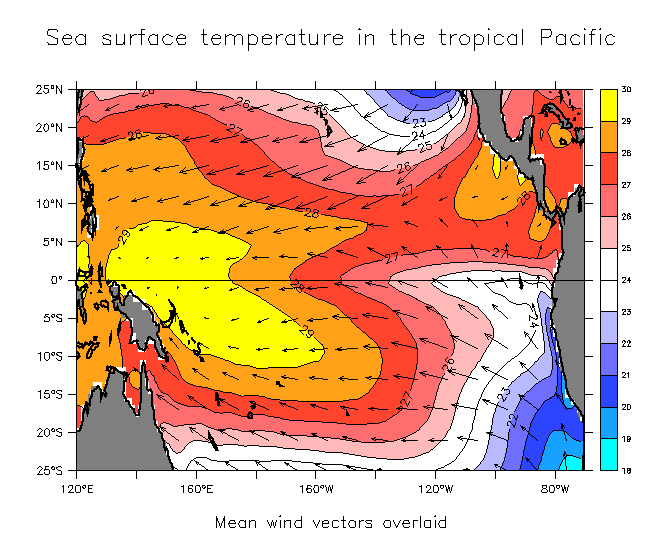
Because the water is warm in the western tropical Pacific, a lot of evaporation takes place there and the warm, moist air rises. This creates an area of low sea level pressure in the western tropical Pacific. Because the water is cooler in the eastern tropical Pacific, cool, dry air falls in that region, creating an area of high sea level pressure. The surface winds (the trade winds) blow from the region with high sea level pressure (eastern tropical Pacific) to the area with low sea level pressure (western tropical Pacific). See Figure 5.

Figure 5
The following is a reprint of a portion of Chapter 4.3 ENSO Indices from Who Turned on the Heat? In fact, Figure 5 (above) is borrowed from that chapter.
[START OF PARTIAL REPRINT FROM WHO TURNED ON THE HEAT?]
The Southern Oscillation Index, or SOI, is a way to portray the atmospheric component of El Niño and La Niña events. It represents the difference in Sea Level Pressure between Darwin, Australia and the South Pacific island of Tahiti. The term Southern Oscillation was coined by Sir Gilbert Walker in the 1920s. Yes, that’s the same Walker as in “Walker Circulation” or “Walker cells”. He was the first researcher to note that the surface air pressures in Tahiti and Darwin, Australia opposed one another; that is, when sea level pressure in Tahiti was high, the sea level pressure in Darwin was normally low, and vice versa.
Let’s discuss the trade winds again for a moment. The trade winds are blowing from east to west when the surface air pressure in the east (Tahiti) is higher than in the west (Darwin). See Figure 5 (above). When the pressure difference between Tahiti and Darwin grows, the trade winds are stronger, and that’s an indication of a La Niña event.
[Addition for this post: Conversely, when the sea level pressures drop in Tahiti and rise in Darwin, that’s an indication an El Niño is taking place.]
The Australian Bureau of Meteorology (BOM) is one of the suppliers of Southern Oscillation Index data. They use a traditional method of presentation, which they explain here. Basically—maybe not so basically—the data is calculated by subtracting the sea level pressure in Darwin from the sea level pressure in Tahiti. Then they determine the anomalies using the method described in Chapter 2.8. Here’s where the not-so-basically part comes in. The anomalies for that month are divided by the standard deviation, to standardize or normalize the data. After that, they multiply the data by 10. Whew! For those interested, there’s a somewhat-simple-to-understand explanation of standard deviation here.
Now that that’s out of the way, let’s compare the Southern Oscillation index data to the NINO3.4 sea surface temperature anomalies we’ve been using as an ENSO index. See Figure 6. Because the Southern Oscillation index data is multiplied by 10 as part of its calculation, we’ll need to scale the NINO3.4 sea surface temperature anomalies. A factor of 10 works. The Southern Oscillation index data is noisy, so the two datasets were smoothed with 13-month running-average filters. It’s very easy to see the inverse relationship between the two datasets. Equatorial Pacific sea surface temperature warm and cool during the evolution and decay of an El Niño, and Southern Oscillation index data dips and rebounds. The opposite holds true during a La Niña. There are some minor differences. For example, the Southern Oscillation index data shows the 1982/83 El Niño was stronger than the one in 1997/98, while the NINO3.4 sea surface temperature anomalies show them the other way around. Notice also, there doesn’t appear to be a La Niña event after the 1982/83 El Niño using the Southern Oscillation index, but one is present in the NINO3.4 data. Other than those and some others minor differences, the two datasets do mimic one another, but inversely.
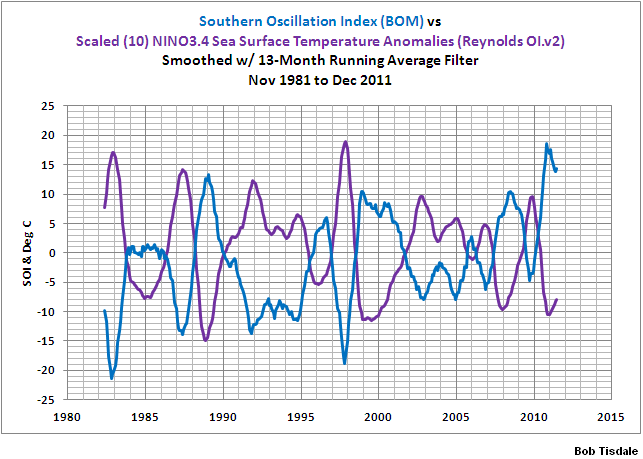
Figure 6
According to the BOM, La Niña events are sustained positive Southern Oscillation Index values in excess of +8 and El Niño events are sustained negative values in excess of -8. In that discussion at the BOM website, however, the Southern Oscillation Index data is being presented as a 30-day running average, so you can’t apply those values to Figure 4-16, which has been smoothed with a 13-month running-average filter.
[END OF PARTIAL REPRINT FROM WHO TURNED ON THE HEAT?]
POSITIVE FEEDBACK
As discussed above, the trade winds blowing across the tropical Pacific are part of Walker Circulation. The trade winds cause the temperature difference between the eastern and western tropical Pacific. But the temperature difference between the eastern and western tropical Pacific also cause the trade winds to blow. The temperature difference and the strength of the trade winds are interdependent…with positive feedback. That is, the temperature difference and the strength of the trade winds reinforce one another. That positive feedback was introduced by Bjerknes.
(And what fundamental feedback in the tropical Pacific are climate models still unable to simulate correctly? That’s right: Bjerknes feedback. See Bellenger et al (2013).)
THE CHICKEN OR THE EGG
NOAA’s Bill Kessler describes the chicken-and-egg relationship between the trade winds and the sea surface temperatures of the tropical Pacific in his ENSO FAQ webpage:
This sets up the coupled ocean-atmosphere interaction in the tropical Pacific in which the winds determine the water temperature but the water temperature also determines the winds, in a chicken and egg situation. In this system, we can start a description at any point in the cycle. For example, we observe that there is cool water in the east and warm in the west (see the figure “Mean SST and winds in the tropical Pacific”). The winds blow towards the warm water, since that heats the atmosphere and makes the air rise, then other air flows in to fill the gap. (These are the trade winds, that the Spanish used to sail from their colonies in South America to the Philippines). Because of the force of the trades, sea level at Indonesia is about 1/2 meter higher than at Peru. At the same time the trade winds act on the ocean as well. The westward winds along the equator push the warm water (heated by the sun) off to the west, drawing up the thermocline and exposing the cooler water underneath in the east. This upwelling cools the eastern surface water, and we have returned to the starting place of the description.
A QUICK LOOK AT AN ENSO INDEX REVEALS A CHANGE IN THE DOMINATION OF EL NIÑO EVENTS
Figure 7 presents a commonly used index for the strength, frequency and duration of El Niño and La Niña events. It is a graph of the sea surface temperature anomalies of the NINO3.4 region. I’ve also highlighted NOAA’s official El Niño (red) and La Niña (blue) events, based on their Oceanic NINO Index (but the data in the graph are not from the Oceanic NINO Index). And as we can see, there were a series of strong and long El Niño events from 1982 through 1998: the 1982/83, the 1986/87/88 and the 1997/98 El Niños. Although the series of El Niños in the first half of the 1990s are now considered independent events, Trenberth and Hoar proclaimed them as one long event in their 1996 paper The 1990-1995 El Niño-Southern Oscillation Event: Longest on record. The El Niño events since 1998 have not been as strong, and the frequency of La Niña events has increased.
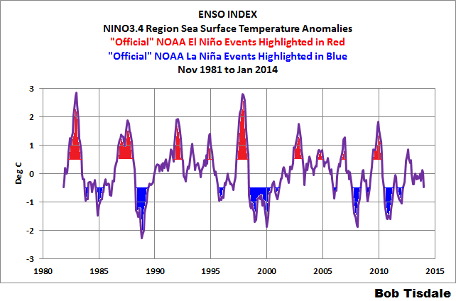
Figure 7
Because trade winds are weak during El Niños and strong during La Niñas, the change in the frequencies of El Niño and La Niña events indicate the trade wind should have increased during that time…and they have, and they also caused…
THE GROWING TEMPERATURE DIFFERENCE BETWEEN THE EASTERN AND WESTERN TROPICAL PACIFIC
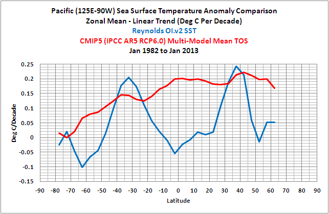
Before we present the sea surface temperature anomaly differences between the eastern and western tropical Pacific, let’s first look at the sea surface temperature anomalies for the entire tropical Pacific. See Figure 8. The data are the satellite-enhanced sea surface temperature data (Reynolds OI.v2) for the coordinates of 20S-20N, 120E-80W. The models are represented by the average of all the simulations of sea surface temperature anomalies for that region from the climate models prepared for the IPCC’s 5th Assessment Report. See the post here for the reasons we use the average of the model outputs; a.k.a. the model mean. (The base years for anomalies are the NOAA standard for the Reynolds OI.v2 data: 1971-2000.) The sea surface temperature data for the tropical Pacific show that the surface of the tropical Pacific has not warmed over the past 32+ years—the full term of the Reynolds OI.v2 sea surface temperature data. On the other hand, climate models indicate that, if the surface temperatures of the tropical Pacific were warmed by manmade greenhouse gases, they should have warmed more than 0.6 deg C (or about 1.1 deg F). The models have a big problem with how they simulate surface temperatures of the tropical Pacific, but we already knew that. (See Figure 2 from the post CMIP5 Model-Data Comparison: Satellite-Era Sea Surface Temperature Anomalies.)

Figure 8
Figure 9 presents the sea surface temperature anomalies of the eastern and western tropical Pacific. The coordinates used are listed in the title block, but, basically, I’ve divided the data for the tropical Pacific at the dateline. Although the sea surface temperatures of the tropical Pacific as a whole have not warmed in 32+ years (see Figure 8), the sea surface temperature anomalies of the western tropical Pacific have warmed and, in the eastern tropical Pacific, they’ve cooled.

Figure 9
WHAT CAUSED THE SEA SURFACE TEMPERATURES OF THE WESTERN TROPICAL PACIFIC TO WARM?
We would have to conclude that stronger trade winds (associated with the changes in the frequencies of El Niño and La Niña events) contributed to the warming of the western tropical Pacific based on our earlier discussions. But the data for that region also indicate there was an upward shift in the sea surface temperatures of the western tropical Pacific in 1995. See Figure 10. Based on the period-average temperature anomalies before and after 1995 (the blue lines), the sea surface temperatures of the western tropical Pacific shifted upwards about 0.3 deg C in 1995.
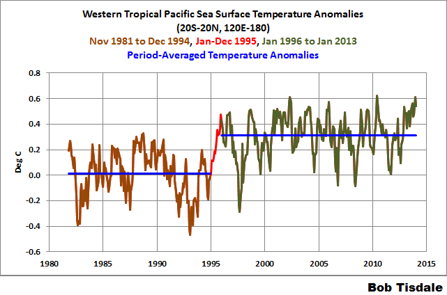
Figure 10
If we now overlay the East Pacific data onto that color-coded graph, we can see that the upward shift occurred during the transition from the 1994/95 El Niño to the 1995/96 La Niña. See Figure 11.
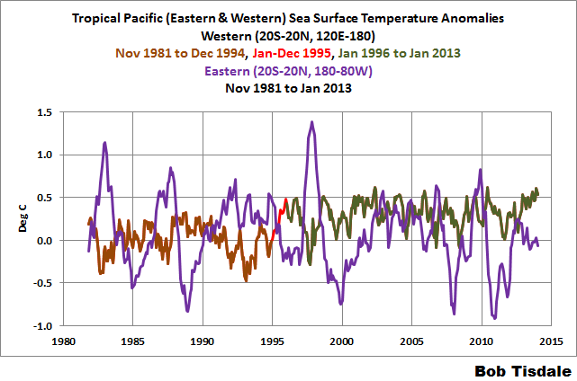
Figure 11
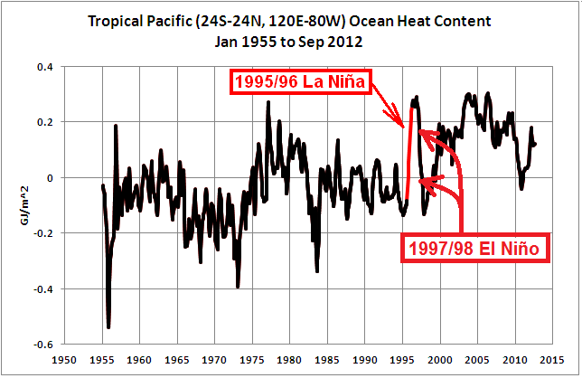
As you’ll recall from past discussions, there was a similarly timed warming of the ocean heat content of the tropical Pacific about 1995. All of the warm water for the 1997/98 “super” El Niño was created during the 1995/96 La Niña. See Figure 22 of the post Is Ocean Heat Content Data All It’s Stacked Up to Be? Refer also to the post La Niña – The Underappreciated Portion of ENSO.
WHAT CAUSED THE SEA SURFACE TEMPERATURES OF THE EASTERN TROPICAL PACIFIC TO COOL?
Again, based on our earlier discussions, we would have to think that stronger trade winds (associated with the changes in the frequencies of El Niño and La Niña events) contributed to the cooling of the eastern tropical Pacific, through an increase in the upwelling of cool waters from below the surface of the eastern equatorial Pacific.
The eastern boundary currents of the North and South Pacific feed water to the eastern tropical Pacific. In the North Pacific, that current is the California Current, and in the South Pacific, it’s the Humboldt Current. For Figure 12, I used the extratropical coordinates of 20N-45N, 135W-105W for the California Current and 50S-20S, 90W-70W for the Humboldt Current. They both show that the waters feeding the eastern tropical Pacific have also cooled over the past 32+ years. (I’ve also included the warming estimated by the climate models, for those interested.) Then again, the El Niño- and La Niña-related processes taking place in the eastern tropical Pacific have a strong impact on the sea surface temperatures of the eastern boundary currents of the North and South Pacific (except in the climate models, apparently, which still cannot simulate basic El Niño and La Niña processes and their aftereffects).

Figure 12
THE TEMPERATURE ANOMALY DIFFERENCE BETWEEN THE EASTERN AND WESTERN TROPICAL PACIFIC
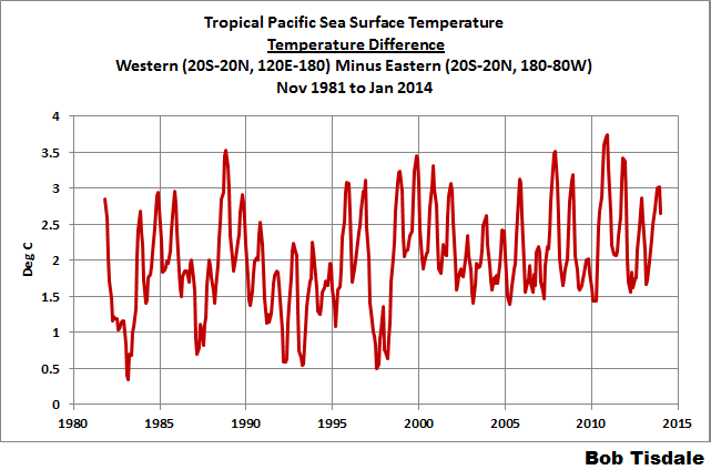
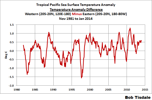
Figure 13 presents the difference between the Eastern Tropical Pacific (20S-20N, 180-80W) and the Western Tropical Pacific (20S-20N, 120E-180) sea surface temperature anomalies, with the Eastern data subtracted from the Western data. It’s very obvious that the temperature difference has increased as a result of the stronger trade winds—which are caused by the changes in the frequencies of El Niño and La Niña events.

Figure 13
For those interested, the temperature (not anomaly) difference is presented in the graph here.
Did the climate models used by the IPCC for their 5th Assessment Report capture this ENSO-related change in the temperature difference between the eastern and western tropical Pacific? Of course not. See Figure 14.
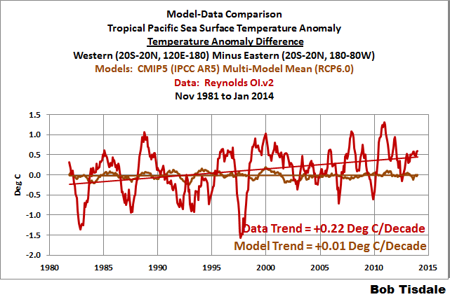
Figure 14
Climate models have no value at determining why the temperature difference between the eastern and western tropical Pacific has grown, because the models still cannot simulate the basic processes that cause El Niño and La Niña events.
We’ve presented the temperature difference between the eastern and western tropical Pacific, so let’s take a look at the trade wind indices. Because the temperature difference and the trade winds are coupled, the curve of the trade wind data should be similar to that of the temperature difference.
THE NOAA TRADE WIND INDICES
The NOAA Monthly Atmospheric & SST Indices webpage present numerous El Niño/La Niña-related indices, including trade winds for the equatorial Pacific. The trade wind indices are for the equatorial Pacific (5S-5N) at 850mb (which is an altitude of about 5000 feet, about 1500 meters). These indices are based on a reanalysis, which is a computer model that uses data as inputs, so we have to keep that in mind. NOAA provides indices for the:
- Western Equatorial Pacific (5S-5N, 135E-180): data here.
- Central Equatorial Pacific (5S-5N, 170W-140W): data here.
- Eastern Equatorial Pacific (5S-5N, 135W-120W): data here.
Figure 15 presents the indices in their “raw” monthly form, not as anomalies. Also included are trend lines. We can see that the trade winds (according to the reanalysis) have grown stronger in the western and eastern tropical Pacific, but have weakened in the eastern equatorial Pacific.
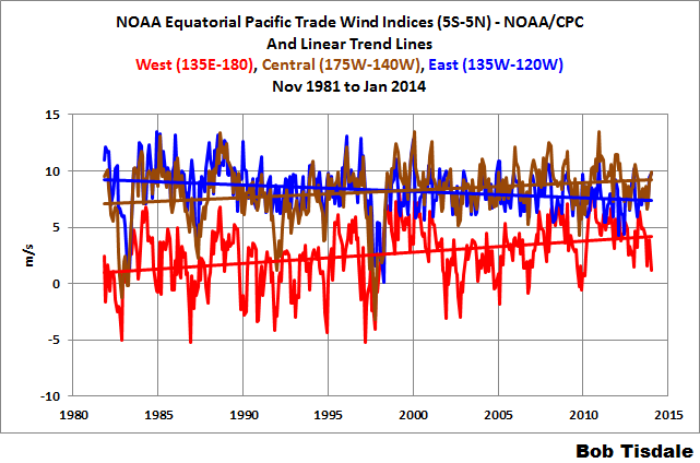
Figure 15
In Figure 16, I’ve smoothed the data with 12-month running-average filters to help show the El Niño- and La Niña-related variations. To further help with that, I’ve also included NINO3.4 sea surface temperature anomalies (the ENSO index shown in Figure 7). During El Niños, the trade winds slow (weaken), and during La Niñas, the trade winds increase (strengthen).
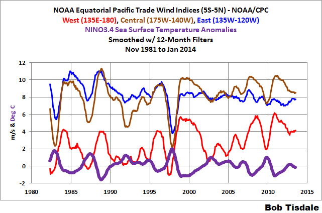
Figure 16
Unfortunately, NOAA does not provide a trade wind index for the entire equatorial Pacific, so we’ll have to create one. That’s relatively easy. We’ll use a weighted-average of the individual indices, based on the longitudes they cover: West (47%), Central (37%) and East (16%). Figure 17 presents the result. The trade winds have increased for the equatorial Pacific, just as we would expect, with the transition from a period when El Niño events dominated.
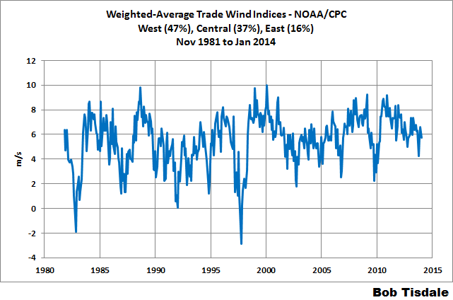
Figure 17
TRADE WINDS VERSUS THE TEMPERATURE ANOMALY DIFFERENCE BETWEEN THE EAST AND WEST TROPICAL PACIFIC
Animation 1 compares the weighted-average of the trade wind indices to the temperature anomaly difference between the eastern and western tropical Pacific.
Animation 1
The curves are very similar. Now consider that:
- The trade wind indices are for the equatorial Pacific and they’re based on a reanalysis, not data, and,
- The temperature difference is for the tropical Pacific and I simply selected the dateline for the dividing point. (See the update after Figure 18.)
How similar are the curves? For Figure 18, I’ve converted the data to annual averages, made the two datasets anomalies with 1982 to 2013 as the base years, and then standardized each dataset by dividing it by its standard deviation. The correlation coefficient is 0.93, and as a reference, 1.0 means they are perfectly correlated.
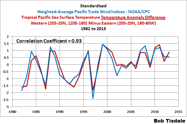
Figure 18
[UPDATE: In anticipation of some “what if” questions: If we change the dividing point for the eastern and western tropical Pacific to 165E for the sea surface temperature data, we can increase the correlation with the weighted trade wind index to 0.95. Additionally, if we then confine the sea surface temperature data to the equatorial Pacific (like the trade wind indices), the curve changes slightly, but the correlation is the same at 0.95. However, the intent of this exercise was not to try to find the best correlation; the intent was to show an interrelationship between the trade winds and the sea surface temperatures of the tropical Pacific. And I believe we’ve done that.]
And for those interested, I’ve added the annual BOM Southern Oscillation Index (SOI) data to the comparison in Figure 19, following the same procedure to normalize the SOI data. Obviously, the strengths of the trade winds and the temperature difference between the eastern and western tropical Pacific and the sea level pressure difference between the Darwin Australia and Tahiti (both located in the tropical South Pacific off the equator in the Southern Hemisphere) are all interdependent.
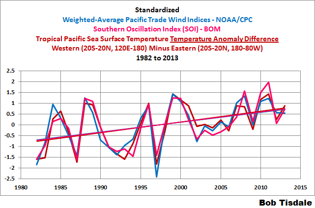
Figure 19
CLOSING
Hopefully, this introduction to trade winds will help persons understand why those winds occur in the tropical Pacific…and why they vary. And hopefully it will help provide a background for those who are interested in learning the basic processes that drive El Niño and La Niña events. Additionally, when someone uses the phrase “coupled ocean-atmosphere process”, hopefully you’ll think of this post as an example.
Once again, the climate models used by the IPCC for their 5th Assessment Report are shown to have no basis in reality and, in this instance, provide no help in determining why the trade winds have changed recently and how they might change in the future.
A very good description of the complex link between wind and currents on a global scale.
My only quibble is the use of Coriolis ‘force’ instead of ‘effect’.
“During El Niños, the trade winds slow (weaken), and during La Niñas, the trade winds increase (strengthen).”
For the purpose of applying all that to multi-centennial climate changes such as MWP to LIA to date one needs to consider whether the observed changes could have been induced as a result of latitudinal shifts in the entire global air circulation across centuries.
I have proposed that solar induced changes in the gradient of tropopause height between equator and poles could produce such latitudinal shifting and be the primary cause of the changes that Bob has so clearly described.
On that basis an active sun expands the equatorial air masses poleward and the winds reduce leading to less clouds, warming and stronger El Ninos relative to La Ninas but when the sun is less active the equatorial air masses contract and the winds increase leading to more clouds, cooling, and weaker El Ninos relative to La Ninas.
thanks Bob.
The Coriolis force produces the Coriolis effect. (As explained to me years ago by a real climatologist).
Thanks Bob
Mr Tisdale, excellent article and a useful reference.
From graph on the Fig. 7 it can be ascertain that the ENSO index peaks (on average) about 5 years (as confirmed by the ENSO spectrum).
Spectral analysis of Arctic temperatures, Earth’s magnetic field variability and tectonics activity in the warm pool area (fig 5) all show very prominent periodicity of just above 5 years. There is, however remote possibility that the movement of large volume of water is a ‘synchronising trigger’ for occurrence of the last two.
Superb explanations as usual Bob. But it still leaves open (to me at least) the question of what drives the underlying change in the balance of El Nino/La Nina events. Clearly the models haven’t a clue on this, so the explanation must lie elsewhere.
Thanks Bob. You have done a lot of hard work, and increased everyone’s understanding. I’ll put your observations-of-reality ahead of observations-of-a-model, any day.
While the Hadley, Ferrel and Polar Cells look wonderfully neat, tidy and organized in a drawing, I find they are more complex in reality, especially the Polar Cells, and especially this winter. Rather than mild air heading to the Pole aloft it has sometimes gone straight up to the Pole at the surface, as cold air charged down to Minnesota, and on one occasion it was ten degrees colder in Iowa than it was at the Pole. Then that mild air rises up at the Pole, and chills. In the past week or ten days some “mild” air went up towards the Pole that was only minus-five at the surface, and then on the DMI temperature map you could watch that air chill, day by day, down to minus-thirty. This sort of behavior does not compute, when you try to use the simplistic concept of a Polar Cell to understand it. (I know because I have tried, and suffered a melt-down of perfectly good brain-cells I likely should have saved, and instead used for remembering where I put my car keys.)
I think the Hadley Cells are the most well-behaved and useful, in terms of understanding the majesty of our atmosphere and oceans..
Great article Bob. Just one tiny thing; I think the term comes not from the Spanish, but from the English and the Portugese. The Portugese used them initially, as then did the English, and the English named them. I think that’s right.
A very good a clear description Bob. Very nicely explained.
I don’t believe NOAA’s “chicken and egg” . The chicken and egg paradox is a …. paradox. Just saying ENSO is like “chicken and egg” does not explain ANYTHING. All it does is say they have a paradox in their limited understanding of the process.
When they start to look at the tidal influence of the moon (and sun) they may get rid of the paradox and finally understand what may be laying the eggs.
Thanks, Bob
A very helpful article.
johnmarshall says:
thanks Bob.
The Coriolis force produces the Coriolis effect. (As explained to me years ago by a real climatologist).
====
The Coriolis force IS the Coriolis effect. It is a FICTITIOUS force that needs to be artificially introduced to enable us to use newtonian mechanics in a rotation frame of reference (the earth we are sat on and imagine that our feet are butts are not moving., rather than the spinning one seen from space).
In reality it is just inertial. The tendency of things to keep going in straight lines.
Coriolis force does not exist, it is a mathematical convenience since the maths and the mental gymnastics is easier if we can remain with the intuitive idea of the earth as we perceive it.
Thanks. I’ve bookmarked this post.
Thank you Bob. I’m going to enjoy sharing this with a stock market advisor friend.
He’s a believer in the AGW camp, and I’m trying to open his eyes. I got his attention when I asked him if he’d buy or sell Global Warming stock based on it going up or down.. (I’d provided a earler WUWT link for reference, showing charts & graphs & explanations)…. His response?
“I’d buy the dips and sell the rallies!”
So again, I’m going to hit him on a level he understands, finances and economic math. I’ll present to him that the IPCC assessment reports are the equivalent of annual corporate reports, replete with extensive analysis by financial wizards and people with a serious vested interest in their company, and their jobs. Their assessment reports show a continued upward, and accelerating growth.
Then I’ll point out that there are people, equally qualified, outside of the IPCC who have discovered false reports and charts and graphs and all manner of representation which are based on missing or manipulated data. I’ll point out too that they discovered the computer models used to generate the impressive financials do not replicate real world data. In the financial world, this is called “fraud”.
These people (some of whom worked directly on the IPCC reports), calling into question these reports and the methods used to create them are called “deniers”.
Caleb says: “I know because I have tried, and suffered a melt-down of perfectly good brain-cells I likely should have saved, and instead used for remembering where I put my car keys.”
Thanks, I enjoyed that.
Figure 2… Come on…
This post and your book should be required reading for all climate students (and policy makers) Thanks Bob
Thanks Bob for the Trade Winds basic review. As an old operational tropical forecaster I take issue with NOAAs description of ‘Trade Winds’ in the 5N to 5S band, and especially using 850 for the analysis. The coordinates delineate an area of variable winds; trade winds at the end of their tether so to speak. They are affected by the Monsoon Westerlies, frequently cross the equator; frequently are part and parcel of ‘Twinning’ or the formation of mirror Tropical Cyclones, one in the northern hemi and the other in the southern. In general the winds are certainly not constant in speed or direction and not the place to be for a Sailing Vessel plying trade. It’s a bad, very bad way to analyse the true trade winds to the north and south of that band. The other issue I have are the 850 winds. I used to use them to forecast movement of MCSs forming near Island Groups ( Tonga, Fiji, etc) which can and do travel counter to the trade winds. This level in the atmosphere is decoupled with the surface. A SE wind of 20kts can have 850 winds stronger and from the WSW as an example. Sailors in the Tropics frequently marvel at why Cumulus clouds often blow in a different direction than the surface winds.
If someone wanted to analyse Trade Winds for the South Pacific for example I would suggest acquiring data from the Met Services of French Polynesia, Tonga, Fiji, Vanuatu and New Caledonia; then one would have real data for the real trades.
Apart from this I always enjoy your posts.
It’s very obvious that the temperature difference has increased as a result of the stronger trade winds—which are caused by the changes in the frequencies of El Niño and La Niña events.
An excellent article, Bob. I question this claim, however. I think the cause is still an open question.
My own view I have articulated before. The Meridional Overturning Circulation (MOC) varies in speed. When it speeds up it provides more cold water to the upwelling currents. That is probably responsible for the cooling of the Humboldt and California currents. Since you have more cold water the trade winds increase and this changes the frequencies of the various ENSO events. Your cause is my effect.
Consider the MOC consists of very cold, dense water. Hence, it is heavier. This weight is allows it to drive the upper ocean currents. The net result of these changes is also what leads to the changes that determine the PDO index.
Thanks Bob. Very good article.
Natural winds caused by Sun-warming drive ENSO.
You almost have it right but at the last minute you screw it up. An El Nino does not start because trade winds slacken. It is the other way around: trade winds slacken because an El Nino is starting. You have the eastward flow along the equatorial countercurrent right but then you somehow manage to steal its momentum away. Once in motion the El Nino wave keeps going until it hits the South American coast and spreads out north and south. The exposed warm water then warms the air above it, warm air rises, interferes with the trade winds, joins the westerlies, and we notice that an El Nino has started. But any wave that runs ashore must also retreat. When the El Nino wave retreats water level behind it drops by half a meter, cold water from below fills the vacuum, and a La Nina has started. As much as the El Nino warmed the air the La Nina will now cool it. That is the ENSO cycle. It has nothing to do with global warming. The energy to keep it going comes from the Walker circulation. If interrupted it will restart and resume its natural period of oscillation which is one El Nino every four-five years. This period is determined by the dimensions of the ocean basin within which the water mass oscillates. Water first gets piled up in the Indo-Pacific Warm Pool. When the level there is high enough gravity flow starts along the equatorial counter-current. The momentum of this eastward flow carries it up along the east coast of the ocean as I pointed out. Return flow in the form of a La Nina starts by gravity also and is then augmented by the trade winds. That is when the energy to keep the oscillation going is injected into the system. Simple physics but thousands of articles about El Nino simply don’t get it. I have always been impressed by the info you get from Nino3.4 observation region. Just by dogged trial and error they found a spot in the middle of the equatorial counter-current where they can observe the passage of an El Nino wave across the ocean. They even knew about the delay between 3.4 and observed atmospheric warming but still could not put the whole thing together. Interestingly, if you somehow manage to block the equatorial counter-current ahead of the El Nino wave it will spread out in the middle of the ocean instead of along the coast. This does produce an El Nino called El Nino Modoki or Central Pacific El Nino. Obviously the La Nina that follows will also differ from normal but I haven’t figured out just how.
Nice work Bob.
Thanks, Bob,
Living in California through many La nina droughts and El nino deluges my takeaway is at some point those winds will slow and a whole bunch of warm water will slosh back which is when we seem to get more rain. Seems to support why so many of our droughts seem to end in a dramatic fashion.
Bob, I need to correct your geography re “Darwin Australia and Tahiti (both located in the tropical South Pacific)”. Darwin is most definately not located in the South Pacific. It sits on the Timor Sea, a sub-set of the Indian Ocean, and is physically separated from the Pacific by the Australia-New Guinea continental land mass. Its a fact that much of Australia’s weather/climate is and has been a result of what goes on in the Indian Ocean, and not what happens in the Pacific. Which leads me to wonder how useful the Darwin-Tahiti measure may be.
Our highly prized ex-pert, Bill Nye, should be sent a sighted copy of this post.
This sort of post is exactly why WUWT is so fantastic. A very heartfelt thank you for this, my most recent aha! moment. My goal is always to seek greater knowledge through deeper understanding of fundamental drivers of processes. This post was an experience almost as good as the time a long time ago when I finally understood how to calculate the angle an object hanging from the car mirror deviates from vertical when accelerating. And I appreciate this story mainly because of the many excellent posts here on WUWT from you and many others over the years. Thanks again!!
drbob, don’t you think the measure is useful because it is useful? Understanding the basis of its utility was explored here. The underlying point of your question seems important. Obviously, we still have much to learn.
Bob: I loved “Who Turned on the Heat?” and so can read through your posts easily! I’ve always wondered how the sun plays a role in ENSO… and Stephen Wilde puts a plausible explanation out there vis a vis causes… I believe a changing sun affects the earth’s climate system – and I believe we will see your work and others’ work come together in the coming years. What a power team there could be here for you!
Bob, Menzie Chin believes this is a good model: http://econbrowser.com/archives/2014/02/ex-post-historical-simulation-of-a-statistical-model-of-anthropogenic-climate-change
Signed…darn auto correct
Arno Arrak says: “You almost have it right but at the last minute you screw it up. An El Nino does not start because trade winds slacken. It is the other way around: trade winds slacken because an El Nino is starting.”
Arno, I suggest you go study ENSO before you try to correct decades of research on the subject. The term you’ll want to Google is “Westerly Wind Burst”. Your knowledge of ENSO is as poor as your description of it.
Pamela Gray says:
February 23, 2014 at 11:12 am
What, Nye would refuse a visually-impaired copy of this post? I believe that violates ADA.
🙂
]
Bob:
Let me add my appreciation for your latest contribution to WUWT, along with the many previous ones.
Your closing sentence:
Leads to the question: do we have any way to know whether the trade winds have changed similarly in the past, and if so, how far back can we create a record of such changes?
TomRude says: “Figure 2… Come on…”
If you were to perform a Google image search of “Hadley cell”, I believe you’d find a wide selection of similar illustrations.
Regards
Alan Watt, Climate Denialist Level 7 says: “do we have any way to know whether the trade winds have changed similarly in the past, and if so, how far back can we create a record of such changes?”
That was one of the points I tried to make with my post about England et al. (2014).
http://bobtisdale.wordpress.com/2014/02/10/quick-comments-on-england-et-al-2014/
The wind data sampling are very poor along the equator in decades past. There’s really no way to tell how unusual the current conditions are or whether they will have an impact on ENSO.
Regards
Thanks for your insights, Weather Dave.
figures 10 and 11 titles; is that dec 1994 in brown and Jan 1996 in green rather than the 2004 and 2006? Also, thank you so much for all your work and the knowledge and info regarding this area that you and many of the commenters provide to neophytes like myself.
I missed that post; thank you. I wonder if it would be possible to extract a usable proxy for trade winds from ship records from the sailing days? I would guess (hope) that many of the logs from the East India company would be in a library somewhere. I’m not suggesting you should do that; just wondering whether it could be done and whether the output would usefully extend the data on wind data. Sparse data I know, but people paid a lot more attention to the wind when that’s what they depended on to power their ships.
Bob, appreciate this and your other contributions to understanding. Yes, I’ll remember this post when I read of “coupled ocean-atmosphere process,” and I’ll have a new chicken/egg example, too.
Particularly illuminating and readable, thanks Prof Tisdale.
Fig 17 plus intuitive cyclomania might suggest that a few years of strengthening trades lie ahead.
Fig 13 leads one to speculate what might be brewing in the Pacific.
Really useful. Thanks.
Re Alan Watt, Climate Denialist Level 7 says:
February 23, 2014 at 3:15 pm
Sailing ship records were discussed in an earlier WUWT post:
http://wattsupwiththat.com/2014/02/10/the-reason-for-the-pause-in-global-warming-excuse-37-in-a-series-trade-winds/
There was a link to a NOAA report on Manila galleon voyages:
milodonharlani says:
February 10, 2014 at 9:40 am
It has been done:
http://www.esrl.noaa.gov/psd/spotlight/2004/manila-galleon.html
Bob: Car keys analogy holds for me. I refer to my old physical oceanography text, but prefer your explanations. Thank you for the effort you put into these.
Bob. moe says: “figures 10 and 11 titles; is that dec 1994 in brown and Jan 1996 in green rather than the 2004 and 2006?”
Thanks for finding those typos. I’ve corrected them.
Regards
@ Neil Jordan (February 23, 2014 at 8:54 pm):
Another post I missed; thank you. The Manila-galleon story concludes with:
The study covered ship logs from 1590 to 1750 on voyages between Manila, Philippines and Acapulco, Mexico.
(Note the obligatory obeisance to climate change and “extreme weather”).
So to answer my own question, yes, trade winds have undergone significant strength changes before.
Bob:
It’s pretty clear the the CAGW paradigm is eroding fast, driven by the extended stasis in surface temperatures. It’s also clear that the catastrophists are betting the farm that a monster El Nino will “save the day” (for them) and drive up surface temperatures by .5 C.
As Nuccitelli write in the Guardian:
“In any case, England concludes that surface temperatures may rapidly warm when the IPO phase shifts again in the next decade or so, and it will eventually be as though the surface warming slowdown never occurred… England says, “We should be very clear: the current hiatus offers no comfort – we are just seeing another pause in [surface] warming before the next inevitable rise in global temperatures.”
So is there anything in the current ENSO data that indicates that a “monster” is brewing and will show up in say the next 18 months? Or are those links just too obscure to make any sort of prediction, and that M. England’s comments about his paper are just wishful thinking?
There have been four Ninos since the 1998 monster, but the others since then have not derailed the temperature stasis.
sarastro92 says:
February 24, 2014 at 7:03 am
“…So is there anything in the current ENSO data that indicates that a “monster” is brewing and will show up in say the next 18 months? Or are those links just too obscure to make any sort of prediction, and that M. England’s comments about his paper are just wishful thinking?
There have been four Ninos since the 1998 monster, but the others since then have not derailed the temperature stasis.”
++++++
My bet is that if the sun has anything to do with the energy that “supercharges” the westerly flow of water in the equatorial region, and that there is a positive feedback effect (more clouds caused by less energy from sun + less energy from the sun), that the El Niño’s will be less massive and La Niña’s will dominate. We’re still at the current solar cycle maximum… but as we dip into the solar min, after this weak max, we’ll soon see! Of course correlation is not causation – but many have been waiting for such a perfect storm in time to see this play out.
Bob,
I’m intrigued with the 1995 step temperature change shown in Figure 10. The same step change occurred in the satellite global temperature record, but two years later, in 1997! It’s very clearly seen here:
http://www.drroyspencer.com/2014/02/uah-global-temperature-update-for-january-2014-0-29-deg-c/
The IPCC needs to explain how this step change occurred, because the satellite global temperature record very clearly shows two essentially horizontal trends. The first runs from 1979 to 1997. The second runs from 1998 to present.
-Gerry Pease
Where or what is Figure 4-16? (Referred to just below Figure 6)
The German MSM titles these days: El Nino could turn climate upside-down, cause a catastrophy and signal the end of the hiatus…. yes that’s right, all those things 🙂
@Bob Tisdale, notwithstanding the wealth of data you always bring forward in your posts :
Instead of a Google search, the late Marcel Leroux did reconstruct the geometry of tropospheric circulation. He found that those illustrations were and still are simply inaccurate: the Polar and Ferrel cells do not exist and the Hadley Cell downdraft does not reach the surface. Furthermore, he demonstrated there is continuity between polar, temperate and tropical circulation proving this kind Wikipedia illustration http://en.wikipedia.org/wiki/File:Airmassesorigin.gif obsolete and simply wrong. A nice concise post on http://www.skyfall.fr/?p=1269 illustrates that quite well.
Finally, Leroux was also wary of theories that use oscillations indexes, defined by statistical pressure centers such as the “Azores Anticyclone” and the “Icelandic Depression”, and that pretend to discover physical mechanisms of natural climatic variations from entities that do not even exist at the synoptic meteorological scale. During El Niños, Darwin and Tahiti are not located in the same circulation unit: Darwin is affected by the Australian Monsoon thus “subject to the northern winter dynamic, while Tahiti experiences the southern summer dynamic” Chapter 14.5 “Dynamic Analysis of Weather and Climate”, Leroux, Springer 2010.
A lot of info presented but so systematically I believe I understand much of the presentation. Thanks.
The missing clue and somewhat of an elephant in the room is the Moon and its Declination cycle of 18.613-years, giving the quarter cycle the ENSO period. It is illogical to ignore currents as causing surface winds, and equally illogical to say surface winds cause currents, especially in the deep. Strength of currents determines extent of mixing, and SSTs rise when oceanic mixing slows. The warm waters of your spa will be felt to cool as people start to move around.
Winds are caused by currents and waves beneath them, not viceversa. You can easily prove this. Go ask a yachtie if there is often a big blow before the turn of the tide after which the air goes calm on the turn. If he tells you yes, then either the current influences the wind or the wind causes a change in the water. But it cannot be the air causing the turn of the tide, it is the current that chages the air. Sit in the bath and move the air with a fan. Does some underwater current begin and move the water around beneath the surface? Conversely gently move a paddle beneath the surface and watch a candle flicker beside the bath.
Now take a step back and consider that it is the Moon causing, by varying current strength, oceanic mixing. It is therefore the Moon causing wind systems, not the “atmospheric heat engine” doing it. Every approx 4.5-years ocean currents slow down with the build-up of sealevel in the west. To restore levels the ocean flows the other way just like the sloshing backwards and forwards of a dish. We now call this the El Nino, and we say it causes westerlies. But El Nino doesn’t cause anything. It is just the name given to the observed effect. Ignore the Moon if you want, but ignoring it this raises more questions. How could a huge celestial body between a third and a quarter the size of Earth, and only 10 earth circumferences from us not have any effect on the earth and everything on the earth, including the land beneath the sea (Land or Earth Tide), the sea and the air? How could all these three not be interconnected – after they completely and perfectly interface over 73% of the surface of the planet. How could it be that only one would have a tide, but not the other two, when all three are intermeshed?
The ocean feeds the air currents but not the air temperatures, which come from the Sun. Cyclones, hurricanes and typhoons are caused by the equinoxes, when the atmosphere undergoes a twisting action through the plane of the ecliptic due to the increase in speed of the Sun relative to the orbit of the earth.
The atmospheric heat engine theory is flawed and is too simplistic. If an atmospheric heat engine worked minus the Moon then under ideal conditions the weather should be exactly the same on any given day of the year. After all, the earth’s rotation is constant, as is its orbit around the Sun. In general the Sun pours the same amount of heat into the atmosphere each day, so the atmospheric “engine” should respond by giving the same results year by year, season by season, month by month. and day by solar-calendar day. Frosts would be on same nights, same amounts of cloud will form each day, seasons would never be early or late and anticyclones will always be at same intensity and same latitudes for the same period of time of year.
The Moon is the reason not for temperatrures, but for the changing of temperatures and the lunar-induced atmospheric tide is why the Arctic and Antarctic are where the ice is. The Arctic and Antarctic are the results of the weather and not a storehouse of weather as most meteorologists would like us to believe.
The high pressures of an anticyclone have been explained by stating that cooling air from the tropics becomes heavier when descending over the temperate zones thus giving the higher pressures. But what of low pressures? If descending air raises air pressure then rising warm air should give low pressures. But low pressures are usually associated with depressions that mostly begin in the cold latitudes where the air is already heavier. The literature is strangely silent on this anomaly and never questions what causes low pressures, nor has there been any explanation as to why pressures change anyway, for the atmosphere is supposed to be a constant and with the same barometric pressures day in and day out.
What they have overlooked is the Declination Cycle of the Moon, which, due to the obliquity of the earth, monthly shifts great volumes of water between hemispheres and monthly changes barometric pressures. With water relocation comes current variation, depending on the speed of the Moon relative to the earth and of course orographical factors, and from that derive wind systems. Forget the atmospheric heat engine and replace it with something that includes the lunar declination cycle.
Otherwise we are stuck with having to ignore the Moon which is impossible because we know it is there, having to ignore the declination cycle which has been measured and monitored for centuries by all stome circles such as Stonehenge, and even having to deny the Moon affects ocean tides and currents.
That is a lot of denying. It is easier to ditch outmoded theories. Start with the preface that the Moon controls El Nino/La Nina. All else will now fit into place
Ken Ring
Longrange forecaster
New Zealand
kenmoonman says:
February 25, 2014 at 8:18 pm
It makes a lot of sense, but there has to be more to it since the number is odd. So if we are in one phase now, the next time we are in the same phase would be 7 months later so we would be in very different season so that complicates things as well.
How could a huge celestial body between a third and a quarter the size of Earth
But the mass is only 1/81 that of Earth.
The Moon’s mass does not cause the tilt of the earth, which is responsible for the Lunar Declination cycle. Neither does the Moon’s mass cause the ocean tide, which rides atop the Land Tide, which in turn comes about due to geomagnetic stress within the earth caused by the daily transitting Moon through Earth’s electromagnetic field. The “mass” argument is what is usually thrown up as a way of dismissing anything lunar.
kenmoonman says:
February 25, 2014 at 9:39 pm
Neither does the Moon’s mass cause the ocean tide
This should have been discussed on the recent post on tides.
The “mass” argument is what is usually thrown up as a way of dismissing anything lunar.
That was not my intention at all. It was just in response to your “between a third and a quarter the size of Earth”. This may have given a misleading impression.
Fair enough.