We’ve already discussed Cowtan and Way’s infilling of HADCRUT4 data in the post On Cowtan and Way (2013) “Coverage bias in the HadCRUT4 temperature series and its impact on recent temperature trends”. The paper is available here. In that earlier post, I presented the following graph and noted:
If we compare the HADCRUT4 data to the CMIP5 models (historic and RCP6.0) for the period of 1997 to 2012, Figure 1, we can see that the models over-estimate the warming from 65S to 65N (the vast majority of the planet) and underestimate the warming at the poles. Therefore, if the Cowtan and Way (2013) data are increasing the warming in the Arctic, they are creating a greater divergence from the models there, but failing to reduce the differences between the models and data where the models overestimate the warming.

Figure 1
(I changed the above Figure number for this post. It was Figure 9 in the earlier post.)
The Cowtan and Way (2013) data do increase the warming at the poles and exaggerate the failings in the models there, while doing little to explain the hiatus in the non-polar regions, which make up about 90% of the planet.
Note: For those not familiar with the type of graph shown in Figure 1: It illustrates the warming and cooling rates of the HADCRUT4 data, and the average of the CMIP5 (IPCC AR5) climate runs for the period of January 1997 to December 2012…the hiatus period. The vertical axis (y-axis) is scaled in deg C/decade, so we’re showing the warming and cooling rates (that is, the trends). The horizontal axis (x-axis) is scaled in latitude, so the South Pole is to the left at -90 (90S) and North Pole is to the right at 90 (90N). From 1997 to 2012, the HADCRUT4 data show the very slow warming rates (and cooling at some latitudes) extending from the mid-latitudes of the Southern Hemisphere to the mid-latitudes of the Northern Hemisphere. Both poles continue to show warming, however. On the other hand, the models do not show the lack of warming in the non-polar regions during this period. That is, they do not capture the hiatus, the pause, the halt, the cessation of global warming in the non-polar regions. And the models underestimate the warming at the poles, especially in the Arctic, and that means the models do not properly simulate polar amplification. But we already knew the models cannot simulate polar amplification—we discussed and illustrated that failing in the posts here and here.
Back to the Cowtan and Way (2013) data:
In the earlier post, I had not presented warming rates (or lack thereof) for the Cowtan and Way data on a zonal-mean (latitude-average) basis (like Figure 1)because their data is not available on a gridded basis in an easy-to-use format. However, blogger Nick Stokes made the effort to determine those trends for the Cowtan and Way “hybrid” version, for the period 1997 to 2012. (Just what we’re looking for.) See Nick’s post Cowtan and Way trends. Nick was also very kind and he listed the trends in a table. (Thanks, Nick.)
Figure 2 presents the trends of the Cowtan and Way “hybrid” data (courtesy of Nick Stokes) versus the trends of the multi-model mean of the climate models used by the IPCC for their 5th Assessment Report (AR5), for the period of 1997-2012. I’ve also included the HADCRUT4 trends as a reference (dashed lines), because they’re the basis for the Cowtan and Way data. The Cowtan and Way infilling make the models perform worse at the poles, and they had performed very badly with the HADCRUT4 data without the “help” of Cowtan and Way. And the Cowtan and Way infilling did little to eliminate the hiatus in the non-polar regions. Most notably, Cowtan and Way reduced, but did not eliminate, the cooling taking place in the Southern Ocean surrounding Antarctica, a place where sea ice has been expanding in recent decades…and where sea surface temperatures have been cooling.
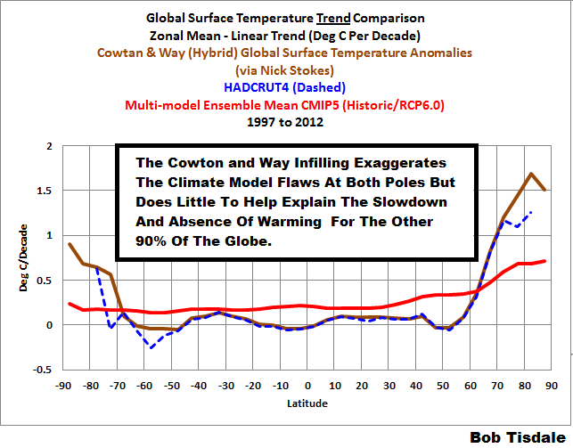
Figure 2
CLOSING
The Cowtan and Way (2013) revisions to the HADCRUT4 data do nothing to explain the absence of warming that is occurring in the non-polar regions during the hiatus period. Those non-polar regions cover about 90% of the planet and it’s there that climate models cannot explain the slowdown and absence of warming. The Cowtan and Way revisions also exaggerate the warming at the poles which further undermines the current generation of climate models, because the models are unable to explain the observed warming at the poles. That is, the models are still not capable of properly simulating polar amplification.
Those who promote the Cowtan and Way (2013) revisions to the HADCRUT4 data don’t understand where the hiatus is taking place and they don’t understand the model failings at simulating polar amplification—or—they are intentionally being misleading.
SOURCES
The HADCRUT4 data and the climate model outputs are available through the KNMI
A global cooling spell involves more meridional / equatorward jets which allows more warm air inflows to the polar regions whilst cold air flowing out from the poles cools the middle latitudes.
A global warming spell involves more zonal / poleward jets which tends to isolate the poles and allows them to become colder whilst the middle latitudes warm up.
The additional warmth at the poles during the cooling scenario allows faster energy loss to space from the poles and the more meridional jets gives more global cloudiness to reduce solar input to the oceans.
Open water in the Arctic allows energy out to space faster and more than offsets the effect of reduced albedo in the Arctic Ocean.
The chart above makes the point very well by showing the slight cooling beneath the mid latitude jet stream tracks in each hemisphere and beneath the ITCZ (which is slightly to the north of the equator) along with the polar warming.
If we were in a global warming spell I would expect to see the opposite, namely, colder poles and slightly warmer areas beneath the jet stream tracks and the ITCZ.
The cynical would say just 2 Sceptical Science insiders/contributors trying their damnedest to put a ‘pause’ rebuttal out there… the cynical amongst us, might say using/misusing peer review to do it?
Ie nobody will look at the paper, just wave around, a rebutall – look this paper says no pause,(ignore Met Office) aren’t those sceptics dumb (oh and its going in the oceans anyway)
After all what do the Met Office know vs 2 guys from Skeptical Science, who don’t like the ‘pause’
Kevin C [Cowtan}
https://www.skepticalscience.com/posts.php?u=3863
Robert Way
https://www.skepticalscience.com/posts.php?u=2360
My conclusion, based on observing a lot of AGW promoters in action is that when a paper is published to explain away why yet another prediction failed, it is actually a demonstration of after the fact arm waving designed to give comfort to the believers.
Stephen Wilde says:
February 22, 2014 at 4:22 am
Stephen, I think your description of jet direction could do with some rework.
Bob, is there an agreed figure for what percentage of the global surface is polar? Your estimate of 10% sounds high.
It strikes me as being the same as rearranging the deck chairs on the Titanic but in this case it is HadCRUT4 temperatures that are being rearranged. The ship is still going to sink.
The problem with Cowtan & Way is that they manage that mathemagical trick of getting a larger trend in their result data set than is present in either of their two source data sets. That alone should cause ‘pause for thought’.
Barry Woods is absolutely right.
It’s time these activist-inspired “peer reviewed” papers from the Cook/Nuccitelli “et al” Skeptical Science crowd were called out for what they are – manufactured pseudo-science, conceived and designed only to plug gaps in the climate alarmism narrative.
We saw from the leaked SkS private forum how these people connived behind the scenes to distort proper scientific climate debate by faking up their 97% “paper” which had no statistical or scientific merit and was simply a elaborate exercise in dressing up their own prejudices.
It’s worth noting that both Kevin Cowtan and Robert Way were active & vocal plotters on the “secret” SkS forum well before they decided to re-write the HADCRUT historical temperature record and attempt to get rid of the embarrassing “pause”.
Cowtan is a crystallographer who describes his interest in climate science as a “hobby” and Way is still (AFAIK) a PhD student. Whether you accept Bob’s interpretation of their results here or not – is it not bizarre that senior climate scientists like Schmidt & Rahmstorf at Real Climate, and various others, are now quoting “Cowtan & Way” as if it were part of the accepted historical temperature record – rather than just an interesting piece of mathematical extrapolation by a couple of amateurs.
The fact is – every piece of pseudo-science that has been dreamt up by the SkS crowd has been conceived to produce a pre-determined outcome – which could be exploited to advance a cause.
That is the exact opposite of the spirit of scientific enquiry.
Hadcrut4 added 628 new stations compared to Hadcrut3. These were mostly in Arctic regions and this was the main reason that global average temperatures increased slightly after 2000. Meanwhile. 176 stations in the Americas were dropped and Africa still has hardly any coverage at all. The new stations are shown in red while the dropped stations are shown in blue in this map.
Now Cowan and Way want to add even more stations in arctic regions to get the average temperature anomaly up even higher ! To be consistent they should request that the missing grid points in Africa get sampled.
One other point to remember in all this is that CRU use a 5×5 degree grid. The area of each grid cell increases dramatically the further north you go so if you walk in a circle around the north or south pole you will pass through 72 grid cells ! It pays to add stations near the poles especially when you know that the temperature rise is greater.
Bloke down the pub says:
February 22, 2014 at 4:36 am
“Stephen, I think your description of jet direction could do with some rework.”
Such as ?
Clive Best says:
February 22, 2014 at 5:29 am
Clive: shouldn’t that read: “The area of each grid cell decreases dramatically the further north you go …”
Bloke down the pub says: “Bob, is there an agreed figure for what percentage of the global surface is polar? Your estimate of 10% sounds high.”
The latitudes of 65N-90N (or 90S-65S) represent about 5% of the surface of the globe. And as a reference, the Arctic Ocean covers a surface area of about 4.3% of the surface of the global oceans, according to NOAA webpage here…
http://www.ngdc.noaa.gov/mgg/global/etopo1_ocean_volumes.html
Regards
Stephen Wilde says:
February 22, 2014 at 4:22 am
Meridional flow (or amplified flow) has big ripples in the track of the jet stream. What goes north has to come south. Like this year – the southern lobe over the north central US is balanced by the northern lobe that has brought such warmth to western Alaska and kept rain away from California. There’s equatorward and poleward air flow.
Zonal flow is more east-west and brings relatively boring weather. I suppose it lets the arctic get cold since there’s less exchange of air mass between that and the mid latitudes.
Bloke down the pub says:
February 22, 2014 at 4:36 am
Bob, is there an agreed figure for what percentage of the global surface is polar? Your estimate of 10% sounds high.
Working out the area using the formula for a spherical cap……. Take the ACOS of 0.9. (100% -10%). Gives. 25.8 degrees. 90-25.8 =64.2deg lat as the 10% of hemisphere (5% of globe). Pretty close to the 65 degrees being the quoted figure.
@Gilbert K. Arnold
Oops – Indeed it should ! The area of each grid cell decreases dramatically the further north/south you go.
More on sampling biases here:
CRU’s Arctic Fix and
A Study of Hadley-CRU weather station data
IMHO, Hadcrut3 temps should have been used. Just because most models have been parametrized with HadCrut3.
I know I am alone in this battle, but I still think I am right. If you move the termometers, the analysis is not valid.Lets compare apples to apples.
Ok, I read Clive Best’s post and I am happy to see that I am not alone. 🙂
huh cowtan and way dont warm the arctic. its warming fine by itself.
1. hadcrut is biased cold in arctic.
2. Cowtan and way estimate the arctic.
3. That estimate can be tested.
4. it passed
From the whistle blown SkS author/contributor forum:
extract: General Chat – 12/02/04 – Can Someone help me…
Cowtan:
“What are you after? If you want to do a HADCRUT3 takedown, that’s what I’m working on at the moment (as a paper, but got some nice analogies for popular usage). It’s arguably better than the BEST argument because it’s global, although I’m not ready for publication yet! But I can give a trivial argument by analogy which shows that HADCRUT3 must be wrong, and give a corrected version in which 2010 beats 1998.”
now the paper may be good;
but I have a problem with the attitude here – ‘takedown’ , for popular ‘usage’ which makes me question everything they do, something to be waved around, for the cause, not to advance science?
Except that the MultiModel Ensemble Mean of the CMIP5 models is a Meaningless quantity, indefensible by any of the laws of statistics.
One could fairly compare the models in CMIP5 one at a time to the temperature distribution of HADCRUT4 and fail them one at a time, but discussing the collective “mean behavior” of a bunch of not-even-independent models, all of which contribute completely different numbers of perturbed parameter ensemble runs to the single model mean, which is then averaged into the MME mean with an equal weight, when many if not most of those models would independently completely fail simple hypothesis tests such as this one against the data makes no sense, and using the MME mean in comparisons simply continues to give credence to a complex statistical fraud.
If one generated (say) 36 different versions of the graphs above, one per model, one would, I’m sure, find that some models are so far away from the data as to be completely absurd. Yet they are still in that good old MME mean. Who knows, one or two models in CMIP5 could be doing pretty well against the data, but are they given greater credence or weight? Of course not. We don’t even know which ones they are — if we did, we’d use them and throw the rest away, and most of the predicted warming would disappear alone with the discarded part.
rgb
To Clive:
Yes, one of the greatest sources of idiocy in climate science is the use of a lat/long grid both in CRU and in GCM’s. Why both with icosahedral tesselations that don’t have a singular Jacobean? It’s so much easier to pretend that the world can be covered with a rectangular grid, even at the poles.
I often wonder how much the computations would change if anyone built climate models on top of an automagically rescalable icosahedral tesselation and did proper adaptive quadrature and interpolation on an unbiased adaptive grid. From my experience (which is fairly considerable) trying to integrate in spherical polar coordinates the other way, it is virtually impossible to get decent accuracy in any adaptive algorithm on a pseudorectangular grid — one simply cannot get the weighting right — one oversamples the hell out of the poles to get adequate sampling at the equator.
rgb
foxgoose says:
February 22, 2014 at 5:24 am
“is it not bizarre that senior climate scientists like Schmidt & Rahmstorf at Real Climate, and various others, are now quoting “Cowtan & Way” as if it were part of the accepted historical temperature record – rather than just an interesting piece of mathematical extrapolation by a couple of amateurs.”
Rahmstorff et al shurely noticed that Cowtan&Way makes the problems for the models worse. But they bank on the media never telling the populace. And the media never will.
Barry
Good find – that nails it precisely in Kevin Cowtan’s own words.
If an individual, scientist or not, embarks on a piece of work with the main objective being to “takedown” some other work and achieve “popular usage” – it ceases to be science.
Feynman understood this perfectly when he said :-
If you’ve made up your mind
to test a theory, or you want to explain some idea, you should
always decide to publish it whichever way it comes out. If we only
publish results of a certain kind, we can make the argument look
good. We must publish both kinds of results.
Why can’t the SkS “Crusher Crew” understand what science is?
Clive Best says:
February 22, 2014 at 5:29 am
The use of a 5×5 degree gridding may also have a material effect on basic calculations in the Cowtan and Way paper that the authors may not be aware of. Kriging involves the use of a covariance function which measures the degree of relationship of the temperatures of grid cells a given distance apart. The covariance function is estimated from the data as described in the supplementary materials for the paper:
Assuming that great circle distances between the centers of cells were used, the lower distance bins are dominated by differences from high latitude cells while the relative influence of low latitude cells is manifest in the bins for greater distances. What effect this might have on the estimation of the covariance function parameters is not immediately clear, but it does reasonably indicate the need for further analysis by the authors.
Steven Mosher says:
February 22, 2014 at 7:16 am
“2. Cowtan and way estimate the arctic.”
C&W managed to get a result set for the Arctic to have warmed faster than the warming patterns in either of their two input data sets.
How do you support that conclusion?
Why do you believe that a short geographic and time period alignment is possible whereas a longer time and/or geographical between Satellite and Thermometer has so far been resisted by everybody?
Here’s another interesting re-analysis.
http://judithcurry.com/2013/11/28/is-earth-in-energy-deficit/
rgbatduke says:
February 22, 2014 at 8:05 am
“Yes, one of the greatest sources of idiocy in climate science is the use of a lat/long grid both in CRU and in GCM’s. ”
It is a very cylindrical set of glasses to view the world indeed. Great care needs to taken at every step to ensure you do not get a very distorted view of the situation.
rgbatduke says:
February 22, 2014 at 8:05 am
“…an automagically rescalable icosahedral tesselation and did proper adaptive quadrature and interpolation on an unbiased adaptive grid. …
Sure, that’s easy for your to say! :=)
At the following, we have this quote:
http://wattsupwiththat.com/2013/12/03/cowtan-way-and-signs-of-cooling/
But is there a warming in the Antarctica? The UAH data-set (although contradicted by the majority of the Antarctica surface-stations especially those in inland and by the RSS data-set) shows a warming both for land and ocean there.
Can we further contradict the UAH data-set, not just for the land, but the ocean too? I think we can very well.
However your Figure 1 also shows that Hadcrut4 shows warming in the Antarctic. It therefore seems as if the only two sets that show warming in the Antarctic are UAH and Hadcrut4. Is that correct? If so, then any other two sets such as GISS and RSS would have given completely different results as Cowtan and Way. Is that correct?
My own results show that it has been cooling significantly in Alaska, at a rate of -0.55 degree C per decade since 1998.
http://oi40.tinypic.com/2ql5zq8.jpg
That is almost one whole degree C since 1998. And it seems NOBODY is telling the poor farmers there that it is not going to get any better.
NASA also admits now that antarctic ice is increasing significantly.
http://wattsupwiththat.com/2013/10/22/nasa-announces-new-record-growth-of-antarctic-sea-ice-extent/#more-96133
so what we are seeing is sharp cooling from the top latitudes down which necessarily causes more condensation at the lower latitudes. Due to energy coming free from condensation you might get a false impression at acertain places that earth is not cooling overall.
But it is.
http://www.woodfortrees.org/plot/hadcrut4gl/from:1987/to:2015/plot/hadcrut4gl/from:2002/to:2015/trend/plot/hadcrut3gl/from:1987/to:2015/plot/hadcrut3gl/from:2002/to:2015/trend/plot/rss/from:1987/to:2015/plot/rss/from:2002/to:2015/trend/plot/hadsst2gl/from:1987/to:2015/plot/hadsst2gl/from:2002/to:2015/trend/plot/hadcrut4gl/from:1987/to:2002/trend/plot/hadcrut3gl/from:1987/to:2002/trend/plot/hadsst2gl/from:1987/to:2002/trend/plot/rss/from:1987/to:2002/trend
sorry, in one of my previous comments on another thread I had asked Steven Mosher to show me the BEST data on Alaska trended from 1998 and he could or would not give this. Perhaps he will give it to me now?
bob, you are confused here. global warming certainly doesn’t require that all areas must warm equally. so there’s no point in talking about where the hiatus is taking place, etc. – there will likely always be a region that is in ‘hiatus’ somewhere. greenhouse gases cause a global energy imbalance, so assessing their impact requires a global temperature dataset. cowtan and way address the global need in a better way than do hadcrut4 or giss, and so it provides a better comparision for models.
wbrozek says: “However your Figure 1 also shows that Hadcrut4 shows warming in the Antarctic. It therefore seems as if the only two sets that show warming in the Antarctic are UAH and Hadcrut4. Is that correct?”
As you’ll recall, RSS ends their Southern Hemisphere data at 70S. So we can’t refer to it in this discussion.
From 1997-2012, GISS also shows warming in the Antarctic:
http://bobtisdale.files.wordpress.com/2013/11/figure-72.png
That graph is from the earlier Cowtan and Way post:
http://bobtisdale.wordpress.com/2013/11/19/on-cowtan-and-ray-2013-coverage-bias-in-the-hadcrut4-temperature-series-and-its-impact-on-recent-temperature-trends/
And in the post you provided, Jan Zeman showed that the GHCN (which is from the NCDC) also showed warming in the Antarctic since 1997.
Regards
In your conclusion you say,
1: “The Cowtan and Way (2013) revisions to the HADCRUT4 data do nothing to explain the absence of warming that is occurring in the non-polar regions during the hiatus period. ”
and I say, “ Cowtan and Way provided a more accurate method to include the areas that were not currently covered under the Hadcrut4 series. Their paper is only that and they don’t need to explain something that is currently well understood.”
Then you say,
2: “Cowtan and Way revisions also exaggerate the warming at the poles”
and I say, “you did not make a case for this in your article. nor has there been any reasoned critique of their methodology in the body of work. Their methods followed best practices for this type of work and they passed peer review. Your unqualified assertion, without providing any discussion on the accusation in your work, should be ignored.”
Then you say, finally,
3: “Those who promote the Cowtan and Way (2013) revisions to the HADCRUT4 data don’t understand where the hiatus is taking place and they don’t understand the model failings at simulating polar amplification—or—they are intentionally being misleading.”
and I say, “ The Cowtan and Way paper stands apart from any of the CMIP5 model runs. There is absolutely no correlation between the two. one is a model that is producing a projection of FUTURE temperatures the other is developing a more accurate way to understand the CURRENT earth’s temperatures.
–or, in other words,
Just because I say that my new electronic weather station in my backyard has a 40% better accuracy rating doesn’t mean that the weather forecast for next week is any better or worse because of it.
With regard to your southern ocean SST graph, this one is much more accurate
from http://www.hindawi.com/isrn/oceanography/2013/392632/
finally,
your critique of the CMIP5 model runs, on the gridded comparison, would be much more credible if you supplied the applicable error margins for the model projections at those latitudes. If you do, you will find that the error margins are well within region of temperatures that you are plotting from nick stokes.
[You will find the convention on this site is to “italicize” the original comment (or use blockquote html marks) and plain text for your own. Mod]
Hmmmmn.
Granted, summertime temperatures are not the only measure of whether the “Arctic” – somehow now expanded in the CAGW to include everything north of 60 latitude, but these models (deliberately ?) ignore the inconvenient fact measured by DMI at latitude 80 north continuously since 1959.
Summertime actual temperatures since 1959 have NOT increased at all. And, in recent years (since 1995) the summertime temperatures in the Arctic have been decreasing, not increasing! Now, winter temperatures have been higher and have a substantially higher standard deviation – and, from higher winter (no sun) temperatures, you can average the two and claim “Arctic temperatures are higher than ever!”
But you still have to explain why summertime temperatures have not changed through 60 years of ever-increasing CO2 levels. The theory is dead wrong. Logical of course, but dead wrong.
Now, about all those Arctic trees and grasses and bushes and flowering plants that ARE growing faster and higher and darker and longer than ever before up across the forest, taiga, tundra and grassy plains north of latitude 60….. Think THAT might increase the air temperature over land areas?
HenryP said:
“Due to energy coming free from condensation you might get a false impression at certain places that earth is not cooling overall.”
That is an interesting idea.
A cooling climate system reduces the amount of water that can be held in vapour form so the vapour condenses out.
The condensate then both increases global albedo to reduce solar input to the oceans AND radiates energy out to space faster due to the release of latent heat when the phase change occurs at a height above the surface.
That additional radiation out makes it appear that the surface is warmer but in fact it is not.,
There we have one of the pitfalls in trying to apply the S-B equation from a point within an atmosphere that contains GHGs (water vapour) capable of condensing.
The AGW theory really is full of flaws because radiative physics alone cannot account for the surface temperature beneath an atmosphere, especially if it contains a mix of condensing and non condensing GHGs.
The idea that radiative physics alone can predict surface temperatures beneath atmospheres is fundamentally flawed for a variety of reasons yet we are supposed to make global energy policy on that basis?
Madness.
.
Ric Werme says:
February 22, 2014 at 6:18 am
I think you are agreeing with me.
Am I right or have I missed something ?
C&W is an interesting exercise in not agreeing that Satellite and Thermometer can be aligned unless it is convenient to do so!
Try this for a fully aligned series of both.
http://climatedatablog.wordpress.com/combined/
If C&W can do it short term in a localised area, why not go the whole way and do it globally and for the full overlap period
Chet says: “bob, you are confused here. global warming certainly doesn’t require that all areas must warm equally. so there’s no point in talking about where the hiatus is taking place, etc…”
Nope. I’m not confused here at all. You’ve missed the obvious. Since 1997, ninety percent (90%) of the planet shows little to no warming, while the climate models indicate those regions should have warmed if (big if) they were warmed by manmade greenhouse gases.
Jai Mitchell says: “Cowtan and Way provided a more accurate method to include the areas that were not currently covered under the Hadcrut4 series. Their paper is only that and they don’t need to explain something that is currently well understood.”
Nonsense. Obviously, the absence of warming over 90% of the planet since 1997 is not well understood if the models cannot simulate it.
Jai Mitchell says: “you did not make a case for this in your article.”
Also nonsense. You obviously have difficulty comprehending Figure 2. The graph indicates that the Cowtan and Way revisions exaggerated the warming at the poles that is shown by the HADCRUT4 data.
Jai Mitchell says: “The Cowtan and Way paper stands apart from any of the CMIP5 model runs. There is absolutely no correlation between the two.”
That’s obvious. Thanks for confirming that the models perform like crap at simulating surface temperatures.
Jai Mitchell says: “one is a model that is producing a projection of FUTURE temperatures the other is developing a more accurate way to understand the CURRENT earth’s temperatures.”
Wrong again, Jai. Read the title block of the graph. The model outputs include simulations of surface temperatures based on “historic” forcings. They run through 2005. The “Future” portion (RCP6.0) is only for 2006 through 2012. Both of which are, to use your term, “current”. If the models can’t simulate the recent past, then there is no basis to view them as useful tools for predicting the future climate based on projections of future forcings.
And now, here is where you show your total and complete lack of understanding of the topics being discussed, Jai Mitchell.
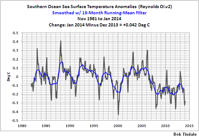
I linked the following graph at the end of my post.
http://bobtisdale.files.wordpress.com/2014/02/14-southern-ssta.png
To that, Jai Mitchell says: “With regard to your southern ocean SST graph, this one is much more accurate
from http://www.hindawi.com/isrn/oceanography/2013/392632/ ”
It’s the same dataset, Jai, or didn’t you bother to check. I presented the NOAA Optimum Interpolation sea surface temperature data (a.k.a. Reynolds OI.v2) in my graph, Jai. And the trend map you linked, assuming it’s from the paper you linked, is the NOAA Optimum Interpolation sea surface temperature data.
You waste your time every time you comment on one of my posts here at WUWT, Jai. And, more importantly to me, you waste my time because I feel obligated reply to you and show that what you’ve presented is nonsense.
Adios, Jai. Maybe you’d have a better audience for your nonsense at SkepticalScience or RealClimate or HotWhopper. They revel in that sort of stuff you spread.
Bob Tisdale says:
You waste your time every time you comment on one of my posts here at WUWT, Jai.
Jai wastes everyones’ time here. Bob is very careful with his words. That is a trait among skeptics; words matter. Assuming that words mean something else is where people like mitchell get into trouble.
Bob,
I notice you declined to mention the comment regarding the regional error boundaries for the CMIP5 models. That the current mid-latitude warming amounts are well within those uncertainty ranges. — why didn’t you speak to that???
You say that they “exaggerate” the polar warming, perhaps you need to review websters?
x·ag·ger·ate verb \ig-ˈza-jə-ˌrāt\
: to think of or describe something as larger or greater than it really is
: to make (something) larger or greater than normal
You did not show how their work was an exaggeration, and since they only more accurately captured the regional temperatures that were not previously included in the Hadcrut4 series by utilizing satellite data. This produced a reproducible increase in the testable accuracy of their method, as is described here:
For your information, “more accurate” is the opposite of “exaggerate”.
With regard to modeling, there is no discussion in Cowtan and Way regarding the accuracy of the models, they only deal with observed temperatures. Your attempt to discredit their work because of someone else’s work, on something that is completely unrelated to their work is laughable.
The reason that the graphic I produce is better is because it is more accurate, I know that this is hard for you to understand but actually using the gridded data to plot the actual graph instead of a regional average shows how much variability there is in different regions. Your graph acts like it is all one homogenous temperature pool, which is. . .
an exaggeration.
Jai Mitchell says:
February 22, 2014 at 1:27 pm
“and I say, “ Cowtan and Way provided a more accurate method to include the areas that were not currently covered under the Hadcrut4 series. ”
and I say
C&W filled in gaping holes in the thermometer series by patching in parts from the satellite series in the same way you nail planks in an emergency to make a very temporary patch for holes in a roof. Leaks like a ……
In the process they managed two remarkable things.
1. They used small subsections from the satellite series and aligned them to the thermometer series (which previously everybody has refused to align with at all) in some magical, sub section, only short term and local way. How’s that for cherry picking! Then they used sophisticated maths to try and convince everyone that what they had done was ‘proper and legal’.
2. They also managed to make the resulting trend larger in their result set than the trend in either of the two series they used as their sources. Magic indeed.
RACookPE1978, increasing ice melt in the summer could keep temps flat.
RichardLH
1. They successfully produced an accurate hybrid that utilized both thermometer and satellite data, they tested this methodology by removing about 40% of the known temperature data from the globe and reproduced the temperature series using their method. This was a successful test, they reproduced this test hundreds of times and proved that their methodology was accurate.
2. The UAH arctic temperature values are higher than the Hadrut4 values because the UAH covers about 5% more arctic area than Hadcrut4. The Cowtan and Way series is higher than both the UAH and the Hadcrut4 series because they cover the remaining 5% that the UAH does not accurately cover.
Now, this is a useful discussion regarding Cowtan and Way’s methodologies, as opposed to this tisdale piece that thinks that Cowtan and Way’s methods or work is somehow wrong because he thinks the CIMP5 2005 model runs are off.
Which, if you look at their uncertainty bands, are not.
The fact is that we know why the deeper oceans are warming at a higher rate, we know why some sea surface temperature areas are cooler than normal. We also know that the arctic is warming at a much higher rate than the UAH data (and HADCRUT4) shows.
jai mitchell holds a religious Belief that the oceans are heating up at an accelerating rate. Nothing can shake his Faith, and of course he only cherry-picks whatever supports his True Belief, and ignores all the rest.
It doesn’t matter that the ARGO buoy array doesn’t agree with his religion. jai Believes, and that is all that matters to him.
I just wish he would keep his nonsense to himself, instead of proselytizing here.
dbstealey,
You keep posting those graphics as though they mean something. your first one shows a 0-700 meter heat content that is supposedly graphed from NODC data, it says so right at the bottom of the graph.
But if I go to the ACTUAL NODC website, where you supposedly got that information, it shows this The amount of warming, with error bars, from the actual graphed measurements in this image is the same amount of warming that, if applied to the earth’s atmosphere, would raise the temperature by 38 degrees Fahrenheit (10 x 10^22 joules). This fact is incontrovertible.
also, please notice that this graphic is from the ACTUAL NODC.NOAA.GOV website, not some third-party source, like the one that you get your graphs from, but supposedly reference the nodc source.
so, yes, The oceans ARE heating up, significantly, this is what the people who actually produce the data say.
Jai Mitchell says:
February 22, 2014 at 6:30 pm
The Cowtan and Way series is higher than both the UAH and the Hadcrut4 series because they cover the remaining 5% that the UAH does not accurately cover.
The UAH data set covers 85° N to 85° S. See:
http://www.climate4you.com/GlobalTemperatures.htm#Zonal air temperature changes
With the circumference of Earth being about 40000 km, the distance from 85 to 90 would be 5/90 x 10000 = 555 km. So the area in the north NOT covered is pir^2 = 9.7 x 10^5 km2. So if we double this for the south, we get 1.94 x 10^6 km2. Dividing this by the area of the earth, 5.1 x 10^8 km2, we get about 0.38% NOT covered and 99.62% covered by UAH.
Are you suggesting that this 0.38% that we presumably do not know about can increase the real warming by the factor of 2.5 that Cowtan and Way calculated?
wbrozek,
If you follow this site (and I suspect that you do) then you know that Judith curry wrote about how the coverage in the arctic is very inaccurate due to sea ice and water vapor (dryness) issues in the arctic. She displays an image that shows very spotty treatment between 80-85 degrees north. As well as documenting other measurement error issues.
for example
So, not only is the satellite coverage distorted at the poles due to the look angle, the look angle issue actually causes the satellite to image a wider swath of an area known to produce noisy and highly uncertain microwave data. Basically, the higher the latitude of the satellite imaging past about 60N/60S, the more uncertain the data gets.
so 95% coverage for UAH is pretty damn generous.
jai mitchell,
I notice that you hid out from my proposal to let Long Bets handle this. Wassamatta, you don’t have the courage of your convictions? How you gonna get to eco-heaven like that!? Surely you can scrounge up ten kilobucks. You have friends, dontcha?
Now, you may actually believe that the government doesn’t play shenanigans with it’s public information. You may believe that the government doesn’t change their fabricated data at a later date, despite irrefutable evidence showing that they do just that. But if they didn’t show what you preposterously claim will be an upcoming “38 degree” temperature rise (!), how could they justify their $billions in taxpayer loot? I am just amazed at the credulousness of some folks who post here.
Your appeals to authority are amusing. But until you are willing to put your money where your mouth is, you have neither courage nor convictions.
Really, jai, do you take everything the government tells you at face value? Really?? That’s so cute. But if you really look at, and understand the link I posted here, you will see that the same government has deliberately, and provably, altered the temperature record in a way that claims to show faster and faster global warming. Note to jai: those records are “adjusted” in order to get people just like you on board. And you swallow their bait hook, line, and sinker.
But most of us here can see what’s happening. And it ain’t honest science.
You *do* know that ice sublimates, right? Any clue as to what that does to RH or atmospheric ‘water vapor’ content or ‘dryness’ as you put it? Bonus question: How did this ‘air’ over, or at the arctic become ‘dry’ in the first place? Any idea?
From the link you earlier cited, one finds this as well:
NOAA knows high latitude near-pole data will be noisy and not representative, so they don’t even try to display it. UAH is the same way. Between the look-angle problem and the noise generated by sea ice, their data analysis stops short of the pole. RSS does the same due to the same physical constraints of orbit and look angle.
wbrozek above also worked out some math on this: “we get about 0.38% NOT covered and 99.62% covered by UAH”
Speaking of governments, which one said “If you like your health plan you can keep your health plan”, and for bonus points, which one provided evidence before the UN for “WMD” yet (judging from all the talk) no WMDs were found?
.
JM says:
February 22, 2014 at 9:03 pm
coverage in the arctic is very inaccurate
If that is the case, how do Cowtan and Way know it has been estimated way too low?
if applied to the earth’s atmosphere, would raise the temperature by 38 degrees Fahrenheit (10 x 10^22 joules). This fact is incontrovertible.
But it cannot do that due to the laws of thermodynamics!
If the oceans warmed up by 0.1 F, and this caused the air to warm to the maximum amount, the air could only get 0.1 F warmer. So the oceans are in effect an infinite heat sink for all of our extra heat. Isn’t that great? Our problems are over!
rgbatduke says: February 22, 2014 at 8:05 am
“…an automagically rescalable icosahedral tesselation and did proper adaptive quadrature and interpolation on an unbiased adaptive grid. …
F. Ross says: February 22, 2014 at 10:14 am
Sure, that’s easy for your to say! :=)
But rgb neglected to add: “…based on the analytic and algebraic topology of locally euclidean parameterization of infinitely differentiable Riemannian manifold.” That’s why it was easy to say. : ]
Jai Mitchell says:
February 22, 2014 at 6:30 pm
“1. They successfully produced an accurate hybrid that utilized both thermometer and satellite data”
They successfully got the planks to fit over the holes they had.
I have done exactly what they have done with ALL the thermometer data and satellite data that exists during the whole of their overlap period, not just some convenient. cherry patch. selection.
http://climatedatablog.files.wordpress.com/2014/02/hadcrut-giss-rss-and-uah-global-annual-anomalies-aligned-1979-2013-with-gaussian-low-pass-and-savitzky-golay-15-year-filters.png
That’s all 4 series, HadCrut, GISS, UAH and RSS. Since 1850 up to last month.
Fits very, very well. If you like I’ll withhold 50% of the data (every other month) and get exactly the same fit. You should have no problem with agreeing with the observations that the figure gives then.
The projection that figure provides for the near future is also supported by the curves matching together during the whole of their overlap period with an accuracy of greater than 95 %. So that is certain also.
jorgekafkazar:
Many thanks for your post at February 22, 2014 at 11:21 pm which says
Brilliant! I laughed, thankyou.
Indeed, I laughed at your post almost as much as I have been laughing at the posts from ja1 m1tchell.
Richard
Here’s a link to a cartoon that uses a phrase like that as its caption:
http://i7.photobucket.com/albums/y254/RogerKni/Politics%20%20Finance/skepticaleagle_zps9d625f0b.jpeg
But if I go to the ACTUAL NODC website, where you supposedly got that information, it shows this The amount of warming, with error bars, from the actual graphed measurements in this image is the same amount of warming that, if applied to the earth’s atmosphere, would raise the temperature by 38 degrees Fahrenheit (10 x 10^22 joules). This fact is incontrovertible.
What does this even mean? If you applied it all at once, in an instant? Are you doing something like taking an amount of heat and dividing it by the heat capacity of the atmosphere, top to bottom?
The heat capacity of the ocean is nearly infinite compared to that of the atmosphere. Also, ARGO simply doesn’t go back very far — before ARGO measurements are based on rather sparse sampling in space and time. Even with ARGO one could argue that measurements are rather spatiotemporally sparse, especially at depth.
If the ocean is absorbing all of the supposed energy imbalance from CO_2, that is great news. It can do so for order of centuries without significantly changing its temperature or its temperature profile. We can ignore for the moment just how the energy is getting down to the depths being claimed on a global basis when buoyancy forces directly oppose it, but for the moment I’d take any claims about the ocean’s temperature for more than a remarkably short baseline with a large grain of sea-salt.
rgb
Jai is just desperately stumbling around trying hard to make his pre-conceived view of the world fit with the reality of the data currently available.
rgbatduke
it means that the amount of measured heat added to the atmosphere would raise the atmospheric temperature of the entire measurable mass of the earths atmosphere by 38 degrees Fahrenheit. It means that there is an incredible amount of verified measured warming going on even during the last 15 years.
wbrozek
you said, But it cannot do that due to the laws of thermodynamics!
If the oceans warmed up by 0.1 F, and this caused the air to warm to the maximum amount, the air could only get 0.1 F warmer.
The point is that only a very small percentage of change in the rate of the ocean warming leads to a massive shift in the amount of warming we experience above the ocean’s surface. The amount of measured warming going on since 2005 makes any argument of a hiatus moot.
dbstealey
you are the one that posted a graph that is supposedly from the NODC site, except it isn’t, it is posted by an anonymous third party person with questionable credentials. Your decision to trust a basically anonymous source because it says something you want to believe proves the entire point that I am making.
If you are going to quote a source of information, you have to go to that source. not pretend that any joe out there can make a graph and make it look like you want it to look and chose to believe that it is truth.
for example, the GISP2 graph that you like to show. I put to you the actual link from the data spreadsheet that shows that 1950 was the “before present date” I also showed you the series that showed that the last data point of the graph was .095 thousand years “before present”
which makes the date of the last data point in 1855, or at the end of the little ice age.
yet you CHOOSE to believe a third party graph that puts the date in the 1950’s or even the 1970s because of the plethora of disinformation out there regarding this graph
again, I will point you to the truth.
http://www.ncdc.noaa.gov/paleo/icecore/greenland/summit/document/notetime.htm
.A Note on the Timescales
There are three main timescales used on the CD-ROM. For both GRIP and GISP2, these timescales are in years before present (yr BP) where year 0 refers to northern hemisphere summer of the year 1950 A.D.
You want the truth but you can’t handle the truth!
JMsays:
February 23, 2014 at 1:32 pm
The amount of measured warming going on since 2005 makes any argument of a hiatus moot.
So let us suppose you were told that in 60 years, the air temperature would not go up at all but the ocean would go up by 0.1 C if we did nothing. However if we spent a trillion dollars over 60 years, and suppose we are told the air temperature would still not go up, but the oceans would go up by 0.1 C showing no hiatus. What should we do?
Aah, yes. Thank you for the clarification. Why didn’t I realize that?
Uurk :=)
jai mitchell says:
“dbstealey… you CHOOSE to believe a third party graph that puts the date in the 1950′s or even the 1970s because of the plethora of disinformation out there regarding this graph.”
Um, jai, me boy, you are erecting a strawman to argue with. Because I never posted that graph. But carry on.
jai also says:
“…there is an incredible amount of verified measured warming going on even during the last 15 years.”
We are in agreement: there is an incredible amount of warming being claimed. Just incredible.☺
See, jai, even Planet Earth herself does not agree with your religious belief in catastrophic AGW. Global warming has stopped, even though you refuse to accept that fact. Global warming may resume, or not. At this point, we just don’t know. But the fact that it has stopped is now acknowledged by most of the alarmist clique, and that pretty much negates the “carbon” scare.
But because your own brand of climate alarmism is based on religious belief, and not on science, it is understandable that you cannot accept a threat like that to your dogma.
But carry on. It’s always amusing to see someone absolutely insisting that catastrophic AGW is upon us, when the planet itself is giving that nonsense a big yawn.
Jai,
Haven’t we been over your idiotic conjecture before on another thread?
Didn’t we establish that your conjecture is akin to being that climate sensitivity is in the hundreds of degrees, based on your (stoooopid) notion that warming of the oceans from 2005, CO2 levels 380-ish ppms (insert whatever year and whatever ppm value you want to, since you’re probably 50 orders of magnitude off) to 2013/14, CO2 400 ppms would give a warming of 38 degrees Fahrenheit ? 20 Kelvins for 20 ppms of Beer-Lambert Law-neutered CO2 in 40,000 ppm of water vapor in the tropics.
It gets worse. If you were right, as rgb says more politely, you’ve shown that the world wouldn’t even have to worry about a hundreds of degrees climate sensitivity to a doubling of your hobgoblin gas.
I’m surprised the more professional Climate Parasites haven’t reined in you and your stupid conjecture yet.
….. and also if you are correct, and you also believe in IPCC numbers – go on, I’ll give you six degrees of atmosphere warming per doubling, just for chuckles – haven’t you proved that the vast majority of the ocean warming is not due to the CO2 monster ??
this addresses both of your posts.
phillincalifornia,
wbrozek says:
So let us suppose you were told that in 60 years, the air temperature would not go up at all but the ocean would go up by 0.1 C if we did nothing. However if we spent a trillion dollars over 60 years, and suppose we are told the air temperature would still not go up, but the oceans would go up by 0.1 C showing no hiatus. What should we do?
The heat energy accumulation (warming) of the earth’s oceans indicated by the measured 10×10^22 Joule increase since 2005 IS as much energy as it would take to warm the earth’s atmosphere by 38 degrees Fahrenheit. This is a true statement and can easily be checked
This shows 2 things.
1. There has been no “hiatus” since the measured rate of heat uptake has INCREASED over this period of time.
2. As the earth increases its CO2 atmospheric concentration, if the warming continues to go into the ocean at a large amount, then the atmosphere will not warm as much, consequently, the amount of global energy imbalance, as measured at the TOA will continue to increase. Eventually, the amount of heat imbalance of the earth will be so large that it will shift the arctic and land-based warming intensely.
3. When the oceans stop mixing the heat into deeper strata, then the amount of heat shifted into the atmosphere will increase in proportion to the increased TOA imbalance. This will lead to a rapid heat energy gain in the atmosphere, on the land surface and in the arctic.
this is the conclusion of the recent England Paper
philincalifornia
The measurement of ocean heat uptake has shown that the top of atmosphere energy imbalance has grown. The measured amount of heat is within the estimations of Kevin Trenberth (missing heat) and Hansen and Soto in 2010.
If you consider that the long-term arctic warming rates are increasing, that even with the amount of extra heat going into the oceans, that the permafrost is melting much more rapidly than was modeled, then you must understand that these POSITIVE CLIMATE FEEDBACKS will lead to a climate sensitivity of greater than 6 degrees C for a doubling of CO2 (over the next 500 years or so).
The amount of warming in the ocean compared to the surface affects the rate of atmospheric warming and directly affects how high the Transient Climate Response is, or how fast the earth responds to CO2 in the atmosphere.
The ocean heating shows a very high amount of warming being produced from current CO2 levels. This will only increase as we continue to add CO2 to our atmosphere.
Quickly Jai, before the nurse tops up your medications, give us a quick calculation of climate sensitivity based on 38 degrees F, for CO2 going from 380 to 400 ppm.
Sounds like the feedback already got out from under your bed in 2005 and is now all around us. Are we in trouble !!!!
JM says:
February 23, 2014 at 6:17 pm
Eventually, the amount of heat imbalance of the earth will be so large that it will shift the arctic and land-based warming intensely.
How long would this take? At the rate of 0.1 C in 60 years, it would take 6000 years to raise the deep ocean from 4 C to 14 C where it would approach the air temperature. We will have long ago run out of hydrocarbons before then. I agree that an El Nino can happen which would cause a short blip, but nothing catastrophic will happen temperature wise.
Jai Mitchell says: The heat energy accumulation (warming) of the earth’s oceans indicated by the measured 10×10^22 Joule increase since 2005 IS as much energy as it would take to warm the earth’s atmosphere by 38 degrees Fahrenheit. This is a true statement and can easily be checked”
First, you’ve presented a worthless statistic, because the amount of heat that’s claimed to be entering the oceans cannot escape and warm the Earth’s atmosphere. The oceans release heat to the atmosphere primarily through evaporation. Second, your claim of “heat energy accumulation (warming) of the earth’s oceans indicated by the measured 10×10^22 Joule increase since 2005” appears exaggerated as well:
http://data.nodc.noaa.gov/woa/DATA_ANALYSIS/3M_HEAT_CONTENT/DATA/basin/yearly/h22-w0-2000m.dat
Jai Mitchell says: “This shows 2 things.”
But then you listed three things, Jai. Do you understand why no one here takes you seriously?
Jai Mitchell says: “1. There has been no “hiatus” since the measured rate of heat uptake has INCREASED over this period of time.”
The “global warming hiatus” refers to surface temperatures, Jai. Why is that so hard for you to understand?
Jai Mitchell says: “2. As the earth increases its CO2 atmospheric concentration, if the warming continues to go into the ocean at a large amount, then the atmosphere will not warm as much, consequently, the amount of global energy imbalance, as measured at the TOA will continue to increase. Eventually, the amount of heat imbalance of the earth will be so large that it will shift the arctic and land-based warming intensely.
Utter nonsense. Did you just think of that?
Jai Mitchell says: “3. When the oceans stop mixing the heat into deeper strata, then the amount of heat shifted into the atmosphere will increase in proportion to the increased TOA imbalance. This will lead to a rapid heat energy gain in the atmosphere, on the land surface and in the arctic.”
There is no scenario in which the “the oceans stop mixing the heat”. For that, all ocean circulation and winds would have to stop.
I strongly suggest you take your alarmist nonsense elsewhere. You’re wasting your time here. No one comes to WUWT to read alarmist claptrap, which is why you’re mostly ignored.
Jai:
Care to tell me what is scary about this treatment of the 4 main data series to date using similar methods to those employed by C&W? If they are right then so is this.
http://climatedatablog.files.wordpress.com/2014/02/hadcrut-giss-rss-and-uah-global-annual-anomalies-aligned-1979-2013-with-gaussian-low-pass-and-savitzky-golay-15-year-filters.png
Bob,
Thanks for the link, the amount of warming measured in the whole ocean is indeed recorded to be about 8.5 x 10^22 joules between 2005 and up through june of 2013. At that rate, the amount of additional warming through February of 2014 will easily surpass 10×10^22 joules. or the equivalent of 38 degrees F of additional warming over the entire troposphere.
Over this period of time the atmosphere has only experienced a .15 (or so) global warming (Fahrenheit). So, only a very small amount of decreased ocean surface mixing (wind slow down) even a .5% decrease, will necessarily push some of this heat energy into the atmosphere, leading to a return to global warming, likely at a rate much higher than the 1945-1975 period. (closer to .23C per decade)
the heat that is in the deep ocean today is certainly there to stay, however, if the rate of heat entering the oceans decreases in the future than only a very fractional amount of that heat going into the atmosphere will resume the rapid warming of the atmosphere.
Bob, all
FYI looks like we are setting up for a reasonably srong El Nino, If I am correct, we will see a rapid return to atmospheric warming and a minor decrease in the rate of heat going into the deep ocean (>1000m).
http://www.wunderground.com/blog/JeffMasters/article.html?entrynum=2635
jai mitchell:
An el nino is a natural event. In fact, everything being observed is natural climate variability. Here, let me quote someone who has forgotten more than you will ever learn about climatology:
Yes, that is the internationally esteemed Prof Richard Lindzen of M.I.T. Whereas you get your climate nonsense from a cartoonist, John Cook.
jai, it is obvious that you are a newbie; someone who needs a religion, and has found it in the “carbon” scare. It forms the basis of your self-worth. Your comments are amusing, in that they are copied from thinly-trafficked alarmist blogs, which would go out of existence if they did not censor comments from skeptics. As it is, they cater to a handful of head-nodders like yourself.
I can’t recall the number of times I’ve asked you to respond to the Null Hypothesis, which has never been falsified. It has to be at least a dozen times now. You will recall that the Null Hypothesis requires various Holocene global climate parameters to be exceeded, such as temperatures, precipitation, extreme weather events, etc. But in the event, none of those parameters is being exceeded. What does that mean?
It means that the current climate is normal. The climate variability expressed by the planet is fully explained by natural events. You cannot identify any human cause in global temperatures, because no human cause has ever been measured.
The Null Hypothesis is a hypothesis based on the Scientific Method. It remains standing, despite numerous attempts to falsify it. I understand that you are a religious convert, and as such you only cherry-pick ‘facts’ that you believe support your cAGW religion. But the rest of us know better.
You have never accepted either the Scientific Method or its corollary, the Null Hypothesis. If you did, your religious belief would fall like scales from your eyes, and you would see the light. But I don’t expect that to happen any time soon. Glaciers could cover Chicago again, and you would still be pasting nonsense from SkS and wunderground. Just so you know that we know… ☺
Jai Mitchell says:
February 24, 2014 at 9:16 am
if the rate of heat entering the oceans decreases in the future than only a very fractional amount of that heat going into the atmosphere will resume the rapid warming of the atmosphere
So let us suppose that by some means the atmosphere north of 60 degrees suddenly warmed by 10 C. What would happen? The temperature would be shared with the cold ocean waters so virtually nothing of heat in the air would remain after a short time. And the ocean may have warmed up by 0.04 C as a result. This is basic thermodynamics.
DBStealey,
You chose to disbelieve the data that is published by organizations that produce the data and would rather cite third party analysis of that data that shows obvious misinterpretations or even falsifications of that data (i.e. claiming that the GISP2 series trend ends later than 1855).
In choosing to only accept information that fits your belief, you would rather quote Richard Lindzen who, as far as his multiple pet theories of negative feedbacks and his projections for future warming scenarios has been 100% (completely) wrong.
for example, this graphical image of “skeptic” temperature projections vs. actual projections and how they compare to the actual temperature record shows.
you asked me about a bet, well what you don’t realize is that you are already making that bet. I have too. The bet is that global warming is going to significantly impact the life expectancy and well being of YOUR grandchildren’s adult lives. This is what the scientific models say.
You refuse to believe the multiple levels of data, linked to the original sources. You would rather choose to believe third party individuals, some of whom have stated explicitly that the work they are doing is being done to intentionally “make government smaller”. This is ideology, not science.
Therefore, because of your ideology, you are choosing to bet that your grandchildren’s (really EVERYONE’S grandchildren’s) lives will be fine without CO2 mitigation efforts.
Ideology, taken to this level of extremism is hubris of such a degree that it borders on the verge of sociopathy, it isn’t “skepticism” and it certainly isn’t “science”.
Hows that for a “null hypothesis”?
Jai Mitchell says:
February 24, 2014 at 4:20 pm (replying to DBStealey),
Odd, that.
See , because of your ideology, you are choosing to deliberately kill millions of innocents that otherwise would live longer, healthier lives in better conditions for their grandchildren’s (and EVERYONE’S grandchildren’s) lives that will be not “fine” but much BETTER without the futile CO2 mitigation efforts YOU are demanding. YOU are the one actually killing millions now and through the next 100 years, YOU are the one demeaning and harming billions through YOUR fear of the benefits of CO2 and lower energy costs because YOU fear the “effects” not of a future, but the effects only of propaganda.
By the way, because you do fear the future so greatly, have you sterilized yourself, your family, and all of your relatives? Surely you yourself are going to add to the “burden” of a healthy future world are you?
Ideology, taken to this level of extremism is hubris of such a degree that it borders on the verge of sociopathy, and certainly isn’t “science”.
jai mitchell has a bad case of psychological projection: everything he mentions above he and his alarmist chumps are guilty of. Mitchell cherry-picks whatever supports his religious beliefs, and he disregards all the rest.
Regarding Prof Lindzen, he [Lindzen] has stated in the past that he does not make predictions. Therefore, the Skeptical Pseudo-science chart that mitchell linked to is simply more fabricated nonsense that supports jai’s religious belief. Skeptical Pseudo-science has made dishonesty into an art form. That’s why no one takes them seriously. They have zero credibility. Anthony even gave them their own special category: Unreliable, due to (1) deletion, extension and amending of user comments, and (2) undated post-publication revisions of article contents after significant user commenting.
And regarding mitchell’s bogus concern for ‘the childrunnn’, he sounds more hypocrital than Hitlery Clinton. If mitchell really believed the nonsense that he posts here, he would have taken my wager, which was based on his mythical ’38 degree’ temperature rise. But of course, mitchell knows that is complete nonsense. Otherwise… easy money!
jai mitchell is angry for one main reason: because scientific skeptics will not buy into his silly climate alarmism. Why not? Because we have eyes! We can see that there is nothing unusual happening. Nothing at all. The whole alarmist story is one giant head fake that only credulous acolytes like mitchell would believe.
Once more: not one alarmist prediction has happened. Not one! They have all been flat wrong. With a record of failure like that, only a religious True Believer would still buy into runaway global warming nonsense. jai mitchell does. But not many others do.
jai mitchell:
Well if you believe that ENSO, PDO and world temperatures are in anyway linked, then this should prove an interesting graph to examine.
http://climatedatablog.files.wordpress.com/2014/02/pdo-reconstruction-1470-1998-shen-2006-with-gaussian-low-pass-15-and-75-year-filters-and-hadcrut-overlay.png
Dear Jai, C you’ll get the idea. That’s probably a fair estimate of the probable error, and may even be a bit generous given how new ARGO is and all of the calibration etc unknowns, and the sparsity of the grid.
A) HADCRUT4, based on many, many surface thermometers INCLUDING ARGO, only claims 0.15C accuracy (and probably underestimates it as it often differs from e.g. GISS by more than this). It is very, very doubtful that ARGO instrumentation provides a more accurate global average temperature profile to a depth of kilometers than HADCRUT4 can deliver in a single thin surface layer of the planet. A reasonable person could doubt any assertion of “0.1C warming” or cooling either one over a decade (whatever that means in a profile of temperatures bounded 4C below and by the more or less unchanged SST at the top) as being pure “noise”, measurement+method error. Maybe if we write it as
B) The thermohaline cycle time is order of 1000 years and is fairly well understood. The general surface mixing time down to depth is at least some large fraction of this. Sea water per se is thermally stratified and stable, except to the extent that global processes of thermal expansion and variation of salinity/density at the surface destabilize it, maintaining the thermohaline circulation, plus the extent that the trade winds produce a limited churn at the surface. As far as I know, there is no credible way to explain how heat makes it from the surface to uniformly spread itself out in the top kilometer of ocean water in only a decade. Hence the measurement in A), surely down there in the instrumental noise, is extremely dubious because it lacks a credible physical mechanism that could have produced it that is consistent with our measurements of transport processes in the ocean. Note well that one also has to explain why this mechanism just turned on in time to flatten surface temperatures, why all of the supposed surplus heat responsible for the warming in the 80s and 90s didn’t also go into the ocean. In fact, one has to explain a whole lot of things, as it completely changes the energy dynamics of the entire planet if the ocean can uptake all that extra energy on a whim and spread it out at depth. At the very least, all of the GCMs are wrong, badly wrong.
C) But we knew that. The GCMs are the only source for your belief in a power imbalance, because AFAIK we cannot actually measure a global power imbalance at the TOA. We simply do not have accurate enough instrumentation capable of integrating the outgoing spectrum over the entire surface, and there is a lot of noise. The numbers you use are themselves the predictions of GCMs, with assumptions for feedback, the role of aerosols, the heat transport by things like thunderstorms, that may or may not be correct. In any event, the GCMs are proving to be badly wrong in their predictions of global warming, rainfall patterns, the frequency and violence of storms, droughts, floods. Basically, they are individually failed models, models that simply don’t describe the actual data accumulated since they were initialized and set loose. So when Trenberth looks for “missing heat”, he’s doing so to try to rescue one fragile part of the model predictions — that there is indeed an energy imbalance in the first place — while also explaining why temperatures have managed to be flat. Trenberth actually understand this — from what I’ve seen and read, he realizes that the GCMs are toast because for them to work, they will have to actually extend to depth in the ocean and predict the oceanic heat uptake in a quantitative way, including why it turned on in 1997/1998 with the super ENSO, why it was off before then (so the atmosphere warmed instead), why it might turn on or off in the future. Oops. We cannot even solve the atmospheric problem, and now we have to solve the Navier-Stokes equation for two coupled fluids, both with enormously complex, largely unknown nonlinear interactions, on a ridiculously coarse grained grid, to a depth of ten kilometers on both sides!
Good luck with that.
D) Suppose that the 0.1C is, in fact, by incredibly good fortune, precisely correct (whatever it means, again, in a profile to depth). That is great news! That means that the ocean is perfectly capable of buffering the “imbalance” for the next couple of centuries and preventing catastrophic warming, while humans without any extraordinary expenditure or effort gradually wean themselves from burning carbon for energy not to “save the planet” (which probably doesn’t need saving) but because at least some alternative energy sources will within the next decade or two become systematically cheaper than coal-generated electricity. By 2050, it is likely that carbon utilization will be ramping down even if we do nothing. So in the meantime, perhaps we can invest the energies of human civilization in curing real problems like global poverty and ignorance — which requires cheap, plentiful energy — and war. These are contemporary catastrophes that the entire CAGW scandal was engineered (IMO) to distract us from.
rgb
B)
rgb:
I think the best line I heard on all this was the one where it was said, that in that case, if the heat is indeed going into the deep oceans, then that is the best example of natural variability that could be observed to be currently happening :-).
Hmmmm both poles show warming yet the Antarctic ice is increasing?
Riiiiighhhtt.