The title question often appears during discussions of global surface temperatures. That is, GISS, Hadley Centre and NCDC only present their global land+ocean surface temperatures products as anomalies. The questions is: why don’t they produce the global surface temperature products in absolute form?
In this post, I’ve included the answers provided by the three suppliers. I’ll also discuss sea surface temperature data and a land surface air temperature reanalysis which are presented in absolute form. And I’ll include a chapter that has appeared in my books that shows why, when using monthly data, it’s easier to use anomalies.
Back to global temperature products:
GISS EXPLANATION
GISS on their webpage here states:
Anomalies and Absolute Temperatures
Our analysis concerns only temperature anomalies, not absolute temperature. Temperature anomalies are computed relative to the base period 1951-1980. The reason to work with anomalies, rather than absolute temperature is that absolute temperature varies markedly in short distances, while monthly or annual temperature anomalies are representative of a much larger region. Indeed, we have shown (Hansen and Lebedeff, 1987) that temperature anomalies are strongly correlated out to distances of the order of 1000 km. For a more detailed discussion, see The Elusive Absolute Surface Air Temperature.
UKMO-HADLEY CENTRE EXPLANATION
The UKMO-Hadley Centre answers that question…and why they use 1961-1990 as their base period for anomalies on their webpage here.
Why are the temperatures expressed as anomalies from 1961-90?
Stations on land are at different elevations, and different countries measure average monthly temperatures using different methods and formulae. To avoid biases that could result from these problems, monthly average temperatures are reduced to anomalies from the period with best coverage (1961-90). For stations to be used, an estimate of the base period average must be calculated. Because many stations do not have complete records for the 1961-90 period several methods have been developed to estimate 1961-90 averages from neighbouring records or using other sources of data (see more discussion on this and other points in Jones et al. 2012). Over the oceans, where observations are generally made from mobile platforms, it is impossible to assemble long series of actual temperatures for fixed points. However it is possible to interpolate historical data to create spatially complete reference climatologies (averages for 1961-90) so that individual observations can be compared with a local normal for the given day of the year (more discussion in Kennedy et al. 2011).
It is possible to develop an absolute temperature series for any area selected, using the absolute file, and then add this to a regional average in anomalies calculated from the gridded data. If for example a regional average is required, users should calculate a time series in anomalies, then average the absolute file for the same region then add the average derived to each of the values in the time series. Do NOT add the absolute values to every grid box in each monthly field and then calculate large-scale averages.
NCDC EXPLANATION
Also see the NCDC FAQ webpage here. They state:
Absolute estimates of global average surface temperature are difficult to compile for several reasons. Some regions have few temperature measurement stations (e.g., the Sahara Desert) and interpolation must be made over large, data-sparse regions. In mountainous areas, most observations come from the inhabited valleys, so the effect of elevation on a region’s average temperature must be considered as well. For example, a summer month over an area may be cooler than average, both at a mountain top and in a nearby valley, but the absolute temperatures will be quite different at the two locations. The use of anomalies in this case will show that temperatures for both locations were below average.
Using reference values computed on smaller [more local] scales over the same time period establishes a baseline from which anomalies are calculated. This effectively normalizes the data so they can be compared and combined to more accurately represent temperature patterns with respect to what is normal for different places within a region.
For these reasons, large-area summaries incorporate anomalies, not the temperature itself. Anomalies more accurately describe climate variability over larger areas than absolute temperatures do, and they give a frame of reference that allows more meaningful comparisons between locations and more accurate calculations of temperature trends.
SURFACE TEMPERATURE DATASETS AND A REANALYSIS THAT ARE AVAILABLE IN ABSOLUTE FORM
Most sea surface temperature datasets are available in absolute form. These include:
- the Reynolds OI.v2 SST data from NOAA
- the NOAA reconstruction ERSST
- the Hadley Centre reconstruction HADISST
- and the source data for the reconstructions ICOADS
The Hadley Centre’s HADSST3, which is used in the HADCRUT4 product, is only produced in absolute form, however. And I believe Kaplan SST was also only available in anomaly form.
With the exception of Kaplan SST, all of those datasets are available to download through the KNMI Climate Explorer Monthly Observations webpage. Scroll down to SST and select a dataset. For further information about the use of the KNMI Climate Explorer see the posts Very Basic Introduction To The KNMI Climate Explorer and Step-By-Step Instructions for Creating a Climate-Related Model-Data Comparison Graph.
GHCN-CAMS is a reanalysis of land surface air temperatures and it is presented in absolute form. It must be kept in mind, though, that a reanalysis is not “raw” data; it is the output of a climate model that uses data as inputs. GHCN-CAMS is also available through the KNMI Climate Explorer and identified as “1948-now: CPC GHCN/CAMS t2m analysis (land)”. I first presented it in the post Absolute Land Surface Temperature Reanalysis back in 2010.
WHY WE NORMALLY PRESENT ANOMALIES
The following is “Chapter 2.1 – The Use of Temperature and Precipitation Anomalies” from my book Climate Models Fail. There was a similar chapter in my book Who Turned on the Heat?
[Start of Chapter 2.1 – The Use of Temperature and Precipitation Anomalies]
With rare exceptions, the surface temperature, precipitation, and sea ice area data and model outputs in this book are presented as anomalies, not as absolutes. To see why anomalies are used, take a look at global surface temperature in absolute form. Figure 2-1 shows monthly global surface temperatures from January, 1950 to October, 2011. As you can see, there are wide seasonal swings in global surface temperatures every year.
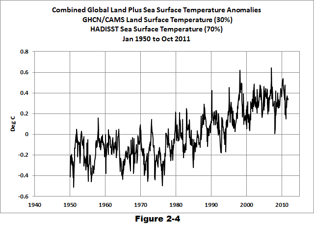
The three producers of global surface temperature datasets are the NASA GISS (Goddard Institute for Space Studies), the NCDC (NOAA National Climatic Data Center), and the United Kingdom’s National Weather Service known as the UKMO (UK Met Office). Those global surface temperature products are only available in anomaly form. As a result, to create Figure 2-1, I needed to combine land and sea surface temperature datasets that are available in absolute form. I used GHCN+CAMS land surface air temperature data from NOAA and the HADISST Sea Surface Temperature data from the UK Met Office Hadley Centre. Land covers about 30% of the Earth’s surface, so the data in Figure 2-1 is a weighted average of land surface temperature data (30%) and sea surface temperature data (70%).

When looking at absolute surface temperatures (Figure 2-1), it’s really difficult to determine if there are changes in global surface temperatures from one year to the next; the annual cycle is so large that it limits one’s ability to see when there are changes. And note that the variations in the annual minimums do not always coincide with the variations in the maximums. You can see that the temperatures have warmed, but you can’t determine the changes from month to month or year to year.
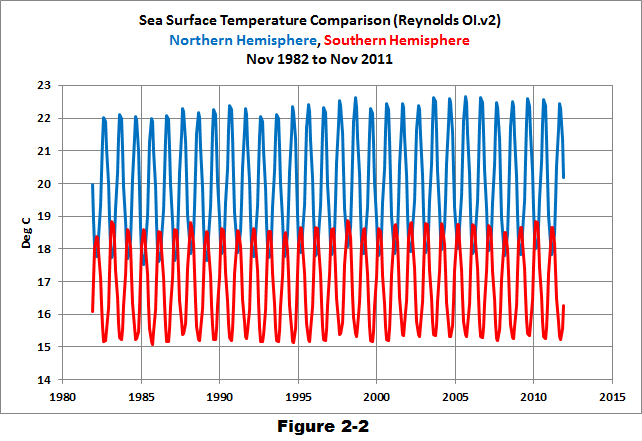
Take the example of comparing the surface temperatures of the Northern and Southern Hemispheres using the satellite-era sea surface temperatures in Figure 2-2. The seasonal signals in the data from the two hemispheres oppose each other. When the Northern Hemisphere is warming as winter changes to summer, the Southern Hemisphere is cooling because it’s going from summer to winter at the same time. Those two datasets are 180 degrees out of phase.
After converting that data to anomalies (Figure 2-3), the two datasets are easier to compare.

Returning to the global land-plus-sea surface temperature data, once you convert the same data to anomalies, as was done in Figure 2-4, you can see that there are significant changes in global surface temperatures that aren’t related to the annual seasonal cycle. The upward spikes every couple of years are caused by El Niño events. Most of the downward spikes are caused by La Niña events. (I discuss El Niño and La Niña events a number of times in this book. They are parts of a very interesting process that nature created.) Some of the drops in temperature are caused by the aerosols ejected from explosive volcanic eruptions. Those aerosols reduce the amount of sunlight that reaches the surface of the Earth, cooling it temporarily. Temperatures rebound over the next few years as volcanic aerosols dissipate.
HOW TO CALCULATE ANOMALIES
For those who are interested: To convert the absolute surface temperatures shown in Figure 2-1 into the anomalies presented in Figure 2-4, you must first choose a reference period. The reference period is often referred to as the “base years.” I use the base years of 1950 to 2010 for this example.
The process: First, determine average temperatures for each month during the reference period. That is, average all the surface temperatures for all the Januaries from 1950 to 2010. Do the same thing for all the Februaries, Marches, and so on, through the Decembers during the reference period; each month is averaged separately. Those are the reference temperatures. Second, determine the anomalies, which are calculated as the differences between the reference temperatures and the temperatures for a given month. That is, to determine the January, 1950 temperature anomaly, subtract the average January surface temperature from the January, 1950 value. Because the January, 1950 surface temperature was below the average temperature of the reference period, the anomaly has a negative value. If it had been higher than the reference-period average, the anomaly would have been positive. The process continues as February, 1950 is compared to the reference-period average temperature for Februaries. Then March, 1950 is compared to the reference-period average temperature for Marches, and so on, through the last month of the data, which in this example was October 2011. It’s easy to create a spreadsheet to do this, but, thankfully, data sources like the KNMI Climate Explorer website do all of those calculations for you, so you can save a few steps.
CHAPTER 2.1 SUMMARY
Anomalies are used instead of absolutes because anomalies remove most of the large seasonal cycles inherent in the temperature, precipitation, and sea ice area data and model outputs. Using anomalies makes it easier to see the monthly and annual variations and makes comparing data and model outputs on a single graph much easier.
[End of Chapter 2.1 from Climate Models Fail]
There are a good number of other introductory discussions in my ebooks, for those who are new to the topic of global warming and climate change. See the Tables of Contents included in the free previews to Climate Models Fail here and Who Turned on the Heat? here.
“Why Aren’t Global Surface Temperature Data Produced in Absolute Form?”
Very good question, Bob.
If we knew from the esteemed institutions of climate research what the current global average surface temperature is, we could then ask the equally esteemed institutions of ecology and biology -who must surely have looked into the matter- for what the exact value of the most desirable global average surface temperature is, for maximizing biodiversity and / or maximizing biomass, whichever is preferrable. This would tell us by exactly how many centrigrades the entire planet needed to be cooled or warmed to achieve said desired maximum.
Ask a warmist, everybody! What temperature must we go for, and where are we currently? Somewhere in this mountain of warmist papers there probably already lurks the solution.
If temperatures were presented in absolute numbers, then it would be evident that a 20 degC rise in Siberia in winter doesn’t matter, as it is a rise from minus 40 to minus 20. So still bitterly cold.
Bob asked:
“Why Aren’t Global Surface Temperature Data Produced in Absolute Form?”
▬▬
“[…] the shift toward earlier seasons is not predicted by any of 72 simulations of twentieth-century climate made using 24 different general circulation models […]
[…] general circulation models forced with the observed twentieth-century forcing not only fail to capture observed trends in temperature seasonality, as mentioned, but also generally fail to reproduce the observed trends in atmospheric circulation […]
Thus, the hypothesis that changes in atmospheric circulation are responsible for changes in the structure of the seasonal cycle is consistent with the failure of general circulation models to reproduce the trends in either […]”
Stine, A.R.; & Huybers, P. (2012). Changes in the seasonal cycle of temperature and atmospheric circulation. Journal of Climate 25, 7362-7380.
http://www.people.fas.harvard.edu/~phuybers/Doc/seasons_JofC2012.pdf
http://www.people.fas.harvard.edu/~phuybers/Doc/Seasons_and_circulation.pdf
▬▬
Regards
Sometimes the best practice would be to present *both* absolute and anomaly temperature data. Of course, that isn’t suitable for every presentation. But it is for sites like GISS which are supposed to cover everything including to the general public. While showing the seasonal cycle isn’t always bad, an annual average of even absolute data would smooth it.
But, if they did so, having not all but even just one prominent plot with its scale starting at 0 degrees (which is so for not even 1 in 100 global temperature plots in my experience, like even figure 2-1 here isn’t remotely that), the public would not be so well educated as it is today by activist standards: According to a 2009 Rasmussen poll,* 23% of U.S. voters believe it is likely that global warming will destroy human civilization within the next century, and those respondents amount to at least around half of all believing in global warming being primarily manmade.
Any semi-competent group always comes up with a decent-sounding excuse for everything; presuming the stated excuse is the sole reason would be naive, though, like activist Hansen’s GISS is responsible for rewriting prior temperature history (the usual 20th century double-peak –> hockey stick conversion, some illustrations halfway down in http://img103.imagevenue.com/img.php?image=28747_expanded_overview3_122_966lo.jpg ) in a manner not suggestive of no bias.
* http://webcache.googleusercontent.com/search?q=cache:c8nEC8bKkd4J:www.rasmussenreports.com/public_content/politics/current_events/environment_energy/23_fear_global_warming_will_end_world_soon
“Why Aren’t Global Surface Temperature Data Produced in Absolute Form?”
Because temperature is an intensive property. Since the atmosphere is not in thermodynamic equilibrium, the temperature of the atmosphere close to the surface is a meaningless concept.
It strikes me that anomalies would be more legitimate if they were expressed as a percentage variation from the local baseline rather than as degrees. For example an anomaly of one degree Celsius from a baseline of zero degrees is a lot more significant than a similar anomaly from a baseline of 30 degrees. Perhaps even more useful would be to relate the anomaly to the baseline temperature range of each location.
Of course, my view is taken from a practical rather than political standpoint.
“Why Aren’t Global Surface Temperature Data Produced in Absolute Form?”
Thanks for the post Dr. Tisdale, it was interesting and timely.
I think figure 2.1 in your post shows why we don’t often show absolute temperatures. That graph of data tells a story that is very different from the anomaly graph that would come from the same data. Figure 2.1 shows how ridiculous it is to worry over 0.1 increases in the “global temperature average” if we can even reliably calculate the “global” average atmosphere temperature.
Seems to me that the presentation of absolute temperatures has its place in discussions about climate as does the anomaly data. I am reminded of the concept of “smoothing” in statistics and how that helps to see things on one hand but hides a lot information on the other hand. Perhaps graphs that that show both in one graph are the best.
One question. Why is there not some agreed upon method or rule for choosing the base period? I always get the feeling that there is bias in the choice of the baseline period no matter who picks it.
I have a problem with any data set of a metric that is impossible to accurately measure. To get an accurate temperature of any object that object must be at thermodynamic equilibrium. Since the planet can never be at this state any accurate measurement cannot be taken and any data obtained lead to incorrect conclusions. Also averages tend to be given to a third or fourth decimal place even though actual readings are to 0.1C. This also leads to poor conclusions.
phillipbratby says:
January 26, 2014 at 3:33 am
“Because temperature is an intensive property. Since the atmosphere is not in thermodynamic equilibrium, the temperature of the atmosphere close to the surface is a meaningless concept.”
Tell that to a poor mountain rat and its family trying to evade overheating by migrating up the slope of a mountain only to find itself at the summit from where it has no place to go but extinct.
“Anomalies are used instead of absolutes because anomalies remove most of the large seasonal cycles inherent in the temperature, precipitation, and sea ice area data and model outputs. Using anomalies makes it easier to see the monthly and annual variations and makes comparing data and model outputs on a single graph much easier.”
These are all good properties of anomalies. But I think your post could better emphasize the key reason. Anomalies are used (by necessity) whenever you average across a range of different measuring points. The issue is homogeneity. Sets of single location data, like stations or SST grid cells, are usually given in absolute. They don’t have to be, and anomalies for them also have the advantages that you list. But they usually are.
But when you calculate an area average, it’s important that the numbers have the same expected value, which might as well be zero. If they don’t, then the result is heavily dependent on how you sample. If you have mountains, how many stations are high and how many low? And then, if a high station fails to report, there is a big shift in the average. The station sample has to match the altitude distribution (and latitude etc) of the region.
But if the expected value is zero, it is much less critical. An anomaly is basically the deviation from your expectation (residual), so its expected value is indeed zero. If a mountain top value is missing, the expected change to the average anomaly is zero. Homogeneity of means.
There is one exception to this anomalies only rule for regions. NOAA gives an absolute average for CONUS. I think the reasons are historical, and they probably regret it. The problems showed up in a post at WUWT, which said that the average for one hot month was less for the CRN network than for USHCN. The reason is basically that the CRN network has a higher average altitude. It’s not measuring the same thing. Which is right? Well, CRN more closely matches the average US altitude. But that is just one factor to match. There is also latitude, coastal vs inland, Pacific vs Atlantic – it’s endless, if you use absolutes.
The temperatures should really be in degrees Kelvin or 288K average with a range on the planet of 200K to 323K.
The physics equations are based in Kelvin. The energy levels are more accurately described by using Kelvin. The graphs would look pretty flat in Kelvin if the X-axis started at 0.0.
Perhaps you miss an aspect of measurement, concerning arbitrary origins and units. Origins and units are arbitrarily chosen for Celsius and Fahrenheit. Even our meter is an arbitrary unit. Only results not depending on arbitrary choices are meaningful. Actually, it is meaningless to say that the distance between a and b is one meter as it may be three feet. It is meaningful to say that the distance between a and c is twice the distance between a and b. You do not loose any meaningful information by taking Celsius anomalies (deviates) in stead of the originals.
I should have added that temperature is the wrong metric since the driver of climate and weather is heat. Temperature alone gives no clue as to the amount of heat available for the processes to work. Also it is bad practice to average a time series because it leads to great errors. All temperature data are time series.
I agree with Bill Illis above.
I would like to see all graphs in Kelvin. I think that such graphs would tend to dampen down the alarm a bit and probably impress people with how amazingly stable our planet it.
For the last billion years the ‘average temperature’ (if such a thing can even be defined!) would look like a horizontal line with a few tiny bumps in it.
I also agree with Bill Illis, Degrees C are not Absolute, they are also arbitrary.
Degrees Kelvin are Absolute.
The whole point of Anomalies is that they can make the Scale much larger and trends more frightening.
Giss’s claim of ” that temperature anomalies are strongly correlated out to distances of the order of 1000 km” is absolute crap and a step too far in “Averaging”.
It may also be to help mask this inconvenient fact: We don’t really know exactly what the ‘global temperature’ was
Our global temperature is often depicted as an ‘anomaly’ ie +0.7 C …. so much above or below the mean global temperature: 2012 Press Release No. 943 World Meteorological Society. Globally-averaged temperatures in 2011 were estimated to be 0.40° Centigrade above the 1961-1990 annual average of 14°C.
But, the accepted ‘mean global temperature’ has apparently changed with time: From contemporary publications:
1988: 15.4°C
1990: 15.5°C
1999: 14.6°C
2004: 14.5°C
2007: 14.5°C
2010: 14.5°C
2012 14.0 °C
2013: 14.0°C
1988: 15.4°C
Der Spiegel, based on data from NASA.
http://wissen.spiegel.de/wissen/image/show.html?did=13529172&aref=image036/2006/05/15/cq-sp198802801580159.pdf&thumb=false
1990: 15.5°C
James Hansen and 5 other leading scientists claimed the global mean surface temperature was 15.5°C. Also Prof. Christian Schönwiese claimed the same in his book “Klima im Wandel“, pages 73, 74 and 136. 15.5°C is also the figure given by a 1992 German government report, based on satellite data.
1999 14.6°C
Global and Hemispheric Temperature Anomalies – Land and Marine Instrumental Records Jones Parker Osborn and Briffa http://cdiac.ornl.gov/trends/temp/jonescru/jones.html
2004: 14.5°C
Professors Hans Schellnhuber and Stefan Rahmstorf in their book: “Der Klimawandel”, 1st edition, 2006, p 37, based on surface station data from the Hadley Center.
2007: 14.5°C
The IPCC WG1 AR4 (pg 6 of bmbf.de/pub/IPCC2007.pdf)
2010: 14.5°C
Professors Schellnhuber and Rahmstorf in their book: Der Klimawandel, 7th edition, 2012, pg 37 based on surface station data.
http://cdiac.ornl.gov/trends/temp/jonescru/jones.html
2012 14.0 °C
Press Release No. 943 World Meteorological Society Globally-averaged temperatures in 2011 were estimated to be 0.40° Centigrade above the 1961-1990 annual average of 14°C. http://www.wmo.int/pages/mediacentre/press_releases/pr_943_en.html
2013 Wikipedia: 14.0°C
Absolute temperatures for the Earth’s average surface temperature have been derived, with a best estimate of roughly 14 °C (57.2 °F).[11] However, the correct temperature could easily be anywhere between 13.3 and 14.4°C (56 and 58 °F) and uncertainty increases at smaller (non-global)
http://en.wikipedia.org/wiki/Instrumental_temperature_record
http://notrickszone.com/2013/04/21/coming-ice-age-according-to-leading-experts-global-mean-temperature-has-dropped-1c-since-1990/
Bob, thank you for your carefull and detailed explanation of a comlpex subject.
May I ask you to run a 15 year low pass filter over your data in Fig 1?
15 years because it provides a binary chop of any long term climatic frequencies in the data into decadale and multi-decadal groups and summates the later.
I think you will find the display informative.
Which filter methology? Well as you know I use cascaded triple running means but the one prefered by Nate will do just as well :-).
Low pass filters are an Occam’s Razor type of tool. Sorts out Climate from Weather rather well in my opinion.
You could try them on you other data sets as well.
And not a gun in sight (in joke).
Bill Illis says:
January 26, 2014 at 3:50 am
I too agree that temps should be expressed in kelvin
markstoval says: “One question. Why is there not some agreed upon method or rule for choosing the base period? I always get the feeling that there is bias in the choice of the baseline period no matter who picks it.”
You’d have ask the three suppliers.
But the other question is, why aren’t they using 1981 to 2010 for base years as requested by the WMO? The answer to that is obvious: the anomalies wouldn’t look so high using the most recent 30-year window (ending on a multiple of 10). It’s all a matter of perspective.
RichardLH says: “May I ask you to run a 15 year low pass filter over your data in Fig 1?”
I hope you don’t mind. I’m gonna pass. The data are available through the KNMI Climate Explorer:
http://climexp.knmi.nl/selectfield_obs.cgi?someone@somewhere
Regards
markstoval, PS: There’s no Dr. before my name.
Cheers
Global Temperature average in Kelvin.
Hadcrut4 on a monthly basis back to 1850.
http://s27.postimg.org/68cs7z8wj/Hadcrut4_Kelvin_1850_to_2013.png
Earth back to 4.4 billion years ago (17,000 real datapoints and some guessing).
http://s12.postimg.org/klksxao9p/Earth_Temp_History_Kelvin.png
Bob. OK. I am mobile at the present so it will have to wait for now.
Please consider it an Engineers alternative to anomolies.
Multi decal display in one pass.
Produces the same answer on raw and anomoly data too!
Bob, the climate equivalent of the broadband filter you may well use to connect to the Internet.
Only the frequencies of interest without the ‘noise’,
Could I just make a very pedantic point because I have become a very grumpy old man. Kelvin is a man’s name. The units of temperature are ‘kelvin’ with a small ‘k’.
If you abbreviate kelvin then you must use a capital K (following the SI convention).
Further, we don’t speak of ‘degrees kelvin’ because the units in this case are not degrees, they are kelvins ( or say K, but not degrees K )
So here is a plot of daily ave temperatures in Ithaca, NY for January, in °K. Hardly anything! So what’s all this I’ve been hearing about a cold snap in the US?
I agree, if we/they are math-literate “scientists” (scare-quotes!), then why not report and discuss in kelvin.
“Why Aren’t Global Surface Temperature Data Produced in Absolute Form?”, because climatologists aren’t physicists.
Thank you Bob Tisdale, you have confirmed what I have always suspected that these data sets are all SWAGs.
http://wattsupwiththat.com/2014/01/25/hadcrut4-for-2013-almost-a-dnf-in-top-ten-warmest/#comment-1548993
Or Engineers either.
Why aren’t all the datasets based on 1981-2010, which is the WMO policy for meteorological organisations? They would then all be comparable.
For instance, GISS use 1951-80, which produces a much bigger, scarier anomaly.
Based on 1981-2010, annual temperature anomalies for 2013 would be:
RSS 0.12C
UAH 0.24C
HADCRUT 0.20C
GISS 0.21C
http://notalotofpeopleknowthat.wordpress.com/2014/01/26/global-temperature-report-2013/#more-6627
Bill Illis says:
January 26, 2014 at 3:50 am
“The temperatures should really be in degrees Kelvin or 288K average with a range on the planet of 200K to 323K.”
Makes perfect sense. It would eliminate the scaling problems with different graphs:
Fig 2-1 covers a range of 5 degrees C
Fig 2-2 covers a range of 9 degrees C
Fig 2-3 covers a range of .9 degrees C
Fig 2-4 covers a range of 1.4 degrees C
Of course it would also reduce the scare impact many manipulators are quite happy to use.
They use anomalies because it lets them hide the fact that the signal they’re looking for (the trend) is a tiny fraction of the natural daily & annual cycles that everything and everyone on the planet tolerates. Basically it’s a tool that enables exaggeration.
Good article, Bob. When I read the title my first thought was kelvin scale. The only thing that seemed to be missing is estimates of error. After a discussion of difficulties in data sets with sparse, widely distributed measurements, problems with elevations, attempts to homogenize the data sets to come out with a product called anomalies, there is no discussion in the uncertainty of these measurements. I find it interesting that climate scientists wax eloquently about anomalies to 2-3 decimal places without showing measurement uncertainties.
Back in the dark ages when I was teaching college chem labs and pocket calculators first came out, the kiddies would report results to 8+ decimal places because the calculator said so. I’d make them read the silly stuff about significant figures, measurement error and then tell me what they could really expect using a 2-place balance. Climate science seems to be a bit more casual about measurements.
With anomalies it is easier to manipulate.
It is also easier to force extraction of bogus meaning to dishonestly present as well developed a science that is only starting.
Don’t even get me started in 1000km correlation crap of GISS
Use of nomalies sounds good, but if they were forced to show actual global average temperatures as well, then it would be more difficult for particularly NASA/GISS but also the other surface temperature providers to “hide the decline” in temperatures before the satellite age in order to produce man made global warming i.e. global warming produced by manipulations.
markx says:
January 26, 2014 at 4:49 am
“But, the accepted ‘mean global temperature’ has apparently changed with time: From contemporary publications:
1988: 15.4°C
1990: 15.5°C
1999: 14.6°C
2004: 14.5°C
2007: 14.5°C
2010: 14.5°C
2012 14.0 °C
2013: 14.0°C
”
Thanks so much, markx! I forgot to bookmark Pierre’s post which amused me immensely when I first read it!
So: We know that warming from here above 2 deg C will be catastrophic! That’s what we all fight against! Now, as we are at 14 deg C now, and we were at 15.5 in 1990, that means we were 0.5 deg C from extinction in 1990! Phew, close call!
I remember all those barebellied techno girls… Meaning, if Global Warming continues with, say 0.1 deg C per decade (that is the long term trend for RSS starting at 1979), we will see a return of Techno parades in 2163! Get out the 909!
The anomalies are fine as long as you include the scale of the temperature. Since we produce a “global temperature” then we in turn MUST use a global scale.
when plotted on a scale of about -65 deg C to +45 deg C the anomalies become meaning less in the grand scale of the planet
The recent release of 34 years of satellite data shows that even when using the skewed data ( it was shifted 0.3 deg C in 2002 with aqua launch) the relative trend has been completely flat inside the error of margin for the entire 34 year range.
This makes sense as its basically an average of averages CALCULATED from raw data.
The only place anomalies show trends are when you take the temperature measurements down to smaller more specific areas such as reasons and specific weather stations.
When you do this fluctuations and decade patterns emerge in the overal natural variance of the location. Groups of warm winters, or cols summers are identifiable.
As well recording changes become apparent such as when equipment screens switched from whitewashed to painted, when electronics began to be included in screens, when weather station started to become “urban” with city growth
You can see definite temperature jumps and plateaus when these things happen. All of these contributing to that infinatly small global average tucked into a rediculously small plus or minus half degree scale shown on anomaly graphs
It’s not the roller coaster shown, it’s a flatline with a minuscule trend upward produced by the continual adjustment UP when ever an adjustment is required. Satellites did not see a 0.3 deg C jump up in 2002
All pre Aqua satellites were adjusted up that amount to match the new more accurate Aqua satellite.
Anecdotally I ask everyone I know if the weather in thier specific area has changed outside of the historical variance known by themselves, thier parents, thier grandparents
The resounding answer is NO
The Canadian Prairies where I live are the same for well over 100 years now.
Nederland (holland) where my ancestry is from is the same
Take note holland is NOT drowning from sea level increases.
Mediterainian ports are still ports,
I work with pressurized systems
I do NOT buy a gauge that reads in a range of 1001 to 1003 psi and freak out when the needle fluctuates between 1001.5 and 1002.5
I buy a gauge that reads 0 to 1500 psi and note how it stays flat around a bit over 1000 psi
On the prairies I’ve been in temps as low as -45 and as high as + 43 deg C
But I know I’m going to spend most of my year -20 to + 28 if it goes out side of that I know its a warm summer or cold winter but nothing special.
Anomaly temps are fine if taken for what they are
Flat CALCULATED averages of averages on a global scale.
My 2 cents but what do I know about data and graphing and history?
When we talk about global warming we are talking about the temperature on the SURFACE of the earth, because that is where we live. So, how do we measure the absolute temperature of the surface of the earth? There is no practical way to do that. Although there are a large number of weather stations dotted around the globe do they provide a representative sample of the whole surface? Some stations may be on high mountains, others in valleys or local microclimates.
What is more, the station readings have not been historically cross-calibrated with each other. Although we have now have certain standards for the siting and sheltering of thermometers a recent study by our own Anthony Watts found that that many U.S. temperature stations are located near buildings, in parking lots, or close to heat sources and so do not comply with the WMO requirements ( and if a developed country like the USA doesn’t comply what chance the rest of the world?).
It is difficult (impossible) therefore to determine the absolute temperature of the earth accurately with any confidence. We could say that it is probably about 14 or 15 deg.C ( my 1905 encyclopaedia puts it at 45 deg.F). If you really want absolute temperatures then just add the anomalies to 14 or 15 degrees. It doesn’t change the trends.
However, we have a much better chance of determining whether temperatures are increasing or not, by comparing measurements from weather stations with those they gave in the past, hence anomalies. That is to say, my thermometer may not be accurately calibrated, but I can still tell if it is getting warmer or colder.
P.S. Oh dear Nick, just after I said don’t say degrees K, you put °K.
John Peter says:
January 26, 2014 at 6:41 am
Use of nomalies sounds good, but if they were forced to show actual global average temperatures as well.
Well said but please if you may, what exactly (and I do mean EXACTLY) is the GLOBAL average temperature? This IS science is it NOT? There must be an exact number.
Find me ONE location on earth where 14.5 (or close to that number) is the normal temperature day And night for more than 50 % of the year
The whole idea of an average on this rotating ball of variability borders on insane.
I love asking that when people tell me the planet is warming. Where? What temp? How fast? In the summer? Winter? Day? Night? Surface? Atmosphere? etc
AlexS says:
January 26, 2014 at 6:41 am
Alex can you please start to explain 1000km correlation of GISS data for us?
Lol
😉
Bob Tisdale says:
January 26, 2014 at 5:05 am
markstoval, PS: There’s no Dr. before my name.
Cheers
Maybe, but there should be!
Thank you Bob,
Have you looked into Steven Goddard’s latest discovery? If correct, this should be interesting.
Regards, Allan
http://wattsupwiththat.com/2014/01/25/hadcrut4-for-2013-almost-a-dnf-in-top-ten-warmest/#comment-1549043
The following seems to have fallen under the radar. I have NOT verified Goddard’s claim below.
http://stevengoddard.wordpress.com/2014/01/19/just-hit-the-noaa-motherlode/?utm_source=newsletter&utm_medium=email&utm_campaign=newsletter_January_19_2014
Independent data analyst, Steven Goddard, today (January 19, 2014) released his telling study of the officially adjusted and “homogenized” US temperature records relied upon by NASA, NOAA, USHCN and scientists around the world to “prove” our climate has been warming dangerously.
Goddard reports, “I spent the evening comparing graphs…and hit the NOAA motherlode.” His diligent research exposed the real reason why there is a startling disparity between the “raw” thermometer readings, as reported by measuring stations, and the “adjusted” temperatures, those that appear in official charts and government reports. In effect, the adjustments to the “raw” thermometer measurements made by the climate scientists “turns a 90 year cooling trend into a warming trend,” says the astonished Goddard.
Goddard’s plain-as-day evidence not only proves the officially-claimed one-degree increase in temperatures is entirely fictitious, it also discredits the reliability of any assertion by such agencies to possess a reliable and robust temperature record.
Regards, Allan
I have whined about this many times on this blog. The real answer is that by showing the anomalies, rather than absolutes, one changes the scale and makes the changes look more ‘dangerous’ than they really are. That hockey stick goes away. Just google the subject and try to find some actual temperatures. Hard to find.
Our climate is remarkably, possibly unreasonably, stable in the scheme of things. Probably one reason why we’re here at all. When one considers all of the variables that need to be “just right” for this Goldilocks phenomina to occur one might conclude that there is a divine Planner, after all. It also leads me to believe that all of the billions of estimated other planets that may exist in habitable zones around other stars might be short of much life other than possibly bacteria or moss and lichens.
This web page
http://www.ncdc.noaa.gov/cmb-faq/anomalies.html
used to say:
Average Land Surface Mean Temp Base Period 1901 – 2000 ( 8.5°C)
Average Sea Surface Mean Temp Base Period 1901 – 2000 ( 16.1°C)
but now it doesn’t. Here’s the wayback machine page:.
It told you that the ocean temperature is 5.7°C warmer than the air temperatures which is nice to know when “THEY” start claiming the atmosphere’s back radiation warms up the ocean.
@ RichardLH
I wonder if you’re familiar with Marcia Wyatt’s application of MSSA?
http://www.wyattonearth.net/home.html
Marcia bundles everything into a ‘Stadium Wave’ (~60 year multivariate wave):
http://www.wyattonearth.net/originalresearchstadiumwave.html
Paraphrasing Jean Dickey (NASA JPL):
Everything’s coupled.
With due focus, this can be seen.
When you’re ready to get really serious, let me know.
Regards
NCDC does not usually report in “absolute”, but they *do* offer “normals” you can add to their anomalies to get “absolute” values.
Thank you for this article. Your Figure 2-1 suggests that global average temperatures vary between about 14.0 and 17.7, however the following site says the variation is from 12.0 and 15.8. Why the difference? Thanks!
http://theinconvenientskeptic.com/2013/03/misunderstanding-of-the-global-temperature-anomaly/
Perhaps it’s because the absolute temperature is not known.
I could go around our back yard with a thermometer and come up with many different readings.
Thanks Bob a timely posting.
Thanks Markx, I was looking for that list of the steadily adjusted down,Average Global Temperatures.
As most other commenter have covered, the anomalies are useful… Politically
Without error bars, a defined common AGT, assumptions listed, they are wild assed guesses at best.Political nonsense at worst.
Of course the activists and advocates will not use absolute values, that would fail the public relations intent of their communications.Where are the extremes? The high peaking graphs?
Communicating science being IPCCspeak for propaganda.
Sorry still chuckling over that Brad Keyes comment, what will Mike Mann be remembered for.
His communication or his science?
The trouble with the lack of scientific discipline on this, temperature as proxy for energy accumulation, front is we may be actually cooling overall through the time periods of claimed warming .
If so the consequences of our government policies may be very unhelpful.
We have been impoverished as a group by this hysteria over assumed warming, poor people have fewer resources to respond to crisis.The survivors of a crisis caused by political stupidity have very unforgiving attitudes.
durr.
Well, at Berkeley we dont average temperatures and we dont create anomalies and average them.
We estimate the temperature field in absolute C
From that field you can then do any kind of averaging you like or take anomalies.
Hmm.
Here is something new
lets see if the link works
Werner Brozek: I can’t answer your question. I presented the results of a sea surface temperature dataset and a land surface air temperature reanalysis. You’d have to ask the author of the post you linked for his sources.
Regards
drat,
try this
https://mapsengine.google.com/11291863457841367551-12228718966281122880-4/mapview/?authuser=0
Allan M.R. MacRae says: “Have you looked into Steven Goddard’s latest discovery?”
Sorry, I haven’t had the time to examine it in any detail.
Can’t use temperatures. Reason is simple, there’s no significance without randomization (R.A Fisher). Thermometers are not in random spots but at places where there are people. So even if you’re not bothered by the difference between intensive and extensive variables, you cannot get a proper sample and thus no valid average. So they have to pretend they’re measuring all. Hence anomalies which are correlated over large distances instead of temperatures that aren’t. For extra misdirection go gridded, homogenize and readjust. And stop talking about temperature…..
I like this answer from GISS:
The Elusive Absolute Surface Air Temperature (SAT)
http://data.giss.nasa.gov/gistemp/abs_temp.html
Bottom line you are looking at the results of model runs and each run produces different results.
Your graph of NH vs SH temp anomalies makes it look like the “global” warming is principally a Northern Hemisphere phenomenon. If we were to take this analysis further, would we discover that “global” warming is really a western Pacific and Indian Ocean phenomenon?
Computational Reality: the world is warming as in your second graph. Representational warming: the Northern hemisphere is warming while the Southern hemisphere is cooling.
I find the regionalism very disturbing, but not as disturbing as the Computational-Representational problem. The Hockey Stick is a fundamental concept of financed climate change programs, but (as pointed out repeated in the skeptic blogs) the blade portion is a function of an outlier of one or two Yamal tree ring datasets and a biased computational program. The conclusion that representationally the Urals were NOT warming as per the combined tree chronologies show has been lost because the mathematics is correct.
I do not doubt that CO2 causes warmer surface temperatures. But the regionalism that is everywhere in the datasets corrupts the representational aspect of observational analysis and conclusion-making. Even the recent argument that the world is still warming if you add in the Arctic data that is not being collected: the implication that the Arctic, not the world, is warming somehow has failed to be noted.
We are seeing, IMHO, a large artifact in the pseudo-scientific, politicized description of climate change. The world is a huge heat redistribution machine that does not redistribute it perfectly globally either geographically or temporally. Trenberth looks for his “missing heat” because he cannot accept philosophically that the world is not a smoothly functioning object without occasional tremors, vibrations or glitches. The heat HAS to be hidden because otherwise he would see a planet with an energy imbalance (greater than he can philosophically, again) accept.
We, all of us, accept natural variations. Sometimes things go up, sometimes they go down, without us being able to predict the shifts because the interaction of myriad forces is greater than our data collection ability and interpretive techniques. But the variations we in the consensus public and scientific world are short-term. Even the claim that the post-1998 period of pause is a portion of natural variation is a stretch for the IPPC crowd: the world is supposed to be a smoothly functioning machine within a time period of five years, to gauge by the claims for the 1975-1998 period. The idea that the heat redistribution systems of the world fiddle about significantly on the 30-year period is only being posited currently as a way out of accepting flaws in the CAGW narrative.
The world is not, again in my estimation, a smoothly functioning machine. There are things that happen HERE and not all over the place. When the winds don’t blow and the skies are clear in central Australia temperatures rise to “record” levels: is this an Australian phenomenon or a global phenomenon? Only an idiot-ideologue would cling to the position that it is a global phenomenon, however, when those regional temperatures are added into the other records, there is a (possibly) blip in the global record. Thus “global” comes out and is affirmed by a regional situation (substitute “Arctic” for “central Australia” and you’ll hear claims you recognize).
I do not disagree that the sun also has a large part in the post 1850 warming, nor especially in the post 1975 warming. I agree that more CO2 has some effect. But when Antarctica ices over while the Arctic melts, I consider likely that unequal heat redistribution is also a phenomenon that has lead to the appearance of a “global” warming.
We are facing a serious error in procedure and belief wrt the CAGW debacle. The smart minds have told us that the bigger the dataset the better the end result. I hold this to be a falsehood that comes from an ill-considered view of what drives data regionally and how outliers and subsets can be deferentially determined from the greater dataset. Computational reality is not necessarily and, in the global warming situation, not actually the same as Representational reality. Just because your equations give you answer does not mean that the answer reflects what the situation is in the world.
timetochooseagain says:
January 26, 2014 at 9:01 am
“NCDC does not usually report in “absolute”, but they *do* offer “normals” you can add to their anomalies to get “absolute” values.”
Good tip!
I find for NOV 2013:
http://www.ncdc.noaa.gov/sotc/global/2013/11/
“Global Highlights
The combined average temperature over global land and ocean surfaces for November 2013 was record highest for the 134-year period of record, at 0.78°C (1.40°F) above the 20th century average of 12.9°C (55.2°F).”
So we were at 12.9+0.78 = 13.68 deg C in NOV 2013.
Here’s again the values that markx collected:
“1988: 15.4°C
1990: 15.5°C
1999: 14.6°C
2004: 14.5°C
2007: 14.5°C
2010: 14.5°C
2012 14.0 °C
2013: 14.0°C”
So NCDC admits that in NOV 2013 the globe was coolest since beginning of Global Warming Research.
This Global Warming is sure a wicked thing.
I guess it’s all got to do with cooling the past, and with “choosing between being efficient and being honest” ((c) Steven Schneider).
This Orwellian science stuff is so fun.
“””””…..GISS EXPLANATION
GISS on their webpage here states:
Anomalies and Absolute Temperatures
Our analysis concerns only temperature anomalies, not absolute temperature. Temperature anomalies are computed relative to the base period 1951-1980. The reason to work with anomalies, rather than absolute temperature is that absolute temperature varies markedly in short distances, while monthly or annual temperature anomalies are representative of a much larger region. Indeed, we have shown (Hansen and Lebedeff, 1987) that temperature anomalies are strongly correlated out to distances of the order of 1000 km. For a more detailed discussion, see The Elusive Absolute Surface Air Temperature…….””””””
“”..indeed, we have shown (Hansen and Lebedeff, 1987) that temperature anomalies are strongly correlated out to distances of the order of 1000 km. ..””
These immortal words, should be read in conjunction with Willis Eschenbach’s essay down the column about sunspots, temperature, and piranhas; well rivers.
Willis demonstrated how correlations are created out of filtering, where none existed before.
Anomalies are simply a filter, and like all filters, they throwaway much of the information you started with; most of it in fact, and they create the illusion of a correlation between disconnected data sets.
Our world of anomalies can have no weather, since there can be no winds flowing on an anomalous planet, that is all at one temperature.
So the gist of GISS is that the base period is 1951-1980. That period conveniently contains the all time record sunspot peak of 1957/58, during the IGY..
So anomalies dispense with weather, in the study of climate, that is in fact the long term integral of the weather; and they replace the highly non linear physical environment system of planet earth with a dull linear counterfeit system, on a non-rotating earth, uniformly illuminated by a quarter irradiance permanent sunlight.
So anomalies are strongly correlated over distances of 1,000 km. Temperatures on the other hand, show simultaneous, observed ranges of 120 deg. C quite routinely, to about 155 deg. C in the extreme cases, over a distance of perhaps 12,000 km.
We are supposed to believe these two different systems are having the same behavior.
So if we have good anomalies out to 1,000 km, then an anomalie measuring station is only required every 2,000 km, so you can sample the equator with just 20 stations and likewise , the meridian from pole to pole through Greenwich .
Do enough anomalizationing, and we could monitor the entire climate system, with a single station say in Brussels, or Geneva, although Greenwich would be a sentimental favorite.
Yes the GISS anomalie charter, gives us a good idea, just what the man behind the curtain is actually doing.
Anomalies are ok, but must be used carefully. You can exaggerate anything that has no importance or you could hide the important. Maybe anomalies should be presented together with absolute values and the seasonal changes, especially around 0 C absolute temperature. I dont know how to do it practically, but as someone said, if it was not for those climatists producing the anomalies you would never know of any temperature changes.
It is a bit like a thermografic image with a resolution of 0.1 degr or better where a 1 degr surface temperature change goes from deep blue to hot red.
High moral is needed to sell rubberbands by meter.
The elephant in the room is explicitly stated by GISS:
The entire analysis and claim of AGW is based on the claims that
1) temperature anomalies are strongly correlated out to distances of the order of 1000 km, and
2) the associated error estimates are correct
For example, based on this type of analysis, Hansen et al claim to calculate the “global mean temperature anomaly” back in 1890 to within +/- 0.05C [1 sigma]
http://data.giss.nasa.gov/gistemp/2011/Fig2.gif
Looking at the Hansen and Lebedeff, 1987 paper
http://pubs.giss.nasa.gov/abs/ha00700d.html
GCM based error estimates, given the known problems with GCMs, should be treated with skepticism. A sensitivity analysis to estimate systematic, as opposed to statistical, errors does not appear to have been done.
If the error bars have been significantly underestimated, then the global warming claim is nothing more than case of flawed rejection of the null hypothesis.
Considering how much has been written in the ongoing debate on the existence of AGW,
it’s surprising that this key point has been mostly ignored.
“””””…..MikeB says:
January 26, 2014 at 5:27 am
Could I just make a very pedantic point because I have become a very grumpy old man. Kelvin is a man’s name. The units of temperature are ‘kelvin’ with a small ‘k’.
If you abbreviate kelvin then you must use a capital K (following the SI convention).
Further, we don’t speak of ‘degrees kelvin’ because the units in this case are not degrees, they are kelvins ( or say K, but not degrees K )……”””””
Right on Mate !
But speaking of SI and kelvins; do they also now ordain that we no longer have Volts, or Amps, or Siemens, or Hertz ??
I prefer Kelvins myself for the very reason it is The man’s name. And I always tell folks that one deg. Kelvin is a bloody cold Temperature. I use deg. C exclusively for temperature increments, and (K)kelvins are ALWAYS absolute Temperatures; not increments.
Steven Mosher says:January 26, 2014 at 10:12 am
Is the Berkeley BEST raw data now finalised?
Have they removed all the obvious errors?
Is it still available at the same place?
From your title, I thought you were going to show this GISS absolute temperature graph:
http://suyts.files.wordpress.com/2013/02/image_thumb265.png?w=636&h=294
Really alarming, isn’t it, the way temperatures have climbed since the 1880s?
Do I need a sarc tag?
Thanks to D.B. Stealey – March 5, 2013 at 12:39 pm…for finding this graph…
Joe Solters: I think I understand the essence of this thread on average global temperature. One, there is no actual measurement of a global temperature due to insufficient number of accurate thermometers located around the earth. So approximations are necessary. These approximations are calculated to tenth or hundredth’s of a degree. Two, monthly average temperature estimates are calculated by extrapolation from sites which may be 1000 km apart on land. Maybe further at sea. Three, these monthly estimates are then compared with monthly average estimates for past base periods going back in time 20 or 30 years. These final calculations are called anomalies, and used to approximate increases or decreases in average global temperature over time. The anomaly scale starts at zero for the base period selected and shows approximations in tenths of a degree difference in average temperature. Few, if any of the instruments used to record actual temp’s are accurate to tenths of a degree. These approximate differences in tenths of a degree are used to support government policies directed at changing fundamental global energy production and use with enormous impacts on lives. Assuming average global temperature is the proper metric to determine climate change, there has to be a better, more accurate way to measure what is actually happening to global temperature. If the data aren’t available, stop the policy nonsense until it is available.
I wish I knew where D.B. Stealey found that original GISS data graph so it could be viewed in it’s larger form…
http://suyts.files.wordpress.com/2013/02/image_thumb265.png?w=636&h=294
J. Philip Peterson says:
January 26, 2014 at 12:02 pm
“I wish I knew where D.B. Stealey found that original GISS data graph so it could be viewed in it’s larger form…”
http://suyts.wordpress.com/2013/02/22/how-the-earths-temperature-looks-on-a-mercury-thermometer/
DirkH says:
January 26, 2014 at 11:01 am
The combined average temperature over global land and ocean surfaces for November 2013 was record highest for the 134-year period of record, at 0.78°C (1.40°F) above the 20th century average of 12.9°C (55.2°F).”
Here’s again the values that markx collected:
“1988: 15.4°C
1990: 15.5°C
1999: 14.6°C
2004: 14.5°C
2007: 14.5°C
2010: 14.5°C
2012 14.0 °C
2013: 14.0°C”
So NCDC admits that in NOV 2013 the globe was coolest since beginning of Global Warming Research.
This sounds contradictory but it really is not. Note the question in my comment at:
Werner Brozek says:
January 26, 2014 at 9:07 am
It is apparent that the numbers around 14.0 come from a source that goes from 12.0 to 15.8 for the year. And the 12.0 is in January so 12.9 in November is reasonable. To state it differently, you can have the warmest November in the last 160 years and it will still be colder in absolute terms than the coldest July in the last 160 years.
Thanks DirkH!, I tried searching at suyts.files.wordpress and all I would get was 404 — File not found. Guess I wouldn’t be much of a hacker…
“Rienk says:
January 26, 2014 at 10:17 am
Can’t use temperatures. Reason is simple, there’s no significance without randomization (R.A Fisher). Thermometers are not in random spots but at places where there are people. ”
######################################
Untrue. around 40% of the sites have no population to speak of ( less than 10 people) withing 10km. Further you can test whether population has an effect ( needs to be randomized )
population doesnt have a significant effect unless the density is very high ( like over 5k per sq km) In short, if you limit to stations with small population, the answer does not change in any statistically significant way from the full sample.
#####################################
So even if you’re not bothered by the difference between intensive and extensive variables, you cannot get a proper sample and thus no valid average. So they have to pretend they’re measuring all. Hence anomalies which are correlated over large distances instead of temperatures that aren’t. For extra misdirection go gridded, homogenize and readjust. And stop talking about temperature
Wrong as well. Temperatures are correlated over long distances. You can prove this by doing out of sample testing. You decimate the sample ( drop 85% of the stations ) create the field
and then use the field to predict the temperature at the 85% you held out) Answer? temperature is correlated out to long distances. The distance varies with latitude and season.
“Don’t even get me started in 1000km correlation crap of GISS”
actually you’ll find correlation to distances beyond this, and some distances less than this.
Its really quite simple. You tell me temperature at position xy and mathematically you
can calculate a window of temperature for a location x2,y2.
depending on the season, depending on the latitude, the estimate will be quite good.
This is just plain old physical geography. Give me the temperature and the month and you can predict ( with uncertainty) the location at which the measurement was taken. add in the altitude and you can narrow it down even more.
given the latitude and the altitude and the season you can predict the temperature within about 1.6 C 95% of the time. Why? because physical geography determines a large amount of the variance in temperature. why? its the sun stupid.
Isn’t it lucky we’ve got the UAH satellite record to provide such solid support for the surface temperature data.
On the point in Bill Illis’ post about the use of Kelvin rather than Degrees Celsius for absolute temperature. He’s absolutely correct. The Celsius scale, in effect, simply reports anomalies relative to a constant base line of 273K. However, despite it’s attraction to some, a lot of information would be ‘lost’ if the Kelvin scale were used in practice. The glacial/interglacial variation in global mean temperature is only ~5 degrees C. On a graph using the Kelvin scale that would only show as relatively tiny departure in the temperature record.
As far as climate is concerned, we are interested in temperature variation within a narrow range. We want to know whether the world is going to warm 3 degrees, 1 degree … or not at all over the rest of this century. Anomalies are just fine for assessing the likely outcomes.
A C Osborn says:
January 26, 2014 at 11:33 am
Steven Mosher says:January 26, 2014 at 10:12 am
Is the Berkeley BEST raw data now finalised?
Have they removed all the obvious errors?
Is it still available at the same place?
####################################
1. Raw data is a myth. There are first reports. When an observer writes down the value
he thinks he saw on thermometer. this is a first report. When a station transmits its data
to a data center, this is a first report. They may not be “raw’, whatever that means.
From day 1 the “raw” data (as you call it) has been available.
A) we pull from open sources, 14 of them, the code shows you the URLS
B) those files are ingested monthly, they are output in a “common format”. values are not changed, merely re ordered.Common format is posted.
2. It is never finalized since new reports continue to come in. Further archives are being
added to. This last month 2000 new stations were added. There are mountains of
old data being added to the stream. These old data show us that our predictions for
the temperature field are correct within uncertainty bounds. For example, with the old data
we have an estimate for Montreal in 1884. New data comes in from digitization projects
where old records are added to the system. These “new’ observations can be used
to check the accuracy of the estimate. Guess what?
3. Have all obvious errors been removed? With over 40000 stations this is the biggest challenge
For example, a grad student found a duplication error that effected 600 stations. After fixing that problem.. the answer……. did not change. Currently working with guys who are specialists in various parts of the world, fixing issues as they crop up. Again, no material changes. LLN is your friend.
4. They should be in the same place. Researchers who are going over the data seem to have no problem finding it or accessing the SVN. When they find issues they write me and the issues get reviewed.
When you pose the problem in the right mathematical framework.. “How do i estimate the temperature at places where I dont have measures?”, RATHER THAN “how do I average temperatures where I do have them?” you get a wonderful way of showing that your prediction is accurate within the stated uncertainties. So you can get it..
Take all 20K stations in the US. drop the CRN stations (110). These are the stations which
WUWT thinks are the gold standard. Drop those. Next, estimate the field using the 19,810 other stations. This field is a prediction Temperature at x,y,z and time t will be X
Then, see what you predict for those 110 CRN stations. is your prediction within your uncertainty or not?
As Steve Mcintyre explained the temperature metric is not rocket science. Its plain old ordinary accounting ( well ordinary geostatistics) its used every day in business. Nothing cutting edge about it whatsoever. The weird thing is that GISS and CRU use methods they invented but never really tested. berkeley? we just used what businesses use who operate in this arena.
Bottom line. There was an LIA. Its warmer now. and we did land on the moon.
John Finn says:
January 26, 2014 at 1:43 pm
Isn’t it lucky we’ve got the UAH satellite record to provide such solid support for the surface temperature data.
##############################
huh?
You realize that UAH does not measure temperature. UAH ESTIMATES the temperature of the air miles above the surface. Its a very smooth grid. To estimate the temperature UAH has to use physics.
What Physics do they use?
The same physics that says that C02 will warm the planet. That is they run radiative transfer codes to estimate the temperature.
PSST.. there is no raw data in their processing chain. Its all been adjusted before they adjust it further.
PSST they only report anomalies…
I’ve followed these discussions for years now, but don’t recall seeing the data presented before quite like Figure 2.1. I get the point of evaluating the anomalies, but Fig. 2.1 really says a lot – and I wish the general public would see it. I wholeheartedly agree with Mark Stoval: Figure 2.1 shows how ridiculous it is to worry over 0.1 increases in the “global temperature average”. I had not realized the intra-year swings were quite so large. It certainly gives some perspective.
I’ve thought for a while now that it would be revealing to have an “instantaneous” world average temperature “clock” somewhere like Times Square showing the actual average in degrees C, with a few hundred well-sited world-wide stations reporting via radio/internet, analogous to the National Debt Clock. I can see why “Climate Science ™” wouldn’t want that.
Thanks, as always, Bob. By the way, I did buy your book – I’ve just been waiting to go on vacation to read it. (Didn’t get a vacation in 2013.)
When you take the seasonal changes out of the temperature record then you also take the signs of life interacting with the global climate out , it is easier to see the Earth just as a steam engine then. I would think that life has a greater impact on Earths climate than ocean cycles but life is seasonal.
Steven Mosher says:
“Bottom line. There was an LIA. Its
warmernot as warm now. and we did land on the moon.”There. Fixed, Steven.
Otherwise, we would not be regularly discovering new evidence of Viking settlements on Greenland, which appear as the land warms up and melts the permafrost that has been frozen since the LIA ended.
Emipirical evidence always trumps computer models.
Always.
If I put a two-quart pot of water on a cold stove, with temperature sensors spaced every cubic inch, I would expect some variation in temperature among the sensors, but could objectively determine an average temperature for the volume of water.
However, if I turn the heat on and come back in one hour, I would expect that every single sensor would record an increase in temperature – there would be no sensor that would record a decrease.
An increase in every temperature sensor — that would be proof of “global” warming.
Mr. Tisdale ==> This still doesn’t answer the question : “When all is said and done, when all the averaging and adding in and taking out is done, why isn’t the global Average, or US Average Land, or Monthly Average Sea Surface, or any of them simply given, at least to the public, in °C? If you are only giving ONE number, in an announcement to the general public, the year’s average global temperature — be it 17 or 0.2 — why not give it as 15.24°C rather than 0.43°C anomaly from some year period base?” You are always free to say, this is a shocking 0.2 degrees higher, lower than last year if you must.
Personally, I think the true PR reason is that it is hard to scare people with a number that would be something like 16°C or 61°F –> as in this quip….
Radio announcer speaking —— “People of Earth — Just think of the horror of it — if the average temperature of the Earth were to soar to the blistering temperature of 61° Fahrenheit.”
Steven Mosher says:
January 26, 2014 at 2:02 pm
John Finn says:
January 26, 2014 at 1:43 pm
Isn’t it lucky we’ve got the UAH satellite record to provide such solid support for the surface temperature data.
##############################
huh?
Steve
What is your point? I think you might have missed mine.
You appear to be confused between LIA and MWP. Easily done – they both have 3 alpha characters.
Oh? Can you back up your assertion with a link?
A good discussion of temperature anomalies and spatial correlation is in
http://preview.tinyurl.com/spatial-correlations [pdf]
Another assertion. Evidence?
Not sure why you’re belittling the cognitive competency of an inanimate object [the sun, not some poster . . .]
If your assertion is correct, extracting a tiny temperature anomaly on the order of 0.1C from a data set with an uncertainty of 1.6C requires significant model dependent assumptions.
markx,
That’s an informative comment. Thanks.
I have found an english language article that is contemporary to the Der Spiegel one, from the NY Times: Temperature For World Rises Sharply In the 1980’s
It’s quite interesting. Even then they were considering that the extra heat from global warming might be going into the oceans rather than be apparent in the surface data.
A puzzle:
From the 1988 NY Times article: “One of the scientists, Dr. James E. Hansen of the National Aeronautics and Space Administration’s Institute for Space Studies in Manhattan, said he used the 30-year period 1950-1980, when the average global temperature was 59 degrees Fahrenheit, as a base to determine temperature variations. ”
From a current NOAA page on global temperature trends: “The average temperature in 2012 was about 58.3 degrees Fahrenheit (14.6 Celsius), which is 1.0 F (0.6 C) warmer than the mid-20th century baseline. ”
The baseline periods are ever so slightly different (1950 to 1980 versus 1951 to 1980) but that surely cannot explain a nearly two degrees Fahrenheit difference in the value calculated in 1988 and the value calculated in 2012.
Steven Mosher says:
January 26, 2014 at 2:02 pm
“What Physics do they use?
The same physics that says that C02 will warm the planet. That is they run radiative transfer codes to estimate the temperature. ”
Sleight of hand there. “The Physics” does not say “The Planet Will Warm”. If radiative transfer models would say that, why would we need GCM’s?
Mosher wants to create the same illusion as Gavin Schmidt (who frequently talks of “first principles” his modeling implements (in his mind only)); that negative feedbacks do not play a role and that radiative transfer models are sufficient for predictions of Global Warming.
They are of course not.
Steven Mosher says:
January 26, 2014 at 1:57 pm
“Bottom line. There was an LIA. Its warmer now. and we did land on the moon.”
Couldn’t resist implicating the Lewandowsky smear…
There are some some who suggest we should be using a kelvin scale because it shows how insignificant small temperature changes are. After all, if we took an average temperature of 15C (288K), a 2C (or kelvin) change is only about a 0.7% change in the absolute kelvin temperature of 288K. Surely not significant. Well, tell that to the fruit farmer who is wondering whether the low overnight will be 0C or dip down to -2C. One of two degrees is all the difference needed between getting rain or heavy snow. Or black ice forming on the highways. A 2C difference in the sensitive sections of the vertical temperature profile can easily determine whether severe thunderstorms (and possible tornadoes) will form or not. We use the centigrade scale (a subset of the kelvin scale) because it much better represents the general world we live in.
Another important reason behind the use of anomalies is the fact that it makes it easier to visually magnify the trend without it being obvious that that is what you are doing.
If you plot temps in absolute values without showing 0 degrees, most people will catch on that the trend is a lot smaller than it looks in the graph.
Baselines, baselines , baselines. When looking at “adjustments” made by various orginisations, it pays to calculate the amount the baseline moves.
Here is a graph I did when Warwick Hughes finally got the list of stations that Phil Jones used , I compared what the BOM numbers were to the Hadcrut 1999 numbers and the numbers that the UK met office released that were purported to be the “Based on the original temperature observations sourced from records held by the Australian Bureau of Meteorology”.
Just at this one station which represents ~ 15% of Australia’s land mass the baseline moves 0.83 C over the three sets of data.
http://members.westnet.com.au/rippersc/hccru2010.jpg
Warwick Hughes list of stations here.
http://www.warwickhughes.com/blog/?p=510
“Indeed, we have shown (Hansen and Lebedeff, 1987) that temperature anomalies are strongly correlated out to distances of the order of 1000 km.”
—————————————————————————–
Bob, are you telling us that James Hansen said using anomalies is a good thing to do so we’re doing it?
Some how that doesn’t sound right.
Tell that to a poor mountain rat and its family trying to evade overheating by migrating up the slope of a mountain only to find itself at the summit from where it has no place to go but extinct.
Desert rats will move in. Or temperate rats. Unless they have rabies. When in which case they become intemperate rats. We would prefer those go extinct.
You appear to be confused between LIA and MWP. Easily done – they both have 3 alpha characters.
If we analyze that modulo 26 we get (M-L) = 1 , (W-I) = 14 , and (P-A) = 15. Which says the key is ANO. That would be A No.
Uh. Crypto is a hobby of mine. Why do you ask?
Radio announcer speaking —— “People of Earth — Just think of the horror of it — if the average temperature of the Earth were to soar to the blistering temperature of 61° Fahrenheit.”
The global average temperature has currently deserted Northern Illinois. I miss it.
NOAA/NCDC continues to publish “The climate of 1997” as if it were the real deal, and we are entitled to treat it as such.
http://www.ncdc.noaa.gov/oa/climate/research/1997/climate97.html
Amongst other things, this document states categorically,
“For 1997, land and ocean temperatures averaged three quarters of a degree Fahrenheit (F) (0.42 degrees Celsius (C)) above normal. (Normal is defined by the mean temperature, 61.7 degrees F (16.5 degrees C), for the 30 years 1961-90).”
Therefore, the average global surface temperature in 1997 is 16.92°C, and 16.5°C the average global surface temperature between 1961 and 1990. The WMO states equally categorically,
“The warmest year ever recorded was 2010, with a mean temperature anomaly estimated at 0.54°C above the 14°C base line.”
http://library.wmo.int/pmb_ged/wmo_1119_en.pdf
The 14°C base line in this case is the 1961 to 1990 average global surface temperature. Therefore, according to the WMO, the “warmest year ever recorded” has a temperature of 14.54°C, which is 2.38°C less than the average global surface temperature in 1997, as reported by NCDC. Moreover, on the basis of NOAA’s “The climate of 1997”, every year from 1900 to 1997 has a global surface temperature between 16°C and 16.92°C, which entails, that every year from 1900 to 1997 is “hotter” than the WMO’s “hottest” year on record.
The reason why NASA, NCDC, etc, prefer to work with temperature anomalies rather than absolute temperatures is to disguise the unpalatable truth, that once absolute (or actual) temperatures are brought into the equation, it becomes painfully obvious, that estimates of global surface temperatures come with a margin of error so large, that it becomes impossible to say for certain by how much global surface temperatures have changed since 1850. Thus, HadCrut4 uses the interval from 1961 to 1990 for the purpose of computing global surface temperature anomalies from 1850 to the present. If X°C is the annual global surface temperature anomaly for any year Y within HadCrut4’s scope, the actual temperature for Y could be as high (16.5+X)°C, per NCDC, or as low (14+X)°C, per the WMO.
[(16.5+X)+(14+X)]/2 = 15.25+X
[(16.5+X)-(14+X)]/2 = 1.25
That is to say, the actual GST of Y is 15.25+X, with an uncertainty of (+/-(1.25))°C, and an uncertainty of that amount is more than sufficient to swallow whole all of the global warming which is supposed to have taken place during the instrumental temperature record. So, Bob, I have this question for you, “What value do any estimates of global surface temperatures have, either as anomalies or actuals, when they come with a caveat of (+/-(not less than 1.25))°C?”
from Maxld
“””””….. We use the centigrade scale (a subset of the kelvin scale) because it much better represents the general world we live in……”””””
Well actually it is the Celsius scale that is related to kelvins; perhaps a subset if you like.
It puts zero degrees C at 273.15 kelvins, and 100 degrees C at 373.15 kelvins.
But the Celsius scale IS a “centigrade” scale, in that it divides its range linearly into 100 equal parts.
My rule; “Use deg. C for incremental temperatures, and use kelvins for absolute Temperatures.”
And the general world we live in, seems to cover a range from 180 K up to around 330 K ,so I don’t see any advantage in saying -93 to + 60 deg. C
What is average temperature of about 70% of earth surface area of world’s ocean.
And what is the average temperature of about 30% of earth surface area which is land.
And if don’t know, what do guess the average ocean and land temperature would be?
The simplest explanation for your question is that certain powers that have been wanted premature decisions taken on matters involving trillions of dollars of investment/non-investment prior to appropriate internally consistent, globally standard data sets of 100 years around the globe being available.
The simple answer should be: hold back on doing global data analysis until the global data set is present, consistent and reliable.
The merchants of doom say ‘we don’t have the time for that’.
I say: ‘with 17 years of pause, we have more than enough time for that’.
Climatologists are doing the equivalent of telling a 9 year old child what their career choices must be, before they’ve even got to the stage of knowing what they might in fact be.
Bill Illis says:
January 26, 2014 at 5:11 am
Global Temperature average in Kelvin.
Hadcrut4 on a monthly basis back to 1850.
Beautiful graphs, now warmists , take one look at those graphs and try to tell me that feedback is not nett negative.
Nick Boyce says: January 26, 2014 at 10:09 pm
NOAA/NCDC continues to publish “The climate of 1997″ …. http://www.ncdc.noaa.gov/oa/climate/research/1997/climate97.html ….. this document states categorically,
“For 1997, land and ocean temperatures averaged three quarters of a degree Fahrenheit (F) (0.42 degrees Celsius (C)) above normal. (Normal is defined by the mean temperature, 61.7 degrees F (16.5 degrees C), for the 30 years 1961-90).”
Can someone (Steve Mosher perhaps?) please explain what has changed in the last decades that has apparently resulted in some recent revision downwards of these earlier “global mean temperatures”?
In 1997 we are told that we are comparing with a past 30 year mean temperature of 16.5°C. (the 30 years 1961-90).
Now we are told that same temperature period really averaged 14.0°C.
What has changed? Did more data come in? Is it still coming in? Did TOD adjustments mean it all needed revising downwards by 2.5°C?
And this is not a ‘one-up’ publication – in every period since 1988, reference was to earlier periods which are warmer that we are now quoted. http://wattsupwiththat.com/2014/01/26/why-arent-global-surface-temperature-data-produced-in-absolute-form/#comment-1550024
I would love to hear the explanation.
Steve Mosher is unwittingly letting the cat out of the bag with the discussion (actually ridiculing) the concept of raw data. It’s not raw data, it’s the “first report”, and like any “report” it’s subject to editing by the higher ups. Well, they’ve been repeatedly caught editing the first reports. That’s the basis for all of the changes in previously reported temperatures.
Today, when Steve can just look at his WUWT wall weather station, it’s easy for him to imagine that 100, 150, and 200 years ago people didn’t take data acquisition seriously. After all, having to go outside in the cold/rain/snow/ice/heat to read a temperature is such a bother, better to just fake it. Clearly the weather monitoring stations weren’t manned by postal workers, only they do things in in-climate weather.
Adjusting data is bogus. Take a dataset, copy it, and adjust away, but leave the original dataset alone! Don’t even ask me about miracle filtering…
Interesting that the average annual surface temp of Death Valley and the South Pole, averaged together, is 11.2 deg F, but I would not want to live in either place. Supposedly Mercury has both the highest and lowest surface temperatures in the solar system (excluding the gas giants for which we do not know if there are surfaces) which might lead one to think this might result in excellent temperatures around the terminator. How usefull are averages? Like for the the man that drowned in the river with average depth of 6 inches.
Anyway the real question is :
“Why ARE Global Surface Temperature Data Produced ?”
Temperature is an intensive property that souldn’t be summed up nor averaged, and that cannot be “global”.
What should be used is heat content. Energy.
“markx says:
January 27, 2014 at 5:14 am
Nick Boyce says: January 26, 2014 at 10:09 pm
NOAA/NCDC continues to publish “The climate of 1997″ …. http://www.ncdc.noaa.gov/oa/climate/research/1997/climate97.html ….. this document states categorically,
“For 1997, land and ocean temperatures averaged three quarters of a degree Fahrenheit (F) (0.42 degrees Celsius (C)) above normal. (Normal is defined by the mean temperature, 61.7 degrees F (16.5 degrees C), for the 30 years 1961-90).”
Can someone (Steve Mosher perhaps?) please explain what has changed in the last decades that has apparently resulted in some recent revision downwards of these earlier “global mean temperatures”.
I have an explanation which is untestable by any empirical means, and is therefore highly unscientific in the Popperian sense, but here goes nonetheless.
Having trawled through the internet in search of the “highest global surface temperature ever recorded”, I think that the 1997 global surface temperature of 16.92°C is the highest GST which anyone has ever dared to publish. If global warming were to continue after 1997, then annual GSTs would have to be greater than 16.92°C, and if NOAA/NCDC were to claim that the GST of 2005, for example, were noticably greater than 16.92, some people at RSS and UAH might suggest that this is very implausible.
http://www.drroyspencer.com/2013/04/a-simple-model-of-global-average-surface-temperature/
So, NCDC sneakily, surreptitiously, and artificially reduced GSTs precisely in order raise them again forthwith, so as to give the appeareance of continuous and unabated global warming. Unfortunately, or fortunately, whichever way you wish to look at it, NOAA/NCDC omitted to remove “The climate of 1997” from public view, and it is plain for all to see, that any estimates of GSTs published by NOAA/NCDC are highly suspect, to put it mildly.
There is another point which I have mentioned more than once before. NASA’s “The elusive absolute air temperature” is one of the most subversive documents in climatology, and everyone interested in the subject should read it.
http://data.giss.nasa.gov/gistemp/abs_temp.html
Amongst other things, this document entails, that nobody has even come close to measuring the GST of the entire earth between 1961 and 1990, or any other interval for that matter. Therefore, nobody can prove beyond reasonable doubt, that 16.5°C or 14°C is, or is not, the average GST between 1961 and 1990. In which case, anyone can assert, without fear of empirical refutation, that 16.5°C or 14°C is the average GST between 1961 and 1990. Per “The elusive absolute surface air temperature”, both figures are guesstimates based on very scanty data. “The elusive absolute surface air temperature” entails that the entire global surface temperature record is a castle in the air.
John Finn says:
“You appear to be confused between LIA and MWP. Easily done – they both have 3 alpha characters.”
John, try to relax. Lay down and meditate. When you are fully relaxed, try to understand this concept:
Current excavations are uncovering Viking settlements on Greenland that have been frozen in permafrost for close to 800 years. They are just now re-appearing due to the planet’s current warming cycle.
Do you understand what that means?
It means that the planet was warmer during the MWP. Warmer than now, John.
There is extensive evidence supporting the fact that the MWP was warmer. As more settlements thaw out, we add those to the current mountain of empirical evidence showing that the MWP was pretty warm [but not as warm as prior warm cycles during the Holocene].
I think even you can understand that concept, John — if you’re fully relaxed, and not hyperventilating over the global warming scare.
===================================
Typhoon says to Steven Mosher
“Another assertion. Evidence?”
Steven doesn’t do evidence. He’s a computer model guy. ☺
OK, make that Kelvin with vertical range fitting.
I spend most days wading in economic data, and this reminds me of the “seasonally adjusted” dispute… and various other disputes over “proper” unemployment rates and price indices.
Take for instance ATTM, the temperatures in the Midwest (single digits) or Denver Colorado even (twenties) due to the latest ‘polar vortex’ and compare with West coast LA area (sixties) … correlation?
Ya … do you mean over time? In the sense that they will ‘track’ (a fixed offset)? This would also seem to be problematic, as, the temperature maxima in the Midwest is bound to exceed that of the LA basin seasonally therefore there is no ‘fixed offset’ and therefore no ‘tracking’ ….
.
The instrumental temperature record shows fluctuations of the temperature of the global land and ocean surface. This data is collected from several thousand meteorological stations, Antarctic research stations and satellite observations of sea-surface temperature. The longest-running temperature record is the Central England temperature data series, that starts in 1659. The longest-running quasi-global record starts in 1850.
Chuck Nolan says: “Bob, are you telling us that James Hansen said using anomalies is a good thing to do so we’re doing it?”
Nope, I presented the reasons why GISS, UKMO and NCDC say they supply data in anomalies. And I illustrated how using anomalies removes much of the seasonal cycle. That’s all.
Kip Hansen says: “Mr. Tisdale ==> This still doesn’t answer the question : “’When all is said and done, when all the averaging and adding in and taking out is done, why isn’t the global Average, or US Average Land, or Monthly Average Sea Surface, or any of them simply given, at least to the public, in °C?…'”
Even if GISS, UKMO, NCDC presented the data in absolutes, they and the media would still be making claims that it was the “4th hottest on record”, so I don’t know what you’d gain.
I think things are made unnecessarily complicated by using anomalies and by performing adjustments of the data set.
The hypothesis is that air temperature (K) measured close to ground, averaged around the globe and averaged over a suitable time period has a positive and significant correlation with level of CO2 (ppmCO2) in the atmosphere. If we assume that the dependency is linear around a working point:
Global average Temperature (K) = Constant (K) + CO2 level (ppmCO2) *Sensitivity (K/ppmCO2)
The importance of the measurements and the time series in the data set used to test the hypothesis is that:
– No new measurement points are added to the data set
– No measurement points are removed from the data set
– The measurements does not drift during the period used to test the hypothesis
– The time series for each measurement has a constant interval
– The integrity of the data set is undoubted
As long as the CO2 level is monotonously increasing at a constant rate the only thing you should have to do to test the hypothesis is to:
– Calculate the average of all measurements in the time series in the data set for a suitable averaging period
– Use a calculation tool to calculate the correlation between average temperature K and CO2 level in ppm
– Check if the correlation is positive and significant
The absolute level is not important at all to test the hypothesis as what we are looking for is the rate of change in temperature ( K/ppmCO2 ). In the same manner there is no reason to complicate the issue and bring in uncertainty by introducing anomaly. It is a good practice to stick to international units to avoid wasting effort on uncertainty about and discussion related to units.
You cannot add information by interpolating between points of measurement. So there is no point in interpolating.
The importance of the scale in a figure is that is is suitable for a visual impression about standard deviation of the average temperature and correlation between temperature and CO2 level.
I would be happy to se data sets with proper integrity. 🙂
Anomalization of time-series data is nothing more than the removal of an
ESTIMATED time-average of the data. While intended to put the variations of
all time-series on the same datum level, the critical question is: how
accurately can that be accomplished when data records are of different,
often non-overlapping, short lengths and do not display the same
variability or the same systematic biases? Despite various ad hoc
“homogenization” schemes, that question remains largely unresolved by
aggregate averaging of anomalies in producing various temperature indices.
The situation is scarcely improved by resorting to the conceptual model of
data = regional average + constant local offset + white noise. Clearly, only
the left-hand side is known–and only over irregular intervals. Furthermore,
the spatial extent of a “region” is undetermined. Although dynamic
programming may be used to obtain most-likely ESTIMATES of the regional
average when the station separation is small enough to ensure high
coherence, the technique becomes very misleading in the opposite case. “Kriging”
across climate zones cannot be relied upon to fill gaps in geographic coverage.
In both cases, what is obtained is a statistical melange of inadequately
short data records combined through blithe PRESUMPTION in piecemeal
manufacture of long-term “climate” series. As recognized by “DHF”, what is
sufficient for a global view of temperature changes is a geographically
representative set of intact, vetted station-records of UNIFORMLY LONG
duration. Their absolute average may be off significantly from the real
global average, but the VARIATIONS are free from manufacturing defects.
Sadly, index-makers seem more concerned with claiming high numbers of data
inputs than with the scientific integrity of their product.
DHF says: January 28, 2014 at 10:51 am
“The hypothesis is that air temperature (K) measured close to ground, averaged around the globe and averaged over a suitable time period has a positive and significant correlation with level of CO2 (ppmCO2) in the atmosphere.”
That’s not what is being discussed here. It’s just measuring the global temperature anomaly. Scientists don’t usually do the test you describe; dependence on CO2 is more complicated – history-dependent, for a start. That’s why GCMs are used.
1sky1 says: January 28, 2014 at 4:37 pm
“Anomalization of time-series data is nothing more than the removal of an
ESTIMATED time-average of the data. While intended to put the variations of
all time-series on the same datum level, the critical question is: how
accurately can that be accomplished when data records are of different,
often non-overlapping, short lengths and do not display the same
variability or the same systematic biases?”
Another critical question is, how accurate does it have to be. The objective is to get different stations onto the same datum level to reduce dependence on how sampling is done. If anomalization get’s 90% of the way, it is worth doing.
Hansen looked at your question thirty years ago. He didn’t produce anomalies for individual stations, and index orgs do not generally publish these. Instead he built up anomalies for grid cells, where there was more collective information over a reference period (for him, 1951-80).
“The situation is scarcely improved by resorting to the conceptual model of
data = regional average + constant local offset + white noise.”
That’s what I do with TempLS (offsets month-dependent). “regional average” is actually what you are looking for. Of course the remainder isn’t really white noise; it contains various residual biases etc. If these could be better characterised, they would go into the model.
“what is sufficient for a global view of temperature changes is a geographically representative set of intact, vetted station-records of UNIFORMLY LONG duration”
We have to work with the historic data available. In fact, I’ve been looking at ways of trading numbers for duration quality here.
Does not the use of anomalies under report the absolute variance, giving the false impression that natural variability is much less than it actually is?
Nick Stokes says: January 28, 2014 at 5:24 pm
“That’s not what is being discussed here. It’s just measuring the global temperature anomaly.”
What you intend to use your measurand for has an impact on your choice of measurand. You need a very good reason to deviate from presenting your measurand in another unit than prescribed by ISO 80000 Quantity and units. (International System of Units). Because if you do, you will with certainty end up in having a discussion about it.
Further, if you are interested in the uncertainty of your measurand you should observe the ISO guide 98-3 “Guide to the expression of uncertainty in measurement”. This Guide is primarily concerned with the expression of uncertainty in the measurement of a well-defined physical quantity — the measurand — that can be characterized by an essentially unique value. If the phenomenon of interest can be represented only as a distribution of values or is dependent on one or more parameters, such as time, then the measurands required for its description are the set of quantities describing that distribution or that dependence.
Any operation you perform on your measurands will add uncertainty.
I have not read all that is said above. However, I wonder why people always talk about surface temperatures. I think it would be more scientific to talk about the heat content (in Joules) of the atmosphere + oceans, which would really tell how much the Earth is gaining – or losing – solar energy. Of course the surface temperature, the measurement of which is always more or less biased (on purpose or not) tells something about the current living conditions for the majority of the biosphere, but that can change quickly. I´m afraid the heat content may be too difficult to estimate at present.
Paul Vaughan says:
January 26, 2014 at 9:00 am
“@ RichardLH
I wonder if you’re familiar with Marcia Wyatt’s application of MSSA?
http://www.wyattonearth.net/home.html
Marcia bundles everything into a ‘Stadium Wave’ (~60 year multivariate wave):
http://www.wyattonearth.net/originalresearchstadiumwave.html”
Sorry I was traveling for the last few days.
Yes, Figs 7 though 10 in the Curry & Wyatt Stadium Wave paper clearly show 58-60 Year patterns in the data.
http://curryja.files.wordpress.com/2013/10/stadium-wave.pdf
Figs from Curry & Wyatt
http://i29.photobucket.com/albums/c274/richardlinsleyhood/StadiumWaveFig7_zps47c1bc73.png
http://i29.photobucket.com/albums/c274/richardlinsleyhood/StadiumWaveFig8_zps888a9a96.png
http://i29.photobucket.com/albums/c274/richardlinsleyhood/StadiumWaveFig9_zpsf3c705a6.png
http://i29.photobucket.com/albums/c274/richardlinsleyhood/StadiumWaveFig10_zps366be8ef.png
Fig from Wyatt & Peters 2012
http://i29.photobucket.com/albums/c274/richardlinsleyhood/WyattandPeters2012_zpse2e75309.png
REPLY TO BOB TISDALE’S REPLY ==> “Even if GISS, UKMO, NCDC presented the data in absolutes, they and the media would still be making claims that it was the “4th hottest on record”, so I don’t know what you’d gain.”
Maybe, just maybe, a little bit of sanity, Bob. NASA gives, for children, a simple average temperature for the Earth at about 15°C and tells them that this is a requirement for Earth-type planets everywhere. In the USA, children are trained to convert this to about 60°F, which most consider a bit chilly — sweater weather.
By junior high school (or now Middle School in many places) children learn that because the poles are very cold and the tropics continually in the upper 20s°C (80s°F), they can be comfortable in their American cities most of the year.
The smart kids are somehow not threatened by hearing that the higher northern latitudes alone are warming a few degrees C. Some people want them to be — so they keep pushing these plus so many little partial degrees on wide spread graphs — sharp looking rises.
If we (people like you and I, Bob) are going to talk and write about and around Climate Change and Global Warming, then let’s use real language and real numbers that the common people can understand and apply in their day to day lives. Let the snobs say gnash their teeth, rant and say we don’t understand because we don’t speak the sacred secret language. Speak the truth and the devil take them, I say.
See my little, somewhat stupid essay on sea level rise in NY City, published just the other day, as an example.
Nick Stokes says: January 28, 2014 at 5:24 pm
“Scientists don’t usually do the test you describe; dependence on CO2 is more complicated – history-dependent, for a start. That’s why GCMs are used.”
By “Scientists don’t usually do the test you describe” I understand that you mean climate scientists do not do the test I describe. I would expect that scientists in general normally do check for correlation between dependent and independent variables in their data sets.
“Formally, dependence refers to any situation in which random variables do not satisfy a mathematical condition of probabilistic independence. In loose usage, correlation can refer to any departure of two or more random variables from independence, but technically it refers to any of several more specialized types of relationship between mean values.”
A Global Circulation Model is a model or theory subject for test. It is neither a test nor a demonstration of dependency in itself.
Nick Stokes:
Putting data on the same datum level reduces dependence only upon WHERE, not HOW, measurements are made. It does nothing to reduce the often striking discrepancies between neighboring station-records. Nor can there be “more collective information” in a grid-cell than that produced by available INTACT records over the reference period. Despite what Hansen does, anomalies for INCOMPLETE data records cannot be “built up” without tacitly ASSUMING their complete spatial homogeneity–and high coherence to boot. I learned forty-some years ago that real-world anomalies do not satisfy such presumptions!
P.S. Your sparse-sampling estimate of “global average anomaly” differs very materially from what I’ve obtained using nearly intact century-long station records in conjunction with knowledge of climate zones and of robust signal detection methods.
1sky1 says:
January 29, 2014 at 5:45 pm
“P.S. Your sparse-sampling estimate of “global average anomaly” differs very materially from what I’ve obtained using nearly intact century-long station records in conjunction with knowledge of climate zones and of robust signal detection methods.”
Indeed. I think that Nyquist summed it up rather well. You can just measure the deltas in the points you sample without trying to ‘guess’ the wave shape in between as well.
Statistically you get a better answer.
“The average temperature of the ocean surface waters is about 17 degrees Celsius (62.6 degrees Fahrenheit).”
http://www.windows2universe.org/earth/Water/temp.html
So real average temperature of Earth is 17 C.
But if want include land and you think average ocean and land is 15 or 14 C.
What is average land temperature?
If 70% of earth surface is has average 17 C what does the temperature of land
area have to be to make it average land and sea of 15 C.
So, 10 area of 15 is 150. 7 areas of 17 is 119. So 31 divided by 3 is 10.3 C
If 14 C it’s 10 area of 140. And land has average of 7 C.
So land causes the average global temperature to be cooler,
And land also cools the ocean. Or Ocean warms land.
But suppose land has average elevation of 2000 meters.
And suppose that land as average temperature of 10 C.
If adjust for elevation, if ocean is 17 C, 2000 meters above it
at lapse rate of 6.5 is 4 C . So land would 10 C compared to
ocean being 4 C. So land would warmer than ocean.
In that situation land would not cool ocean- I doubt would warm ocean buy much,
but it should cool ocean. Or ocean should not warm the land which at 2000 meters
elevation.
“The mean height of land above sea level is 840 m.”- wiki
So at 6.5 lapse that’s 5.46 C. Or if you could [and it’s dumb] use this
ocean compared to land is 17 C minus 5.46 or 11.54 compared 15 C world average
of land being 10.3 C. So ocean would not warm land by much. But we know
ocean mostly warms coastal area [tend to be low elevation]. But one could extend this
to interior region which are low elevation.
But such things only “work” on broad sense.
If earth were completely covered with water it seem it’s average temperature would
be around 17 C, maybe a bit more, maybe even less. It’s seems South America
due to higher elevation and being warmer it could be land mass that warms.
But anyhow if one planet ocean covered it’s average temperature would higher
than 15 C
Or better… “The Beauty of Anomalies… How to Create the Illusion of Warming by Cooling the Past”
Last absolute figures I came across printed were:
Trenberth-Fasullo-Kiehl’s last report was 60.71°F (15.95 Celsius).
288.15 K (15.15 Celsius) seems to be a good median for today’s mean.
Oops… need a strike…
288.15 K (
15.15 Celsius) seems to be a good median for today’s mean.I say that with a huge grain of salt and should have added a LOL ROTFLMAO or maybe a sarc. Best I have come up with after digging about BESTs raw data, the world is even colder than you are led to believe, absolutely that is. 🙂
The important thing to take away from this is that temperature anomalies are not data, they are output of calculations based on a variety of assumptions. Absolute temperature measurements, on the other had, are data. Trying to detect changes in tenths of a degree globally, given the non-uniform coverage of the earth and various siting issues, is a rather fanciful endeavor. And trying to attribute causes is even more fanciful. And trying to prove any of it is probably impossible.
Richard Wright says:
January 30, 2014 at 2:35 pm
“The important thing to take away from this is that temperature anomalies are not data, they are output of calculations based on a variety of assumptions.”
Kinda. They have effect of bringing the differences between figures on a year to year basis into a range that we can display on a graph and not run off the top of the page.
If you use a 12 month rolling low pass filter of high quality you will end up with the same answer, just a slight vertical offset due to base periods chosen.
Try it and you will see the validity of that statement.
Richard Wright says:
January 30, 2014 at 2:35 pm
“The important thing to take away from this is that temperature anomalies are not data, they are output of calculations based on a variety of assumptions. Absolute temperature measurements, on the other had, are data.”
I fully agree. And I would like to elaborate my view on this.
Absolute temperature measurements are measurement result of independent variables.
It is very wise of a scientist to keep an undistorted record of the data set consisting of measurement results of independent variables. This is the data set a prudent scientist will revert to as basis when he later want to alter his model or the operations he performs on the data set. This is also the data set he will be wise to offer to others for their independent evaluation. If he do not offer his data set for independent evaluation other scientists will not have confidence in his results.
It is very unwise of a scientist to alter the data set consisting of measurements. The data set will loose integrity if such alterations are not fully documented.
Anomalies are the output from a set with operations performed on the data set. A prudent scientist will explain in detail which operations he performs on the input data set to provide the output data.
Richard Wright says:
January 30, 2014 at 2:35 pm
“Trying to detect changes in tenths of a degree globally, given the non-uniform coverage of the earth and various siting issues, is a rather fanciful endeavor. And trying to attribute causes is even more fanciful. And trying to prove any of it is probably impossible.»
If the hypothesis is correct, it should be possible to find a statistically significant correlation between independent (level of CO2 in ppmCO2) and dependent variables (average temperature K) For some averaging period.
Each temperature measurement will have its uncertainty. Let us say that each measurement has an uncertainty of 1 K.
The measurement uncertainty of an average of n measurements with uncorrelated measurement uncertainty will be equal to:
Uncertainty of the average = (Uncertainty of each measurement) / (Square root of number of measurements)
If you have 100 measurement points (which are not drifting) the measurement uncertainty will be equal to:
Measurement uncertainty of the average = 1 K / 10 = 0,1 K
It should be possible to find many more temperature measurement stations which has not drifted over the years due to external factors. In that way it should be possible to eliminate the measurement uncertainty as a significant contribution.
The time series of yearly average temperature will have a standard deviation which is larger than the measurement uncertainty of the average. This is due all other factors causing variation and the intrinsic variation of the measured quantity. The temperature record seems to indicate a variation which is significantly higher than it would be reasonable to attribute the measurement uncertainty of the average temperature.
The standard deviation of the time series for average temperature can be reduced by averaging over longer time or by increasing the number of measurement points. I am not sure what happens if you add measurement points by interpolation, but it can’t be good.
At some number of measurement points and and at some averaging time ( 1 year , 2 years, 5 years, 10 years, 20 years) it should be possible to demonstrate a positive and statistically significant correlation between measured average temperature (dependent variable) and level of CO2 (independent variable).
If not, it will be valid to say that a statistically significant correlation between CO2 and average temperature cannot be found. A scientist will have a very hard time claiming that a statistical significant correlation is present if he cannot find it with a statistic analysis designed to find correlation.
If the postulated dependency between average temperature and CO2 level cannot be shown to be a statistically significant correlation of a significant magnitude – what is it then supposed to be?
RichardLH says: January 31, 2014 at 1:21 am – About the statement from Richard Wright:
“The important thing to take away from this is that temperature anomalies are not data, they are output of calculations based on a variety of assumptions.”
RichardLH says:
“Kinda. They have effect of bringing the differences between figures on a year to year basis into a range that we can display on a graph and not run off the top of the page.”
I disagree with RichardLH. The statement from RichardLH does not seem to be a logically valid statement because:
Averaging of the measurements in the data set over a year will have the effect of producing output within a smaller range. This will be the case whether absolute temperatures or «anomalies» are used as quantity. The difference between highest and lowest value on temperature axis should be the same whether “anomalies” or absolute temperature are presented. Your statement seems to indicate that zero has to be shown on the temperature axis if thou use absolute values. That is not the case.
Further I disagree in your statement because it is not sufficiently precise. Several other operations, like interpolation and weighting, seems to performed on the input data set to produce the output anomalies. There are several other effects from these operations which might distort the integrity of the input data set and also the output. And if such operations are performed to alter the input data set, without keeping a record of the original input data set, the integrity of the original input data set will be lost.