INTRODUCTION
The recent paper by Cowtan and Way (2013) Coverage bias in the HadCRUT4 temperature series and its impact on recent temperature trends made the rounds in the climate change blogosphere. Posts at RealClimate (here) and at SkepticalScience (here) looked on the paper as the second coming of…errr…Hansen’s GISTEMP maybe, saying Cowtan and Way (2013) proved the UKMO HADCRUT4 data underreports by half the warming of global surface temperatures since 1997. The posts at WattsUpWithThat (here) and at Judith Curry’s blog (here) weren’t so flattering, to put it mildly. Lucia at her blog TheBlackboard had three posts (here, here and here.) Lucia spoke favorably about Cowtan and Way (2013), but offered in a comment (here):
That said: We do need to put the changes in context of testing models, and they don’t make a big difference. Models still look pretty bad, though maybe a tiny bit less bad. If the models are bad we can be pretty confident the divergence will increase over time — though it might take longer. OTOH: if the models are ok, the divergence will correct itself. Observing this puts us exactly where we were before C&W was published!
And Steve McIntyre’s post (here) illustrated the apparent 2005 breakpoint in his Figure 2. I’ll discuss in this post why that’s odd, among other things.
Unlike GISS and NCDC global surface temperature datasets, HADCRUT4 data are not infilled. That is, if there are no temperature measurements in a 5 deg latitude by 5 deg longitude grid for a given month, that grid is left blank in the HADCRUT4 dataset. GISS and NCDC infill most of the missing grids using different statistical tools (with NCDC exclusing the polar sea ice).
Cowtan and Way (2013) used two methods to infill the missing grids in the HADCRUT4 dataset. One is called Kriging. (See the Wikipedia page here.) With the other, they used Lower Troposphere Temperature data from UAH (the Spencer and Christy data) as a source to fill in the blanks. This latter version is called the hybrid version by Cowtan and Way (2013). Their focus appears to be the Arctic, where polar amplification has land surface temperatures warming at an accelerated rate.
Cowtan and Way explain in their post at SkepticalScience:
In their paper, Cowtan & Way apply a kriging approach to fill in the gaps between surface measurements, but they do so for both land and oceans. In a second approach, they also take advantage of the near-global coverage of satellite observations, combining the University of Alabama at Huntsville (UAH) satellite temperature measurements with the available surface data to fill in the gaps with a ‘hybrid’ temperature data set. They found that the kriging method works best to estimate temperatures over the oceans, while the hybrid method works best over land and most importantly sea ice, which accounts for much of the unobserved region.
The basic assumption behind the Cowtan and Way (2013) paper appears to be, because the HADCRUT4 data doesn’t capture the Arctic Ocean (there are no temperature measurements there other than sea surface temperatures when sea ice melts seasonally), the warming in the Arctic is underreported. As a result, the global warming since 1997 in the HADCRUT4 data is too low, because they fail to show the additional warming in the Arctic.
Both methods used by Cowtan and Way (2013) produced curious results, as we shall discuss.
A COUPLE OF QUICK COMPARISONS
As an introduction, Figures 1 and 2 compare the HADCRUT4 data (combined global land air plus sea surface temperature anomalies) to the two datasets from Cowtan and Way (2013). The base years for anomalies are 1981-2010. The source of the Cowtan and Way (2013) data is here, and I used the KNMI Climate Explorer for the HADCRUT4 data. The comparisons for the full 1979 to 2012 term of the Cowtan and Way (2013) are in the left-hand graphs and the “hiatus period” of 1997 to 2012 are shown in the right-hand graphs. (Click on the graphs for larger illustrations.)

Figure 1
# # #

Figure 2
Both versions of the Cowtan and Way (2013) data have slightly higher long-term (1979-2012) warming rates than HADCRUT4, but they have much higher warming rates than HADCRUT4 during the hiatus period of 1997-2012. Of course, this the reason it is praised by global warming enthisiasts.
DIFFERENCES BETWEEN HADCRUT4 AND COWTAN AND WAY DATA PRESENT CURIOUS RESULTS
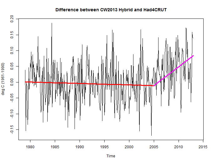
Figure 3 presents two graphs showing the differences between the HADCRUT4 data and the two versions of the Cowtan and Way (2013) data. Note the apparent breakpoint around 2005 with both datasets.

Figure 3
I’ve divided the difference graphs into two periods, January 1979 to December 2004, and January 2005 to December 2012. See Figure 4.

Figure 4
Steve McIntyre noticed the same breakpoint. See Steve’s Figure 2 here.
As you’ll note, the differences shows negative trends before 2005. That means the HADCRUT4 data are warming faster than the Cowtan and Way (2013) data. Then after 2005, the differences are showing positive trends, meaning the Cowtan and Way (2013) data are warming faster than the HADCRUT4 data.
The results are odd.
Why? The Cowtan and Way (2013) datasets were intended to produce polar amplification. Cowtan and Way, in their blog post at SkepticalScience, write:
Both of their new surface temperature data sets show significantly more warming over the past 16 years than HadCRUT4. This is mainly due to HadCRUT4 missing accelerated Arctic warming, especially since 1997.
Stefan Rahmstorf, in his post at RealClimate, explains in the opening 4 paragraphs of that post (His boldface):
A new study by British and Canadian researchers shows that the global temperature rise of the past 15 years has been greatly underestimated. The reason is the data gaps in the weather station network, especially in the Arctic. If you fill these data gaps using satellite measurements, the warming trend is more than doubled in the widely used HadCRUT4 data, and the much-discussed “warming pause” has virtually disappeared.
Obtaining the globally averaged temperature from weather station data has a well-known problem: there are some gaps in the data, especially in the polar regions and in parts of Africa. As long as the regions not covered warm up like the rest of the world, that does not change the global temperature curve.
But errors in global temperature trends arise if these areas evolve differently from the global mean. That’s been the case over the last 15 years in the Arctic, which has warmed exceptionally fast, as shown by satellite and reanalysis data and by the massive sea ice loss there. This problem was analysed for the first time by Rasmus in 2008 at RealClimate, and it was later confirmed by other authors in the scientific literature.
The “Arctic hole” is the main reason for the difference between the NASA GISS data and the other two data sets of near-surface temperature, HadCRUT and NOAA. I have always preferred the GISS data because NASA fills the data gaps by interpolation from the edges, which is certainly better than not filling them at all.
But according to the differences between the HADCRUT4 and Cowtan and Way (2013) datasets, Figure 4, the HADCRUT4 data warms faster than the Cowtan and Way (2013) datasets before 2005. That is, we’re not seeing the impacts of the polar amplification before 2005
We can look at the impacts of the GISS infilling method by subtracting the global GISS land-ocean temperature index data with 250km smoothing from the GISS data with 1200km smoothing. See Figure 5. I’ve also broken the difference results into the same two periods as Figure 4, before and after 2005.

Figure 5
The GISS relationship is what we would expect. Northern Hemisphere surface temperatures have been warming since the mid-1970s. Polar amplification exaggerated that warming in the Arctic. So the infilled GISS data, which extends out over the Arctic, would show the greater warming since the 1970s…until the warming stops for Northern Hemisphere sea surface temperatures and for the low-to-mid latitude land surface air temperatures. See Figure 6.

Figure 6
The left-hand graph in Figure 6 presents the GISS Land-Ocean Temperature Index (LOTI) data for the low-to-mid latitudes of the Northern Hemisphere (0-65N). The ocean data was masked (one of the features of the KNMI Climate Explorer with the GISS LOTI data). Land surface air temperatures there effectively stopped warming around 1998. The right-hand graph in Figure 6 presents the Northern Hemisphere GISS sea surface temperature anomalies. For it, the land surface temperature data was masked. GISS also masks sea surface temperature wherever sea ice has existed so there is little data in the Arctic Ocean. The GISS Northern Hemisphere sea surface temperature data appears to have peaked around 2005. So the additional the warming of the infilled GISS data before 1995 and the slowing afterwards(Figure 5) appears to make sense.
That suggests that the infilling methods used by Cowtan and Way (2013), shown in Figure 4, provide results that aren’t realistic. That of course assumes that the primary reason for the differences between the HADCRUT4 data and the Cowtan and Way (2013) data is the Arctic data—as Cowtan and Way and as Stefan Rahmstorf have portrayed.
THE COWTAN AND WAY DATA DO NOT HELP CLIMATE MODELS
The Cowtan and Way (2013) data are not available on a gridded basis in an easy-to-use format. So we’ll be presenting the HADCRUT3 data along with a few other datasets as references in this section. We’ll also be presenting the warming and cooling rates (the trends) on a zonal means (latitude average) basis.
For example, Figure 7 illustrates the warming and cooling rates of the HADCRUT4 data, and as a reference, the GISS LOTI data, for the period of January 1997 to December 2012…the hiatus period. The vertical axis (y-axis) is scaled in deg C/decade, so we’re showing the warming and cooling rates or trends. The horizontal axis (x-axis) is scaled in latitude, so the South Pole is to the left at -90 (90S) and North Pole is to the right at 90 (90N). Both datasets show the very slow warming rates (and cooling at some latitudes) extending from the mid-latitudes of the Southern Hemisphere to the mid-latitudes of the Northern Hemisphere. Both poles show continued warming.

Figure 7
Background Information: Climate models, on the other hand, have difficulty with polar amplification. They do not simulate it properly. Figure 8 presents model-data trend comparisons for the two warming periods since 1914 and the warming hiatus period from 1945 to 1975. (The illustrations are from my book Climate Models Fail.) The models do a reasonable job of portraying the polar amplification shown by the GISS LOTI data from 1975 to 2012, as illustrated in the upper left-hand graph. But the models fail to capture the polar-amplified cooling in the Arctic from 1945 to 1975 (upper right-hand graph), and they definitely do not show the polar-amplified warming that occurred from 1914 to 1945 (lower left-hand graph).

Figure 8
If we compare the HADCRUT4 data to the CMIP5 models (historic and RCP6.0) for the period of 1997 to 2012, Figure 9, we can see that the models over-estimate the warming from 65S to 65N (the vast majority of the planet) and underestimate the warming at the poles. Therefore, if the Cowtan and Way (2013) data are increasing the warming in the Arctic, they are creating a greater divergence from the models there, but failing to reduce the differences between the models and data where the models overestimate the warming.

Figure 9
Additional note: The following is a portion of Chapter from my book Climate Models Fail. It seems appropriate for this discussion:
There is a remarkable paper that explains why the current generation of climate models (CMIP5) is in better agreement among themselves than the previous generation (CMIP3) but, as a result, they perform worse. See Swanson (2013) “Emerging Selection Bias in Large-scale Climate Change Simulations.” The preprint version of the paper is here. In the Introduction, Swanson writes (my boldface):
Here we suggest the possibility that a selection bias based upon warming rate is emerging in the enterprise of large-scale climate change simulation. Instead of involving a choice of whether to keep or discard an observation based upon a prior expectation, we hypothesize that this selection bias involves the ‘survival’ of climate models from generation to generation, based upon their warming rate. One plausible explanation suggests this bias originates in the desirable goal to more accurately capture the most spectacular observed manifestation of recent warming, namely the ongoing Arctic amplification of warming and accompanying collapse in Arctic sea ice. However, fidelity to the observed Arctic warming is not equivalent to fidelity in capturing the overall pattern of climate warming. As aresult, the current generation (CMIP5) model ensemble mean performsworse at capturing the observed latitudinal structure of warming than theearlier generation (CMIP3) model ensemble. This is despite a markedreduction in the inter-ensemble spread going from CMIP3 to CMIP5, whichby itself indicates higher confidence in the consensus solution. In otherwords, CMIP5 simulations viewed in aggregate appear to provide a moreprecise, but less accurate picture of actual climate warming compared toCMIP3.
In other words, the current generation of climate models (CMIP5) agrees better among themselves than the prior generation (CMIP3), i.e., there is less of a spread between climate model outputs, because they are converging on the same results. Overall, however, the CMIP5 models perform worse than the than the prior generation, CMIP3.
According to Swanson (2013) modelers made the models worse throughout most of the globe in efforts to create more warming in the Arctic. So by increasing the warming in the Arctic, Cowtan and Way have not helped the models.
USING LOWER TROPSPHERE TEMPERATURE DATA TO INFILL SURFACE TEMPERATURE DATA
The hybrid method used by Cowtan and Way (2013) fills in missing data (both land air and sea surface temperature) using lower troposphere temperature data from UAH. Lower troposphere temperature data represents the temperature of the atmosphere at approximately 3000 meters above sea level, as determined by satellite measurements. The lower troposphere temperature data are spatially complete by comparison to surface temperature measurements.
As noted earlier, in their post at SkepticalScience, Cowtan and Way write:
They found that the kriging method works best to estimate temperatures over the oceans, while the hybrid method works best over land and most importantly sea ice, which accounts for much of the unobserved region.
It’s hard to imagine how Cowtan and Way could determine with any degree of certainty how “the hybrid method works best over land and most importantly sea ice” when there is so little surface air temperature data over sea ice. If Cowtan and Way are using reanalyses as references, reanalyses use climate models to infill the missing data, so reanalyses also are not observations-based data out over the Arctic and Southern Oceans. Reanalyses are simply another way of infilling.
Animation 1 compares the GISS land surface air temperature trends to UAH lower troposphere temperature trends over land for the period of 1979 to 2012. The ocean data for both datasets have been masked. We’re using GISS LOTI data because it’s more spatially complete than the UKMO CRUTEM data (which is used in the HADCRUT4 data). The spatial patterns of the warming of both datasets are similar in some places but quite different in others. Assuming the spatial patterns of the warming shown by the GISS LOTI data are close to being correct, then the differences with the lower troposphere data appear to show that lower troposphere temperature data would be of questionable value for infilling the HADCRUT4 data.

Animation 1
The differences in the warming spatial patterns are even more pronounced for the period of 1997 to 2012. See Animation 2. It’s hard to imagine using lower troposphere temperature data to infill land surface air temperature data.

Animation 2
Let’s compare the warming and cooling patterns for lower troposphere temperatures over the oceans to a spatially complete, satellite-enhanced sea surface temperature dataset, Reynolds OI.v2. Because the Reynolds OI.v2 data starts in November 1981, the trend analysis in Animation 3 covers the period of 1982 to 2012. There are few similarities in the warming and cooling patterns.

Animation 3
And for the period of 1997 to 2012, there are no similarities between the warming and cooling patterns for lower troposphere temperatures over the oceans and the satellite-enhanced sea surface temperature data.

Animation 4
Based on the dissimilarities between the warming and cooling patterns of the lower troposphere temperature and surface temperature data, it appears using lower troposphere temperature data to infill surface temperature data would provide erroneous results.
I also suspect that a good portion of the additional warming shown in the hybrid version of the Cowtan and Way (2013) data (versus their Krig data) comes from the Southern Ocean surrounding Antarctica, where sea surface temperatures are cooling and lower troposphere temperatures are warming.
One last comparison graph, as a reference for discussion: Figure 10 compares the trends from 1997 to 2012 of GISS LOTI, HADCRUT4 and UAH Lower Troposphere Temperature anomalies. Curiously, since 1997, the UAH lower troposphere temperature data shows less warming in the Arctic than the GISS and HADCRUT4 data. And the lower troposphere temperatures also show warming in the Southern Ocean (latitudes 65S-55S) while the surface temperature-based datasets both show cooling.

Figure 10
A FINAL NOTE
I’ve used GISS LOTI data in this post as a reference. That does not mean I agree with the way GISS treats the Arctic and Southern Oceans. GISS masks (effectively deletes) sea surface temperature data anywhere sea ice has existed. They then infill the Arctic and Southern Oceans with land surface air temperature data. While this is logical in winter, when sea ice exists on the oceans and snow cover exists on land surfaces, it is not logical during the summer, when seasonal sea ice melt exposes the open ocean, and when snow melt exposes land surface. Sea surface temperatures vary at a much lower rate than land surface temperatures. And air temperatures over exposed land surfaces should warm differently than air temperatures over sea ice, especially when open ocean separates them. GISS data in the Arctic and Southern Oceans, therefore, would exaggerate the warming in both polar oceans.
CLOSING
The datasets produced by Cowtan and Way (2013) do not appear to provide polar amplification for the period of 1979 to 2004, because the HADCRUT4 data warmed faster than the Cowtan and Way (2013) data before 2005. See the discussions of Figures 3, 4 and 5.
Increasing polar-amplified warming in the Arctic does not help climate models, which show poor polar amplification results. Refer to the discussions of Figures 7, 8 and 9.
And due to the differences in the spatial patterns of warming and cooling, using lower troposphere temperatures to infill surface temperature data appears questionable.
As I was writing this post, Judith Curry also published the post Uncertainty in Arctic temperatures. It’s definitely worth reading in light of Cowtan and Way (2013).
The guy’s family name is Way, not Ray … please correct!
agricultural economist, found and corrected.
Thanks.
The climate hypesters will adjust the data and change the standards until they have the answer they want.
This is just another, of a very large number, of AGW deception papers.
When climate hypesters are not hiding declines, they are “adjusting” data. When they are not adjusting data they are cherry picking. When they are not cherry picking, they are using populations of zero to “infill” data. And when all of that fails (and it does), they move the goal posts.
What disturbs me most is that other than people like Tisdale, Curry, McIntyre, etc. there is largely silence from the mainstream climate community. There must be other “establishment” climate scientists out there who can figure all this out. Yet they remain silent.
“Cowtan and Way (2013) proved the UKMO HADCRUT4 data underreports by half the warming of global surface temperatures since 1997. ”
Using Kriging???? Seriously? Did climate scientists completely skip their spatial statistics classes???
So they found a way to make it warmer recently while not warmer in the past so as to have a better fit to their theory, using, of course, temperature “anomalies”. I continue to believe that showing only anomaly data, even were it accurate, is in itself misleading in the graphical depictions of what is going on in the realm of temperature. Graphing actual temperatures would show how we a swating at mosquitoes with a sledgehammer given the very slight changes which are supposedly occuring. Scaling graphs to exaggerate changes is an old, old trick used to fool the innumerate ( mathmatical equivalent of illiterate ).
Maybe I am missing something, but really, who cares if Antarctica and Greenland warm a couple degrees? Unless I am mistaken the inhabitants of Greenland would prefer such a situation. Perhaps we should ask them since basically nobody else would be affected using this model.
Even if they are right nobody should care.
There should be accelerated warming in the Arctic since 1996 due to the increasingly negative NAO/AO episodes. That transports extra warm water north, and the weaker vortex allows greater atmospheric exchange between the Arctic and the Extratropics.
Michael Craig you write “Yet they remain silent.” I have asked the same question over and over again. The only answer I can come up with, is that ALL the learned scientific societies, led by the Royal Society and the American Physical Society have declared, in effect, the science of CAGW to be settled, and everything said to support this, is written on tablets of stone. So it takes a very brave person indeed to stand up and shout from the rooftops that the RS, the APS, Old Uncle Tom Cobbley and All are wrong. There are few with any gonads who are prepared to do it.
It is only people like those you mention who go against The Team, and they pay a price for it.
Ulric Lyons says: “There should be accelerated warming in the Arctic since 1996 due to the increasingly negative NAO/AO episodes. That transports extra warm water north, and the weaker vortex allows greater atmospheric exchange between the Arctic and the Extratropics.”
But we would expect polar amplification to exist prior to the 2005.
GISS with their infilling show no warming trend anyway, since at least 2001.
So, in my book, double nothing is nothing.
http://www.woodfortrees.org/plot/gistemp/from:2002/trend/plot/gistemp/from:2002
As global temperatures have been to all intents and purposes flat for the last 10 to 17 years, and given that all datasets show the Arctic warming, it follows that the rest of the world has been cooling.
Should we not be more worried about that? Did any models forecast that?
And, given the fact that the amount of kinetic energy needed to raise temps by 1C in the Arctic is far less than needed to raise by 1c at lower latitudes, is not the cooling far more significant than the warming?
“It’s hard to imagine how Cowtan and Way could determine with any degree of certainty how “the hybrid method works best over land and most importantly sea ice” when there is so little surface air temperature data over sea ice. ” — Tisdale
This is the only thing of interest. The entire point of interpolation is that *you have no actual data* and are trying to produce it in a controlled manner. Kriging is, for its part, just another curve fitting exercise. But by definition you cannot state that it fits better or worse than the data you do not have. In stating that Kriging ‘fit better’ here and ‘fit worse’ there, where ‘here’ and ‘there’ have no data for which they can make that judgement? Cowtan and Way have explicitly confessed to being at least one of incompetent or pursposefully deceitful with numerical illiteracy. And so to any peer reviewers that signed off on it.
The problem I see with HadCRUT4 and models is that HadCRUT3 have been used to parametrize
most models (HadCRUT4 is less than 10 years old) and hadCRUT4 is been used to test the validity of the projections of the models. They are not comparing apples to apples.
They should either comparing nowadays HadCRUT3 data with computer model output or start over and parametrize the new computer models by using HadCRUT4 data.
(I almost wrote HadCRUT$ instead of HadCRUT4, lol. I am not used to type with caps lock on. Maybe there is a hidden meaning of HadCRUT4 = HadCRUT with $ not capped)
Bob Tisdale says:
“But we would expect polar amplification to exist prior to the 2005.”
It shows strongly from mid 1995 on UAH:
http://snag.gy/Hw34T.jpg
Which is around the time the sea ice extent loss accelerates:
http://arctic.atmos.uiuc.edu/cryosphere/IMAGES/seaice.anomaly.arctic.png
And the NAO episodes became more negative:
http://www.cpc.ncep.noaa.gov/products/precip/CWlink/pna/month_nao_index.shtml
Isn’t warming at the poles a good thing?
Most of the heat is going into big, cold heatsinks and moderating the climate.
Paul Homewood says:
November 19, 2013 at 8:11 am
“As global temperatures have been to all intents and purposes flat for the last 10 to 17 years, and given that all datasets show the Arctic warming, it follows that the rest of the world has been cooling. Should we not be more worried about that? Did any models forecast that?”
No all the models predict lowering Arctic pressure and increasing positive AO/NAO conditions, which cools the Arctic and increases ice extent.
There has to be an obvious and simple flaw in the using of lower troposphere satellite temperatures at 3,000m elevation to guesstimate actual surface polar temperatures.
I think it may have something to do with the polar vortex.
http://www.physicalgeography.net/fundamentals/images/uppercirculation.jpg
Basically, in all parts of the world, temperatures decrease with increasing elevation. However, because of the polar vortex, very cold air is constantly being dragged down towards surface. So, the difference between average temperatures at surface and 3,000m elevation at, say 70 degrees N, will be much less than at 80-90 degrees N.
Hmm, so what’s happening in Antarctica? Shouldn’t be too different from what is being proposed here by torturing data in the Arctic. Oops, that’s another alarmist theory out the window.
http://www.google.co.uk/url?sa=t&rct=j&q=&esrc=s&source=web&cd=3&cad=rja&ved=0CDoQFjAC&url=http%3A%2F%2Ficecap.us%2Fimages%2Fuploads%2Fantarctica_white_paper_final.pdf&ei=V5CLUuO3FIed0QX8p4CAAw&usg=AFQjCNHY9PlAP_i8uKWSM4uMt2I93Ol42Q
Ulric Lyons says: “It shows strongly from mid 1995 on UAH:
http://snag.gy/Hw34T.jpg”
First, what are you illustrating? Second, it would be helpful if you used numeric months.
@Bob Tisdale:
Sorry that was UAH lower troposphere north pole:
http://www.nsstc.uah.edu/data/msu/t2lt/uahncdc_lt.txt
and I’m not sure how to get the months on there, but point 197 (the high spike) is April 1995:
http://snag.gy/Hw34T.jpg
As a casualty actuary, I dislike estimating a trend based on filling in missing temperatures to get an average. Even worse is filling in temperatures using outside data. Both processes introduce errors and invite bias.
IMHO if you want to measure temperature trend based on weather station data, the best method is to use only those weather states that were working throughout the period of interest, excluding any that were damaged or affected by the urban heat island effect. Measure the trend at each of these stations then average these trends. The averaging is a bit tricky, because a weighted average of some sort would need to be used.
So no 17 year pause or slowdown? Hmmm…okay. Also no increased trend in ‘extreme weather’ events, rate of sea level rise, spread of disease, three eyed kittens, birds flying backwards etc. Trying to fix the models, does not fix the failed theory.
The tighter they pull on the loose thread, the more holes open up. At some point their ass is going to fall out for all to see, and they are not going to be able to fit all their junk back in no matter how hard they try.
UAH Arctic data (NoPol) show a trend of +0.14 deg C per decade between 1979 and end 1996. Between 1997 and 2012 this rises to +0.55 deg C per decade.
The C&W hybrid data just reflects these trends.
Ooops!
There is a typo on the right diagram of Figure 1. It should read 1997 and not 1979.
The “Arctic hole” is the main reason for the difference between the NASA GISS data and the other two data sets of near-surface temperature,HadCRUT
What difference? To the end of October, GISS is flat for 12 years and 6 months. To the end of September, HadCRUT4 is flat for 12 years and 10 months.
Michael Craig says:
November 19, 2013 at 7:00 am
Jim Cripwell says:
November 19, 2013 at 7:38 am
Many of the folks you are complaining about have employment contracts committing them to activities that do not include reading and responding to everything Bob T., Steve Mc., and others post on a daily basis. When a few of the “establishment” climate scientists (James H., M. Mann, others) have involved themselves in this sort of activity they have been vilified for being activists followed by admonitions to get back to their day jobs.
I’m beginning to think that much of what gets attributed to “the mainstream climate community” is actually coming from green-eco-activistists. I have been following reports by Donna L. at nofrakkingconsensus. She is now at and reporting on the Warsaw Climate Summit where Greenpeace [her words: “the Climate Action Network (read: Greenpeace)”] and the World Wide Fund (WWF) have free use of the press conferences. I don’t need or want to hear from these types.
Watts, Tisdale, and McIntyre are much preferred.
Thanks Bob. You go to such lengths in such great detail to show the lax thinking and approach of the insiders and I know it will have an effect over time.
I’m sure Cowtan and Way’s Hero of Socialist Science medals are in the mail. Still to be delivered: proof that the globe, or even that small mass of air above that small part of the Earth known as the Arctic, is being heated by increased atmospheric CO2. We know that since the onset of the Little Ice Age, the Earth has been out of balance. The recent 150 years or so have seen balance being reestablished relative to conditions prevailing in, say, 1800AD, as the Earth heats up. At this point, we have no valid concept of what those conditions were, or whether they have been altered by forces unknown, or what the new baseline is.
It seems to me that much of the so-called polar warming is because, where the ice has receded, they compare the surface water temperature to the preceding surface ice temperature, which would be invalid, of course. But not sure that they’re doing that.
Bob, re your Figure 4, I’d argue that you can’t argue for an break point in 2005 with a step difference in your trend lines. If one is looking for a “something changed here” year, one would do better to find the year where the linear trend lines for the before and after segment intersect, that is, a inflection point rather than a step break. This would be circa 2000.
If the added warming from the higher latitudes(focus on Arctic) is now dialed into global temperatures as this paper does, it presents a future dilemma.
The more warming, whether legit or not that makes it to temperature graphs in the short run, the harder it is to continue an uptrend in the future.
Hansen doctored/adjusted US temperatures, cooling them in the 1930’s(earlier periods) then warming them later to turn a downtrend into an uptrend. This works great if you don’t have to deal with the future.
If temperatures did not or have not warmed as greatly as stated, it becomes harder and harder to torture the data to keep the uptrend going.
In fact, the more inflated recent temperatures are, the cooler they will look in this next decade…….unless of course, the warming does actually accelerate.
This same idea is born out with global climate models that predicted the temperature rise to be MUCH greater than what has actually occurred.
15 years ago, you could make a case that if correct we might have catastrophic global warming.
But look what happened:
http://www.drroyspencer.com/2013/06/still-epic-fail-73-climate-models-vs-measurements-running-5-year-means/
15 years later, those advocating major governmental policy based on global climate model predictions.wish the models had not exaggerated the future warming so greatly.
It destroyed their credibility.
The take home point is that the higher that temperatures are adjusted now, for whatever reason, the cooler the future looks vs now.
This is sort of “live for the moment” desperation science that, if not authentic comes back to burn the sources badly.
Unfortunately, it appears that our world is not holding sources accountable to realities when they don’t match up.
John F. Hultquist you write “Many of the folks you are complaining about have employment contracts committing them to activities that do not include reading and responding to everything Bob T., Steve Mc., and others post on a daily basis.”
That is not what I am trying to say. Very recently, David Cameron stated unequivocally that events like Hurricane Sandy, and Super Typhoon Hiayan were definitely caused by global warming. If you are the President of the Royal Society, or the Government Chief Scientist, are you going to proclaim in public that the Prime Minister is a liar? Which he is. Or do you go out and do what Lord Rees did, and lie yourself?
http://theconversation.com/astronomer-royal-on-science-environment-and-the-future-18162
Bob,
Thanks much for the tremendous amount of insight and all the comprehensive data/graphs you generously provide so that people like me can understand this better.
To us here, you are like the Roman God of the sea, Neptune (:
http://www.crystalinks.com/neptunerome.html
With your great power/knowledge, we will crush fraudulent science and those with biased views and manipulated data.
Where do they get all these people?
Wonder what HADCRUT4 and GISS would look like if it used Arctic data (80N+) from DMI instead of inferior techniques? There is no better available data than from DMI surely? It contains the most observations and covers the longest period than any other data set.
Werner Brozek says: “There is a typo on the right diagram of Figure 1. It should read 1997 and not 1979.”
Thanks, Werner. Fixed it.
David Whitehouse neatly sums it all
http://www.thegwpf.org/pause/
His opening comment rather says it all.
This new paper does not affect the fact that the temperature databases, with their own allowances for data-free regions, show no warming for 16-years, or at the very least no warming for about 95% of the globe for 16-years.
Cowtan and Way explain in their post at SkepticalScience
Do serious scientists post at SkS?
No, I thought not!
If satellite temps are good enough to use for the missing bits, why not just use their global numbers, and be done with it?
(Sorry, that would give the wrong “results”, wouldn’t it?)
Paul Homewood says:
November 19, 2013 at 11:29 am
If satellite temps are good enough to use for the missing bits, why not just use their global numbers, and be done with it?
(Sorry, that would give the wrong “results”, wouldn’t it?)
RSS isn’t global. UAH doesn’t show a pause. So “wrong ‘results'” would depend upon for which one is looking.
Jim Cripwell says:
November 19, 2013 at 10:59 am
“Which he is.” Referring to P. M. Cameron as a liar.
Perhaps there is a better word than “liar.” I will not call the Catholic Pope a liar for quoting Jesus although there are several assumptions about doing so that can be questioned. Such discussions do not move science and society forward. Consider the cover of Jo Nova’s “The Skeptic’s Handbook”:
Rise above the mud – . . .
http://jonova.s3.amazonaws.com/sh1/the_skeptics_handbook_2-3_lq.pdf
Guess what Hadcrut5 will look like.
jorgekafkazar says:
November 19, 2013 at 10:24 am
“We know that since the onset of the Little Ice Age, the Earth has been out of balance. The recent 150 years or so have seen balance being reestablished relative to conditions prevailing in, say, 1800AD, as the Earth heats up.”
Hmm. Thinking of Bond Events; there seems to be a natural oscillation with a 1,500 years or so periodicity; so “balance” is never actually achieved. Speaking of the Earth being out of balance sounds like what the housewives – ehm, sorry, empowered modern women – at Grist would say; the most you can say is the Earth being warmer or cooler than the long term average; both states being normal parts of the oscillation; and even that makes little sense as average temperatures are not a meaningful metric for energy.
John F. Hultquist says:
November 19, 2013 at 1:26 pm
“Jim Cripwell says:
November 19, 2013 at 10:59 am
“Which he is.” Referring to P. M. Cameron as a liar.
Perhaps there is a better word than “liar.””
The technical term for Heads of States would be “traitor”.
2005 is the year in which massive changes in station data began to be introduced in the GHCN data base. The abrupt discontinuities are so glaring that Tu Tiempo simply deleted that year for a great majority of USA stations. It would be a mistake to look for physical explanations when data manipulation is so blatant.
John F. Hultquist you write “Perhaps there is a better word than “liar.” I will not call the Catholic Pope a liar for quoting Jesus although there are several assumptions about doing so that can be questioned.”
Nor would I, but I thought we were talking science rather than religion. If you are somehow claiming that David Cameron is stating a religious belief, then I would have no objection. But supposedly some scientist convinced him that there was solid scientific evidence for his statement. Since there is no such evidence, this makes the PM a liar. Precisely what it makes the scientist who persuaded him to lie, is another issue.
“It’s hard to imagine how Cowtan and Way could determine with any degree of certainty how “the hybrid method works best over land and most importantly sea ice” when there is so little surface air temperature data over sea ice. If Cowtan and Way are using reanalyses as references, reanalyses use climate models to infill the missing data, so reanalyses also are not observations-based data out over the Arctic and Southern Oceans. Reanalyses are simply another way of infilling.”
When you define “best” as “fits observations best” then yes, there is a problem.
But when you define “best” as “what is best for The Cause”, the confusion goes away…
Way and Cowtan probably didn’t notice that they force the GCM modelers to make even more tuning acrobatics. If their paper ever becomes canon.
“A new study by British and Canadian researchers shows that the global temperature rise of the past 15 years has been greatly underestimated. The reason is the data gaps in the weather station network, especially in the Arctic. If you fill these data gaps using satellite measurements, the warming trend is more than doubled in the widely used HadCRUT4 data, and the much-discussed “warming pause” has virtually disappeared.”
Filling in the data gaps from satellite measurements and doubling the trend, just means the rest of the surface data used with HADCRUT4 is too warm compared with the rest of the satellite data. This highlights the surface temperatures compared with satellite have a warm bias because the satellite only data doesn’t show the same trend that it has changed. It also makes the data incomparable with older decades and in it funny the only way to show warming these days is to alter the data set..
It continues a dangerous president in climate science to make up data in regions that requires guess work rather than observations. Acceptable in a theory to evaluate the hypothesis using proper observations, but not fine to alter the so called observations and actually take them seriously.
Matt G says:
November 19, 2013 at 3:39 pm
It continues a dangerous president in climate science
Did you mean “precedent” or are talking about president Obama? 🙂
That break-point in the graph looks odd to me.
Neither UAH nor HADCRUT4 does have such so it is very difficult to explain where it is coming from.
It looks like a statistic artifact to me, maybe the infilling increased or decreased in that period with in-filled data being biased warm or biased cold and thus creating that issue.
If their infilling data is depending on the sea ice surface for instance it could create that.
Werner Brozek says:
November 19, 2013 at 5:02 pm
Thanks, sorry I missed this.
I do mean precedent, maybe had the article on the president in my mind.