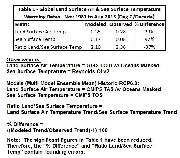
In Climate Models Fail, using a number of different datasets, I illustrated how the climate models used by the IPCC for their 5th Assessment Report could not simulate climate variables such as surface temperatures (land surface air, sea surface and combined land+sea surface), precipitation and sea ice area. There’s another splendid way to present the model failings (that wasn’t presented in the book): by comparing the warming rates of global land surface air temperatures with the warming rates of global sea surface temperatures. It’s astounding that the models perform so poorly. See Table 1.
Note: I’ve made a few changes to the post at the suggestions of the first few persons to comment on the WUWT cross post. Table 1 has been updated and so has the text of the paragraph before Figure 7-29. (Thanks, to bloggers DB and Keith Minto.) And I’ve added a note to the table about rounding errors. (Thanks, Steve Keohane.)
As shown, the models overestimated the warming of global land surface air temperatures since November 1981 by about 23% (which isn’t too bad), but the models doubled the observed rate of warming of the surface temperatures of the global oceans (and that’s horrendous). Now consider that most of the warming of global land surface air temperatures is in response to the warming of global sea surface temperatures. (See Compo and Sardeshmukh (2009) “Ocean Influences on Recent Continental Warming.”) In the real world, the land surface temperatures warmed at a rate that was more than 3 times faster than the warming of global sea surface temperatures, but in the fantasy modeled world, land surface temperatures only warmed 2 times as fast.
And what does that suggest?
Well, we already know that models can’t simulate the coupled ocean-atmosphere processes that cause global sea surface temperatures to warm over multidecadal periods. (See the quick overview that follows.) So, the difference between the modeled and observed ratios of land to sea surface temperature warming rates suggests the basic underlying physics within the models are skewed. Skewed is the nicest word I could think to use.
Consider this: the models simulate coupled ocean-atmosphere processes so poorly that, while the models doubled the observed rate of warming of sea surface temperatures, the models could only overestimate the observed rate of warming of land surface air temperatures by 23%.
TABLE 1 DATA AND MODEL OUTPUT INFORMATION
Source of Data and Model Outputs: KNMI Climate Explorer. (See my blog post Step-By-Step Instructions for Creating a Climate-Related Model-Data Comparison Graph.)
Data: The land surface temperature data are the GISS Land-Ocean Temperature Index with the oceans masked, and the sea surface temperature data are Reynolds OI.v2.
Model Outputs: I’ve used the CMIP5 multi-model ensemble mean (historic through 2005 and RCP6.0 afterwards). The oceans are masked for the land surface air temperature outputs (tas), and the outputs for sea surface temperature (tos) are as presented by the KNMI Climate Explorer.
Other: The start month (November 1981) is dictated by the satellite-enhanced sea surface temperature data. The base years for anomalies are 1982 to 2010 to accommodate the time period.
FAILURES TO SIMULATE COUPLED OCEAN-ATMOSPHERE PROCESSES
[Note: The following Figure numbers are as they appear in Climate Models Fail.]
This part of the discussion gets a little technical, but it provides a basic overview of the naturally occurring processes that cause sea surface temperatures to warm. And it shows quite clearly that the models used by the IPCC for their 5th Assessment Report do not properly simulate those processes.
# # #
Climate models used by the IPCC for the 5th Assessment Report do not properly simulate the AMO (Atlantic Multidecadal Oscillation). In Climate Models Fail, I presented a number of scientific studies that were very critical of how models simulated many variables, including the Atlantic Multidecadal Oscillation. (See Ruiz-Barradas, et.al. (2013) is The Atlantic Multidecadal Oscillation in twentieth century climate simulations: uneven progress from CMIP3 to CMIP5.)
We can illustrate the Atlantic Multidecadal Oscillation using the method recommended by Trenberth and Shea (2006), and it was to subtract global sea surface temperature anomalies (60S-60N, excludes the polar oceans) from sea surface temperature anomalies of the North Atlantic (0-60N, 80W-0). They used HADISST data and so have I. In the time-series graph in Figure 7-22, I’ve also smoothed the AMO data with a 121-month running average filter. As shown by the blue curve, the North Atlantic has a mode of natural variability that causes its sea surface temperatures to warm and cool at rates that are much greater than the variations in the surface temperatures of the global oceans. And we can see that the variations occur over multidecadal time periods (thus the name Atlantic Multidecadal Oscillation). Keep in mind that the Atlantic Multidecadal Oscillation is responsible for some (but not all) of the warming of land surface temperatures in the Northern Hemisphere during the more recent warming period, according to the climate scientists at RealClimate. (See also Tung and Zhou (2012) Using data to attribute episodes of warming and cooling in instrumental records.)
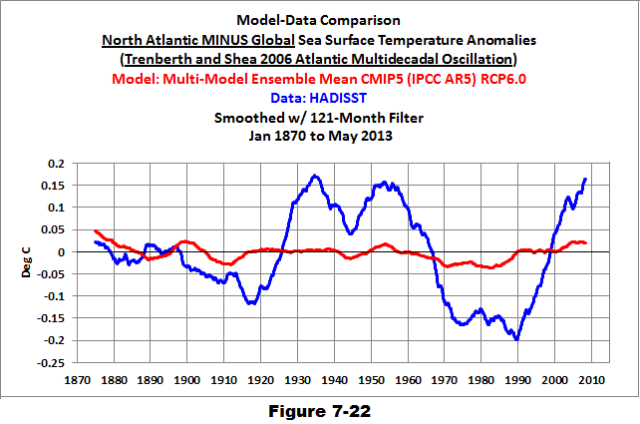
If we subtract the modeled global sea surface temperatures from the modeled sea surface temperatures of the North Atlantic (shown as the red curve in Figure 7-22), we can see that the forced component of the CMIP5 models (represented by the multi-model ensemble mean) does not simulate the observed multidecadal variations in the North Atlantic. That is, there is very little difference between the modeled variations in global and North Atlantic sea surface temperature anomalies. The comparison also strongly suggests that the Atlantic Multidecadal Oscillation is NOT a response to manmade greenhouse gases (or aerosols) used by the climate modelers to force the warming (or cooling) of sea surface temperatures of the North Atlantic.
So the modelers have tried to compensate for that failing. They try to force the warming of the surface of the Atlantic Ocean with manmade greenhouse gases, which results in a poor representation of that warming. We can see this in the modeled and observed warming rates of Atlantic sea surface temperatures during the satellite era. (See Figure 7-12)
Overview of Figure 7-12: Its graph presents observed and modeled warming rates on a zonal-mean (latitude average) basis and it covers the last 31 years. The vertical axis (y-axis) presents the warming rates (based on linear trends) in deg C/decade. The horizontal axis (x-axis) is latitude: where the South Pole is at “-90” deg on the left, the North Pole in at “90” deg on the right, and in the center at “0” deg is the equator. So the North Atlantic is to the right. Basically, the graph shows how quickly the sea surface temperatures of the Atlantic warmed (and cooled) since November 1981 at different latitudes (modeled and observed).

Because climate models cannot properly simulate the Atlantic Multidecadal Oscillation, the modelers tried to force that additional warming of Atlantic sea surface temperatures with manmade greenhouse gases and they needed to do that because the North Atlantic has a strong influence on land surface temperatures in the Northern Hemisphere. But, as shown in Figure 7-12, they failed to capture where the Atlantic warmed and how much it warmed. And that influences where land surface air temperatures warm in the models and by how much.
Also, recall that the high rate of warming in the North Atlantic is tied to a natural cycle, so it’s temporary. The North Atlantic also cools for multiple decades. It may already have started. (See Figure 2-31) But in the models, the warming has not slowed (not illustrated).

In the models, the forced high rates of warming of sea surface temperatures by greenhouse gas then carries over to the other ocean basins — the Pacific for the next example.
As you’ll recall, the Pacific Ocean is the largest ocean basin on the planet. It covers more of the surface of the global oceans than all of the continental land masses combined.
Also, the coupled ocean-atmosphere processes that cause the greatest variations in global surface temperature and precipitation take place in the Pacific Ocean. They are known as El Niño and La Niña events. There are no other natural climate-impacting events on Earth that rival El Niños and La Niñas, other than catastrophic volcanic eruptions.
And what do we know about El Niños and La Niñas?
First, we know climate modelers haven’t a clue how to simulate them and that includes the models used by the IPCC for their 5th Assessment Report. (See Guilyardi, et al. (2009) “Understanding El Niño in Ocean-Atmosphere General Circulation Models: Progress and Challenges” and Bellenger, et al. (2013) “ENSO Representation in Climate Models: from CMIP3 to CMIP5”).
Second, we know that El Niño events release tremendous amounts of (naturally created) heat into the atmosphere, and result in massive volumes of (naturally created) warm water being transported away from the tropical Pacific — and that the warm water is carried into the Indian Ocean and into the mid-latitudes of the Pacific during the trailing La Niñas. (See Figure 7-29, which is a zonal-mean graph showing modeled and observed warming rates in the Pacific.) That’s why, in the real world, the tropical Pacific Ocean has warmed very little over the past 31 years, and why the Pacific has warmed in the mid-latitudes. The strong El Niño events of 1986/87/88, 1997/98 and 2009/10 released a tremendous amount of warm water from below the surface of the tropical Pacific and it was redistributed from the tropical Pacific to the mid-latitudes during the trailing La Niñas.

Third, we know that El Niño events are fueled by warm water created during La Niña events, and that the warm water is created by temporary increases in sunlight associated with La Niña processes (not manmade greenhouse gases). Refer to Trenberth et al (2002) who write:
The negative feedback between SST [sea surface temperature] and surface fluxes can be interpreted as showing the importance of the discharge of heat during El Niño events and of the recharge of heat during La Niña events. Relatively clear skies in the central and eastern tropical Pacific allow solar radiation to enter the ocean, apparently offsetting the below normal SSTs, but the heat is carried away by Ekman drift, ocean currents, and adjustments through ocean Rossby and Kelvin waves, and the heat is stored in the western Pacific tropics. This is not simply a rearrangement of the ocean heat, but also a restoration of heat in the ocean.
Back to Figure 7-29: Because the climate models used by the IPCC cannot simulate (sunlight-fueled) El Niño and La Niña events, they try to force the warming of the Pacific Ocean with manmade greenhouse gases. And once again, the models fail to capture where the surface of the Pacific warmed and by how much. For example, they have forced the tropical Pacific in the models to warm at a very high rate, when, in the real world, the tropical Pacific has warmed very little in 31 years and in some areas it’s cooled.
But the modelers also have another problem: they appear to have set their forcings to the values they need for the additional warming of the North Atlantic and in the models that additional forcing also impacts the Pacific Ocean. That’s a logical explanation for why the models overestimated the warming of Pacific sea surface temperatures by a factor of 2.8. That is, the models almost tripled the warming rate of the Pacific sea surface temperatures. (See the time-series graph in Figure 7-25)

Yet somehow, in the climate models, land surface air temperatures do not warm as one would anticipate in response to all of the additional warming of sea surface temperatures. (Table 1) There must be some additional major flaws in the models.
CLOSING
Climate models simulate naturally occurring and naturally fueled coupled ocean-atmosphere processes so poorly that it appears the modelers to have to “fudge” how land surface temperatures respond to the warming of ocean surfaces.
ADDITIONAL READING
A multitude of climate model failings are discussed in Climate Models Fail. And for further information about El Niño and La Niña events, I’ve written dozens of posts about their processes and their long-term aftereffects at my blog Climate Observations or you could refer to my earlier book Who Turned on the Heat?
In Table 1, the ‘% Difference’ for land should be 23% rather than 123%.
There are no other natural climate-impacting events on Earth that rival El Niños and La Niñas, other than catastrophic volcanic eruptions.
(worth a bold)
Excellent analysis, Bob.
In the paragraph above 7-29, you mention heat distribution to the Indian Ocean during El Nino events, do you mean La Nina events ?
DB and Keith Minto: Thanks, I’ve updated the table and clarified that the El Nino releases the warm water and then it’s redistributed by the trailing La Nina.
Is there a valid, long-term El Nino-La Nina reconstruction possible – maybe from the South American fishing or weather records for the west coast towns off of South America?
Figure 7-22 goes to 1870, but doesn’t appear to explicitly describe the ENSO criteria or cycles over time. The area has been settled (with written records) and irregularly fished since the mid-1500’s.
The ENSO with the AMO and the PDO are main natural oscillations affecting the global temperature, but climate and geo sciences need to identify the causes with a sufficient degree of confidence. It can be shown that the data for the above indices correlate with the data for tectonic activity in the North Atlantic, the North and the (sub)Equatorial Pacific.
http://www.vukcevic.talktalk.net/APS.htm
Correlation is not necessarily causation, but common driver enhances probability for the local tectonics being strong contributory factor.
“Because climate models cannot properly simulate the Atlantic Multidecadal Oscillation, the modelers tried to force that additional warming of Atlantic sea surface temperatures with manmade greenhouse gases and they needed to do that because the North Atlantic has a strong influence on land surface temperatures in the Northern Hemisphere.”
I see an inverse correlation of seasonal/yearly temp’s in West Europe with the SST anomalies:
http://bobtisdale.files.wordpress.com/2013/09/figure-2-31.png
http://climexp.knmi.nl/data/tcet.dat
I would think that atmospheric circulation determines land temperatures more than the ocean temp’ does, and that the atmospheric changes are driving the oceanic variations.
This article comes to similar conclusions with regard to gulf stream variations and land temperatures:
http://www.ldeo.columbia.edu/res/div/ocp/gs/
“In the real world, the land surface temperatures warmed at a rate that was more than 3 times faster than the warming of global sea surface temperatures, but in the fantasy modeled world, land surface temperatures only warmed 2 times as fast.
And what does that suggest?”
That the atmosphere is being warmed faster than the oceans alone can do.
RACookPE1978 says: “Is there a valid, long-term El Nino-La Nina reconstruction possible – maybe from the South American fishing or weather records for the west coast towns off of South America?”
From the late 1800s to present there are three sea surface temperature reconstructions that capture NINO3.4 sea surface temperature anomalies: ERSST.v3b, HADISST, and Kaplan. See the following graph.
http://bobtisdale.files.wordpress.com/2013/09/figure-9-26.png
And here’s the average of the three, since they’re all a little bit different:
http://bobtisdale.files.wordpress.com/2013/09/figure-9-27.png
That gives a general idea, but there’s evidence that three of the El Ninos from 1912 to the early 1940s were stronger. In fact, the 1918/19 El Niño may have been comparable in strength to the El Niños in the late 20th Century.
http://bobtisdale.wordpress.com/2009/09/15/el-nino-events-are-not-getting-stronger/
If you’d like a longer reconstruction, there are paleoclimatological reconstructions of ENSO available from NOAA:
http://www.ncdc.noaa.gov/paleo/recons.html
But like all paleo reconstructions, you have to take them with a large pinch of salt.
Regards
Hmmmmn. Certainly nothing is immediately striking from that ENSO “average” plot, unlike the three explicitly clear spikes (drops) in atmosphere transmissivity at Mauna Loa observatory in 1963, 1982, amd 1991 from volcanoes.
See the plot on the WUWT Solar Page:
http://www.esrl.noaa.gov/gmd/webdata/grad/mloapt/mlo_transmission.gif
However, even those three volcanoes have a 1 to 1-1/2 year impact on temperatures.
https://sfb574.geomar.de/74.html
And there have been no large volcanoes since.
Then again, although the rate or timing of the ENSO seems relatively “steady” over this period of time, certainly the amplitude of the peaks and valleys has varied significantly: Like the sunspot cycles, the totals (though perhaps meaningless!) of the absolute value of the series did increase from 1960 through the mid-90’s, then has slumped off after 1998’s monster.
Question re AMO:
PDO 1950 to 2013
http://www1.ncdc.noaa.gov/pub/data/cmb/teleconnections/pdo-f-pg.gif
PDO solidly in Cool Phase since 1998 and/or 2004
AMO 1856 to 2009
http://upload.wikimedia.org/wikipedia/commons/1/1b/Amo_timeseries_1856-present.svg
AMO still in Warm Phase but declining rapidly
Monthly AMO updates at
http://www.esrl.noaa.gov/psd/data/timeseries/AMO/
NOAA: “Since the mid-1990s we have been in a warm phase.”
http://www.aoml.noaa.gov/phod/amo_faq.php#faq_2
Bob – do you have an estimate when the AMO changes to Cool Phase?
It seems imminent.
Regards, Allan
“Skewed is the nicest word I could think to use.”
Or, you could say they’re all skewed up.
The Global Average Temperature…is a nonsense concept…but if you measure the temp at the same places over time it may have some value..i think it has been cooling by this metric since 2010…am i right ??
Basic science range checks.
Thanks Bob for holding IPCC to the standard of the scientific method. Re:
From experience: sand on the beach gets much hotter than the water.
As a quick “back of the envelope check” I looked into the Engineering Toolbox, and found Specific Heat of some common substances
Clay, sandy 0.33 cal/g deg C or 1381 J/(g deg C)
Water, pure liquid (20 deg C) 1.00 cal/(g deg C) or 4182 J/(g deg C)
Consequence: Ratio Clay/Water ~ 0.33
Ratio Clay/Water Temperature rise expected 3.0
For a typical high school science project. E.g., see pg 71, 72 in Last Minute Science Fair Projects
For an experiment testing the specific heat of sand and water see Understanding Science, University of Berkley, Heating and cooling of the Earth’s surface
This is common science knowledge as shown in typical high school or undergraduate college.
Whatever happened to verification and validitation at the IPCC?
Did it allow politics to sweep away the scientific method?
Allan MacRae says that the AMO change to cool phase seems to be imminent.
I agree. If the tectonics of the North Atlantic is indeed precursor (even if not the actual cause) of the N. Atlantic’s SST oscillations, see link as posted above, then the change is indeed imminent and likely to be as deep as one in the 1960s, i.e. it may amount to as much as 0.5C. Consequently, the N. Europe’s average winter temperatures may fall as much as 1C.
David L. Hagen:
At September 28, 2013 at 6:53 am you ask
No, the IPCC has a remit to ignore the scientific method.
The IPCC is pure pseudoscience intended to provide information to justify political actions; i.e.Lysenkoism.
I have repeatedly explained this recently on WUWT. For example, here
http://wattsupwiththat.com/2013/09/27/sorry-ipcc-how-you-portrayed-the-global-temperature-plateau-is-comical-at-best/#comment-1428167
Richard
Allan MacRae: Are you referring to the cool phase of the AMO as when the AMO index reaches a negative number? Or are you referring to the cool phase of the AMO meaning the North Atlantic sea surface temperatures anomalies have peaked and are starting to cool? If it’s the latter, then it may have already started.
gopal panicker says: September 28, 2013 at 6:45 am
“The Global Average Temperature…is a nonsense concept…”
_____________
One hears this sort of statement from time to time, and I think it tends to obscure the issue of global warming, whether manmade or natural in origin.
I suggest that the global average temperature is a useful concept to, in a single number, attempt to quantify the degree of global warming, but one must be mindful of the limitations of these databases.
The advantage of LT’s is that they sample on a spatially dense and relatively regular basis all over the planet, both over land and sea, and small errors in interpretation can generally be corrected as they are discovered by re-interpreting the raw data. The key disadvantage is the lowest altitude that they measure is (approx.) the Lower Troposphere.
The surface temperatures are obviously measured at the Earth’s surface. That is their only possible advantage versus the LT’s. Surface temperature spatial densities are highly irregular and are typically much more densely sampled over populated areas and much less sampled over unpopulated areas and oceans. Studies have shown that the quality of ST measurement stations is often poor. For example, the surfacestations.org study led by Anthony Watts demonstrate that even in the USA the locations of most temperature measurement stations are deficient. It is probable that surface stations over the rest of the planet are more deficient than in the USA. http://surfacestations.org/
A further problem is a warming bias over time in many ST’s due to growing urbanization around these sites (UHI).
Several years ago I spent some time on this subject, using Hadcrut3 Surface Temperatures (ST) and UAH satellite temperatures in the Lower Troposphere (LT). There is a divergence in the two anomalies of about 0.2C over about thirty years, which could be real or could be a warming bias in the ST versus the LT of about 0.07C per decade. See Figure 1 in the Excel file, at: http://icecap.us/images/uploads/CO2vsTMacRaeFig5b.xls
Regards, Allan
Bob
Thank you for your post. Thank you to vukcevic for your graphic correlation. Somehow the idea of solar physics interacting with the earth may someday be noticed by the political process.
vukcevic says:
“Allan MacRae says that the AMO change to cool phase seems to be imminent. I agree.”
I don’t, I think it will continue mostly in the warm phase for another 15 years at least, while solar activity is lower.
Thanks for keeping on top of this Bob. I’m always impressed that you can stay on top of the tedious presentations. I am curious about table 1. It states % differences between modeled and observed. If I use the amount of change, Modeled minus Observed, as a percentage of the modeled, I get these percent differences, Land= -20%, Sea= -53%, Ratios= +60%. If I compare the observed to the models in the same way I get, Land= +25%, Sea= +112.5%, Ratios= -37.5%. Only this last number for the Ratios is close to what you show. What am I missing?
Ulric says: “I see an inverse correlation of seasonal/yearly temp’s in West Europe with the SST anomalies:”
Wait a minute, this is the well established “colder weather caused by global warming” phenomenon. You really don’t seem to be up to date on your pseudo-science my friend.
What gets me is the emphasis put on models in the first place. It’s as though a computed Al-Gore-Rhythm is a direct replacement for reality, upon which policy decisions can then be made. WAKE UP PEOPLE IT’S NOT REALITY. Watching endless papers and compendia emphasize models this and models that, and racing to conclusions based on their output is a nightmarish experience, a kind of reality torture. I stop reading as soon as a model is mentioned. Climate Science has become a cartoon world of holier-than-thou druids like Mann & Trenberth pretending to know something lofty because they are authorities. Authorities of what? Number crunching? Statistical manipulation of questionable data? Model “output”? It’s a withering assault, and nothing like any science I can remember.
Re RACookPE1978 says: September 28, 2013 at 5:19 am
Bob Tisdale says: September 28, 2013 at 6:11 am
RACookPE1978 says: September 28, 2013 at 6:25 am
UN FAO Fisheries Technical Paper 410 investigates oceanic cycles with respect to fish catch, and has identified Pacific and Atlantic cycles in catches that are coincident with temperature. The paper PDF can be downloaded at:
http://www.fao.org/fi/oldsite/eims_search/1_dett.asp?calling=simple_s_result&lang=en&pub_id=61004
or
ftp://ftp.fao.org/docrep/fao/005/y2787e/y2787e00.pdf
Most intriguing is Figure 6.2 plotting temperature reconstruction with Greenland ice cores, global temperature anomaly, and Japanese sardine catch going back to 1640.
[begin quote]
12.CONCLUSION
This study establishes the concept of 60-year climate oscillations corresponding to the regular fluctuations of the populations and catches of the main commercial fish species. Analysing roughly 30-year alternation of the so-called “climatic epochs” characterised by the variation in the Atmospheric Circulation Index (ACI), the study revealed two ACI-dependent groups of major
commercial species correlated positively with either “meridional” or “zonal” air mass transport on the hemispheric scale.
[end quote]
Bos Tisdale : ” In the real world, the land surface temperatures warmed at a rate that was more than 3 times faster than the warming of global sea surface temperatures, but in the fantasy modeled world, land surface temperatures only warmed 2 times as fast.”
Using ICOADS and hadISST vs BEST land temps I got land sea ratio very close to 2.
http://climategrog.wordpress.com/?attachment_id=219
It seems that it largely depends upon whose “real world” data you are using. In view of the constant gerrymandering of the various datasets as well as the usual genuine sampling issues, I would be a little careful about making such overconfident and strident statements.
Now I’m not a great fan of BEST being best but with this scaling the they all seem to agree fairly well since 1860 (with the exception of the known problems around WWII in ICOADS).
For 80’s, 90’s 2000’s average is centred around 0.1 K/dec and 0.2K/dec for sea/land.
Comparing to your table that means half of the discrepancy is in modelled SST the other half of the problem is is due to GISS LOTI. In view of the large scale rigging ( “correction” ) of land temps by GISS I’m not sure why put this forward as “real world”.
You seem to put a lot of store in GISS LOTI in your graphs. In view of the unashamed manipulations GISS LOTO would be a better name.
Reblogged this on wwlee4411 and commented:
Do you care about “Global Warming/Climate Change?” Do you know the truth/facts about it? Or are you one of those people that it doesn’t matter what the facts are, you’re going to continue to believe what you do because that’s what you believe? It has become your RELIGION, based on belief, not facts/truth. Even if the facts are different from what you’ve been led to believe, you’re going to continue to BELIEVE anyway. You don’t want the truth to get in your way. You/the “scientists” can’t be wrong.
“In the real world, the land surface temperatures warmed at a rate that was more than 3 times faster than the warming of global sea surface temperatures, but in the fantasy modeled world, land surface temperatures only warmed 2 times as fast.
And what does that suggest?
….
So, the difference between the modeled and observed ratios of land to sea surface temperature warming rates suggests the basic underlying physics within the models are skewed.”
That’s not what it suggests to me. To me it suggests that the land surface temperature increases have been exaggerated. They have been exaggerated by (a) bias in the adjustments of data in the global surface temperature record and (b) the urban heat island effect.
I’d also agree that your conclusion is likely correct.
When I say your conclusion is likely correct, I say that with 95% certainty (not 94, not 96, but 95 exactly).
Greg Goodman says:
“Wait a minute, this is the well established “colder weather caused by global warming” phenomenon. You really don’t seem to be up to date on your pseudo-science my friend.”
The opposite of what I suggested, as I followed with: “I would think that atmospheric circulation determines land temperatures more than the ocean temp’ does, and that the atmospheric changes are driving the oceanic variations.”.
Lets see…average temp in the Sahara…+31C. Average temp in Antarctica…-30C. So the global average is 0.5C. Hummmmm. Methinks average global temp is just a piece of BS to fool the policy makers(not hard) and the LIVs. But what about when we were warmer,and the average was +10C? Seems we are still overall cooling from the last inter-glacial.Now when do I get my research monies?
Bob Tisdale says: September 28, 2013 at 7:43 am
Allan MacRae:
Are you referring to the cool phase of the AMO as when the AMO index reaches a negative number? YES
Or are you referring to the cool phase of the AMO meaning the North Atlantic sea surface temperatures anomalies have peaked and are starting to cool? NO
If it’s the latter, then it may have already started. AGREE.
Brilliant, brilliant work, Mr. Tisdale. Maybe someday the modelers will recruit an empirical scientist who is not willing to use top-down calculations for all climate phenomena.
Over recent times the AMO has trailed the PDO in the following manner. When the PDO moves across the zero anomaly line the AMO changes direction. The AMO is at it’s peak/valley at that time. Applying this to the present, the AMO should have been near it’s peak when the PDO went negative and should be dropping now. However, it will take 8-10 years before it becomes a negative anomaly.
Since we have only a little data on this subject the observations may not hold into the future. In fact, the peak AMO may have been 2012 which is well beyond the date of the PDO crossing the zero line.
Greg Goodman says: “Using ICOADS and hadISST vs BEST land temps I got land sea ratio very close to 2.
http://climategrog.wordpress.com/?attachment_id=219”
First, my presentation was for the satellite era of sea surface temperatures, starting in November 1981. Yours was not.
Second, would not use ICOADS data for this comparison because it is not spatially complete. ICOADS excludes much of the high latitudes of the Southern Hemisphere where sea surface temperatures have cooled over the past 31 years. Therefore, the ICOADS data has a warm bias.
Third, the satellite bias adjustments in the HADISST data aren’t as good as the Reynolds OI.v2 data, (which is one of the things I believe the UKMO is correcting with HADISST2). Therefore, using the end month of July 2012 dictated by the BEST data that you used, the HADISST global data has a linear trend of 0.07 deg C/decade as opposed to 0.08 deg C/decade for the Reynolds OI.v2 data that I had used. If I had used HADISST, the ratio of land surface temperature trend to sea surface temperature trend would have been greater. Nowhere near 2 as you suggest.
Greg Goodman says: “Comparing to your table that means half of the discrepancy is in modelled SST the other half of the problem is is due to GISS LOTI. In view of the large scale rigging ( ‘correction’ ) of land temps by GISS I’m not sure why put this forward as ‘real world’.” And you continued, “You seem to put a lot of store in GISS LOTI in your graphs. In view of the unashamed manipulations GISS LOTO would be a better name.”
Fourth, the linear trends of the BEST data and the GISS LOTI data with the oceans masked are the same at 0.29 deg C/decade for the period of November 1981 to July 2012 (the last month of the BEST data).
That leaves the modeled SST.
Regards
Table 1 shows that the actual warming trends for both land & sea are about 0.08C less than the models prescribe. Be cautious when wringing more from those numbers.
Justthinkin says: “Lets see…average temp in the Sahara…+31C. Average temp in Antarctica…-30C. So the global average is 0.5C. Hummmmm……”
Global surface temperatures are presented as anomalies, not as absolutes.
Thank you Bob.
My concern is global cooling and harsh winters, particularly in the UK and continental Europe, where Tony Blair and his Euro-cohorts have severely damaged their energy systems through the foolish adoption of “green energy” schemes, which have caused electricity prices to soar. I refer specifically to the politically-enforced, highly-subsidized implementation of impractical grid-connected wind and solar power schemes.
I understand the “excess winter mortality” in the UK is about 35,000 people per year. This is reportedly due (in part) to fuel poverty, also called “heat or eat”, where people, particularly seniors, cannot afford to heat their dwellings and many huddle in their beds through the winter to keep warm.
Fuel poverty is also commonplace across Western Europe, again thanks to green energy nonsense.
Falling sea surface temperatures in the North Atlantic suggest that Europe is starting to cool, and there is an increased probability of more severe winters.
http://bobtisdale.files.wordpress.com/2013/09/figure-2-31.png
I strongly suggest that it is past time for British and European governments to face climate and energy reality. Europe is probably cooling, not warming, and these governments needs to discard their foolish notions of global warming alarmism and address the real problems that are facing their citizens right now – fuel poverty in a cooling winter climate.
Current government global warming alarmist policies are apparently exacerbating the rate of excess winter mortality in the UK and continental Europe.
European leaders need to be told unequivocally: “Your foolish global warming alarmist policies are, in all probability, killing your own people.”
Yours sincerely, Allan MacRae
Excess Winter Mortality in England and Wales, 2010/11 (Provisional) and 2009/10 (Final)
http://www.ons.gov.uk/ons/rel/subnational-health2/excess-winter-mortality-in-england-and-wales/2010-11–provisional–and-2009-10–final-/stb-ewm-2010-11.html
Key findings: “There were an estimated 25,700 excess winter deaths in England and Wales in 2010/11, virtually unchanged from the previous winter.”
“Told You So” Ten Years Ago
http://www.apegga.org/Members/Publications/peggs/WEB11_02/kyoto_pt.htm
“Climate science does not support the theory of catastrophic human-made global warming – the alleged warming crisis does not exist.”
“The ultimate agenda of pro-Kyoto advocates is to eliminate fossil fuels, but this would result in a catastrophic shortfall in global energy supply – the wasteful, inefficient energy solutions proposed by Kyoto advocates simply cannot replace fossil fuels.”
– Dr. Sallie Baliunas, Dr. Tim Patterson, Allan M.R. MacRae, P.Eng. (PEGG, November 2002)
Steve Keohane says: “Only this last number for the Ratios is close to what you show. What am I missing?”
There are rounding errors in my table, because I limited the number of significant figures in the trends. Thanks. I’ll add a note to Table 1.
Bob T…but are they presented as anomalies?The IPCC,UN,alarmists,etc,try to present these as absolutes in their SPM. For example,today in Edmonton,Alberta,@ 1400 MDT,we are at +17C.Hasn’t been seen since 1990.And above “normal” forecast for the next 4 days. So are we warming(NOT),or does this affect the global average numbers. I am sure you have seen where they take an area,like Edmonton,or Phoenix,or wherever,which comprise less than 0% of the Earth’s area,and blow it out of proportion. So is it an anomalie,and presented as such,or is it used to scare monger,and keep the trough money coming? Now I’m confused.
TRBixler says:
September 28, 2013 at 8:03 am
Bob
Thank you for your post. Thank you to vukcevic for your graphic correlation. Somehow the idea of solar physics interacting with the earth may someday be noticed by the political process.
I’ll keep this brief, not to divert from Mr. Tisdale’s thread
One hopes so. What is happening in the North Atlantic is somewhat baffling
http://www.vukcevic.talktalk.net/NA-SSN.htm
As one could see, the North Atlantic tectonics and the SST follow the solar output, but both (for some reason) fail to register cycle 19. This would suggest (with the proviso: correlation is not causation) that NA SST is more closely related to the tectonics than the SSN.
Oh.Sorry,Bob. I should add.Which way should it be presented? Anomalie or absolute?
Justthinkin says: “Which way should it be presented? Anomalie or absolute?”
Due to the seasonal cycle in the absolute data, I’d prefer to work with anomalies:
http://bobtisdale.files.wordpress.com/2013/09/figure-2-1.png
The above data is a weighted average of HADISST sea surface temperature data @70% and GHCN/CAMS land surface temperature reanalysis @30%.
“Climate models simulate naturally occurring and naturally fueled coupled ocean-atmosphere processes so poorly that it appears the modelers to have to “fudge” how land surface temperatures respond to the warming of ocean surfaces.”
No sensible person can challenge that without sacrificing their integrity.
Ulric Lyons (September 28, 2013 at 5:35 am) wrote:
“[…] atmospheric changes are driving the oceanic variations.”
Correct. I’ve just finished doing the analyses (something I’ve known I need to do for a very, very long time — but time is always so severely overfilled that many important things are always being pushed lower & yet lower in the list of ever-boiling priorities…) The idea that the oceans are doing the driving can be strictly ruled out (in the mathematical sense), but the oceans are excellent – you could even say supreme – indicators of what the sun is doing top-down to terrestrial climate at multidecadal to centennial timescales. It’s even going to be possible to prove mathematically exactly why the standard mainstream solar-climate narrative (which is TOTAL BS in the most egregious sense possible) is wrong – (it’s a simple matter of making strictly false assumptions about aggregate properties). That’s all for today…
Build a model that simulates the inbetween extended times between La Nina and El Nino. Then see what happens to land temps. Is this how we get the temperature step functions up or down? IE enough clear sky conditions to keep it going, or cloudy skies to pump out the heat. If it starts stepping down, do we have enough lead time to prepare for cold/stormy/drought conditions? If it starts going back up, do we plant crops not usually suited for northern zones?
If we give agriculture a couple three years lead time, we can stay ahead of crop failures due to weather pattern change. Screw long-term-boiling-Earth-100-years-from-now! That won’t put food on the table. It won’t prevent farmers from losing their herd due to a lack of winter feed stores. It won’t prevent, godforebid, frozen grapes.
In fact I would venture to say than any politician who fell for this load of crap now or in the past decided to ride the bandwagon to keep their nose in the trough in exchange for food on our plates. Well screw them too.
Thanks, Bob. Well explained: GCMs fail.
If the models forecasted an observed SST change of .02 C and it was observed to be .01 C, would you call that “horrendous”? Using percentages (especially of deltas) can be misleading. Probably why you did it.
Bob,
I’m astounded by the way people still seem to refuse to take in the clear-cut message you’ve been trying to convey to the world for the last four and a half years (?), that global temperatures sit within the firm grip of ENSO, driven most of the time by its East Pacific part, but also by its West Pacific part, specifically during the step changes of 1988 and 1998. I hope you’re not letting the apparent indifference get to you. You know you nailed it already from the start. Your original discovery and the resulting explanation of the evolution of global temperatures during the last 30-35 years are simply unassailable.
Why this rabid fear of simply looking at the data from the real Earth system, investigating it and letting it lead the way to enlightenment? I tried to bring it up at Lucia’s The Blackboard a while ago. But she’s simply not interested. It’s like talking to the proverbial wall. It’s all about regression analysis and linear trend lines. Nothing else matters it seems.
Keep up the good work, though.
it seems Australia newspapers have fallen for the IPCC fraud http://www.smh.com.au/environment/climate-change/bondi-under-siege-as-swelling-ocean-seeps-into-suburbs-20130928-2ul6l.html
I usually prefer to lurk, I have followed this blog for more than a few years courtesy of Instapundit, and have been debating ‘global warming’ with true believers at the amateur level since 2006 when things stopped adding up for me.
I also once dated a woman who turned out to have psychopathic levels of jealousy and selected other paranoia triggers, a temper that fed on itself until exploding, and a tendency to resort to violence (both inwardly and outwardly directed, sometimes simultaneously).
Along the path to successfully escaping from this relationship, I was woken up one morning by her beating on me. As a small woman, she could get away with games like that, but I had to wonder why she was doing it. When she finally got her anger burned out, she was able to tell me that she had a dream that I was cheating on her during the night (that night, not another night) and she couldn’t stand the thought of sleeping all night next to a cheater. It didn’t matter that in reality, and intellectually, she knew I had never left her side, the dream controlled her emotional side to the point where she was unable to conceive that reality was real.
These failures of fscking modelers, and the warmists who believe only in them… they are that ex.
For anyone interested, coursera.org has multiple courses on or related to Global Warming, one is taught by a group out of Australia’s University of Melbourne (current session just about over) and another is taught by an instructor from the University of Chicago, David Archer, called ‘Global Warming: The Science of Climate Change’ which starts Oct. 21 and runs for 8 weeks. The forums offer a significant opportunity for spirited debate for interested parties. I am curious if the instructor would refuse to give a certificate of achievement to someone who he considers a “denialist” based on forum discussions.
Richard M says: September 28, 2013 at 11:34 am
Over recent times the AMO has trailed the PDO in the following manner. When the PDO moves across the zero anomaly line the AMO changes direction. The AMO is at it’s peak/valley at that time. Applying this to the present, the AMO should have been near it’s peak when the PDO went negative and should be dropping now. However, it will take 8-10 years before it becomes a negative anomaly.
++++++++++++
Thank you Richard.
IF you are correct, I suggest PDO went negative circa 2005 which seems to coincide approx. with AMO index peak, and AMO index should go negative circa 2015.
This is just my WAG based on your hypo. I suggest others may spend more time and do a better job.
Regards, Allan
Kristian says: “I tried to bring it up at Lucia’s The Blackboard a while ago. But she’s simply not interested. It’s like talking to the proverbial wall. It’s all about regression analysis and linear trend lines. Nothing else matters it seems.”
As you’re aware global warming depends on events, which must be accounted for separately. The climate science community and statisticians have relegated the events to noise. There are likely statistical tools they could use to account for those events, but I don’t expect them to use those tools because the findings would undermine preconceived notions about the cause of global warming. The only thing I can hope for are another couple of decades without a strong El Niño event to drive up surface temperatures–and without a catastrophic volcanic eruption to add real noise.
Time will tell the story.
Bill says: If the models forecasted an observed SST change of .02 C and it was observed to be .01 C, would you call that “horrendous”?”
But as listed in Table 1, Bill, the models estimated a warming rate in SST of 0.17 deg C/ decade, which when multiplied by the 3 decades over which they are based comes to over 0.5 deg C, not 0.02 deg C as you claim.
Nice try at misdirection, Bill, but it didn’t work.
Despite the early comments and corrections, I am still puzzled at the Table 1 SST difference being 97%. It doesn’t look like a rounding error to me?
The Raised Incidence of Winter Deaths in the UK
The Scottish report (below) is of particular interest. It states, in part:
There are indications that measures of this ‘excess winter mortality’ have been relatively high in Scotland (and the rest of the UK) when compared with many countries with more extreme winter climates, although further research on this is needed…
… indoor temperature and factors associated with poor thermal efficiency of dwellings, including property age, are associated with increased vulnerability to winter death from diseases of the heart and circulation.
Several decades ago, the Government of Canada launched a program to subsidize the insulation of older homes. It had some problems but was generally successful, as I recall.
Reduced energy costs and improved home insulation would probably have been a much better use of government spending in the UK, as opposed to the forced introduction of nonsensical “green energy’ schemes that have caused energy costs to soar, are certainly not environmentally beneficial and do not produce much useful net energy.
Best, Allan
The Raised Incidence of Winter Deaths (Scotland 2002)
http://www.gro-scotland.gov.uk/files2/stats/increasedwinter-mortality/occ-paper-winter-deaths.pdf
Summary
This short paper presents selected information, mainly in graphical form, that illustrates seasonal variations in Scottish mortality levels. In particular it focuses on measures of what has become known as ‘excess winter mortality’. As well as covering information on selected broad cause of death categories, it gives specific consideration to deaths involving hypothermia and influenza.
Key points to emerge include the following:
• Mortality rates are markedly higher in winter months than summer months.
• There are indications that measures of this ‘excess winter mortality’ have been relatively high in Scotland (and the rest of the UK) when compared with many countries with more extreme winter climates, although further research on this is needed.
• The term ‘excess winter deaths’ is potentially misleading as it may wrongly be interpreted as a precise number of avoidable deaths.
• ‘Excess winter mortality’ is particularly pronounced for the elderly.
• Deaths from hypothermia are relatively rare; they do not represent a significant part of ‘excess winter mortality’.
• Deaths where influenza has been mentioned on the death certificate are also relatively infrequent …
• … however there is a very strong relationship between the numbers of deaths from all causes and measures of influenza activity.
• Additional winter deaths are particularly associated with respiratory and circulatory diseases.
Discussion (page 12)
Whilst the charts presented in this paper show a clear link between marked winter mortality peaks and the incidence of influenza, they also show that there is still ‘excess winter mortality’ in years when influenza incidence is at a low level. In particular Chart 10 shows that deaths from circulatory and respiratory diseases display marked seasonality for all years.
There has been much research into why this should be the case; and why, as mentioned above, it is greater in Scotland (and rest of UK) than in many other countries with more extreme winters. A number of key studies are mentioned briefly below (full references are given at the end of the paper). Whilst there a number of common themes, as yet there is no consensus on the precise physiological and environmental factors that give rise to the relatively high levels of winter mortality experienced in the United Kingdom.
Curwen (1997) concluded that when the effects of influenza were disregarded there was a significant correlation between ‘excess winter mortality’ and temperature, but he was unable to shed any light on the observed differentials between England and Wales and most of the countries in Northern Europe. In their 1997 Lancet article, the Eurowinter Group reported on a detailed study of the relationships between inside and outside temperatures, and the types of winter clothing worn, in various European regions. They concluded that there was some evidence that people in countries with relatively mild winters did not take appropriate protective measures during cold spells. In a Scottish study, Gemmell et al (2000) expressed a similar view. They concluded that ‘ … the strength of this relationship [between temperature and mortality] is a result of the population being unable to protect themselves adequately from the effects of temperature rather than the effects of temperature itself’. Recent research by Wilkinson et al (2001) has given detailed consideration to the impact of housing conditions on ‘excess winter deaths’ in England. This study concluded that ‘ … indoor temperature and factors associated with poor thermal efficiency of dwellings, including property age, are associated with increased vulnerability to winter death from diseases of the heart and circulation’.
Finally, ongoing work of special interest is a project entitled ‘Forecasting the nation’s health’, funded by the Department of Health, currently being undertaken by the Meteorological Office under the direction of Dr William Bird. As well as looking for links between meteorological data and patterns of morbidity, and therefore use of the health service, the project team has been considering the relatively high levels of winter mortality in the United Kingdom.
More information about this work may be found on the Met Office website.
Excess Winter Mortality in England and Wales, 2011/12 (Provisional) and 2010/11 (Final)
http://www.ons.gov.uk/ons/rel/subnational-health2/excess-winter-mortality-in-england-and-wales/2011-12–provisional–and-2010-11–final-/ewm-bulletin.html
Excess Winter Mortality in England and Wales, 2010/11 (Provisional) and 2009/10 (Final)
http://www.ons.gov.uk/ons/rel/subnational-health2/excess-winter-mortality-in-england-and-wales/2010-11–provisional–and-2009-10–final-/stb-ewm-2010-11.html
Bob – do you have an estimate when the AMO Index changes to Cool Phase?
“On this timescale the AMO is shown to lead the PDO by approximately 13 years or to lag the PDO by 17 years.”
______________
On the Pacific Decadal Oscillation and the Atlantic Multidecadal Oscillation: Might they be related?
http://www.atmosp.physics.utoronto.ca/~peltier/pubs_recent/Marc%20d'Orgeville%20and%20W.%20Richard%20Peltier,%20On%20the%20Pacific%20Decadal%20Oscillation%20and%20the%20Atlantic%20Multidecadal%20Oscillation%20Might%20they%20be%20related,%20Geophys.%20res.%20Lett.%2034,%20L23705,%20doi.10.1029.2007GL031584,%202007.pdf
Marc d’Orgeville and W. Richard Peltier
Received 3 August 2007; revised 21 September 2007; accepted 1 November 2007; published 5 December
2007.
The nature of the Pacific Decadal Oscillation (PDO) is investigated based upon analyses of sea surface temperature observations over the last century. The PDO is suggested to be comprised of a 20 year quasi-periodic oscillation and a lower frequency component with a characteristic timescale of 60 years. The 20 year quasi-periodic oscillation is clearly identified as a phase locked signal at the eastern boundary of the Pacific basin, which could be interpreted as the signature of an ocean basin mode. We demonstrate that the 60 year component of the PDO is strongly time-lag correlated with the Atlantic Multidecadal Oscillation (AMO). On this timescale the AMO is shown to lead the PDO by approximately 13 years or to lag the PDO by 17 years. This relation suggests that the AMO and the 60 year component of the PDO are signatures of the same oscillation cycle.
Citation: d’Orgeville, M., and W. R. Peltier (2007), On the Pacific Decadal Oscillation and the Atlantic Multidecadal Oscillation: Might they be related?,
Geophys. Res. Lett., 34, L23705, doi:10.1029/2007GL031584.
Allan MacRae says: “Bob – do you have an estimate when the AMO Index changes to Cool Phase?”
Nope. Sorry, Allan. I don’t make predictions.
Thanks to Albert Jacobs for this – see the interesting graph at
Imminent global cooling hypo is further supported by this work.
Bundle up!
Best, Allan
Niroma’s 220 year solar cycle
The late Timo Niroma identified the 220 year repetition of solar activity patterns, based on sunspot records. His graph was later enhanced by Eduardo Ferreyra and shows a prescient view of what is happening today.
The idea was taken a bit further by Dave Dilley ( http://www.globalweathercycles.com ) who writes on one of the Forums:
[….] It is important to note there has been 5 global warming and
cooling cycles during the past 1100 years. They occur approximately every
220 years with the solar cycles and the earth-moon-sun gravitational
cycles. When a warming cycle occurs it has a twin signature of two 10 to 14 year
temperature peaks such as what we saw in the 1930s and from about 2002 to
2012 (or 1998 to 2012).
Each warming cycle has a noted stall in temperature rises, or the 10-14
year temperature plateau. Difficult to understand why the IPCC has not seen
this. The stalls act like goal posts with about 70 years of cooler climate
between them. The current global warming cycle that is now ending was
extemely similar to the warm cycles in the 1700s, 1500s, 1300s etc.
Volcanic activity can have a short term but significant bearing on each
global cooling cycle. My research shows that the coldest and most severe
time period during a cooling cycle is during the first 30 years (i.e. 1800 to
1830). Then the next warming cycle 1st goal post occurs about 130 years
following the beginning of the prior cooling period (i.e. 1800 initial cooling
and the warm goal post beginning in 1930).
During the first 30 years of the last 5 cooling cycles, 4 out of 5 cycles
experienced a category VEI* 6 to 7 volcano (rated VEI power from 1 to 7)
within the dramatic first 25 years of cooling. This scenerio caused the year
of no summer in 1816 (VEI 6 Tambora volcano in 1815) and likely cause
similar conditions during the initial phases of prior global cooling cycles.
The large amount of sulfur injected into the upper atmosphere apparently
produces a double shock on the climate (dramatic global cooling and the
volcano).
Thus earth can and has experienced coupled short term and longer term
natural forcing occurring at the same time. This scenario couples solar
activity, gravitational cycles and volcanic cycles forced by gravitational and
electromagnetic cycles.
* VEI: Volcanic Explosive Index
The worst of all this (because it is so well hidden from the public) are the stitched on code and fudge factors added to the mathematically represented dynamical sequences in the computer models. These “value added” pieces do not match observations. But the proponents simply respond by saying we don’t have sufficient sensors to pick up these observations which “must be there in order to explain the warming”.
This modeling era started in earnest in the 60’s with “getting-closer” dynamical models of climate and weather systems all focused on explaining natural variation. The research was headed in the right direction and championed by truly curious researchers who just wanted to figure out the puzzle of climate and weather pattern variations. They hadn’t completed the work before corruption raised its fugly fangs which sunk deep into this still young research and took it to a dark land.
The culprits are politically motivated scientists who have slowly and in sleeper-cell like fashion, tweaked, adjusted, and corrupted these models with “missing data” formulas (IE fudged aerosols, WAGed deep ocean heating, trumped up water vapor, etc) to tune the model outputs to long term observed data series in order to advert our eyes from natural variation to sinister human pollution. The switch was almost imperceptible. Which is all the more dangerous. Slow change brings along the sheeple, including respected but gullible scientists, in relative comfort.
But we cannot reverse that by bringing them out of it in relative comfort. We must knock some sense into the crowd and scatter the herd so they can see the cliff looming in front of them, else they will simply walk right over the edge without so much as a scream.
Is there a list of “value added” and fudge factor codes? It would be great to simply spell it all out in a post or series of posts focusing on each one. It could be the next book: “The Dark Side of Anthropogenic Climate Model Code”.
Pamela Gray:
In your post at September 30, 2013 at 11:09 am you suggest
That would merely be a list of minor detail.
As I have repeatedly reported and explained on WUWT, my work (1999) expanded on by Kiehl (2007) shows the models are flawed in principle and do not model the climate system of the real Earth. Discussing details of the code would not assist publication of that fact.
Richard
….(Richard says)….
Moving on, a decade ago several researchers who authored statistical modeling of natural ENSO processes began in earnest to investigate dynamical processes involved with GCModeling. They proposed using statistical modeling to diagnose dynamical models and processes. However, with many “pet” dynamical GCM’s now infested with fudge factors to simulate runaway warming, this rather promising exploration seems to have gone by the wayside. These are the issues that I speak of when talking about the dark side of model codes. Anymore, I wonder if to get funding to use a GCM, you have to infect it.
Here is just one example of promising articles on statistical modeling. Was it cut short? Did they go on to follow their suggestions for further research? Or were they forced to use infected dynamical models in order to get a grant?
http://www.esrl.noaa.gov/psd/people/michael.alexander/newman.et.al.asl-2000.pdf
Pamela Gray:
Returning to reality.
In your post at September 30, 2013 at 11:57 am you say
So what? The models are flawed in principle.
Discussing the nature of their codes is like discussing the colours of the bricks when a Lego model was supposed to be of a house but resembles a fish.
Richard
Back to why value added models reported in IPCC fail. They have attached fudge factors so they can tune to observed data. But I have a strong hunch the folks that tuned these GCModels fiddled with added code based on their a priori bias, not on a proper investigation of all possible dynamical variables.
What are those added “human pollution” variables in the code and what does the code string look like? I wanna see the maths for those pieces.
Meanwhile Richard, if you want to continue to state that you dismiss climate modeling altogether be my guest. No one here has a chance in hell of stopping you.
Pamela Gray:
I refute your twaddle at September 30, 2013 at 12:43 pm which says
NO! I am refuting your silly suggestion that there is value in scrutinising details of code in the flawed models. It is a pointless distraction when the models are each fundamentally flawed.
For the benefit of onlookers I explain why yet again.
None of the models – not one of them – could match the change in mean global temperature over the past century if it did not utilise a unique value of assumed cooling from aerosols. So, inputting actual values of the cooling effect (such as the determination by Penner et al.
http://www.pnas.org/content/early/2011/07/25/1018526108.full.pdf?with-ds=yes )
would make every climate model provide a mismatch of the global warming it hindcasts and the observed global warming for the twentieth century.
This mismatch would occur because all the global climate models and energy balance models are known to provide indications which are based on
1.
the assumed degree of forcings resulting from human activity that produce warming
and
2.
the assumed degree of anthropogenic aerosol cooling input to each model as a ‘fiddle factor’ to obtain agreement between past average global temperature and the model’s indications of average global temperature.
More than a decade ago I published a peer-reviewed paper that showed the UK’s Hadley Centre general circulation model (GCM) could not model climate and only obtained agreement between past average global temperature and the model’s indications of average global temperature by forcing the agreement with an input of assumed anthropogenic aerosol cooling.
The input of assumed anthropogenic aerosol cooling is needed because the model ‘ran hot’; i.e. it showed an amount and a rate of global warming which was greater than was observed over the twentieth century. This failure of the model was compensated by the input of assumed anthropogenic aerosol cooling.
And my paper demonstrated that the assumption of aerosol effects being responsible for the model’s failure was incorrect.
(ref. Courtney RS An assessment of validation experiments conducted on computer models of global climate using the general circulation model of the UK’s Hadley Centre Energy & Environment, Volume 10, Number 5, pp. 491-502, September 1999).
More recently, in 2007, Kiehle published a paper that assessed 9 GCMs and two energy balance models.
(ref. Kiehl JT,Twentieth century climate model response and climate sensitivity. GRL vol.. 34, L22710, doi:10.1029/2007GL031383, 2007).
Kiehl found the same as my paper except that each model he assessed used a different aerosol ‘fix’ from every other model. This is because they all ‘run hot’ but they each ‘run hot’ to a different degree.
He says in his paper:
And, importantly, Kiehl’s paper says:
And the “magnitude of applied anthropogenic total forcing” is fixed in each model by the input value of aerosol forcing.
Thanks to Bill Illis, Kiehl’s Figure 2 can be seen at
http://img36.imageshack.us/img36/8167/kiehl2007figure2.png
Please note that the Figure is for 9 GCMs and 2 energy balance models, and its title is:
It shows that
(a) each model uses a different value for “Total anthropogenic forcing” that is in the range 0.80 W/m^-2 to 2.02 W/m^-2
but
(b) each model is forced to agree with the rate of past warming by using a different value for “Aerosol forcing” that is in the range -1.42 W/m^-2 to -0.60 W/m^-2.
In other words the models use values of “Total anthropogenic forcing” that differ by a factor of more than 2.5 and they are ‘adjusted’ by using values of assumed “Aerosol forcing” that differ by a factor of 2.4.
So, each climate model emulates a different climate system. Hence, at most only one of them emulates the climate system of the real Earth because there is only one Earth. And the fact that they each ‘run hot’ unless fiddled by use of a completely arbitrary ‘aerosol cooling’ strongly suggests that none of them emulates the climate system of the real Earth.
But you want to give them apparent credibility by discussing details of their codes!
The climate models are flawed in principle. They need to be scrapped and ‘done over’ again.
Richard
So we have two parts here. Fudge factors added to:
1) GCModel runs of past observed data
2) GCModel runs of future projections
I wondered what the “unvarnished” models looked like and what studies were done to investigate their ability to simulate the actual Earth? The study I linked to above was an attempt to do that. I found it interesting. I have not found a current examination of current dynamical models being “diagnosed” with statistical models. I would imagine that as time went by, using a statistical model to diagnose the successes and failures of dynamical models with and without fudge factors proved to be a grant-less dead end.
I do know that of the spread of ENSO models, the combined output of the statistical models are far and away the better set of predictors of ENSO conditions less than a year ahead when compared to the combined output of the dynamical models. So it made immediate sense to me that an ensemble member of a dynamical GCModel was diagnosed with an ENSO statistical model, and found wanting in its projection. This would lead me to tinker with the dynamical model because it is very possible that some piece of that dynamical model has not been mathematically represented correctly.
Reposted below regarding evidence of aerosol fudging of climate models, from DV Hoyt, for Pamela:
Best personal regards, Allan
Please also see
http://wattsupwiththat.com/2013/09/27/reactions-to-ipcc-ar5-summary-for-policy-makers/#comment-1431798
and
http://wattsupwiththat.com/2013/09/19/uh-oh-its-models-all-the-way-down/#comment-1421394
[excerpt]
…– the (climate) models have probably “put the cart before the horse” – we know that the only clear signal in the data is that CO2 LAGS temperature (in time) at all measured time scales, from a lag of about 9 months in the modern database to about 800 years in the ice core records – so the concept of “climate sensitivity to CO2” (ECS) may be incorrect, and the reality may be “CO2 sensitivity to temperature”
I think you would agree that the use of “CO2 sensitivity to temperature” instead of “climate sensitivity to CO2” (ECS) would require a major re-write of the models.
If you wanted to stick with the ECS concept, then you would have to (as a minimum) delete the phony aerosol data, drop ECS to ~~1/10 of its current values, add some natural variation to account for the global cooling circa 1940-1975, and run the models. The results would probably project modest global warming that is no threat to humanity or the environment, and we know that just would not do. Based on past performance, the IPCC’s role is to cause fear due to alleged catastrophic global warming, even if this threat is entirely false, which is increasingly probable.
Meanwhile, back at the aerosols:
You may ask why the IPCC does NOT use the aerosol historic data in their models, but rather uses assumed values (different for each model and much different from the historic data) to fudge their models (Oops! I guess I gave away the answer – I should not have used the word “fudge”, I should have said “hindcast”).
.
[excerpt from]
http://wattsupwiththat.com/2013/09/15/one-step-forward-two-steps-back/#comment-1417805
Parties interested in the fabrication of aerosol data to force-hindcast climate models (in order for the models to force-fit the cooling from ~1940 to ~1975, in order to compensate for the models’ highly excessive estimates of ECS (sensitivity)) may find this 2006 conversation with D.V. Hoyt of interest:
http://www.climateaudit.org/?p=755
Douglas Hoyt, responding to Allan MacRae:
“July 22nd, 2006 at 5:37 am
Measurements of aerosols did not begin in the 1970s. There were measurements before then, but not so well organized. However, there were a number of pyrheliometric measurements made and it is possible to extract aerosol information from them by the method described in:
Hoyt, D. V., 1979. The apparent atmospheric transmission using the pyrheliometric ratioing techniques. Appl. Optics, 18, 2530-2531.
The pyrheliometric ratioing technique is very insensitive to any changes in calibration of the instruments and very sensitive to aerosol changes.
Here are three papers using the technique:
Hoyt, D. V. and C. Frohlich, 1983. Atmospheric transmission at Davos, Switzerland, 1909-1979. Climatic Change, 5, 61-72.
Hoyt, D. V., C. P. Turner, and R. D. Evans, 1980. Trends in atmospheric transmission at three locations in the United States from 1940 to 1977. Mon. Wea. Rev., 108, 1430-1439.
Hoyt, D. V., 1979. Pyrheliometric and circumsolar sky radiation measurements by the Smithsonian Astrophysical Observatory from 1923 to 1954. Tellus, 31, 217-229.
In none of these studies were any long-term trends found in aerosols, although volcanic events show up quite clearly. There are other studies from Belgium, Ireland, and Hawaii that reach the same conclusions. It is significant that Davos shows no trend whereas the IPCC models show it in the area where the greatest changes in aerosols were occurring.
There are earlier aerosol studies by Hand and in other in Monthly Weather Review going back to the 1880s and these studies also show no trends.
So when MacRae (#321) says: “I suspect that both the climate computer models and the input assumptions are not only inadequate, but in some cases key data is completely fabricated – for example, the alleged aerosol data that forces models to show cooling from ~1940 to ~1975. Isn’t it true that there was little or no quality aerosol data collected during 1940-1975, and the modelers simply invented data to force their models to history-match; then they claimed that their models actually reproduced past climate change quite well; and then they claimed they could therefore understand climate systems well enough to confidently predict future catastrophic warming?”, he close to the truth.”
_____________________________________________________________________
Douglas Hoyt:
July 22nd, 2006 at 10:37 am
MacRae:
Re #328 “Are you the same D.V. Hoyt who wrote the three referenced papers?”
Hoyt: Yes
.
MacRae: “Can you please briefly describe the pyrheliometric technique, and how the historic data samples are obtained?”
Hoyt:
“The technique uses pyrheliometers to look at the sun on clear days. Measurements are made at air mass 5, 4, 3, and 2. The ratios 4/5, 3/4, and 2/3 are found and averaged. The number gives a relative measure of atmospheric transmission and is insensitive to water vapor amount, ozone, solar extraterrestrial irradiance changes, etc. It is also insensitive to any changes in the calibration of the instruments. The ratioing minimizes the spurious responses leaving only the responses to aerosols.
I have data for about 30 locations worldwide going back to the turn of the century.
Preliminary analysis shows no trend anywhere, except maybe Japan.
There is no funding to do complete checks.”
I think the basis of our disagreements may center on what is a GCM and how is it made to “run”. A GCM is a dynamical calculation of weather pattern variation made to run or driven with selected inputs. Inputs can be any variable one chooses to study climatologically. By themselves, with real data input, it appears that GCMs do a fair job of demonstrating large scale, regional scale, and micro scale weather pattern variation and so, do a fair job of predicting, days ahead, what could happen. They can even be run in reverse but only for a short span of time, IE measured in days, and also fairly represent what came just before. They have not been able to hindcast or forecast longer range events based on a single “day” (or other such limited amount of data) of input. And so fudge factors are ADDED onto the model they are using in order to tweek the hindcast.
The GCMs discussed in the IPCC tracts are made to run with fudge factors for hindcasting correlation (not causation) to observed data, and are made to run with increasing anthropogenic CO2 for proposed projections far into the future. To be sure, without being driven by something, the GCMs just sit there.
Therefore, it is how the “blind” models are DRIVEN that needs clarifying, not necessarily the models themselves. It seems that the core models, by themselves, do a pretty good job of peering behind and ahead for a few days, indicating that at least for short term simulations driven by real data, they do a fair job.
As to their names, a particularly driven GCM is given an acronym to differentiate its driver and core recipe from someone elses. There are not very many core GCMs. But there are lots of “recipe” ones.
OK, Pamela, I’ll bite and ask the needed specific question: Educate me. 8<)
If “step changes” in CO2 are what the models “try to” use to determine/predict/project (got to keep Oldberg happy here), but require several decades to “re-stabilize” before future temperatures are correct ….. How are the current models back-casting the actual slow month-by-month changes in CIO2 that have actually happened? Or phrasing it differently to address the day-to-day relative accuracy you specifically mentioned: where the the global plots of each of today's -20 year and + 20 years of "simulated" global temperatures, winds, currents, ice sheets, ice caps, and land masses?
Rather, what I read over-and-over again is that the model conditions are “set” from a zero-zero baseline, and the models are run over thousands of iterations to stabilize (apparently to some acceptable and stable worldwide “climate” of simulated ice, simulated ocean currents, simulated air flows and wind flows, global temperatures, and global (preset) cloud albedoes) and preset land-and-ocean detail mapping; then CO2 is “stepped” to a new value and the difference from the previous conditions are plotted. Rinse, wash, repeat for a new trial. Yet we have NEVER been shown that simulated “step 0″ original worldwide global “climate” that is supposedly the baseline for telling us what the “change in climate:’ will be in year +1, year + 2, year + 3, … year + 1000
However, should not each of the 23 GC Models be able to return to 1890′s actual atmosphere conditions (CO2, assumed air temperature anomalies over the global for 1890, actual global temperatures, assumed arctic and antarctic ice extents, assumed aerosols, and known volcanoes fro 1890 through 2013. Then RUN the actual slow CO2 increase from 1950 through 2013. Show us the result. No “stabilization, no short 10 year run. A single 120 year run against known known volcanoes and known CO2 increases.
The result has never been plotted. Apparently, this simple long-term test against reality has never been done successfully.
From my understanding of projection runs, the CO2 variable is adjusted to rise (example 1% per year) each year, if the model uses a greenhouse gas dynamic at its core. For other models, the sea surface temperature might be adjusted to rise each year if the model uses oceanic dynamics at its core. That I believe is where you get different scenarios. But I am open to correction here. Detailed model run parameters are hard to find.
Interesting article looking at regional scale precipitation observations compared to IPCC models. Great source for information on these model types and the various individualized model constructions under each main TAR, SAR, FAR, AR4 heading. The overall match to observations is pretty impressive. However, the reader is cautioned to understand that the match was a priori in that modelers were free to “estimate”, as in use their own judgement, as to how to adjust the input parameters to match observations. At least it gives us a shovel to start digging into these models and their individual constructions.
http://www.jamstec.go.jp/frsgc/research/d5/jdannan/Das_Clim.%20Res._2012.pdf