Initial Notes: This post contains graphs of running trends in global surface temperature anomalies for periods of 12+ and 16 years. They indicate that we have not seen a warming hiatus this long since the 1970s.
Other than the overview and updates, much of the following text is boilerplate. It is intended for those new to the presentation of global surface temperature anomaly data.
OVERVIEW
The NCDC stirred up a few news articles and some dialogue around the blogosphere yesterday with their State of the Climate Report for May 2013. I’m not going to dwell on their rankings because, as we can see in following graph, the May 2013 value is not exceptional. It’s just another little wiggle in a global temperature record that has been exceptionally flat since 2001.
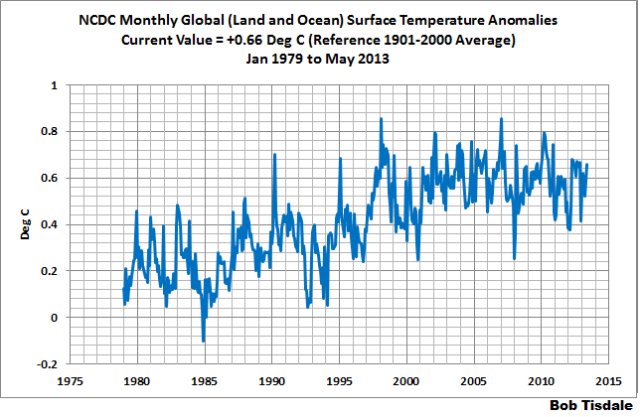
NCDC Global (Land and Ocean) Surface Temperature Anomalies
In other words, the NCDC is making a big to-do about nothing.
NCDC GLOBAL SURFACE TEMPERATURE ANOMALIES
Introduction: The NOAA Global (Land and Ocean) Surface Temperature Anomaly dataset is a product of the National Climatic Data Center (NCDC). NCDC merges their Extended Reconstructed Sea Surface Temperature version 3b (ERSST.v3b) with the Global Historical Climatology Network-Monthly (GHCN-M) version 3.2.0 for land surface air temperatures. NOAA infills missing data for both land and sea surface temperature datasets using methods presented in Smith et al (2008). Keep in mind, when reading Smith et al (2008), that the NCDC removed the satellite-based sea surface temperature data because it changed the annual global temperature rankings. Since most of Smith et al (2008) was about the satellite-based data and the benefits of incorporating it into the reconstruction, one might consider that the NCDC temperature product is no longer supported by a peer-reviewed paper.
The NCDC data source is here. NCDC uses 1901 to 2000 for the base years for anomalies.
Update: The May 2013 NCDC global land plus sea surface temperature anomaly is +0.66 deg C. It increased +0.14 deg C since April 2013.
149-MONTH RUNNING TRENDS
As noted in my post Open Letter to the Royal Meteorological Society Regarding Dr. Trenberth’s Article “Has Global Warming Stalled?”, Kevin Trenberth of NCAR presented 10-year period-averaged temperatures in his article for the Royal Meteorological Society. He was attempting to show that the recent hiatus in global warming since 2001 was not unusual. Kevin Trenberth conveniently overlooked the fact that, based on his selected start year of 2001, the hiatus has lasted 12+ years, not 10.
The period from January 2001 to May 2013 is now 149-months long. Refer to the following graph of running 149-month trends from January 1880 to May 2013, using the NCDC global temperature anomaly product. The last data point in the graph is the linear trend (in deg C per decade) from January 2001 to the current month. It is slightly negative. That, of course, indicates global surface temperatures have not warmed during the most recent 149-month period. Working back in time, the data point immediately before the last one represents the linear trend for the 149-month period of December 2000 to April 2013, and the data point before it shows the trend in deg C per decade for November 2000 to March 2013, and so on.
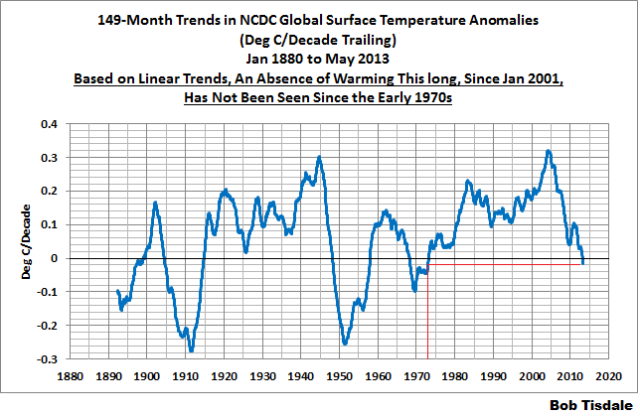
149-Month Linear Trends
The highest recent rate of warming based on its linear trend occurred during the 149-month period that ended in late 2003, but warming trends have dropped drastically since then. Also note that the early 1970s was the last time there had been a 149-month period without global warming—before recently.
192-MONTH RUNNING TRENDS
In his RMS article, Kevin Trenberth also conveniently overlooked the fact that the discussions about the warming hiatus are now for a time period of about 16 years, not 10 years—ever since David Rose’s DailyMail article titled “Global warming stopped 16 years ago, reveals Met Office report quietly released… and here is the chart to prove it”. In my response to Trenberth’s article, I updated David Rose’s graph, noting that surface temperatures in April 2013 were basically the same as they were in June 1997. We’ll use June 1997 as the start month for the running 16-year trends. The period is now 192-months long. The following graph is similar to the one above, except that it’s presenting running trends for 192-month periods.

192-Month Linear Trends
The last time global surface temperatures warmed at the minimal rate of 0.03 deg C per decade for a 192-month period was the late 1970s.
The most widely used metric of global warming—global surface temperatures—indicates that the rate of global warming has slowed drastically and that the duration of the hiatus in global warming is unusual during a period when global surface temperatures are allegedly being warmed from the hypothetical impacts of manmade greenhouse gases.
A NOTE ABOUT THE RUNNING-TREND GRAPHS
There is very little difference in the graphs of 149-month and 192-month running trends if GISS or HADCRUT products are used in place of NCDC data. I’ll alternate the data source monthly to show this.
GISS LAND OCEAN TEMPERATURE INDEX (LOTI)
Introduction: The GISS Land Ocean Temperature Index (LOTI) data is a product of the Goddard Institute for Space Studies. Starting with their January 2013 update, it uses NCDC ERSST.v3b sea surface temperature data. The impact of the recent change in sea surface temperature datasets is discussed here. GISS adjusts GHCN and other land surface temperature data via a number of methods and infills missing data using 1200km smoothing. Refer to the GISS description here. Unlike the UK Met Office and NCDC products, GISS masks sea surface temperature data at the poles where seasonal sea ice exists, and they extend land surface temperature data out over the oceans in those locations. Refer to the discussions here and here. GISS uses the base years of 1951-1980 as the reference period for anomalies. The data source is here.
Update: The May 2013 GISS global temperature anomaly is +0.56 deg C. It warmed about +0.05 deg C since April 2013.

GISS LOTI
UK MET OFFICE HADCRUT4 (LAGS ONE MONTH)
Introduction: The UK Met Office HADCRUT4 dataset merges CRUTEM4 land-surface air temperature dataset and the HadSST3 sea-surface temperature (SST) dataset. CRUTEM4 is the product of the combined efforts of the Met Office Hadley Centre and the Climatic Research Unit at the University of East Anglia. And HadSST3 is a product of the Hadley Centre. Unlike the GISS and NCDC products, missing data is not infilled in the HADCRUT4 product. That is, if a 5-deg latitude by 5-deg longitude grid does not have a temperature anomaly value in a given month, it is not included in the global average value of HADCRUT4. The HADCRUT4 dataset is described in the Morice et al (2012) paper here. The CRUTEM4 data is described in Jones et al (2012) here. And the HadSST3 data is presented in the 2-part Kennedy et al (2012) paper here and here. The UKMO uses the base years of 1961-1990 for anomalies. The data source is here.
Update (Lags One Month): The April 2013 HADCRUT4 global temperature anomaly is +0.43 deg C. It increased +0.01 deg C since March 2013.

HADCRUT4
COMPARISON
The three datasets are compared in the next two time-series graphs. The first graph compares the GISS, HADCRUT4 and NCDC global surface temperature anomaly products starting in 1979. Again, due to the timing of this post, the HADCRUT4 data lags the GISS and NCDC products by a month. The graph also includes the linear trends. Because the three datasets share common source data, (GISS and NCDC also use the same sea surface temperature data) it should come as no surprise that they are so similar. For those wanting a closer look at the more recent wiggles, the second graph starts with Kevin Trenberth’s chosen year of 2001. Both of the comparisons present the anomalies using the base years of 1981 to 2010. Referring to their discussion under FAQ 9 here, according to NOAA:
This period is used in order to comply with a recommended World Meteorological Organization (WMO) Policy, which suggests using the latest decade for the 30-year average.

Comparison Starting in 1979
###########

Comparison Starting in 2001
AVERAGE
The last graph presents the average of the GISS, HADCRUT and NCDC land plus sea surface temperature anomaly products. Because the HADCRUT4 data lags one month in this update, the most current average only includes the GISS and NCDC products. The flatness of the data since 2001 is very obvious, as is the fact that surface temperatures have rarely risen above those created by the 1997/98 El Niño.

Average of Global Land+Sea Surface Temperature Anomaly Products
Having read and reread a few books on global warming, or lack there of, The comment above
“This period is used in order to comply with a recommended World Meteorological Organization (WMO) Policy, which suggests using the latest decade for the 30-year average.”
Isn’t using the last decade going to skew the graph? Isn’t it short-centering that gave the hockey stick graph its hockey stick shape?
What happens to the anomaly if all 3 decades are used?
What is the significance of looking at 149 and 192 month averages?
Hard to see why some people get their panties in such a twist.
Not only is the trend flat, but I think we may have seen a 0.1C-0.2C step down after the 2009/2010 El Niño. Ryan Maue’s charts over at Weatherbell seem to indicate so, IMHO: http://models.weatherbell.com/temperature.php (note that the 2005-2012 chart hasn’t been updated since November 2012, but the more detailed charts have).
Time will tell!
Bob says
They indicate that we have not seen a warming hiatus this long since the 1970s.
Henry says
Are you surprised?
Maximum temps. have been dropping since 1995
so cooling was bound to come, at some stage, when earth’s stores are depleted of the extra warmth given from 1951-1995.
http://blogs.24.com/henryp/2012/10/02/best-sine-wave-fit-for-the-drop-in-global-maximum-temperatures/
It is hard to look at these charts and not think a ‘tipping point’ occurred around a decade ago, but not the sort of ‘tipping point’ alarmists have been praying for – it’s going the wrong way!
I guess this says it all – ‘climate science’ at its best:
“Keep in mind, when reading Smith et al (2008), that the NCDC removed the satellite-based sea surface temperature data because it changed the annual global temperature rankings. Since most of Smith et al (2008) was about the satellite-based data and the benefits of incorporating it into the reconstruction, one might consider that the NCDC temperature product is no longer supported by a peer-reviewed paper.”
Bob says: “What is the significance of looking at 149 and 192 month averages?”
They’re not averages. They’re trends. Notice the units of the y-axis are “Deg C/Decade”. They show that the recent absence of warming for 12+years, and the recent slow-down in the warming rate for 16 years are unusual, inasmuch as they have not been seen since the 1970s.
Darn , that is starting to show signs of being a 60 (or so) year sine curve, and we’ve just passed the top.
and heading back down.
Unmistakable, but, how will our governmental ‘overlords’ and the paid lackeys at ‘unis’ and ‘climate central’ (in contrast to the volunteer crew attendant here) that ‘serve them up their daily gruel’ treat this? Will they assume a position of blind and willful ignorance, pledging obedience to the ‘science’ and doctrine of CAGW nonetheless?
‘Prolly so’ …
.
Sorry Anthony for posting this here your tips and notes page wasn’t opening properly on my computer
Discover Magazine has published a lengthy article and compares GMO and Vaccine “Deniers” with climate change deniers while displaying a stunning lack of self awareness. They also repeatedly refer to Monsanto’s herbicide Roundup as a pesticide
http://blogs.discovermagazine.com/science-sushi/2013/06/19/the-very-thick-line-between-raising-concerns-and-denialism#.UcRD24l5mc3
Ah, “Guess/Lotto “and only peer approved climatoligists are allowed to “win”….
The devil is in the details. The detail that interests me is that peak in 1998. It is in the UAH global data and is more significant in the UAH tropical ocean data. I checked the reanalysis data for 15S 90 to 180W at the 700mb level and it is there. After normalizing the three sets of data, I plotted them and found they track well. From that, one might conclude that the southern equatorial Pacific is the primary driver for global atmospheric temperature and that there was a highly significant change in 1998 (tipping point). That was 25 years ago.
And the sun is starting on its way back to the South! (well tomorrow and the 23rd to be precise) and we have this from the Arctic…
http://ocean.dmi.dk/arctic/meant80n.uk.php
If Antarctica continues to grow at current rates we are in for some major extension of colder air into SH continents during coming winters. Expect snow in Buenos Aires and Santiago, New Zealand North island, Melbourne, Cape Town, Sydney? (not likely) this year as those cold air masses extend further north (depends on angle, wind, other pressure systems of course) LOL
fhhaynie says: “From that, one might conclude that the southern equatorial Pacific is the primary driver for global atmospheric temperature and that there was a highly significant change in 1998 (tipping point). That was 25 years ago.”
I assume that’s a typo and you meant to say 15 years ago. Other than that you’ve made a good observation.
The spike in 1997/98 was caused by the colossal, naturally occurring El Niño that season. As you’ll note in the graphs, there was another upward shift that appears about 1987/88, so that global temperatures spiked and then remained relatively flat until the upward shift in 1997/98. The earlier shift was also caused by an El Niño. It’s much easier to see and describe with sea surface temperature data, especially when you divide the data into two subsets: (1) East Pacific and (2) Atlantic, Indian and West Pacific.
For more on this, refer to my illustrated essay “The Manmade Global Warming Challenge” [42MB]:
http://bobtisdale.files.wordpress.com/2013/01/the-manmade-global-warming-challenge.pdf
And since I didn’t plug my book “Who Turned on the Heat?” in the post, here’s a link to the introductory post for it:
http://bobtisdale.wordpress.com/2012/09/03/everything-you-every-wanted-to-know-about-el-nino-and-la-nina-2/
You can’t tax nature, but you can tax humanity!!!!
Alan the Brit is quite right. Given a lifespan of threescore years and ten, it should be possible to impose a carbon tax on estimated exhalations of C02 per person.
I’m no warmist, but could not the temperature advance in stepwise fashion with each new mega El Nino?
Bob. I would like to see your charts if you used the 1999 GISS data for all months prior to 1/1/2000. Hansen, with his post 2000 “adjustments”, has cooled the early ’30s and warmed the late ’90s – by significant amounts when you are looking for 0.2C/decade trends. I’m sure that data is archived somewhere and it is only fair to use Mike’s “nature” trick against the AGW crowd.
Bill
Thanks, Bob. Good article.
It was clear then, or shortly afterwards, that El Niño 1998 rose the global temperature.
I think that without it, the hiatus would have occurred at a lower temperature.
For me the question is: Will our planet turn to cooling? Or will it resume warming up?
I don’t think the slight cooling trend seen now is an indicator, I don’t think the continued rising of atmospheric CO2 is an indicator either; it has proven to be a weak forcing.
Are we in the realm of natural emergent causes and natural emergent effects?
I think we are. We will adapt if our economy is not destroyed.
fhhaynie says
and that there was a highly significant change in 1998 (tipping point). That was 25 years ago.
henry says
like Bob noted: 2013-1998= 15
the tipping point of maximum temps. was around 1995
http://blogs.24.com/henryp/2012/10/02/best-sine-wave-fit-for-the-drop-in-global-maximum-temperatures/
Maxima is like energy-in
so energy-out (means) is a few years later….
fwe are going down, losing warmth. anyone can see this, even if you look in your own backyard…
http://blogs.24.com/henryp/2013/02/21/henrys-pool-tables-on-global-warmingcooling/
What is interesting to me about the 149 month trend diagram is that it confirms what I have been saying for a very long time and very simply blows their CO2 argument out of the water. The 1915-1945 change in trend is nearly identical to the 1975 to 2005 change in both magnitude and duration. They are very nearly identical though it is becoming harder to see in the land surface temperature graphs because of the continuing retroactive adjustments.
Human emitted CO2 could not possibly have been the cause of the 1915 (actually, I generally use 1912) warming cycle because humans just didn’t emit enough of it back then. We have a period of nearly identical duration with nearly identical warming yet they completely ignore it and focus only on the period of warming after 1975 and use that to explain their hypothesis for extracting our money from our wallets.
I would love to see the climate cabal engage in serious study focused on the change in climate of that earlier period and explain exactly why that is different from the post 1975 change.
Hy guys, get with the program! 2006 is the new 1998.
Carbon500 says:
June 21, 2013 at 8:27 am
Alan the Brit is quite right. Given a lifespan of threescore years and ten, it should be possible to impose a carbon tax on estimated exhalations of C02 per person.
Don’t forget cremation or decomposition.
O2bnaz says:
June 21, 2013 at 5:21 am
Sorry Anthony for posting this here your tips and notes page wasn’t opening properly on my computer
Discover Magazine has published a lengthy article and compares GMO and Vaccine “Deniers” with climate change deniers while displaying a stunning lack of self awareness.
>>>>>>>>>>>>>>>
That is really quite amusing since the anti-GMO people are mostly socialists, (think the GMO battle in the EU) as are the anti-vaccine people while ‘climate change deniers’ are all labeled republicans.
Bob,
Your NCSD graph doesn’t show the data that you are supposedly rebutting.
when the NCSD said, “May 2013 tied with 1998 and 2005 as the third warmest May in the 134-year period of record across global land and ocean surfaces, at 0.66°C (1.19°F) above the 20th century average”
it is saying that the temperature anomaly of .66C is a high for MAY. not June July or August.
If you want to compare the MAY temperatures then you need to use this graph
http://www.ncdc.noaa.gov/sotc/service/global/glob/201305.gif
This shows that the MAY global temperature of sea and land is higher. That is what they are saying and what you need to try to rebut.
jai mitchell says: “Your NCSD graph doesn’t show the data that you are supposedly rebutting.”
Did you read the post, jai mitchell? This is a simple one and you’re reading things into the post that aren’t here.
First, did you mean NCDC instead of NCSD?
Second, where did I write in this post that I was questioning the data, jai mitchell? If you hadn’t noticed, I’m not rebutting the NCDC. In fact, I began the post with: I’m not going to dwell on their rankings because, as we can see in following graph, the May 2013 value is not exceptional. It’s just another little wiggle in a global temperature record that has been exceptionally flat since 2001.
Third, why does your comment refer to “June July or August”? Do I mention any of those three months in my post? .
Once again, jai mitchell, you’ve shown that you have no understanding of the subject matter.
Adios!
adam says: “I’m no warmist, but could not the temperature advance in stepwise fashion with each new mega El Nino?”
That’s actually a skeptic viewpoint. And the steps are becoming more evident with every year that goes by since the 1997/98 El Nino–the “flatness” since 1997/98 helps to emphasize the other steps. The other steps occurred in response to the 1986/87/88 El Nino and in response to the 1976 Pacific Climate Shift. Curiously, that was how Trenberth divided the data with his “big jumps” graph in his article for the Royal Meteorological Society. See my post here:
http://bobtisdale.wordpress.com/2013/06/04/open-letter-to-the-royal-meteorological-society-regarding-dr-trenberths-article-has-global-warming-stalled/
Regards
Bob,
your reference graph, ” as we can see in following graph, the May 2013 value is not exceptional”
BECAUSE
in your “following graph” you include previous June Julys and Augusts. Not just Mays.
The point is that this May WAS exceptional.
It tied for the warmest May in recorded history.
and that is why I posted this graphic.
http://www.ncdc.noaa.gov/sotc/service/global/glob/201305.gif
So why wasn’t this may’s temperatures significant to other may temperatures.
you do realize we are still in a negative PDO and La Nina conditions. . .so how do you reconcile that?
http://www.cpc.ncep.noaa.gov/products/analysis_monitoring/enso_update/ssta_c.gif
A query: With regard to the Land Surface temperature data used in
all these enquiries, is one allowed to ask how many temperature stations
are measured to provide the information ? 1,000? 5,000? 10,000?
20,000? … any figure available ? Thanks.
AndyG55
“and heading back down”
And in a couple of years the 20-yrs cycle will be heading back up…
Rex says: @ June 21, 2013 at 2:37 pm
A query….
>>>>>>>>>>>>>>>>>
A lot of work has been done on the Land Surface temperature record.
Try E. M. Smith (Chiefio) (tons of posts) some are under these listings (look under categories about three page down on the right) January of 2010 is when the station drop out problem was under discussion.
http://chiefio.wordpress.com/category/agw-and-gistemp-issues/agw-gistemp-specific/
http://chiefio.wordpress.com/category/dtdt/
…..
Another place to look is diggingintheclay
Start about here: http://diggingintheclay.wordpress.com/2009/12/22/physically-unjustifiable-noaa-ghcn-adjustments/
and go to the upper right and page over to the next post or you can go down the right hand side and click on Categories (Paging over is easier since she had a ton of posts on temperature at that time)
…..
There was also discussion here at WUWT see Ric Werme’s Guide to WUWT again in right hand column
http://home.comcast.net/~ewerme/wuwt/categories.html
…..
Here is the index to Jo Nova’s website:
http://joannenova.com.au/about/index/
Happy hunting. There is a LOT of information out there that the skeptics have dug up.
OH, and I almost forgot. A. J Strata’s analysis of the error: http://strata-sphere.com/blog/index.php/archives/11420
Aha, the troll continues to waste his and my time.
jai mitchell says: “in your ‘following graph’ you include previous June Julys and Augusts. Not just Mays.”
Of course I included the previous “June Julys and Augusts”. I presented month data. I also included Septembers, Octobers, Novembers, Decembers, Januarys, Februarys, Marches and Aprils. The post is a monthly update. I presented monthly data. My point was that there are dozens of anomalies higher than the May 2013 value of 0.66 deg C in the monthly NCDC data.
jai mitchell says: “The point is that this May WAS exceptional. It tied for the warmest May in recorded history. and that is why I posted this graphic.
http://www.ncdc.noaa.gov/sotc/service/global/glob/201305.gif”
And you’ve illustrated for everyone reading the comments on this thread that you can’t even read a graph, jai mitchell. May 2013 was not the warmest on record. Go ahead, look at the graph you linked once more. Take a close look.
In fact, if you had read the NOAA May 2013 State of the Climate Report…
http://www.ncdc.noaa.gov/sotc/global/2013/5
…that I linked at the beginning on my post, you would have noted that they do not say that May 2013 was the warmest on record. They say: “The combined average temperature over global land and ocean surfaces for May 2013 tied with 1998 and 2005 as the third warmest on record…”
NOAA says “third warmest on record”. But you say “It tied for the warmest May in recorded history” based on your inabilities to read the very simple bar chart that you’ve linked.
jai mitchell says: “you do realize we are still in a negative PDO and La Nina conditions. . .so how do you reconcile that?
http://www.cpc.ncep.noaa.gov/products/analysis_monitoring/enso_update/ssta_c.gif”
The tropical Pacific is presently in ENSO-neutral conditions, jai mitchell. Or aren’t you aware of that? Refer to the weekly NOAA ENSO update:
http://www.cpc.ncep.noaa.gov/products/analysis_monitoring/lanina/enso_evolution-status-fcsts-web.pdf
In the summary on page 3, NOAA writes in the first bullet point:
“ENSO-neutral conditions continue.*”
Or do you, jai mitchell, have your own definition of “La Niña conditions”? Do you think the blue colors on the graph you linked define La Niña? Or maybe you are intentionally misrepresenting the present state of the tropical Pacific. Could that be it, jai mitchell? A little smoke and mirrors?
Apparently you are not aware that NOAA uses NINO3.4 sea surface temperatures anomalies to determine whether the tropical Pacific is in El Niño, ENSO-neutral, or La Niña conditions. For there to be La Niña conditions, the NINO3.4 sea surface temperature anomalies have to be cooler than -0.5 deg C. In looking at the graphs you linked, are NINO3.4 sea surface temperature anomalies cooler than -0.5 deg C, jai mitchell?
With respect to the PDO, you’ve also misrepresented the current PDO conditions. For the first time in many months, the JISAO PDO index rose above zero in May 2013:
http://jisao.washington.edu/pdo/PDO.latest
The May 2013 PDO index value is 0.08. It doesn’t have a minus sign before it. That means it is a positive value, not a negative value.
And to answer your question, I have no need to reconcile anything, when you have not presented the truth.
Once again, jai mitchell, you’ve expressed your total lack of understanding of the subject matter and/or you’ve flaunted your willingness to misrepresent it.
Bye-bye.
Rex says: “With regard to the Land Surface temperature data used in
all these enquiries, is one allowed to ask how many temperature stations
are measured to provide the information ? 1,000? 5,000? 10,000?
20,000? … any figure available ? Thanks.”
GISS, the Hadley Centre and NCDC all rely primarily on NOAA’s GHCN data. GISS has a graph showing the number of surface stations in use. And it appears to be updated regularly:
http://data.giss.nasa.gov/gistemp/station_data/
Looks like it’s a little more than 2000 in recent years.
Regards
Bill Yarber says: “Bob. I would like to see your charts if you used the 1999 GISS data for all months prior to 1/1/2000. Hansen, with his post 2000 “adjustments”, has cooled the early ’30s and warmed the late ’90s – by significant amounts when you are looking for 0.2C/decade trends. I’m sure that data is archived somewhere and it is only fair to use Mike’s “nature” trick against the AGW crowd.”
If you can provide me with a reliable link (a GISS link preferably) to the old data, I’ll be happy to provide you with a graph.
Regards
Jai Mitchell says: ” So why wasn’t this may’s temperatures significant to other may temperatures.
you do realize we are still in a negative PDO and La Nina conditions. . .so how do you reconcile that?
I doubt if Bob will even bother to reply to this one Jai. Not sure why I am.
First, very unlikely that the UAH, RSS or radiosonde data will support the warmest May.
Just entered the cool phase of PDO.
And since when are we in a LaNina? We just happen to be in ENSO neutral phase.
ColdinOz says: “I doubt if Bob will even bother to reply to this one Jai”
I actually wasted the time to reply to the troll, just as you did. I have a soft spots for warmists who present alternate realities, or have no grasp of the subject matter, or who are willing to misrepresent reality.
I really get cranky when one calls me a liar:
http://bobtisdale.wordpress.com/2013/06/15/i-dont-like-being-called-a-liar-fabricator-or-data-manipulator/
And I get really cranky when they claim I haven’t explained something, when, in fact, I have:
http://bobtisdale.wordpress.com/2013/01/25/untruths-falsehoods-fabrications-misrepresentations/
BTW, Happy winter to you, ColdinOz. It’s still cold on this side of the world. I’m wearing a sweatshirt indoors on the first day of Summer.
Cheers.
Gail Coms says:
June 21, 2013 at 3:04 pm
Rex says: @ June 21, 2013 at 2:37 pm
A query….
>>>>>>>>>>>>>>>>>..
Rex you might be interested in this chart http://diggingintheclay.files.wordpress.com/2010/04/canadadt.png
Thanks Bob
jai mitchell says:
June 21, 2013 at 2:11 pm
It tied for the warmest May in recorded history.
Why does GISS not agree? With its format, it is easy to compare all Mays at a glance. See:
http://data.giss.nasa.gov/gistemp/tabledata_v3/GLB.Ts+dSST.txt
Note that there are 9 Mays that are higher than the 56 for May, 2013.
The 149 and 192-Month Linear Trend graphs also really highlight the similarity of the warming rate of the early and late 20th century warming periods, presumably driven by very different external forcings
jai mitchell says:
June 21, 2013 at 2:11 pm
The point is that this May WAS exceptional.
It tied for the warmest May in recorded history.
Actually, according to NCDC “State of the Climate” report linked to above:
“The combined average temperature over global land and ocean surfaces for May 2013 tied with 1998 and 2005 as the third warmest on record…”
This statement uses preliminary, incomplete data for May 2013 and compares it to complete, adjusted date of the past.
Further, the NCDC report notes:
“The data presented in this report are preliminary. Ranks and anomalies may change as more complete data are received and processed.”
One should not be making any sort of claim such as “warmest May in recorded history” or “third warmest May on record” based on this preliminary incomplete data.
It is sad to see that you are unable to realize that the supporters of CAGW by CO2 have you fooled.
Bob Tisdale–please don’t consider your response to jai mitchell, the troll (June 21, 2013 at 3:38 pm) a waste of time.
I greatly appreciate it–your lengthy explanation was excellent and informative.
It also confirmed “troll” status for jai.
“They indicate that we have not seen a warming hiatus this long since the 1970s.”
Weren’t the 1970s a cool time?
(Or is someone treating the 1970s as a hiatus from the 1930s/40s? Naw, that doesn’t compute.)
Note that if there is a 60-year cycle, as there may have been (cool end of 19th century, warm 1930s, cool by 1970s, warm 1990s), if it is sinusoidal there may appear to be a period of little change at the top and bottom of the cycle when rate of change is slow.
Given the noise in the data, it would be difficult to detect a trend until several years have elapsed – which they now have (15 years is half of the top-bottom duration of the cycle thus if 1998 was peak today would be time of rapid change).
Many factors of course, including ones that could swamp cycles.
As an Engineer looking at the 1st graph, my first reaction was “We are past the peak”.
There has been a record early snow in New Zealand…http://thewatchers.adorraeli.com/2013/06/21/polar-blast-hit-new-zealand/. All is not well in Oz.
MattN, I would go so far as to say we are even past the shelf-life date.
Jai, you are making it too easy to pick on. But don’t be too sad. We have folks here on the skeptical side of the debate who are equally stubborn in holding on to a pet hypothesis of one kind or another that is completely without validity or reliability.