UPDATE: I’ve added a link at the end of the post for those interested in a copy of it in .pdf format.
###########
OVERVIEW
This is a somewhat lengthy blog post. There’s lots of information for newcomers, and there are new presentations of data (new for me) for those who have already examined multidecadal variations in sea surface temperatures.
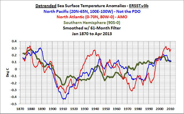
This post presents the multidecadal variations in sea surface temperatures in the North Atlantic, the North Pacific and in the Southern Hemisphere. It presents those multidecadal variations using the three primary sea surface temperature reconstructions—NOAA’s ERSST.v3b, and the UKMO Hadley Centre’s HADISST and HADSST3 datasets—to highlight the subtle differences in the timings and magnitudes of those variations. Last, this post reminds the reader that the long-term sea surface temperature dataset are reconstructions and that they differ quite drastically from the source data.
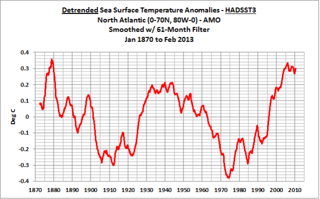
Figure 1
This post does not comment on peer-reviewed journal articles. It presents data, and it will hopefully give you a better background in long-term sea surface temperature data. That way you can have a deeper understanding of the topic when you read a paper or blog post about multidecadal variability.
INTRODUCTION
The multidecadal variability of sea surface temperatures is a reoccurring topic in temperature data analyses, climate model-based studies, and, of course, in posts around the climate change blogs.
The pause or hiatus in global warming has resurrected it. Multidecadal variations in sea surface temperatures were discussed in David Appell’s post W[h]ither Global Warming? Has It Slowed Down? He writes:
These increases are certainly less than the warming rates of the 1980s and first half of the 1990s of about 0.15 to 0.20 C (.27 and .36 F respectively) and per decade. The earlier period may have provided an unrealistic view of the global warming signal, says Kevin Trenberth, climate scientist with the National Center for Atmospheric Research in Boulder, Co.
“One of the things emerging from several lines is that the IPCC has not paid enough attention to natural variability, on several time scales,” he says, especially El Niños and La Niñas, the Pacific Ocean phenomena that are not yet captured by climate models, and the longer term Pacific Decadal Oscillation (PDO) and Atlantic Multidecadal Oscillation (AMO) which have cycle lengths of about 60 years.
Note: To head off those who want to claim the heat is being stored deeper in the oceans, we’ve addressed that in numerous posts over the past few months. Working back in time, refer to the posts here, here, here, here and here for example.
SkepitcalScience had a recent post about Tung and Zhou (2013) “Using data to attribute episodes of warming and cooling in instrumental records”. The final sentence in the abstract of Tung and Zhou reads:
Quantitatively, the recurrent multidecadal internal variability, often underestimated in attribution studies, accounts for 40% of the observed recent 50-y warming trend.
The author of the SkepticalScience post disagreed with that paper, and titled his flawed critique Tung and Zhou circularly blame ~40% of global warming on regional warming. That SkepticalScience post was written by a blogger who calls himself “Dumb Scientist”. (Note to “Dumb Scientist”: If you want your posts to be taken seriously, you need to change your name.) SkepticalScience, to its credit, has posted a 2-part reply by KK Tung, the lead author of that Tung and Zhou (2013) paper. I haven’t read the first part of KK Tung’s rebuttal, but I’ve read the second part, and it is worth reading. You’ll note that one of Tamino’s graphs appears in it, as Figure 5.
Speaking of Tamino, he presented a post about the Atlantic Multidecadal Oscillation, see his post here, and I replied to it in my post Comments on Tamino’s AMO Post. In another of his posts, Tamino took exception to a comment I made that climate models cannot reproduce the multidecadal variations exhibited in the temperature record, and in my response, I presented the outputs of all of the CMIP3 climate model simulations in a gif animation to show that the vast majority of the model simulations do not present the multidecadal variability that exists in the data.
Some model-based studies say multidecadal variations are caused by changes in anthropogenic and natural aerosols, while data and other climate models point to internal natural variability. No consensus there. Refer to Isaac Held’s blog post Atlantic multi-decadal variability and aerosols.
Many times it seems researchers and bloggers lose track of the fact that the data they’re examining has been reconstructed and that it differs greatly from the source data—and that it differs greatly from one reconstruction to another. There are also instances when researchers appear to forget how sparse the source sea surface temperature data is and that they’re examining data that has been infilled using statistical tools—and that they’re primarily performing statistical analyses not of data, but of the statistically created infillings. In other words, they’re studying make-believe data.
There are also numerous ways to present the multidecadal variations in sea surface temperatures. The Atlantic Multidecadal Oscillation is sometimes presented in very abstract forms, but it is most often portrayed as sea surface temperature anomalies of the North Atlantic that have been detrended. See the NOAA ESRL webpage about their AMO (Atlantic Multidecadal Oscillation) index. They note:
Method:
1. Use the Kaplan SST dataset (5X%)
2. Compute the area weighted average over the N Atlantic, basically 0 to 70N.
3. Detrend that time series
4. Optionally smooth it with a 121 month smoother
That is, with detrending, the sea surface temperature anomaly curve of the North Atlantic is basically laid on its side to help highlight the multidecadal changes in sea surface temperatures there. Detrended North Atlantic (0-70N, 80W-0) sea surface temperature anomalies are shown in Figure 1.
Note: I have not presented the NOAA ESRL version of the AMO index data in this post. That data are based on the Kaplan sea surface temperature reconstruction. Unfortunately, the Kaplan data was removed from the KNMI Climate Explorer, which is the source of data for this post.
On the other hand, the variations in the North Pacific data north of 20N are typically presented in a very abstract form known as the Pacific Decadal Oscillation (PDO) index. (Not illustrated.) See the JISAO webpage here. The PDO index is inversely related to the sea surface temperatures of that region in the North Pacific, so the PDO index only adds confusion in discussions of global surface temperatures. The PDO index is also standardized (the data is divided by its standard deviation) and this exaggerates the magnitude of its variability, making it appear (on a graph without units) to be as strong as the variations in sea surface temperature anomalies (in deg C) along the equatorial Pacific caused by El Niño and La Niña events.
To make matters even more confusing, many times a climate scientist or blogger will use the name Pacific Decadal Oscillation when talking about the multidecadal variations in the sea surface temperatures of the North Pacific, which are not represented by the PDO index.
To minimize confusion, we’ll only use detrended data to illustrate multidecadal variability in this post. And when the data have been detrended, the title blocks note it. I’ve also provided the data in its standard form to keep things in perspective.
Also, to help show the differences between ocean basins, the long-term data have been smoothed with 61-month filters. This minimizes the year-to-year wiggles due to El Niño and La Niña events but does not smooth the data as much as the 121-month filter, which NOAA’s ESRL applies to their Atlantic Multidecadal Oscillation index data. The lesser filtering will also help to show the subtle differences between datasets when we look at comparisons of the detrended data with the three long-term reconstructions.
THE MULTIDECADAL VARIATIONS IN THE SEA SURFACE TEMPERATURES OF THE NORTH ATLANTIC ARE WELL STUDIED. BUT WHAT ABOUT THE NORTH PACIFIC?
The Atlantic Multidecadal Oscillation is well studied and there are numerous posts and websites about it. NOAA has their informative webpage Frequently Asked Questions About the Atlantic Multidecadal Oscillation (AMO). I provided an introductory post about the Atlantic Multidecadal Oscillation here. RealClimate has a very brief overview here. And Wikipedia discusses the Atlantic Multidecadal Oscillation here. The first sentence of the Wikipedia webpage reads:
The Atlantic Multidecadal Oscillation (AMO) is a mode of variability occurring in the North Atlantic Ocean and which has its principal expression in the sea surface temperature (SST) field.
NOAA’s FAQ webpage provides a similar but easier-to-read answer to the question “What is the AMO?”:
The AMO is an ongoing series of long-duration changes in the sea surface temperature of the North Atlantic Ocean, with cool and warm phases that may last for 20-40 years at a time and a difference of about 1°F between extremes. These changes are natural and have been occurring for at least the last 1,000 years.
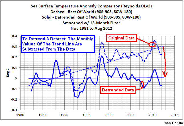
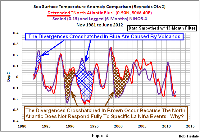
As discussed earlier, and shown in Figure 1, the Atlantic Multidecadal Oscillation is often presented as detrended North Atlantic sea surface temperature anomalies. Refer to the illustration here for an overview of detrending. Rarely do discussions of the Atlantic Multidecadal Oscillation note that it also extends into the tropics of the South Atlantic—see the illustration here, from this post. I also have not found any peer-reviewed journal articles that explain why the sea surface temperatures of the North Atlantic do not cool proportionally during the 1988/89 and 1998-01 La Niña events; we can show this here (from this post) by detrending short-term (satellite-era) sea surface temperature anomalies of the North Atlantic and comparing them to a scaled ENSO index.
Those items aside, the multidecadal variations in the sea surface temperature data of the North Atlantic appear in many data-based and model-based studies. So is the North Pacific sea surface temperature data. Unfortunately, most studies of the North Pacific data present it in an abstract form called the Pacific Decadal Oscillation (PDO) index. The PDO represents the strength of the spatial pattern of the temperature anomalies in the North Pacific. (Example: A spatial pattern with warm anomalies to the east and cooler anomalies to the west and central portions, an El Niño-like pattern, presents a positive PDO value.) But the PDO does not represent sea surface temperature in the North Pacific, because the spatial pattern discussed in the example has occurred at various sea surface temperatures over the years. Refer to the comparison of the PDO index to the sea surface temperature anomalies of the same region in the North Pacific here.
Briefly, the Pacific Decadal Oscillation is a lagged El Niño-Southern Oscillation signal that is influenced by the sea level pressure and wind patterns of the North Pacific. More information about what the PDO represents, and more importantly what it doesn’t represent, can be found here, here and here.
Those studies of that use the PDO when studying the multidecadal variations in the North Pacific overlook a very important fact—that the North Pacific also has a multidecadal signal that can be presented very simply by detrending the sea surface temperature anomalies of the North Pacific north of 20N. (We exclude the tropical North Pacific to avoid the direct signals from El Niño and La Niña events.) That is, just like the natural variability of the North Atlantic, the multidecadal variations in the sea surface temperatures of the North Pacific can contribute to global warming or suppress it—(assuming that a manmade global warming signal exists in the sea surface temperature data, and there is evidence that warming of the oceans is natural. See “The Manmade Global Warming Challenge” [42MB].)
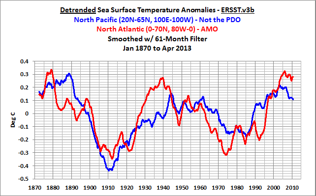
Detrended North Pacific (20N-65, 100E-100W) and North Atlantic (0-70N, 80W-0) sea surface temperature anomaly data are compared in Figure 2, using the HADSST3 sea surface temperature dataset. The amplitudes of the variations in the North Pacific sea surface temperatures are almost as strong as those in the North Atlantic, and the variations in the two ocean basins can run in and out of phase with one another. Most notably, the rise in the North Pacific data stopped in the early 1920s and dropped for a decade before resuming the climb again. And the North Atlantic began its mid-20th century decline before the North Pacific. In recent years, the North Pacific data appears that it might have begun a new decline period, while it’s too early to tell with the North Atlantic data.
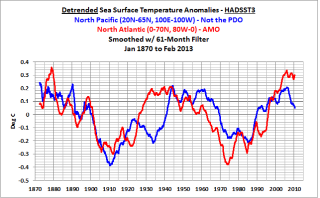
Figure 2
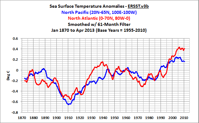
But we have to keep in mind that the data in Figure 2 has been detrended to help show the multidecadal variations. Figure 3 presents the same two subsets in their standard form—that is, it has not been detrended. Both datasets show multidecadal periods of flat temperatures before they cool sharply, and there’s no reason to think the upcoming period won’t start the same way—flat for a while before a dip. Then again, Mother Nature does what Mother Nature wants to do.
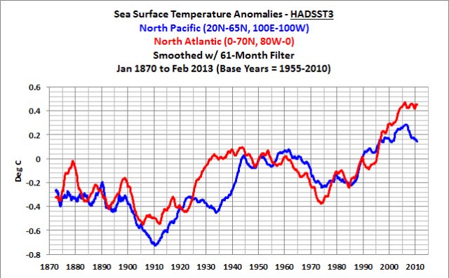
Figure 3
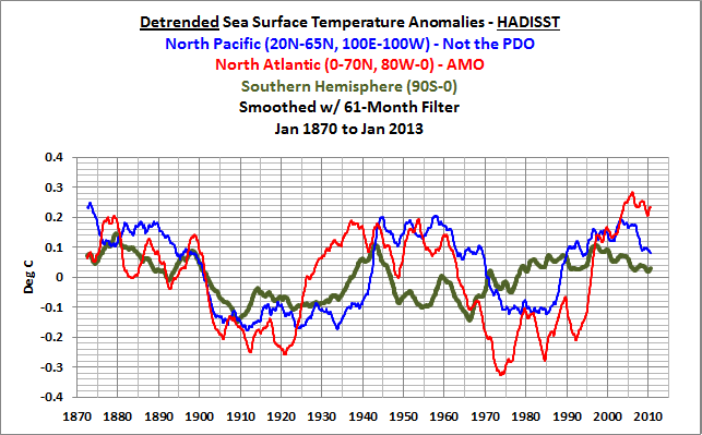
For those interested, the following links present the same graphs as Figures 2 and 3 but using NOAA’s ERSST.v3b data and the Hadley Centre’s HADISST data.
ERSST.v3b: Figure 2 and Figure 3.
HADISST: Figure 2 and Figure 3.
So, the natural variations in the sea surface temperatures of the North Pacific must also be factored into discussions of past and future global warming—though they are typically overlooked because they are usually expressed in the abstract form of the PDO.
We’ll provide comparisons of the North Atlantic and North Pacific data for the 3 datasets later in this post, but first…
WE CAN’T FORGET ABOUT THE SOUTHERN HEMISPHERE
The sea surface temperature data of the Southern Hemisphere also show multidecadal variations. Refer to Figure 4. They’re simply of a lesser amplitude than the two larger ocean basins in the Northern Hemisphere.
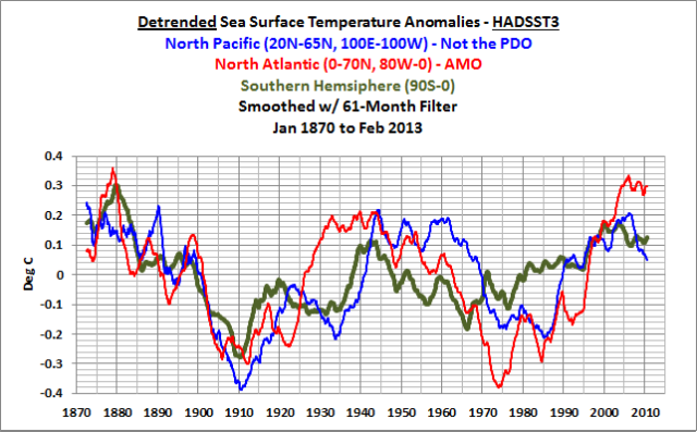
Figure 4
Figure 4 with ERSST.v3b data is here, and with HADISST data, it’s here.
The problem: there is so little long-term source data in the Southern Hemisphere that we really can’t define those multidecadal variations.
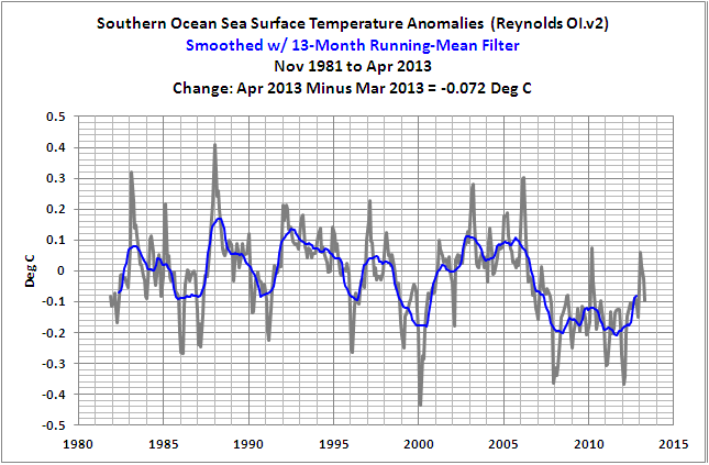
Are there multidecadal variations in the sea surface temperatures of the Southern Ocean surrounding Antarctica? We don’t know. We only have a reasonable amount of data there starting in the satellite era, about 1982, and it shows the sea surface temperatures of the Southern Ocean were flat for a couple of decades and then suddenly cooled around 2005, as shown here.
But NOAA doesn’t use satellite-based data in their ERSST.v3b dataset. In fact, they originally included it but then removed it because it changed the ranking of the warmest year in their combined land+sea surface temperature product—they didn’t want 1998 to be comparable to or a couple hundredths of a deg C warmer than 2005. And the Hadley Centre doesn’t use satellite-based data either in their HADSST3 data, shown in Figure 4.
The long-term data is so sparse in the Southern Hemisphere that it really serves no purpose to break out the individual basins there for this post. The following animation includes four maps that show which cells have sea surface temperature data in the Septembers of 1870, 1900, 1955 and 2010. Those cells colored white have no data. The dataset is the ICOADS sea surface temperature data, which is the source data for the ERSST.v3b, HADISST and HADSST3 datasets. Ship tracks are visible in the early maps. Unfortunately, there wasn’t a lot of ship traffic in the Southern Hemisphere. Even in September 2010 there were few temperature samples south of 45S. (You might need to click the animation to start it.)
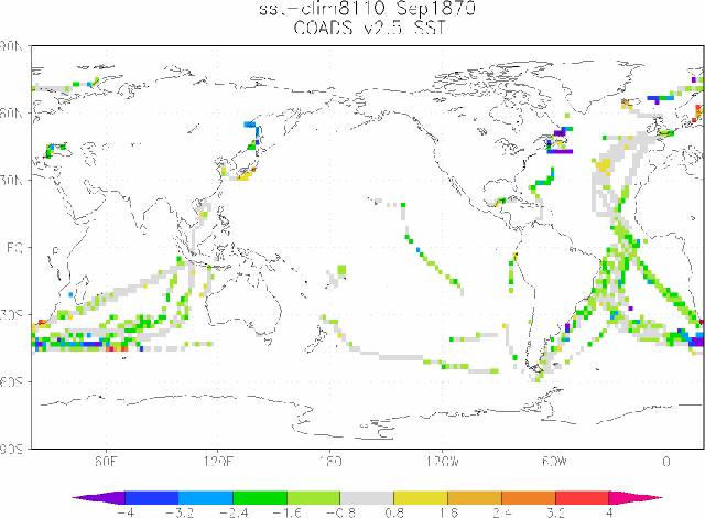
Animation 1
Figure 5 presents the HADSST3-based sea surface temperature anomalies for the North Atlantic, North Pacific and Southern Hemisphere in their standard form—without the detrending—but still smoothed with the 61-month filters. There are two very obvious periods in the data, and the break point is at about 1910. After 1910, the three subsets show many differences in the variations over multidecadal periods. Before 1910, they all more or less agree. We can’t blame that early alignment on the base years used for anomalies. I used 1955 to 2010 for base years, not 1870 to 1910. Did something cause all of the ocean basins to cool in unison from 1870 to 1910? Or is the source data so sparse from 1870 to 1910 and has it been adjusted so much that it all seems to align during that period? The latter sounds more realistic to me.
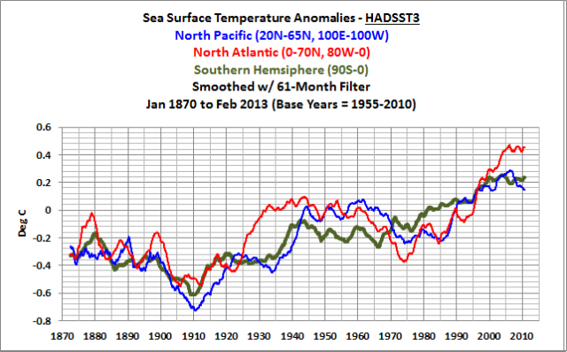
Figure 5
The HADISST data, Figure 6, shows the same basic alignment during the first 4 decades, but with less cooling, but the ERSST.v3b data, Figure 7, shows differences between the subsets even during the initial cooling period from 1870 to 1910.
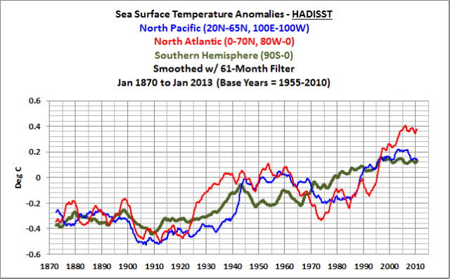
Figure 6
##########
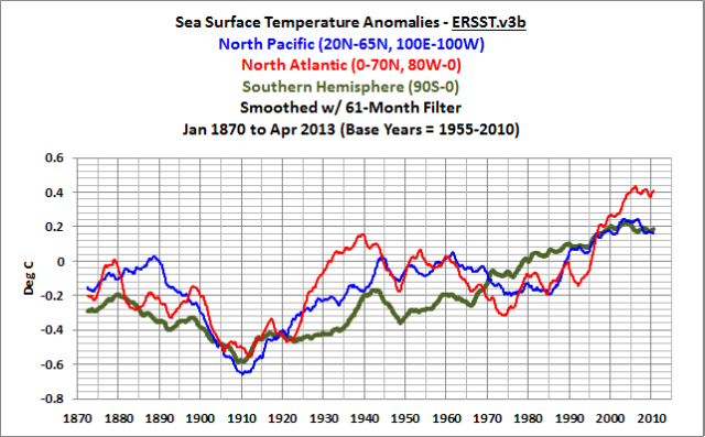
Figure 7
Does that indicate that ERSST.v3b is a better dataset before 1910? No, it simply indicates NOAA used a different method to infill the data during that period than was used by the Hadley Centre for HADISST. (HADSST3 is not infilled.) Or in other words, it simply gives us results that are more along the lines we would expect.
COMPARISONS OF ERSST.v3b, HADISST, AND HADSST3 DATA
Let’s start with the detrended North Atlantic sea surface temperature anomalies, Figure 8. Considering that the HADSST3 data haven’t been infilled while the other two datasets have been, the three datasets track each other remarkably well. There are some occasional divergences, but, all in all, they follow one another.
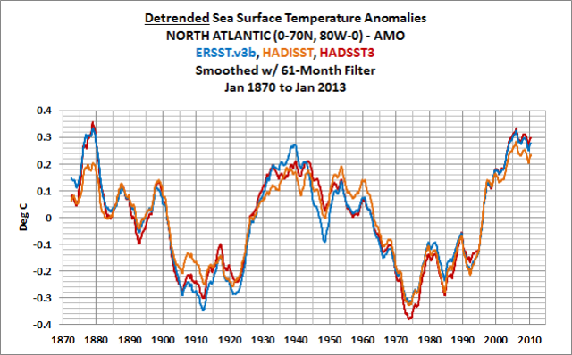
Figure 8
The reason: the North Atlantic has the most complete long-term source data of all the ocean basins. And as NOAA notes on their AMO FAQ webpage:
Most of the Atlantic between the equator and Greenland changes in unison. Some area of the North Pacific also seem to be affected.
The North Atlantic sea surface temperature anomaly data (not detrended) are shown in Figure 9. Looking at the early data, the ERSST.v3b data (which has been infilled) matches the earlier decline exhibited by the HADSST3 data (which hasn’t been infilled). On the other hand, the infilling used in the HADISST data did not create as much cooling during that period. Was the ERSST.v3b data infilled so that it better recreated the greater cooling shown in the HADSST3 data?
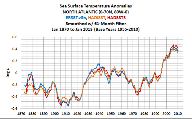
Figure 9
Figure 10 is the reconstruction comparison of the detrended North Pacific sea surface temperature anomalies. There are many more differences between the ERSST.v3b, HADISST and HADSST3 datasets in this ocean basin. The differences in the detrended HADISST data and the other two are significant from 1900 to 1920—with the HADISST data not taking a major a dip and rebound. The detrended ERSST.v3b data diverges from the other two from the early 1930s to the early 1960s.
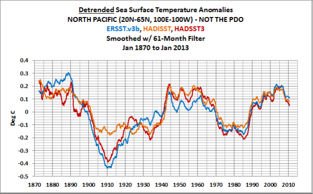
Figure 10
Comparing the North Pacific sea surface temperature anomalies without the detrending, Figure 11, we can see that the ERSST.v3b data is the outlier before 1900 and from the early 1920s to about 1940. Does this make ERSST.v3b data wrong in the North Pacific during those two periods? No again. NOAA simply used a different method to infill missing data than the Hadley Centre for its HADISST data, and in this instance, those methods provided results that were different than the other two.
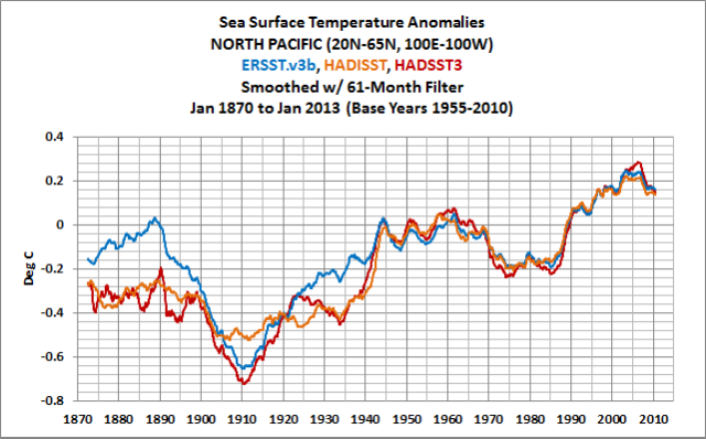
Figure 11
Now for the Southern Hemisphere: The detrended sea surface temperature anomalies for the three datasets are shown in Figure 12. There are few periods of agreement between the 3 reconstructions. Because HADISST uses satellite-based data since the early 1980s, it diverges from the other two after the late 1990s. That is likely caused by the better coverage of the high latitudes of the Southern Hemisphere (the waters surrounding Antarctica), where sea surface temperatures have cooled.
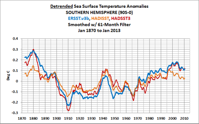
Figure 12
In its standard form, the three renditions of the Southern Hemisphere sea surface temperature data agree with one another only for a few decades—from the late 1960s to the late 1990s—but that’s likely the result of the base years used for anomalies. As opposed to the other two datasets, the HADISST data shows little cooling from 1870 to the about 1920—similar to the Northern Hemisphere data. And there’s little agreement with the amount of warming that took place from the 1920s to the early 1940s. Near the end of the data, the HADISST data clearly diverges from the ERSST.v3b and HADSST3 data. As discussed above, HADISST uses satellite-based data starting in the early 1980s, so the recent divergence in the HADISST data is likely the result of the better sampling in the high latitudes of the Southern Hemisphere, where it’s cooling. Note also how the ERSST.v3b data appears to have continuous warming from 1910 to present with a “World War II” blip imposed on it. On the other hand, the two Hadley Centre datasets show warming from 1910 to the early 1940s, and then a flat temperature period until the mid-1960s.
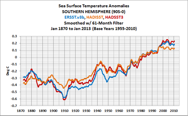
Figure 13
CLOSING TO THE DISCUSSION OF MULTIDECADAL VARIABILITY
Detrending long-term sea surface temperature data is a way to illustrate that there are multidecadal variations in the sea surface temperatures of the North Pacific and Southern Hemisphere oceans—in addition to the multidecadal variations in North Atlantic. The strength of the variations in the North Pacific data might be less than those exhibited in the North Atlantic, and they can run in and out of synch with the North Atlantic, but the variations in the North Pacific are very strong. In the Southern Hemisphere, there appear to be multidecadal variations in two of the long-term reconstructions, but, based on the limited amount of data we have there, the multidecadal variations are weak by comparison to those in the Northern Hemisphere. Unfortunately, the data is so sparse in the Southern Hemisphere that we really have no idea about how, where and why those multidecadal variations exist.
Detrending is also a way to highlight the similarities and differences between the three long-term reconstructions of sea surface temperatures. And outside of the North Atlantic, there are more differences than similarities. In the North Pacific, the differences between the three reconstructions are not enough to rule out the existence of multidecadal variations there. In fact, the multidecadal variations are quite strong in all three reconstructions. On the other hand, the methods used by NOAA to infill their ERSST.v3b data suggest the sea surface temperatures of the Southern Hemisphere may have warmed gradually without the multidecadal variations exhibited in the two Hadley Centre products.
SPATIAL COVERAGE IS NOT THE ONLY PROBLEM WITH THE EARLY SEA SURFACE TEMPERATURE DATA
In addition to poor sampling of the global oceans, the reconstruction of long-term sea surface temperature data presented researchers with another problem. Temperature sampling methods changed with time. Refer to Folland and Parker (1995) Correction of Instrumental Biases in Historical Sea Surface Temperature Data. Steve McIntyre has a few posts about the corrections. Refer to his posts since 2005:
Changing Adjustments to 19th Century SST
And
And
And:
And
Since the early 2000s, ARGO floats have measured sea surface temperatures when they bob to the surface at 10-day intervals. (I believe ARGO floats are included in the ICOADS source data.) Satellite-based data are used only in HADISST and the shorter-term (November 1981 to present) Reynolds OI.v2 datasets. Stationary buoys were deployed starting in the 1980s in the tropical oceans as part of the Tropical Atmosphere-Ocean (TAO) project—the tropical Pacific was first to receive the buoys, and their installation was complete in the early 1990s. Temperature measurements from ship inlets have been available since the early 1920s, but their use was more common starting in the 1940s. Buckets of different types (canvas, wood), with different heat losses, were tossed over the sides of ships, then retrieved, and a thermometer was placed in the bucket of water as it rested on deck. The transition of the different types of buckets in the late 1930s to early 1940s is said to explain the sudden rise then in the source data. Refer to the comparison of global sea surface temperature anomalies for the 3 reconstructions and the source dataset in Figure 14.
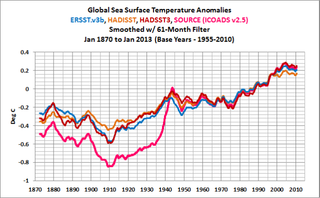
Figure 14
Those “bucket corrections” brought the sea surface temperature data into line with the Night Marine Air Temperature (NMAT) data, which is illustrated by the MOHMAT data in Figure 15.
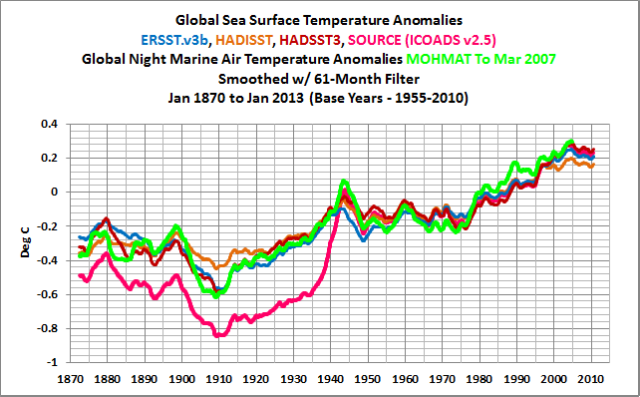
Figure 15
But you have to keep in mind the Night Marine Air Temperature data is also adjusted or corrected, and it does not include all of the Marine Air Temperature data. As its name suggests, it only represents the nighttime readings. The daytime readings were thought to include a type of heat island effect and those observations were excluded. See Figure 16, which compares the global MOHMAT night marine air temperature to the source ICOADS marine air temperature data. A reduction in nighttime readings during World War II appears to the cause of the spike in the source data then. And I will assume the same logic applies to the correction of the inconveniently warm marine air temperature data in the late 1800s.
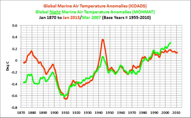
Figure 16
In short, there have been so many adjustments to the sea surface temperature data before the early 1940s that we really have no idea how much it warmed from the 1910s to the 1940, or, just as importantly, we have no idea how much it cooled from the late 1800s to about 1910. There’s one thing for sure: climate models cannot simulate the cooling that took place then. See Figure 17. And as a result, they fail to simulate the warming that took place from the 1910s to the 1940s.
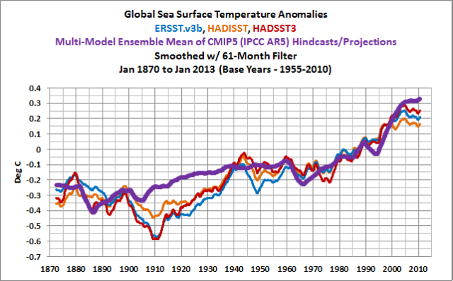
Figure 17
And if climate models can’t explain the warming from 1910 to the early 1940s, they cannot be used to claim that manmade greenhouse gases caused the warming that took place from the mid-1970s to present.
A COUPLE OF QUICK NOTES ABOUT THE PAUSE IN GLOBAL WARMING
It should be very obvious that the greatest warming of sea surface temperatures took place in the Northern Hemisphere. Because land surface air temperatures mimic and exaggerate the warming of sea surface temperatures, land surface temperatures in the Northern Hemisphere also warmed much more than those in the Southern Hemisphere.
The recent study Balmaseda et al (2013) notes that while the warming of sea surface temperatures have paused, the oceans at depth continue to warm—according to computer model simulations of ocean heat content and according to a data- and computer model-based reanalysis. As a recent post by Dana Nuccitelli at SkepticalScience notes, there are other computer model-based studies that suggest the same thing. I’m not sure why anyone would believe climate models since they do not model ocean processes correctly. Refer to the discussion of Guilyardi et al [2009] here. Models can’t simulate ENSO, but now model simulations of ENSO are being used to explain the lack of sea surface temperature warming and the assumed continued warming at ocean depths. And the true-blue believers in hypothetical human-induced global warming at SkepticalScience choose to believe the climate models. Go figure.
And as illustrated and discussed in the post Ocean Heat Content (0 to 2000 Meters) – Why Aren’t Northern Hemisphere Oceans Warming During the ARGO Era?, the NODC’s annual ARGO-era ocean heat content for the North Atlantic shows little to no warming to depths of 2000 meters and shows cooling to depths of 700 meters, Figure 18. Even worse, in the North Pacific, the ocean heat content shows cooling to depths of 700 and 2000 meters, Figure 19.
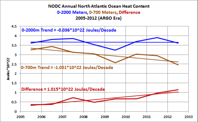
Figure 18
###############
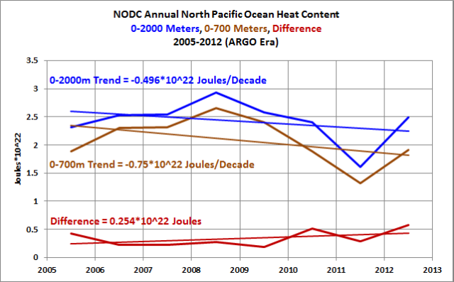
Figure 19
Also, my standard presentations of the East Pacific sea surface temperature anomalies and those of the Atlantic, Indian and West Pacific oceans provide a simple but logical explanation for why the warming of global surface temperatures has slowed to a crawl.
As we all know, sea surface temperatures for the East Pacific have not warmed since the November 1981 start of the Reynolds OI.v2 dataset, Figure 20.
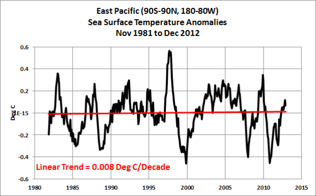
Figure 20
On the other hand, the 1986/87/88 and 1997/98 El Niños released enough naturally created warm water from below the surface of the tropical Pacific to raise sea surface temperatures of the Atlantic, Indian and West Pacific oceans about 0.28 deg C from the early 1980s to the 2000s. In other words, those two El Niños caused the vast majority of the long-term warming of sea surface temperatures since the start of the satellite era. Sea surface temperatures were flat again until the 2009/10 El Niño, and that El Niño only released enough naturally created warm water to warm sea surface temperatures in the Atlantic, Indian and West Pacific oceans about 0.04 deg C. Simple as that.
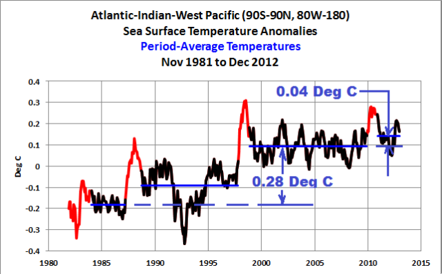
Figure 21
Refer again to “The Manmade Global Warming Challenge” [42MB] for a further discussion of the natural warming of the global oceans.
CLOSING TO THE LATTER PART OF THIS POST
Researchers have attempted to reconstruct the sea surface temperatures of the global oceans. The actual temperatures in the early part of the record, before 1950, will remain somewhat of a mystery because of the limited amount of source data and the amounts the source data have been adjusted to accommodate changes in sampling methods. Many times you’ll find articles in scientific journals that exclude sea surface temperature data before 1950 due to the uncertainties of the early data. This post should have helped you understand why those uncertainties exist.
I presented a quote from Kevin Trenberth earlier in this post, in which he blames the IPCC for failing to acknowledge the contribution of natural variability to the recent warming of global surface temperatures. I found that curious because Kevin Trenberth was a lead author of the IPCC’s 3rd and 4th Assessment Reports. Is he blaming himself?
“One of the things emerging from several lines is that the IPCC has not paid enough attention to natural variability, on several time scales,” he says, especially El Niños and La Niñas, the Pacific Ocean phenomena that are not yet captured by climate models…
Look again at Figure 20 and 21 and then contemplate the quote attributed to Kevin Trenberth. Will the IPCC and its lead authors eventually acknowledge that El Niño and La Niña events are responsible for the warming of sea surface temperature and ocean heat content over the last 3+ decades? I’m not holding my breath.
Nor am I holding my breath for the next strong El Niño. Without it, global sea surface temperatures should continue to remain flat—until the multidecadal variations in the sea surface temperatures of the North Atlantic start their decline.
SOURCE
The data and model outputs presented in this post are available through the KNMI Climate Explorer.
#############
UPDATE: On the cross post at WattsUpWithThat, a number of people have asked for a copy of this post in pdf form. A copy is available here [Less than 1MB].
If you found this post informative, you may also be interested in a copy of my ebook Who Turned on the Heat?, which is only available here in pdf form for US$8.00. Or if your name is Big Oil, a tip or donation of a dollar or two here would be much appreciated.
Thanks, Bob Tisdale
Thanks once again Bob a wonderful example of how WUWT treats/teaches/contributes to science
“Having observed the apparent failure of the models with their speculative CO2 component and having seen the relative success of the solar and astronomic influences at anticipating real world changes I have written this article to draw attention to what I consider to be the underlying real world process of global temperature change. Global temperature is controlled quite precisely (although it is difficult to calculate) by solar energy modulated by a number of overlapping and interlinked oceanic cycles each operating on different time scales and being of varying intensities, sometimes offsetting one another and sometimes complementing one another.
Any other single influence such as an enhanced greenhouse effect from CO2 is just one of a plethora of other potential but relatively minor influences which as often as not offset one another and leave the solar/oceanic driver unchallenged in terms of scale.”
from here:
http://climaterealists.com/index.php?id=1302&linkbox=true&position=10
“The Real Link Between Solar Energy, Ocean Cycles and Global Temperature ”
May 21st 2008
Is there anyway I can download posts like this as pdf files?
This is such a thorough post!
thanks Bob.
So reconstructed means altered to match the models then.
I would like a pdf of this as well if possible.
North Atlantic SST has direct link to non-climate natural events
http://www.vukcevic.talktalk.net/AMO-NV.htm
johnmarshall says: “So reconstructed means altered to match the models then.”
Nope, you missed Figure 17:
http://bobtisdale.files.wordpress.com/2013/05/figure-17.png
The models can’t simulate the early dip and rebound.
Bob:
You say: “the North Pacific also has a multidecadal signal that can be presented very simply by detrending the sea surface temperature anomalies of the North Pacific north of 20N.”
You may remember that I wrote a post about this a month ago over at Tallblokes’s Talkshop in which I suggested that we combine the AMO and the “PMO” into a single “Northern Multidecadal Oscillation Index”.
http://tallbloke.wordpress.com/2013/04/15/roger-andrews-a-new-climate-index-the-northern-multidecadal-oscillation/
Henry@stephen
Looking at figure 3, North Pacific,
again, ignoring a possible error of about 0.3 degrees C most probably due to more accuracy from thermometers, since that time,
is see a fine correlation with what happened 88 years ago: 2013-88= 1925.
That means we are heading to the drought conditions that caused the Dust Bowl drought 1932-1939.The Dust Bowl drought 1932-1939 was one of the worst environmental disasters of the Twentieth Century anywhere in the world. Three million people left their farms on the Great Plains during the drought and half a million migrated to other states, almost all to the West. http://www.ldeo.columbia.edu/res/div/ocp/drought/dust_storms.shtml
Danger from global cooling is documented and provable. It looks we have only ca. 7 “fat” years left, give or take a few years.
Stephen, I think I asked this before, but do you also see this coming, due to a change in the direction of the winds??
http://blogs.24.com/henryp/2013/04/29/the-climate-is-changing/
if so what is your time line?
JCrew and johnmarshall: I’ve added a link to a copy of the post in pdf format at the end of the post:
http://bobtisdale.files.wordpress.com/2013/05/multidecadal-variations-and-sea-surface-temperature-reconstructions-with-illustrations1.pdf
Roger Andrews says: “You may remember that I wrote a post about this a month ago over at Tallblokes’s Talkshop in which I suggested that we combine the AMO and the “PMO” into a single ‘Northern Multidecadal Oscillation Index’.”
Yup, I recall. Thanks for the link. My primary intent here was to inform or remind readers that the North Pacific also has a multidecadal mode of variability that is not represented by the PDO index.
Regards
Bob
Do you have OHC data for the 100-300m layer?
lgl says: “Do you have OHC data for the 100-300m layer?”
Nope. Sorry.
A good post Bob.
One thing worth reviewing is shown in your figure 16. Hadley SST removes most (more than 50%) of the variability from most of the ICOADS SST record (pre 1945 is about 2/3) as I showed here:
http://judithcurry.com/2012/03/15/on-the-adjustments-to-the-hadsst3-data-set-2
You also point out that they are doing a similar thing to marine air temperatures … before using them as a reason to reduce the SST variations in SST data.
The big problem here is that Met. Office Hadley seem to have a mindset that climate never changes ( apart from the effects of CO2 ) , so anything that shows greater variability must be a data error and needs “correcting”.
BEST analysis, which goes a fair bit further back, also shows that there WAS more variability in earlier climate data. Now that may well be CLIMATE, it should be studied, not removed.
The trouble is that notable early cooling for 1880 to 1915 does not fit AGW hypothesis so they automatically regard it as being erroneous and remove ( or attenuate ) it.
If you look at the reasons given for all these “corrections” , as I did in my Curry article, they are all highly speculative and NOT scientifically justifiable corrections.
What we are faced with here is not bias correction but “correction” bias being introduced.
I do not imagine that ICOADS is without problems but much of what is being done to the data is simply motivated by a preconceived idea that changes in variability in climate data are errors that need correcting.
Anyway, a good post Bob, I would suggest giving a bit more attention to ICOADS in such comparisons because, after all, it is the DATA in the story, the rest are reconstructions as you point out.
“In recent years, the North Pacific data appears that it might have begun a new decline period, while it’s too early to tell with the North Atlantic data.”
It is already clearly seen in both basins, but used smoothing obscures it.
North Atlantic:
http://blog.sme.sk/blog/560/310249/Natlantic.jpg
North Pacific:
http://blog.sme.sk/blog/560/310249/Npacific.jpg
That is, just like the natural variability of the North Atlantic, the multidecadal variations in the sea surface temperatures of the North Pacific can contribute to global warming or suppress it—(assuming that a manmade global warming signal exists in the sea surface temperature data, and there is evidence that warming of the oceans is natural. See “The Manmade Global Warming Challenge” [42MB].)
I downloaded it. Thank you for that, for today’s post, and for your ongoing presentations of empirical evidence.
What causes the increased trade winds that caused the 1996/1996 (and other) La Niña events?
Your question is good: “Does this agree with your understanding of manmade global warming?” Personally, I believe that the dynamics of the climate system are not understood by anyone. It’s a high dimensional non-linear dissipative system with non-constant inputs. What a small increase in downwelling long wave radiation would cause can not be predicted. Apparent step-changes (possibly “emergent properties”) can not be ruled out, afaict.
Your summaries of large quantities of empirical data are valuable. To me, it is a shame that you eschew publishing them in a scientific monograph. But you have responded to this before, and it’s clearly your choice.
To me, it seems there’s only one global multidecadal (and longer) oscillation with slightly different regional/zonal manifestations (phase, amplitude…). This global oscillation correlates with solar activity.
Matthew R Marler says: “What causes the increased trade winds that caused the 1996/1996 (and other) La Niña events?”
Bill Kessler of NOAA has a good general overview of the interrelationship between the sea surface temperature gradient across the tropical Pacific and trade winds in the following FAQ webpage:
http://faculty.washington.edu/kessler/occasionally-asked-questions.html
Why was the 1995/96 La Niña so unusual? McPhaden 1999 “Genesis and Evolution of the 1997-98 El Niño” provides a detailed overview of the conditions leading up to it, including the 1995/96 La Niña:
http://lightning.sbs.ohio-state.edu/geo622/paper_enso_McPhaden1999.pdf
Summed up a few words: Unusual weather conditions.
Thanks Bob, I have been pushing the “oceans did it” meme for about a year now.
Has anyone computed an R2 value for the correlation since 1880 vs. CO2?
We keep coming up with patterns suggesting a turn-around of mechanisms/temperatures around 2010. Would a sustained drop of 0.2C by 2015 be enough to kill CAGW?
Maybe not. If the sensitivity of temp to CO2 is maintained at 3.0/doubling, then a drop would only prove that the natural power to “delay” our extinction is >3.0 equivalent; once the delay reversed, the warming power would be >2X the power of CO2!
Erhlich has the answers to the disconnect: he isn’t wrong about WHAT he predicts, he has just been a little off on the TIMING. (And lucky for us that means we have more time to act!)
Like the baseball game: the team didn’t lose, it just ran out of time.
A magisterial review by Bob – many thanks! The closing sentence gave me quite a jolt. Bob has always – unlike some of us – been very disciplined and restrained from getting drawn into future predictions. So for Bob in closing to issue an outlook of little chance of any el Nino and a move toward cooling with a descending AMO – that really has some significance. To say the least!
Matthew R Marler
I agree with your comment about climate being a dissipative nonlinear system. Thus some clues to its working might be found in the foundational work on nonlinear thermodynamics by Ilya Prigogine. On that note an important comment was made in a recent post here by pochas – that emergence of nonlinear pattern (Prigogine’s “dissipative structures”) means a loss of entropy. Thus for Thermodynamics II to be satisfied there must be a net export of entropy from the system, i.e. Loss of heat. This chimes with Matthias Bertram’s definition of nonlinear pattern systems – they acquire structure by the export of entropy. In such a system any transient or local radiative effect of CO2 could easily and swiftly be negated by emergent structure (correlations over distance, anisotropy etc.) with consequent and inescapable export of entropy as heat loss.
Perhaps Prigogine’s nonlinear thermodynamics could hold the key to the CO2 and radiative balance question. The simple picture of CO2 IR backradiation warming the planet always reminds me of the African childrens’ story of the monkey trying to pull itself out of the mud by its own whiskers.
Matthew R Marler (May 14, 2013 at 11:46 am) addressed Bob:
“To me, it is a shame that you eschew publishing them in a scientific monograph.”
Mainstream convention’s the problem, not the solution.
Dear Mr. Tisdale,
Thank you for, once again, teaching a college course for free. I have learned so much from you over these past weeks. Your impressive research proves you are a fine scholar. Your clear, careful, writing-to-be-understood and patient answering of questions (some of them obnoxiously lazy-minded) demonstrate that you care deeply about the truth want with all your heart to rescue humanity from the conjecture and lies of the pro-AGW gang. Your generosity in sharing your hard work with the world, proclaims loudly and clearly that you are not in this for the money.
You shine, Bob Tisdale. You are a treasure.
With gratitude,
Janice
I’d just like to add an expression of my appreciaton for the rigour and detail of Bob’s work.
Thanks for the pgf Bob, and yes I did miss Fig17 but not now so I partially withdraw my comment. I still think this is done in some cases though.
Bob,
Thank you so much for your efforts to communicate what you learn.
I’ve purchased your recent book and appreciate the pdf file of this post.
It his a joy to learn the effects of the oceans on the atmosphere and climate.
phlogiston says: “A magisterial review by Bob – many thanks! The closing sentence gave me quite a jolt. Bob has always – unlike some of us – been very disciplined and restrained from getting drawn into future predictions…”
(Sarc on) Like the IPCC, I made a projection, not a prediction. (Sarc off)
Uh-oh, Roger Pielke Sr is arguing that projections and predictions are basically the same thing over at ClimateDialogue:
http://www.climatedialogue.org/are-regional-models-ready-for-prime-time/#comment-491
Regards
Thanks for all of the kind words on this thread. And many thanks to those who bought my book or tipped/donated. .
Careful explorers please exercise due caution …
Even where data have been infilled they are functions of observations, so observed coherence may be highly informative but just be very careful with interpretations — e.g. a time series may be called “ERSSTv3b 60-90S” and whether it is or is not accurately telling us something about ERSSTv3b 60-90S (no quotes) it may be telling us something quite or very important about aggregate properties of the real data used to infill ERSSTv3b 60-90S estimates —– same or similar caution applies to pretty much all paleo-data.
It’s only naive &/or deceptive observers who interpret proxy-labeling literally, but I readily acknowledge that in the climate discussion that’s probably most people. Thorough, sensible explorers need to be more concerned with 100%-unconstrained broad multivariate awareness & careful interpretation than with naive public misinterpretation of proxy-labeling, but I readily acknowledge that there’s a formidable challenge for narrative-builders (I have neither time nor interest to include myself in this group) who attempt to directly reach all members of the masses.
The climate discussion’s big enough to afford scope for specialized roles.