
Image Credit: Jo Nova – David Lappi – GISP2
Your help is needed in building the new WUWT Paleoclimate Reference Page. Below I’ve posted all of the credible 3rd party paleoclimate graphs I’ve compiled thus far, but I am sure there are lots more. As such, please post links to any credible paleoclimate data sources below or in comments of the WUWT Paleoclimate Reference Page and we will review them for inclusion. Also, your thoughts on the provenance of the graphs included thus far, links to the papers they are based upon, and appropriate titles for each graph would be most appreciated.
In terms of additional graphs for potential inclusion, I struggled with shorter term reconstructions, as many of them are still a matter of controversy. As such, please post any pertinent information, including any credible graphs illustrating the last few millennia and the Medieval Warming Period. For reference, there are an array of less than ideal options available on the bottom of this NOAA NCDC page. From a cursory review, I found the summary for Overpeck et. al 1997 to be enlightening, e.g.;
“Together, they indicate that the Arctic has warmed up to 1.5°C since 1850 – the coolest interval of the Arctic “Little Ice Age.” Much of the recent Arctic warming took place between 1850 and 1920, most likely due to natural processes”
However, after Overpeck the “Team” went to work, i.e. Briffa et al., 1998, Jones et al., 1998, Mann et al., 1998, Pollack et al., 1998, Jones et al., 1998, Mann et al., 1999, Mann et al., 2000, Briffa et al., 2001, Esper et al., 2002 and Jones and Mann 2004, and paleoclimatology became a quite a sordid science. The IPCC’s 2007 contribution in AR4 section 6.6.1.1, brought things to a new low when they appear to have pasted a thick black HadCRUT2 line onto some kindergartner’s art project…:

Anyway, it is also interesting to note that the NOAA NCDC site doesn’t seem to include any reconstructions after 2006, while there has been much valuable paleoclimate research conducted since then, e.g.:
Ljungqvist, F. C., Krusic, P. J., Brattström, G., and Sundqvist, H. S (2012).: Northern Hemisphere temperature patterns in the last 12 centuries, Clim. Past, 8, 227-249, doi:10.5194/cp-8-227-2012, 2012. See JoNova, CO2Science and Abstract at Clim-Past.
Christiansen, B. and Ljungqvist F. C. (2012). The extra-tropical Northern Hemisphere temperature in the last two millennia: reconstructions of low-frequency variability. Climate of the Past JoNova 1, JoNova 2, Abstract at Clim-Past
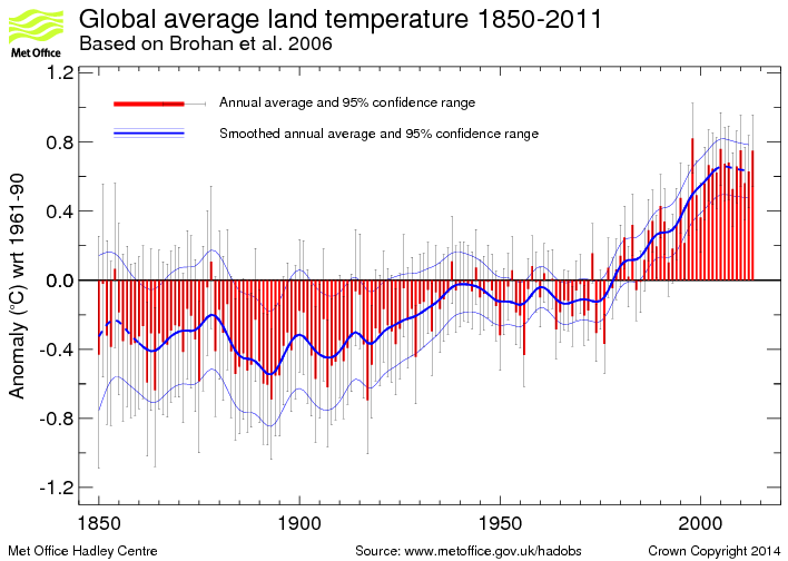
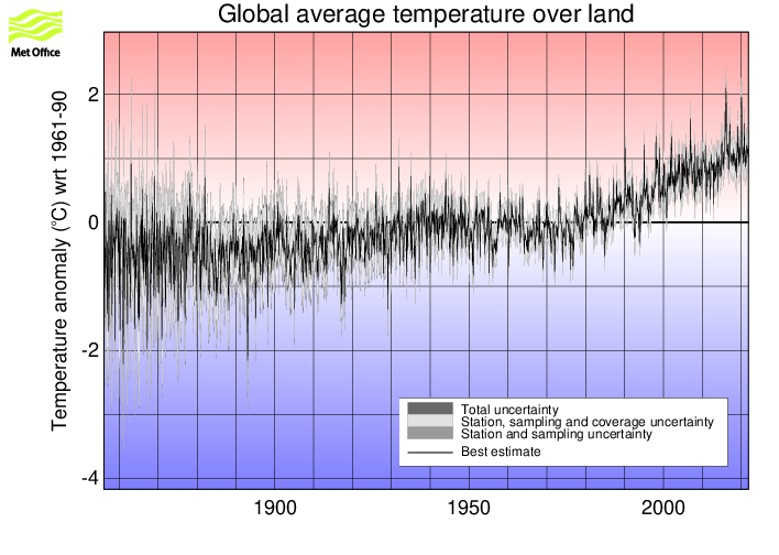
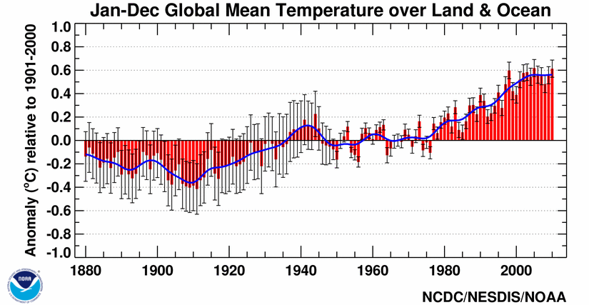
JoNova has a good article on some of these more recent reconstructions. Also, in addition to reconstructions, we have temperature records from the Met Office 1 and 2, as well as NOAA, but these surface temperature records are burdened with issues of questionable siting, changes in siting, changes in equipment, changes in the number of measurement locations, modeling to fill in gaps in measurement locations, corrections to account for missing, erroneous or biased measurements, and the urban heat island effect.
With that for background, the following are the graphs currently included in the WUWT Paleoclimate Reference Page:
600 Years Arctic Temperature

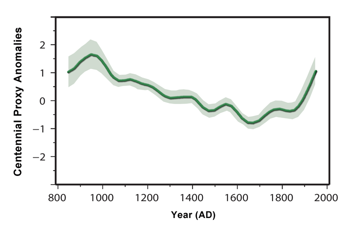
1,100 Years Ljungqvist et al

1,100 Years Ljungqvist et al

1,100 Years Kirkby 2007

2,000 Years – J. Esper et al.

2,000 Years Christiansen

2,000 Years Christiansen

10,000 Years GISP2 Ice Core
11,000 years GISP2 Temperature Since 10700 BP with CO2 from EPICA DomeC

120,000 Years

140,000 Years Antarctic/Vostok

150,000 years Taylor Dome -Ross, Antarctica E. J. Steig, et al 1999:

400,000 Years Antarctica/Vostok

450,000 Years Temperature Anomaly

750,000 Years Rate of Change of Ice Volume and June 65N Insolation

800,000 Years Orbital and Millennial Antarctic Climate Variability

800,000 Years Orbital and Millennial Antarctic Climate Variability

1,000,000 Years

5,500,000 Years Antarctica/Vostok Temperature

5,500,000 Years Antarctica/Vostok Temperature – Reversed

[Which version of the above two graphs do you prefer?}
65,000,000 Years

540,000,000 Years

543,000,000 Years Area of Continents Flooded, Concentration of CO2 and Temperature Fluctuations

600,000,000 Years – C. R. Scotese and R. A. Berner

(Please note that WUWT cannot vouch for the accuracy of the data/graphics within this article, nor influence the format or form of any of the graphics, as they are all linked from third party sources and WUWT is simply an aggregator. You can view each graphic at its source by simply clicking on it.)
Please post your thoughts, recommendations, graphs, links, research, suggested graph titles, etc., for the WUWT Paleoclimate Reference Page in comments. Thanks JTF
On the charts out to 400,000 years and beyond, it looks like we have overstayed our welcome at the present warm period. Personally prefer present date to right on x-axis and all of the temp versus C deg charts in sequence.
Absolutely invaluable. I have been looking for something like this. Just a pity there is no consistency in time direction. Time advancing to the left seems the majority choice so that is my answer to the Antarctica/Vostok Temperature question.
It is interesting that the very long series show ice age temps march down over tens of thousands of years and then jump all the way up to warm in a few thousand years where they begin to march down again. Now that is alarming
I think we should also have written historical and archeological data, and art (kids playing on the frozen Thames), etc.
Henry Clark says: February 23, 2013 at 3:29 pm
Firstly, apologies, as I inadvertently deleted your cross post here (clumsy with the moderation), similar to your comment on the Paleoclimate Page;
http://wattsupwiththat.com/reference-pages/global-weather-climate/paleoclimate/#comment-1231381
content included below. Please feel free to resubmit, or this comment can stand for it.
While a good combo overall, one link is broken but could be fixed.
For 1,100 years Kirkby 2007, this page presently has:
“Figure 2 http://desmond.imageshack.us/Himg707/scaled.php?server=707&filename=kirkby1.jpg&res=land“
The above does not work because it is missing 3 letters, by having the link as:
http://desmond.imageshack.us/Himg707/scaled.php?server=707&filename=kirkby1.jpg&res=land
What does work is instead adding ing to the end, as follows:
http://desmond.imageshack.us/Himg707/scaled.php?server=707&filename=kirkby1.jpg&res=landing
Yes, corrected on the Paleoclimate page and added to the article above. Thank you for your help.
The GISP2 graphs are incorrectly labelled, they actually end at 95 years before present (1950).
I just have a couple of cosmetic items. I realize things are sometimes hard to change on graphics, especially when they are not your own so it would be up to you if you want to contact the author about these things.
However for the very first graph, the x axis seems to start 95 years before 2000 or 1905? Is that correct? That is a rather odd place to start. Then there is the matter of the numbers along the x axis. They should be some even number like 100 or 200, but not numbers like 95, 208, and 346, etc. As well, all numbers should be in equal increments. Right now, 208 – 95 = 113 but 346 – 208 = 138, etc. What I would recommend is that there be a “0” line that starts at the year 2000. Then points just to the right of the “0” point could be made to update it to 2013. There is room for about 40 numbers and you want to cover 10,000 years so even intervals of 250 years would be about right.
Then there is the graph further down with numbers like 300000. My suggestion is to either write 300,000 or 300 000 or 300 kyr, but not 300000.
justthefactswuwt:
Glad to hear that. You’re welcome, and thanks. (The reduced duplication of the comment is no problem at all; its purpose has already been fulfilled).
Gary Pearse says: February 23, 2013 at 3:42 pm
I think we should also have written historical and archeological data, and art (kids playing on the frozen Thames), etc.
I am open to that, perhaps we can include a section of historical supporting materials after the graphs. Materials on the Medival Warming Period and Little Ice Age might be especially helpful in demonstrating the normal and natural changes that occur in Earth’s climate system.
The Greenland ice core data make the last 1-2000 years look very cold. Were the Roman and Minoan warming periods so much warmer than the MWP? And the CO2 levels seem to have little relationship to the changing temperatures in Greenland!
Is this data reliable? If it is I can see no reason to link that the slight warming over the last century with changes of the CO2 levels.
Will AR5 mention this data, if not why not, and if so how do they explain it away?
Research conducted by an international team using tree ring data from Finnish Lapland was published by the Johannes Gutenberg Universitat Mainz July 2012. They created a 2000-year temperature reconstruction for Northern Europe that matches most of the others from that time frame.
http://www.uni-mainz.de/eng/15491.php
My comment is that there is a «cycle» in the Milankovitch theory which is hardly ever – if at all – mentioned here on WUWT (and on any other blog-spot) i.e. The 433000 year cycle.
My references tell me that «Milutin’s cycles» – supported by evidence from «deep-ocean sediment cores» – repeat themselves every 19 000 – 23 000 – 100 000 and 433 000 years.
It seems to me that we are presently in the 433000 year inter-glazial cycle which is a bit cooler than the others, but luckily for us (if correct) they are of a longer duration. –
Though I doubt The BBC is correct in saying (in «the Earth’s amazing journey») that the next «Ice Age» will not occur during the next 60 000 years.
Werner Brozek says: February 23, 2013 at 4:00 pm
I just have a couple of cosmetic items. I realize things are sometimes hard to change on graphics, especially when they are not your own so it would be up to you if you want to contact the author about these things.
Let’s see what we can do.
However for the very first graph, the x axis seems to start 95 years before 2000 or 1905? Is that correct? That is a rather odd place to start. Then there is the matter of the numbers along the x axis. They should be some even number like 100 or 200, but not numbers like 95, 208, and 346, etc. As well, all numbers should be in equal increments. Right now, 208 – 95 = 113 but 346 – 208 = 138, etc. What I would recommend is that there be a “0” line that starts at the year 2000. Then points just to the right of the “0” point could be made to update it to 2013. There is room for about 40 numbers and you want to cover 10,000 years so even intervals of 250 years would be about right.
I tend to agree, it is a good graph, but the axis location and numbering are confusing. The graph;
http://jonova.s3.amazonaws.com/graphs/lappi/gisp-last-10000-new.png
is by David Lappi, who wrote a guest post for JoNova’s site:
http://joannenova.com.au/2010/02/the-big-picture-65-million-years-of-temperature-swings/
Perhaps someone can check with Jo to see if she would invite David to comment here?
Then there is the graph further down with numbers like 300000. My suggestion is to either write 300,000 or 300 000 or 300 kyr, but not 300000.
Then there is the graph further down with numbers like 300000. My suggestion is to either write 300,000 or 300 000 or 300 kyr, but not 300000.
That graph;
http://www.climate4you.com/images/VostokTemp0-420000%20BP.gif
is one of Ole Humlum’s. He is a Professor in the Geosciences Department at the University of Oslo and he runs the very informative website Climate4You.com:
http://www.climate4you.com/
and has this helpful “overview to get things into perspective”
http://www.climate4you.com/GlobalTemperatures.htm#An%20overview%20to%20get%20things%20into%20perspective
among an array of valuable resources.
Ole is obviously quite graphically adept, thus if someone sends him a friendly email;
http://www.mn.uio.no/geo/english/people/aca/geogr/olehum/index.html
I am sure he or one of his staff could clean up those data labels.
Markonis, Y., and D. Koutsoyiannis, Climatic variability over time scales spanning nine orders of magnitude: Connecting Milankovitch cycles with Hurst–Kolmogorov dynamics, Surveys in Geophysics, doi:10.1007/s10712-012-9208-9, 2012.
http://itia.ntua.gr/en/docinfo/1297/
•Preprint (corrected) (796 KB)
http://itia.ntua.gr/getfile/1297/2/documents/2012SurvGeophysMilankovitch-Hurst-KolmogorovPPCorrected.pdf
http://dx.doi.org/10.1007/s10712-012-9208-9
Especially
Fig. 5 Global temperature series of: (a) instrumental data going back to 32 and 160 years, respectively,
and (b) multi-proxy reconstructions going back up to 2000 years (see Table 1).
Fig. 6 Global temperature series from ice core reconstructions going back up to about 800 thousand
years BP (see Table 1).
Fig. 7 Global temperature series from sediment reconstructions going back up to about 500 million
years BP (see Table 1).
Fig 9, Fig 11
See sources in Table 1. Instrumental and proxy time series of global temperature used in the study.
Markonis, Y., and D. Koutsoyiannis, Hurst-Kolmogorov dynamics in paleoclimate reconstructions, European Geosciences Union General Assembly 2010, Geophysical Research Abstracts, Vol. 12, Vienna, EGU2010-14816, European Geosciences Union, 2010.
http://itia.ntua.gr/en/docinfo/980/
Presentation (608 KB)
http://itia.ntua.gr/getfile/980/2/documents/2010EGU_ReconHurstPr.pdf
Presentation, for print (835 KB)
http://itia.ntua.gr/getfile/980/3/documents/2010EGU_ReconHurstSM.pdf
Dear Anthony
It seems I have got some computer gremlins. My previous comment should have started thus:
Unfortunately I cannot add to or subtract from any of the graphs you have printed here. However I will make a small (and probably un-important) comment to the graph entiteled:
“450,000 Years Temperature Anomaly
climate4you.com – Ole Humlum – Professor, University of Oslo Department of Geosciences – Click the pic to view at source”
I’d like graphs from the Taylor Dome (Antarctica) included, as they are Greenland like, and show different timing of events like the YD to other Antarctic cores like Vostok.
The page below shows the Taylor O18 record, but unfortunately the link to the graph doesn’t work. I’ll try and find a direct link.
http://depts.washington.edu/isolab/taylor/
‘ …these surface temperature records are burdened with issues of questionable sighting, changes in sighting…’ Is this supposed to refer to siting?
Excellent resource – paleo is what got me interested in (C)AGW – how we’ll cope with the next abrupt glaciation I’ve got no idea. Around 2000 I read an interview with William Calvin on this – cannot find the original but the gist of it (from another article) was:
“Plummeting crop yields will cause some powerful countries to try to take over their neighbors or distant lands — if only because their armies, unpaid and lacking food, will go marauding, both at home and across the borders. The better-organized countries will attempt to use their armies, before they fall apart entirely, to take over countries with significant remaining resources, driving out or starving their inhabitants if not using modern weapons to accomplish the same end: eliminating competitors for the remaining food.”
…
“Any abrupt switch in climate would also disrupt food-supply routes. The only reason that two percent of our population can feed the other 98 percent is that we have a well-developed system of transportation and middlemen — but it is not very robust. The system allows for large urban populations in the best of times, but not in the case of widespread disruptions.”
…
“There is, increasingly, international cooperation in response to catastrophe — but no country is going to be able to rely on a stored agricultural surplus for even a year, and any country will be reluctant to give away part of its surplus. In an abrupt cooling the problem would get worse for decades, and much of the earth would be affected. A meteor strike that killed most of the population in a month would not be as serious as an abrupt cooling that eventually killed just as many. With the population crash spread out over a decade, there would be ample opportunity for civilization’s institutions to be torn apart and for hatreds to build, as armies tried to grab remaining resources simply to feed the people in their own countries. The effects of an abrupt cold last for centuries. They might not be the end of Homo sapiens — written knowledge and elementary education might well endure — but the world after such a population crash would certainly be full of despotic governments that hated their neighbors because of recent atrocities. Recovery would be very slow.”
http://williamcalvin.com/1990s/1998AtlanticClimate.htm
Calvin thinks that we can geo-engineer our way out of this scenario. I doubt it. But given the high likelihood of the next glaciation setting in any decade now, paleo should be the primary research focus for climatology.
A few typos:
there’ are -> there are
issues of questionable sighting, changes in sighting -> siting
Reference the Johannes Gutenberg Universitat Mainz study above. The conclusions from their abstract have implications for policy makers that continue to be covered up by the IPCC, CAGW propagandists, and those milking taxpayers with CO2-limiting energy policies.
“In addition to the cold and warm phases, the new climate curve also exhibits a phenomenon that was not expected in this form. For the first time, researchers have now been able to use the data derived from tree-rings to precisely calculate a much longer-term cooling trend that has been playing out over the past 2,000 years. Their findings demonstrate that this trend involves a cooling of -0.3°C per millennium due to gradual changes to the position of the sun and an increase in the distance between the Earth and the sun.
“This figure we calculated may not seem particularly significant,” says Esper. “However, it is also not negligible when compared to global warming, which up to now has been less than 1°C. Our results suggest that the large-scale climate reconstruction shown by the Intergovernmental Panel on Climate Change (IPCC) likely underestimate this long-term cooling trend over the past few millennia.” “
Concerning the last chart, showing the Phanerozoic going back 542 million years, I’m not sure exactly how to interpret it. But I’d like more information showing CO2 levels in paleo-times reaching 7000ppm or whatever levels. So, whatever links or information you have on that, great.
Now, my major point on that is that, if it is more or less definitively confirmed that CO2 was at 7000ppm, you wonder why no ocean-boiling runaway greenhouse effect was experienced here on earth. The scaremongers maintain that CO2 is both an effect and a cause of climate temperature change (the evidence is that CO2 is an effect of temperature change, not a cause, but…). If CO2 is in fact both a cause and an effect of temperature change, and Co2 levels were indeed 7000ppm in the paleopast, it begs the question or whatever of why in hells kitchen we didn’t go into a runaway greenhouse effect. As temps rose, CO2 would rise, causing the temps to rise, causing more CO2 (to come out of the oceans), causing more temperature rise, on and on, until… the boiling end game. No, it seems temperatures were “normal” at 7000ppm; in any event, there was no runaway greenhouse effect, obviously, and I think this fully disqualifies the warmist theory on CO2. I don’t know why we don’t make a bigger squawk about this.
Don Easterbrook
http://myweb.wwu.edu/dbunny/publications.html
Easterbrook, D.J., ed., 2011, Evidence-based climate science: Data opposing CO2 emissions as the primary source of global warming: Elsevier Inc., 416 p.
Easterbrook, D.J., 2011, Geologic evidence of recurring climate cycles and their implications for the cause of global climate changes: The Past is the Key to the Future: in Evidence-Based Climate Science, Elsevier Inc., p.3-51.
http://myweb.wwu.edu/dbunny/pdfs/easterbrook_geologic-evidence-of-recurring-climatic-cycles.pdf
FIGURE 21 Greenland temperatures over the past 25,000 years recorded in the GISP2 ice core.
FIGURE 22 Magnitudes of the largest warming/cooling events over the past 25,000 years.
Temperatures on the vertical axis are rise or fall of temperatures in about a century.
FIGURE 24 Temperatures over the past 10,000 years recorded in the GISP2 Greenland ice core
(modified from Alley, 2000).
FIGURE 25 The 8,200-year B.P. sudden climate change, recorded in oxygen isotope ratios in the
GISP2 ice core, lasted about 200 years.
FIGURE 27 Greenland ice core isotope curve showing warming and cooling periods since
1480 A.D. The vertical lines at the bottom show peak cool periods which occurred with an average
of every 27 years.
FIGURE 29 Surface temperatures of the Sargasso Sea reconstructed from isotope ratios in marine
organisms (Keigwin, 1996).
FIGURE30 Reconstructed paleotemperatures without tree ring data (Loehle, 2007).
FIGURE 31 Summer sea surface temperatures near Iceland (Sicre et al., 2008).
FIGURE 53 Correspondence of cold periods and solar minima from 1500 to 2000. Each of the
five named solar minima was a time of sharply reduced global temperatures (blue areas).
FIGURE 56 Correlation of temperature (d18O) and radiocarbon production (d14C) from
a stalagmite in Oman (Matter et al., 2001).
Easterbrook, D.J., Gosse, J., Sherard, C., Finkel, R., and Evenson, E., 2011, Evidence for synchronous global climatic events: Cosmogenic exposure ages of glaciations: in Evidence-Based Climate Science, Elsevier Inc., p. 53-88.
http://myweb.wwu.edu/dbunny/pdfs/easterbrook_geologic-evidence-of-recurring-climatic-cycles.pdf
FIGURE 11 Correlation of glacial fluctuations, global temperature changes, and the Pacific
Decadal Oscillation.
FIGURE 21 Cyclic warming and cooling trends in the past 500 years (plotted from GISP2 data,
Stuiver and Grootes, 2000).
In the archeology department: While playing around with the Weather Channel’s dumb storm names, I bumped into evidence that the Eskimos remember one of those MUCH warmer times…. which means, of course, that the Eskimos and their food sources SURVIVED those much warmer times.
http://www.polistrasmill.blogspot.com/2013/02/missed-best-name.html
Eric Simpson,
Here is a chart for you. The biosphere is currently starved of CO2. More is better, at both current and projected concentrations.
• • •
JTFWUWT,
Excellent post, as usual.
http://www.co2science.org/data/mwp/description.php
Phil. says: February 23, 2013 at 3:58 pm
The GISP2 graphs are incorrectly labelled, they actually end at 95 years before present (1950).
I liked Werner’s math better than yours, but there does seem some basis for this, in that this 1992 paper indicates that the GISP2 data ended in 1950;
ftp://ftp.ncdc.noaa.gov/pub/data/paleo/icecore/greenland/summit/gisp2/depthage/gisp2age.txt
and David Lappi points out in his article;
http://joannenova.com.au/2010/02/the-big-picture-65-million-years-of-temperature-swings/
that GISP2 “data set is useful because it reports temperatures (measured by oxygen isotopes) every 10 to 60 years”.
However, Lappi also notes in his article that “the US government drilled the GISP 2 ice core in central Greenland over a five-year period, and the data is available here”:
http://www.ncdc.noaa.gov/paleo/metadata/noaa-icecore-2475.html
and the Alley, R.B. 2000 data he references ends in 2000 AD. In comment’s of the Lappi’s article someone raised the 1905 concern;
http://joannenova.com.au/2010/02/the-big-picture-65-million-years-of-temperature-swings/#comment-32179
and it did not seem to get addressed, so I cannot say with certainty as to when the Lappi GISP2 graph ends.
Even if it’s not the Alley data, there are an array of other GISP2 reconstructions that extend the record beyond 1950, including Kobashi et al. 2011 4000-Year Ar-N2 Isotope Temperature Reconstruction;
ftp://ftp.ncdc.noaa.gov/pub/data/paleo/icecore/greenland/summit/gisp2/isotopes/gisp2-temperature2011.txt
which extended the GISP2 record through 1993 using temperature data based on borehole temperature modeling, and there are an array of other studies that extend the GISP2 record;
http://www.ncdc.noaa.gov/paleo/icecore/greenland/greenland.html
With this noted, can anyone speak to the Lappi graph, the data set used and the end point for that data set?
Koutsoyiannis, D., Hydrology and Change (Plenary lecture), IUGG 2011, Melbourne, International Union of Geodesy and Geophysics, 2011.
http://itia.ntua.gr/en/docinfo/1135/
Slide 20, 24 Nilometer
Slide 27 Co-evolution of climate with tectonics and life on Earth over the last half billion years
Slide 28 Temperature change on Earth based on observations and proxies
From Markonis and Koutsoyiannis (2011)
Slide 29 A combined climacogram of all 10 temperature observation sets and proxies
Shaviv and Veizer 2003 has a 500 million year climate reconstruction graph (figure 1) plotting temperature as derived from oxygen isotopes in shells. The same graph also plots ice rafting data and CO2 reconstructions so you’ll have to include the caption for people to make sense of it:
http://stephenschneider.stanford.edu/Publications/PDF_Papers/shaviv-veizer-03.pdf
Their figure 2 shows the same shell-based temperature data smoothed and plotted against the cosmic ray flux.
I have a little graph I use of 3000 years of surface temperature data from the Sargasso Sea
Figure 5 of a Science paper I only have a link to the abstract.
“The Little Ice Age and Medieval Warm Period in the Sargasso Sea”
http://www.sciencemag.org/content/274/5292/1503.abstract
It is described as from Keigwan 1996
Science 29 November 1996:
Vol. 274 no. 5292 pp. 1503-1508
DOI: 10.1126/science.274.5292.1503
abstract:
Sea surface temperature (SST), salinity, and flux of terrigenous material oscillated on millennial time scales in the Pleistocene North Atlantic, but there are few records of Holocene variability. Because of high rates of sediment accumulation, Holocene oscillations are well documented in the northern Sargasso Sea. Results from a radiocarbon-dated box core show that SST was ∼1°C cooler than today ∼400 years ago (the Little Ice Age) and 1700 years ago, and ∼1°C warmer than today 1000 years ago (the Medieval Warm Period). Thus, at least some of the warming since the Little Ice Age appears to be part of a natural oscillation.
Hope this is the sort of thing you had in mind
Pete Olson says: February 23, 2013 at 4:41 pm
< …these surface temperature records are burdened with issues of questionable sighting, changes in sighting…’ Is this supposed to refer to siting?
DaleC says: February 23, 2013 at 4:42 pm
A few typos:
there’ are -> there are
issues of questionable sighting, changes in sighting -> siting
Corrected, thank you both
Julian in Wales says on February 23, 2013 at 4:22 pm:
Is this data reliable?
= = = = = = =
You can bet your balls (christmas decorations) that this data – as you call them (or it) is and are as reliable as man kind can find – or retrieve them. – Going back 650 000 to 1 million years and ice-core research and other «palaeoclimatolical (ocean and lake sediment cores) research» do agree on all the main points which are that an interchange of warm and cold periods (during the past – close to – one million years of the Earth’s history) have been happening. – That however is not the problem that we face today. – What we now are faced with is a «gang» of sub-scientists who do «blatantly» disreguard data and instead reguard CO2 as the «main greenhouse gas» which therefore is responsible for what is called «The Greenhouse Effect» – They (the gang) are «Model Makers» and as long as they put CO2 into their models as being responsible for any earthly temperature rise, then it is quite correct for them to say that «All our models show that CO2 is responsible for the recent warming. —-
Well, that was back in the 1970ies, 80ies and 90ties. — But then the warming stopped. – Well, do not make the mistake of thinking that the climate cooled – it did not – But nor did it warm – and that is the whole kabbudle – The theory was «increase the CO2 GHG and the Earths temperatures will be forced to rise. – After all, we were supposed to fry on the top of the surface – and as a theory, that also is quite correct. –
Philip Bradley says:
February 23, 2013 at 4:40 pm
I’d like graphs from the Taylor Dome (Antarctica) included, as they are Greenland like, and show different timing of events like the YD to other Antarctic cores like Vostok.
The page below shows the Taylor O18 record, but unfortunately the link to the graph doesn’t work. I’ll try and find a direct link.
http://depts.washington.edu/isolab/taylor/
Agreement between the Antarctic Taylor dome and Greenland is very interesting. Some climate scientists are hitting on the idea of using an NH-SH antiphase alternation in climate as a way of wriggling out of the problem of CO2 lagging temperature in ice cores. But if Greenland and Taylor dome both confirm NH-SH synchrony and still display CO2 lagging (which I believe they do) then this kills this AGW attempt to get out of the lagging-CO2 problem.
justthefactswuwt says:
February 23, 2013 at 5:12 pm
Phil. says: February 23, 2013 at 3:58 pm
“The GISP2 graphs are incorrectly labelled, they actually end at 95 years before present (1950).”
I liked Werner’s math better than yours, but there does seem some basis for this, in that this 1992 paper indicates that the GISP2 data ended in 1950;
ftp://ftp.ncdc.noaa.gov/pub/data/paleo/icecore/greenland/summit/gisp2/depthage/gisp2age.txt
and David Lappi points out in his article;
http://joannenova.com.au/2010/02/the-big-picture-65-million-years-of-temperature-swings/
that GISP2 “data set is useful because it reports temperatures (measured by oxygen isotopes) every 10 to 60 years”.
However, Lappi also notes in his article that “the US government drilled the GISP 2 ice core in central Greenland over a five-year period, and the data is available here”:
http://www.ncdc.noaa.gov/paleo/metadata/noaa-icecore-2475.html
and the Alley, R.B. 2000 data he references ends in 2000 AD. In comment’s of the Lappi’s article someone raised the 1905 concern;
http://joannenova.com.au/2010/02/the-big-picture-65-million-years-of-temperature-swings/#comment-32179
and it did not seem to get addressed, so I cannot say with certainty as to when the Lappi GISP2 graph ends.
Even if it’s not the Alley data, there are an array of other GISP2 reconstructions that extend the record beyond 1950, including Kobashi et al. 2011 4000-Year Ar-N2 Isotope Temperature Reconstruction;
ftp://ftp.ncdc.noaa.gov/pub/data/paleo/icecore/greenland/summit/gisp2/isotopes/gisp2-temperature2011.txt
which extended the GISP2 record through 1993 using temperature data based on borehole temperature modeling, and there are an array of other studies that extend the GISP2 record;
http://www.ncdc.noaa.gov/paleo/icecore/greenland/greenland.html
With this noted, can anyone speak to the Lappi graph, the data set used and the end point for that data set?
Lappi used the Alley data he just screwed up and assumed that because the data was published in 2000 that ‘before present’ meant before 2000 which is not correct as it refers to before 1950 by convention with reference to C14 dating.
If you look at the 100,000 year figure (multi-coloured) showing precession, obliquity, eccentricity, solar activity and glacial phase, I noticed an apparent trend in the shape of the interglacial timecourse in relation to the magnitude of eccentricity.
Eccentricity shows a “wave within a wave” modulation, so that the oscillations have 100 kYr wavelength while the modulating wave has 400 kYr wavelength. So eccentricity has high amplitude and magnitude around 200 kYr, 600 kYrs and 1000 kYrs, and low amplitude and magnitude nodes around 800 kYrs, 400 kYrs and now.
Where the wave is at high peaks at 200, 600 and 1000 kYrs ago, the waveform of temperature and glacial / interglacial state shows a ragged form with multiple peaks – apparent instability. However at the nodes around 800 and 400 kYrs ago the interglacial peaks are “cleaner” showing a single well defined peak without accessory peaks, evidently a more stable switching between glacial and interglacial attractors. The same should apply to now. If this were a real trend it would mean that we can expect a clean sharp drop back to glaciation mirroring the sharp rise at the start of the Holocene.
BTW figure numbers would have been helpful 🙂
Keith says: February 23, 2013 at 4:32 pm J. Esper et al. – Johannes Gutenberg University Mainz (JGU) – Click the pic to view at source[/caption]
Research conducted by an international team using tree ring data from Finnish Lapland was published by the Johannes Gutenberg Universitat Mainz July 2012. They created a 2000-year temperature reconstruction for Northern Europe that matches most of the others from that time frame.
http://www.uni-mainz.de/eng/15491.php
The associated paper J. Esper et al., Orbital forcing of tree-ring data, Nature Climate Change, 8 July 2012, can be found here:
http://www.nature.com/nclimate/journal/v2/n12/full/nclimate1589.html
and the associated 2,000 year graph:
[caption id="" align="alignnone" width="542"]
now appears in this article and on the WUWT Paleoclimate page. Thank you very much for your contribution.
JTF – I can’t add anything to your excellent work, but I do have two suggestions for the final Paleo page:
1. Do include “Team” graphs. Like them or not, they are in the literature. But with any graph of dubious merit, “Team” or other, you could include links to why it is dubious. Apologies if you were planning to do this anyway.
2. Highlight whenever time runs Right-to-Left in a graph.
Incidentally, the quote you provide re the Arctic:
“Together, they indicate that the Arctic has warmed up to 1.5°C since 1850 – the coolest interval of the Arctic “Little Ice Age.” Much of the recent Arctic warming took place between 1850 and 1920, most likely due to natural processes”
is very well demonstrated by the retreat maps of Alaskan glaciers you provided years ago.
http://wattsupwiththat.com/2010/04/12/pilgrimage-to-montana/
Note: fullest extent around the time Captain Cook was looking for a NW passage and 100 kms of retreat before 1900. Fit that in with the global warming orthodoxy?
Is the chart from this source too flippant? Using media stories as a proxy for global temperature.
http://butnowyouknow.wordpress.com/those-who-fail-to-learn-from-history/climate-change-timeline/
I’m not sure whether these would be usable but each image is linked to the source material (I think that applies to them all).
http://pages.science-skeptical.de/MWP/MedievalWarmPeriod1024x768.html
Thanks D.B. Stealey for the link. Good chart, plus I checked out a file mentioned on the chart: ftp://ftp.ncdc.noaa.gov/pub/data/paleo/climate_forcing/trace_gases/phanerozoic_co2.txt
That file seems to be a good “raw data” source confirming the paleo-CO2 info (7000ppm+). But oddly it doesn’t show CO2 in ppm, but as a multiple of “todays” CO2 level (I think?), and the paper was written in 2002 it seems, so those numbers would be off now.
So, if anyone could help, I’m still in the market for more raw data sources and / or reference worthy analyses confirming past high levels of CO2, plus side by side comparisons of the paleo-CO2 levels to temperature. And anything about why these 7000ppm levels didn’t cause a runaway greenhouse effect.
This Wikipedia graph is helpful in seeing the big paleoclimatic picture; Wikipedia- Click the pic to view at source[/caption]
[caption id="" align="alignnone" width="578"]
unfortunately it appears erroneous due a complete ignorance of the Medieval Warm Period, and is thus deemed insufficiently credible for WUWT’s Reference Pages. Does anyone know of a comparable compilation of reconstructions we can use that gets the last couple mellennia right? If not,can anyone build one?
Mike Jonas says: February 23, 2013 at 5:55 pm
1. Do include “Team” graphs. Like them or not, they are in the literature. But with any graph of dubious merit, “Team” or other, you could include links to why it is dubious. Apologies if you were planning to do this anyway.
I was not planning to, but it is a good idea. My only concern is that it might create confusion. What if I create a section of graphs at the bottom under a header like Disputed Graphs, Suspect Graphs, etc.?
2. Highlight whenever time runs Right-to-Left in a graph.
Another good idea. Would inclusion of something like this ← or this → in the title work, or perhaps this;
5000 Years ← Present
centered above or below each graph?
Numerous paleoclimatology studies covering the globe are cited at NOAA’s paleoclimatology reference page. Several of these were cited above and there does not appear to be any attempt to screen out politically incorrect research papers. http://www.ncdc.noaa.gov/paleo/recons.html
The paleo perspective on global warming was written in 2009 based the “Team’s” views. http://www.ncdc.noaa.gov/paleo/globalwarming/home.html
Phil. says: February 23, 2013 at 5:48 pm Richard Alley – NOAA – NCDC – Click the pic to view at source[/caption]
Lappi used the Alley data he just screwed up and assumed that because the data was published in 2000 that ‘before present’ meant before 2000 which is not correct as it refers to before 1950 by convention with reference to C14 dating.
Richard Alley used “2000” as present on his graph;
[caption id="" align="alignnone" width="578"]
for his 2000 publication:
http://www.ncdc.noaa.gov/paleo/pubs/alley2000/alley2000.html
Are you suggesting that Richard Alley also “screwed up”?
Great Page says:
February 23, 2013 at 3:37 pm
On the charts out to 400,000 years and beyond, it looks like we have overstayed our welcome at the present warm period.
________________
Every time I examine (some of) these graphs, an audio loop of the word “Uh-Oh” starts playing in my head.
@justthefactswuwt
A fantastic resource and a great summation of the work undertaken by some of the leading Climate Scientists in response to Overpeck et al 1997.
I have already posted this in the February 23, 2013 Open Thread Weekend and at the risk of duplication (it is post 26) I would appreciate if you gave consideration to including some form of the following :-
Anthony,
James Delingpole has an interesting challenge that may interest your readers at http://bogpaper.com/2013/02/22/delingpole-on-friday-governments-cant-spend-their-way-out-of-a-recession-by-stimulating-demand/#comment-1251
The challenge is toward the end and it is,
“What we need to do is find a way of expressing, lucidly, entertainingly, persuasively, why it is that all those liberal-lefties who believe that it makes economic sense for government to go on spending at current levels are not just wrong but demonstrably wrong.
So that’s my challenge to you, Bogpaper readers. Especially those of an economic bent.”
And I urge folk to check out the comments by poster ‘dr’ and ‘david’.
Their posts certainly gave me food for thought!
http://www.nature.com/nature/journal/v483/n7390/full/nature10891.html
MIS-11
MIS-5
http://www.nature.com/nature/journal/v431/n7005/abs/nature02805.html
Excellent !
Mann et al., Jones et al, Overpeck et al., Hansen et al., are dead in the water and listing to port as their decks are awash. Let them go. Send in new dive bombers. Send in new ‘HellCats’. (SNIP – There’s no need for that, JTF) A very ignominious death in public. Popcorn a pop’n.
XD
An episode of NOVA dealt with this issue. The data is qualitative rather than quantitative, but may be easier for laymen to grasp. The URL is http://www.pbs.org/wgbh/nova/earth/cause-ice-age.html Here are a couple of interesting snippets, but the entire page is a worthwhile read.
> Climatic Cooling from 60 million years ago to present day
>
> Between 52 and 57 million years ago, the Earth was relatively
> warm. Tropical conditions actually extended all the way into the
> mid-latitudes (around northern Spain or the central United States
> for example), polar regions experienced temperate climates, and
> the difference in temperature between the equator and pole was much
> smaller than it is today. Indeed it was so warm that trees grew in
> both the Arctic and Antarctic, and alligators lived in Ellesmere
> Island at 78 degrees North.
[…snip…]
> The Earth was once more released from the grip of the big chill
> between 5 and 3 million years ago, when the sea was much warmer
> around North America and the Antarctic than it is today. Warm-weather
> plants grew in Northern Europe where today they cannot survive,
> and trees grew in Iceland, Greenland, and Canada as far north as 82
> degrees North.
And on a related topic, what about paleo ice-cover?
http://exhibits.museum.state.il.us/exhibits/larson/LP_extinction.html shows a couple of maps of glacial retreat in North America. 18,000 years ago, ice sheets up to 2 miles thick covered Canada and parts of the “northern-tier” US states. The point to make is that the macro trend has been one of shrinking ice-cover for the past 18,000 years, with a few speed-bumps along the way (Younger Dryas, Little Ice Age, etc, etc). Viewed in that context, the last 30 years of shrinking arctic sea ice cover is not alarming at all. It is merely the continuation of the macro trend during the current interglacial.
A related point is that when the retreat of the ice caps started,there were fewer than 1 million homo sapiens on the entire planet. They were hunter-gatherers, and no, they were not running around in CO2-spewing SUVs. This destroys the AGW alarmist theory that today’s industrial society is the only possible cause of the current ice cover retreat.
justthefactswuwt says:
February 23, 2013 at 5:34 pm
Pete Olson says: February 23, 2013 at 4:41 pm
there are
issues of questionable sighting, changes in sighting -> siting
Corrected, thank you both
Well…one corrected anyway – what about the other just before it?:
‘issues of questionable SIGHTING, changes in siting…’
Mod: You don’t have to publish this – just fix. Thx.
[Done. Thank you. Mod]
Eric Simpson, looks like the higher levels of CO2 were eaten into a lot when photosynthesis started happening on a massive scale (from cellular organisms in the oceans) and oxygen rose, followed by the evolution of life on land (supported by the rise in O2). So various factors would have prevented a ‘runaway’ warming.
Something like: weathering -> drop in CO2, photosynthesis from ocean microorgs ->drop in CO2, rise in O2 (see also SPICE reference below) then terrestrial life and modern atmosphere. Bearing in mind geological time scale is vastly different to human timescale. A ‘rapid change’ in geological terms could be a couple of million years, with ‘instantaneous’ being maybe 20,000 years! Some of the data on geo atmospheric composition are resolved to 30 million years (eg Berner) so don’t show short(er) blips.
The sun was fainter 500,000,000 years ago so higher levels of CO2 did not warm earth as much back then (because there wasn’t as much energy coming from the sun).
This article is about the SPICE event plus talks about paleo changes:
http://researchnews.osu.edu/archive/oxypulse.htm
http://www.globalwarmingart.com/
and
http://climate4you.com/
Are a couple excellent sources …
@justthefactswuwt
May I also urge consideration be given to creating a short youtube clip to present this paleo information for those that best absorb visual and spoken data as opposed to written data.
I know from my experience from being in business or business accounting for the last 50 years and as a member of the ‘WUWT limited partnership of concerned human beings from around the world that have contributed to WUWT’ would love to have a short video to be able to send to some of my friends and family.
I would suggest that Willis Eschenbach, if he has the time, would be able to put together a great script and provide some great nature fill in shots.
As a presenter I would suggest http://joannenova.com.au/2013/02/tophers-new-video-the-forbidden-history-of-terrible-taxes/
You would need to search youtube for his previous video’s and I believe he could make a valuable contribution.
Kind Regards
Philip Bradley says: February 23, 2013 at 4:40 pm E. J. Steig, et al – University of Washington Click the pic to view at source[/caption]
I’d like graphs from the Taylor Dome (Antarctica) included, as they are Greenland like, and show different timing of events like the YD to other Antarctic cores like Vostok.
The page below shows the Taylor O18 record, but unfortunately the link to the graph doesn’t work. I’ll try and find a direct link.
No worries on the link, from a Windows machine, right click on the image and select “View Image”, this will take you to the image link:
http://depts.washington.edu/isolab/images/tdicecore.gif
I thus added 150,000 years Taylor Dome -Ross, Antarctica E. J. Steig, et al 1999;
[caption id="" align="alignnone" width="578"]
to this article and the Paleoclimate page. Thank you
“….these surface temperature records are burdened with issues of questionable sighting, changes in siting, ….
Typo, questionable siting
{Fixed, thank you. Mod]
I is interesting to note that the data ends in 1855. Just a wee bit before today. (the chart here is labeled before present (BP) the P in this is 1950. So the last data point is at 95 years before present, 1855.
Some of these may have already been posted:
http://www.biocab.org/SL_and_CO2.jpg
http://www.biokurs.de/treibhaus/180CO2/bayreuth/bayreuth1e.htm [interactive chart]
http://members.shaw.ca/sch25/FOS/Beck%20CO2.gif
http://cdiac.esd.ornl.gov/trends/co2/graphics/South_Pole_CO2.jpg
http://wattsupwiththat.files.wordpress.com/2009/02/eia_co2_contributions_table3.png
http://www.john-daly.com/co2-2000.gif
http://oi26.tinypic.com/311s08x.jpg [click to embiggen]
http://jennifermarohasy.com//wp-content/uploads/2009/10/Lance_Experience-Curve-CO2-and-SST-with-21-moving-average-12May092.jpg
http://www.climate4you.com/images/GISS%20GlobalMonthlyTempSince1958%20AndCO2.gif
http://www.climate4you.com/images/HadCRUT3%20GlobalMonthlyTempSince1940%20AndCO2.gif
http://www.geocraft.com/WVFossils/last_400k_yrs.html
http://www.geocraft.com/WVFossils/PageMill_Images/image277.gif
http://icecap.us/images/uploads/MSUCRUCO2.jpg
http://cadenzapress.co.uk/download/beck_mencken_hadley.jpg
http://c3headlines.typepad.com/.a/6a010536b58035970c013480b4810c970c-pi
http://img7.imageshack.us/img7/2127/last3iceages.png
http://img260.imageshack.us/img260/8371/transitioniceageco2.png
http://img339.imageshack.us/img339/879/co2lagkz2.png
http://c3headlines.typepad.com/.a/6a010536b58035970c011572416077970b-pi
http://icecap.us/images/uploads/8YearTemps.jpg
http://jennifermarohasy.com//wp-content/uploads/2009/09/Tim-Curtin-_temp-and-co2-chart-ver-2.jpg
http://wattsupwiththat.files.wordpress.com/2007/11/co2-h2o_solubility.png
http://c3headlines.typepad.com/.a/6a010536b58035970c011570a85da7970c-pi
http://www.biocab.org/GWMA-002_op_987x740.jpg
http://climatesanity.files.wordpress.com/2010/02/correlation-coefficents-sorted-by-t.gif
http://climatesanity.files.wordpress.com/2010/02/correlation-coefficents-sorted-by-co2.gif
http://www.biocab.org/Geological_Timescale.jpg
http://img708.imageshack.us/img708/4313/co2fossilsoilsar4.png
http://jennifermarohasy.com//wp-content/uploads/2009/07/Fieldings-chart.gif
http://c3headlines.typepad.com/.a/6a010536b58035970c0120a5e507c9970c-pi
http://icecap.us/images/uploads/Correlation_of_Carbon_Dioxide_with_Temperatures_Negative_Again.pdf
http://c3headlines.typepad.com/.a/6a010536b58035970c0120a5f34862970b-pi
http://3.bp.blogspot.com/_cHhMa7ARDDg/SNW-4aiO9PI/AAAAAAAAAd8/5wuDuVDjYqI/s1600/Geocarb%2BIII-Mine-02.jpg
http://www.john-daly.com/artifact.htm
http://www-das.uwyo.edu/~geerts/cwx/notes/chap01/Image17.gif
http://www.biomind.de/realCO2/bilder/CO2%20MBL1826-2008-2n-SST-2k.jpg
http://c3headlines.typepad.com/.a/6a010536b58035970c0115707ce438970b-pi
http://wattsupwiththat.files.wordpress.com/2010/03/heating_effect_of_co2.png
http://s90.beta.photobucket.com/user/dhm1353/media/Climate%20Change/PhanerozoicCO2vTemp.png.html
http://www.daviesand.com/Choices/Precautionary_Planning/New_Data/IceCores1.gif
http://c3headlines.typepad.com/.a/6a010536b58035970c0120a60a2a5c970b-800wi
http://img254.imageshack.us/img254/2626/tempobsrvvsco2ct4.png
http://icecap.us/images/uploads/MSUCRUCO2June09.jpg
http://www.brighton73.freeserve.co.uk/gw/paleo/400000yearslarge.gif
http://icecap.us/images/uploads/USHCNvsCO2.jpg
http://www.edgeblog.net/wp-content/uploads/2009/10/Global-CO2.PNG
http://img172.imageshack.us/img172/2464/tempvsco267m.png
http://icecap.us/images/uploads/TEMPSvsCO2.jpg
http://img823.imageshack.us/img823/9508/tempco2570mlefttoright.png
http://joannenova.com.au/global-warming-2/ice-core-graph/
http://www.worldclimatereport.com/wp-images/national_emissions.JPG
http://2.bp.blogspot.com/_cHhMa7ARDDg/SoxiDu0taDI/AAAAAAAABFI/Z2yuZCWtzvc/s1600/Geocarb%2BIII-Mine-03.jpg
http://www.woodfortrees.org/plot/rss/from:1995/plot/rss/from:1996.83/trend/plot/esrl-co2/from:1996.83/normalise
http://members.shaw.ca/sch25/FOS/GlobalTroposphereTemperaturesAverage.jpg
http://wattsupwiththat.files.wordpress.com/2012/07/mauna-loa-co2-vs-uah.jpg
http://www.woodfortrees.org/plot/esrl-co2/isolate:60/mean:12/scale:0.26/plot/hadcrut3vgl/isolate:60/mean:12/from:1958 [T leads CO2]
http://www.co2web.info/C-atm-vs-human.jpg
http://theresilientearth.com/files/images/hansen_forecast_1988-2.jpg
http://icecap.us/images/uploads/ALL_SINCE_2002.jpg
http://justdata.files.wordpress.com/2009/12/raw_temp_1990-20091.jpg
http://justdata.files.wordpress.com/2009/12/raw_temp1.jpg
http://www.ianschumacher.com/img/TempsvsIPCCModelsWM.jpg
http://carbon-sense.com/wp-content/uploads/2009/10/18-20-temps.png
http://butnowyouknow.files.wordpress.com/2009/07/globa-mean-temp.gif?w=469&h=427
http://www.worldclimatereport.com/wp-images/US_temps_fig1.gif
http://jonova.s3.amazonaws.com/graphs/hadley/Hadley-global-temps-1850-2010-web.jpg
http://www.globalwarmingskeptics.info/thread-188-post-3130.html
http://img856.imageshack.us/img856/2403/dailyuahtempsmar92010.png
http://wattsupwiththat.files.wordpress.com/2011/03/record2bhigh2btemperature2bchart1.jpg
http://oi49.tinypic.com/rc93fa.jpg
http://img576.imageshack.us/img576/2681/temperaturewithrealbase.gif
http://oi56.tinypic.com/2reh021.jpg
http://www.middlebury.net/op-ed/hope-it-lasts.jpg
http://curryja.files.wordpress.com/2011/12/14.jpg [tonyb chart]
http://oi35.tinypic.com/2db1d89.jpg
http://jonova.s3.amazonaws.com/graphs/giss/hansen-giss-1940-1980.gif
http://wattsupwiththat.files.wordpress.com/2011/08/alternativeinterpretationofgmtfig2.png?w=640&h=429
http://www.thetruthaboutclimatechange.org/tempsworld.html
http://icecap.us/images/uploads/ALL_SINCE_2002.jpg
http://www.friendsofscience.org/assets/documents/FOS%20Essay/HadCrut3Global.jpg
http://wattsupwiththat.files.wordpress.com/2011/10/article-2055191-0e974b4300000578-216_468x4731.jpg
http://stevengoddard.files.wordpress.com/2012/12/screenhunter_320-dec-01-11-30.jpg?w=640&h=484&h=484
ftp://ftp.ssmi.com/msu/graphics/tls/plots/rss_ts_channel_tls_global_land_and_sea_v03_3.png
Got more, but these crowdsourced links should do for now.
A couple of suggestions (might have been made already, have only skimmed the comments.)
It would be helpful to emphasise the distinction between global paleo temperature reconstructions and local paleo temperature reconstructions. I think some people are confusing local sets with global sets.
For example the top chart is for the ice core site in Greenland only and doesn’t apply globally, and this could be made more clear.
With the ice cores from Greenland and Antarctica, different indicators of temperature are used for local (site specific) than for global (world-wide) and IMO it’s important to distinguish the two.
Other global reconstructions (recent times) are derived from proxies all around the world, with some reconstructions using more data from more sites and others drawing on less proxies from fewer sites. It would be useful to indicate how many different proxy sets were used in each and how large the spread of sites around the world. Individual reconstructions are of less value where data is from limited latitudes or a very small number of localities or are ‘weighted’ in a way that is less representative of the globe. Having said that, looks as if there isn’t a huge difference between the reconstructions to date though some would have larger error bars than others.
Older paleo (hundreds of millions of years) is based on geological data etc and of much coarser resolution.
justthefactswuwt says:
February 23, 2013 at 7:41 pm
I thus added 150,000 years Taylor Dome -Ross, Antarctica E. J. Steig, et al 1999;et al 1999;
E. J. Steig, et al – University of Washington Click the pic to view at source
to this article and the Paleoclimate page.
If graphs are joined as in the example it is absolutely essential (in my opinion) that this be made crystal clear to even a very casual observer. Best way could be a wiggly vertical line clearly separating the two data sets and also highlighting the changed x-axis scale if this has been altered as well.
I much prefer data presented with the current date at the right of x-axis.
This is going to be a great resource…well done for tackling it…I must admit I get the chills when I see all these graphs pointing in the same worrying direction! Maybe nuclear power in the future and domes over cities could keep us warm…but not the crops!
I have found this to be a good paleo-climate site: http://www.scotese.com/
It has geological changes too.
Another suggestion is that each graph has an About link that explains the graph and its significance, plus any issues there may be with it. These could be easily crowd sourced. I’d be happy to write some.
Not sure if it is possible but to the extent it is possible, it would be good if we could also access original data , in an excel spreadsheet or some sort of ascii format. This would facilitate comparing these various datasets which could lead to a lot of interesting analysis by anyone who cared to get into the data. Alternatively, these various plots could be digitized & re-sampled to facilitate this as well. Software is available to do such digitization.
Rattus Norvegicus says: February 23, 2013 at 7:54 pm
I is interesting to note that the data ends in 1855. Just a wee bit before today. (the chart here is labeled before present (BP) the P in this is 1950. So the last data point is at 95 years before present, 1855.
Which data, in which chart?
This looks a good project. My only worry is that alarmists will mis-use it to support their CAGW argument. (eg by tacking on the temperatures of the last hundred years or so.)
justthefactswuwt;
What if I create a section of graphs at the bottom under a header like Disputed Graphs, Suspect Graphs, etc.?
>>>>>>>>>>>>>>>>>>
If you put it at the bottom, you’ll just get accused of trying to hide it. I suggest putting it at the top with a big bold “what they tell you” title (or similar) followed by “what they don’t tell you” (or similar) sectgion.
That would allow you to go so far as to put a few words about where to look to raise questions about entries in the first one. For example, put the graph from Briffa’s hockey stick paper in the top section, and the graph from his most recent paper in the bottom section.
Oh…. and don’t forget, Clams can Talk!
http://wattsupwiththat.com/2010/03/10/paleo-clamatology/
justthefactswuwt;
“What if I create a section of graphs at the bottom under a header like Disputed Graphs, Suspect Graphs, etc.?”
If you put a separate section you’d have to say who disputes them and on what grounds.
It would leave you wide open to criticism if, for example, you said a graph constructed by X using Y’s data was good, but Y’s own construction/interpretation was ‘suspect’ unless you gave a very good reason.
This is especially the case given that virtually all the base data is from climate scientists, even though a number of the charts above look to have been re-interpreted by different skeptics. For example, older data being up-dated/replaced after new findings would be a valid reason; or refutations/rebuttals that have been shown to stand up in the literature (with no counter-rebuttals).
Just saying it was disputed on a skeptic blog somewhere would have less validity in the eyes of the general public. (Though you might get away with it here I suppose.)
I guess it depends on why you are collecting the material in the first place.
I cant find the source of the particular graph of Keigwin’s Sargasso Sea reconstruction that I use but I tracked a version down here which includes the graph from his paper and a post 1996-commentary
http://www.skepticalscience.com/print.php?n=1457
@ David L Hagen
Thanks a million for that link to the presentation by Demetris Koutsoyiannis. That is easily the best summary of his thought I have found anywhere. Invaluable, and essential reading for anyone who really wants to understand climate.
phlogiston says: February 23, 2013 at 5:52 pm
BTW figure numbers would have been helpful 🙂
Philip Bradley says: February 23, 2013 at 8:40 pm
Another suggestion is that each graph has an About link that explains the graph and its significance, plus any issues there may be with it. These could be easily crowd sourced. I’d be happy to write some.
Jeff L. says: February 23, 2013 at 8:40 pm
Not sure if it is possible but to the extent it is possible, it would be good if we could also access original data , in an excel spreadsheet or some sort of ascii format.
Adding better graph titles, background and explanations is definitely a worthy endeavor, I’ve been adding details as I come across them, but help on this front would be most appreciated. The About summaries should have a reasonably standard format, e.g.:
Common Name – Data Source Location – Link to Paper – Publication Date – Figure Number – Link to Paper/Abstract – Link to Excel or ascii Data Source – Links to Criticisms of the Graph – Brief explanation of graph
and I’d prefer that they be succinct enough to fit in between the graphs of the Paleoclimate page. Please let me know if you have any suggested changes/additions to the draft About summary elements/order.
In terms of help to pulling together the About summaries, anyone who would like to help is most welcome, Even if only help out on one o two and we can only identify some of the About summary elements for each graph, it will still be a significant accomplishment.
Thanks again D. B. for the great trove of links. I wanted to report back the charts etc that I found the most helpful, but I’m still going through them. Your comment alone would be worthy of linking to in our comments elsewhere.
http://wattsupwiththat.com/2013/02/23/crowdsourcing-the-wuwt-paleoclimate-reference-page/#comment-1231508
Took one look at the graphs and decided I should have put water in with the scotch, But I have a question (I am an absolute nimcomepoop regarding the research all of you do so well) Some of you (SA Mr, Dnes) mention evidence that tropical climate existed in Northern latitudes 50-60 million years ago (northern Spain and middle of the USA, according to Mr. Dnes) But where is the tectonic plate movement EVER mentioned? If plates move at today’s rates (up to 2.5 cm/year) so where the heck were they 50 million years ago? In perhaps a tropical zone at the time? And the plates just maybe carried the evidence with them? (just like a tire carries Georgia mud to NY?) What was the inclination of the planet? The magnetic field? How much closer (or further) to the sun were we and how much hotter (colder) was the sun at that time , just say’n 🙂 apologize for the construction of the sentences good scotch.
justthefactswuwt says:
February 23, 2013 at 6:50 pm
“Richard Alley used “2000″ as present on his graph;”
To follow up further – I went to your linked source for the Alley Younger Dryas paper (2000) which has a link to data (presumably the source for the chart on that same page). The source temperature data for Central Greenland starts 95 years (0.095k years) ‘before present’.
ftp://ftp.ncdc.noaa.gov/pub/data/paleo/icecore/greenland/summit/gisp2/isotopes/gisp2_temp_accum_alley2000.txt
You might be confusing the year of publication with the data in the chart?
@tobias
tectonic plates moved very little (relatively) from 50-60 million years ago to today. That would put the earth in the neogene-eocene epoch. A quick look at a map of the earth during the eocene on wikipedia shows a very similar continental pattern to today, albeit with much higher sea level.
http://www.scotese.com/newpage9.htm
Julian in Wales says:
February 23, 2013 at 4:22 pm
The Greenland ice core data make the last 1-2000 years look very cold. Were the Roman and Minoan warming periods so much warmer than the MWP? And the CO2 levels seem to have little relationship to the changing temperatures in Greenland!……..”
///////////////////////////////////////////////////////////////////////////////////////////////////
I am of the view that the Greeenland temps for the MWP are under-assessed since they suggest that Greenland was only about 1 to 1.5degC warmer today.
Since Viking Settlements are still being revealed as the glacier retreats, and more significantly with the primative tools, feeds, crops, farming technology etc available, there is no way the Vikings could have farmed Greenland for a couple of hundred years if it was only about 1 to 1.5degC warmer than today.
Given the primative farming technology and knowledge, Greenland needed to probably be at least 3 degC warmer than today. Crops must have been bountiful in Viking times if not, had farming and life been on such a subsistence level one bad winter would have killed off a settlement.
It is inevitable that even had the climate been warmer than today there would have been periods when there were 2 or more consecutive bad winters and poor summer growing conditions, and this suggests that more generally the temperature must have been significantly warmer than today so that food could be grown in surplus and stored to meet the demands of 2 or more bad consecutive winter/growing seasons.
It would be interesting to have the views of an agricultural expert on what farming conditions were required to grow food and animal husbandry given Viking technology and knowledge for the Vikings to have maintained settlements at the high Northern latitudes for several hundred years..
Can I contribute my reconstruction of CET to 1538?
http://judithcurry.com/2011/12/01/the-long-slow-thaw/
In the study I compared the reconstructions of Lamb and Mann and researched numerous historical and scientific references in order to push CET back from 1660 to 1538. There are a variety of graphs including comparisons with BEST Giss and Hadley data..
Its significance is that CET is seen by many scientists as a proxy (not perfect but useful) of global temperatures. I am currently working on Part 2 whereby I am trying to identify the transition from the MWP to LIA
I subsequently carried out a separate study into the BEST global data to 1750 here.
http://wattsupwiththat.com/2012/08/14/little-ice-age-thermometers-historic-variations-in-temperatures-part-3-best-confirms-extended-period-of-warming/
It can be seen there is a reasonably good correlation with CET
tonyb
“justthefactswuwt says: February 23, 2013 at 5:12 pm
Phil. says: February 23, 2013 at 3:58 pm
The GISP2 graphs are incorrectly labelled, they actually end at 95 years before present (1950).
I liked Werner’s math better than yours, but there does seem some basis for this, in that this 1992 paper indicates that the GISP2 data ended in 1950;”
I think Phil’s interpretation is right. Here is the actual numerical data. First temperature entry 0.0951409 before present. Units are 1000 year. And what is “present”? Paleo convention is 1950. And in Alley’s paper he makes one explicit reference that confirms that is his usage. On p 214, Sec 2, he says:
“and those summarized by Alley et al. (1997b), indicate an age close to 11,500 yr before 1950 (11.5 kabp), or perhaps older by up to a century or so.”
Note the definition of kabp here.
Here is a site with numerous historical charts.
http://www.c3headlines.com/temperature-charts-historical-proxies.html
Can I reiterate the comments a couple of people have made especially with regards to the longer lived graphs, and that is in many cases- but not all- “BP” means 1950 not today i.e 2013. Therefore if using these the undoubtedly warming climate since then needs to be taken into account.
Also bear in mind that polar ice core data comes from places where temperatures seem to be considerably amplified. A good example at present is the warm arctic which is at variance with much of the rest of the globe, so an ice core taken in the future from this era would show a warming there that wasnt happening elsewhere.
tonyb
I was having a think about the Greek “Dark Ages”, Mycenean collapse etc and came across this guy’s research. May be interesting. Something sure started going wrong for humans in the Late Bronze. Maybe a cold Mediterranean with less rainfall? A lot of speculation, much to untangle, but it’s interesting. That’s a hell of a cooling in the Ionian.
Sorry, forgot the link. It was Tony Abbott fault.
http://www.bleedrake.com/page4/page11/index.html
JTF – re your two questions. The first one is difficult. No matter what you do (leave them out, stick them at the bottom, put the criticism next to them, post them without comment, etc, etc), you can be criticised. I would certainly try to be unbiased so that graphs are judged only on quality, not on whether the story they tell tallies with “sceptic” thinking. Perhaps I would deal with them in three ways:
1. If it seems to be genuine, post it, even if it conflicts with other graphs. Let’s face it, most of the paleo graphs are from a single location so of course there will be discrepancies between the graphs. Perhaps an explanatory note to that effect at the start of the page would help.
2. If you feel it is really low quality or has been manipulated, leave it out. But unlike those who adjust temperature records in secret, document it. eg, provide a separate (linked) page with links to rejected graphs plus reasons.
3. If you just can’t decide between 1 and 2, put it in with a comment and/or a link to criticism.
My suspicion is that as you get into the swing of it, there won’t be much in category 3.
re the second question: I would put a fairly prominent standard statement near each R-to-L graph, eg. “Time in this graph runs Right to Left”.
But those are just my suggestions. it’s your page.
Couple of problems, but please don’t downplay the importance of what you are doing.
1. Calibration. If temperature, calibration against instrumental record, which record was used?
2. If oxygen isotopes, give ref to paper containing calibration equation or at least a general ref like http://www.earthobservatory.nasa.gov/Features/Paleoclimatology_OxygenBalance/
or Jouzel, J., R. D. Koster, R. J. Suozzo, G. L. Russell. 1994. Stable water isotope behavior during the last glacial maximum: A general circulation model analysis. Journal of Geophysical Research, 99: 25791-25802.
3. Error terms. This is a mess. The stats of standard deviations etc on an Excel graph regression don’t include specifics on bias in a process and often (as noted above) are more like cartoons than scientific calculations. I find it hard to place credibility on graphs with silly error envelopes and this undermines trust in the project.
4. Data provenance. It’s desirable to include info on whether the graph shows a tiny study area or is global or somewhere in between.
I realise that the first step is to gather the data in a form as original as possible. The generation of a lovely set of matched graphs presents no problems: it merely takes time. But calibration and error are two topics that are quite vital and hopefully will be refined as the project progresses.
Do you have future plans to quote non-graph data such as this email portion –
From: Edward Cook
To: “Michael E. Mann”
Subject: Re: hockey stick
Date: Wed, 2 May 2001 15:25:41 -0400
0988831541.txt in part –
I do think that the Medieval Warm Period was a far more significant event
than has been recognized previously, as much because the high-resolution data to evaluate it had not been available before. That is much less so the
case now. It is even showing up strongly now in long SH tree-ring series.
So, at this stage I would argue that the Medieval Warm Period was probably
a global extra-tropical event, at the very least, with warmth that was
persistent and probably comparable to much of what we have experienced in
the 20th century. However, I would not claim (and nor would Jan) that it
exceeded the warmth of the late 20th century. We simply do not have the
precision or the proxy replication to say that yet. This being said, I do
find the dismissal of the Medieval Warm Period as a meaningful global
event to be grossly premature and probably wrong.
justthefactswuwt says:
February 23, 2013 at 4:07 pm
Gary Pearse says: February 23, 2013 at 3:42 pm
I think we should also have written historical and archeological data, and art (kids playing on the frozen Thames), etc.
I am open to that, perhaps we can include a section of historical supporting materials after the graphs. Materials on the Medival Warming Period and Little Ice Age might be especially helpful in demonstrating the normal and natural changes that occur in Earth’s climate system.
If you do this you will be heading for a book. Now, that’s not a complaint. I think a book on this single, well defined subjet would be as useful as the work you have started here.
Thanks for all your effort.
In my earlier comment I had not understood that the title graph (GISP2) ends 95 years ago, presumably to do with the way the sampling is done(?). Does that mean that it would be reasonable to add about .7 to account for estimated warming over the last 100 years?
For me this is the most graphic and simple to understand image, it is the one I would use to discuss climate variability with my non scientific friends who have little grasp on the details of how complex the science is and are the sort of people who would be won over by the hockey stick junk science
A. Crowe says:
February 23, 2013 at 8:19 pm
It would be helpful to emphasise the distinction between global paleo temperature reconstructions and local paleo temperature reconstructions. I think some people are confusing local sets with global sets.
I agree that it is important to do that, but some of the “local” sets are representative for larger area’s that sometimes expected. The GRIP ice cores e.g. collect precipitation from evaporation of most of the North Atlantic, thus represent the ocean (and N.W. Europe) temperatures over the measured period. The coastal Antarctic ice cores represent the nearby coastal waters, but the high altitude inland ice cores represent most of the SH oceans…
Maybe some additional information for each graph can help to indicate the area that is captured by the proxy or reconstruction?
Further a few links to graphs:
https://www.dmr.nd.gov/ndgs/Newsletter/NL99W/PDF/globlwrmw99.pdf
10,000 years of lake sediments in Sweden/Finland + 7,500 years of tree ring temperature reconstruction of Northern Scandinavia + peat bogs over 1,500 years and other interesting items:
http://www.pages.unibe.ch/products/newsletters/nl2003_2.pdf
The first chart of the page (temp from -10000 to know) seemed very astonishing to me. I looked for the given reference and the article was about temp between 16000 and 10000, with no sign of any chart of this sort ! So were does this chart come from ?
As an example of misleading, the chart at the top of the page has a green line through it (second order polynomial – why?). Even a polynomial, which is not the right tool, would be quite a different shape if the time horizon was expanded by 1000 years (or by 4000 years, which would include the Younger Dryas cold event). More so if it included the full 50,000 years of available data it was based on. (I assume the green line was meant for ‘entertainment purposes only’ in the style of Spencer – but it should be removed).
I assume the recent 10,000 years was picked to show up the change in Central Greenland since human civilisation. And because the relatively small fluctuations over this more recent time period wouldn’t show up well if the prior 40,000 years was included (because it was markedly colder at that site and subject to much greater fluctuations). So that’s fair enough and the full 50,000 years can be shown in a separate chart. However the green line is still very misleading and should go.
This example highlights the importance of not including a chart unless you can also link to the sources of data. Here’s the data for the chart in question:
ftp://ftp.ncdc.noaa.gov/pub/data/paleo/icecore/greenland/summit/gisp2/isotopes/gisp2_temp_accum_alley2000.txt
Have a look at http://klimaatgek.nl/wordpress/opwarming/ for more paleoclimatological graphs. Other pages at the site may contain more graphs. For a Google translation from Dutch to English use the sidebar.
Geoff Sherrington says:
February 24, 2013 at 1:31 am
Do you have future plans to quote non-graph data such as this email portion –
From: Edward Cook
To: “Michael E. Mann”
Subject: Re: hockey stick
Date: Wed, 2 May 2001 15:25:41 -0400
0988831541.txt in part –
___________________________
Good idea, Jeff. It couldn’t hurt, but hasn’t made a difference so far.
I could get really snarky and mention recent speeches by POTUS, for instance…
Several other articles reconstructing the last 10K years in Sweden are found in the journal Holocene http://hol.sagepub.com/content/22/2/165.abstract. They confirm the high latitude climate variability shown elsewhere.
A 3600 year reconstruction is found in the journal Geografiska Annaler: Series A, Physical Geography. http://hol.sagepub.com/content/22/2/165.abstract.
The abstracts are free but you may be able to obtain the full text through local library resources. Charts are not included in the abstract.
For shorter term reconstructions showing the medieval warm period, has Cook, Esper and D’Arrigo, 2004, Extra-tropical Northern Hemisphere land temperature variability over the past 1000 years, Quat. Sci. Rev 23, 2063–-2074, been considered? Paper available at http://www.ldeo.columbia.edu/res/fac/trl/downloads/Publications/%20cook2004.pdf. Figure 3 is perhaps the most relevant graph. This was cited, for instance, in Hegerl et al’s 2006 Nature paleoclimate climate sensitivity study (Fig.1).
Interesting. I note the “double” interglacial ~420kya.
There’s a chart on this link that has temp,volcanos plotted on a basic graph.It’s from people that get payed to forecast the weather.
http://www.longrangeweather.com/global_temperatures.htm
You could probably use the 800,000 year Epica Dome C ice core from Antarctica (there doesn’t seem to be a good chart on the net which just has the temperature record, so here is a chart that could be used – this is Antarctica temperatures changes at the Dome C summit – global would be about half of this change given the polar amplification of Antarctica).
http://s7.postimage.org/jmmpbkai3/Antarctica_Temps_800_000_years.png
Data source.
ftp://ftp.ncdc.noaa.gov/pub/data/paleo/icecore/antarctica/epica_domec/edc3deuttemp2007.txt
And the new NEEM ice core from Greenland which extends the Greenland temperatures farther back into the Eemian at 128,000 years ago (versus the previous NGRIP-extended and Antarctic ice core temperatures).
http://s18.postimage.org/4awjdwew9/New_Neem_Temps_vs_NGRIP_Antarctica.png
Paper and data source for NEEM.
http://www.nature.com/nature/journal/v493/n7433/full/nature11789.html
I’ve got temperatures over the last 750 million years here (my own work so probably not useful but it is the same basic methodology used by GlobalWarmingArt, Royer,Berner2004, Shaviv,Viezer2003; I’ve just amped up the resolution and gone back a little farther with the isotopes).
http://s4.postimage.org/5nwu2ppdp/Temp_CO2_750_Mya.png
This has nothing to do with paleoclimate but if you have any traction with what goes into the WUWT reference pages I would like to have ready access to this Ryan Maue graphic, perhaps in the Atmosphere page, and on several different scales. It shows dynamic tropopause potential temperatures which should be related to surface temperatures, and I’d like to know more about how they are related (they seem always higher than surface temperatures). It would be great do have RM do a guest posting. Thanks for anything you can do.
http://climaterealists.com/attachments/ftp/Tweet%20Feed%20442.jpg
Julian in Wales says:
February 24, 2013 at 2:17 am
“In my earlier comment I had not understood that the title graph (GISP2) ends 95 years ago, presumably to do with the way the sampling is done(?). Does that mean that it would be reasonable to add about .7 to account for estimated warming over the last 100 years? ”
It actually ends in 1855, 95 years before 1950 (see posts by RattusN and Nick Stokes and others). It was mis-labelled.
It’s not a global temperature series. You’d have to go to Central Greenland temperature records to add/splice temperature for the intervening years since 1855 (with calibration to this series) – and indicate it’s from a different source. Not sure whether you’d get all years over that whole period.
Further to:
climatereason says:
February 24, 2013 at 12:48 am
//////////////////////////////////////////////////////////////
It is not easy to see why CET should be a proxy for global temperatures. Surely, it is an artefact of the temperature of the North Atlantic (presuming that the UK receives predominantly Westerlies), or to a lesser extent, the North Sea.
Personally, I would have thought that it is a fairly good proxy for the Gulf Stream in and around the UK. Whether the Gulf Stream is a good proxy for global conditions more generally, I would have thought to be more moot.
tobias says:
February 23, 2013 at 10:33 pm
/////////////////////////////////////////////////
Past temperatures that long ago cannot be considered in isolation without detailed knowledge and consideration of plate tectonics and the then oceans and the then prevailing oceanic currents.
anarchist hate machine says:
February 23, 2013 at 11:50 pm
@tobias
tectonic plates moved very little (relatively) from 50-60 million years ago to today. That would put the earth in the neogene-eocene epoch. A quick look at a map of the earth during the eocene on wikipedia shows a very similar continental pattern to today, albeit with much higher sea level.
http://www.scotese.com/newpage9.htm
//////////////////////////////////////////////////////
AHM, the map you attach shows a very different world some 50 million years ago (Australia just breaking away from Antartica, India about to collide with Asia, very different in and around the Med, North & South America not joined, Europe not joined with Russia etc) with significantly different oceans and ocean currents. The then prevailing ocean currents is probably the most material factor since these are the heat pump of the planet and distribute warmth from the tropical regions to the poles.
.
In the Caenozoic Quaternay period, plate tectonics may not be a factor. However, when going back to the early Neogene and certainly when going as far back as the Palaeogen, plate tectonics becomes an issue if one is wishing to compare like with like. .
The BBC are reporting a project by the Marine Institute in Plymouth, UK, to ask ships to take plankton depth samples for more data on plankton abundance:
http://www.bbc.co.uk/news/education-21547272
One the face of it this could be a useful scientific project. However the inevitable, baleful agenda behind this is that apparently plankton is “changing” and that this is inevitably disastrous, and all our fault. They dig up the horribly flawed research showing a supposed 40% fall in plankton abundance since the 1950’s. (Willis Esschenbach demolished this study in a posting last year.)
This infantile rubbish makes the BBC look stupid, twisted and dishonest at the same time, and will label them as such for all time. In view of palaeo-climate data, how is it possible for a non mentally retarded “scientist” to propose that a rise in temperature globally of a fraction of a degree can wipe out half the ocean’s phytoplankton? When for hundreds of million years in the past the global temperature was at least 10 degrees (C) warmer than today, with marine plankton apparently alive and well?
Each and every one of the disaster scenarios of CAGW is uttery rubbished and destroyed by the palaeo climate record. When AGW was formulated, palaeo climate data was entirely absent from the minds of those who cooked up this scam. Some of them continue to pretend that the world only came into existence in 1850. Others belatedly are trying to concoct a rather pathetic AGW “palaeo-apologetics”, which follows the strategy of fundamentalist literal 6-day creationists in undermining the credibility of any palaeo data.
That is why this post with crowd-sourced palaeo data is very important and valuable. These data need to be communicated to the general public so that they can see for themselves the impossibility of the CAGW scare story. As George Orwell wrote in “1984”, “He who controls the past controls the future. He who controls the present controls the past.”
Defend the past from being edited and controlled, and thus defend our future.
A good start would be to copy the post by D.B. Stealey with a list of palaeoclimate links.
richard verney says:
February 24, 2013 at 6:14 am
Further to:
climatereason says:
February 24, 2013 at 12:48 am
//////////////////////////////////////////////////////////////
It is not easy to see why CET should be a proxy for global temperatures. Surely, it is an artefact of the temperature of the North Atlantic (presuming that the UK receives predominantly Westerlies), or to a lesser extent, the North Sea.
Personally, I would have thought that it is a fairly good proxy for the Gulf Stream in and around the UK. Whether the Gulf Stream is a good proxy for global conditions more generally, I would have thought to be more moot.
The gulf stream appears to be a good proxy for the AMO, as shown in this posting showing close correllation of the AMO with Barents Sea temperatures
And the AMO is not a bad proxy for at least NH temperatures.
I went to the R Alley publication, “The Younger Dryas cold interval as viewed from central Greenland,” the one which is said in the graphic to be the source of the extremely interesting graphic above, “10,000 Years GISP2 Ice Core.” However, this publication only appears to discuss the years surrounding the Younger Dryas, e.g., from roughly 10,000 to 16,000 years before present.
Could someone please send the correct source for the “10,000 Years GISP2 Ice Core” graphic”
I’m not sure if I’ve sptted something in the 450,000 Years Temperature Anomaly graph. In the glacials are 2 peaks and then a little peak. With each glacial the first 2 peaks have gotten smaller whilst the last peak has grown and spead out more. Is there anyway of confirming this signal?
Perhaps the first 2 have gotten bigger too. No sure why I said that but the last is definitely growing.
– – – – – – – –
justthefactswuwt,
I admire your effort in putting this together.
I would suggest to include all graphs including ones created and/or endorsed by proponents of the IPCC’s assessment of alarming / dangerous AGW.
Show no favor as to inclusion of formally published graphs.
If you do that then i think it would be necessary to indicate which of the WUWT reference page graphs the IPCC used to support their alarming / dangerous assessments.
If the above approach is taken then there could be no case made that you/WUWT aren’t being balanced in an open objective way.
Take care.
John
Great Idea!
tobias says:
February 23, 2013 at 10:33 pm
Very appropriate questions; let me only address your question about the plates and tectonic drift. I will let others address solar intensities over very long periods of time.
By 65 MYA (million years ago) about the time that the Gulf of Mexico was hit by the meteor which killed off dinosaurs worldwide, the western and southern continents (South America, North America, Africa) were already well separated. India was already over towards Asia – colliding to build the Himalaya mountains. But common dinosaur fossils and sedimentary rock unite Africa and South America, and common dinosaur fossils unite all three – so we know they had previously been grouped together. All were near the equator when together. The “split” is believed to be exactly what is happening now in east Africa at the rift zones, and would look like the Gulf of Aquiba, or Red Sea, or Gulf of California once opened up: a very long but narrow sea. Not too easy for animals to cross, easy for birds to get over, and – depending on winds or pollen or birds-dropping-seeds, may or may not be “crossed” by new plants. Old plants on both sides and old animals would just keep getting carried further away from each other: again, like southern California and Mexico – not too much difference, but slow changes over time would begin.
It is believed that the Isthmus of Panama began “closing” as islands built up about 15 MYA, but water flow was continued (but slowing in total mass but with increased speed as channels got narrower and narrower – look at the currents in the Straits of Magellan now north of Antarctica, or across Gibraltar) until 3 million years ago. It is an open question about changes in climate worldwide between 15 MYA and 3 MYA – look at these graphs to see any pattern, but AFTER 3 MYA, the Atlantic Ocean was definitely a separate north and south entity from the Pacific, and today’s “modern” climate patterns were in place, though probably not complete with north sea ice and the southern continental ice masses as they are now.
So mentally, keep everything after 3 MYA in one “climate pocket” – one with a unique Atlantic Ocean circulation and continents pretty much as we see them now – and everything before 160 MYA in a very different “climate pocket” of a single warm continent near the equator surrounded by a single sea. (Kind of like Genesis there, ya know.) Climate patterns between the two are very, very different than today, and cannot be compared to today’s world in any real manner.
Antarctica was a separate continent from Africa and India – though only divided by very narrow seas – by 130 MYA, though it was not yet centered on the south pole until much later.
Justthefacts Alley used 1950 as ‘present’ in his 2000 paper, you are confusing the date of the paper with the date of the data! As I said before the Lappi graph is mislabeled. The data is freely available so why not plot it yourself with the correct axis label?
So, the dance card still requires a fast dance on the head of a even smaller pin and graphs of a time unknown by all.
It is not about the temperature.
It is not about clouds.
It is not about ice.
It is not about the sun.
It is and will remain about redistribution of wealth.
Play this game for pleasure.
Get in the real game for that is the human event question.
Please check out the graph under the heading of:
“Global Temperature and Atmospheric CO2 over Geologic Time ”
on http://www.geocraft.com/WVFossils/Carboniferous_climate.html to see if it is worthy of inclusion.
Thanks,
justthefactswuwt
Re “Does anyone know of a comparable compilation of reconstructions we can use that gets the last couple mellennia right?”
The full range of data is graphed over multiple expanding time scales by:
Markonis, Y., and D. Koutsoyiannis, Climatic variability over time scales spanning nine orders of magnitude: Connecting Milankovitch cycles with Hurst–Kolmogorov dynamics, Surveys in Geophysics, doi:10.1007/s10712-012-9208-9, 2012.
http://itia.ntua.gr/en/docinfo/1297/
See figs itemized in the post above. More descriptive labels could be added by an enterprising grapher and the full graphs uploaded and linked. Suggest someone working with Koutsoyiannis’ team to prepare these.
More misc. climate charts, including many from Vostok & Greenland:
http://1.bp.blogspot.com/_cHhMa7ARDDg/SsVwqCgB-LI/AAAAAAAABKo/U92CnYMmeSU/s1600-h/Vostok-400Kd.jpg
http://mclean.ch/climate/figures_2/GISP_to_11Kybp.gif
http://cdiac.ornl.gov/trends/temp/domec/epica2d.jpg
http://4.bp.blogspot.com/_cHhMa7ARDDg/SsZbFvC5SJI/AAAAAAAABLY/uZxh6g17bmE/s1600-h/GISP2_10Ke.jpg
http://oi31.tinypic.com/2149sg0.jpg
http://jonova.s3.amazonaws.com/graphs/stations/great-dying-of-thermometers.gif
http://www.geo.arizona.edu/BGDL/images/Vostok_CO2_airt.gif
http://3.bp.blogspot.com/_cHhMa7ARDDg/SmDoZBIkB3I/AAAAAAAABAc/KkUzrz2abwI/s1600-h/Vostok-140Kc.jpg
http://zapruder.nl/images/uploads/screenhunter3qk7.gif [Hansen, blink gif]
http://oi44.tinypic.com/295sp37.jpg
http://wattsupwiththat.files.wordpress.com/2008/08/mauna_loa_0803-0804_blink.gif [MLO blink]
http://oi44.tinypic.com/23vjjug.jpg [Station loss]
http://www.appinsys.com/globalwarming/GW_Part1_PreHistoricalRecord_files/image023.gif
http://2.bp.blogspot.com/_cHhMa7ARDDg/SsVwd55PJ8I/AAAAAAAABKY/52SrhXN4C3c/s1600-h/Vostok-10Kd.jpg
http://mclean.ch/climate/figures_2/Vostok_to_10Kybp.gif
http://wattsupwiththat.files.wordpress.com/2008/12/nansen_sea_ice_extent2-520.gif?w=520&h=390
http://www.daviesand.com/Choices/Precautionary_Planning/New_Data/IceCores1.gif [T leads CO2]
http://essayweb.net/geology/quicknotes/images/450%20thousand.jpg [NH/SH correlation]
http://oi43.tinypic.com/1zoanbc.jpg
http://c3headlines.typepad.com/.a/6a010536b58035970c0134840e51fd970c-pi
http://i90.photobucket.com/albums/k247/dhm1353/Climate%20Change/HolHad.png
http://i90.photobucket.com/albums/k247/dhm1353/Climate%20Change/Subatlantic_Had.png
http://c3headlines.typepad.com/.a/6a010536b58035970c0120a6927337970c-pi
http://wattsupwiththat.files.wordpress.com/2009/12/noaa_gisp2_icecore_anim_hi-def3.gif
http://jonova.s3.amazonaws.com/graphs/lappi/vostok-last-12000-years-web.gif
http://www.brighton73.freeserve.co.uk/gw/paleo/400000yearslarge.gif [T leads CO2]
http://img827.imageshack.us/img827/4488/gisp2temperature.png
http://img802.imageshack.us/img802/7913/gisp2temperaturexaxispr.png
http://wattsupwiththat.files.wordpress.com/2011/01/easterbrook_fig5.jpg
http://www.greenworldtrust.org.uk/Science/Images/Main/Warm_periods.jpg
http://theinconvenientskeptic.com/wp-content/uploads/2010/09/Vostok-CO2.png
http://www.gisp2.sr.unh.edu/IMAGESGISP2/Bender-NSF.GIF [NH/SH overlay]
http://www.globalwarmingart.com/images/8/8f/Ice_Age_Temperature_Rev.png [NH/SH]
http://www.ncdc.noaa.gov/paleo/abrupt/images/data4-climate-changes-lg.gif
http://i90.photobucket.com/albums/k247/dhm1353/Climate%20Change/GISP2_Ljung_HadCRUT_10kya.png
http://www.robertb.darkhorizons.org/TempGr/Vostok.JPG [click to embiggen]
http://upload.wikimedia.org/wikipedia/commons/thumb/6/66/Ice-core-isotope.png/800px-Ice-core-isotope.png
http://oi53.tinypic.com/sg2wav.jpg
http://www.plusaf.com/pix/2000-years-of-global-temperatures.jpg
http://www.econ.ohio-state.edu/jhm/AGW/Loehle/Fig2color.gif
http://earthobservatory.nasa.gov/Features/ArcticIce/Images/arctic_temp_trends_rt.gif
http://theinconvenientskeptic.com/wp-content/uploads/2010/11/LI-Holocene.png
http://members.shaw.ca/sch25/FOS/SvensmarkTempComicRay550MillionYrsSmall.jpg
http://bp1.blogger.com/_4ify7vDXrDs/SFvKsbaDcAI/AAAAAAAAC00/rXH2TzvwcZA/s1600-h/_0_0_a_mi_GlobalRelativeHumidity300_700mb.jpg
http://www.climate4you.com/images/NOAA%20ESRL%20AtmospericSpecificHumidity%20GlobalMonthlyTempSince1948%20With37monthRunningAverage.gif
http://s19.postimage.org/pk8wtzxqr/WV_IPCC_AR5_Forecast_2100.png
http://wattsupwiththat.files.wordpress.com/2009/01/ap-index-1932-2008.png
I can’t find that anyone has posted the ice core record from Wikipedia derived by Petit et Al. This ice-core was drilled to a depth of over 3km and provides a scientific record of temperature variations over the past 400,000 years.
http://commons.wikimedia.org/wiki/File:Vostok-ice-core-petit.png
I like this graph for several reasons
Firstly, it shows that the ice ages (more correctly maximum glaciation periods) come and go in a regular cycle, with a period of about every 100,000 years. There are theories of what causes this but, whatever it is, it is clearly not due to the behaviour of human kind. We probably hadn’t discovered fire back then, never mind fossil fuels. So we have evidence of a repeating pattern of cooling and warming which can only be due to ‘natural’ causes. We are in one of the warming phases (called interglacials) now, Not surprisingly therefore, the world has been warming (right on cue). Our present interglacial is called the Holocene.
Secondly, it also shows the corresponding CO2 concentration determined from the same ice-core. Here we see clearly that the temperature swings move in ‘lock-step’ with CO2 concentration – as Al Gore put it (but we now know, from a more precise study of the ice-core, that the temperature variations came first and then the CO2 followed.
Thirdly, we see that the temperatures reached in all the previous interglacials is actually slightly higher than it is in our Holocene (even though CO2 levels are a lot higher now). We certainly know that in the previous interglacial, about 120,000 years ago, which is called the Eemian that, according to the IPPC
and that
Please add big “YOU ARE HERE” arrows with the associated 100 year teeny time bar for folks on Slashdot, Reddit, and the MSM.
Paper by Oppo and Wood Hole Institute published in Nature shows that the temperature of Indo-Pacific Warm Pool during the Medieval Warm Period were equivalent to present day. http://www.whoi.edu/main/news-releases/2009?tid=3622&cid=59106 This suggests that the MWP was global and not regional as has been proposed by some. Also includes graph, though they have slapped Mann’s curve on the graph which contravenes the findings.
Here are some links with excellent figures. See Mayewski et al Figs 1 2,3,and 4 on pp 244-248 at
http://yly-mac.gps.caltech.edu/AGU/AGU_2008/Zz_Others/Li_agu08/Mayewski2004.pdf
( Note the important Fig labels are sepated from the Figs)
Also Fig 2and esp 3 from Steinhilber et al
http://www.pnas.org/content/109/16/5967.full
This is a great project Anthony – Thanks Norman
D.B. Stealey says: February 23, 2013 at 8:10 pm Nasif Nahle 2009 – BioCab.orr – Click the pic to view at source[/caption]
 climate4you.com – Ole Humlum – Professor, University of Oslo Department of Geosciences – Click the pic to view at source[/caption]
 climate4you.com – Ole Humlum – Professor, University of Oslo Department of Geosciences – Click the pic to view at source[/caption]

 C. R. Scotese and R. A. Berner – Geocraft.com – Click the pic to view at source[/caption]
It goes without saying, but that is nothing short of an amazing list of links. I will have to work through it in pieces.
http://www.biocab.org/SL_and_CO2.jpg
Yep, 543,000,000 Years Area of Continents Flooded, Concentration of CO2 and Temperature Fluctuations;
[caption id="" align="alignnone" width="578"]
added at the bottom of both the article and page.
http://www.climate4you.com/images/GISS%20GlobalMonthlyTempSince1958%20AndCO2.gif
http://www.climate4you.com/images/HadCRUT3%20GlobalMonthlyTempSince1940%20AndCO2.gif
While too short a time period for the Paleo page, these graphs might offer inspiration for Werner’s Stalled series;
http://wattsupwiththat.com/2013/02/10/has-global-warming-stalled/
As such, Werner, do you think you can create a graph similar to the two below;
[caption id="" align="alignnone" width="578"]
[caption id="" align="alignnone" width="578"]
using WFT, with several of the longer data sets incorporated? This type of graph might serve as a supplement and offer perspective on the shorter term graph overlaying temps and CO2 that you use already;
http://www.geocraft.com/WVFossils/PageMill_Images/image277.gif
Yep, added 600,000,000 Years – C. R. Scotese and R. A. Berner
[caption id="" align="alignnone" width="578"]
to the article and page. More to come.
this is great collection; my non expert conclusion is that “enjoying the interglacial while it lasts” has merit… If only those who lobbied in favor of manipulating the already bogus ETS system (“…Shell, General Electric, Kingfisher, Unilever and EDF … among more than 30 large companies…”) could profit from a new ice age, I am sure we would be buying extra sweaters.
The quoted company names are from h++p://www.greenwisebusiness.co.uk/news/big-firms-sign-up-to-call-to-revive-flagging-eu-emissions-trading-scheme-3802.aspx The Green lobby is becoming obvious at least in Europe.
How about including other climate related data like estimated sea levels and the limits of certain types of plants and animals that may correlate with, if not indicate, climate. I guess that’s ‘paleoenvironment’. I tried a quick google search and found very little in the way of charts. But that’s also interesting, because a lot of what is available seems to be AGW junk. There are many journals some of us might be able to explore. These are just the ones published by Springer.
http://www.springer.com/environment/paleoenvironmental+sciences?SGWID=0-40617-12-451307-0
I think it would be a good idea to begin some effort in this area to show how nature deals with authentic climate change. On Earth, change occurs constantly. That’s what a dynamic system is. Living systems demonstrate this principle quite well, although self-appointed environmentalists seem to fail to understand that point.
Nick Stokes says: February 24, 2013 at 12:53 am Imageshack – Click the pic to view at source[/caption]
I think Phil’s interpretation is right. Here is the actual numerical data. First temperature entry 0.0951409 before present. Units are 1000 year. And what is “present”? Paleo convention is 1950. And in Alley’s paper he makes one explicit reference that confirms that is his usage. On p 214, Sec 2, he says:
“and those summarized by Alley et al. (1997b), indicate an age close to 11,500 yr before 1950 (11.5 kabp), or perhaps older by up to a century or so.”
Note the definition of kabp here.
Julian in Wales says: February 24, 2013 at 2:17 am
In my earlier comment I had not understood that the title graph (GISP2) ends 95 years ago, presumably to do with the way the sampling is done(?). Does that mean that it would be reasonable to add about .7 to account for estimated warming over the last 100 years?
For me this is the most graphic and simple to understand image, it is the one I would use to discuss climate variability with my non scientific friends who have little grasp on the details of how complex the science is and are the sort of people who would be won over by the hockey stick junk science.
A. Crowe says: February 24, 2013 at 4:35 am
As an example of misleading, the chart at the top of the page has a green line through it (second order polynomial – why?). Even a polynomial, which is not the right tool, would be quite a different shape if the time horizon was expanded by 1000 years (or by 4000 years, which would include the Younger Dryas cold event). More so if it included the full 50,000 years of available data it was based on. (I assume the green line was meant for ‘entertainment purposes only’ in the style of Spencer – but it should be removed).
I assume the recent 10,000 years was picked to show up the change in Central Greenland since human civilisation. And because the relatively small fluctuations over this more recent time period wouldn’t show up well if the prior 40,000 years was included (because it was markedly colder at that site and subject to much greater fluctuations). So that’s fair enough and the full 50,000 years can be shown in a separate chart. However the green line is still very misleading and should go.
This example highlights the importance of not including a chart unless you can also link to the sources of data. Here’s the data for the chart in question:
ftp://ftp.ncdc.noaa.gov/pub/data/paleo/icecore/greenland/summit/gisp2/isotopes/gisp2_temp_accum_alley2000.txt
A. Crowe says: February 24, 2013 at 6:11 am
It actually ends in 1855, 95 years before 1950 (see posts by RattusN and Nick Stokes and others). It was mis-labelled.
It’s not a global temperature series. You’d have to go to Central Greenland temperature records to add/splice temperature for the intervening years since 1855 (with calibration to this series) – and indicate it’s from a different source. Not sure whether you’d get all years over that whole period.
I am on the fence on this. On one hand the Alley data does appear to begin 0.0951409 (thousand years before present);
ftp://ftp.ncdc.noaa.gov/pub/data/paleo/icecore/greenland/summit/gisp2/isotopes/gisp2_temp_accum_alley2000.txt
and from Alley’s paper;
http://www.sciencedirect.com/science/article/pii/S0277379199000621
Figure 1 clearly shows “Present” as being 1950;
[caption id="" align="alignnone" width="542"]
which would support the criticism that the last century and a half of warming is excluded from this graph. On the other hand, as I noted here;
http://wattsupwiththat.com/2013/02/23/crowdsourcing-the-wuwt-paleoclimate-reference-page/#comment-1231479
the Alley chart here;
http://www.ncdc.noaa.gov/paleo/pubs/alley2000/alley2000.html
also seems to infer that present is 2000. Regardless, short of further clarification, I am inclined to add a notation to this graph indicating that its end date is disputed and possibly a link to this comment. Thoughts? Can anyone present any further evidence indicating the end point of the Alley data and the Lappi graph?
Which one represents the temperatures measured in the 4000 foot hole, done by the Norweigen group, using micro-thermometers up and down the hole? A purely “mechanical” measurement which represents steady state CONDUCTION through the 4000′ of ice, goes back about 100K years. MOST ACCURATE TEMPERATURE SCALE I believe!
Olav says:
“Though I doubt The BBC is correct in saying (in «the Earth’s amazing journey») that the next «Ice Age» will not occur during the next 60 000 years”
It’s easy to point out from the 1 million year chart that the BBC is wrong. It shows 41 cycles of the Obliquity. In every single one of the 41 cycles, between one peak and the next peak there is always shown a significant drop (at least 25% to 33% of max temp peak to trough range) in the temperature, even in the middle of glacial cycles. Furthermore, there are no instances where the largest drop in that 41K year period was just a respite within an interglacial. So while the glacial cycles may show the frequency of the Eccentricity cycles, serious temperature drops show the frequency of the Obliquity cycle, That doesn’t mean it won’t take several thousand more years or longer, but certainly not the 60,000 the BBC posited. Doing some admittedly poor comparisons of prior period from that 1 million year chart, my guess is we have no more than 2000 to 3000 more years max (and probably less) before we see some serious end-of-interglacial type cooling.
A question I have is what sort of a lag may exist between actual temperature declines and the proxies represented by those longer time scale temperature/glaciation charts. Is a serious drop in the chart really later than when the serious temperature drops occurred or is it already adjusted for within whatever the timescale error factor is? If those large drops are realy lagging the true temperature drop, then that 2000 to 3000 year guesstimate becomes a lot smaller.
The above is of course, extremly rough because it was based on copying the graphic into a tool that allowed me to place horizontal and vertical gridlines on it at a fine scale so it is no more accurate than whatever the accuracy of the 1 million year chart is.
The more alarming chart is the one the article opened with. If that downward curve and the graph behind it are scaled correctly, then i would expect that within our lifetimes we could see a true return to the little ice age temperatures, and lower in our grandchildren’sor great-granchildren’s lifetimes without eben getting to the big end of interglacial drop above.
One need to make a distinction between borehole temperatures and isotope temperatures:
– Borehole temperature is a direct measurement of the local temperature at the sidewall of the borehole where the ice (or rock) was removed. That gives an impression of the local temperature at the place of snow deposition (or the top of the rock) over time, but with a lot of calculation: over time there was conduction from/to above and below, so temperatures were smoothed out, more and more back in time. Therefore the borehole temperature reconstruction from the top of the Greenland ice sheet only shows the temperature on top of the Greenland ice sheet (which in variability in general is opposite to the variability of Western Europe temperatures, due to the NAO).
– The isotope ratio’s (dD and d18O) of the ice in ice cores depends on mainly two temperatures: the temperature of the oceans where the vapours did originate and the temperature where the vapours condensate to waterdrops or snow/ice. With some scaling, the temperature at the origin of the snow deposited in the ice core can be retrieved, which in the case of Greenland ice cores is most of the North-Atlantic bassin and for far inland Antarctic ice cores most of the SH hemisphere.
Thus the Greenland borehole temperature and the Greenland ice core temperature are quite different items; the first is purely local, the second is from a large area and may give different, even sometimes opposite, results…
Modern instrumental temperature record should not be stuck onto paleoclimate reconstruction, modern bias, and untrustworthy sources that have been exposed should not blemish the excellent science being done. Please use individual traceable scientific data sources, don’t use ready made mix and matches.
All the best 🙂
The borehole temperature calibration of the dO18 isotopes is faulty and should be discarded, especially the Greenland ones as Alley 2000.
Huang 1997 says that one can get any of the following temperature curves from land boreholes depending on the assumptions used.
http://2.bp.blogspot.com/_Lxqre8hMG3M/S504c-JzB8I/AAAAAAAABHA/G7Ws8krIN3A/s400/weatherBoreholeTemperatureOld.jpg
And that comes from the actual borehole logging temperatures of this. A typical borehole profile on land.
http://www2.sunysuffolk.edu/mandias/global_warming/images/borehole_reconstruction.jpg
But if we look at ALL the boreholes in the Northern Hemisphere versus the profile expected, it is this.
http://www.seafriends.org.nz/issues/global/borehole_harris_chapman2005.jpg
And even wierder is how one can take the borehole temperatures from the Greenland Ice-Sheet here:
http://s12.postimage.org/d9wzihmil/Greenland_Ice_Sheet_Temps.png
And somehow, this translates into -25C of temperature decline at Greenland during the Last Glacial Maximum. (global was -5.0C, Tropics -3.5C and Antarctica -10.0C : How can Greenland be -25.0C : Greenland’s dO18 isotopes only say -8.0C)
http://farm4.staticflickr.com/3140/3117078756_d086e3c07a.jpg
Borehole science is crap.
It is based on the biased assumptions of the scientists about how energy moves through land and ice (and then tuned to get the curve they want).
The concept orignated in Johnsen 1995 and Cuffey 1994 and 1995.
They then used this temperature reconstruction to “recalibrate” the dO18 isotopes and we ended up with Richard Alley 2000.
This set-back Greenland ice core science by 20 years and it is only now starting to be corrected.
http://courses.washington.edu/pcc589/2009/readings/Dahl_Jensen.pdf
http://courses.washington.edu/proxies/CuffeyScience1995.pdf
http://www.tellusb.net/index.php/tellusb/article/view/16077
ftp://ftp.ncdc.noaa.gov/pub/data/paleo/icecore/greenland/summit/grip/physical/griptemp.txt
http://www.ncbi.nlm.nih.gov/pmc/articles/PMC34297/
Great Page says:
February 23, 2013 at 3:37 pm
Agree both points.
General knowledge is that we have been on top of warm trend for a long time, when drop towards glacial period is question. Does look like sooner rather than later by trend of trends.
Graph: from past on left to present on right. Standard in business and anything that you wish to use graph for projections into future (the principal use of any analysis is to help prepare for what is to come).
The first two commenters –
Great Page says:
February 23, 2013 at 3:37 pm
On the charts out to 400,000 years and beyond, it looks like we have overstayed our welcome at the present warm period. Personally prefer present date to right on x-axis and all of the temp versus C deg charts in sequence.
GreatAnarch says:
February 23, 2013 at 3:40 pm
Absolutely invaluable. I have been looking for something like this. Just a pity there is no consistency in time direction. Time advancing to the left seems the majority choice so that is my answer to the Antarctica/Vostok Temperature question.
– raisee a presentaitonal query.
Now – Left – or Right.
I have no prfernce, but would like it to be consistent.
Please.
Thanks a shed-load!
Auto
Dear folks:
I hope that the O16/18 ratios and borehole temps reconstructions are NOT being confused with the VERY STRAIGHT FORWARD ice temperature measurements made by the Norwiegien group (can never spell that right and my checker isn’t working…sorry..ok, the guys that eat Lutfisk and chew snoose..) which work on the principle that given a semi-infinite flat sheet, with two boundary conditions, i.e., bottom (ROCK), presumed rather FIXED thermally and the TOP, presumed varying…the record of the varience is “stored” by the ice temperature at various levels. Obviously some smearing and averaging, but all in all a very good record. I believe I saw them clearly illustrating the “medievil warm period” in this work.
@ polistra February 23, 2013 at 5:00 pm
From your link:
http://www.polistrasmill.blogspot.com/2013/02/missed-best-name.html
It states that the calamity mongers missed the name “Qailertetang” for their blessed winter storm “Q”.
What? That’s like getting them to try and pronounce “Eyjafjallajökull.” I imagine that their eyes just glossed over when they saw it… though the sounds are easier to cope with. (that umlaut is scary looking ya know.)
I see two points of interest in the first plot above:
1. The amount of “noise” on the basic intergalacial signal – the Minoan Warm has effectively provided a “double top”. How does this compare with previous intergalacials plotted to the same scale for time?
2. The CO2 plot isn’t superimposed. On small (time) scale plots of previous intergalacials, the CO2 appears to have followed temperature down with a lag of 70-100 years or so. This doesn’t seem to have happened after the most recent intergalacial peak. Comparison with the CO2 behaviour at previous intergalacials at the same scale might confirm or otherwise that the behaviour really is different. If it is, then it might be an indication of a step change (such as has ocurred before – e.g. the step change in intergalacial peak, temperature 6 peaks back as compared with last five peaks) with the intriguing possibility that recent CO2 growth is natural, rather than man-made (a change of behaviour say 7,000 years ago seems unlikely to be anthropogenic, since the humanoid population was so low).
Summary and responses to questions on what to do with disputed, questionable and falsified graphs:
davidmhoffer says:February 23, 2013 at 9:10 pm
If you put it at the bottom, you’ll just get accused of trying to hide it. I suggest putting it at the top with a big bold “what they tell you” title (or similar) followed by “what they don’t tell you” (or similar) section.
That would allow you to go so far as to put a few words about where to look to raise questions about entries in the first one. For example, put the graph from Briffa’s hockey stick paper in the top section, and the graph from his most recent paper in the bottom section.
But there are some graphs, e.g. Mann’s hockey stick which have been falsified, thus it is unacceptable to give it the same prominence as graphs that have no been falsified. We will just have to come up with an evaluation process and classification system such that it is transparent, fair and factual.
A. Crowe says: February 23, 2013 at 9:40 pm
If you put a separate section you’d have to say who disputes them and on what grounds.
Agree, any disputes and associated classifications will need to be well documented in a link log to who disputes the data/graph, on what grounds, any supporting evidence/papers and our comments assessing the credibility of the dispute and graph.
It would leave you wide open to criticism if, for example, you said a graph constructed by X using Y’s data was good, but Y’s own construction/interpretation was ‘suspect’ unless you gave a very good reason.
This is especially the case given that virtually all the base data is from climate scientists, even though a number of the charts above look to have been re-interpreted by different skeptics. For example, older data being up-dated/replaced after new findings would be a valid reason; or refutations/rebuttals that have been shown to stand up in the literature (with no counter-rebuttals).
I am wide open to criticism, it is core to maintaining good science. If people disagree with the disputes and classifications they can do so in comments. We can evaluate their arguments and if they have merit, add them to the graphs or change the classifications.
Just saying it was disputed on a skeptic blog somewhere would have less validity in the eyes of the general public. (Though you might get away with it here I suppose.)
I am not sure what that means. If I post something erroneous on these pages a line of both warmist and skeptic scientists, bloggers and trolls will post comments and articles pointing out the error. That’s the beauty of the internet, blogging and crowdsourcing.
I guess it depends on why you are collecting the material in the first place.
I have been working for a few years to help build WUWT’s Reference Pages, it is my effort to keep the Global Warming debate centered around the facts. As such, I am collecting this material so that people can see the facts and make up their own minds.
Mike Jonas says: February 24, 2013 at 1:22 am
JTF – re your two questions. The first one is difficult. No matter what you do (leave them out, stick them at the bottom, put the criticism next to them, post them without comment, etc, etc), you can be criticised. I would certainly try to be unbiased so that graphs are judged only on quality, not on whether the story they tell tallies with “sceptic” thinking. Perhaps I would deal with them in three ways:
1. If it seems to be genuine, post it, even if it conflicts with other graphs. Let’s face it, most of the paleo graphs are from a single location so of course there will be discrepancies between the graphs. Perhaps an explanatory note to that effect at the start of the page would help.
2. If you feel it is really low quality or has been manipulated, leave it out. But unlike those who adjust temperature records in secret, document it. eg, provide a separate (linked) page with links to rejected graphs plus reasons.
3. If you just can’t decide between 1 and 2, put it in with a comment and/or a link to criticism
My suspicion is that as you get into the swing of it, there won’t be much in category 3.
I think this is a reasonable classification system, i.e.:
“Disputed” there’s some question about it, but nothing substantive enough to exclude it from the rest of the data. We add links and possibly a brief explanation to the graph.
“Questionable/Falsified” there’s enough valid criticism to exclude it from the rest of the data. I think I will create a “Questionable/Falsified” graphs section at the bottom of the page, similar to what we do when sea ice graphs are temporary broken due to satellite issues or otherwise. For these graphs we would add links, a more involved explanation to the graph and the reason that it was excluded from the rest of the credible graphs.
“Indeterminate” we don’t yet know enough about a graph to give it a classification. This is where most of the Team’s graphs stand for me at present, because, aside from Mann’s graph, I have not read much on the data and methods utilized by the others and any associated disputes. As such, in order to accurately classify these graphs, I am planning to post a second crowdsourcing thread in the coming weeks that will show all of the Disputed and Indeterminate graphs and we can see how many of them end up getting classified as “Questionable/Falsified”.
John Whitman says: February 24, 2013 at 8:28 am
I would suggest to include all graphs including ones created and/or endorsed by proponents of the IPCC’s assessment of alarming / dangerous AGW.
Show no favor as to inclusion of formally published graphs.
If you do that then i think it would be necessary to indicate which of the WUWT reference page graphs the IPCC used to support their alarming / dangerous assessments.
If the above approach is taken then there could be no case made that you/WUWT aren’t being balanced in an open objective way.
Do you think what I’ve outlined above is a reasonably balanced, open and objective way of addressing disputed graphs?
Hate to be so picky when you do such great work, but noted the use of plural verb with singular noun in second paragraph: “For reference, there are an array of less than ideal options…”
Correct should be: …there is an array of…
George
ustthefactswuwt says: February 24, 2013 at 11:10 am
“the Alley chart here;
http://www.ncdc.noaa.gov/paleo/pubs/alley2000/alley2000.html
also seems to infer that present is 2000.”
How?
The only reference to 2000 that I can see is in the title, which seems to simply refer to the date of the paper (R.B.Alley 2000). In fact, it’s even used in the link alley2000 – I doubt if that’s a reference to the “present” datum.
JTF – I like your suggested classification system.
polistra says:
February 23, 2013 at 5:00 pm
“In the archeology department: While playing around with the Weather Channel’s dumb storm names, I bumped into evidence that the Eskimos remember one of those MUCH warmer times…. which means, of course, that the Eskimos and their food sources SURVIVED those much warmer times.”
Seems to me they were describing a larger vessel breaking ice.
justthefactswuwt says:
February 24, 2013 at 10:32 am
Werner, do you think you can create a graph similar to the two below
It would not be a problem to create such things, but you no doubt have heard of “down the up escalator” or something like that. In that case, they use many short periods where it goes down, but none of the periods is over 15 years. With your two graphs, the final line is only 10 years so you are inviting criticism of cherry picking short periods. For these people, even 15 years is too short, but at least we can argue that NOAA considers 15 years as nothing to sneeze at. GISS still goes up for the last 15 years, but Hadcrut3 goes flat for almost 16 years so I would rather just work with Hadcrut3.
Is this what you wanted? Or do you want the breaks from one line to the next removed?
http://www.woodfortrees.org/plot/hadcrut3gl/from:1957/scale:0.5/offset:-0.2/plot/esrl-co2/from:1957/normalise/scale:0.5/offset:0.2/plot/hadcrut3gl/from:1958/to:1976/trend/scale:0.5/offset:-0.2/plot/hadcrut3gl/from:1976/to:1997.25/trend/scale:0.5/offset:-0.2/plot/hadcrut3gl/from:1997.25/trend/scale:0.5/offset:-0.2
If with so many graphs there’d be a risk of losing overview, I’d suggest sub-sections on (1) solar-climatic coupling and (2) records suggesting the related ocean lag times (sun -> atmosphere).
Nick Stokes
In your linked article that goes to Science Direct it actually says 1950 in the abstract.
tonyb
Nick, dont expect any correction. It’s clear from the text and the data and the standards of the science that it is 1950. Its clear the chart maker made a mistake. Correcting it should be easy. But.. go figure.
Phil. says: February 24, 2013 at 8:48 am
Alley used 1950 as ‘present’ in his 2000 paper, you are confusing the date of the paper with the date of the data! As I said before the Lappi graph is mislabeled. The data is freely available so why not plot it yourself with the correct axis label?
Nick Stokes says: February 24, 2013 at 2:29 pm
The only reference to 2000 that I can see is in the title, which seems to simply refer to the date of the paper (R.B.Alley 2000). In fact, it’s even used in the link alley2000 – I doubt if that’s a reference to the “present” datum.
climatereason says: February 24, 2013 at 4:04 pm
In your linked article that goes to Science Direct it actually says 1950 in the abstract.
Based upon Alley’s own Figure 1;
http://ars.els-cdn.com/content/image/1-s2.0-S0277379199000621-gr1.gif
from his 2000 paper;
http://www.sciencedirect.com/science/article/pii/S0277379199000621
the “Age (thousand years before 1950)”, thus Lappi’s x axis label “Years Before Present (2000 AD)”;
http://jonova.s3.amazonaws.com/graphs/lappi/gisp-last-10000-new.png
appears inaccurate. I will include Lappi’s graph in the subsequent crowdsourcing thread to review and classify disputed graphs, and we should try to get Lappi to correct his graph, but in the interim, I am going to add a classification warming flag to Lappi’s graph, e.g.:
Disputed Graph Note that the x axis label, “Years Before Present (2000 AD)”, should read Years Before Present (1950 AD).
Please let me know if this is a reasonable note to address a dispute. I am also still unclear as to why the data appears to begin 0.0951409 (thousand years before present), while Alley’s Figure 1 says “Age (thousand years before 1950)”, can anyone explain?
I found this buried deep in the bowels of Wikipedia. Its not associated with any relevant pages I know of. (File:Past 740 kyrs Dome-Concordia ice core temperature reconstructions.png)
http://en.wikipedia.org/wiki/File:0Master_Past_740000yrs_temperatures_CO2_icecore_Dome_C_150dpi.png
It is not easy to see why CET should be a proxy for global temperatures. Surely, it is an artefact of the temperature of the North Atlantic (presuming that the UK receives predominantly Westerlies)
Less so than Armagh.
It would be expected that
the Arrnagh data would follow the central England
variation closely, however, there are distinct differ-
ences. From Fig. 8, we note the following: (i) The
amplitude of the variation in temperature at Armagh
is slightly greater than that of the central England
series. (ii) The general behaviour of the variation from
1860 to the present is similar, with peaks and troughs
at roughly similar times, with the exception of the last
minimum, which occurred in the late 1960s in central
England, but did not reach its minimum at Armagh
until the late 1970s.
The reason for the later minimum in the 1970s is that essentially the same clean air act was only introduced in N Ireland 8 years after the mainland.
Philip Bradley,
The value of the CET temperature record is in showing the long term warming trend since the LIA. It corresponds well with other locations, which also show the natural recovery trend since the LIA.
The long term trend is the same — about 0.35º/century — no matter whether CO2 was low or high.
Werner Brozek says: February 24, 2013 at 3:38 pm

It would not be a problem to create such things, but you no doubt have heard of “down the up escalator” or something like that. In that case, they use many short periods where it goes down, but none of the periods is over 15 years. With your two graphs, the final line is only 10 years so you are inviting criticism of cherry picking short periods. For these people, even 15 years is too short, but at least we can argue that NOAA considers 15 years as nothing to sneeze at. GISS still goes up for the last 15 years, but Hadcrut3 goes flat for almost 16 years so I would rather just work with Hadcrut3.
Is this what you wanted? Or do you want the breaks from one line to the next removed?
http://www.woodfortrees.org/plot/hadcrut3gl/from:1957/scale:0.5/offset:-0.2/plot/esrl-co2/from:1957/normalise/scale:0.5/offset:0.2/plot/hadcrut3gl/from:1958/to:1976/trend/scale:0.5/offset:-0.2/plot/hadcrut3gl/from:1976/to:1997.25/trend/scale:0.5/offset:-0.2/plot/hadcrut3gl/from:1997.25/trend/scale:0.5/offset:-0.2
That looks pretty good, i.e.:
I might remove the first two trend lines and only show the last trend line for the period to present with no warming. Also, adding in more data sets, e.g. GISS, as well as possibly some of the satellite data sets, might help to show the general agreement among them and divergence from the CO2 trend.
Mike Jonas says: February 24, 2013 at 1:22 am
re the second question: I would put a fairly prominent standard statement near each R-to-L graph, eg. “Time in this graph runs Right to Left”.
But those are just my suggestions. it’s your page.
Day Hay says: February 24, 2013 at 10:07 am
Please add big “YOU ARE HERE” arrows with the associated 100 year teeny time bar for folks on Slashdot, Reddit, and the MSM.
I will play around with this when I have time and provide a few options for the next crowdsourcing thread.
Mike Jonas says: February 24, 2013 at 1:22 am
But those are just my suggestions. it’s your page.
It’s really “our” page, as everyone who comments and contributes is a developer. Thank you for your thoughts JTF
So, what best correlates with that little red uptick in the first graph?
– – – – – – – – – –
justthefactswuwt,
I had to think more about the purpose of the WUWT Paleoclimate Reference Page to answer your question.
If one of the primary goals of the WUWT Paleoclimate Reference Page is to present the literature in a more balanced way than the IPCC’s way then merely presenting a representative literature (both endorsed by the IPC and not) of paleoclimate should be enough without going into disputed issues. I would say just indicate if a piece of literature was used in the IPCC.
If we decide that it is also a primary goal of the WUWT Paleoclimate Reference Page to catalogue the disputes surrounding each piece of literature (whether endorsed by the IPCC or not) the disputes about disputes will be prolific to say the least, : ) , but that is bread and butter at WUWT. Maybe one option for a reasonable approach for each disputed piece of literature is that you could just link to a representative blog post discussing it; the link being a relatively balanced presentation of a dispute. A disclaimer can be made that it is just a representative link to the disputed issues; then more links can be added over time.
To answer your specific question, I think that your proposed outline of addressing disputes is reasonable.
Again, cheers to you for your leadership efforts.
John
Also, adding in more data sets, e.g. GISS, as well as possibly some of the satellite data sets, might help to show the general agreement among them and divergence from the CO2 trend.
Here is the same with Hadsst2
http://www.woodfortrees.org/plot/hadsst2gl/from:1957/scale:0.5/offset:-0.2/plot/esrl-co2/from:1957/normalise/scale:0.5/offset:0.2/plot/hadsst2gl/from:1958/to:1976/trend/scale:0.5/offset:-0.2/plot/hadsst2gl/from:1976/to:1997.25/trend/scale:0.5/offset:-0.2/plot/hadsst2gl/from:1997.25/trend/scale:0.5/offset:-0.2
Here is GISS
http://www.woodfortrees.org/plot/gistemp/from:1957/scale:0.5/offset:-0.2/plot/esrl-co2/from:1957/normalise/scale:0.5/offset:0.2/plot/gistemp/from:1958/to:1976/trend/scale:0.5/offset:-0.2/plot/gistemp/from:1976/to:2001.2/trend/scale:0.5/offset:-0.2/plot/gistemp/from:2001.2/trend/scale:0.5/offset:-0.2
Here is the same with RSS, except it starts at 1979
http://www.woodfortrees.org/plot/rss/from:1979/scale:0.5/offset:-0.2/plot/esrl-co2/from:1979/normalise/scale:0.5/offset:0.2/plot/rss/from:1979/to:1997/trend/scale:0.5/offset:-0.2/plot/rss/from:1997/trend/scale:0.5/offset:-0.2
Here is Hadcrut4
http://www.woodfortrees.org/plot/hadcrut4gl/from:1957/scale:0.5/offset:-0.2/plot/esrl-co2/from:1957/normalise/scale:0.5/offset:0.2/plot/hadcrut4gl/from:1958/to:1976/trend/scale:0.5/offset:-0.2/plot/hadcrut4gl/from:1976/to:2000.8/trend/scale:0.5/offset:-0.2/plot/hadcrut4gl/from:2000.8/trend/scale:0.5/offset:-0.2
At the moment, UAH cannot be used as the flat part is only 4 years, 7 months. However all it would take is a couple of low months to push it back to 12 years.
pochas says: February 24, 2013 at 6:11 am
This has nothing to do with paleoclimate but if you have any traction with what goes into the WUWT reference pages I would like to have ready access to this Ryan Maue graphic, perhaps in the Atmosphere page, and on several different scales. It shows dynamic tropopause potential temperatures which should be related to surface temperatures, and I’d like to know more about how they are related (they seem always higher than surface temperatures). It would be great do have RM do a guest posting. Thanks for anything you can do.
http://climaterealists.com/attachments/ftp/Tweet%20Feed%20442.jpg
I certainly have a bit of “traction with what goes into the WUWT reference pages”, but I am not sure where Ryan stores that graphic these days. When he supported the Florida State University (FSU) Center for Ocean-Atmosphere Prediction Studies (COAPS) their website was great. But since he joined Weatherbell;
http://models.weatherbell.com/
COAPS weather page evaporated and only certain graphics are available on Ryan’s website Policlimate;
http://policlimate.com/tropical/
and I do not believe any of the tropopause are included. You could check with Ryan, sign up for Weatherbell or try another source, e.g.:
MIT has Tropopause Temps
http://wind.mit.edu/~reanal/pv.html
and University of Washington has Theta, Potential Vorticity and Pressure:
http://www.atmos.washington.edu/~hakim/tropo/index.psp?page=trop_theta&hem=
ColdOldMan says: February 23, 2013 at 6:11 pm
I’m not sure whether these would be usable but each image is linked to the source material (I think that applies to them all).
http://pages.science-skeptical.de/MWP/MedievalWarmPeriod1024x768.html
That is a great collection of graphs and really well laid out geographically, everyone should take a look at that. I am realizing that it will be quite a challenge to determine which graphs to include and exclude.
D.B. Stealey says:
February 24, 2013 at 6:53 pm
Philip Bradley,
The value of the CET temperature record is in showing the long term warming trend since the LIA. It corresponds well with other locations, which also show the natural recovery trend since the LIA.
The CET is a composite of 5 or 6 locations over 100 km apart. Any blending of data from multiple sources always raises suspicions for me.
Armagh OTOH is a single location and no movements have been more than 100 meters or so. Unfortunately, it’s downwind of Armagh town (aerosol changes), but still the best UK series IMO.
John Hounslow (JohnH) says:
February 24, 2013 at 2:05 pm
Comparison with the CO2 behaviour at previous intergalacials at the same scale might confirm or otherwise that the behaviour really is different.
There is a lag of 800 +/- 600 years during warming up periods from glacial to interglacial periods. That extends to several thousands of years when temperatures are cooling down again. That is not different in the last glacial-interglacial transition (in high resolution samples of the Epica Dome C core):
http://www.ferdinand-engelbeen.be/klimaat/klim_img/epica5.gif
The increase in CO2 (and CH4) over the Holocene (the past 10,000 years) is quite modest, some 10-20 ppmv, compared to previous interglacials for the same temperature. That is proof for some reserachers for the increasing growth of crops by humans… Until some 160 years ago, then we have a CO2 hockeystick blade (a real one this time), visible in all medium to high resolution ice cores, here over the past 10,000 years:
http://www.ferdinand-engelbeen.be/klimaat/klim_img/antarctic_cores_010kyr.jpg
Over the past 1000 years:
http://www.ferdinand-engelbeen.be/klimaat/klim_img/antarctic_cores_001kyr_large.jpg
The disputed graphs that fail to show the MWP are disputed because the vast perponderance of research, both before and after the hockey stick reconstructions, supports a MWP. Jut label them as “Minority studies that deny the MWP.” Factual, and quite a play on theCAGW enthusiast constant clamour to label sceptics as minority deniers.
Justthefacts, the reason 1950 is used as the baseline in dating is based on C14 dating. Subsequent to that date the concentration of C14 in the atmosphere more than doubled due to nuclear testing so the earlier date was used as a reference. This is conventionally referred to in the field as ‘before present’. The first datapoint of the GISP2 core is dated ~95 years before then, 168 years ago.
Re questions of why do this – I’d have thought the purpose of the exercise was to encourage people to explore what caused global (and hemispherical and regional) changes to climates of the past, so as to better understand what is happening today.
Particularly fascinating is how scientists are able to figure out temperatures of the past, and the nature of the work involved (drilling ice cores, collecting rock samples, fossils and all sorts of biological and geological material etc, at times working in extreme conditions and doing things even many extreme sport enthusiasts would baulk at).
Looking at a chart, then going to the data, then reading about how it was collected and why and what it tells us – it’s like an adventure story. Wonderful stuff. It is a constant wonder how, in such a short space of time, we have been able to learn so much about early earth going back hundreds of millions of years ago – despite humans only emerging a couple of hundred thousand years ago, civilisation only starting 10,000 years ago and most of the knowledge accumulated only over the past few decades.
Philip Bradley,
No dispute with what you’re saying. But the value of the CET record is still in its recording of the long term temperature trend. It matters not if the CET is one thermometer or several. It still shows that the long term temperature trend has been rising at about the same rate [±0.35ºC/century] since the LIA, regardless of the CO2 level.
That tells us that CO2 makes no measurable difference re: global warming, and it deconstructs the AGW conjecture.
David says “The disputed graphs that fail to show the MWP are disputed because the vast [preponderance] of research, both before and after the hockey stick reconstructions, supports a MWP. Jut label them as “Minority studies that deny the MWP.” Factual, and quite a play on theCAGW enthusiast constant clamour to label sceptics as minority deniers.”
Question: If a graph doesn’t show the MWP, should it be rejected?
Answer: No, that’s confirmation bias. If there is a genuine temperature study, conducted properly, using trusted methods, presented properly, that does not show the MWP, then it should be included. But if, for example, the study uses suspect proxies (eg. bristlecones, or any tree-rings for that matter), or uses biased techniques (eg. selecting samples that match some other temperature record), or misrepresents, or manipulates, or cherry-picks, etc, then it should be rejected. And, of course, the same rules apply to graphs that do show the MWP.
But there could be a lot of work involved in the decision-making process.
This is great work. Worthy of publication in a peer reviewed journal as a survey of the literature. I encourage Watts et al to submit this to an academic journal for publication. Actually, you are writing what should be a chapter in the next IPPC report.
This open process is ideal for surveys. Too bad the IPPC does not do it. “The Team” will not like this. Hard to control the results.
If a graph doesn’t show the MWP, should it be rejected?
Nope, just isolated as the extreme minority it is, conflicting (with out comment on attempting to overturn that extensive MWP history) with decades of research pre amd now post the hockey stick. A simple paragraph describing the conflict as you have presented would be fine.
Loehle and McCulloch (2008), corrected; 2,000 year global temperature reconstruction.
http://www.econ.ohio-state.edu/jhm/AGW/Loehle/
Bilal Haq and A. M. Al-Qahtani 2005, Jurassic-Neogene Arabian Platform Cycle Chart (Phanerozoic Cycles of Sea-Level Change on the Arabian Platform.
It has a fine sea level curve beginning Late Triassic and going all the way to the Holocene. It matches stratigraphy, sea level, major tectonic events, and Paleoceanographic and climatic events. I have a PDF of the large chart I can send if you like. A smaller version of that graph that goes back even further (to pre-Cambrian) can be seen at:
http://www.searchanddiscovery.com/documents/2010/40594snedden/ndx_snedden.pdf
I’m not sure why the MWP is considered so important relative to any other climate fluctuation over time around the world. However a comment FWIW regarding the MWP and people wanting to identify ‘disputed’ charts, it would be essential to show the time of what is meant by the ‘MWP’ to get some consistency before ‘disputing’ a particular piece of research on the grounds that it didn’t show what you want it to show (for whatever reason).
Going to this page that was referred to above:
http://pages.science-skeptical.de/MWP/MedievalWarmPeriod1024x768.html
It has lots of temperature series all around the world, some have warming pre-900, some around 1000, some closer to 1400 AD and some no particular warming at all. If you line them up time-wise, many places are cooling when other locations are warming. There is no consistent period of time when every chart everywhere shows warmer. In fact if you overlaid them all (all sites with charts) you’d probably be hard-pressed to see a single period of warming.
It’s easier to see consistency at the regional (if you divide the globe into regions), with parts of Europe / parts of the Arctic obviously having a warm period at around the same time (which I suspect is what people here are referring to) – but it doesn’t look global going by the website above.
So if people want to dispute charts, they will need to identify which period is their preferred ‘MWP’ at least to the level of century if they can’t do it at the decadel level. (Eg Greenland and parts of Europe vs the rest of the world).
Phil. says: February 25, 2013 at 2:30 am
Justthefacts, the reason 1950 is used as the baseline in dating is based on C14 dating. Subsequent to that date the concentration of C14 in the atmosphere more than doubled due to nuclear testing so the earlier date was used as a reference. This is conventionally referred to in the field as ‘before present’. The first datapoint of the GISP2 core is dated ~95 years before then, 168 years ago.
Hmmm, that makes that chart reasonably misleading… Do you have confidence in any of the GISP2 reconstructions that extend the record closer to present e.g. Kobashi et al. 2011 4000-Year Ar-N2 Isotope Temperature Reconstruction;
ftp://ftp.ncdc.noaa.gov/pub/data/paleo/icecore/greenland/summit/gisp2/isotopes/gisp2-temperature2011.txt
which extended the GISP2 record through 1993 using temperature data based on borehole temperature modeling?
A. Crowe says: February 25, 2013 at 7:23 pm
I’m not sure why the MWP is considered so important relative to any other climate fluctuation over time around the world. However a comment FWIW regarding the MWP and people wanting to identify ‘disputed’ charts, it would be essential to show the time of what is meant by the ‘MWP’ to get some consistency before ‘disputing’ a particular piece of research on the grounds that it didn’t show what you want it to show (for whatever reason).
Going to this page that was referred to above:
http://pages.science-skeptical.de/MWP/MedievalWarmPeriod1024x768.html
It has lots of temperature series all around the world, some have warming pre-900, some around 1000, some closer to 1400 AD and some no particular warming at all. If you line them up time-wise, many places are cooling when other locations are warming. There is no consistent period of time when every chart everywhere shows warmer. In fact if you overlaid them all (all sites with charts) you’d probably be hard-pressed to see a single period of warming.
It’s easier to see consistency at the regional (if you divide the globe into regions), with parts of Europe / parts of the Arctic obviously having a warm period at around the same time (which I suspect is what people here are referring to) – but it doesn’t look global going by the website above.
So if people want to dispute charts, they will need to identify which period is their preferred ‘MWP’ at least to the level of century if they can’t do it at the decadel level. (Eg Greenland and parts of Europe vs the rest of the world).
I agree,we cannot exclude graphs solely because they do not show what we might or might not expect to see. Rather, in order for a graph to be considered disputed, someone must have demonstrated that there is something wrong with the data used, the corrections applied, the methods used, the data/axis/chart labels, etc. Furthermore, for a graph to be deemed Questionable, the dispute must be credible and to be of sufficient gravity, whereby a warning label is not sufficient to address it. Lastly, for a graph to achieve a Falsified classification there must be a sufficiently deep body of evidence in support of the dispute, as to allow a fair and logical determination based upon a preponderance of the evidence.
A. Crowe says – “I’m not sure why the MWP is considered so important relative to any other climate fluctuation over time around the world. […] There is no consistent period of time when every chart everywhere shows warmer.“.
The MWP was considered important enough by the Climategate people that they wanted to get rid of it. I think its importance is that it wasn’t very long ago and the models can’t explain it.
It is irrelevant whether every chart everywhere shows warmer. The “global warming” that everyone is getting so excited about today doesn’t occur everywhere either. For starters, we all know that Antarctica (“East” Antarctica, that is) hasn’t warmed. And for good measure, I took a punt and had a look at central Tasmania – well away from the towns and cities. The longest-running station there is Bushy Park #095003, from 1931 to 2011. Data source is bom.gov.au
http://members.westnet.com.au/jonas1/BushyParkTAS095003Temps.JPG
Surprise, surprise, no warming trend there either.
Mean Monthly Max trend 0.00756 (per annum)
Mean Monthly Min trend -0.00815
Average of the two -0.00030
Curiously, “Monthly mean maximum and minimum temperatures for over 50% (10%) of the Northern (Southern) Hemisphere landmass, accounting for 37% of the global landmass, indicate that the rise of the minimum temperature has occurred at a rate three times that of the maximum temperature during the period 1951-90 (0.84 C versus 0.28 C).“.
http://www.ncdc.noaa.gov/oa/climate/mxmntr/mxmntr.html
So the max/min relationship is inconsistent too.
“The MWP was considered important enough by the Climategate people that they wanted to get rid of it.”
I don’t follow. If you’re talking about CRU scientists (rather than the people who ‘interpreted’ their emails), it’s a curious statement, given that their reconstructions of northern hemisphere temperature show it. (It doesn’t show up in most global temperature reconstructions because of SH data series showing it was most like regional not global as also indicated in that great website showing lots of reconstructions all around the world.) In fact, if not for scientific efforts to collect and collate temperature proxy data around the globe, no-one would know the extent of it at all. If not for scientific data from more sources in more places, we’d probably only know about warming in southern Greenland and a bit of Europe because that’s about all that history alone tells us.
Justthefacts: With all of the charts, studies, and information provided on this crowd-sourced request I wanted to reiterate the surprising conclusion by the Johannes Gutenberg Universitat Mainz study above. I have not seen any other studies specifically conclude a -0.3C per millenium cooling though others have suggested a slight cooling. That is significant.
“In addition to the cold and warm phases, the new climate curve also exhibits a phenomenon that was not expected in this form. For the first time, researchers have now been able to use the data derived from tree-rings to precisely calculate a much longer-term cooling trend that has been playing out over the past 2,000 years. Their findings demonstrate that this trend involves a cooling of -0.3°C per millennium due to gradual changes to the position of the sun and an increase in the distance between the Earth and the sun.
“This figure we calculated may not seem particularly significant,” says Esper. “However, it is also not negligible when compared to global warming, which up to now has been less than 1°C. Our results suggest that the large-scale climate reconstruction shown by the Intergovernmental Panel on Climate Change (IPCC) likely underestimate this long-term cooling trend over the past few millennia.” “
Bill Illis says:
February 24, 2013 at 12:33 pm
“Borehole science is crap.
Important to clear away garbage in the search for the past climate. I first had my doubts about boreholes when I saw a borehole paper where they found several recent measurements which suggested a trend of warming in the last century or two, and then EXTRAPOLATED the curve back in time to reach asymptotic climate stasis at all times before about 500 years ago. What can you say?
One brief observation – there’s a lot of comment about the MWP. However there would be no MWP with out the LIA. My impression is that the LIA is the more concrete phenomenon, the MWP was kind of like the last bit of normality before the LIA struck. There are many great data sources in the above post and in many posted comments. One paper in particular by Mayewski posted by Normal Page, contains a wealth of palaeo data that – from quick eyeballing – seem to confirm the LIA as a significant excursion of instability. This is shown in timelines of sea wind (Na+ ions), Siberian high, Iceland low, glaciation, precipitation (e.g. Ecuador lake sediment, Chile pollen), Antarctic CO2.
To me this suggests the LIA has deep significance, as possibly an unstable wobble indicative of an impending (on a timescale of centuries) end of the Holocene.
Phil. says: February 25, 2013 at 2:30 am
Justthefacts, the reason 1950 is used as the baseline in dating is based on C14 dating. Subsequent to that date the concentration of C14 in the atmosphere more than doubled due to nuclear testing so the earlier date was used as a reference. This is conventionally referred to in the field as ‘before present’. The first datapoint of the GISP2 core is dated ~95 years before then, 168 years ago.
I’ve added the following warming note to Lappi’s graph, i.e.:
Disputed Graph – The x axis label, “Years Before Present (2000 AD)”, should read Years Before Present (1950 AD)