Guest post by Bob Tisdale
Date: December 14, 2012
Subject: Sleight of Hand in PBS Frontline Report “Climate of Doubt” and Other Global Warming Discussions
From: Bob Tisdale
To: John Hockenberry
cc: Fred Singer – SEPP
Dear John: I enjoyed your PBS Frontline report “Climate of Doubt”. There was, however, a very obvious sleight of hand during the discussion of the decadal global temperature trends. I will address that initially in this correspondence. In addition, I’ve provided another classic example of misdirection by climate scientists, this one in a peer-reviewed paper. The discussion progresses to an easy way to tell if the Escalator graph of global surface temperatures from “Climate of Doubt” can be created with full 10-year periods for the “steps”.
Last, but most important, whenever misdirection is used, people examine what’s being hidden. So please read through to the end of this discussion, because I’ll be happy to show you what the climate science community has failed to disclose.
This correspondence covers a lot of material, and some of it will likely be new to you, so take your time with it. As noted at the end of this discussion, if you have any questions, feel free to ask them at my blog.
You’re probably wondering who I am. I am one of a handful of independent researchers who study the warming of the global oceans. For the past 4 to 5 years, I have been investigating, very intensely, sea surface temperature and ocean heat content data, and I have presented my findings in hundreds of blog posts, with a good many of them cross posted at the world’s most-viewed website on global warming and climate change, WattsUpWithThat. I’m probably best known for my research into the long-term impacts of major El Niño and La Niña events. I’m also known for my annotated graphs. Many persons will simply scroll down through those graphs before reading the content of the post, so feel free to do that. It should spark your interest.
More on my findings later. First, let’s address the sleight of hand in “Climate of Doubt”.
“CLIMATE OF DOUBT” SLEIGHT OF HAND
Initial note: The vast majority of the people watching “Climate of Doubt” were not scientists or statisticians. They were global warming laypeople. It should be a safe assumption on my part that laypersons were your intended audience. Therefore, in your presentation, the statistical significances of the trends in the surface temperature “escalator” were not important. It was only their appearances that mattered.

Figure 1 – Annotated Escalator from “Climate of Doubt”
Regarding the lack of global warming over the past decade, the transcript of “Climate of Doubt” reads (my comments in parentheses):
FRED SINGER: —tell me that there hasn’t been any perceptive trend. We essentially get no warming trend—
In the last 10 years, there hasn’t been a warming. We don’t know why that is. But one doesn’t see any warming in the observations. There simply is no trend.
JOHN HOCKENBERRY: No warming in the last 10 years? No long-term trend? Climate scientists would say that’s playing games with the data.
(A quick note: Fred Singer did not say there was no long-term trend. His comments were specifically about the last ten years.)
ANDREW DESSLER, Climate Scientist, Texas A&M University: You can, if you want, very carefully select the end points of your time series, the starting month and the ending month, and you can come up with— maybe you can come up with something that shows no warming.
(The graph from “Climate of Doubt”, Figure 1, shows there was no warming for the last 11 years. There’s really no maybe about it.)
JOHN HOCKENBERRY: In a sense, what Dessler saying is that you can do this at home. On a complex chart, depending on the beginning points X and ending points Y, you can select a trendline that does indeed show temperature going down.
[on camera] Could I pick 10 years of world history and show a climate cooling?
GAVIN SCHMIDT, Climate Scientist, NASA Goddard Institute: Oh, you could totally do that! In fact, you could take the entire climate history that we have in the instrumental record and you could find cooling trends every 10 years.
(The data contradicts that statement.)
JOHN HOCKENBERRY: [voice-over] Cooling trends between 1958 and 1969, 1969 and 1978, 1978 and 1987, and so on. Scientists have a name for this. They call it “going down the up escalator.”
(That was where you began to introduce the escalator. See Figure 1, above, which I’ve annotated.)
GAVIN SCHMIDT: You pick the end points and you could find any particular year as part of a cooling year. But actually, the whole thing has been moving up.
ANDREW DESSLER: If you look at all of the data, it’s quite clear that the warming is continuing.
That portion of “Climate of Doubt” starts at about the 16:23 minute mark on YouTube edition here.
Curiously, 5 of the 7 periods illustrated in the Escalator graph were less than 10 years, yet this was presented in response to Fred Singer’s statement, “In the last 10 years, there hasn’t been a warming.” One of the periods on your graph appears to have only been 5.5 years. That’s a prime example of why people are very skeptical of climate science. It’s standard procedure for climate scientists to either redirect the discussion or to use misdirection, sleight of hand, when responding to specific comments. That happens all the time, even in peer-reviewed papers—example to follow.
I’m not being nit-picky in any way. The specific period being discussed was 10 years—not 5.5 years, not 7 years—it was 10 years.
Note 1: To determine the periods of the “steps” in Figure 1, I replicated the escalator graph from “Climate of Doubt”. You had not presented the start and end dates of all the periods, so that left me to my own devices. Referring to the trend lines in the escalator graph (Figure 1), I attempted as best I could to reproduce those trends. The periods appeared to be January 1951 to December 1957 (84 months), January 1958 to December 1968 (132 months). March 1969 to June 1978 (112 months), January 1979 to June 1987 (102 months), skip 30 months, Jan 1990 to December 1996 (84 months), January 1997 to December 2002 (67 months), overlap 23 months, and February 2001 to August 2012. Please confirm the actual time periods with the party who created your graph. I might be off by a month or two—but not by 4.5 years.
Note 2: The length for the most recent cooling period, according to your graph, is now longer than 10 years. Fred Singer was not wrong when he said, “In the last 10 years, there hasn’t been a warming. We don’t know why that is. But one doesn’t see any warming in the observations. There simply is no trend.”
Note 3: The trend for the entire period of 1951 through 1976 is basically flat so it’s very easy to pick decadal cooling periods then. Very obviously, however, between 1976 and about 2001, it became increasingly difficult to find the 10-year cooling periods. Otherwise you would not have needed to skip more than 2 years of data and resort to periods of about 5.5 and 7 years for your trend lines.
ANOTHER EXAMPLE OF MISDIRECTION – THIS TIME IN A PEER-REVIEWED PAPER
I noted above that misdirection appears to have become commonplace in climate science. The following example comes from the peer-reviewed paper Hansen et al (2005) “Earth’s energy imbalance: Confirmation and implications”. I’m sure you’ve heard of James Hansen. He’s the very outspoken head of NASA’s Goddard Institute of Space Studies (GISS) in New York. Regarding their Figure 3, they write (my boldface):
Figure 3 compares the latitude-depth profile of the observed ocean heat content change with the five climate model runs and the mean of the five runs. There is a large variability among the model runs, revealing the chaotic ‘‘ocean weather’’ fluctuationsthat occur on such a time scale. This variability is even more apparent in maps of change in ocean heat content (fig. S2). Yet the model runs contain essential features of observations, with deep penetration of heat anomalies at middle to high latitudes and shallower anomalies in the tropics.
My Figure 2 is Figure 3 from Hansen et al (2005), with the five individual model runs removed. Visually compare the top profile, which is based on measured data, to the model mean at the bottom, which is the average of the 5 model simulations. The average of the simulations does not in any way “contain essential features of observations”. In reality, there are few if any similarities. But that’s climate science for you. They tell you one thing, but show you something completely different. In climate science, what is often passed through peer review is mind boggling.

Figure 2
And some people wonder why there are climate skeptics.
Note 4: There’s a specific reason why I removed the individual model runs from Figure 3 of Hansen et al (2005). A copy of the complete illustration is here. The model mean provides the best representation of the greenhouse gas-driven scenario—not the individual model runs, which contain noise created by the model. For this I’ll provide two references:
The first is a comment made by Gavin Schmidt (climatologist and climate modeler at the NASA Goddard Institute for Space Studies—GISS). He is one of the coauthors of the Hansen et al (2005) paper, one of the scientists you interviewed in “Climate of Doubt”, and one of the contributors to the website RealClimate. The following quotes are from the thread of the RealClimate post Decadal predictions. At comment 49, dated 30 Sep 2009 at 6:18 AM, a blogger posed this question:
If a single simulation is not a good predictor of reality how can the average of many simulations, each of which is a poor predictor of reality, be a better predictor, or indeed claim to have any residual of reality?
Gavin Schmidt replied:
Any single realisation can be thought of as being made up of two components – a forced signal and a random realisation of the internal variability (‘noise’). By definition the random component will uncorrelated across different realisations and when you average together many examples you get the forced component (i.e. the ensemble mean).
To paraphrase Gavin Schmidt, we’re not interested in the random component (noise) inherent in the individual simulations; we’re interested in the forced component, which represents the modeler’s best guess of the effects of manmade greenhouse gases.
Hansen et al (2005) even refers to the noise in the above quote, when they state:
There is a large variability among the model runs, revealing the chaotic ‘ocean weather’ fluctuationsthat occur on such a time scale.
In the real world, El Niño and La Niña are the greatest sources of ocean heat content variations, but Hansen et al (2005) note that:
…our coarse-resolution ocean model is unable to simulate climate variations associated with El Niño-Southern Oscillation processes.
Therefore, the large variability among the GISS models in that paper result from “chaotic ‘ocean weather’ fluctuations” in the models, not something that exists in the real world.
The second reference is a similar statement by the National Center for Atmospheric Research (NCAR). I’ve quoted the following in numerous blog posts and in my recently published ebook. Sometime over the past few months, NCAR elected to remove that educational webpage from its website. Luckily the Wayback Machine has a copy. NCAR wrote on that FAQ webpage that had been part of an introductory discussion about climate models (my boldface):
Averaging over a multi-member ensemble of model climate runs gives a measure of the average model response to the forcings imposed on the model. Unless you are interested in a particular ensemble member where the initial conditions make a difference in your work, averaging of several ensemble members will give you best representation of a scenario.
To sum up this note, John, we’re not “interested in a particular ensemble member”; we’re interested in the “best representation of a scenario”, which is why I removed the visual noise of the individual simulations from Figure 3 of Hansen et al (2005) in my Figure 2.
CAN YOU REALLY FIND A COOLING TREND EVERY 10 YEARS?
Gavin Schmidt of GISS stated in “Climate of Doubt”:
In fact, you could take the entire climate history that we have in the instrumental record and you could find cooling trends every 10 years.
That’s wishful thinking. We can determine how realistic this is by plotting, on a monthly basis, the values of the 120-month linear trends in Deg C per decade. See Figure 3. Each data point in the graph indicates the value of the linear trend for the 120-month period ending at a given month. That is, the data point at August 2012 represents the linear trend in Deg C per decade for the period from September 2002 to August 2012, and the data point before it represents the linear trend from August 2002 to July 2012, and so on, working back in time until the first data point at December 1959, which shows the linear trend for the period of January 1950 to December 1959. If the trend showed global temperatures cooled over a 120-month period, the trend value is negative, and vice versa for warming. The dataset in the graph is global land-plus-sea surface temperature anomaly data from the National Climatic Data Center (NCDC), same as yours, and starts in January 1950, as did yours, John, in “Climate of Doubt”.

Figure 3
As shown, the 120-month (decadal) trends have been slightly negative since about 2011. In other words, global temperatures have been cooling—slightly. Working back in time, they came close to reaching a zero trend (no warming or cooling) for the period ending about January 1997, but they don’t quite reach it. That means we have to go back another decade, to January 1987, until we can see the decadal trends reach zero again, but they don’t drop appreciably below it. It’s not until the late 1970s that a significant decade-long cooling period exists.
The bottom line: The escalator in “Climate of Doubt”, if you had actually presented 120-month trends, would not confirm Gavin Schmidt statement “…you could take the entire climate history that we have in the instrumental record and you could find cooling trends every 10 years.” See Figure 4. The decadal period ending in January 1997 shows a slight warming and the one ending in January 1987 is essentially flat. Additionally, the gap in the late 1990s to the early 2000s contradicts his statement.

Figure 4
Now, it could be argued that the differences in the trends are not statistically significant, but, as noted earlier, the vast majority of your viewers were not be interested in statistics. They were interested in what the graph looked like. And wasn’t that why you presented the graph, for appearance sake? The problem was, if you had used actual 10-year periods, which was the topic of discussion, the “down the up escalator” visual effect would not have worked very well.
The global land-plus-sea surface temperature anomaly dataset called HADCRUT4 from the UK Met Office shows the same problem. (Click here for a decadal-trends graph using HADCRUT4.) The same thing holds true for the Goddard Institute for Space Studies (GISS) dataset called the GISS Land-Ocean Temperature Index (LOTI). While the GISS Land Ocean Temperature Index trend ending about May 1997 actually reaches zero (no warming or cooling), it would still have that multiyear gap in the late 1990s-early 2000s. (Click here for a decadal-trends graph using the GISS LOTI dataset.)
Figure 4 is really not a bad representation of a step effect. It’s simply not the “down the up escalator” they described. Keep in mind, Fred Singer hadn’t used the word cooling in what you quoted. It was Gavin Schmidt who introduced decade-long cooling periods to the discussion.
As mentioned above, we can get reasonable step results with the GISS data. In fact, because the GISS Land-Ocean Temperature Index data does actually reach zero in 1997, we can actually prepare a nice-looking graph using trends for 120-month, and longer (not shorter) periods. See Figure 5. (The actual trend values are presented in a graph here.) It still has the gap in the late 1990s to early 2000s, but the climate scientists you interviewed could have presented it, no problem, without having to resort to misdirection and redirection. The period from 1951 to 1976 is much longer than 10 years, and they could have exploited that. And the last period is also a little longer than a decade. They could have noted that as well, saying it’s not unusual to have decadal periods and even longer periods with no warming. Why didn’t they?
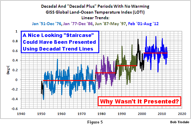
Figure 5
WHAT ARE THEY HIDING?
In a press conference or debate, whenever a candidate uses misdirection in response to a question, the press grasps hold of it immediately and belittles the candidate. Why isn’t the mainstream media doing that with climate scientists, John?
Look at the break points in Figures 4 and 5. There’s one in 1976 that corresponds to the Great Pacific Climate Shift of 1976. That natural phenomenon effectively shifted the surface temperature of the entire Eastern Pacific Ocean (about 33% of the surface area of the global oceans) up about 0.17 deg C. In Figure 5, you can see its impact very clearly now that you know it exists. The Great Pacific Climate Shift also refers to the change in the basic state of the ocean processes taking place in the tropical Pacific. After 1976, El Niño events dominated, but for the period from the early-1940s to 1976, El Niños and La Niñas were more evenly matched, with La Niñas just a little bit stronger.
Looking again at Figure 5, there are two more break points. They occurred at 1987 and 1997, both of which correspond to the monstrous, but naturally occurring, El Niño events of 1986/87/88 and 1997/98.
If you’re concerned about the influence of greenhouse gases on El Niño and La Niña, refer to recent paper by Ray & Giese (2012) titled Historical changes in El Niño and La Niña characteristics in an ocean reanalysis. The abstract ends:
Overall, there is no evidence that there are changes in the strength, frequency, duration, location or direction of propagation of El Niño and La Niña anomalies caused by global warming during the period from 1871 to 2008.
I’m sure you remember all the hubbub back in the late 1990s about El Niño, John. There were the nonstop cartoons in newspapers blaming everything under the sun on El Niño and La Niña events—and rightly so. They are the largest naturally occurring weather phenomenon Mother Nature has devised. Sea levels in parts of the eastern tropical Pacific temporarily rose approximately 33 cm (about 1 foot) and warmed in places almost 5 Deg C (9 Deg F) during the El Niño of 1997/98—all the result of a huge volume of warm water that was created naturally during the 1995/96 La Niña and then shifted east almost halfway around the globe by that El Nino. All of that warm water, much of it now on the surface, released a tremendous amount of moisture through evaporation into the atmosphere. Weather patterns changed for years after that El Niño. The topic of El Niño was so popular at that time Chris Farley played the character El Niño in an October 25, 1997 NBC Saturday Night Live sketch. (A copy of the script is here and a YouTube copy of a portion of the sketch is here.)
El Niño was such an important topic of discussion in the late 1990s that the National Oceanographic and Atmospheric Administration (NOAA) created a number of websites about them. Refer to an example called The ENSO Cycle. The El Niño-based webpage contains the link to one titled Climate variability. See the screen capture here. Note the photos—what some would now call climate catastrophes. In the late 1990s, weather events were responses to Mother Nature’s handiwork. A few years later, climate scientists must have become tired of being upstaged by her, so those alarmist scientists took possession of weather and began blaming thunderstorms, beach erosion, wildfires, floods, drought, snowfall, hurricanes, tornadoes, you name it, on greenhouse gases.
That nonsense is running amok now. Sea surface temperatures along Hurricane Sandy’s track haven’t warmed in 70+ years; in fact, they’ve cooled in the extratropical portion; yet alarmists had the gall to blame Sandy on manmade global warming.
Back to Figure 5: Those break points and upward shifts in Figure 5 do have natural causes and they make themselves known very well with the 10-year trends. One might assume the climate scientists were trying to hide those naturally caused upward shifts when they avoided using decadal periods in the escalator graphic. The following heading indicates what they were hiding.
THE DATA INDICATES THE OCEANS WARMED NATURALLY
You may find that hard to believe, John, but read on. It’s blatantly obvious. There’s no need for statistics. No need for models. Anyone who can read a graph can see it.
A little bit more about my background: I am the independent researcher who—fortunately or unfortunately, depending on your viewpoint—discovered there is no evidence of a manmade warming component in satellite-era sea surface temperature data or in ocean heat content data, the latter of which relies on ocean temperature measurements to depths of 700 meters (about 2300 feet). More specifically, while the global oceans have warmed, the data indicates they warmed naturally; that is, there is no indication that greenhouse gases played any part in the ocean warming.
That’s not surprising. Infrared radiation from manmade greenhouse gases can only penetrate the top few millimeters of the ocean–at the skin where evaporation takes place. Based on the following data presentation and discussion, it appears as though the additional infrared radiation must simply evaporate a little more water from the surface. Further, because the vast majority of the warming of global land surface air temperature is in response to the natural warming of the global oceans, there is very little overall impact of greenhouse gases on land surface air temperatures as well.
The following is a short version of my standard presentation about the natural warming of the global oceans. I’ve added a few new graphs and discussions here to shorten it.
Figure 6 is a graph of the sea surface temperature anomalies for the global oceans during the satellite era, which started in November 1981. This sea surface temperature dataset from NOAA is called the Reynolds Optimum Interpolation sea surface temperature dataset, version 2, a.k.a. Reynolds OI.v2. It’s used by GISS in their Land-Ocean Temperature Index data. In a 2004 peer-reviewed paper, Smith and Reynolds called this sea surface temperature dataset “a good estimate of the truth.” (See page 10 of the paper.) It’s the best sea surface temperature dataset that’s available. It shows the sea surface temperatures of the global oceans warmed about 0.26 deg C or 0.47 deg F over the past 30 years. That’s a period the climate models employed by the IPCC say only greenhouse gases can explain the warming. The data contradicts them. And it’s so obvious you’ll wonder how they’ve overlooked this. Maybe they haven’t. Maybe the IPCC has elected not to be forthcoming about it.

Figure 6
Let’s divide the global oceans into two logical subsets: the East Pacific Ocean and the Rest of the World, which is made up of the Atlantic, Indian, and West Pacific Oceans. (Click here for a map.) There’s a very good reason we’re isolating the East Pacific from the Rest-of-the-World. The East Pacific acts as the temporary home of the warm water released from below the surface of the western tropical Pacific during an El Niño. That naturally created warm water sloshes into the eastern tropical Pacific, spreading across the surface during an El Niño, and it sloshes back to the west at its end, where it remains on the surface. Therefore, if the effects of anthropogenic greenhouse gases were to show themselves anywhere in the surface temperatures of the global oceans, it should be in the data of the East Pacific Ocean. In fact, the climate models used by the Intergovernmental Panel on Climate Change (IPCC) say, if the ocean surfaces were warmed by manmade greenhouse gases, the East Pacific data should have warmed about 0.42 to 0.44 deg C over the past 30 years. (Graph of climate model outputs for the East Pacific here.)
Figure 7 is a graph of the measured sea surface temperatures for the East Pacific Ocean, reaching from pole to pole and from the dateline to the Isthmus of Panama (90S-90N, 180-80W). What do you see in that graph, John?
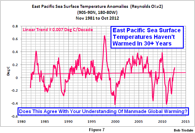
Figure 7
The large upward spikes are caused by El Niño events and downward ones are caused by La Niña events. (In case you’d like to confirm that, click here for a graph that compares the East Pacific data to a commonly used index for the strength, frequency and duration of El Niño and La Niña events. The East Pacific sea surface temperature anomalies mimic the variations in the El Niño/La Niña index. ) Notice the linear trend in Figure 7. It’s a miniscule 0.007 deg C/decade. Basically, the sea surface temperature anomalies of the East Pacific have not warmed in 31 years. That data represents about 1/3 of the surface of the global oceans. It’s not a small portion. Further, if we were to correct that dataset for the biases caused by the cooling that took place in response to the explosive volcanic eruptions of El Chichon in 1982 and Mount Pinatubo in 1991, the sea surface temperatures for the East Pacific Ocean would show cooling for the past 30 years. Does that agree with your understanding of global warming? The IPCC’s climate models say the surface of this part of the global oceans should have warmed 0.42 to 0.44 deg C or about 0.7 to 0.8 deg F. Maybe your understanding of global warming is based on the models, not the data. One might guess that’s true for many people.
Figure 8 is a graph of the sea surface temperature anomalies for the Rest of the World—the Atlantic, Indian and West Pacific oceans. The coordinates are 90S-90N, 80W-180. This dataset cover about 67% of the surface area of the global oceans. The responses of this dataset to the very strong El Niño events of 1982/83, 1986/87/88, 1997/98 and 2009/10 are highlighted in red. The dip and rebound starting in the early 1990s was caused by the colossal eruption of Mount Pinatubo in 1991, and the eruption of Mexico’s El Chichon in 1982 counteracted the response of the Rest-of-the-World data to the 1982/83 El Niño. Other than that, what do you see in the graph, John?

Figure 8
What I see: the only times the sea surface temperatures warmed was during the major El Niño events. Or looking at it in another way, the sea surface temperatures did not warm between those El Niño events. We can confirm that by removing the upward shifts in the data caused by the highlighted El Niño events and replace that data with flat lines. See Figure 9. Without those El Niño events, the Rest of the World sea surface temperatures would not have warmed in over 3 decades. Is that your understanding of global warming, that the warming of sea surface temperatures occurs only during El Niños?

Figure 9
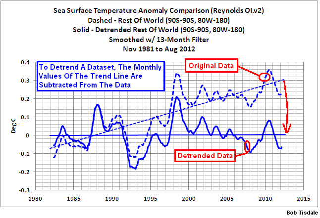
The question now: Why do the sea surface temperatures warm for this part of the globe? The answer can be seen if we remove the trend of the sea surface temperature data for the Rest of the World. (Here’s a graph that illustrates and describes detrending.) In Figure 10, I’ve compared the detrended Rest-of-the-World data to a scaled version of the dataset that represents the frequency, magnitude and duration of El Niño and La Niña events. The first and third major divergences between the two datasets are caused by the response (cooling) of the sea surface temperatures to the eruptions of El Chichon and Mount Pinatubo. The second and fourth divergences are different. The Rest-of-the-World data remains warmer than the scaled ENSO index; in other words, the Rest-of-the-World data does not cool proportionally during the La Niña events that followed the major El Niños of 1986/87/88 and 1997/98. We can see the Rest-of-the-World sea surface temperature anomalies warmed in response to the 1986/87/88 and 1997/98 El Ninos, but they did not cool fully during the 1988/89 and 1998-2001 La Niñas. Is that your understanding of how El Niño and La Niña events work?

Figure 10
Because there’s no warming without the El Niño events, Figure 8, one might also assume the sea surface temperatures for the Rest-of-the-World subset would show no warming if that dataset cooled proportionally during those anomalous La Niñas. That is, if the Rest-of-the-World sea surface temperature data cooled proportionally during the La Niña events, they would also show no long-term warming similar to the East Pacific Ocean in Figure7.
Back to my last question, which was: Is that your understanding of how El Niño and La Niña events work? We’ve been told for years that global temperatures warm during El Niños and that they cool during La Niñas. In reality, only about 33% of the global oceans respond that way. Some climate scientists—those who have become nothing more than climate activists—represent that La Niñas oppose El Niños and that their impacts on global temperatures are proportional. That’s why they treat El Niños and La Niñas as noise and attempt to remove their effects through statistical analyses. An example of this misrepresentation of El Niño and La Niña is the peer-reviewed paper Foster and Rahmstorf (2011). There are many more papers that misrepresent El Niño and La Niña, including the IPCC’s upcoming 5th Assessment Report.
In reality, based on the processes that govern La Niña and El Niño events, and based on the instrument temperature record, those processes are best viewed as a recharge-discharge oscillator, not simply as cyclical warming and cooling in the eastern tropical Pacific. The recharge-discharge oscillator process was proposed in the 1997 paper “An Equatorial Ocean Recharge Paradigm for ENSO”, Part I and Part II, authored by Fei-Fei Jin. It was subsequently incorporated into the unified ENSO oscillator theory discussed in Chunzai Wang’s 2001 paper On ENSO Mechanisms. Looking at El Niño and La Niña as a recharge-discharge oscillator is nothing new, but it took a blogger to show its impacts on global surface temperatures.
A brief overview of how La Niña and El Niño relate to a recharge-discharge oscillator: During La Niñas, tropical Pacific trade winds are stronger than normal. This pushes aside cloud cover and allows more sunlight to enter and warm the tropical Pacific to depths of about 100 meters—with the majority of the warming taking place closer to the surface. Trade wind-driven ocean currents carry the sun-warmed water to the west where it pools to depths of 300 meters (about 1000 feet) in an area of the western tropical Pacific appropriately called the west Pacific Warm Pool. That’s the simple explanation of the recharge phase. El Niños, the discharge phase, release that warm from below the surface of the west Pacific Warm Pool and spread it across the surface of the eastern tropical Pacific. With that warm water covering more of the surface, more heat than normal is discharged into the atmosphere through evaporation. The El Niño does not consume all of the warm water. After the El Niño, the leftover warm water is redistributed from the tropical Pacific. The divergences during the 1988/89 and 1998-01 La Niñas shown in Figure 10 are caused by the warm water that’s left over after the major El Niño events that preceded them. That’s why the El Niño events of 1986/87/88 and 1997/98 appear to create the upward shifts in the sea surface temperatures for the Atlantic, Indian and West Pacific Oceans (the Rest-of-the-World data in Figure 8).
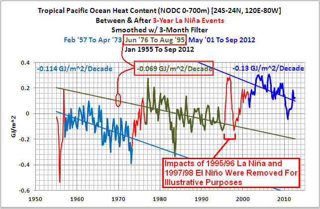
The recharge and discharge phases are visible in the Ocean Heat Content data for the tropical Pacific (24S-24N, 120E-80W), Figure 11. This dataset was created and is maintained by the National Oceanographic Data Center (NODC), a division of NOAA. The data begins in 1955. The dataset is composed primarily of temperature measurements to depths of 700 meters, or about 2300 feet. Because salinity measurements are also used to calculate ocean heat content, the dataset is presented in Joules. In the following graphs, the units are Gigajoules per square meter (GJ/m^2). There are 3 periods highlighted in red in Figure 11. Those are the 3-year La Niña events that served as the primary sources of warm water for the numerous El Niños that followed them. The lesser La Niña events that trailed individual El Niños are not identified. Notice how the Ocean Heat Content for the tropical Pacific cools between the 3-year La Niñas. This indicates the lesser La Niña events that trailed the El Niños typically only recharge some, but not all, of the warm water discharged and redistributed by the El Niños.

Figure 11
Also note the upward spike in the late 1990s. The leading edge, the warming, is the tropical Pacific’s response to the 1995/96 La Niña. That La Niña was relatively weak by most standards. There were, however, very strong trade winds in the western tropical Pacific that caused that build-up of heat (by reducing cloud cover and allowing more sunlight to warm the tropical Pacific to depth). See McPhaden 1999 The Evolution of the 1997/98 El Niño. The freakish 1995/96 La Niña created the warm water for the 1997/98 El Niño, which in turn caused the sea surface temperatures of the Atlantic, Indian and West Pacific oceans to shift upwards approximately 0.19 deg C (Refer to the period-average sea surface temperatures for the Rest-of-the-World here). The 1995/96 La Niña, effectively, also caused an upward shift in the ocean heat content for the tropical Pacific, which means it skewed the trend line for the middle period in Figure 11. Click here for a graph that shows how strongly the ocean heat content of the tropical cooled between the 1973-76 La Niña and the 1995/96 La Niña. Does that graph, with the multidecadal cooling periods, agree with your understanding of the warming of the global oceans, John?
It’s difficult to claim that manmade greenhouse gases had any impact on the Ocean Heat Content of the tropical Pacific when it cools for multidecadal periods between major La Niña events.
That same problem with the hypothesis of manmade global warming exists in the ocean heat content data for the North Pacific, north of the tropics (24N-65N, 120E-80W). See Figure 12. For it, I’ve isolated and highlighted in red an upward shift in ocean heat content that occurred in 1989 and 1990. Before that shift, the ocean heat content for the North Pacific cooled at a significant rate. Obviously, there’s no visible impact of greenhouse gases during that period. After the shift, it warmed. Notice how the cooling and warming rates before and after the shift are basically the same. The cooling period lasts longer than the warming period, and that means, if the effects of the upward shift in 1989 and 1990 were removed from the data, the ocean heat content for the North Pacific would cool over the entire term.

Figure 12
If you’re wondering, it’s very easy for Mother Nature to create a 2-year shift in ocean heat content like the one shown in Figure 12. Before the shift, the North Pacific was losing heat faster than it was gaining it. That’s pretty obvious. That likely indicates the wind patterns there were allowing warm water to be carried poleward from the tropics, where it could be released to the atmosphere and space more readily, and that the rate of transport was such that the heat released was greater than the amount of warm water being supplied from the tropics. Then in 1989 and 1990 there was a change in wind patterns that resisted that poleward transport and the warm water from the tropics simply backed up and accumulated. That’s all it would take. Curiously, even though this dataset has been available for a number of years, I have yet to find a scientific paper that addresses that obvious climate shift in the ocean heat content of the North Pacific.
Is that your understanding of manmade global warming, John? That the warming of the ocean heat content for the tropical Pacific relies on naturally occurring La Niña events? That it relies on a freak of nature, a weather event, like the 1995/96 La Niña? That the warming of ocean heat content for the North Pacific relies on an upward shift during a 2-year window in order to show warming? My guess: that’s not you understanding of manmade global warming. My guess is that you’ve only seen graphs of the relatively continuous warming—one presented by climate scientists using GLOBAL ocean heat content.
We’ve seen in Figures 11 and 12 how the ocean heat content for the tropical Pacific and for the North Pacific, north of the tropics, do not confirm the existence of a manmade global warming signal. Watch what happens when we combine those two datasets. The ocean heat content for the Pacific Ocean north of 24S (24S-65N, 120E-80E) is compared to ocean heat content for the global oceans in Figure 13. Now the data seems to support the global warming hypothesis. The Pacific subset is much more volatile, but it follows the same basic long-term variations. The Pacific data has a slightly lower long-term trend than the global data, but that difference is caused by the extra natural variability of the North Atlantic.

Figure 13
All in all, the ocean heat content data for the Pacific Ocean north of 24S (Figure 13) gives the misleading impression of relatively continuous warming—and seems to confirm the existence of manmade global warming. On the other hand, when we break the Pacific data down into two logical subsets (Figures 11 & 12), the data contradicts the hypothesis of manmade global warming.
The hypothesis of manmade global warming is, therefore, fatally flawed. It was built on a poor foundation. It is not supported by ocean heat content data (Figures 11 and 12) and it is not supported by sea surface temperature data (Figures 7 to 10). Is your understanding of global warming based on data or climate models?
ADDITIONAL INFORMATION
I’ve been presenting the long-term effects of El Niño and La Niña events in scores of blog posts over the past 4 years, and as noted in the introduction, many of those blog posts have also appeared at the world’s most-viewed website on global warming and climate change, WattsUpWithThat. Tens of thousands of people have read them and are aware of the basic flaws in the hypothesis of manmade global warming. I’ve explained, illustrated, animated and documented with data the processes of El Niño and La Niña events—and their impacts on the long-term warming of the global oceans. I’ve also been presenting the ocean heat content for the tropical Pacific and the North Pacific north of the tropics ever since the Royal Netherlands Meteorological Institute added the NODC’s dataset to their KNMI Climate Explorer more than 3 years ago.
Recently, I created 2-part video series that explains, on a very basic level, the dynamics of El Niño and La Niña and their long-term effects. The videos are titled The Natural Warming of the Global Oceans. Part 1 appeared on the 24-hour WattsUpWithThat television (WUWT-TV) marathon. That video covers the basic processes of El Niño and La Niña events, the natural warming of sea surface temperatures during the satellite era, and the natural warming of the ocean heat content data for the tropical Pacific. Part 2 presents the problems with the ocean heat content data and it also presents the natural factors that contribute to the warming of that dataset outside of the tropical Pacific. If you’d like a more detailed discussion, I also recently published the ebook Who Turned on the Heat? – The Unsuspected Global Warming Culprit, El Niño-Southern Oscillation. It was introduced in my blog post Everything You Ever Wanted to Know about El Niño and La Niña…
I’d be happy to send you a link to a copy of my book, John, but if you’d prefer to buy a copy—it’s only $8.00US—you can do so here. (Credit and debit cards accepted through the PayPal site. If you don’t have or want to open a PayPal account, simply scroll down past that portion.)
SOURCES
Anyone with internet access and spreadsheet software can confirm what’s presented in this post. The Reynolds OI.v2 sea surface temperature data presented herein is available through the NOAA NOMADS website. The NODC ocean heat content data for 0-700 meters is available through the KNMI Climate Explorer. That website also includes the Reynolds OI.v2 data in an easier-to-use format. The GISS, UK Met Office/Hadley Centre and NCDC land-plus-sea surface temperature data are also available through the KNMI Climate Explorer, or through their respective websites: here for GISS, here for UK Met Office, and here for NCDC.
CLOSING
This memo briefly introduced a significant problem with the climate science community. Instead of providing objective answers, they often give misleading ones or offer replies intended to misdirect. The climate scientists who have taken on the roles of alarmists and activists rely on the public’s inherent trust in them. The public depends on climate scientists for the truth, but what they often get in return is much less than that. In order to perpetuate the faulty hypothesis of manmade global warming, the scientists/activists also rely on the simple fact that the public does not have the time, inclination or background to verify the accuracy of what they’re being told. Enter climate skeptics with data. The proponents of anthropogenic global warming then respond with excuses, misdirection, redirection and outright falsehoods—and when they’re really desperate, they rely on name calling.
You may view the escalator discussion as trivial. It’s not worth arguing about. It served as the introduction to the major problem with the manmade global warming hypothesis and that was, the hypothesis doesn’t work for sea surface temperature and ocean heat content data.
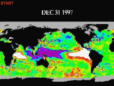
I have to ask you something. Were you aware the satellite-era sea surface temperature data and the ocean heat content data do not support the hypothesis of manmade global warming, John? I’ve been discussing this for 3 to 4 years. What I’ve presented is blatantly obvious. Anyone who can read a graph can see it. And if you were to take a couple of minutes you can watch an animation of global sea surface temperature anomaly maps with an infilling graph to its right and see the sea surface temperatures shift upwards in response to the warm water that’s left over from the 1997/98 El Niño. If you’re still skeptical of the existence of warm water left over after an El Niño, you can watch a small portion of a video from JPL that illustrates sea level residuals—more satellite-based data—which I’ve converted into a gif animation. It shows a portion of that leftover warm water. It’s also very difficult to miss. Quite plainly, you can see a huge volume of warm water being returned to the western tropical Pacific at the end of the 1997/98 El Niño. Watch what happens when that phenomenon called a slow-moving Rossby wave reaches Indonesia. It’s like a secondary El Niño event taking place in the western tropical Pacific, but it’s happening during the La Niña. All of that leftover warm water counteracts the effects of the La Niña throughout the globe. It causes the divergences during the La Niñas that follow the major El Niño events (Figure 10). The YouTube edition of the full animation from JPL is here.
Someday, the mainstream media will examine the instrument temperature record in logical subsets as I have done and they’ll understand the significance. They’ll then ask climate scientists about the conflicts with the hypothesis of manmade global warming and realize the answers they’re getting are excuses, misdirection, redirection and outright fabrications. There are blatantly obvious conflicts between the ocean temperature data and the hypothesis of manmade global warming, John. If, for political reasons, you’d prefer not to report on these conflicts, please email your associates who you believe might be willing to address them.
If you have any questions, feel free to ask them at my blog. If you would prefer that I not post your questions, I could then reply to you via email. While you’re at my blog, have a look around. I’m sure you’ll find the comparisons of climate model outputs and measured temperature data very enlightening. Refer to the posts here, here, here and here. The climate models used by the IPCC show no skill at being able reproduce the global temperatures of the past. Why would anyone believe their projections of future climate are credible?
Last, if you’re wondering, I’m not supported financially by any industry. My funding comes solely from book sales and from rare donations/tips through PayPal, both of which are much appreciated.
Sincerely,
Bob Tisdale
Wonderful.
Hockenberry’s presentation was about as fair as baseball’s 1919 World Series.
Mr. Tisdale: I commend you for a great piece of work. I think SS should pick this up and post it as well so that more folks can be informed.
Global redistribution, regional events compounded in a probabalistic manner, to give a non-regular quasi cyclic appearance of a pattern.
Local cycles layered onto a non-similar larger trend or period of additivive-subtractive changing events of somewhat chaotic cyclicitiy.
I feel as if I’m searching for terms to describe chaotic cloud shapes to those determined to find rigid, repeating patterns. Deterministic terms to described stochastically defined events.
The end point hasn’t been selectively “picked.” It’s NOW.
(Mencken said, “We are here and it is now. Beyond that, all human knowledge is moonshine.”)
Thanks, Anthony.
Nice work.
Dessler published a correlation coefficient of 0.02 in Science – this was an impressive achievement even in the crooked world of climatology.
Gail Combs, in this post Bob provides the charts that I once saw quite a few years ago that inclined me to believe that the Arctic ice would be declining due to the effects of a warmer Gulf Stream. These kinds of charts are easier to fathom than the ones from Vukcevic, which are good no less.
Well done Bob Tisdale.
You should ask for equal time, to present to their audience, how the real world actually works.
See if they are willing to present your information, with no rebuttal from opposing views, as they did with their “Climate of Doubt” program.
After you ask him for equal time, I hope you post the response on this web site.
Good work, and thanks again.
During La Niñas, tropical Pacific trade winds are stronger than normal. This pushes aside cloud cover and allows more sunlight to enter and warm the tropical Pacific to depths of about 100 meters—with the majority of the warming taking place closer to the surface. Trade wind-driven ocean currents carry the sun-warmed water to the west where it pools to depths of 300 meters (about 1000 feet) in an area of the western tropical Pacific appropriately called the west Pacific Warm Pool. That’s the simple explanation of the recharge phase. El Niños, the discharge phase, release that warm from below the surface of the west Pacific Warm Pool and spread it across the surface of the eastern tropical Pacific. With that warm water covering more of the surface, more heat than normal is discharged into the atmosphere through evaporation.
Any idea what causes the trade winds to be stronger than normal? I’d imagine that it is the usual sort of oscillation that you get with high dimensional non-linear dissipative systems, but that is a classification that does not elucidate any of the mechanisms in the La Niñas.
What initiates the El Niños?
Why do the El Niños occur when the surface temp is at a high region in its oscillation and the La Niñas occur during the low regions in the oscillation?
Spectacular! I only hope Hockenberry actually reads this.
I can’t help but think that Gavin Schmidt meant to say that in any 10 year period there will be at least a couple of years of cooling. He did not say that, nor do the remarks of Dressler and Hockenberry provide clarification.
Perhaps things might be clearer if it were known where the idea for the escalator chart came from (was Gavin the source of the idea?). Anyway, as the transcript shows Fred Singer was correct and the others seem to be confused, perhaps because they are.
I like this part of Bob T’s summary:
“You may view the escalator discussion as trivial. It’s not worth arguing about. It served as the introduction to the major problem with the manmade global warming hypothesis and that was, the hypothesis doesn’t work for sea surface temperature and ocean heat content data.”
The data do not support the hypothesis. The hypothesis is wrong.
So either CO2 only randomly turns on for eighteen month periods then turns back off for four to twelve years or it has NOTHING to do with driving atmospheric temperatures.
“there’s no such thing as an ‘urban heat island'”
“the weather stations are accurate”
“only carbon dioxide variations can affect tree ring growth”
“greenhouse effect”
We’ve buried these lies, keep beating the undead stupidity of AGW with the shovel. and we’ll find its unnatural driving force and bury it too.
Bob, I agree with all of the above accolades. HOWEVER (You knew there was an “however” coming, didn’t you, Bob). I have concerns about the tone.
I think we are at a tipping point, but the inertia is on the other side. If we are to prevail, we need to convert a select few voices in the MSM, using incontrovertible facts. Hockenberry appears to be a scientifically literate, albeit brainwashed, commentator. You understand that, don’t you Bob?
Your post was obviously aimed at a sophisticated WUWT audience (and not the addressee in your memo), but the patronizing tone probably made an “enemy for life” of Mr Hockenberry, who, I would assume as science editor, influences opinions of others on PBS. (I know, I also believe in the tooth fairy.) But you knew that, didn’t you Bob?
Please take this comment in the spirit in which it was intended, including forgiveness for the obvious parody of your memo.) If you were pissed at me, I made my point.
I continue to be humble before your expertise. Please keep up the good fight.
Not that unnatural, this greed shown by the greedy green cult.
In my personal lexicon, a “Hockenberry” equates to a meadow muffin, and has for many years.
Thank you, Bob, for a thorough and polite refutation of another PBS lie. An effort which frankly is beyond both my patience and technical expertise.
Matthew R Marler says:
December 14, 2012 at 6:03 pm
“Any idea what causes . . . ”
Maybe if some of the money directed at CO2 could be used to investigate your questions progress could be made. Bob T will tell you that he looks at and presents data. Others have not ignored your questions. Maybe they need lots more data and help understanding it. Stephen Wilde provides an example of this sort, constantly adjusting his thoughts and improving the written description thereof but without data and documented mechanisms. Maybe that’s a bit too strongly worded – have a look at the link here starting at about page 5 or 7:
http://climaterealists.com/attachments/ftp/ANewAndEffectiveClimateModel.pdf
Note that this document has no published date but claims creation on 4/7/2010. No data. No graphs. No maps. Still he claims “So I suggest that a degree of predictive skill is already apparent for my NCM.” [NCM = New Climate Model]
This link to Stephen Wilde’s NCM is in E. M. Smith’s recent post:
http://chiefio.wordpress.com/2012/12/12/tropopause-rules/
Search ‘chiefio’ for related posts.
Here is a link to an Excel 2003 GISS v3 chart that I just finished. It has a linear regression (red) that starts 2001/01 and ends 2012/10. The start point can be changed with a spinner. The end point sets itself to whatever the latest month is in the GISS record. There is a second spinner that moves a regression (green) of the same length as the first across the GISS data record showing. It makes more sense once you see the chart.
http://www.mediafire.com/view/?vxfh6umrsjh3qax
I can easily provide a chart where both ends of the red regression are adjustable with spinners if that would be useful. The length of the green regression is always the same as the red for comparison.
Great presentation and very informative; thanks so much Bob!
“In fact, you could take the entire climate history that we have in the instrumental record and you could find cooling trends every 10 years. — GAVIN SCHMIDT
=====
I’m not trying to defend Gavin Schmidt, but Bob seems to understand his statement differently than I do. I understand him to be saying that you could take any 10-year period and find a downward trend (relative cooling) in some part of that period. Bob seems to think he is saying that in any 10-year period there will be a set of temperatures that fall below the long term average temperature. Figure 3 shows a 24-year period that Bob labeled as “No Decadal Cooling.” During that period there are no temperatures that fall below the zero line, but there are several downward trends.
When Gavin says “cooling trends,” I think he is just referring to downward trends. Let’s say I bring cool tap water to a boil and then turn off the stove. After a few minutes wouldn’t it be correct to say that the water is experiencing a “cooling trend” even though it is still quite hot? I can’t say the water is “cool,” but I can say it is experiencing a cooling trend. It would help to find out what people mean before trying to argue against them.
This is one hell of a good job or putting things in some kind of rational order.
Louis says: “Bob seems to think he is saying that in any 10-year period there will be a set of temperatures that fall below the long term average temperature.”
Nope. Read the description of Figure 3 again please.
Louis says: “Figure 3 shows a 24-year period that Bob labeled as ‘No Decadal Cooling.’ During that period there are no temperatures that fall below the zero line, but there are several downward trends.”
The second sentence here is wrong. The units in Figure 3 are Deg C/Decade, not Deg C. Your second sentence should read, During that period there are no 120-month periods with cooling trends.
George Daddis says: “…but the patronizing tone probably made an ‘enemy for life’ of Mr Hockenberry…”
I was trying for a conversational tone. Sorry that it appears patronizing to you.
Rufus says: “I only hope Hockenberry actually reads this.”
I hope he does also. I emailed a link to Fred Singer with hope that Fred had John Hockenberry’s email address. I asked Fred to forward the link.
John F. Hultquist says:
December 14, 2012 at 8:14 pm
Thanks John.
It is surprising how far one can get by applying logic to other people’s data and charts.
As regards ENSO I know that Bob prefers not to go beyond the data that he can analyse but I am inclined to go outside that box and try to fit Bob’s fine work into the wider scenario and I see from some comments here and in previous threads from Bob that many are hungry to see that process engaged.
I’ll make two points here that I think help to integrate Bob’s date with the longer term climate scenario.
i) ENSO started in the first place because the clouds of the Inter Tropical Convergence Zone are on average north of the equator. Consequently there is an imbalance of solar input to the oceans either side of the equator. Over time, that imbalance builds up and is periodically discharged in the manner described so well by Bob.
ii) In the background are solar induced effects which operate on the timescale of the major climate oscillations such as MWP. LIA and the recent warming. Above and beyond the 60 year periods of Pacific Multidecadal Oscillation (not PDO) the level of solar activity alters climate zone positioning so that an active sun widens the subtropical high pressure belts and an inactive sun narrows them. The cause is a change in the vertical temperature profile of the atmosphere especially above the poles in response to solar induced compositional changes in the upper atmosphere. Probably involving ozone mostly.
Widened subtropical high pressure belts at a time of more active sun allow more solar energy to enter the oceans with a warming effect which skews ENSO in favour of warming El Nino events relative to cooling La Nina events.
The opposite happens when the sun is quiet as now.
Matthew R Marler says: “Any idea what causes the trade winds to be stronger than normal? I’d imagine that it is the usual sort of oscillation that you get with high dimensional non-linear dissipative systems, but that is a classification that does not elucidate any of the mechanisms in the La Niñas.”
In the tropical Pacific, the trade winds and sea surface temperature gradient (cooler in the east than in the west) are coupled—along with numerous other factors such as cloud cover, downward shortwave radiation, thermocline depth, and so on. The trade winds and temperature gradient reinforce one another. That is, there’s positive feedback (called Bjerknes feedback). To cause the La Nina, one or more of the factors has to overreact—examples: warmer than normal sea surface temperatures (not anomalies) in the west or cooler sea surface temperatures in the east or a combination of both. An upwelling (cool) Kelvin wave (travels from west to east along the equator in the Pacific) is known to cause the end of the El Nino and initiate a La Nina. The IRI website has a somewhat easy-to-understand discussion of the delayed oscillator theory.
http://iri.columbia.edu/climate/ENSO/theory/index.html
I’ve tried to make the introduction to the delayed oscillator theory even less technical in chapter 4.9 of my book.
Matthew R Marler says: “What initiates the El Niños?”
A weakening of the trade winds in the western tropical Pacific initiates an El Niño. The weakening is normally referred to as a westerly wind burst. And there are a number of things that can cause westerly wind bursts: tropical cyclones, a pair of them sometimes straddling the equator, cold surges from the mid-latitudes, and convection associated with the Madden–Julian oscillation (MJO), or a combination of them. To complicate things, there are indications that ENSO can create the background conditions that promote Westerly Wind Bursts. See Yu et al (2003) “Case analysis of a role of ENSO in regulating the generation of westerly wind bursts in the Western Equatorial Pacific”.
http://airsea-www.jpl.nasa.gov/publication/paper/Yu-etal-2003-jgr.pdf
In other words, ENSO has the built-in ability to trigger itself.
Stephen Wilde says: “i) ENSO started in the first place because the clouds of the Inter Tropical Convergence Zone are on average north of the equator.”
ENSO is a product of Bjerknes feedback, while the off-equatorial nature of the ITCZ is a response to the asymmetries of the Central and South American coastlines north and south of the equator and to wind-evaporation-SST (WES) feedback. See:
http://iprc.soest.hawaii.edu/users/xie/ITCZ.html
To confirm your statement, you’d have to prove that Bjerknes feedback would not exist without the asymmetry of the coastlines.
I don’t see any obstacle to a Bjerknes feedback developing as a result of a thermal imbalance between the water temperatures north and south of the equator.
The land / sea distribution involving the coastlines either side of the Pacific is obviously a factor but more important is the simple fact that oceans drive the atmosphere and there is more ocean in the southern hemisphere so the permanent climate features are skewed norhward by the greater thermal capacity of the southern ioceans.
I don’t think it has to be any more complex than that.
Masterful!
In the UK, Channel 4 had a programme recently supporting the man made bad weather meme. I was tempted to contact them in order to point out the errors in the show but to do it thoroughly would have required something twice as long as this post. When you know that they’ve already made their minds up and wont take any notice anyhow, it becomes hard to raise the enthusiasm. Kudos to you for your continuing efforts.
WOW !!!
That post is a mini book !!
Can’t wait to hear what the reply is !!!
Stephen Wilde says: “I don’t see any obstacle to a Bjerknes feedback developing as a result of a thermal imbalance between the water temperatures north and south of the equator.”
Is that a response to my reply, To confirm your statement, you’d have to prove that Bjerknes feedback would not exist without the asymmetry of the coastlines?
Stephen Wilde says: “The land / sea distribution involving the coastlines either side of the Pacific is obviously a factor but more important is the simple fact that oceans drive the atmosphere and there is more ocean in the southern hemisphere so the permanent climate features are skewed norhward by the greater thermal capacity of the southern ioceans.”
We’re talking sea surface temperatures, Stephen. The annual cycle in the sea surface temperatures for the tropical South Pacific are much much greater than the annual variations in the tropical North Pacific.
http://i50.tinypic.com/15cikpz.jpg
The thermal capacity of the South Pacific does not appear to be suppressing the sea surface temperature variations in the tropical South Pacific.
Also, in your attempt to downgrade the coastlines to a lesser effect, are you overlooking where and why the Peru Current becomes the South Equatorial Current, and where and why the California Current becomes the North Equatorial Current? Are you forgetting the normal position of the Pacific equatorial counter current and where it feeds?
The ITCZ exists above the warmest water. I believe you’ll find the warmest water exists in the equatorial counter current.
Regards
Tisdale –> a silly exercise. Hockenberry could not possibly have read past the second page.
Interesting paper, but not for that audience or for that purpose.
Kip Hansen says: “Hockenberry could not possibly have read past the second page.”
That’s okay. My post is only one page long–actually a long single page.
Well done paper, good points – but I’ve come to realize lately that unless you can put it in words that Honey Boo Boo would say, no one in the general public is going to be interested.
PBS has got that part down – “ooh look! Storm! SCARY! AHHHH!!!” That’s the level the “argument” is at now. That’s the level society is at now.
I notice that John Hockenberry still drives a car, and heats and cools his home and uses coal-fired electricity, all of which produce CO2. He must be a climate skeptic like me. What do these alarmists expect anyone to do, live like the Amish? When I see global temperatures really rising and believers living like the Amish, then I will consider living like the Amish too.
I wasn’t aware that you had not sent this directly to Mr Hockenberry Bob so I have just sent it to his twitter feed in hope of a response. @JHockenberry
“The annual cycle in the sea surface temperatures for the tropical South Pacific are much much greater than the annual variations in the tropical North Pacific.”
Of course they are. More sun in and more radiation out due to the clouds of the ITCZ and most of the land masses being north of the equator. I don’t see why you think that invalidates my suggestion.
“The ITCZ exists above the warmest water. I believe you’ll find the warmest water exists in the equatorial counter current. ”
I’m not sure where you are going with that either. The warmth of the southern oceans has to accumulate somewhere and because the southern oceans are larger than the northern oceans it happens that the excess warmth pushes north of the equator in the form of the equatorial counter current.
“The thermal capacity of the South Pacific does not appear to be suppressing the sea surface temperature variations in the tropical South Pacific.”
Didn’t say it would. My point is that having gained excess energy the southern oceans will hold onto it longer than the northern oceans due to thermal inertia but the southern oceans also radiate out to space more due to the clouds of the ITCZ being north of the equator.
So they can hold more total energy than the northern oceans notwithstanding greater variations in surface. temperature.
As for the Bjerknes feedback I do not have to prove a negative. It is quite possible that a portion of such a feedback is dependent on landmass configuration and would be present in any event but it would be substantially enhanced by an initial destabilisation from thermal imbalances in the oceans.
John Bell says:
December 15, 2012 at 7:21 am
“. . . What do these alarmists expect anyone to do, live like the Amish? When I see global temperatures really rising and believers living like the Amish, then I will consider living like the Amish too.”
It has been my understanding that Amish heat their homes and cook with wood or coal. That’s not the “alarmist-way” nor the EPA’s either. Some Amish apparently have accepted the use of solar power/batteries for buggy lights and other battery powered devices. Seems a good idea.
———————-
Note to Matthew R Marler: You asked several important questions and Bob and Stephen (in their own fashion) have responded. Did you get answers to your questions? Partial answers? Some ideas?
Thanks, Bob and Stephen for your contributions, different as the are.
Bob Tisdale: In other words, ENSO has the built-in ability to trigger itself.
Thank you for your replies. I’ll follow the links. With that quote, you go a ways toward substantiating my guess that El Niños are catastrophes, of the dynamical systems sort. it seems to me that you are building a good understanding of how the ENSO works. I read your interchange with Steven Wilde. I’ll reread it.
John F. Hultquist: Maybe if some of the money directed at CO2 could be used to investigate your questions progress could be made.
A great deal of money and labor have been invested in creating and curating the data sets that Bob Tisdale, Williis Eschenbach and others have analyzed. There are a number of data sets that are publicly available for free download, such as the TAO data that Willis has analyzed. Some of these data sets are huge. As you look around in the climate science community you will find a large number of analyses of these data sets, all contributed to the cause of understanding the dynamics of the systems that produce the weather and climate. Even if no one cared a whit about CO2, the progress that results from the ongoing investigations would be slow. As it is, there is a substantial prima facie case that CO2 is important, so it would be remiss to redirect all money and effort away from understanding it.
This brings me to my last question for Bob Tisdale, Steven Wilde and others, a question I have asked a few other people who study the dynamics of weather and climate: Given your understanding of ENSO, El Niños, and La Niñas, what would be the effects on those processes of doubling the concentration of CO2 in the atmosphere? It seems to me that you’d expect slightly greater heat accumulation in the ocean during the La Niñas, and slightly greater transfer of energy to the atmosphere during the El Niños. That is, you’d expect the stair-step increase in temperatures documented in your figure 5. Put differently, you have not demonstrated that there is for sure no CO2 effect, you have presented a mechanism by which CO2-induced global warming has in fact occurred, a dynamic account that complements the equilibrium-based prima facie case that dominates AGW discussion. Notice please that my conjecture does not dispute any of your work, but builds on it.
Matthew R Marler:
In your post at December 15, 2012 at 11:23 am you assert
Say what!?
Which planet are you talking about and what is the “case”?
Despite three decades of world-wide effort costing tens of $billions nobody has managed to find any evidence of any kind to support the “case that CO2 is important” except as plant food.
No evidence; none, zilch, nada.
If you have found some then please report it because the IPCC desperately wants it to compensate for
missing ‘hot spot’
missing ‘committed warming’
missing ‘polar amplification’
missing missing water vapour feedback’
missing ‘Trenberth’s heat’
no global warming for 16 years while atmospheric CO2 rise continues
etc.
Richard
Bob,
I do a lot of Peer Review work in another discipline. Can I make a suggestion.
Your analysis is very detailed and I’m sure that people you might send this to, – well their eyes will have probably glazed over half way through. I have to admit although I have read your book I wasn’t prepared to go in detail what you have written. Life is too busy. This is not because it is not relevant but you really need to provide an Executive Summary at the start of the article. Present the key points to your submission, particularly for such a long article so that the person reading will gain in a short time what the key points are you are making in the document. This is standard procedure for any engineering or scientific report. This applies also to the “letter report” you have submitted.
Cheers.
Matthew, I can’t speak for Bob and he may respond differently but in my opinion a doubling of CO2 would result in an infinitesimal shift in global air circulation which would leave equilibrium temperature unchanged.
Much bigger natural variations occur and I think the stair stepping is the solar effect since the LIA having an effect on each successive 60 ocean cycle.
I would expect to see downward stepping from a quieter sun as from MWP to LIA
Only mass, gravity and insolation can change equilibrium temperature.
Full narrative here:
http://climaterealists.com/index.php
“The Ignoring Of Adiabatic Processes – Big Mistake “
As always a very interesting article with interesting comments.
Not being a ‘climate scientist’ I always try to find ‘the bottom line’ in (very) simple terms.
Would this be correct as a broad analysis (In very simple terms…)?
Activity of the sun + the land-ocean imbalance between the Northern and Southern hemisphere -> ENSO -> Climate
Matthew R Marler says: “Given your understanding of ENSO, El Niños, and La Niñas, what would be the effects on those processes of doubling the concentration of CO2 in the atmosphere?”
I provided a quote in the post from Ray and Giese (2012) in an attempt to counter that thought. They write, “Overall, there is no evidence that there are changes in the strength, frequency, duration, location or direction of propagation of El Niño and La Niña anomalies caused by global warming during the period from 1871 to 2008.”
If there hasn’t been any influence on ENSO in the past 137 years, why would you think a doubling of CO2 would have any influence, Matthew?
Matthew R Marler says: “That is, you’d expect the stair-step increase in temperatures documented in your figure 5.”
You’d expect it? Please link the climate model-based studies that show this effect. If we’d expect it, then the model-based studies most assuredly would have presented it.
Matthew R Marler says: “Put differently, you have not demonstrated that there is for sure no CO2 effect, you have presented a mechanism by which CO2-induced global warming has in fact occurred, a dynamic account that complements the equilibrium-based prima facie case that dominates AGW discussion.”
This is a very curious statement, Matthew. Maybe you’re focusing too much on Figure 5. Did you read beyond it? I suspect not.
The East Pacific hasn’t warmed in 31 years:
http://bobtisdale.files.wordpress.com/2012/12/figure-7-east-pac.png
Please advise how that “complements the equilibrium-based prima facie case that dominates AGW discussion.”
Without the strong El Nino events shown in Figure 8, the sea surface temperatures for the Rest of the World would also show no warming:
http://bobtisdale.files.wordpress.com/2012/12/figure-9-row-b.png
Please advise how that “complements the equilibrium-based prima facie case that dominates AGW discussion.”
The ocean heat content for the tropical Pacific cools between the 3-year La Ninas and the freakish 1995/96 La Nina:
http://bobtisdale.files.wordpress.com/2012/12/trop-pac-ohc-trends-between-3-yr-ln-w-o-1995-96-ln2.png
Please advise how that “complements the equilibrium-based prima facie case that dominates AGW discussion.”
And the Ocean Heat Content of the extratropical North Pacific cools for the first 33 years of the dataset, then shifts upward over a 2-year period. Without that 2-year shift, the ocean heat content of the North Pacific would cool over the term of the data:
http://oi46.tinypic.com/316ogmr.jpg
Please advise how that “complements the equilibrium-based prima facie case that dominates AGW discussion.”
Please also link all of the computer-model based papers that explain how CO2 caused the warming while considering those factors exhibited by the data.
zootcadillac says: “I wasn’t aware that you had not sent this directly to Mr Hockenberry Bob so I have just sent it to his twitter feed in hope of a response. @JHockenberry”
Thanks, zootcadillac.
Stephen Wilde says: “I’m not sure where you are going with that either. The warmth of the southern oceans has to accumulate somewhere and because the southern oceans are larger than the northern oceans it happens that the excess warmth pushes north of the equator in the form of the equatorial counter current.”
What excess warmth in the southern hemisphere oceans? Stephen, here’s the graph I linked earlier. Look at it again. Which sea surface temperature dataset is warmer, the Southern or Northern Tropical Pacific?
http://i50.tinypic.com/15cikpz.jpg
To help, I’ll smooth it with a 12-month filter:
http://i47.tinypic.com/10cnuas.jpg
Are you aware that the sea surface temperatures of the entire South Pacific are cooler than the entire North Pacific? In this graph I’ve limited the southern border of the South Pacific to 60S:
http://i50.tinypic.com/1exaa0.jpg
My guess is you’re not aware the sea surface temperatures are cooler in the South Pacific when you make statements like “…the excess warmth [from the southern oceans] pushes north of the equator…” Once again, your comments appear to be based on speculation, not data. And since you do not have a basic understanding of the sea surface temperatures in the Pacific, one might assume the rest of your speculation is simply that, speculation.
You need to start looking at data, Stephen.
Other_Andy says: “Would this be correct as a broad analysis (In very simple terms…)? Activity of the sun + the land-ocean imbalance between the Northern and Southern hemisphere -> ENSO -> Climate”
Nope. Without sounding rude, can I ask how you came to that conclusion from my post above or from any post I’ve presented about ENSO?
Thank you , Bob.
I accept the data that shows that the Sea Surface Temperatures are lower south of the equator than north of the equator.
But we know that there are less clouds over the southern Pacific because most clouds are along the ITCZ to the north of the equator.
So what happens to the extra solar energy that gets into the southern Pacific ?
First it radiates energy more readily to the cloud free air above which warms in order to push the ITCZ north, second it flows into the equatorial counter current which warms and provokes the convection in the ITCZ and which restricts further radiative loss, thirdly in successive El Nino pulses it transfers to the northern oceans where it backs up somewhat due to the shapes of the continents narrowing the oceanic regions towards the north pole.
So, your observation is not necessarily conclusive.
But I’m open to alternative suggestions.
i) Why do you think the ITCZ is on average north of the equator?
ii) What do you think happens to the extra insolation south of the equator ?
iii) Why do you think the waters under the ITCZ are warmer than elsewhere?
iv) Why do you think the northern Pacific is warmer than the southern Pacific?
Apologies if it is already in your work but if it is then it would be helpful if you could pull it out for easier consideration.
“Activity of the sun + the land-ocean imbalance between the Northern and Southern hemisphere -> ENSO -> Climate.”
That is my opinion in very broad terms rather than Bob’s and I know he regards it as speculation but at least it is logical.
Stephen Wilde, everything you wrote in your December 15, 2012 at 2:52 pm reply is speculation, because you’re not documenting it with data. Right off the get go, the data contradicts you.
Stephen Wilde says: “But we know that there are less clouds over the southern Pacific because most clouds are along the ITCZ to the north of the equator.”
The ICOADS data cloud cover data from 1981 to 2011 says they’re basically the same, with the South Pacific cloud cover actually a little greater:
http://i49.tinypic.com/2r2vgbo.jpg
I’m done countering your speculation with data for this thread, Stephen.
You really should rely on data.
Hi Bob,
Thanks for your reply, you are not sounding rude at all.
As a non-scientist I am trying to make sense of it all so please set me straight if I got the wrong idea…..
In your article you write:
“In the real world, El Niño and La Niña are the greatest sources of ocean heat content variations”
And….
“They are the largest naturally occurring weather phenomenon Mother Nature has devised. Sea levels in parts of the eastern tropical Pacific temporarily rose approximately 33 cm (about 1 foot) and warmed in places almost 5 Deg C (9 Deg F) during the El Niño of 1997/98—all the result of a huge volume of warm water that was created naturally during the 1995/96 La Niña and then shifted east almost halfway around the globe by that El Nino. All of that warm water, much of it now on the surface, released a tremendous amount of moisture through evaporation into the atmosphere. Weather patterns changed for years after that El Niño”
I read it to mean that El Niño and La Niña events are the most important drivers of the weather (Climate) over long periods of time affecting, humidity, atmospheric pressure, wind and precipitation.
My question was, “If so, what drives El Niño and La Niña events?”
After my initial read I thought it was the warming of the water (By the Sun), especially in the Pacific.
You write:
“….the global oceans have warmed, the data indicates they warmed naturally…”
“….while the global oceans have warmed, the data indicates they warmed naturally; that is, there is no indication that greenhouse gases played any part in the ocean warming.”
This idea was strengthened by Stephen Wilde’s comment (December 15, 2012 at 1:29 am and at December 15, 2012 at 8:06 am )
“ENSO started in the first place because the clouds of the Inter Tropical Convergence Zone are on average north of the equator. Consequently there is an imbalance of solar input to the oceans either side of the equator. Over time, that imbalance builds up and is periodically discharged in the manner described so well by Bob.”
From what I understand is that in the Northern Hemisphere there is about twice as much land (Compared with water) as the Southern Hemisphere so to me it makes sense (Wrongly?) that there is more cloud cover in the Northern Hemisphere and an imbalance of solar input to the oceans either side of the equator.
This is where my (Very simple) analysis came from.
Activity of the sun + the land-ocean imbalance between the Northern and Southern hemisphere -> ENSO -> Climate
However, after reading your article again and reading through the comments and your answers (Matthew R Marler and Stephen Wilde) I now see that you are saying that the warming of the ocean is caused by La Niñas and not the other way around and that ENSO has the built-in ability to trigger itself.
“During La Niñas, tropical Pacific trade winds are stronger than normal. This pushes aside cloud cover and allows more sunlight to enter and warm the tropical Pacific to depths of about 100 meters…”
“What I see: the only times the sea surface temperatures warmed was during the major El Niño events. Or looking at it in another way, the sea surface temperatures did not warm between those El Niño events. We can confirm that by removing the upward shifts in the data caused by the highlighted El Niño events and replace that data with flat lines. See Figure 9. Without those El Niño events, the Rest of the World sea surface temperatures would not have warmed in over 3 decades.”
I will read your replies to Matthew and Stephen more carefully and will have a look at the links you provided.
I am not sure I understand how a system can have a built-in ability to trigger itself.
I was under the impression that all weather and climate events had a trigger…
Thanks again for your reply.
They are the largest naturally occurring weather phenomenon Mother Nature has devised.
Could they be influenced by the changes of the solar wind speed? See:
http://snag.gy/UtqpX.jpg
When the wind speed is low such as 1998 and 2010, we had El Ninos, but when the wind speed is high, such as 1989 and 2000, we had La Ninas.
(This is from the following at Dr. Spencer’s site: Ulric Lyons says:
December 14, 2012 at 4:14 PM
El Nino unforced? I don’t think so. Check for the big drops in solar wind speed in 1997 and 2009: http://snag.gy/UtqpX.jpg)
Bob Tisdale: If there hasn’t been any influence on ENSO in the past 137 years, why would you think a doubling of CO2 would have any influence, Matthew?
Because doubling would be a larger change in CO2, and I prefer “might” to “would” to emphasize the doubts. You described a bunch of heat transfer processes; I doubt that the evidence to date rules out the possibility that increased CO2 would alter some of those processes.
As you have asserted, the most reliable evidence dates from the satellite era; what pre-dates the satellites has too much noise, bias and inaccuracy to permit a detection of any CO2 signal of the size generally hypothesized by AGW proponents. Most of that 137 year span is negligible in addressing the question I posed.
Bob Tisdale: The East Pacific hasn’t warmed in 31 years:
Lots of places on Earth have not warmed in 31 years, yet the annual global mean has a stair-step increase. It should be obvious that no one graph has the complete relevant information in it. Somehow, the El Niños and La Niñas have, in your telling, increased the global mean temperature in a stair-step fashion without warming the East Pacific. It seems to me that your analysis is equally valid whether CO2 does or does not have an effect, unless for some reason one assumes the CO2 effect to be uniform throughout the Earth climate system.
La Niña occurs when the wind reduces the cloud cover, to oversimplify; during the parting of the clouds, would a doubled concentration of CO2 cause greater heat accumulation than before? Would a doubling of the CO2 concentration cause a slightly reduced parting of the clouds caused by the winds. How can you tell that a doubling of CO2 does or does not have an effect?
As I read the literature I am impressed by how much data have been collected and how much is known about the basic processes generating the changes in weather. Simultaneously, I am impressed that most of the basic questions about how CO2 would change those processes can’t be answered with the data collected to date. Yet an overwhelming majority of commentators seem confident that the answer is one thing or another.
Other_Andy, thanks for the detailed clarification. Readers have to be careful going through comments, because some who comment here with conjecture only add confusion to already complex discussions.
Matthew R Marler says: “As you have asserted, the most reliable evidence dates from the satellite era; what pre-dates the satellites has too much noise, bias and inaccuracy to permit a detection of any CO2 signal of the size generally hypothesized by AGW proponents. Most of that 137 year span is negligible in addressing the question I posed.”
I believe you have misinterpreted or are misrepresenting what I’ve written, Matthew. Please advise the readers where and when I have ever asserted that “what pre-dates the satellites has too much noise, bias and inaccuracy to permit a detection of any CO2 signal of the size generally hypothesized by AGW proponents. Most of that 137 year span is negligible in addressing the question I posed.”
Are you aware that I’ve published model-data comparisons running back to 1900 that illustrate how pathetically the models perform? I linked samples of them at the end of the post. See here:
http://bobtisdale.wordpress.com/2011/12/09/do-climate-models-confirm-or-contradict-the-hypothesis-of-anthropogenic-global-warming-part-1/
and here:
http://bobtisdale.wordpress.com/2011/12/12/part-2-do-observations-and-climate-models-confirm-or-contradict-the-hypothesis-of-anthropogenic-global-warming/
and here
http://bobtisdale.wordpress.com/2011/04/10/part-1-%e2%80%93-satellite-era-sea-surface-temperature-versus-ipcc-hindcastprojections/
and here:
http://bobtisdale.wordpress.com/2011/04/19/492/
Your last sentence in what I quoted above, “Most of that 137 year span is negligible in addressing the question I posed,” is absurd. The entire climate model-based argument for anthropogenic global warming is based on the last 30 years. Have you ever read the IPCC’s 4th Assessment Report, Matthew? Go to chapter 9:
http://www.ipcc.ch/pdf/assessment-report/ar4/wg1/ar4-wg1-chapter9.pdf
And read the discussion of Figure 9.5. They wrote:
“Figure 9.5 shows that simulations that incorporate anthropogenic forcings, including increasing greenhouse gas concentrations and the effects of aerosols, and that also incorporate natural external forcings provide a consistent explanation of the observed temperature record, whereas simulations that include only natural forcings do not simulate the warming observed over the last three decades.”
That argument is so important to the IPCC that they included it in the Summary for Policymakers.
Without climate models and the erroneous assumptions made by the modelers while programming those models, there is no evidence that CO2 was responsible for the warming of the oceans.
It will be very apparent to those reading this thread that you are twisting the anthropogenic global warming argument to suit your wants.
Let’s go back to your original question, which was: “Given your understanding of ENSO, El Niños, and La Niñas, what would be the effects on those processes of doubling the concentration of CO2 in the atmosphere?”
Based on the fact that NINO3.4 sea surface temperature anomalies have not warmed, and may have cooled, since 1900…
http://oi45.tinypic.com/f28u9w.jpg
…and based on the fact that NINO3.4 sea surface temperature anomalies have cooled over the past 31 years…
http://i48.tinypic.com/4ghxev.jpg
…I’ll state that there is no apparent influence of CO2 on that ENSO index. Any assumptions you’d like to make about a future change in ENSO would not be supported by the temperature record.
“The ICOADS data cloud cover data from 1981 to 2011 says they’re basically the same, with the South Pacific cloud cover actually a little greater:
http://i49.tinypic.com/2r2vgbo.jpg”
Then it has to be a matter of latent energy content in the air above the southern oceans that pushes the ITCZ north of the equator.
More evaporation in the southern hemisphere would cool the water surface but leave more latent heat in the air above the water surface in that hemisphere as compared to the northern hemisphere.
The higher rate of evaporation south of the equator would be unlikely to remove all the extra solar input to the south of the ITCZ which would leave energy to accumulate at greater depth in order to fuel the ENSO cycle.
You data is helping me to narrow down the possibilities but if you had an alternative suggestion I would be interested to hear it.
I share the doubts of others as regards the suggestion that the ENSO process is entirely self inducing and self regulating over thousands of years.
Matthew R Marler, you quoted me, “The East Pacific hasn’t warmed in 31 years.”
And then you wrote. “Lots of places on Earth have not warmed in 31 years, yet the annual global mean has a stair-step increase.”
Show me the areas around the global oceans comparable in size to the East Pacific that have not warmed in 31 years, Matthew. Or if you’d prefer, show me the land surface areas comparable in size to the East Pacific that have not warmed in 31 years. Additionally, I have not presented annual global mean temperature graphs on this thread. Please show the stair-step increases you’re referring to using annual global surface temperature data.
Matthew R Marler says: “La Niña occurs when the wind reduces the cloud cover, to oversimplify; during the parting of the clouds, would a doubled concentration of CO2 cause greater heat accumulation than before? Would a doubling of the CO2 concentration cause a slightly reduced parting of the clouds caused by the winds. How can you tell that a doubling of CO2 does or does not have an effect?”
There is no evidence that the historical rise in CO2 has had any effect on sea surface temperatures or ocean heat content or had any impact on ENSO. In addition, I’ll revise my earlier reply to you: any assumption you’d like to make about a future change in ENSO, sea surface temperatures or ocean heat content would not be supported by the temperature record.
Matthew R Marler says: “Simultaneously, I am impressed that most of the basic questions about how CO2 would change those processes can’t be answered with the data collected to date.”
This is similar to the illogical comment you made earlier, which is contradicted by the IPCC’s failed efforts to use of climate models to simulate the present warming.
I think Bob’s sceptical responses to my suggestions are due to the fact that he compares the Pacific north of the equator with the Pacific south of the equator and in each case only up to a limited distance from the equator.
In contrast I am looking at the global system holistically and comparing the entire northern hemisphere with the entire southern hemisphere.
In that situation it is quite possible for regional data in the north and south Pacific to differ from the net global scenario yet the global scenario still to be correct.
The interplay between regional effects in the areas concerning Bob and the global scenario which I present is yet to be properly investigated.
So I guess Willis would argue that without the bit of extra downwelling from human CO2 the cooling would have been more extreme and the Nino spikes less pronounced?
Bob Tisdale: I have not presented annual global mean temperature graphs on this thread. Please show the stair-step increases you’re referring to using annual global surface temperature data.
I apologize. I seem to have completely misunderstood your figure 5. If you have not written that the earth has warmed recently in response to La NInos and El Ninos, (“Who turned the heat on?”), then I shall have to restudy your work to figure out what you have written. Sorry.
Bob Tisdale: I believe you have misinterpreted or are misrepresenting what I’ve written, Matthew. Please advise the readers where and when I have ever asserted that “what pre-dates the satellites has too much noise, bias and inaccuracy to permit a detection of any CO2 signal of the size generally hypothesized by AGW proponents. Most of that 137 year span is negligible in addressing the question I posed.”
If you assert that the pre-satellite record is as accurate, reliable and unbiased as the satellite record, I’ll take that as your opinion. My opinion is that the pre-satellite era data are too noisy, biased and inaccurate to address the question that I asked.
Stephen Wilde says: “Then it has to be a matter of latent energy content in the air above the southern oceans that pushes the ITCZ north of the equator.”
Stephen, the location of the ITCZ is a much-studied phenomenon, using data, and has to do with the layout of the continental landmasses and coastlines. There should be references in the link I provided earlier.
Stephen Wilde says: “I think Bob’s sceptical responses to my suggestions are due to the fact that he compares the Pacific north of the equator with the Pacific south of the equator and in each case only up to a limited distance from the equator.”
The Pacific ends at 65N, at the Bering Strait. Also, if I had included the Southern Ocean portion of the Pacific (south of 60S) in the temperature graph, the temperature difference would have been greater.
Stephen Wilde says: “In contrast I am looking at the global system holistically and comparing the entire northern hemisphere with the entire southern hemisphere…”
Nice try, Stephen. The specific topics of discussion related to the Pacific, not the globe.
Matthew R Marler says: “I apologize. I seem to have completely misunderstood your figure 5. If you have not written that the earth has warmed recently in response to La NInos and El Ninos, (“Who turned the heat on?”), then I shall have to restudy your work to figure out what you have written. Sorry.”
I presented monthly data in Figure 5, not annual data. The steps appear in Figure 5 due to the specific ending months of the trend periods. The steps may or may not appear with annual data.
Also, the arguments presented in my posts over the past 4 years and in my book “Who Turned on the Heat?” rely on sea surface temperature data and ocean heat content data to describe the causes of the shifts seen in Figure 5, which is why the post continues past Figure 5.
“Stephen, the location of the ITCZ is a much-studied phenomenon, using data, and has to do with the layout of the continental landmasses”
Of course it does. More ocean in the southern hemisphere, more land in the northerrn hemisphere. Greater thermal inertia in the oceans and the ITCZ pushed north of the equator. Obviously some contribution to the exact position from coastline shapes.
That situation then results in more solar energy getting into the southern oceans than the northern oceans. It could not be otherwise.
How that then translates into regional temperature and cloud differences is another matter but simply having the southern ocean surface temperatures lower than the northern ocean temperatures is not conclusive of anything due to the greater evaporation over the southern oceans.
Nor is more clouds over parts of the southern oceans conclusive of anything due to higher air temperatures and hence total water vapour capacity over the southern oceans.
What really matters is the interplay between ocean and air circulations once the imbalance has arisen and as I often say you do a fine job of description within the ENSO region but not of explanation in a wider global context.
So, my hypothesis remains intact for the time being at least.
“Bloke down the pub says:
December 15, 2012 at 4:12 am
In the UK, Channel 4 had a programme recently supporting the man made bad weather meme. I was tempted to contact them in order to point out the errors in the show but to do it thoroughly would have required something twice as long as this post. When you know that they’ve already made their minds up and wont take any notice anyhow, it becomes hard to raise the enthusiasm. Kudos to you for your continuing efforts.”
Saw the same and I did write a rather long rebuttal to Channel 4 but nothing in reply to date except an acknowledgement of the e-mail. I am not holding my breath for any meaningful response.
RES
Nice post Bob, but never interrupt your opponent when they are making a mistake, applies to all of our corrupt media.
Encourage the meme, man made bad weather. Its so asinine that nothing needs to be said.
Its coming down to, point and laugh, the Emperor is old fat and unclean not just naked.
This scam is as old as language, You bad.. storm comes= Give gift I sing and dance and storm go.
Tisdale says a nice looking staircase could have been presented in decades; why wasnt it used?
Umm, are you serious? Because they were making fun of people that choose their data sets to get trend lines. When you are talking about bad science why should you pretend that it’s good? SkS little video has been one of the best tools demonstrating misuse of figures, and is routinely used in stat classes.
trafamadore:
At December 17, 2012 at 9:17 pm your post says in total
The SkS ‘escalator’ is diabolical propaganda. It was thoroughly demolished in the WUWT thread at
http://wattsupwiththat.com/2012/11/25/skeptical-science-misrepresents-their-animation-the-escalator/
It was NOT “making fun”: that excuse was used as a ‘fall-back’ position when the ‘escalator’ was exposed as being fallacious. This ‘change of tack’ is clearly demonstrated in the link by SkS representatives who were attempting to defend their indefensible ‘escalator’ graph.
(Changing the past is common for warmunists. If they can do this
http://jonova.s3.amazonaws.com/graphs/giss/hansen-giss-1940-1980.gif
then claiming an attempted lie was “making fun” is relatively trivial.)
And if that video is being “routinely used in stat classes” then it can only be as an example of “misuse of figures” or as a method to brainwash the young.
Richard
Nice, but it might have been simpler just to point out it doesn’t matter if there are past 10-year cooling periods in the GISS data, because the models didn’t predict this one (but can supposedly hindcast the others).
And GISS is crap anyway, everyone knows that. This is akin to arguing whether a turd tastes better with or without predigested corn in it — better to just rule out eating it at all.
“making fun of people that choose their data sets to get trend lines.”
Oh, the irony doesn’t get much richer than that. Hide the decline!