 Guest post by Bob Tisdale
This is a deviation from my typical presentation of a subdivided dataset. Usually, I divide the dataset in a way that is intended to illustrate how and why natural variables can explain the warming over the term of that data. In this post, I’ve broken it into subsections that allow the data to show behavior that cannot be explained by anthropogenic global warming, and I’m leaving it to the proponents of manmade global warming to explain, through their own data analyses of the five subsets, how those five subsets show continuous and continued warming, when clearly they do not.
Believe it or not, the NODC’s ocean heat content data for the depths of 0-700 meters contain a couple of hockey sticks—that is, no warming for 4 decades and then, presto, there’s warming. One of the datasets is relatively small, but the other is quite large, representing about 39% of the surface area of the global oceans.
FOREWORD
The National Oceanographic Data Center (NODC) Ocean Heat Content data is only available to the public in an easy-to-use format through the KNMI Climate Explorer, where it is available only for the depths of 0-700 meters. The NODC recently released its new dataset for 0-2000 meters but it’s available only to the public in limited subsets and it is smoothed with a 5-year filter, which makes it useless in attribution studies. Regardless, this doesn’t stop proponents of anthropogenic global warming who repeatedly and nonsensically claim only greenhouse gases could have caused the warming and that the warming continues.
We know the NODC’s ocean heat content data for depths of 0-2000 meters are available on a monthly basis because the UKMO uses it in its EN3 ocean heat content dataset. The NODC and UKMO apparently do not want KNMI to provide the public easy-to-use access to UKMO EN3 data (in unadjusted form) because by KNMI removed it from their Climate Explorer only a day or two after my first post that included that data. Refer to the post here.
With that in mind, please don’t ask me why I did not use the NODC ocean heat content for 0-2000 meters in this post. That will save me the time of suggesting to you that you read the post instead of looking only at all the pretty pictures.
USING A GLOBAL DATASET TO REPRESENT GLOBAL WARMING IS MISLEADING
It sounds odd, but it’s true.
By looking at a dataset on a global basis, one can only assume greenhouse gases play a role in the warming. As I’ve noted in numerous previous posts, dividing the dataset into smaller subsets allows the data to present how it truly warmed.
That is, global temperature (and related) metrics show evidence of global warming. These include sea surface temperature, lower troposphere temperature, combined land+sea surface temperature and ocean heat content for depths of 0-700 meters. See Figure 1 for the NODC global ocean heat content anomalies for depths of 0-700 meters. While each of those datasets show warming has occurred, for more than 3 ½ years, I have illustrated and discussed here and in cross posts at WattsUpWithThat how the warming over the last 3 decades can be attributable to natural factors, primarily strong, naturally occurring El Niño and La Niña events. I’ve also published an ebook in pdf form that explains the natural processes that cause the warming. It’s written for those with and without technical backgrounds.

Figure 1
I’ve divided the global oceans into 5 subsets for this presentation. See Figure 2. As noted earlier, I’m taking a change of tack for this post. I’m presenting the data so that it shows how it contradicts the hypothesis (fancy word for guess) of manmade global warming.

Figure 2
But in this post, as also noted earlier, I’m leaving it up to proponents of anthropogenic global warming to explain, based on their data analyses, not climate models, how and why they find evidence of continuous and continued anthropogenic global warming in all 5 of the following subsets.
LOW-TO-MID LATITUDES OF THE NORTH ATLANTIC
The ocean heat content anomalies of the low-to-mid latitudes of the North Atlantic (0-45N, 80W-20E), Figure 3, would be ideal for proponents of anthropogenic global warming if it wasn’t for the fact that it stopped warming in the early 2000s. With its excessive trend (0.215 GJ/m^2 per decade) versus the global trend (0.075 GJ/m^2 per decade), this portion of the North Atlantic exhibits signs of the ocean heat content equivalent of the Atlantic Multidecadal Oscillation, but with this dataset, it has already started to cool.
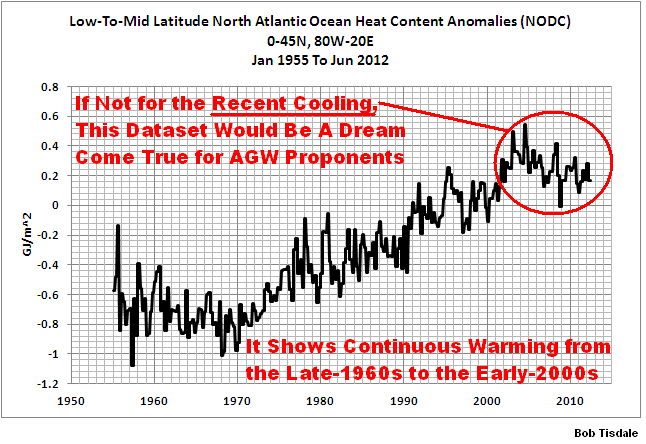
Figure 3
This subset clearly fails to illustrate “continued recent warming”.
NORTHERN NORTH ATLANTIC
Figure 4 shows our first ocean heat content anomalies subset with a hockey stick-like curve. Ocean heat content anomalies for the Northern North Atlantic (45N-90N, 80W-20E) cooled significantly for 40+ years, from 1955 to 1996, a time period when manmade greenhouse gases were increasing at accelerated rates. Then, magically, in 1997, ocean heat content anomalies there skyrocketed. Notice also how the ocean heat content anomalies for the Northern North Atlantic peaked in the early 2000s and have been cooling since then.

Figure 4
This subset definitely does not show “continuous warming”.
SOUTH ATLANTIC
As clearly shown in Figure 5, since 1960, the ocean heat content anomalies for the South Atlantic (90S-0, 70W-20E) warmed in 1981 and over the 2-year period of 2004 and 2005. For the multidecadal periods before and between, and for the short period after, the South Atlantic exhibits no evidence of warming. In other words, the South Atlantic ocean heat content anomalies only warmed during the three years of 1981 and 2004/05. I don’t believe greenhouse gases can pick and choose which years they’ll impact and then sit idly by for the other 50+ years.

Figure 5
The South Atlantic does not pass the test for “continuous warming”. The same can be said for the next subset.
EAST PACIFIC
Figure 6 presents the ocean heat content anomalies for the first of the two major subsets. The East Pacific (90S-90N, 180-80W) covers about 33% of the surface area of the global oceans. There are a number of papers that discuss the impact of the 1976 Great Pacific Climate Shift on the sea surface temperature of the East Pacific. It also appears to have had an impact on the ocean heat content of the East Pacific. The data also exhibits an upward shift in 1990, immediately after the 1988/89 La Niña event, which was the strongest single season La Niña event in recent history. If not for the upward shifts in those two years, the East Pacific ocean heat content anomalies show no evidence of warming for the decadal and multidecadal periods before, between and after them.

Figure 6
INDIAN-WEST PACIFIC
The Indian-West Pacific (90S-90N, 20E0180) is the largest of the subsets presented in this post. It represents about 39% of the surface area of the global oceans. Curiously, it is the only subset to exhibit warming in recent years. Note also how the ocean heat content anomalies for this region failed to warm from 1955 to 1997, even though greenhouse gas emissions were increasing over those 4 decades. If anything, they cooled slightly. Then in response to the 1998/99/00/01 La Niña, ocean heat content shifted upwards. That upward shift actually makes sense, though we might have expected to see other less-notable shifts in the past. What really looks awkward is the continued warming in response to the pair of double dip La Niña events that followed the moderate-to-strong El Niño events of 2006/07 and 2009/10. They weren’t super El Niño events by any stretch of the imagination, but they caused unusually strong ocean heat content rises according to the data.
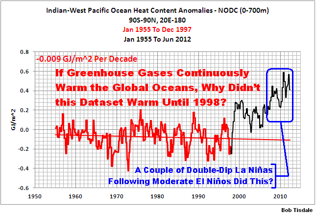
Figure 7
This is when I wish we still had access to the UKMO EN3 ocean heat content data through the KNMI Climate Explorer. That dataset presented the ARGO-era ocean heat content data without the NODC’s constant adjustments. Could it be that those adjustments are the only reason the ocean heat content data in this region continues to exhibit warming? Do we assume that when corrections are made they’re made equally across all ocean basins? They may not.
Regardless, the Indian-West Pacific dataset fails to provide the continuous warming one would expect from anthropogenic greenhouse gases.
CLOSING
Any takers?
If you’re a proponent of anthropogenic global warming and if you choose to present your data analyses, please do so using data available on a gridded basis in a reasonably easy-to-use format, from a source such as the KNMI Climate Explorer, as I always do in my blog posts so that anyone can verify results. What we’re not looking for are claims to the effect of, “oh, that’s caused by aerosols.” You’ll need to supply the data source to accompany your claim, to show cause and effect. If you’re a modeler and you’d like to discuss your models, please ask KNMI to add to their Climate Explorer the outputs of your ocean heat content simulations that exist in the CMIP3 and CMIP5 archives.
Please also explain, as part of your analyses, how anthropogenic forcings are responsible for the disparity in the trends, as shown in Figure 8. Don’t forget the data to accompany your claims.

Figure 8
If you’re a regular visitor to SkepticalScience, please don’t waste your time and present the gif animation The Escalator. That would clearly indicate you haven’t a clue what you’re talking about.
SOURCE
The data presented in this post is available through the KNMI Climate Explorer.
I’m really uncomfortable about this analysis. When there isn’t any global warming, a common ploy of those who promote AGW is to subdivide the globe into smaller areas, so that at least one of those areas (usually the Arctic) will show what they want to see and can be cherry-picked for propaganda purposes. I accept that your approach is different in that you claim that all five areas support your case, but the discomfort remains.
My general approach is to look for global (or long term) data not regional (or short term) in order to counter cherry-picking. You have moved in the opposite direction.
Your challenge is too easily handled by saying that stuff sloshes around the oceans so no one part will show consistent warming, but the overall global trend is up. I could have suggested that you put up the AGW prediction for each of the five areas, and then show whether they have performed as predicted, but this would be unproductive because the models are known to be useless at a regional level. So .. It’s hard to suggest ways of redirecting your argument.
What we’re not looking for are claims to the effect of, “oh, that’s caused by aerosols.”
While I am a fan of your analyses, I’ll suggest you don’t fall into the ‘absence of evidence is evidence of absence’ trap. Aerosol data isn’t systematically collected because it would undermine the forcings basis of the climate models, and hence the claimed CO2 forcing.
Ask Willis.
[snip]
Sloshing as suggested by Mike Jonas might be an explanation. What do you know about the rate of water exchange between the regions? Is it more or less rapid than the temperature changes?
Mike Jonas says: “Your challenge is too easily handled by saying that stuff sloshes around the oceans so no one part will show consistent warming, but the overall global trend is up.”
Saying and showing are two entirely different things. First, you’d have to show the sloshing and explain the processes of the sloshing. And if the sloshings are process related, then clearly the processes contribute to the warming.
For example, the upward shifts in the East Pacific data are clearly ENSO related, with both shifts occurring after strong La Nina events. The disparity in trend of the low-to-mid latitudes of the North Atlantic is related to the AMO/AMOC. The shift in the Northern North Atlantic appears to be a function of the NAO switching to negative about 1997. By stating those things, however, you’d be admitting that Mother Nature caused the warming.
But in looking at the Indian-West Pacific data, I’m well versed in ocean processes and there is no reason known to me why that dataset remained flat until the late 1990s and then suddenly started responding to the leftover water from ENSO. It appears more closely related to the number of ARGO profiles:
http://i50.tinypic.com/29cnw3q.jpg
Curious, isn’t it?
To borrow from a classic: “Where there’s warmth, there’s liars.”
Bob, Tamino will not be happy with you. I think global atmospheric temperatures can be sximilarly graphed. Decades of no statistically significant trend, but when added up gives you a large trend.
Philip Bradley says: “Aerosol data isn’t systematically collected because it would undermine the forcings basis of the climate models, and hence the claimed CO2 forcing.”
Aerosol data is collected by NASA/GSFC as part of their TOMS project:
http://toms.gsfc.nasa.gov/aerosols/aerosols.html
The data is available through the KNMI Climate Explorer from 1980 to 2001. Using those years, one could check to see whether they should bother to ask KNMI to update the data and to install a land mask. Of course the impact of Saharan dust on the sea surface temperatures of the North Atlantic has been studied and it does provide feedback. Then again, Saharan dust is a natural variable.
The Indian-West Pacific & North Atlantic OHC jumps beginning in the late 1990s suggest a learning opportunity. Bob & any others who may be able to nail this concisely: You have my attention.
North Atlantic (55N-80N) holds the key to the temperatures natural variability understanding:
http://www.vukcevic.talktalk.net/EarthNV.htm
I know that it is fashionable to use ‘anomalies’ rather than actual heat content. However, is there anywhere where total ocean heat content is available? The Indian ocean areas is large but it also includes quite disparate oceans with the West Pacific being totally different from the Indian Ocean. So wouldn’t a total ocean heat content (down to 700m) be a more interesting figure? Unlike anomalies it would allow assessment of how much heat is gained or lost. This could then be compared to the Trenberth estimates and the size of the ‘travesty’ could be identified.
Mike Jonas: Update: Maybe the sudden shift in the response to ENSO during the last decade or so is real. If we look at the difference in sea level pressure between the East Pacific-Atlantic subset and the Indian-West Pacific subset [(EP-A 90S-90N, 180-20E) MINUS (I-WP 90S-90N, 20E-180)] smoothed with a 121-month fliter, we can see that there was a recent change in delta SLP.
http://i49.tinypic.com/2cru97c.jpg
Or maybe it’s a combination of that and the under sampling that took place prior to the late 1990s.
Bob, I’ve been reading your book (up to p. 100 so far). I understand the 1998/9 rise in Fig 7 as resulting from neutral & La Nina following the very strong 1997/8 El Nino. I agree somewhat with your question in blue on that figure, specifically that the El NInos in the 2000’s were not strong enough to get a good slug of W. Pacific warming in subsequent La Ninas. But it seems possible that the increases in back radiation and lack of volcanoes could have helped with the 2000’s warming. For your other question, why is Fig 7 flat before 1998, that could be El Chichon and Pinatubo and with only the one strong El Nino. I realize this is not a complete explanation, mainly because I’ve ignored the other figures.
I’m joking at Judy’s about buying your book before it sells out, but it seems that the NODC is already sold out.
======
MikeN says: “Bob, Tamino will not be happy with you. I think global atmospheric temperatures can be sximilarly graphed. Decades of no statistically significant trend, but when added up gives you a large trend.”
I’ve been doing that for years with sea surface temperature data and explaining the processes that cause the upward shifts. I’ve even responded to Tamino’s Foster and Rahmstorf (2011) paper:
http://bobtisdale.wordpress.com/2012/01/14/revised-post-on-foster-and-rahmstorf-2011/
And I’ve also extended the discussion to TLT and GISS LOTI data.
vukceic, what data is this “geo-solar-cycle” you’re plotting? Your work is very interesting but I often find myself frustrated that you show something that’s looks important but it’s not possible to follow up on since you don’t document clearly where all the data are sourced and often, like here, I don’t even see clearly what the original of we are supposed to be looking at, is.
It doesn’t even matter that they have been playing around with the numbers.
90% of the expected energy accumulation has gone missing, has merely escaped to space or was reduced temporarily by volcanoes or aerosols etc.
Actual energy accumulation in the 0-2000 metre ocean and in the land, ice and atmosphere versus the accumulated GHG forcing since 1955.
http://s19.postimage.org/pxgxoq2s3/OHC_GHG_and_Missing_Energy.png
Mike Jonas says:
October 14, 2012 at 4:21 am
Your challenge is too easily handled by saying that stuff sloshes around the oceans so no one part will show consistent warming.
Ever heard of thermo-haline circulation (THC)? It takes seawater about 1000 years to “slosh” around the planet.
Denis Rushworth says: “Sloshing as suggested by Mike Jonas might be an explanation. What do you know about the rate of water exchange between the regions?”
The rates vary and are poorly documented, which was one of the reasons for Trenberth’s travesty email—they couldn’t track the energy of an El Niño:
“Where did the heat go? We know there is a build up of ocean heat prior to El Nino, and a discharge (and sfc T warming) during late stages of El Nino, but is the observing system sufficient to track it?”
Refer to the following Trenberth post about the impact of ENSO on sea surface temperatures:
http://bobtisdale.wordpress.com/2012/09/20/a-blog-memo-to-kevin-trenberth-ncar/
On the other hand, the timings are known. We’re talking months, not years. The primary “sloshings” take place in the tropical Pacific. An equatorial Kelvin wave (carrying warm or cool water during an El Niño or La Niña, respectively) takes about 2 months to cross the equatorial Pacific from west to east. The Rossby waves that return from east to west take about 6 months to travel the width of the Pacific at about 10S-5S, and 5N-10N. Due to the disparity in the strength of El Niño and La Niña events from 1976 to the early-to-mid 2000s (El Niño clearly stronger during that period), there was significantly more leftover warm water that was then distributed toward the poles and carried into the eastern tropical Indian Ocean. Though I’ve never seen it discussed, it should take about a couple of more months for the Rossby wave to cross the Indian Ocean and a couple more for it to round Cape of Good Hope into the South Atlantic. Refer to the animation here:
http://i54.tinypic.com/eu4pzq.jpg
It’s from this post:
http://bobtisdale.wordpress.com/2011/03/25/argo-era-nodc-ocean-heat-content-data-0-700-meters-through-december-2010/
Teleconnections also cause OHC to respond to El Niño and La Niña events in a matter of months. For example, in the tropical North Atlantic, OHC lags NINO3.4 sea surface temperature anomalies by about 6-9 months, where tropical North Atlantic sea surface temperatures respond in about 3 months.
Denis Rushworth: PS, the primary current that carries waters between the ocean basins is the Antarctic Circumpolar Current (aka ACC). If memory serves, it takes surface waters about 8 years to make a trip around Antarctica. I’ve never seen a paper that discusses how much longer it would take for subsurface waters, but, then again, I also don’t recall looking for it.
Come on Bob, you know better than this. You know there’s a consensus of 97% of climate scientists and every scientific organization has signed on to the meme. This ain’t some puny skiff you can rock with a little inconvenient data; you’re trying to rock a supertanker here. Obviously, the heat is hiding above 90N, outside of your analysis coverage, melting ice and waiting for the perfect time to unleash its fury upon the world. (/sarc)
Seriously though, I think you’ve done an excellent job on all your ocean temperature posts. The approach you’ve taken here clearly shows how amalgamating data sets can be a form of “cherry-picking” too. I do wish you would turn your considerable abilities to the stratosphere once in a while though, as Gavin said it’s a cleaner metric for GHG warming (strat cooling) and certainly isn’t cooperating with the hypothesis either as far as I can tell.
Bill Illis (October 14, 2012 at 7:15 am): It’s been a while since you’ve written a guest post here at WUWT. That would be a good one.
Regards
“USING A GLOBAL DATASET TO REPRESENT GLOBAL WARMING IS MISLEADING”
HA HA HA! That’s a true classic. You sincerely believe that every part of the ocean should respond uniformly to a climate forcing? You seriously don’t understand that local factors also come into play? And not one of the comments so far actually points out how abysmally flawed your thinking is? Wow…
These energy content charts worry me a lot.
Given the massive heat capacity of water, and the massive amounts of water involved, tiny measured increases in temperature are being used to create dramatic energy charts.
For example,
“World ocean heat content and thermosteric sea level change (0-2000), 1955-2010 Paper in Press Levitus etal
(as discussed earlier by Willis Eschenbach) discusses a temperature increase of 0.09 C over a period of 55 years in the 0 to 2000 meter band, and a temperature increase of 0.18 C over 55 years in the 0 to 700 meter band.
It seems incredible that anyone could consider the measurements to be precise enough to reveal that level of change, especially going back to the bucket and rope days of 55 years ago.
So a question to Bob Tisdale: How much faith do you have in the accuracy of the measurements of the underlying temperature changes from which these energy charts are calculated?
Bob Tisdale says: no reason known to me why that dataset remained flat until the late 1990s and then suddenly started responding to the leftover water from ENSO. It appears more closely related to the number of ARGO profiles:
http://i50.tinypic.com/29cnw3q.jpg
Curious, isn’t it?
HHHHHHHHHHHHHHHHHHHH
Well it’s not that curious really , this is the problem with the whole thing you are presenting here. Even the max of 39% is not much to start drawing conclusions from. And that’s best end of the data.
You have not assessed the changes in coverage at all (beyond this one comment) yet it is not just a detail. Much of the deployment of ARGO fleet was very specifically aimed at improving the geographic coverage which had some huge regions with very little data.
This fact on it’s own means the early data had regional biases and the changes over time aimed at reducing this will this also have heavy geographic bias in the new data coming in. Some ocean basins had better coverage to start with so less changes in coverage.
There are linkages in climate between basins either by direct flow or weather related.
No one I’m aware of is suggesting all regions are independent and are all warming at a constant rate due to CO2, with no variations. You are setting up a false claim, then knocking it down and says “come on then, explain THAT”.
I think that is what is generally referred to a straw man argument.
The main contention in the IPCC presentations is that all these currents and interactions are “internal variation” and should all average out globally and in time. That seems reasonably consistent with your figure 1. The rest does not belie that position.
Of course this data set , like all the rest will be suffering from ‘correction’ BIAS as much as it benefits from bias correction.
You also really need to up your game on the data processing front and move beyond just fitting linear trends with Excel, if you want to be taken more seriously. There is nothing that is linear in all these time series on any time scale , so all your straight lines are subjective and pretty much meaningless.
Even if CO2 is significant that won’t be a straight line rate of change either.
Bill, any chance you could put a white b/g on your plots instead of transparent. Firefox (not unreasonably) renders transparent as black if there’s nothing behind it and the graphs are unreadable.
Thanks.
Bill Illis says: 90% of the expected energy accumulation has gone missing, has merely escaped to space or was reduced temporarily by volcanoes or aerosols etc.
That is not a problem in hard sciences like physics so why is it a problem in climatology ??
90% is the ratio of dark matter/energy in the universe. Perhaps the missing heat is just being converted to dark energy. 😉
Prediction: The West Pacific/Indian Ocean data set will join the rest of the data sets in showing a loss in ocean heat content over the next 10 years, putting the nail in the coffin of CAGW! It is already starting to happen.
It has been obvious from the start that, all else being equal, the warming resulting from a doubling of CO2 would be right around 1 degree C. And that the actual warming would be less than that due to negative feedbacks. The negative (stabilizing) feed backs are obvious because there is no record of positive feedbacks in the geological record, despite much higher concentrations of CO2. Furthermore, the onset of significant global cooling always begins with atmospheric CO2 at a relative high mark, further demonstrating the absence of positive feedbacks, and the likelihood of negative feedbacks.
Climate change is very real and very natural. There is no doubt that the latter 1/3 of the 20th Century saw global warming. There is also no doubt that a small fraction of that warming was produced by humans and a fraction of that human produced warming resulted from our CO2 emissions, but only a small part. The IPCC’s argument from ignorance that they cannot explain the warming any other way (than increasing CO2) is indeed ignorant, when thy refuse to even look at natural ocean cycles.
Mike Jones argues that we should look at the global, long term data to avoid cherry-picking, but the global data only shows that there has been global warming, not WHY there has been global warming. The above article shows why it has warmed: the oceans are responding to natural ocean cycles. There is no indication of CO2 type warming in the records, just a 30 year correlation; a correlation that only exists in the latter 1/3 of the 20th century. In the 30 years before that, increasing CO2 correlates well with DECREASING temperatures. The correlation with natural ocean cycles, however, appears consistent with all of the available data.
Possibly someone could explain this to me. When I examine a satellite image layer from the visible part of the spectrum I see visible light reflected for both the land and sea surfaces. Visible light is reflected more from the land than the sea.
Light reflected from land is longer in wavelength coming out than going in. Thus, GHG absorb more of the energy coming out than going in. This is the “greenhouse” effect.
But this does not seem to apply over the seas. When I look at satellite image layer from the infra-red part of the spectrum, the land is white but the sea surface appears black. This is because infrared light is reflected more from the land than the sea. Little or no infra-red is emitted from the sea. Energy is absorbed by water not GHGs. What is happening is that full-spectrum light is entering the sea and not much energy is coming out. The energy is absorbed and this is why the seas get warm.
This would occur with or without GHGs and the seas make up about 70% of the Earth’s surface.
So my question is: Why would warmer oceans indicate that GHGs cause global warming? Wouldn’t the rise in temperature of the oceans be more likely related to an increase in solar energy emitted by the sun.
Presumably the heat would accumulate, so only a small change in solar energy would be needed if the time period were long enough, say 20 years.
What am I missing?
I mentioned it elsewhere today, but this is a better thread.
I switched the WUWT ENSO meter, http://home.comcast.net/~ewerme/wuwt/elninometer-current.gif , back to NOAA’s NCEP data from Australia’s BoM. I have to get the data in a two step process, the first being a form submission specifying a date range, instead of scraping a single text only page, but it wasn’t too bad.
So, the ENSO meter should be reflecting the most recent value Bob mentions in various posts.
Excellent analysis and discussion. Thank you Mr. Tisdale and posters.
I apologize if you answered this before but \I missed it if you did. Like many I have a difficult time reading volumes of the computer screen. I would like to purchase a hard copy of your book if possible. Do you have any plan to offer a hard copy?
Looking at the sharp increases in temperature that you highlighted makes me wonder how you can get such changes in the heat content of the ocean. Can the sun, ocean currents, etc. produce enough energy over that period of time or how can the oceans lose that amount of energy? Don’t these changes have to be produced by redistribution of heat within the ocean itself? Then one would ask, what kind of cycles are present in the ocean and what is the lenght of the maximun cycle?
Bob, your caption on figure 1 says, “It gives the false impression that warming was continuous and caused by greenhouse gases”.
Perhaps so if you fit an inappropriate straight line and incorrectly assume that GHG effect would be linear increase in temperature. The false impression is entirely your own.
If you try to fit circa 60 y and 20 y cosines peaking around y2k, you would find that fitted far better than your “trend”. Such a model would not suggest GHG as a major component. It would tend to disprove it or leave it as a minor factor.
I don’t think you can fit more complex functions with Excel , so you may need to learn some new skills.
REJ says Looking at the sharp increases in temperature that you highlighted makes me wonder how you can get such changes in the heat content of the ocean.
No , most of the rapid changes a likely to be sampling bias, Without examining that, the rest of the analysis is rather irrelevant..
Bob Tisdale says: October 14, 2012 at 7:24 am
……………..
Teleconnections also cause OHC to respond to El Niño and La Niña events in a matter of months. For example, in the tropical North Atlantic, OHC lags NINO3.4 sea surface temperature anomalies by about 6-9 months, where tropical North Atlantic sea surface temperatures respond in about 3 months.
Hi Bob
I distrust the ‘teleconnections’ hypothesis since contradicts physics as I understand it:
If the heat energy has to to ‘teleconnected’ i.e. transported from Pacific to Atlantic, it has to be via atmosphere, but we know that difference in the heat capacity between water and air makes that next to impossible. Alternatively one could invoke some kind of ‘cloud feedback’, from central Pacific to the North Atlantic, but that again at best is unlikely.
I would suggest that the OHC changes are not due to any ‘teleconnections’ around the globe, but are most likely caused by same sun-earth cause, whereby Pacific response is quickest as the tidal energy dissipation would indicate:
http://eoimages.gsfc.nasa.gov/images/imagerecords/0/654/dissipation_large.jpg
(see also http://www.vukcevic.talktalk.net/EarthNV.htm )
P. Solar says: October 14, 2012 at 7:00 am
……..
In contrast to the AGW thinking, to paraphrase Dr. S. my ‘calculations are elementary and accurate’ but mechanism may not be so.
Bob: Your forward says the NODC OHC data is “only available to the public in an easy-to-use format … only for the depths of 0-700 meters” but that accessible data for the 0-2000 meter depths are both limited and smoothed (i.e., not as useful). My questions:
1. Is the deeper data available in “hard-do-use” formats? If so, some here, perhaps even me, might volunteer help (although I assume your own competence is likely sufficient?).
2. Otherwise, could the data for deeper depths be obtained by (a) direct request, (b) request via a congressional representative, or (c) FOIA?
Aside: it seems strange that scientific data would be shared with foreign countries (UK and the Netherlands), but not with U.S. citizens.) If U.S. taxpayers are paying to collect this data, oughtn’t the data be publicly available?
Bob says (October 14, 2012 at 7:24 am): “On the other hand, the timings [of sloshings] are known. We’re talking months, not years. The primary “sloshings” take place in the tropical Pacific. An equatorial Kelvin wave … takes about 2 months to cross the equatorial Pacific from west to east. The Rossby waves that return from east to west take about 6 months …”
Aren’t sloshings different from waves? As I recall, water molecules move up and down (and in vertically oriented circles as a wave passes by them. Would not the heat content of the water move much more slowly that the waves?
Bob, you say: “But in looking at the Indian-West Pacific data, I’m well versed in ocean processes and there is no reason known to me why that dataset remained flat until the late 1990s and then suddenly started responding to the leftover water from ENSO. It appears more closely related to the number of ARGO profiles”
I don’t think it’s necessary to look outside the natural realm for an explanation to that apparent conundrum. First, there is clearly an upward step forming from 1970 to 1976, much like the rise from 1995 to 2001. The two periods follow the exact same pattern: distinct La Niña, major El Niño, major (three-year) La Niña. After the major La Niñas there follows a period of neutral to secondary El Niño states which prevails until the next repeated ENSO sequence starts with a new distinct La Niña. What is special about the first sequence, though, is that it ends with a highly anomalous event – the Super El Niño of 1982/83. This drains the WPWP OHC to such an extent that the next ENSO sequence, beginning with La Niña 1984/85, starts from a much lower OHC level than it normally would have. Hence, it’s in a way deprived of the opportunity to lift the OHC to a new level, like the 1973-76 and 1998-01 events do. Without El Niño 1982/83 I think the curve’s progression would have met our expectations.
Rossby Waves: http://en.wikipedia.org/wiki/Rossby_wave
These are inertial waves not surface gravity waves.
This goes to the heart of my earliest question and, since then, continuous complaint: that regional patterns become “global” patterns through absolutely correct mathematical combinations but misrepresent – misinform about – the situation.
The amount of warming is also a problem when combining datasets – which this shows. Continental US or Arctic temperatures, by rising, raise the average, but, unlike the tide, do not tell you that something global is happening.
Simplicity is the God of Apple, according to Jobs’ autobiographer. But in climate science, if not in all science, it is the Snake in the Garden. Even if something like E=mc2 defines a universal driving mechanism, that simplicity can’t be applied to the meandering of heat flow from the sun, to the Earth and out to space again. Some complexity must be involved, with often counter-intuitive implications.
Err Bob.
The theory is not that GHG will warm the ocean continuously or homogeneously.
Simply. When you add GHGs to the atmosphere the spatialy averaged rate at which the planet cools is lowered. GHGs dont ‘warm’ the planet any more than a thermos warms coffee. Restricting the emission of LWIR to space results in a planet that emits more LW. the planet cools less rapidly than it would otherwise.
The spatial and temporal evolution of this phenomena is not known with any measure of certainty.
That is, at the boundary we can say the the temperatures may increase by 1C to 6C, but How that energy is arranged and distributed is very uncertain. one thing IS certain. We know that the rise will NOT be uniform. We know it will not be monotonic. And we know that while someplaces cool others will warm. We know it wont be homogeneous.
If the theory predicted monotonic homogeneous increases your post might actually address the Theory. But the theory predicts NO SUCH THING, in fact in predicts the opposite. So you are arguing against at theory that no one holds.
the
Steven Mosher says:
October 14, 2012 at 12:28 pm
We know that the rise will NOT be uniform. We know it will not be monotonic. And we know that while someplaces cool others will warm. We know it wont be homogeneous.
Term teleconnection was introduced by meteorologist G.Walker more than a century ago.
Teleconnection is defined by the American Meteorological Society as:
-1. A linkage between weather changes occurring in widely separated regions of the globe.
– 2. A significant positive or negative correlation in the fluctuations of a field at widely separated points. Most commonly applied to variability on monthly and longer timescales, the name refers to the fact that such correlations suggest that information is propagating between the distant points through the atmosphere
Roger Pielke Sr quotes example paper Impact of Atlantic sea surface temperature anomalies on the summer climate in the western North Pacific during 1997–1998 (Geophys et al)
Despite Dr. Pielke Sr ‘s credentials I am not convinced that Atlantic sea surface temperature could alter climate in Vancouver or California.
What is your take on teleconnection? (my view see post here).
Ric says: In response to my statement, “USING A GLOBAL DATASET TO REPRESENT GLOBAL WARMING IS MISLEADING”, you wrote, “HA HA HA! That’s a true classic. You sincerely believe that every part of the ocean should respond uniformly to a climate forcing? You seriously don’t understand that local factors also come into play? And not one of the comments so far actually points out how abysmally flawed your thinking is? Wow…”
Apparently you have trouble comprehending English. My statement “USING A GLOBAL DATASET TO REPRESENT GLOBAL WARMING IS MISLEADING” does not equate to my believing that “every part of the ocean should respond uniformly to a climate forcing”. Just the opposite.
You wrote, “You seriously don’t understand that local factors also come into play?”
Actually I do understand the local factor and processes. It’s the climate modelers who misunderstand or misrepresent them.
That’s why no one but you responded to that statement as you did. They can read and comprehend.
markx says: “So a question to Bob Tisdale: How much faith do you have in the accuracy of the measurements of the underlying temperature changes from which these energy charts are calculated?”
Little.
frankpwhite says: “So my question is: Why would warmer oceans indicate that GHGs cause global warming? Wouldn’t the rise in temperature of the oceans be more likely related to an increase in solar energy emitted by the sun.”
The global warming hypothesis assumes solar energy is relatively constant and that the primary means through which the oceans absorb and release that solar energy is relatively constant, but the assumptions are of course wrong.
Earlier you noted, “What is happening is that full-spectrum light is entering the sea and not much energy is coming out.”
Heat is released by the oceans primarily through evaporation.
OK , I suggested fitting some cyclic variations and since that’s not really Bob’s gig, I thought I’d have a look.
As usual, in look for climate change I start by looking rates of change rather than time series. Since the OHC data has the same value for three months in a row, that meant removing the two months with no change. The resulting d/dt series has some petty large swings that mask the long term pattern so I then applied 12m gaussian filter.
I started out seeding two sine functions with periods of 20 and 60 years. The 20y locked into about 21.7 fine but the other ran out to about 360 years cycle, with very large uncertainty on the fit. This may mean there is no such long cycle or simply that with a few decades of data you can not pin down a 400yr cycle. I decided that even if the cycle was of that order a straight line fit would be about as reliable over the range of the data. Also a short circa 4y cycle was quite obvious in the data so I a short sine plus the linear. This locked in well on around 3.7 years. The fit had fairly large error margins since there is considerable variation in the magnitude and some breakage of the pattern that cam probably be attributed to volcanoes.
Here’s the fit:
http://i48.tinypic.com/zx1d9k.png
The data diverges from the fitted model in four notable points. The first three seem to be fairly clearly attributable to Mt Agung, El Chichon, ant Mt Pinatubo. The final peak around 2001/3 is a bit surprising. This about the period a lot of ARGO data came on line so it may require examination for a possible discontinuity due to the equipment or coverage changes.
There is also an indication of something that has been nagging at me for a while and this is probably the clearest indication of that I’ve seen so far. That is the idea of volcanic rebound. I have been suggesting for a while that negative feedback in the climate causes a warming period 5 or 6 years after a volcano that largely wipes out the cooling effect.
Here all three volcanoes are followed by stronger warming peak in the short cycle.
Another interesting point also confirms what I have already noted in a lot of other data sets, that El Chichon seems to have had more impact that Mt Pinatubo. This is a bit surprising since I was under the impression that Mt P was the really big one. Here both the cooling and the rebound is much stronger for El Chichon.
This model fitted a linear component of 0.001 GJ/m2/year. Someone could work out what that is in W/m2/year but any attempt to project this as a climate “trend” beyond the frame of the data would be very dubious since there has been significant volcanic disturbance during the fitting period. This could reflect LIA recovery, multi-century variations or some anthropogenic influence (or a mixture of all that).
The final point of interest here is the periods of the cyclic components. The 21.7yr clearly suggests Hale-Schwabe cycles. I’ll have to confer with Scaffeta’s “numerology” to see if he has any comment on 3.7years.
With the exception of deviations probably caused by volcanoes it is surprisingly regular in period and phase. This suggests it may have an extra-terrestrial driver rather than being caused by ocean currents. (Sorry Bob).
Overall , seeing this kind of structure does seem to indicate that they have made quite a good job of digging some climate signal out of all this. A result that frankly I did not expect.
RobW says: “I would like to purchase a hard copy of your book if possible. Do you have any plan to offer a hard copy?”
Sorry, I looked into it. Due to the printing costs of a color 550+page book, I have no plans to offer a hard copy. At over $100, I’d only sell a handful. However, there’s no reason you can’t buy the pdf and have one hardcopy made, even if it’s taking it to your local printer to have them print it out on loose 8 ½ X 11 paper.
vukcevic says: What is your take on teleconnection? (my view see post here).
I’d be more convinced that North Pacific can infulence N. Atllantic since that’s the way the weather systems propagate. I’d say it was more likely than not that warmer/colder air moving across Canada could affect meteo conditions in the Atlantic enough to induce significant changes in cloud cover. SST changes would inevitably follow.
P. Solar says: “Perhaps so if you fit an inappropriate straight line and incorrectly assume that GHG effect would be linear increase in temperature. The false impression is entirely your own.”
The anthropogenic GHG effect is represented as being continuous and persistent.
P. Solar says: “I don’t think you can fit more complex functions with EXCEL, so you may need to learn some new skills.”
I have no need to present more than what’s available through EXCEL. As I’ve discussed with you repeatedly, anyone is more than welcome to carry the analyses farther. That’s why I link the source of the data.
These responses should be applicable to your other comments on this thread.
WHEN did the ARGO BOUYS come on line?
WHAT is the basis for this alleged “data” prior to that point?
Garbage IN, Garbage out… The king has no new clothes. This is a contrived data set (except for the ARGO data, which is MEANINGLESS.
Pitiful.
Max
Thanks for the answer and I completely understand. I will suck it up and download the pdf. Oh and great work. Please keep it up. Those out there that truly appreciate real science, not the voodoo political science we see all too often in climate science, really appreciate what you are doing.
A quick look at N. Scaffeta’s paper “A shared frequency set between the historical mid-latitude aurora records and the global surface temperature” shows something corresponding to the short cycle in aurora data 1872-1966 (figure 4D).
There is a twin peak of (visual read-off) 3.7 and 4 years. This is one of the strongest peaks in relation to his tests for significance against red noise. Though his paper deals more specifically with the longer cycles, the fact that this is found in aurora data corroborates my suggestion that this frequency is of extra-terrestrial origin.
Good writing is in itself a pleasure, of course this goes much further.
Bob says: The anthropogenic GHG effect is represented as being continuous and persistent.
That does not spell linear.
Even if there is a linear component you are not going to be able to fit it until you have a stab at removing the bigger pseudo cyclic signals.
Yabut, if the solar explanation is correct why with a grand solar thingy from 1920-2000 take until 1980 to show up? And if there’s a 60 year build up there’s another 60 years until things get back to 1920 data. The temperature may not increase anymore, but it is still far above the 1920 values. A look at any of the 5 regions show them to be far warmer than 1955 data, anyone can see that. The CO2 theory is not reasonable, but they have the world pretty much eating out of their hands, so the emphasis is on us to provide a compelling reason for the warming, not to yap that CO2 couldn’t do it. After all they say they couldn’t find any other means for the AGW theory so we must provide that and not be so negative about CO2. We cannot disprove AGW by crying about CO2, we need to provide evidence that can be used to prove there is a method of warming that doesn’t rely on CO2.
vukcevic says: “I distrust the ‘teleconnections’ hypothesis since contradicts physics as I understand it:
“If the heat energy has to to ‘teleconnected’ i.e. transported from Pacific to Atlantic, it has to be via atmosphere, but we know that difference in the heat capacity between water and air makes that next to impossible.”
There is no transport of heat through the atmosphere as part of a teleconnection. You’ve misunderstood the term. To save myself 5 minutes, let me quote from “Who Turned on the Heat?”:
We already know how and why the trade winds weaken in the eastern tropical Pacific during an El Niño. Those changes in atmospheric circulation in the Pacific, in turn, cause the trade winds in the tropical North Atlantic to weaken, too. The slower trade winds blowing across the surface of the tropical North Atlantic Ocean don’t cool the surface waters as much as they normally would; there’s less evaporation with the slower trade winds; so the sea surface temperatures warm in the tropical North Atlantic. That’s only part of the explanation. With trade winds in the North Atlantic at their normal strength, cool waters from below the surface are pulled up to the surface there. In other words, where upwelling occurs, it is occurring at its normal rates when the trade winds are at their normal strengths. When the trade winds weaken during an El Niño, there is less cool water being pulled up to the surface, so the tropical North Atlantic warms as a result of that weakening process also. Refer to Wang (2005) ENSO, Atlantic Climate Variability, And The Walker And Hadley Circulation for a more detailed discussion.
HHHH
Because the tropical North Atlantic consistently warms in response to El Nino events, the sea surface temperatures there and in the NINO3.4 region are said to be teleconnected.
Even allowing for some lumpiness, isn’t there too much lumpiness? That’s what Bob should have been attacking, and that core of his argument remains after its excesses have been pruned.
Ian W says: “I know that it is fashionable to use ‘anomalies’ rather than actual heat content. However, is there anywhere where total ocean heat content is available?”
I write ocean heat content anomalies out of habit. According to Levitus et al (2012), their ocean heat content data is presented as anomalies so my adding anomalies is redundant. Refer to their paragraph 3:
http://data.nodc.noaa.gov/woa/PUBLICATIONS/grlheat12.pdf
So the short answer to your question is, nope.
One question I have is, from looking at the graphs is, are only anomalies being studied? If so, this seems kind of short sighted since eventually there should be no anomalies. We’ll also never know the quantity (5 days out 365) or whether or not the anomalies out weigh normality.
Have I missed something or am I looking at the wrong part of the data?
eric1skeptic: I understand what you’re saying, but the sudden shift looks odd. Also, why then aren’t volcanic eruptions more evident in the other subsets? And are the apparent dips in 1982 and 1991 in the Indian-West Pacific subset actually responses to ENSO and not volcanic eruptions? It’s very difficult to find a volcanic aerosol signal in OHC data.
phlogiston says: “Ever heard of thermo-haline circulation (THC)? It takes seawater about 1000 years to ‘slosh’ around the planet.”
On the surface and “near surface”, the time is measured in months and years. See my October 14, 2012 at 7:24 am reply to Denis Rushworth. But it depends on how we’re defining “sloshing”.
Regards
P. Solar: With respect to your comment on my earlier reply to Mike Jonas I presented a follow-up:
Update: Maybe the sudden shift in the response to ENSO during the last decade or so is real. If we look at the difference in sea level pressure between the East Pacific-Atlantic subset and the Indian-West Pacific subset [(EP-A 90S-90N, 180-20E) MINUS (I-WP 90S-90N, 20E-180)] smoothed with a 121-month fliter, we can see that there was a recent change in delta SLP.
http://i49.tinypic.com/2cru97c.jpg
Or maybe it’s a combination of that and the under sampling that took place prior to the late 1990s.
And again, P. Solar, there is nothing wrong with my investigations or analyses. The fact that you want more simply indicates that YOU should carry the ball farther. You’d never be happy with what I’ve done anyway. Have fun.
RHS says: “One question I have is, from looking at the graphs is, are only anomalies being studied? If so, this seems kind of short sighted since eventually there should be no anomalies.”
OHC data is only presented as anomalies. Refer to paragraph 3 of Levitus et al (2012):
http://data.nodc.noaa.gov/woa/PUBLICATIONS/grlheat12.pdf
They write: “We use the term ‘ocean heat content’ as opposed to ‘ocean heat content anomaly’ used by some authors because ‘ocean heat content’ is an anomaly by definition. OHC is always computed with a reference mean subtracted out from each temperature observation. Otherwise the OHC computation depends on the temperature scale used.”
Bob says: It’s very difficult to find a volcanic aerosol signal in OHC data.
It;s not that hard, in fact that was one of the main things that I found straight away by looking at rate of change of OHC. as posted above: http://wattsupwiththat.com/2012/10/14/tisdale-wheres-the-anthropogenic-global-warming-signal-in-the-nodc-ocean-heat-content-data-0-700meters/#comment-1109491
NeedleFactory says: “Aren’t sloshings different from waves?”
It depends on your definition of sloshing, doesn’t it? Refer to Bill Kessler’s ENSO FAQ webpage:
http://faculty.washington.edu/kessler/occasionally-asked-questions.html
A Kelvin wave is the initial part of the sloshing he describes as part of ENSO.
“After all they say they couldn’t find any other means for the AGW theory so we must provide …”
What? The fact that they can’t find anything else (mainly because they’re not looking) is really such a stupid argument to put forward in a scientific context. It certainly does not put the onus anyone else to provide an alternative explanation.
” I haven’t found anything else” is not a scientific argument and does not need any rebuttal other than to point out how stupid it is.
Can you explain why circa 1950 is the starting point on these data sets? Why not 1900 or 1930? What would the trend lines show with these starting points?
Steven Mosher says: “Err Bob.
“The theory is not that GHG will warm the ocean continuously or homogeneously…”
Err Steven: Anthropogenic global warming is said to be “systematic and persistent”. Refer to paragraph 32 of Trenberth and Fasullo (2012):
http://www.cgd.ucar.edu/cas/Trenberth/trenberth.papers/TF_RHW_JGR_2012JD018020.pdf
I could also find a couple of quotes in AR4 if you’d prefer, but you could do the same.
Also, climate models suggest a relatively uniform warming among the ocean basins, inasmuch as the zonal-mean trends of satellite-era sea surface temperatures are basically the same for the ocean basins:
http://i56.tinypic.com/t4wpys.jpg
While in the real world they are not:
http://i53.tinypic.com/24zf4f9.jpg
Those two graphs are from the following post:
http://bobtisdale.wordpress.com/2011/04/10/part-1-%e2%80%93-satellite-era-sea-surface-temperature-versus-ipcc-hindcastprojections/
Bob says: And again, P. Solar, there is nothing wrong with my investigations or analyses. The fact that you want more simply indicates that YOU should carry the ball farther. You’d never be happy with what I’ve done anyway. Have fun.
I have carried the ball, done the analysis and posted a graph and detailed comments. Maybe you missed it 😕
Never happy, not really, I think I was quite complementary about your showing how ENSO could actually be a means of getting more solar energy into the system , rather than just being an internal cycle. I also pointed out some faults in your argument and suggested how you may improve it. You were as refractory as ever, but I did say it looked like an important finding.
You will notice I did not need to detrend the data to get this graph.
http://i48.tinypic.com/zx1d9k.png
The volcanic rebound is similar to what I suggested you may see in your ENSO work if you avoided the detrending.
Since the presumed volcanic cooling is essential to exaggerated CO2 warming I think the question of volcanic rebound is highly significant.
Without volcanic cooling, climate models would have to apply the true physically provable CO2 warming without jacking it up by a factor of 3. They may then start to behave a little more like the climate they are purported to model.
The modellers will probably have to be dragged though hell, backwards before they accept that but you never know.
[sourcecode]
BTW, for completness, here are the NLLS fitting results for the model shown in the graph
Final set of parameters Asymptotic Standard Error
======================= ==========================
x1 = 2003.33 +/- 0.8568 (0.04277%)
a1 = -0.0297402 +/- 0.004427 (14.89%)
p1 = 21.807 +/- 0.7037 (3.227%)
x2 = 2000.29 +/- 2.773 (0.1386%)
a2 = -0.0172149 +/- 0.04718 (274.1%)
p2 = 3.72418 +/- 0.03225 (0.866%)
a = 0.0010536 +/- 0.0001978 (18.77%)
c = 0.0411344 +/- 0.004228 (10.28%)
[/sourcecode]
P. Solar quoted Lightrain without attribution: “After all they say they couldn’t find any other means for the AGW theory so we must provide…”
And then in the same comment you quoted again without attribution, “I haven’t found anything else…” and in this instance that statement appears nowhere else on the thread. To whom are you attributing the quote, when no one wrote it?
Bob Tisdale on teleconnection
….
Yes, trend winds idea at first instant sounds plausible, but as far as I can see it 3 to 9 months delays make a questionable proposition.
also Roger Pielke Sr quotes example paper:
Impact of Atlantic sea surface temperature anomalies on the summer climate in the western North Pacific during 1997–1998
https://pielkeclimatesci.wordpress.com/2008/11/18/what-is-a-teleconnection-why-are-teleconnections-important-in-climate-science/
I have my doubts, but thanks anyway.
P. Solar says: “It;s not that hard, in fact that was one of the main things that I found straight away by looking at rate of change of OHC. as posted above:”
And as I noted in the comment upon which you are responding, it could be argued you’re seeing a response to ENSO. As you may not be aware, the tropical Pacific was under-sampled prior to the installation of the TAO project buoys, which were completed in the early 1990s, so one would not expect the OHC data to respond similarly to the 1997/98 and 1982/83 El Nino events.
If you like, why don’t you study the impact on the variability of the increasing samples with time? Also, while your studying that, you’ll need to consider that the Indian and West Pacific OHC data vary inversely with ENSO and that the variations in the East Pacific and Atlantic are related positively, which would affect their perceived impacts.
Paddy says: “Can you explain why circa 1950 is the starting point on these data sets? Why not 1900 or 1930? What would the trend lines show with these starting points?”
There’s too little source data at these depths prior to the 1950s. In fact, in the 1950s, the sampling at depth was pretty much limited to the North Pacific and the Atlantic.
Nah. Just because “they couldn’t find” anything else to explain warming, etc., etc., does not establish CO2 as the Null (default). They would have had to have PROVEN that there is no other “forcing variable” for that argument to have weight. They haven’t come close. The CO2-AGW cartoon hypothesis is simplistic compared to any real analysis, so the lazy may prefer it, of course.
“USING A GLOBAL DATASET TO REPRESENT GLOBAL WARMING IS MISLEADING
By looking at a dataset on a global basis, one can only assume greenhouse gases play a role in the warming. As I’ve noted in numerous previous posts, dividing the dataset into smaller subsets allows the data to present how it truly warmed.”
I’m very happy I didn’t have any coffee in hand when reading this – I would have spilled it and possibly injured myself laughing.
So in this post, by looking at sufficiently small regions (sub-basins of the oceans, not even complete oceans), over sufficiently small depths (0-700 meters, irregardless of the 0-2000 meter data), and sufficiently short time periods (under 10 years in some of your examples – far too small for statistically significant linear trends, let alone to identify the claimed step changes with three times the parameters) – you find portions of the data that don’t move in lockstep with globally average data? And you consider that a strong argument against global warming?
That’s a fine batch of cherries you’ve picked – “…the fallacy of incomplete evidence is the act of pointing to individual cases or data that seem to confirm a particular position, while ignoring a significant portion of related cases or data that may contradict that position.” – http://en.wikipedia.org/wiki/Cherry_picking_%28fallacy%29 . You simply cannot discuss global warming without global data.
I’m going to share this post of yours with every statistician I know – they need the laugh.
—
More seriously – posts like this one, with obvious (and stated) tactics of slicing and dicing the data until a subset is found to confirm particular beliefs – do not support the AGW skeptic case. Instead, these, like 2nd law of thermodynamics arguments, serve only to convince many readers that the skeptic side has little to say based on reality.
In the deeper oceans?
http://www.nodc.noaa.gov/OC5/3M_HEAT_CONTENT/
(Click on number 2 graph)
KR says:
October 14, 2012 at 8:46 pm
Studying a system by looking is various subsystems is always an important way to study a system. It has to be done with care, for example with cars if you look at the radio, transmission, and center console you’d come across as barking up the wrong tree. OTOH, if you looked at the engin and transmission, you’ll get the impression the whole system can move under its own power.
How many do you know well?
Not really surprising that the oceans show no constant signal of human CO2 because the “It’s simple physics” says that we simply know of no mechanism for greenhouse gasses to warm the water except by gradually and proportionally reducing radiation from the water surface to the air by virtue of warmer air. Some will say that conduction to the surface through the skin layer is reduced by reducing the gradient through the top mm, but this ignores the increased radiation from a warmer water surface. (Go) whitecaps are a possible exception except that latent heat release is a warming function and warmed things tend to rise…
Any time a data set is subdivided there will be questions of selection. My personal objection is to grouping the West Pacific with the East Indian oceans. This probably came from Modoki and there are undoubtedly atmospheric connections of importance, but I don’t think a lot of water communicates and if the Kelvin and Rossby waves are reflecting off Indonesia back across the Pacific they aren’t passing through to the Indian Ocean. There is actually consistent leeward upwelling in the Indian Ocean west of Indonesia from the trades and whatever water does get through.
Bob Tisdale says: “If you like, why don’t you study the impact on the variability of the increasing samples with time? Also, while your studying that, you’ll need to consider that the Indian and West Pacific OHC data vary inversely with ENSO and that the variations in the East Pacific and Atlantic are related positively, which would affect their perceived impacts.”
LOL, that is what several people have told you is wrong with the analysis you posted here. That is what YOU need to do to present your argument.
Since I am looking at the global heat content and not oceans and bits of oceans I am not concerned with inter-oceanic swings.
The question of whether earlier sampling was good enough is an issue as is endemic problem of bias correction versus correction bias , as I already commented. The fact that fairly clear, period signals are clearly detectable and match cycles already documented in other physically independent quantities like aurora (Scaffeta) gives me a lot more confidence in the signal to noise ratio that I would have had before doing the rate of change analysis I posted.
http://i48.tinypic.com/zx1d9k.png
I do have reservations about the very strong increase in OHC around 2001/2003. This seems exceptional in the whole record and coincides with deployment of large numbers of ARGO. floats. On the face of it, it looks like a sampling discontinuity rather than climate. This will be significant in the fit parameters of the linear part of the model.
” it could be argued you’re seeing a response to ENSO.”
The El Chichon eruption, and what I’m suggesting as climatic rebound, happened before that change. The fact that the supposed “super El Nino” of 1998 does not stand out at all, despite the better coverage, is itself interesting. It was not captured as exceptional in the (peer refused) BEST data analysis either.
Just what part of what I found would you like to argue as being ENSO and why?
Slight correction. The second post Pinatubo peak was somewhat reduced. This is different from the El Chichon response which was followed by two clearly stronger peaks.
This reduction in the peak around 1998 may indeed reflect the heat lost to the atmosphere as a result of that stronger than usual El Nino.
“Instead, these, like 2nd law of thermodynamics arguments, serve only to convince many readers that the skeptic side has little to say based on reality.”
LoLoLoLoLoLoLoLoLoLoLoLoLoLoLoLoL
Actually, HaHaHaHaah! Haaah HaaahH haH haH HAH!
Soon he’ll be explaining how big oil captured all ..the infrared telescopic equipment on the globe and we can’t check the atmosphere by just LOOKING,
to see if AGW is real.
“Yew cain’t look thair, yew aint no CLIMATALujiST!”
…Indeed.
P. Solar says: “LOL, that is what several people have told you is wrong with the analysis you posted here. That is what YOU need to do to present your argument.”
Not sure why you’re laughing out loud. I’ve just scrolled through the comments and only you criticized my suggestion that the increased samplings played a role. There are no “several people”. In a comment, I introduced it as a possibility and then later offered that it may also be due to a shift in sea level pressure. You criticized my comment, so I suggested to you that you study it. The reason I made the suggestion was because it seems to interest you. It doesn’t interest me.
P. Solar says: “Since I am looking at the global heat content and not oceans and bits of oceans I am not concerned with inter-oceanic swings.”
The reason I separated the East Pacific from the Indian-West Pacific was precisely for that reason. ENSO is responsible for the “inter-oceanic swings” and the timings of ENSO events are known.
P. Solar says: “The El Chichon eruption, and what I’m suggesting as climatic rebound, happened before that change.”
Nonsense. My ENSO statement that you quoted had to do with the 1982/83 El Nino, that it was likely you were seeing the impact of the 1982/83 El Nino which started at the same time as the eruption of El Chichon.
http://i50.tinypic.com/28qynom.jpg
Adios.
Another good post from BT.
It demonstrates how it is possible to take part of a natural cyclic process, partly understood, and assuming that the upward trend was continuous rather than cyclic and heap blame needlessly on the humans for the increases, but not the drops of course.
KR says: “So in this post, by looking at sufficiently small regions (sub-basins of the oceans, not even complete oceans), over sufficiently small depths (0-700 meters, irregardless of the 0-2000 meter data), and sufficiently short time periods (under 10 years in some of your examples – far too small for statistically significant linear trends, let alone to identify the claimed step changes with three times the parameters) – you find portions of the data that don’t move in lockstep with globally average data? And you consider that a strong argument against global warming?”
My oh my, so many attempts to criticize my post in one sentence.
You wrote, “…over sufficiently small depths (0-700 meters, irregardless of the 0-2000 meter data)…”
If you had read the post, you would have understood the reason I did not use the 0-2000 meter data. First, it’s not readily available on a gridded basis. Second, from the NODC it is only available with 5-year smoothing which makes it useless in an attribution study.
You wrote, “…by looking at sufficiently small regions (sub-basins of the oceans, not even complete oceans)…”
If you understood the subject matter, you would know why I subdivided the oceans as I did. But since you obviously have no grasp of the subject, let me explain. The North Atlantic is isolated because it has a significantly higher trend due to AMO/AMOC, which are natural variables. I separated the high latitudes there due to the shift in the late 1990s associated with the change in wind patterns reflected by the North Atlantic Oscillation—a natural variable. That left the low-to-mid latitudes of the North Atlantic where the majority of the exaggerate AMO/AMOC trend is located. The East Pacific is isolated because it is the temporary home of the warm water released from the West Pacific and Indian Ocean during El Nino events—and the East Pacific also exhibits upward shifts in response to strong La Nina events. ENSO is a natural variable. The Indian-West Pacific is isolated because it is the source of the warm water for El Nino events, and because it’s warming obviously occurs during La Nina events. Again, ENSO is a natural variable. That leaves the South Atlantic. It’s simply the leftovers.
You wrote, “…under 10 years in some of your examples – far too small for statistically significant linear trends, let alone to identify the claimed step changes with three times the parameters…”
Some might say you’ve misrepresented what I’ve presented. Of the 8 trend lines in Figures 4 through 7, only one is for a period of less than 10 years. I really didn’t need to included it because anyone who can read a graph can see the South Atlantic has cooled since 2005. Six of the 8 trend lines covered multidecadal periods.
You concluded, “I’m going to share this post of yours with every statistician I know – they need the laugh.”
Please do. Because they will likely read your comment AND my reply to you, and when they laugh, they will be laughing at your expense, not mine.
Have a nice day.
gymnosperm says: “My personal objection is to grouping the West Pacific with the East Indian oceans. This probably came from Modoki and there are undoubtedly atmospheric connections of importance…”
Minor correction: The dataset you’re questioning is the “Indian-West Pacific” not the “East Indian-West Pacific”.
Also the reason I separated the East Pacific from the “Indian-West Pacific” is ENSO-related, not only as a function of Central Pacific El Nino events—aka El Nino Modoki. BTW, East Pacific El Nino events still occur in the east of the dateline—they simply do not extend east to the coast of South America.
gymnosperm says: “…but I don’t think a lot of water communicates and if the Kelvin and Rossby waves are reflecting off Indonesia back across the Pacific they aren’t passing through to the Indian Ocean.”
Refer to the Lee et al (2000) poster:
http://www.aviso.oceanobs.com/fileadmin/documents/OSTST/2000/lee.pdf
Also refer to the animation here. You can get an idea of the magnitude of the volume of water that passes through the Indonesian Throughflow when Rossby waves reach Indonesia. And that wasn’t a large El Nino:
http://i54.tinypic.com/eu4pzq.jpg
It’s from this post:
http://bobtisdale.wordpress.com/2011/03/25/argo-era-nodc-ocean-heat-content-data-0-700-meters-through-december-2010/
Regards
Oops, when I cut and pasted my reply to you from Word, gymnosperm, I missed part of it. Here’s the initial part.
gymnosperm says: “Any time a data set is subdivided there will be questions of selection.”
Why not ask the question then?
The North Atlantic is isolated because it has a significantly higher trend due to AMO/AMOC, which are natural variables. I separated the high latitudes there due to the shift in the late 1990s associated with the change in wind patterns reflected by the North Atlantic Oscillation—a natural variable. That left the low-to-mid latitudes of the North Atlantic where the majority of the exaggerate AMO/AMOC trend is located. The East Pacific is isolated because it is the temporary home of the warm water released from the West Pacific and Indian Ocean during El Nino events—and the East Pacific also exhibits upward shifts in response to strong La Nina events. ENSO is a natural variable. The Indian-West Pacific is isolated because it is the source of the warm water for El Nino events, and because it’s warming obviously occurs during La Nina events. Again, ENSO is a natural variable. That left the South Atlantic.
Barry, in response to the title question, you wrote, “In the deeper oceans?
http://www.nodc.noaa.gov/OC5/3M_HEAT_CONTENT/
(Click on number 2 graph)”
Thank you for NOT reading my post. Your comment broadcasts how little you understand of the subject matter and what was presented in the post. If you had read the first few paragraphs of it, you would have understood why I did not use the NODC’s OHC data for 0-2000 meters. In short, first, it’s not readily available on a gridded basis. Second, from the NODC, it is only available with 5-year smoothing which makes it useless in an attribution study.
NeedleFactory: Regarding your question about the UKMO using the NODC’s 0-2000 meter data in their EN3 data, the UKMO uses an older version (2005) of the NODC OHC data as the basis for its EN3 OHC dataset. As far as I know, the newer version of the NODC’s 0-2000 meter data is only available with the 5-year smoothing, which, as I noted in the post, makes it useless in attribution studies.
Thanks, Anthony.
Bob T. says: “Not sure why you’re laughing out loud. I’ve just scrolled through the comments and only you criticized my suggestion that the increased samplings played a role. ”
I was not criticising the idea that sampling changes played a role , I was criticising the fact that having noted it was a problem you do your whole article without taking account of it.
You now say you are “not interested”. Kind of undermines the credibility of what you put forward.
“The North Atlantic is isolated because it has a significantly higher trend due to AMO/AMOC, which are natural variables. I separated the high latitudes there due to the shift in the late 1990s associated with the change in wind patterns reflected by the North Atlantic Oscillation—a natural variable. That left the low-to-mid latitudes of the North Atlantic where the majority of the exaggerate AMO/AMOC trend is located. The East Pacific is isolated because it is the temporary home of the warm water released from the West Pacific and Indian Ocean during El Nino events—and the East Pacific also exhibits upward shifts in response to strong La Nina events. ENSO is a natural variable. The Indian-West Pacific is isolated because it is the source of the warm water for El Nino events, and because it’s warming obviously occurs during La Nina events. Again, ENSO is a natural variable. That left the South Atlantic.”
So you specifically and intentionally picked areas where you could be sure that natural variations drowns out any AGW , zoom in on cooling periods and think that proves something.
How odd.
Ya know, with all these armchair scientist wannabees and hasbeens (that would be me) and practicing independent scientists (that would be Bob and Anthony as well as others on this blog), a software developer should be able to come up with an affordable statistics program, aka Statview, that we non-slop-trough folks could afford. I still have my Statview SE (love that program) and it still runs on a very old and limping Mac. I’ve also done an ANOVA by hand and calculator. The math is really quite easy at each step when the design is a simple one. For correlation studies at climate and weather levels, one really needs software so those that wish to engage in this endeavor can at least have time to eat three times a day and sleep at night.
As for an above commenter’s thought that maybe a small percentage of SST change can be attributed to CO2, I doubt it rises above noise, meaning that you won’t be able to measure it at a significant variance or even correlative level. Short wave IR is such a powerful and deep heating mechanism compared to back radiation’s weak shallow skin deep ability. With trades and Kelvin waves being such highly variable mixing agents, the skin over the water being prone to evaporation, and clouds being such a powerful mitigator of IR, I don’t expect CO2 to be a player in measurable SST changes. That highly paid scientists keep beating this pretend CO2 drum boggles my mine.
Here is a comparison of the residual of OHC from the 2 sine + linear model compared to El Nino 3.4 data.
http://i45.tinypic.com/2mgr13q.png
Strong correlation for a lot of it . This would seem to support Bob’s hypothesis that ENSO is capturing and outputting heat rather than just being a passive “internal variation”.
( See, I told you I thought it was a good idea and an important finding )
What I suspect is that this mechanism is a important part of climatic negative feedback that helps keep climate stable. It needs more thought, but the warming rebound I’m proposing may actually be happening VIA the ENSO impact Bob suggested.
ie The volcanic cooling , that is generally accepted, may be the trigger of the stronger ENSO fluctuations seen in this period.
If it’s not then we need see why there are major volcanoes happening at around the same time there are large ENSO variations.
The 1998-2002 period seems to have another trigger , maybe a correction for the 30 years of warming.
Note in previous post that ENSO is inverted , La Nina events are replenishing OHC during the volcanic rebound periods , El Nino is giving up ocean heat to the atmosphere during the volcanic cooling.
Pamela Gray says: That highly paid scientists keep beating this pretend CO2 drum boggles my mine.
Not mind boggling really, it is because they are _highly paid_ to do it. I suspect they’ve already done the “what if” runs of the climate models with different parameters. They know they can keep on improving the software as long as they publish the right results. The day that the politics change they will “correct” some of their inputs and get runs that resemble real climate.
P. Solar: In response to my description of why I subdivided the ocean basins, you wrote, “So you specifically and intentionally picked areas where you could be sure that natural variations drowns out any AGW , zoom in on cooling periods and think that proves something.” And you ended with, “How odd.”
That is the most ridiculous comment you’ve made to date. The subsets are extremely logical IF you want to study the impacts of natural variability.
P. Solar says: “You now say you are ‘not interested’. Kind of undermines the credibility of what you put forward.”
Not at all. Your comment indicates that you haven’t bothered to read the post. The intent of this post was to illustrate once again that the global oceans have to be subdivided into logical subsets in order to see what caused them to warm and also to show that the warming was not continuous and that it continues in only one region.
Also note that I did not write the phrase “not interested”. So once again you are attributing a quote to someone on this thread when they did not write those words.
P. Solar says: “I was not criticising the idea that sampling changes played a role , I was criticising the fact that having noted it was a problem you do your whole article without taking account of it.”
Actually, this is what you wrote and what I responded to, “LOL, that is what several people have told you is wrong with the analysis you posted here. That is what YOU need to do to present your argument.”
So thank you for confirming that you fabricated the “LOL” sentence. That’s not good sign, P.Solar. Add to that your continued need to incorrectly attribute quotes to people. Also not a good sign.
As a result, I’m done replying to your comments on this thread, P. Solar. You may want to rethink your debate tactics because they undermine YOUR credibility.
Bob T. says: “Not at all. Your comment indicates that you haven’t bothered to read the post. The intent of this post was to illustrate once again that the global oceans have to be subdivided into logical subsets in order to see what caused them to warm and also to show that the warming was not continuous and that it continues in only one region. ”
No, Bob, it is you who don’t read comments or refuse to take on board what others are telling you. You make up some fictitious position that overall warming and even localised OHC has to be “continuous” and unrelenting because GHG effects are continuous. You extend this idea , quite illogically, into warming must be continuous in all subdivisions you may to chose when you choose them precisely because you know other factors dominate any AGW signal there.
Like I already said that is a straw man argument. This whole article is meaningless.
Bob T. says: ” You may want to rethink your debate tactics”.
I don’t have “debate tactics”, since I’m not out to “win” any debate. I make criticisms where I think they are appropriate. For you apparently winning the “debate” is more important than improving your work. You prefer to get in to knit-picking arguments rather than to address the issues. Fine, whatever motivates you…
I think your proposition about ENSO having the possibility to create a net warming ( and presumably cooling) is likely to be correct and is a useful contribution.
This article however, is not one of your best.
This article by Bob does achieve its objective. The more light of factual analysis is turned on the ocean dynamics, the less credible it makes CAGW look.
This is not about SSTs, but about heat and temperature down to 700m – recall that the top 1-2 m only of the oceans contain the same heat as the whole atmosphere. So the trends in OHC to 700m represent processes occuring on timescales of decades at minimum, up to centuries and millenia. This is the timescale required to move enough heat to make a difference in the ocean. This places a very small limit on the possible significance of conjectured minor atmospheric radiative forcing over less than a century.
This data also underlines the reality – which AGW proponents still try to evade – that oscillation and change are the norm for ocean temperatures, that the ocean and climate are complex systems with differing dynamics at different places.
Incidentally if you take figure 4 for the Northern north Atlantic, starting from about year 2000, and invert it, you get something close to the trajectory of Arctic ice summer extent for the last decade.
The endless returning to particulates and volcanoes, soot etc, is also an indicator of climate ignorance, a mindset in which every tiny up or down wiggle of global temperature needs its own unique and distinct – and always atmospheric – “forcing”.
Global climate is ocean -driven, complex, a nonlinear-nonequilibrium system, Lyapunov-stable, resistant to perturbation but subject at the same time to fluctuate ALL BY ITSELF. The only forcings at work are a bunch of hominids trying to force other hominids to believe nonsense.
Hi Bob,
I’ll add my voice to those telling you that you have posed a straw man argument. I know of no argument that says that AGW is uniform or monotonic. It stands to reason that to the extent that AGW does in crease terrestrial heat update, it is a signal on natural variability.
Philogen says: Incidentally if you take figure 4 for the Northern north Atlantic, starting from about year 2000, and invert it, you get something close to the trajectory of Arctic ice summer extent for the last decade.
Indeed, a graph I’ve posted here recently shows the relationship of AMO and rate of change of NH sea ice extent. The change in mode is significant. It is clear that big slide of 1997-2007 had ended.
http://i46.tinypic.com/r7uets.png
“So the trends in OHC to 700m represent processes occuring on timescales of decades at minimum, up to centuries and millenia. ”
It would be more accurate to say that OHC700 _includes_ longer scale changes. The top waters will still register short term changes and this was clear in the two short term cyclic variations I picked up and posted here:
http://i48.tinypic.com/zx1d9k.png
The 3.7 period is a clear short term signal that Scafetta also found in aurora data. 21.7y also corresponds closely with Schwabe-Hale cycles in solar activity. You are quite correct that 700m ocean depth should contain multi-centennial information but with just 40 y of data identifying it is going to be very uncertain.
Having removed the cycles examining the residual signal looks very interesting in relation to volcanoes and ENSO.
RobertInAz says: “I’ll add my voice to those telling you that you have posed a straw man argument. I know of no argument that says that AGW is uniform or monotonic.”
As I replied to Steven Mosher above, anthropogenic global warming is said to be “systematic and persistent”. Refer to paragraph 32 of Trenberth and Fasullo (2012):
http://www.cgd.ucar.edu/cas/Trenberth/trenberth.papers/TF_RHW_JGR_2012JD018020.pdf
I could also find a couple of quotes in AR4 if you’d prefer, but you could do the same.
Also, climate models suggest a relatively uniform warming among the ocean basins, inasmuch as the zonal-mean trends of satellite-era sea surface temperatures are basically the same for the ocean basins:
http://i56.tinypic.com/t4wpys.jpg
While in the real world they are not:
http://i53.tinypic.com/24zf4f9.jpg
Those two graphs are from the following post:
http://bobtisdale.wordpress.com/2011/04/10/part-1-%e2%80%93-satellite-era-sea-surface-temperature-versus-ipcc-hindcastprojections/
Figure 7 shows “Indian West Pacific” with the caption “A couple of double dip La Ninas following moderate El Ninos did this ?”
Well yes, that is exactly what you would (or rather should) expect. OHC is not not SST. You, yourself suggested that ENSO provides a mechanism for getting heat into climate system and here you see it happening yet you shout like it is madly wrong.
LA NINA IS A WARMING EVENT IN TERMS OF OHC. EL NINO IS OCEAN COOLING.
The one thing I see as the biggest anomaly (ie a real anomaly not a climatological one) in the OHC data is the big spike around 2002/3 without any obvious climatic event to explain it.
http://i45.tinypic.com/2mgr13q.png
Your regional breakdown, esp. figure 5 helps see the cause. It seems the only region showing huge step in this period is the Southern Ocean. This region had particularly poor coverage and was one of the major targets for ARGO deployment. The period of the peak I identified in that rate of change graph is the beginning of major ARGO deployment in S. O.
The magnitude of the step , about 0.2 GJ/m2 over three years is about the same size as the deviation of this period from the fitted model as can be seen in the graph linked above.
This adds some substantial evidence to my earlier suggestion that this spike is a data discontinuity and not a real OHC warming. Since it gives a nice little warming boost to the time series when real climate is pretty flat , I don’t expect they will removing this obvious flaw any time soon. They’ll probably use it to justify warming up some other datasets instead.
The bottom line is that the similarity of deviations from the model suggest that ENSO is providing the mechanism that allows the climate to warm back to it’s pre-eruptions state and that there is no energy deficit as a result of volcanic events beyond about 10 years.
The fact that climate models don’t model ENSO properly means they only get half the story on volcanoes. This leads them to hypothesising amplification of the scientifically justified CO2 forcing to make up the deficit.
So Bob’s other posts suggesting ENSO is the cause of global warming may be valid in part. It looks like ENSO is responsible for part that models incorrectly attribute to amplification: in the climate sensitivity of 3, one part is real, the other two are ENSO acting as the mechanism restoring volcanic cooling losses.
That still leaves the true CO2 forcing since 1960 which may be at least part of the linear term in the model. Now further study may show that ENSO may be coming into play again to dump out some of that extra accumulated heat by means of the 1998 super el Nino
The falsified hypothesis that carbon dioxide has a distinct heat handling relationship is done for when submarine design doesn’t take into effect the temperature changing as carbon dioxide levels go up to 4,000 ppm and beyond;
but thanks for playing the ‘let’s make up false facts and defy anyone to ever discover we’re lying’
game.