They say “imitation is the sincerest form of flattery”, so color me flattered. I’ve been remiss in writing about this effort by Roger Tattersall (aka Tallbloke) and his colleague Tim Channon, but a tip from WUWT reader David Schofield brought me to think this would be good to mention it, so they can make comparisons. First, as you may know, they have an ongoing effort to catalog UK surface measurement stations. Details here.
They are using the Leroy 2010 methods as I use in Watts et al 2012, for example here.
A recent post talks about 20 UK CLIMAT stations, which are used to report to GHCN. It might be interesting to see where those stations are located in relation to this:

This is an official output from the UK DECC website called “The National Heatmap”:
http://ceo.decc.gov.uk/nationalheatmap/
The plot is generated by turning on layers using the interface. TB’s stations that he has surveyed could easily be added since this is a Google Earth product. All he has to do is get the source data from DECC. Or, some manual overlays could be tried.
Given the recent paper highlighted on WUWT about heat density/UHI in China versus surface temperature, this would seem to be a good exercise.
Here’s a closeup of London, showing the heat map along with power station locations plotted.

The station that got all this started with an errant temperature, Gravesend, is east of London along the Thames. I theorized then that that Thames itself might be a source of heat for that station, and given the density of power plants along it shown above, there might be some truth to that theory.

Broadness Radar. Swanscombe, Kent, Great Britain. This is the shipping radar station at broadness helping keep river traffic safe Date: 4 September 2005. Photo by Glyn Baker via Wikimedia Commons and Geograph. http://commons.wikimedia.org/wiki/File:Broadness_Radar_-_geograph.org.uk_-_48941.jpg
Look at the location located by Tim Channon:
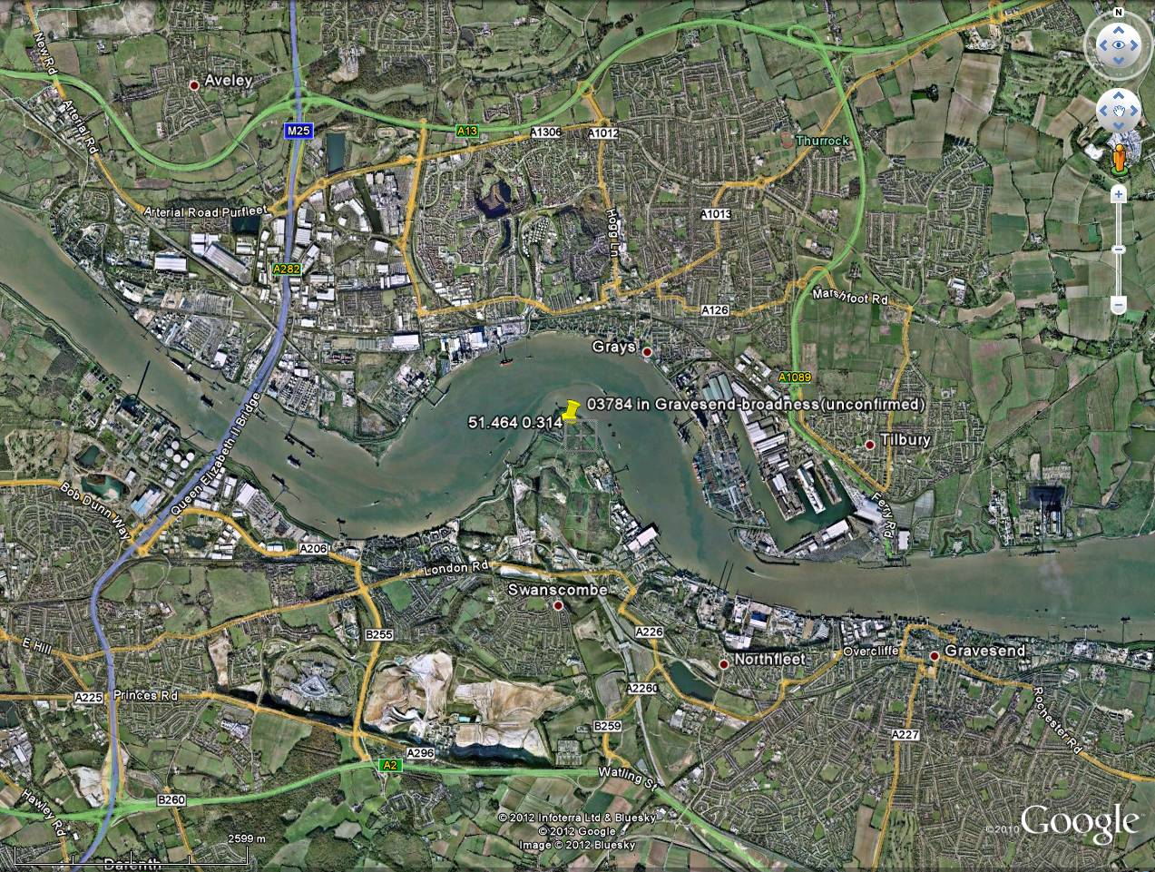
That spit of land juts into the Thames. If the Thames is warmed by power plant cooling outlets putting out waste heat upstream, I would think this station is getting a huge dose of the heat seen in the national heat map.
Anthony, something puzzles me about the whole “heat islands” thing. I can see where a thermometer in Las Vegas might be registering considerably more heat in 2012 than in 1952 due to urbanization, but shouldn’t there be at least a few dozen or hundred weather stations around the world with decent records and that are still sitting 50 miles from the nearest McDonald’s? Aren’t there enough stations like that to record the changes/lack-of-changes accurately or are the changes being looked for so small that they get lost in the noise without many hundreds of data gathering points?
😕
MJM
The met office make an allowance of 0,2c for uhi as regards CET. Some people would argue that this is insufficient for a small country that is in effect one big heat island.
Would it be possible to overlay the triangulation of the CET area on to the first map which seems to illustrate this heat island effect neatly?
Tonyb
This is just a hunch, but isn’t there a built-in bias in locating temp stations, since so many seem to be placed where they are easily got at (next to roads, building, etc) and where they can obtain
the power necessary to operate? With batteries and solar panels, one would think that power from the grid would no longer be required, nor comm lines to report data. Today’s technology
should allow stations to be placed where they make logical sense.
The BBC TV weather forecasts now regularly point out that “these temperatures are for the cities; in the country they may be …” and quote figures that are up to 3 or 4 degrees C colder.
This seems to be an explicit acknowledgement of the urban heat island effect, and a generously large one. So is the CET area (with only 0.2 degrees C) largely countryside? Doesn’t it include chunks of Lancashire and the industrial midlands?
Puzzled …
My daughter lives in all blue blue blue, far from any huge UHI effect, far from any large urban area. Life is good, until a hard winter when it’s nice to be a bit warmer.
What I have found surprising about the work carried out by Tallbloke and Tim is how circumspect the majority of the Met office’s weather stations are.
I had thought that they would be the global gold standard but it seems that most have serious flaws in their present day locations which give rise to temperatures which are artificially high.
Given that the data from these stations is being used not only for political means but also national energy policy this is a disgrace. Garbage in, Garbage out.
That Gravesend station could have lots more problems in the future if Paramount Pictures gets to set up it’s new theme park there.
http://www.gravesendreporter.co.uk/news/hollywood_theme_park_to_rival_disney_planned_for_swanscombe_1_1578470
Congratulations to Tim for his excellent open approach.
1. I hope that he keeps records of all his classifications as well as the source material required
to check and verify his work. Otherwise, it’s not reproduceable and not science.
2. He really should automate the process to remove the potential for “rater” bias. That can of course include a final human judgement where pixels are sometimes hard to classify automatically.
3. Its great that he publishes data as he gets it.
The interesting thing of course will be to understand the scientific basis of the rating system itself. That is, get the field test reports which determine that this is something more than a rule of thumb. There are some studies of temperature gradiants as you move away from paved surfaces that bear looking into. Where is Geiger when you need him.
@michaeljmcfadden,
One thing that has been blogged about here before is the dropping number of stations in the global land surface temp products particularly GISS.
People here looked into it and discovered that many of the missing stations are still to this day reporting data.
They also found that the stations dropping out where overwhelmingly rural, making the global products much more heavily weighted towards urban temps in recent years.
They even had a video clip of an animation showing the change in stations / station distribution over time. I don’t remember which articles it was on, maybe one of the mods here can look it up for you.
Having read through all the issues at this site in the 18th Aug post, I wondered whether the nearby radar emitter would not also have an effect. I’m guessing this is a thermistor sensor. Thermistors are semi-conductors, the powerful radar emitter could be inducing small currents in the device or its wiring or physically heating the sensor.
A typical resistance of a thermistor is in the kilohm range and the small thermal mass of thermistors makes them very sensitive to joule heating.
The screen is well off-axis w.r.t. the radar beam but it’s close enough to still receive a fair amount of power. This looks like a short range, high frequency Surface Movement Radar (SMR) . They operate in K-band , around 20GHz.
Assuming that the sensor is standard weather station equipment, the shielding my not be adequate for that sort of environment.
For major heat sources around late afternoon, I would expect the power stations to be spinning up for max daily load 5pm-6pm. If one is oil burning , this is probably exactly when it will be called into service.
Typo at the end: huge dose vs “a huge does of the heat seen in the national heat map.”
Good info as always.
[Fixed. Thank you. Mod]
I have been following Tim’s work, his methodical approach shows how science should be done, considered and without prejudice.
I still think Met-Office does a good job, not that I understand what they do, but because I assume that the early data (1690-1750) data was more or less fixed decades ago, and then we have current records.
The biggest surprise is that two are, for all practical purposes near identical if you assume that UHI and modern instrumentation has increased values by mere 0.6C some 270 years later.
http://www.vukcevic.talktalk.net/CET1690-1960.htm
Add to this high correlation of the Northern hemisphere to the CET, than if one is a honest devotee of the AGW, than one has to sit down and ask :how come?
One of the big problems with the UK is our weather stations are often locked away in RAF sites, eg Church Fenton, and completely inaccessible.
re. radar inducing heating in the Gravesend sensor: I’ve never seen the inside of a meteo thermistor sensor, but I’m guessing that in order to be a sensitive as possible to changes in air temp , the thermistor is probably not inside any kind of metallic shielding. Maybe our host could comment. I’d guess he’s seen a few 😉
This is good. Just like what Anthony (and the “et al”) have done, I’m surprised that anyone, anyone trying to learn the temperature of the globe would raise any objections or obstructions to the efforts.
If they want us to change the worlds’ economies based on the hypothosis of CAGW, doesn’t it make sense that they’d want to be sure the numbers they are using are accurate?
(Unless, of course, the the goal isn’t to save us from CAGW but rather to gather more cash and control.)
Just one thermometer in the middle of a remote unpopulated desert recording MINIMUM clear sky night time temperatures might indicate global warming IF it is happening.
You should be aware that DECC is about as credible as the IPCC. The new head of DECC, John Gummer aka Lord Deben, once famously fed his daughter a hamburger during the BSE crisis when his remit was food safety.
He has interests in ye olde climate change……
Veolia Environmental and water
Sancroft International – specialises is advising businesses on how to make money from policies enacted to combat global warming.
Chairman of Forewind, a consortium trying to build thousands of turbines in the North Sea’s Dogger Bank.
See Bishop Hill – http://www.bishop-hill.net/
Corruption is the name of the game.
NB Gummer chairs the Climate Change Committee
Kent Beuchert says:
October 10, 2012 at 12:24 pm
This is just a hunch, but isn’t there a built-in bias in locating temp stations, since so many seem to be placed where they are easily got at (next to roads, building, etc) and where they can obtain
the power necessary to operate? With batteries and solar panels, one would think that power from the grid would no longer be required, nor comm lines to report data. Today’s technology
should allow stations to be placed where they make logical sense.
=====================================================================
I would think that easy access and security issues would also be involved.
The closer they are to people, the easier they are check.
The closer they are to people, the more access needs to be restricted.
So accurate temperature measurement suffers because to meet those requirements, stations will tend to placed where people or enclosures already exist.
May I be serious for a moment?
Here’s a question I have often asked but have never received a satisfactory reply to;
Given that few machines even approach 100% efficiency and that every machine generates excess heat and that we ‘burn’ gigatons of fossil fuels as well as utilise nuclear, hydro, wind power etc….has anyone ever tried to calculate how much ‘heat’ is added to the atmosphere in a generalised way (as opposed to measurable UHI effects)?
If the Alarmists claim to be able to measure fractions of a degree’s warming due to PPM of CO2 in the atmosphere, it surprises me that no-one talks much about the actual waste heat that we produce and its effects on ambient temps.
Any explanations welcome.
Be gentle.
Tony McGough says:
October 10, 2012 at 12:31 pm
I posted a similar comment on a previous article here, East Midlands weather tacitly assume +3’C for towns (Derby, Nottingham and Leicester).
MJM
October 10, 2012 at 12:08 pm
Try this
http://www.wunderground.com/about/faq/international_cities.asp
From this list I’d say these were far from anywhere
Muckle Flugga UK 60.85 -0.88 0 03001
Baltasound UK 60.75 -0.85 15 03002
Sella Ness UK EGPM 60.45 -1.27 8 03006
Muckle Holm UK 60.58 -1.27 22 03007
Fair Isle UK 59.53 -1.63 59 03008
North Ronaldsay UK 59.37 -2.42 11 03009
Sule Skerry UK 59.08 -4.40 16 03010
North Rona UK 59.12 -5.82 98 03011
Foula UK 60.15 -2.07 22 03013
Foula UK 60.12 -2.07 13 03014
Benbecula UK EGPL 57.47 -7.37 6 03022
South Uist Range UK 57.33 -7.37 10 03023
Butt Of Lewis UK 58.52 -6.27 23 03025
Waterstein UK 57.43 -6.77 92 03027
Loch Glascanoch UK 57.72 -4.88 265 03031
Aultbea UK 57.87 -5.63 11 03034
Barra UK 57.03 -7.45 3 03035
Kilmory UK 56.77 -6.05 45 03040
Aonach Mor UK 56.82 -4.97 1130 03041
Altnaharra UK 58.28 -4.43 80 03044
Tulloch Bridge UK 56.87 -4.70 237 03047
Cape Wrath UK 58.63 -5.00 112 03049
The Heat Density map shows very clearly urban heat. All the main urban areas are clearly visible. Considering that in the space of about 100 years the number of cities of over 1,000,000 people has grown by several 1000%. On this map there are many towns of much less than a 1,000,000 and they show up clearly also.
When I commented (at the Talkshop a couple of months ago) about the Littlebrook power station waste heat outflow at Gravesend, I made some rough calculations of the possible temperature rise in the river on the bend around the weather station. I didn’t put these in the comment because I was playing around with inputs and don’t know the turbulence behaviour in the Thames, not to mention the tides, which Tim discussed briefly. I thought it too speculative in the context at the time. But what the heck, I’ll throw it in here. It was between 0.4 and 0.8 C if concentrated in a surface layer of 500mm and a couple of hundred metres wide. The UK record in 2003 from this station (one of the reasons for that blog post by Tim) was 100.8F and it was that ‘.8’which captured the public’s imagination because we had breached the 100F point. So a warming of the river of 0.4C to 0.8C just might have caused the media frenzy that followed.
The UK Met office is complicating matters by cobbling together a more extensive meteorological network of weather data from private observers as part of the Weather Observations Website (WOW) project which was launched in 2011.
http://www.weatherstations.co.uk/wow.htm
The map of the UK Met Office weather stations is here:
http://www.metoffice.gov.uk/climate/uk/networks/
The dodgy station at Gravesend (Broadness radar) shows (22.25 GMT) Air Temperature 8.8 °C, Wind Speed 6.0 mph, Relative Humidity 84.0 %, Wind Direction 90 °.
The WOW station in Gravesend shows (22.25 GMT) Air Temperature 9.9 °C, Wind Speed 2.5 mph, Relative Humidity 77.0 %, Wind Direction 138 °.
http://wow.metoffice.gov.uk/home
Presumably they’ll concoct a model to homogenize the data, especially as there is a rather curious site named, S.L.O. Maidenhead Weather (30641083) (Org. / School name: S.L.O. Maidenhead Berkshire England) where, at local time 22:35 on 10 October 2012, the air temperature was…
24.5 °C (Apparent Temperature 12.0 °C).
http://www.maidenhead-weather.co.uk/
http://wow.metoffice.gov.uk/sitehandlerservlet?requestedAction=READ&siteID=30641083
I agree with Gunga Din. It’s always puzzeled me who good news such as less warming is always ignored, while bad news like fewer poly bears etc becomes front page news. Surely the possibility of the planet not having to endure CAGW is something to be happy about.
Cardiff, Swansea? Edinburgh, Glasgow? Belfast ? no sensors. How come only English areas are recorded, Do Wales Scotland and Ireland not count?
Matt says:
October 10, 2012 at 1:03 pm
@michaeljmcfadden,
One thing that has been blogged about here before is the dropping number of stations in the global land surface temp products particularly GISS.
======================================================================
1940 there were some thousands of stations:
http://bacontime.files.wordpress.com/2012/09/climate_and_man_002.jpg
Please see this link for more details: http://en.wikipedia.org/wiki/Solar_energy
Basically, all human energy producing activities per annum amount to less than one (1) hour’s worth of energy from the sun.
Which are the 20 UK Climat surface stations, please?
Its a shame the heat island effects havn’t saved the crops in Britain this year , lack of warm sunshine and cold rain has done for the farmers . The grape crops have just been left on the vines as they are not worth picking . Who would have thought there would be widespread crop failures due to cold in this ever warming world ?
The National Heat Map is built from a bottom-up address level model of heat demand in England. The model estimates the total heat demand of every address in England, but based on published sub-national energy consumption statistics and without making use of metered energy readings.
The map is of essentially waste heat, not temperatures as some have assumed. Some studies show waste heat contributes minimally to UHI. Other studies suggest it can be a significant factor.
And, I and some others concluded that the reason for the high temperatures at the Gravesend site is the low albedo (dark) mudflats that surround it on 3 sides.
There are two things competing with temperatures. One is the actual temperature in an undisturbed, pristine environment. The other is the temperature experienced by residents of a town, city, or metropolis. Both of them should be actually measurements of enthalpy, with humidity taken into the computation.
The first is the only true measure of what the pristine planet is doing, provided only pristine measuring sites are used in determining enthalpy – this would include temperatures/humidity at the same height over a body of water, not just land. There should be rigorous standards for measuring these quantities, and there should be significant oversampling, both spatially, and temporally.
The second can’t have the same rigor applied, as the temperatures/humidities experienced by the residents are comprised of the varied environmental modulations of the base temperature/humidity (that of a now fictional pristine site). These measurements are just the actual life experiences of those residents. Some weather broadcasts are now including the “Feels like” temperature, which includes the humidity. I personally would love to hear a report saying, “Tomorrow’s enthalpy will be…, so get out your (fill in the blank).”
@ Matthew W
That is not the image I was looking for. There was an animation that showed the locations of temp stations globally from something like 1890 to ~2000.
Matt,
Is this what you are looking for?
http://jonova.s3.amazonaws.com/graphs/stations/great-dying-of-thermometers.gif
small quibbleDavid Schofield brought me to think this would be [a] good [time] to mention it,
@ Matthew W & michaeljmcfadden
Here is the article I was refering to. Go watch the video
http://wattsupwiththat.com/2008/03/06/weather-stations-disappearing-worldwide/
It’s not a heat map.
Check out Didcot power station – it produces no heat. Neither does one of the largest users of electricity in the country, which is situated just down the road in Culham. Nearby houses produce more heat according to theis DECC product.
It’s a utilities bill map, which ignores real sources of heat, and users of oil, lpg, coal, wood, and those with special deals with power stations.
Charles Nelson – yes, we are generating more heat than ever before. But it goes somewhere. It radiates into space. The amazing thing we have learned about our planet is that the atmosphere keeps the planet atmosphere temp in a certain range, allowing us to live. The overall temp can vary, but across shorter terms, say decades, if we geenrate more heat, it heats the atmosphere, then radiates into space.
The global warming hypothesis is that one part of the regulatory system, the atmosphere, is itself changing. The carbon dioxide added does not leave, and its addition holds more heat in, overall. If the carbon dioxide global warming hypothesis is true, we would be getting a warmer planet even if all of our heat-generating human activity were at a steady state – we would generate more heat, but a greater portion would be retained.
“marchesarosa says:
October 10, 2012 at 3:56 pm
Which are the 20 UK Climat surface stations, please?”
Goodness knows if this will post, copied from an actual source file.
local stations={ { wmo=3005, name='Lerwick', lat=60.1391666666667, long=-1.18472222222222}, { wmo=3017, name='Kirkwall Airport', lat=58.95352188819607, long=-2.901431693510928}, { wmo=3026, name='Stornoway', lat=58.21361824254632, long=-6.318955738311116}, { wmo=3066, name='Kinloss', lat=57.6456067915196, long=-3.563464535150946}, { wmo=3091, name='Aberdeen / Dyce', lat=57.20497061327473, long=-2.205313861954394}, { wmo=3100, name='Tiree', lat=56.50001018774803, long=-6.880803487104119}, { wmo=3162, name='Eskdalemuir', lat=55.31209027497275, long=-3.206307301991473}, { wmo=3171, name='Leuchars', lat=56.37735298771637, long=-2.86192902784711}, { wmo=3257, name='Leeming', lat=54.29698920443254, long=-1.533062211300392}, { wmo=3302, name='Valley', lat=53.25267670440459, long=-4.53652739944032}, { wmo=3377, name='Waddington', lat=53.17535595567492, long=-0.5233386419626107}, { wmo=3414, name='Shawbury', lat=52.79469108656707, long=-2.664777635006615}, { wmo=3502, name='Aberporth', lat=52.13947375127079, long=-4.571154152607138}, { wmo=3590, name='Wattisham', lat=52.13947375127079, long=-4.571154152607138}, { wmo=3740, name='Lyneham', lat=51.50313207002159, long=-1.992399086381173}, { wmo=3772, name='London, Heathrow', lat=51.47916444653322, long=-0.4505671614755646}, { wmo=3797, name='Manston', lat=51.3463666867272, long=1.335387206040604}, { wmo=3808, name='Camborne', lat=50.21831496050969, long=-5.327559840358448}, { wmo=3862, name='Hurn, Bournmouth Airport', lat=50.77935751853183, long=-1.836177830278091}, { wmo=3917, name='Belfast, Aldergrove', lat=54.66377729916611, long=-6.22513985034386} }Is Durham used?
a) I’m close.
b) I know where it is.
c) I know there has been a big housing estate built nearby.
DaveE.
http://www.metlink.org/pdf/articles/urban_heat_island_-_manchester.pdf
shenington says:
October 10, 2012 at 5:02 pm
It’s not a heat map.
It’s a utilities bill map
It’s a map of space heating demand. And assuming those spaces are heated on average the same amount, a map of waste heat from buildings. Although lacking some sources of waste heat, such as electronics. Because they are true climatists, they don’t tell you how they did the calculation, but presumably its derived from the interior space of buildings.
At last someone is having a good look at the station locations. I’d always thought some to be a bit bizzarre to say the least – this was (and probably still is) one near to me in Manchester : http://www.flickr.com/photos/kh1234567890/sets/72157622974758406/
Forgot d.
Never received a reply when I asked If I could go and check it.
DaveE.
I have photocopies of the original hand-written thermometer records for the first ever weather station in the world, at Durham, UK. The actual written data for the early 1700’s is between 5 and 10 deg C cooler than the Met Office quoted temperatures derived from the same records. I have emailed the Met Office several times over the last 5 years for clarification on the differences and have been ignored. Since I am busy making a living I have not chased this up vigorously, especial as it looked like the sceptics had “won the argument”.The other interesting thing I found out while accessing the historical records is that even up until 2011, no calibration data of the instruments at Durham university have been archived/stored/ are available…
There have been kind words, thank you.
David A. Evans says:
October 10, 2012 at 5:28 pm
Is Durham used?
It is marked as active. Not seen that one in ages and IIRC was a CET station removed because of UHI yet why so? Not wonderful, but fair enough, however, play with Google Earth history, ouch.
Roughly 54.768, -1.58612
Changes like that ought to be clearly mentioned in the formal records.
Not seen it mentioned in extremes so I’ve not paid attention. (quite a few are known but not yet posted as articles, in part because I am trying to avoid deluging someone else’s blog)
Leroy’s rating of the quality of location of atmospheric measurement stations is very good. Have you published it, Anthony? It would make a good post by itself.
This French guy, Leroy, has spent many years on assessing the quality of weather station sites. I translated a 1990’s paper by him for Anthony. He is quite meticulous. That French love for Cartesian logic does not allow Warmista Wibblyism.
What is most interesting is that he provides strict criteria for the ACCURACY of a weather station’s different measurements. Thus, under this condition, the error bar will be this much; under that condition, the error bar of that measurement will be this much. And, the error bars are different for each type of measurement in each environment.
kh1234567890 says:
October 10, 2012 at 5:35 pm
At last someone is having a good look at the station locations. I’d always thought some to be a bit bizzarre to say the least – this was (and probably still is) one near to me in Manchester ”
There is one marked as current at 53.4668,-2.25152, sheesh, although it might not be accurate.
The Google Earth history is unusual, from 2000, see a building rise but this poses a problem: the data starts 1996 when the new building was not there. Maybe it was on the old library. A quick look I can’t see a screen in Hulme Park which is opposite and a more typical location.
Matt says:October 10, 2012 at 1:03 pm
Is this the animated GIF you are referring to?
http://i44.tinypic.com/23vjjug.jpg
Steve Keohane,
He’s not paying attention to us.
Steve Keohane & D Boehm,
That is a version of it yes, but I was actually thinking of the video posted in the WUWT article I linked to.
Perhaps the surface station was cursed by Pocahontas. She is actually buried at Gravesend, but the exact location is not known.
Mark Cooper says:”I have photocopies of the original hand-written thermometer records for the first ever weather station in the world, at Durham, UK. The actual written data for the early 1700′s is between 5 and 10 deg C cooler than the Met Office quoted temperatures derived from the same records.”
*****************************************************
5 and 10 degrees is huge. Wouldn’t that mean that it has warmed quite a bit more than they are reporting? (for your region anyway) i would think they would jump on it. Maybe they know something about the data we don’t–I hope they answer you and you report back.
Most were “dropped” only in the sense of being ignored by GISS and the boys.
Yes; the Great Dying continues. The Great Disregarding would come closer, tho’.
Charles,
You are absolutely correct much of the UHI is in fact waste heat, but also the built environment has heat sinking (thermal mass) effects as well. In fact since energy is never created or destroyed (apparently except for magical CO2) almost 100% of our energy use ends up as heat eventually. For example you might put energy from your electric car into motion, but the energy inherent in that velocity is then converted to heat eventually through friction with the road and other moving parts and via the brakes when you stop, the energy is never “Used up” it goes on and on, from one form to another forever eventually degrading to the lowest form – heat.
So when looking at UHI trends the real influencing factor on UHI is Energy density – that is what is the energy consumption per square meter, rather than the heat emission per square meter. Energy density is related to the population density AND Energy Consumption per capita. I’ll wager that our modern energy consumption profile per capita alone, is enough to create an upward trend in UHI without even taking into account changes in population density.
Anthony, you should look at this factor?
Bob
tchannon says:
October 10, 2012 at 5:26 pm
>>
“marchesarosa says:
October 10, 2012 at 3:56 pm
Which are the 20 UK Climat surface stations, please?”
Goodness knows if this will post, copied from an actual source file.
… station list…
>>
How many of those are major airports? Quite a few it seems.
Heathrow is IIRC the worlds busiest airport with a plane taking off every 30 seconds ! Considering the time it takes to accelerate before take off, that means four turbo-reactors at full power pretty much continuously from early morning until late evening.
How about a back of envelop calculation of the energy burnt to get a large commercial airliner off the ground and how much heat that dumps into the local environment every 30s?
Heathrow has also seen massive growth in the post-war era.
It’s quite amazing they chose that as a climate reference station. Unless, of course, their aim is to increase the correlation of the resulting warming of the temperature record with fossil fuel consumption.
In that case choosing major airports would be an excellent idea.
MarkCooper
I have Durham on my historic temperatures site here.
http://climatereason.com/LittleIceAgeThermometers/
Do you have the older handwrittenDurham records in any sort of digitised format and the comparitive older Met office records? I would like to add them to the site.
tonyb
I just wanted to bump this intriguing comment.
Mark, why don’t you get these photocopies to Anthony, Willis, Marc Morano and Steve Goddard. They are not only incredibly effective in getting to the bottom of these issues, but they also have the means to get these facts in front of millions of people almost instantly.
tchannon says:
‘There is one marked as current at 53.4668,-2.25152, sheesh, although it might not be accurate.
The Google Earth history is unusual, from 2000, see a building rise but this poses a problem: the data starts 1996 when the new building was not there. Maybe it was on the old library. A quick look I can’t see a screen in Hulme Park which is opposite and a more typical location.’
That’s the location, just across the road to the east from your co-ordinates. It’s never been in the park – it would not last five minutes in that neighbourhood.
Hulme Library was built in the 70’s. The surrounding area was redeveloped at that time from terraced streets to quite widely spaced large blocks of apartments (Hulme Crescents). These were in turn demolished in late 90’s and the area redeveloped to what it is now.
The only other data available for Manchester would be Manchester Airport, way to the south and a completely different place.
“If the Thames is warmed by power plant cooling outlets putting out waste heat upstream”
The Thames here is tidal – so downstream heat can get here too.
Tony McGough says:
October 10, 2012 at 12:31 pm
The BBC TV weather forecasts now regularly point out that “these temperatures are for the cities; in the country they may be …” and quote figures that are up to 3 or 4 degrees C colder.
This seems to be an explicit acknowledgement of the urban heat island effect, and a generously large one. So is the CET area (with only 0.2 degrees C) largely countryside? Doesn’t it include chunks of Lancashire and the industrial midlands?
Puzzled …
I can remember in the 60’s London used to be 2°C warmer than the rural locations. Now it’s 3 to 4 degrees!
Philip Bradley:
As I said, it’s a utilities bill map. It’s closer to a population density map than anything directly to do with temperature or “heat”. As such, it conveys no new information. Power stations don’t even show up, because their electricity isn’t metered.
@michaeljmcfadden:
There are a few relatively unchanged and ‘pristine’ thermometers. When you look at those locations, there is little to no warming. At present, the GHCN has something like 60% of the thermometers in use at AIRPORTS. You know, tarmac, cars, jet engines… For some countries is rises to over 90% headed to 100% (Like in the USA and New Zealand IIRC).
For reasons known only to NOAA, they chose to drop from the record most of the thermometes. (Bt keep them in the early years / baseline period). So the peak was about 7000, then dropped to abotu 1200 in 2007 or so. As some of THEM are “new” and codes like GIStemp toss out any records shorter than 20 years, even fewer are actually used in the present (to compare to those older colder ones…)
The temperate records / distribution of thermometers is entirely unsuited for century scale calorimetry….
Small typo right near the start of the story…under the Broadness photo.
“….shipping radar station at broadness helping keep river traffic safe Date: 4 September 2005. Photo by Glyn Baker via Wikimedia Commons and Geograph.”
‘Broadness’ in body text with a cap B, I think.
Sounds like a great project. Now we need something similar here Downunder.
Swanscomb not only gets heat from the Thames but radar has a heating effect, like microwaves, and there is an air conditioner spilling heat from the equipment room. So an unreliable data set from here.
I know I have said this before, but when my children worked in Exeter, Devon during their spare time whilst still at school, I would often have to drive in a few miles to pick them up after work, as we live in the countryside. In winter, on those occasionally frosty nights, I would start my car, the air-con would inform me that ice was a potential issue by flashing -4.0°C outside temp. As I drove out of my driveway this would then show -3.0°C. As I drove up the hill & downthe other side it might read -2.0°C. As I approached the outskirts of the city, it would read -1.0°C or even 0.0°C. By the time I got to the city centre it would be something like 1.0-2.0°C. I know it’s not scientific, the temp sensor can only read to the nearest whole degree, air friction over the sensor could cause temp fluctuatons, etc., but it still “felt” warmer in town than in the countryside, but then again we’re into “feelings” as opposed to data, although if my darling daughter had been waiting around for more than 20 mins she might just disagree with that assessment in no uncertain terms, however, both my cars over the last 8 years had similar air-con systems both being Peugeots, but the temp tracking was the same!!!
Stephen Skinner says:
October 10, 2012 at 2:44 pm
The Heat Density map shows very clearly urban heat. All the main urban areas are clearly visible. Considering that in the space of about 100 years the number of cities of over 1,000,000 people has grown by several 1000%. On this map there are many towns of much less than a 1,000,000 and they show up clearly also.
There are only two cities in Britain with a population of over a million, London and Birmingham. If you added in the surrounding built up areas you would be able to add a few more to that list.
tchannon says:
October 10, 2012 at 5:26 pm
re your list of sites
RAF ‘Kinloss’, lat=57.6456067915196, long=-3.563464535150946},
RAF ‘Leuchars’, lat=56.37735298771637, long=-2.86192902784711},
RAF ‘Leeming’, lat=54.29698920443254, long=-1.533062211300392},
RAF ‘Valley’, lat=53.25267670440459, long=-4.53652739944032},
RAF ‘Waddington’, lat=53.17535595567492, long=-0.5233386419626107},
RAF ‘Lyneham’, lat=51.50313207002159, long=-1.992399086381173},
RAF ‘Belfast, Aldergrove’, lat=54.66377729916611, long=-6.22513985034386}
Aldergrove is an oddity because although it is a civil airport, the thermometer site is on the RAF portion.
Your chances of getting to these sites I would say is 3/5s of 5/8s of FA
As for the Durham site.
All the estate to the west is less than 10 years old, the estate to the south probably mid ’60s.
Apart from the observatory itself, that was pretty much a green-field site at the start of the record.
Matt says:October 10, 2012 at 8:16 pm
Steve Keohane & D Boehm,
That is a version of it yes, but I was actually thinking of the video posted in the WUWT article I linked to.
Matt, I saved that file Feb, 10, 2008. I would suspect it came from a current posting here at WUWT. You might check the old posts from then..
Having stayed in Morecambe whilst visiting our daughter I liked the look of this site just across the road from the sea front
https://maps.google.co.uk/maps?hl=en&ll=54.076429,-2.859825&spn=0.0011,0.00327&t=m&z=19&layer=c&cbll=54.076346,-2.860066&panoid=vpuS0ojWfuZ9M-175pc-_Q&cbp=12,98.6,,0,8.62
The prevailing wind is from the sea but blows across the esplanade and road before getting to the instruments.
James Bull
Why are new stations being sited on high rooftops ?
http://www.cas.manchester.ac.uk/restools/whitworth/photos/
All this is a very good reason to use the satellite data – albeit that is for troposphere rather than surface. If you look at the records in the Climate4you web site the surface record correlates very well to the satellite record, in fact the satellites are showing more recent warming than the surface stations.
If they were getting the surface station record wrong, or making insufficient allowance for the UHI, should we not see a divergence between the satellite and surface station records?
David A. Evans says:
October 11, 2012 at 3:21 am
>>
tchannon says:
October 10, 2012 at 5:26 pm
re your list of sites
RAF ‘Kinloss’, lat=57.6456067915196, long=-3.563464535150946},
RAF ‘Leuchars’, lat=56.37735298771637, long=-2.86192902784711},
RAF ‘Leeming’, lat=54.29698920443254, long=-1.533062211300392},
RAF ‘Valley’, lat=53.25267670440459, long=-4.53652739944032},
RAF ‘Waddington’, lat=53.17535595567492, long=-0.5233386419626107},
RAF ‘Lyneham’, lat=51.50313207002159, long=-1.992399086381173},
RAF ‘Belfast, Aldergrove’, lat=54.66377729916611, long=-6.22513985034386}
Aldergrove is an oddity because although it is a civil airport, the thermometer site is on the RAF portion.
Your chances of getting to these sites I would say is 3/5s of 5/8s of FA
>>
At least RAF stations are generally fairly rural and not the same continual traffic as a commercial airport. Presumably they have decent maintenance. On that basis they are probably on the better end of the quality scale.
On this link here http://badc.nerc.ac.uk/view/badc.nerc.ac.uk__ATOM__dataent_CET you will find another link to the C.E.T. ‘Triangle’ here,http://badc.nerc.ac.uk/data/cet/map.html
I think they only use about four or five stations from inside the triangle to compile the C.E.T.
D. J. Hawkins says:
October 10, 2012 at 3:47 pm
Charles Gerard Nelson says:
October 10, 2012 at 2:09 pm
it surprises me that no-one talks much about the actual waste heat that we produce and its effects on ambient temps.
Basically, all human energy producing activities per annum amount to less than one (1) hour’s worth of energy from the sun.
============
However, the sun’s energy is spread across the globe, while human energy use is concentrated into urban areas. Sort of like focusing a magnifying glass out in the sun, what was only warm suddenly becomes hot.
Doing the calculations on our urban property, out energy use works out to 9 W/m2. Not much when you look at the average contribution from the sun. However, the IPCC calculates that 3.7 W/m2 is the net effect of a doubling of CO2.
Thus, CO2 doubling would have only a small effect on our urban property as compared to the heat from our energy use. Which is what we find. A good deal of the surface area on our urban property is maintained at 20C/70F, regardless of the effects of CO2 or the sun.
I expect many other urban dwellers will find the same. If they place a thermometer randomly on some point on their property, the air temperature 2 meters above ground level will read 20C/70F, depending on whether the point selected is inside or outside.
This is what is overlooked when talking about UHI. In a rural setting, everywhere that is 2m above surface is “outside”. In an urban setting, a good percentage of the surface is “inside” where it is temperature regulated. What remains is in large part pavement, with some domesticated grass and trees thrown in along the borders. For the most part it has no resemblance to the rural area it replaces.
Makes one wonder if those radical (deniers) who maintain that temperatures have hardly risen at all may be closer to reality than we thought.
Large red area in South Yorkshire – looks like my wife is turning the heating on during the day again ;>)
Tallbloke or Tim
Are you able to superimpose the CET area on to your map as it demonstrates the heat island effect nicely?
http://badc.nerc.ac.uk/data/cet/map.html
This private email from the Met office to me describes the allowance made for UHI as follows;
“The urbanisation corrections to the CET series have been applied since 1974. Initially they were just 0.1 degree C, in certain months, then gradually for more months of the year; from about 1995 onwards some of the corrections increased to 0.2 deg C, and by about 2002 all the corrections were 0.2 deg C.”
The question needs to be asked as to whether this allowance is enough as England has some 55 million people crammed into a small area (with lots of attendant industry) and is a heat island itself, so in effect CET is measured within a heat island within a heat island. Despite the undoubted warming effect temperatures have declined sharply over the last decade (although still remain at a high level)
http://www.metoffice.gov.uk/hadobs/hadcet/
Perhaps this might make a good thread Anthony, whereby readers could try to determine the proper allowance for UHI on CET?
Tonyb
I’m sorry. I’ve been trying for 1/2 hour to put this thought into the Tips and Notes page.
Along the theme of temperature trends and verification of historical records. I got to thinking about soil temperatures. As an agrarian by education, we use soil temps to determine planting times and seed germination.
The ARS has a number of sites throughout the midwest, and many states have their own research stations with long soil temperature records.
Would not a station with a 50+ year record of soil temperature at the 5cm and 45 cm depth provide a decent record of climate? This record may give us an indication of both the air temp and the solar heating average with some degree of blindness to the increasing CO2 concentration?
From this temperature plot I can readily identify every city and major town in England.
Suddden thought!
So why aren’t the maximum heat records in the hot spots?
If you go to the map site http://ceo.decc.gov.uk/nationalheatmap/ and click on layers and just tick only on industrial heat density and commercial heat density it gets a lot hotter!
Someone asked where are the Climat surface stations on the map at the top of the article.
The simplest answer is that only two appear to be in areas showing surplus heat: Heathrow, which is probably around the western fringe of the red heart of the London blob, and Hurn, which is somewhere in the northern part of the yellow blob furthest west along the Channel coast.
All of the others appear to be in blue/green zones: Leeming in the Vale of York, Waddington south of Lincoln, Shawbury north of Shrewsbury, Wattisham north-west of Ipswich and Manston south-west of Ramsgate (these two are also within the expanded map, but neither is marked), Lyneham south-west of Swindon, and Camborne out in the far South West. All are in fairly rural areas.
@QuestingVole,
Even the one’s in generally rural areas can be subject to micro climate heat sources such as (grills, trash burning bins, AC exhausts, pavement) All things that rural stations in the US have been found to be exposed to. The problem is that temp stations (especially the newer automated ones) tend to be built close to human habitation even in rural areas.
“The interesting thing of course will be to understand the scientific basis of the rating system itself. That is, get the field test reports which determine that this is something more than a rule of thumb. There are some studies of temperature gradiants as you move away from paved surfaces that bear looking into. Where is Geiger when you need him.”
Looks interesting
http://www.ucprc.ucdavis.edu/
The temperature differential for various types of concrete is rather huge up to 20F difference depending on the type of pavement you have. Berkeley ( LLB labs) has a bunch of research on this, basically to cool cities by using different types of and finishes of pavement.
Bob Mount says:
October 11, 2012 at 10:09 am (Edit)
From this temperature plot I can readily identify every city and major town in England.
##################
thats because its not a HEAT (temperature ) map. its a map of ELECTRICITY usage done in “heat map” format. Heat map is a TYPE of map. This maps electricity usage and shows the electrcity demand in a heat map FORMAT. That’s why, for example, when you zoom in you can see that roads etc have no “heat” or trees have no heat
http://flowingdata.com/2010/01/21/how-to-make-a-heatmap-a-quick-and-easy-solution/
That Said, the real test will be to see how well electricity usage correlates with actual temperature measures. basically there you will be looking for the waste heat contribution to UHI.
So. This is not a map of temperature. it is a HEAT MAP ( a type of format ) of electricity demand. A heat map is a type of map that turns numbers ( kilowat hours ) into COLORS.
or more precisely is is a map of Kilowat demand ( what they call heat demand ) in a heatmap format. Just to be clear
@Fred Berple
I agree in some sense however you are ignoring other factors of your energy consumption, for example the 50KWh you consume driving to and from work gas consumption, and the reduction is transpiration cooling for the built area of your property. I’d wager if you took this into account your “Footprint” would be something of the order of 30-40 watts per square meter, or about 10 x CO2 theorized effect for a doubling, and about 100 x the theoretical effect of CO2 for the increase from 1960 to now. Let’s assume energy use on your property increased linearly from nothing (wilderness) in 1960 to your current estimated 33 W/ Sq m, That results in a gradient of 3w/m2 per decade for UHI growth and a maximum of about 80/310 * 3.7/11 per decade using a linear approximation or 0.086 w/m2 for CO2. So we have a situation that a thermometer placed on your property would experience extra heating energy trend of 3W/m2 per decade for UHI Vs 0.086 W/m2 per decade for CO2 – and they think from this noise they can extract the CO2 component accurately. To quote a famous Australian Film ” The Castle” , tell-em they’re dreamin’
Oh Fred, the calculation (above) assumes your 9w/m2 for your property is correct
While this is primarily about UHI, rural areas also have had changes causing warming, with likely a greater overall effect because the land area is much larger.
Since the 1950s there have been large increases in field drainage, which reduces evaporation and hence increases temperatures, this in turn has allowed earlier planting of crops, generally reducing albedo (again causing warming), and hedgerows and small copse of trees have been removed (in the 1970s and 80s as much as 2% of hedgerows were removed every year), reducing turbulence and boundary layer mixing at night. Without getting into the details, reduced boundary layer mixing, locally cools, but over wider areas the net effect is warming.
Thanks for the responses and links regarding the surface stations! Interesting.
I must admit I’m a bit puzzled by the reliance on surface station data though. I would think that there must be fairly standardized high quality weather data recorders based on satellites extending back at least 30 years or so. True, that’s rather short in terms of geological time periods, but given the likely near-immunity to local fluctuations and heat island effects and such things I’d expect that “trends” would be fairly clear, up, down, or stable. No?
– MJM
“PRD says:
October 11, 2012 at 9:12 am
…
Along the theme of temperature trends and verification of historical records. I got to thinking about soil temperatures. As an agrarian by education, we use soil temps to determine planting times and seed germination.”
You are correct, ground temperature is the body temperature, entropy, not the ephemeral layer of gas. Moreover it is an integrating measure which largely avoids the Nyquist violation so endemic in what passes for measurement.
I’ve spent a lot of time on ground temperature data. I found that wrong adjustments to the data have been made. Also, the available data is in a worse state than air measurements, perhaps because it has received so little attention.
There is a very common misunderstanding of the infamous Stephan Boltzman equation, a purely theoretic thing where it has to connect with the real world via “magic”. The key is the surface thermal conductivity and thermal capacity, as I showed via modelling the lunar surface, matching the Diviner data (but not the wrong public web version, undergrad errors). http://diviner.ucla.edu/
Lunar dust behaves as highly thermally insulating, in a large part because it is in high vacuum which defeats gas conduction. Radiation is a very weak energy transfer mechanism. This has been known or correctly theorised for many years but the true implication seems to have been missed.
I like it when maths and measurement agrees.
The earth behaves as highly conductive but is far beyond my meagre capability at figuring out. I could make some observations, best kept private since I am in strong disagreement with many. Nevertheless much the same process takes place at the air/ground interface.
The ground behaves as a thermal delay line introducing a phase lag with depth (acts as a natural low pass filter). The energy flow is bidirectional on a thermal capacitance. The body rotation and orbital is critical to almost all parts of the physics yet largely ignored in climate, want a fixed world.
An exactly similar effect is taking place with objects near Stevenson screens hence phase delay is introduced. I have seen sites where temperature rise _after_ peak insolation, known heavily contaminated sites. If pristine high resolution data is available that is a signature.
michaeljmcfadden,
Yes, any actual trend in the satellite data would be clear and largely un-affected by UHI or other micro climate effects.
The problem is that there are known natural climate cycles with periods longer than 30 years, so the satellite record is useless for trying to attribute that trend to a cause or causes.
For the people pushing the catastrophy idea, a catasprohy that they can’t blame people for is useless.
Very useful informations, thankyou very much!
K.R: Frank
Image reminds me of IR mapping of a mother board.
“Here’s a question I have often asked but have never received a satisfactory reply to;
Given that few machines even approach 100% efficiency and that every machine generates excess heat and that we ‘burn’ giga-tons of fossil fuels as well as utilize nuclear, hydro, wind power etc….has anyone ever tried to calculate how much ‘heat’ is added to the atmosphere in a generalized way (as opposed to measurable UHI effects)?”
Answer from Max:
Considering that the daily input from the Sun is on the order of 1,000,000 times the total amount of energy “release” from coal, nuclear, gasoline, fossil fuels in general..the contribution of the “heat load” from our energy sources is miniscule. Now DO NOT be lead down the “primrose path” that “Well, ‘we’ should get all our energy from the SUN…and not use any of these non-Green sources…” As this is where we get into the concepts of ENERGY DENSITY, energy distribution (time and space) and ECONOMICS. All of which make SOLAR and WIND terribly useless logistics wise (time and space) and HORRIBLY expensive (ECONOMICS).
(Not So Mad) Max
P. Solar;
It is important to keep in mind that the airport stations are fit for purpose — their own purpose: the reporting of takeoff and landing atmospheric conditions over the tarmac. Planes urgently require that info, so those stations are not about to become “good” general weather stations. Ever.
Max;
+1
The issue with UHI is the misrepresentation of a specialized subset of readings as representative of the whole, despite their obvious unfitness for that purpose.
The whole “sustainability” push, too, is a farce. Time-travel back 100 years, and advise our ancestors what to “conserve” for our needs. There is nothing they used that we now care about, or isn’t in plentiful supply. We could advise them to lay off the slaughter of passenger pigeons and Dodos, perhaps, and encourage the substitution of petroleum for whale oil, but not much else.
And the technological change over the last century is nowhere near as swift and unpredictable as the next’s will be. It is risible to imagine we can “save” anything the future economy will care much about.
I know of RAF Waddington near Lincoln. I lived there once. All that area is subject to drought and being flat is generally a temperate area. It was once home to the Vulcan V bombers and it featured in Thunderball, the 707 movie in the 60s, my ex was flying one of the Vulcans featured in it. The Vulcans have gone and I believe very little military aircraft are there anymore.