Guest post by Bob Tisdale
MONTHLY SST ANOMALY MAP
The following is a Global map of Reynolds OI.v2 Sea Surface Temperature (SST) anomalies for August 2012. It was downloaded from the NOMADS website. The contour levels are set at 0.5 deg C, and white is set at zero.

August 2012 Sea Surface Temperature (SST) Anomalies Map
(Global SST Anomaly = +0.271 deg C)
MONTHLY OVERVIEW
The Monthly NINO3.4 SST Anomaly continued to warm as one would expect during the evolution of an El Niño (rising about 0.18 deg C) to +0.847 deg C, which is well above the +0.5 Deg C threshold of an El Niño and still well below the +1.0 threshold of a moderate El Niño. See the weekly NINO3.4 graph near the bottom of the post also.
Global Sea Surface Temperature anomalies warmed (+0.037 deg C) as one would expect in response to the developing El Niño. The hemispheres responded differently. The Northern Hemisphere warmed since July, while the Southern Hemisphere was basically unchanged. The South Pacific and the South Atlantic were the only two ocean basins that cooled in August. The monthly Global Sea Surface Temperature anomalies are presently at +0.271 deg C.
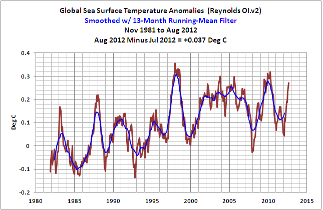
(1) Global Sea Surface Temperature Anomalies
Monthly Change = +0.037 deg C
####################################
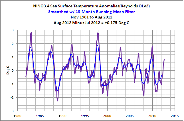
(2) NINO3.4 Sea Surface Temperature Anomalies
(5S-5N, 170W-120W)
Monthly Change = +0.175 deg C
####################################
THE EAST PACIFIC VERSUS THE REST OF THE WORLD
The East Pacific and the Rest-Of-The-World (Atlantic-Indian-West Pacific) datasets were first discussed in the post Sea Surface Temperature Anomalies – East Pacific Versus The Rest Of The World, and was discussed a few months later in How Can Things So Obvious Be Overlooked By The Climate Science Community?
It was also discussed in great detail in my recently published book Who Turned on the Heat? The Unsuspected Global Warming Culprit, El Niño-Southern Oscillation. The Updated Free Preview (typos corrected) includes the Table of Contents; the Introduction; the beginning of Section 1, with the cartoon-like illustrations; the discussion About the Cover; and the Closing. Also see the blog post Everything You Every Wanted to Know about El Niño and La Niña… for an overview. The book is only US$8.00. Please click here to buy a copy. (Paypal or Credit/Debit Card).
In the following two graphs, both datasets have been adjusted for the impacts of volcanic aerosols. The global oceans were divided into these two subsets to illustrate two facts. First, the linear trend of the volcano-adjusted East Pacific (90S-90N, 180-80W) Sea Surface Temperature anomalies since the start of the Reynolds OI.v2 dataset is basically flat. That is, the East Pacific hasn’t warmed in 30+ years. The East Pacific linear trend varies very slightly with each monthly update. But it won’t vary significantly between El Niño and La Niña events.

(3) Volcano-Adjusted East Pacific Sea Surface Temperature (SST) Anomalies
(90S-90N, 180-80W)
####################################
And second, the volcano-adjusted Sea Surface Temperature anomalies for the Rest of the World (90S-90N, 80W-180) rise in very clear steps, in response to the significant 1986/87/88 and 1997/98 El Niño/La Niña events. It also appears as though the Sea Surface Temperature anomalies of this dataset may have made another upward shift in response to the 2009/10 El Niño and 2010/11 La Niña events. For those who are interested in the actual trends of the Sea Surface Temperature anomalies between the 1986/87/88 and 1997/98 El Niño events and between the 1997/98 and 2009/10 El Niño events refer to Figure 4 in Does The Sea Surface Temperature Record Support The Hypothesis Of Anthropogenic Global Warming? I further described (at an introductory level) the ENSO-related processes that cause these upward steps in the post ENSO Indices Do Not Represent The Process Of ENSO Or Its Impact On Global Temperature.

(4) Volcano-Adjusted Sea Surface Temperature Anomalies For The Rest of the World
(90S-90N, 80W-180)
####################################
The periods used for the average Rest-Of-The-World Sea Surface Temperature anomalies between the significant El Niño events of 1982/83, 1986/87/88, 1997/98, and 2009/10 are determined as follows. Using the original NOAA Oceanic Nino Index (ONI)for the official months of those El Niño events, I shifted (lagged) those El Niño periods by six months to accommodate the lag between NINO3.4 SST anomalies and the response of the Rest-Of-The-World Sea Surface Temperature anomalies, then deleted the Rest-Of-The-World data that corresponds to those significant El Niño events. I then averaged the Rest-Of-The-World SST anomalies between those El Niño-related gaps.
The “Nov 2010 to Present” average varies with each update. As noted in the post Sea Surface Temperature Anomalies – East Pacific Versus The Rest Of The World, it will be interesting to see where that Sea Surface Temperature anomaly average settles out, if it does, before the next significant El Niño drives them higher.
Of course, something could shift. Will the upward ratcheting continue when the Atlantic Multidecadal Oscillation (AMO) decides to turn around and start its decline? The upward steps would not continue in the North Atlantic, but would the AMO impact the upward steps in other portions of the globe? For more information about the Atlantic Multidecadal Oscillation, refer to the post An Introduction To ENSO, AMO, and PDO — Part 2.
The Sea Surface Temperature anomalies of the East Pacific Ocean, or approximately 33% of the surface area of the global oceans, have decreased slightly since 1982 based on the linear trend. And between upward shifts, the Sea Surface Temperature anomalies for the rest of the world (67% of the global ocean surface area) remain relatively flat. As discussed in my book, anthropogenic forcings are said to be responsible for most of the rise in global surface temperatures over this period, but the Sea Surface Temperature anomaly graphs of those two areas prompt a two-part question: Since 1982, what anthropogenic global warming processes would overlook the Sea Surface Temperatures of 33% of the global oceans and have an impact on the other 67% but only during the months of the significant El Niño events of 1986/87/88, 1997/98 and 2009/10?
STANDARD NOTE ABOUT THE DATA
The MONTHLY graphs illustrate raw monthly OI.v2 SEA SURFACE TEMPERATURE anomaly data from November 1981 to August 2012, as it is presented by the NOAA NOMADS website linked at the end of the post. I’ve added the 13-month running-average filter to smooth out the seasonal variations.
MONTHLY INDIVIDUAL OCEAN AND HEMISPHERIC SEA SURFACE TEMPERATURE UPDATES
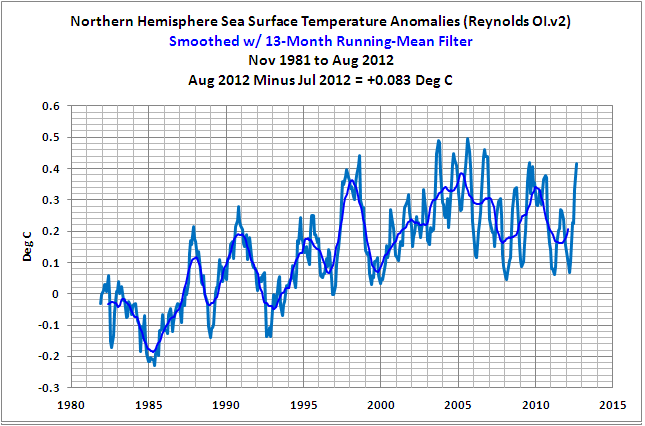
(5) Northern Hemisphere Sea Surface Temperature (SST) Anomalies
Monthly Change = +0.083 deg C
####################################

(6) Southern Hemisphere Sea Surface Temperature (SST) Anomalies
Monthly Change = +0.001 deg C
####################################

(7) North Atlantic Sea Surface Temperature (SST) Anomalies
(0 to 70N, 80W to 0)
Monthly Change = +0.180 deg C
####################################
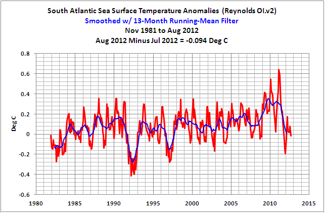
(8) South Atlantic Sea Surface Temperature (SST) Anomalies
(0 to 60S, 70W to 20E)
Monthly Change = -0.094 deg C
Note: I discussed the (now apparently temporary) upward shift in the South Atlantic Sea Surface Temperature anomalies in the post The 2009/10 Warming Of The South Atlantic. Prior to that shift, the South Atlantic sea surface temperature anomalies had been relatively flat for about two decades. It looks as though the South Atlantic sea surface temperature anomalies are returning to the level they were at before that surge, and where they had been since the late 1980s. We’ll have to see where things settle.
####################################

(9) North Pacific Sea Surface Temperature (SST) Anomalies
(0 to 65N, 100E to 90W)
Monthly Change = +0.027 Deg C
####################################

(10) South Pacific Sea Surface Temperature (SST) Anomalies
(0 to 60S, 120E to 70W)
Monthly Change = -0.008 deg C
####################################

(11) Indian Ocean Sea Surface Temperature (SST) Anomalies
(60S to 30N, 20E to 120E)
Monthly Change = +0.121 deg C
####################################
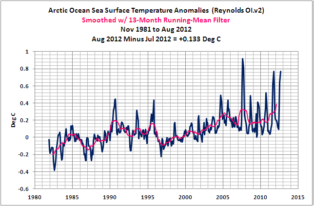
(12) Arctic Ocean Sea Surface Temperature (SST) Anomalies
(65N to 90N)
Monthly Change = +0.133 deg C
####################################
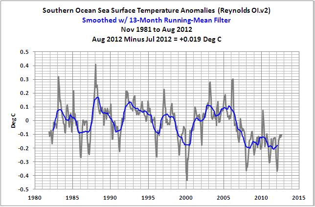
(13) Southern Ocean Sea Surface Temperature (SST) Anomalies
(90S-60S)
Monthly Change = +0.019 deg C
####################################
WEEKLY SEA SURFACE TEMPERATURE ANOMALIES
The NINO3.4 Sea Surface Temperature anomalies based on the week centered on August 5, 2012 dropped back down into weak El Niño range. They are presently at +0.881 deg C.

(14) Weekly NINO3.4 Sea Surface Temperature (SST) Anomalies
####################################
The weekly global Sea Surface Temperature anomalies are wiggling their way warmer in response to the seasonal ENSO signal and are at +0.276 deg C.
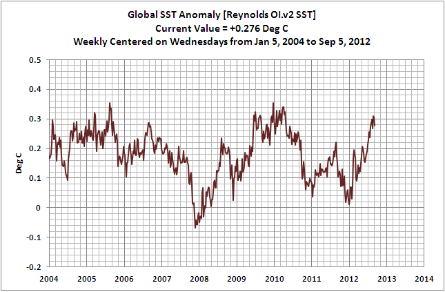
(15) Weekly Global Sea Surface Temperature (SST) Anomalies
####################################
INTERESTED IN LEARNING MORE ABOUT THE EL NIÑO AND LA NIÑA AND THEIR LONG-TERM EFFECTS ON GLOBAL SEA SURFACE TEMPERATURES?
Why should you be interested? The sea surface temperature record indicates El Niño and La Niña events are responsible for the warming of global sea surface temperature anomalies over the past 30 years, not manmade greenhouse gases. Scroll back up to the discussion of the East Pacific versus the Rest of the World. I’ve searched sea surface temperature records for more than 4 years, and I can find no evidence of an anthropogenic greenhouse gas signal.
I’ve recently published my e-book (pdf) about the phenomena called El Niño and La Niña. It’s titled Who Turned on the Heat? with the subtitle The Unsuspected Global Warming Culprit, El Niño Southern Oscillation. It is intended for persons (with or without technical backgrounds) interested in learning about El Niño and La Niña events and in understanding the natural causes of the warming of our global oceans for the past 30 years. Because land surface air temperatures simply exaggerate the natural warming of the global oceans over annual and multidecadal time periods, the vast majority of the warming taking place on land is natural as well. The book is the product of years of research of the satellite-era sea surface temperature data that’s available to the public via the internet. It presents how the data accounts for its warming—and there are no indications the warming was caused by manmade greenhouse gases. None at all.
Who Turned on the Heat? was introduced in the blog post Everything You Every Wanted to Know about El Niño and La Niña… …Well Just about Everything. The Updated Free Preview (typos corrected) includes the Table of Contents; the Introduction; the beginning of Section 1, with the cartoon-like illustrations; the discussion About the Cover; and the Closing.
Please click here to buy a copy. (Paypal or Credit/Debit Card). It’s only US$8.00.
You’re probably asking yourself why you should spend $8.00 for a book written by an independent climate researcher. There aren’t many independent researchers investigating El Niño-Southern Oscillation or its long-term impacts on global surface temperatures. In fact, if you were to perform a Google image search of NINO3.4 sea surface temperature anomalies, the vast majority of the graphs and images are from my blog posts. Try it. Cut and paste NINO3.4 sea surface temperature anomalies into Google. Click over to images and start counting the number of times you see Bob Tisdale.
By independent I mean I am not employed in a research or academic position; I’m not obligated to publish results that encourage future funding for my research—that is, my research is not agenda-driven. I’m a retiree, a pensioner. The only funding I receive is from book sales and donations at my blog. Also, I’m independent inasmuch as I’m not tied to consensus opinions so that my findings will pass through the gauntlet of peer-review gatekeepers. Truth be told, it’s unlikely the results of my research would pass through that gauntlet because the satellite-era sea surface temperature data contradicts the tenets of the consensus.
SOURCES
The Sea Surface Temperature anomaly data used in this post is available through the NOAA NOMADS website:
http://nomad1.ncep.noaa.gov/cgi-bin/pdisp_sst.sh
or:
http://nomad3.ncep.noaa.gov/cgi-bin/pdisp_sst.sh?lite=
Apologies in advance…
And if the tenets contradict, the “consensus” must acquit.
Thanks, Anthony.
http://www.atmos.washington.edu/~rmeast/Full_Text_D1.pdf
See Eastman and Warren (2012) above:
Figure 6 (pg 38) shows cloud cover for the period 197- 2009. The data distribution is poor over the Antarctic, but it would appear that during the prior 40 years there has been an increase of cloud cover in the Arctic, with a corresponding decrease of cloud cover in the Antarctic.
If we ASSUME:
a. the changes in cloud cover occur equally all through the year (and for those of you who wish to say otherwise, I wish to point out that the TSI for the north and south pole are 22 W/m2 between June and Jan due to the orbitabl eccentricity of Earth, so if we can’t assume this then we have to rework our data of planetary energy to include regional, temporal changes in ground reaching insolation before we can talk about global insolation effects), and
b. the net impact of changes in TSI on each area are proportional to the impact the Arctic and Antarctic have on the planetary temperature averages, then:
1. during the summer in both hemispheres, the “day” temperatures in the Southern Hemisphere will be elevated, while those of the Northern Hemisphere will be depressed. The TSI of the SH, as the Earth is at perihelion during the Southern summer, is higher than that in the summer of the NH, when the Earth is at its aphelion position. The net effect is to increase the relative warming of the SH to the NH, but one effect to some extent cancels out the other. But even if the percentages are equal, the higher TSI in the Antarctic summer will cause a net warming effect to the planet. The orbital eccentricity, in conjunction with the observed changes in cloud cover, requires proportionately more cloud cover (i.e. albedo) increase in the northern hemisphere summer to balance the changes in summer period heating. The open ocean of the Arctic summer, by releasing heat, will moderate the summertime loss of heat due to cloud cover over the land, however.
2. during the winter in both hemispheres, the lower temperatures are not (much less) determined by the TSI, as large parts of the high latitudes are in darkness. The controlling factors are radiative loss and out-of-darkness atmospheric transfer of heat. In the Antarctic, however, the decrease in cloud cover INCREASES the radiative loss, bringing the net temperatures DOWN. In the Arctic, the increase in cloud cover during the winter darktime in the southern hemisphere DECREASES the radiative loss, bringing the temperature UP. What we would see is the wintertime warmer in the Arctic while colder in the Antarctic.
The Antarctic, however, has a large open ocean to maintain heat transfer, while the Arctic does not. The net effect would be to reduce the wintertime cooling in the Antarctic while the lack of open ocean in the Arctic provides no counterbalancing heat transfer mechanism there.
Conclusion:
Temporal changes in cloud cover as shown in Eastman and Warren (2012) suggest a summer based warming trend in the Antarctic and a winter based warming trend in the Arctic. During the winter in the Antarctic, the open ocean moderates heat loss to the Antarctic land mass, while during the summer, open ocean in the Arctic moderates the heat loss due to increased cloud cover. The result is suggested to be a net warming when the two areas are averaged together: changes in regional cloud cover, not global cloud cover, may be sufficient to give rise to the observed temperature “anomalies” of the past 30 years.
(Of course I’m not suggesting such a simplistic scenario, but the temporal, regional effects should be looked at with the Eastman/Warren data, to determine if the +/- actually nets out to zero, as proposed.)
It looks like the El Nino will weaken now.
Normally the ENSO is a coupled Ocean-Atmosphere phenomenon, but this time, the Atmosphere side of it is not co-operating. All of the Atmosphere-related components are neutral/La Nina.
So the Ocean side is now weakening and there will not be even a moderate El Nino, just a weak one peaking at about +1.0C last week. That will put this El Nino into the non-typical category and closer to a neutral year.
Bill Illis: That scenario if it plays out as you describe would be interesting to watch. Of course, it would be attributed to AGW.
We’ve got El Nino, La Nina and La Nada. What would we call that?
BT: Have just purchased yr book. What is chance of a serious review by a recognised authority?
Thanks Bob.
There’s another reason why there won’t be a full blown el nino. The warm pool dissipated.
http://tallbloke.wordpress.com/2012/09/02/2012-el-nino-looking-unlikely/
hillrj says: “BT: Have just purchased yr book. What is chance of a serious review by a recognised authority?”
I haven’t seen any purchases by those who I would consider authorities on ENSO. Time will tell. Roger Pielke Sr suggested the scientific community review my findings objectively, with an emphasis on objective:
http://pielkeclimatesci.wordpress.com/2012/09/04/announcement-bob-tisdales-new-book-who-turned-on-the-heat-the-unsuspected-global-warming-culprit-el-nino-southern-oscillation/
Thanks for buying a copy.
Regards
Dr. Roger Pielke Sr. is a recognized authority.
http://is.gd/ekWsc7
The key word is objective.
Oops. Sorry Bob T. Delete mine.
Bob,
Is your book available for Kindle?
Further to the discussion as to whether an El Nino is developing, the 30 day SOI is now positive, though the 90 day index is still negative. See http://www.longpaddock.qld.gov.au/seasonalclimateoutlook/southernoscillationindex/30daysoivalues/
Pardon me for introducing a question outside the scope of the original article. I live in New Brunswick, and the Atlantic Ocean (including the Bay of Fundy) is red from eastern Canada through to Iceland, one of the few red areas of the world. Can anyone tell me why this region is so “warm”? The CBC carried an interview with someone who said that the conditions were unusual and that it must be due to global warming, etc., etc. I don’t have a ready answer as to why the water is so “warm” in this region. Related to this, I wonder how much of that warm water is finding its way into the Arctic Ocean and how much of the melting ice is due to this water.
IanM
DR says: “Is your book available for Kindle?”
I still have no plans for a Kindle edition. The file is too large, and that makes it too expensive.
“Heat is energy associated with motion and positions of the molecules in material….the conversion of macroscopic (mechanical) energy into microscopic (thermal) energy.” [1]
As such, heat is anti-gravity, always flowing away from mass, or occasionally against gravity from hot to cold (example advection of warm front over cold surface). It is unlikely that there is a great deal of horizontal drift in the flow of this energy, so the surface variations over time are most likely an indication of subterranian variations. Notice the Great Lakes are warmer at the same time there is a heat wave and drought in the Midwest. There is no reason that geothermal energy should be constant over time, or over location. We are talking a total range of 6 C, when only a few degrees make a measurable difference.
[1] “Fundamentals of Mechanics and Heat”, Hugh D Young, Carnegie Institute of Technology
Lots of red at the top pole. With six months of dark coming, that’s lots of heat that will radiate out to the great heat sink in the sky. Everywhere else is middlin’.
Better buy a coat.
Bob,
Please forgive my ignorance in regard to the coupling between the La Nina and El Nino phenomenon in relation to the following question.
First a little background:
In your model, a La Nina event:
a) is associated with stronger Westerly equatorial winds which bottle up the Pacific ocean’s excess near surface heat content in the Western Pacific Warm Pool.
b) produces clear conditions in the Eastern Equatorial Pacific, resulting in a Solar re-charge of the Eastern Pacific ocean’s near surface heat content [through the solar warming of recently up welled deep ocean water].
If an El Nino event follows a La Nina event, then its job is to:
a) is associated a weakening of the Westerly Trade Winds which eventually leads to the development of Easterly Equatorial winds that move the excess near surface heat content of the Western Pacific Warm Pool to the Eastern Equatorial Pacific.
b) merge the easterly moving warm pool water with the rewarmed deep ocean water in the Eastern Equatorial Pacific Ocean
c) eventually redistribute the excess near surface ocean heat content in the Eastern Equatorial Pacific to the rest of the World’s oceans [particularly the Nth Pacific and Nth Atlantic] via atmospheric tele-connections.
You have proposed that the global warming phase in the world’s mean temperature [i,e. from about 1976 to 2006] has been characterized by a greater frequency (and/or strength?) of El Ninos compared to La Ninas and that this imbalance has lead to step-like warming of the rest of the World’s oceans at the times of strong El Nino events in 1983, 1987, 1998 and 2010.
Now the question:
If the above is true, how would your model have worked during the epoch in which the World’s mean temperatures cooled [i,e, from about 1940 to 1970]? Presumably this epoch has been characterized by a greater frequency (and/or strength?) of La Ninas compared to El Ninas and the reduced number of frequent strong El Nino events [like those in 1983, 1987, 1998, and 2010] would have suppressed the redistribution of the excess near surface heat-content of the Eastern Equatorial pacific to the other worlds oceans.
Is this a reasonable summary of your ideas on the ENSO heating and cooling mechanism?.
Ian L. McQueen: Here’s a graph of the NW North Atlantic (40N-80N, 80W-15W). Those coordinates should capture that hotspot.
http://i48.tinypic.com/m9afy8.jpg
As you can see, it’s not unprecidented. There was a similar spike a couple of years ago. But there’s been a recent change in the variability/volatility. Why? Sorry to say I haven’t looked into it yet.
If the additional volatility doesn’t persist for a decade or so, it might be difficult to track down. Like the South Atlantic data. It had been existing happily in a reasonably small band of anomalies for about 20 years, with a trend that was basically flat. Suddenly in 2009 it warmed for a few years, but then shifted back down again. I haven’t been able to track down that one. I also haven’t seen any papers about it.
Bob,
Sorry, but I have the equatorial wind directions around the wrong way. Were I have said westerly, I meant easterly, and vice versa. Sorry for the confusion.
Ninderthana says: “In your model, a La Nina event… … b) produces clear conditions in the Eastern Equatorial Pacific, resulting in a Solar re-charge of the Eastern Pacific ocean’s near surface heat content [through the solar warming of recently up welled deep ocean water].”
It’s not my model. My description is how the process works.
What’s your definition of near surface ocean heat content?
The clear conditions also occur toward the central and western tropical Pacific. In fact, cloud cover is normally higher in the west. Wouldn’t the stronger trade winds have a greater impact there?
Ninderthana says: “a) is associated a weakening of the Westerly Trade Winds which eventually leads to the development of Easterly Equatorial winds that move the excess near surface heat content of the Western Pacific Warm Pool to the Eastern Equatorial Pacific.”
Yes, the warm water pools in the western tropical Pacific, but…
The sea level is higher in the western tropical Pacific than it is in the Cold Tongue Region during normal and La Nina conditions. The trade winds are holding the warm water at elevated levels in the west. The relaxation of the trade winds allows gravity to carry the warm water east. The convection accompanies the warm water to the east and the trade winds in the western tropical Pacific change to Westerlies to supply the necessary make-up air for the convection.
Ninderthana says: “b) merge the easterly moving warm pool water with the rewarmed deep ocean water in the Eastern Equatorial Pacific Ocean”
What rewarmed water in the eastern equatorial Pacific?
Before the El Nino, the upwelled cooled water in the cold tongue region in the east is carried west by the trade-wind driven ocean currents. The sun warms it gradually 7 to 8 deg C before it reaches the West Pacific Warm Pool.
Ninderthana says: “c) eventually redistribute the excess near surface ocean heat content in the Eastern Equatorial Pacific to the rest of the World’s oceans [particularly the Nth Pacific and Nth Atlantic] via atmospheric tele-connections.”
Some of the warm water that’s left over after a major El Nino event is carried directly to the western North Pacific, some into the western South Pacific, some into eastern tropical Indian ocean, and some remains in the west Pacific Warm Pool to help with the replenishing of warm water for the next El Nino. Referring to your description, it’s the North Atlantic that’s teleconnected.
Ninderthana says: “You have proposed that the global warming phase in the world’s mean temperature [i,e. from about 1976 to 2006] has been characterized by a greater frequency (and/or strength?) of El Ninos compared to La Ninas…”
I haven’t proposed it. The data shows it.
Ninderthana says: “… that this imbalance has lead to step-like warming of the rest of the World’s oceans at the times of strong El Nino events in 1983, 1987, 1998 and 2010.”
The 1982/83 El Nino was counteracted by the eruption of Mount Pinatubo. There was no upward shift in response to that El Nino. And yes, the 1986/87/88 and 1997/98 and 2009/10 El Nino events were strong enough to create the upward shifts. But so were the 1918/19/20 and 1939/40/41/42 El Nino events, as I showed in chapter 8.12 of my book. They’re very apparent in East Indian-West Pacific SST data, using the new and improved HADSST3 dataset.
Ninderthana says: “If the above is true, how would your model have worked during the epoch in which the World’s mean temperatures cooled [i,e, from about 1940 to 1970]?…”
First, there’s another mode of natural variability you have to consider: the AMO. It contributed to the overall decrease in global sea surface temperatures from the mid-1940s to the mid-1970s, especially from about 1960 to 1975.
Yes, since there were no super strong El Nino events from the mid-1940s to the mid-1970s, the ENSO bias was slightly weighted toward La Nina.
Personal opinion.
We should have been heading back towards weak La Nina conditions from about the middle of July. However, the trade winds stayed suppressed due to the extraordinary cool waters between Australia and PNG/Indonesia. The pressure differential between Tahiti and Darwin has been depressed because of this.
When the trade winds are suppressed, they are unable to cool the sea surface (like blowing across the top of your cup of tea to cool it down. We are talking about sea SURFACE temperatures).
When warm water penetrates into the Timor sea, Darwin pressure should drop and the trade winds should pick up again.
Cold upwelling water has been prominent along the coast of Peru for about 3-4 weeks now. Once the tradies pick up, these cold waters should start migrating west…..hello La Nina.
Eastern Australia will have a wetter than normal summer this year with a La Nina prominent by the middle of January.
Interesting prediction by Baa Humbug – all I know is it has been bone dry here in Caloundra since June following near record Jan-June rainfall – wetter than 2011 the year of the Brisbane and other areas floods.
You’d think people would be cautious about predictions but the CAGW crowd aren’t. Pride often comes before a fall.
I remember in 1973 a well renowned long range weather forecaster who used sunspots as part of his methodology succumbed to commercial temptation and appeared in TV commercials for a lawn sprinkler after his forecast of a dry summer approaching.
Like now an approaching El-Nino weakened and disappeared altogether. The forecaster tried in vain to reverse his message and have the commercials pulled from TV.
Everyone in Queensland remembers the summer of 1973/74 as the wettest period since 1893 and the biggest flood in Brisbane of modern times.
I’m hopimg for a similar fate for all those who make absurdly confident predictions about global warming on flimsy correlation !
Ian L. McQueen says:
September 10, 2012 at 6:28 pm
Pardon me for introducing a question outside the scope of the original article. I live in New Brunswick, and the Atlantic Ocean (including the Bay of Fundy) is red from eastern Canada through to Iceland, one of the few red areas of the world. Can anyone tell me why this region is so “warm”? The CBC carried an interview with someone who said that the conditions were unusual and that it must be due to global warming, etc., etc. I don’t have a ready answer as to why the water is so “warm” in this region. Related to this, I wonder how much of that warm water is finding its way into the Arctic Ocean and how much of the melting ice is due to this water.
I’d venture it has something to do with the heat wave in the US. The Great Lakes were extremely warm due to the heat and all that water flows into the North Atlantic. Another factor could be less ice in the Arctic.
NH SST definitely turned a corner in 2005-2006. North Atlantic has temporarily peaked just now, but the overall downward trend is clearly visible. Northern Pacific is as cold as in mid-80ties. Easy to compare with CMIP models.
Juraj V. says: “Northern Pacific is as cold as in mid-80ties. Easy to compare with CMIP models.”
In one word, how do the models perform compared to the observations?
At the Chicago presentations a couple of years back, one of the events had a ‘bonus’ film between events. The presenter showed a movie of temperature movement in the North Pacific. It showed that it was about 18 years from a temperature spike in the middle to where that band of temperature reached the Alaska area.
I’ve kept thinking about that. I’ve looked at maps of the currents around the globe. It looks to me like the key is Drake Passage.
The Southern Circumpolar current whacks into it and some water gets peeled off and goes up the coast of South America. Then turns out into the central Pacific. Eventually it gets to the Indian Ocean (that then wraps around Africa into the Atlantic.
It looks to me like the Southern Ocean out to cool first, then the Pacific, eventually the Indian and last the North Atlantic. Looking at the ‘by ocean’ graphs above, they seem to match that timing pattern.
It needs a better examination that I can give it right now; but I suspect some looking at how the gyeres interact with the Southern Ocean would be helpful. (So, for example, that the N. Pacific has temperature bands moving ‘up’ over time says little about the S. Pacific pattern).
The basic idea that it takes a decade or two for cooling to propagate would mean that in about 2020 the final cooling of the 2000 spike happens.