Guest post by Bob Tisdale
Date: August 16, 2012
Subject: Southern Hemisphere GISS LOTI Land Surface Temperature Anomaly Data
From: Bob Tisdale
To: James Hansen – GISS
Dear James:
I discovered what appear to be an atypical upward step and a recent abnormal increase in variability in the land portion of the GISS Land-Ocean Temperature Index (LOTI) dataset for the Southern Hemisphere. I found this yesterday while preparing one of the final chapters of my book Who Turned on the Heat? The Unsuspected Global Warming Culprit, El Niño-Southern Oscillation.
I used the ocean mask feature of the KNMI Climate Explorer to isolate the Land Surface Temperature portion of the LOTI data for the Southern Hemisphere, then smoothed it with a 13-month running-average filter. Since I’m using the satellite-based Reynolds OI.v2 sea surface temperature dataset as the primary source of data for my book, the graph starts in November 1981, and the GISS LOTI data through the KNMI Climate Explorer was only available through March 2012, and that explains the end month. I used the base years of 1982 to 2011 for anomalies to try to minimize any seasonal components. As shown in Figure 1, there appears to be an upward shift in the data during the 1998/99/00/01 La Niña, around the year 2000. The timing of the shift does not agree with what would be an expected response to a major ENSO event.

Figure 1
Comparing the Southern Hemisphere LOTI data without the ocean data to scaled NINO3.4 sea surface temperature anomalies as a reference for the timing of ENSO events, and shifting the NINO data upwards by 0.3 deg C after January 2000, helps to highlight the upward step I was seeing. See Figure 2.

Figure 2
I found this odd, to say the least, so I started looking for explanations. I checked to see if there was a problem with the land-mask feature of the KNMI Climate Explorer. I had never encountered one before, but I checked anyway. Figure 3 compares the GISS land-only surface temperature anomaly data (with 250km smoothing) to the LOTI data with the ocean data masked. Both datasets show the unusual rise.
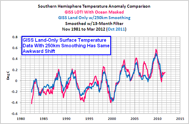
Figure 3
I checked NOAA’s GHCN and the UK Met Office’s CRUTEM3 land surface temperature anomalies for the Southern Hemisphere, and they did not display the shift, as shown in Figure 4.

Figure 4
When I compared the four versions of the Southern Hemisphere land surface temperature anomalies, Figure 5, a few other things stood out. It appears the two GISS datasets pick up an additional warming trend after 2000 that does not exist in the GHCN and CRUTEM3 data, and the two GISS datasets appear to have much greater year-to-year variations in recent years.
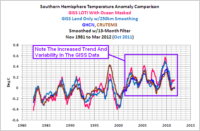
Figure 5
Regarding the trends, Figure 6 shows the GISS LOTI data for the Southern Hemisphere, with the ocean data masked, for two periods: November 1981 to December 1999 and January 2000 to March 2012. The trend for the GISS data starting in January 2000 is 3 times greater than the earlier period. But if we look at the average of the GHCN and CRUTEM3 data, Figure 7, the trend from January 2000 to present is considerably less than the earlier period.

Figure 6
HHHHHHHHHHHHH
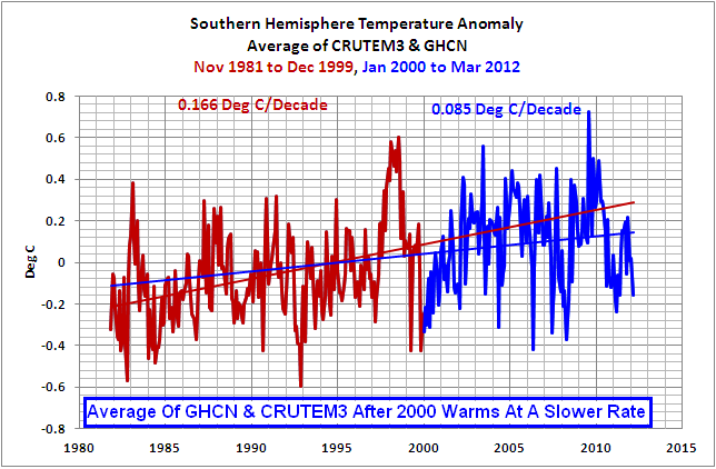
Figure 7
The GHCN and CRUTEM3 datasets include less data in Antarctica, and of course, they don’t have the 1200km smoothing employed by GISS to infill areas with missing data. So for the next two graphs, Figures 8 and 9, to try to isolate the cause, I excluded all land surface temperature data south of 60S, to remove the Antarctic data. The GISS data still has a higher linear trend during the latter period, while the average of the GHCN and CRUTEM3 data continues to warm at a lesser rate after 2000.
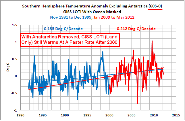
Figure 8
HHHHHHHHHHHHH
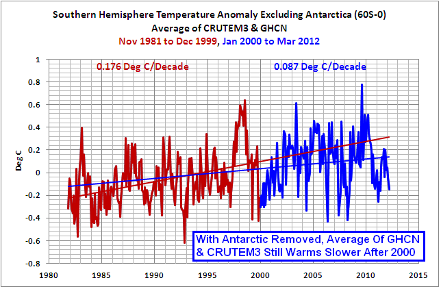
Figure 9
Could the 1200km smoothing be the cause? I wouldn’t think so, but I checked. Figure 10 shows the linear trends for the two periods using the GISS land-only temperature data (250km smoothing) for the Southern Hemisphere, and, as you’ll note, I’ve excluded the Antarctic data. The period starting in January 2000 has a much higher trend than the earlier period. That’s really odd since the GHCN and CRUTEM3 data in Figure 9 should be using data similar to, if not the same as, GISS, but their trend is less during the later period. And as you’ll note, the GISS trend for the period starting in 2000 is about 2.8 times higher than the average of the other two datasets.

Figure 10
That made me wonder if the coverage of the GISS land-only temperature data (250km smoothing) was in fact similar to the GHCN and CRUTEM3 datasets, so I used the map-making feature of the KNMI Climate Explorer to run a quick comparison of spatial coverage. I set the map type so that it would display grids and areas where data existed, and I set the contours so that the grids and areas wouldn’t offer any distractions by changing colors. I plotted the Southern Hemisphere for each January starting in 1982, and animated the sequence of maps. This was just a cursory look. It appears that GISS excludes grids or stations in the Southern Hemisphere sooner than the other two and GISS seems to have less coverage than GHCN and CRUTEM3 as time progresses. You may need to click on the animation to view it.

Animation 1
James, you should look into this matter. I don’t have the time or the inclination to carry this investigation any further.
Some persons might think GISS has been manipulating data to acquire a higher land surface temperature anomaly trend in recent years. They also might assume GISS has been reducing coverage in recent years to create a little more variability, thereby increasing the chances for new record temperatures with each El Niño. And the way that all suppliers of temperature data appear to use data for a grid one year but not the next, and then have data for that grid reappear a year or two later, may lead some persons to think data is being cherry picked for use. We wouldn’t want people to think those things.
Final note: As you know, GISS, in effect, deletes sea surface temperature data in areas of seasonal sea ice and replaces it with much-more-variable land surface temperature data. This, of course, creates a warming bias at the poles in the GISS data. Refer to the zonal-mean graph in Figure 11 that compares the linear trends of the Reynolds OI.v2 data and the version of it with the GISS modifications, for the period of January 1982 to October 2011. It’s from my most recent post that discusses this subject: The Impact of GISS Replacing Sea Surface Temperature Data With Land Surface Temperature Data.

Figure 11
Because of that monumental bias, when I present GISS Land-Ocean Temperature Index data, I usually limit the latitudes to exclude polar data. Now, with this find in your land surface temperature data, I’ve had to switch to an average of the GHCN and CRUTEM3 data for that chapter of Who Turned on the Heat? The Unsuspected Global Warming Culprit, El Niño-Southern Oscillation.Sorry to say, but with all of the biases toward warming, your GISS LOTI data, in my eyes, is becoming more and more unsuitable for research.
Sincerely,
Bob Tisdale
SOURCE
The data and the maps used in this post are available through the KNMI Climate Explorer.
“Ducks in a row” probably means you will never get a reply. GK
I hope you get a reply from Hansen Bob. BTW here is a report of a new study by the CSIRO about a rise in sea temp and tropical fish moving further south.
Just hope somebody has the time check out this study when it’s available online.
http://www.abc.net.au/am/content/2012/s3569893.htm
Wasn’t there a recent blog: Who is warming Columbia? That was “James” too?
Bob, this might be of interest to you. Its a graph of atmospheric water content and low, middle and high level cloud cover.
Note the step down in atmospheric water content in 1998, and the start of a trend of decreasing low level clouds and increasing middle and high level clouds in the same year.
Unfortunately I was unable to find a SH only version of this graph.
http://climate4you.com/images/CloudCoverAllLevel%20AndWaterColumnSince1983.gif
for me, the question isn’t whether Hansen will read Bob’s memo, but if Hansen will even utter the name ‘Bob Tisdale’ ? Hansen refuses to utter the name ‘Steve McIntyre’. Bob could be on that list?
I wonder who else is on Hansen’s ‘names that should never be uttered” list ?
Well I looked at Figure 11 above and thought to myself… I’ve seen that graph before. Or one an awful lot like it. And I have. IPCC AR4 fig 10.6
http://www.ipcc.ch/publications_and_data/ar4/wg1/en/figure-10-6.html
which is in turn drawn from AR4 10.3.2
http://www.ipcc.ch/publications_and_data/ar4/wg1/en/ch10s10-3-2.html
One can only be impressed that Hansen’s GISS has managed to produce a graph so similar to what was predicted back in 2007. Who helped write that chapter again? How come the keepers of the other termperature records were unable to produce the predicted profile? What skill does Hansen possess that his data matches predictions and their’s don’t?
Perhaps I misunderstand what Tisdale’s graphs show versus the IPCC predictions Dr Hansen, and if so, I’d appreciate you setting the record straight.
Bob, Thank you for that essay. There are many topics under this broad umbrella. For example, Australia sends CLIMAT monthly data overseas, where various agencies treat it in various ways. I have often wondered who was affected by this little gem from CG2 and whether it has been corrected by now.
It’s from Blair Trewin, of Australia’s Bureau of Meteorology.
“I’ve finally had a chance to have a look at this – it turned out to be
> more complicated than I thought because a change which I thought had
> been implemented several years ago wasn’t.
> Up until 1994 CLIMAT mean temperatures for Australia used (Tx+Tn)/2. In
> 1994, apparently as part of a shift to generating CLIMAT messages
> automatically from what was then the new database (previously they were
> calculated on-station), a change was made to calculating as the mean of
> all available three-hourly observations (apparently without regard to
> data completeness, which made for some interesting results in a couple
> of months when one station wasn’t staffed overnight).
>
> What was supposed to happen (once we noticed this problem in 2003 or
> thereabouts) was that we were going to revert to (tx+Tn)/2, for
> historical consistency, and resend values from the 1994-2003 period. I
> have, however, discovered that the reversion never happened.
>
> In a 2004 paper I found that using the mean of all three-hourly
> observations rather than (Tx+Tn)/2 produced a bias of approximately
> -0.15 C in mean temperatures averaged over Australia (at individual
> stations the bias is quite station-specific, being a function of the
> position of stations (and local sunrise/sunset times) within their time
> zone.”
As my colleague Chris noted to the BoM, “Is there a reason why the error was overlooked for nine years and why it then wasn’t corrected for six years? Does the correction suggest that international (GISS, NCDC) records of Australia’s temperatures from 1994 to 2009 underestimate (by about .15C) the actual temperatures recorded, or adjusted for the HQ series? Are Australian temps since 1994 accurate in current global climate records?”
This alone would not account for all of your postulated ‘shift’, but a combination of episodes from donor countries might.
BTW, I’ve been studying the 1998 hot year. Your graphs above simply increase my confusion about it. It’s already gathered enough conflict to be the topic of a book. Chapter one would be be about the correct estimation of errors.
Can you point me to a reference that shows large lake temperature changes spanning the 1998 year, preferably up to near-present? I’m trying to mask ocean current complications in water T measurements. I hate to ask because you do so much of value and your time must be at a premium.
http://www.australianclimatemadness.com/2012/08/lomborg-on-extreme-weather-myths/?utm_source=rss&utm_medium=rss&utm_campaign=lomborg-on-extreme-weather-myths australian climate madness and what the fruit cakes are saying about the climate
I personally believe that NASA is entirely corrupted in this field. And it will get far worse before the election. These people care not about the real data, they are simply far left ideologues that will miss Dr. Chu, a willing accomplice to theft of public funds to pay for their advisory roles in private business and their political goals re capitalism versus collectivism.
You have a very nice way of telling the world that Hansen and his cronies in the IPCC, GIS, NOAA, NASA are intellectually naked. I unfortunately lack such tact. They are incompetent at best and possibly liars pushing intellectual fraud.[snip] these fluff brained elitists with empty Ivy League degrees conferring undeserved power allowing idiots to push intellectual junk science for clowns like Brown and Obama to use to further “evil” as Hitler did with eugenics.
It is unfortunate that “good men” such as yourself are too few to stop this new evil as we’re those who saw Eugenics for the evil it was.
“Some persons might think GISS has been manipulating data …
We wouldn’t want people to think those things.”
No need to speculate. GISS have placed their code on line here. They use accessible data sources. You can see exactly what they do. Have you tried looking?
Thanks Bob, good work. Over at the talkshop we have started looking at SH land data to see how badly it has been Mullered by BEST. I won’t spoil the surprise (shock) now, but we hope to have a major post up soon.
I used the GISS map tool to compare 2005-2008 to 1994-1997: http://data.giss.nasa.gov/cgi-bin/gistemp/do_nmap.py?year_last=2012&month_last=7&sat=4&sst=0&type=anoms&mean_gen=0112&year1=2005&year2=2008&base1=1994&base2=1997&radius=250&pol=reg
It seems like the warming is highest in Antarctica and southern central Africa, followed by Tasmania and southern Australia. I used their station location tool to try to find out which stations contribute to the central southern Africa warming, but all stations in that area seem to have poor records… The Tasmanian warming, though, is probably just familiar airport warming: http://data.giss.nasa.gov/cgi-bin/gistemp/gistemp_station.py?id=501949750000&data_set=14&num_neighbors=1
Reading the wikipedia entry for Hobart International Airport, reveals that a LOT happened in that area from 1998 on: “On 11 June 1998, the airport was privatised on a 99-year lease, being purchased by Hobart International Airport Pty Ltd, a Tasmanian Government-owned company operated by the Hobart Ports Corporation.[10][13][16] In 2004, the domestic terminal was redeveloped for the first time in its 30-year history. This development involved modernising the terminal, moving the retail shops to within the security screening area,[17] realignment of the car park and moving the car rental facilities to new building in the car park. During 2005, Hobart Airport experienced record annual passenger numbers[14] and it was then decided to bring forward plans to upgrade the seating capacity of the airport. This work involved expanding the domestic terminal building over the tarmac by three metres to provide more departure lounge space.” (http://en.wikipedia.org/wiki/Hobart_International_Airport).
If you look further down the Wikipedia page, you’ll see that traffic has increased significantly. So I think that in Tasmania, Hansen just measures the growth of international air traffic 🙂
Geoff is on the right track. I think the GHCN – GISS divergence is due to the former relying more on fixed time observations, while the latter relies more on min/max temps. Not sure about HADCRUT.
As my graph above shows, low level clouds declined post 1998 and minimum temperatures are especially sensitive to changes in low level clouds, because minimum temperatures are generally set just after dawn when sunlight traverses the atmosphere at a low angle. Less low level clouds = increased solar insolation = earlier and higher Tmin.
And the BoM has got the source of their error the wrong way round. The -0.15C error is in the min/max derivation, and had they gone back in time they would have found the error was rather larger than -0.15C.
davidmhoffer: Please advise what similarities you find between the zonal-means graph in Figure 11 and the ones you linked from the IPCC’s AR4. I can find nothing in common.
Here’s the comparison you’re interested in. It shows the global sea surface temperature anomaly trend for the past 30 years on a zonal mean basis versus the IPCC AR4 (CMIP3) hindcast/projection for the same period:
http://i53.tinypic.com/wjt82o.jpg
The graph is from part 1 of a two part post. Refer to the comparisons on an individual ocean-basin basis. See here:
http://bobtisdale.wordpress.com/2011/04/10/part-1-%e2%80%93-satellite-era-sea-surface-temperature-versus-ipcc-hindcastprojections/
And here:
http://bobtisdale.wordpress.com/2011/04/19/492/
Good work Bob. I did some digging on this subject, and found a spurious hockey stick. By suppressing historical temperatures and bumping up more recent ones these naughty boys have created a warming trend from the comfort of their offices. What power – to change the climate without needing to go outdoors!
http://endisnighnot.blogspot.co.uk/2012/03/giss-strange-anomalies.html
Now, THAT’s what I call an Inconvenient Truth…
GISS LOTTO sounds more apt?
There seems to be a surge in junk climate science lately. Could it be a last desperate bid to keep a hoax alive and the grants flowing particularly at a time when nations around the globe are realising they have incurred serious debt and are unable to repay it. The world economy has slowed, the ever increasing GDP of the 90s has stalled, the slush fund that fed the AGW scam has diminished as has politicians enthusiasm for sponsoring a cause which the populace no longer believes in. The climate frauds will keep sending their press releases to a complicit media but no one is listening as the 100 year fear is replaced by the more immediate concerns of paying the mortgage and keeping one’s job.
Geoff Sherrington says: “Can you point me to a reference that shows large lake temperature changes spanning the 1998 year, preferably up to near-present?”
Sorry, Geoff. I haven’t looked into it.
Have you tried using the KNMI Climate Explorer for the Reynolds OI.v2 data. It’s presented in 1-degree grids and you may be able to eek out some data from very large lakes through it. Example for the Great Lakes:
http://i45.tinypic.com/xenz8l.jpg
An obvious upward shift in response to the 1997/98 El Niño shows up in that data.
Do you suppose that GISS has its own equivalent of Harry Read Me?
At last real proof that the global warming is man made(AGW)!
And it’s made by one man only, James Hansen?
To stop global warming we just have to stop James Hansen?
Deary, deary me! I must say Mr Tidsale you’ve really gone & done it now. I bet Dr Hansen has removed you from his Christmas card list after this!
Thanks Bob! Makes one wonder whether even Hansen has a clue what GISS is now *really* measuring.
Geoff Sherrington says (August 16, 2012 at 11:23 pm)
——
Geoff – would any of the work cited here help you?
http://thegwpf.org/the-observatory/6060-worlds-lakes-show-global-temperature-standstill.html
Tallbloke,
Theres nothing wrong with BEST….Mosher says the data is fine I believe.
“And the way that all suppliers of temperature data appear to use data for a grid one year but not the next, and then have data for that grid reappear a year or two later, may lead some persons to think data is being cherry picked for use.”
And that’s the most damning bit in my mind. If you could find the raw data and show that the values would have brought down the averages in those years that they vanish you’d have a smoking gun.
Bob Tisdale:
Thankyou for this article.
I don’t know if you have read this
http://www.publications.parliament.uk/pa/cm200910/cmselect/cmsctech/memo/climatedata/uc0102.htm
It is the record on the UK Parliamentary Record of my submission to the Select Committee Inquiry which did the ‘climategate’ whitewash.
I think you will want to read it especially its Appendix B.
Richard
Perhaps a good time to remind ourselves of the immortal words of Stephen Schneider, climate scientist extraordinaire:
“To capture the public imagination, we have to offer up some scary scenarios, make simplified dramatic statements and little mention of any doubts one might have.
“Each of us has to decide the right balance between being effective, and being honest.”
It is becoming increasingly obvious which Hansen has chosen.
Philip Bradley says:
August 17, 2012 at 1:36 am
I disagree with most of this. At the places I’ve lived in, nights with radiational cooling provide a much lower Tmin than similar nights with clouds. There can be some funky effects with dew and in September fog from the warm rivers nearby can engulf the valley and shutdown what otherwise would be a good radiational cooling event.
BTW, I’m inspired to play with my nearly nine years of Vantage Pro data. I have both Tmax and Tmin, and also samples from every 10 minutes. Inspiration is one thing, time to play is another. If anyone wants it, contact me via http://wermenh.com/contact.html The siting probably counts as CRN 5, but the grill is 30 feet away and I try to keep the snowblower from putting snow on the sensors. Also, I record things on Eastern Time with manually changed daylight/standard events. I’d discard those days if I were you. 🙂
Still, given the difficulties finding raw data, nine years of raw data is a nice attribute.
Al Gore: I’m surprised your pseudonym made it past the moderator.
There is an old saying” Figures don’t lie, but liars figure.
Brilliant work, Mr. Tisdale. Obama should fire Hansen and hire you as his replacement. Then some valuable work would get done. Better yet, fire Holdren and hire you as his replacement.
I am not particular friend of breaking up the timeline at some arbitrary point and making conclusions from differences between the ‘before’ and ‘after’. Especially if the timeline is not very long, the point is at depths of La Nina, and the noise level is of about the same magnitude as the discussed effect.
Actually I don’t see any step change in 2000 at all. You remove the two blue rectangles, put in just one (1990-2005) and voila – you got a nice smooth gradual change over course of 15 years. Which view is correct? Neither, I guess.
Nick Stokes: “They use accessible data sources. … Have you tried looking?”
“Error establishing a database connection”
Yep, an impersonator and a violation of Godwin’s Law…moderation please! I have read elsewhere that 1998 did indeed mark a regime shift that shows up in more than one data set. At this point I am seeing evidence of a distinct difference in trends but would need more convincing as to which better reflects reality.
Nick Stokes wrote:
“You can see exactly what they do. Have you tried looking?”
Don’t you think that barb is a little sharp on a post jam-packed with data to which you have added absolutely nothing? Why don’t you take your own homework assignment and explain to us why GISS is actually better?
It has been claimed, repeatedly, that the dropping of station data has not affected the temperature profiles. Since the data is collected anyway, and the analysis is done by enough staff to fill … a government agency … and then modified by computer programs, I’ve always felt this to be a suspicious reason. Unless you say that the additional data is bogus, so you don’t use it any more – which means that its past use gave results you don’t trust – then more is better.
The variation is half of alleged warming. The variation allows Hansen et al to say that the temperature rise is accelerating.
All non-replicable scientific claims depend on credibility. That is all arguments from authority are, extended credibility from other areas. So another nail in the coffin of Credibility. Station dropout is important.
Hansen should be terminated. And those who worked for him taking raw data and “correcting” it should be subject to Congressional questioning.
Nick Stokes: “No need to speculate.”
From NASA’s GISTEMP:
“2011-12-15: GHCN v2 is no longer being updated, hence the GISS analysis is now based on the adjusted GHCN version 3 data.” “It is shown that global temperature change is sensitive to estimated temperature change in polar regions, where observations are limited.” “The GHCNv3/SCAR data are modified to obtain station data … The urban and peri-urban (i.e., other than rural) stations are adjusted so that their long-term trend matches that of the mean of neighboring rural stations. Urban stations without nearby rural stations are dropped.”
Correct you are. We can read for ourselves that NASA is biasing GHCN data. And when data isn’t available, they know taking SWAGs at the data has real effect on Global temperatures. Finally, it looks like there is lemon and cherry picking being done. At least NASA is honest about it.
The whole process is ripe for abuse. Especially when a key-player in the process has a radical attitude coupled to a political agenda, and the organization fails to police its own.
Show us the ORIGINAL RAW Data!
Theo Goodwin: “Obama should fire Hansen and hire you as his replacement. Then some valuable work would get done.”
Not going to happen. Goes against plans of mandated redistribution of wealth, goods and resources; while securing power and control to the few social elite.
Nick Stokes says:
August 17, 2012 at 12:59 am
“Some persons might think GISS has been manipulating data …
We wouldn’t want people to think those things.”
No need to speculate. GISS have placed their code on line here. They use accessible data sources. You can see exactly what they do. Have you tried looking?
It is not the code – Bob has pointed out that it is the selection of sites on which the code operates. This has some points in common with the Jim Goodridge UHI thread immediately before and indeed with the fact that “the warmest July ever announcement by NASA is based on observations that are known to be incorrect and the high quality observation station network that NOAA has which meets the ISO standard shows lower figures. This may or may not be intentional, although it certainly always errs in the direction that supports the NASA arguments. However, it displays a level of ineptness in governance and configuration management by NASA that I would not accept in an undergraduate project. In fact the governance is so poor that the entire output of that branch of NASA should be treated with extreme caution. It is definitely not suitable for decision making.
and the GISS LOTI data through the KNMI Climate Explorer was only available through March 2012
I know you were looking at specific things, however the ‘GISTEMP LOTI global mean’ is available on WFT right up to July, 2012. But this may not help you at all. By the way, Hadcrut3, Hadsst2 and the WoodFor Trees Temperature Index are also only available to the end of March, 2012 on WFT. But the values for GISS, Hadcrut3 and Hadsst2 are available for much later dates. Here is the latest.
With the GISS anomaly for July at 0.47, the average for the first seven months of the year is (0.34 + 0.40 + 0.47 + 0.55 + 0.66 + 0.56 + 0.47)/7 = 0.493.
With the Hadcrut3 anomaly for June at 0.477, the average for the first six months of the year is (0.217 + 0.194 + 0.305 + 0.481 + 0.475 + 0.477)/6 = 0.358.
With the sea surface anomaly for July at 0.386, the average for the first seven months of the year is (0.203 + 0.230 + 0.241 + 0.292 + 0.339 + 0.351 + 0.386)/7 = 0.292.
(P.S. Figure 8 had a typo: Anatarctica)
Darren Potter says:
August 17, 2012 at 8:28 am
Nick Stokes: “No need to speculate.”
‘From NASA’s GISTEMP:
“It is shown that global temperature change is sensitive to estimated temperature change in polar regions, where observations are limited.”’
Why would anyone need to show that? Any measure of anything is sensitive to estimated inputs. In fact, the sensitivity is as unbounded as the imagination of the person doing the inputs.
Darren Potter says:
August 17, 2012 at 8:41 am
Change “few social elite” to “bloated governing elite.”
Kasuha: Exactly what I thought as I was reading it. I had a professor once who would not be convinced by a graph unless it passed the “thumb test” (if you cover up a point with your thumb, your trend should still hold). Take figure 1, cover up that unusual dip in 1999 (accepted as a bizarre time due to the ENSO events), and suddenly the step disappears. Given the variability and the extremely short spans of time, the minute differences in trends before and after that point are meaningless.
Bob,
While I think you are likely to be right in your identification of regime shifts, it would be more thorough to identify them statistically. You might want to use the routine found here: http://www.beringclimate.noaa.gov/regimes/.
Hm. This is interesting, but I have a question about figure 11. Is it dealing only with summer temperatures (for the respective hemispheres, of course), or is it year-round? Even with the land masked, you know, those two charts are measuring two different quantities: sea surface temperature and air temperature. If the charts are for year round data, then a deviation towards the poles would be expected even if you had perfect thermometer coverage across the globe, because during the winters sea temperature would be locked at zero C (or rather, the freezing point of sea water, but you get my point), while temperatures in the air would be free to do whatever the heck they wanted. That’s not to say that Mr. Tisdale’s point is invalid, of course, but if he is using year-round data then figure 11 doesn’t support his contention that the large difference in trends is spurious (There would, of course, still be a small positive deviation, thanks to GISS applying the mask year round–I’m just not sure how large it would be, and whether it really ends up being significant).
…In fact, come to think of it even if it is only seasonal data you’d still expect to see a deviation between the two graphs, because even during the austral and boreal summers the sea ice doesn’t melt completely, so air temperatures over the ocean are STILL going to deviate from ocean temperatures–just not as much.
I was tempted halfway through to check the comments for the expected Nick Stokes “Stupid skeptic! If you could possibly understand how brilliant GISTEMP is then you would know why this is!” sneer. I waited, it was there. I’m disappointed. He didn’t even try the pretense of a rebuttal, which equates to an acknowledgment that Tisdale has found something major that can’t be readily dismissed.
Note to GISS: At the Nick Stokes-provided link to the source code here, you provided this link to the “updates to analysis”. This is incorrect, the link is actually this one. The changeover to v3 was in December 2011, your attention to detail is noted.
There was much ado about the Clear Climate Code project, the faithful rewriting and re-implementation of GISTEMP with the Python programming language. This was felt needed as the original code was problematic to get running, needed several “tweaks”, etc. Often people would say “GISS released all their code and it works fine!” then link to the CCC version. There were some bugs found in the GISTEMP code, that when corrected “Didn’t (meaningfully) change the results at all!” As I recall, there was talk that the CCC code was so good, and did such an accurate reproduction of the GISTEMP results, GISS was going to switch over to it.
Then GISTEMP went v3 Dec 2011. The last update at the CC site was Feb 2011. At the Google code repository, the last ccc-gistemp release was Oct 2010, last upload period was apparently a GUI (graphical user interface) from July 2011.
So… What happened? Is the CCC project now assigned to the digital dustbin, the only acceptable source of “GISTEMP code” is once again a nigh-inscrutable pile of mixed-language droppings from GISS?
Nick … rather than denigrate perhaps you could offer some of you expertise and respond to Bob’s work? If there are errors in it point them out. If tehre is a rational basis for the step change educate why.
Theo Goodwin: Why would anyone need to show that? Any measure of anything is sensitive to estimated inputs.
No argument from me. I was just pointing out that even NASA is acknowledging that estimating what the temperature data might have been for missing stations in polar regions has an impact on Global Temps.
Ric Werme says:
August 17, 2012 at 6:00 am
Philip Bradley says:
August 17, 2012 at 1:36 am
As my graph above shows, low level clouds declined post 1998 and minimum temperatures are especially sensitive to changes in low level clouds, because minimum temperatures are generally set just after dawn when sunlight traverses the atmosphere at a low angle. Less low level clouds = increased solar insolation = earlier and higher Tmin.
I disagree with most of this. At the places I’ve lived in, nights with radiational cooling provide a much lower Tmin than similar nights with clouds.
Go and look at the graph again. Total cloud cover hasn’t changed much. Decreases in low level clouds have been matched by increases in middle and high level clouds. Night time back radiation wouldn’t have changed much.
Bob, it would be really helpful if you could do a statistical analysis to confirm whether the step change and the differences in slope are significant. Otherwise it’s just pretty pictures. To do this in time series like these requires proper adjustment for serial dependence but you can do a first pass using linear regression and see if it gets significance: linear regression results are likely to err in favour of significance, so if your linear regression results are non-significant then it’s highly unlikely that there’s anything to see here.
Setting break points (“regime changes”) is difficult to do objectively, but I think Steve Marron’s SiZer routines (only available for Matlab) will give you estimates of the significance of a regime change at any point in a smoothed curve across a range of bandwidths. You could then fit a simple linear regression to each of your temperature series using a step change at the identified break point, and an interaction term between the step and time (to test for difference in trend before and after). You could probably also compare trends between series with a slightly different interaction model.
None of that would pass peer review because it doesn’t adjust for serial dependence and it would make an expert like Tamino weep tears of blood, but as a rough first pass for a blog post it would be acceptable provided you added caveats. My guess (following Kasuha above) is that there is no step change in the averaged data once you adjust for the trend, but there is in the GISS LOTI – possibly also a change of slope. The problem is that it’ll be borderline significance, which means that once you adjust for serial correlation, it’ll probably disappear.
Bob, just a note of caution. Nothing you can say or offer will have any effect on faustusnotes, and he won’t accept any questions himself but just generates new ones. The best strategy is to simply ignore him.
Ah, perhaps I should have looked at your graph before. I’m talking about individual nights, you’re talking about month-long averages.
At any rate, I’m more intrigued with the down step in water content than the clouds. Less humidity and less low level cloudiness suggest more clear nights, and more efficient cooling. (Dew fall slows the rate of temperature decline because of the heat released while condensing.) Not really what Bob’s graphs show, but so be it. Unfortunately, I don’t have time to check data from around the world.
Drier conditions could lead to a delay in cloud formation and higher cloudbase. Those could leard to warmer Tmax values. Don’t have time to check that either.
Darren Potter says:
August 17, 2012 at 2:01 pm
Right. My comment (thought) was directed at NASA. The author of the NASA statement just might be trying to admit the truth, that the data is unjustifiably manipulated, without actually saying it.
At any rate, I’m more intrigued with the down step in water content than the clouds. Less humidity and less low level cloudiness suggest more clear nights, and more efficient cooling.
Anthropogenic aerosols seed more persistent clouds. That is, clouds that take longer to precipitate out. Reducing these aerosols would decrease these persistent clouds and hence reduce the atmospheric water content. It also explains the reduction in low level clouds and the increase in higher level clouds. Water vapor that would have formed aerosol seeded clouds now migrates higher in the atmosphere before forming clouds.
Which doesn’t explain the step down in 1998. I’ve suggested before that the Russian Financial Crisis in 1998, which resulted in the shutdown of much of the aerosol polluting Soviet era industry, was the cause, but have no evidence to back this up.
Which is why I’d like to see separate NH and SH versions of that graphic.
Sam Yates says: “Hm. This is interesting, but I have a question about figure 11. Is it dealing only with summer temperatures (for the respective hemispheres, of course), or is it year-round?”
That’s year round.
Sam Yates says: “Even with the land masked, you know, those two charts are measuring two different quantities: sea surface temperature and air temperature.”
Yes and no. The Reynolds data is sea surface temperature data. The GISS Land-Ocean Temperature Index data with the land masked is sea surface temperature data from about 52S to 52N until the data diverge. North of 52N and south of 52S it transitions to land air temperature.
Sam Yates says: “In fact, come to think of it even if it is only seasonal data you’d still expect to see a deviation between the two graphs, because even during the austral and boreal summers the sea ice doesn’t melt completely, so air temperatures over the ocean are STILL going to deviate from ocean temperatures–just not as much.”
Depends on the hemisphere, doesn’t it? And in the Arctic, with open waters, GISS should not be able to extrapolate land surface data across the open ocean to the remaining sea ice. Consider also where the sea ice remains near the coast. There’s the change in albedo when the snow near the weather stations melts and leaves ground cover. Would the albedo at the stations be similar to the albedo of the sea ice then? GISS shortcuts the process.
Regardless, as I noted in the post, because they replace sea surface temperature data with land surface temperature data, I rarely use GISS polar data because of the seasonal bias.
Bob:
There is this little thing about testing a theory against other known databases, which you did. The mere fact that the “jump” doesn’t not appear in those data sets should be a good indicator of the trustworthiness of those questionable data sets.
This is not the first time Mr Hansen has been caught with his hands in the cookie jar and manipulating data. The fact that he is doing it to the satellite data, which was up until recently was disproving CAGW, creates problems for their continued implementation of draconian control over the populace. HE who controls the Oil controls the world.
Excellent post Bob… just another pin in the hot air filled balloon of CAGW.
I have been trying to conceive of some physical mechanism that would hold the Great Lakes at a new higher equilibrium after a single step shift, and I am completely unable to do so. The lakes are fed and flushed by freshwater sources, and unless said sources (rivers) were also suddenly warmer and (more or less) stably so, one would have expected gradual “reversion to the mean”. I suspect data corruption; it is the only available consistent possible source of the consistency!