Note: I’m blogging this from Atlanta, where I am at the TWC Pioneers reunion. Bob was kind enough to provide this post so I can relax a bit (though I think I’ll chase a NOAA USHCN weather station today anyway). His figure 10 (below) is interesting, his figure 11 even more so. – Anthony

Guest post by Bob Tisdale
With the recent release of the CRUTEM4 data came the expected two-sided discussion (argument) about the changes from the earlier version of the dataset, CRUTEM3. One side claimed the adjustments were needed, while the other side protested the increase in global surface temperature anomalies. There were also differences of opinion about where the adjustments were made. Some claimed the added Arctic surface stations were the sole contributors to the trend, and others countered that the adjustments and dataset additions impacted data globally.
Who was right about the locations of the additions and adjustments? And when did the adjustments and additions have the greatest impact in recent decades?
The changes impacted the land surface temperature anomaly data globally. The Jones et al (2012) paper Hemispheric and large-scale land surface air temperature variations: An extensive revision and an update to 2010 discussed them in detail.
To illustrate the answer those questions in ways not presented in the paper, we’ll look at the CRUTEM3 and CRUTEM4 land surface temperature anomaly data from January 1975 to the end of the CRUTEM4 data in December 2010. That period represents the late 20thCentury warming period as it continues to present, and it’s also 36 years long so we can divide the data into two equal 18-year periods. And we’ll compare the trends of the two datasets on time series and zonal-mean (latitudinal) bases. Let’s start with the trends for the two periods on zonal mean bases just get an idea of where around the globe those changes took place.
TRENDS ON ZONAL MEAN BASES
The trends of the two datasets from the beginning of the recent warming period (January 1975) to December 1992, and the differences in the trends, are shown Figures 1 and 2. The linear trends were determined at each 5 degree latitude band and plotted in centered 5 degree increments, from 55S to 85N. (Note: The Climate Research Unit [CRU] of the University of East Anglia does present Antarctic land surface temperature anomaly data, but it is sporadic and would require me to infill some missing data for the trend analyses, so I excluded the Antarctic data in the zonal mean graphs, and only those graphs. All data is included in the global time-series graphs.) To calculate the differences, the trend of CRUTEM3 at each 5 degree latitude band was subtracted from the corresponding CRUTEM4 trend. Over this period of 1975-1992, compared to CRUTEM3, the new and improved CRUTEM4 land surface temperature anomaly data has higher linear trends in the Northern Hemisphere from about 35N to 75N, but lower trends between 10S and 35N, overlooking that little blip about 27N. CRUTEM3 also has significantly higher trends than the updated CRUTEM4 north of 75N.
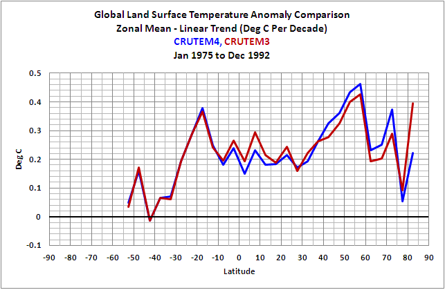
Figure 1
HHHHHHHHHHHHHHHHHHHHHHHHHHHHHHHHHHHHHHHHH
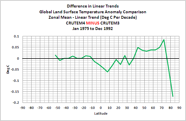
Figure 2
A few things to keep in mind: In a few of the zonal-mean graphs, there are major differences between the trends of the CRUTEM3 and CRUTEM4 data at the latitude of 82.5N. But the percentage of land at that latitude is minimal, only about 12%, the rest being ocean. (And, yes, there is sea surface temperature data at that latitude, even more so with a satellite-based sea surface temperature dataset.) So a major correction there doesn’t have a major impact on global surface temperature anomalies when the CRUTEM3(4) data is combined with HADSST2(3) data to form HadCRUT3(4). (High temperature anomalies simply look impressive at that latitude on maps that blow the Arctic out of proportion.) The zonal mean graphs of the land surface temperature linear trends in this post are also not weighted by latitude; corrections at low latitudes have a much greater impact on global temperatures than at high latitudes. And, of course, the CRUTEM data only represents land surface temperatures, but the oceans cover a much greater portion of the surface of the globe. Figure 3 compares the percentages of land and ocean surface area from 90S to 90N on a latitudinal basis, where the surface area percentages have also been weighted by latitude. The percentages of land surface area in 5 degree latitude bands were determined using a land mask calculator at the KNMI Climate Explorer.

Figure 3
Before we compare the trends of the two datasets during the second period, I wanted to compare the trends of 1975-1992 and 1993-2010. We could use either dataset for this, so I’ve used the newer CRUTEM4. Refer to Figure 4. The biggest difference in the trends of the two periods is the absence of the exaggerated warming in the Arctic during the early period of 1975 to 1992. That is, there’s little polar amplification during that period. Of course, you ask yourself, why? The first thing that comes to mind is the eruption of Mount Pinatubo, but I prepared a few more trend graphs on zonal mean bases that ended before and after 1992 (started in 1975) and the polar amplification was still absent for a few years before and after that volcanic eruption. (I have not presented those additional graphs.) What caused the shift toward polar amplification in the land surface temperature data during the period after 1992? Maybe a reader who’s studied the Arctic can fill us in. But we’re getting sidetracked.
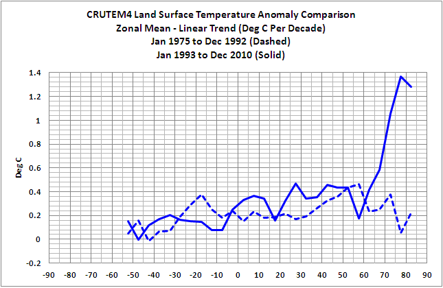
Figure 4
Figures 5 and 6 compare CRUTEM3 and CRUTEM4 trends during the period of 1993 to 2010. The CRUTEM4 trends are noticeably higher than CRUTEM3 in the Southern Hemisphere from 40S to 10S, and they are significantly higher in the Northern Hemisphere, with the difference in trends peaking at the latitude band of 70N-75N.

Figure 5
HHHHHHHHHHHHHHHHHHHHHHHHHHHHHHHHHHHHHHHHH

Figure 6
Figure 7 compares the differences in trends between CRUTEM3 and CRUTEM4 for the two periods of 1975-1992 and 1993-2010. Not too surprisingly, the additions and adjustments to CRUTEM4 from 1993-2010 had a greater impact than during the earlier period.
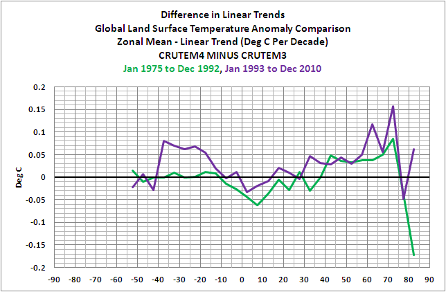
Figure 7
A QUICK LOOK AT LONG-TERM TRENDS
For those interested, Figure 8 presents the same CRUTEM3 and CRUTEM4 trends comparison on a zonal mean basis, but with the data starting in 1900. I thought many would be interested to see that the CRUTEM datasets showed no trend since 1900 just north of the equator (0-5N). I find it interesting because there’s also been no trend in NINO3.4 sea surface temperature anomalies (an El Niño-Southern Oscillation index, with the coordinates of 5S-5N, 170W-120W) over that period, too, based on HADISST data. Just a curiosity that I’ve never seen presented before.

Figure 8
THE NUMBER OF STATIONS
There was a step decrease in the early 1990s in the number of Northern Hemisphere surface stations used in CRUTEM3. That station dropout had come under scrutiny in recent years, with some analyses suggesting that the cutback in the number of stations was, in part, responsible for the increased warming since that time. That drop in surface station quantity was addressed in Jones et al (2012) toward the beginning of the paper. It seems as though they made an effort to put that complaint to rest with their discussion of the increased number of stations and their Figure 1, presented here as Figure 9. They eliminated the sudden dropout of stations…and, to contradict the naysayers, when they added the surface stations, the surface temperature trends increased.

Figure 9
GIF ANIMATIONS OF MAPS SHOWING ADDITIONAL GRID COVERAGE
CRU definitely added data in the Arctic; see Animation 1, which presents the grids covered and color-coded temperature anomalies for CRUTEM3 and CRUTEM4 in the Arctic.

Animation 1
But they also added data elsewhere globally, as shown in Animation 2.
Animation 2
A DISCUSSION ABOUT SEA SURFACE AND LAND SURFACE TEMPERATURES
Land surface temperature records and sea surface temperature records both show that surface temperatures have warmed since 1901, Figure 10, with the land surface temperatures mimicking and exaggerating the variations in sea surface temperature—as they should.
Figure 10
But as we can see in Figure 11, the land surface temperatures have warmed much more rapidly than sea surface temperatures in recent decades.

Figure 11
Let’s consider for a few moments that exaggerated warming of land surface temperatures that occurred in recent decades. We understand that the sea surface temperature data is biased toward being a Southern Hemisphere dataset, because the surface area of the Southern Hemisphere oceans is 1.4 times greater than that of the Northern Hemisphere oceans, and we understand that the natural variations in the sea surface temperature anomalies of the Northern Hemisphere oceans are greater than the Southern Hemisphere. The variations in the Northern Hemisphere sea surface temperatures include the Atlantic Multidecadal Oscillation (AMO) in the North Atlantic and an unnamed mode of multidecadal variability in the North Pacific [not the PDO] that appears to have a frequency and magnitude similar to the AMO, though they’re slightly out of synch. (See the discussion under the heading of PACIFIC DECADAL VARIABILITY toward the end of the post here.) We also understand that the land surface temperature data is greatly biased toward being a Northern Hemisphere dataset, since there’s about 2.2 times more land surface area in the Northern Hemisphere than in the Southern Hemisphere. So, considering the additional land surface area of the Northern Hemisphere and the additional multidecadal variability of the sea surface temperature anomalies there, we would expect some additional natural exaggeration of the land surface temperature data in response to the additional variations in the Northern Hemisphere sea surface temperatures. But how much should be expected? How much of the exaggeration in land surface temperature anomalies occurs naturally or is the result of continuous upward data adjustments?
![an unnamed mode of multidecadal variability in the North Pacific [not the PDO] that appears to have a frequency and magnitude similar to the AMO](http://i56.tinypic.com/t9zhua.jpg)
TIME-SERIES COMPARISONS
Figure 12 is a time-series graph of CRUTEM3 and CRUTEM4 land surface temperature anomalies for the period of January 1975 to December 1992, the first half of term being discussed. The two datasets are so similar for much of the period that it’s difficult to differentiate between the two. As you’ll note, there’s a very slight difference in the linear trends. But if you scroll back up to Figures 1 and 2, there were changes at all latitudes, some of them significant changes. Somehow all of those changes resulted in very little change in the overall global land surface trends with the update from CRUTEM3 to CRUTEM4.

Figure 12
On the other hand, during the period of January 1993 to December 2010, Figure 13, the new and improved CRUTEM4 data has a trend that’s approximately 0.05 deg C/decade higher than the CRUTEM3 data.

Figure 13
To some, 0.05 deg C/decade may not seem like a significant amount, but it changed the years of the record high temperature anomaly. With CRUTEM3, the record year was 1998, but with CRUTEM4, its 2007, with 2010 a close second (not illustrated). Figure 14 illustrates the difference between the two datasets with CRUTEM3 subtracted from CRUTEM4. I’ve also smoothed the difference with a 13-month running-average filter to reduce the noise. Two of the greatest adjustments came during what was once the record year, 1998, and toward the end of datasets, around 2007, just when it was needed to have 2007 as the warmest year.

Figure 14
CLOSING
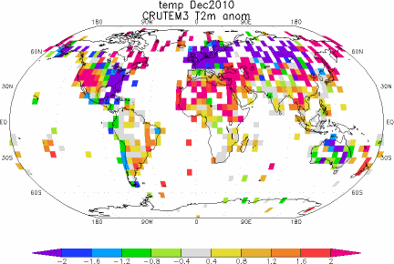
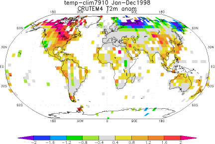
The adjustments shown in Figure 14 might lead some readers to believe the Climate Research Unit went to all that work with the single-minded goal of raising the land surface temperature anomalies after 1998 so that their records could show that global warming continued. Yup. Those adjustments just might lead people to believe that. But maybe we also need to consider the locations of the new 5X5 grids that contain data and the land surface temperature anomaly patterns in 1998 and 2007. Figures 15 and 16 present the CRUTEM3 and CRUTEM4 zonal mean land surface temperature anomalies (not trends) for the years of 1998 and 2007. And Animations 3 and 4 present maps of the temperature anomalies, and grids with and without data, during those two years for the two datasets. I’ll let you decide.
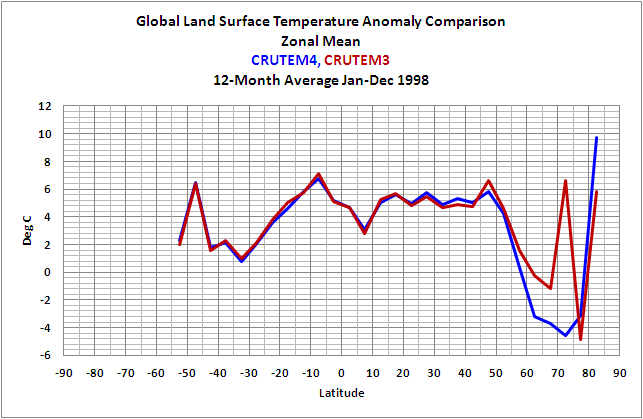
Figure 15 – (1998)
HHHHHHHHHHHHHHHHHHHHHHHHHHHHHHHHHHHHHHHHH

Figure 16 – (2007)
HHHHHHHHHHHHHHHHHHHHHHHHHHHHHHHHHHHHHHHHH

Animation 3 – (1998)
HHHHHHHHHHHHHHHHHHHHHHHHHHHHHHHHHHHHHHHHH

Animation 4 – (2007)
HHHHHHHHHHHHHHHHHHHHHHHHHHHHHHHHHHHHHHHHH
BEFORE YOU JUMP TO CONCLUSIONS
For the next two animations of global temperature anomalies, we’ll need to switch the base years for anomalies to a period that will work with RSS Lower Troposphere Temperature (TLT) anomalies and CRUTEM4, so we’ll use 1979 to 2010. Animations 5 and 6 compare the global CRUTEM4 land surface temperature anomalies to the Remote Sensing Systems (RSS) Lower Troposphere Temperature anomalies for 1998 and 2007. Again, I’ll let you decide.
Animation 5 – (1998 with RSS)
HHHHHHHHHHHHHHHHHHHHHHHHHHHHHHHHHHHHHHHHH

Animation 6 – (2007 with RSS)
HHHHHHHHHHHHHHHHHHHHHHHHHHHHHHHHHHHHHHHHH
MY FIRST BOOK
The IPCC claims that only the rise in anthropogenic greenhouse gases can explain the warming over the past 30 years. Satellite-based sea surface temperature disagrees with the IPCC’s claims. Most, if not all, of the rise in global sea surface temperature is shown to be the result of a natural process called the El Niño-Southern Oscillation, or ENSO. This is discussed in detail in my first book, If the IPCC was Selling Manmade Global Warming as a Product, Would the FTC Stop their deceptive Ads?, which is available in pdf and Kindle editions. A copy of the introduction, table of contents, and closing can be found here.
SOURCES
The monthly CRUTEM3 and CRUTEM4 data used in the time-series and zonal-mean graphs and the maps, including the RSS TLT anomalies, are available through the KNMI Climate Explorer.
The annual CRUTEM4 data used in Figures 10 and 11 is available at the Hadley Centre’s webpage here, specifically the annual data here, and the HADSST3 data is available through the KNMI Climate Explorer here.
Stop worrying about crossing the tees and dotting the I s
it is time to spend our efforts on informing the Post Petroleum Paradigm we will leave to our children.
I agree with tom and it appears that natural gas is the, well, “natural” replacement for petroleum.
As long as we’re throwing ideas out: Petroleum is not a fossil. It is a geologic deposit. Mass quantities exist. We have only just begun discovering it.
OK, moshe; I need a little help here.
=========
I think I’ll chase a NOAA USHCN weather station today anyway
Addictive, isn’t it? Maybe Willis can come up with a 12 step program to help us…
Thank you Bob for this really detailed and interesting analysis. Personally I think CRUTEM4 is result of really meticulous work and it is much higher quality than CRUTEM3 was. There is no problem with the data itself, the problem is with interpreting the data.
First thing that must be noticed is that CRUTEM only covers land. You can see it on the maps in the article.
Second thing that must be noticed is that when comparing CRUTEM and satellite data, CRUTEM represents what can be called ‘near-ground temperatures’ while satellite data represent temperature of the mass of the atmosphere. There are some meteorological stations which also measure near-ground temperatures, where the thermometer is placed just about 20 centimeters above the ground. There are very profound differences in what these thermometers record compared to records of thermometers in the standard height. Similar kind of differences is bound to appear between recordings from meteorological stations compared to satellite recordings.
As long as there are already satellite records, then if we are concerned about evolution of global mean of the atmospheric temperature, CRUTEM can hardly be taken as reliable record. Satellite data are the reliable record. CRUTEM gives us overview about evolution of conditions in which people actually live but definitely does not give us global temperature. And of course, CRUTEM can be used as a proxy to the past when satellite records did not exist.
Visually, it seems as though the additional stations in Russia (cold in 1998, warm in 2007) caused much of the [desired?] 2007 increase in CRUTEM4. Is that a correct conclusion, Bob?
http://i40.tinypic.com/16a368w.png
I’ve now developed an analogous metric that’s coherent with NPI at interannual timescales.
Yes, I’d like to see Mosh, or anybody, try to justify that 50% of the historical warming is the result of advancement in our ability to interpret thermometer readings taken in the year 2006.
off topic I know but how do I donate?
[Reply: Along the right sidebar. Scroll down until you see the “Donate” button. ~dbs, mod.]
RobRoy says:
April 28, 2012 at 9:27 am
Yes! If petroleum is from ‘fossils’, why are there seas of ethane on Titan? Did the dinosaurs move there ahead of the asteroid strike 65 mya?
Warming in Russia (Siberia) to 2007 was real. Since then it has started to drop in temperature. It is said that the temperature in Ulaanbaatar (south of Siberia) rose 6 C in 60 years. Not sure how reliable that is but it seems to have gone down lately. Is there a long data set for Ulaanbaatar? It was a well-established centre of learning for centuries. There might be a Reaumur scale or record from Russians going back a long way.
Hey, Paul, how do those oceans make the sun wiggle around so?
===================
Will those CNG ‘filling stations’ for the soccer mom crossovers’ be self service?
Where will all the soccer gear go?
.
The divergence between satellite and thermometer data points to a serious data problem in climate science, which calls into question all decisions based on the data.
The notion that you can reliably extrapolate missing temperature data and receive an accurate view of global temperatures is at the heart of the problem.
Take a picture of the earth. Blank out large portions of the surface. Now use the finest mathematics in the world to redraw the missing information using only the surrounding areas of the picture.
What you will end up with will look nothing like the earth. The exact same thing happens in climate science. The satellites give us a picture of the earth. Climate science then uses an incomplete picture drawn from thermometers to extrapolate a picture of the earth.
No surprise, the thermometer picture looks nothing like the satellite picture. This is exactly what we would expect from our earlier example of drawing the earth by extrapolating and incomplete image.
However, the problem is that climate science insists that the picture drawn by extrapolating the incomplete thermometer data is correct, while at the same time insisting that the more complete picture drawn by satellites is wrong.
This is the illogical nonsense of modern climate science. The problem is that the satellites are not giving them the answer they expect – so the satellites must be wrong. The thermometers are giving them the answer they expect – so the thermometers must be right.
Nowhere do they consider the obvious – the evidence shows the most likely answer is that their expectations are wrong.
Crispin in Waterloo says:
April 28, 2012 at 9:59 am
Warming in Russia (Siberia) to 2007 was real. Since then it has started to drop in temperature. It is said that the temperature in Ulaanbaatar (south of Siberia) rose 6 C in 60 years.
Over the past 12 hours the temperature here has gone up 10C.
@jim, even better: What about all those drive-offs where the soccer moms leave the filling nozzle in the vehicle?
RobRoy and Babsy, I agree 100%.
Babsy, We agree. Oceans of Methane on Titan proves hydrocarbons can be natural geologic formations.
ferd berple says:
The thermometers are giving them the answer they expect
————————————————————-
The models give them the answers they expect. Almost everything else has to be adjusted to fit the preconceived notion.
Please correct me if I’m offbase here:
It appears to me that the differences subsequent to adjustments increase the ranges, i.e. the hot is hotter, the cool, cooler. Also that the differences between land records and satellite measurements are increasing, especially in the extremes. Further, that the changes result not from a weak global changes but strong regional changes.
Can it be that the rise and fall is determined by 80% with nothing and 20% with something? That the global increase is a function of the proportion of small area warming vs small area cooling?
Further, I have wondered if prior adjustments have became untenable over time, and the last 15 years of no-growth in the HADCruT are a reflection of the “corrected” data coming back into line with actual measurements. Also if in GISTemps situation, the adjustments have a systemic flaw in that the adjustments have some reliance on prior corrected temperatures, a circular modification problem.
It seems impossible that “errors” detected and corrected for yesterday need further attention today unless what is done today is a function of happened yesterday, a process that creates a sturdier wall by adding bricks behind it as it adds bricks beneath it. Are the continuing adjustments of the same type, but more numerically, or are they additional factors being considered, possibly considered with different importance factors with time?
In my experience with uncertain outcomes of technical projects, several parameters with slight optimism often become more optimistic as the project develops. They start out reasonably “okay”, but finally the increasing optimism multiplies together to produce overreaching conclusions. Here, are the corrections being applied to individual stations over time displaying this, i.e. if you take a group of local stations that are corrected, and look at their raw vs adjusted temperatures over time, do the adjustments show growth (outside of UHIE, which should DECREASE the final number)?
http://judithcurry.com/2012/03/15/on-the-adjustments-to-the-hadsst3-data-set-2/
This article looks at the HadSST3 component of CRUTEM4
tom says:
April 28, 2012 at 8:36 am
“Stop worrying about crossing the tees and dotting the I s
it is time to spend our efforts on informing the Post Petroleum Paradigm we will leave to our children.”
Uh, yeah somebody think of the chilrren.
Global annual enrgy consumption is 457 EJ, known reserves of all energy raw materials are 39,794 EJ and resources are 613,180 EJ, that gives a relationship of 1 to 87 to 1342.
This doesn’t include Uranium or Thorium in seawater and it doesn’t include anything renewable.
German study.
http://www.bgr.bund.de/DE/Themen/Energie/Downloads/Energiestudie-Kurzstudie2010.pdf?__blob=publicationFile&v=3
Keep in mind that with rising prizes some of the “resources” automatically become “reserves”. The distinction is determined by economic feasibility of production.
kim (April 28, 2012 at 9:59 am) asked:
“Hey, Paul, how do those oceans make the sun wiggle around so?
===================”
I figured it out this morning kim …but since I work close to 80 hours per week, you might have to wait decades before I’ll have time to satisfy the administrative/editorial/cosmetic demands of establishment hoop-masters ( http://en.wikipedia.org/wiki/Peter_Principle ), who have exponentially increased the manufacture of red tape in a last-ditch effort to preserve the existing hierarchy. Cheers!
_Jim says:
April 28, 2012 at 10:09 am
“Will those CNG ‘filling stations’ for the soccer mom crossovers’ be self service?
Where will all the soccer gear go?”
CNG and LPG stations are self service. You have to screw a nozzle on your tank’s inlet, and keep a button on the pump pressed as long as it fills. It switches off automatically when max pressure is detected. Foolproof technology. If you manage to drive off while it’s still screwed on your tank you will just rip out the hose but at that moment it’s not under pressure.
R Barker says:
April 28, 2012 at 11:26 am
The models give them the answers they expect. Almost everything else has to be adjusted to fit the preconceived notion.
————
This is exactly what parameter driver model do best. They are very good at predicting the answer the researchers expect to see. If they don’t, the researchers will adjust the parameters
until they do.
This need not be deliberate on the part of the researchers. They simply regard any behavior of the models that doesn’t fit expectations as an error, and make adjustments.
That is why independent, blind testing and certification is a critical part of building reliable models. A necessary step that has been ignored by climate science in their ignorance of computer science.
Climate scientists complain when someone outside of climate science talks about climate science, but ignore the fact that climate science is no qualification to build reliable computer models.
P. Solar says:
April 28, 2012 at 11:46 am
http://judithcurry.com/2012/03/15/on-the-adjustments-to-the-hadsst3-data-set-2/
This article looks at the HadSST3 component of CRUTEM4
Oops, of course I meant the component of HadCRUT
Nicely dissected, Bob
RobRoy says:
April 28, 2012 at 9:27 am
As long as we’re throwing ideas out: Petroleum is not a fossil. It is a geologic deposit. Mass quantities exist. We have only just begun discovering it.
—
Over time, CO2 from the atmosphere collects at the bottom of the ocean as limestone. This is carried into the interior of the planet by subduction, along with water. The heat and pressure within the earth in the presence of iron convert the limestone to iron rich rock, releasing hydrocarbons as a by product. The lighter hydrocarbons percolate to the surface, where they are occasionally trapped by rock formations allowing for efficient harvesting by humans.
Iron is plentiful in the core of the planets and sun because it is dense, and iron is the stable product of hydrogen fusion. Over time as fusion continues, the core of stars should fill with iron, but that is the subject of another debate.
from wikipedia:
The fusion of two nuclei with lower masses than iron (which, along with nickel, has the largest binding energy per nucleon) generally releases energy, while the fusion of nuclei heavier than iron absorbs energy.
It is uncanny how each advance in climate science finds more warming and polar amplification.
(And how the global sea ice area is unimpressed by it. Don’t they adjust the satellite photographs, one wonders? Maybe that will take another breakthrough in Post Normal Science.)
Paul,
which of the JapaneseSeaLevel is the NPI?
Thank you Bob for all this work.
Since the satellite data became available, I rely upon it almost entirely and tend to ignore the surface thermometry data, since it is defective on many fronts.
Does anyone have a plotted comparison of UAH LT and the latest HadCRUT4 (or similar) anomalies since 1979? All my previous stuff is dated, ending circa 2008 and using Hadcrut3
I also recall that UAH changed to a 30-year baseline recently.
I’ve been trying to calculate the global average temperature of our house. It seems to be biassed by the cooktop, oven, gas water heater, room heaters and refrigerator. Somehow “global average temperature” seem a tad silly.
A quick read of the CRUTEM4 document turns up other matters not covered by BT, here are a couple: (1) About a third of the pre-1895 temperature records were discarded if there was a “step” discontinuity in that year. The effect (predictably) is to lower Earth’s temperature by 0.15C from 1895 back to the dawn of time. So this is predicated on the assumption that 1894 temps should be even with 1895. If in fact 1894 was a bit warmer, then all the stations showing that are biffed out — which is basically what CRU has done. This should not have passed peer review. (2) Additional Russian station data were gained through “personal contacts”, but the data has both systematically offset stations (without specifying in which direction) and random offset data. The random offsets were accounted for and processed, the systematically offset stations were assumed to have been offset by the Russians, even though the Russians denied it!! (because they did not confirm it as they had confirmed the random artifacts). I would have jumped all over this, had I been a reviewer.
Mr Berple. Yes, I understand that when a star’s fusion of matter builds that matter up to Fe It,s supernova time and all matter with a atomic number higher than Fe is created in that conflagration.. Very interesting stuff about the limestone reacting with iron (molten, I presume) to form hydrocarbons
.Any chemists on board to confirm this?
What’s the problem?
http://www.woodfortrees.org/plot/hadsst2gl/from:1975/mean:12/plot/crutem4vgl/from:1975/mean:12/offset:-0.1/scale:0.5/plot/uah/from:1975/mean:12/scale:0.6/offset:0.2
bob the correct way to compare the land to sst is to compute the land sea contrast.
it is roughly constant at 1.6.
@ferd berple says:
>Over the past 12 hours the temperature here has gone up 10C.
Heh heh…yeah that’s how it is over there. They had a killer winter in the city this year. Usually the coldest night is -35 to -40. This year, no such luck as it hit -44 and was -40 or colder for 8 days. The forecast is -1 C tonight and 27 during the day on Thursday. Welcome to a dry climate.
As for this post, Seems Anthony’s work surveying the stations showed what this story shows, unreliable haphazard data collecting. This iffy data with all the assumptions and disagreements, can’t be “adjusted” into correctness.
Attention government action zealots, this is more proof that prudence would dictate waiting for satellite data to accumulate for some years before any action.
.
I heave a great sigh as I ask this question, but here goes anyway. When I was taking my university statistics classes, we did a lot of analysis of data sets (obviously). However, none of the statistical operations we executed CHANGED THE DATA in any way; they just exposed relationships between the data from different perspectives.
Why, then, the insistence on “adjusting” the raw data from the field? Put into public opinion poll terms, it seems as though after they ask 1200 people all the poll questions, the pollsters would then take all the data about the people answering the questions to “adjust” the result: “Oh, this guy was a white, 65-year-old urbanite Democrat with a bachelor’s degree — he answered that question in a more liberal manner than an “average” guy would, so we’ll change his response from ‘Love the Affordable Care Act’ to ‘Like the Affordable Care Act very much.’ That’ll put him more in line with the ‘average’ answer to that question.”
That is a silly version of things, but I don’t yet understand why the raw temperature readings from Bumfuca, WV or Times Square, NY need to be “adjusted” for anything. The temperature there at that time and date are what they were, so why change them — unless there’s a known issue like a replacement thermometer was known to read 1 F higher than the thermometer it replaced. Otherwise, I don’t get it.
for the deepest significance, calculate the average telephone number in the northern hemisphere.
more meaning, less adjustment!
Hottest years 1-5 for the following data sets.
NASA GISS 2010 2005 2007 1998 2009
CRUTEM 3 1998 2010 2005 2003 2002
CRUTEM 4 2007 2010 2005 1998 2006
So the hottest year is????????
jaschrumpf
I can’t find Bumfuca, WV on Google Maps.Is it very small?
It might be interesting to note where the Russians are burning off the flares from their oilfields by the billions of cubic meters.
Kasuha says: “Personally I think CRUTEM4 is result of really meticulous work and it is much higher quality than CRUTEM3 was…”
My concern, Kasuha, is the continued adjustments to the raw data. If we look at the adjustments NOAA/NCDC makes to its USHCN data…
http://www.ncdc.noaa.gov/img/climate/research/ushcn/ts.ushcn_anom25_diffs_urb-raw_pg.gif
…and if we assume the rest of the land surface temperature data globally has the same adjustments, then the long-term difference between sea surface temperature anomalies and land surface temperature anomalies shown in Figure 11 above pretty much disappears.
Lance Wallace says: “Visually, it seems as though the additional stations in Russia (cold in 1998, warm in 2007) caused much of the [desired?] 2007 increase in CRUTEM4. Is that a correct conclusion, Bob?”
It appears to have had an effect. But so did the changes in the Southern Hemisphere.
http://i45.tinypic.com/2ngya1e.jpg
.
Allan MacRae says: “Does anyone have a plotted comparison of UAH LT and the latest HadCRUT4 (or similar) anomalies since 1979? All my previous stuff is dated, ending circa 2008 and using Hadcrut3”
I haven’t gotten around to comparing the HadCRUT4 data primarily because it isn’t on the KNMI Climate Explorer yet.
Steven Mosher says: “bob the correct way to compare the land to sst is to compute the land sea contrast.
“it is roughly constant at 1.6.”
And upon what are you basing the constant, Steven?
lgl says:
April 28, 2012 at 1:55 pm
“What’s the problem?
http://www.woodfortrees.org/plot/hadsst2gl/from:1975/mean:12/plot/crutem4vgl/from:1975/mean:12/offset:-0.1/scale:0.5/plot/uah/from:1975/mean:12/scale:0.6/offset:0.2
”
The problem is that you had to use fudge factors to align the series.
jaschrumpf says:
April 28, 2012 at 2:16 pm
When I was taking my university statistics classes…
————
Well, you’ve heard of frequentist statistics, and you’ve heard of Bayesian statistics, this is the new Faustian statistics.
Clearly this is a case of fiddling it until they get the answer they wanted. The rest is noise, pun intended… 😉
Valiant attempt at an answer there Dirk, but the ‘mass consumer market’ has yet to make use of CNG refueling stations with the ‘same success’ as we have for normal ‘liquid refueling’ mass consumer market, including such ‘habits’ by the customers as drive-offs with the filler attached, smoking while filling/fueling, inattention during hookup resulting in spillage; when it comes to ‘fueling with a high-pressure gas, what could possibly go wrong – go wrong – go wrong – go wrong …
Checking in on CNG: Accidents Will Happen
CNG and Hydrogen Vehicle Fuel Tank Failure Incidents, Testing, and Preventive Measures
Robert Zalosh
I wonder, in those states where the roads are heavily ‘salted’, at the inspections any more frequent?
What does it cost to replace a tank, and given the inspection interval cited just above, might this be some multiple of 3 years or 36,000 miles?
Honda’s “How to handle a CNG vehicle involved in an accident” guide:
Emergency Response Guide
Prepared for Fire Service, Law Enforcement, Emergency Medical, and Professional
Towing Personnel by American Honda Motor Co., Inc.
Honda CNG Vehicle
.
Another excellent Tisdale article.
And FYI:
Trust in science and scientists is rapidly eroding due to the AGW scam. And rate of retractions in scientific papers skyrockets.
[source]
Lots of wriggly lines and detailed discussion for the experts.
Any chance of a sim-ple sum-ma-ry of the main points in eas-y words for those of us who are in-ter-est-ed but not ex-perts?
Otherwise, we’re doomed.
lgl says @ April 28, 2012 at 1:55 pm: “What’s the problem?”
Perhaps I am not understanding your intent or your graph, but I see a problem with your graph. Likely, the point of the graph is that all three measures end up in the same place. But you get there by starting off in different places. For example, UAH starts off over 0.1 degree higher than CRU4. If all measures started in the same place, then you would see a noticeable difference at the end.
http://www.woodfortrees.org/plot/hadsst2gl/from:1980/mean:12/plot/crutem4vgl/from:1980/mean:12/offset/scale:0.5/plot/uah/from:1980/mean:12/scale:0.6/offset
Still looks like about 0.2C warming bias in Hadcrut vs UAH
The big “political” change in Hadcrut4 vs Hadcrut 3 is to minimize 1998 and maximize 2007 – I call BS.
lgl says:
April 28, 2012 at 1:55 pm
“What’s the problem?
lgl, you obviously didnt’t read the post or as is common with warmists, ignored the very data in front of your eyes.
The graph you linked to actually demonstrates Mr Tisdale’s very point, that is that CRUTEM4 has been modified to make 2007 the warmest year on record while CRUTEM3 had 1998 as the warmest year on record.
As is indictaded by your link, CRUTEM4 now disagrees with both UAH and HADSST, thats an “own goal”.
Well done. Couldn’t have said it better myself.
Someone please explain how near surface temperature trends can exceed tropospheric trends based on greenhouse effect theory. Thanks.
RoHa: Whatcha wanna know?
Alvin says:
April 28, 2012 at 10:46 am
@jim, even better: What about all those drive-offs where the soccer moms leave the filling nozzle in the vehicle?
The idea that LPG/CNG is unsafe is simply false. All the evidence shows LPG and CNG vehicles are safer than petrol vehicles. Where I live in Perth pretty much every service station has a LPG pump. If the LPG hose isn’t connected to a tank, the supply of LPG simply cuts off. So while you can pump petrol onto the station forecourt ground, you can’t pump LPG. And even if you could the LPG would dissapate pretty much instantaneously (at least in the climate here). Which is why LPG/CNG vehicles are safer in an accident.
Its my understanding that CNG isn’t suitable for small vehicles, because you need a bigger heavier tank, but LPG is fine for cars and SUVs.
The real problem is that vehicle manufacturers fueled by government subsidies wasted billions on electric and hybrid vehicles that hardly anyone wants (at their real cost), while LPG/CNG vehicles were neglected (excepting bus manufacturers). Even today, almost all the factory produced LPG/CNG passenger vehicles are in places like Iran and Brazil.
Must be chilly climate weather, it appears all of the trolls are deep in their pits.
Terrific post Bob. It’s amazing what errors in thermometer reading those CRU climate scientists can dredge up stuck in their tiny offices with piles of lost papers hiding the lost temps prior to their previous adjustments.
Maybe they discovered those temperature errors whilst traveling on those exotic junkets?
Hmm, let’s see, when did the real warmup of the Siberian stations happen? Could it have been about the time the stations stopped receiving their fuel allotments based on how cold the temperature was??? You couldn’t trust Siberian weather reports during the cold war, I heard that some of those stations would report 5C low just to make sure they didn’t run short of fuel oil to heat their stations, and Moscow would short them if they thought it was not so bad. I don’t know how long that arrangement continued after Yeltson came to power, so an exact date for when the incentives to fudge the data low ended is unknown to me, but I’m sure there is someone out there that knows this.
The smoother and steeper the warmists make the warming trendline up to the present, the more devastating for their cause when that trendline is broken by a cooling trend. I.e., it will be harder for them to claim that it’s just a blip, because they’ve smoothed out the other blips.
Figures lie, and liars figure. Don’t like the way the data looks? Well, just make adjustments until it looks like you want it. Boy, that’s real science, isn’t it? /sarc
> kasphar says:
> April 28, 2012 at 2:55 pm
> Hottest years 1-5 for the following data sets.
> NASA GISS 2010 2005 2007 1998 2009
> CRUTEM 3 1998 2010 2005 2003 2002
> CRUTEM 4 2007 2010 2005 1998 2006
> So the hottest year is????????
None of these year averages is remotely ‘hot’, so asking
which is the ‘hottest’ is meaningless.
Apologies – Correction to plot only.
http://www.woodfortrees.org/plot/uah/from:1980/mean:12/plot/hadcrut3gl/from:1980/mean:12/plot/hadcrut4gl/from:1980/mean:12
The most important adjustment is the reassignment of bucket measurements to ERI:
This is an extremely dubiuous overwriting of 30% of data. The reasoning is very weak to say the least. And then they claim that by doubting and overwriting the content of historic documents, they “correct the uncertainty”. Of course, uncertainty cannot be “corrected”. Instead they increase uncertainty by doubting the content of historic logs. This single episode contributed about 1/3 of the warming since the last cyclical peak in the 1940s. The warming would be 0.2 degree instead of 0.3 degrees in 70 years or 0.3 degrees insted of 0.45 degrees per century.
—————————————
“It is likely that many ships that are listed as using buckets actually used the ERI method (see end Section 3.2). To correct the uncertainty arising from this, 30+-10% of bucket observations were reassigned as ERI observations.”
Section 3.2:
“It is probable that some observations recorded as being from buckets were made by the ERI method. The Norwegian contribution to WMO Tech note 2 (Amot [1954]) states that the ERI method was preferred owing to the dangers involved in deploying a bucket. This is consistent with the rst issue of WMO Pub 47 (1955), in which 80% of Norwegian ships were using ERI measurements. US Weather Bureau instructions (Bureau [1938]) state that the \condenserintake method is the simpler and shorter means of obtaining the water temperature” and that some observers took ERI measurements \if the severity of the weather [was] such as to exclude the possibility of making a bucket observation”. The only quantitative reference to the practice is in the 1956 UK Handbook of Meteorological Instruments HMSO [1956] which states that ships that travel faster than 15 knots should use the ERI method in preference to the bucket method for safety reasons. Approximately 30% of ships travelled at this speed between 1940 and 1970.”
http://climateaudit.org/2011/07/12/hadsst3/
Steven Mosher (April 28, 2012 at 2:04 pm):
“bob the correct way to compare the land to sst is to compute the land sea contrast. it is roughly constant at 1.6.”
WT…_?
“Hmm, let’s see, when did the real warmup of the Siberian stations happen?”
I remember a few years ago (2005-ish?) comparing trends between the surface and satellite data for Siberia and the warming trend was much greater in the surface data that satellite. So I’m sure there’s been real warming, but nowhere near as much as the surface measurements show.
lgl asked (April 28, 2012 at 1:30 pm)
“Paul, which of the JapaneseSeaLevel is the NPI?”
Neither — see here:
http://judithcurry.com/2012/04/06/aerosols-and-atlantic-aberrations/#comment-190763
It’s *another metric (an analogous one) that I have *not illustrated that’s coherent with *interannual NPI. (I’ve presented that result via backchannels, but not in public.)
In the Climate Etc. thread to which I’ve linked, you’ll find plenty of related notes which I volunteered on a day when I had some extra time — for example:
“Mainstream Climate Scientists:
The calculations to get this [ http://i43.tinypic.com/o52jbd.png ] result can be done in a spreadsheet in a few minutes. Don’t underestimate the depth of the fundamental reforms demanded by this sheer simplicity. Contact me if you need help. […] All the info needed to crack the code of ENSO is now publicly available. We shall see if any climate scientist is willing & able to follow through.”
Best Regards.
All the land surface temperature analyses are proof one thing, that Confirmation Bias is a real phenomena.
TomRude (April 28, 2012 at 4:52 pm) wrote:
“Clearly this is a case of fiddling it until they get the answer they wanted. The rest is noise, pun intended… 😉 “
We got a lesson on ‘Texas Sharpshooting’ over at Climate Etc. a few weeks back:
Eyal Porat (April 6, 2012 at 10:42 am):
“This is a classic case of shooting the arrow (anthropogenic CO2 global warming) and then drawing the target around it (computerized models).”
http://judithcurry.com/2012/04/06/aerosols-and-atlantic-aberrations/#comment-190615
…And to quote one of our fellow fire-breathing Canadians:
“We don’t need a cure for the weight of the world
Cuz it’s floatin’ ’round in the universe
Just swing it like it’s tied by a string that you hold
AND LET IT GO” — Dragonette – LET IT GO
Josh should do a cartoon on the red tape being used to hold together the “C” (& the “A”) in cagw.
Reblogged this on The GOLDEN RULE and commented:
Cooking the global warming figures.
and for land-only
http://www.woodfortrees.org/plot/uah-land/from:1980/mean:12/plot/crutem3vgl/from:1980/mean:12/plot/crutem4vgl/from:1980/mean:12
This is interesting
http://www.woodfortrees.org/plot/hadsst2gl/from:1980/mean:12/plot/uah/from:1980/mean:12/plot/uah-land/from:1980/mean:12
Bob has done a great job, here.
But there are two snags.
One snag is that whatever the temperature readings have been doing, it doesn’t even begin to demonstrate that anthropogenic CO2 emissions have any significant influence whatever.
Second snag is that ANYTHING produced by Jones, Briffa and the other con men and incompetents at UEA is hugely suspect.
Once you trash people’s trust you can’t just soldier on and expect to be taken seriously.
Especially when it is the basis for Trillion dollar expenditure. And that every scare story built upon their ‘science’ has been comprehensively falsified.
To all the big-conspiracy-believers, don’t worry about Siberia, it will follow the AO down again.
http://virakkraft.com/AO-Kirensk.png
Just make sure the AO sensitive stations are not removed again 🙂
Bob Tisdale says:
April 28, 2012 at 3:27 pm
My concern, Kasuha, is the continued adjustments to the raw data. If we look at the adjustments NOAA/NCDC makes to its USHCN data…
__________________________________________________
Yes, I am concerned about adjustments to USHCN data too – there’s something strange with them but that is not something that can be analyzed by comparing means or trends, one has to go down to the data and identify those microscopical steps they introduce into them and find what’s wrong with these.
I have not invested time to doing any such analysis yet so I can’t say anything about them beside that they look suspicious. Most frequent adjustments are between -1 and +2 °C but there are extremes like adjustment of about 5.5 °C. But I have not analyzed whether this is or isn’t related to e.g. number of step changes. I don’t believe there’s any intent but it is possible there is a programming error, something like a single incorrectly applied rounding, which could introduce bias like this. And it is long known fact that if an error produces favorable results, people are much less willing to look for it than if it produces unfavorable results.
Regarding CURTEM3 vs CRUTEM4 comparison, though, if CRUTEM4 has these errors, then CRUTEM3 has them too at the same magnitude. Which still means CRUTEM4 is overall better quality than CRUTEM3.
I feel like looking at snakes coming out of master tamers cage helping to sell the snake oil and not any scientifically plotted data.
In my view the “changing the past” part more then everything is pushing climatology in the same fake-science group with astrology.
Bob do you have the confidence intervals to add on the comparison graphs v3 versus v4? Would be good to have a closer look at what are they are selling and the value of it. They admit now to have been off by how much in the previous work? And how much off to the previous?
****
DR says:
April 28, 2012 at 5:54 pm
Someone please explain how near surface temperature trends can exceed tropospheric trends based on greenhouse effect theory. Thanks.
****
Exactly. Straight GHG “theory” says the surface trend should be ~0.8 of the tropo trend (up or down).
Re-posting for greater clarity:
For land-only temperatures, the big political change in Hadcrut4 vs Hadcrut3 is to maximize 2007 and other recent years versus the “former” warmest year 1998 – Hadcrut4 land-only thus gives the false impression that Earth is still warming for the past decade, not flat or cooling.
Much too convenient, especially coming from the “Stars of Climategate” at Hadley CRU. Hadcrut4 looks like more “political science” and is not credible, imo – another “Hide the Decline”, aka “Mike’s Nature Trick”. Will this land-only Hadcrut4 become the new fraudulent poster-boy for the global-warming movement, like the Mann-made global warming hokey stick? Here is the plot, thanks to WoodforTrees:
http://www.woodfortrees.org/plot/uah-land/from:1980/mean:12/plot/crutem3vgl/from:1980/mean:12/plot/crutem4vgl/from:1980/mean:12
The next plot is interesting. None of these three better-quality temperature series show 2007 as the warmest year. They also show better coherence with each other than with Hadcrut4. There is interesting (and logical) conformance in the highest peak values.
http://www.woodfortrees.org/plot/hadsst2gl/from:1980/mean:12/plot/uah/from:1980/mean:12/plot/uah-land/from:1980/mean:12
For global temperatures (land and sea), the Hadcrut4 ~2007 bias is moderated by the inclusion of sea temperatures in the following plot. There is still ~0.2C warming bias in Hadcrut3&4 vs UAH, and Hadcrut4 increases this warming bias.
It is unlikely that Hadcrut4 is “better quality” than Hadcrut3, as some allege, since it exhibits even greater divergence with the much-better quality UAH satellite record.
http://www.woodfortrees.org/plot/uah/from:1980/mean:12/plot/hadcrut3gl/from:1980/mean:12/plot/hadcrut4gl/from:1980/mean:12
ferd berple says: April 28, 2012 at 12:09 pm
IMHO, this one of the most important observations made within these pages.
markx says:April 29, 2012 at 9:56 am
ferd berple says: April 28, 2012 at 12:09 pm
Climate scientists complain when someone outside of climate science talks about climate science, but ignore the fact that climate science is no qualification to build reliable computer models.
Markx: IMHO, this one of the most important observations made within these pages.
___________
Agree – when you build a mathematical model, you first try to verify it. One method is to determine how well it models the past (“hindcasting”).
The history of climate model hindcasting has been one of blatant fraud. Fabricated aerosol data has been the key “fudge factor”.
Here is another earlier post on this subject, dating from mid-2009.
It is remarkable that this obvious global warming fraud has lasted this long, with supporting aerosol data literally “made up from thin air”.
Using real measured aerosol data that dates to the 1880’s, the phony global warming crisis “disappears in a puff of smoke”.
Regards, Allan
http://wattsupwiththat.com/2009/06/27/new-paper-global-dimming-and-brightening-a-review/#comment-151040
Allan MacRae (03:23:07) 28/06/2009 [excerpt]
FABRICATION OF AEROSOL DATA USED FOR CLIMATE MODELS:
The pyrheliometric ratioing technique is very insensitive to any changes in calibration of the instruments and very sensitive to aerosol changes.
Here are three papers using the technique:
Hoyt, D. V. and C. Frohlich, 1983. Atmospheric transmission at Davos, Switzerland, 1909-1979. Climatic Change, 5, 61-72.
Hoyt, D. V., C. P. Turner, and R. D. Evans, 1980. Trends in atmospheric transmission at three locations in the United States from 1940 to 1977. Mon. Wea. Rev., 108, 1430-1439.
Hoyt, D. V., 1979. Pyrheliometric and circumsolar sky radiation measurements by the Smithsonian Astrophysical Observatory from 1923 to 1954. Tellus, 31, 217-229.
In none of these studies were any long-term trends found in aerosols, although volcanic events show up quite clearly. There are other studies from Belgium, Ireland, and Hawaii that reach the same conclusions. It is significant that Davos shows no trend whereas the IPCC models show it in the area where the greatest changes in aerosols were occurring.
There are earlier aerosol studies by Hand and Marvin in Monthly Weather Review going back to the 1880s and these studies also show no trends.
___________________________
Repeating: “In none of these studies were any long-term trends found in aerosols, although volcanic events show up quite clearly.”
___________________________
Here is an email just received from Douglas Hoyt [my comments in square brackets]:
It [aerosol numbers used in climate models] comes from the modelling work of Charlson where total aerosol optical depth is modeled as being proportional to industrial activity.
[For example, the 1992 paper in Science by Charlson, Hansen et al]
http://www.sciencemag.org/cgi/content/abstract/255/5043/423
or [the 2000 letter report to James Baker from Hansen and Ramaswamy]
http://74.125.95.132/search?q=cache:DjVCJ3s0PeYJ:www-nacip.ucsd.edu/Ltr-Baker.pdf+%22aerosol+optical+depth%22+time+dependence&cd=4&hl=en&ct=clnk&gl=us
where it says [para 2 of covering letter] “aerosols are not measured with an accuracy that allows determination of even the sign of annual or decadal trends of aerosol climate forcing.”
Let’s turn the question on its head and ask to see the raw measurements of atmospheric transmission that support Charlson.
Hint: There aren’t any, as the statement from the workshop above confirms.
__________________________
IN SUMMARY
There are actual measurements by Hoyt and others that show NO trends in atmospheric aerosols, but volcanic events are clearly evident.
So Charlson, Hansen et al ignored these inconvenient aerosol measurements and “cooked up” (fabricated) aerosol data that forced their climate models to better conform to the global cooling that was observed pre~1975.
Voila! Their models could hindcast (model the past) better using this fabricated aerosol data, and therefore must predict the future with accuracy. (NOT !)
That is the evidence of fabrication of the aerosol data used in climate models that (falsely) predict catastrophic humanmade global warming.
And we are going to spend trillions and cripple our Western economies based on this fabrication of false data, this model cooking, this nonsense?
Quoting Bob Tisdale – from the article above:
“With CRUTEM3, the record year was 1998, but with CRUTEM4, its 2007, with 2010 a close second (not illustrated). Figure 14 [ http://bobtisdale.files.wordpress.com/2012/04/figure-141.png ] illustrates the difference between the two datasets with CRUTEM3 subtracted from CRUTEM4. […] Two of the greatest adjustments came during what was once the record year, 1998, and toward the end of datasets, around 2007, just when it was needed to have 2007 as the warmest year.”
Priceless.
Bob, there’s quite a story in Figure 14 [ http://bobtisdale.files.wordpress.com/2012/04/figure-141.png ] about continental winter variance and its temporally-windowed effect on moving-climatologies. It would be interesting to see the effect of removing coastal stations (and perhaps also removing some inland stations that are strongly affect by flows from coasts). Endless supply of interesting things to potentially investigate for future articles. Looking forward to those articles whenever your volunteering schedule permits… Cheers.
What point(s) this discussion is supporting. And perhaps a note on why those points are important to the big question.
RoHa says: April 29, 2012 at 6:01 pm
What point(s) this discussion is supporting. And perhaps a note on why those points are important to the big question.
______
Allan MacRae says: April 29, 2012 at 9:07 am [excerpt]
For land-only temperatures, the big “political change” in Hadcrut4 vs Hadcrut3 is to maximize 2007 and other recent years versus the “former” warmest year 1998 – Hadcrut4 land-only thus gives the false impression that Earth is still warming for the past decade, not flat or cooling.
Much too convenient, especially coming from the “Stars of Climategate” at Hadley CRU. Hadcrut4 looks like more “political science” and is not credible, imo – another “Hide the Decline”, aka “Mike’s Nature Trick”. Will this land-only Hadcrut4 become the new fraudulent poster-boy for the global-warming movement, like the Mann-made global warming hokey stick?
@Allan MacRae
So they are fiddling the books again by taking land-only, and Bob Tisdale is exposing this imaginative accountancy?
Thanks.
Woops! No, it’s Anthony!
Philip Bradley says:
April 28, 2012 at 6:51 pm
Alvin says:
April 28, 2012 at 10:46 am
@jim, even better: What about all those drive-offs where the soccer moms leave the filling nozzle in the vehicle?
The idea that LPG/CNG is unsafe is simply false. All the evidence shows LPG and CNG vehicles are safer than petrol vehicles.
++++++++++++++++++++++++++++++++++++++++++++++++++++++++++++++++++++++++
Lots of propane powered vehicles in Alberta and for many years there were grants to provide an incentive to convert. Four issues prevented it from taking off. 1. While LPG stations are available in most places, on long trips you may have to search for refuelling stations and going south into the US requires a lot of planning as to LPG refuelling. 2. The fuel is less efficient than gasoline or diesel so your range is limited and engine power is reduced. 3. Because of 2 – large tanks are required – 25 to 30% of the useable bed space in a pick up truck or huge underslung tanks on RV’s. 4. In our Canadian winters, the propane regulators and lines are subject to freeze up although there are innovative work arounds. Most pickup truck conversions here in the past were dual fuel with folks running on gasoline in the winter and switching to propane in the summer. Most of my friends that had propane powered RV’s have switched to diesel – more range, more power, more fuel availability.