Guest post by Bob Tisdale
This post is a continuation of my post Tamino Once Again Misleads His Followers, which was cross posted at WattsUpWithThat here. There Tamino’s disciples and his other followers, one a post author at SkepticalScience, have generally been repeating their same tired arguments.
The debate is about my short-term, ARGO-era graph of NODC Ocean Heat Content (OHC) data versus the GISS climate model projection. This discussion is nothing new. It began in with Tamino’s unjustified May 9, 2011 post here about my simple graph. My May 13, 2011 reply to Tamino is here, and it was cross posted at WUWT on the same day here. Lucia Liljegren of The Blackboard added to the discussion here.
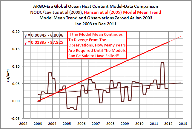
A graph that’s similar to the one Tamino and his disciples think is fake is shown in Figure 1. It’s similar but different, sort of a short-term OHC model-data comparison Modoki. We’ll get back to it.

Figure 1
First, let’s discuss…
…THE BLATANTLY OBVIOUS ERROR IN TAMINO’S RECENT FAILED CRITIQUE
Tamino’s recent failed critique is titled Fake Predictions for Fake Skeptics. Some people have noted that a fake climate skeptic would be an anthropogenic global warming proponent, but we’ll move on from the implications of that.
Tamino linked to the NODC Ocean Heat Content webpage as the source of his data. There, the NODC provides a spreadsheet of their global OHC data (here). Tamino presents a few preliminary graphs and observes:
Note that there’s a decided hot fluctuation in 2003. So we’ll “predict” the time span 2003 to the present, based on data from 1993 to 2003.
His next graph (my Figure 2) is identified only with the heading of “Ocean heat content 0-700m”. It includes a linear trend that Tamino claims is “based on data from 1993 to 2003”. The length of the trend line is assumedly based on the same period as data. But the period of his trend line does not include the “decided hot fluctuation in 2003.”

Figure 2 (Tamino’s 3rdgraph)
Tamino’s next graph, my Figure 3, includes an extension of his linear trend. In addition to the heading, the graph identifies the red trend line as “fit 1993-2003”, but his “fit 1993-2003” still does not include the “decided hot fluctuation in 2003.”

Figure 3 (Tamino’s 4rdgraph)
In the paragraph after that graph, Tamino states:
We can see that observations don’t follow the prediction exactly — of course! The main difference is that during 2003, the observations were hotter than the prediction. For that time span at least, the oceans had more heat than predicted.
He reinforces that the 2003 data is warmer, yet he and his disciples fail to observe that the 2003 data is not included in his “fit 1993-2003”.
The NODC clearly marks their quarterly data in the spreadsheet they provide here. The Global OHC value at 2002-12 is 6.368768 [*10^22 Joules], and the value at 2003-12 is clearly marked 11.6546 [*10^22 Joules]. But the data included in Tamino’s trend does not include the 4thquarter 2003 data at 11.6546 [*10^22 Joules].
If you’re having trouble seeing that, Figure 4 is similar to Tamino’s graph with the hash marks included. It shows the trend based on the period of 1993 to 2002.

Figure 4
And Figure 5 gives you an idea what Tamino’s graph would look like if he had actually included 2003 data in his trend.

Figure 5
Animation 1 compares the two. (You may need to click on it to get the animation to work.)

Animation 1
How could Tamino and his disciples have missed such an obvious mistake? Some of you might even think it wasn’t a mistake on Tamino’s part, and that his disciples purposely overlooked that blatant error. I’m sure you’ll have a few comments about that.
HANSEN ET AL (2005) OFFSETS THE OHC DATA
A recent comment noted that the observations-based dataset in Hansen et al (2005) was not NODC OHC data, that it was the OHC data based on Willis et al (2004). I never stated that I was providing Willis et al (2004) data. My OHC update posts have always been about the NODC dataset.
My Figure 6 is Figure 2 from Hansen et al (2005). Note that the data starts at about zero watt-years/m^2 in 1993. And my Figure 7 is Figure 3 from Willis et al (2004). Note that the Willis et al data starts at -1 * 10^8 Joules/m^2 at 1993. Hansen et al converted the data, which is not in question since I’ve done the same thing, and Hansen et al have offset the data, which I have done also.

Figure 6
HHHHHHHHHHHHHHHHHHHHHH

Figure 7
Mysteriously, Hansen et al can shift the data without comment from Tamino, but when I do it, it’s interpreted by Tamino and his disciples, and by those from SkepticalScience, as a fake graph.
THE BEST WAY TO COMPARE THE MODELS TO THE OBSERVATIONS-BASED OHC DATA
Obviously, the best way to present the GISS Model-ER projection for Ocean Heat Content would be to use the actual GISS Model-ER data. The RealClimate annual model-data updates here and herepresent the Model-ER data. But the Model-ER OHC simulations are not available in an easy-to-use format like at the KNMI Climate Explorer. If it was available, all of this nonsense about my shifting data, my misrepresenting data, etc., would disappear. Why?
I have stated in comments at WUWT that I would use the ensemble mean of the Model-ER data and the NODC OHC observations for my future model-data comparisons. I’ve also stated I would use the base years of 1955-2010 to avoid the possibility of being accused of cherry-picking the base years.
Why? I presented this in a June 14, 2011post. And that post has been linked to all OHC updates since then.
Figure 8 is a graph from a 2008 presentation by Gavin Schmidt of GISS. It includes the OHC simulations of the Model-ER for the period of 1955 to 2010, which is the model data shown in the RealClimate model-data posts. It also includes the older version of the global NODC OHC data.

Figure 8
If we:
1. replicate the ensemble mean data of the GISS Model-ER,
2. replace the older NODC OHC data with the current version, and
3. use the base years of 1955-2010 so that no one can complain about cherry-picked base years,
Figure 9 would be a reasonable facsimile of the long-term comparison from 1955 to 2010. Notice where the ensemble mean of the GISS Model-ER intersects with the data near the ARGO era. Sure looks like 2003 to me. Figure 1 at the top of this post confirms how closely the GISS Model-ER would intersect with the NODC OHC data at 2003.

Figure 9
That graph in Figure 1 looks familiar, doesn’t it? It sure does look like the ARGO-era graphthat Tamino and his disciples dislike so much.
MY OFFER
In my January 28, 2012 at 6:18 pmcomment at the WUWT cross post I wrote the following:
I offered in a comment above to use the base years of 1955-2011 for my short-term ARGO-era model-data comparison. That way there can be no claims that I’ve cherry picked the base years or shifted the data inappropriately. I do not have the capability to process the GISS Model-ER OHC hindcast and projection data from the CMIP3 archive. So I cannot create the ensemble member mean of the global data, on a monthly basis, for the period of 1955 to present. But some of you do have that capability. You could end the debate.
If you choose to do so, please make available online for all who wish to use it the Global GISS Model-ER hindcast/projection ensemble member data on a monthly basis from 1955 to present, or as far into the future as you decide.
I will revise my recent OHC update and reuse that model data for future OHC updates. That way we don’t have to go through this every time I use that ARGO-era comparison graph as the initial graph in my OHC updates.
Fair enough?
Any takers?
CLOSING
I know the trend of the OHC data is not the model mean, but for those who are wondering what Tamino’s NODC OHC graph might have looked like if he had actually included the 1993 through 2003 data in his trend AND then compared it to the period of 2003 to 2011, refer to Figure 10.

Figure 10
And if he had lopped off the data before 2003, because it isn’t presented in the graph that he complains about so much, the result would look like Figure 11.

Figure 11
Ouch. Granted, that will leave a mark, and foster ill will with some operatic warmist…
Thanks, Anthony.
Great post Bob, Sir!
And far more eloquently stated and ‘restrained’ than perhaps Tamino deserves….
Bob Tisdale said @ January 31, 2012 at 1:53 pm
Thanks, Bob 🙂
*pops popcorn* as I wait for the Tamino faithful to appear
He reinforces that the 2003 data is warmer, yet he and his disciples fail to observe that the 2003 data is not included in his “fit 1993-2003”.
—————–
Tamino is following a standard practice of using an inclusive-exclusive time range. In other words 1993-2003 should be interpreted as a time range beginning at the start of 1993 and ending at the start of 2003. In other words the range excludes the year 2003.
So Tamino made no mistake and his followers made the obvious interpretation without even noticing the mental effort required.
——————-
Tamino was making a point that it is not legitimate to exaggerate the difference between graph trends by introducing arbitrary vertical offsets or using reduced time ranges. Particularly if the reduced time range includes outliers.
Bob has missed the point and has gone off on a tangent of his own.
I don’t get it, Bob. Your posts and explanations are clear enough for this dumb ol’ engineer and the couple of times in the past when I didn’t ‘get’ something, you clarified your point; once in a comment and once you actually edited your post for a clearer exposition.
Hang in there. All I’m seeing from the complaints of detractors is that they are trying to get you to make your point so clear (“How clear is it?”) that no one can see it any more!
Can I take a shot, Bob? (Here goes anyhow.)
See Figure (pick a Figure, any Figure, past several Tisdale posts). Note where the model trend does not match observations. Ask yourself, “What’s a reasonable conclusion when a model doesn’t match observations?”
Okay. Done.
Another way to put this. 1993 to 2003 was used to build a prediction model. 2003 to present is data which can be used to test that prediction model. What is the R^2 of the predictors versus the observed during 2003-current?
I asked this at Tamino’s site but was moderated.
You’re a gem Bob. I never fail to learn something from your posts. Tamino getting involved is just the entertainment factor that makes learning fun.
School kids should have it so good.
Tamino has no valid points of contention.
The folks who believe strongly in AGW are trying to mask the issue. Since 2003, there has been a growing divergence. They should be happy for the data splice in 2003. Imagine if XBT data had continued to be used?.Oh man……….the divergence would be so huge that you could drive a couple of Unit Trains through it instead of a Mack Truck.
So a linear regression for the period of 1993-2003 leads to a very different interpretation than a linear regression for 1993-2002. Apparently one additional year makes a big difference. What does that say about the uncertainty of trends in short, noisy time series? Somehow this point doesn’t seem to sink in, so maybe this post can be a lesson for some. Sure, the 1993-2002 trend *by itself* is no more valid an estimate than the 1993-2003 trend, but we do have more data. A better estimate – the trend for the entire 1993-2011 period – happens to match the 1993-2002 trend pretty well in part because the 1993-2002 period does not start or end on any noticeable outliers. Clearly though, 10 years is not enough time to constrain the uncertainty in the OHC trend.
Just noticed the thread title:
“Part 2 of Tamino Once Again Misleads His Disciples”
Shouldn’t it read:
“Part 2 of the Continuing Saga of Tamino Misleading His Disciples”?
Just wonderin’.
Tamino’s site is all about agreement – it is impossible to serve kool aid to someone who only wants a tall cold glass of clear thinking…
Bob was making the point that observations are not following the models. Tamino and his followers dislike this fact of life and decided to go off any make their own straw man.
LazyTeenager says:
Tamino was making a point that it is not legitimate to exaggerate the difference between graph trends by introducing arbitrary vertical offsets or using reduced time ranges.
Tamino’s point is inapplicable. The vertical offset is not an issue, unless the absolute magnitude of the divergence is the topic that the graph is intended to illustrate. It wasn’t. Bob spoke only of the comparison of slopes. His graph is appropriate for that discussion. It is not misleading.
Tamino’s post is misleading. He presents graphs that are only relevant to the discussion of the absolute magnitude of the divergence. That was not Bob’s point. Bob’s point was the comparison of slopes, and Tamino did not present the relevant slopes in his post. Doing so would have made Bob’s point, and Tamino’s irrelevant red herring, quite clear.
Grant Foster is smart enough that he doesn’t need to erect strawmen to conquer. It must be the overall deficiency of his position that causes him to do such things, huh?
OHC for the last ten years is proceeing on a much flatter trajectory than previously. And flatter than the model runs predict. That was, and remains, Bob’s point. He is absolutely correct about that, as this post and the two previous demonstrate. His question was, and remains, how much longer can this divergence persist before the model worshippers come down from the hill and perform the virual equivalent of the “Great Disappointment” response? It is a good question. You guys should answer it, rather than trying to distract from it.
Because when you attempt to distract from it, as Tamino has done here, you end up doing two things: 1) You look desperate, grasping at straws from which to construct sparring partners, and 2) you end up forcing guys like Bob into examining things that don’t turn out well for you. In his original post, he was not talking about the absolute magnitude of the OHC divergence, only the slopes. Off topic complaints forced him to address the former, and look what he found: Fig 9 above shows that in addition to being way off predicted slope for the last 10 years, the absolute value of the OHC has been below model predicted values for the last 15 years.
Add that to Bob’s question above.
Thanks, JJ. I was ready to point out the obvious strawman (offsets are irrelevant when comparing trends – indeed, starting both at the same point is the only way that even makes sense) and you beat me to it. As for the silly inclusive/exclusive argument: it does not support any “defense” when one point makes that much of a difference. Duh.
Mark
Hi Everyone!
If Open Mind allowed for comments to discuss/debate articles from that site, WUWT probably wouldn’t have to publish an article to provide a dissenting view.
But there it is.
Open Mind and other Pro-CAGW sites just don’t allow for intelligent discourse and proper debating.
So be it.
The thing that gets me is, is that WUWT allows for such types of discussions(mind you civil), giving rise to dissenting Con-CAGW views, yet these posters defend websites that censor.
Period.
So, those of you that support those websites and/or their views, why don’t you go to those websites and ask/demand they show the same courtesy and transparency.
Otherwise, your opinions here are but a tool to muddy the waters.
If you support CAGW and comment here to defend your right to free speech and do nothing about the censorship from other websites, you should be ashamed of yourself.
You want to be heard.
We want to be heard.
You want freedom and change.
We want freedom and change.
The next time you feel obliged to speak your mind here, remember this:
Skeptics don’t have that same freedom.
You call us deniers to our face and behind our backs.
For years you laughed and ridiculed skepticism.
Now that a growing majority don’t believe in CAGW or their views, you come here and mock the process, knowing we don’t have the same privilege.
You want us to respect your opinion, demand open discourse from you trusted friends at Real Climate and Open Mind and the like.
But until then, you are but a tool of the worst sort.
Unfortunately, those that agree with closing debate do not care whether you respect their opinion. They are interested only in whether you accept it (agreement is not even necessary) along with the consequences and, ultimately, are willing to use force should you refuse. It is, and always has been, about control.
Mark
The problem is still this “ARGO-era” concept. If I understand what Bob is saying, it’s something like this: in the 4th quarter of 2002, only 49% of the readings were from ARGO buoys, so that data is garbage and we ignore it. But in the 1st quarter of 2003, 51% of readings were from ARGO buoys, so that data is good and we start tracking ocean temperatures from there. To me that raises lots of questions. What is it about the ARGO readings that make them “better” than the old sources? If “better” just means greater accuracy, why does that mean the older data is garbage? (To make an analogy, it’s not like the technology went from sundials to atomic clocks overnight. A thermometer in 2002 was not that different than one in 2003.) And how do you address the fact that much of your 2003-present data is “contaminated” with data from these low-quality older data sources? It looks like Bob is deliberately choosing a starting point that happens to best make his argument (that ocean temperatures aren’t rising). It looks like he is starting with the graph he wants to show and is choosing the data to show that graph. This “ARGO-era” stuff is a mighty thin justification for what he is doing to these graphs. I’m just saying that’s how it looks.
Peter says:
It looks like Bob is deliberately choosing a starting point that happens to best make his argument (that ocean temperatures aren’t rising). It looks like he is starting with the graph he wants to show and is choosing the data to show that graph. This “ARGO-era” stuff is a mighty thin justification for what he is doing to these graphs. I’m just saying that’s how it looks.
For the sake of discussion, assume that is true. It remains that for the last 10 years the slope of the model prediction is way off the slope of the observations. Also, for the last 15 years the observations are below the model prediction, and the disparity is growing wider faster more recently. How long can this persist, before the Modelites reinterpret the ETA of the Second Coming of the Heat?
Here in the Great South Land as many of your observant readers will know, except for Andrew Bolt there is vitally no media discussion of the great debate between the warmists and the contrarians. However an interesting wild card has recently been dealt. Gina Reinhardt, one of the worlds richest women has bought a swag of shares in the media group Fairfax
(publishers of the Sydney Morning Herald and the Melbourne Age, both very warmist). This will enable Mrs Reinhardt, a vehement contrarian, to obtain a seat on the board. Her influence on the board of Chanel 10 TV got Andrew Bolt a half hour current affairs program. Cheers from a soggy Downunder.
Sorry Bob.
I don’t mean to detract from your efforts but surely, you’ve already spent too much time on this idiot Foster!
I think most reasonable people can see that aligning in the y axis can give a different perspective, it’s a trademark of their con!
Get back to explaining ENSO, the PDO & suchlike!
LazyTeenager says: “Tamino is following a standard practice of using an inclusive-exclusive time range. In other words 1993-2003 should be interpreted as a time range beginning at the start of 1993 and ending at the start of 2003. In other words the range excludes the year 2003.”
I have to admit, LazyTeenager, that was pretty creative. That was your best attempt to misdirect yet.
Now, if “inclusive-exclusive time range” is “standard practice”, why is it when I Google “inclusive-exclusive time range” in quotes, I get only one return, and that return is your use of it on this thread?
When someone lists start and end years of a dataset or subset, they’re stating that it includes all of the data during that period.
Peter says: “The problem is still this “ARGO-era” concept. If I understand what Bob is saying, it’s something like this: in the 4th quarter of 2002, only 49% of the readings were from ARGO buoys…”
Please quote chapter and verse where I have ever stated or inferred something to that effect. You’re reaching.
Peter says.
Well sort of peter, except that before ARGO, we weren’t really looking at ocean temps, therefore, not looking at the largest energy sink on Earth!
Try telling me atmospheric temps are significant now!
DaveE.
JJ: Thanks for your January 31, 2012 at 3:38 pm comment. Would you mind if I posted it at my blog as a “quote of the month”?
Lazy Teenager sez:
>> Tamino is following a standard practice of using an inclusive-exclusive
>> time range. In other words 1993-2003 should be interpreted as a time
>> range beginning at the start of 1993 and ending at the start of 2003. In
>> other words the range excludes the year 2003.
What “standard practice” ??? Never heard of it.
NatJ says: “So a linear regression for the period of 1993-2003 leads to a very different interpretation than a linear regression for 1993-2002. Apparently one additional year makes a big difference. What does that say about the uncertainty of trends in short, noisy time series?”
As far as I can tell, Tamino’s concern is not the slope of the line. His concern is and has been where my model trend intersects with the observations. The difference in the trends between the periods of 1993-2002 and 1993-2003 is not that large. But it impacts his presentation and his complaint about where the model intersects with the data.
H.R. says:
January 31, 2012 at 2:43 pm
Ask yourself, “What’s a reasonable conclusion when a model doesn’t match observations?”
OK, I’ll bite. Useless?
🙂
Bob,
Quote of the month? I’m honored.
Wow. I’ve never won anything before. I feel I should thank the Academy or something.
Bob:
Tamino can also project forward the models without comment from Nick Stokes and crowd too. When you do it, however, it’s an error.
Lazy: “Tamino is following a standard practice of using an inclusive-exclusive time range”.
I think you just made that up. I found exactly one hit for it on google, to your comment.
/rolls eyes
David A. Evans says: “Get back to explaining ENSO, the PDO & suchlike!”
I’ve been writing about ENSO for most of the day. This is just a distraction.
@Babsy says:
January 31, 2012 at 5:32 pm
H.R. says:
January 31, 2012 at 2:43 pm
Ask yourself, “What’s a reasonable conclusion when a model doesn’t match observations?”
OK, I’ll bite. Useless?
🙂
========================================================================
LOL! I hadn’t thought of that answer as a particular. I was thinking “Wrong!” and” Do- over!”
I have been following Bob’s posts here and at his blog and he can only be described as courteous and thorough. He can be a little “cloudy” at times but all you have to do is ask! Bob will do his best to clarify. I just got a little PO’d (and mischievious) by the nitpicking that took advantage of his very professional and good nature and had to jump in. Like any good punchline, your response was a hoot; deadpan, unexpected, and pttttt…. right on point.
Made my day!
(P.S. Bob’s posts are always a good addition to any day. Do I sound like a Tisdale groupie? Naahhh… I’m not, but I really like, and learn, from his posts.)
When SkepticalScience criticize you you know you’re on the right path – they’re an evil little nest of vipers.
I wouldn’t worry too much about what Tamino publishes, nobody else does. Seriously. He is so completely discredited as nothing more than an alarmist shill that he is completely predictable in his position on any question that might come up. He simply tunes for maximum warming and lets it rip. It’s so simple even a caveman could do it.
Bob: “When someone lists start and end years of a dataset or subset, they’re stating that it includes all of the data during that period.”
I backed you last time and I’ll back LazyTeenager this one. Ranges in this manner are commonly either [1993,2003] or [1993,2003). Which to use is largely not relevant and a matter of taste. And while I do think the inclusive range [1993,2003] is certainly more common overall I would not go so far to claim that it isn’t used *at* all. Charitably, LT has a point that is valid under one interpretation.
That said, if we grant the point that Tamino meant [1993,2003) then he cherry-picked *out* the date that he’s scolding you as having cherry-picked *in*. In which case we can be certain that LT acknowledges that Tamino is as out of line as yourself.
We should make a point that 1.0 W/m2/year across the entire oceans on the Earth is 1.13 X10^22 joules. There is too much obfuscation by working back and forth between the W/m2 and joules/m2/year. 1.13 joules should be committed to memory if you want to work on OHC.
Hansen 2005 jerks around back and forth between saying the imbalance is 0.6 W/m2/year and 0.85 W/m2/year. It seems that he meant the imbalance should be 0.85 W/m2/year, that the oceans are absorbing something close to this.
So that should then translate into 0.96 X10^22 joules/m2/year of OHC rise.
From 1993 to 2011, the OHC should have increased by 18 years times 0.96 X10^22 joules/m2 or around 17 X10^22 joules/m2.
How much did it increase? About 10 (even including the unexplainable 2.5 step increase during 2002).
So yeah, Hansen is way off and Tamino should be reprimanded with a thick metre-stick like the Nuns used to do.
H.R. says:
January 31, 2012 at 6:24 pm
I am amazed at the warmists’ attachment to their models. Absolutely amazed.
The “standard practice” is to be clear. As in “1990 – 2012 inclusive”, or “1990 – 2012 exclusive”. Let’s not be too lazy to be clear. K?
Bob Tisdale said:
“LazyTeenager says: ‘Tamino is following a standard practice of using an inclusive-exclusive time range. In other words 1993-2003 should be interpreted as a time range beginning at the start of 1993 and ending at the start of 2003. In other words the range excludes the year 2003.’
I have to admit, LazyTeenager, that was pretty creative. That was your best attempt to misdirect yet.”
Bob, I’m on the fence one this one.
Lazy Teenagere, I take it, would, using “the standard” when describing the date of data from 1955, say the data is from the period 1955-1956 – whereas others might say it’s from 1955.
Is there a difference in kind when describing some data vs describing a time span the data was taken from ? Is a difference created if the data comes in quarterly vs all at once per year…therefore “spanning” the period” ?
So after all these pages with pictures and graphs with a description on the back of each one we reaffirm a decade old guess by a crazy guy is still wrong, and Tamino lacks integrity. Can we bury this now? It is not science.
Join in the singing when it comes around again. Here it comes…
Bob,
I think your Fig 8 is the place to look for a model/OHC comparison. The runs were designed for that purpose, and you can easily add the recent years obs. Gavin’s presentation is here.
Their runs were to investigate the effect of ocean model on the calcs, and show they used Russell, which runs hot here, and Hycom, which runs cold. You’ve chosen to emphasise the Russell model, but their purpose was to investigate the range of uncertainty. The Hycom model (EH) was running cooler since 1990, but is about right now.
There is obvious short term variability which the models run in projection mode (with forcing scenarios) are not capturing. That is not surprising. They are trying to resolve the longer term trend disparity between the two models.
Maus said:
“[1993,2003)” is called a half-open range, and they are very common in some environments, significantly programming and some mathematics. But the names of the endpoints (here “1993” and “2003”) in that circumstance are always names of a single value point, not the name of a range of values. The number of a year names the entire 12 months of the year. A half-open range might be passable if it were presented as “1/1/1993 to 1/1/2003”, but just with the year numbers it must certainly be written out more clearly, for example “1993 to but excluding 2003”, or “1993 through 2002”.
If you can’t justify why we should ignore the data from prior to 2003, then you are cherry picking data. That is exactly the point. In science you try to look at all the data you can – at least that’s what I was taught. This analysis is based on a subset of data cherry picked out of a larger data set.
JJ, with respect to your point, you are correct – the slope is much less if you use 2003 as a start year. And it might be more if I use 2001 as a start year. Or less if I use 2010 as the start year. It would be a huge slope if I just looked at 2Q11 to 3Q11!!! I can pick any start period and any end period I want and come up with a different slope. What makes that different than this analysis from Mr. Tisdale? The point is, we have lots of data on OHC, so why would one choose to ignore a large part of your data set? Perhaps it is because you doubt the veracity of data that doesn’t fit your preconceived notion of what the data should say.
Ron House: ““[1993,2003)” is called a half-open range, and they are very common in some environments, significantly programming and some mathematics.”
Just so, and I appreciate the assist. But surely you’re not claiming that mathematics and programming have anything to do with the CC debate?
LazyTeenager says: “Tamino is following a standard practice of using an inclusive-exclusive time range. In other words 1993-2003 should be interpreted as a time range beginning at the start of 1993 and ending at the start of 2003. In other words the range excludes the year 2003.”
LazyTeenager is right – it IS standard practice for climate scientists to include/exclude certain dates. They’ll add or delete data that will “hide the decline”, graft on the temp data to almost any chart they can, and simply refuse to discuss any divergence that results from use of the full data.
Peter – what happens if you pick slopes of 1, 2, 3, 5, 7, 11, 13, 17 years – all randomly picked out of the blue sky prime numbers, of course. Overlay them on the graph using observed data and you get a curve. Do that long enough and you will have a history. The advantage is you get to see lots of start years. Try to project that or any one of them into the future and you have fiction. The lesson we learn from all this is projecting into the future is futile and in the worst case will cause you to claim turnpikes on the Atlantic seaboard will disappear under the waves in our lifetimes. FAIL!
Models are wrong, observations are right. Subject to the Mann Normalization method, of course, but today and all yesterdays are worth bumpkis regarding what the next 10,000 tomorrows will be like.
My point is Bob can pick from dozens of models and they’re all going to diverge. Climate models applied long term are the man behind the curtain – pay him no mind.
I’m beginning to wonder if “Grant Foster” is just another case of nominative determinism.
To continue JJ’s and others’ analogies: Once they realize that the heating time is delayed, they will predict another era during which it will come; or some will say that the heating isn’t taking place on this earth, but somewhere else in the heavens, (which is more believable).
RE: Lazy Teenager: “Tamino is following a standard practice of using an inclusive-exclusive time range.”
Is that all he was doing? Gosh! I thought he was attempting to show that malfunctioning models were not actually malfunctioning.
I love the way these fellows tinker with models after-the-fact to “fix” them.
If they were selling me a new car, and I pointed out the odometer read 9,000 miles, they would tinker with the odometer until it read zero. Then they would smile and brightly state, “There! All fixed! It is new again!”
Peter says:
If you can’t justify why we should ignore the data from prior to 2003, then you are cherry picking data. That is exactly the point. In science you try to look at all the data you can – at least that’s what I was taught. This analysis is based on a subset of data cherry picked out of a larger data set.
You are evidently one of those unfortunates who has been trained to use “cherry picking” like an ad hominem. You call names at other’s reasoning, thinking you have refuted it. That is not the case.
The justification for picking ca 2003, if you dont like the reason Bob gave, is that ca 2003 represents the beginning of a change that continues through an important period of time. The significance of that period is marked by the change in trend, the length of the period vs the variability of the data, and the fact that the period is one of substantial interest – namely the present. This is all implicit in the argument that you ignore by calling “cherry picking”.
JJ, with respect to your point, you are correct – the slope is much less if you use 2003 as a start year. And it might be more if I use 2001 as a start year. Or less if I use 2010 as the start year. It would be a huge slope if I just looked at 2Q11 to 3Q11!!! I can pick any start period and any end period I want and come up with a different slope. What makes that different than this analysis from Mr. Tisdale?
If you will ponder what you have just presented, perhaps you will arrive at the answer to your question on your own. You have all of the information you need, you just need to not let other people do your reasoning for you, by filling your mind with simplistic notions of “cherry picking”.
The point is, we have lots of data on OHC, so why would one choose to ignore a large part of your data set? Perhaps it is because you doubt the veracity of data that doesn’t fit your preconceived notion of what the data should say.
If your child comes to you and says “Daddy, I feel sick” do you want to know what her body temperature averaged over her seven year lifetime is? Averaged over the last month? The last week? Or do you put your cheek to her forehead to find out what it is right now? Significant information is gained by paying attention to the data that are important, and “ignoring” what is not. Change is often a marker of importance. If you are not looking at all relevant subsets of the data, you are not using all of the data.
OHC trend is much flatter than modeled for the last 10 years. OHC value is lower than modeled for the last 15 years, and the disparity is increasing. These facts are unquestionably important. The only question is whether or not they are currently sufficient to constitute an outright falsification of the models, and if not, how long would they need to persist before that became the case. That question is being avoided, with ruses which include calling “cherry picking” ignorantly.
Nick:
I don’t think that is a very honest assessment of why the models can’t capture short-period variability. This unwillingness on your to honestly state the limits of the models really undermines your credibility at times.
On the subject of whether or not 2003 is included then a look at the graphs seems to point clearly to the fact that the figures that the original projection was based on terminated at the transition from 2002 to 2003, that is, excluded 2003.
However, whatever the range of data, what I believe this is yet another example of the stupidity of using linear trends for any attempt at climate prediction. Sooner or later this will result in absurdity. In this case Bob has shown clearly that it is sooner, and most of the debate is about semantics.
Peter wrote:
” The point is, we have lots of data on OHC, so why would one choose to ignore a large part of your data set? Perhaps it is because you doubt the veracity of data that doesn’t fit your preconceived notion of what the data should say.”
Because it’s actually two different data sets melded together and the data set circa 2003 becomes vastly more accurate (although far from perfect). So of course it is interesting to look at different data sets that attempt to measure the same thing. What is more interesting is that you know this already, so why the rhetorical tactic of pretending you don’t know this I wonder?
Peter says: “If you can’t justify why we should ignore the data from prior to 2003, then you are cherry picking data…”
You’re recycling the same old argument. Hansen used 1993 to 2003 to show the models performed well during that period. I start my ARGO-era period to show that the models haven’t done as well since then. It’s as simple as that, Peter.
Nick Stokes says: “I think your Fig 8 is the place to look for a model/OHC comparison. The runs were designed for that purpose, and you can easily add the recent years obs. Gavin’s presentation is here.”
I agree that the model data is the place to look. I just wish it was online at the KNMI Climate Explorer so I could present the modeled OHC on an ocean-basin basis and on a zonal-mean basis. The model simulations should look as bad as SST. And thanks for the link, but I included it in the text of my post.
You continued, “Their runs were to investigate the effect of ocean model on the calcs, and show they used Russell, which runs hot here, and Hycom, which runs cold. You’ve chosen to emphasise the Russell model…”
The Russell ocean model, as far as I can tell, was used in Hansen et al (2005). Russell is one of the authors. Also Hansen et al (2005) refer to their “coarse resolution” ocean model which should be Russell ocean. Again, as far as I can tell, the Russell ocean model uses larger grids than HYCOM—coarser resolution. Further, the Russell ocean model is used by Gavin in his annual model-data comparisons. One would conclude then that the GISS Model-ER was preferred by GISS.
Choose the appropriate time period and anything can be claimed.
To choose the upward part of a cycle will ‘prove’ warming. You need the whole cycle to prove anything.
The ARGO buoy system is a good way to find all sorts of facts about the oceans but there are not enough of them. Each one has to look after around 210,000 cubic Km of water. This will give fairly wide error bands.
Bob Tisdale says: February 1, 2012 at 2:10 am
” Further, the Russell ocean model is used by Gavin in his annual model-data comparisons. One would conclude then that the GISS Model-ER was preferred by GISS.”
Not in Gavin’s presentation – they plotted both, to give a range of variation, they said. I would conclude that they expected one to be at the high end, one at the low.
Carrick Talmadge says: January 31, 2012 at 6:08 pm
“Tamino can also project forward the models without comment from Nick Stokes and crowd too. When you do it, however, it’s an error.”
You can always extrapolate to see what happens. You can extrapolate the observed data too. Because the GISS-ER model and the data agree in the range to 2003, you’ll get much the same line.
The error is in the inference, which was that the model was wrong because the extrapolation didn’t look good. All you can deduce is that the post-2003 OHC went in a different direction. That no more invalidates the pre-2003 model results than it invalidates the pre-2003 data. And that’s all that were used here.
JJ says: “Quote of the month? I’m honored”
I posted it as “Comment of the Week” since it was applicable to the week-long discussion of Tamino’s critique. If it hasn’t been a week, it seems like it.
http://bobtisdale.wordpress.com/2012/02/01/the-comment-of-the-week/
Regards
JJ: “If your child comes to you and says ‘Daddy, I feel sick’ do you want to know what her body temperature averaged over her seven year lifetime is? Averaged over the last month? The last week? Or do you put your cheek to her forehead to find out what it is right now? ”
I think the analogy should be a bit more complicated. Something like “daddy am I still sick?” You might say well, last time we checked your temp was 102F, and now it’s 99.5, so I think you’re getting better. But you wouldn’t think they’re really better unless the temperature stayed down (even in the afternoon when fevers go up, or after the acetaminophen was fully out of her system). Id imagine one day of your childs temperature fluctuations is probably like 20 years of ocean heat content. You do want to know what it is now, but also the long arc of the “illness.”
JJ: “The only question is whether or not they are currently sufficient to constitute an outright falsification of the models, and if not, how long would they need to persist before that became the case. ”
I think the reason people think “cherry-picking” is that if you look at the start point of Bob’ graph in context of more years of data, it’s clear that he starts at an anomalously high point. Kind of like having a kid whose fever is going from 99 to 103 every day, and you check it today and say, “ah my last check was 103, and my first check today is 102, we’re getting over this!”. It may not be a deliberately picked cherry, but it still is an anomalously hight start point for a trend. If you start the trend 6-12 months earlier the trend is quite different, even though just about the same percent of the data came from ARGO. Which is why, titillating as it might seem, Bob and your suggestions of being near model “falsification”, whatever that means, are off base.
By the way, it’s far less cool to be a “disciple”, than a “minion”, so you guys definitely are winning on the name your opponent game.
I left a handful of comments on SkepticalScience over the last week but quickly understood it was intelectually equivalent to attending a UFO convention.
The AGW self referential hive-mind cannot be deterred from its assault on reason.
Nick Stokes says:
February 1, 2012 at 3:14 am
“You can always extrapolate to see what happens. You can extrapolate the observed data too. Because the GISS-ER model and the data agree in the range to 2003, you’ll get much the same line.”
Wrong answer, bud. You can extrapolate *AND* see what happens but not extrapolate *TO* see what happens. Observation trumps model. Always. Have a nice day!
Utahn says:
“By the way, it’s far less cool to be a ‘disciple’, than a ‘minion’…”
True. But I consider myself one of Anthony’s henchmen. A henchman has more gravitas than a disciple or a minion. You don’t mess with a henchman if you know what’s good for you. Nobody wants to get henched… ☺
JJ, the problem with your logic is that is that it ignores things like measurement error that cause noise or uncertainty in the data record. And because there is noise in the data you need to look at a long term record before you can draw conclusions about the rate of change.
Try this experiment: fill a pot with water, put it on the stove, and turn on the burner. Measure the temperature after 1 min, 2 min, 3 min, etc. until it begins to boil. Then plot a graph. Perhaps your readings increase by 2 degrees in the first minute, then 3 degrees in the 2nd minute, and then 2 degree in the 3rd minute. After 3 minutes, do you conclude that the rate of heat increase is slowing? Obviously not because there is some measurement error. Now think about the size and complexity of the body of water we are trying to measure and the inherent weaknesses in measurement accuracy. That is why you need a multi-decade record of data before you can draw conclusions about the rate of change.
I tried to leave a post on “Open Mind” but was moderated into non-existence. In that post I simply stated that Bob’s original post was showing the divergence of the slopes between the model predictions and the actual readings. I was not rude in any way, yet my post was not accepted. What kind of open-mindedness is that? Lesson learned for me I suppose.
Nick Stokes:
That wasn’t the argument you were making the other day. A new day a new contradictory argument.
Once again you undermine your own position with this weaselly language.
As to didn’t look good, why didn’t it “look good”. Does that have anything to do with the completely meaningless offset that is only important as visual candy? (The only meaningful comparison is in whether the trends agree.)
Here’s Tisdale’s projection showin the full region. It “looks” fine to me.
IMO, you’re just being mini-Tamino, dutifully defending every word that come blathering out of his mouth as if it were gospel. That’s too bad, because you’re actually a lot smarter, and better trained, than him. You should be laying in to him, like you did Judith Curry.
It’s an unfortunate fact that Tisdale corrects errors, when the criticisms are sensible, and Tamino bans the blogger when his errors get pointed out.
(Tisdale IMO still has a long way to go, but he does have a strong point about your and others hypocrisy in your criticisms at this point.)
Smokey: “You don’t mess with a henchman if you know what’s good for you. ”
Nor a minion, usually, but if you’re a disciple, you’re just asking to be messed with!
The ironic thing about Tidasle’s extrapolation (which we’re left wondering why it doesn’t “look good”, unless maybe he used too garish of a color or something), is that the comparison that Tisdale did, in shifting the offsets so they match in 2003—
That’s really the correct way to visualize two curves, if what you are trying to assay is whether the trends agree or not. What Tamino did was actually to obscure the amount of disagreement between the two curves.
That said, I don’t think Tisdale did a perfect job (people rarely manage perfect even in peer-reviewed manuscripts), and hope he continues to show the willingness to adapt to constructive criticism.
Maus says: “That said, if we grant the point that Tamino meant [1993,2003) then he cherry-picked *out* the date that he’s scolding you as having cherry-picked *in*. “
There is no cherry-pick on my part. I explained the reason for 2003 in my first response to Tamino back in May. And if you’re not aware, 2003 wasn’t the “cherry” year when I started the model-data comparisons; 2004 was. In that time, the NODC made corrections to their dataset and that altered the data in 2003 and 2004.
Additionally, there’s no reason to grant Grant any latitude. I can think of no climate change-related papers where the end year did not include all months of data during that year. Foster (Tamino) and Rahmstorf (2011) is an example. The title of the paper is “Global temperature evolution 1979–2010”. The last sentence of their abstract reads, “The adjusted data show warming at very similar rates to the unadjusted data, with smaller probable errors, and the warming rate is steady over the whole time interval. In all adjusted series, the two hottest years are 2009 and 2010.”
If Tamino and Rahmstorf did not include 2010 data in their analysis, they could not have made any claim about the adjusted temperature in 2010. In his recent post, Tamino either made a mistake or he tried to pull a fast one. Take your pick.
corporate message says: “Is there a difference in kind when describing some data vs describing a time span the data was taken from ? Is a difference created if the data comes in quarterly vs all at once per year…therefore ‘spanning’ the period’ ?”
LazyTeenager was getting creative, as was at least one person at Tamino’s blog. There are no climate change-related papers that I’m aware of where the end year did not include all months of data during that year. Further to that, Tamino set the precedent for himself with his Foster (Tamino) and Rahmstorf (2011) paper. The title of the paper is “Global temperature evolution 1979–2010”. The last sentence of their abstract reads, “The adjusted data show warming at very similar rates to the unadjusted data, with smaller probable errors, and the warming rate is steady over the whole time interval. In all adjusted series, the two hottest years are 2009 and 2010.” They had to have included 2010 temperature data in their analysis; otherwise they could make no claims about 2010 temperatures.
Here’s a link to the paper:
http://iopscience.iop.org/1748-9326/6/4/044022/pdf/1748-9326_6_4_044022.pdf
And here’s a link to Tamino’s post about the paper. It contains a link to the data he used in the paper, and it runs through December 2010 (2010.958 on the spreadsheet).
http://tamino.wordpress.com/2011/12/15/data-and-code-for-foster-rahmstorf-2011/
No worries Bob, the alarmists are jumping ship faster than you can say: “Is that my reputation being flushed down the global warming toilet?” They’re wrestling over the life vests at this very minute, sit back, enjoy the show, let time and empirical evidence prove them wrong (again).
Bob, if Grant Foster ever produces a graph that isn’t misleading, that would be news worth reporting.
John Greenfraud says: “No worries Bob, the alarmists are jumping ship faster than you can say…”
Not all of them, though, John. I’ve got one hanging onto the ship’s railing over at my place…
http://bobtisdale.wordpress.com/2012/01/28/tamino-once-again-misleads-his-followers/#comment-3419
…who’s rehashing and rephrasing worn-out, tired-old arguments that I’ve replied to here, there, and everywhere over the past few posts.
LazyTeenager says:
January 31, 2012 at 2:40 pm
He reinforces that the 2003 data is warmer, yet he and his disciples fail to observe that the 2003 data is not included in his “fit 1993-2003”.
—————–
Tamino is following a standard practice of using an inclusive-exclusive time range. In other words 1993-2003 should be interpreted as a time range beginning at the start of 1993 and ending at the start of 2003. In other words the range excludes the year 2003.
So why did he omit the 2003 data in the 1993-2011 trend? And, by the way, why did he keep the 2011 data in the 1993-2011 trend… by your argument he should have left it off.
I mean, he just dropped a year of data IN THE MIDDLE OF THE TREND. How do you justify this?
Please help me out here and correct me if I’m wrong. The data splice occurs in 2003. Tamino built his trend without using 2003 data. Had he used 2003, he would have had to combine older data plus the first year of ARGO data to calculate his trend. That doesn’t seem legitimate. I agree however, since two distinct data sets are being compared, slopes should be the issue and that is where Tamino apologists are all wet.
Utahn says:
I think the analogy should be a bit more complicated.
I did not provide an anaolgy. I gave an example. An example of an instance where the appropriate period of analysis was very short (instantaneous). You provide an example where the appropriate period of analysis is somewhat longer (a few hours to a day or so). We can easily provide another example – low grade fever indicative of a chronic infection – where the appropriate period of analysis could be several days to several weeks or even months.
That is my point. All of those periods are appropriate, for their intended purpose. You cannot a priori claim “cherry picking” based on the period alone. You need to compare it against the purpose to which the data are being put. WRT the validity of climate model predictions, periods of 10 to 15 years are clearly within the realm of consideration, and such periods that include the present are particularly relevant.
I think the reason people think “cherry-picking” is that if you look at the start point of Bob’ graph in context of more years of data, it’s clear that he starts at an anomalously high point.
Not true. And on top of that, irrelevant.
If you will look closely at Bob’s figure 10 above, you will see that the period for his recent era trendline starts first quarter 2003. That was, if anything, a low point – being below the trend line of the 1993-2003 data. Also, the data subsequent to 2003 are of similar magnitude to the 2003 data – hence the flatter trend over that period. So, Bob did not start his trend on the high point in 2003, and that point is not anomalous wrt the rest of the period.
And it would not matter if he had started on the high point. Appropriate and relevant analysis periods may start on high points, or low points, or points in between. The point chosen may be inappropriate, but that cannot be a priori determined from the relative magnitude of the point alone. The full context of the period and the purpose to which the data are being put must be considered. All too often, we see the ignorant name calling of “cherry picking” without consideration of those issues.
It may not be a deliberately picked cherry, but it still is an anomalously hight start point for a trend.
Nonsense. There is a clear break in trend around that point, and the period subsequent is long enough wrt the variability of the data and flat enough wrt the predicted trend to warrant consideration.
If you start the trend 6-12 months earlier the trend is quite different, even though just about the same percent of the data came from ARGO. Which is why, titillating as it might seem, Bob and your suggestions of being near model “falsification”, whatever that means, are off base.
Nonsense. Fifteen years of lower than predicted values, with an increasing disparity that results in a strongly divergent trend over the most recent 10 years, is significant. The only question before us is whether or not it is yet of sufficient significance to constitute a falsification of the models. It is certainly in the vicinity.
A further point that needs to be made regards “starting points”. In any trend analysis that includes the present, a perfectly valid and very useful question to ask is “For how long has the current trend been active.” That question is answered by extending the period of analysis back in time until the bounds by which you define the current trend are exceeded. The point reached is not the starting point, but rather the ending point, of that analysis. That point will most relevantly occur at a break in trend, and often at or near an extreme value. That it does so does not by itself render the trend invalid. Trends are not invalid. Only the use to which they are put can be invalid, and determining that requires consideration of much more than whether or not the trends starts, ends, or contains , a “high point”.
“Cherry picking” can be a valid complaint, but it is much overused – both by those that dont understand the concept as well as those that know better.
Peter says:
JJ, the problem with your logic is that is that it ignores things like measurement error that cause
noise or uncertainty in the data record.
Nonsense. To the contrary, a comprehensive analysis dedicated to identifying measurment error will seek out obvious discontinuities in the data and breaks in the trend, such as occur in the OHC data ca 2003. They are often indicative of a problem with the data. Given that this discontinuity and trend break is coincident with the changeover to the entirely different instrumentation and methodology of the ARGO-data-based OHC estimates, one of the first things I would question is whether or not there is an error in the homogenization of that hybrid dataset. If there is, it needs to be fixed before those data are put to any use. If there is not, then the discontinuity and break in trend are real, and the length of the period over which they operate and their recent behaviour render them worthy of consideration.
And because there is noise in the data you need to look at a long term record before you can draw conclusions about the rate of change.
You say “long term record” as if that has a singular meaning, and no doubt you equate that singular meaning with whatever period it takes to achieve your predetermined result. Nonsense.
To properly analyze trend data, one need not look at a “long term record”. One need only look at a long enough term record. “Long enough” is determined by the purpose of the analysis and the magnitude of the variability of the data vs the size of the change or trend in the data. Ten to fifteen years of large and increasing divergence is long enough to support asking questions regarding the validity of these model predictions vs these data. It is in the vicinity of long enough to invalidate those models against these data and the purpose for which these predictions are being used, though you will note that neither Bob nor I have yet drawn that conclusion.
That is why you need a multi-decade record of data before you can draw conclusions about the rate of change.
Nonsense. There is no set period necessary for drawing conclusions about the rate of change, “multi-decadal” or otherwise. The necessary period is determined by the measured
rate of change and the variability of the measurements. I trust that if the global average surface temperature began rising 1 degree C per year for the next five years, you would not calmly demand another twenty five years or so of monitoring before coming to the conclusion that the rate of change had increased.
ClimateForAll says:
January 31, 2012 at 3:53 pm
“Hi Everyone!
If Open Mind allowed for comments to discuss/debate articles from that site, WUWT probably wouldn’t have to publish an article to provide a dissenting view.
But there it is.
Open Mind and other Pro-CAGW sites just don’t allow for intelligent discourse and proper debating.
So be it.
The thing that gets me is, is that WUWT allows for such types of discussions(mind you civil), giving rise to dissenting Con-CAGW views, yet these posters defend websites that censor.
Period.
……….
You want us to respect your opinion, demand open discourse from you trusted friends at Real Climate and Open Mind and the like.
But until then, you are but a tool of the worst sort.”
Very well said ClimateForAll!
Ockham says: “Please help me out here and correct me if I’m wrong. The data splice occurs in 2003. Tamino built his trend without using 2003 data. Had he used 2003, he would have had to combine older data plus the first year of ARGO data to calculate his trend. That doesn’t seem legitimate.”
The NODC Ocean Heat Content dataset includes data from a number of different sampling devices. One of them is ARGO. There is no specific date when XBTs were stopped and ARGO floats started. XBT’s were still being used in 2010, but the number of ARGO measurments now dwarfs those by XBTs.And the spatial coverage of the global oceans is much, much better. Then there are the TAO project buoys in the tropical Pacific, which were deployed starting in the 1990s.. They are still in use.
Regards
Nick Stokes says: “Not in Gavin’s presentation…”
That’s understood. My discussion of the GISS preference for Model-ER simulation data related to why I would use it in a model-data comparison—because Hansen and Gavin use it.
You continued, “The error is in the inference, which was that the model was wrong because the extrapolation didn’t look good. All you can deduce is that the post-2003 OHC went in a different direction. That no more invalidates the pre-2003 model results than it invalidates the pre-2003 data. And that’s all that were used here.”
If the GISS OHC model simulations were available in an easy-to-use format, I would use it. Since they’re not, I have to rely on the extrapolation just as Gavin does in his annual model-data updates at RealClimate.
JJ:”I did not provide an anaolgy. I gave an example. An example of an instance where the appropriate period of analysis was very short (instantaneous)…All of those periods are appropriate, for their intended purpose. You cannot a priori claim ‘cherry picking’ based on the period alone. ”
Thanks for the clarification. I would say that a graph showing 7-8 years, starting at an unusually high datapoint, is not appropriate for the intended purpose (as shown always in red letters), of wondering about model falsification.
“That was, if anything, a low point – being below the trend line of the 1993-2003 data. ”
It is only looks like its below the trend line because Bob didnt continue the trend, but skipped a quarter! That’ one of the complaints. If you look at the data that doesn’t start at 2003(as in fig 3), you can see that it was indeed anomalous relative to what had preceded it.
“Trends are not invalid. Only the use to which they are put can be invalid, and determining that requires consideration of much more than whether or not the trends starts, ends, or contains , a ‘high point’.” Agreed, and a 7 year trend, starting at an anomalously high point, is invalid for suggesting falsification of a long term model.
Utahn says:
Thanks for the clarification. I would say that a graph showing 7-8 years, starting at an unusually high datapoint, is not appropriate for the intended purpose (as shown always in red letters), of wondering about model falsification.
As explained above, it is not an unusuallly high point relative to the subsequent data. There is an apparent break in trend. It is not too soon to begin asking about that, given the size of the divergence with model predictions and the significant break in slope with same. See Fig 9.
It is only looks like its below the trend line because Bob didnt continue the trend, but skipped a quarter! That’ one of the complaints.
In Fig 10, the trend is continuous. Q1 2003 is below that line. This is also true of Fig 3 above, which is Tamino’s.
If you look at the data that doesn’t start at 2003(as in fig 3), you can see that it was indeed anomalous relative to what had preceded it.
But not anomalous relative to what has followed it…
JJ: “As explained above, it is not an unusuallly high point relative to the subsequent data.”
That’s what you’d expect if global warming is occurring. Kind of like temps after the strong El Niño Influence on 1998 not falling back down as low as before.
If you look at the residuals of the smoothed curve on Tamino’s post, it’s clear 2003 was anomalous compared to before and after…
“In Fig 10, the trend is continuous. Q1 2003 is below that line. This is also true of Fig 3 above, which is Tamino’s.”
You might want to look at that again.
Actually I don’t have as much of a problem with Fig 10, using a trend that ends in a date, then starting from that date to predict forward is not out of line. Though having the end point of your trend calculation occur at an anomalously high point in the data is slightly setting up your trend to fail, of course.
Utahn says:
JJ: “As explained above, it is not an unusuallly high point relative to the subsequent data.”
That’s what you’d expect if global warming is occurring. Kind of like temps after the strong El Niño Influence on 1998 not falling back down as low as before.
It is also “what you’d expect” if global warming has peaked and flattened prior to the onset of global cooling. That’s the problem with those “consistent with” pseudo-arguments – they are indeterminate.
BTW, surface temps after the 1998 El Nino did fall back down as low as before. The step up occurrred when temps did not fall back down as low after the 94-95 El Nino. That provided the elevated base from which the 1998 El Nino operated.
“In Fig 10, the trend is continuous. Q1 2003 is below that line. This is also true of Fig 3 above, which is Tamino’s.”
You might want to look at that again.
You are correct. Q1/2003 is slightly above the trend line. It remains that this point is not anomalous.
Actually I don’t have as much of a problem with Fig 10, using a trend that ends in a date, then starting from that date to predict forward is not out of line. Though having the end point of your trend calculation occur at an anomalously high point in the data is slightly setting up your trend to fail, of course.
The choice of endpoint for that trend calculation is inconsequential wrt the import of analysis. The trend from Q1/1993 – Q4/2003 is ~ seven times the trend from Q1/2003 – Q4/2011. Remove the “anomalous high point” (it isnt) from the early trend, and it is still ~ six times the recent trend. The break in trend is obvious. This is “what you’d expect” if global warming has peaked and flattened prior to the onset of global cooling. A peaked and declining 3rd order polynomial fits the data from 1993 -2011 better than the linear trend over the same period. That isnt an argument, just an observation wrt curve fitting that is as relevant to this discussion as you believe curve fitting to be.
The divergence between the trend in observations and the model prediction trend is more interesting. The model has been predicting higher than actual temps for the last 15 years, and the disparity is increasing – over the last 8-9 years, the disparity is increasing at a rate that approximates the models predicted rate of increase.
These are significant issues, and cannot be glossed over by quibbles over intercepts and endpoints.
“Remove the “anomalous high point” (it isnt) from the early trend, and it is still ~ six times the recent trend. ”
How about removing the anomalous high point from the earlier trend(it is) and starting the second trend from the same point, rather than skipping a quarter?
Looking at short term trend is great, and I think wondering what variation is caused by underlying CO2 or natural or manmade variability is great too, but model falsification, it ain’t.
JJ, forgot to mention, curve fitting, as you suggest, I don’t find relevant, but looking at residuals to find anomalous data (not in error, just anomalous for whatever reason), I think is highly relevant.
Utahn says:
“Remove the “anomalous high point” (it isnt) from the early trend, and it is still ~ six times the recent trend. ”
How about removing the anomalous high point from the earlier trend(it is) and starting the second trend from the same point, rather than skipping a quarter?
I didn’t skip a quarter. Endpoint choice is simply not a significant factor here. The break in trend is 6X or 7X. It doesn’t matter which. A break of 3X would be noteworthy.
Looking at short term trend is great, and I think wondering what variation is caused by underlying CO2 or natural or manmade variability is great too, but model falsification, it ain’t.
“Natural or manmade variability” is such a weasel term. In this context, it should be referred to as “unmodeled parameters”. And sufficient magnitude of those results in a useless model. Fifteen years of increasingly greater over prediction suggests something isn’t be accounted for properly.
JJ, forgot to mention, curve fitting, as you suggest, I don’t find relevant, but looking at residuals to find anomalous data (not in error, just anomalous for whatever reason), I think is highly relevant.
So do it. Which points are “anomalous”? Q4/2003? Q1/2004? Q1-Q3/2001? Q2/1996?
Q4/2003 is a break point for trend. That is also highly relevant.
Utahn says: “It is only looks like its below the trend line because Bob didnt continue the trend, but skipped a quarter! That’ one of the complaints.”
That’s news to me, Utahn. Please identify what quarter you claim I missed and in what graph.
Bob I did have a goof, the figure I was thinking JJ was referring to was fig 1 of your last post, “part 1.”. In that figure I thought a quarter was skipped because Hansens trend ends at fourth-quarter 2002 whereas your trend begins at first-quarter 2003.
For the figure 10 above JJ was actually referring to my only complaint is that the initial trend ended it anomalously high data point q4 2003.
JJ: “Endpoint choice is simply not a significant factor here”.
If not, then why are figure 4 and 5 so different above? Figure 4’s trend ends at a non-anomalous datapoint, figure 5 ends at a hot anomaly.
For the residuals, why not look at Tamino’s post where they are shown? (I am a “disciple”, had to try)
Sorry for the mixup Bob and JJ, most of this is on the bus and phone.
It also appears that in one regard I have not been misled by Tamino, but did misunderstand both his critique and your response, thereby misleading myself. I see in reading Hansen et al that they didn’t end in last quarter 2002, so I retract my poorly founded accusation that a datapoint was “skipped”. Very, very sorry, probably need more time to read all posts. Bad disciple, bad!
My only complaint remains the choice of endpoint/startpoint, and the shifting of the intercept of the trend from years past to an anomalously high startpoint for such a short trend (in Fig 1 from Part 1). Which was actually Tamino’s actual complaint, not the one I made up in my head…
Utahn says:
JJ: “Endpoint choice is simply not a significant factor here”.
If not, then why are figure 4 and 5 so different above? Figure 4′s trend ends at a non-anomalous datapoint, figure 5 ends at a hot anomaly.
Because both of those trends, though they are a somewaht different from each other, are very different from the trend of the more recent data. – and that is the difference that was the subject of Bob’s initial post. It doesn’t matter much which point in the vicinity of the break you use, the period before and the period after are substantially different in trend.
For the residuals, why not look at Tamino’s post where they are shown? (I am a “disciple”, had to try)
Looking at those, it is clear that 2003 is by no means anomalous (not that it would matter a hill of beans if it were, see above). Several of those observations deviate more from the 1993-2002 trend Tamino used than does 2003. And, as Bob illustrates in fig 4 & 5, had Tamino used the 2003 data to compute his trend as his text and labeling stated he had, some of those other points would have deviated more from the trend, whereas 2003 would have deviated less. Causes one to question if that was the intention.
The really interesting and relevant issue, of course, is the deviation of the model predictions from the observations. From Fig 9 above, that deviation starts about 15 years ago as a divergence in the slope of the trend that would itself result in a bust over a fairly short period of time, with the model predicting higher heat than actually occured. That divergence steepened 8-9 years ago, and currently approximates the slope of the trend in the model predictions. That is significant.
Note that the model results also reliably under predict OHCs prior to that point. Under prediction in the past, plus over prediction in the present, equals a greatly exaggerrated warming trend in the model. No wonder some folks are trying soooo hard to distract from Bob’s point, with pissant complaints over irrelevant intercepts and misleading graphs that dont present what they cliam to, let alone what they should.
JJ: “Because both of those trends, though they are a somewaht different from each other, are very different from the trend of the more recent data. – and that is the difference that was the subject of Bob’s initial post. It doesn’t matter much which point in the vicinity of the break you use, the period before and the period after are substantially different in trend.”
If it didn’t matter, then using figure 4 (that is, the long-term trend extrapolated from the trend ending in q4 2002), and starting the short term “divergence-assessing” trend from q4 2002 onward would be just fine and should show about the same divergence problem, right?
I’d have no problem with that graph, it’s only one datapoint earlier than the starting point Bob uses for his “divergence-assessing” short term trend that started q1 2003. Why don’t we just ask Bob to show us that graph, and I’ll shut up about it…
Perhaps given my earlier errors, Bob doesn’t feel inclined to waste time on this, which is completely understandable, but how about it Bob?
Utahn says:
JJ: “Because both of those trends, though they are a somewaht different from each other, are very different from the trend of the more recent data. – and that is the difference that was the subject of Bob’s initial post. It doesn’t matter much which point in the vicinity of the break you use, the period before and the period after are substantially different in trend.”
If it didn’t matter, then using figure 4 (that is, the long-term trend extrapolated from the trend ending in q4 2002), and starting the short term “divergence-assessing” trend from q4 2002 onward would be just fine and should show about the same divergence problem, right?
Yes. Even including that low point (Q4 2002) in both trends (not standard practice) demonstrates a significant break in trend before and after.
I’d have no problem with that graph, it’s only one datapoint earlier than the starting point Bob uses for his “divergence-assessing” short term trend that started q1 2003. Why don’t we just ask Bob to show us that graph, and I’ll shut up about it…
Why would Bob waste any more time than he already has on these irrelevant rabbit trails?
Bob’s point was the divergence between model predictions and actual observations. Bob’s point was not the break in trend that occurs in the observations ca 2003. Tamino raised that as a distraction. In his misleading post, he refused to include data relevant to Bob’s point, the the divergence between model predictions and actual observations, because he did not want anyone to notice the divergence between model predictions and actual observations that Bob was pointing out.
You are doing the same, and with a persistance that indicates intention.
JJ: “Yes. Even including that low point (Q4 2002) in both trends (not standard practice) demonstrates a significant break in trend before and after.”
It’s interesting, looking at Figure 4, you think Q4 2002, which occurs where the line changes color, is a low point, and that Q4 2003, the big mountain next door, is not anomalous?
“Tamino raised that as a distraction.”
If any trend line, modeled or not, is drawn so that it starts or stops at an anomalous datapoint, that’s also a distraction, a distraction from reality. I guess my “intention” is to make that point.
I won’t shut up about it until someone shows me that Q4 2002 stop and start graph or just admits that 2003 is an outlier and shouldn’t be used to make claims about “model falsification”, whatever that means (all models wrong, some useful yadayada). No one has to waste time on humoring me here, but if they did, I’d shut up, which might be a plus!
I’ve just permanently banned a blogger for troll-like behavior at my blog. My guess is he’ll show up here and complain.
Utahn says:
February 5, 2012 at 1:12 pm
JJ: “Yes. Even including that low point (Q4 2002) in both trends (not standard practice) demonstrates a significant break in trend before and after.”
It’s interesting, looking at Figure 4, you think Q4 2002, which occurs where the line changes color, is a low point, and that Q4 2003, the big mountain next door, is not anomalous?
Yes, Q4 2002 is a low point, relative to both of the trends referenced. And yet including that low point in both trends – as you suggested be done – still results in a significant break in trend. And yes, Q4 2003 is not anomalous. See above.
If any trend line, modeled or not, is drawn so that it starts or stops at an anomalous datapoint, that’s also a distraction, a distraction from reality.
That is simply not true.
I guess my “intention” is to make that point.
Your “point” is irrelevant to what Bob was posting about. Bob’s point was the divergence between model predictions and actual observations. Bob’s point was not the break in trend that occurs in the observations ca 2003. You perseverate on that as a distraction from what Bob was talking about: the divergence of the model predictions from the observations.
I won’t shut up ..
The first step is admitting the problem. Do proceed.
… about it until someone shows me that Q4 2002 stop and start graph …
Make it yourself. The exercise would be good for you.
… or just admits that 2003 is an outlier …
It isn’t even anomalous, let alone an outlier.
The only reason that you make such assinine claims, is because you think (incorrectly, btw) that calling names at Q4-2003 supports your preconceived outcome of Tamino’s trumped up dispute over the break in the trend of the observations. If you actually bothered to consider the topic of Bob’s post – the divergence of the model predictions from the observations – then you would rapidly drop the notion that 2003 is “anomalous”, as those few “anomalous” points ca 2003 are the only ones in the last fifteeen years that come close to the model prediction. Everthing else is low, and getting lower all the time.
… and shouldn’t be used to make claims about “model falsification”, …
There have been no claims made about model falsification. There has been a question asked, and that question is predicated on the divergence of the model predictions from the observations. None of that has anything to do with what you are talking about, which is the break in trend within the observations. This has been pointed out to you more than enough times.
Why don’t you spend a little time considering the divergence of the model predictions from the observations? If doing so doesn’t shut you up altogether, perhaps it will at least rekindle your love for the OHC data from 2003.
JJ: “Yes, Q4 2002 is a low point, relative to both of the trends referenced. And yet including that low point in both trends – as you suggested be done – still results in a significant break in trend. And yes, Q4 2003 is not anomalous.”
Really, a significant break in trend? Statistically signficant or “because I want it to be” significant? Well, I did take a look with my crude XL skills. And using Q4 2002 as a stop and restart point shows what looks like a slight decrease in trend compared to the 1993-Q42002 trend, but nothing like the claimed 14X trend difference that shows up using *less than one year* later. Apologies that I haven’t got the skillz to make a pretty picture to insert. So to me, that 2003 mountain still looks pretty relevant,and starting or zeroing a trend line there seems misleading. Also playing around it looks like you can even make negative trends over short time series, and also markedly positive trends worse than GISS would predict.
I guess it still seems to me like we’re going down the up-escalator (http://www.skepticalscience.com/graphics.php?g=47) , and that start and stop points really do matter for short term estimations of *model or observational* trends.
I think I’ll let you have the last word JJ and actually shut up about it after all, having admitted my problem, and now dealing with it. Thanks for the discussion!
You refuse to acknowledge to topic of the discussion, you quote lies from the likes of Cook, and you add your own (14x?) to the mix. Clearly, there is no purpose in discussing anything with you, apart from demonstrating the desperate and dishonest behaviour of warmist groupies. That mission well accomplished, I’m signing off.