
In a recent discussion in comments regarding the AO (Arctic Oscillation), this subject was brought up by R. Gates (IIRC) I thought I would make it prime time for the educational value it offers.


CPC – Climate Weather Linkage: Madden – Julian Oscillation.
The Madden-Julian oscillation
| B. Geerts and M. Wheeler | 5/’98 |
Discovery
In the tropics weather is not as predictable as in mid-latitudes. That is because in mid-latitudes the weather variables (clouds, precipitation, wind, temperature, and pressure) are largely governed by the upper-tropospheric Rossby waves, which interact with surface weather in a process called baroclinic instability (Note 13.B). In the tropics there is no such dominant instability or wave motion, and therefore the weather is less predictable for the 1-10 day period. Until recently it was believed that tropical weather variations on time scales less than a year were essentially random.
In 1971 Roland Madden and Paul Julian (1) stumbled upon a 40-50 day oscillation when analysing zonal wind anomalies in the tropical Pacific. They used ten years of pressure records at Canton (at 2.8� S in the Pacific) and upper level winds at Singapore. The oscillation of surface and upper-level winds was remarkably clear in Singapore. Until the early 1980’s little attention was paid to this oscillation, which became known as the Madden and Julian Oscillation (MJO), and some scientists questioned its global significance. Since the 1982-83 El Niño event, low-frequency variations in the tropics, both on intra-annual (less than a year) and inter-annual (more than a year) timescales, have received much more attention, and the number of MJO-related publications grew rapidly.
| The MJO, also referred to as the 30-60 day or 40-50 day oscillation, turns out to be the main intra-annual fluctuation that explains weather variations in the tropics. The MJO affects the entire tropical troposphere but is most evident in the Indian and western Pacific Oceans. The MJO involves variations in wind, sea surface temperature (SST), cloudiness, and rainfall. Because most tropical rainfall is convective, and convective cloud tops are very cold (emitting little longwave radiation), the MJO is most obvious in the variation of outgoing longwave radiation (OLR), as measured by an infrared sensor on a satellite.
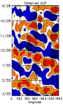
Figure 1 (from Elleman 1997) shows how the OLR anomalies in the eastern hemisphere propagate to the east at around 5 m/s. The OLR signal in the western hemisphere is weaker, and the recurrence interval for the eastward propagating OLR anomalies in the eastern hemisphere is about 30 to 60 days. How exactly the anomaly propagates from the dateline to Africa (i.e. through the western hemisphere) is not well understood. It appears that near the dateline a weak Kelvin wave propagates eastward and poleward at a speed exceeding 10 m/s. Associated with the propagation of convective anomalies, the MJO involves variations in the global circulation. The MJO affects the intensity and break periods of the Asian and Australian monsoons and interacts with El Niño. Wet spells in the Australian monsoon occur about 40 days apart. Fairly weak correlations with the midlatitude rainfall patterns and jet stream characteristics have also been found (2). |

Fig 1: Departures from normal outgoing longwave radiation around the globe between 5� S and 5� N during 6 months (10/’91 through 3/’92). The contour interval is 5 Wm-2. Areas in blue have a negative anomaly exceeding 5 Wm-2, and areas in red have positive anomalies over 5 Wm-2. The data have been ‘filtered’ to remove high-frequency (<30 day) variations. |
From:
http://www-das.uwyo.edu/~geerts/cwx/notes/chap12/mjo.html
Structure of a Madden-Julian wave
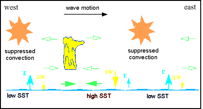
Within the center of suppressed convection, clear skies associated with a stronger-than-normal trade wind inversion allow more shortwave radiation to reach the ocean surface (Figure 2), causing a slight SST increase as the wave travels eastward (3). The Trade winds too are stronger than normal, explaining enhanced evaporation from the sea surface.

Fig 2: Schematic of the MJO. The cross section represents the equatorial belt around the globe, or just the eastern hemisphere. E stands for evaporation, SW for net shortwave radiation absorbed by the ocean. The converging bold green arrows indicate the location of strongest moisture convergence. The hollow green arrows show the anomalous circulation associated with the MJO. The areas of enhanced convection are indicated by the yellow schematic thunderstorm. (adapted from Elleman 1997)
Easterly winds (and the evaporation rate) weaken near the western edge of the suppressed convection region, and this leads to low-level moisture convergence. This triggers deep convection, leading to the other half of the OLR oscillation, i.e. the region of enhanced convection. This region is comprised of one or more super cloud clusters (SCCs) that move eastward along with the MJ wave. Within the SCCs, westward-moving cloud clusters form at the eastern edge of the SCC and die at the western edge. These smaller clusters have a lifetime of one to two days. In turn, the individual mesoscale convective systems within these smaller clusters typically move eastward, usually by discrete propagation, and have a lifetime of 6-12 hours. The SCCs travel eastward at 5-10 m/s, not as a long-lived storm complex, but rather as a moving wave or oscillation, i.e. the MJO. The MJO has a wavenumber of 1-2, that is at any time there are one or two areas around the equator with enhanced convection, and one or two with suppressed convection.
MJO Dynamics

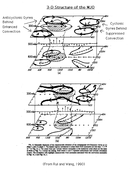
Equatorially trapped waves (Kelvin and Rossby waves) that explain the evolution of an El Niño event (Note 11.C) are also the driving mechanism for the MJO. These waves occur in the entire troposphere from 30� N to 30� S, mainly in the eastern hemisphere. Surface air flows away from the suppressed convection in both zonal directions towards enhanced convection regions. In the upper troposphere, anomalous easterlies exit the west side of the enhanced convection (Figure 2). The strong westerlies from the east side of the enhanced convection flow into the region of suppressed convection (Figure 3, from (4)). When suppressed convection is strong from the Indian Ocean to the middle Pacific Ocean, anomalous cyclonic gyres at 200 mb trail the region of suppressed convection. Similarly, anticyclonic gyres at 200 mb trail the enhanced convection region once it becomes strong in the Indian and western Pacific Oceans. Gyres in the opposite sense are produced at surface, but they are much weaker than the ones at the tropopause. The zonal circulation and horizontal gyres are important processes by which the MJO shuffles mass around the tropics.
The explanation above is simplistic, in that it idealises the oscillation, as it isolates it from other variations. As mentioned before, the speed and size are variable, and the MJO mainly affects rainfall patterns in Indonesia and surrounding areas. Not all of the elements of the MJO — convection, zonal wind, moisture convergence, and SST anomalies — are always visible (5). It is only when the 30-60 day oscillations are extracted from a series of MJO events that the idealised picture of the MJO emerges. Consecutive oscillations have varying amplitudes, periods, and wavelengths. The MJO exhibits the mixed Kelvin-Rossby wave structure over the eastern hemisphere, but over the western hemisphere, it only shows a Kelvin wave structure. It moves through the eastern hemisphere at around 5 m/s and through the western hemisphere at a higher speed (at least 10 m/s). The oscillation is stronger in the northern hemisphere winter. It is also in this season that the negative OLR anomalies are most likely to propagate along the equator from the Indian Ocean to the central Pacific Ocean. In the northern hemisphere summer, many of the anomalies veer away from the tropics before they make it to the central Pacific (6).
Notwithstanding its complexity and dependence on convection, the essence of the MJO (its periodicity, structure and zonal asymmetry) can be simulated in a GCM (7).
References
- Madden, R. A., and P. R. Julian, 1971: Detection of a 40-50 day oscillation in the zonal wind in the tropical Pacific.J. Atmos. Sci., 28, 702-708.
- Madden, R. A., and P. R. Julian, 1994: Observations of the 40-50 day tropical oscillation: a review. Mon. Wea. Rev., 122, 814-837.
- Jones, C., D.E. Waliser and C. Gautier 1998. The influence of the Madden-Julian Oscillation on ocean surface heat fluxes and sea-surface temperatures. J. Climate 11, 1057-72. (also on the web: Coupled modes of air-sea interaction and the Madden and Julian oscillation.)
- Rui, H., and B. Wang, 1990: Development characteristics and dynamic structure of tropical intraseasonal convection anomalies. J. Atmos. Sci., 47, 357-379.
- Jones, C. and B.C. Weare 1996. The role of low-level moisture convergence and ocean latent-heat fluxes in the Madden and Julian Oscillation. J. Climate, 9, 3086-104.
- Elleman, R. 1997: Predicting the Madden and Julian Oscillation Using a Statistical Model. (unpublished)
- Hayashi, Y. and D.G. Golder 1993. Tropical 40-50 and 25-30 day oscillations. J. Atmos. Sci., 50, 464-94.
During the Atlantic hurricane season, you can watch the MJO pulse traverse the basin and see how it “enables” tropical waves.
Kind of like a long rope that you raise and lower to generate a travelling wave, when the rising air meets a tropical wave going in the opposite direction…bingo…tropical cyclone.
(Hardly a guarantee but if shear is low and SSTs are high, look out!)
Dang, for a science that’s supposedly “settled”, there seem to be an awful lot of new details…
Wonderful!
Something new has been learned about the dynamics of the atmosphere.
It will be interesting to see how rapidly the models can incorporate this new understanding.
On the face of it, the writeup suggests that these oscillations create a balanced dissipative response to offset increased insolation. That may be very helpful in the determination of the level of feedback from increased levels of CO2 or related greenhouse gases.
Holy crap I feel stupid. Yet, I learn so much here. Thanks for not being just.. a blog. But a resource. Everyday you prove worthy and worthwhile to the world.
Keep up the awesome work.
Great post.
The MJO is definitely a significant player in the global weather patterns.
Joe Bastardi has been opining about it for years on his Pro Site, and you guys are right, the MJO is little known and under-recognized.
Chris
Norfolk, VA, USA
I never liked tropical weather. One minute it is hot and humid, and the next minute it is raining. And they only have two seasons: rainy and dry.
That beautiful time-lapse graph, although it is for only one month, really show the difference between the tropics and mid-latitudes. There is barely some change in the equatorial regions, while cold and warm swirl around elsewhere.
AMO, AO, PDO and now the MJO?
Just how many more oscillations are there? Next you’ll tell me that they interact with each other.
Now over to the solar “oscillations” and how they interact with us. Oh yea the science is really settled.
It’s such a relief to read a climate article that does not contain the phrase “global warming”!!!
So who wins in the SST race, SW radiation sea surface temperature increase or Trade wind induced evaporative cooling?
TimM says: December 22, 2010 at 6:38 pm
“AMO, AO, PDO and now the MJO?
Just how many more oscillations are there?”
You note two different types oscillations. The AMO and PDO are Oceanic Oscillations, whereas the AO and MJO are Atmospheric Oscillations. In terms of Atmospheric Oscillations, in addition to the Madden / Julian Oscillation (MJO);
http://www.cpc.noaa.gov/products/precip/CWlink/MJO/mjo.shtml
and Arctic Oscillation (AO);
http://www.cpc.noaa.gov/products/precip/CWlink/daily_ao_index/ao.shtml
http://www.ossfoundation.us/projects/environment/global-warming/arctic-oscillation-ao
This is a good animation of the northern polar circulation and Arctic Oscillation over the last month:
http://www.cpc.ncep.noaa.gov/products/intraseasonal/z500_nh_anim.shtml
there is also there is also the Antarctic Oscillation (AAO);
http://www.cpc.noaa.gov/products/precip/CWlink/daily_ao_index/aao/aao.shtml
http://www.ossfoundation.us/projects/environment/global-warming/antarctic-oscillation-aao
This is a good animation of the southern polar circulation and Antarctic Oscillation over the last month:
http://www.cpc.noaa.gov/products/intraseasonal/z500_sh_anim.shtml
the North Atlantic Oscillation (NAO);
http://www.cpc.noaa.gov/products/precip/CWlink/pna/nao.shtml
http://www.ossfoundation.us/projects/environment/global-warming/north-atlantic-oscillation-nao
and the Southern Oscillation, which is closely associated with El Nino/La Nina and collectively referred to as (ENSO)
http://www.cpc.ncep.noaa.gov/products/precip/CWlink/MJO/enso.shtml
http://www.ossfoundation.us/projects/environment/global-warming/southern-oscillation-soi
In addition the Pacific / North American Pattern (PNA) is a significant atmospheric phenomenon.
http://www.cpc.noaa.gov/products/precip/CWlink/pna/pna.shtml
http://www.ossfoundation.us/projects/environment/global-warming/pacific-north-american-pattern-pna
Is anyone else aware of any other significant Atmospheric Oscillations?
So, how many of the NASA or GISS or anyone’s models take this into account? Do I dare make a wild guess, such as ZERO . . ? ! ? (OK, that MUST be wrong, all the models MUST HAVE incorporated the MJO into their models, because they have been written about since the early 1980s, right . . ? . . um sarc on or off now . . . ?)
But seriously, it is great to read about things like this, and as several have mentioned already, it shows just how much the ‘science is NOT settled’ !
Ed Caryl,
Your observation was quite correct — until you wrote the words yourself!
This bit is quite useful:
“The oscillation is stronger in the northern hemisphere winter. It is also in this season that the negative OLR anomalies are most likely to propagate along the equator from the Indian Ocean to the central Pacific Ocean. In the northern hemisphere summer, many of the anomalies veer away from the tropics before they make it to the central Pacific (6).”
I don’t know if it’s been noted before, but climatologists really should use a correct (equal-area) map projection if they want to present their data cartographically. The map projection used by CPC in the animation at the top of this article appears to be an equidistant projection map . . . makes the data processing simple for producing the map but is visual garbage, wildly overemphasizing the polar regions (this overemphasis going to infinity as you approach the pole.
If you don’t want to “lie with (graphical) statistics,” deliberately or inadvertenly, you need to use an equal-area projection. Using the wrong projection for a map is a scientific error which should be on the same level as using an inappropriate statistical test for a given sample of data. Competent scientists should never do it, precisely because it calls into question your competence among people who do know what a proper map projection would be to accurately depict the data.
The Gall-Peters or Lambert cylindrical projections would be much better choices for this kind of scientific data presentation.
(Geographer’s rant off)
R. Gates posted a link to this clear & concise MJO overview in a recent WUWT thread:
Gottschalck, J. (2008). Meet the MJO.
http://wwa.colorado.edu/IWCS/archive/IWCS_2008_May_focus.pdf
If anyone knows of a more clear & concise overview of MJO, please share the link — thank you.
Re Just The Facts says:
December 22, 2010 at 7:06 pm
Is anyone else aware of any other significant Atmospheric Oscillations?
Yes, there is a huge oscillation not mentioned. How the all interact and are effected by cosmic forces is hugely entertaining. The oscillation not mentioned is the summer winter oscillation. Sunlight, falling on the Earth when it’s about 3,000,000 miles closer to the sun in January, is about 7% more intense than in July. Because the Northern Hemisphere has more land which heats easier then water most people state that the Earth’s average temperature is about 4 degrees F higher in July than January, when in fact they should be stating that the ATMOSPHERE is 4 degrees higher in July. In January this extra SW energy is being pumped into the oceans where the “residence time” within the Earth’s ocean land and atmosphere is the longest. Some of the energy increases the mean evaporation rate of the earth and is transmitted to latent heat before being released, but most of the extra energy is lost to the atmosphere for a time as it is contained within the ocean, but eventually it is radiated from the ocean as LWR and increased latent heat in water vapor.
In actuality, due to the more intense southern sun’s SW radiation being trapped in the oceans, the earth is gaining energy in the southern hemisphere summers, and losing energy in the northern hemisphere summer. The extra energy is just hidden in the oceans for a time while the northern hemisphere summer reacts on a more sensitive atmosphere, creating a rise in atmospheric heat, but a net loss to the planet relative to the southern hemisphere summer.
David says: December 22, 2010 at 10:32 pm
“The oscillation not mentioned is the summer winter oscillation.”
You are misusing the word “oscillation”. Oscillations in this context are repetitive variations that occur within or between portions of the climate system, i.e. the Atmosphere, Oceans, Polar Ice, etc. The changes that occur due to Earth’s tilt and elliptical orbit around the sun are referred to as the Seasonal Cycle, and, while certainly a significant influence on Earth’s Oscillations, it is not, in and of itself, one of them.
“most people state that the Earth’s average temperature is about 4 degrees F higher in July than January, when in fact they should be stating that the ATMOSPHERE is 4 degrees higher in July.”
What? Who are these “most people” and what do they know? I know that if you go to Roy Spenser and Danny Braswell’s temperature website;
http://discover.itsc.uah.edu/amsutemps/
and you check the sea surface temperature;
http://discover.itsc.uah.edu/amsutemps/execute.csh?amsutemps+001
you’ll see that the difference between January and July appears nominal. The biggest variation in the last few years seems to be March vs. November, and that only seems to be about 1/2 a degree difference.
“Most people” might have been referring to higher up in the atmosphere, like 14,000 feet;
http://discover.itsc.uah.edu/amsutemps/execute.csh?amsutemps+002
but the ATMOSPHERE extends well beyond that, and at 25,000 feet there’s only a slight bump from January to June:
http://discover.itsc.uah.edu/amsutemps/execute.csh?amsutemps+003
at 36,000 feet there’s a small increase from January to June.
http://discover.itsc.uah.edu/amsutemps/execute.csh?amsutemps+005
at 68,000 feet the difference is again small;
http://discover.itsc.uah.edu/amsutemps/execute.csh?amsutemps+007
and over 100,000 feet the trend appears inverted:
http://discover.itsc.uah.edu/amsutemps/execute.csh?amsutemps+009
http://discover.itsc.uah.edu/amsutemps/execute.csh?amsutemps+010
You never know where “most people” get their facts from…
I’ll add a couple, though they are not oscillations.
Antarctic Circumpolar Wave (ACW). Found by Warren B. White & Ray G. Peterson in 1996. It is a coupled ocean/atmosphere wave that circles the Southern Ocean in approximately eight years. Since it is a wave-2 phenomenon (there are two ridges and two troughs in a latitude circle) at each fixed point in space a signal with a period of four years is seen. The wave moves eastward with the prevailing currents, with the wave seen in temperature, atmospheric pressure, sea ice and ocean height.
http://www.cima.fcen.uba.ar/~pgonzalez/circulacion/material/White-Peterson.1996.pdf
http://www-das.uwyo.edu/~geerts/cwx/notes/chap11/ant_wave.html
It couples with ENSO and Indian Ocean Dipole (IOD). IOD index (based on SST variations, not pressure, as for the SOI) which correlates with Australian rainfalls, especially over the western half of the continent.
The Indian Ocean Dipole (IOD) is an irregular oscillation of sea-surface temperatures in which the western Indian Ocean becomes alternately warmer and then colder than the eastern part of the ocean.
http://en.wikipedia.org/wiki/Indian_Ocean_Dipole
http://news.xinhuanet.com/english2010/sci/2010-10/04/c_13542305.htm
Ocean’s Meridional Overturning Circulation:
http://mgg.coas.oregonstate.edu/~andreas/pdf/S/schmittner07agu_intro.pdf
Arctic dipole anomaly, Antarctic Circumpolar Current (ACC).
TimM says:
December 22, 2010 at 6:38 pm
QBO
filbertmedary says:
December 22, 2010 at 7:31 pm
I don’t know if it’s been noted before, but climatologists really should use a correct (equal-area) map projection if they want to present their data cartographically.
=============================================================
Thank you for your comment. I was wondering if I was the only one who noticed this. An equal-area map projection is something that should absolutely be required for publication. I get so tired of the GISS anomoly maps with the appartent huge area of red at poles as they over-estimate the polar temperature. It makes the whole world look like it’s on fire. Which, of course, is exactly their aim.
Thanks for the detailed post on the MJO. It had been rarely mentioned here and your post now fills in that gap excellently. What’s really important, IMO, when looking at the MJO, PDO, ENSO, etc. it to think about time scales. All of these are natural oscillations that occur on different time scales and yet can have modulating influences on each other. For example, the PDO has a long period, whereas ENSO is shorter and the MJO shorter still. In knowing these different lengths for oscillations, you can more accurate describe a weather event that may seem uncharacteristic when considering one oscillation but very well described when considering another, i.e. a short term oscillation such as the MJO can often create weather that is completely opposite what would “normally” be expected during a La Nina, etc.
Someone asked about all the other cycles or oscillations that are “out there”, and of course there are dozens. One resource I use for a general reference is here:
http://www.esrl.noaa.gov/psd/data/climateindices/
You have to sort of know what you’re looking for, but they are broken up nicely by ocean, atmosphere, etc. such that even a novice can work their way through it and get some useful and interesting information after some practice.
These oscillations, both atmospheric and oceanic, have tremendous power in them to change temperature and weather, both in the short and long term. Their forcing and driving power far outguns both anthropogenic CO2 and solar influences on change over time.
Just The Facts says:
December 23, 2010 at 12:44 am
You never know where “most people” get their facts from…
###
Nor do you want to know…
>Just The Facts & ES.
Thanks for the links guys. So much to read and I’m on holidays so I actually have time. The whole subject is just fascinating to me for some weird reason. Maybe it is because this just might be one of the most complex systems we humans have ever tried to analyze! Us chess players like to figure out complex stuff so I blame my dad for teaching me chess when I was a kid 🙂
Cheers and happy holidays everyone!
One large problem with these Miller Cylindrical World Projection maps is the fact that they are not proportional to the area of the hemispheres. This accentuates the visible changes in the north making these areas of heating (or cooling) look far larger than they actually are. I would love to see these graphics done on 3d models or something like the Eckert IV (or VI) Equal-area World Map Projection or other projections that are more realistic of the actual areas of the planet. A nice set of different projections is here (Canadian viewpoint). Mind you the The equal-area Mollweide projection looks very nice on Wikipedia. One can get a bit lost trying to find the best projection, but I think it is important enough to tone down some of the visual rhetoric…
In a recent WUWT thread, John from CA posted the following:
“I also ran across this paper:
EOF representations of the Madden-Julian Oscillation and its connection with ENSO
Kessler, W.S., 2001: J. Climate, 14, 3055-3061
http://faculty.washington.edu/kessler/abstracts/k01-eofmjo-abstract.html
data: http://faculty.washington.edu/kessler/mjo/revision.html “
A few clicks (to look at the graphs) and it was crystal clear that the EOFs are spatial derivatives. This goes a long way towards understanding why the early ’90s SOI pattern baffled the mainstream climate science community. (The preceding insights without reading any text — indeed, pictures are worth 1000s of words.) Do they realize the connection with QBO? (might have to read to see, with an eye to how IOD ties in…)
Thanks again John — much appreciated.
Re: filbertmedary
Thanks for expressing that — same thoughts cross many or our minds with respect to (rectangular) map interpretations by lay audiences. However, for a data explorer who is mindful of the distortion, the rectangular representation is superior in many ways. For those with the tools, a toggle button to flip between projections would be helpful, but in the interest of succinctness, we’re not going to see that in journal articles (although it certainly might be workable for author websites in many cases, funding & map projection skills/technicians permitting). With data visualization, it’s always a trade of one feature for another (like using all the space available on a page [instead of leaving big blank corners that do nothing] to ease graph reading). People will have disagreements about preferences (e.g. some people like normalization, some hate it, etc., etc. – i.e. too much noise), but where toggle buttons can be worked in to permit flipping between representations, we have a solution. Certainly the net is superior to print for data visualization.
MJO data & info:
http://www.cpc.ncep.noaa.gov/products/precip/CWlink/MJO/mjo.shtml
I agree Paul, the net is potentially a superior medium for data visualization if the simulation (model) is designed properly. The modeling is typically 2D and is usually focused on the interaction of smaller parts of the system.
The following statements jumped out at me. The various oscillations are typically presented as separate entities online and in studies yet are clearly interrelated. Have you run across a 3D dynamic model that presents the system rather than the state of various parts?
I realize Science usually takes a bottom up approach but it would be refreshing to see a top down approach that seeks to visually account for all the parts and then the interactions between them. If the WCRP/WWRP THORPEX YOTC Task Force focuses too specifically on MJO they’re likely to miss the forest for the tree?
EOF representations of the Madden-Julian Oscillation and its connection with ENSO
Kessler, W.S., 2001: J. Climate, 14, 3055-3061
“The stationary mode is represented by the first two EOFs, which form the familiar lag-correlated quadrature pair, and the eastward-extending mode is represented by the third EOF, which is usually ignored although it is statistically significant. However, the third EOF also has a systematic phase relation with the first pair, and all three should be considered as a triplet; rotating the EOFs makes the phase relation clear.”
“This suggests that a complete understanding of the evolution of the ENSO cycle depends on understanding the role of the MJO in it, and the question will not be represented as a simple change in global MJO activity.”