Since I’m traveling at the moment at have a combination of occasional Internet connectivity and exhaustion, I’ll defer to Joe D’Aleo’s excellent writeup on UAH, RSS, GISS, and HadCRUT. – Anthony
Global Data All In – NASA GISS Biggest Outlier Again
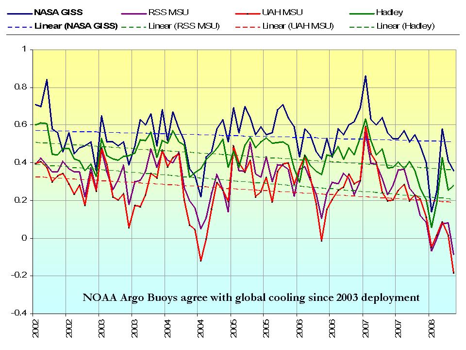
UAH and RSS MSU satellite data uses a base period of 1979-1998. NASA uses the coldest period of the last century 1951 to 1980. Hadley uses 1961 to 1990 as a base period. Obviously satellite providesthe best coverage of the low and middle latitudes land and oceans. The other data bases are at the mercy of the country governments and of spotty imperfect ocean temperature measurements.
2/3rds pf the worlds station dropped out after 1990 and the number of missing months in places like Asia and Africa increased tenfold. Siting has been shown so well by Anthony Watts at http://surfacestations.org to ba an issue with more than 2/3rds of the United States stations poorly sited. The importance of urbanization is underestimated thanks to the flawed research of Peterson and Parker in all the global surface data bases. Numerous studies have shown that surface data bases may overestimate warming by 50%. And then there is the issue of the oceans and each of the data centers treats that differently and now will likely change the data to better reflect the changeover from buckets to ship intakes. See Steve McIntyre’s Lost at Sea here.

See larger image here
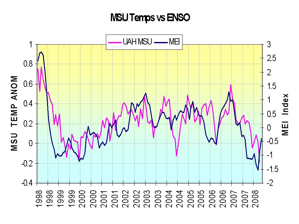
All four plotted data sets, yes even GISS shows a decline since 2002. GISS has the largest positive anomaly because it uses the coldest base period. Satellites, the coldest since, their base period (by chance) was in the warmest decades (of the positive PDO with most El Ninos). Note how well the temperature variations have tied to the variations of ENSO, in this case using the Mulitvariate ENSO Index (MEI) of CDC’s Wolter.

See larger image here
What seems peculiar to me (apart from the fact that 3 out of 4 have a decline for May and one has a rise?) is that the difference between satellite (UAH and RSS) and landstation (GISS and HadCRU) measurements has become so enormous. They seem to have lost any correlation that, in broad terms, existed up until lately. The difference between the highest (GISS) and lowest (UAH) anomalies is a whopping 0,54 deg that is, even understanding the different base line, totally unprecedented!
Derivation of baseline differences at:
http://www.woodfortrees.org/notes#baselines
Any speculation about the 6/26 press conference in NYC by van Loon et al?
=========================================
The correlation between temperature anomaly and ENSO seems to suggest that changes in ENSO precede changes in temperature during the late 1990’s and over the last few years (when there were relatively larger changes, the period in between was too noisy too interpret). Perhaps this implies that ENSO is a leading indicator of whatever is driving global climate over an intermediate time period, and the actual temperatures is more of a lagging indicator. Or am I reading too much into the data?
“UAH and RSS MSU satellite data uses a base period of 1979-1998. NASA uses the coldest period of the last century 1951 to 1980. Hadley uses 1961 to 1990 as a base period”
“University of Alabama MSU was the coldest with a -0.18C. RSS MSS was a close second with -0.083C. Hadley had a +0.278C and NASA GISS came in at +0.36C.
NSSL, why do we even bother?
Is this the MSU RSS plot for global or S. Hemisphere?
What is interesting to look at, especially with regards to the past year of the GISS records, is that about the only place that has been consistantly significantly “warmer” than usual, and therefor driving the “global warming” numbers, is Northern Asia. Interestingly how this is a predominately unihabited area, and likely has very few actual temp stations, nor reliable long term temp data.
See monthly GISS data maps since Mar 07:
http://data.giss.nasa.gov/gistemp/graphs/monthly_maps.pdf
GISTemp: “Fake but accurate”.
Sven: “What seems peculiar to me (apart from the fact that 3 out of 4 have a decline for May and one has a rise?) is that the difference between satellite (UAH and RSS) and landstation (GISS and HadCRU) measurements has become so enormous. They seem to have lost any correlation that, in broad terms, existed up until lately. The difference between the highest (GISS) and lowest (UAH) anomalies is a whopping 0,54 deg that is, even understanding the different base line, totally unprecedented!”
Yes it is interesting that the gap between the surface temps and the satellite temps seems to be getting bigger and bigger. All this, while according to CO2/AGW theory,The troposphere is what should see more warming due to “enhanced greenhouse effect” that occurs in the atmosphere.
What is also interesting is that the US surface temps are way below “average” this year, yet on the GISS maps, they aren’t being reported to the same degree of cooling as what NOAA is reporting. Given that the base period is different, makes you kind of wonder.
What I would like to see is an analysis of the RSS data for the Continental US, compared to the surface temps from the US. I think this could be a significant way of looking at how accurate the Satellite data is, compared to respective US temps, and then GISS and Hudcrut Global temps.
If there is indeed a fairly close correlation between the US surface temps and US satellite temps, then that would show just how “whacked out” the GISS and Hadcrut temps could be.
So there’s the challenge for anybody else out there to come up that comparison.
NASA applies an urban correction of its GISS temperature index in the wrong direction in 45% of the adjustments. Instead of eliminating the urbanization effects, these wrong-way corrections makes the urban warming trends steeper. This article by me discusses Steve McIntyre’s audit of the GISS corrections.
http://www.friendsofscience.org/assets/documents/CorrectCorrections.pdf
It is in the Urban Heat Island section of our website here
http://www.friendsofscience.org/index.php?id=228
This is the reason GISS shows too high a warming trend.
Gary Gulrud — Yeah, count me with “GISTemp: “Fake but accurate”.”. Who is it in charge of GIS data, I forgot, but it may be a clue. When everything is going against you, fake it, who will know. It’s also the problem inherent with computer mathematical models, easy to fake the output. I’m just saying, not accusing …
This the whole problem with the global warming for taxes scam — pay more in taxes and government will PRETEND to control the weather.
What interests me is that the satellite datasets show lower lows for May, something which can’t be said for either GISS or Hadley. (Lower low meaning May’s anomaly is lower than January’s trough.) This is what I would call a significant divergence between the datasets.
I would also guess that GISS thinks that they can bide their time with the divergence problem since they believe that the earth must start warming again in the near future. The anomalies have to continue to trend upward because of CO2. There is no other possibility, according to their models. They can just wait it out.
Harold,
You do have a point. We are close to an ENSO neutral period, which should be followed by an El Nino event shortly thereafter. I would expect, if the pattern remains constant, of a weak to moderate El Nino event. This should cause the NH to see relatively mild temps in the short run (esp for winter). Expect any positive anomaly to be amplified by NASA and The Team. Look for a return to the daily highlights of record breaking high, etc…
But, what if this negative PDO is a 30 year event? The next expected El NIno could be even shorter and weaker than the last one, or even fail to come at all. The Pacific could go ENSO neutral followed by another moderate La Nina. And what if the N. Atlantic basin continues to remain neutral or even cool, thus shut-off the supply of warm equatorial air masses to Western Europe?
These are a lot of what-ifs. Not one major forecast center can with any precision forecast the next 3 months let alone the next 3 years. However, the sun continues to slide into some kind of dormant phase and the SH shows no signs of warming.
Anthony,
A little off topic here. Have you seen the NASA Earth Observatory posting on the predicted effects of the closing of the southern hemisphere ozone hole? http://earthobservatory.nasa.gov/Newsroom/MediaAlerts/2008/2008061226928.html I’d be interested to hear your take on it. It seems to strike a blow against the alarmism but I haven’t seen it picked up anywhere else yet. Thanks–Adam
Its rather odd to call GISS an outlier when its lower than HadCRU this month when you normalize all the data series on the same baseline period.
The more interesting development is the unusually large divergence between satellite and ground-based series.
I went ahead and plotted the normalized (HadCRU + GISS)/2 – (RSS + UAH)/2 to show the variance between satellite and land-based temperatures. You can see it here: http://i81.photobucket.com/albums/j237/hausfath/Land-Satellite.jpg
While the differences for the last two months are on the large side for the last 10 years, its certainly not that far beyond the norm.
I agree with Zeke; it seems to me the satellite sources (UAH/RSS) react more strongly to short-term events – both positive (El Nino 1998) and negative (El Nina now) than the land/sea ones (GISTEMP/HADCRUT3). With my rather simplistic engineer’s understanding, this could simply be a matter of thermal mass.
Take a look at the different series around the 1998 El Nino (baseline adjusted).
http://www.woodfortrees.org/plot/hadcrut3vgl/from:1997/to:2002/offset:-0.15/plot/gistemp/from:1997/to:2002/offset:-0.24/plot/uah/from:1997/to:2002/plot/rss/from:1997/to:2002
Would people be screaming that UAH/RSS had faked their data in (say) April 1998?
The current divergence is not unusual, and I do think we need to stop this name-calling. Detailed work ensuring the quality of the data is one thing; accusing people of faking it on the basis of a few months’ (fairly routine) divergence is another.
What do you mean, Zeke? I have to say I can’t undrestand your graph. Firstly, for May this year (HadCRU+GISS)/2-(UAH+RSS)/2=(0.278+0.36)/2-((-0.180)+(-0.083))/2=0.319-(-0.1315)=0.4505. I don’t see this in your graph. And secondly, though the first graph in the article above is only for six years, at no point the difference comes even close to that of May. What’s the catch?
That’s true – outlier this month was HadCRU (that was rising) not GISS
My daily check indicates it is a rounded 5 degrees colder than last month and last year in Wallowa County at 6:35 AM. The weather trend continues here. It matters little when I check, morning, noon, or night, the temperature differences are evident. Sometimes they are large and sometimes they are small, but overall, at least for this privately run published data weather station, we are colder (http://www.enterpriseweather.com/).
This is like being pregnant. You know there is a baby inside but you can’t take it out and show everyone it is indeed a baby. You can only take grainy pictures of it. You know the wait must happen before you can show the new baby around and everyone admits it is a baby. I know it is colder. I know I must wait before GW as a theory ends and a new theory takes its place. Some people just don’t want to change their minds till they are forced to buy long underwear.
Sven,
GISS and HadCRU are on different baselines than the satellite records. GISS anomalies are calculated relative to the 1951-1980 mean temperature. HadCRU is calculated relative to 1961-1990. To effectively compare the different records, you have to put them all on the same baseline, so their anomalies mean the same thing.
To convert HadCRU to the 1979-1998 satellite temperature record baseline (used by RSS and UAH) you subtract 0.146 degrees C. To convert GISS to this baseline you subtract 0.238 degrees C.
So for May you actually get (0.132+0.122)/2-((-0.083)+(-0.18))/2=0.127-(-0.1315)=0.2585
This is the highest value in some time, though there were a number of much higher deviations in 1998. My apologies about the lack of clear labels on the graph; I threw it together a tad quickly. The numbers on the x axis are months, and it spans the period between 1979 and present.
It’s a good graph Zeke and something I’ve been wondering about but haven’t seen anywhere else (not that I’ve looked that hard). Thanks for putting it together.