It has been 10 years since the super El Niño of 1998 helped to spike global temperatures dramatically. Now since it appears we are in the opposite phase, I thought it would be interesting to look at the 10 year trend from January 1998 to January 2008.
Here’s a link to a 2-minute video called “The El Niño Factor”. Bob Tisdale points out to me this interesting graph: (slightly modified the key placement to fit the image in this blog)

Here’s the link to the Webpage that’s the source of the data for the above graph.
Now let me be clear that a 10 year trend period is not typical for climate analysis. Typically a 30 year period is used to establish a climate baseline. For example, NOAA publishes climate summaries for cities in the USA based on 30 year periods. I’m not trying to do anything to compare to the last 30 or even the last 100 years. I’m simply curious about what the trend looks like since the last big El Niño event in 1998 now that we are in a La Niña. Of course this may upset some folks, and I’ll probably get the usual invective hurled at me and furious scribblings on other blogs refuting this as “He’s doing it wrong”, but I think looking at what has happened globally between a large a large El Niño and La Niña is both interesting and useful.
To do this, I used the same global temperature anomaly datasets that I’ve used for the last few posts I made on the subject of global temperature anomalies. I created a new file, using all four global metrics, with only the last 10 years of data, which you can inspect here: 4metrics_temp_anomalies_1998-20081.txt
Here are the four charts of global temperature anomalies, note that there are links to each original organizations data source below each graph. Click each image to get a full sized one.
University of Alabama, Huntsville (UAH) Dr. John Christy:

Reference: UAH lower troposphere data
UAH shows a slightly positive anomaly trend of 0.028°C for the last ten years.
Remote Sensing Systems of Santa Rosa, CA (RSS):

Reference: RSS data here (RSS Data Version 3.1)
RSS shows a slight negative anomaly trend of -0.01°C for the 10 year period. This may have to do with the fact that RSS reported an anomaly for January 2008 that was twice the size than what UAH reported (-0.08 for RSS, -0.044 for UAH) owing to a different methodology of the satellite data preparation.
UK’s Hadley Climate Research Unit Temperature anomaly (HadCRUT) Dr. Phil Jones:

Reference: above data is HadCRUT3 column 2 which can be found here
description of the HadCRUT3 data file columns is here
The HadCRUT land-ocean global anomaly data shows a slight trend of 0.017°C for the last ten years. Surprisingly, it is lower than the trend of 0.028°C for the UAH satellite data.
NASA Goddard Institute for Space Studies (GISS) Dr. James Hansen:

Reference: GISS dataset temperature index data
And finally we have the NASA GISS land-ocean anomaly data showing a ten year trend of 0.151°C, which is about 5 times larger than the largest of the three metrics above, which is UAH at 0.028°C /ten years.
Given some of the recent issues Steve McIntyre has brought up with missing data at NASA GISS, it also makes me wonder if the GISS dataset is as globally representative as the other three.
UPDATE: The answer as to why the GISS data diverges so much may be found in the 2005 summary on the GISTEMP website, (h/t Barry H.) Here is a relevant excerpt:
Our analysis differs from others by including estimated temperatures up to 1200 km from the nearest measurement station (7). The resulting spatial extrapolations and interpolations are accurate for temperature anomalies at seasonal and longer time scales at middle and high latitudes, where the spatial scale of anomalies is set by Rossby waves (7). Thus we believe that the remarkable Arctic warmth of 2005 is real, and the inclusion of estimated arctic temperatures is the primary reason for our rank of 2005 as the warmest year.
I’m not sure the “remarkable Arctic warmth” is real, especially since the disappearance of arctic sea ice during that time has been linked not to warmer temperatures, but to wind patterns by other researchers at NASA. The sea ice “melt” as proxy for increased arctic temperatures doesn’t seem to be connected. Further, a NASA satellite AVHRR image shows the high latitudes near the south pole getting colder, except in areas where volcanic activity is known to exist.
A recent comment from Carl Smith came with an animated graphic showing how that 1200 km spatial extrapolation looks when compared to a 250 km block, which is also used in GISS analysis. Carl writes “Bear in mind that the data in a 250km ‘block’ is in many cases from a single station, especially in remote areas, so is really just a minuscule dot on the map. Note how little real polar region data there is in the 250 km map, whereas in the 1200 km map the polar regions appear to be well covered.”
As a creator and purveyor of meteorological measurement technology I have never been a fan of “extrapolated” data. It is not a confidence builder to know that data for something so important has been either extrapolated or estimated, especially when there are so few stations in the high latitudes, as evidenced by the Historical Station Distribution study by John Goetz.
By treating the NASA GISS data as being an outlier due to that data confidence difference, and by taking a “3 out of 4 approach” in looking at the plotted trends, one could conclude that there has not been much of a trend in global temperature anomalies in the past ten years.
It seems to me as if a 30 year mean is as arbitrary as anything else in Climate Science, and in our particular case creates an illusion that something is “wrong” becuase the starting point was cooler than the ending point. If they went with an 80m year mean then there wouldn’t be any cause for concern, except when the past gets all “adjusted” for no apparent reason.
You will also notice that GISS and NOAA are very close. This makes sense as GISS uses a homogenized version of NOAA. (The giveaway fingerprint is 2005 spiking higher than 1998.)
Notice also how the ground measures diverge from the satellite measures in that both ground measures have the current temp as the lowest in the series while the satellites both rate Jan. 2000 as cooler.
This would tend to confirm the heat sink theory that when there is a warming trend (as 2005), Heat Sink Effect seems to accelerate the trend, and when it cools, HSE exaggerates the cooling trend (as 2008) as the effect “undoes” itself.
It is important to point out that a heat sink adds a direct warming offset offset, and when a cooling trend occurs, HSE exaggerates it, but STILL RETAINS a piece of the initial warming offset. The exaggerated cooling effect will will never extend past the initial warming offset. (They would not “equal out” until abosolute zero.)
Look at the metrics from 1978 to 1992 UAH, .025C per decade. So short of the magic GISS global warming consists of eight years of warming between 1992 and about 2000. Really not even a decade, hardly worth crippling and economic system for?
Interesting post, thanks. It looks to me as if the GISS anomaly was lower than the others in 1998, compared to the following years within each of the 4 measures. GISS is the only one, for instance, where the peak of the first 6 months is lower than the peak around month 50. The lower 1998 anomaly would push their 10-yr trend up, relative to the others.
I created a quick chart with trend lines.
http://www.flickr.com/photos/7672614@N05/2319280978/
REPLY: Thanks Jim. Everybody this is worth a look.
Jeff: “It seems to me as if a 30 year mean is as arbitrary as anything else in Climate Science”
It’s a very common baseline and has been used for a very long time. It very well may be arbitrary but not more so than the 95% rule used in a lot of statistical studies — you have to start somewhere. OTOH, there may be a genuine physical basis for using it. In any case, it’s a widely used practice. The question of ‘why’ should be asked when it’s NOT used.
What Anthony has done here is more than reasonable. Of course, that doesn’t mean his critics will be.
A large part of this seems to be the choice of trendline dates.
What does a graph of “length of trendline” versus “amplitude of trendline” look like?
We know that Jan07-Jan-08 is steeply down. I’d posit that a two-year trendline is less steep. And a three year. And four… to ten. Which is flat. (As above). But what happens as the length of the trendline is 11, or 12, on the way to 30… and past 30.
Is the thirty year trendline the absolute worst? Is it… an outlier.
There is a great deal on this website that I simply do not understand, but I’m having a heck of a time trying to learn. Thanks and if you get a chance to dumb down some of your commentary, please consider doing so. Some of us have a lot of catching up to do.
Just because it’s been used for a very long time doesn’t mean it’s a good metric to go by. And it seems to cause spurious “emergencies”. Looking at longer term metrics shows there is nothing out of the ordinary going on. Things go up and down all the time.
The lower 1998 anomaly would push their 10-yr trend up, relative to the others.
Yes, we seem to have noticed that GISS adjustment methods seem to involve taking NOAA (present-adjusted-up) data and cooling down the past.
To determine this one way or the other, I’d like toi see a side-by-side comparison I’d like to see is a 1900-2000 comparison between GISS and NOAA metadata.
Some of us have a lot of catching up to do.
Amen to that, Thomas. I never took physics in high school or college, and my last statistics class was in 1966.
Stick around, though, ’cause every once in a while someone comes along and translates things into layman’s terms, causing that little cfl (heh) above your head to light up. And another thing you’ll quickly notice about this blog is that we’ve pretty much gotten past questioning each other’s integrity and intelligence.
Now let me be clear that a 10 year trend is not typical for climate analysis. Typically a 30 year mean period is used to establish a climate baseline
Anthony, you seem to be confusing the baseline and the trend. They are independent. The baseline is just an average over a time period. The anomaly trend is the change in value over another time period from that average. The trend will be the same irrespective of the baseline.
In fact, you will get the same trend using absolute values rather than anomalies. The steepness of the trend may be different, but that’s just a function of the scaling of the y axis.
REPLY: I could have worded that better, I’ll rewrite it to make a bit more sense. What I was trying to convey was that a 10 year period is not typically used but that a 30 year period is.
By the way (and apropos trends etc) one of the earlier 4 anomaly posts had a link to the Hadley Atmospheric data (HADAT2) which has readings going back to 1958 for a wide range of altitudes (~1500m to ~24km).
The trend of all the upper atmosphere readings (150hPa / 13.5km and higher) are all clearly down while the lower ones (up to 300hPa / 9km ) are trending up. I’m trying to create a post with the right graphs but its tricky to do. RSS and UAH seem to track quite well with the middle/lower ranges of the series which should not be too great a surprise. Also interesting is that the last 10 year trend is negative for 300hPa and up but flattish for below.
Lee, are you literally suggesting that ONLY GISS contains polar data? NCDC and HadCrut don’t? That seems unlikely to me…
Lee: Your notion “noisy data” is epistemological nonsense. I suggest you dial the attitude back just a wee tad. One finds in life from, time to time, that you’ve brought a knife to a gunfight and it ain’t pretty.
BTW, UAH does seem to have polar data:
http://www.junkscience.com/MSU_Temps/UAHMSUNPol.html
http://www.junkscience.com/MSU_Temps/UAHMSUSPol.html
Lee, I’ll cast a vote for you to take Anthony up on his offer – my impression is that there are lots of stats novices on this site who are enthusiastic about learning. If you have the time and inclination, even a post showing just: (1) why sig testing for trends matters, vs. eyeballing a graph; (2) the enormous difference in size of confidence intervals for 10-yr and 30-yr trends, and perhaps a longer trend just for comparison; and (3) icing on the cake could be showing the very different impacts that extreme values have on short vs. long trends (here I’m thinking of the impact of 1998…). But as Anthony says, be nice – it’s continuing ed, not a grad seminar. I know I’m making this sound like less work than it would really take, but I hope you have the time and inclination, and I appreciate your posts.
Lee, given data such as this:
http://climate.gi.alaska.edu/ClimTrends/Change/7707Change.html
it looks more like one site in Alaska, Barrow, needs a site survey.
Extrapolating from this I would guess, and yes this is a guess, maybe 3 sites in Canada, two in Greenland and a handful in China and Siberia are what account your “arctic is warming faster” data. Have these been checked for microsite issues?
I seem to remember Raven and Steven Mosher on an earlier thread discussing GISS Arctic input and the last assertion on the issue (Mosher’s) was that the Arctic input was interpolated, his word ‘estimated’.
We know that their grids are, well, enormous, up to 1250km^2, if I recall at all accurately.
I suspect there’s less here than advertised.
The arctic above 82.5 N is rather less than 0.5% of the surface of the globe. I am not sure why including that in the measurement should make all that much difference to the global average anomaly.
REPLY: Thanks, I was getting to that next.
This is all good stuff. It will take a couple of years of the same before the public gets wind of the FACT that “the globe isn’t, actually, ‘warming'”.
In the meantime, when I meet a believer, I avoid the detailed discussion of observations, which they are mostly incapable of, and go for the jugular:
“Clearly you think the planet is too hot. How cold do you want it?”.
UAH satellite data for the poles is collected, but not used for the gridded global analyses. It’s available and used for other purposes, though – if anyone’s interested and near a library, a couple of interesting examples of the UAH polar data at work are:
Johanson, CM & Fu, Q, Antarctic atmospheric temperature trend patterns from satellite observations, Geophysical Research Letters, 34 (12): Art. No. L12703 JUN 19 2007, and
Swanson, RE, Evidence of possible sea-ice influence on Microwave Sounding Unit tropospheric temperature trends in polar regions, Geophysical Research Letters, 30 (20): Art. No. 2040 OCT 22 2003.
As a bit of a side issue, these papers also illustrate that the satellite data can be subject to adjustments and biases, and their readings are refined over time, just as the GISS/HadCRU products are.
Anthony, you’re doing great work and with a positive attitude.
The people who toss invective at you just cement their position as being more and more irrelevant to the conversation.
Hmmm, based on his posts, I think Lee had plenty of time this afternoon to do his own analysis. If it’s important enough to add post after post…….
btw, has Lee offered any apology for his ‘over the top’ stuff from earlier in the week?
REPLY: I don’t know what “over the top” stuff you are referring to. But it is of no consequence.
“Clearly you think the planet is too hot. How cold do you want it?”.
Most excellent!
the anomaly period does not change the trendline. Anomaly just shifts curves up and down in Y axis.
On the artic: when discrepencies between GISS and Hadcru are raised, there are
Several defenses that warmers raise.
1. Make sure you correct the series to the same base period. Essentially
HADcru is about .1C shifted down in Y
2. Hadcru do not estimate the polar region, but include a term in their error
calculation for error to to station coverage.
#2. I repeat their defense. I do not endorse it. have not checked it. I’m just giving you the story. Obviously, it seems a bit odd on its face, but truth
can be stranger than friction.
There are other differences I noted as well. Since Hadcru publish a month by month mean with error bands, it would be instructive to see if GISS falls in this ban.
Nevertheless, GISS and Hadcru are not “independent” measures in the strict
sense of the term. in some places they use the same stations, in other places they differ.
I don’t see a good reason why a polar orbiting satellite could not extract LT data from the poles. I’m looking forward to hearing what Christy has to say about it.
FWIW, I’ve read that it has something to do with ice cover screwing up the microwave readings.
Do the same analysis for the last 11 years and 9 years. Report the results. You might find it interesting.
The point is that if you use 1998 to 2008 you get a peak-of-El Niño to depth-of-La Niña measure, thus including a high and a low.
Using a 9 or 11 year measure would yield a misleading result, seeing as how temps climed hugely right before 1998 and then dropped hugely right after 1998.
Peak-to-trough is the informative measure. (And we don’t even know if we have hit the bottom of the trough yet.
In defense of GISS, one can argue that a 1951-1980 zero-anomaly measure is not too unreasonable, seeing as how it (roughly) covers a peak-to-trough span of the last cooling phase of the Pacific Decadal Oscillation.
Of course it might be best to measure the trend from 2001 to 2006 and cut out both sides of the up-downs. but that leaves a very short stretch.
For a zero-anomoly, the peak-to-trough works, but it will cause a more downward trend.
Evan, examining “peak-to-trough” differences makes sense for a wave or cycle, but not when the peak and trough are created by a mix of random and non-random forces that operate on different time scales. Based on your comment above, you’re thinking that summer 1998 to winter 2007-8 temp difference shows half of an ENSO cycle?
I don’t think Anthony was making claims that the trend had deep seated meaning, merely that it was there and it was interesting. Moreover the original post said something to the effect that the GISS data seemed to be an outlier. I read this as a “hey, now isn’t this interesting” blog post.
I reckon Lee is making a moutain out of 0.5% of a molehill, and for what purpose, it’s hard to tell. I’m one of the people who read this site and I’m probably pretty typical; I’m confused neither by the graphs nor what was written.
UPDATE: A question posed to Dr. John Christy about why a polar orbiting satellite does not have data for the poles has been answered:
So that’s why a polar orbiting satellite can’t get polar data. Truth is indeed stranger than fiction.
So the data sets of UAH, RSS, and HadCRUT don’t have any data for the poles. GISS does, but according to Lee and others, it is interpolated. IMHO that is just one more reason to think of GISS data as an outlier due to this interpolated polar data and the many other issues that have been raised about the GISS dataset recently, not the least of which is missng data from easily obtainable stations.
As Dr. Christy says:
Interpolated data is not a confidence builder. Looking at the lack of polar or near polar stations in this study by John Goetz, one has to wonder what they are using as a starting point for interpolation in the first place.
Lee, in the GISS data, the “extreme” high occurred in 2007. To do a peak to trough study on GISS, you need to start with 2007, not 1998. That gives you a year’s worth of data to work with. Or, you could pick the previous “extreme” high but it also occurred after 1998, according to GISS.
It is appropriate in a post-peak study to start with a peak, which is what Anthony is doing. The other three data sets clearly show that the “extreme” high occurred in 1998.
I find it difficult to believe that 0.5% of the earth’s surface (the arctic) would account for the bulk of the difference between RSS and GISS over that 10-year period. Maybe I’m not giving GISS enough credit for their ability to interpolate temperatures in an area with practically no SSTs.
You still get a (slight) positive trend because the ENSO is the ‘noise’ in the trend, not the trend maker. The PDO is the trend maker (possibly by regulating ENSO events). Over the last 100 years, the global temperature trend has been perfectly synched with the phase of the PDO. Over the next 10 years we will still see the ups and downs of El Nino/La Nina oscillations in the global temperature record, but the overall trend will be down if the PDO is truly sliding into its multidecadal cool phase.
The warming effect of increasing CO2 did not overide the cooling effect of the PDO in the mid-20th Century and there is no reason to think it will overide it this time. Add in the forecast for a quieter sun and there is just no way those little CO2 molecules can trap enough heat to compensate! Cooling is imminent!
Lee,
I have an idea!! why don’t you and I go survey some weather stations!!!
Anthony, I have enjoyed this post in its entirety. I am not sure that I understand all that Lee has tried to post. I do not care for his attitude but will over look it to try to understand his post. I have heard that the ice cover does cause problems with the microwave sounder but the years prior to 2007 should not have been a problem with the published shortage of ice in the arctic regions.
Keep up the good work Anthony. Keep presenting the data in a way that I a non-scientist can understand.
Lee this is a serious blog and Anthony tries to follow all the posts. Please present your graphs and data to make your point. I am sure that Anthony would be most appreciative of your efforts.
bill
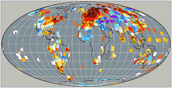
An idea of the GISS interpolation effect can be conveyed graphically using GISS images.
The link below is to two NASA GISS global grid temperature images of the Jan 2008 anomly data that have been made into a simple GIF animation, the first is with 250km smoothing, the second with 1200 km smoothing. Bear in mind that the data in a 250km ‘block’ is in many cases from a single station, especially in remote areas, so is really just a miniscule dot on the map.
http://plasmaresources.com/ozwx/climate/globaltemp/images/gisstemp250kmMollweide-sm.gif
The GISS images have been reprojected from Equirectangular to Mollweide to reduce the polar exaggeration that happens in a square grid and to instead show areas as equal on the map. Note how little real polar region data there is in the 250 km map, wheras in the 1200 km map the polar regions appear to be well covered.
REPLY: Thank you Carl, this is one of those “picture is worth a thousand words” moments.
If the error in the anomalies for UAH and RSS are +/_ 0.05 Deg C (I read somewhere), do trends of less than this have any meaning at all? (re Wm Briggs). Are the error ranges even known for HADCRUT and GISS?
Lee said:
Actually, these statistical methods all depend on having an accurate model for the underlying data. I would really be interested in seeing a Power Spectral Density plot of the data which would reveal exactly what frequency components are evident. With such data, one could go beyond mere linear trending to constructing a Kalman Filter/Smoother which would provide a much more robust estimate of any actual trend.
The Daily Telegraph (London) has picked up this story and give Anthony a mention, although there’s a misattribution about who found the Y2K error at NASA – I thought that was Steve Mc.
REPLY: It was Steve McIntyre who found the error, I simply started the ball rolling with posting a station survey of Detroit Lakes, MN from volunteer Don Kostuch and pointing out an anomaly (spike) that initially appeared to be connected to the thermometer placement near air conditioner systems, but turned out to be NASA’s data error.
Many of us average Joe’s out here are watching the discussions. We may not be eminent climatologists, but we have in-depth scientific training in our respective areas. And thus we can at least view the critical discussions with some understanding.
It seems to me that the gist here is that the GISS data has to contain a lot more value than the other data sets for the Warming Enthusiasts to base their claims. And then I see a picture like that presented by Carl Smith where there are obviously two different and widely variant interpolations on the GISS data. Taking that in to account along with many recent reports of SST microsite and other data gathering problems, healthy skepticism seems entirely reasonable. Does the GISS data really contain that much extra value? Not a rhetorical, but an honest question. It seems unlikely.
Lastly everyone will judge long term climate catastrophe based on the politics of crisis. It seems to me that the Warmers have vastly overplayed their hand. Dire predictions widely trumpeted in the media won’t be visible at all to the average person in any human time frame. As another ten to twenty years roll by without visible catastrophe, massive economic intervention will be harder and harder to sell.
Trends.. Warming… Cooling… Good…. Bad…? As Bob Carter says in this video….. It “Depends”…
It’s a good video. There’s four of them… I don’t think I’ve linked ’em here before.
Re; the GISS differences versus the other 3 data sets…
> Our analysis differs from others by including estimated
> temperatures up to 1200 km from the nearest measurement station.
Is that called a “GISStimate” ?
Bart says:
Actually, these statistical methods all depend on having an accurate model for the underlying data.
Thank you. About time somebody pointed that out. Fitting a trend line is only meaningful if there is a physical basis for it, and then you can talk about uncertainties and error bars. But the weather itself is whats real. The recorded highs and lows are an approximation of that, and an inferred trend line is a just mathematical abstraction that always pops out if you stick numbers in. Nothing more.
RandomEngineer is dead on mark, picking fights over imprecise language is a misdirection.
If the underlying phenomena were identified, as it digital data transmission, and the trendline could actually be decomposed into causative factors (or a digital signal); talk of noise, error estimation, confidence intervals and the like are meaningful. But here there is no definable population that we are sampling.
This phenomena, ‘global temperature’, is chaotic. Measuring the temperature in a quasi-closed system, like a furnace at constant temp, one finds it is a fractal function. Changing the scale of measurement yields the same vaguely sinoid signal. There is no true trend to be pursued.
That statistics is not our focus is perfectly in order, nearly everyone who comes here to read has had some statistics. How about multivariate, differential and vector calculus, shall we require these? They’re more important to the study of the underlying phenomena.
I found this site/blog having followed up the report in the Daily Telegraph. Having spent nearly 50 years analysing ‘noise’ from sources such as plasma physics and gas jets, I am fascinated by your graphs and would like to use my own collection of analytical techniques on the original numerical data. Where can I find that original data in a form that I could download into XLS.
REPLY: The links to raw data are directly below each graph
So it looks like GISS interpolates polar data. UAH and RSS could interpolate polar data but choose not to because the interpolation cannot be trusted. HadCRU is a mystery pudding and cannot be trusted.
Hansen has argued that trend errors in US surface measurements didn’t matter because the US represented a small fraction of the global surface area. Assuming a polar angle of 82.5N as being the highest latitude with trustworthy satellite MSU data, I calculate the surface area (land and sea) being missed at about 0.4%, the same as Patrick Hadley in an earlier post. Why bother to interpolate when this is a factor of ten smaller than the surface area dismissed by Hansen? Is this where Waldo is hiding?
Anthony: Thanks for posting the link to my video “The El Nino Factor”. Using Youtube was the fastest way for me to post the coincidence/correlation I had stumbled on. It amazed me at first.
I tweaked the data, and it created a “running average” curve that was almost as interesting. The coincidence with Global Temperature shifted.
I cranked out another quick video to illustrate the original coincidence may have been just that, a coincidence; to explain my intent with using a running total; and to show a few other correlations/coincidences.
Comments from your readers would appreciated.
If anyone has a link to raw Nino3.4 data–raw meaning no standardization, etc–from the mid-to-late 1800s to Present, it would be appreciated as well.
Thanks again.
paminator — (So it looks like GISS interpolates polar data.)
Yes, and I question the utility of this given that the polar data extremes seem to be driven by ocean currents and wind patterns.
From what I’m given to understand is that the northwest passage has been open many times in the past (e.g. the 30’s) so it seems disingenuous at best to include these effects NOW and not account for them in the interpolated data in past reconstructions.
By not including the past polar data — i.e. at least a WAG based on anecdotal NW passage evidence plus the known cycle times (e.g. PDO) and sun activity etc. then where it concerns present day arctic warming, it artifically makes the avg modern temp seem much higher.
As a result it seems like Anthony’s instinct to treat the GISS data as an outlier is correct in that what we’re wanting to see is apples compared to apples and the GISS data set is undeniably an orange.
An important global temperature chart to monitor is this one:
http://davidsmith1.files.wordpress.com/2008/03/0310084.jpg
This shows the sea surface temperature anomaly of the “Indo-Pacific Warm Pool” (“IPWP”).
This is the large body of very warm tropical water that stretches from Africa to the eastern side of Australia, and northwards to The Philippines. It is sort of like Earth’s basement boiler, which supplies heat to the rest of the globe.
Since about 2000 it has been easing slowly downwards, as has the global temperature (once the ENSO variation is removed).
An important question is, does the global air temperature drive the tropical sea surface temperature (the IPWP), or is it the other way ’round? My bet is that the driver is the sea and the global atmosphere is the passenger.
If that is correct, then the next important question is, “What causes the variation in the IPWP?”
REPLY: Gee David, that graph looks awfully familiar…now where have we seen a graph like that before? 😉
A point about the POES satellites. They are NOT in polar orbits. The inclination is about 98 degrees, meaning that they do not come closer to the poles than about 82 degrees north or south. I suppose they can cover areas a bit closer to the poles by using off-nadir measurements at the cost of lower quality data and more complex data interpretation.
As for surface data there is actually a weather station at the South Pole and one or two more stations above 80 degrees south. The North Pole has never had a weather station except for a brief period in 1937 when the Papanin expedition was there. There is definitely no weather stations north of 83 north for the simple reason that there is no land closer to the pole anywhere. If the Alert station on Ellesmere land is still operating it is probably the northernmost in the World (about 82 degrees). There are few, if any, other operating stations north of 80 degrees.
So in essence: there are almost no reliable weather data south of 82 degrees south, and none at all north of 82 degrees north.
REPLY: Well we have another one of those “truth is stranger than fiction” moments. Soemthing named a Polar Operational Environmental Satellite doesn’t actuallly get close to the poles…even though NOAA itself calls them “Polar Orbiting Satellites” on their web page for them:
http://www.oso.noaa.gov/poes/
whooda thunkit?
Here is the coverage map for POES:
http://www.met.fsu.edu/explores/CurrCD/CURRCD-FINAL/Appendix/Ap4-POEScoverage.jpg
For those of you in love with straight line trends, you might like to wander over to William Briggs lastest essay “You cannot measure a mean”.
http://wmbriggs.com/blog/
Anthony,
I am surprised by your exchange by your exchange earlier in this blog with Lee. I view it as uncharacteristic of you to speculate needlessly – albeit graciously — when you could have waited. Not only did you speculate, but you also were not aware of what had been quite well established in the literature — that only the GISS dataset purports to measure the Arctic Ocean temperatures. (Perhaps it would be more accurate to say that GISS projects Arctic Ocean temperatures rather than interpolates them. On one hand the GISS method could be credible because of the recent melts in the Arctic. On the other hand, there are apparently other reasons for the melt besides higher temperature, and the weather stations used to measure and project temperatures in the extreme North seem to have been influenced by exhausts and other human phenomenon.)
If I remember correctly, Lee also points out that GCM was used to help adjust satellite measurements. I believe that RSS used it quite some time ago in their attempts to further refine effects of orbital decay and deviation. Christy apparently did not necessarily accept that these further adjustments were necessary for his UAH measures – he had previously made adjustments for orbital decay – but he expressed no concerns about the RSS adjustments because they were within the error bars of measurement.
Meanwhile, the quote from Wikipedia misses an important point: If trends in satellite and land temperatures indeed converge, then the Global Climate Models are invalidated. The theory behind the GCMs is that troposheric temperatures will warm faster than the earth’s surface. Ironically, if the pro-AGW crowd would accept that the GISS and Hadcrut trends are overstating surface trends (due to UHI), then they would win the argument about the GCMs’ validity, and the argument would move to discussion if the trend is significant and then if warmer is indeed harmful on balance. Yet, as the IPCC points out, observations at this point in time do not entirely match the model’s outputs and either the models are somewhat off or the observations are somewhat off. They tend to believe the latter since the troposphere is not observed to be warming faster than the surface.
REPLY We all have our days. See the thread on UAH/RSS sat data:
http://wattsupwiththat.wordpress.com/2008/03/08/putting-a-myth-about-uah-and-rss-satellite-data-to-rest/
Lots of good things came from the exchange even though the exchange itself was messy.
Boy, did this discussion ever take off fast! Where was I when it began?
Jumping into the fray, allow me to say this about the back and forth over the meaning of trends in the data, and whether or not we can say anything meaningful about trends as short as, or shorter, than a decade. First, IPCC and others, have made the discussion of the historical record all about trends. So it is natural to want to parse the data and see what it really says about “trends.” And in truth, there is so much cyclical variation in the data (giving rise to serial correlation) that ferreting out trends that are “statistically significant” is an heroic task. While I imagine that Anthony has simply fit an OLS trend line to the data (and thus has not controlled for serial correlation), there’s not a doubt in my mind that Anthony’s basic point is valid. In the past ten years, it is highly likely that the temperature trend is not significantly different than zero.
In fact, when the entire history of the satellite period (1979 onwards) is analyzed rigorously, none of the four metrics Anthony is blogging about have trends that are significantly different than zero. I’ve always wondered why more attention hasn’t been given to using ARIMA to analyze the data. I know about Ross McKitrick’s paper, and I imagine that there are others, but given the continual attention made to “trends” I’m still surprised. So I took a quick stab at throwing something together this afternoon. Results in the next post.
I’m not going to go too far into the details right now. I’ll just post links to a couple of pics.
http://i28.tinypic.com/28cpoqs.jpg
http://i25.tinypic.com/r7vfxi.jpg
Just a couple of quick observations about what we’re looking at. First, the images plot seasonal differences in Anthony’s “metrics,” not the anomalies themselves. Besides some obvious analytical advantages, these seasonal differences are what started all of this in the first place, i.e. the change from January 2007 to January 2008. Second, the first plot is based on an analysis of the average of the two satellite series, and the second plot is based on an analysis of the average of the two land_sea series. Third, in each, I’ve computed and put on the images the historical and projected “trends” (back to anomalies now, not seasonal differences). Astute observers will note that the historical trend for the satellite series is noticeably lower than the historical trend for the land_sea series, which is not what we expect to see under the AGW hypothesis.
Finally, the forecast models were based on 1979 through 2006 so we could see how the model performed in the final year and a month of the available data. The forecast period then runs out another 12 months, to 2009:1. During the 12 months of purely forecasted data, the trends in the anomalies are negative for both series.
While none of the “trends” in this Q&D analysis are “statistically significant,” January 2008 did indeed fall outside the 95% confidence interval for a forecast based on the models. So something “significant” did indeed happen, and we cannot deny that by hiding behind the “noise” in the data.
REPLY: Basil, you are welcome to create a guest post on this if you wish. Just let me know via comments and I’ll set you up.
Why is the GISS data for 1998 so low? That’s exactly why GISS data trends up so much more than the others. 1998 is not like the others.
BTW, I expect when 1998 drops off the 10 year trend, the decadal trend will likely go up for all metrics.
Lee,
Well, what you see is what we got, i.e. the month of January 2008 was outside the predicted range. By itself, of course, one observation falling outside of the predicted range might not be particularly “significant” (in the sense of “meaningful”). But it didn’t just fall outside the range. It fell well outside the range. It will be interesting to see if that continues.
Meanwhile, Anthony, give me a couple of days to pull things together in more polished format. You’ve got my email.
Basil
Anthony,
You do great work here, but best of all, your work resonates with the general public. Not everyone is a professional grad student or an environmental zealot with a doctorate. The common folks are busy with their lives, raising their kids, paying the mortgage and are lucky to have a few minutes of spare time. They don’t have the time to learn about proxies or dendro or the ins and outs of microwave sounding units. But they do understand that a temperature sensor next to an air conditioner exhaust isn’t right. They also understand that the AC unit probably wasn’t there 60 odd years ago.
That is why the true believers are running scared and are spending enormous amounts of energy attacking you. If you can be shown to be wrong on some technical detail, then they will claim all of your work is in question. Even if that doesn’t work, at least they tie up large amounts of your time with endless questions and circular reasoning. Your patience in dealing with them is truly amazing, but I fear they are accomplishing their goals. They are not trying to learn, but to obfuscate. Cast not your pearls…
A daily check of Arctic temperatures revealed that since last October the temperatures in the high Arctic (Ellesmere Island) have consistently been minus 30 to minus 50 deg C. It is minus 41 ‘as we speak’, not a lot of melting , in fact none in the last 6 months with a hell of a lot of ice freezing going on.
Where are those, including Gore and Suzuki “when we really need them” who have been so concerned about the Arctic melt and the imminent demise of the polar bears? Why are they not at “ground zero” (Ellesmere Island ) to see for themselves the conditions? Why too are they not cheering now that the polar bears have been ‘granted a reprieve’?
The basis for Kyoto, the IPCC and “the carbon games” are being shredded.
If anyone should be jailed as a result of supposed AGW and the lack of action arising from thereof, it should be Suzuki for his fear mongering and attempts at causing mass hysteria.
A very interesting site and well put arguments. As a lay person who started from a neutral and concerned position over global warming I regret that I see the same positions from the opposite sides. One side from the doubters who put up relevant data and facts.The other from the “warmists” who then accuse them of knowing nothing and misleading the rest of us (who also know nothing) but who then decline to reply with relevant facts. “I dont have time”. I may not be a scientist but I am able to judge based on balance of probabilities and facts presented and as far as I am concerned the case for global warming has most certainly not been made.
Pardon my ignorant questions, but I was impressed with Lee’s point about confidence intervals. Since I had Hansen et. al 1999 on hand, I searched and found his error bars on one graph.
The confidence interval, according to the text, had to do with spatial temperature measurements, i.e., that in many cases the use of data from one station could be used over large spaces (interpolation?). I did not find an expression of confidence for the aggregate set of measurements and adjustments, but, maybe this was described in an earlier government funded study that is not available on the government sites.
Since I am only a casual observer I won’t personally trouble Dr Hansen for copies of his old, unavailable papers.
Perhaps someone can take a look at Hansen 1999 and explain the error expression.
Also, Dr Hansen speculates on a “smoking gun” in section 11.1.3. Did we achieve his speculated 0.05 deg C average increase within 2 to 3 years after 1999 relative to 1951-1980?
The paper is interesting reading, and I wouldn’t want to be the one to make sense of thousands of temperature readings, knowing that there were probably HUI problems, and who knows what other errors creep into the mix.
Sorry if this post is a bit off topic.
Hi all,
I’ve used Satellite Took Kit to show a one day passage of NOAA 18 by the north pole.
http://www.flickr.com/photos/24537036@N02/2324711796/
NOAA 18 is in a 98.8 degree inclined orbit, which is a Sun Synchronous Orbit (not polar). This orbit uses the oblatness of the earth to cause the orbit to rotate about the pole once per year, keeping the sun angle constant. This way, every passage of the equator occurs at the same local sun “time” every orbit, every day, all year. We set these up, for example, as 10 a.m. descending node orbits, or maybe 2 p.m. ascending node orbits…etc. These can drift with time if propellant is not used to maintain the orbit altitude. At 800+ km for these SATs, this effect is pretty small, but not negligible over lifetime.
So, NOAA 18 only goes up to 81.2 degrees latitude, with the instrument seeing a 3.3 degree field of view. Since this is a nadir pointing instrument, you will only see slightly north of the 81.2 degrees.
I guess they didn’t want to call the program SSOES, even though the satellites are not polar. Polar orbits are by definition inclinations of 90 degrees, taking the spacecraft directly over the poles. If the satellites were in this orbit, the time of day would vary for the each passage, so that might complicate the temperature measurements.
Hope this was helpful….
Have you ever heard of winter? Do you understand that no climate scientist in the world would claim that the arctic won’t freeze over in the winter, when it is night for months, receives no direct solar energy at all?
I’ve posted a reply: 4 of 4 Global Metrics Show Agreement in Trends. The Reader’s Digest version: the analysis done for this post is not wrong, but it’s misleading.
I would claim that a ten year trend is probably dominated by things besides any possible “climate change” types of things. For example, the El Nino La Nina cycle as opposed to any changes due to things like CO2, CH4, etc. But I would also claim that a ten year trend is not meaningless, it simply shows other things. For example, all four metrics show ranges of 0.6 C or more over ten years. That shows us that the “natural variation” is at least that large. So, what the ten year trend shows is, discerning an effect of something like 1.2 C over a century, amid natural variation of 0.6C (or more) per decade, requires very accurate data. And a very good understanding of the atmosphere and oceans. I’m not real sure we have those.
Anthony,
Thanks for a great website. As a casual observer just jumping into things, I have a few comments/questions about what I have read:
1. Atmoz says that he proves that a five year trend is meaningless and then goes on to say that you need to use 13 years or greater to determine an accurate trend. He bases this on the fact that there is a positive slope in the overall temperature readings and conducting 5 year trends on the data results in almost equal number of negative trends as positive – because of the positive trend over the temperature data then you can not have an almost equal number of negative trends as positive trends (my words not his). He in turn does an analysis of number of positive trends against the number of sampling years to prove that when you get close to 13 years you get approx 70% positive trends. I do not agree with that argument. You only need two data points to make a trend and 5 years of data have plenty of data points. Comparing the number of positive trends to negative trends does not prove that a 5 year trend is meaningless. I assume if he did an analysis of the magnitude of the trends he would find that the 5 year positive trends are of higher magnitude then the negative trends there by resulting in positive temperature gradient over the sampled data. It is about the magnitude of the trend not the number of positive or negative trends.
2. Atmoz talks about “noise”. The bigger your time interval the less the “noise” impacts your trends. Data is data; I do not understand the concept of “noise”. Do they use this to discount data? A more in-depth discussion of “noise” would be great.
3. I have a question about Temperature Anomalies (the basis for all this discussion). How are they determined? This may be a simple question, but in previous posts people have stated that the baseline does not matter when you are looking at trends. When you are measuring an anomaly, I think it does. Depending on where you measure this anomaly from (i.e. the baseline) will have a huge impact on the data.
REPLY: Your questions are good ones, but I’m in between locations at the moment. Perhaps our readers can help with the answers until I can join back in?
Lee,
Thanks.
I am still unclear where the 310.14K or 37C (I am using your example to illustrate the baseline and understand this is not the baseline used for the analysis in the post) comes from in the analysis of the measured temperature anomalies? How did they determine the best temperature for the 310.14K/37C (if this represents the baseline in which the anomaly is measured)? That baseline could change based on data sets and would very much so change the resulting trends. Am I missing something?
Lee,
Sorry for the second post.
In your post you are talking about changing the temperature scale not the baseline. Of course the anomaly will not change between K and C. But the baseline is the temperature they consider normal and the anomaly is the difference between the normal temperature and the measured temperature i.e. anomaly. How did they determine the normal temperature? Hope this clears up my question.
**********We have three metrics that supposedly don’t have polar data, UAH, RSS, HadCRUT, (I’m still out on UAH waiting to hear from Christy) and one the that does have polar data, GISS, but it is “interpolated”.*******
Interpolated (or, more accurately, extrapolated — since there is no data point at the pole) values cannot be accurately called “data”. Stuff like this should never be used without lots of caveats and explanations on the method of extrapolation and how sensitive the results are to the algorithm and parameters used, and how (if at all) it has been verified. For example, is the ice melt taken as a proxy of temperature, or are the wind effects accounted for — and what is the confidence interval of the accounting, and how is it arrived at?. How sensitive are the values to errors in one or a small number of neighboring stations? Strange that Lee seems OK with accepting the extrapolation method without question — do you know more than you are saying, or is it just what you would like to believe?
I invite anyone to extrapolate any random stock price time series using polynomials and bet a bunch of money on it — this should bring home the difference between extrapolated values and data.
Regarding 1: See also Stoat, where actual statistical significance is calculated.
Regarding 2: This Wikipedia article on signal-to-noise ratio may help.
Atmoz,
Thanks for the response. Both of the links do not tell me anything. I understand signal-to-noise. What is the signal and what is the noise as it is in reference to your post? I can not accept that it is noise, when there is no explanation of what you mean. For a long term warming trend may say something different to a 5 year trend, but to say they are meaningless is a little disingenuous. You can compare the rate of change over 5 year periods (i.e. trends) and it is not meaningless. The link to Stoat does not provide any additional statistical analysis, just shows me what you show. Because a trend does not match the overall trend, the does not make is meaningless, it may make it less significant than a longer time interval (Stoat says this). But if you want to look at the 5 year trend, say 2003 to 2008, and the magnitude of the trend (i.e. slope is significantly larger that prior analysis) it would be significant.
Oldengineer
Good post.
Sheaks3:
The signal is ‘global warming’, which I have modelled as a linear trend plus some arbitrary bias. In this zeroth order model, everything else is noise.
Stoat does contain additional statistical analysis because my post contains none. I never compute whether a trend is statistically significant. In general, I’ve only recieved good remarks about that post, and it was aimed at people without much experience with statistics. Hence my referring to ‘meaningless’ trends as opposed to ‘insignificant’ trends.
Consider a time series of length T with a red-noise spectrum and a linear trend over the entire period of zero. In general, for a random time series of length t < T the trend will still be near zero, but will not be exactly zero. The change in trend will be positive about 50% of the time; it will be negative about 50% of the time. I am not a statistician, so don’t ask me to prove this.
Now consider the temperature time series I provided in the blog post. It clearly has some trend leading to warmer temperatures in recent years. However, when I looked at the percentage of the trends greater than zero, it was only near 50%, the same as our null hypothesis. Thus I concluded that the results from 5 year trends were meaningless; I did not conclude they were statistically insignificant, which is a must stronger statement.
How did they determine the normal temperature? Hope this clears up my question.
Sheaks3, since we know the normal temperature of the human body (in Lee’s example), I assume you’re asking how the normal temperature of the planet was determined. And, IMO, that really is the crux of the entire debate — what is normal? Who determines it, and how is it determined? Since I’m probably the most math/physics/statistics challenged individual on this blog, I’d love to hear a scientific answer to those questions.
On a related topic, I asked the following questions on another blog a couple weeks ago:
<blockquote?If you were King of the World and had complete control over everything and everyone; what past climate would you try to emulate, what would you do to get there, and what evidence do you have that the policies you would enact would, in fact, achieve the desired results?
I only got one serious taker, and here was his answer (quite good, actually):
Re-education camps, hell. I’m for shootin’ ’em.
Au contraire! I can beat ANYONE at that claim.
Watch this: 2+2=fish
See!
REPLY: Teach a man to add, and he can fish for a day. Teach a man to multiply fish and he can eat for a lifetime.
I’m just a humble mechanical engineer who does a lot of measurement & calibration so I make no claim to be a climate expert. But I am negatively astonished to discover that there is an argument going on here about “interpolated data” for the polar region. Data is something you actually physically measure; an interpolation is a guess. I don’t care how clever or esteemed the climate scientist in question is, a guess is a guess and imho has no place being included in a data set. As for the argument about the length of the period used for calculating the trend…. give me strength. Who cares? You can find what you want to find by picking the start point that appeals to you.
Jeff, I propose a contest to determine which one of us is the dumbest. And since you are so good at “fish” problems, I pose the following:
My son-in-law and I went ice fishing on my pond a couple weeks ago and caught a couple dozen Bluegills. We threw back all the ones under 8″. How many did we keep? As Anthony says, simple multiplication, right?
As an aside, (and in keeping with the nature of this blog), you can’t imagine what a treat it was to fry up a bunch of freshly caught Bluegill in the middle of one of the coldest and snowiest winters in recent memory.
Well, I wouldn’t say “dumb”, lol. Just took different paths in life from those math types 😉 I was more into history, did not bad in HS biology, was always good at geography. Astronomy always fascinated me too, until the math came into play…
Not enough information. What time did the train leave Chicago, and how many of the girls are under 5 feet tall?
Never did any ice fishing, but did plenty of summertime pond fishing in the Blue Ridge Mountains of Norhwestern Virginia as a boy. I usually threw back the bluegill in favor of largemouth bass.
Not enough information. What time did the train leave Chicago, and how many of the girls are under 5 feet tall?
Train? What train? ROTFLMAO!! My wife is just over 5 feet — does that count?
I have almost the exact same background as you do in terms of education. I did well in high school chemistry and biology, math — not so much. When I moved out in the country a decade ago, (I’m in northeastern Indiana) I bought a decent telescope, but ended up using it more for birds and wildlife than for astronomy. I have a BS in Business Administration with an unintentional minor in history, simply because history has always fascinated me.
BTW, I have Largemouth Bass in my pond too, and we caught several of them through the ice. In the summer, the Bass are more fun to catch, particularly on a fly rod, but not as tasty to eat. The two species do compliment each other in a small pond (mine’s 1/2 acre, about 16 feet at the deepest point, fed primarily by my open loop geothermal system, as well as draining a watershed of around 6-7 acres. Interestinglly, I’m 63, and the last time I fished through the ice was as a teenager.
“GISS attempts to correct for this by using the known spatial coherence of anomaly data to interpolate the missing grid cell measurements. ” I do hope that no-one is using these interpolations as if they were data i.e. measurements. Just as I hope that they do analyse measurements, rather than measurements “adjusted” by essentially arbitrary “corrections” – I’ve seen too much of that sort of rubbish over the years.
Hey Stan, would love to continue the conversation, but don’t want to hijack the thread any further. You can email me at jeff at jalberts dot net, if you like.
Dhogaza’
You don’t understand.
The point is how ridiculous the warmingists are, when they speak in the ‘present tense’ of Arctic ice melting, on a minus 50 deg day.
Having experienced such conditions many times, I am well aware of them, including that ice does not melt on a minus 50 deg day. Perhaps you are a warmingist who still thinks that temperatures in the Arctic are warmer than normal when the facts are that it has been below normal consistently for nearly six months now. The new Arctic ice will not be melting anytime soon. Don’t buy any tickets for an Arctic cruise next summer as the cruise lines are not making plans to have their ships converted into ice breakers.
[…] statistically significant warming 11 03 2008 Yesterday, in response to the thread on “3 of 4 global metrics show nearly flat temperature anomaly in the last decade” I got a short note from MIT’s Richard Lindzen along with a graph. I asked if I could […]
[…] period to try to discern a trend in global average temperature, there is no a priori reason why a period of 10 years could not yield meaningful insights. It all depends on the “skill” with which we look at the […]
Anthony: Here’s a link to “El Nino Factor III”–probably the last of the series.
It compares and illustrates the correlations of NINO3.4 data to TSI (Can’t Miss It!) and to standardized global temperature. It also illustrates the correlations of global temperature to the Oceanic Nino Index (ONI) and to the Global SST ENSO Index. It’s almost twice as long as the first two, but I cover more topics.
I’ll retract the comment I made earlier on this thread about it being only a coincidence. The cumulative effect is sensitive to the base period of the raw data.
If I do another one, it’ll be an attempt to illustrate what’s happening and why the Running Total works. Other than that, I’ve run out of El Nino indices to play with.
If you’d like, I can email a copy of the spreadsheet so you can play with the data. Please advise.
Regards
NOTE –
Somebody just made a comment here that I accidentally deleted. The delete and edit words links are right next to each other on the comment form, I went to hit edit, to add a reply, but missed the target, and unfortunately WP has no “are you sure” or recovery options for a deleted comment.
The comment was about the number of months in the 10 year trend. Whomever that was, feel free to repost. My sincere apology for the trouble.
Lee said:
“arctic ice as of today is still almost a half million km2 below 1978-2000 mean for this date.”
Correct. And the Antarctic sea ice extent is a full million square km ABOVE the 1979-2000 average, for this date.
http://arctic.atmos.uiuc.edu/cryosphere/
If either is relevant, both must be. The worldwide total anomaly is currently positive, not negative.
Anthony,
Mine was the comment you deleted. My comment was simply that the data that you link contains 121 months, so it is not a true 10 year analysis. To get 120 months you would need to drop either Jan98 or Jan08 from your analysis. The other 119 months would be the same under either scenario, but you would get different outcomes. For instance, the average monthly anomaly over jan98 to dec07 in the UAH data is .2458333 and from Feb98 to Jan 08, the average of all 120 anomalies is .24016667. While those numbers look small, that’s a change of over 2% by just dropping one number and adding another.
My point is first, you’re looking at 121 months, not 120, and second if changing1 number has that large an influence, I think your time frame is too short to have any meaning.
Lastly, I want to add I’m not a stat guy, so I don’t even know if the average of the anomalies has any significance anyway. I just used it to get a quick and dirty look at the impact of which set of data you use.
REPLY: thanks for reposting.
[…] Data for first analysis: Blog post at Watt’s and text […]
[…] reference the temperature records over the last 10 years from 4 different metrics presented over at Anthony Watt’s blog. Yes, it’s only a 10 year period, but I fail to see any noticeable short-term direct relationship […]
[…] decréscimo acentuado da temperatura global. Algumas fontes de medições climatéricas indicam que nos últimos 10 anos a temperatura global se manteve estatisticamente a mesma. O artigo da Nature, apesar de se basear em novas medições e numa nova estratégia de fazer as […]
This is really interesting — the four modelled results and the numerous interpretations, exceptions, etc. I wish the conversations had continued beyond May.
Frankly, I’ve been a skeptic from the day I saw the Time magazine cover for “Earth, Planet of the Year”.
Twenty years have proven the skeptics correct and incorrect. Global warming is not really about climate change, and it’s not about environmentalism. It’s about social experimentation; about creating the perception of a crisis and emplacing conditions and restrictions on who loses and who receives it, by writ of law. It’s the same game that man has played throughout our just-above-the-monkeys existence.
Hopefully, the data you observe and the models you build will give us a much clearer picture of what the futures holds. God speed.
I wonder if someone can check if the HadCRUT3 calculation has changed. I see on their website <a href= “http://hadobs.metoffice.com/hadcrut3/” here they comment:
“We have recently changed the way that the smoothed time series of data were calculated. Data for 2008 were being used in the smoothing process as if they represented an accurate esimate of the year as a whole. This is not the case and owing to the unusually cool global average temperature in January 2008, it looked as though smoothed global average temperatures had dropped markedly in recent years, which is misleading”.
[…] because temperatures have been flat if not cooler since 1998, the hottest year on record. 3 of 4 global metrics show nearly flat temperature anomaly in the last decade « Watts Up With That? You want to know by far the biggest deciding factor in the Earth’s climate? I’ll give you a hint, […]
[…] in as an aside the claim that the earth has actually cooled over the last decade anyway (which might be true). I ended up trying to explain, without being overly antagonistic, that most environmentalist […]
When using rolling averages, example, 30 year trend, one must place it in the center of the time period, i.e. about 1993 for 30 year average ending 2008. Using the 30 year trendline to represent the present rate of change is flat wrong.
[…] Gehöre ja zu dem Volk, das der Klimahysterie skeptisch gegenübersteht. Ich weiß nicht, ob der Klimawandel wirklich zum Großteil durch den Menschen verursacht wird. Bin mir noch nicht mal mehr sicher, ob er überhaut stattfindet. Immerhin ist’s seit zehn Jahren nicht mehr wärmer geworden. […]